The Livingetc newsletters are your inside source for what’s shaping interiors now - and what’s next. Discover trend forecasts, smart style ideas, and curated shopping inspiration that brings design to life. Subscribe today and stay ahead of the curve.
You are now subscribed
Your newsletter sign-up was successful
Kitchen renovations are a series of compromises. They tend to start with a vision — let's call it a dream — and end up somewhere that is hopefully close to the original hope, but quite possibly pretty different. There will have been practical difficulties, budgetary climb-downs, and new ideas that emerged along the way.
One issue I had was that the contractors were always looking for an easier way (I'm happy with the end result, but it's telling that we didn't use them again). They knew exactly what they were doing and had a fine eye for detail, working with the unusual curves of the doorway and the uneven surface of the 200-year-old flagstone floor — but even though they were being paid by the day rather than for the job, they always seemed reluctant to do anything that might delay them in any way.
Well, this almost caused a full-blown fight when it came to the positioning of the pantry. A fight I was very near to letting them win until I got the tape measure out and realized I was right. Ultimately, I'm so glad I pushed back — it not only made all the difference in the space but also meant that I followed one of the cardinal rules when it comes to the best kitchen layouts; something I'd never forgive myself for forgoing.
Article continues belowThe problem

My dream kitchen remodel had a full-sized island bench and a double-fronted pantry — one side to conceal the refrigerator, and one for ingredients, produce, and drawers for baking sheets and trays. Technically, we could have fit all that in with the pantry flush to the wall, leaving just enough floor space to open the doors and walk between the island and the pantry.
But, not only would that have made the entire space tight, but the pantry would have jutted into the room, taking over the space; a monolith that would have undoubtedly stolen focus. While I was planning to paint it terracotta, I still wanted the main focus to be on the granite countertop in the middle of the room.
The solution

So, my solution? To hollow out the thick stone wall in the kitchen to have the pantry set back a foot into the recess. Simple, right?
Well, the contractors scratched their heads. "I mean, it could be done, but it's going to cause you problems," they told me. "Such as?" I asked, my resolve to excavate slowly waning. "Well...the dust. It'll take a bit of time. It'll be noisy. We'll have to fill in the wall we've cut to make it smooth again," they listed, adding "It probably won't make all that much difference."
The Livingetc newsletters are your inside source for what’s shaping interiors now - and what’s next. Discover trend forecasts, smart style ideas, and curated shopping inspiration that brings design to life. Subscribe today and stay ahead of the curve.
I began to capitulate. They were telling me it would be tough, and they were the professionals. We were only a few days in, and already I wanted the whole project to be over. Surely anything that might extend it wasn't worth doing? "Ok, fine, let's not bother," I replied, thinking anything to get out of this conversation would be welcome right now. But then I paused, took a deep breath, and told them to go for it. They grimaced. They scratched their chins. They sighed. They rolled their eyes. And then they did it — and I'm so glad.
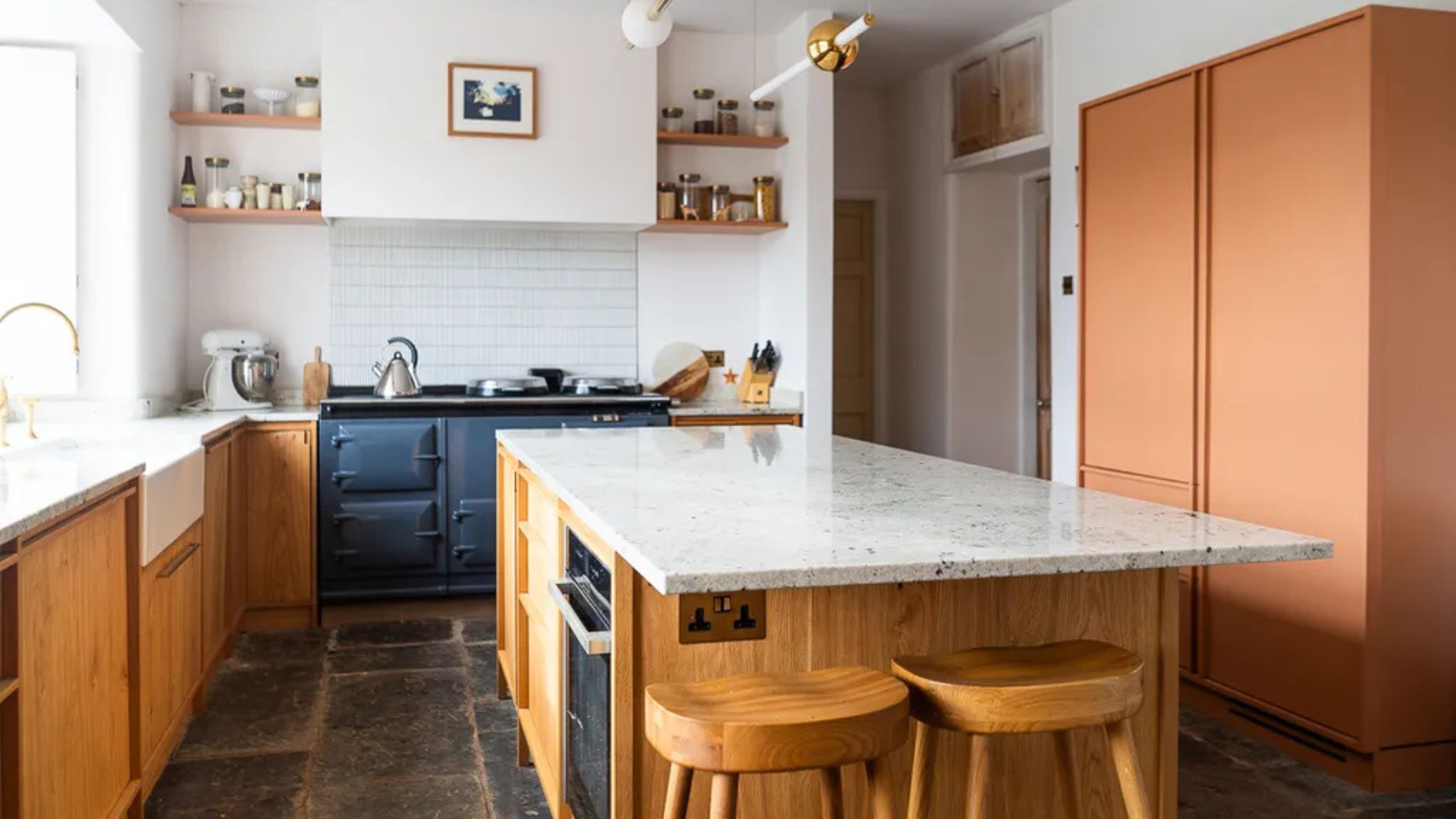
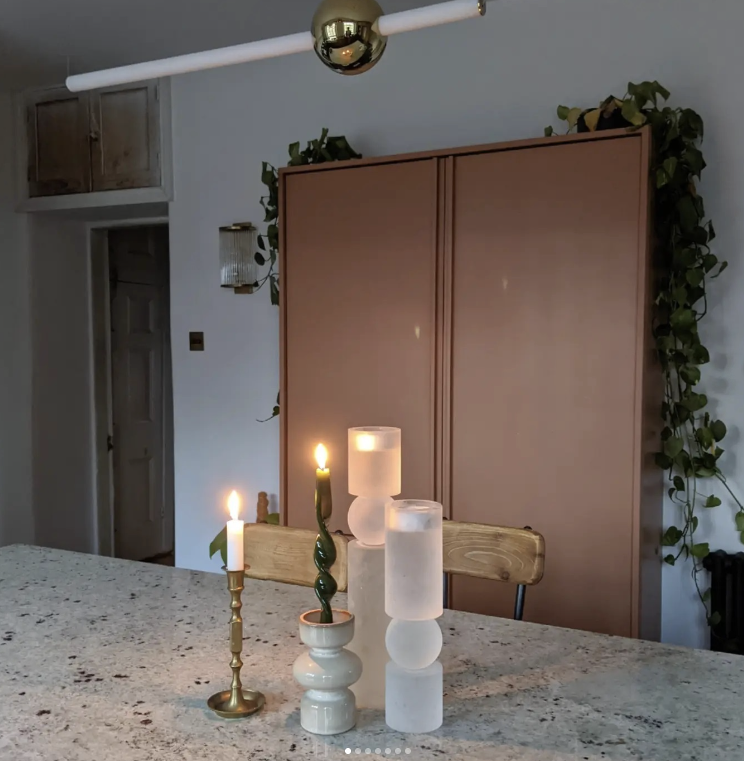
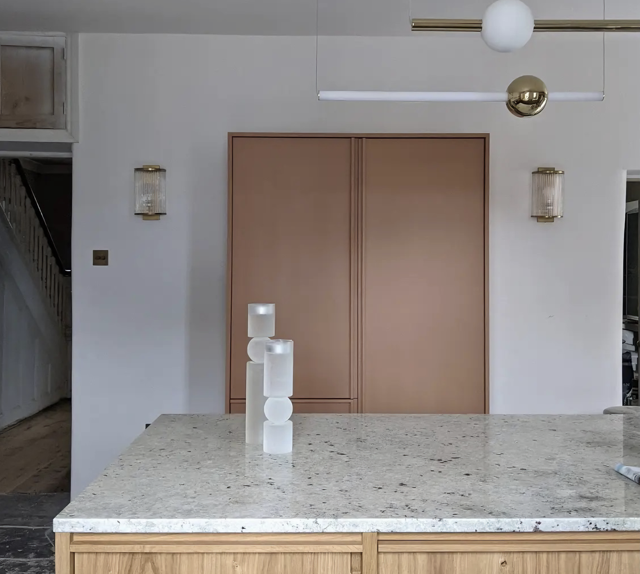
As you can see from the picture above, the pantry still protrudes, but nowhere near as much as you'd expect for kitchen storage that houses a full-height refrigerator.
How wide should a walkway in the kitchen be?

The result of this 'stand off' (which likely felt worse to my conflict-averse self than it may have actually been) was that we had 38 inches of floor space to walk through between the pantry and island, instead of just 33 inches. The whole room is so much airier, and more importantly, easier to navigate thanks to those crucial five inches.
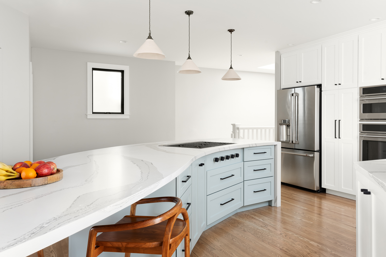
"The standard approach to spacing for cabinet units as well as appliances (since they are usually built to the same dimensional specifications anyway) is to plan for a 36-inch space between openings," says Brandon Walker, company construction manager at ASAP Restoration in Scottsdale, Arizona. "This way when you have an island cabinet, you can open the door to access it, and open the door to the cabinet on the wall side, without the doors hitting each other."
He goes on to add that this rule also applies elsewhere in the kitchen. "This is the same spacing for appliances as well," he says. "This way you can pull the door to your dishwasher down without it hitting the island countertop, or smashing into one of the drawers."
But when I say 'rule', it's not actually a rule. In fact Brandon says there aren't many regulations in most municipalities regulating this. "If you want to design your kitchen so that the cabinet doors hit each other, that's your right," he says.
In smaller homes, or for those with particularly big kitchen dreams, there may be some ways to swing this in your favor. If you're working with a small kitchen remodel, "the best way to get the most value out of the real estate is to plan for the tightness being a feature rather than a bug," says Brandon. "This means you won't be able to cram everything in together, but it will make for a more functional space."
To do this Brandon stresses the importance of not only knowing your dimensions, but also knowing how you will use the space, and how this will impact that. "Let's say you need a lot of countertop space, but you only have so much room," he theorizes. "You have to determine if an island or a peninsula is the better use of your space. Then you have to think of your habits. Would you be inconvenienced by a peninsula because you need to regularly access that area, and so only an island will do? Do you have space enough for either one?"
For studio apartment kitchen ideas, you may need to look to places other than Pinterest for your inspiration. "If your space is truly small, then you need to start thinking in terms of how boats and RVs are built," says Brandon. "These tight space restrictions force creativity when it comes to design. This might mean that your tiny kitchen will need to have a pull-out bread board-style countertop extension in order to get the space you need."
The best small kitchen storage ideas also incorporate increased access, adds Brandon. "This might mean splurging on cabinets that have pull-out drawers, or whole units so that you don't have any lost cabinet real estate at the back where no one can reach."
So, the most important takeaway from all this? Storage can make or break a kitchen design. No matter how big the space is, you'd be surprised what a difference a few inches can make. So if that means having to push through a short and uncomfortable conversation or two in the short-term, that can be the difference between having a comfortable space to live in for years to come, or one you'll feel awkward in every day.
The editor of Livingetc, Pip Rich (formerly Pip McCormac) is a lifestyle journalist of almost 20 years experience working for some of the UK's biggest titles. As well as holding staff positions at Sunday Times Style, Red and Grazia he has written for the Guardian, The Telegraph, The Times and ES Magazine. The host of Livingetc's podcast Home Truths, Pip has also published three books - his most recent, A New Leaf, was released in December 2021 and is about the homes of architects who have filled their spaces with houseplants. He has recently moved out of London - and a home that ELLE Decoration called one of the ten best small spaces in the world - to start a new renovation project in Somerset.