How Can I Make a Shaker Kitchen Feel More Modern? 5 Twists to Make This Classic Style Feel Fresh
This kitchen cabinetry classic might be timeless, but there are ideas interior designers are choosing for a more modern look
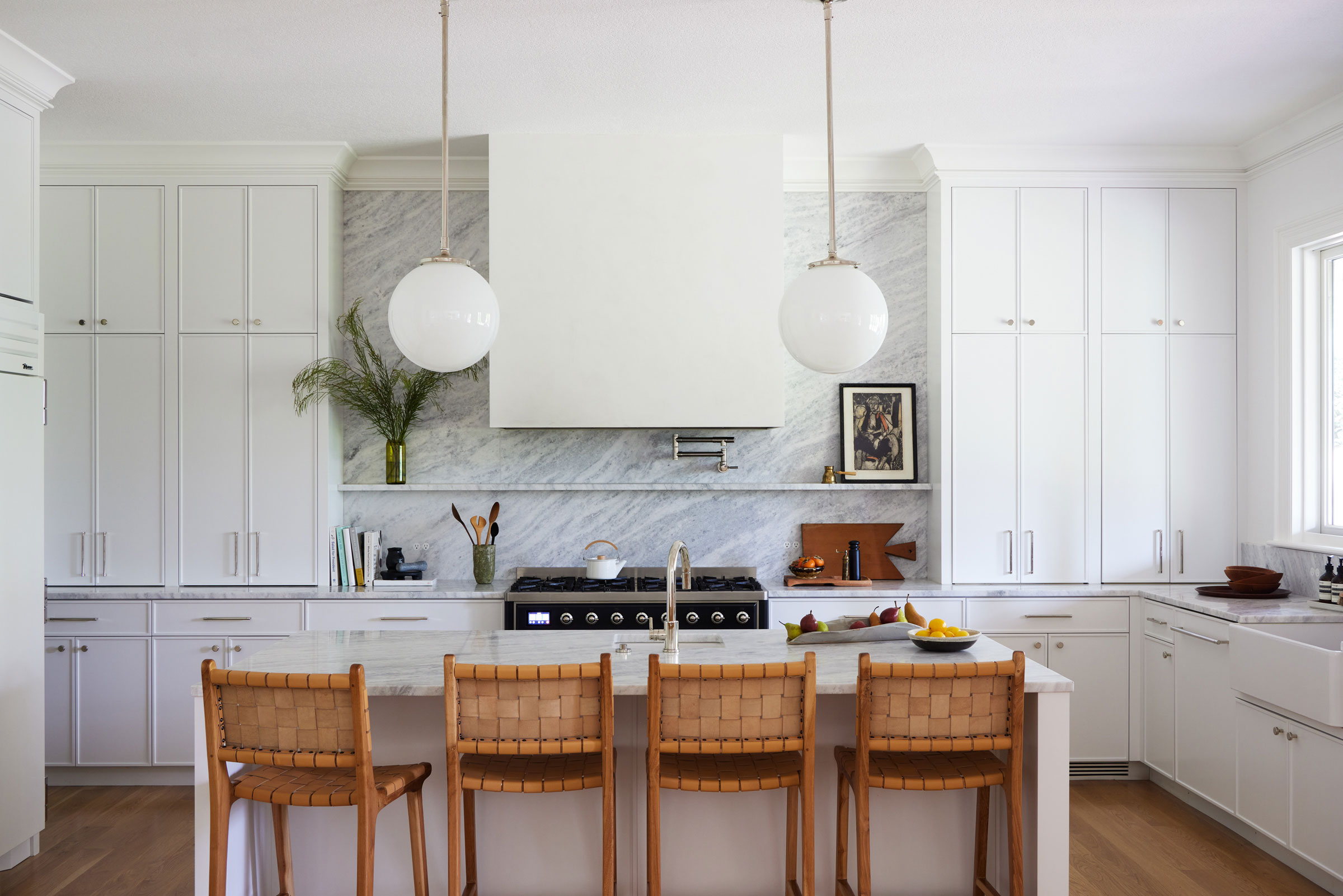

A Shaker style cabinet is as about as timeless as it gets when it comes to a kitchen — the design, with its paneled front and recessed center, is one you'll see in all kinds of kitchens, from the most traditional to a variety of modern spaces.
Shaker style kitchens have a charming quality to them that feels a little more luxurious than a flat, slab door — however, when it comes to what people choose for a sleek, minimalist and truly modern kitchen, it's the slab doors that usually win out. However, not always.
There are tweaks designers are making to Shaker style doors to give them a more contemporary feel. We asked designers for the best design tricks for more modern cabinetry.
1. Keep it simple

Shaker kitchens aren't all the same as a standard — they're often customized with different moldings that, in most cases, make the doors feel more intricate, and therefore ups the luxury factor.
However, to keep a Shaker a little more modern, designers are keeping this part of the design a little more simple.
‘For door styles, we’re seeing a trend towards less ornate doors,' says interior designer Jennifer Verruto of Blythe Interiors, 'lots of skinny Shaker and bevelled edges.’ Skinny Shaker, you say? More on that later.
2. Pick a curved profile

Whether it's organic curves or playful arches, soft edges are a signature of modern interior design trends, and it's an idea that we can apply to the usually-boxy Shaker door, too.
'The curved kitchen cabinet trend infuses a sense of fluidity and sophistication into the culinary hub, creating a gentle, inviting atmosphere,' says Interior designer Kerrie Kelly from luxury kitchen designers Hestan. 'Employing these elegant curves in a renovation allows a "softening" of the kitchen's typical edges, adding a touch of grace and visual intrigue.'
This kitchen, designed by Pernille Lind, introduces an interesting curved Shaker, both on the lower cabinetry, and highlighted by doors with inset fluted glass.
3. Choose slim-line Shaker doors
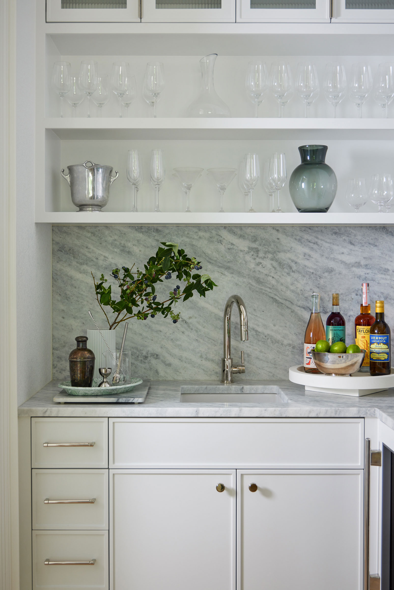
Back to our so-called "skinny Shakers". 'In kitchen design, homeowners are looking for something that isn’t too modern or too traditional,' explains Philip Consalvo, Principal of PJCArchitecture. 'We’re seeing a lot of interest in “Slim Shaker” Cabinetry, which is somewhere in between a flat slab door and a traditional shaker door. This transitional style features slimmer trim detailing for an elevated look.'
It's a design that interior designer Casey Keasler, founder of Casework, chose for this white kitchen to give it a contemporary edge. 'We've been calling this a slim line Shaker cabinet,' Casey tells us. 'It's similar to the traditional Shaker cabinet door, only instead of a 2" or 3" frame, it's 1/2".'
4. Use wood for your doors
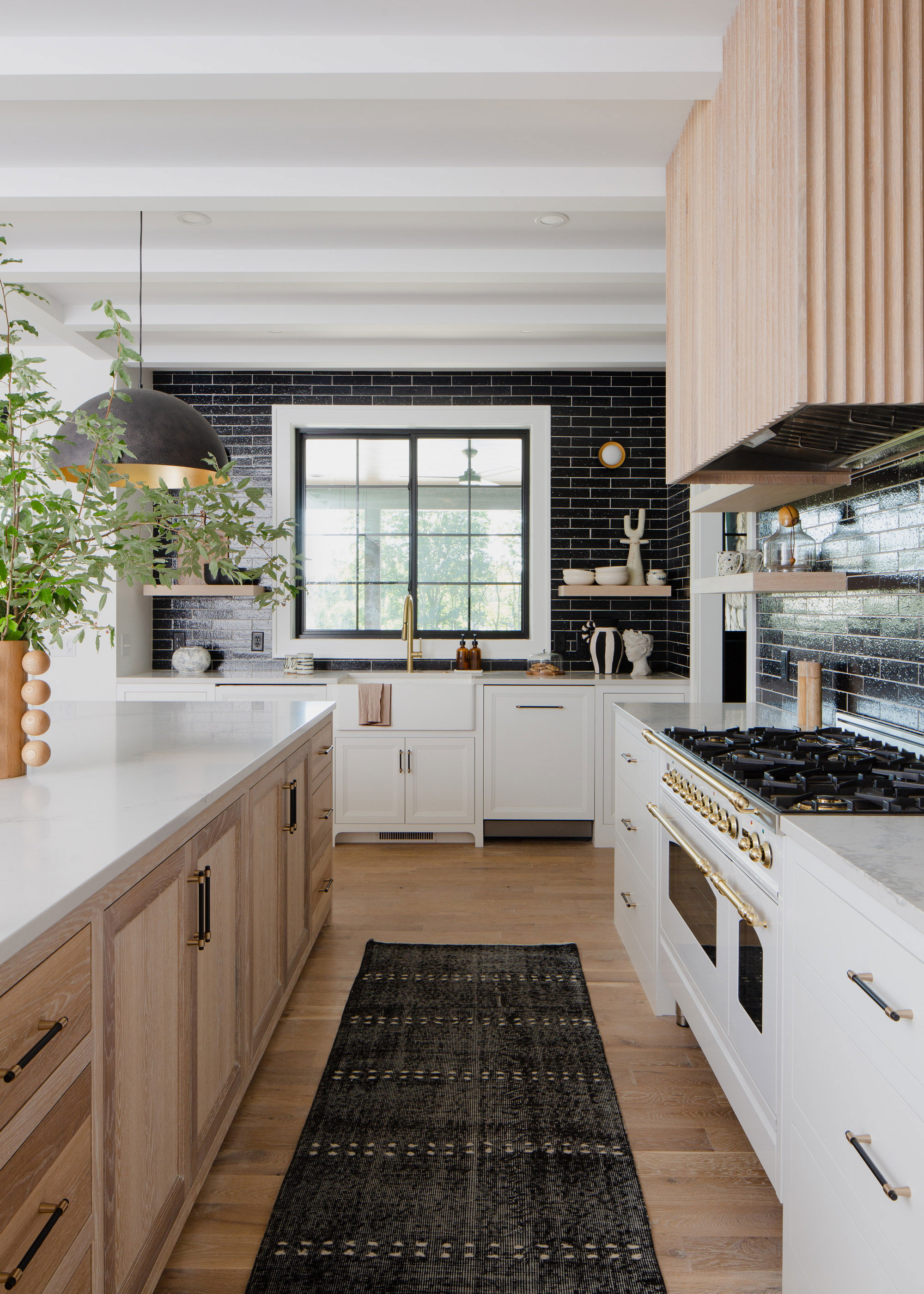
When we asked designers what's the most modern kitchen cabinetry, their somewhat surprising answer was simple: wood. It may not seem like the flashy, modern materials we're used to seeing in what we'd usually consider modern kitchens, but interior designers are choosing it as a material that defines contemporary design.
Often, this is for a simple slab door, but this wood kitchen, created by KLH Homes, goes to prove what intrigue raw wood can bring to a Shaker kitchen, too. 'We played the simplicity of flush inset drawers off of triple-stacked Shaker door panels for extra depth and dimension,' explains Liz Hoekzema, creative director of KLH Custom Homes. The shifting direction of the grain on the Shaker door panel brings a movement to the design that really makes it feel special. 'We then brought in fluting on the vent hood to play some curvature against all of the straight lines,' Liz says. 'Open shelves in the same oak finish kept things light and airy, in contrast to our dark tile walls.'
5. Add metal inserts
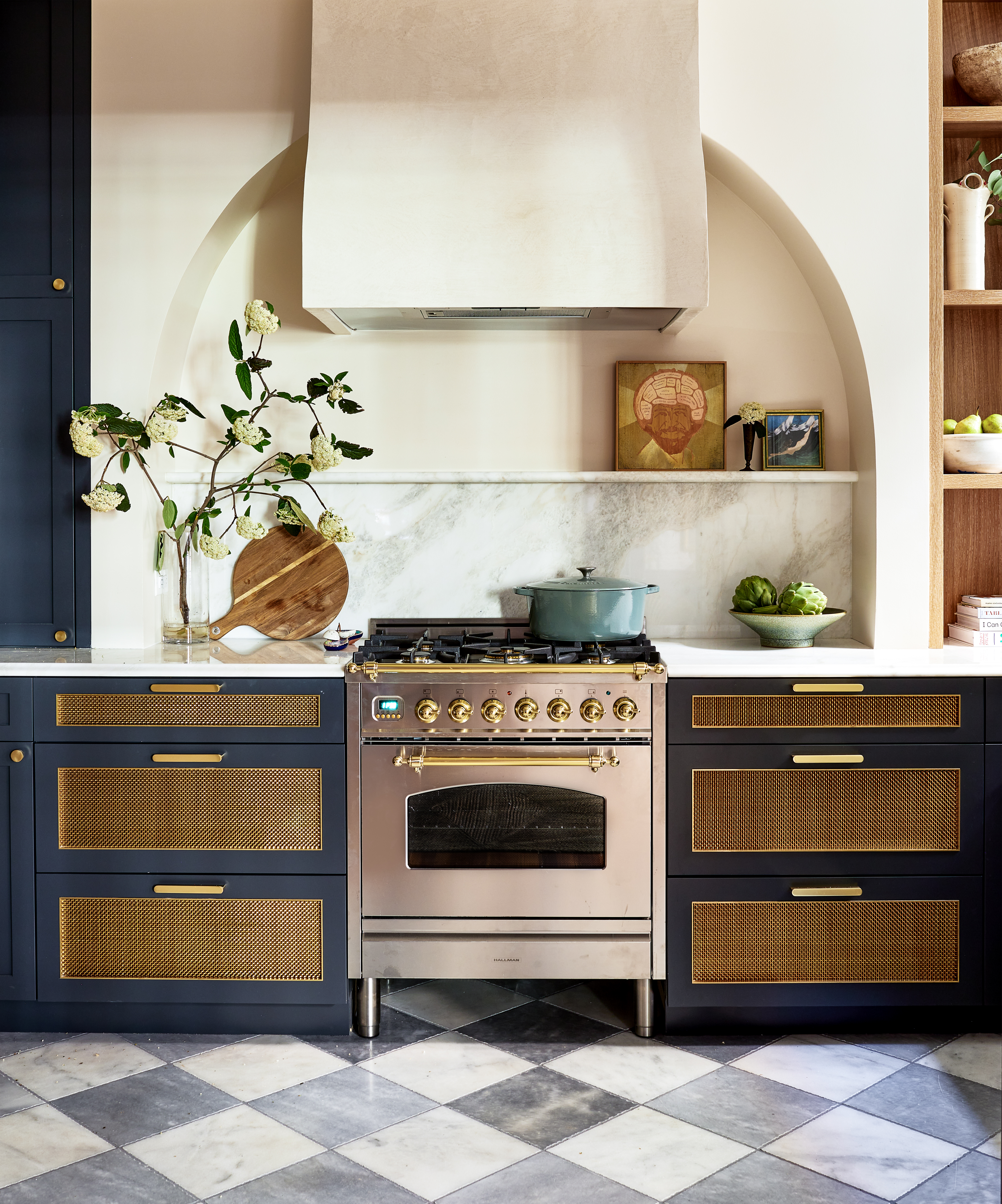
When it comes to kitchen trends, we're seeing lots of Shaker doors with inset materials, whether that be wire meshes, reeded glass, or even fluted wood set within the Shaker panel. 'The industry is seeing some exciting things happening in modern cabinetry right now,' kitchen designer Gabrielle Fabbri explains. 'There's a big call back to metal cabinet doors specifically.'
In this kitchen by interior designer Zoe Feldman, gleaming brass inserts in the Shaker panels surrounding the range tie the room's metallic elements together.
Be The First To Know
The Livingetc newsletters are your inside source for what’s shaping interiors now - and what’s next. Discover trend forecasts, smart style ideas, and curated shopping inspiration that brings design to life. Subscribe today and stay ahead of the curve.

Luke Arthur Wells is a freelance design writer, award-winning interiors blogger and stylist, known for neutral, textural spaces with a luxury twist. He's worked with some of the UK's top design brands, counting the likes of Tom Dixon Studio as regular collaborators and his work has been featured in print and online in publications ranging from Domino Magazine to The Sunday Times. He's a hands-on type of interiors expert too, contributing practical renovation advice and DIY tutorials to a number of magazines, as well as to his own readers and followers via his blog and social media. He might currently be renovating a small Victorian house in England, but he dreams of light, spacious, neutral homes on the West Coast.
-
 My 10 Favorite Designs at Milan Design Week 2025 — Out of the Hundreds of Pieces I Saw
There is a new elegance, color, and shape being shown in Milan this week, and these are the pieces that caught my eye
By Pip Rich
-
 Iridescence Is Chrome’s More Playful, Hard-to-Define Cousin — And You're About to See It Everywhere
This kinetic finish signals a broader shift toward surfaces that move, shimmer, and surprise. Here's where to find it now
By Julia Demer
