How do you decorate an awkward entryway? 7 designer-approved tricks for tough-to-style entrances
Decorative details, clever storage and statement art all play a part in making a design-led space out of an awkward entryway
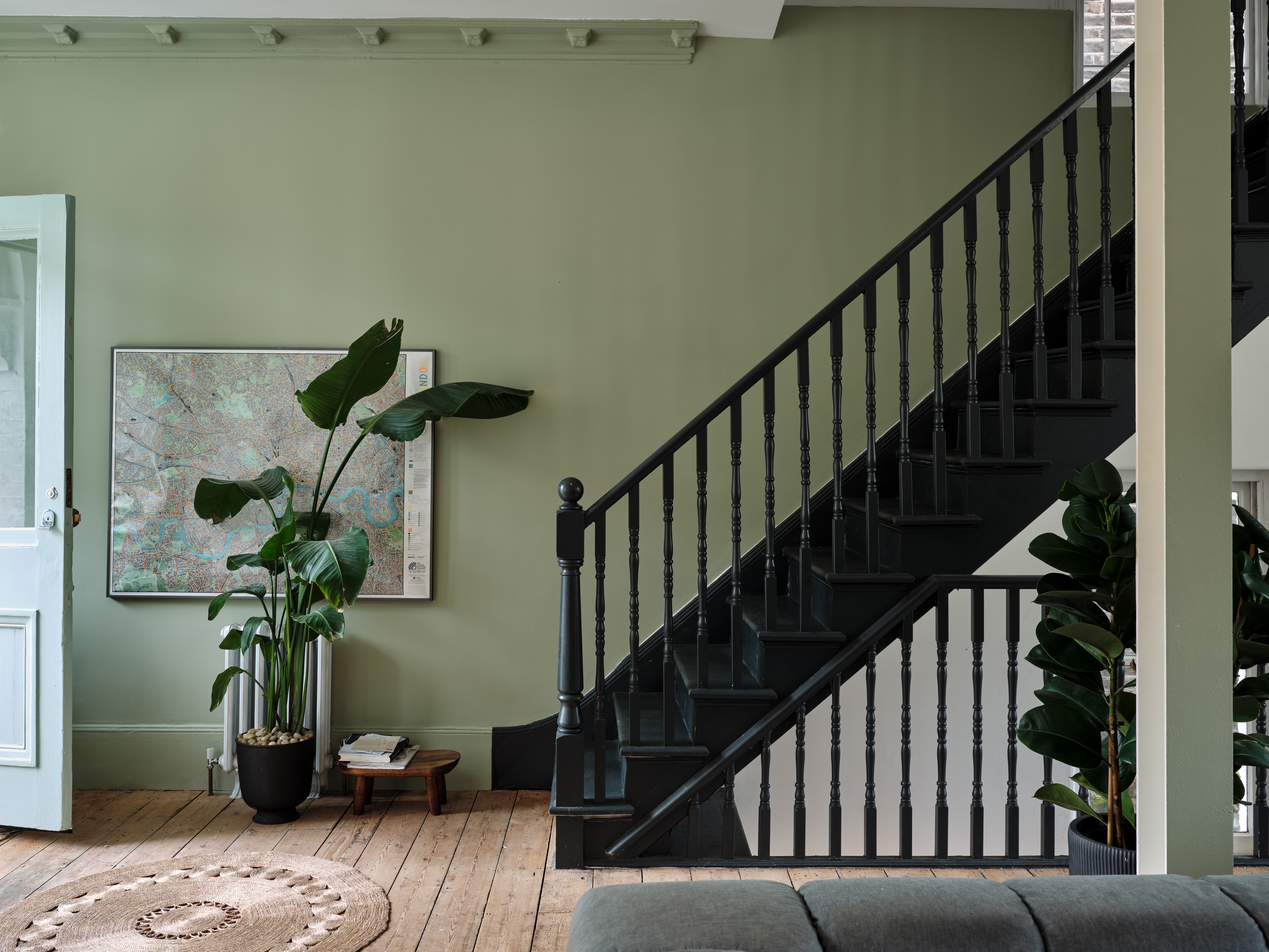
Styling an awkward entryway can make all the difference when it comes to giving your guests a luxe first impression and setting the tone for the rest of your home. Rather than seeing it as an obstacle, try viewing an entrance that has a small or difficult layout as an opportunity to get creative.
Play with pattern, display objet on thin shelves, go bold with color and artwork, and never forget the importance of good storage.
We tapped a host of designers to reveal their winning entryway ideas for the battle against awkward spaces below.
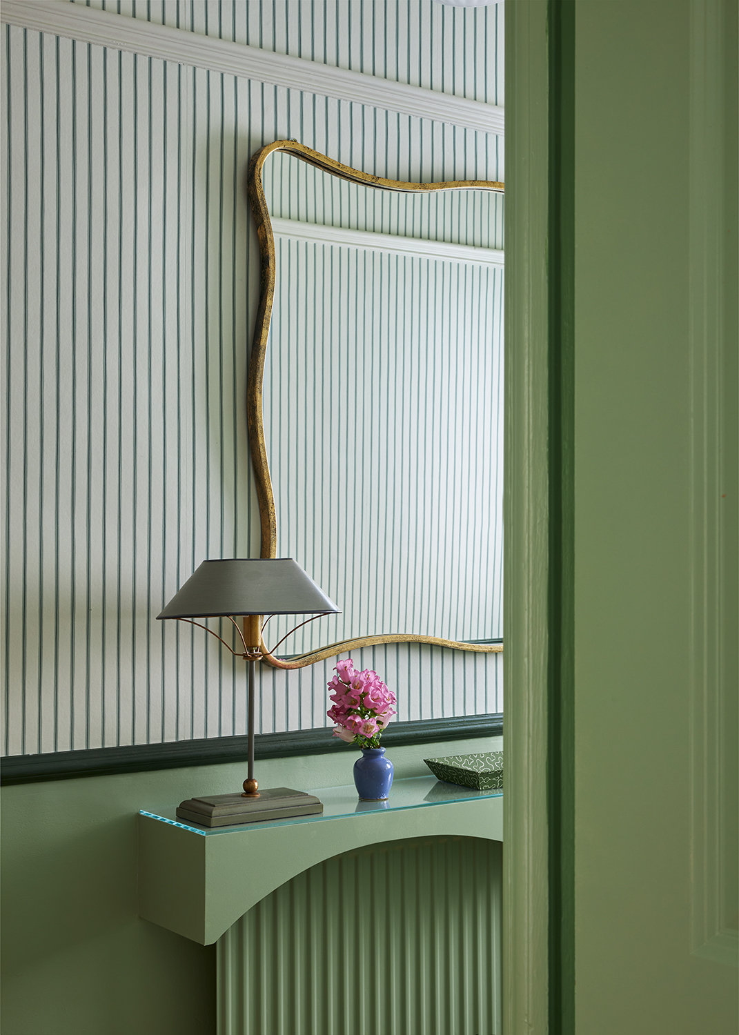
'Awkward entryways can sometimes be a challenge, but embracing its weirdness can be a blessing,' says Linda Hayslett of LH.Designs.
From floating shelves to statement trees, designers reveal how they approach awkward entryway styling below.
1. Showcase decorative details on floating shelves
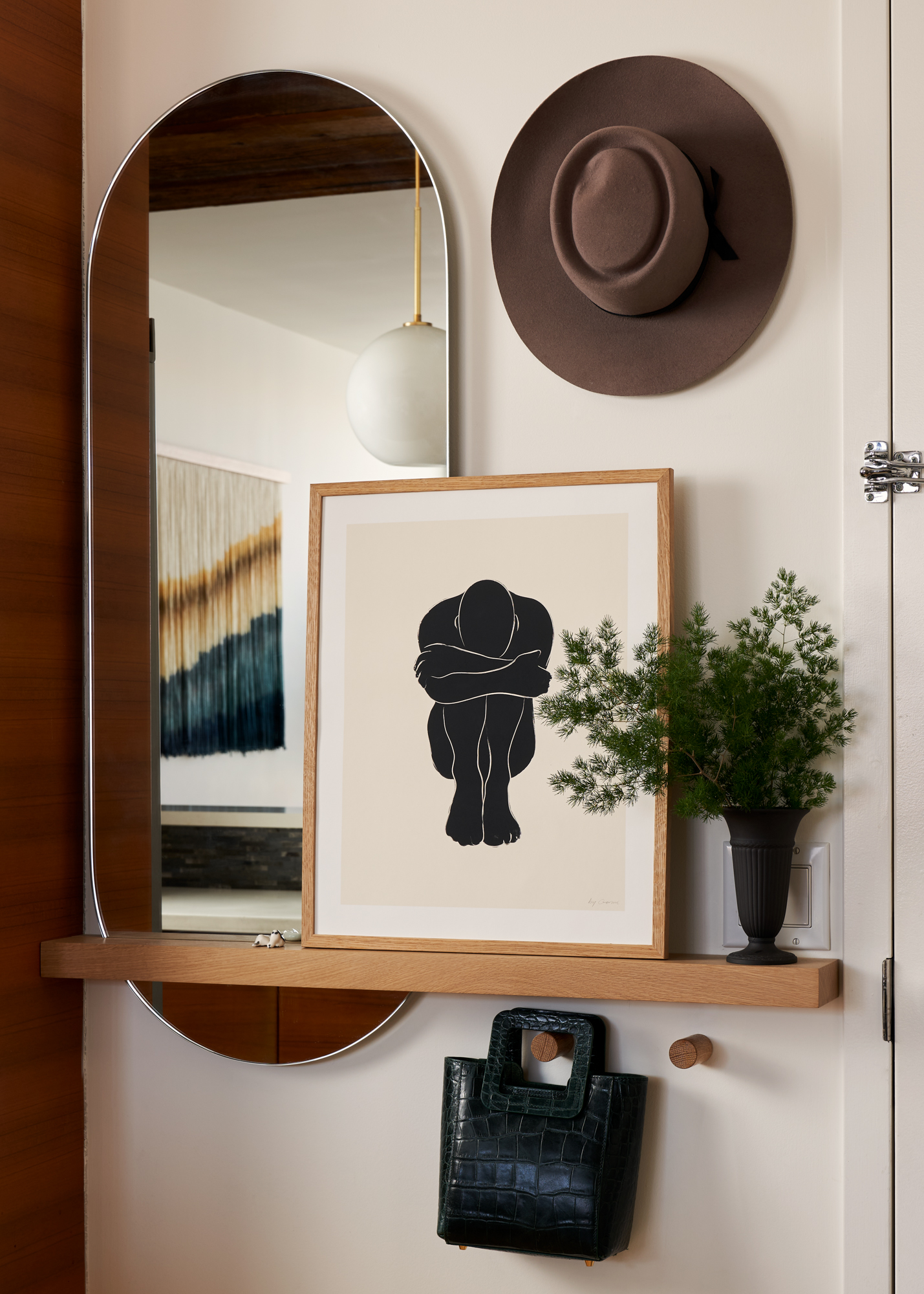
If you're working with a small entryway or awkward entryway, don't be fooled into thinking you can't display decorative objects - there's always enough room to add a little 'pretty' to any space, and inishing touches can transform the overall aesthetic.
'Small entries deserve a moment to shine, just like larger spaces,' says New York-based interior designers Molly Torres Portnof of DATE Interiors.
'Floating shelves and hooks are a great way to make a 'barely there' entry functional, as well as beautiful. Add art, plants, vases and decor for the finishing touches.'
2. Go bold with artwork
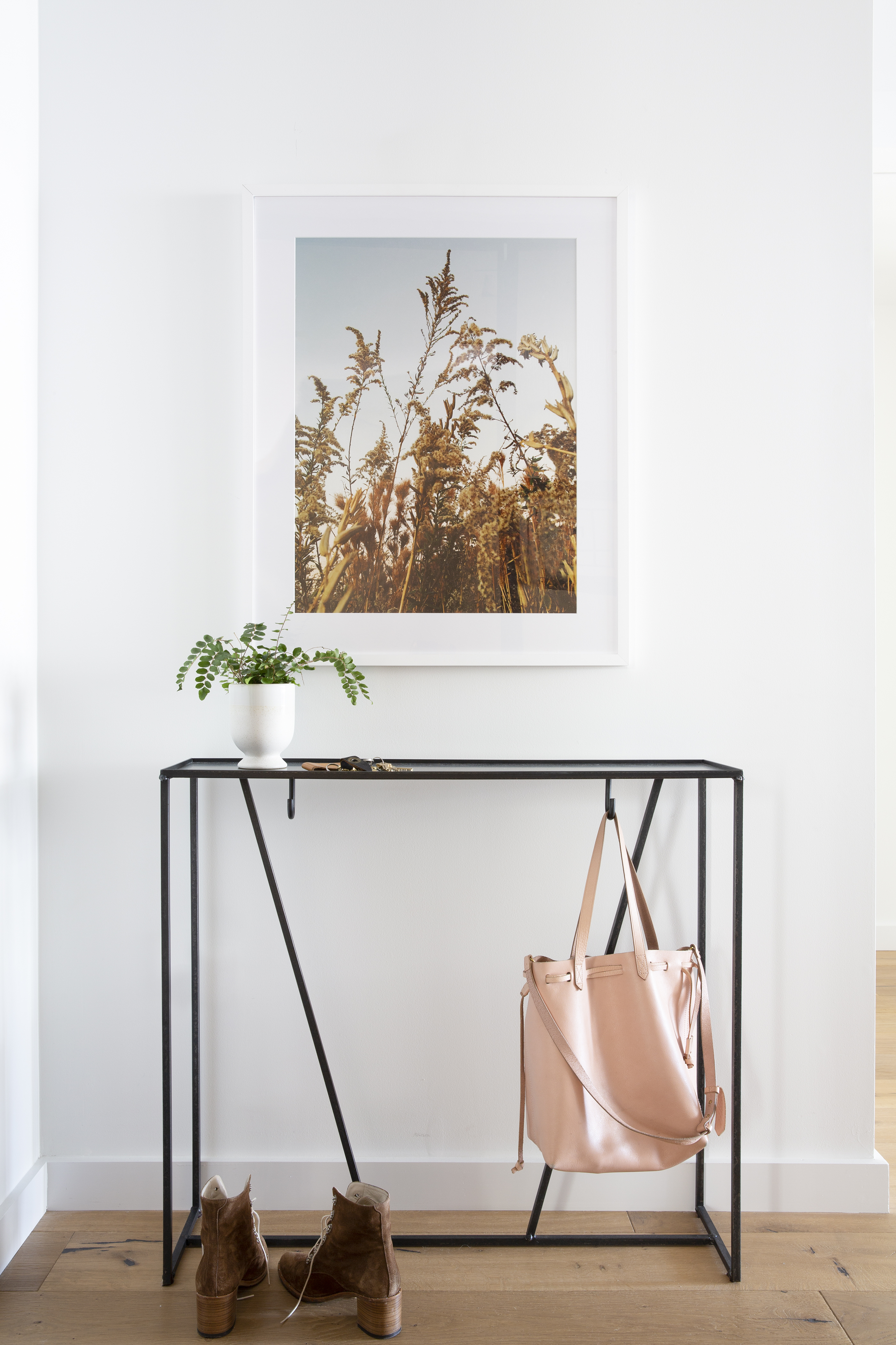
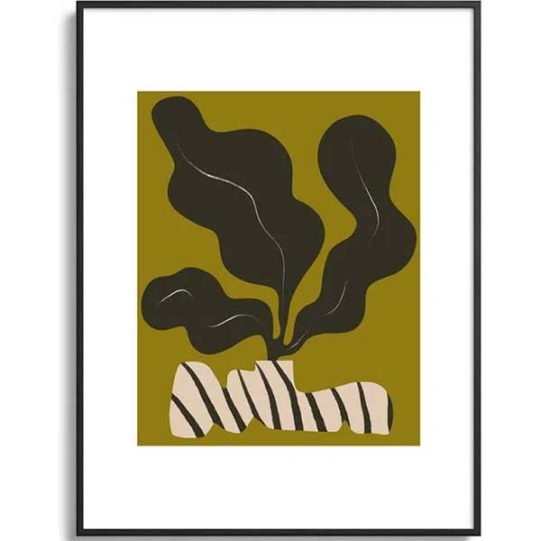
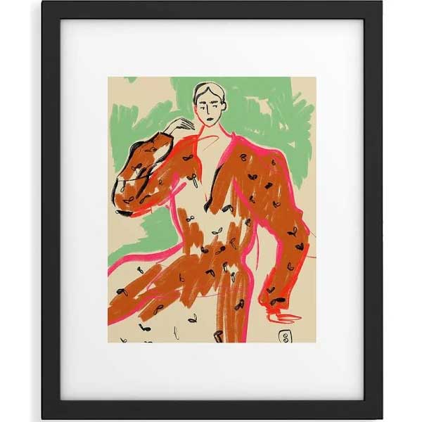
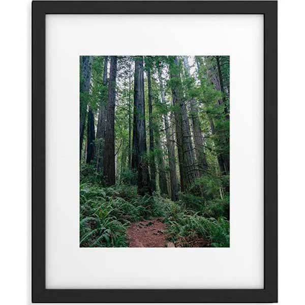
Just because your entryway is awkward, small or lacking in light doesn't mean it can't pack a punch with bold pieces of art.
Whether you opt for a fun gallery wall or one large statement print, art is an easy way to make your entryway look more expensive no matter the size of layout of your hallway.
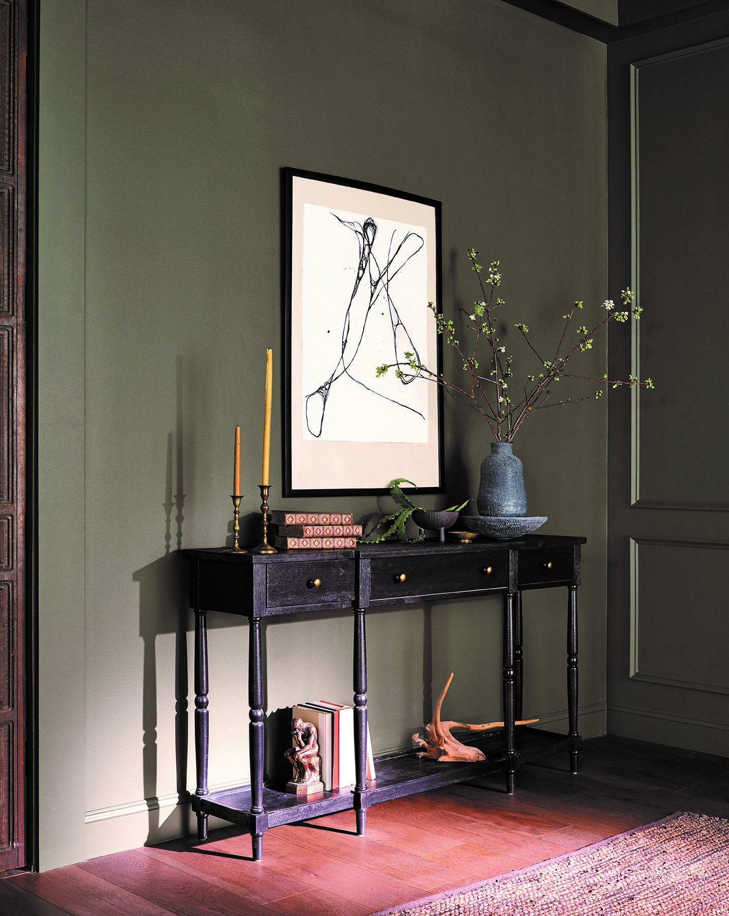
'When the front opens right into a living space, you need to get creative with your furniture and styling,' Kristen Pena, of K Interiors, says. 'Using some inviting art and a space-saving furniture piece can help to keep things organized and tidy but also attractive.'
3. Try a hall tree
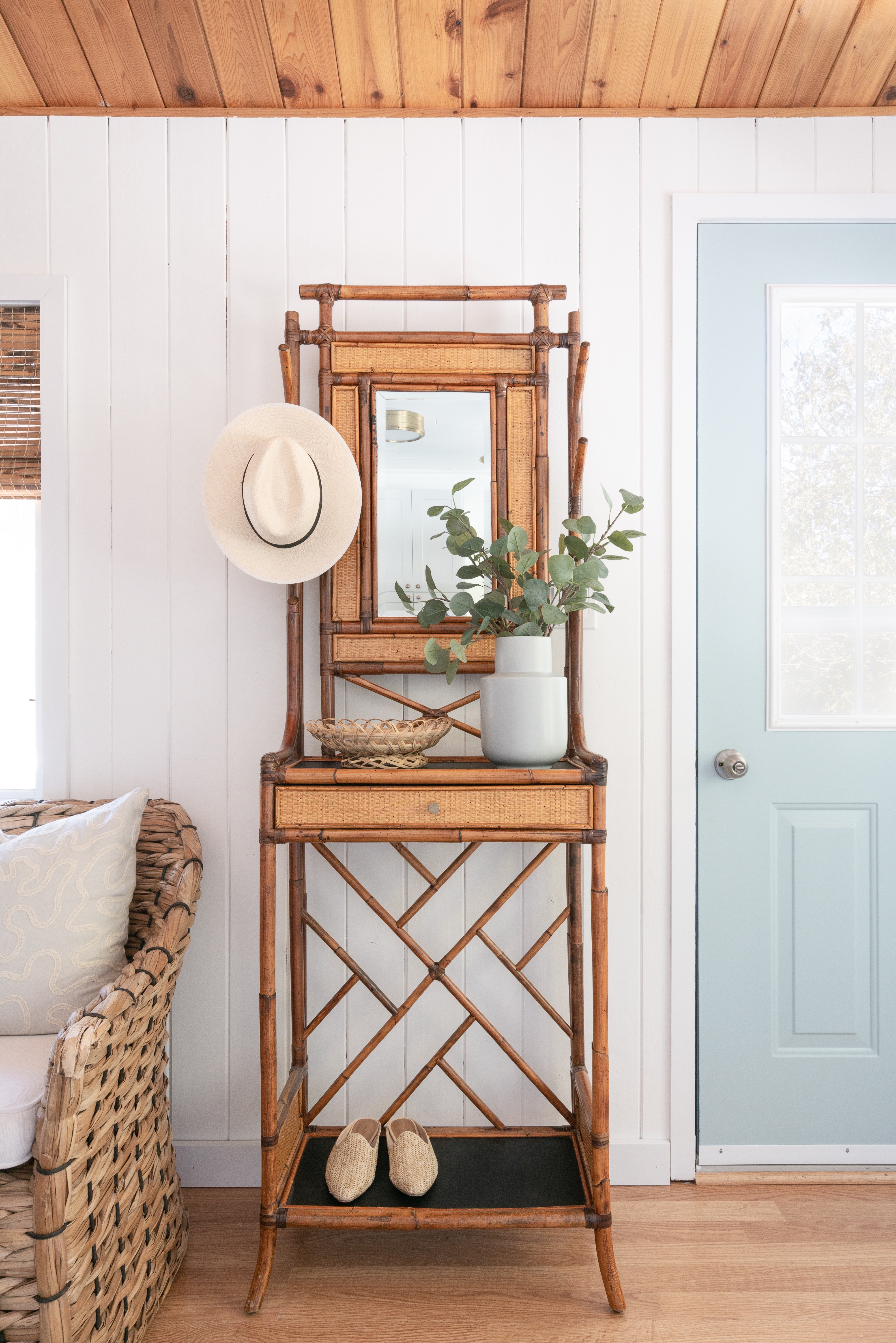
Layout doesn't allow for a designated entryway? Simply create one with styling tricks.
Tiffany Leigh, Principal, Tiffany Leigh Design, swears by a hall tree for creating an "entryway". 'This cottage had no real front entry - so we made one out of a small slice of wall and a hall tree,' says Tiffany. 'I love a classic vintage hall tree in a small entry because it looks good and solves a multitude of functions. Typically hall trees have a mirror, hooks, small drawer, counter surface, and sometimes even a shelf.'
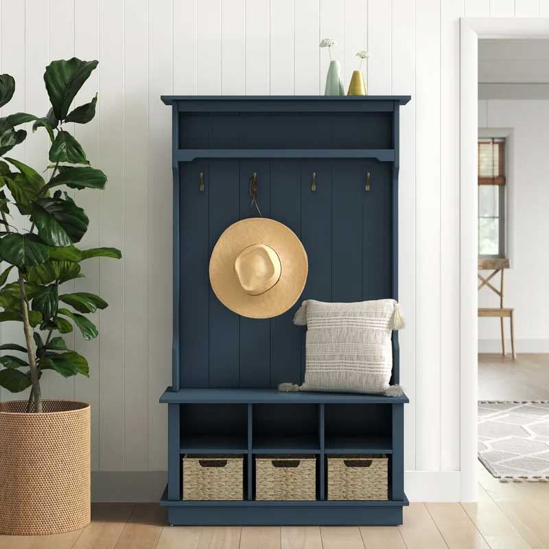
Was: $464.99
Now: $239.99
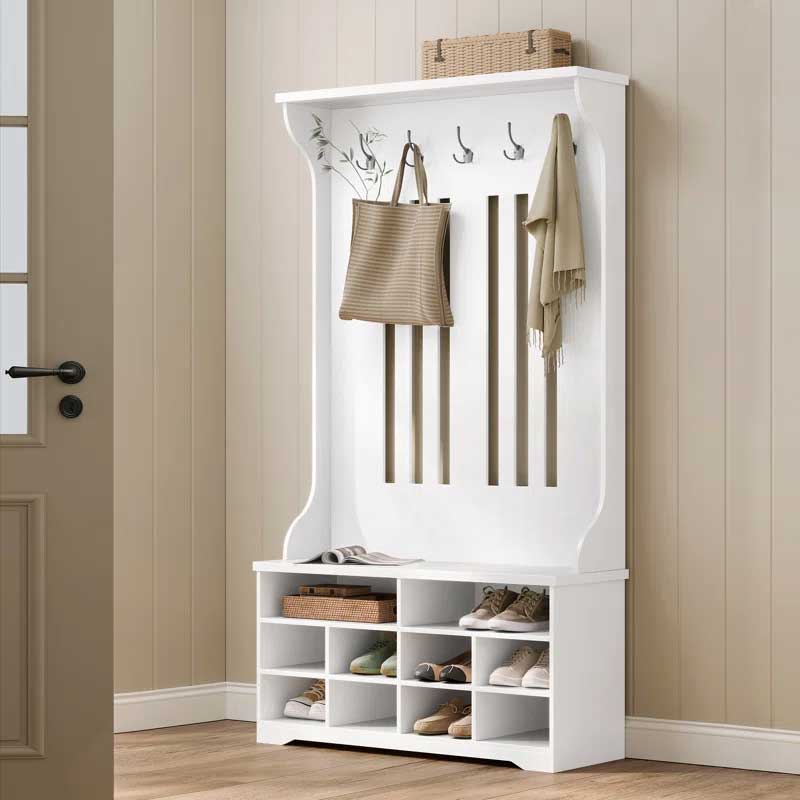
Was: $195.99
Now: $122.97
4. Add a statement indoor tree
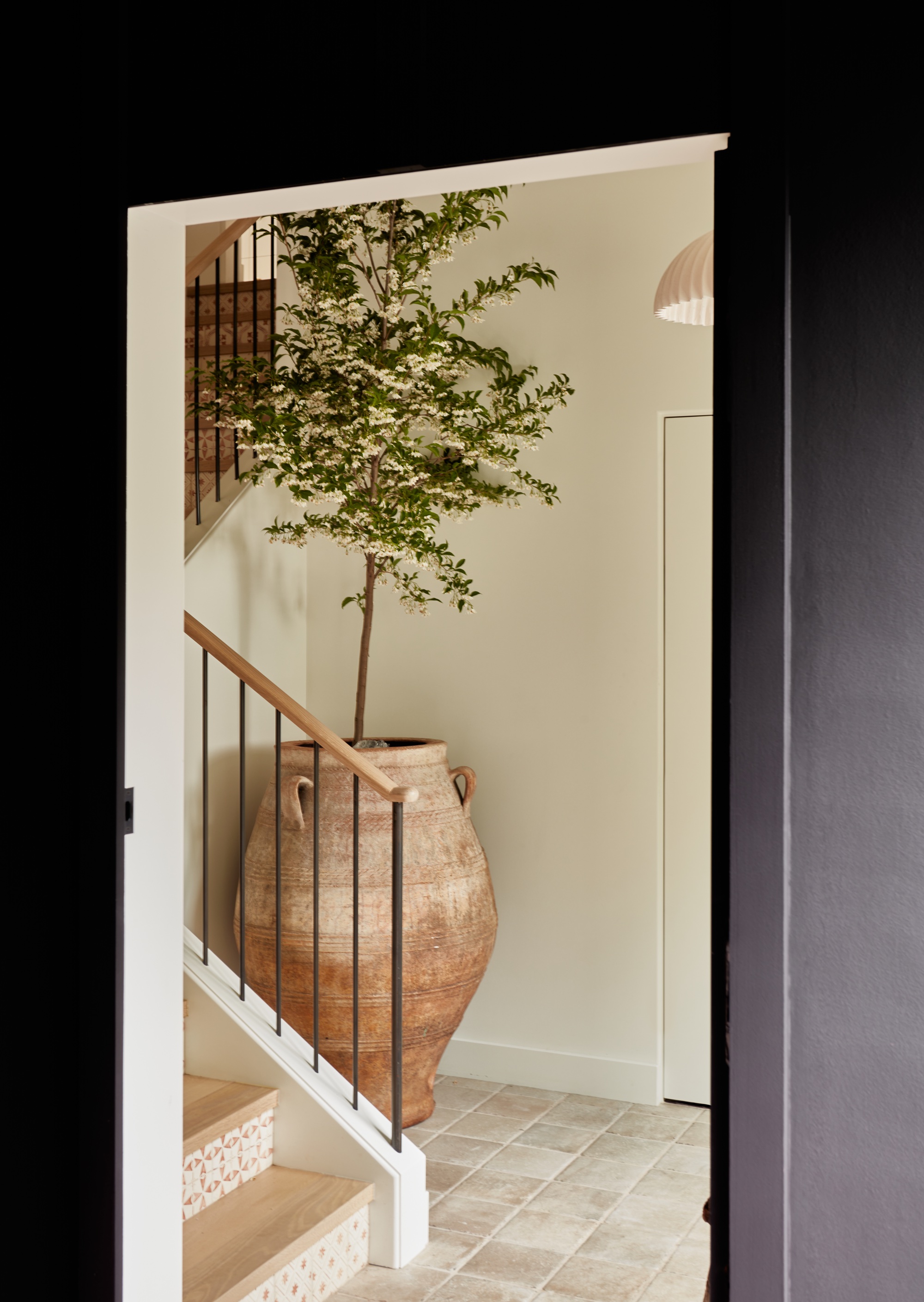
Don't let a random corner go to waste - you can easily turn it into a design feature that instantly elevates an awkward entryway.
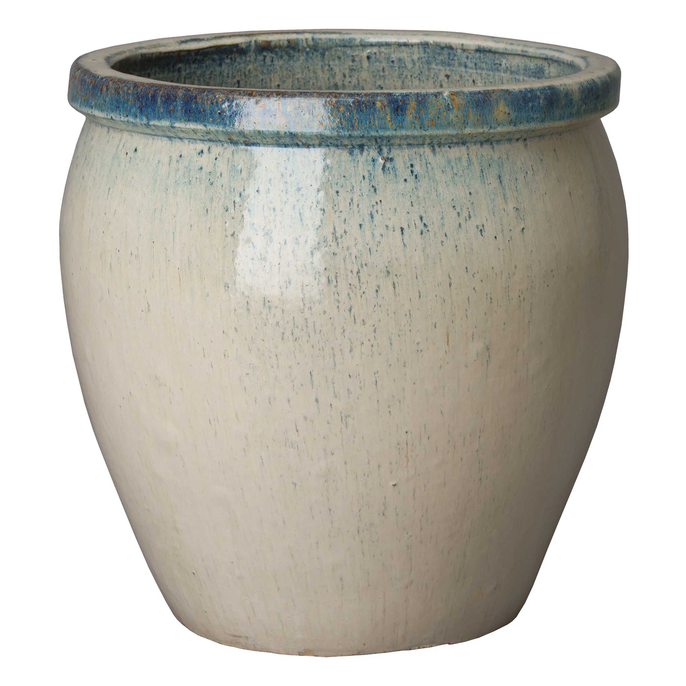
Make the space feel more expansive by playing with proportion; instead of opting for a small pot, choose an oversized terracotta urn and statement indoor tree for a showstopping way to welcome your guests.
The best indoor trees go floor to ceiling and work to add height to a space. And for something on-trend? Choose a black olive tree, favored by the likes of designer-to-the-stars Brigette Romanek.
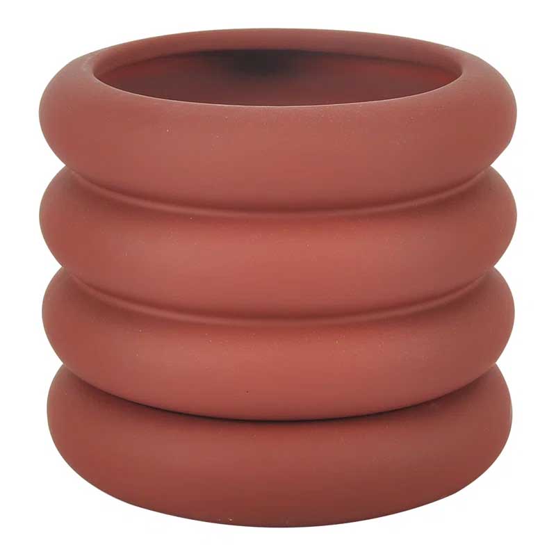
Was: $73
Now: $50
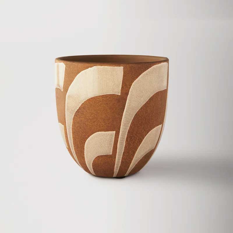
Was: $52.99
Now: $33
5. Think about chic storage
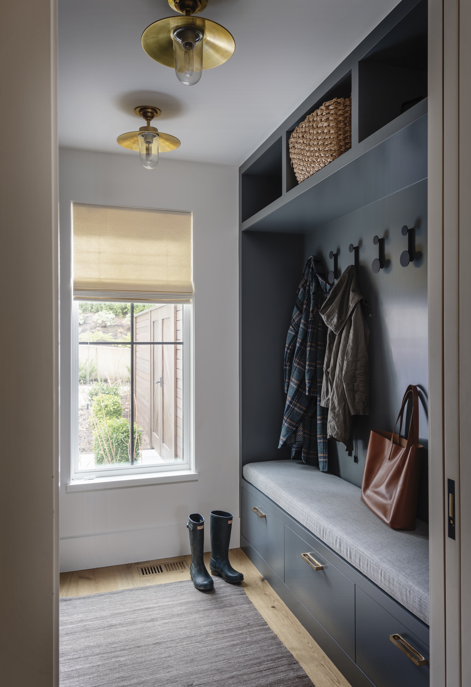
Built-in storage is the best way to optimize space in an awkward or narrow hallway and will ensure the clutter is kept at bay to maintain an elegant look.
But there are a number of stylish and practical entryway storage ideas to keep coats and shoes tidy that you can simply use on their own, or incorporate into your bespoke storage if you have it.
Wall hooks, baskets, and storage benches are all good ideas for an awkward entryway. Using what wall space you have to add in hooks or small baskets for coats and items that gather at the entry will help make the entry feel inviting and interesting as well,' comments Linda Hayslett of LH.Designs.
'And, if it's a tight fit, having a seating bench or storage ottomans that can fit under a narrow entry table can help make that space feel usable and more practical than odd and funky.'
6. Color drench to make an awkward space feel cohesive
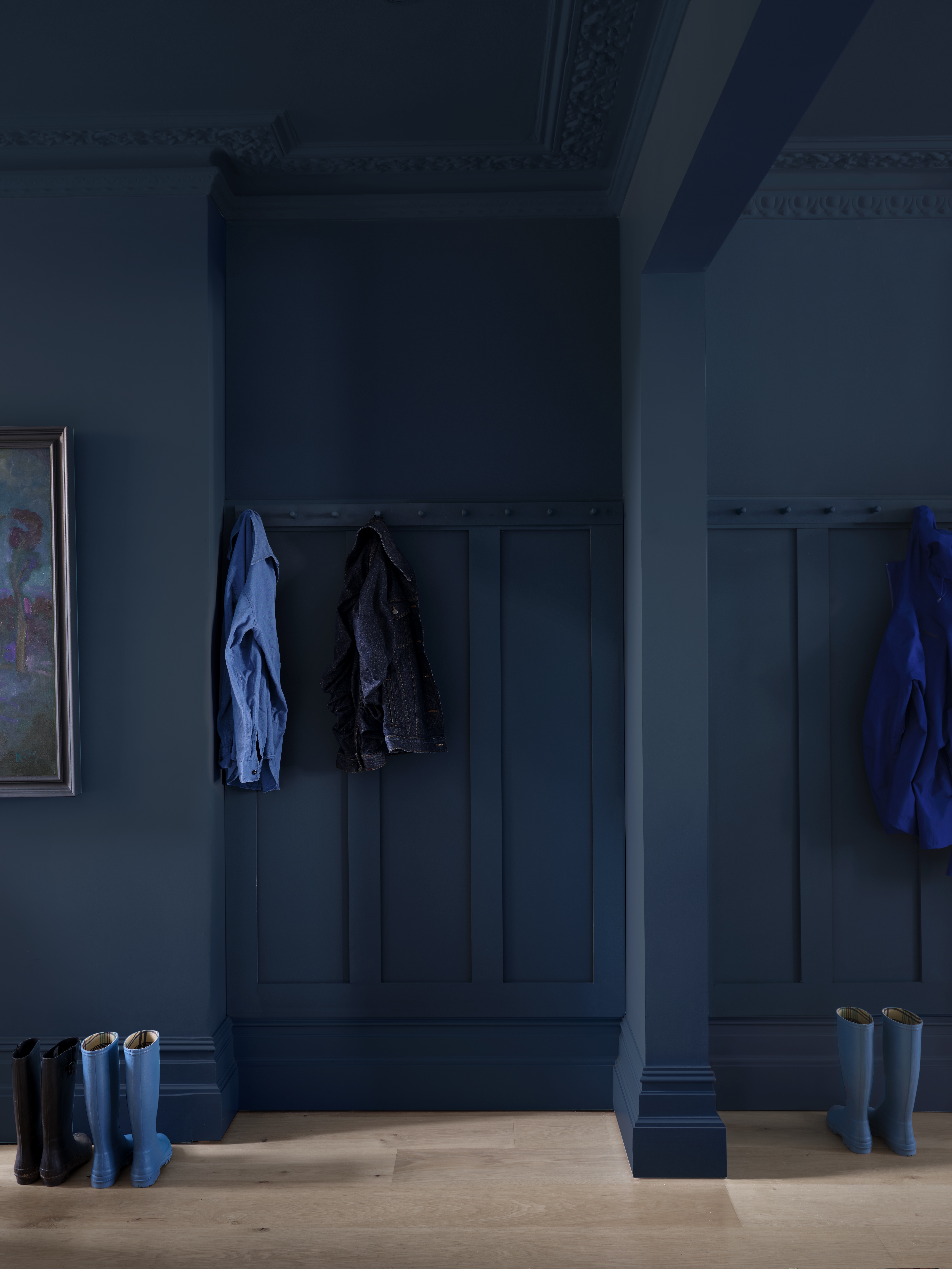
'Entranceways can often be dark, narrow awkward spaces, but they set the mood, be that for the start of your day when you are leaving home, or when welcoming you and your guests into your home,' says Ruth Mottershead, Creative Director at Little Greene.
'They are a transitional space, often seen through open doorways or between other rooms, so they are the perfect host for versatile, sophisticated and inviting tones that are easy to combine with a multitude of complementary colors and finishes.
'Rather than treating these often purely functional spaces as an afterthought, integrate your hallway into the rest of your design scheme, offering a glimpse into your personal style and the interior beyond.'
Ruth suggests color drenching as a way of making an awkward entryway feel curated and cohesive.
She continues: 'If you have an awkward entryway space, with multiple architectural details converging in a small area, consider uniting the space with ‘color drenching’ - painting your doors, woodwork, walls and the ceiling in a single color.
'By enveloping an entryway in one color and incorporating all elements within the space, you can create a truly engaging scheme that will soften any awkward areas to create a cohesive and cocooning space.'
7. Dare to go dark
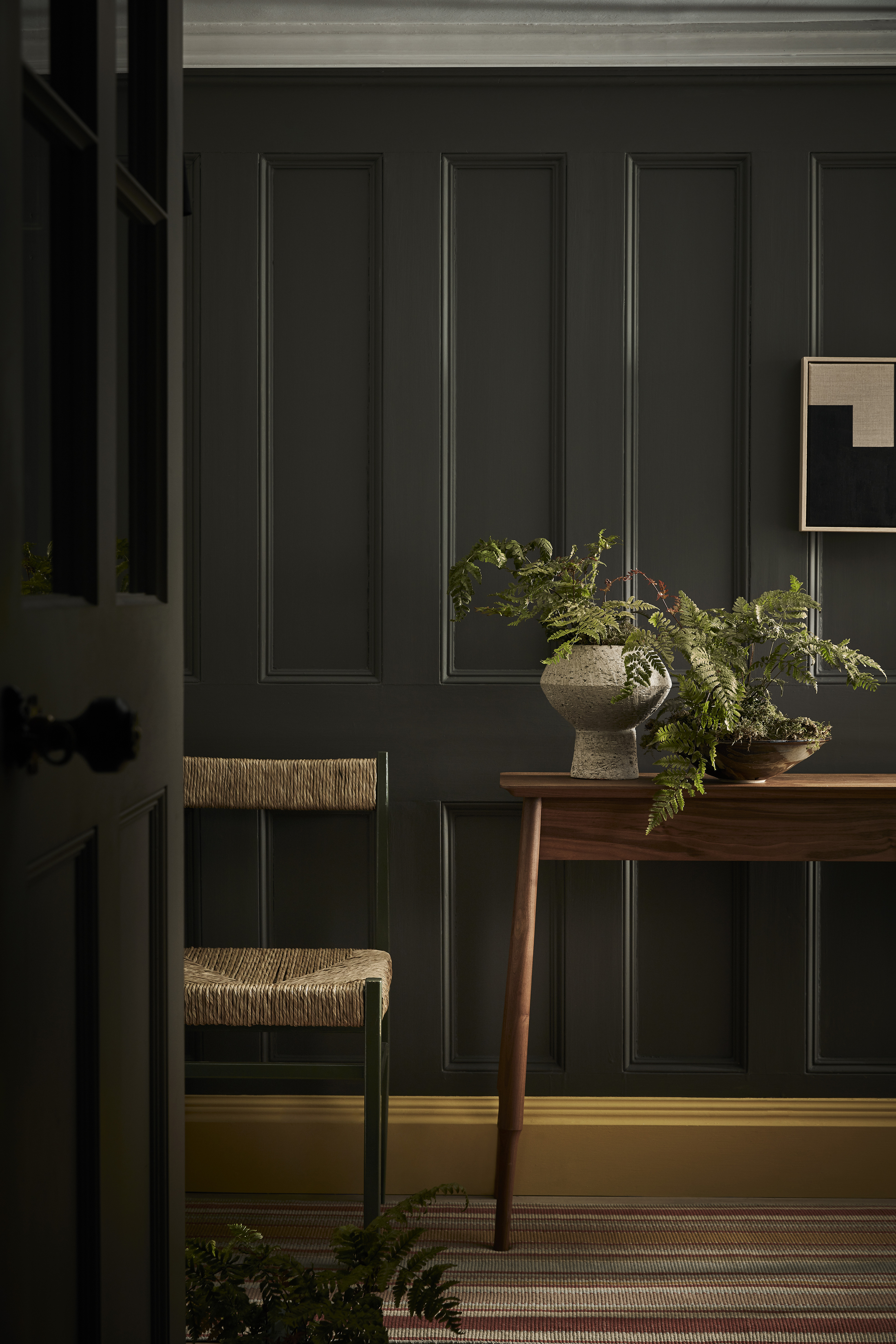
So what are the best paint colors for a small entryway? An awkward entryway is the ideal place to experiment with darker hues - which are also a great way to make your artwork pop.
'Most people panic over paint colors, often due to the limitations of natural light, but as these are essentially transient spaces to lead you to the primary rooms of the home, you can play with this,' says Patrick O'Donnell, International Brand Ambassador, Farrow & Ball. 'Venture towards the darker end of the spectrum - you will be amazed how beautiful it will be (and surprisingly not as enclosing as first might appear).
'Dark colors are a wonderful backdrop for pictures – something like Railings in Modern Emulsion will make your forgotten masterpieces sing in a new light.'
Be The First To Know
The Livingetc newsletters are your inside source for what’s shaping interiors now - and what’s next. Discover trend forecasts, smart style ideas, and curated shopping inspiration that brings design to life. Subscribe today and stay ahead of the curve.
Ruth Doherty is a lifestyle journalist based in London. An experienced freelance digital writer and editor, she is known for covering everything from travel and interiors to fashion and beauty. She regularly contributes to Livingetc, Ideal Home and Homes & Gardens, as well as titles like Prima and Red. Outside of work, her biggest loves are endless cups of tea, almond croissants, shopping for clothes she doesn’t need, and booking holidays she does.
-
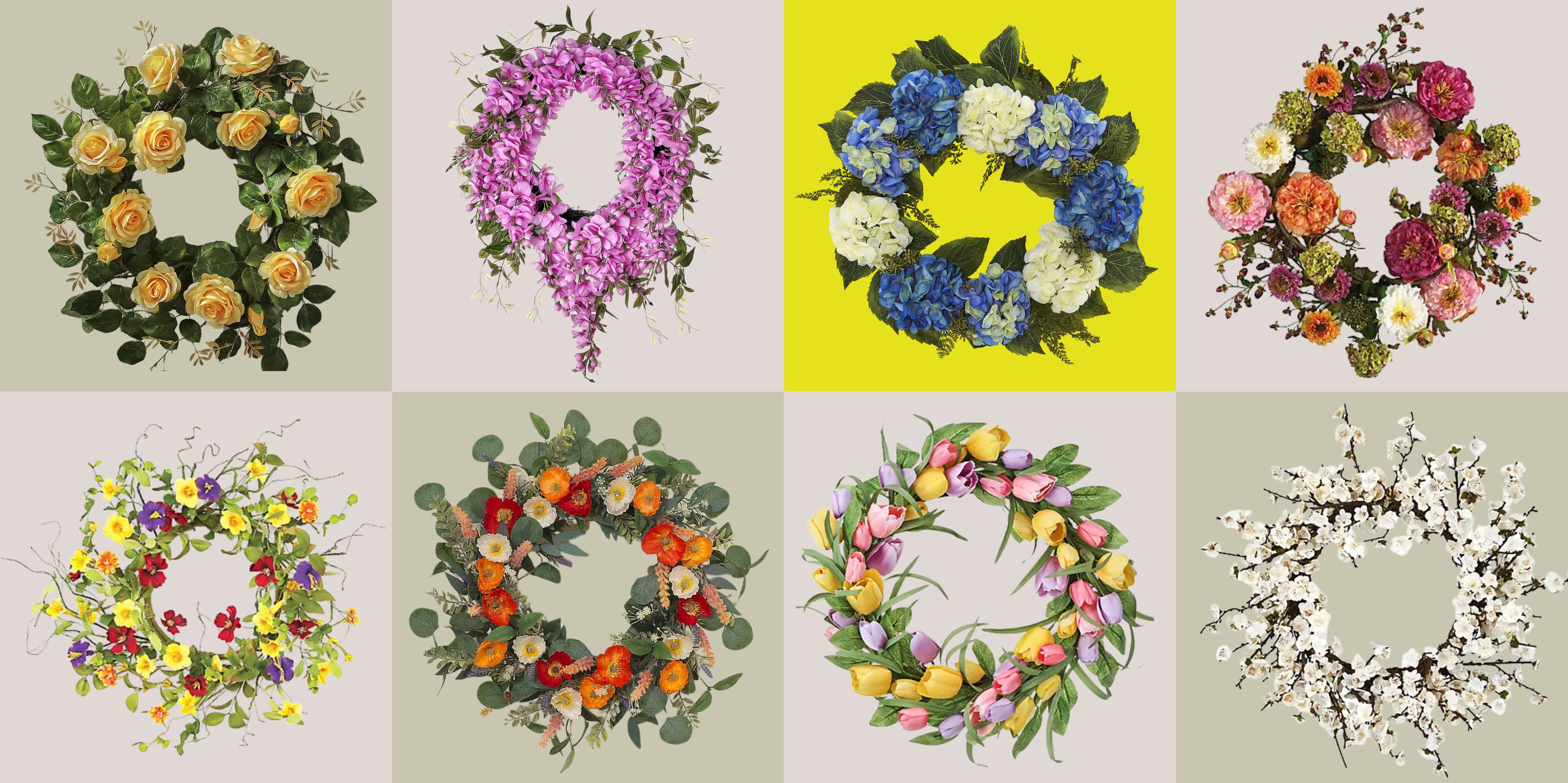 These Are the Flower Crowns I’m Wearing This Spring (Spoiler: They’re Actually for My Door)
Coachella confirmed the comeback of flower crowns. At home, they just go by another name: the spring wreath
By Julia Demer
-
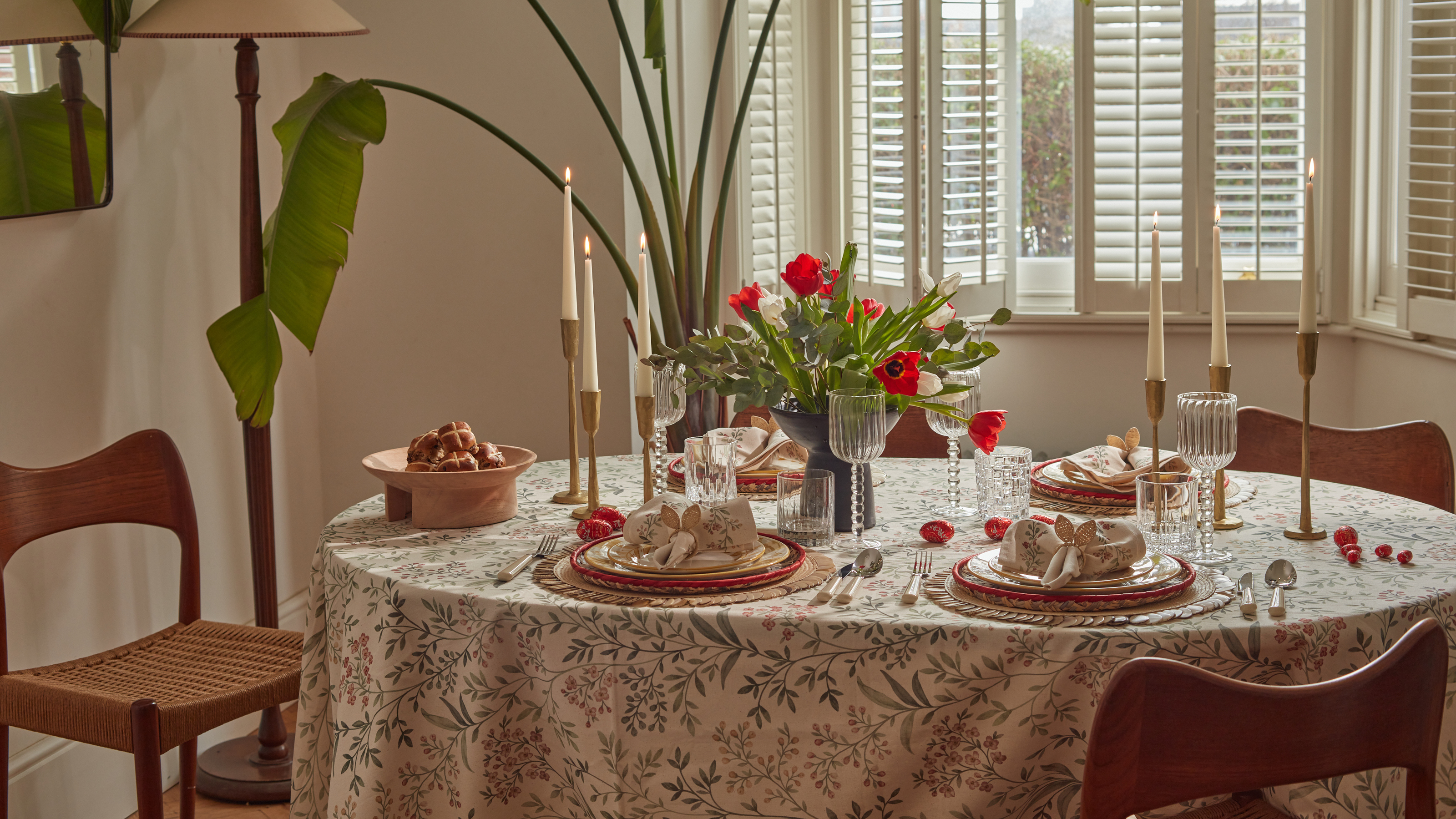 Bunny Ears, Be Gone — 7 Easter Table Styling Mistakes That Will Take Your Setting from Tawdry to Tasteful
From fussy floral displays that disrupt conversation to over-relying on tacky tropes, don't fall victim to these errors when decorating your Easter table
By Lilith Hudson
