How to Decorate With Farrow & Ball’s Shade ‘Sardine’ — 'It's the Perfect Way to Embrace 2024's Biggest Color Trend!'
This beautiful shade of paint is perfect for use in dabs or douses. These experts offer their advice on how to use it
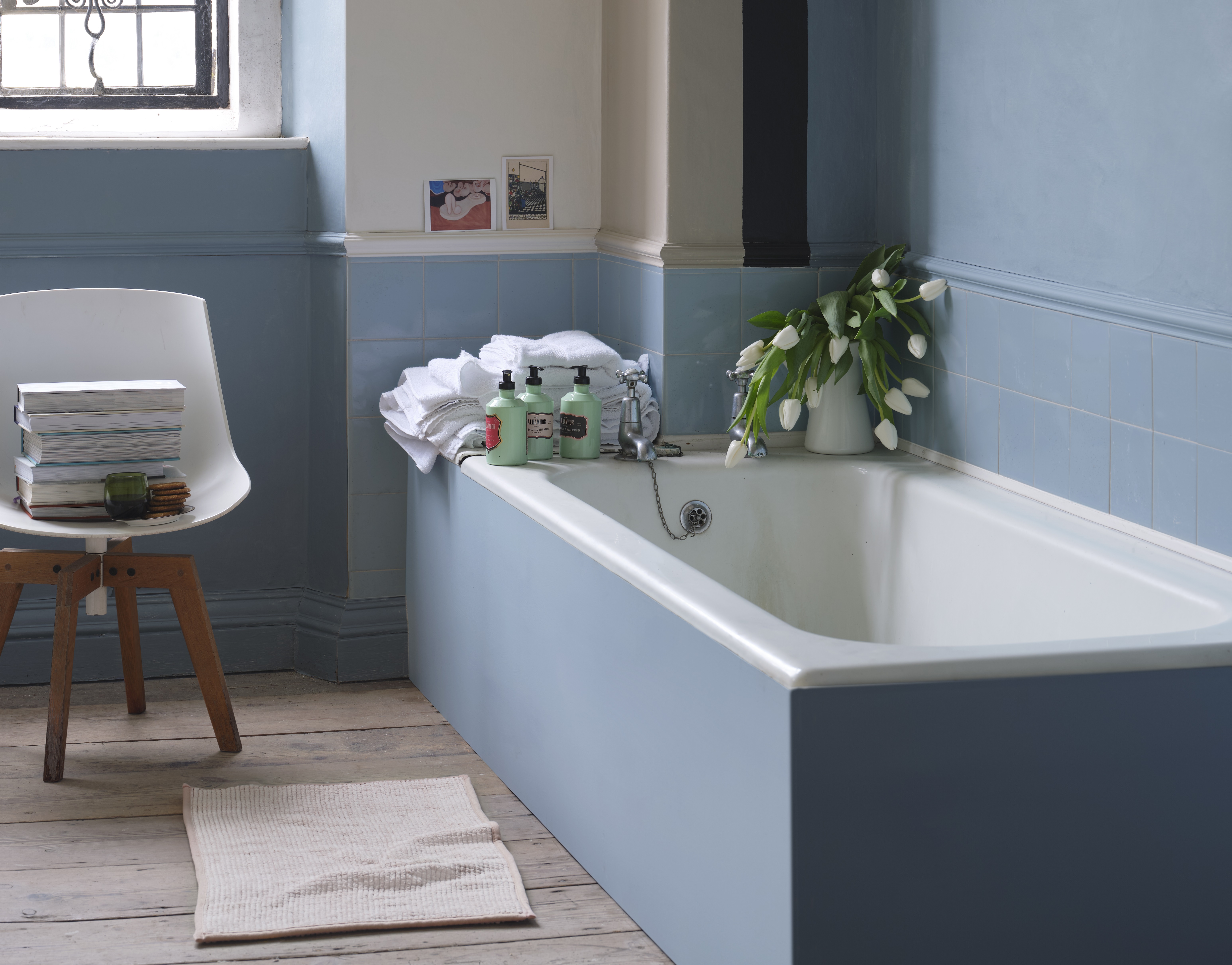

If there's one hue that's dominating 2024's color trends, it's cool blues. This year, we're ready to wave goodbye to long-enduring greens in favor of a perkier, brighter, more playful tone, and if you're looking to dip your brush into the trend a little more, we've found the perfect shade for you.
When it comes to the hottest color trends of the year, the cool tones have taken over by a landslide. After scouring the virtual aisles we found Farrow & Ball's stunning 'Sardine' shade to be one of the more trendy blue hues of the season so, curious to pinpoint the exact reason behind its popularity, we spoke to a couple of experts. Here, they tell us why the shade is increasingly popular among the most chic homes, as well as their top tips for styling the shade.
What color is 'sardine'?

At first glance, Farrow & Ball's 'Sardine' appears to simply be a pretty blue hue but if you give it a little bit of attention, you'll notice that this color is dimensionally attractive. The muter silvery tones give the shade a touch of luxury and the mid-toned blue is a pleasant shade to get lost in.
While speaking to Charlotte Crosby, the creative director of Farrow & Ball, she tells us that Sardine is the perfect shade to rely on if you're interested in creating a relaxing living space. 'Sardine achieves a fresh, optimistic look and is a great way to add color without being too overpowering,' says Charlotte.
Launched as a member of the Carte Blanche collection in collaboration with fashion designer Christopher John Rogers, this silver-blue shade is a bold stroke of color that works perfectly as an accent tone in a contemporary home. Infused with a sense of nostalgia, Christopher took inspiration from one of his grandfather's favorite snacks while creating the shade, thereby giving rise to the title of 'Sardine'.
The designer recommends pairing the mid-toned blue with shades like the cheerful pink 'Shallot' or the rich black 'Liquorice' for a clever contrast. If you're striking out on paint ideas, this muted blue shade might be a great option to consider as it isn't too loud for color-drenching but it's also vibrant enough for small accents of color.
How to decorate with Farrow & Ball's shade 'Sardine'

Interior designer Nina Lichtenstein tells us that 'Sardine' offers rich undertones making it a sophisticated shade that provides endless possibilities for modern interiors. For too long, many of us have shied away from this cooler tone in our homes, but with so many colors that go with blue, it's actually much easier to decorate with the shade than you might think.
For a harmonious backdrop, Nina suggests pairing 'Sardine' with neutrals like soft grays and creamy whites. While this is a great option for minimalistic homes that require a touch of color, she also suggests combining deep blues and forest greens to bring out the depth of the muted hue. Since lighting can truly make or break the beauty of a color, it's important to take careful consideration when perusing light options. Nina recommends opting for ambient lighting with warm undertones for a calming ambiance. 'Soft, golden-hued lighting fixtures or vintage-style lamps can create a cozy atmosphere that complements the richness of the color,' she says.
We love the idea of decorating around the shade with earthy textures or striking accents and so does Nina. 'Using the color as a feature wall or for accent pieces such as furniture, cushions, or artwork is a great way to bring a room to life,' she says. 'You can also incorporate natural materials like wood and brass to add textural warmth.'
Nina also recommends choosing soft textiles in complementary tones to create a cozy blue living room with an inviting feel or, use it to drench small spaces like powder rooms or bathrooms in need of a dramatic touch.
The versatility of this silvery blue hue makes it a great contender for vivid home colors that are on trend for the year. So the next time you're planning out your color scheme and you're interested in injecting your home with a layer of sumptuous blue, we sincerely suggest giving 'Sardine' a swatch.
3 alternative powdery blues to buy
Be The First To Know
The Livingetc newsletters are your inside source for what’s shaping interiors now - and what’s next. Discover trend forecasts, smart style ideas, and curated shopping inspiration that brings design to life. Subscribe today and stay ahead of the curve.

Amiya is a Home Wellness Writer at Livingetc. She recently graduated with a Masters Degree in Magazine Journalism from City, University of London, and has lent her words to beauty, fashion, and health sections of lifestyle publications including Harper’s Bazaar and Women’s Health. Her experience as a research analyst has equipped her with an eye for emerging trends. When she’s off the clock, she can be found reading, listening to music, or overanalyzing her latest Co-Star update.
-
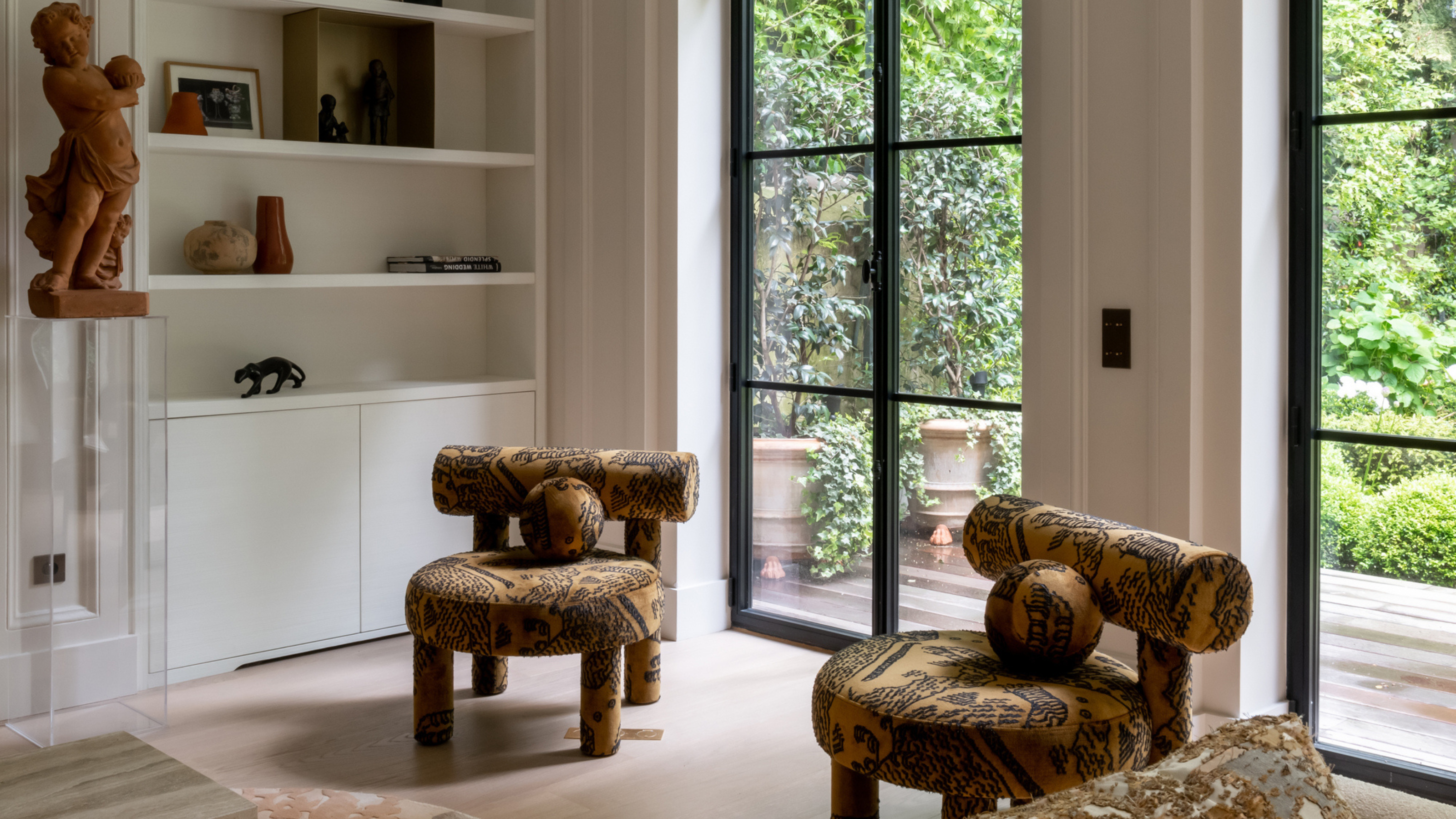 This Specific Fabric Print Is Literally Everywhere Right Now — Here's Why
It's whimsical, artistic, and full of character. We've called it already: Dedar's 'Tiger Mountain' is the fabric that will define 2025
By Devin Toolen
-
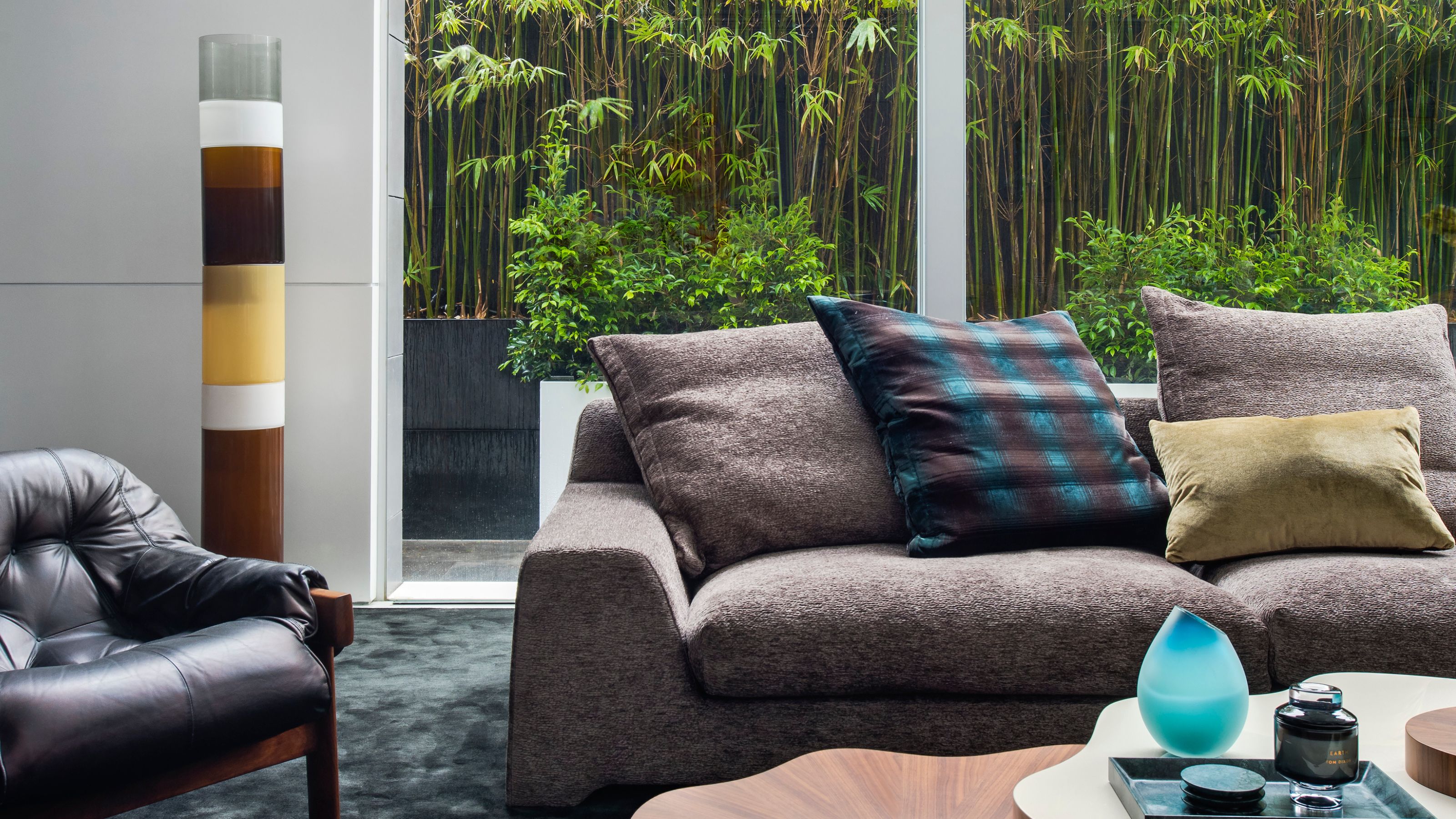 These Are the Dos and Don'ts of Bamboo Plant Placement — Follow This to Avoid Bad Feng Shui
By following the experts' guidance on where to place this houseplant you can usher luck, wealth, and prosperity into your home
By Lilith Hudson
