How do you make a boring kitchen look good? 6 clever ways to add character to your cooking space
Create a chic and inviting space with these designer tricks to elevating a boring kitchen
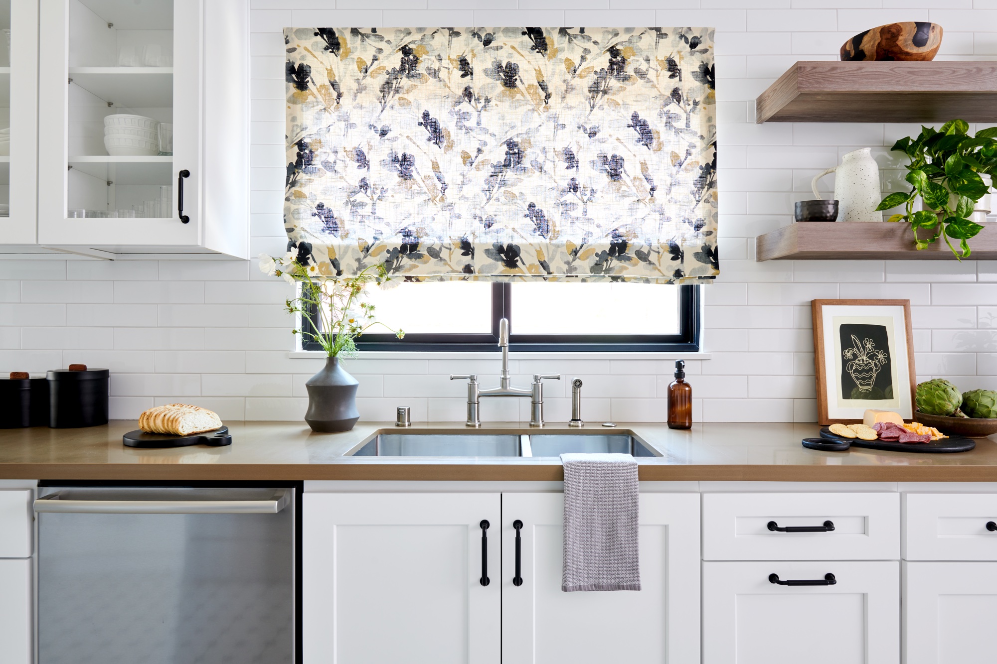
How can I make my boring kitchen look better? If your cooking space is a little plain or tired, it's probably a question you've asked yourself a number of times. And, thankfully, there are a number of style solutions that are really easy to implement without carrying out an expensive remodel.
'If you don't have a budget to remodel your kitchen, there are some simple ways in making it look updated without breaking the bank,' says Linda Hayslett of LH.Designs. 'Bringing in visual stimulation that doesn't necessarily have to be used for cooking, can help make a kitchen feel warmer, and inviting.'
From artwork and creative displays to plant life and new hardware, there's plenty of modern kitchen ideas you can try that will give your space a bit more pep. See more designer tips on creating an interesting and inviting space below.
1. Replace upper cabinets with open shelving
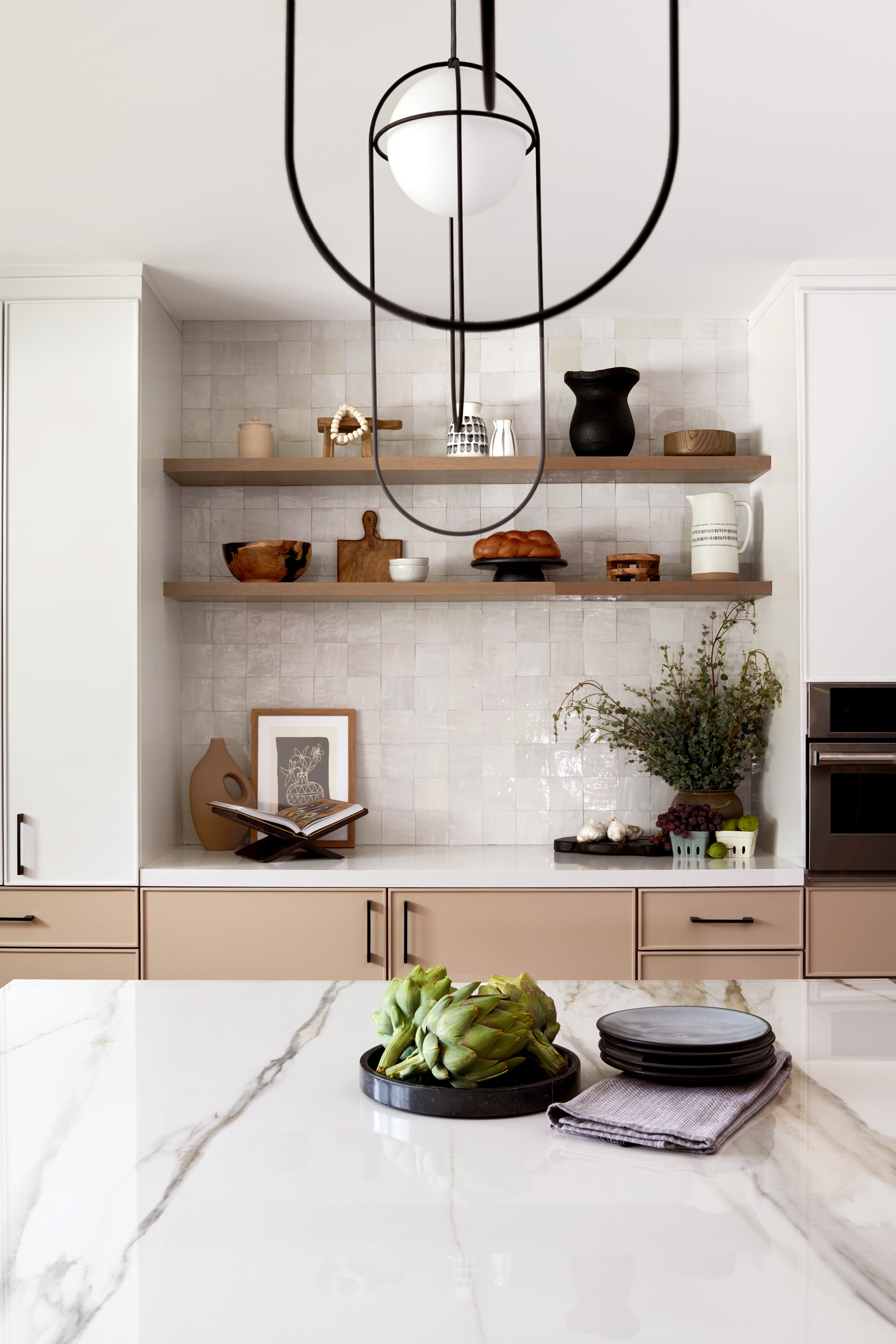
'A way to give your kitchen a new look without a complete redo, is to replace the uppers with open shelving that is more interesting and well styled with books, plants and interesting objects,' says Kristen Pena of K Interiors.
Open shelving in a kitchen is a good idea for bringing in personality with pretty objet and display items. You can showcase pieces you use in the kitchen - like ceramics, bowls, and spoons - but can also introduce decorative pieces, like vases, art, and plants, that simply make the space more inviting.
'Having something to look at that's pretty or fun can make a boring, average kitchen come to life,' says interior designer Linda Hayslett. 'Even books that aren't cookbooks can be added in the kitchen for some interesting styling on counters and shelves.'
2. Switch out the hardware
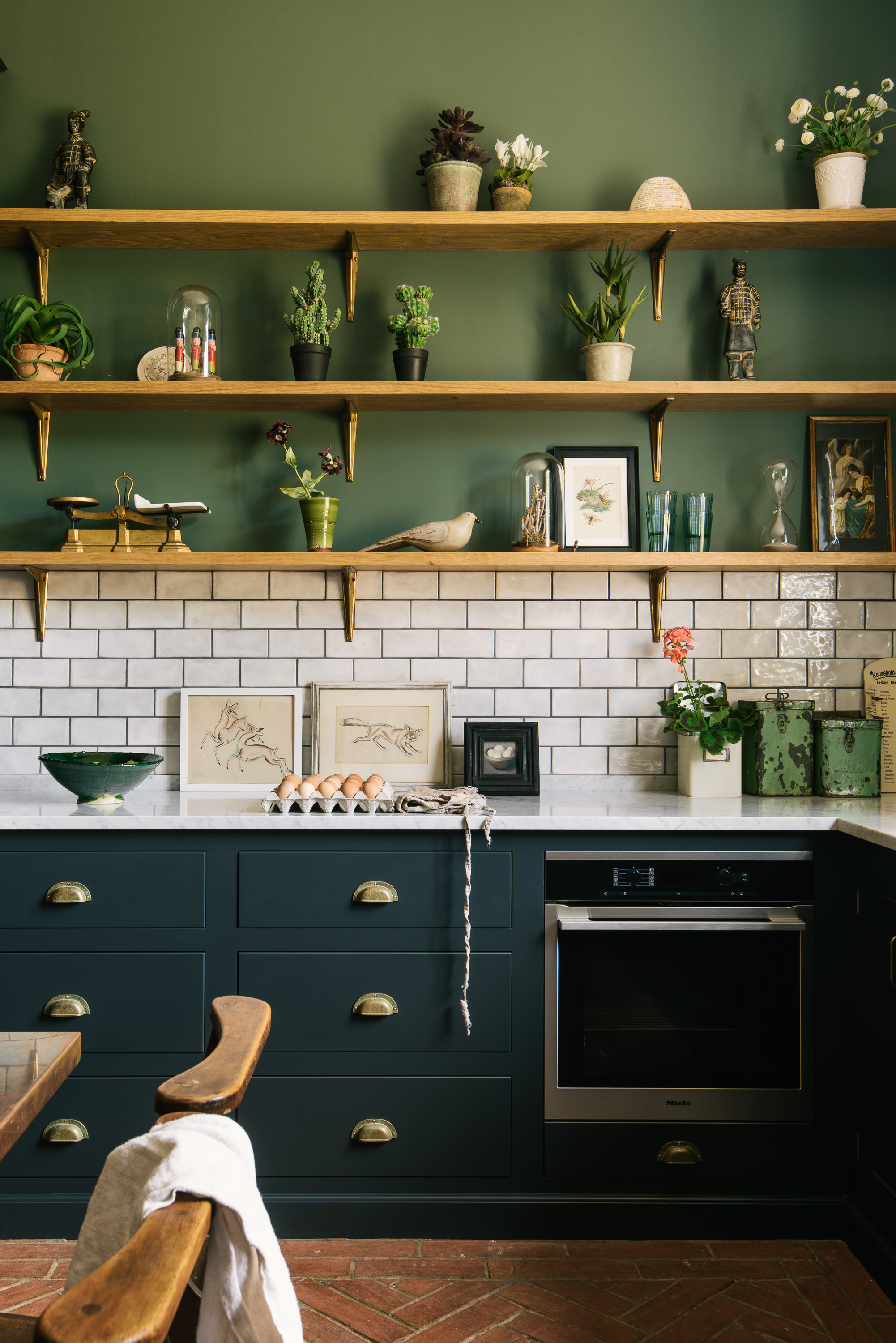
One of the easiest - but most effective - ways to add interest to a boring kitchen is by switching out tired hardware with fancy new replacements.
'There are things you can do if you feel that you do not want to replace your kitchen in its entirety and want to try and live with it as is,' says Helen Parker, creative director of deVOL Kitchens.
'I would look after your cupboards and if they are wood keep them oiled or carefully painted and change the knobs and handles to give a fresh new look,' Helen adds. 'This can be fun and just as rewarding and visually different as having a new kitchen, it requires a little imagination, which is creative and satisfying.'
So what are the best kitchen handles for 2024? 'Brass kitchen hardware has been a favorite for many years now and one we adore,' William Durrant of kitchen brand Herringbone, says. 'However, for 2024 gunmetal, tarnished or darker metal finishes for hardware are flourishing.'
3. Add a kitchen island centerpiece
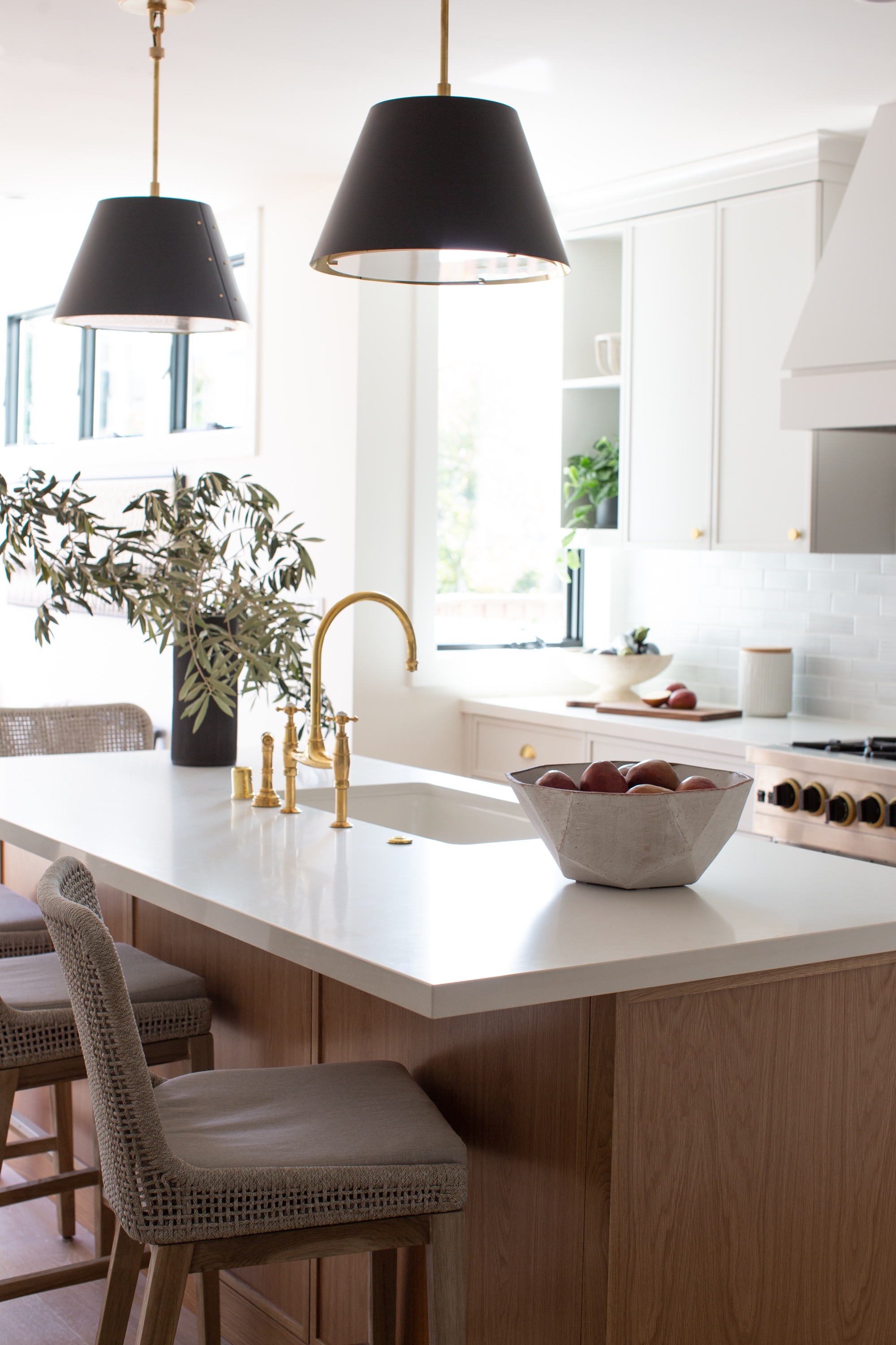
Whether it's an oversized vase with large branches, a bunch of flowers, or a dough bowl with artificial artichokes, a kitchen island centerpiece can really lift your space.
'I love a big vessel with large dramatic branches,' says Kristen Pena. 'I’ve never been an arranged floral person, but give me leaves or branches, and I’m in love.
'I also love a bowl of fruit moment, mostly because it can add color and texture, but also indicates that people live in the space,' Kristen adds. 'I like homes that feel accessible and inviting.'
And if you don't have a kitchen island? No problem, simply transfer the decorative piece to your countertop, dining table, or any surface you have free.
4. Introduce artwork
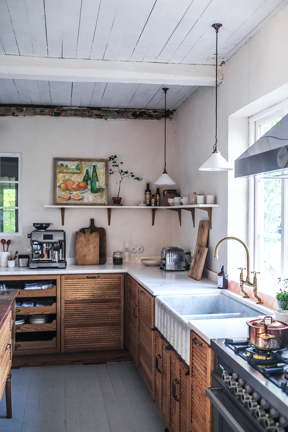
Artwork might traditionally have been more closely associated with a living room or dining room, but adding art to the kitchen has been a rising trend for a little while now, highlighting the fact that we now see the kitchen as a 'living space' as opposed to merely functional.
'Using art as kitchen wall decor further confirms the notion that kitchens are for living in, not just for working in,' says Helen Parker, Creative Director of deVOL Kitchens
'They are places to entertain and socialize and therefore they should be decorated and accessorized in the same way as the other rooms in your home. Art adds a very personal touch to a home and can cause intrigue and atmosphere in a way nothing else can.'
And if you feel overwhelmed with the large selection of prints to choose from, Helen has a couple of top tips for the kitchen. 'Food related artworks really well in kitchens for obvious reasons, but it is actually a really lovely look,' she adds. 'Often quite classic still life images are very stylish, especially good when framed in something quite ornate and possibly vintage, if that's your look.'
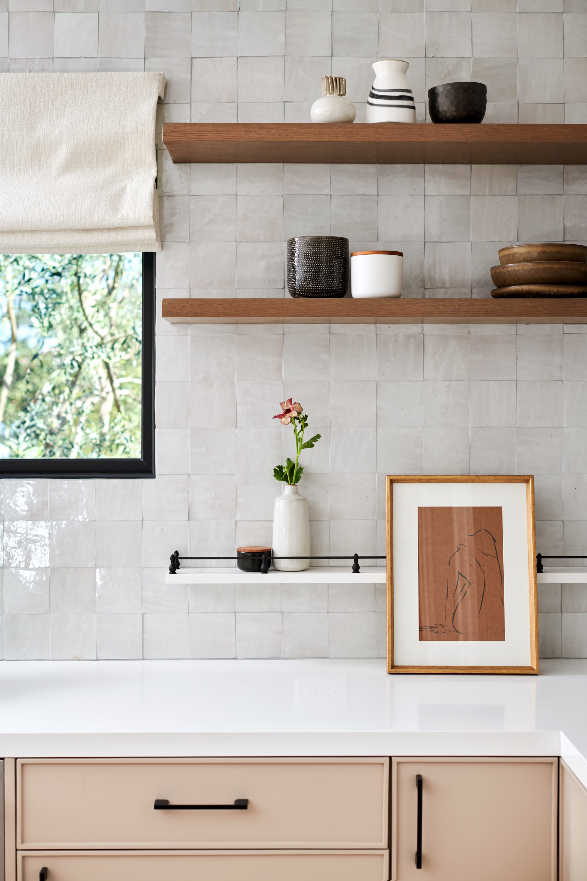
'There are no rules here, just buy what you like and give it a try. Portraits are also very popular, old oils on canvas and again maybe in a bold guilt frame just to add to the drama.' For a contemporary look, you might choose an abstract line drawing to add verve to your space, as seen in the kitchen designed by LH. Designs below.
5. Put the 'fun' into functional
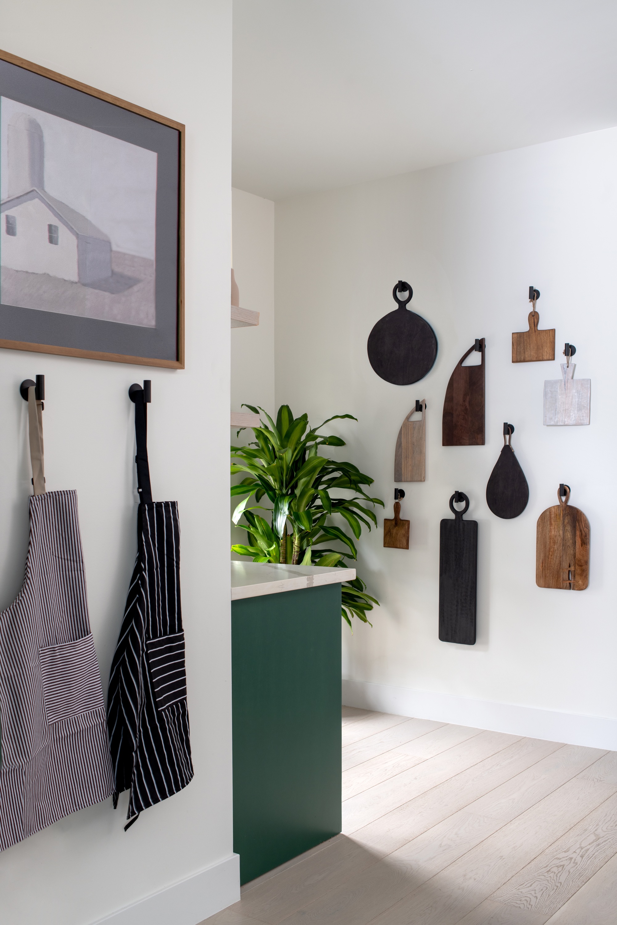
It doesn't always have to be artwork that you hang on the wall. Try taking functional pieces and creating interesting displays with them.
This chopping board display is not only a stylish way to use dead space in your kitchen but also offers a practical kitchen storage solution all those pretty pieces you've been collecting.
Top tip for a cool display? Showcase pieces in different shapes and sizes to keep things visually intriguing. In this kitchen by LH. Designs, Linda also shows another way to make a boring kitchen look good: introducing plants and greenery into the space for added life and interest.
6. Pep things up with plant life
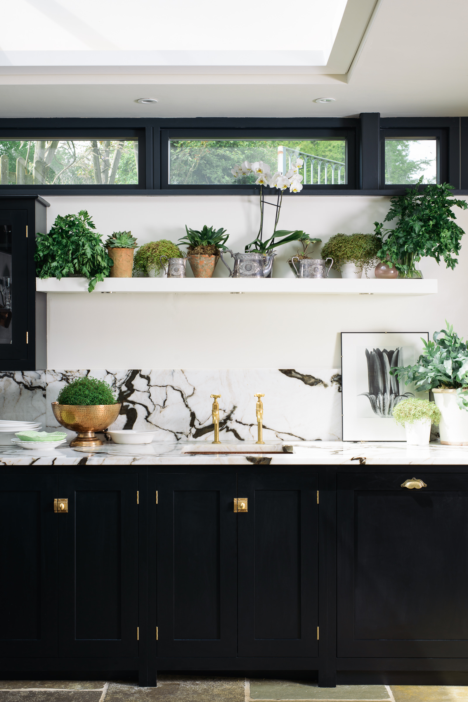
A little greenery goes a long way, and you can instantly add interest to a boring kitchen with plants. Whether it's a standalone piece, a statement display of branches, or a host of little potted plants, greenery will bring your kitchen to life.
'I find that planting them up in old terracotta pots and vintage garden urns makes them feel more special and cohesive,' says deVOL's Helen Parker. 'Whilst any greenery looks wonderful, for me abundance is also important - the more you commit to the botanical theme the more impressive it looks, walking into a foliage filled room is uplifting, high maintenance but really worth the effort when they flourish and your room is ever changing with new growth.'
Be The First To Know
The Livingetc newsletters are your inside source for what’s shaping interiors now - and what’s next. Discover trend forecasts, smart style ideas, and curated shopping inspiration that brings design to life. Subscribe today and stay ahead of the curve.
Ruth Doherty is a lifestyle journalist based in London. An experienced freelance digital writer and editor, she is known for covering everything from travel and interiors to fashion and beauty. She regularly contributes to Livingetc, Ideal Home and Homes & Gardens, as well as titles like Prima and Red. Outside of work, her biggest loves are endless cups of tea, almond croissants, shopping for clothes she doesn’t need, and booking holidays she does.
-
 This Outdoor Lounger Is the Color of the Season for Garden Furniture — And It's on Sale This Weekend
This year, it's all about the contrast, and this bright, sunny hue is the perfect foil to your green outdoor spaces
By Hugh Metcalf
-
 Kelly Wearstler Designed an Animal Hospital Where "Anxiety Just Melts Away", and I'm Taking Notes for My Own Home
The renowned designer's foray into healthcare demonstrates have even the most functional of spaces can still be design-forward
By Devin Toolen
