How to make a narrow room look wider with paint - expert tricks to make small spaces seem bigger
How to make a narrow room look wider with paint, from clever techniques to the perfect tones to try at home


When it comes to making a narrow room look wider, paint is one of the best tools you have at your disposal to help create a spacial illusion and avoid that tunneling feeling that can happen in narrow spaces.
From the varying hues and colors used in the space to the way paint is applied to the wall, from ceiling paint to going bold with your crown molding details, there are plenty of ways to trick the eye into believing that a space is larger and wider than it actually is in reality. Read on for our favorite paint ideas to inspire you at home.

Oonagh is an interiors writer and editor, and expert at keeping up with trends from the world of interior design. For this story, she's spoken to the designers and architects who have worked on small-scale projects to dig out practical tips to help homeowners create a spacial illusion through the medium of paint.
1. Try horizontal stripes
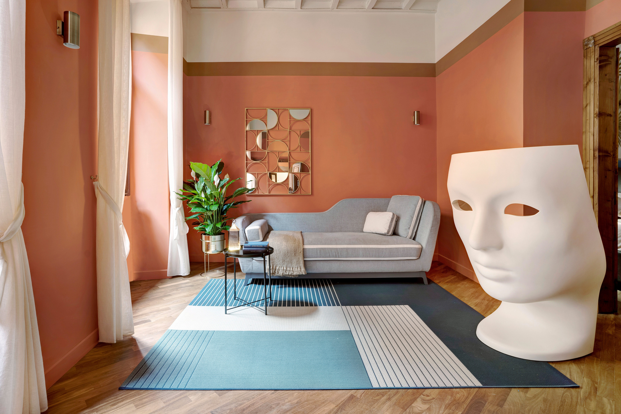
Simple strips painted horizontally along the wall is a great paint technique to help make a room feel larger. Horizontal stripes in a narrow living room draw the eye outwards and make it appear as though the walls are farther apart than they actually are.
'To make a room larger we can think of a cake,' says Francesca Venturoni of Venturoni Studio. 'The cream, the white, must invade the ceiling and run down the walls. Immediately after we have the filling - a darker edge that clearly divides the top from the bottom. And finally, the base, the main color that will give the camera its real shape.'
You might want to use your crown molding as a guide or a marker to help distinguish the space, and giving you a natural border to the room to follow that helps trick the eye.
2. Make the space look continuous by painting it one color
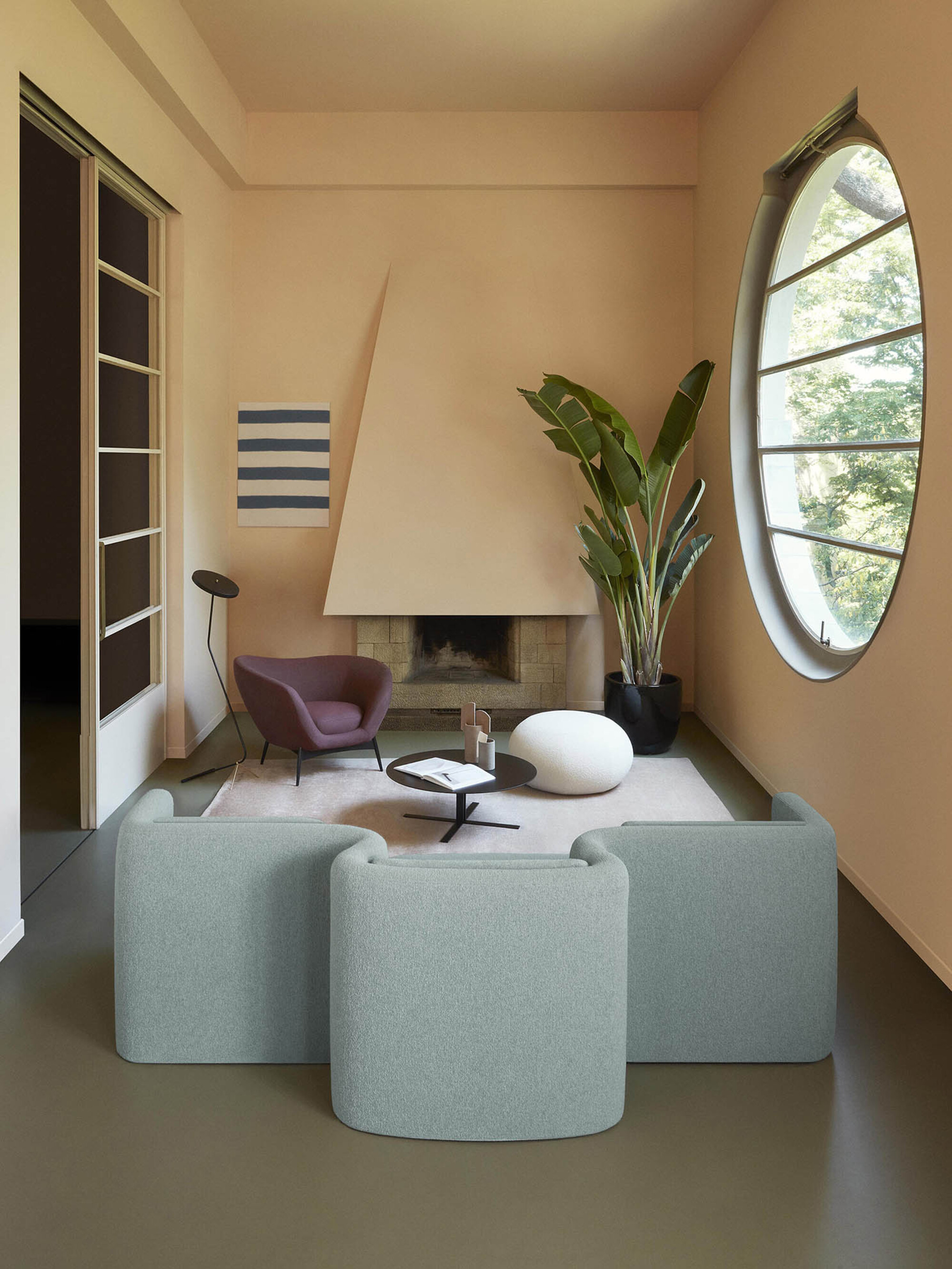
When you use one color on the walls and ceiling, known as color drenching, the space can appear continuous and seamless, helping a room appear wider than it is. 'Keep your palette restrained so you're causing as little visual distraction possible between planes like where the wall stops and where the ceiling stars,' says Patrick O'Donnell, brand ambassador at Farrow & Ball.
Think carefully about the type of color you want to use on the walls to create this effect. For a light and airy room, a pale blue will work to create an illusion of space and remind us of endless skies, while a calming neutral like this pale plaster tone feels bright and spacious.
3. Take the paint along the wall and up the ceiling
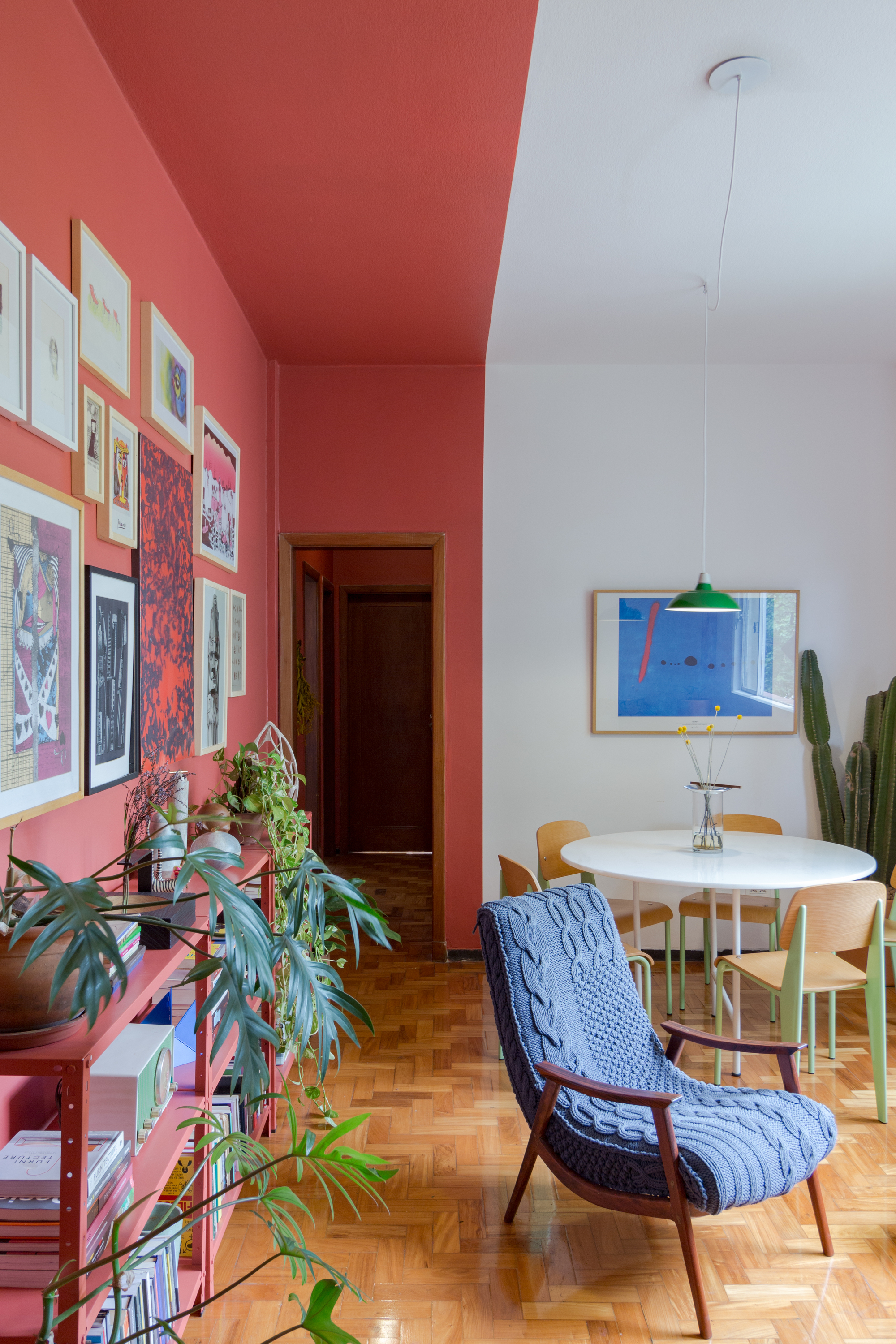
Another way to create the illusion of space is by taking the paint all up the wall and along the ceiling. This use vertical lines instead of horizontal is often associated with height instead of width, but can help to get more from the space you have.
When painting two tone in contrasting colors, as exhibited here by Brazilian architecture firm, Studio Pedro Haruf, the result is that the room divides into two and the illusion is that there are almost two spaces within one. This can also work in more subtle colors, especially helpful when distinguishing spaces in an open-plan room.
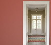
If you're looking for a similar cherry red pop for your walls, Farrow & Ball's recent shade, Bamboozle, is a great option. Fiery yet earthy all at once, it can be cleverly used to divide the room and create the illusion of space.
4. Take advantage of architectural features and paint your trim
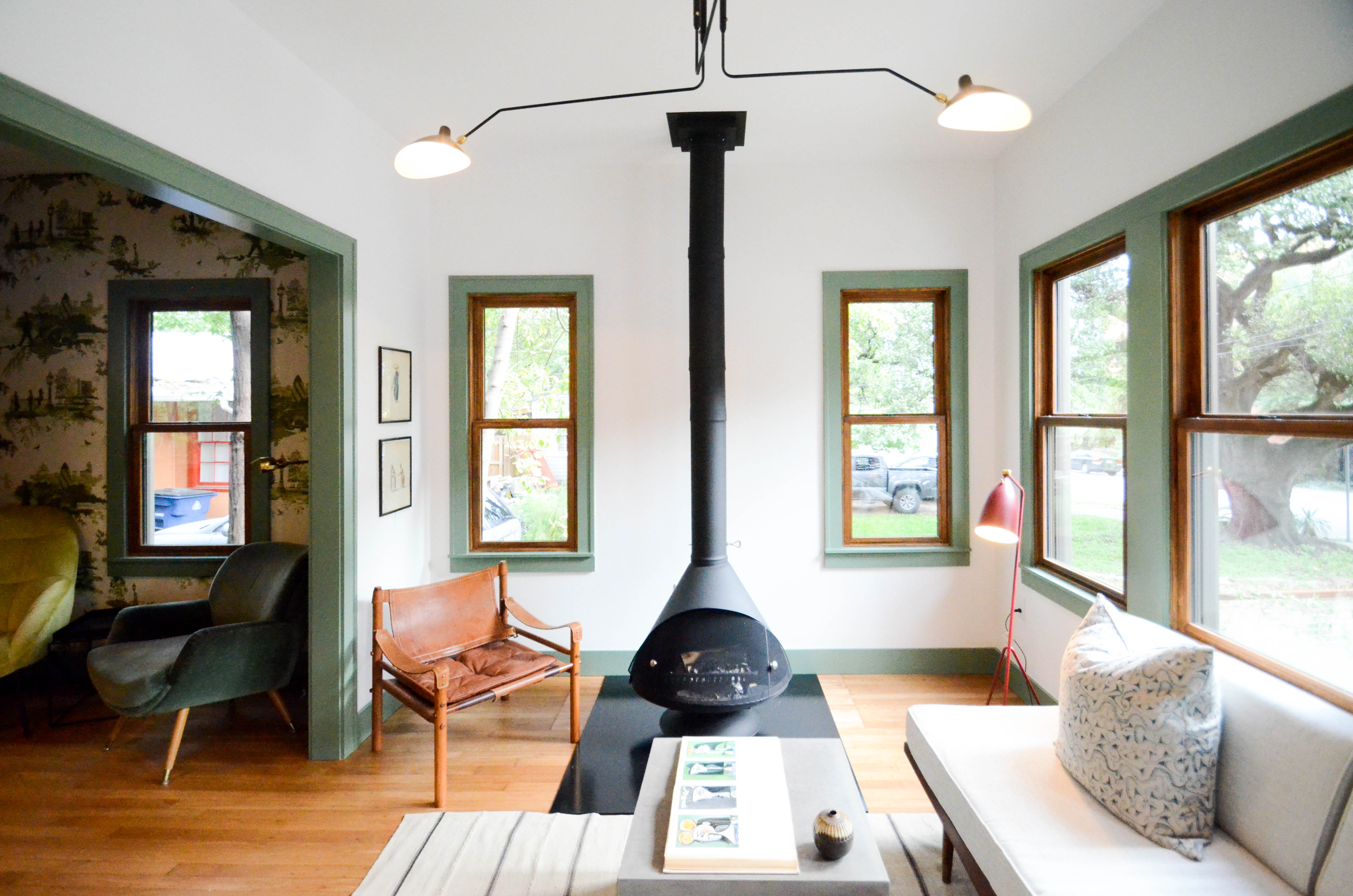
Make the most of the trim in your narrow room and paint it in a different tone to the walls to help draw the eye around the room and emphasize the footprint of the space.
This design from Elizabeth Baird does just this, guiding the eye around the space, with white walls that don't leave much space for wall art, but using an olive green paint to help direct the eye.
Our article on how to paint trim will help you here.
5. Paint the far wall in a darker tone
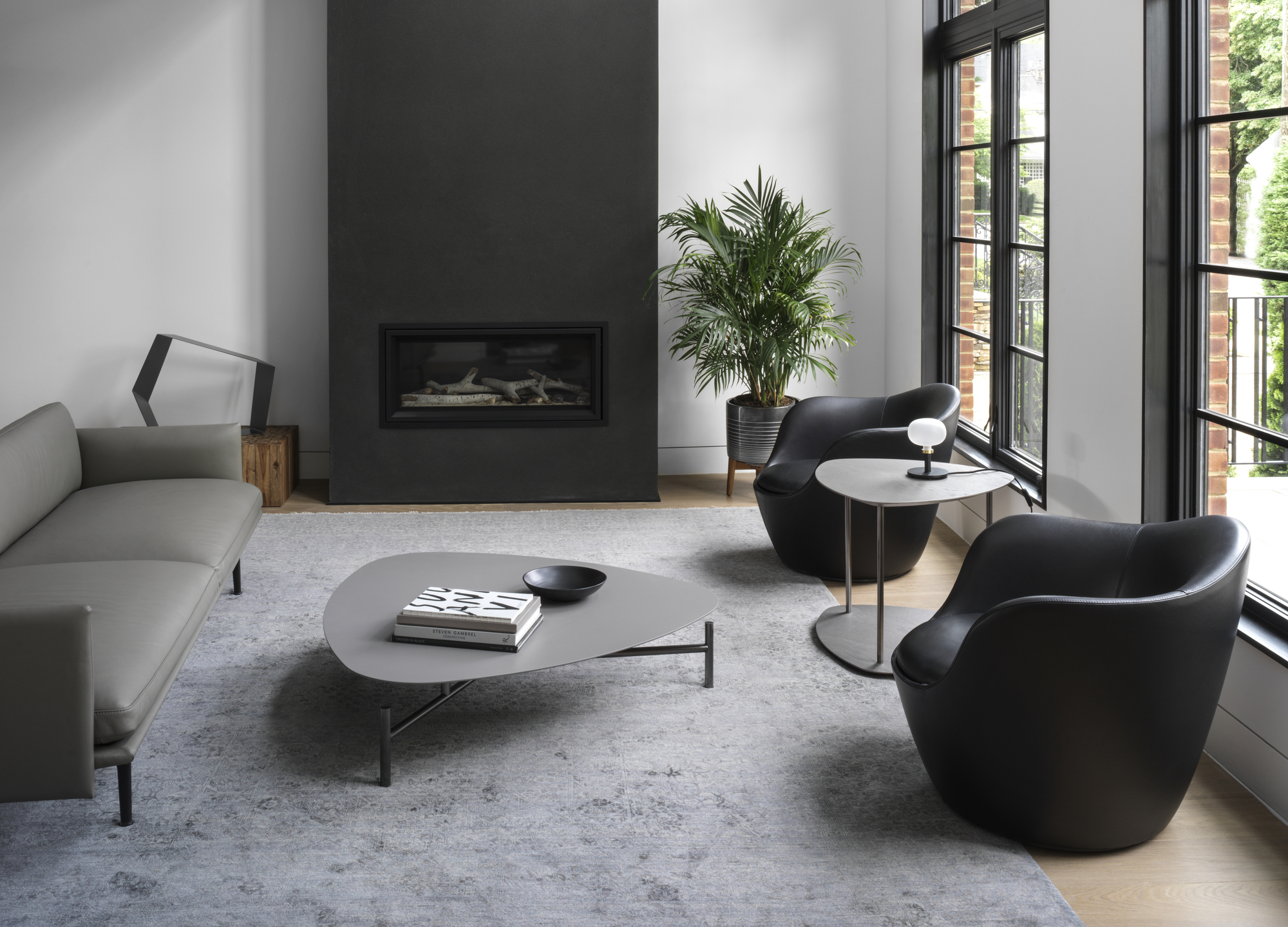
Painting the wall on the far side of the room in a dark contrasting color while keeping the side walls a lighter shade is a well-documented trick that will help the room look more spacious. 'Dark paint is the great illusionist,' says Melissa Frederiksen, director at Atmosphere 360.
'Remember, dark colors recede so they are often the perfect solution to widen a space.' In this example of a living room accent wall, Brooklyn-based designers, OAD Interiors wanted to really provide contrast and guide the eye to the end of the room to help emphasize the space.
A black and white combination is ever-fashionable and can be a great solution, with black on the far wall helping a space feel bigger.
6. Try out some color blocking
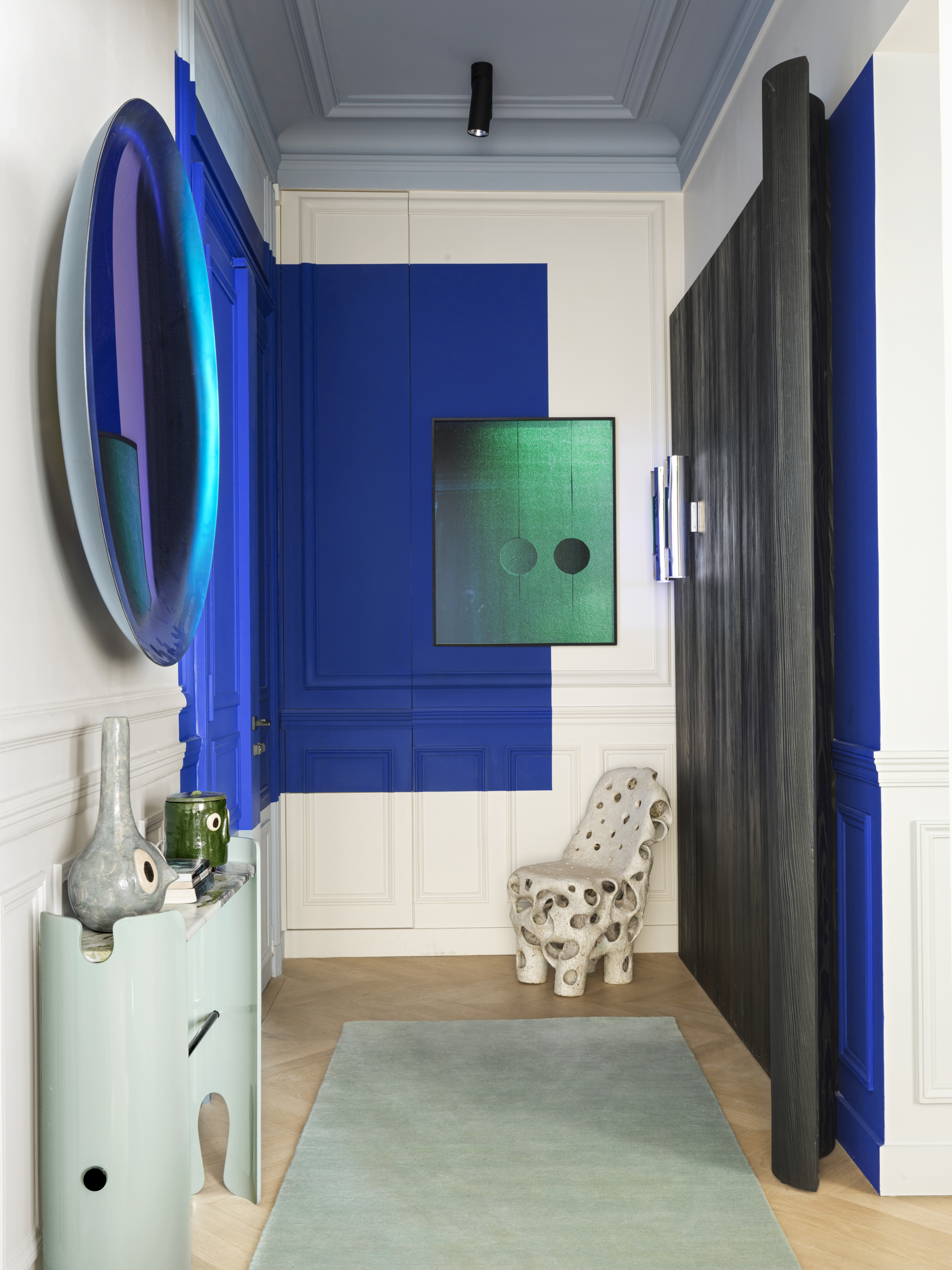
Distract from the lack of space by creating bold color blocks on the wall. Color blocking is a technique you can do with paint to create solid contrasting colors and shapes on the wall.
Use color theory to decide on the best colors that will complement what is already in the space, but if you go darker and keep the foundation wall paint light and pale, you can distract from the narrow nature of the room and get the eye to focus instead on the shapes.
7. Ceiling paint
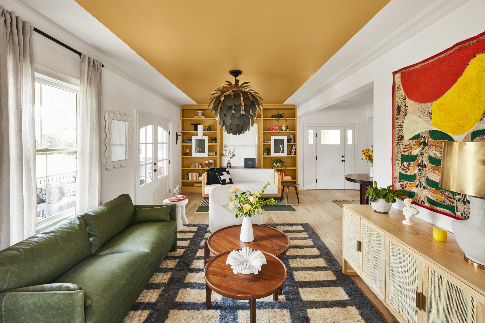
When painting a narrow room, consider going for a painted ceiling, which will visually break up the walls, direct your gaze to the back of the room and help the space feel less narrow.
'In this case, I decided to go with a wide stripe instead of painting the whole ceiling in order to keep the color from overwhelming the entire space,' says Natalie Papier of Home EC.
'But by drawing the color from the bookcases, across the ceiling and down the walls of the bay window on the opposite side it brought the whole linear space together. The wide stripe gives the optical illusion of a wider room. Stripes are also a great way to add a focal point to the room and give a space contrast.'
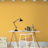
Tuscan sunshine from Graham & Brown
Warming and inviting, this shade of yellow exudes happiness and joy and works well on a ceiling or as a feature wall.
8. Paint the lower half of the wall
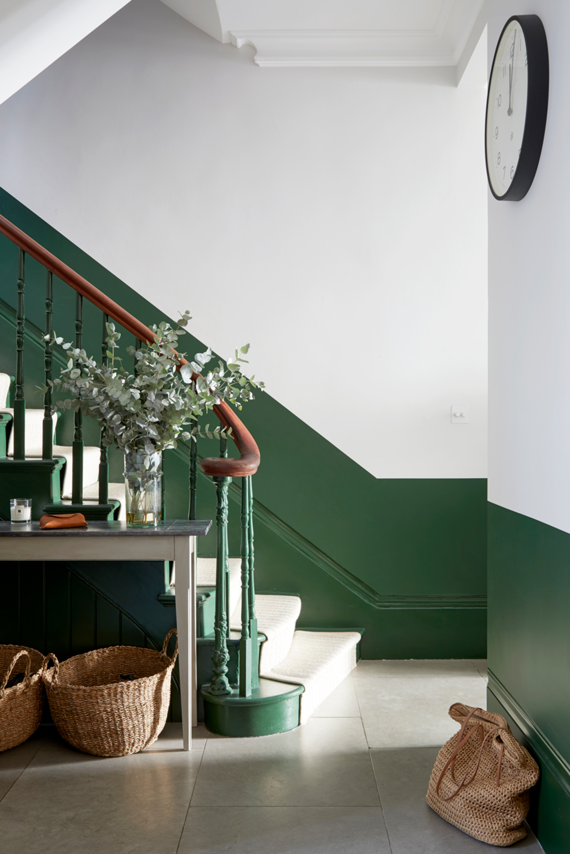
Add the illusion of space by painting the bottom half of a room and keeping the top half of the room bright and white, keeping the same shade on the ceiling and crown molding to avoid attracting attention to the confines of the room.
In the relatively narrow and small entryway of this townhouse, designers Indie & Co have done just that. 'The ceilings are very high so we had the luxury to play around with painting the walls horizontally,' says Céline Erlam, director of Indie & Co.
Be The First To Know
The Livingetc newsletters are your inside source for what’s shaping interiors now - and what’s next. Discover trend forecasts, smart style ideas, and curated shopping inspiration that brings design to life. Subscribe today and stay ahead of the curve.

Former content editor at Livingetc.com, Oonagh is an expert at spotting the interior trends that are making waves in the design world. She has written a mix of everything from home tours to news, long-form features to design idea pieces, as well as having frequently been featured in the monthly print magazine. She is the go-to for design advice in the home. Previously, she worked on a London property title, producing long-read interiors features, style pages and conducting interviews with a range of famous faces from the UK interiors scene, from Kit Kemp to Robert Kime. In doing so, she has developed a keen interest in London's historical architecture and the city's distinct tastemakers paving the way in the world of interiors.
-
 The 'New British' Style? This Victorian London Home Embraces Its Owners' Global Background
Warm timber details, confident color pops, and an uninterrupted connection to the garden are the hallmarks of this relaxed yet design-forward family home
By Emma J Page
-
 Muji Living Room Ideas — 5 Ways to Harness The Calming Qualities of This Japanese Design Style
Inspired by Japanese "zen" principles, Muji living rooms are all about cultivating a calming, tranquil space that nourishes the soul
By Lilith Hudson
