How to Make a Small Kitchen Feel More Airy — 5 Designer-Approved Tricks to Enhance Light and Space
Interior designers share simple tips and design choices that will allow your space to breathe
Our kitchens are incredibly hardworking, functioning as cook spaces, workspaces, social spaces, and even laundry spaces. So given how much multitasking they are doing day in, day out, it's no surprise that our small kitchens often feel more cramped, cluttered, and 'eclectic' than the kitchens on our Pinterest boards.
However, there are plenty of ways to open things up and create a space that elicits a deep exhale on entering, giving us a dose of well-being and cooking inspiration. Creating a spacious and bright kitchen is as much about avoiding design elements that can feel oppressive — such as heavily patterned tiles and dark overhead cabinets — as it is about welcoming in natural light.
We asked interior designers how to make a small kitchen feel more airy and rounded up their best five tips, whether you are remodeling a kitchen or simply looking for quick fixes for an existing cook space that's feeling a little gloomy.
1. Maximize natural light
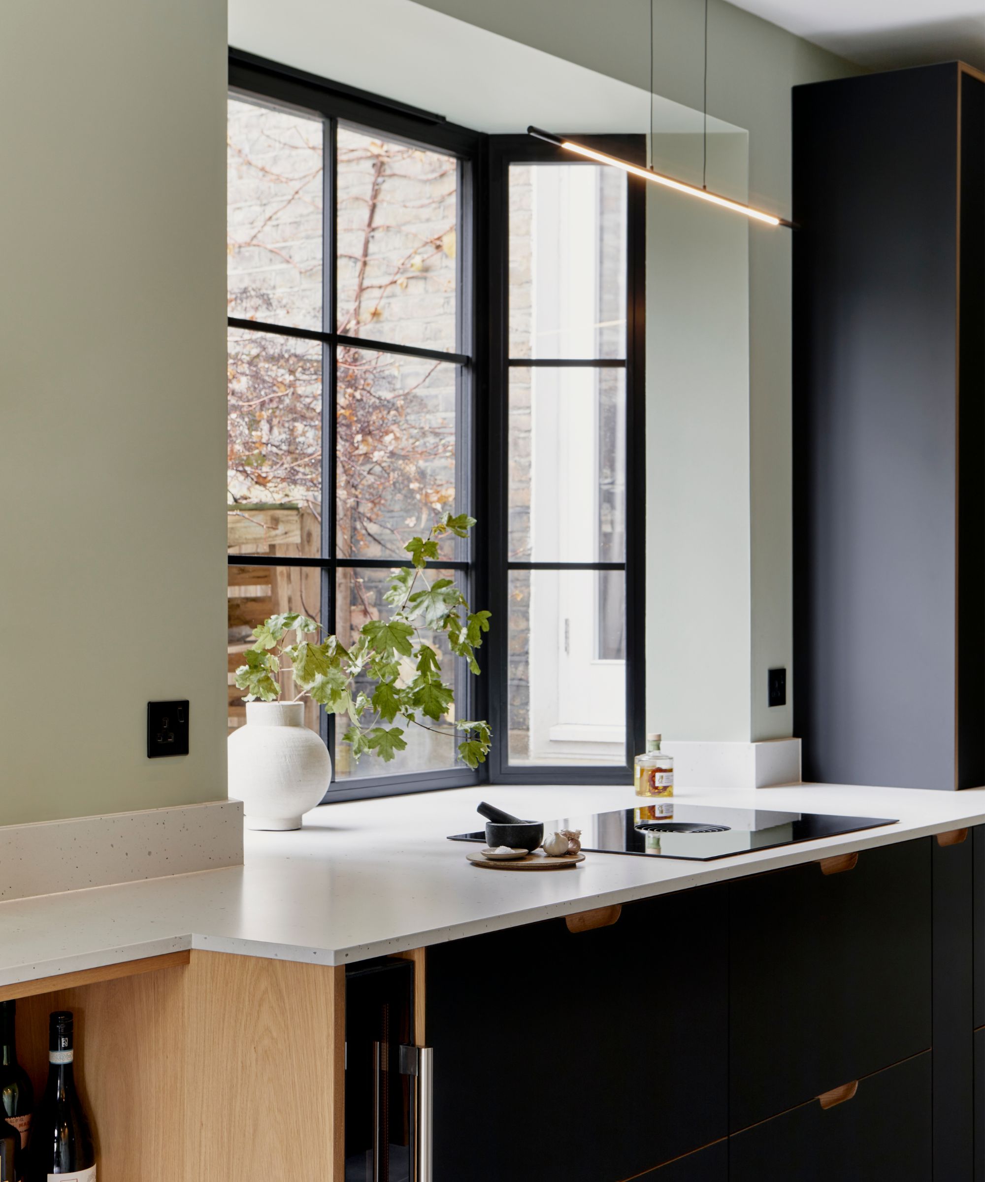
First, do everything possible to increase the natural light levels. Are your windowsills cluttered with plants and decor, and do the windows themselves need a clean? Perhaps you could find alternative kitchen window treatments that will let more light in if your current blinds or curtains block out light.
'If you're looking for an airier feel in your kitchen, the best thing to do is maximize natural light,' agrees New York City-based interior designer Kathy Kuo. 'Consider window treatments that are light-colored and lightweight, and choose a warm white for the wall color. Adding a medium-sized wall mirror is also a great way to add airiness and depth.'
Other reflective surfaces, such as gloss splashback tiles in a light neutral tone, will also play with natural light and create a sense of movement. Interior designer April Gandy's go-to for small kitchen flooring is large format tile in white with a satin finish. 'This reflects well in light to aid in making the room feel brighter but isn’t as slippery as a polished or glossy sheen,' April explains.
2. Create the illusion of height and space
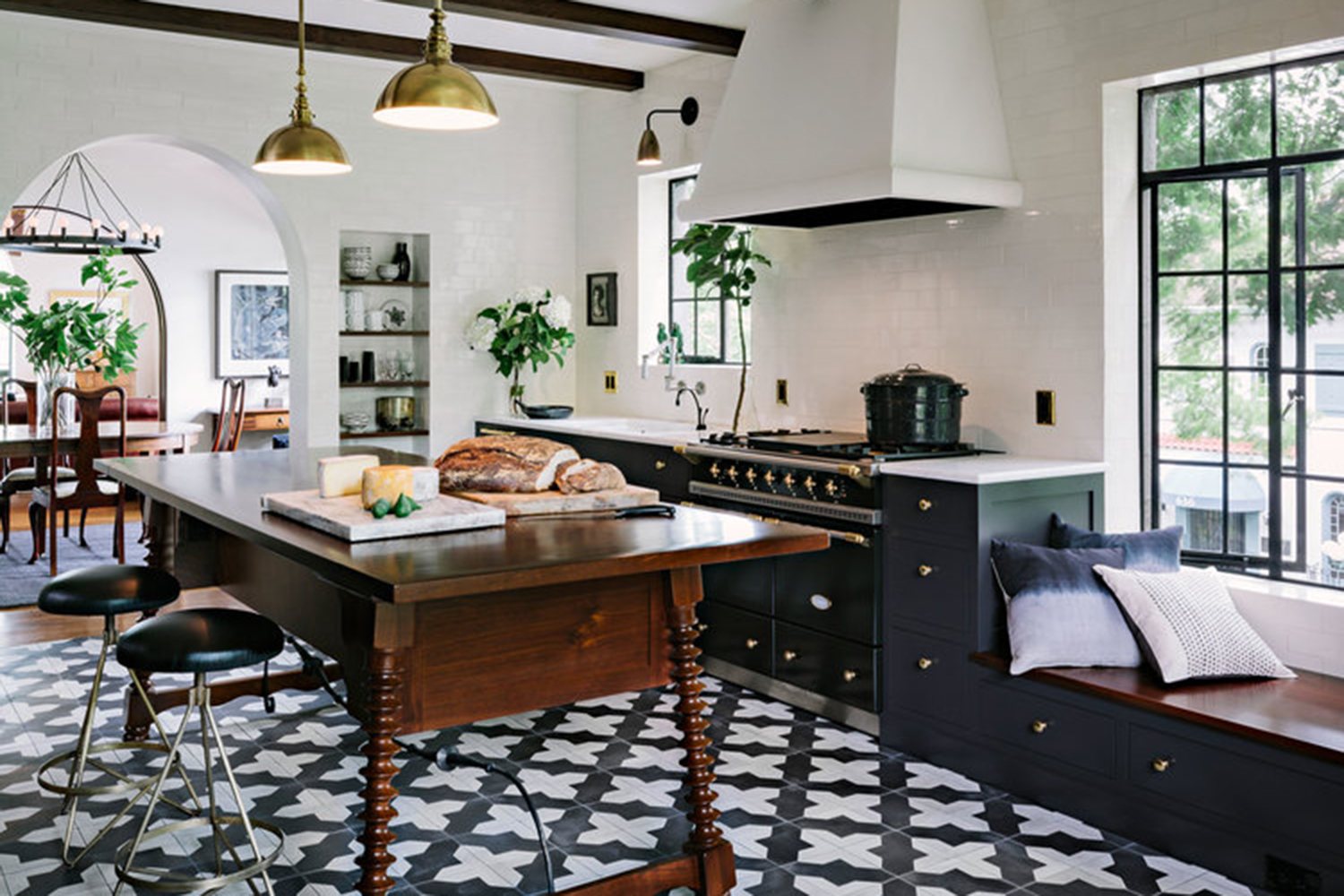
As well as inviting in more natural light, you can also create the impression of a loftier and more expansive space with a few smart visual tricks.
For example, Annabel Harrison, founder and creative director at FARE INC. design studio, suggests creating illusions of height with faux beams: 'I recommend incorporating slim faux beams with batons or similar materials to add depth to the ceiling. Painting them in a light color instantly imparts a breezy and Mediterranean ambiance, making even a small kitchen feel more spacious. The elevated ceiling creates an illusion of height, contributing to an overall airy atmosphere.'
Kitchen expert Fiona Ginnett from HØLTE says drawing focus to windows and doors in your kitchen makes for a more spacious feel. 'Keep the wall space around windows and doors open to draw attention to them.
'Place tall cabinets on the opposite side or in the darker corners of the room. Choose open shelves instead of wall cabinets around kitchen windows, and consider painting the frames in a bold color to attract the eye toward the glass and create a visually engaging perspective,' Fiona says.
3. Keep counters clear of clutter
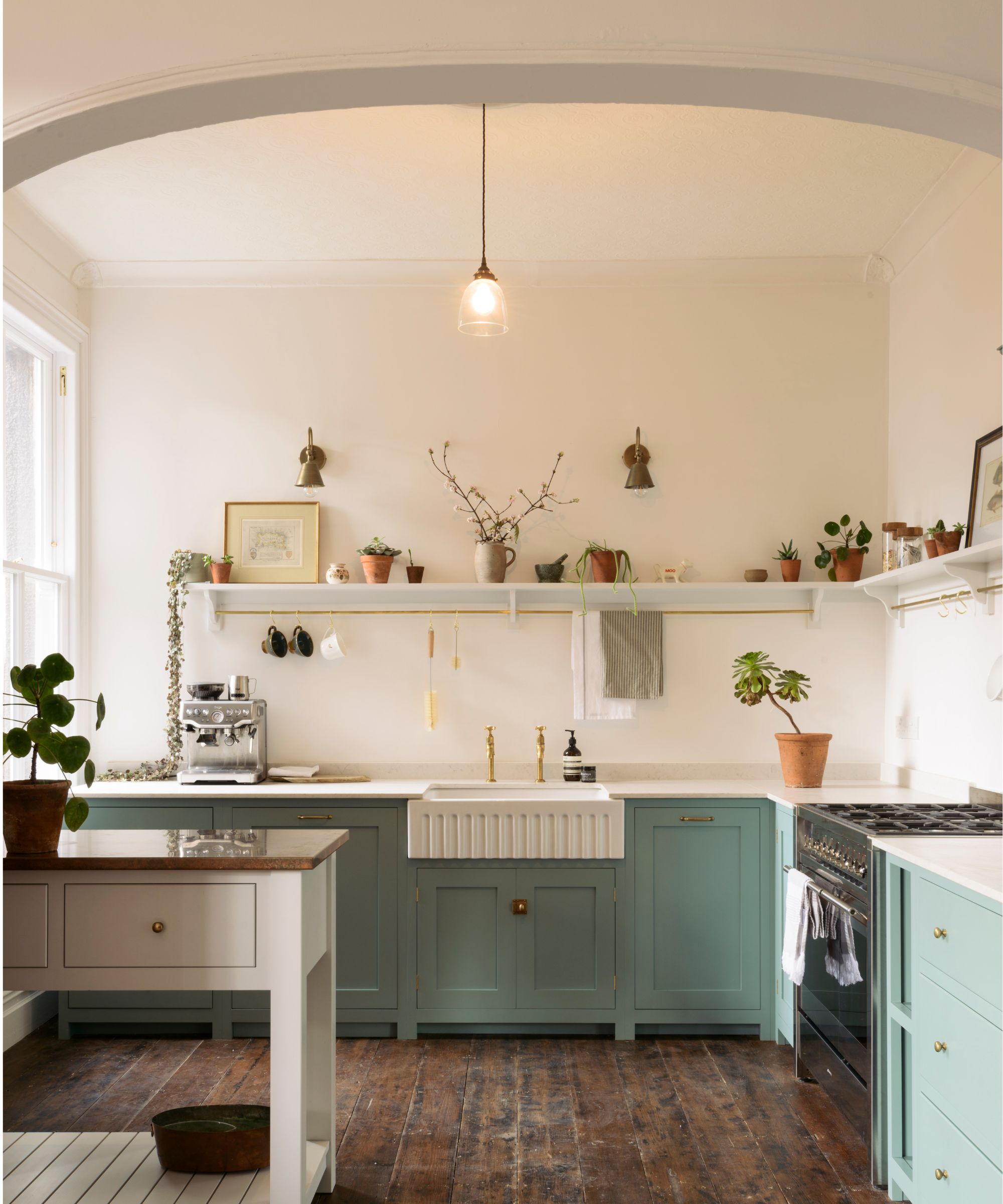
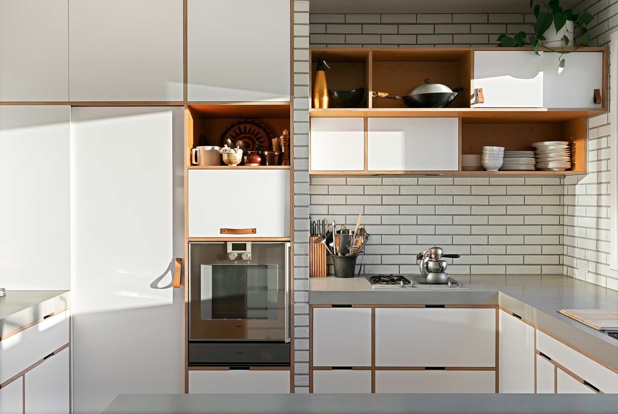
Decluttering kitchen countertops of those lesser-used appliances and any day-to-day items that don't belong in the kitchen will mean there is less for the eye to land on, reducing the visual noise. Large swathes of empty surfaces open up the space while offering valuable countertop space for cooking.
'The easiest way to make your kitchen look larger is to clear off the counters,' says interior designer Nicole Cullum at Color Caravan. 'Tuck away anything you’re not using on a daily basis into a drawer or easily accessible cabinet.
'Pair down surface decor so you have plenty of open space along your countertops. This will trick the eye into making your kitchen look bigger.' Clever kitchen storage solutions will help with keeping kitchen countertops clear.
4. Think about flow
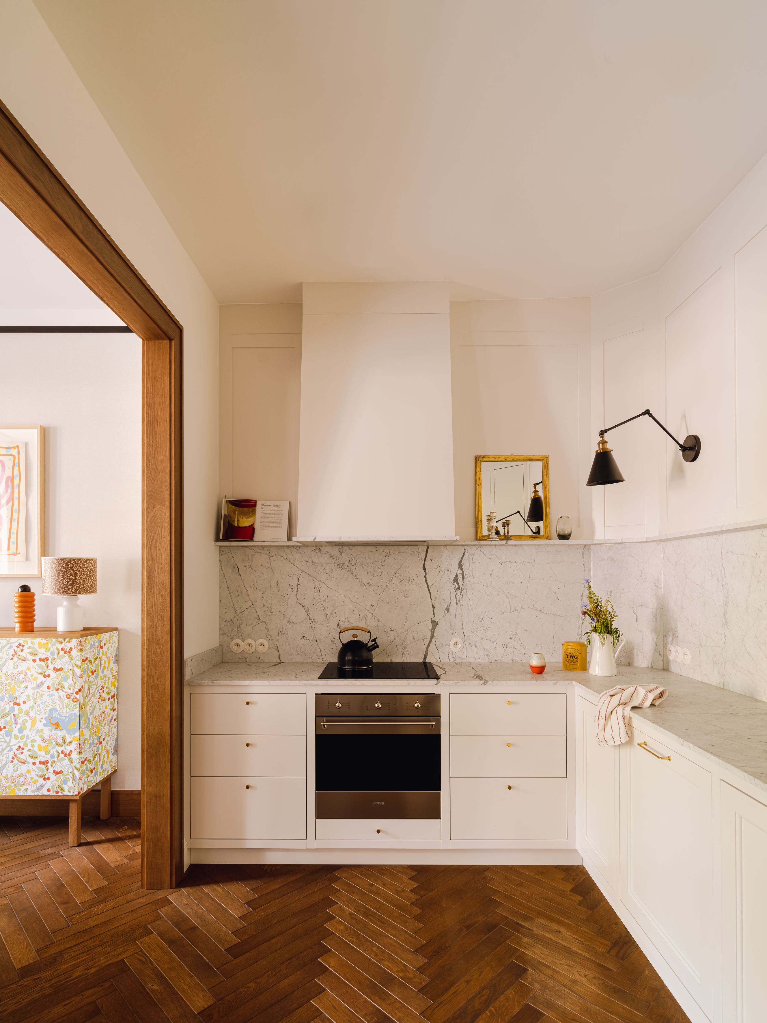
Some thoughtful kitchen layout tweaks can enhance the sense of space and light, such as making the entry to the kitchen narrower than the rest of the space, giving the sense of a pathway that opens out into a more spacious area.
Interior designer Annabel Harrison explains the idea in more detail: 'Consider adopting a galley or U-shaped layout for your small kitchen, strategically placing a pantry and fridge next to each other as you enter.
'This layout is designed to guide movement through a slightly tighter initial space, creating a deliberate transition into a more open area. By avoiding large blocks of components scattered in different locations, this design fosters a seamless flow and instils a heightened sense of space and light.'
5. Use color contrasts
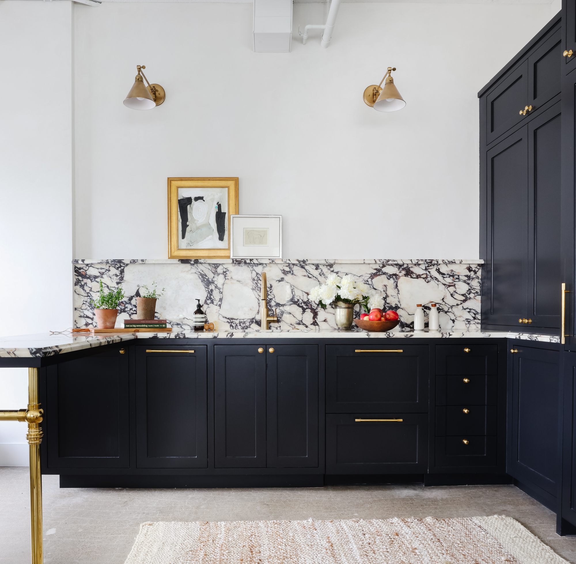
If you're up for doing some DIY, try painting opposite walls in contrasting colors. This bold and playful approach to kitchen color ideas works particularly well in narrow kitchens and can widen the space. 'Maximize the impact of natural light by introducing a dark color on one side of a galley and a light color or material on the other, creating a sense of expansiveness,' says Fiona Ginnett.
Alternatively, opt for darker cabinetry in an otherwise light and bright scheme, as shown above. If you're cautious about dark colors in small spaces, don't be. 'It is also worth mentioning that a small kitchen filled with dramatic colors, textures and accessories can become big in personality which can also visually give a sense of a large space,' says Helen Parker, creative director of deVOL Kitchens.
Be The First To Know
The Livingetc newsletters are your inside source for what’s shaping interiors now - and what’s next. Discover trend forecasts, smart style ideas, and curated shopping inspiration that brings design to life. Subscribe today and stay ahead of the curve.
Millie is a homes writer and journalist renting in North London. She contributes regularly to Livingetc, Ideal Home and Real Homes. As well as covering shopping trends online, she loves vintage furniture, candles, Interior Design Masters and a Facebook Marketplace bargain. She has previously written for Fabulous, Stylist and Marie Claire.
-
 The Weighted Blanket That Doesn’t Make You Sweat (and the Eye Mask to Match)
Luxury has weight. And apparently, volcanic minerals
By Julia Demer
-
 What Is Biophilic Interior Design? I'm an Actual Biophilic Designer, and This Is How to Apply It to Your Home
A biophilic designer explains the core principles of this practice, and the easy ways you can apply it to your home's design
By Marianna Popejoy
