How to Make Your Home's Storage Look More Expensive — 5 Inexpensive Tricks Designers Always Use
Storage may be a necessity in our homes, but that doesn't mean that it can't be the design element that elevates your space
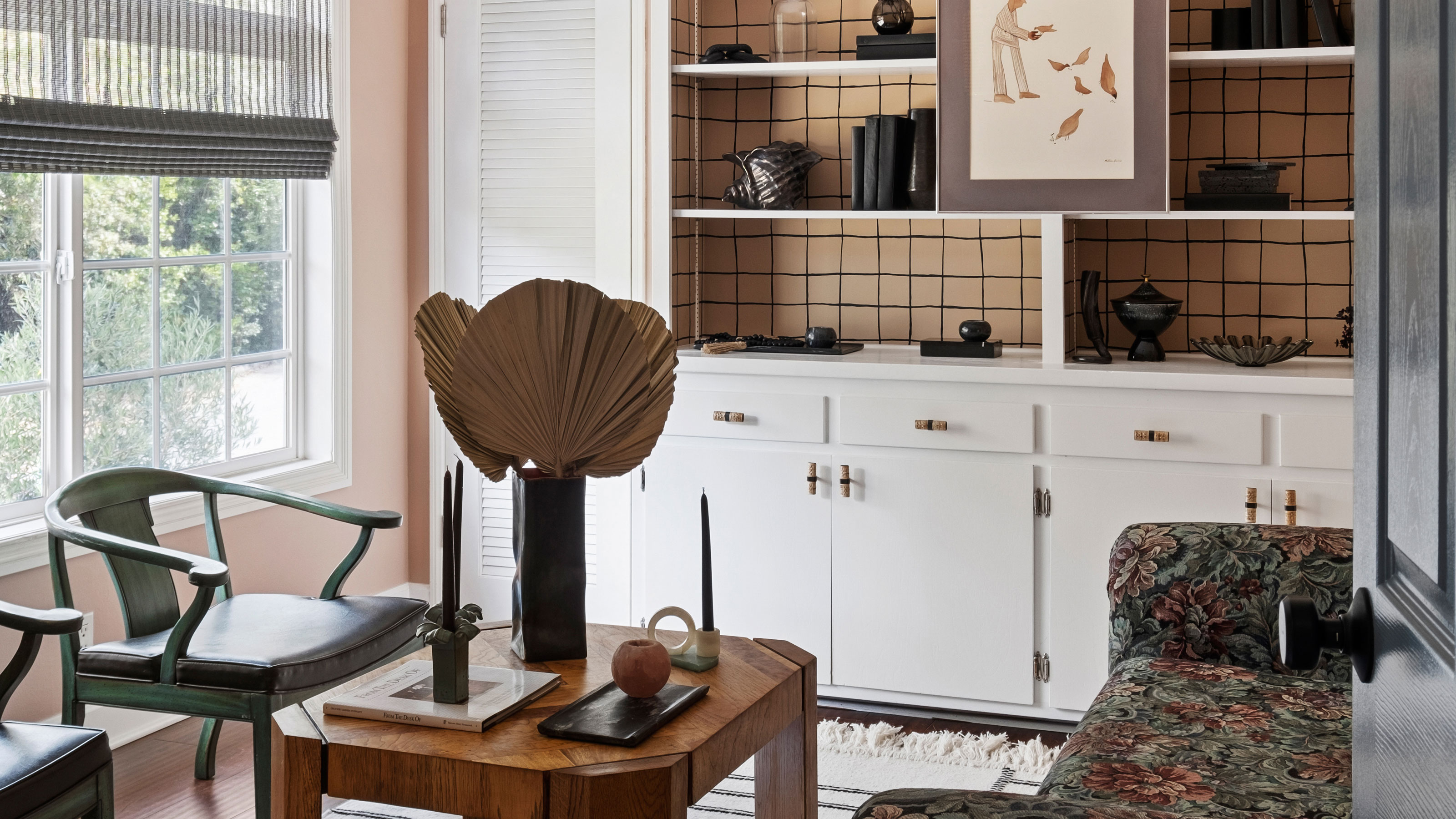

For most of us, storage falls into the 'need' rather than the 'want' category when it comes to our homes. It's not often thought of as stylish or particularly creative, but rather something we need to squeeze into our designs for functionality's sake.
As a result, it too often becomes an afterthought; something we retrofit once we realize that our modern, minimalist aesthetic doesn't always work in the real world. When that happens, we risk our home storage looking clumsy, cheap and cramped.
The good news is, it doesn't have to be that way. It also doesn't have to be custom-made or bespoke to look premium and polished. There are plenty of stylish storage ideas to be discovered. Below, we spoke with designers to find out five ways to make your home storage look more expensive. Here's what they had to say.
1. SEAMLESSLY INTEGRATE OR 'HIDE' YOUR STORAGE
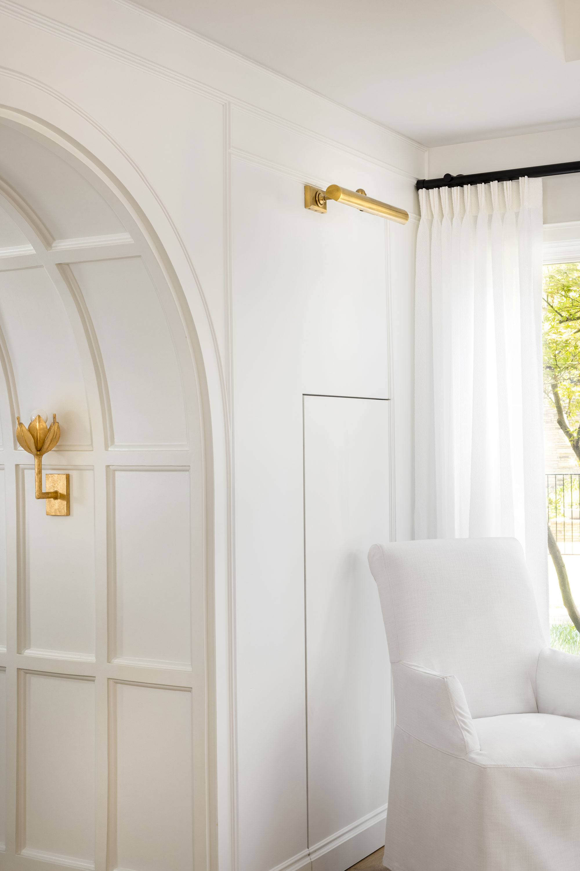
It may seem counterintuitive, but one of the best ways to make your storage look expensive is as simple as not seeing it at all. 'Hidden drawers or cabinets can keep essentials close at home while maintaining a sleek look,' explains Katie Skoloff, principal designer and founder of South Carolina-based studio, In Site Designs.
As seen in the project above, the team at Maestri Studio managed to add extra storage to this home by seamlessly integrating hidden storage into the living room wall. Rather than a bulky bookcase or shelves that may have overwhelmed the space, the hidden storage does its job without interrupting the look and feel of the room.
2. COLOR DRENCH STORAGE FOR A SEAMLESS LOOK
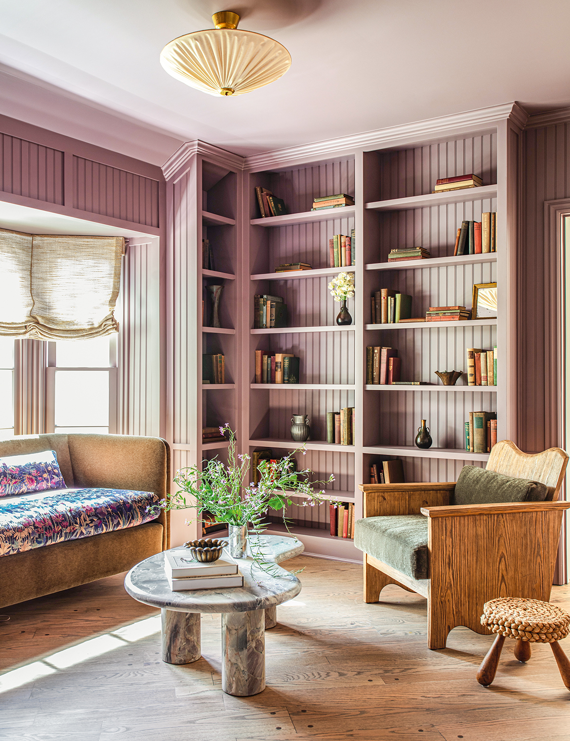
The last thing you want is for your home storage to stick out in your space unintentionally, or to interrupt the flow of a room. But having something integrated structurally isn't always an option. That's where color comes in, offering a simple and cost-effective way of making your storage look expensive.
Los Angeles-based designer Jake Arnold chose to paint the bookcase the same color as the walls in this living room, giving it an expensive and cohesive feel that makes the storage look like a considered part of the room, rather than simply added into the design after the fact. 'Color drenching is a trend that just equates to more expensive-looking spaces right now,' says Hugh Metcalf, editor of Livingetc.com. 'It's such an easy shortcut for making storage feel more elevated, and Jake's inclusion of paneling on the back of these built-ins makes it feel even more elevated.'

Price: $59.98/gallon
Description: A light, saturated plum that embodies the essence of early summer fruits.
3. FIND FURNITURE THAT DOUBLES AS STORAGE SOLUTIONS
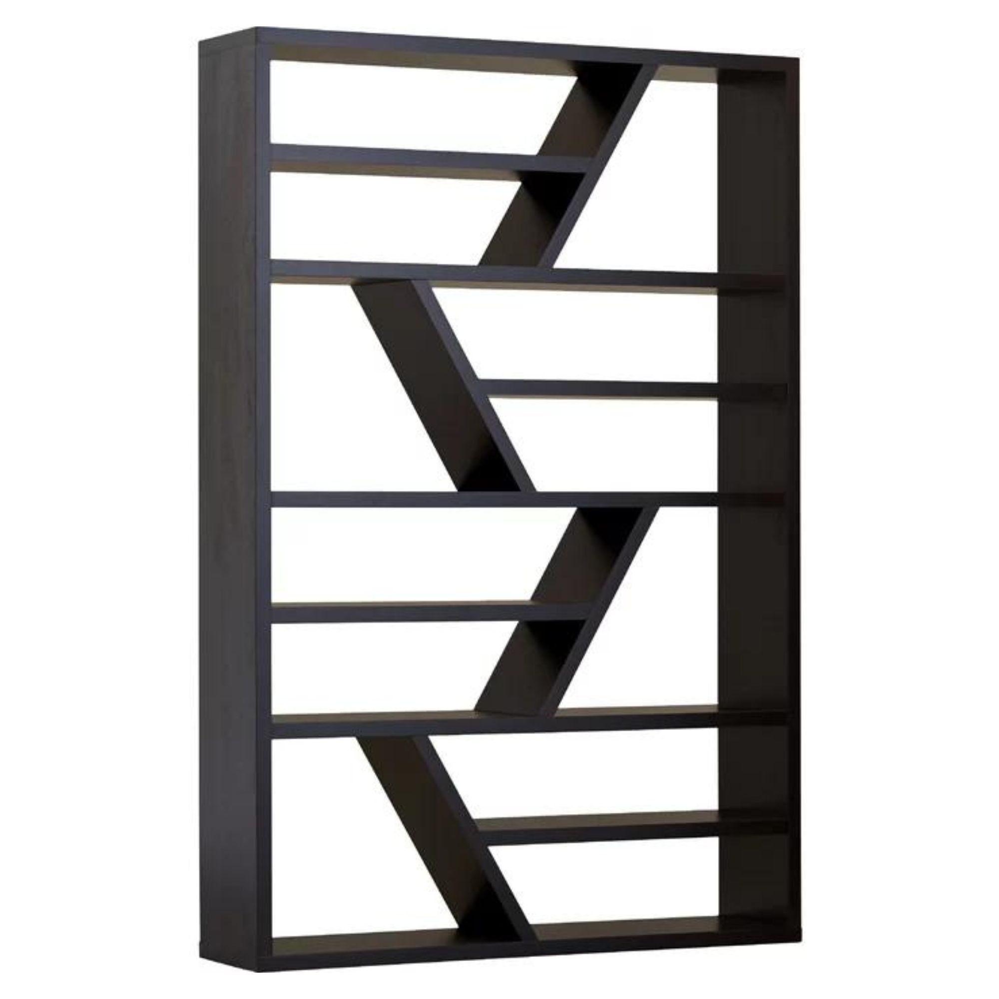
There are so many different storage solutions out there, from bookshelves and cupboards, to furniture that coverts into places you can put things. In fact, the more creative you get with your storage solutions, the more expensive and custom it tends to look.
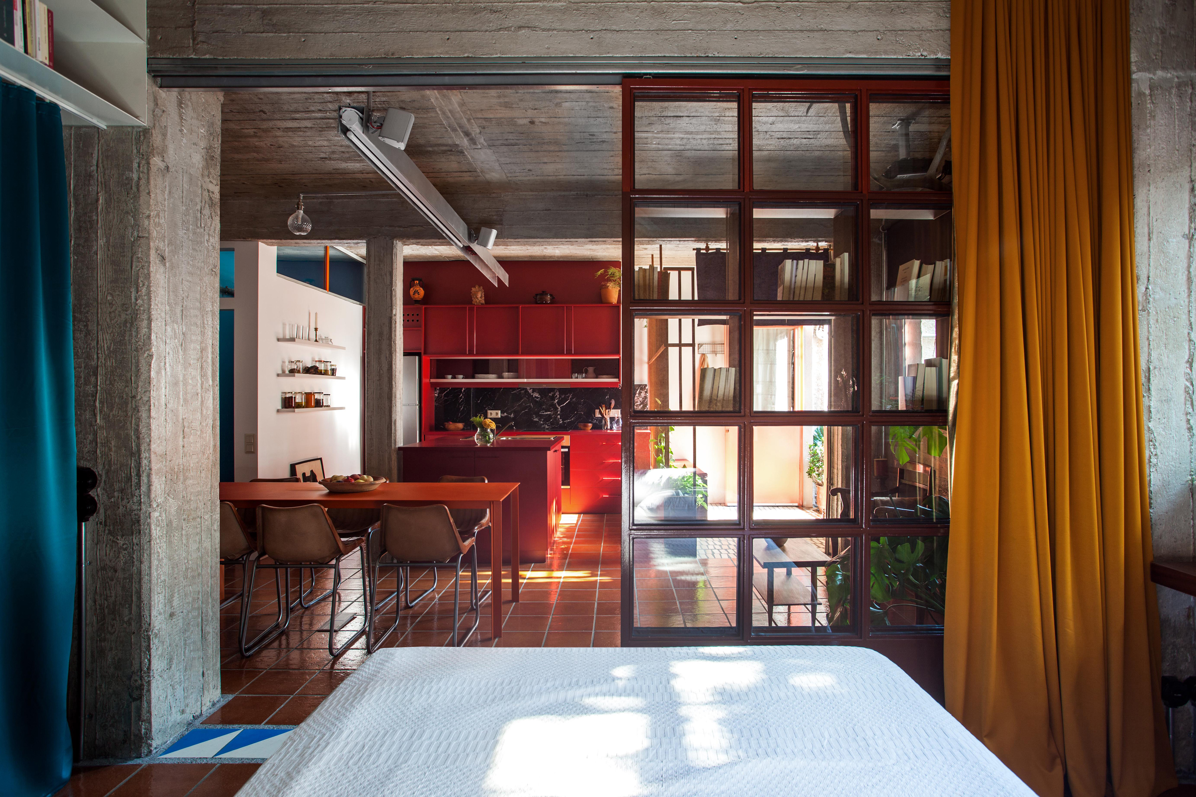
For example, stylish room dividers can also cleverly incorporate storage elements. 'A bookshelf that acts as a partition can provide storage and display space functionality while maintaining an open flow,' says interior designer Katie Skoloff.
As seen in the studio apartment above, designed by Greek architecture firm Point Supreme, a glass room divider with built-in shelving provides ample storage space without blocking light or flow in the small space.
4. GET THE RIGHT HEIGHT AND PROPORTION
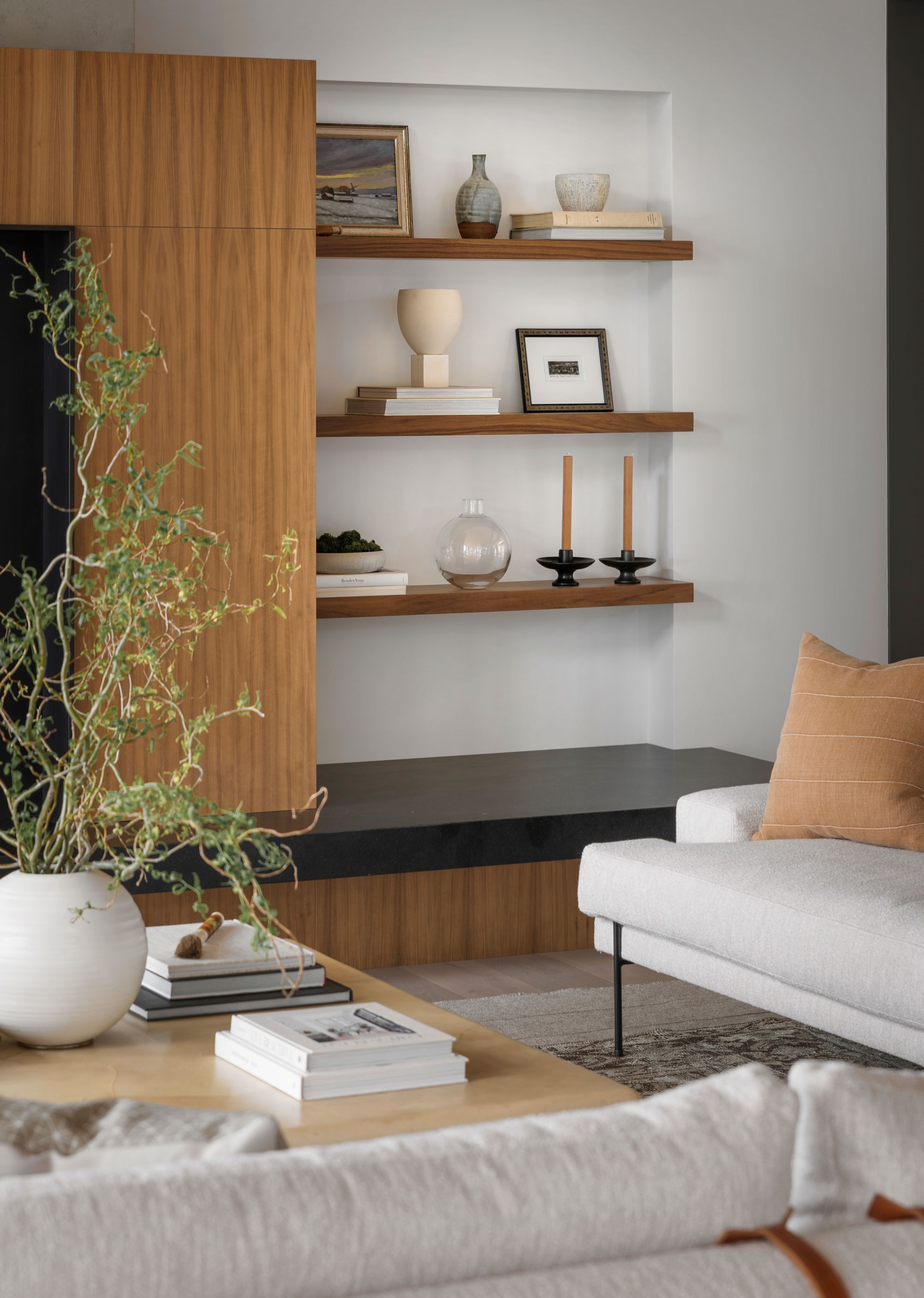
Not many people realize how something as simple as the size and proportions of your storage can impact how expensive it looks. Solutions that fit seamlessly into a space will look custom and bespoke, and therefore, more expensive.
Something that is too big for a space, or leaves awkward gaps around the edges will look clumsy and cheap. Take floating shelves for example. They're an affordable form of storage but, when done right, can look very stylish. It's important to hang them at the right height: eye height, or at least 10 inches above any furniture. It also looks best when they fit snug between two walls (as seen in the living room shelving by Lisa Staton Design above) rather than leaving small gaps on either end.
5. MAKE SMALL TWEAKS TO CUSTOMIZE YOUR STORAGE
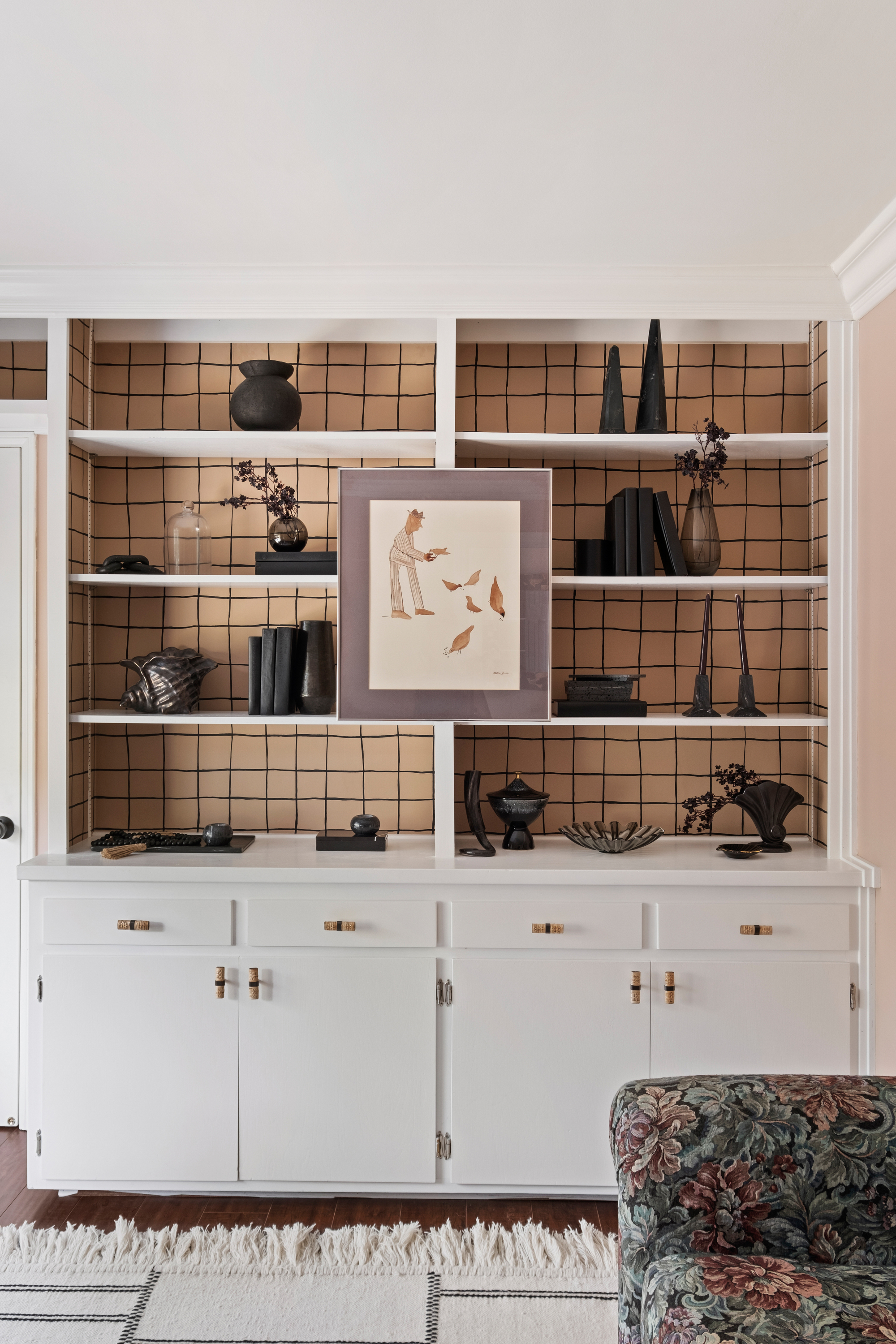
You may not be able to afford something custom, but that doesn't mean you can't customize your storage to make it look more expensive than something straight off the shelf.
Small tweaks like new cabinet handles, a fresh coat of paint or a little bit of wallpaper won't necessarily cost you a lot, but can make it look like your storage did.
'These shelves were existing and they were just outdated and boring. We swapped out the hardware and decided to wallpaper the backs [a recent wallpaper trend] with a fun and playful wallpaper,' says US-based interior designer Victoria Holly, founder of Victoria Holly Interiors.
The key to making your home storage look more expensive is making it slip seamlessly into your interiors — whether that's in the actual structure of the room, the color choices, the existing furniture or simply the same aesthetic.
It doesn't have to be expensive to look expensive, but it needs to be a considered part of the design from the very beginning. There are endless storage ideas for small spaces and beyond, you just need to approach it the same way you might for a more traditionally exciting aspect of the design process.
In short: make your home storage a 'want' as well as a 'need'.
Be The First To Know
The Livingetc newsletters are your inside source for what’s shaping interiors now - and what’s next. Discover trend forecasts, smart style ideas, and curated shopping inspiration that brings design to life. Subscribe today and stay ahead of the curve.

Emma is the Interiors Editor at Livingetc. She formerly worked on Homes To Love, one of Australia's leading interiors websites, where she wrote for some of the country's top publications including Australian House & Garden and Belle magazine. Before that she was the Content Producer for luxury linen brand, CULTIVER, where she nurtured a true appreciation for filling your home with high-quality and beautiful things. At Livingetc, she spends her days digging into the big design questions — from styling ideas to color palettes, interior trends and home tours. Outside of work hours, Emma can often be found elbow-deep at an antique store, moving her sofa for the 70th time or mentally renovating every room she walks into. Having just moved to London, she's currently starting from scratch when it comes to styling her home, which, while to many may sound daunting, to her, is just an excuse to switch up her style.
-
 Italian Kitchen Trends — 5 Emerging Ideas From the Chicest Italian Designers That I Predict Will Go Global in 2025
Fresh from Milan Design Week, these are the exciting finishes, styles, and innovative materials I can't wait to see in more kitchens this year
By Faiza Saqib Published
-
 Small Patio Ideas — 8 Clever Ways to Style Up Even the Tiniest of Outdoor Spaces
If you're dreaming of turning your small patio into a dream space the right combination of practical and creative ideas will help you max up its potential
By Sarah Wilson Published
