

In case you haven't heard, there's a new color trend on the block. It stems from a viral theory circulating social media dubbed 'Unexpected Red', and while it might be hard to pin down any meaning from the name alone, the idea itself makes a lot of sense once you see it in practice.
No prizes for guessing that the color in question is, of course, red. Many of us tend to shy away from using this bold shade in our designs, but it's fast becoming one of designers' favorite accent hues to elevate designs and throw in an element of surprise, especially in kitchens.
For years now, red has largely been considered too overbearing a color to use in a kitchen, a space that's become more calming and convivial in recent years. While it might not be a tone to take to all four walls, many designers are now encouraging its use in smaller doses, and it's all thanks to the new 'Unexpected Red' interior design trend. Keen to learn more about how to introduce this shade into your kitchen to make an impactful statement? We asked designers to tell us how it's done.
What is the 'Unexpected Red' Theory?

First coined by TikTok user Taylor Simon (@intayriors), the idea behind the unexpected red theory is that a random injection of red can make a room look seriously elevated and feel so much more design-worthy. In most cases, bright shades of the classic primary red are used for this color trend.
'The idea is to introducie the color red into your kitchen as a pop through accessories or accents,' explains Priya Vij, founder of Hapny Home. 'Red evokes strong emotions and makes for a naturally interesting visual choice given the boldness of the color. A little goes a long way, which is exciting from a design perspective.'
As hinted at by Priya, the theory can translate to the kitchen in many ways, but generally, it's all in the details. That could mean small soft furnishings like placemats or tea cloths, or stoneware accents such as plates, mugs, or even ceramic cabinet knobs.
There's also the connotations of the color red and what it can communicate when used wisely. Priya is an especially big fan of the viral unexpected red theory due to her Indian heritage, where the shade represents love and commitment in her culture. 'What better place to showcase it than the kitchen, which is often the heart of the home,' she says.
How should we decorate with red in a kitchen?

The great thing about a place like the kitchen where there are so many decor and kitchenware elements is that it offers untold possibilities for introducing color. The added benefit is that this space is one we can often overlook when it comes to curated, impactful designs. Often devoid of color or character - and a place where we typically settle for a standardized norm (think faucets, sinks, and hardware) - introducing a color theory like this one can go a long way, injecting a zesty effervescent feel where it's needed most.
On top of all this, while red might be a bit too overwhelming as a paint idea on your kitchen walls, its use in smaller doses - peppered throughout a space to draw the eye - makes so much sense. 'While red is a bold color selection for the home, it's more versatile than you might think,' says Priya. 'It pairs well with most standard hardware finish tones - from the warm golds of brass to the cool silvers of nickel and chrome and even with black.'
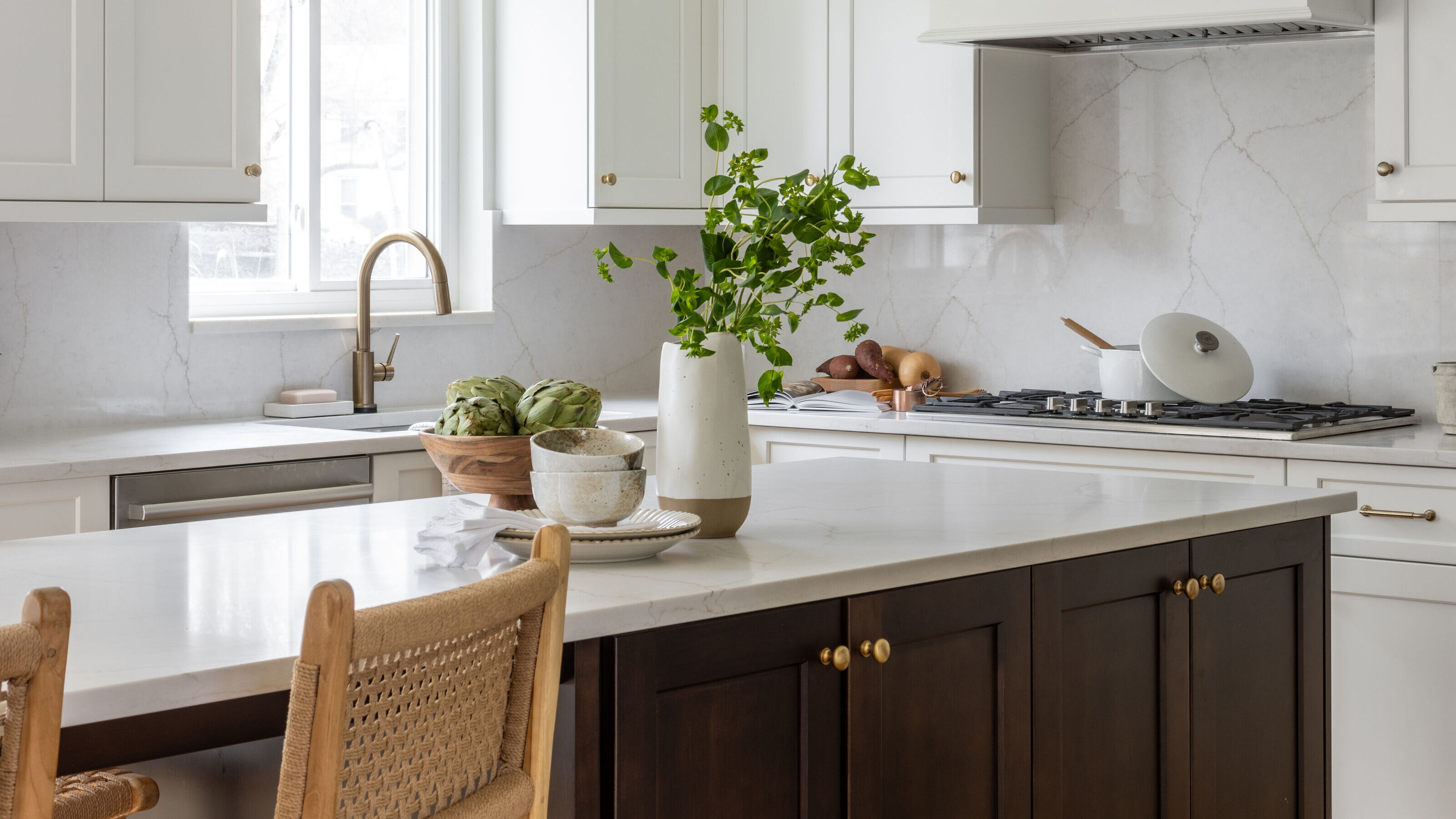
What all of this suggests is that red kitchens can be subtle, instead of simply overpowering or too stimulating. Take the design pictured above, for example. Surrounded by neutrals and natural wood tones, the small amount of red really sings, adding an unexpected burst of flavor and introducing depth and dimension to the simple cabinetry.
'In the same vein as an accent wall, you could have red cabinets or paint the inside of your cabinets red for a more subtle inclusion,' Priya suggests. 'Installing red fixtures (think plumbing or lighting) is a fun way to add a pop of color and draw attention without overwhelming the space. Given the versatility of red, it would be easy to complement your hardware with those fixtures seamlessly.' Used this way - or by simply decorating with a few red decor items inside the space - a feeling of cohesiveness is created that brings harmony to your kitchen, something professional designers always do so well.
What other colors or accents go with red?

Though it may be a bold choice, and certainly it's earned itself a tricky reputation in the design world, there are plenty of colors that go with red. 'Gold, silver and black are all traditional choices that work well with red,' says Priya. 'If the point is to use red as an accent color, the space should be designed to let the red pop as much as possible. In terms of hardware, this means choosing a material and finish that will complement, not compete, with the red.'
For a cozier look, Priya suggests sticking to gold hardware. 'Gold and red is a timeless combination given the warm undertones of both,' she notes. 'For a more dramatic look, a nickel or chrome finish will introduce a cooler tone against the red without clashing. Matte or brushed finishes will be more subtle, while reflective polished finishes will draw more attention. A more modern look would be to pair matte black with red. While both are bold colors, the pairing is visually very clean.'
There are so many ways to play with this idea in your kitchen, and they don't have to be permanent design commitments either. Even if you're not a fan of red, see what difference a hint of this shade can make in your kitchen. Who knows - you may even be surprised.

Price: $37.34
Material: Metal

Price: $150
Scent: Tomato Leaves

Price: $15.99
Quantity: 4

Price: $9.99
Material: Stoneware

Price: $96
Quantity: 4

Price: $26.99
Scent: Pink Grapefruit

-
 We've Weighed Up the Pros and Cons of Bamboo Flooring, the New Eco Choice That Looks Effortlessly Elevated
Serving on both style and sustainability, we've asked the experts everything you need to know when specifying bamboo flooring in your home
-
 5 Home Reno Projects You Should Never Do By Yourself — Especially if You Want to Avoid Costly Mistakes
Experts say even the most seasoned DIYers shouldn't attempt these high-risk renovations (especially if you want a worthwhile ROI)


-
 6 Cut Flower Trends That Will Bring Lushness, Life, and a Little Bit of Luxe to Your Interiors in 2025
These are the fresh blooms florists and designers are favoring this year, plus how to arrange them for a striking look that fills your home with joy
-
 I Spy With My Design Eye: This Specific Fabric Print Is Literally Everywhere Right Now — We've IDed It for You
It's whimsical, artistic, and full of character. We've called it already: Dedar's 'Tiger Mountain' is the fabric that will define 2025
-
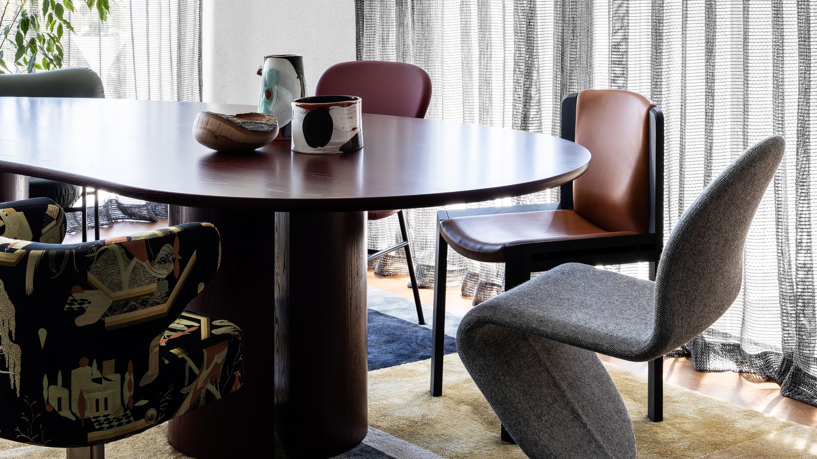 Having Mismatched Dining Chairs Is the New Telltale Sign of Serious Style — Here's How to Make It Look Intentional
Once considered a sign of a lack of care, a dining room table with different chairs now screams ultimate curation... if you can do it right, that is
-
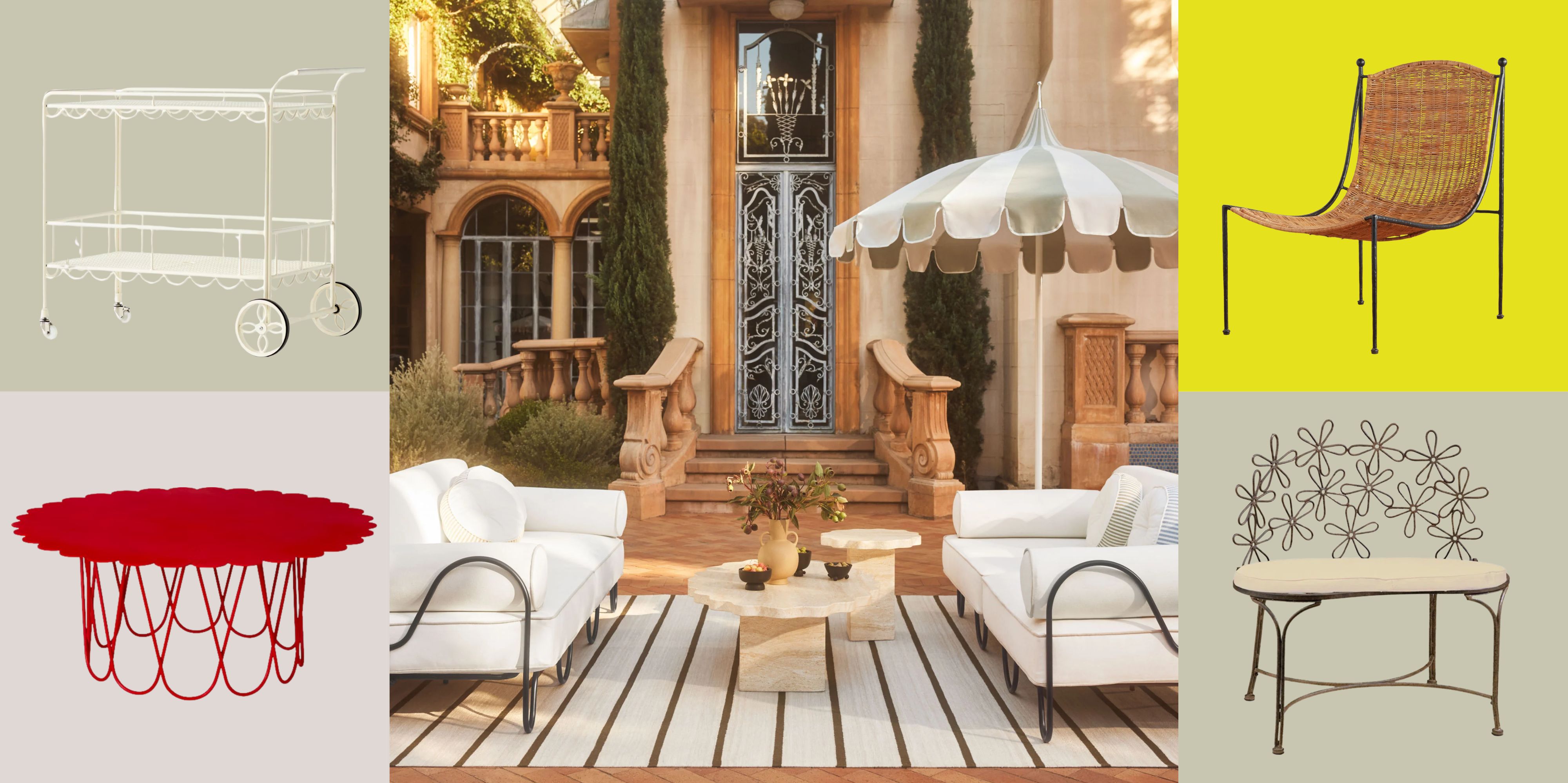 There’s a New Shape in the Garden — Why Whimsical Curves Might Be the Outdoor Furniture Silhouette of the Summer
Powder-coated petals, wavy lines, and a hint of surrealism — this microtrend is blooming, and we’re paying attention
-
 I Asked Interior Designers to Share the Worst Decorating Trends They've Seen on Social Media
Just because something is trending, doesn't mean it's tasteful — from dupe-culture to OTT lighting, here's what designers hate seeing in homes
-
 I'm Calling It — Chrome Decor Is the Most Influential Design Trend of 2025 for Rooms That Feel Effortlessly Cool
Have you been eyeing a chrome candle holder or side table to complete your room's look? This is your sign to embrace the shiny, chic material
-
 Straight from Salone: 5 Emerging Trends I Found in Milan That'll Shape Interiors for the Year Ahead
From reflective silver to fluidity, here's my perspective on the key themes and new moods coming through from Milan Design Week
-
 The 'Red Table Trick' Is the Easiest and Most Expensive-Looking Trend to Hit 2025 So Far
A red dining table makes a seriously stylish statement; the beloved pop of red trend just got an bold and expensive-looking upgrade


