Designer-approved IKEA kitchen ideas that show it's easy to elevate affordable cabinets
Let these designer-approved IKEA kitchen ideas inspire you to create a space that's looks bespoke on a budget
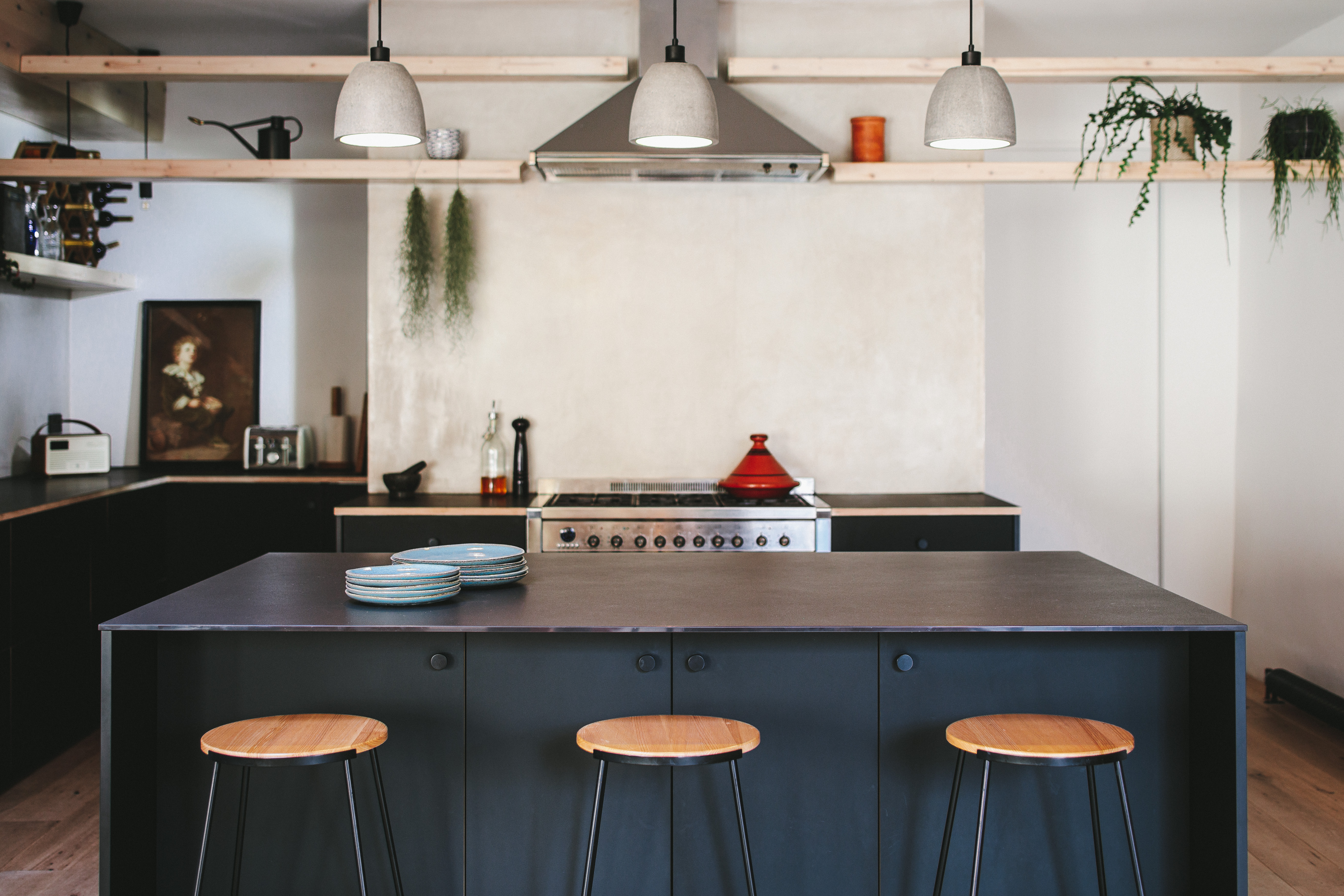

IKEA kitchen ideas have come a long way since the days of picking up the catalog and transporting one of those exact designs into your own space. We see so many gorgeous IKEA kitchens that you would have no idea were not bespoke designs, created just for that home.
So to pay homage to the classic and humble IKEA kitchen design, and to prove just how fabulous (and more affordable) they can be, we have asked designers what their tips are for getting the most out of your IKEA kitchen. From simple switches like changing out the hardware or choosing a more unique countertop to using affordable IKEA base units along with custom doors to create a totally new design.
'The frames are the bones of your kitchen and what IKEA offers is solid quality base with plenty of options to customize the functionality of the cabinet interiors. But it’s the facade that really works to offer a stylish kitchen space,' explains Kathryn Hawkes, Co-founder of Fronteriors, a company that specializes in custom fronts for IKEA kitchen systems.
'Spend time looking at kitchens that inspire you online and then think about your family’s needs to ensure that you create a space that not only looks pretty but really works for those who use and spend time in it,' she says. 'A kitchen is the heart of the home after all.'
IKEA kitchen ideas
1. Upgrade an IKEA kitchen with custom doors
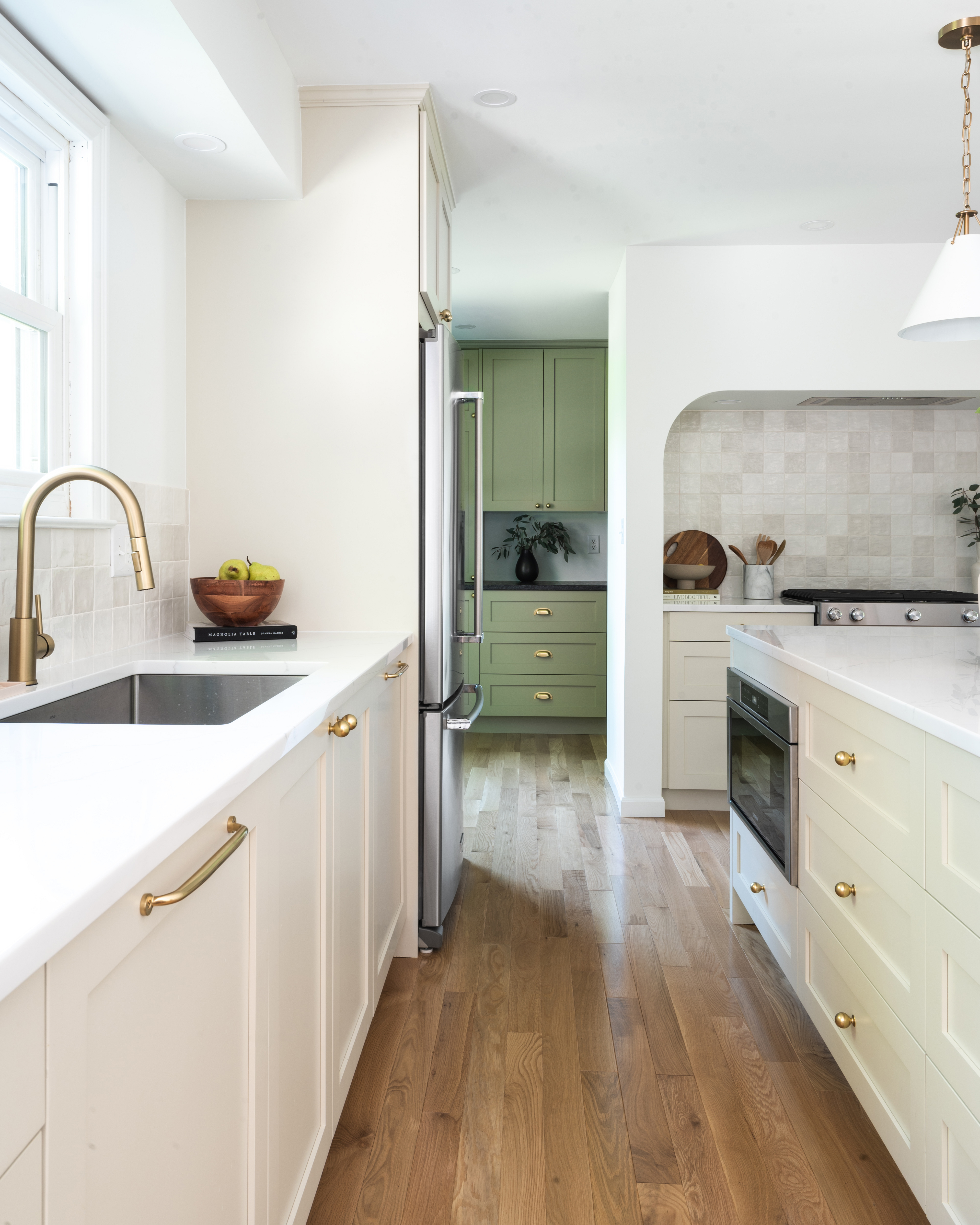
IKEA's kitchen base units and storage systems are flawless – flawless and affordable. In recent years companies have caught on that you can still use those brilliant bones, but create a more bespoke look by adding custom doors and fixtures. There are so many brilliant brands out there that can take your basic IKEA fitted kitchen and turn it into something incredibly chic.
That's what new designer Carli Kessler did for this kitchen glow-up. 'My clients reached out last year because they felt their kitchen was small, dated, and cluttered. They wanted my help creating a new layout that would open things up and make it more functional for their growing family. And they definitely wanted to update their finishes to give it a more modern look and feel. Because this was an extensive renovation, and in order to stay within budget, we opted to use IKEA kitchen cabinet frames and Semihandmade doors,' she explains
'The Semihandmade doors really changed the look of the space. We used the DIY doors and had them professionally painted in Benjamin Moore Natural Cream and Nantucket Gray. The finish is stunning. You would never know there are IKEA frames under there. Another way we elevated the space was through the hardware. We used Rejuvenation aged brass cabinet knobs and pulls and it was worth the splurge!'
2. Fit an IKEA kitchen seamlessly into your space
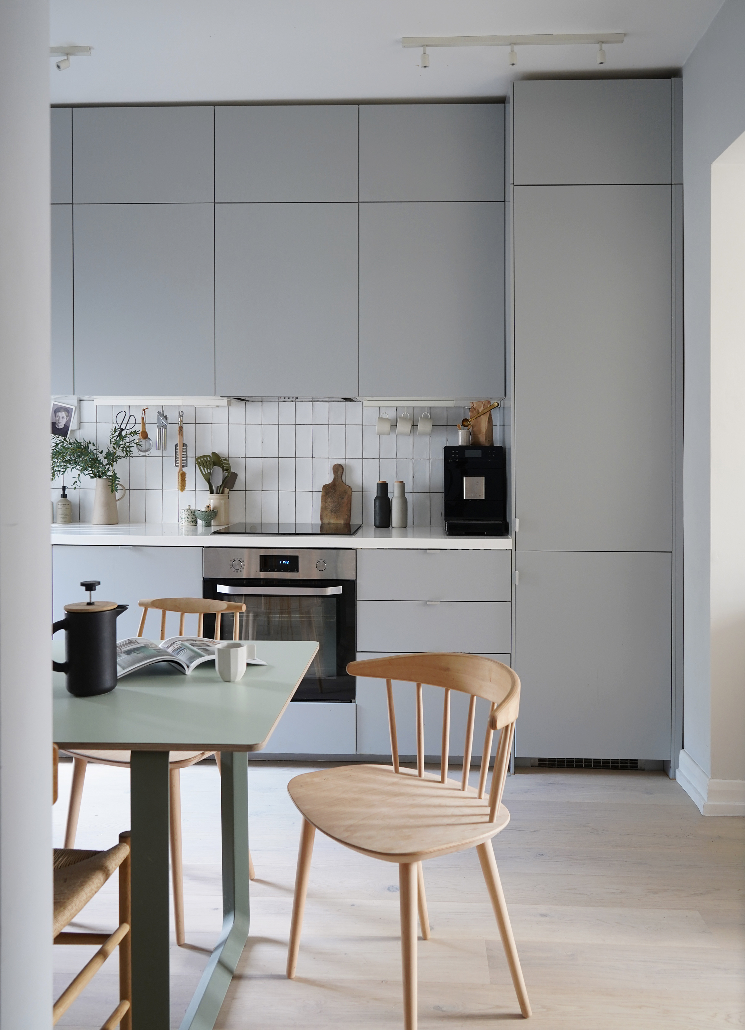
This gorgeous small IKEA kitchen is home to interior stylist Cate St Hill. It's an IKEA kitchen at its best – simple, chic, a little bit Scandi – and what we love most about it is how it really fills the space. It looks like it was designed bespoke and built in.
'We chose an IKEA METOD kitchen with VEDDINGE grey fronts,' explains Cate. 'I wanted something simple and minimal that would blend into the space and give the bespoke look for less. I love the Scandi look of the matte grey fronts and that you could choose between handles or push openers.'
'I planned the units really well so it fitted seamlessly into the space. I chose to have extra units above the top units so it looked more built-in. I also chose one of IKEA’s more expensive worktops – a white acrylic with an under-mounted sink – and spent a bit more on appliances that weren’t from IKEA so it looked more high-end.'
'Play around with the IKEA kitchen planner to see what’s possible in your space,' advises Cate. 'Working in plan will really help you get the best out of the room. You can then go through the plan with one of IKEA’s kitchen planners in store. I would also recommend going into a store and having a look at all the material samples for fronts and worktops, it makes such a difference seeing things in person. You could always buy one single front and take it home to see what it will look like in your space too.'
3. Go for a classic Shaker with a contemporary twist
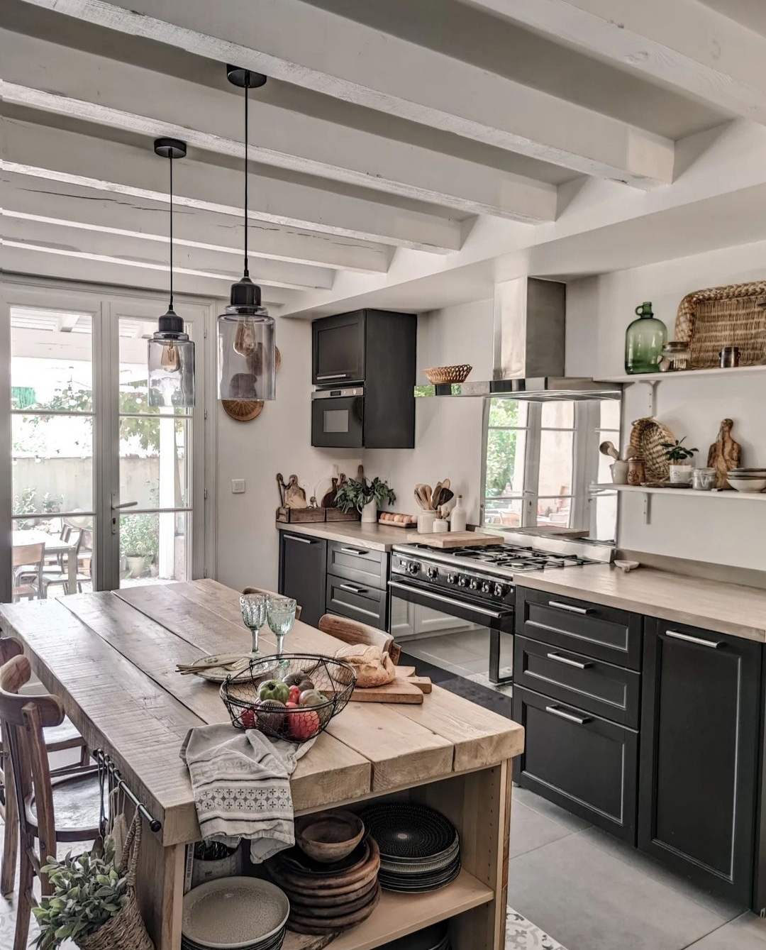
Shaker kitchens are a classic, they will always be on trend and will also be adaptable to suit any style. IKEA's version of Shaker is the LERHYTTAN, and the best part is, along with it being affordable, it comes in black. A black Shaker kitchen is how Shaker kitchens should be done. Going for a dramatic shade just instantly gives this classic style more of a modern edge.
Anne Cervoni of @unemaisondusud designed this beautiful modern farmhouse kitchen. 'When I bought my house, which was to be completely renovated, we had to move the old kitchen to the new space, so that I could recover the room to create a bedroom. We, therefore, had to think of everything so that this kitchen space would be practical and welcoming. I wanted a black kitchen because I find it very classy so we chose METOD cabinets with the LERHYTTAN finish,' she explains.
'The configuration of the room forced us to make two distinct face-to-face spaces, separated by a handmade central island. All the cabinets have been designed and optimized to take up less space and allow for plenty of storage.'
4. Blend custom designs with an IKEA kitchen
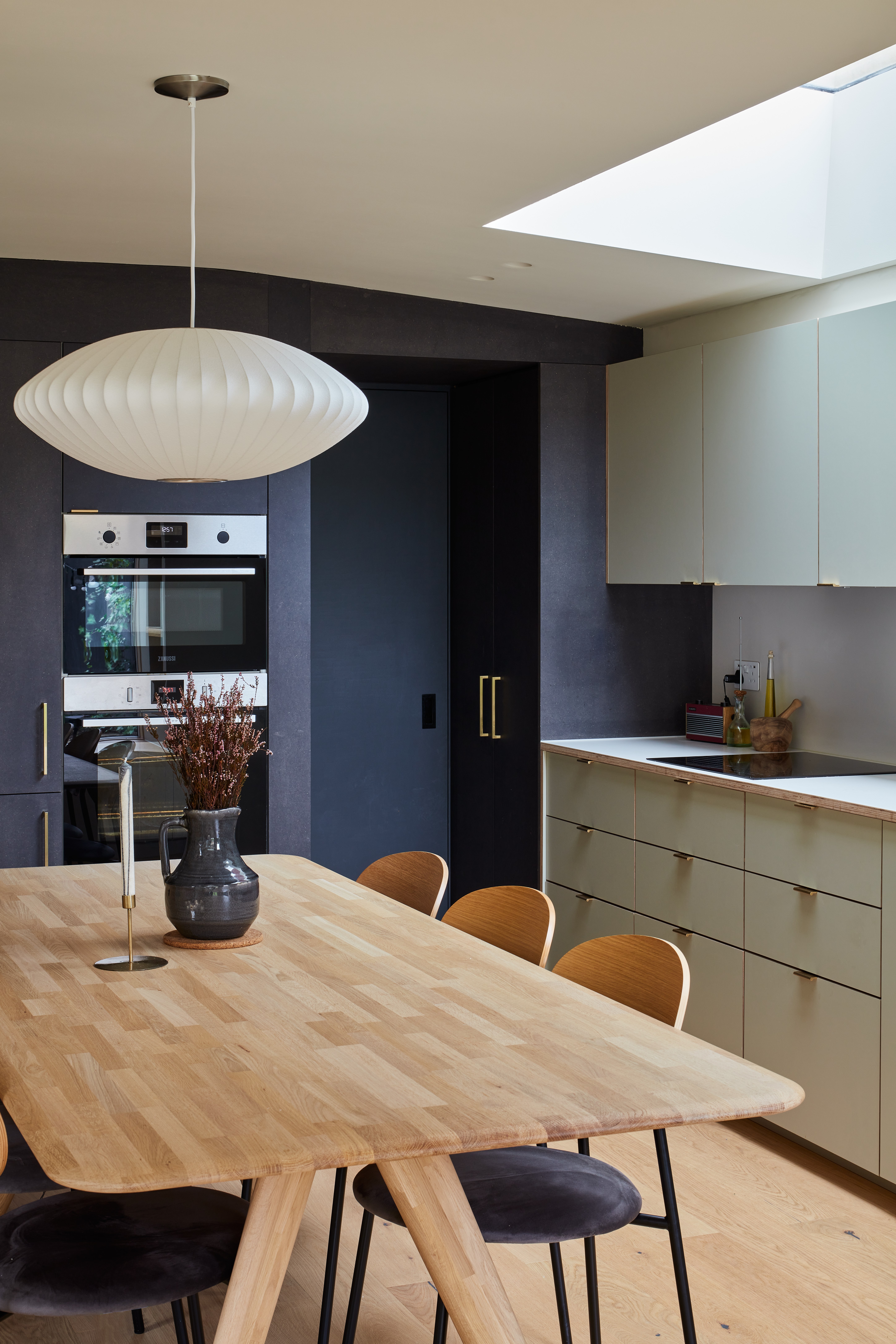
A totally custom kitchen is the thing of dreams, but going totally bespoke means having a pretty sizeable budget. However, you can create that 'built for this space only' look by combining bespoke elements with elements of an IKEA kitchen. Working with a joiner to create a few aspects of your kitchen that will give it a custom look will be a fraction of the price of going custom with all your cabinetry. That was how this wonderful transitional-style kitchen look was achieved by Prop Architects and Plykea.
'For the kitchen at our Granville Road project, we utilized a combination of fully bespoke, black valchromat joinery with off-the-shelf IKEA carcasses and Formica faced fronts from Plykea.' explains Heidi Wakefield of Prop Architects.
'By keeping the main run of kitchen units to standard carcass sizes, we were able to provide a cost-effective solution for the client, whilst upgrading the facing materials from both an aesthetic and practical point of view. We worked closely with the client to develop a material palette of natural timber, grey greens, and warm whites to deliver a calm and muted feel to this north-facing space.'
5. Mix and match textures for tons of interest
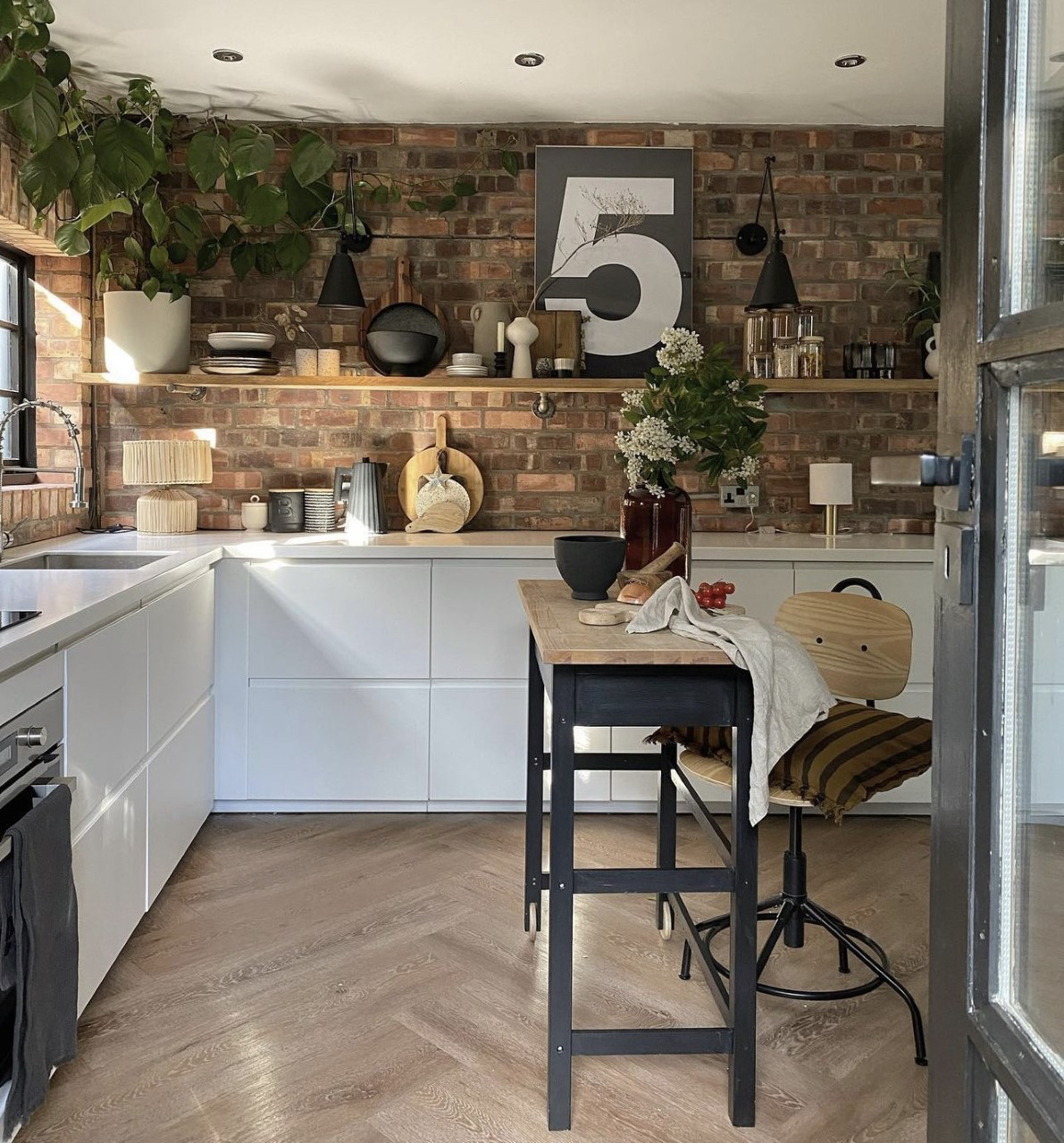
Ah, the IKEA VOXTORP, what a classic. When we think of an IKEA kitchen we think of this. It's not too much to look at when it's not in situ, in fact, it's probably the simplest kitchen IKEA do, but in the right space and with the right styling, we think it's actually the chicest on offer. It's easy to make it into an IKEA hack - just add your own accessories. As stylist Nina Gee proves.
'I chose IKEA as it's super affordable, and the turnaround is pretty quick. I’m obsessed with simple Scandinavian style and so knew the VOXTORP would work. It’s modern but gently understated so relatively timeless too. IKEA is one of my favorite brands and I knew we’d be in safe hands with their kitchen teams,' she explains.
'We went for drawers only as I think cupboards are less effective in terms of storage I like that everything is easily accessible and can be viewed openly within a drawer. It’s much easier for stock rotation and you can fit so much more in! I think aesthetically, it looks “neater” too which further highlights the more laid-back aesthetic of the brick/shelf combination. The countertop was a bigger splurge and is acrylic. It was totally worth the extra expense though as is really hard wearing and again, adds a bit of luxe to a relatively inexpensive kitchen. We also decided to go white throughout to keep the area brighter, and to allow the brick to really shine,' adds Nina.
'I knew I wanted high contrast and a real juxtaposition of texture in materiality. The kitchen units are sleek but the brick wall grounds it and prevents it from feeling too flat and clinical. I also opted for only base units as I knew I wanted an old shelf to display my favorite nik naks, to make it feel cozy and “lived in”. My advice is to avoid buying everything from one place. To avoid being too precious about everything matching and not be scared to take risks. Mixing old and new is a guaranteed way to add visual interest, layers, and to keep the eye interested.'
6. Add warmth with wooden fronts
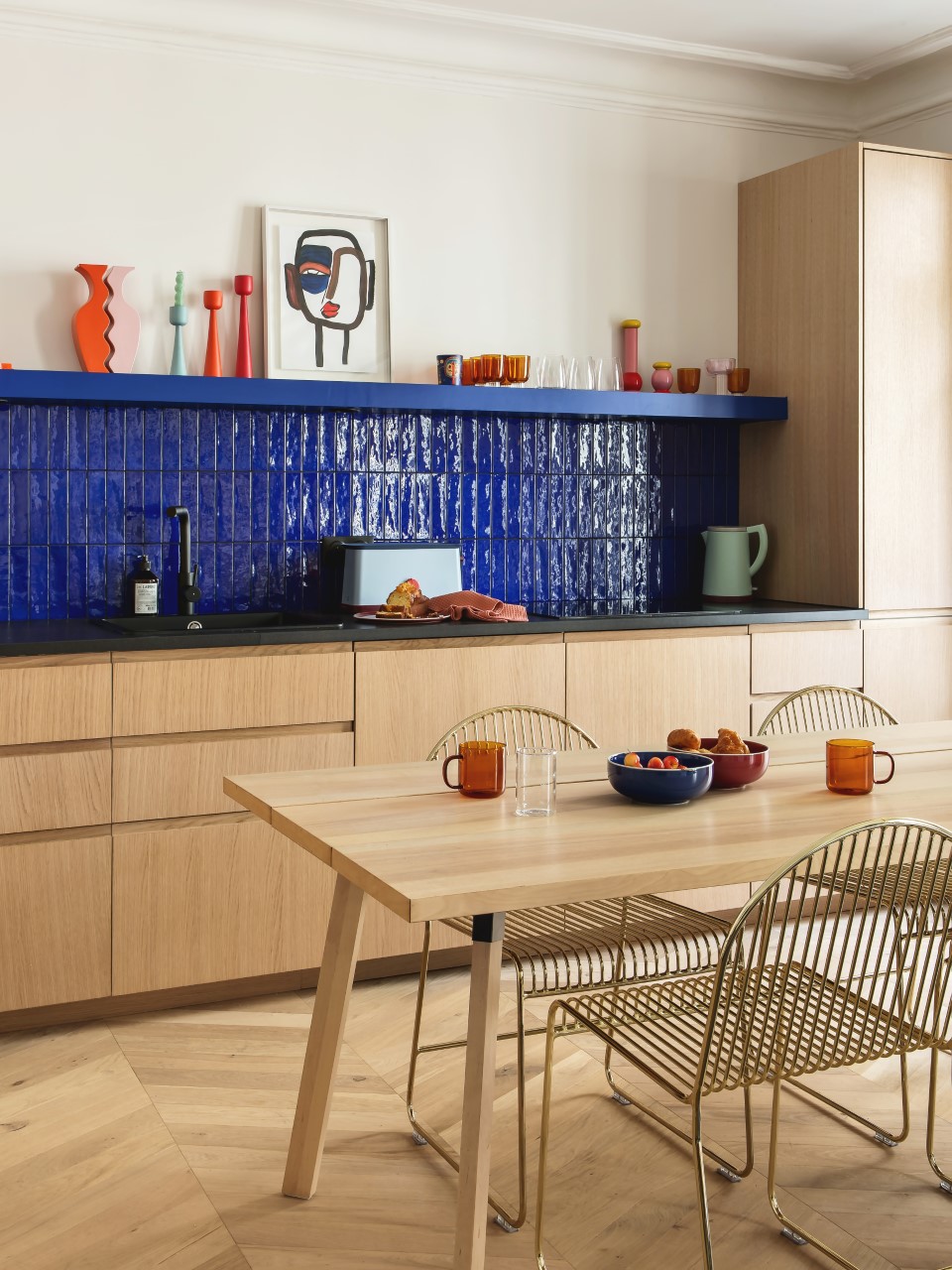
Wooden kitchen cabinets have been a reoccurring kitchen trend for years now. They bring warmth and an unexpected texture into a room that's often made up of so many hard surfaces and clean lines. Wood brings much needed softness into a kitchen.
IKEA do some great wood veneer fronts, but this fabulous kitchen takes it a step further with custom solid oak fronts from Plum. 'A Plum kitchen is on average two to three times less expensive than a high-end kitchen designer model, for equivalent quality. This is made possible by the excellent quality/price ratio of IKEA cabinets, enhanced with quality fronts,' explains Kelly Boumard of Plum.
Saving on units with IKEA frees up budget to use elsewhere too. We've said it plenty of times but what elevates an IKEA kitchen is mixing it with more unique elements. Worktops and splashbacks are where we would recommend slightly splurging as they can add all the interest you need in a kitchen – perfectly demonstrated by these gloriously high-gloss blue tiles adding texture and color and a focus amongst all that wood.
7. Enhance an industrial vibe with a stainless steel kitchen
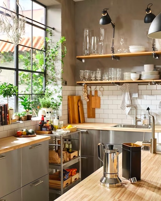
Once reserved only for professional kitchens, stainless steel has been seeping into residential spaces over the last few years and we are very much here for it. It's a surprisingly chic material – perhaps because it's still such an unexpected vibe in a home kitchen – and makes any kitchen look polished and expensive. Plus, it's super practical, it's used in the food industry for a reason. It's easy to keep clean and can stand the high traffic of a busy kitchen.
The VARSTA fronts are IKEA's answer to getting this kitchen trend on a relatively low budget. We think it looks best when mixed with softer materials, just so you don't tip over too much onto the side of restaurant kitchen. Combine these sleek cabinets with a wooden worktop, or marble for something really luxurious, and tone down the sleekness with plenty of decor and personal touches.
8. Add character with second hand finds
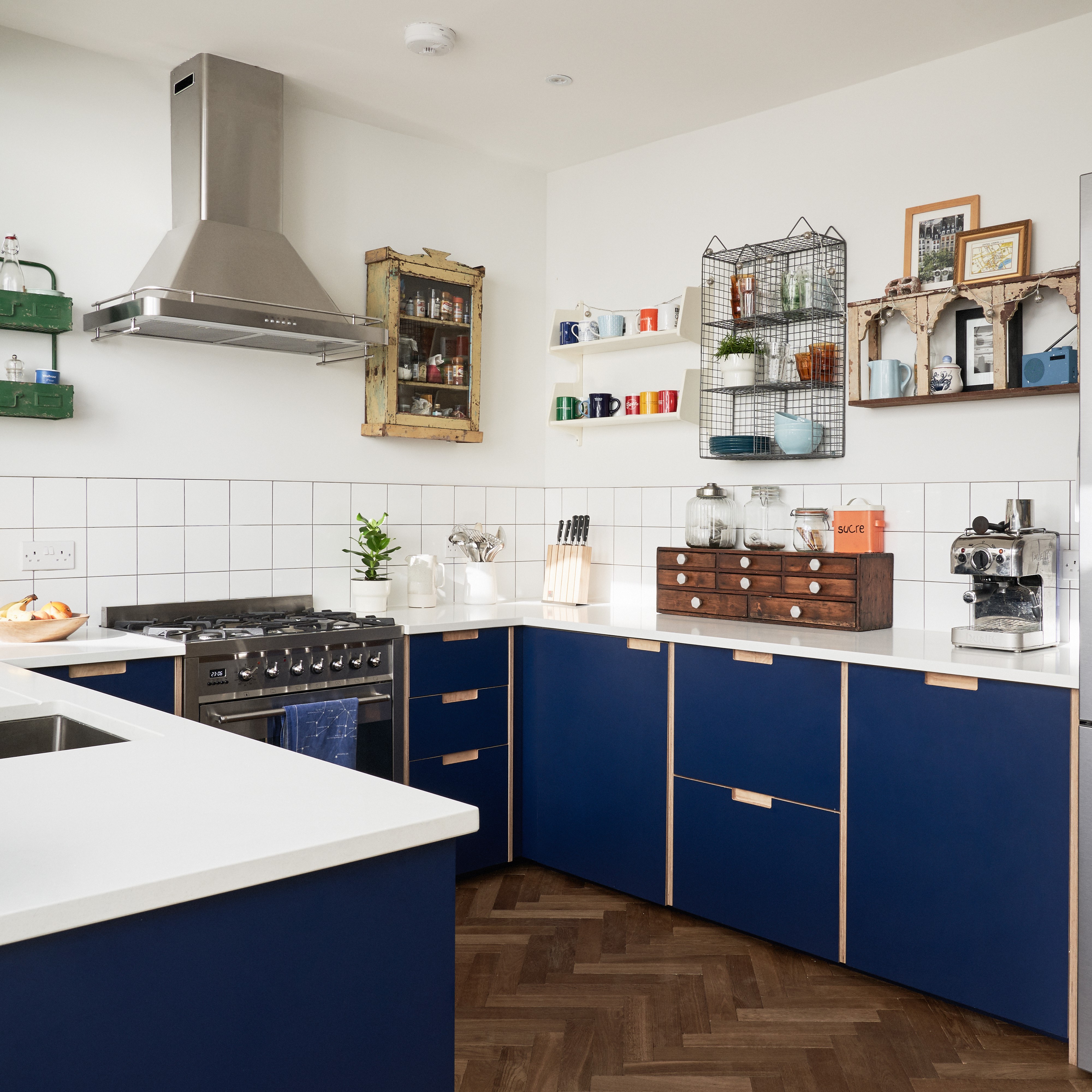
As all these fabulous IKEA kitchens have proved, the key to creating a space that fits your home and doesn't feel too... IKEA, is to mix and match with different brands, styles, and textures.
A simple way to give your IKEA kitchen some extra personality is to blend in vintage finds. That could be a big piece like an antique butcher's block or smaller elements like what can be found in this colorful kitchen by Plykea. The base units are IKEA METOD with Plykea's navy blue custom fronts, but the wall cabinets are an eclectic array of quirky vintage shelving units.
This is such an ingenious idea that we've not come across before. Ditch the wall cabinets (often a good idea in a small kitchen anyway) and instead opt for a fabulous mishmash of unique wall storage. Look to online marketplaces or antique stores for pieces that speak to you and are sure to inject something different into your IKEA kitchen.
9. Go handless for a minimalist design
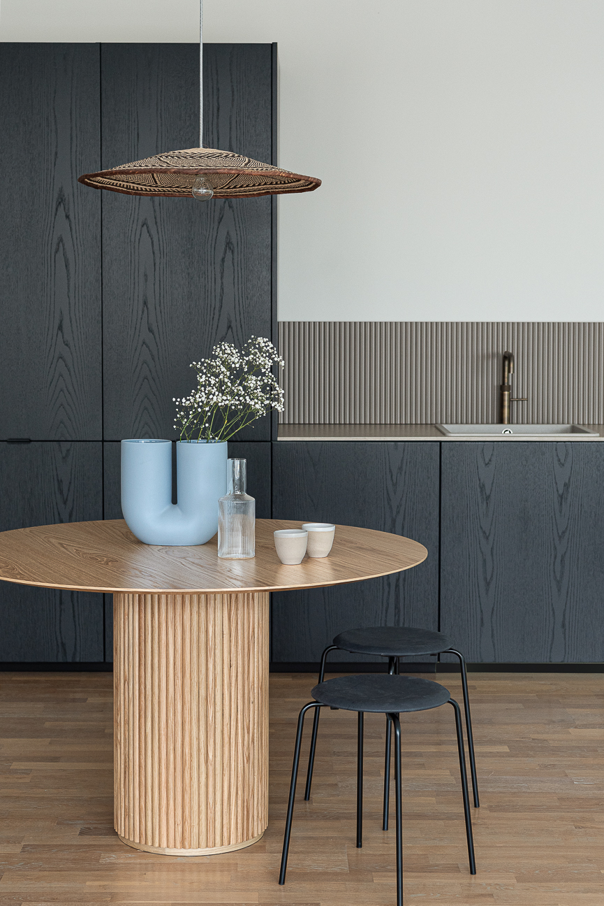
For a clean, minimalist, modern kitchen you want your cabinets to be as fuss-free as possible. Forgoing the handles will do just that – creating a seamless wall of barely interrupted cabinetry. And you can then add interest in other ways – note that in this kitchen the doors are super simple but there's that lovely wooden texture you can just catch with the light. It is contemporary, yes, but the wood gives it a warmth, a softer feel.
This deliciously dark kitchen was designed by Fronteriors, a company that take IKEA frames and turns them something into something really beautiful. They usually work with the METOD series, which CEO Kathryn Hawkes says is by far her favorite, 'Without a doubt, the Metod series is the best, as these super versatile cabinets can be used in almost every corner of your home. We have used them for bathrooms, wardrobes, dining or office consoles, stylish hallway shoe storage, etc. You name it, we’ve probably used a Metod frame for it!'
'The number one tip would be to switch our your fronts, countertops, and hardware for a massive aesthetic upgrade on the standard IKEA kitchen,' she continues 'We’ve developed plenty of small tweaks that really elevate a kitchen from looking like a box standard IKEA one. Some of these include custom-sized side panels for a seamless look, extended door lengths on top cabinets to conceal the underside of the frame and offer handle-less openings, and longer door lengths for tall cabinets – just to name a few.'
10. Mix modern and rustic with panelled cabinetry
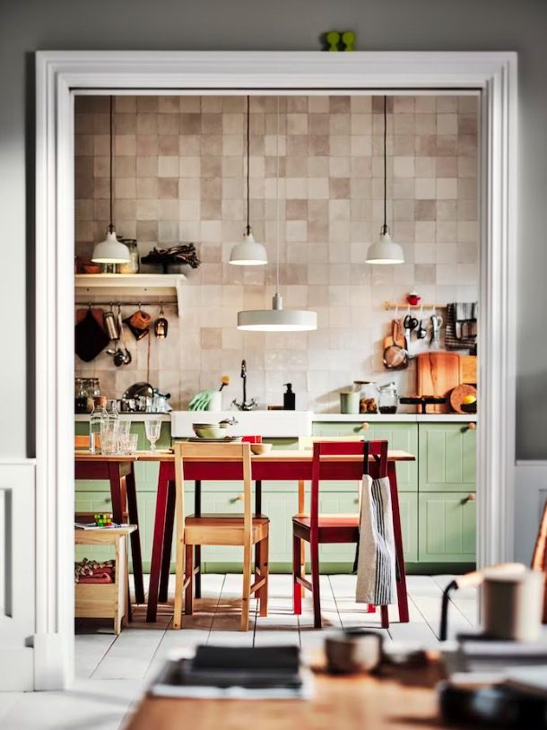
This is the IKEA STENSUND kitchen we talked of earlier. A little bit country, a little bit contemporary, it's the perfect cabinetry for creating a modern rustic kitchen. The grooved panels and lovely sage green color all point to classic farmhouse kitchen, but if you get funky with the layout of the cabinetry it can have a really modern vibe to it. And that's the best thing about IKEA kitchens, you can be so flexible and make pretty much any design fit with your style.
Case in point with this kitchen. It's stuck to just one cabinet front, a simple rectangle used the entire width of the space. The lack of wall cabinets keeps the room really open, not filling it will too much visual bulk and gives plenty of space to add personality to the basic kitchen design – the zellige wall tiles that expand all the way to the ceiling, the handy rails, hooks, and shelves that allow for both extra storage and style, and all the lovely (curated) clutter that lines the countertop.
Are IKEA kitchens any good?
Yes, we believe IKEA kitchens are good, especially if you are designing a kitchen on a budget. The different modular systems make them really flexible and the design process is made really simple with the online kitchen planner and having a kitchen expert on hand to help. Also, the installation times can be really quick too, so if you are on a time crunch they can be good options. In terms of choice, you are spoilt and IKEA are constantly bringing out new ranges and colors as trends change, so that's a win.
What about quality? IKEA base frames are made from coated particle board (the fronts themselves vary in material), it's strong but speaking from personal experience it's not the strongest and can chip over time and warp when wet. However, for the cost, you've got to expect them to be lighter weight and we think for the versatility and the massive amount of choice you have with the base systems you'd struggle to find better quality elsewhere.
What are the best IKEA kitchens?
The best IKEA kitchen will come down to your personal style. If you are a fan of a rustic country look, check out BODBYN, LERHYTTAN (both Shaker styles), and STENSUND (paneled fronts). For a modern look, some of our favorites are MAXIMERA, BODARP, and VOXTORP. Spend some time over on the IKEA website, they have loads of inspiration broken down into styles to help you decide on the right one for your home. And of course pop into store where you can see the designs in situ and get a better idea of the colors and finishes.
Be The First To Know
The Livingetc newsletters are your inside source for what’s shaping interiors now - and what’s next. Discover trend forecasts, smart style ideas, and curated shopping inspiration that brings design to life. Subscribe today and stay ahead of the curve.

Formerly the Digital Editor of Livingetc, Hebe is currently the Head of Interiors at sister site Homes & Gardens; she has a background in lifestyle and interior journalism and a passion for renovating small spaces. You'll usually find her attempting DIY, whether it's spray painting her whole kitchen, don't try that at home, or ever-changing the wallpaper in her entryway. She loves being able to help others make decisions when decorating their own homes. A couple of years ago she moved from renting to owning her first teeny tiny Edwardian flat in London with her whippet Willow (who yes she chose to match her interiors...) and is already on the lookout for her next project.
-
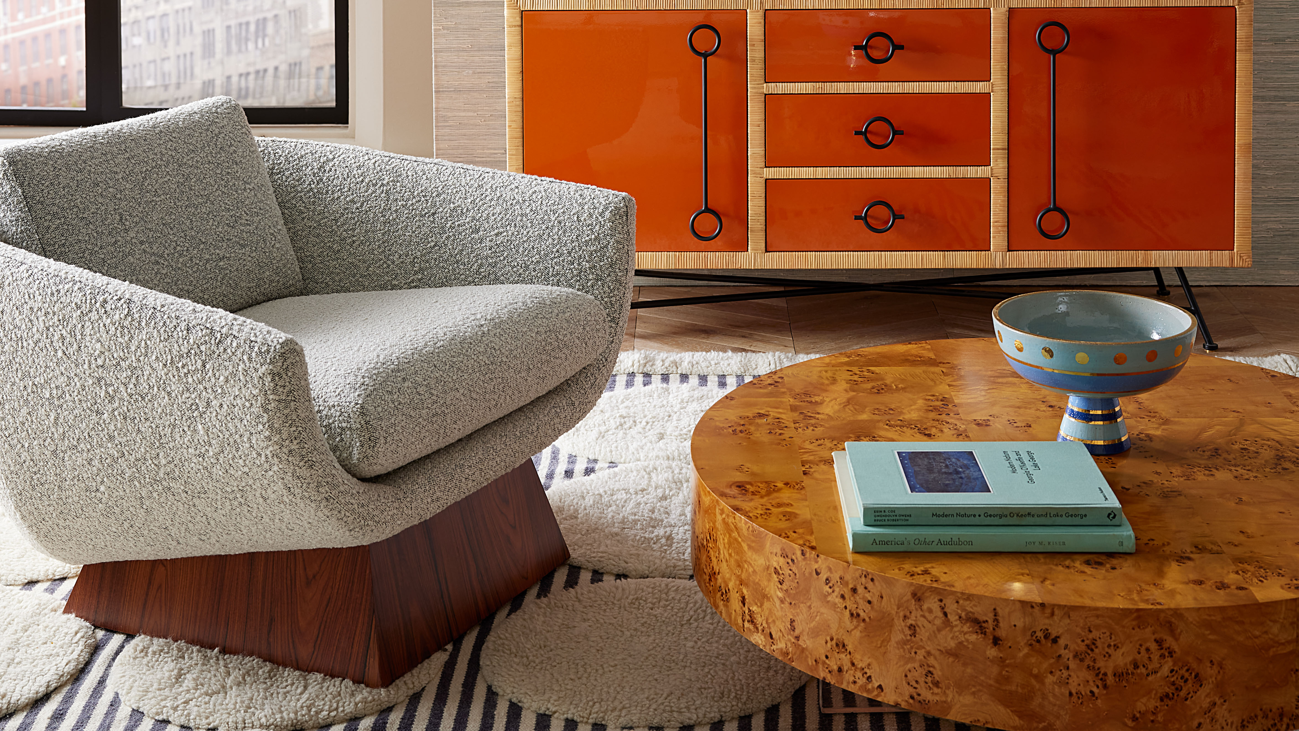 Burl Wood Decor Is 2025’s Most Coveted Comeback — Here’s How to Get the Storied Swirls for Less
Irregularity is the ultimate luxury, but you don’t need an antiques dealer to find it
By Julia Demer Published
-
 5 Garden Features That Instantly Add Value to Your Home — While Making Your Outdoor Space More Practical, too
Get to know all the expert tips and tricks for making your backyard a standout selling point for your home.
By Maya Glantz Published