The 16 Rules of Interior Design The World's Best Designers Have Told Me
These 16 basic rules of interior design are the ones I've been gifted by the most creative minds behind the most beautiful rooms, and are all you need to make a scheme
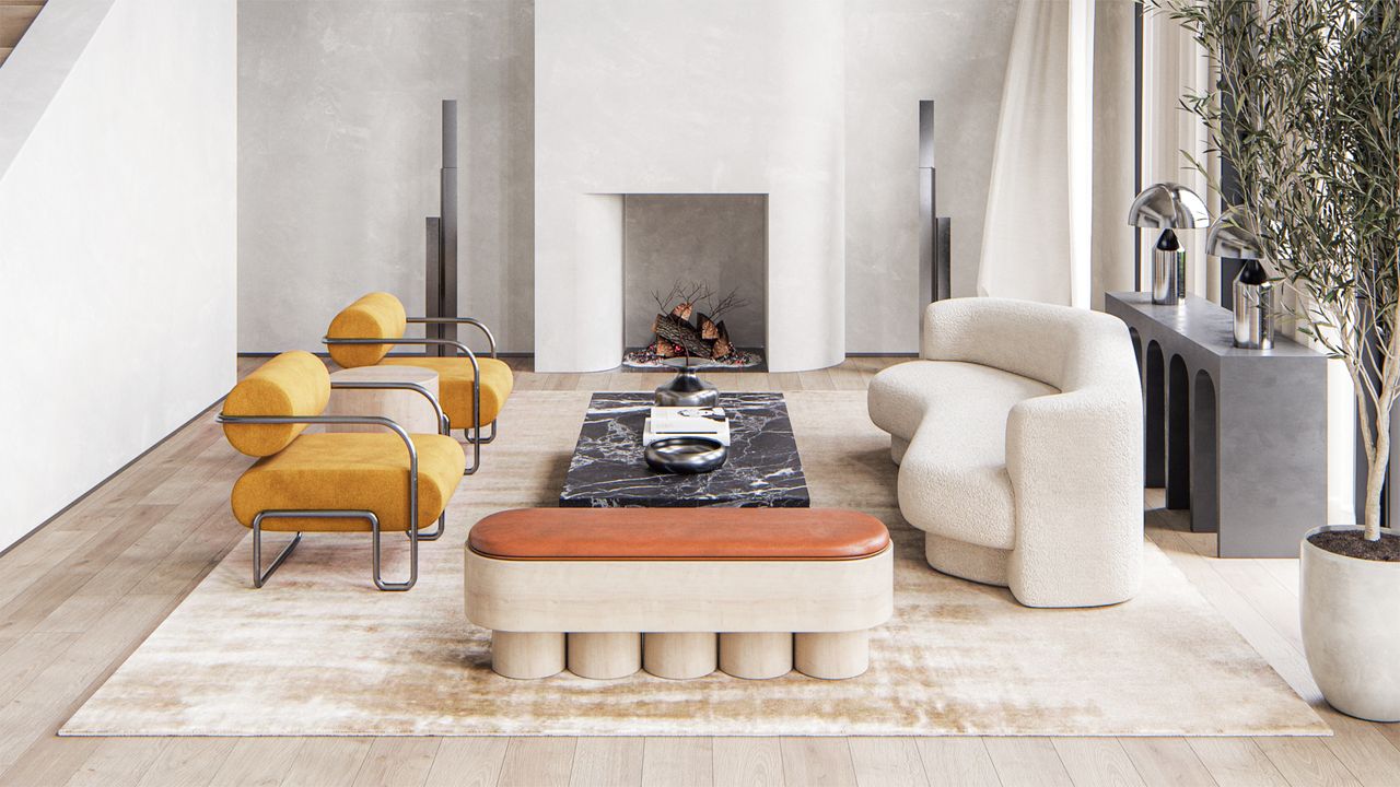
Good interior design can make you feel amazing. It can uplift you, it can soothe you, and it can - truly - make you feel better about your life. The right color choice, the little bit of extra flair, the shape or curve or finer detail that brings a room together can uplift a room from ordinary to extraordinary.
'Interior design should be fun,' says Joa Studholme, head of color at Farrow and Ball. 'A little playful, a bit sophisticated, and used to create spaces that make you smile.'
In my 20 years as an interiors journalist, I've interviewed countless interior designers, watched trends come and go, and been inspired by numerous ideas. Here are the 16 I think apply best to design right now, the ones that have helped form Livingetc's view on what style looks like today. And they're the ones I'm currently referring back to again and again as I redecorate my own home. They are easy guidelines to allow you to create the perfect modern space, full of personality, charm, and rooms that enrich your soul.

As the editor of Livingetc, Pip spends his days speaking to the greatest design minds alive today. He has all the best interior designers in his contacts book, and has written hundreds of articles using their knowledge, explaining how readers can decorate their homes. For this piece, he too the very best pieces of wisdom fro the world's very best designers.
Interior design - the 16 best rules to start you off
1. Put a person on your moodboard
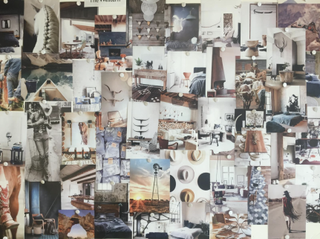
A moodboard for a Livingetc shoot that included people living the vibe we were trying to create
When creating a moodboard, it can be hard to know where to begin. Which colors to pick, which fabrics to go for, how you want the room to make you feel. The chocies are overwhelming.
That's why international interior designer Tara Bernerd always begins the process with a picture of a person, rather than a piece of furniture.
'Always throw an image of a person into the mix from the start,' Tara says, using the example of a living room she created which had a picture of Robert Redford. 'It could be a hand holding a handbag over a shoulder, a woman in a linen suit, the clunk of a tortoiseshell bracelet that speaks to me about how I want to feel when I'm in the room. This helps you to center the DNA of the the space, to work out what the story is and who or what you're trying to create the decor for - specifically, how you want to feel when you're in the room. By distilling that attitude into every design choice you then go on to make, you can easily create a cohesive look that has an emotion at its core.'
2. Get the feeling of a room right
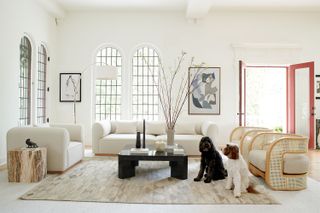
Using an evocative person to help you build the mood of a room is key to a successful end result. Because no matter how you want a room to make you feel - calmed, uplifted, energized - that emotion is what stays with someone far longer than how it looked.
'People don't remember every piece of furniture in a room,' says the interior designer Brigette Romanek. 'But they will remember how they felt when they were in it.'
So focus less on having the right stuff, and instead, more on having the right energy. 'More than ever, I think good decor is about energy,' Brigette says. 'If you can create a space people want to sit in for hours, and have drinks or chats or good times, then you'll be making yourself and others happy.'
The short way to do this is to ask yourself how you want to feel in room. If it's comforted, then go for darker colors and layered textures. If it's uplifted, then go for lighter colors and rounder shapes.
3. Start by looking at the space through your phone
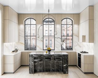
It can be hard to know where to begin with a room, and designer Noa Santos suggests taking images of it on your phone and studying its angles.
'Use your phone as a tool - pretend like you're a photographer and just look at it what is feeling unbalanced, and go from there,' Noa says. 'It’s helpful to see and analyse those photos as design can be enjoyed in smaller gestures - it may be as simple as starting with a corner of your house.'
This is an approach that really works - it helps you to see a room differently and focus on how it looks. This is harder to do in by just being in the room, when you can get distracted by how it feels.
4. Nothing is more key than comfort
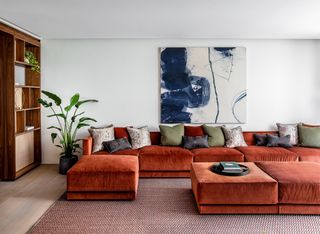
In all the aesthetic planning it can sometimes be hard to remember that a spacde has to be comfortable. It's not just key for a couch look good - if you can't lie back on the arms while watching TV reclined across its perfect sofa dimensions, then what's the point?!
'Comfort is key to a home, it has to be,' says the designer Bethan Gray. 'But comfort isn’t just about how literally comfortable a room is - it’s also about how easy it is to live in it. You’ve always got to factor in the functional things, like somewhere to put your coffee cup or wine glass when you’re relaxing - a little end table at the side of the sofa is key. If a layout isn’t thought through like this, about how you’ll use it, it’s not comfortable. Also, the view needs from where you’re sitting needs to be relaxing.'
5. Begin your decor with a conversation piece
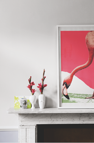
Award winning designer Yinka Ilori agrees with Brigette Romanek that what matters most is what people take away from a room. 'I like to think of design as a way to make memories,' he says. 'By getting people to laugh or share a good time together, you're allowing them to create a shared memory, which is a way for them to feel connected.'
He suggests that the best way to do this is to begin with what the talking point will be, and work outwards from that. 'When you’re decorating a room, your starting point should be ‘what is the takeaway going to be?’' Yinka says. 'It could be a color, a texture, a word - or a flamingo! - , but knowing what the key moment will be allows you to create a real design story.'
6. Know the differences between all the whites
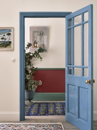
Walls painted in School House White by Farrow and Ball
The amount of white paints available is overwhelming. Thankfully, there are some simple rules for picking the right one for your room. This involves looking at the pigments that have gone into each white - these are always listed on any paint brand's website - and choosing the ones that make sense in the space you have.
'Simply put, use whites with blue tints for cool, urban spaces, as they have a Scandinavian design feel to them which is really contemporary,' says Farrow and Ball's head of color Joa Studholme. 'Red-tinged whites work for warmer urban spaces, as they reflect and enhance the brick that tends to surround them, and add a note of coziness ideal for a family space. Green whites look good in cool country homes - think the modern farmhouse vibe - while yellow whites are ideal for more traditional rustic spaces.'
Joa says that if you're nervous of making the wrong choice then stick to softer whites, rather than the more brilliantly white paints. 'I've created School House White, Shaded White, Shadow White and Dropcloth for Farrow and Ball, and they all have a stony base to them,' she says. 'You just can’t use them wrongly.'
7. Never use a color in isolation
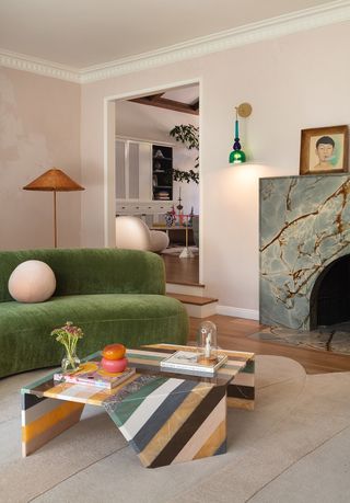
Design by LALA Reimagined
Another hard part of interior design is making a house feel cohesive. But linking spaces together, even if you've gone for a maximalist color palette, is straightforward and turns your home into somewhere that reads as artful, considered and well thought out.
This comes down to never just using a color once in your home. 'There does have to be a through line,' says the stylist and fashion legend Lucinda Chambers. 'Diana Vreeland always said that the eye had to travel, and when you walk into my house there are always colors that link spaces. I have an electric yellow dining room, but in the hall there is a picture by Jack Davison with a tiny bit of yellow in it. This sort of creeping color is so unobtrusive the person won’t even register it, but it’s a connection, and it sinks in by osmosis.'
Within a room, this is a clever way to approach using pattern. Despite the striped coffee table by Patricia Urquiola for Artemest seeming like a tough piece to blend into a scheme, every color in it is used again elsewhere in the scheme.
8. Think about the symmetry
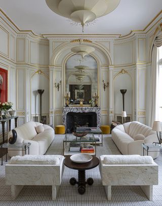
Photograph by James McDonald
When focussing on furniture placement, it can be helpful to fall back on the traditional approach of using symmetry. Two chairs that mirror each other, or sofas that act like twins. Even wall lights either side of an art work can help to bring a sense of order. It's an easy way to achieve balance in interior design.
'It's quite a traditional approach, but it works,' say the interior designer Bryan O'Sullivan. 'The trick is to put a twist on it, to use modern organic shapes rather to make it feel contemporary.' He used this technique to perfection in the living room above, softening the grand architecture with the rounded sofas.
He suggests centering the layout around a window or fireplace, and building it from there.
9. Include contrasts
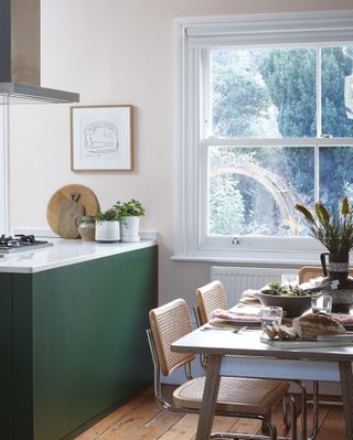
When choosing a color palette, use color theory to guide you. It's based around a wheel of shades, and the basic principle is that the colors opposite each other will work together.
And within the nuances of the wheel, there's one simple rule to remember - contrasts are always key. A matching scheme feels one note, without flair, a little like you've been too nervous to try anything else.
Designer Matthew Williamson is the master of getting this right. 'I’ve always been drawn to pinks and greens together, they’re a comfy combination, ' he says. 'The trick is to contrast them - a dark olive with a powdery calamine, a soft green with fluorescent flamingo. Pink is a neutral to me, it’s like beige but warmer. I’ve just done my lounge in my London house in a pink from Pickleson Paints, and the bedroom in green - mid tone green on the walls, darker green on the ceiling. It’s about not pairing too many vibrants - or pale - colors together - I wouldn’t do purple and orange.'
10. Don't have a default for ceilings
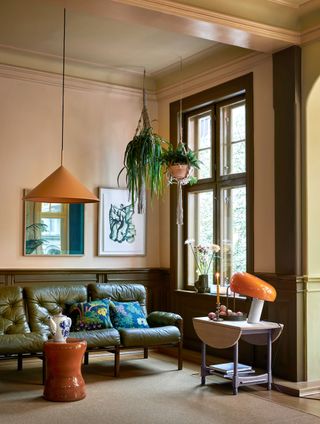
As to when and how to paint a ceiling or not, there is no hard and fast rule. Instead, it depends purely on the space itself.
On the whole, rooms where the ceilings aren't just white by default are more interesting and contemporary. However, you can base this decision on the height of the walls.
'If you have low rooms, you should always use the same color on the walls and ceiling so your eye can’t tell where the wall ends,' says Farrow and Ball's Joa Studholme. 'If you’re lucky enough to have tall spaces, you can highlight them a bit more, by contrasting a soft white with stronger color on the walls.'
There is also a third way - picking a color that is neither on the walls nor white.
'The warm green on the ceiling [above] is perfectly in order because it relates very strongly with the khaki at the lower level,' says Little Greene's creative director Ruth Mottershead. 'It is a similar tonal strength to the terracotta wall color and so does not compete. In this case, the ceiling color is a diluted version of the khaki. This is a clever way of decorating without pure white as these very diluted colors behave as white and satisfy the requirement for a lighter ceiling whilst maintaining a more comprehensive scheme. To choose the correct diluted color for the ceiling, pick one of the key colours in the design scheme and find a white with a hint of a similar hue.'
11. Don't try and be fashionable with the floor
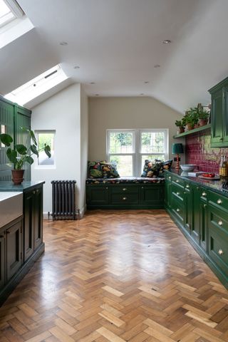
Realistically, a floor is something you will only change once in the entire time you live in a house. Maybe twice, if you're updating the carpet. And while flooring trends come and go - with cork being bang on for right now - you want to make a decision you can live with for many years.
'It pays not to be too fashionable with flooring,' says the interior designer Russell Sage. 'Opt for a material with longevity rather than something that is on trend. While very stylish at the moment, a white carpet isn't going to be practical.'
Instead, timeless choices like herringbone parquet, a checkerboard entryway or wooden boards will age gracefully as you live in a house, working with every other decor update you will inevitably make.
12. Storage needs to be built in
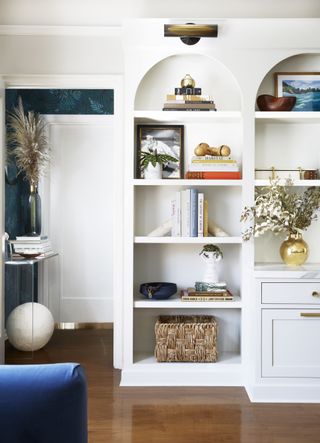
For a room to be usable and functional, storage needs to be incorporated into the very fabric of the scheme. There is a huge amount of joy to be found in having stuff, but only if you know how to store it.
When the experts are thinking about interior design, they're always thinking about how and where they'll be adding storage. Drawers are usually more useful, as you don't have to keep everything in them tidy while on display - always include some in any living room shelving.
'Consider what you're wanting to store, how often you need to access it, and how easy it will be to do so,' says the interior designer Clare Gaskin. 'Consider what you're wanting to store, how often you need to access it, and how easy it will be to do so. Sometimes drawers can work really well, other times, access from the top is best.'
Clare suggests looking for hidden spaces in every room to keep more of your things. 'Banquette seating can be designed with drawers of lift-up storage, while any available recesses can be used for storage, with discreet knobs or push catches for access. Smaller voids may just be a space for keys, but every little counts!'
13. The placement of seating matters
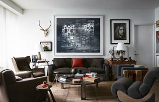
There is a big sofa trend at the moment for conversational seating. For furniture with curved edges that draw people together and allow them to feel cocooned, connected, and like they'd want to chat.
This vibe can easily be achieved with any seating. 'I'll angle seats towards each other to create conversational pools,' says the designer Robert Stilin. Many of his rooms center on a sofa, and two matching armchairs that face in towards the sofa, encouraging discourse between anyone who sits in them. It's a mood shift away from making the living room TV the focus, and part of a wider trend, spoken about earlier, for rooms that help people forge bonds. What this means is that simply by the angle of a chair, the way it faces another rather than the television, you can shidt the entire mood of the room.
14. If in doubt, stay neutral on the walls
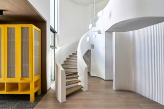
While many designers are confident and accomplished enough to use bold prints and clashing colors, it can be daunting to know what to pair. Fortunately, neutral color schemes are far from boring, and pale really is interesting.
'Beige has never left us,' says the internationally acclaimed designer Kelly Hoppen. 'Think of it as the perfect base color, like when you’re putting on make up. You apply it first, then layer other things on top. It’s ideal for this.'
She suggests using it on the walls, then going bolder on the furniture. 'I really like yellow, and pops of red,' Kelly says. 'Emerald greens and whites and then black for the floors. A modern red chair or footstool and then an old tapestry on the wall.'
Designer of the moment Beata Heuman agrees. 'The best way to dabble in color is to keep walls neutral, then add a splash with furnishings,' she says. 'This also works if you have a large open plan space. Keep walls light, then layer in color - the more the better. If there's a bit of everything, nothing looks out of place.'
15. Always have a plinth...or at least the mood of one
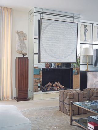
Jonathan Adler is a great believer that every home should have a plinth - the sort of pedestal you can display your favorite objet on. 'I love plinths,' he says. 'Fill your home with them – so unnecessary but so fabulous.'
Now, clearly a plinth isn't an actual essential. It's not, say, bed or a table to eat at. But what they do is provide an opportunity to show off your most treasured possession, placing it firmly in the spotlight. And this is a way to think about design. Even in minimalist interior design, there is still a belief that wonderful things should have room to be appreciated, uncluttered, and adored.
So whether you have a plinth or the top of a cabinet or some open shelving, always find room to put the pieces you hold dear fully on view. They're what make a house a home.
16. Believe in your DIY abilities
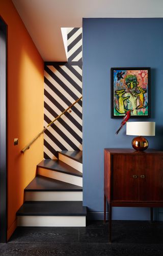
There are some jobs its advisable to get a professional in for. Rewiring, new heating systems, and most modern bathroom fittings.
But putting yourself to work in other areas is a good way to not only save money but to bring your own vision to life - it's surprisingly common to brief a decorator only to not get quite the result you'd hoped.
And the thing is, you have the skills within you. 'We’re all makers,' says the designer Sebastian Cox. 'You could plaster a wall. I mean, ceilings are hard - don’t do ceilings until you’ve really practiced on how to paint a wall - but we’re all evolved from makers. Our ancestors cooked and built stuff - if they didn’t, they wouldn’t have survived - so we have it within us. You just need a bit of confidence, everything is learnable from the internet.'
Go on, pick up that brush....
Be The First To Know
The Livingetc newsletter is your shortcut to the now and the next in home design. Subscribe today to receive a stunning free 200-page book of the best homes from around the world.
The editor of Livingetc, Pip Rich (formerly Pip McCormac) is a lifestyle journalist of almost 20 years experience working for some of the UK's biggest titles. As well as holding staff positions at Sunday Times Style, Red and Grazia he has written for the Guardian, The Telegraph, The Times and ES Magazine. The host of Livingetc's podcast Home Truths, Pip has also published three books - his most recent, A New Leaf, was released in December 2021 and is about the homes of architects who have filled their spaces with houseplants. He has recently moved out of London - and a home that ELLE Decoration called one of the ten best small spaces in the world - to start a new renovation project in Somerset.
-
 This Storage Coffee Table Has Drew Barrymore's Stamp of Approval — And It Brings Secret Storage to Your Living Room
This is certainly not your average coffee table. With a removable lid that reveals a storage pit, this coffee table can store living room clutter in the most stylish way
By Devin Toolen Published
-
 Believe It or Not, 'Fridge Feng Shui' Is a Thing — And These Are the 6 Things You Should Be Doing for It
Even concealed appliances like fridges count in the world of Feng Shui. So if you're keen on optimizing the energy in this space, here's how to do it
By Amiya Baratan Published