Designers Say This Kitchen Mistake is What They Notice Most — Have You Avoided It?
Choosing the wrong kitchen backsplash color, finish or layout could break the look of the room. Experts point out common errors to watch out for

While it may seem like a small element, a kitchen backsplash plays a significant role in tying the entire room together. Since it sits at eye level and is immediately noticeable, its installation, design, and finish matter a lot.
To ensure that you choose the right options, we reached out to experts to learn about the common errors people make in kitchen backsplashes. After all, its appearance, lifespan, and quality are important to eventually prolong the life of your modern kitchen. Take a look at these mistakes and their solutions.
1. Choosing mirror tiles
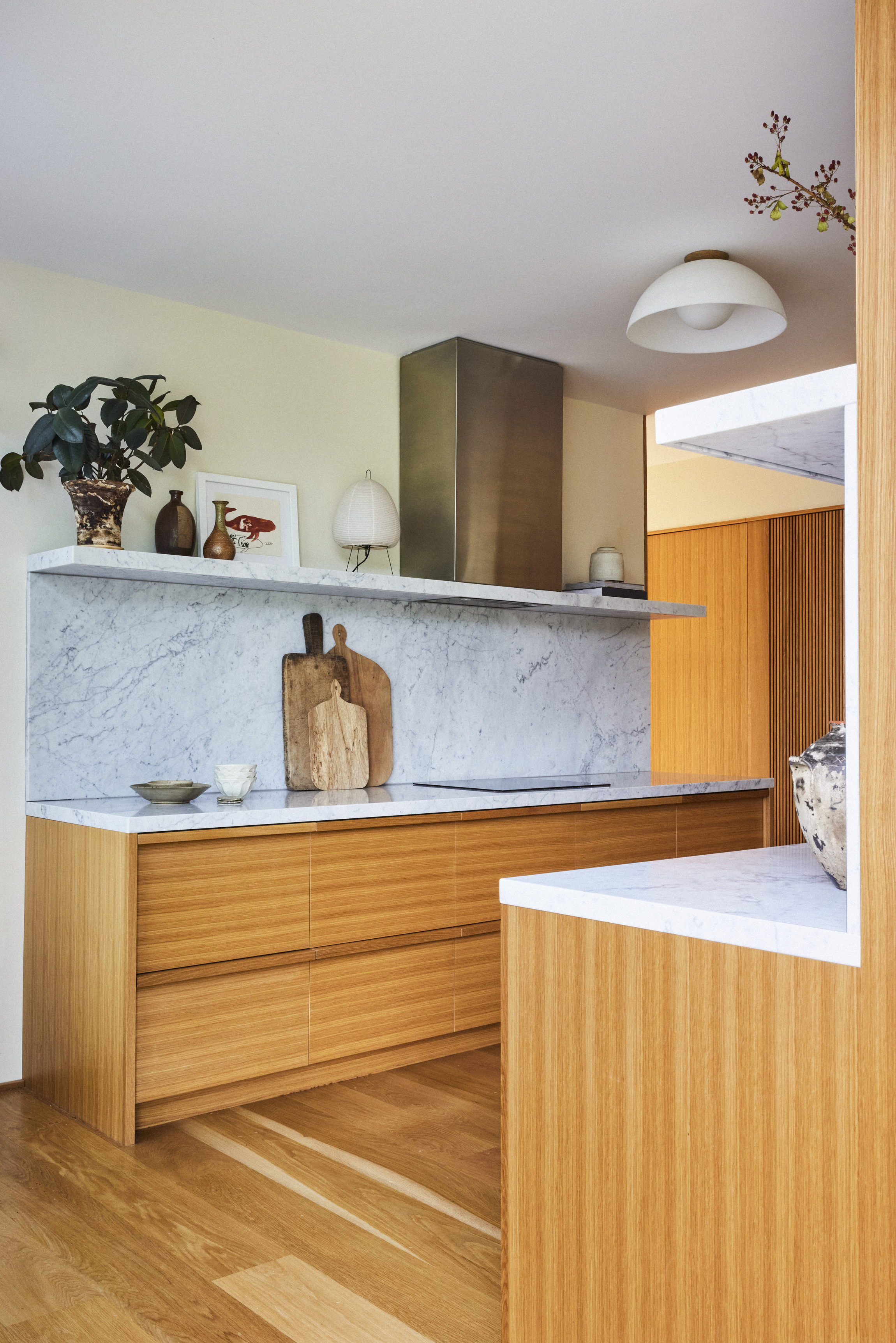
One kitchen backsplash material that is not worth investing in is mirror tiles.
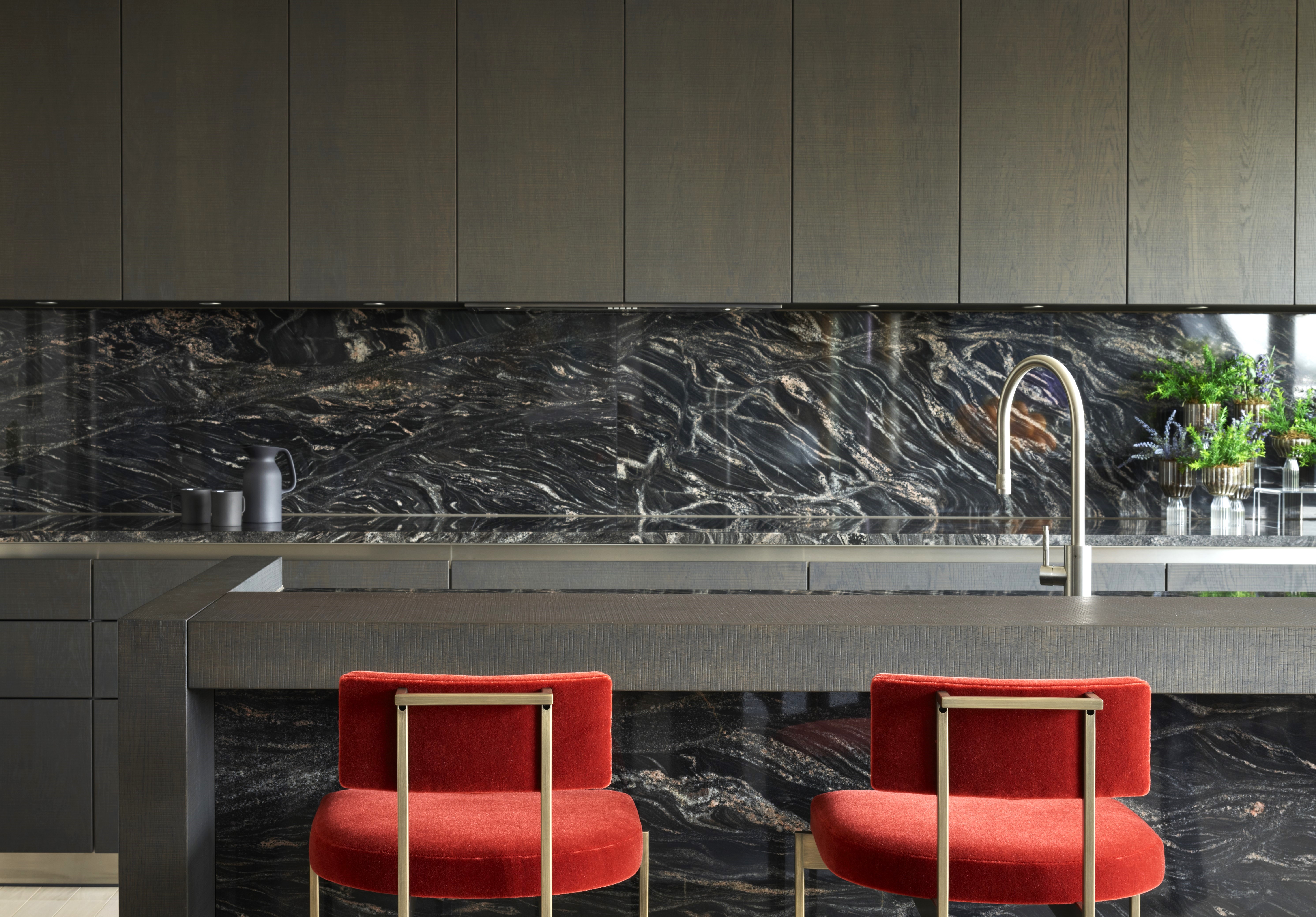
'Super shiny materials like mirror tiles are best avoided,' says Julia Mack, founder of Julia Mack Design. 'The reflective surface magnifies food splatters and oftentimes reflects people in an unflattering way. Plus they could crack if exposed to high heat. Conversely, the best materials are large format matte slabs of stone or tile with minimal grout joints for a clean, contemporary look.'
These apart, you could also look at the quartz composite, engineered stone for a long-lasting backsplash material. Brands such as Silestone and Caesarstone produce high-performing varieties that are heat-and-scratch resistant as well as extremely tough.
2. Opting for marble and granite backsplash tiles
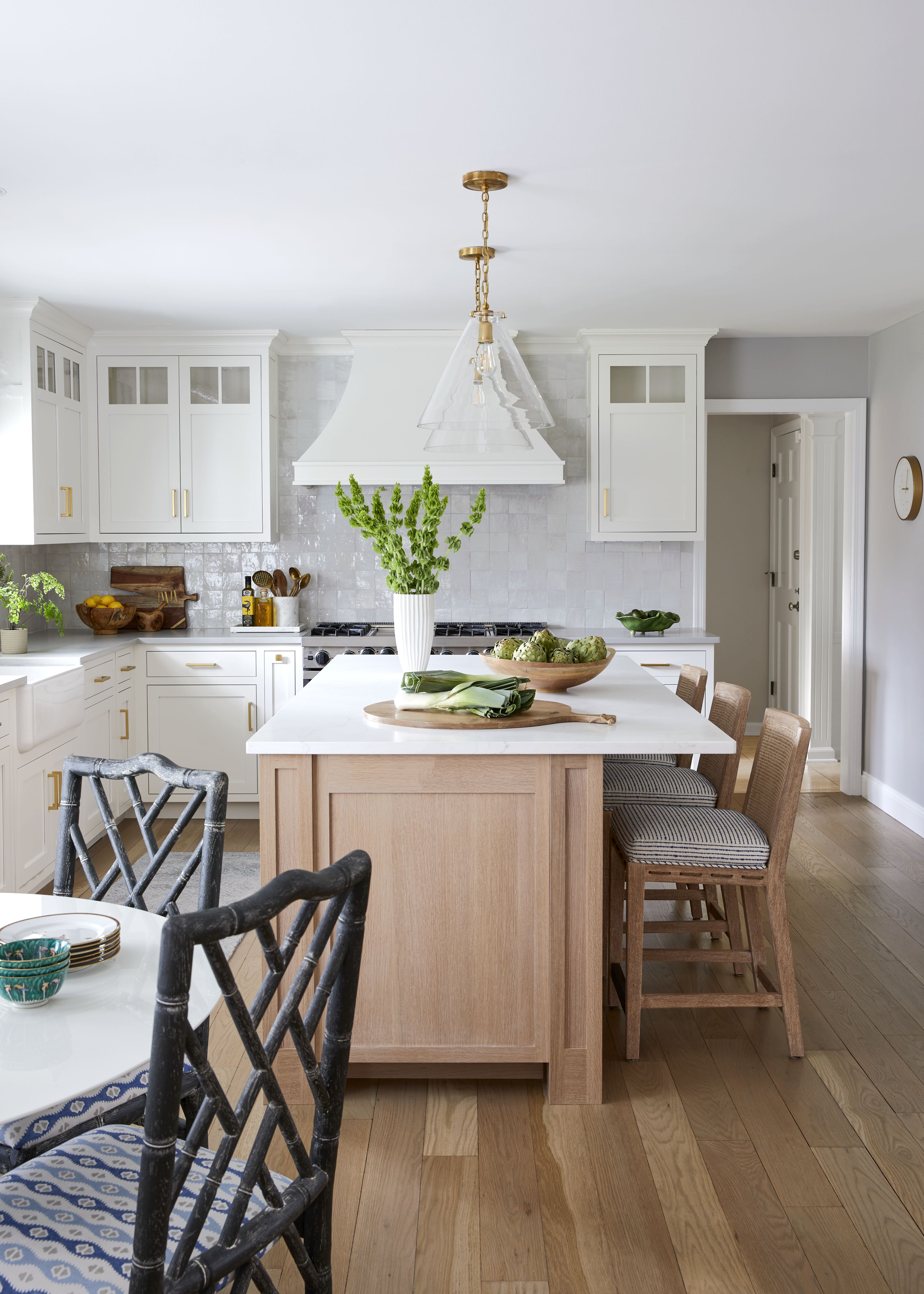
'Among backsplash materials, natural stones like marble, slate, and granite demand the most upkeep, challenging homeowners with their distinct maintenance needs,' says interior designer Nishtha Vashist. 'While the allure of these materials is undeniable, understanding their care requirements takes time. For example, granite and marble have differing demands, and it's crucial to know them before making a selection. Surprisingly, materials such as cement or terracotta can require even more attention due to their porosity, yet proper sealing can mitigate many concerns. For those seeking ease without sacrificing style, ceramic and porcelain stand out as low-maintenance alternatives.'
'Porcelain, in particular, shines for its robustness and minimal water absorption, presenting an optimal blend of functionality and aesthetic appeal for kitchen backsplashes,' avers Nishtha.
Another great contender when it comes to timeless kitchen backsplashes is zellige tiles. 'A zellige tile that looks hand-forged with some patina will create a bespoke and polished look, and last long,' says Kristina Phillips of Kristina Phillips Interior Design.
And while we're on the right tiles for the backsplash, remember to seal them periodically. Use a sealant that protects them from moisture and stains. If you neglect to seal your tiles, it can lead to damage over time.
3. Going in for a dark-toned backsplash
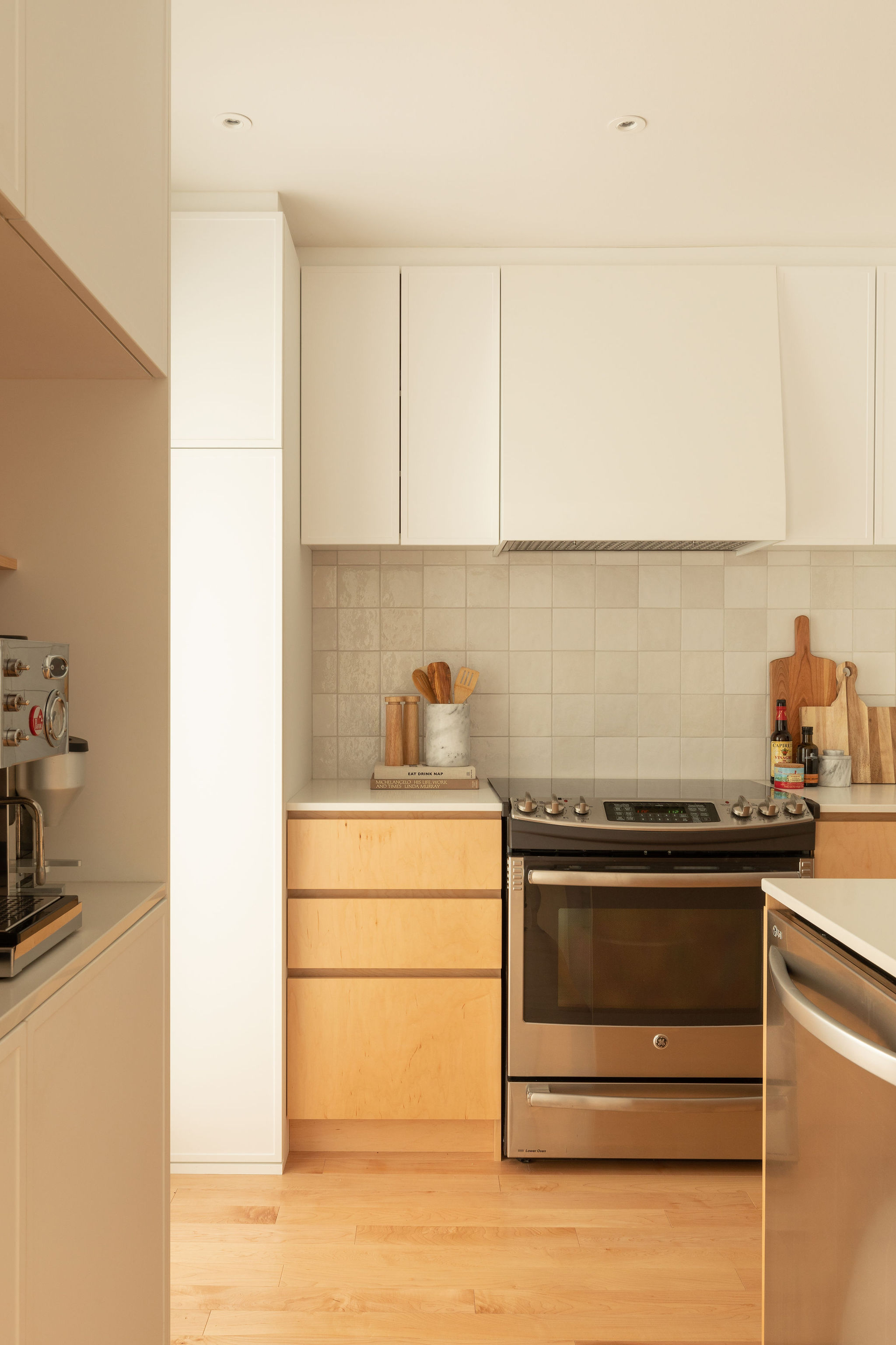
It's important to give kitchen colors a considered thought as this is an element you cannot change quickly and easily. Once you paint those cabinets or choose colored tiles, you'll have to live with them for a few years.
'A very dark backsplash, like brown or black will close in the kitchen, especially if it is already small,' says Kristina. 'I suggest incorporating a lighter-toned backsplash color, or a color that coordinates with the decor.' Consider tones such as cream, beige, or grey for your tiles as these will open up the kitchen and make it feel breezy. But if you're too worried about the stains seeming too obvious on neutral tiles then you could go in for mid-tone grey, mid-tone blue, or rust-colored tiles.
4. Considering small tiles

While remodeling a kitchen, you might be tempted to use small format tiles for the backsplash, hoping to create a neat look. But this could be counterproductive.
'Small tiles are eye-catching but oftentimes impractical for a hardworking kitchen, as they lead to lots of grout joints,' says Julia. 'It's important to keep in mind that grout will discolor over time, making a clean kitchen look dirty. Aim to select a large tile or slab that minimizes grout joints creating a near-seamless backsplash. Overall, it's best to choose a larger format stone or tile with an interesting pattern or texture in matte or low sheen.'
5. Choosing the wrong grout color
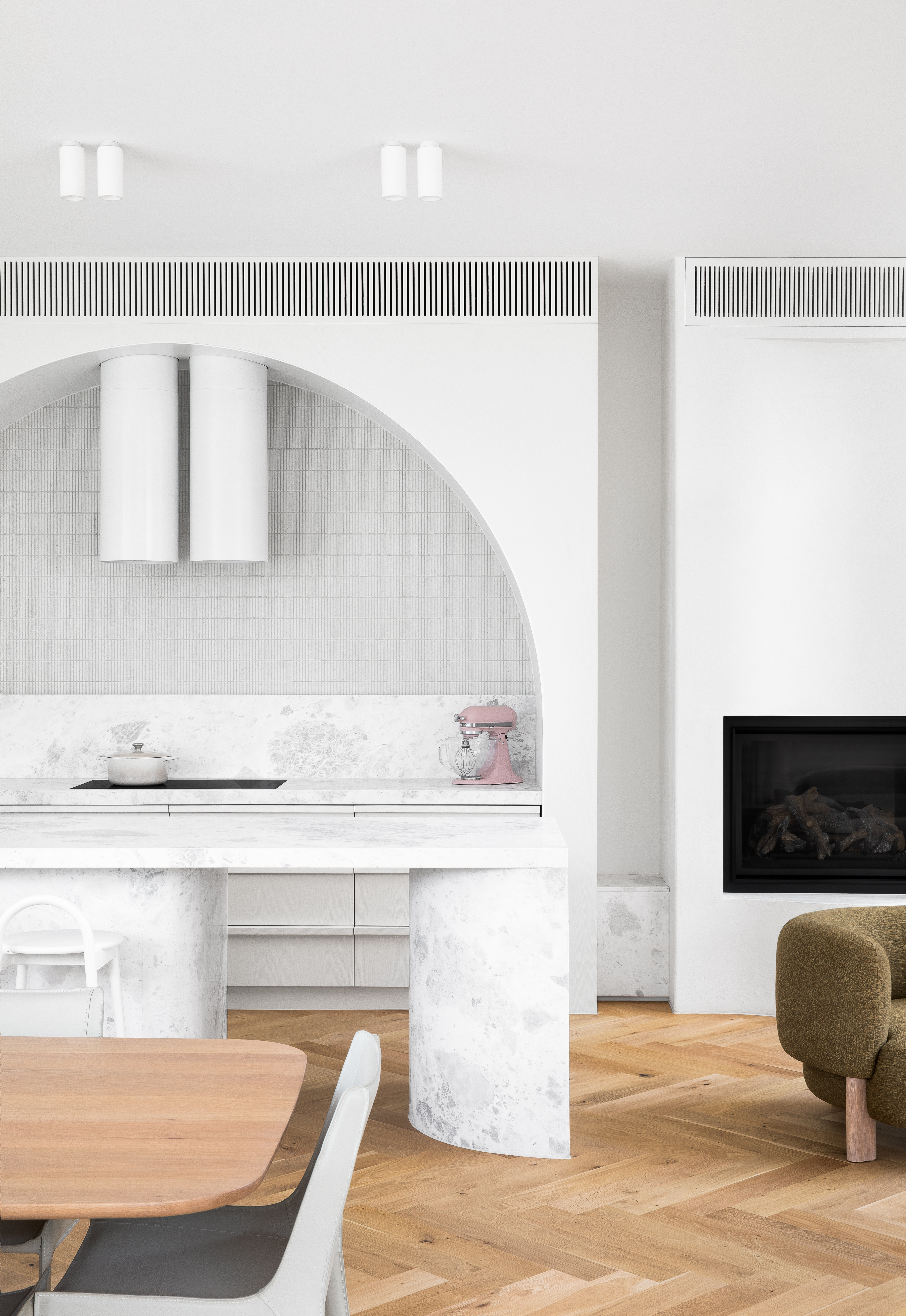
Speaking of grout lines, you want to make sure grout colors match the kitchen wall tiles. This will ensure the space looks uniform, clean, and sleek.
'The most common misstep in selecting kitchen backsplash grout color is underestimating its impact on both cleanliness and design,' says Nishtha. 'White grout may be challenging to maintain, yet the durability and aesthetic appeal of a backsplash hinge on the right grout choice — be it sanded, unsanded, or polyurethane. It's crucial to view grout as an integral part of your backsplash, not an afterthought. For design harmony, a tone-on-tone color scheme offers elegance, while contrasting grout colors and thicker lines should be considered to highlight the tile pattern. If the goal is to let the tile's beauty stand out, selecting a matching grout color with tighter lines is advisable. Remember, the grout color can define the overall look and feel of your kitchen backsplash.'
6. Extending tiles beyond the counter
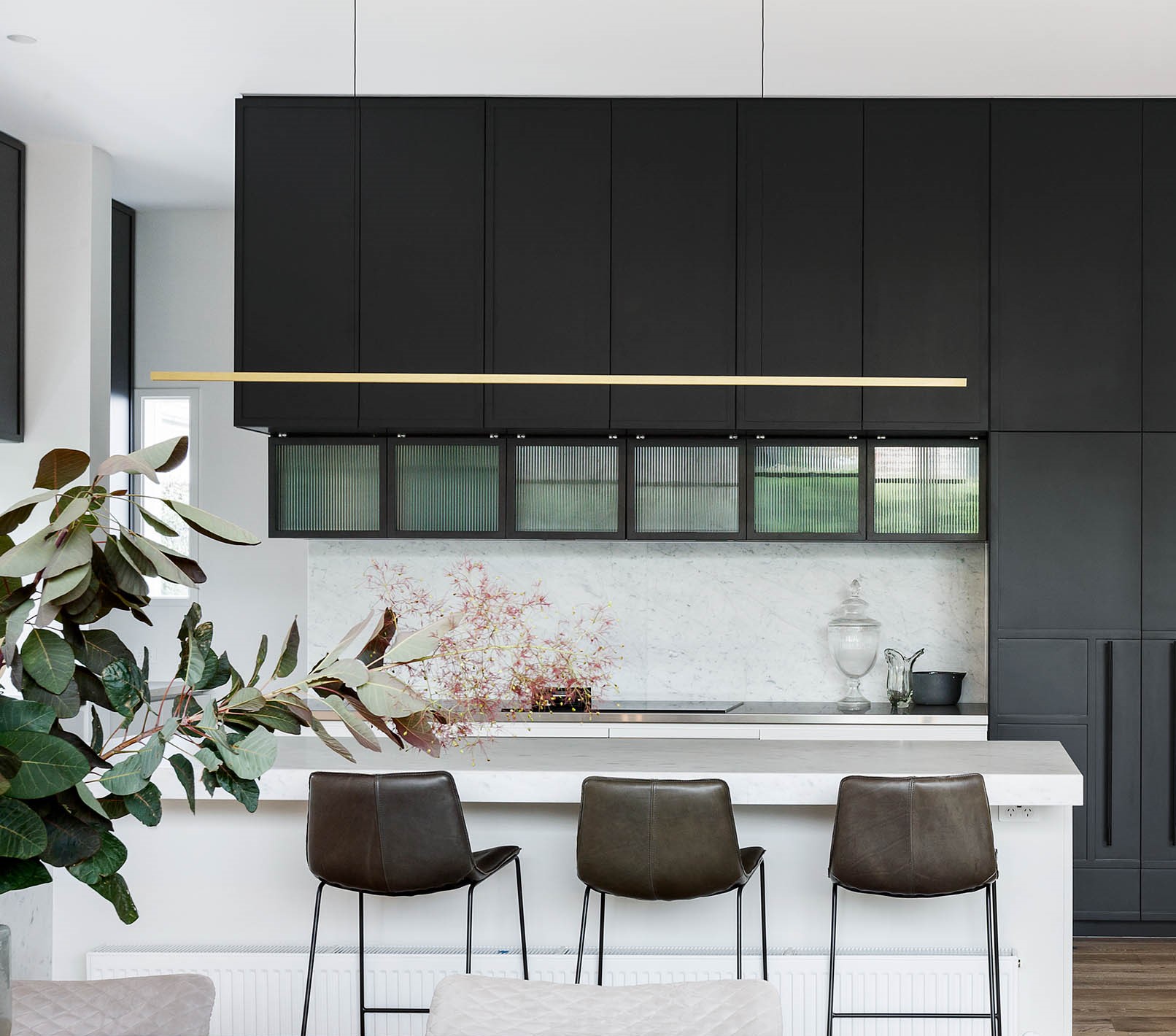
And finally, if you're wondering how to tile a backsplash right, you want to make sure the layout you choose does not throw off the room's look. One of the common mistakes is to install tiles that run beyond the counter and look odd.
'Also, a backsplash should extend all the way up to the crown, avoiding the mistake of ending the tile at the cabinet line,' says Kristina. 'If there is not a natural ending point on the sides, add a border molding to finish the sides.'
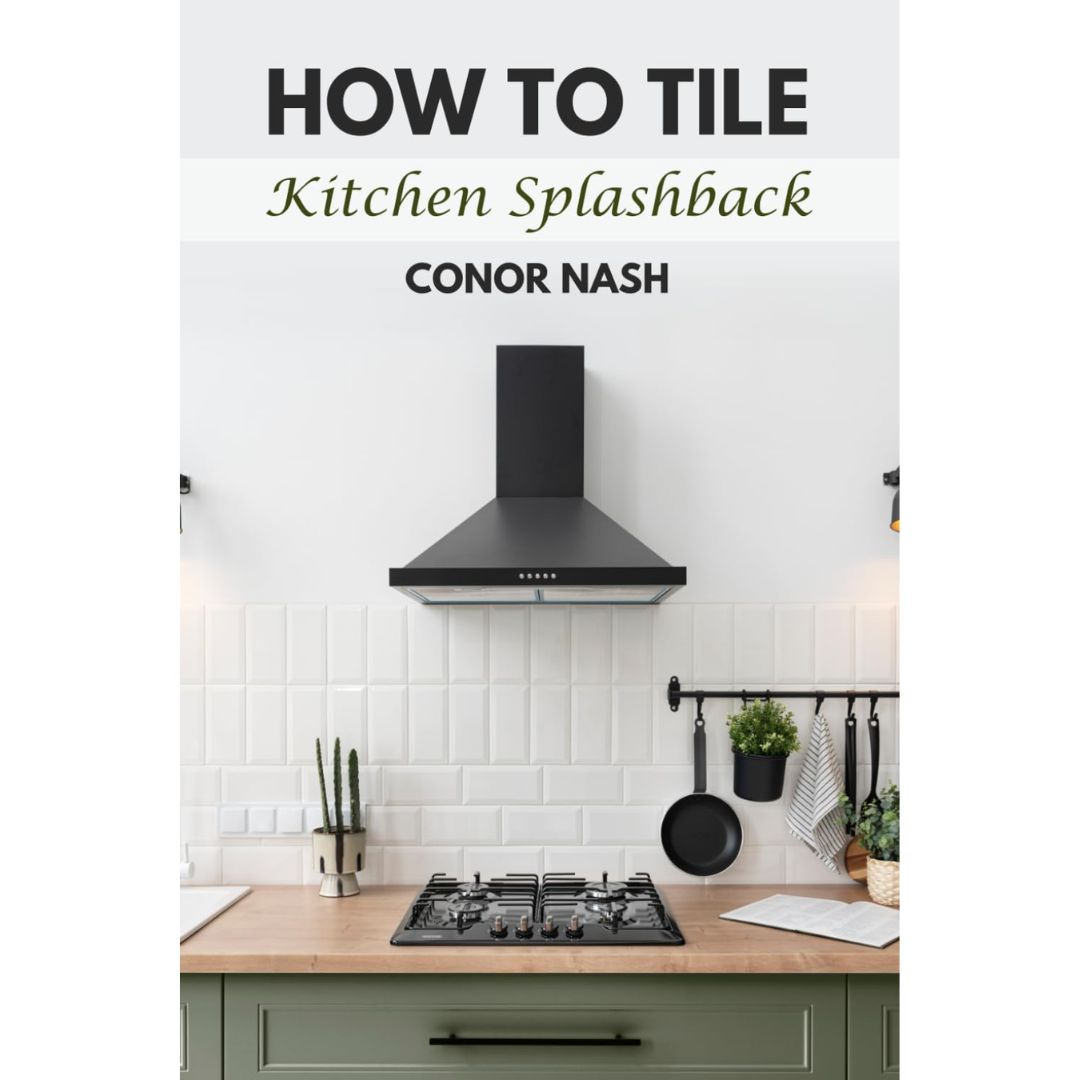
3 books to update your kitchen layout and design knowledge
Be The First To Know
The Livingetc newsletters are your inside source for what’s shaping interiors now - and what’s next. Discover trend forecasts, smart style ideas, and curated shopping inspiration that brings design to life. Subscribe today and stay ahead of the curve.

Aditi Sharma Maheshwari started her career at The Address (The Times of India), a tabloid on interiors and art. She wrote profiles of Indian artists, designers, and architects, and covered inspiring houses and commercial properties. After four years, she moved to ELLE DECOR as a senior features writer, where she contributed to the magazine and website, and also worked alongside the events team on India Design ID — the brand’s 10-day, annual design show. She wrote across topics: from designer interviews, and house tours, to new product launches, shopping pages, and reviews. After three years, she was hired as the senior editor at Houzz. The website content focused on practical advice on decorating the home and making design feel more approachable. She created fresh series on budget buys, design hacks, and DIYs, all backed with expert advice. Equipped with sizable knowledge of the industry and with a good network, she moved to Architectural Digest (Conde Nast) as the digital editor. The publication's focus was on high-end design, and her content highlighted A-listers, starchitects, and high-concept products, all customized for an audience that loves and invests in luxury. After a two-year stint, she moved to the UK and was hired at Livingetc as a design editor. She now freelances for a variety of interiors publications.
-
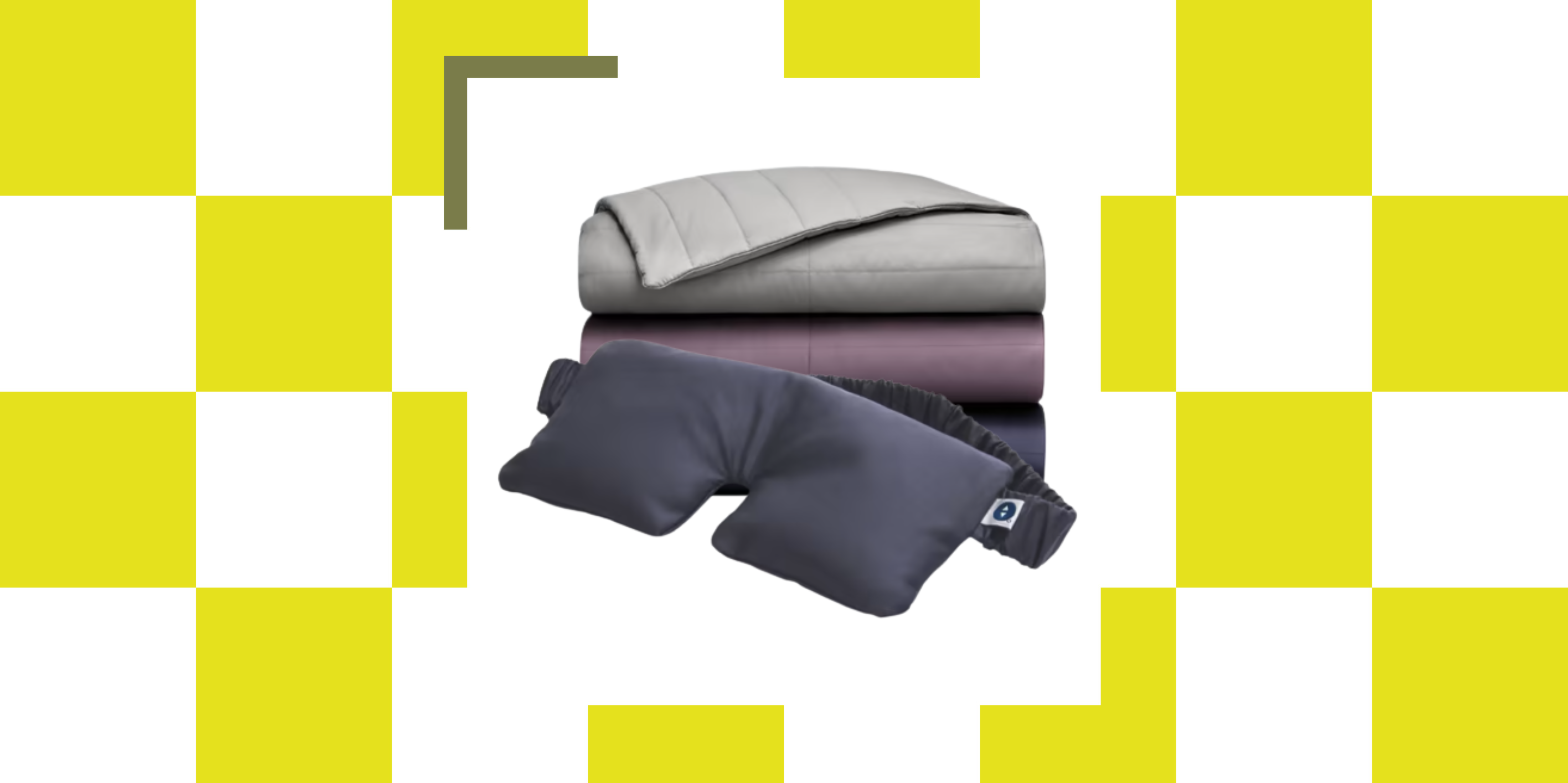 The Weighted Blanket That Doesn’t Make You Sweat (and the Eye Mask to Match)
Luxury has weight. And apparently, volcanic minerals
By Julia Demer
-
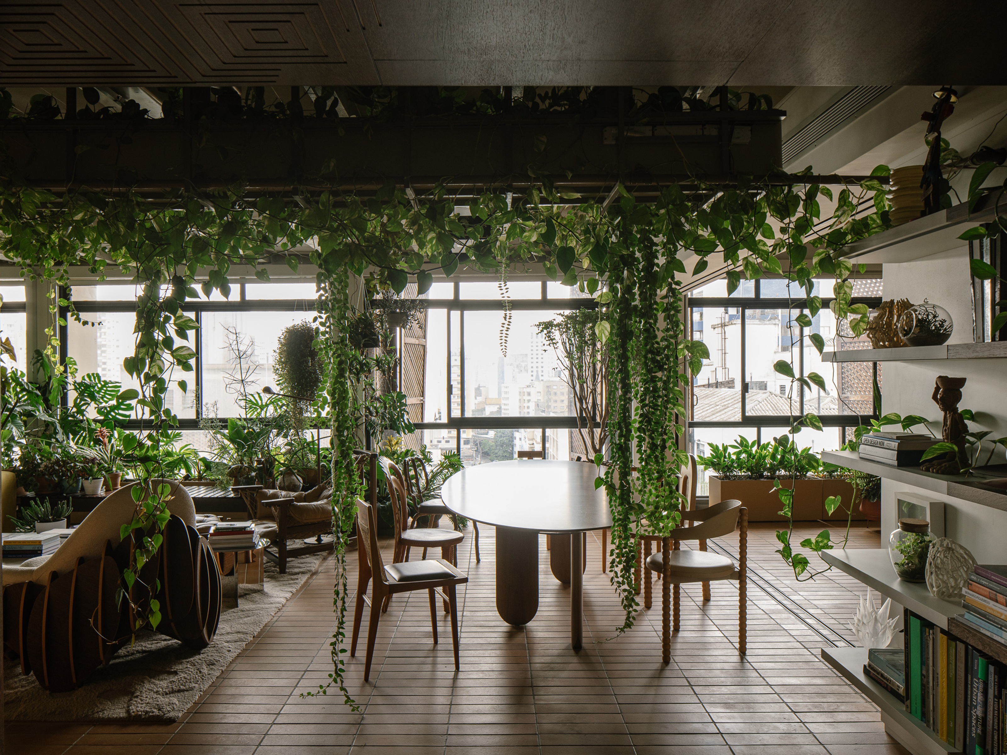 What Is Biophilic Interior Design? I'm an Actual Biophilic Designer, and This Is How to Apply It to Your Home
A biophilic designer explains the core principles of this practice, and the easy ways you can apply it to your home's design
By Marianna Popejoy
