5 Times Interior Designers Have Used Trim and Moldings to Make Simple Kitchens Look Amazing
These clever kitchen cabinet molding and trim ideas add texture and intriguing details to door fronts
When designing a kitchen, the cabinetry is among those first few design decisions you can get excited about. But there is much more to choose from than just the color of your cabinet doors. Molding and trim can transform the look of your design, adding depth and drama to your kitchen.
Traditional molding might consist of ornate trim that runs along the crown, base, and cabinetry of your kitchen but more contemporary approaches are less biblical in their application. Trim comes in many shapes and forms, and we’re excited to see how designers are reinventing its application for modern kitchens.
From curved and crenelated moldings to textured cane surfaces, we’ve brought together a selection of our favorite ideas to help get you started on your kitchen design journey. Alongside, expert interior designers weigh in on the details and everything to consider when creating a modern mesmerizing kitchen.
1. SOFTEN THE EDGES WITH CURVED MOLDING
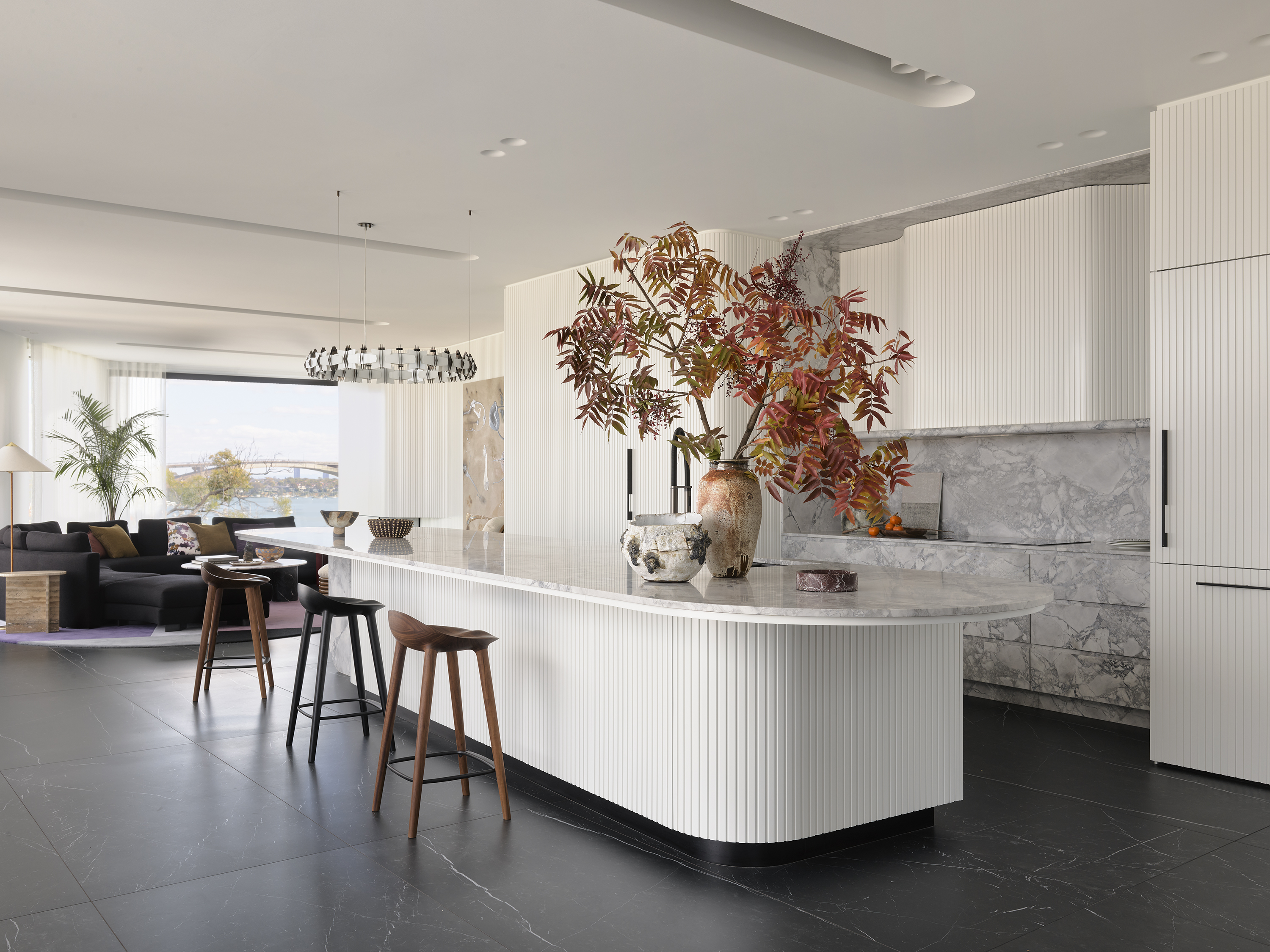
Curves have had no shortage of popularity over the last few years within interior design and the trend is now making its way into the kitchen. This open and expansive kitchen designed by Australian designer, Greg Natale feels calm and collected in its environment and each rounded curve plays a part in that. From the rounded base molding to the almost invisible trim, this kitchen exudes confidence as it seamlessly flows from end to end.
'Modern homes with spacious, contemporary interiors will often have open plan kitchen layouts,' Greg tells us. 'Finishing your kitchen joinery with curved moldings will soften stark interiors and create an organic sense of movement where one living space flows into the next.'
'For this modern residence in Hunters Hill, NSW, the curved kitchen cabinets are soft and easy on the eye, moving in a wave-like motion from the kitchen into the main lounge and finally out toward the spectacular Sydney view. Curved moldings are not only a unique, modern twist to kitchen joinery, they also bring a calming sense of comfort to the overall space,'
2. LET CANE ADD TEXTURE TO YOUR KITCHEN
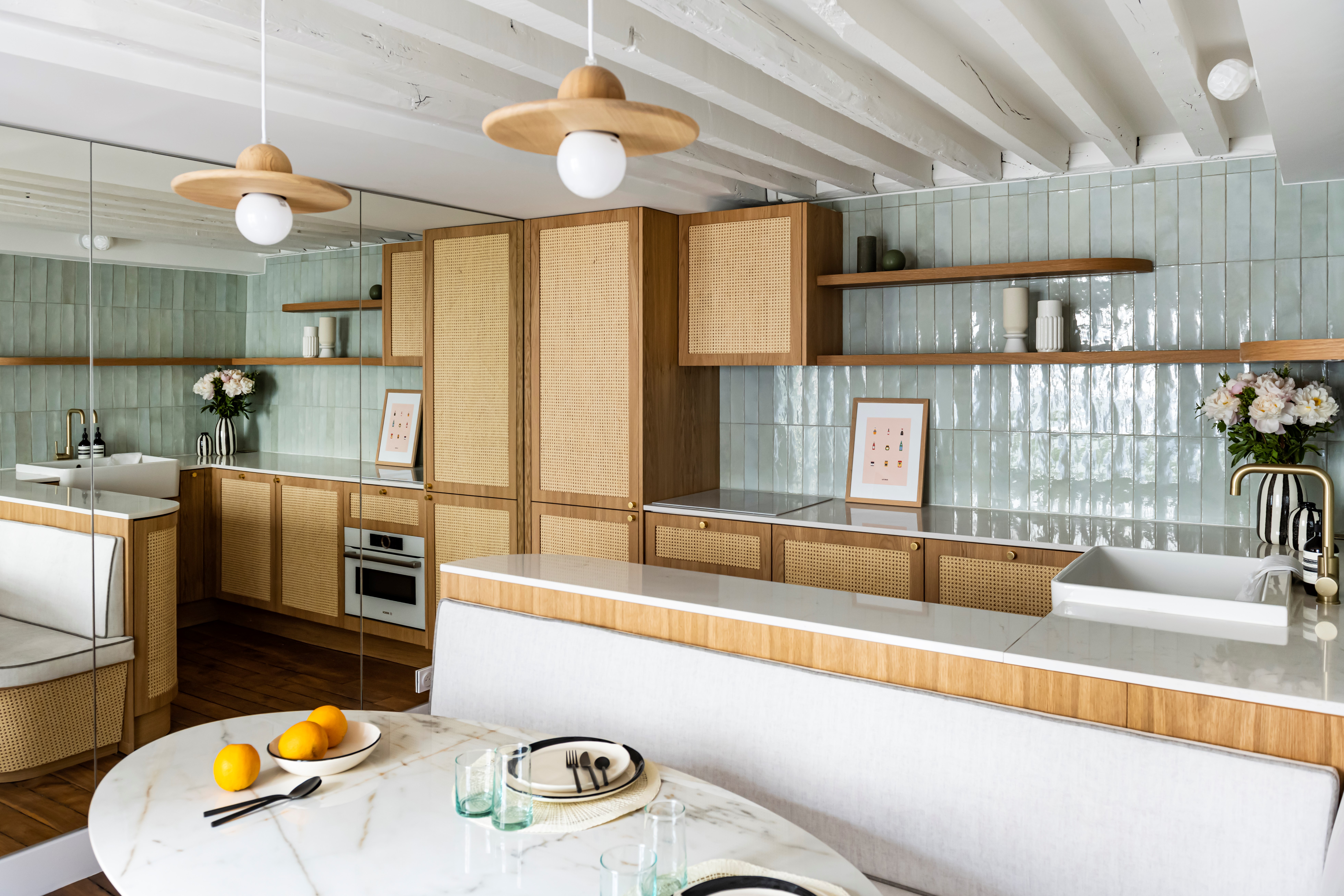
This cane and soft green kitchen presents an impactful and yet serene aesthetic. Designed by French studio, MIID, it highlights the versatility of cane perfectly as the material covers cabinetry and molding accents. Note the cane detailing that runs underneath the breakfast banquette. The studio makes the case for natural materials within their work.
'In recent years, with growing concern for the environment, natural materials have been increasingly used for furniture,' reveals Ingrid Marie, founder of MIID. 'Wood, rattan, and cane are therefore at the heart of current trends. Increasingly present in furniture and decoration, the latter is a real must-have. The greatest advantage of cane is that it adapts to every style! Vintage, bohemian, chic, art deco, or exotic, it's all possible. You just need to find the right pieces. What's more, it goes well with every color, from terracotta to emerald, and can be combined with other materials, such as velvet or metal.'
3. CREATE STRUCTURED ELEGANCE WITH WALNUT PANELING
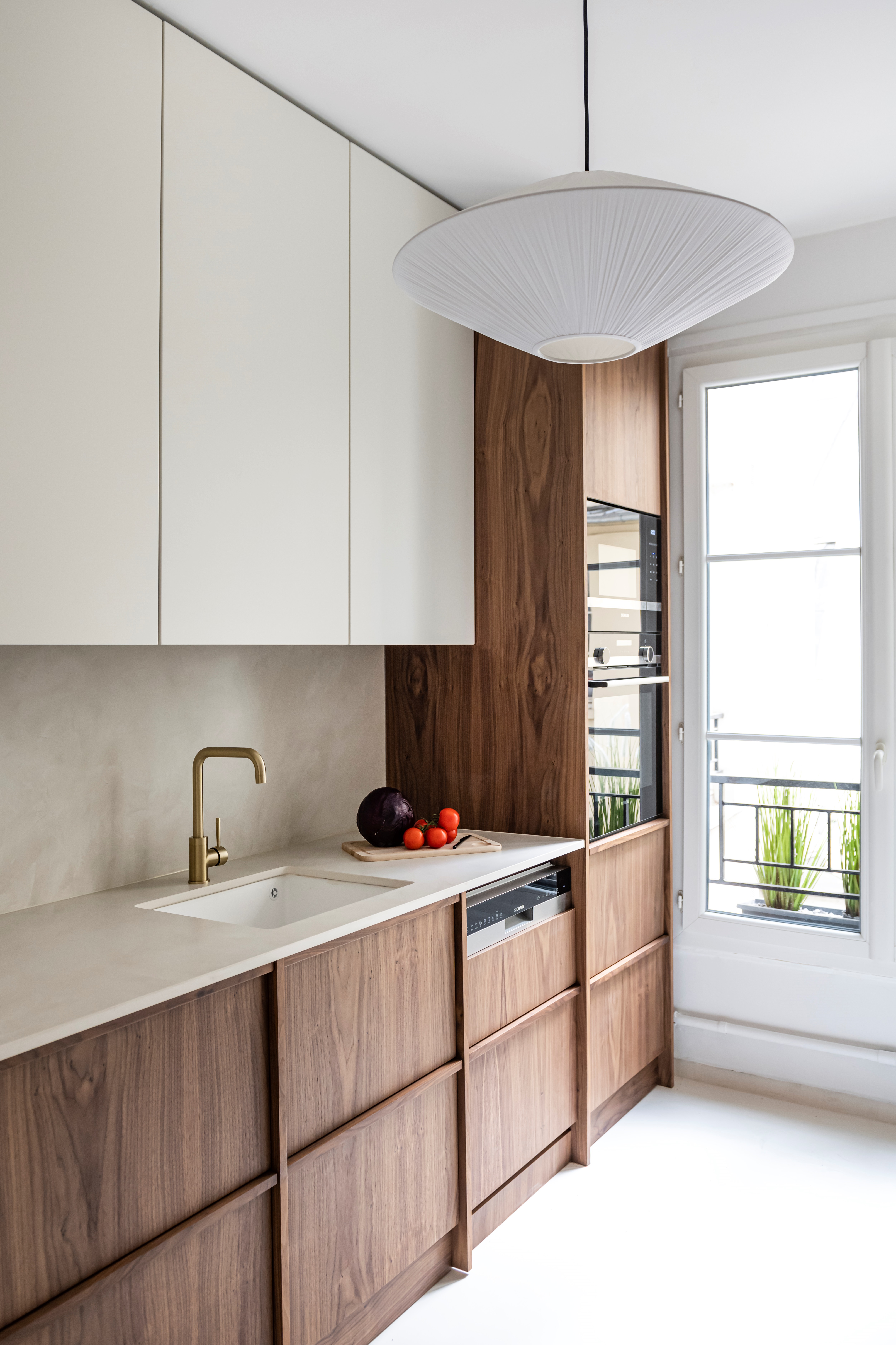
Traditional notions of molding and trim suggest the constant addition of excess but this beautifully balanced kitchen design from MIID proves otherwise. The walnut trim forms a panel-like effect across the lower cabinetry of this wood kitchen whilst the top remains minimal and refined. The contrast of these two, dark and light surfaces imbues the space with both warmth and light.
'From small decorative touches to more imposing pieces of furniture, walnut has the ability to transform a space, bringing warmth and character. Dark tones have always brought a certain warmth to a home, and walnut wood is proof of this. Long consigned to the closet, wood is once again seductive and finding its place in our interiors,' says Ingrid Marie, founder of MIID.
4. EMBRACE AN INVISIBLE KITCHEN WITH YOUR MOLDING

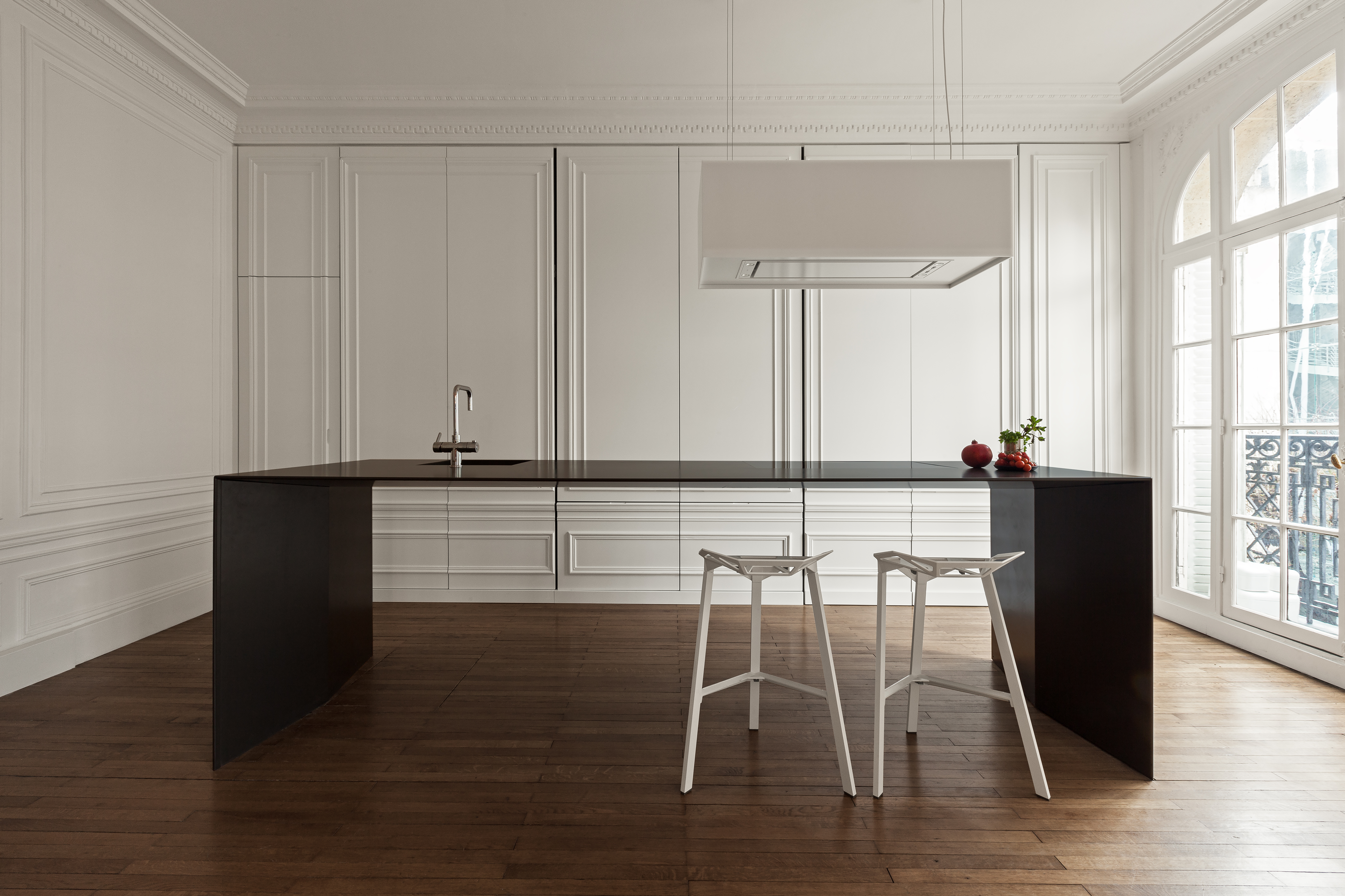
Imagined and brought to life by contemporary Amsterdam-based design studio, i29, this Parisian apartment project features the most striking kitchen design. Minimal and yet showcasing traditional Haussmann style trim and moldings along its cabinetry, it cleverly uses the interior architecture that is so inherent to these buildings to hide the kitchen.
Behind each panel laden with moldings hides the fridge, pantry, and more — a perfect solution for those seeking minimal grandeur or those who want to keep their kitchen feeling forever clean. 'Over the last couple of years, the kitchen has become more and more part of the living room for many people. The owners of this apartment in Paris also asked us to integrate the two,' say the i29 design team. 'We did exactly that, but without disturbing the natural beauty of this grand old lady. We reduced our design to the absolute minimum and designed a kitchen island so thin it’s hardly visible. Large sliding panels with the same profile as the walls around it, conceal all kitchen appliances and storage space. This way the kitchen becomes almost invisible in the monumental space. Contemporary and classic at the same time.'
5. INTRODUCE RHYTHM WITH INLAID TRIM

This sweet kitchen design from French studio, MIID experiments with kitchen molding and trim across a small but impactful surface, the kitchen island. The first trim ribbon plays with a larger crenellation whilst the subsequent panel introduces a smaller-scaled pattern. The gold trim that runs along the perimeter, highlights the pattern and gives the island an added dose of glamor.
'The crenelated effect, also known as the staircase effect, brings a captivating visual aspect and lends notable relief to cabinet doors that might otherwise appear rather banal. This technique also lends a touch of modernity that beautifies the kitchen and gives it a contemporary feel,' says Ingrid Marie, founder of MIID. Take inspiration from Marie and experiment with the scale with your own choice of molding and trim, the two accents will feel connected and cohesive but break away from the expected ideals of repetition.
Be The First To Know
The Livingetc newsletters are your inside source for what’s shaping interiors now - and what’s next. Discover trend forecasts, smart style ideas, and curated shopping inspiration that brings design to life. Subscribe today and stay ahead of the curve.
Writer and design expert Faaizah Shah is the founder of The Interiors Consultancy. She has worked with designers such as Staffan Tollgard and design houses such as Sanderson to help them understand and communicate their narratives. She is known for crafting engaging stories and imaginative content, and understanding great decor from her years alongside some of the best creatives in the industry. She is also a contributor to Livingetc.
-
 The Weighted Blanket That Doesn’t Make You Sweat (and the Eye Mask to Match)
Luxury has weight. And apparently, volcanic minerals
By Julia Demer
-
 What Is Biophilic Interior Design? I'm an Actual Biophilic Designer, and This Is How to Apply It to Your Home
A biophilic designer explains the core principles of this practice, and the easy ways you can apply it to your home's design
By Marianna Popejoy
