10 key kitchen hardware trends for 2023: handles, hinges and pulls that update without a full renovation
Who knew a contrast pull or brass backplate could transform the look and feel of a space? This crop of top designers explain the latest kitchen hardware trends
Anyone who has spent weeks poring over cabinet styles, worktop materials and appliances could be forgiven for running out of steam just as they need to get a handle on the finishing touches. Which is where kitchen hardware trends come in - innovative and beautiful ideas to give your that inspirational boost you need.
Unless you've committed to an ultra-clean seamless modern kitchen look, we say it's a decision worth considering carefully. 'Cabinet hardware can be like jewelry in a room, providing that little bit of sparkle and interest,' suggests Emilie Munroe of San Francisco-based design firm Studio Munroe. That's why we'd also recommend seeing if you can switch up your handles or pulls before committing to the full rip-it-out reno job; you might be surprised at just how different the same space can feel.
Remember this is a high-traffic zone, so always keep longevity in mind – however beautiful a handle. 'Hardware withstands a lot of wear and tear from everyday use,' says interior designer Sara Hillery. 'I encourage homeowners to invest in quality and durability.'
The ten projects below are a testament to the power of a well-judged handle – and help distill current kitchen trends for you to choose from.
The 10 key hardware trends for 2023
1. Jewelry-like
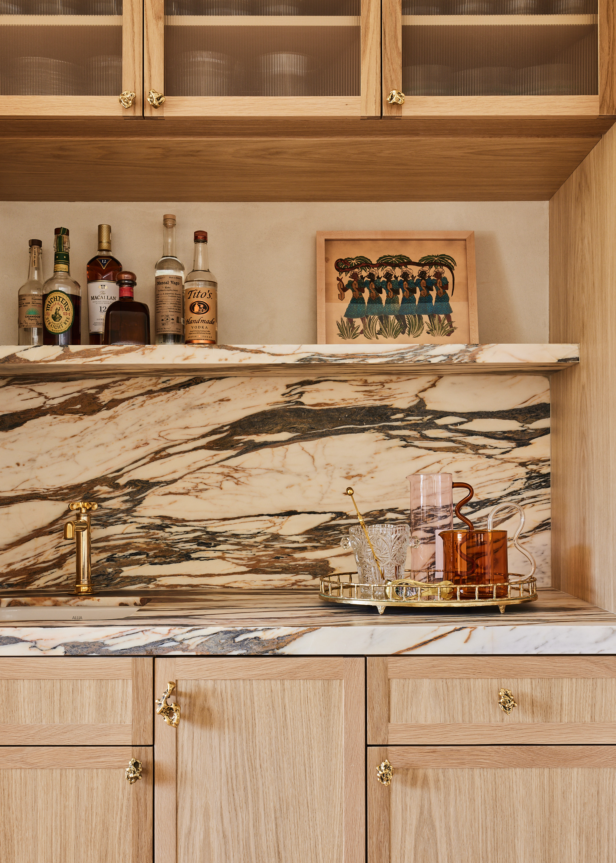
While there's much to love about this bar area by Miami-based interior designer Bunsa Studio – the seamless transition between the marble counter, backsplash and shelf, or just the very prospect of having such an area dedicated solely to drinks – we say it's the organic shape of the solid brass pulls that really sets it off. It'll come as little surprise that their maker, Los-Angeles based Lisa Eisner, is a jewelry designer by trade, and takes most of her inspiration from the natural world.
'I love the way these add so much texture and they feel really great in your hand,' says studio founder Jennifer Bunsa. She also enjoyed the unlikely connection to Denver's basketball team: 'It’s called the “Nugget” collection, which we thought was particularly appropriate for a Colorado home.'
2. Cabinet contrast
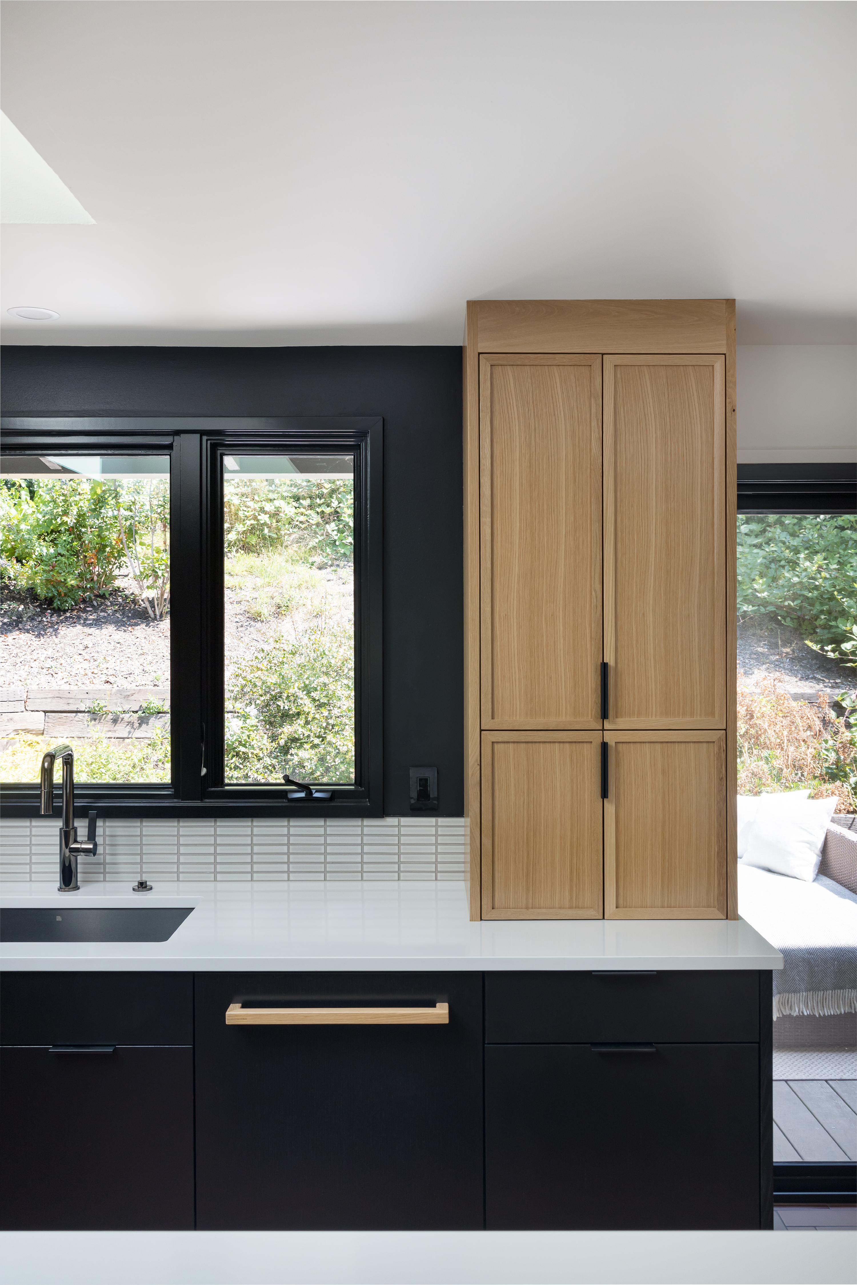
'I would say we consider kitchen cabinet pulls as one of the most important final details for the design, right after the lighting,' says Alissa Pulcrano, the CEO and principal designer of Portland-based practice Bright Designlab. 'We take great care looking for the perfect pulls or knobs, and if we don't find one, we sometimes have them made. The shape and size should reiterate the style of the room as well as being a functional piece.'
In this project, black and (gloriously chunky) natural oak handles have been 'swapped', thus drawing a visual link between the cabinets. Black handles on the oak wood cabinets, oak handles on the black ones. 'These particular pulls are "off the shelf" but placement and finish were carefully selected,' she adds. 'The black pulls tie in the black cabinets.'
Stainless black drawer pulls, $23.99 for ten, Amazon
Amazon is a brilliant stockist of drawer pulls, handles and knobs, many of which are at bargain prices. These black drawer pulls are stainless, easy to keep clean and very affordable for a pack of ten.
3. Muted metal
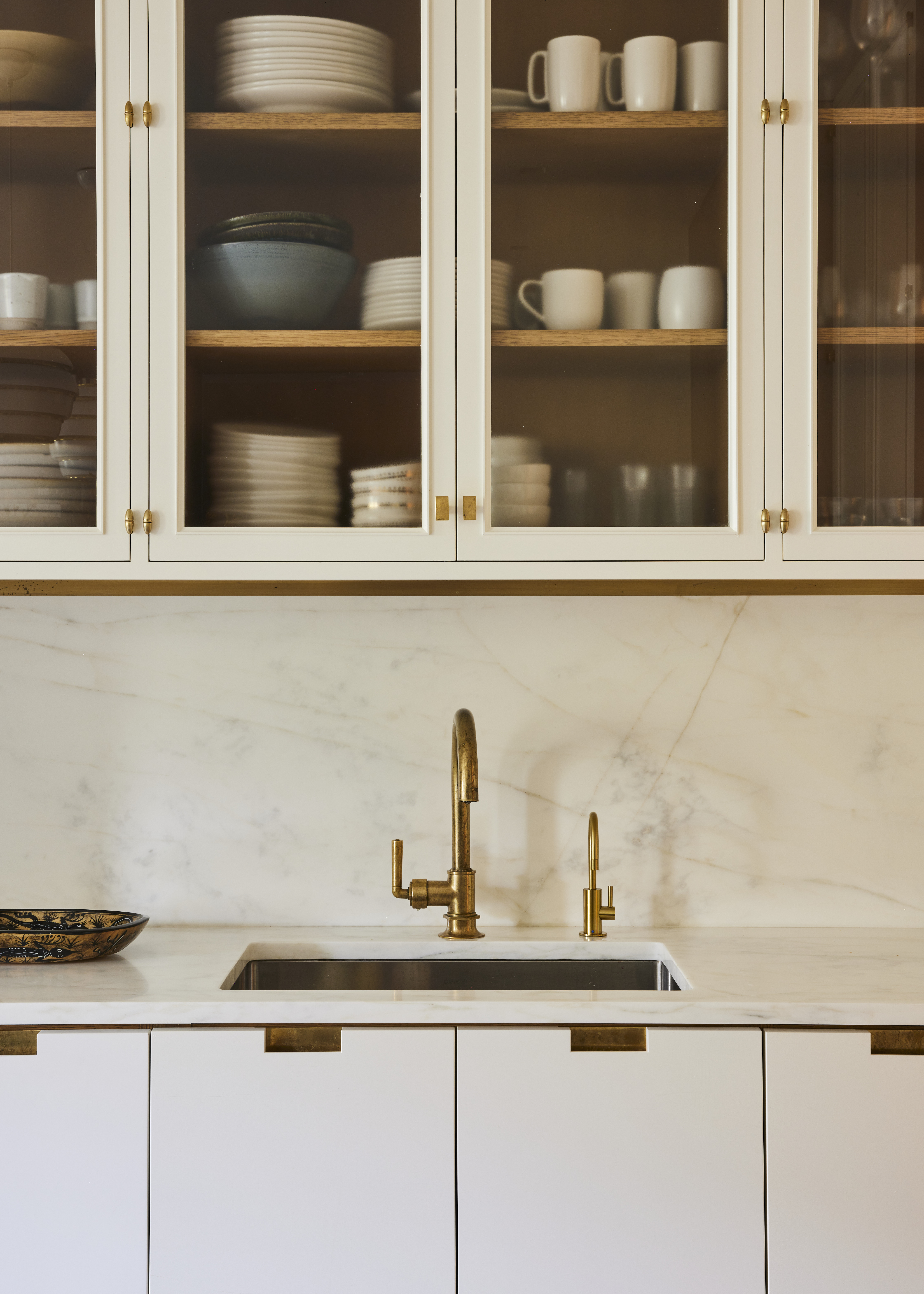
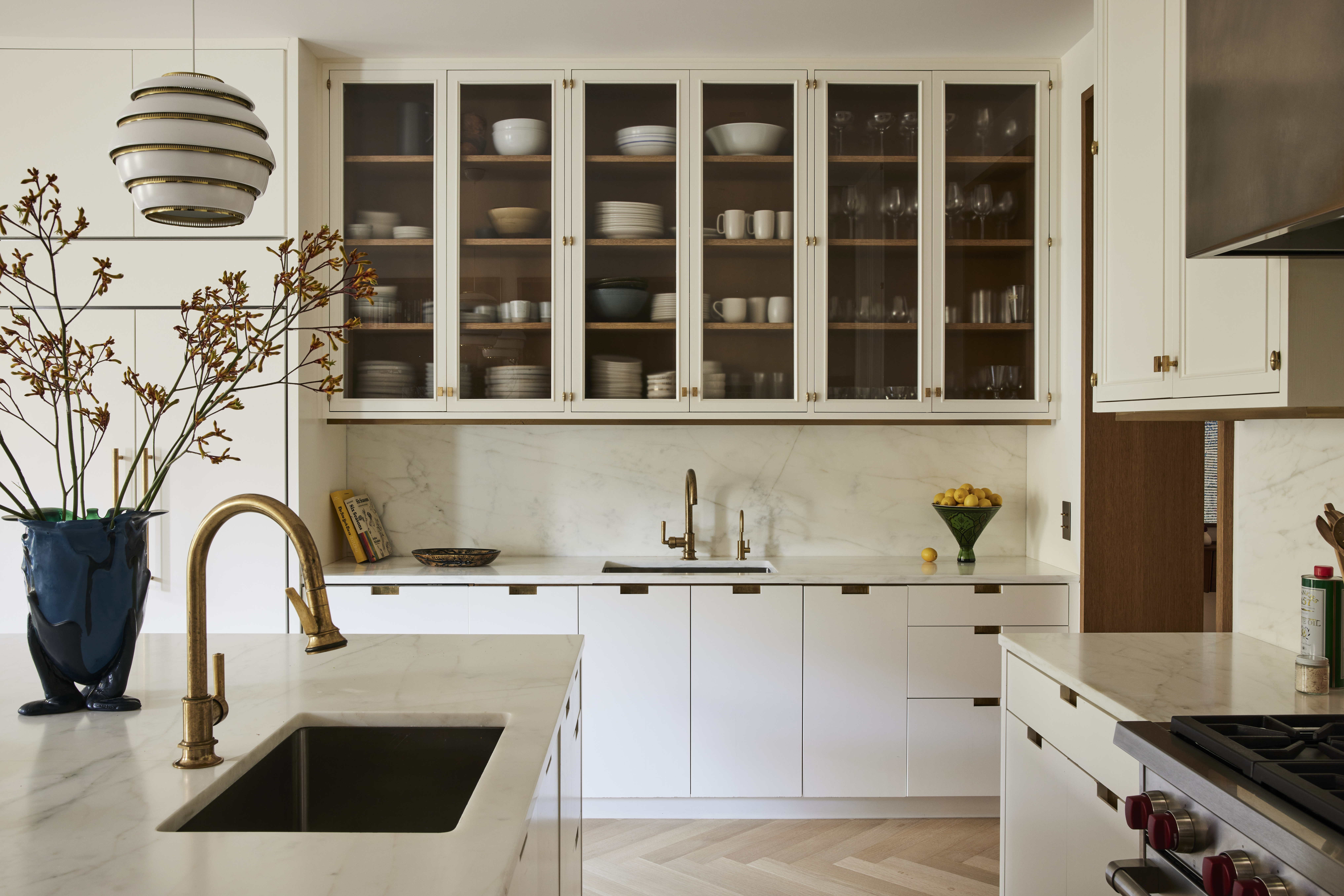
The cut-out cabinet pull is something of a shortcut to modernity, and you'll spot a clean, rectangular shape in many an architect's plan at the moment. We suspect this white space by New York firm Gachot Studios, with its Imperial Danby marble kitchen countertop and backsplash, would look totally different with a more traditional pull.
Before you tell us that the entire point of this look is the lack of hardware, let us point out the trick up its sleeve: the brass backplate. It's the best of both worlds, really – that subtle glint works as a clever foil to such a clean and simple form. Note too how it references nearby fixtures, from the faucets above to the hinges and pulls on the upper cabinets.
4. Hidden gem
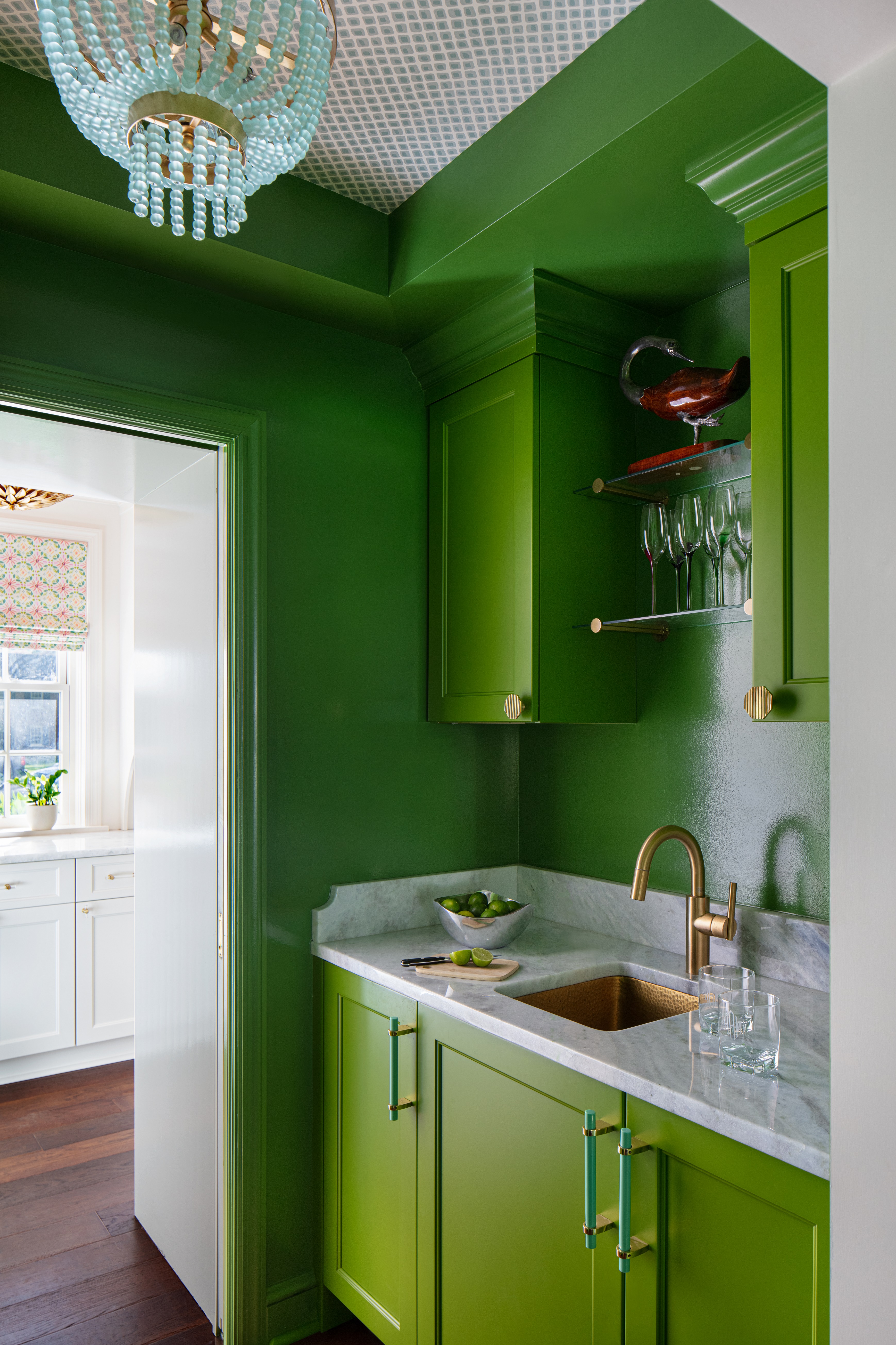
While handles should function well and feel natural in the hand, don't lose sight of their capacity to embellish. 'It's inspiring to have fun with hardware – especially in areas like a bar or butler’s pantry,' says Sara Hillery of the eponymous interior design studio. 'Here I selected refreshing cool blue amazonite pulls to serve as a cheerful and unexpected complement to bright lacquered green cabinets.'
It's a lesson in looking at a space as a whole, rather than selecting each element in silo. 'These smooth high-gloss pulls contrast the texture of the frosted glass-beaded chandelier. Depending on the function of each cabinet and drawer, I like to incorporate both pulls and knobs in my designs.'
A note to price-conscious renovators, too: 'Knobs tend to be less expensive than pulls, with a wider variety of available options.'
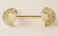
There is a good selection of characterful handles at Anthropologie, from this one that looks like it has tasseled fans on each end to one that seems hand knotted. Experiment, have fun!
5. Rounded edges
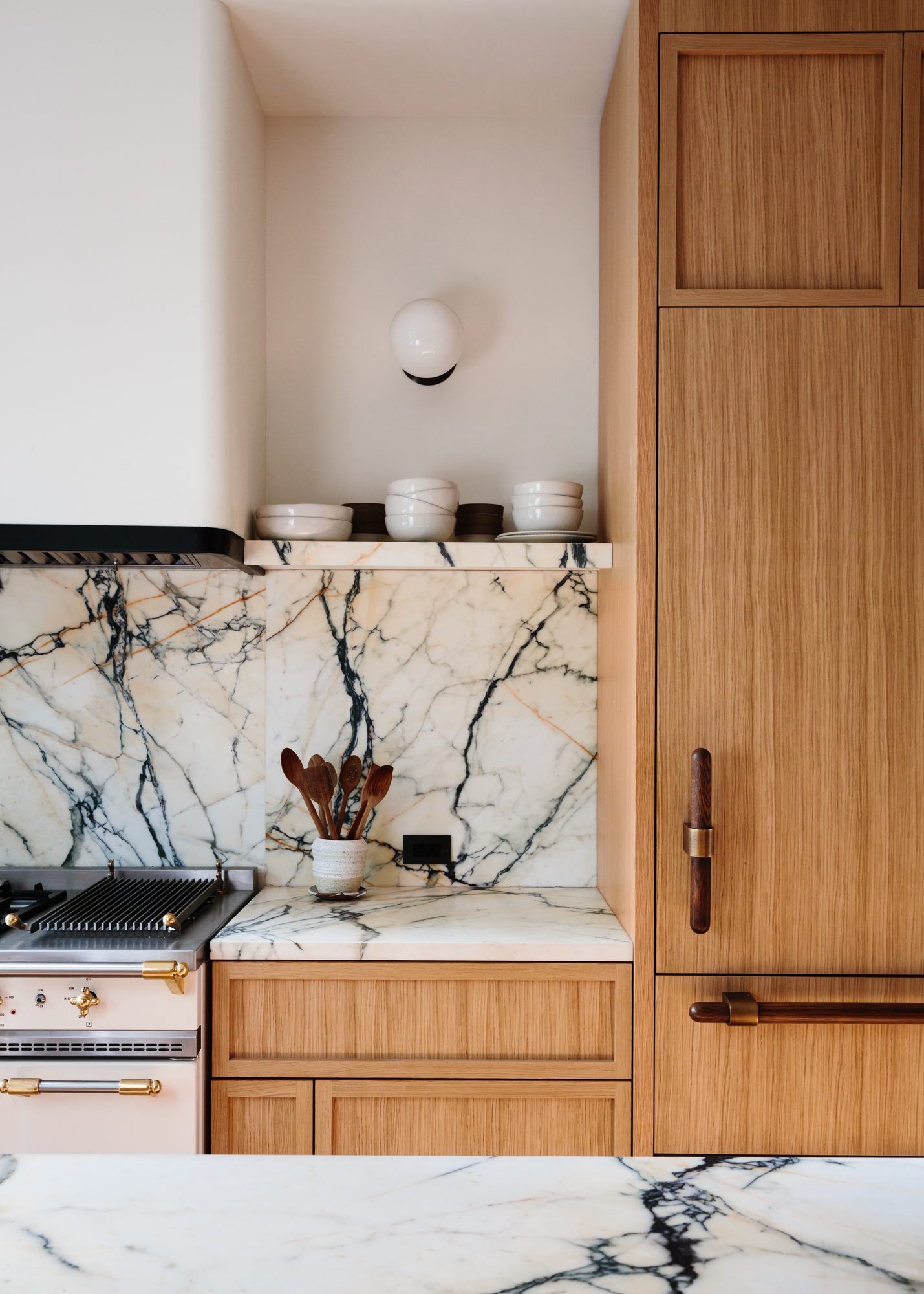
Sometimes a fixture screams custom-designed, and such is the case for these beautiful oak and brass handles. They are the work of Brooklyn architectural practice Home Studios. Suitably generous in the hand, they hold their own in a space characterised by a distinctive Paonazzo marble and ceramic tiled kitchen island.
The combination of natural materials and a softer, rounded shape provides something of a counterbalance to the kitchen's obligatory hard lines and surfaces, showing how something like a handle can subtly shift the mood of a space. If an architect-designed kitchen is within your sights, consider what might be created as a custom fixture.
6. Exposed hinges

Though they do a rather important job, hinges are something you rarely think about – until they're put on show. 'Using exposed hinges flips a typically utilitarian element of casework into a sculptural accent piece,' suggests Emilie Munroe, the founder of Studio Munroe. 'It provides unexpected glamour in a space'.
Especially against that gorgeously inky blue, perhaps ('in our book, a navy kitchen is as classic as white one') which grounds the decorative detail and makes this kitchen bar area feel extra grown up. Though it requires some careful alignment, this is an easy way to add some industrial edge to a space without going full pelt down the brick-wall-and-bare-bulb route.
7. Supersized
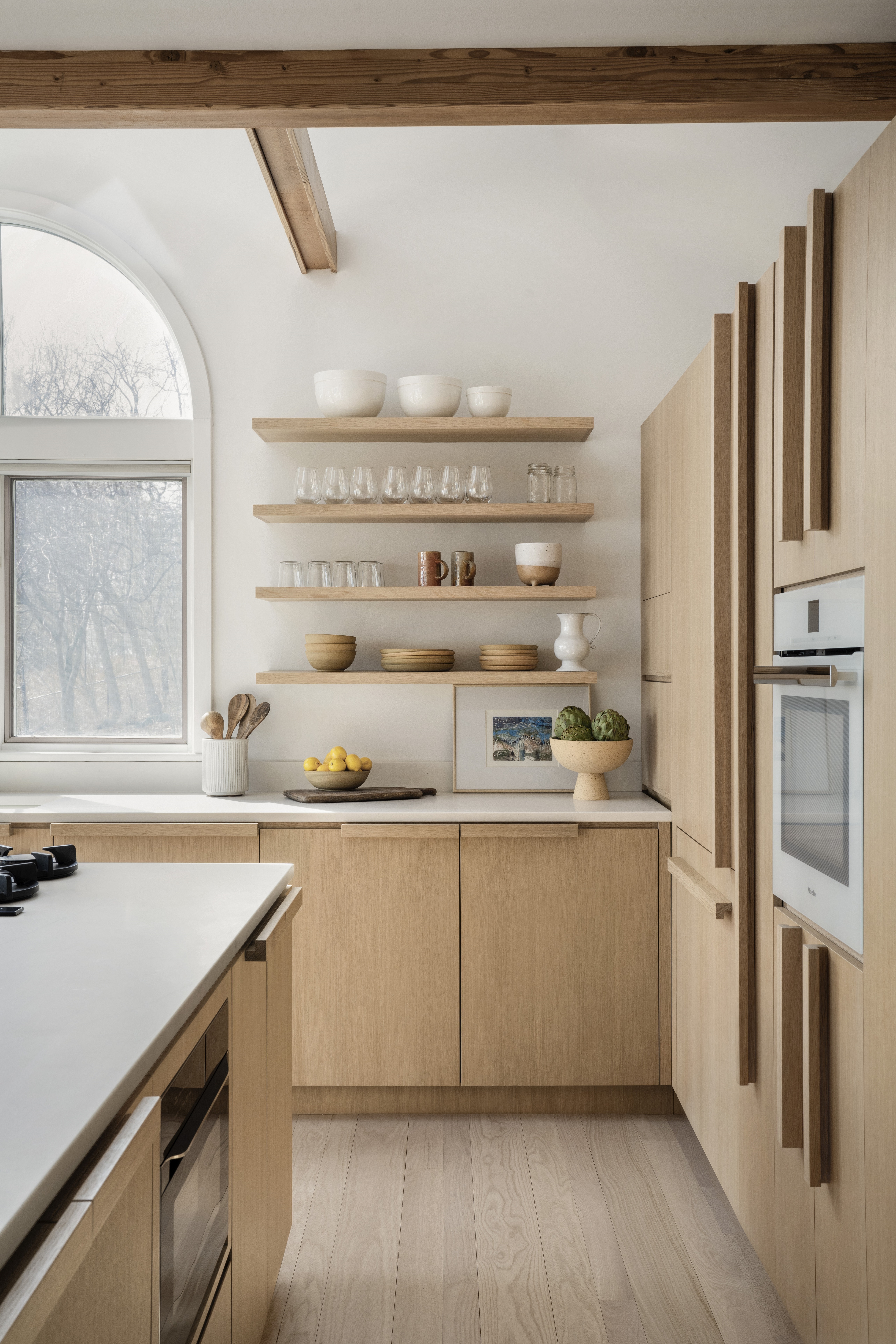
When prospective clients approached Connecticut architecture firm Stewart-Schafer with an ambitious plan to renovate the first floor of their upstate New York home, they did so with mid-century Californian influences in mind. The studio then gently refined those ideas 'with a cleaner, more organic Scandinavian undertone'.
Part of what that meant in practice was a wealth of pale wood, which is used to striking effect in the new transitional-style kitchen. A simplicity of form means that the generous handles, which were custom-made for the project, feel well-judged – even when following almost the full length of the floor-to-ceiling cupboards. See too how they smartly mirror the dimensions of the open shelving, which creates a real sense of visual balance.
8. High-shine strip
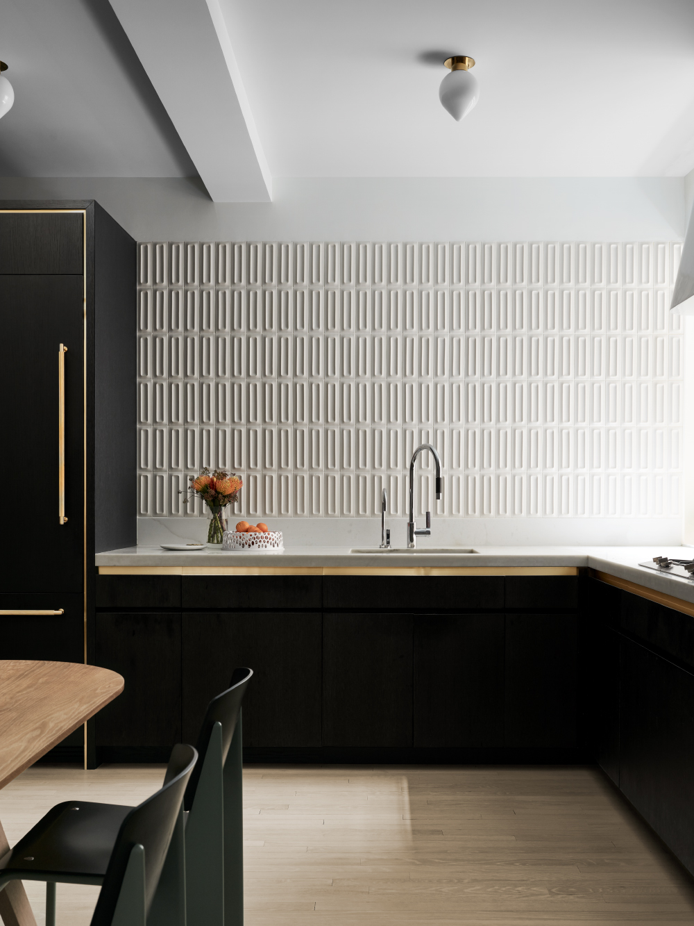
With a wonderfully tactile wall of tiles above, a sliver of metal is all this minimalist kitchen needs to feel suitably impactful. In technical terms, 'the cabinet face is beveled to reveal a strip of brass in the finger pull and in a recessed channel around the taller pantry doors,' explains architect Michael K Chen, who redesigned this apartment on New York's Park Avenue.
There was also a practical consideration in play. 'This is a room without an abundance of natural light – it faces inward toward a building courtyard – so our intention was to introduce visual contrast in the materials, as well as texture, to keep the space feeling lively and to encourage a play of light.'
The good news is that it will only get better with age. 'The brass breaks up the mass of the dark cabinet and is intended to oxidize over time.'
9. Mixed and matched
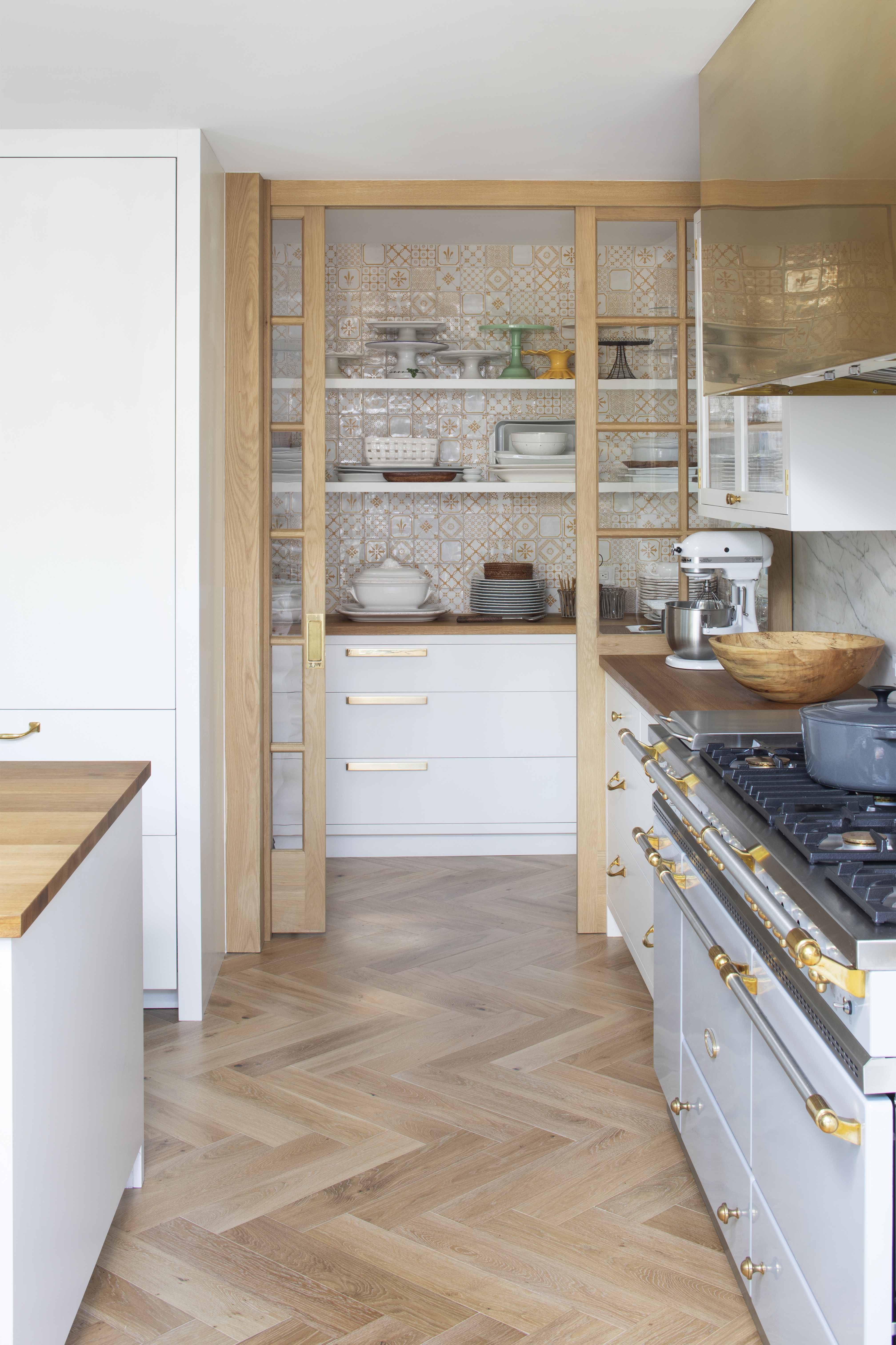
Tear your eyes away from that sliding door set-up for a moment and consider how cohesive this space feels – that's despite the three different styles of handle on the cabinetry, plus all manner of fixtures and fittings on the range cooker. There are wide, rectangular handles that reflect the width of the pantry drawers, ring pulls on the narrower ones and simple knobs on the day-to-day drawers at the top.
While the dimensions have been carefully weighed up, the real lesson here is that mixing and matching handle shapes won't throw your scheme into disarray as long as there is an element of uniformity – here, it's the metal finish, which is also mirrored in the unlacquered brass range hood. Cabinets and drawers are designed for different functions, so should there be a one-size-fits-all handle?
10. Against the grain
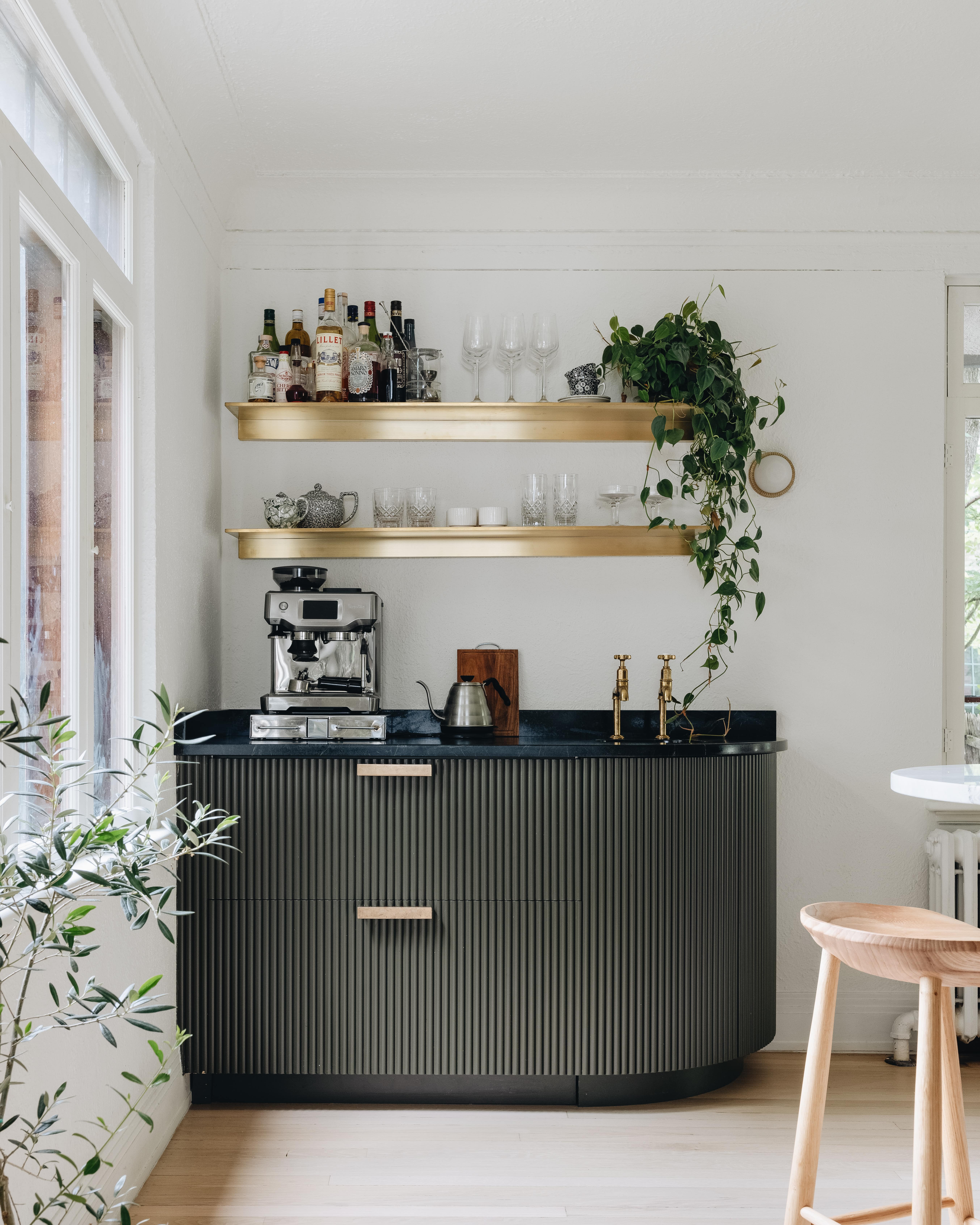
Created for her daughter and son-in-law, this versatile coffee and cocktail station by Michigan-based Jean Stoffer was designed to make the most of a underutilised corner of their kitchen and deliver a little extra surface space in the process.
Charmingly bijou but just as considered as any full kitchen installation, it's a simple enough idea executed with real precision. Though the cabinet handles are a fairly classic choice by most metrics – they're Armac Martin's 'Longbridge' pulls in a burnished brass finish – what's interesting here is the play between the vertical custom ribbed cabinetry and the horizontal fixtures. The sharpest-eyed among us will also spot the way that the two parallel handles mirror the two shelves above.
Be The First To Know
The Livingetc newsletters are your inside source for what’s shaping interiors now - and what’s next. Discover trend forecasts, smart style ideas, and curated shopping inspiration that brings design to life. Subscribe today and stay ahead of the curve.
Cat Olley is a British design and lifestyle journalist, editor and copywriter. Formerly on the features team at ELLE Decoration, she has written for The Guardian, The Modern House, Evening Standard Homes & Property, Inigo and John Lewis at Home. She specializes in the latest trends and ideas happening in the design world, and is our go-to for aesthetically-led pieces.
-
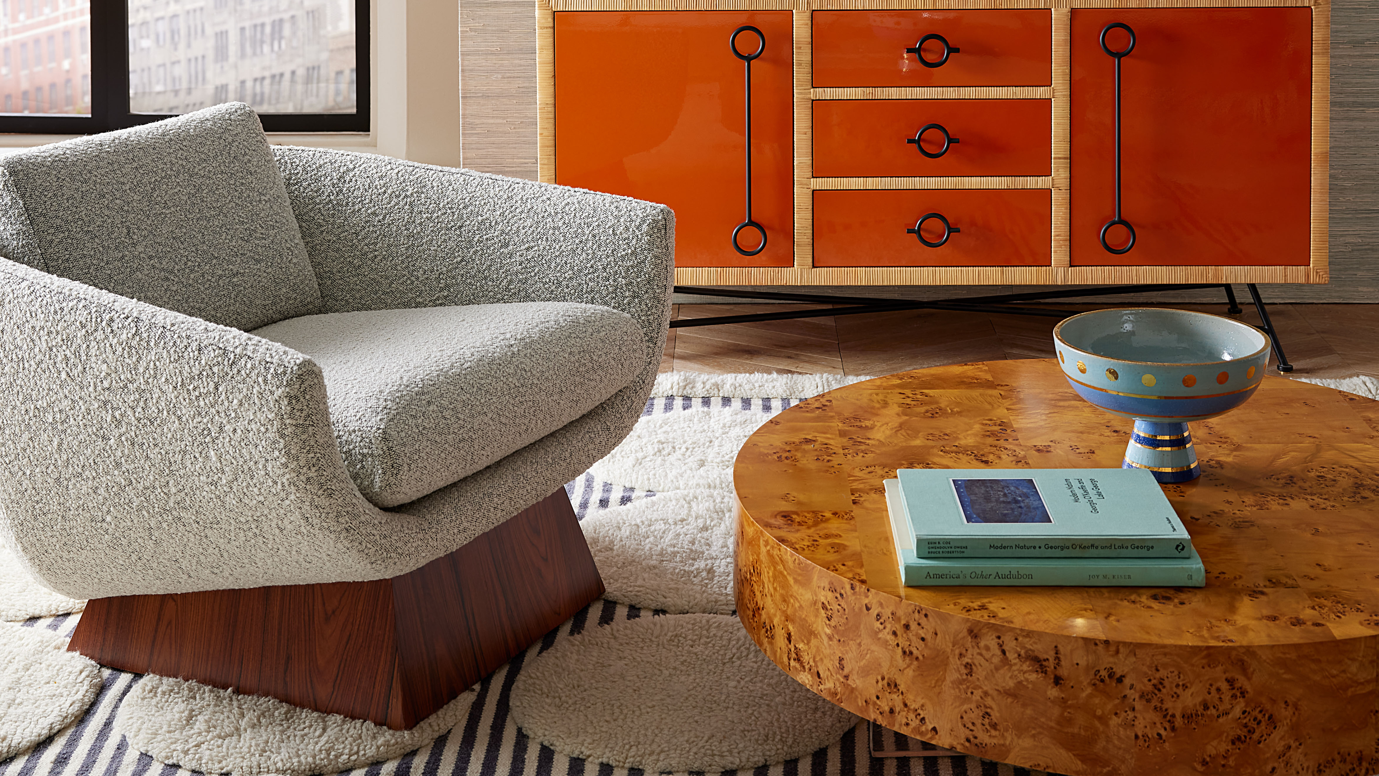 Burl Wood Decor Is 2025’s Most Coveted Comeback — Here’s How to Get the Storied Swirls for Less
Irregularity is the ultimate luxury, but you don’t need an antiques dealer to find it
By Julia Demer Published
-
 5 Garden Features That Instantly Add Value to Your Home — While Making Your Outdoor Space More Practical, too
Get to know all the expert tips and tricks for making your backyard a standout selling point for your home.
By Maya Glantz Published

