Kitchen ideas – leading designers reveal the 34 most stylish looks which will inspire your next kitchen remodel
Get ready to find your dream kitchen ideas. Top designers share their unique ways of creating the most beautiful and functional space that will stand the test of time
Implementing the right kitchen ideas will make this space easily the most important room in the home. That's become even more the case in the last couple of years since it became a space for a myriad of tasks, from cooking to taking online office meetings. As a result, today’s kitchens require just as much form as function, and cookie-cutter kitchens simply don’t cut it.
Unlike in years past, kitchens are no longer sealed off and tucked away. They are focal points of the home and open to living space or, at the very least, increasingly open to guests, so their design requires a lot of thought and consideration to reach its full potential and it is important to work out which kitchen trends you want to take note of and also the kitchen trends to avoid.
'The kitchen is no longer a place to retreat to, or a space to hide — instead, it has become a central gathering area that is both functional and social,' says Sarah Zames, an interior architect at General Assembly. 'To us, the detailing in a kitchen is just as important as heirloom furniture that you may keep in other spaces of the home—it should be built to last, but have enough interest in it to be admired.'
If the kitchen really is the heart of the home, it’s also where homeowners are letting their personalities shine. And the design of it doesn’t have to be overwhelming, thanks to these 34 designer-approved kitchen ideas that will inspire.
34 inspirational kitchen ideas
“Kitchen design is a success when it is gracious and inviting, while also being extremely useful“
Robert Stilin, interior designer
1. Introduce a curved banquette to maximise seating
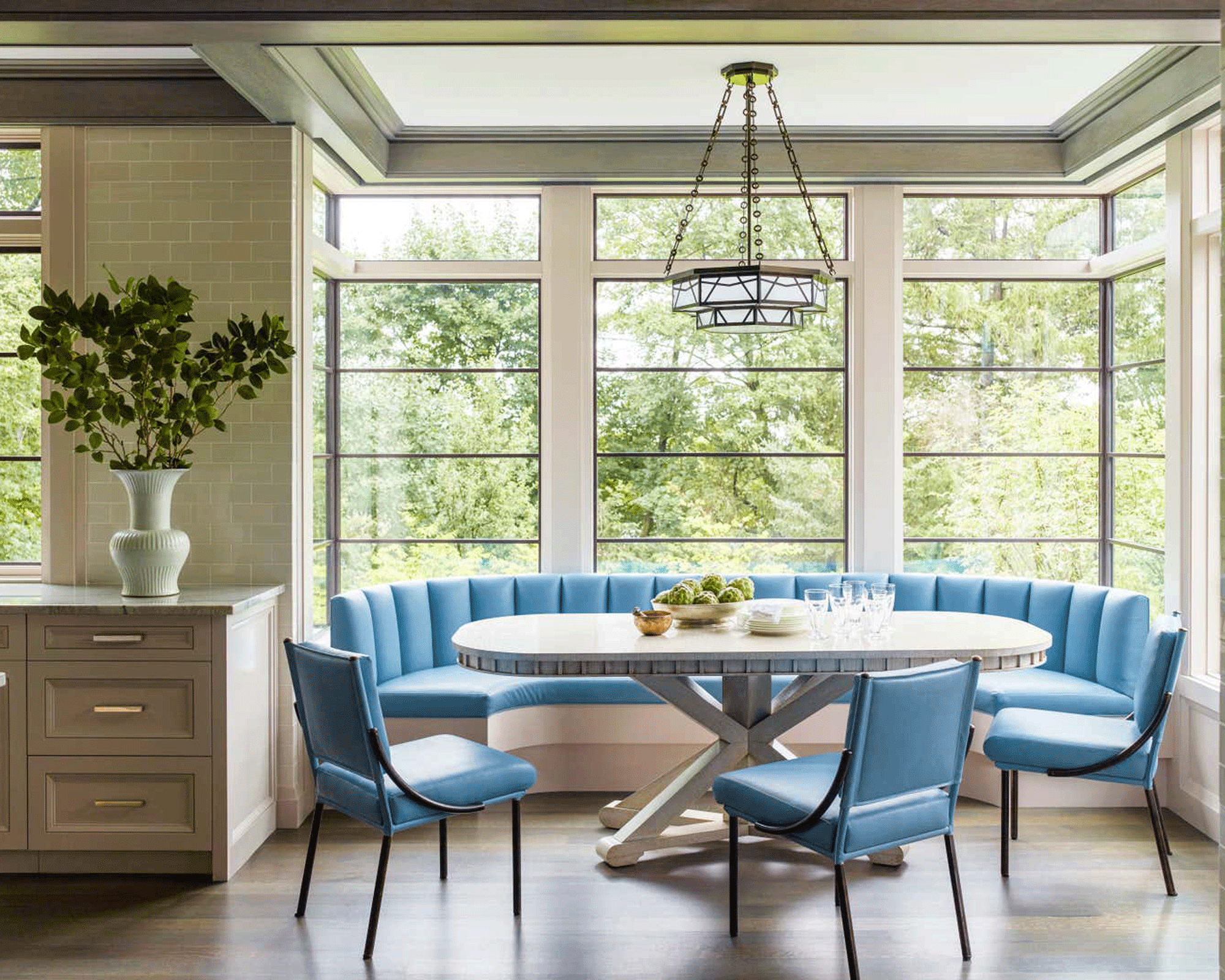
Built-in seating has become one of the most popular kitchen trends in recent years. Banquettes easily hold more people than a conventional chairs-and-table kitchen dining idea and are also a simple way to inject some color and tactility into a kitchen design.
But for maximum impact, go curved. Not only does a curved banquette soften the harder lines of the kitchen, it feels more welcoming because its convivial shape encourages conversation. This eating nook, designed by Boston-based Nina Farmer Interiors fits 10 people with ease and the powder blue gives it a fresh, yet soothing feel.
'The banquette is located in a corner niche specifically designed to house the breakfast area,' says Nina, who features in 1stDibs 50, the annual 1stDibs showcase for leading interior designers and architects. 'My clients eat the majority of their meals there because of its central location and beautiful natural light.
'It is paired with a custom oval oak table, Soane Opera chairs and a pendant from Charles Edwards.'
2. Go classic with a black and white look
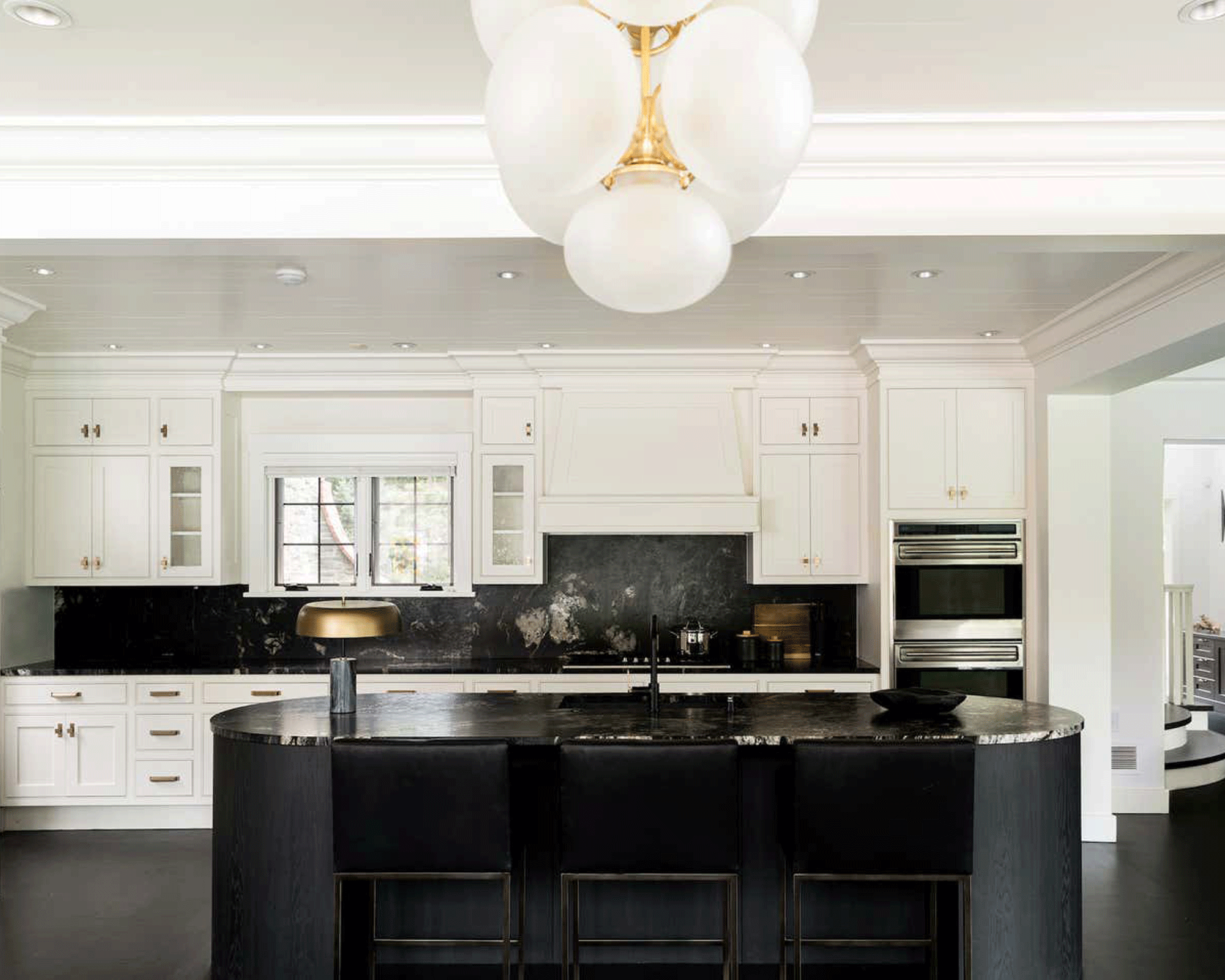
Black and white kitchen ideas are an enduring color pairing for good reason – it is timeless, sophisticated and a design language that is spoken and understood all over the world.
In this kitchen designed by Tiffany Thompson of Portland-based Duett Interiors, the two colors act as perfect companions with white giving the look of serenity while the dark stone adds drama to the kitchen island and the backsplash.
‘I was thinking of how we elevate the black and white aesthetic by combining standout silhouettes with elevated textures,’ says Tiffany, who also features in 1stDibs 50, the annual 1stDibs showcase of inspiring work by the world’s most talented interior designers and architects.
‘I’m thoughtful about my intentions in the work and how things are placed, sourced and curated together. It’s not about a certain design style but about the intentions and emotions you want for the space.’
3. Visually expand a galley with a single shade on walls and units
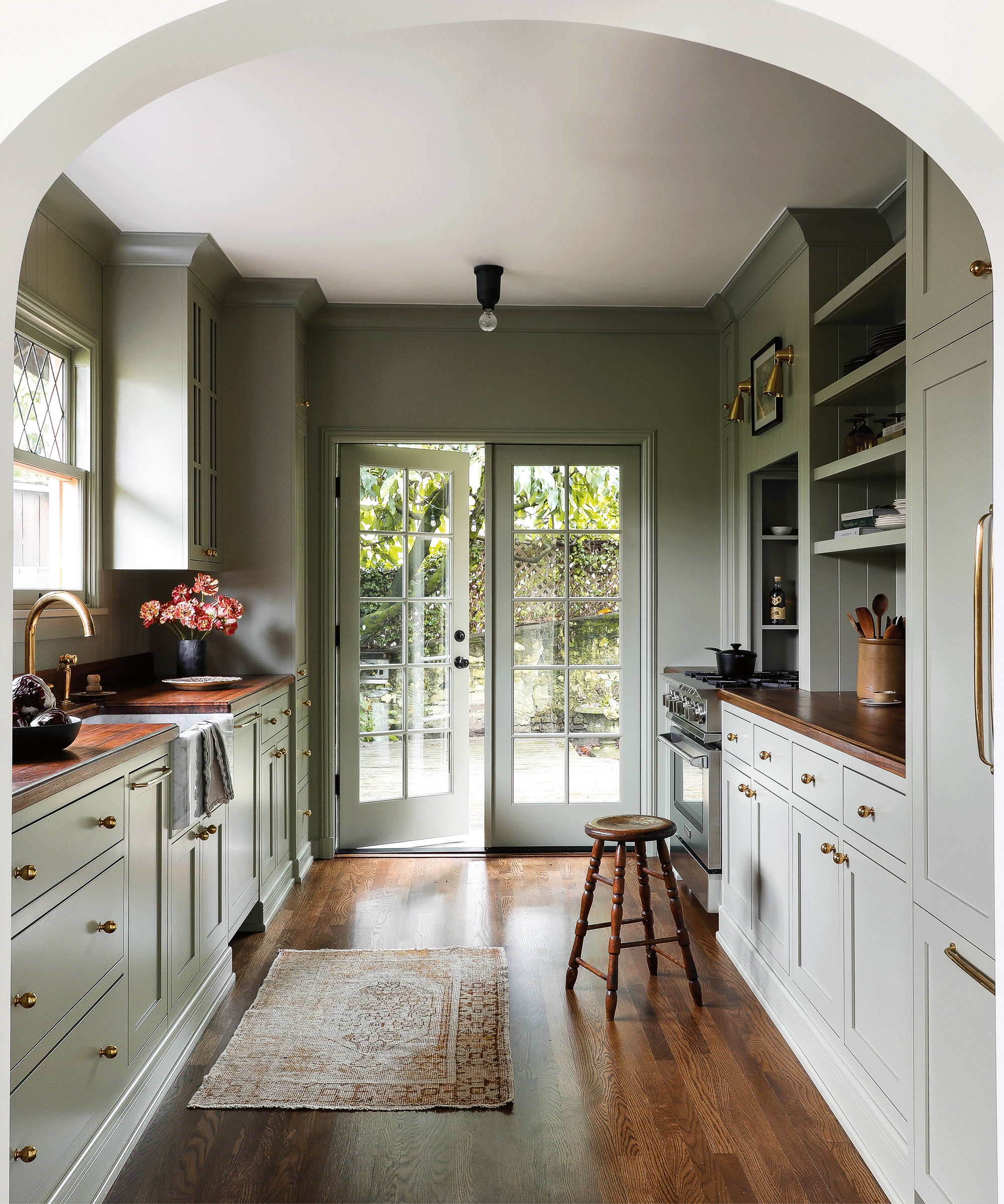
A galley kitchen can be seen as a disadvantage, but designed well it can function as well as any kitchen twice the size, or indeed width. There are lots of tricks to make the most of a galley kitchen, one of which is to ensure you don’t have wall units on both sides to avoid the dreaded ‘tunnel effect’.
Here, the talented Heidi Caillier, known for her relaxed and comfortable approach to interiors, has employed another clever device, painting the kitchen cabinets and the walls the same color. The effect is that the units visually recede into the walls which makes the space appear bigger.
‘I painted the kitchen cabinets and walls the same color, Farrow & Ball’s French Gray, to unify the room,’ she says. Alongside that, she chose almost utilitarian fixtures to maintain the pared-back look. ‘I didn’t want to do anything too decorative,’ she adds.
4. Bring in texture with metallic fluting
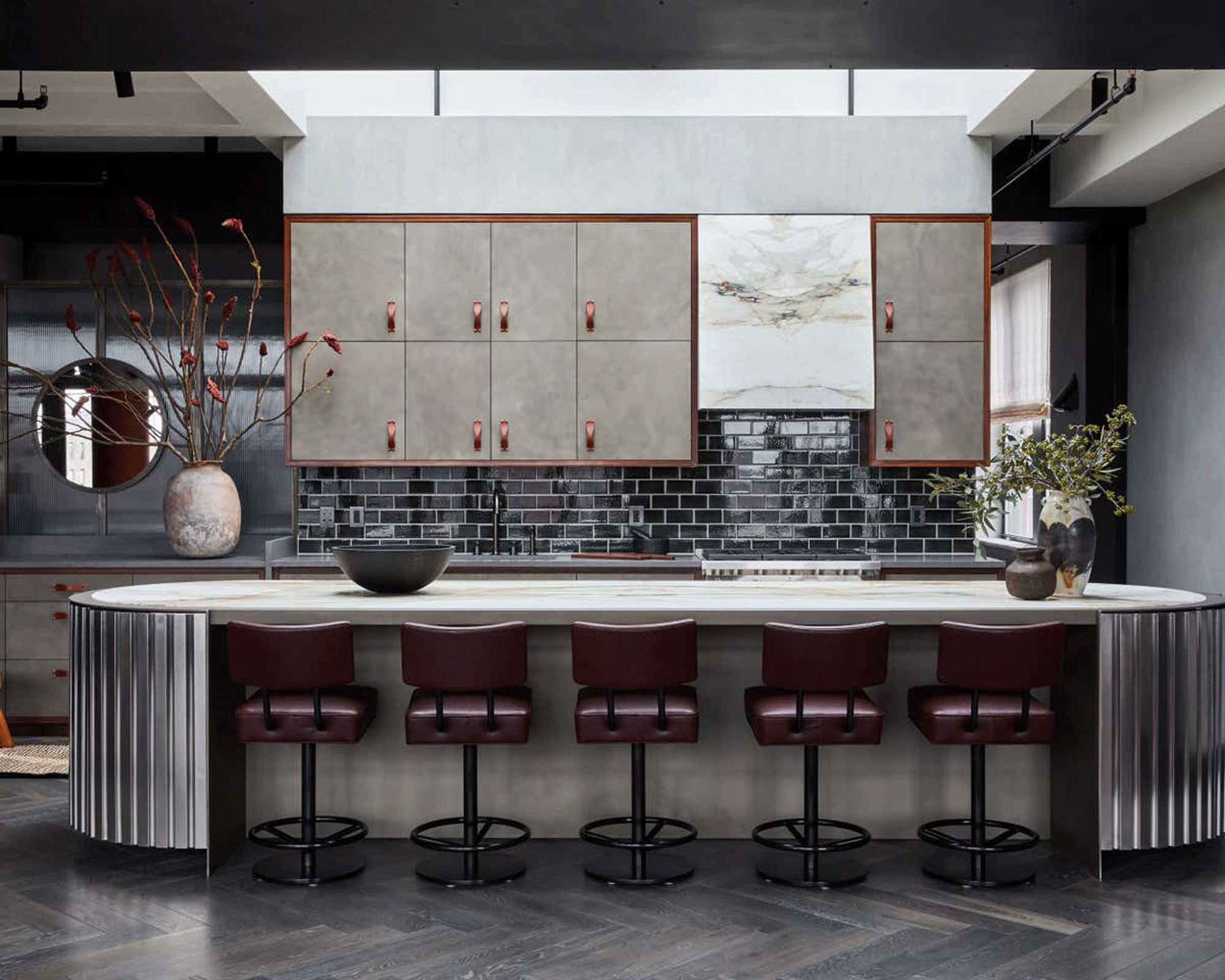
Fluted kitchen islands are one of the key kitchen design trends of the moment. Full of texture, they help elevate and bring character to an otherwise flat surface.
The scope for materials is expanding all the time. Wood, alongside marble, has been a popular choice for statement kitchen island ideas but they are now having to make way for a new fluting option - metal.
In this kitchen designed by Brooklyn based duo Jesse Parris-Lamb who feature in 1stDibs 50, the annual 1stDibs showcase of inspiring work by the world’s most talented interior designers and architects, the pair created a cabinet with exaggerated, oversize fluted doors.
And as the centerpiece of the kitchen, they designed an island with fluted metal sides and a capsule-shaped top of Calacatta Macchia Vecchia marble. The metallic fluting not only adds texture but helps bounce light around.
‘The form and material of the kitchen island came from a vintage cocktail shaker, scaled up,’ they say. ‘The blade-style foot was inspired by the bottom of a vintage serving bowl.’
5. Use oversized lanterns to make a lighting statement
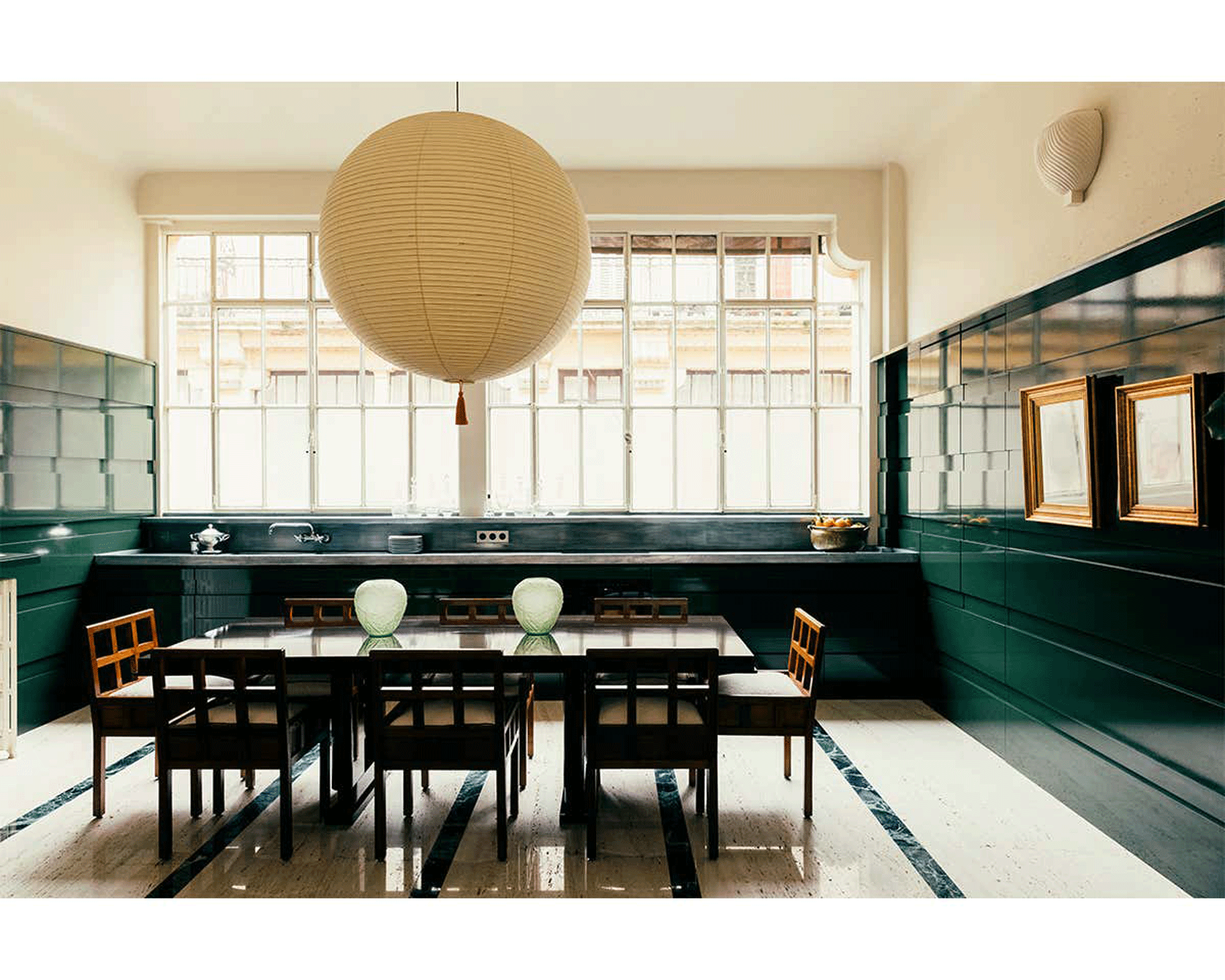
Lighting is an important part of a good design, but the power it can have is not always harnessed. Too often, kitchen lighting is seen as functional and a mere afterthought, but the reality is lighting can make or break a kitchen design.
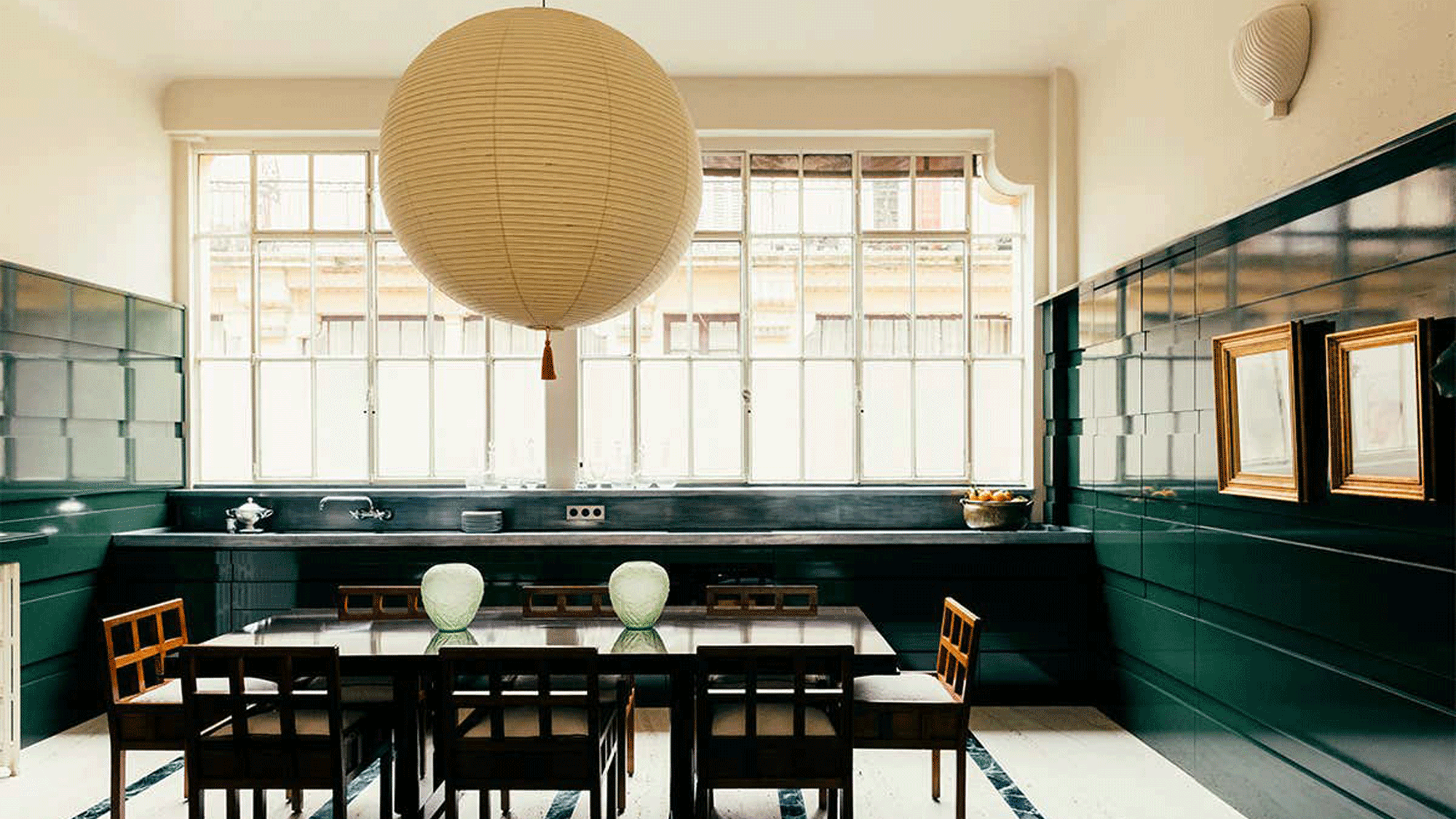
The ideal kitchen lighting would be a mix of functional ones like task lighting, and decorative ones like over-the-island pendants. In this kitchen designed by Fabrizio Casiraghi, he decided to create big focal point with an Isamu Noguchi paper lantern which he personalised with a solo tassel. The pendant brings a playful twist on the look and because it is playing with our sense of scale, it makes the room appear bigger as whole.
6. Mix and match shades of green to add depth
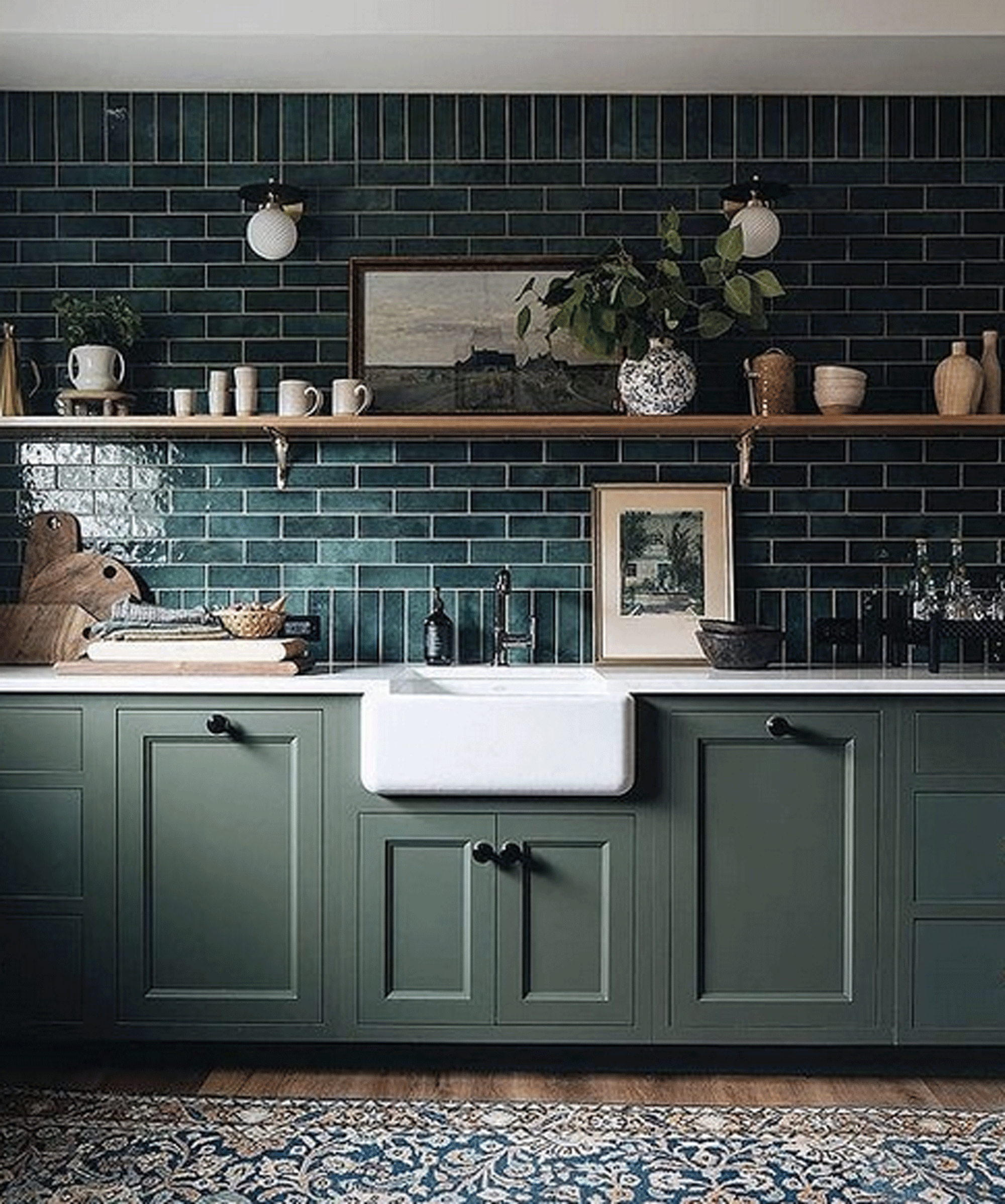
Using different tones of the same color is a clever way of adding depth to a design scheme. This layered approach is about working with colors of the same strength so that you can have a more soothing and harmonious effect than you would get by clashing shades, for instance.
To avoid a ‘flat’ look you can keep a similar hue but clash the material or finish to keep the eye interested. In this kitchen design by Jean Stoffer Design, the green on both the walls and the cabinetry has a cohesive effect but is more intriguing with the mix of matt and glossy finishes. ’Mixing finishes helps keep your space looking timeless, says Jean. ‘If you go all in on trend, it runs the risk of looking dated.’
7. Pile on black on black for a dramatic effect
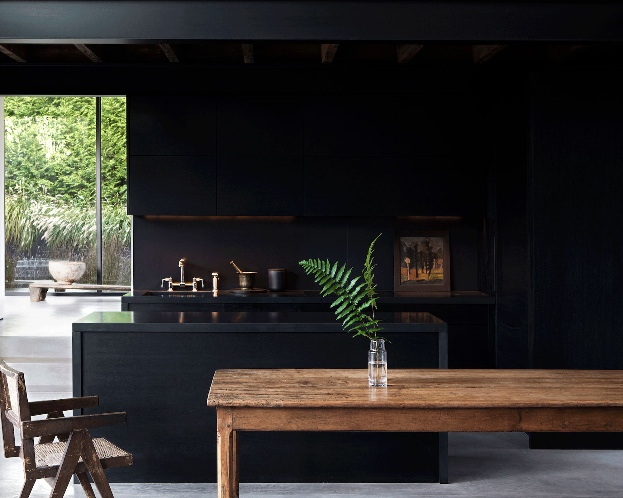
If you are ready to dial up the drama, layer black on black like with this striking all-black kitchen designed by Michael Del Piero who has locations in both the Hamptons and Chicago.
‘We love designing kitchens for clients and, especially when part of an open floorplan, feel that kitchens need a bit of drama to hold their own,’ says Michael.
‘Dramatic hues, such as black, are popular at the moment and certainly add a bit of moodiness to kitchens. When using black paint in an open floorplan, we advise balancing the dark hue with something equally dramatic on the opposing wall—like a black-painted fireplace or similar. It bookends the space, so to speak.
'In this kitchen, modern minimalism was the directive. We brought that inspiration to life with clean, flat-front cabinets and mod black concrete alternative countertops. Black concrete provided a sleek look, where marble and granite would have dramatically changed the aesthetic of the space.’
8. Use a geometric floor to add pattern and interest
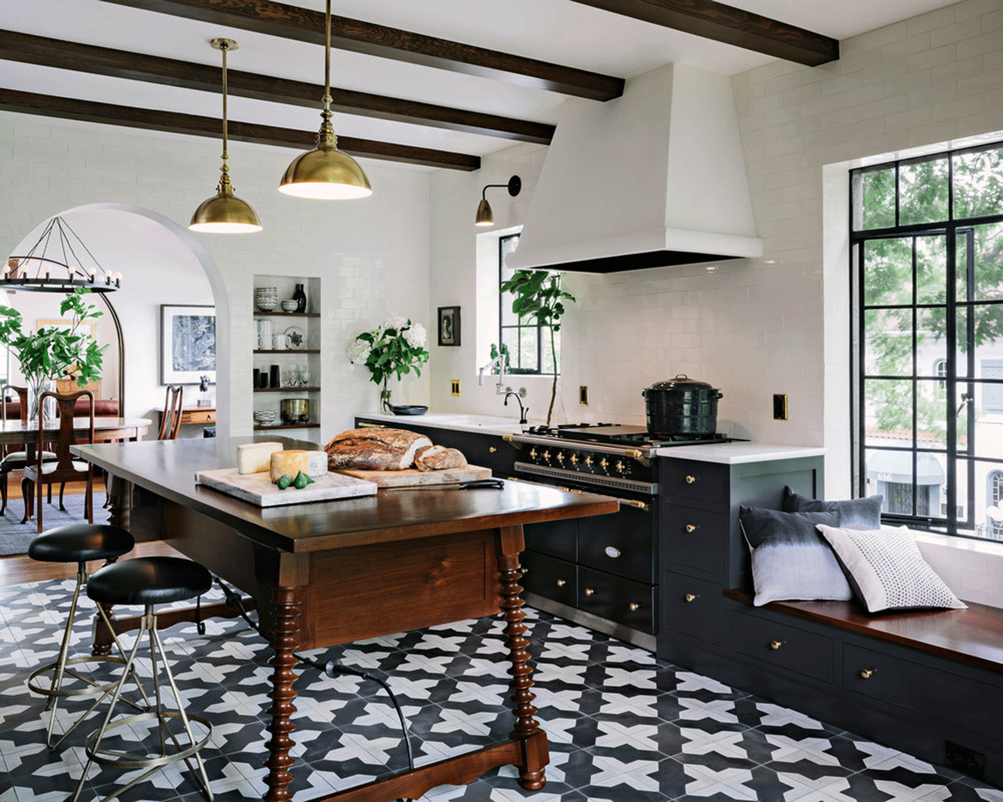
If you are keen to add character to your kitchen and not sure how, an eye-catching floor is an easy win when it comes to kitchen flooring ideas.
A fabulous floor is all the pattern a kitchen needs to add some flair and you can take a number of effective approaches for your desired effect. Keeping a tonal look gives the whole look a calmer feel while contrasting your floor with the cabinetry energises the scheme.
In this kitchen designed by Jessica Helgerson Interior Design, it was decided to go for the latter. ‘The bold decision in this space was to embrace high contrast, both in the dark cabinets playing against the pale ceiling and in the highly patterned floor tiles,’ says Jessica.
9. Add an eye-catching stone backsplash
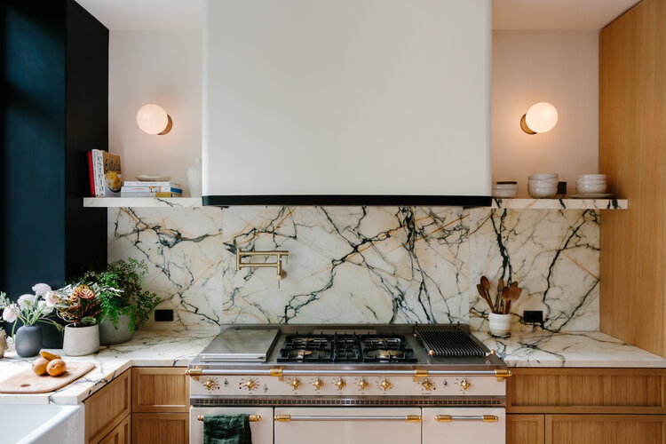
Design by Home Studios
Sure, natural stone kitchen backsplash ideas have practical benefits, like protecting your walls from heat and rogue splashes from a saucepan. But the right stone can be splashier in more ways than one. The natural range in material, from marble to soapstone, folds one-of-a-kind patterns, colors, and texture into a space often filled with sanitized surfaces.
In this kitchen, a Pollock-esque backsplash—the same material used on the countertops—is an expressive, show-stopping masterpiece of marble veining that anchors the space. “I think the mesmerizing marble detail really pops thanks in part to the home’s deliberate neutral color palette,” says Oliver Haslegrave, the founder of Brooklyn’s Home Studios.
10. Update traditional cabinetry with modern colors
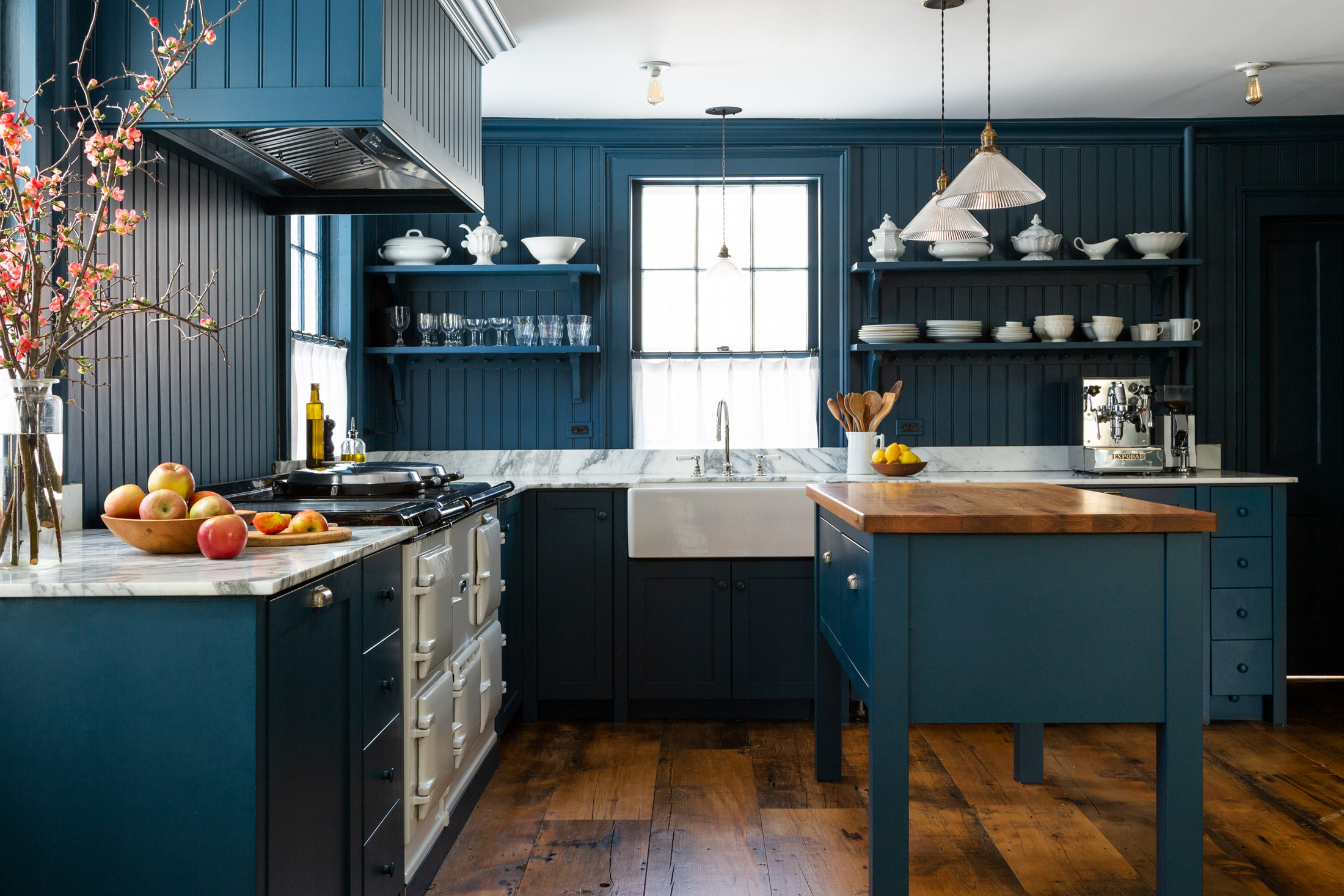
Design by White Arrow
Kitchens are the heart of the home, but this kitchen, which commits to a dark blue palette, has a bit of soul, too. While the overall goal was to embrace the age of the home (an 1850s farmhouse), the designers brought in a modern mood that updated the old-fashioned feel. Just the way to do modern farmhouse kitchen ideas.
“It was an unusual move to run the kitchen's hand-painted cabinetry color onto the paneled appliances, wooden cabinet knobs, beadboard backsplash, and all walls,” says Keren Richter, a co-founder of Brooklyn’s White Arrow, who used a dark blue paint made by Fine Paints of Europe. “However, despite the dark walls, the room doesn't feel overly oppressive because we incorporated several bold gestures for visual contrast.”
The contrast arrives by way of milk-white pops of color. The porcelain farmhouse sink, a show-stopping vintage Aga cooker complement the kitchen shelving ideas, which are as homely as displaying antique Ironstone dishware like sculptural objects.
11. Embrace the Japandi aesthetic
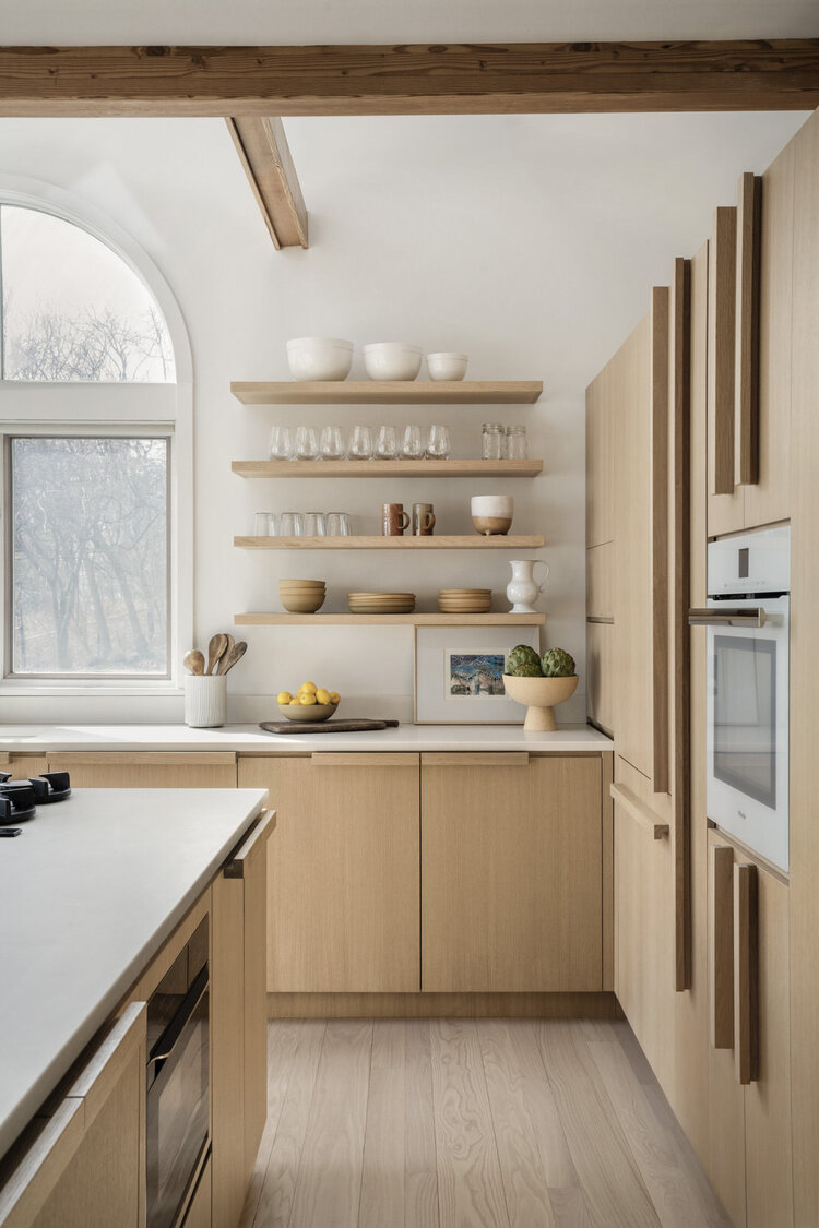
Design by Stewart-Schafer
With so many necessary appliances, not to mention the potential for all sorts of bells and whistles, there’s a lot to cram into our kitchens these days. But minimalism in interior design remains a goal of modern kitchens, and the latest Japandi trend offers a pleasant update.
“The term Japandi really means to blend Scandinavian design with Japanese craftsmanship,” say James Veal and Christine Stucker, the owners of Brooklyn’s Stewart-Schafer, who applied principles of George Nakashima’s iconic woodwork in the kitchen above.
This light-filled and clean-lined Japandi kitchen is a meditation on less is more. “When designing this kitchen, we wanted the natural materials to be the focus,” explains Stewart-Schafer, which bookmatched oak wood to create seamlessly serene surfaces, and skipped metal hardware for custom-made wooden handles that maintained an organic vibe. Wooden kitchen cabinet ideas never felt so calming. “By using lighter wood and making things uniform, we are adding a Scandinavian element which is also all about functionality.”
12. Let your island take center stage
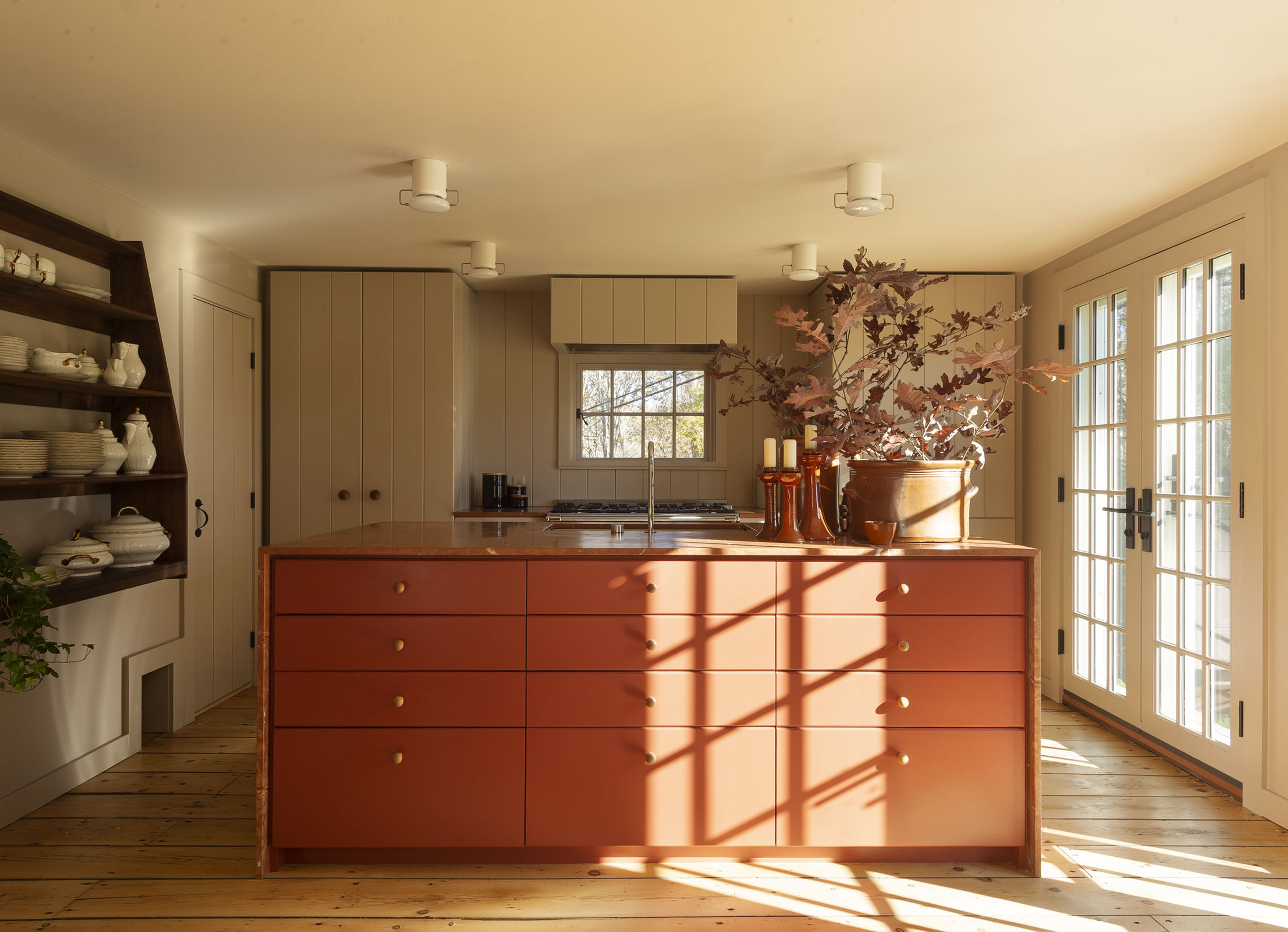
Design by Workstead
The island, by nature, is the centerpiece of most kitchens. This means that kitchen island ideas require some extra attention to avoid creating an eyesore. This is especially true when considering small kitchen ideas, where islands command the room, and particularly if you opt for a built-in over a free-standing unit.
In this charming kitchen, the designers at New York’s Workstead leaned in, making the bold choice to use an eye-catching Rojo Alicante marble countertop complimented by drawers painted in rusty red, drawing the eye to the kitchen island.
“It is the focal point of the kitchen, allowing the rest of the room to recede,” says co-founder Stefanie Brechbuehler, noting the custom wood paneling and hand-turned knobs that Workstead added to cover the appliances. “Because we were working with a small space it was important for all the appliances to appear like cabinetry so nothing but the island would catch the eye.”
13. Lock down your open layout
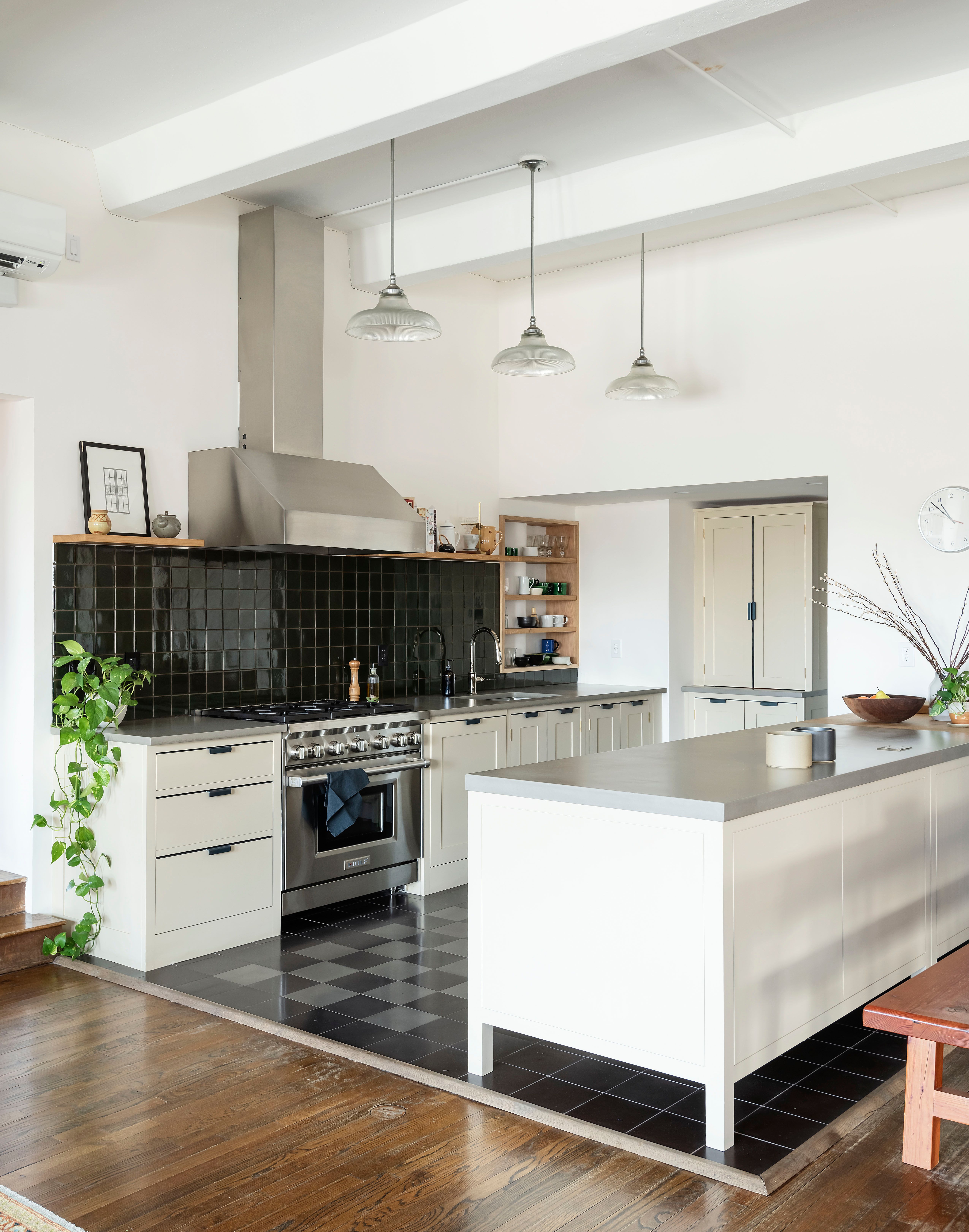
Design by General Assembly
Modern layouts often center around open plan kitchen ideas, which means your cooking area is on display even when it’s not in use. That’s only a problem if your kitchen is distracting, and if the design doesn’t match the overall look of your home.
There are some obvious tricks, like covering large appliances (such as your refrigerator and dishwasher) with a veneer that matches the cabinetry, but truly integrating multiple spaces in one requires some clever planning.
“In large open spaces, you need to get creative about how to define different areas within it,” says Sarah Zames, the interior architect at Brooklyn’s General Assembly.
In the West Village loft pictured above, Zames anchored the open kitchen with a few key design choices.“We took advantage of the light and brought in some darker finishes for the floor and backsplash which contrasted with the cream colored millwork,” notes Zames, noting how the kitchen’s darker tiles anchor the open kitchen, creating its own zone.” Yet another example of why we love to think about cream kitchen ideas so often.
“By removing typical upper cabinets from the design, we were able to create a lower baseline for the cabinets that connected to the dining room and living room furniture more naturally,” she adds.
14. Use the triangle rule wisely
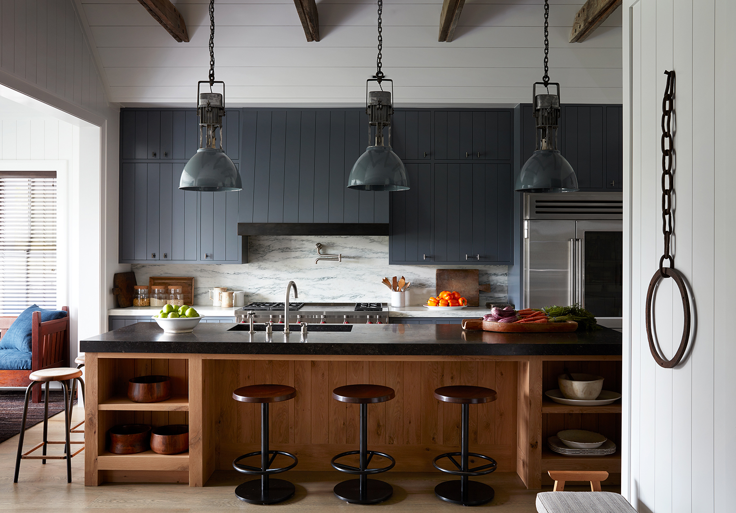
Design by Robert Stilin
At the end of the day, your kitchen’s design must work. Which is why small kitchen layout ideas all focus on one algorithm. The tried-and-true method for a functional, flowing cooking space is the kitchen triangle rule, which orients the key areas (sink, fridge, stove) in a task-friendly triangle.
Like a chef’s table, this Southampton kitchen by New York’s Robert Stilin balances it all. “The design for this kitchen is such a success because it is gracious and inviting while also being extremely useful,” says Stilin, noting its traditional triangle design. It's a masterclass in how to design and install a kitchen island.
“The owners like to cook and work together in the kitchen, so there is ample space for them to both utilize the kitchen” Stilin continues. ”They are also able to cook and entertain guests at the same time as the kitchen is adjacent to a living space. The kitchen is elegant and allows for a free flow of relaxed cooking and engagement with friends and family.”
15. Pick a bold accent and back it up
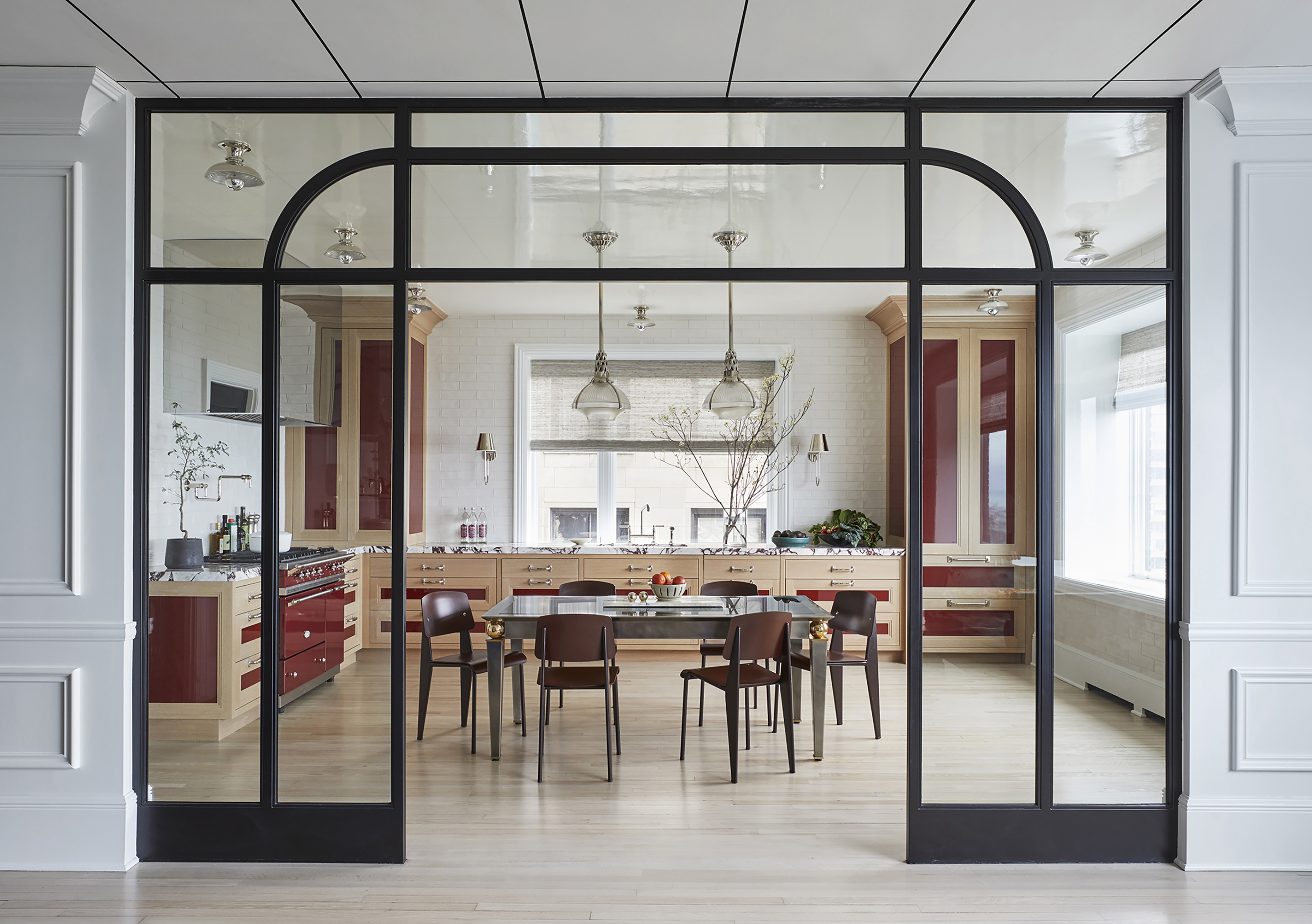
Design by Summer Thornton Design
There’s nothing wrong with a kitchen that shows restraint, but bold, punchy layers can kick your kitchen into overdrive. “A lot of designers water-down boldness with blandness,” says Summer Thornton of Chicago’s Summer Thornton Design. “They do one bold thing and offset it with a lot of beige or grey. I do the opposite—I layer bold colors, bold finishes, and bold patterns all together.”
In this Chicago kitchen, a daring combination of materials and kitchen color ideas turn the space into a rockstar. “With this kitchen we were trying to create a level of sophistication and polish, so the mirror-finish stainless steel hood, the high-gloss ceiling and the high-gloss panels on the cabinets add elevation, but the wood tone in the oak feels very familiar and more humble and is a significant portion of the overall palette,” says Thornton.
“The viola marble adds an unexpected twist and the ox blood color just feels rich and sophisticated and fearless. I think confidence is a big element that makes it work, there’s no timidity. You have to fully commit and go for it or it will fail.”
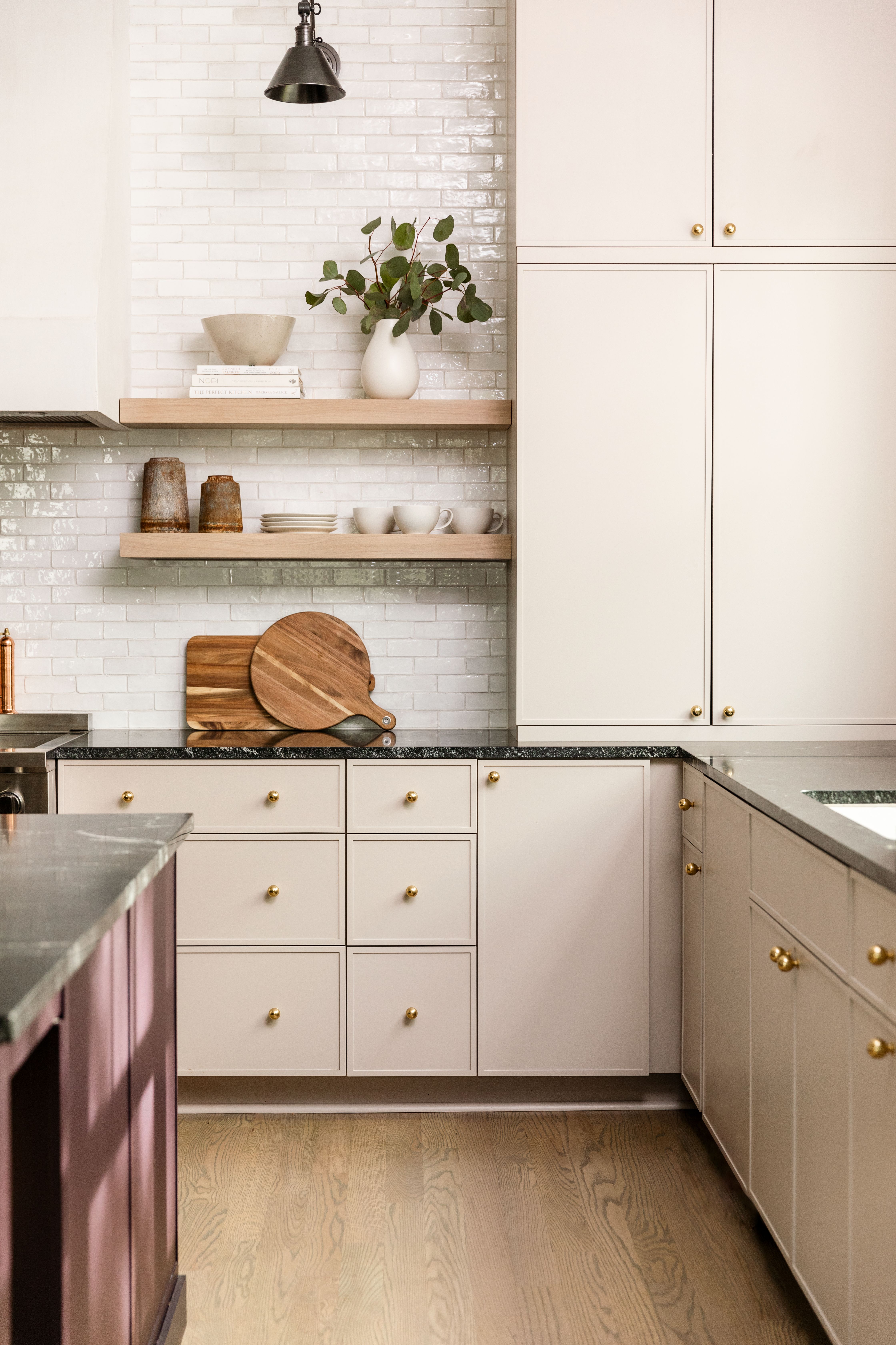
16. Pick a warm, modern neutral
Design by Zoe Feldman Design
Years ago, the most ubiquitous kitchen cabinet color ideas in modern home renovations may well have been whites and grays, two resoundingly safe choices. But today’s interiors welcome a bit more joy. “I think there are enough people that are now looking for something warmer than white, but hope to retain a neutral palette for an all-around more timeless design,”says Washington, D.C.’s Zoe Feldman.
In one of Feldman’s recent kitchen renovations, a beautifully matte, macaron-like paint creates a neutral, elegant, and cozy vibe. “Blush, putty, grayish-blues, chalky greens, and chocolate brown are all great alternatives that add an element of sophistication and detail [that] can fall short with white cabinetry,” explains Feldman, who then added in some smart kitchen tile ideas. “Natural woods like white oak and walnut on islands, cupboards, open shelves, etc. are a great way to layer warmer hues which cozy up the space and add dimension and contrast."
17. Add texture with plaster
Design by Jersey Ice Cream Co.
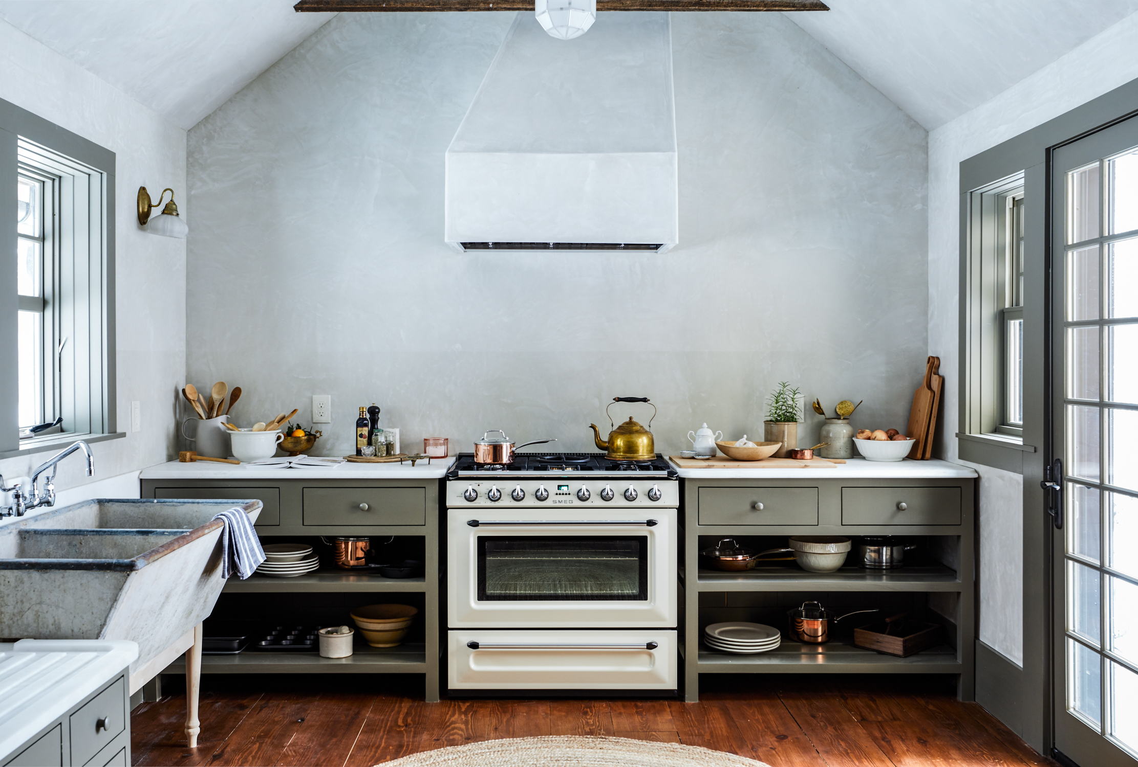
The same way that it can transform a dish, texture can add depth to your kitchen. A coat of paint is one of the most cost-effective ways to update your space (with plenty of modern kitchen color schemes to choose from). But if you’re working with a vintage kitchen and want to maintain a classic atmosphere, there’s an alternative to paint that can give texture and character: plaster.
In this kitchen renovation, Jersey Ice Cream Co. used plaster to reconnect the space with the rest of the old-school house. “We love the mood plaster brings to a space,” says co-founder Tara Mangini. “Here we used a slightly green tinted plaster to play off the green of the cabinets, giving the whole thing a patina haze.”
Look closely and you’ll see a protective finish just above the range, and other old-timely choices (like marble counters with built-in drainboards, vintage light fixtures, and copper pots) that add texture to the story. Knowing how to create plaster effect walls gives you so much range.
“Of course, in efforts to keep things feeling time appropriate, we plastered in the range hood, and embraced the asymmetrical nature of it,” Tara continues. ”Those are the types of details we love in old homes, so we try to highlight those moments whenever we can.”
18. Use handmade details
Design by DISC Interiors
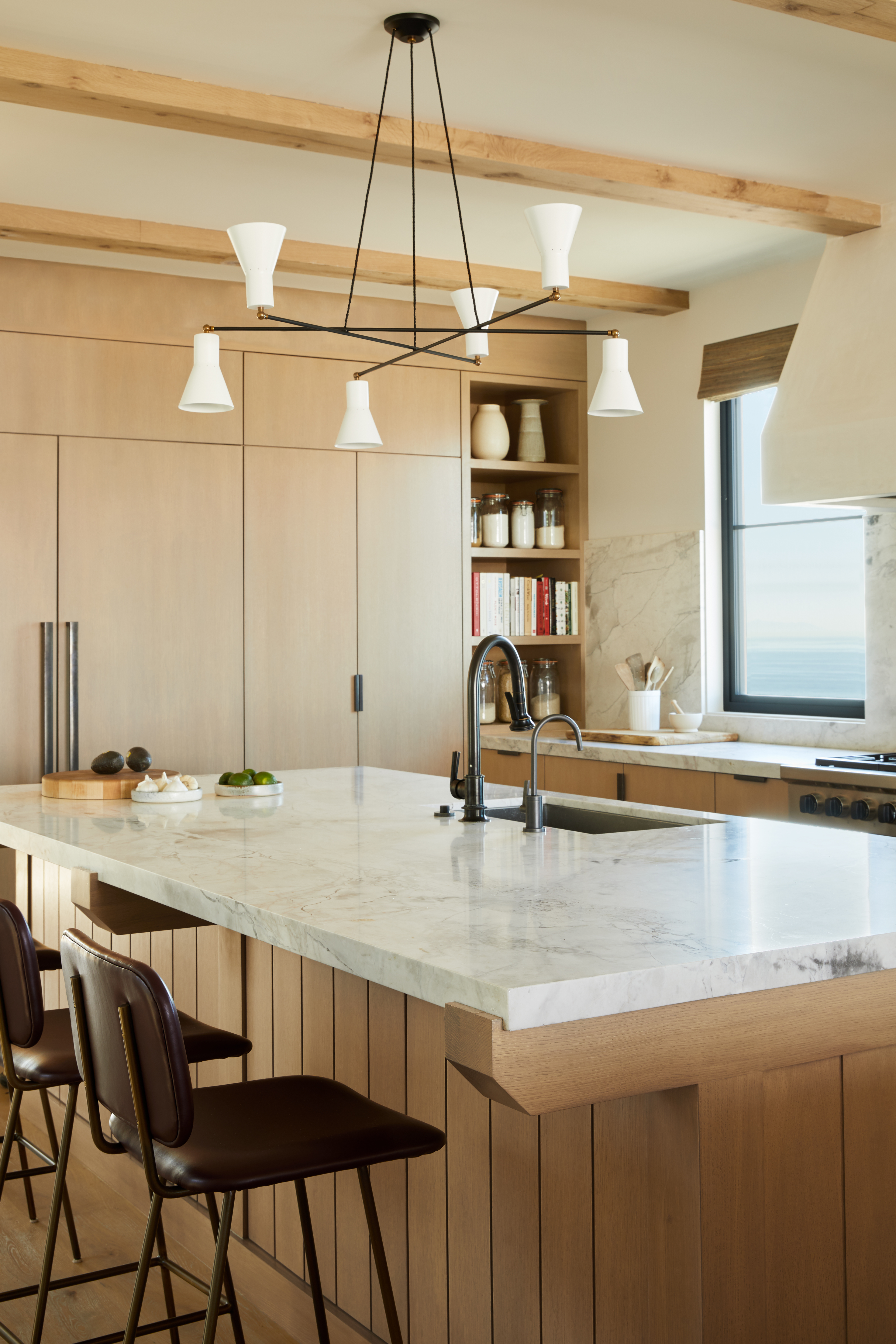
Modern kitchen ideas are known for their clean lines, but clean lines can sometimes appear cookie-cutter. Adding touches of craft detailing, like custom millwork, can bring character into your kitchen—it’s a human-made effect for a room often dominated by machine-made appliances.
“We designed the kitchen to feel contemporary but also to have a few elements that spoke to the handcraft, such as the island detail, which has a unique wood and stone transition,” says David John Dick, a designer at Los Angeles’ DISC Interiors.
“The hardware for all of the custom cabinetry is from Sun Valley bronze and is cast bronze which patinas over time, also adding a certain time worn element into the contemporary design.”
19. Consider your lighting
Design by Studio Hus
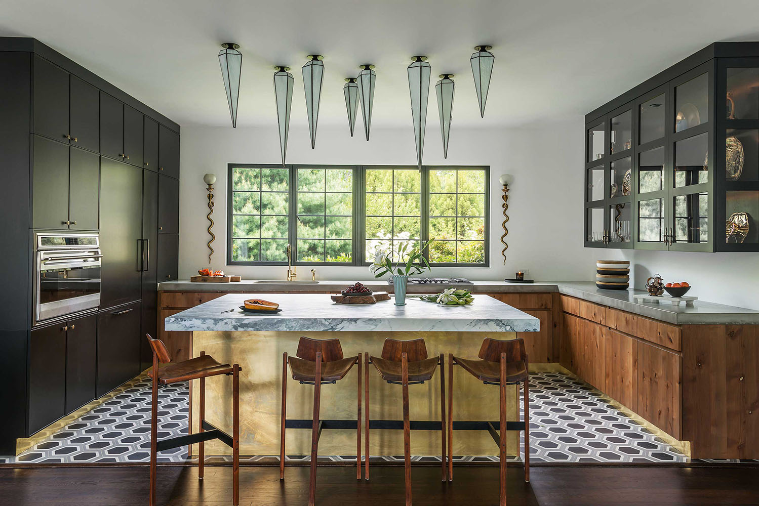
Even if your space is fully kitted out, it won’t make an impact without the right kitchen lighting ideas. It’s not just about picking one show stopping fixture—it’s about placement, variety, and style. You want lighting that creates enough light to safely cook (just think about mincing a clove of garlic in the dark), but you also want the ability to tone it down with accent lighting (especially if your kitchen doubles as your dining room).
“I love lighting, I use it like jewelry on an outfit—it really has the power to make or break a room,” says Tatum Kendrick, the designer behind Los Angeles’ Studio Hus.
In this East Hampton kitchen, Kendrick chose sconces that added visual interest to an otherwise minimalist kitchen. “The snakes give it a punchy sensuality that helps balance the harder architectural lines,” she says, commenting on the metallic fixtures on either side of the kitchen’s panoramic window.
Over the kitchen island, Kendrick looked for something unexpected and modern to cut through the home’s otherwise classical features, ultimately arranging a group of fixtures by lighting designer Jason Koharik that hang like stalactites. “It was definitely a bold design risk but we couldn’t have been happier with the results.”
20. Mix materials
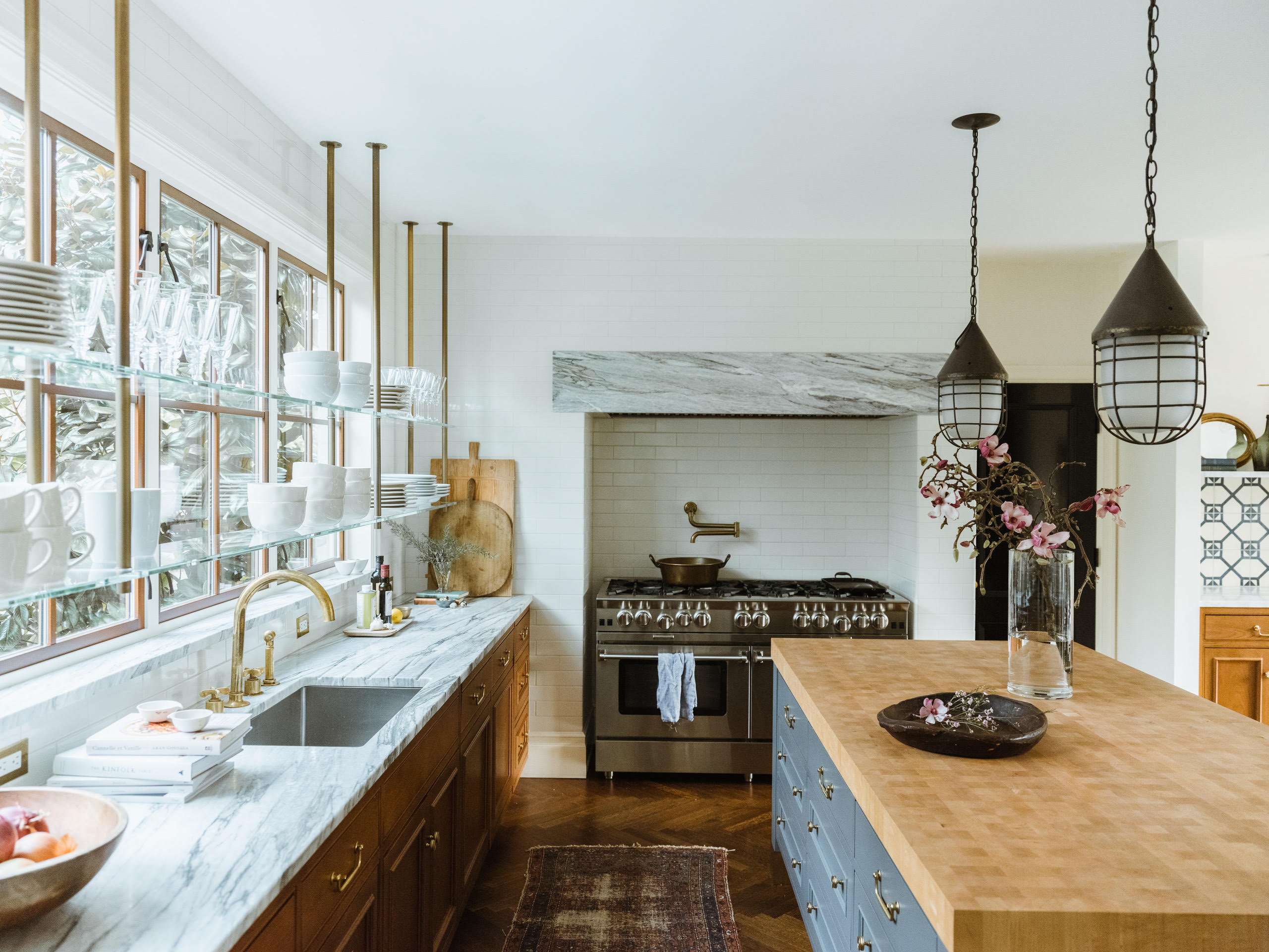
Kitchens tend to have more materials than any other room in the house—from cabinetry to backsplashes, countertops, appliances, and hardware, the opportunities to customize are endless if not overwhelming.
And while many modern kitchens take a minimalist’s approach with pared down palettes, why not include everything and the kitchen sink? With a steady hand, you can layer in a spread of materials like a patchwork that builds a rich character.
In the kitchen above, a range of materials and finishes—from glass to metal, wood, and stone—collide like a medley.
“At the time, I found myself drawn to kitchens from early 20th century European homes, with stained cabinetry and authentic materials that stood the test of time; combining Classic subway tile, Calacatta marble, thick maple butcherblock, and varying metal finishes seemed to fall in-line effortlessly,” explains Katie LeClercq, founder of Seattle’s Katie LeClercq Design Studio. A smart take on luxe marble kitchen ideas.
21. Embrace black cabinets and counters
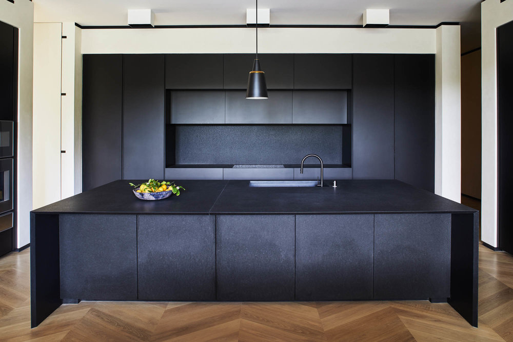
Design by The Unionworks
When your open kitchen is fully exposed to the rest of your living space, it can be a force to be reckoned with, demanding focus - if that’s not what you want, there are striking ways to put it on the backburner.
In this kitchen, part of the home’s family room, Poonam Khanna of The Unionworks used black kitchen ideas to let the space stand out while blending in. “It does pull your eye in but it gives the rest of the space great warmth and creates a cocoon,” says Khanna. “We knew we wanted it to be dark because it was part of the family room—and we wanted it to be in the background.”
And yet, as far as backdrops go, it brings plenty of drama; while the surfaces are all black, a closer look reveals slight variations on texture. “All the surfaces are slightly flamed, meaning the stone has undulations giving it rich texture,” adds Khanna. “And the stone is not a flat black, it has depth.”
22. Include styled open shelving
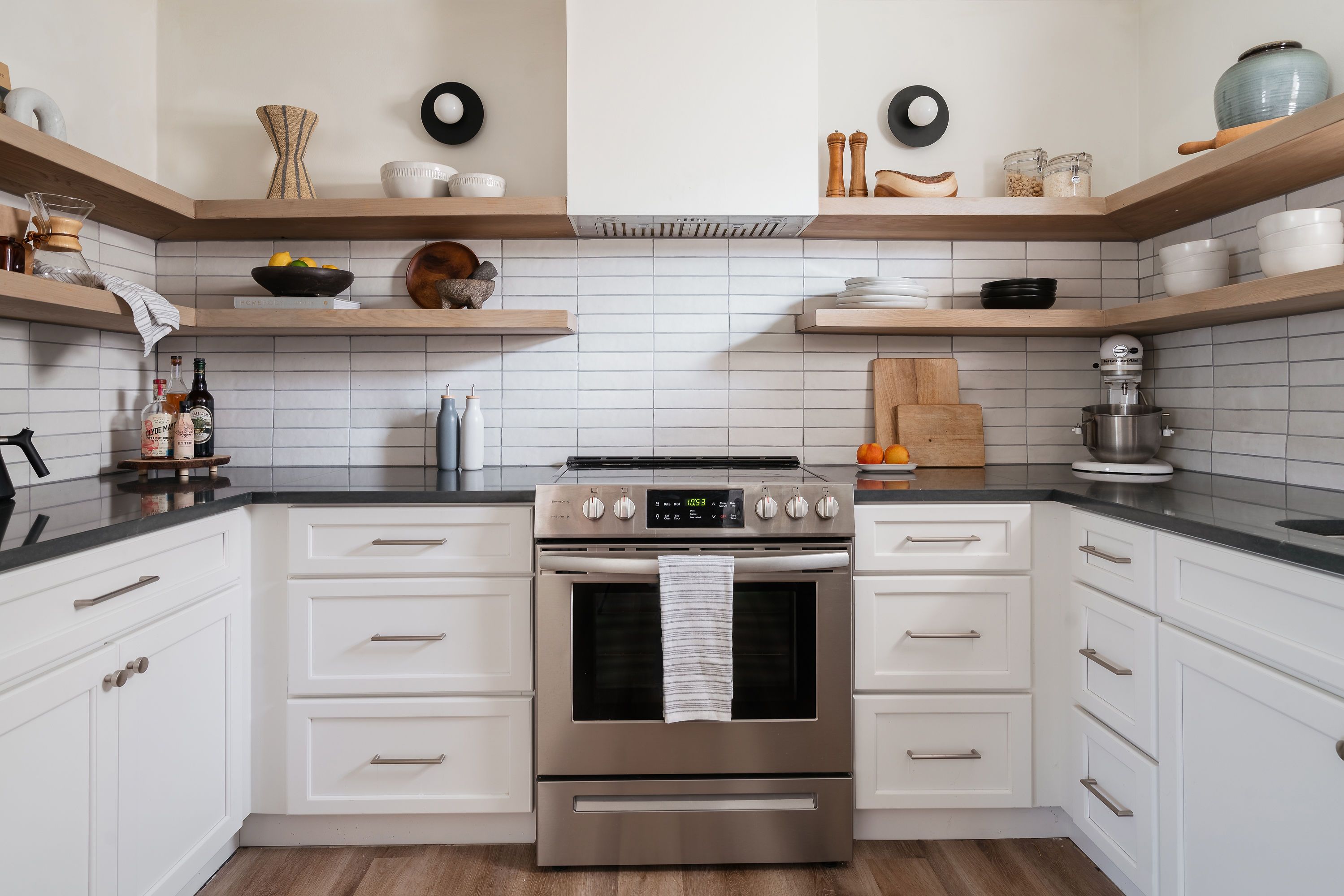
Design by Cailey Damron of Corio Design House
Like wearing a see-through blouse, open shelving can be terribly stylish—even so, it’s not for the everyday kitchen. Deft styling can make it all look effortless, but a single misplaced dish can make it look disheveled.
“If you are planning on incorporating open shelving in your kitchen, I would highly suggest you save a bit of your budget for beautiful new dishware to adorn the shelves with,” recommends designer Cailey Damron or Corio Design House. “This will help the space feel clean and consistently styled.”
In this kitchen, Damron went for bold basics (like black countertops against white matte subway tiles - matte being one of the key kitchen trends) to create subtle visual interest in the space. The floating oak shelves offer warmth.
“This kitchen is unique because it utilizes all open shelving, which in my opinion is only doable for small families,” adds Damron. “For my clients with larger families, I suggest incorporating open shelving more sparingly in areas such as coffee stations or bars.”
23. Create a tiled mural
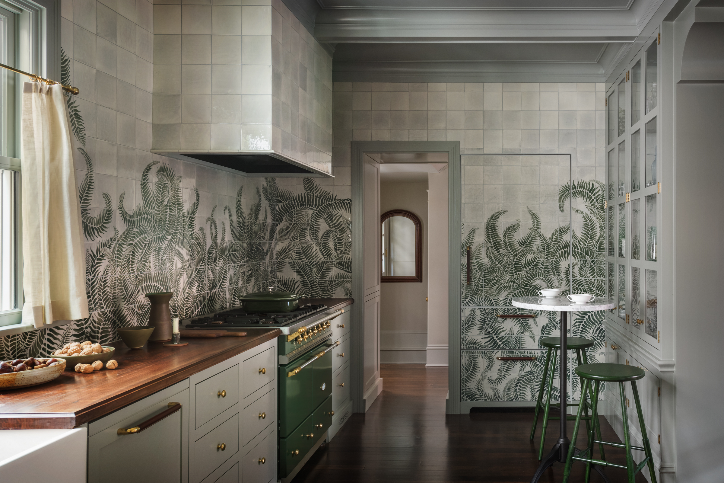
Design by Jessica Helgerson Interior Design
Kitchen ideas may not be the most obvious realm for pattern; at the end of the day, kitchens are meant to be functional. But even the most simple arrangement of tiles (squares in a grid) adds geometry and texture to backsplashes, floors, and countertops—an easy way to create visual interest. You can keep it simple with a bold tile, or you can make a statement like those found in this Pacific Northwest kitchen.
Anchored with a soft color palette (a wonderful use of green kitchen ideas) and a mix of organic materials, Portland-based designer Jessica Helgerson created a cool and collected mood that accommodated a louder, lush tile design.
“It allowed us to make the big move of introducing the ferns because there isn’t too much else happening visually,” says Helgerson. In a fabulous flourish, the tiles don’t just stop at the backsplash, but cover even the range hood and a secret built-in refrigerator, as if the entire kitchen was engulfed in a thicket of nature—while plenty of patterns can go over the top, this one is a touch closer to earth.
24. Harness the spirit of nature
Design by Sandra Weingort
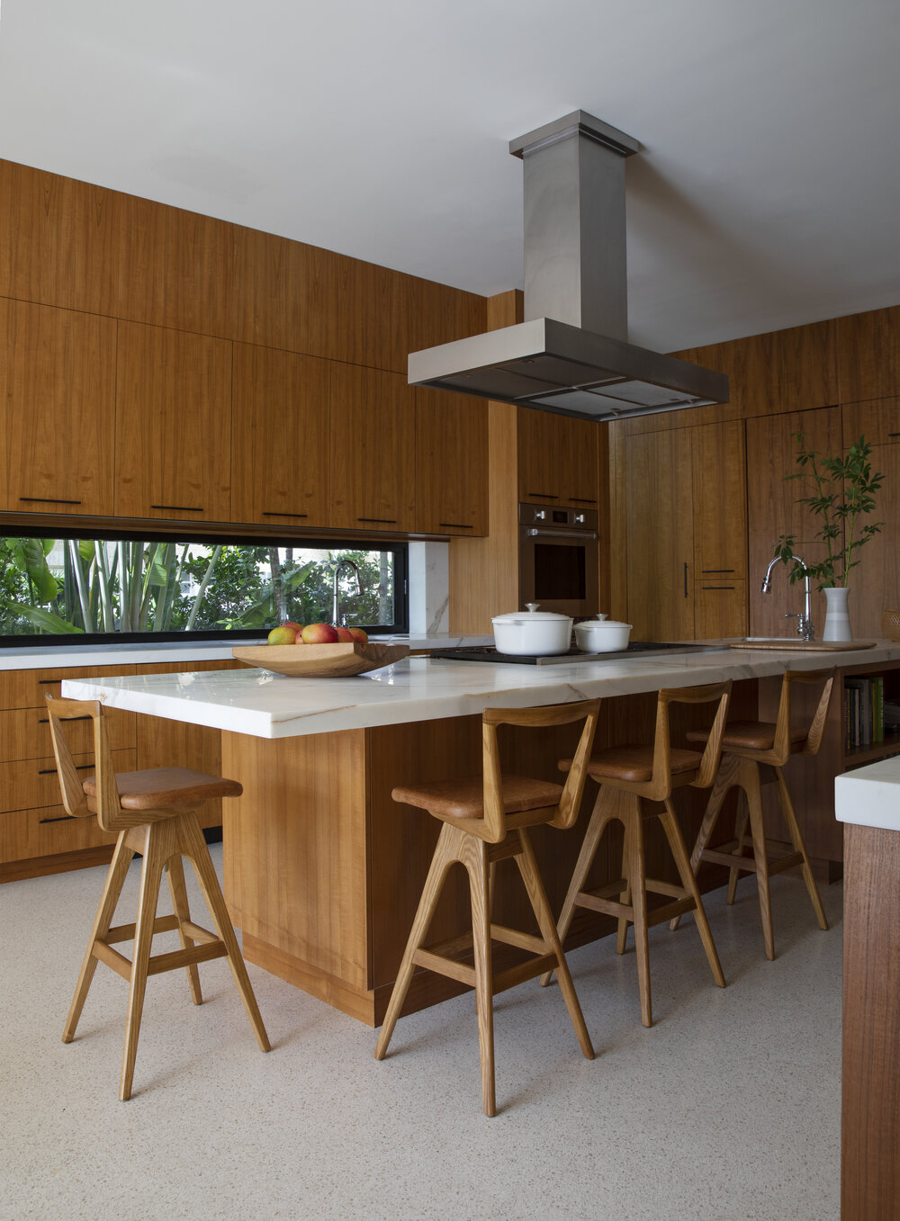
The big-ticket feature in most kitchens is the one that tends to be custom: cabinetry. It’s why knowing how to paint kitchen cabinets is so useful - it brings new life to the most dominant, expensive part of your kitchen. There are plenty of choices for materials, but wood adds a new layer of warmth to any space, and cabinetry has plenty of surface to make an impact.
In this kitchen, a landscape of all-natural materials, mother nature gets her due. “I was very careful not to overpower the nature around the house, so I used only natural materials like teak, stone and metal to bring the warmth and tones of the exterior into the interior,” says interior designer Sandra Weingort, who also noted the influence that nature has on positive vibes.
“Being that the kitchen is the soul of a home, the use of natural materials is even more relevant here, and design can really transcend the visuals through incorporating nature in our interior environments.”
25. Choose soft finishes to feel relaxed
Design by A1000XBetter
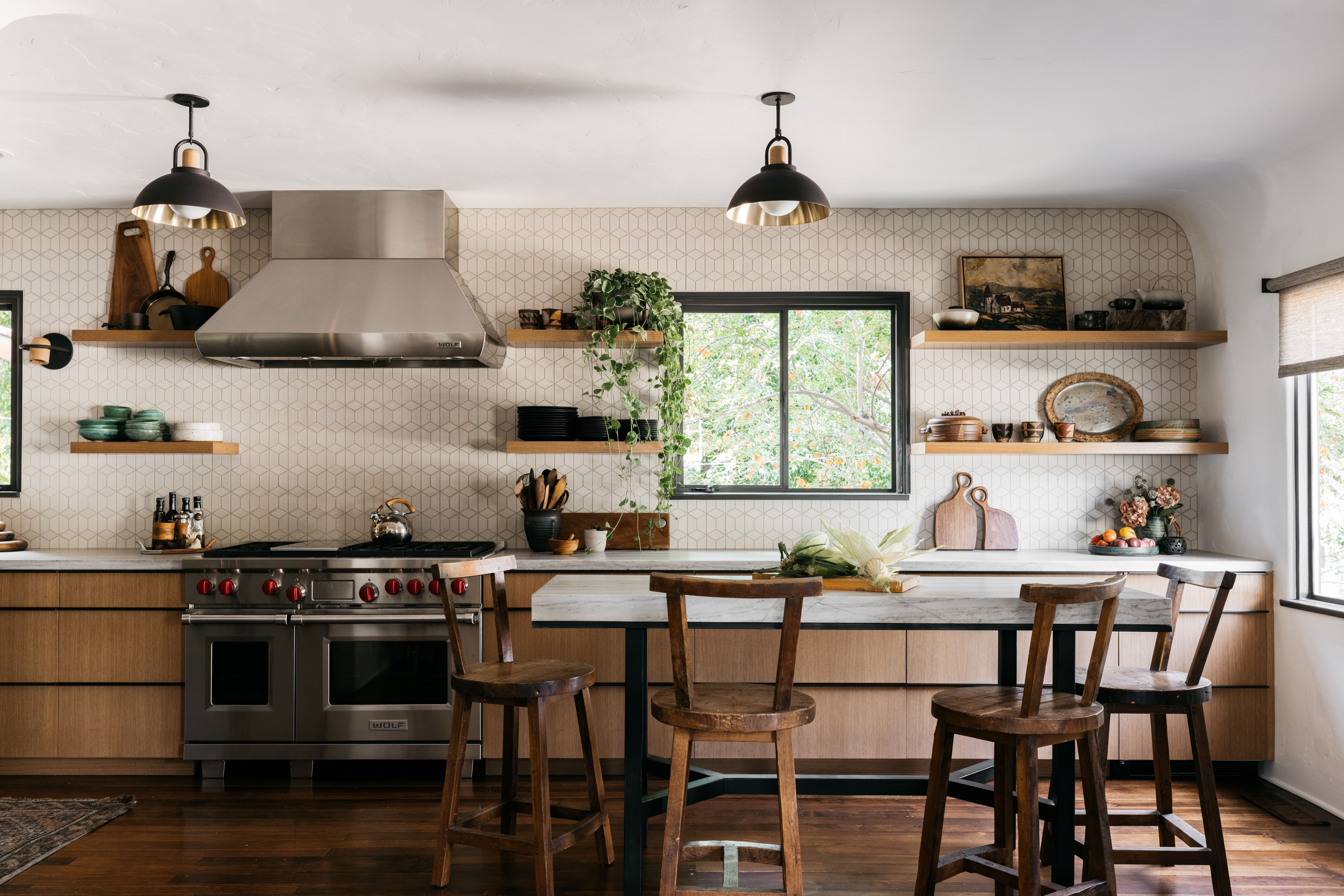
While some modern kitchens emphasize sleek surfaces and an abundance of stainless steel, they can often look, well, cold. But in these kitchen ideas, the designers at A1000XBetter relaxed the space—a major feat, considering they doubled the original kitchen’s size—by grounding the interiors with material touches.
“Our goal with any design is to make a space feel approachable and effortless,” says Patrick Maziarski, a lead designer at A1000XBetter, who knows how to create a relaxed-looking kitchen. “Aside from the sharp lines of the cabinetry, the other elements maintain a softness and laid-back essence; feathery tile, leathered counters, aged wood accents. The custom steel and stone island also played to this layering and casual approach to the design.”
26. Zone a small space
Design by Neal Beckstedt
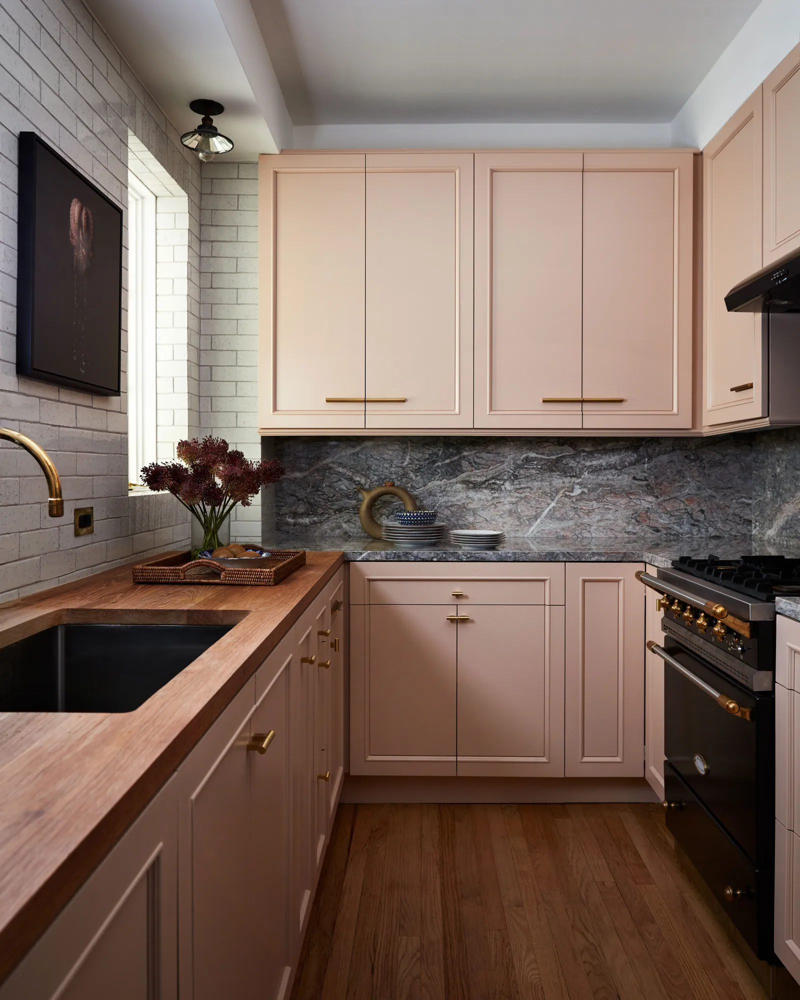
If you’re focussing on galley kitchen ideas, maximizing every surface is key. In this West Village kitchen, New York interior designer Neal Beckstedt took it to another level, breaking down the small space in a unique way. “There is not just one counter or backsplash material for instance—it varies per function,” says Beckstedt.
On one side, a space for cleaning and chopping features an oak butcher block countertop backed by a white brick backsplash. On the other side, the surface for cooking and plating are rendered in Fior Di Pesco marble.
“The finishes vary in each of the areas,” adds Beckstedt. “Even though [it is a] small space the change in materiality helps with interest and most importantly is super practical.”
27. Hang art cleverly
Design by A1000XBetter
Kitchens rarely feature art. It’s a shame, but it makes sense: there’s a scarcity of wall space and a hesitancy to put art within the splash zone (one errant droplet of tomato sauce could wreak havoc). We’re not here to make you turn your galley kitchen into an art gallery, but if you have the space—and the right piece of art—you can add beautiful forms to an otherwise functional space.
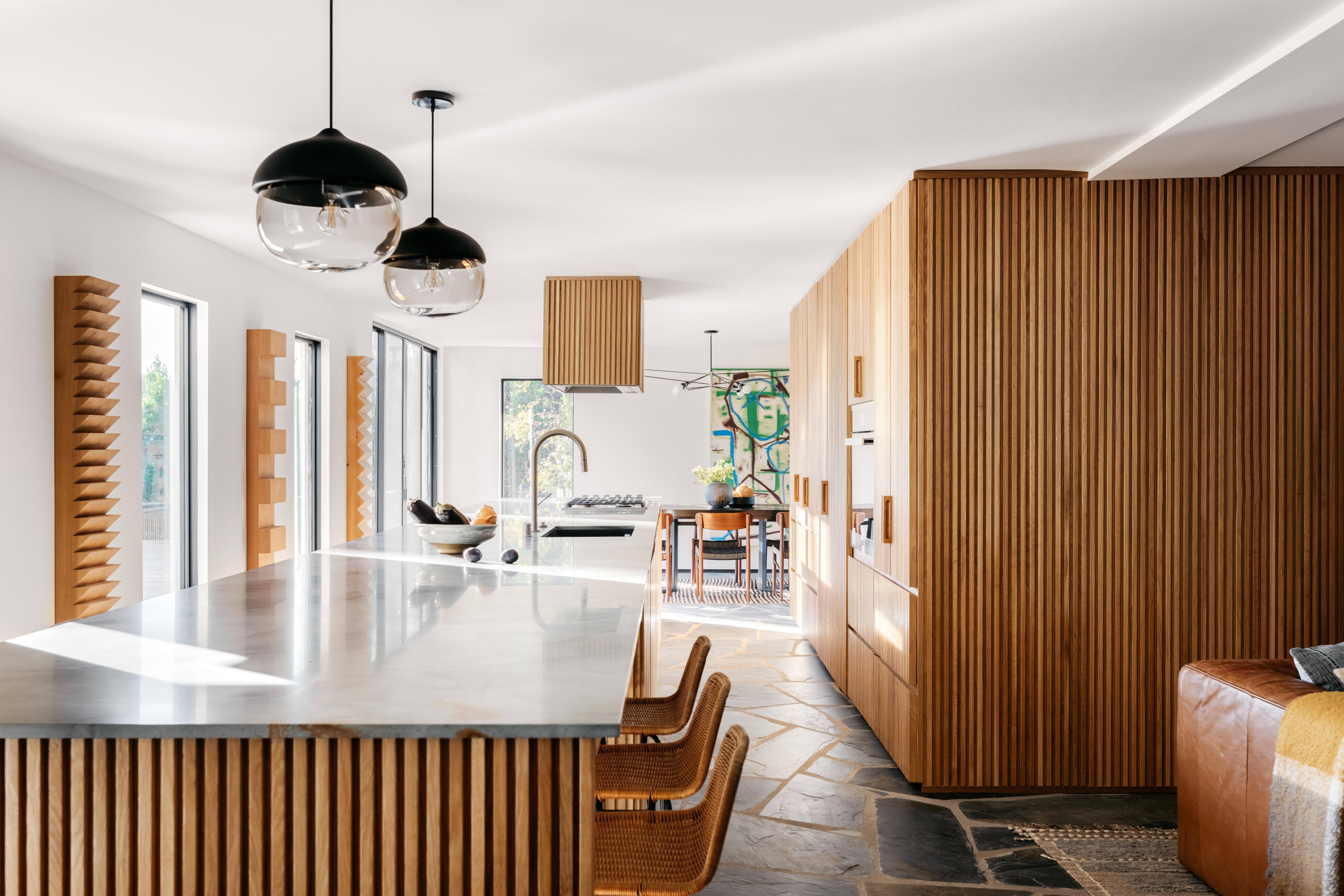
“At the end of the day, art must complement and enhance the space (as art often does),” says Patrick Maziarski, a lead designer at A1000XBetter. In this larger-than-life kitchen, Maziarski's goal was to create a space for entertaining (the kitchen is where guests gather, after all), which meant the kitchen required just as much visual interest as the homeowner's living room ideas.
Along the wall, three sculptural pieces by Los Angeles-based artist Bradley Duncan jive with the kitchen’s slatted wood-clad surfaces. We think fluted kitchen islands are an emerging trend, and this space proves why. “This was a rare and wonderful occasion where the art and space came together effortlessly,” explains Blazek. “In any case, when designing a space (even a kitchen) the rule of thumb should be: make room for art.”
28. Include two kitchen islands
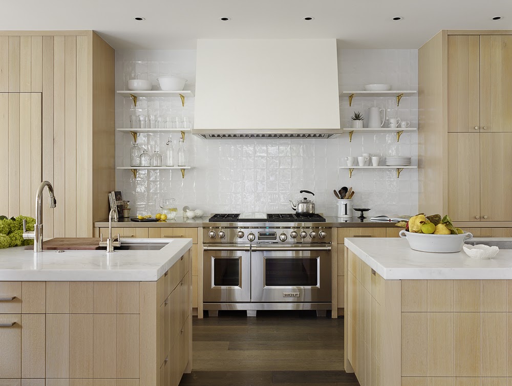
Design by M. Elle Design
If you have the space, install a kitchen island. If you have double the space, install double kitchen islands! It’s a luxury, no doubt, but it’s an unexpected twist for the traditional layout. Breaking up the space creates movement and flexibility—multiple zones for entertaining, cooking, and seating—while anchoring the entire space with a sense of balance.
“A specific goal of ours was to achieve symmetry throughout the entire house, which was also reflected in the kitchen with the two islands,” says Marie Carson, founder of Los Angeles’ M. Elle Design.
“Two islands also provide a unique way to cook and gather in the kitchen. One can be used for food prep and the other can be used for family and friends to join the culinary experience.”
29. Create a waterfall kitchen island
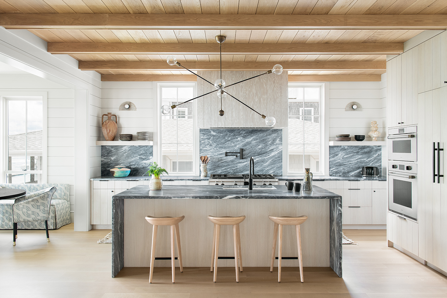
There are many kitchen island ideas to choose from, but one no-brainer approach that’s a staple of modern kitchens is the waterfall island. The striking design is sleek and simple: a stone countertop that continues vertically over the edge and down to the floor on either end of the island. It gives the island a sense of permanence and purpose, like bedrock.
“In this open concept floor plan, we wanted the island to be a showpiece full of welcoming energy,” says South Carolina’s Cortney Bishop of the kitchen countertop ideas above. “The waterfall island, clad in Evorio marble, is a statement all its own, while being completely functional for this family and their guests.”
In Bishop’s design, there’s space for bar stools, allowing the island to serve overtime as an impromptu dining table or work station. But if you’re going to incorporate such a monolithic feature—one that casts a material across two visual planes—you’ll need to be picky. “If someone is thinking about achieving a similar look, I'd recommend selecting a stone with organic movement that visually contrasts, yet balances other finishes in the space,” recommends Bishop. “Let the stone stand on its own!”
30. If you're fancy, add a pantry
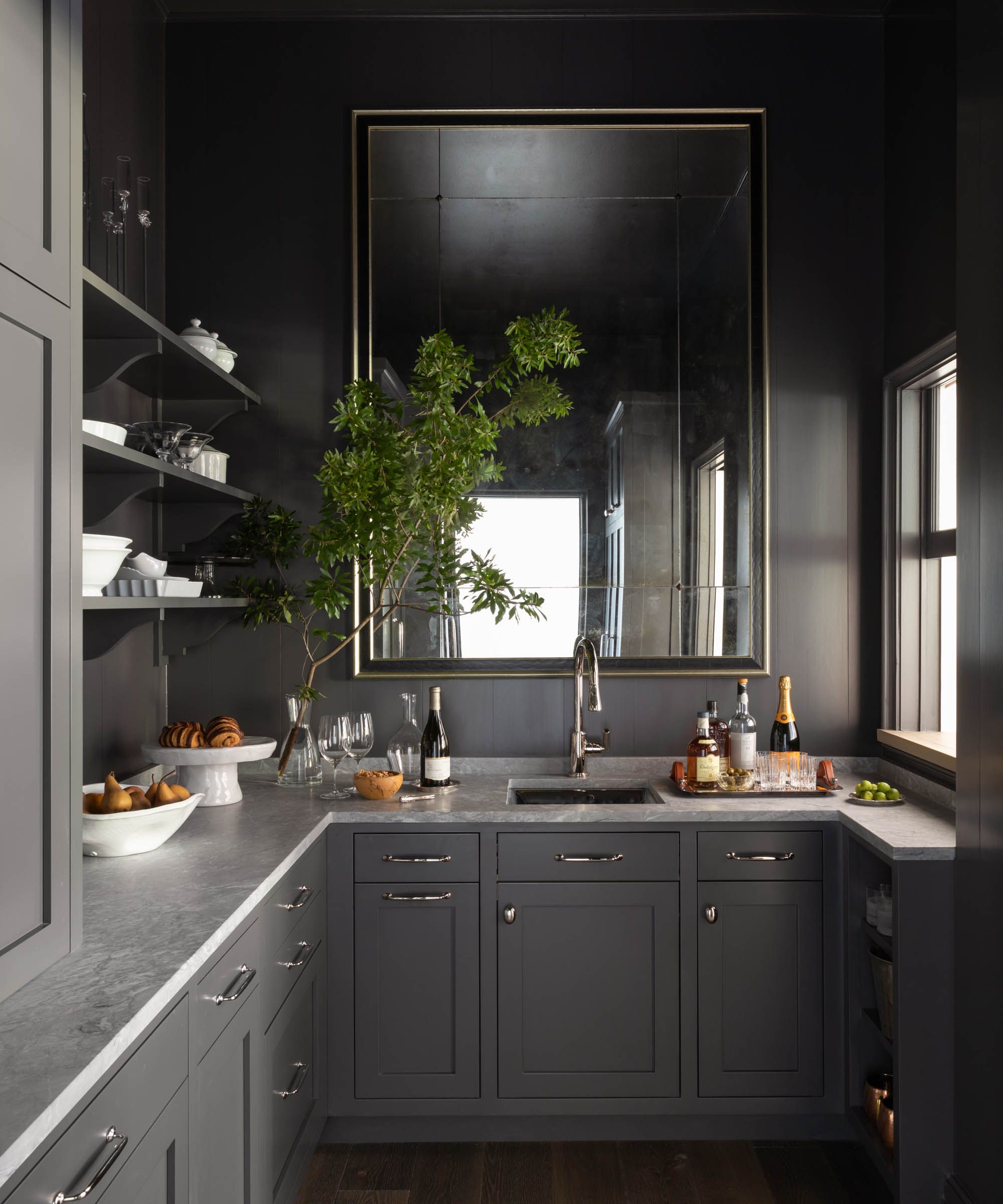
Design by Beth Webb
A kitchen pantry is as luxurious as it sounds. While there are plenty of pantry ideas that suit smaller spaces (a well-stocked cupboard for dried goods will do the trick), homeowners with plenty of square footage take it over the top. Whether it’s a designated area for a coffee bar (some of the best coffee makers can turn your pantry into a bonafide café) or a space for a second dishwasher, today’s largest pantries are certainly extra.
“With an open kitchen—one attached to the main family room and breakfast area—when one is entertaining it allows for that place to hide away the mess,” says Atlanta-based Interior Designer Beth Webb, who picked a dark and moody paint (Benjamin Moore’s Iron Mountain) for bold contrast in the above butler’s pantry ideas.
“Who doesn’t want that extra refrigeration, wall oven, dishwashing and storage. Designed correctly it is as useful for daily life as it is for the larger entertaining events.”
31. Add brick flooring
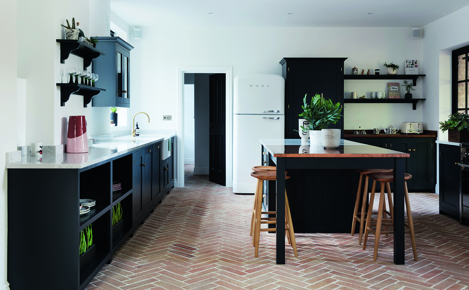
When it comes to floor types for the kitchen, brick - and brick effect - is having a moment. Laid in a classic herringbone style, brick floors suddenly become ornate and ornamental, reminding us of their Ancient Roman origins and hinting at the mosaic. When laying brick in more adventurous patterns in the kitchen, keep the rest of the space simple and let the floor do the talking.
"Why does brick flooring work so well in the kitchen? Because it’s so durable!" says the designer Amber Lewis. "The kitchen typically gets a lot of foot traffic, so materials, such as bricks, that can withstand wear and tear should be a go-to."
Bricks can be used in so many ways on the kitchen floor; it really depends on the feeling you want to create for that particular space, making them a brilliant addition to your kitchen flooring ideas. "I have used all sorts of bricklaying techniques," Amber says. "But most recently in my home entryway, I chose a stacked border with a herringbone interior to keep things interesting. I enjoy using classic layouts, but sometimes it just feels right to mix it up and use a quirkier pattern."
Brick floors are versatile and mix well with different textures and tones. "Brick is warm and neutral, and I’m always guided by the material," Amber says. "I personally love layering a vintage rug or runner over a brick floor, that extra layer adds so much coziness to the space, which is a feeling I’m always trying to achieve in my designs and which helps make the kitchen the center of the home."
32. Soften a kitchen with fabric
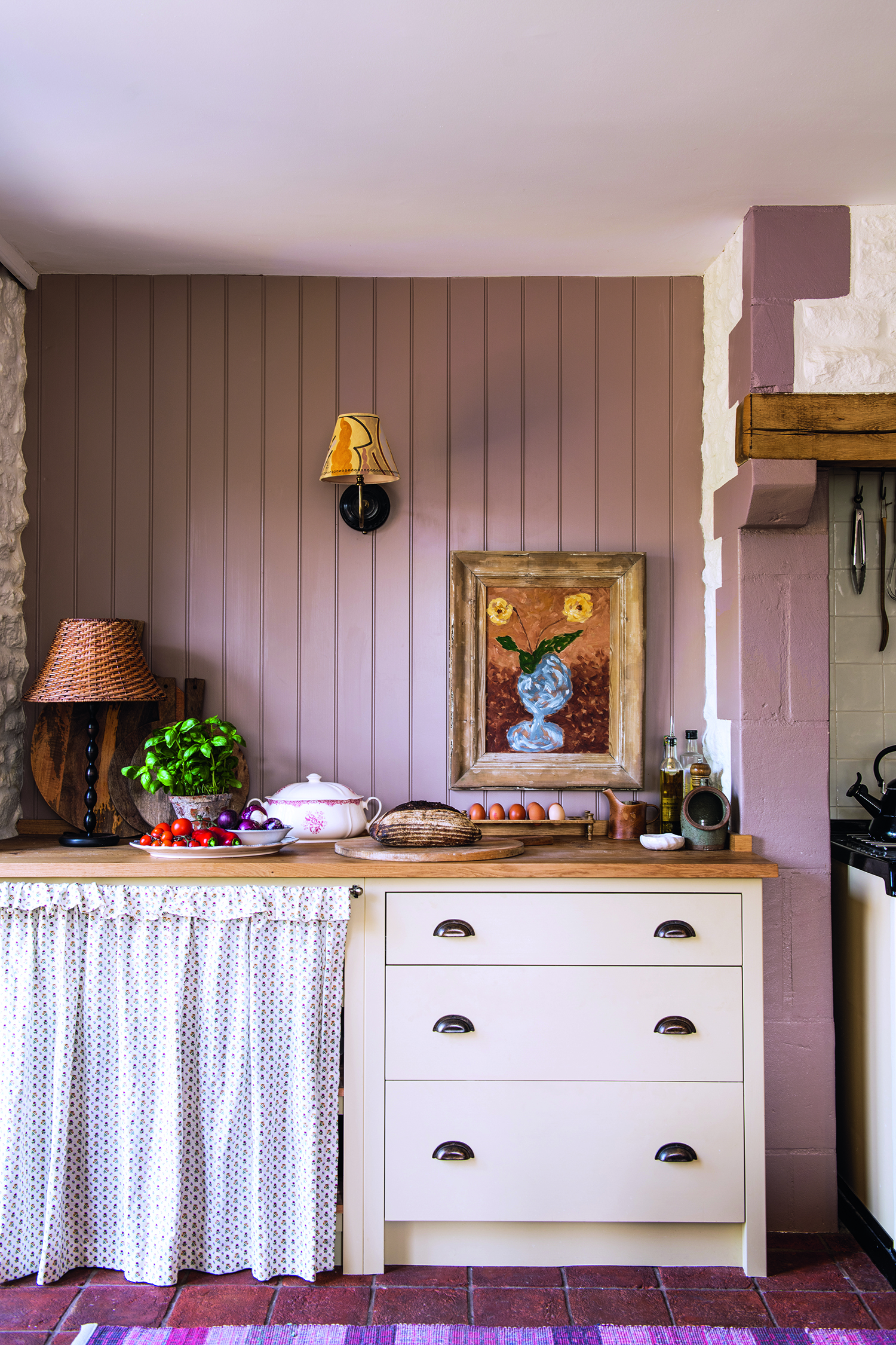
A traditional kitchen accoutrement, the skirt is being happily embraced by city dwellers as an easy way to convert unsightly areas into stylish storage with just a swish and a flick. They're useful to add into your modern kitchen cabinet ideas if you've not got the budget to totally revamp, as they cover a multitude. A longer skirt length with a linear pattern emphasizes the movement of the fabric, creating a relaxed, ‘gathering fruits for harvest festival’ vibe.
"Fabric skirts are a refreshing opportunity to be nostalgic in the kitchen," says the interior designer Joy Moyler. "They create such a relaxed feel, conjuring imagery of your granny about to place a delicious afternoon cake on the table at any moment."
Kitchen trends come and go but this one seems to be sticking around, though it's important to choose the right material. "I recommend medium to heavyweight cottons that are washable and weighted to hang properly, so they don’t bunch up and look unsightly," Joy says. "If the fabric is light enough, it moves softly in a breeze. It can be very romantic. Plain and patterned fabrics, I’m drawn to them both, although I tend to stay away from large-scale patterns – instead, go for small-scale stripes and graphic patterns, such as ticking. My favorite thing to do is have fun with pattern play! Use a pattern on one side of the skirt and a solid fabric on the other."
33. Mix materials
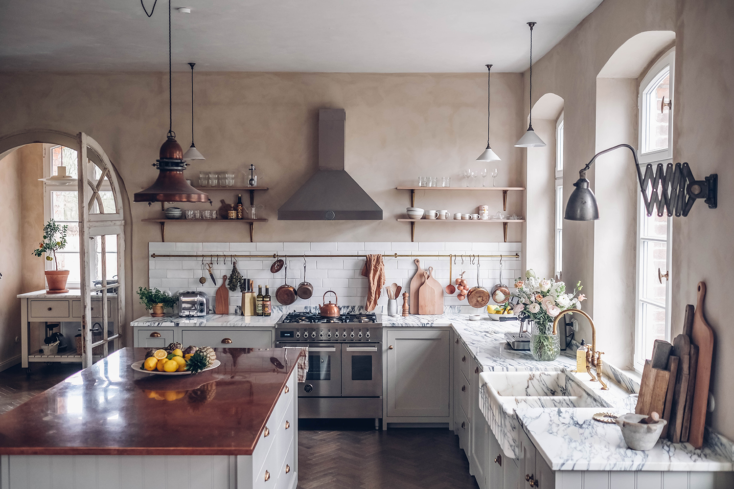
In this beautiful kitchen, the marble veining of the sink is matched to the worktops, creating a dramatic statement that is rich and luxurious.
Designed by Laura Muthesius and Nora Eisermann of Our Food Stories, an unfitted look feels more easy-going and natural, especially in this older property, where a modern fitted kitchen would have jarred with its inherent rustic charm.
The key to an ‘unfitted’ fitted kitchen is to mix up materials in a calm, considered way. ‘We used deVOL’s Real Shaker range in Mushroom for the main units, and then added a freestanding Haberdasher’s Pantry in white-tinted oak to break things up and introduce more storage,’ Laura says. ‘The two furniture designs are very different, but the finishes share the same soft, neutral tones so they work harmoniously together.’ To help unite the space, deVOL's shelving ideas are fashioned in the same oak as the pantry unit.
‘We also used traditional lime paint on the walls, which has a wonderful, imperfect texture,’ Nora says. ‘Whether it’s new but made to look old or actually old, nothing is too precious, and everything is designed to be used.’
34. Pair industrial style with rustic touches
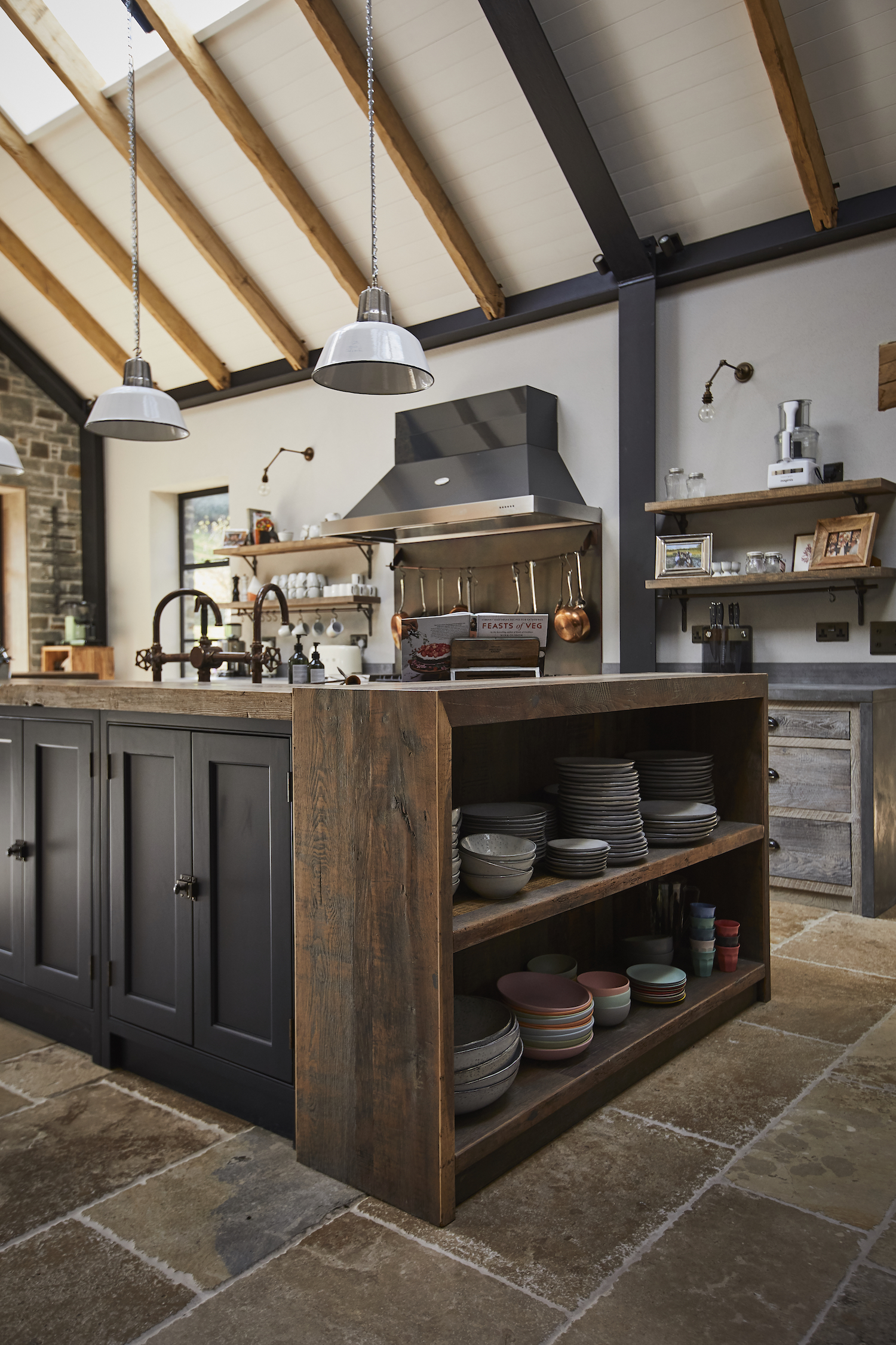
If you’re looking for a modern rustic aesthetic, take inspiration from this country chic kitchen and incorporate reclaimed materials, such as salvaged wooden beams and Cornish stone.
“To create contrast, we opted for dark blue cabinetry to offset the coloring of the wood on the central island,” says Alex Main, Director at The Main Company. “Oak features heavily in this design to add character and depth to this beautiful and inviting space.”
How do I beautify my kitchen?
The most surefire way to beautify your kitchen is to add texture, through new cabinet doors, or even new handles. This extra element lifts the space and creates a really interesting way for natural light to travel across it throughout the day, revealing different shadows and interplays.
'We've seen a rise in the trend for fluted kitchen islands, all of which are truly beautiful,' says Livingetc's Editorial Director Sarah Spiteri. 'However, just adding a ridged handle to a cabinet is much faster and easier way to create some of the same effect, instantly making the space feel more designed.'
Storage hacks are also a useful way to beautify a kitchen - arrange jars of different heights on a shelf to look like an art installation. Every third jar or so, include an ornament like a vase or candlestick, for visual interest.
What should you not forget when designing a kitchen?
There is really only one hard and fast rule to remember when designing a kitchen, and it's to do with natural light. As the room you are likely to spend more time in than any other, you want to maximize the feel of light as much as you can. Design your kitchen around where the windows are and you almost can't go wrong.
'Natural light is often overlooked during the design process and it’s important to maximise it with some clever design tips and tricks to truly transform the look and feel of your kitchen space,' says Darren Watts, Design Director at Wren.
The trick is to try to leave the areas around the windows as clear as possible. 'Try to not crowd the window with cabinets either side as that will limit the brightness of your space,' Darren says.
What is a Shaker kitchen?
The Shaker style, of kitchen is a distinctly American aesthetic from the 18th century that’s found new life in modern kitchens. “Shaker kitchens feel simultaneously classic and modern because they focus on functionality, practicality, clean lines, efficient detailing, and paired-down aesthetics,” says Keren Richter, a co-founder of White Arrow. “In many ways, the American Shakers were the originators of ‘minimalism.’"
Shaker style is characterized by flat-pannelled cupboard doors with minimal details - just a centre panel surrounded by a rectangular edge. Traditionally, Shaker kitchens were white, cream or wood, but are now seen in almost any color you can imagine.
"If I have it my way, we’ll be seeing a lot more traditional, rustic-style kitchens and homes in the next year," says the designer Amber Lewis, on the appeal of Shaker kitchens. "There’s a big resurgence and interest in tried-and-true traditional designs, as well as a desire for comfortable, cosy, relaxing spaces. The materials, techniques and elements we choose for the home are key to creating this calming ambience."
What is a Japandi kitchen?
A wave of soothingly clean-lined spaces of the Japandi variety (a new blend of Scandinavian design with Japanese craftsmanship) strikes at our conscious approach to kitchen interiors.
“In today's world, people crave thoughtful spaces that are free of clutter, and that is what makes the Japandi style so appealing,” say the founders of Stewart-Schafer. “There is nothing ornate about the design, no excessive molding and trim or decorative hardware. It allows you to really appreciate the materials and thoughtful craftsmanship.”
The thread isn’t just contemporary aesthetics, per se, it’s character. Today’s kitchens are personal, intimate regardless of size, rendered with achingly bespoke, beautiful detail.
Be The First To Know
The Livingetc newsletters are your inside source for what’s shaping interiors now - and what’s next. Discover trend forecasts, smart style ideas, and curated shopping inspiration that brings design to life. Subscribe today and stay ahead of the curve.
Keith Flanagan is a New York based journalist specialising in design, food and travel. He has been an editor at Time Out New York, and has written for such publications as Architectural Digest, Conde Nast Traveller, Food 52 and USA Today. He regularly contributes to Livingetc, reporting on design trends and offering insight from the biggest names in the US. His intelligent approach to interiors also sees him as an expert in explaining the different disciplines in design.
-
 Lone Fox's Drew Michael Scott Drops a Vintage Capsule with Joon Loloi (And Some Seriously Good Tips For Thrifting Antiques)
Sourced straight from one of the world's biggest antique shows, Drew shares how to stay sane, cut through the noise, and score what you actually want
By Julia Demer Published
-
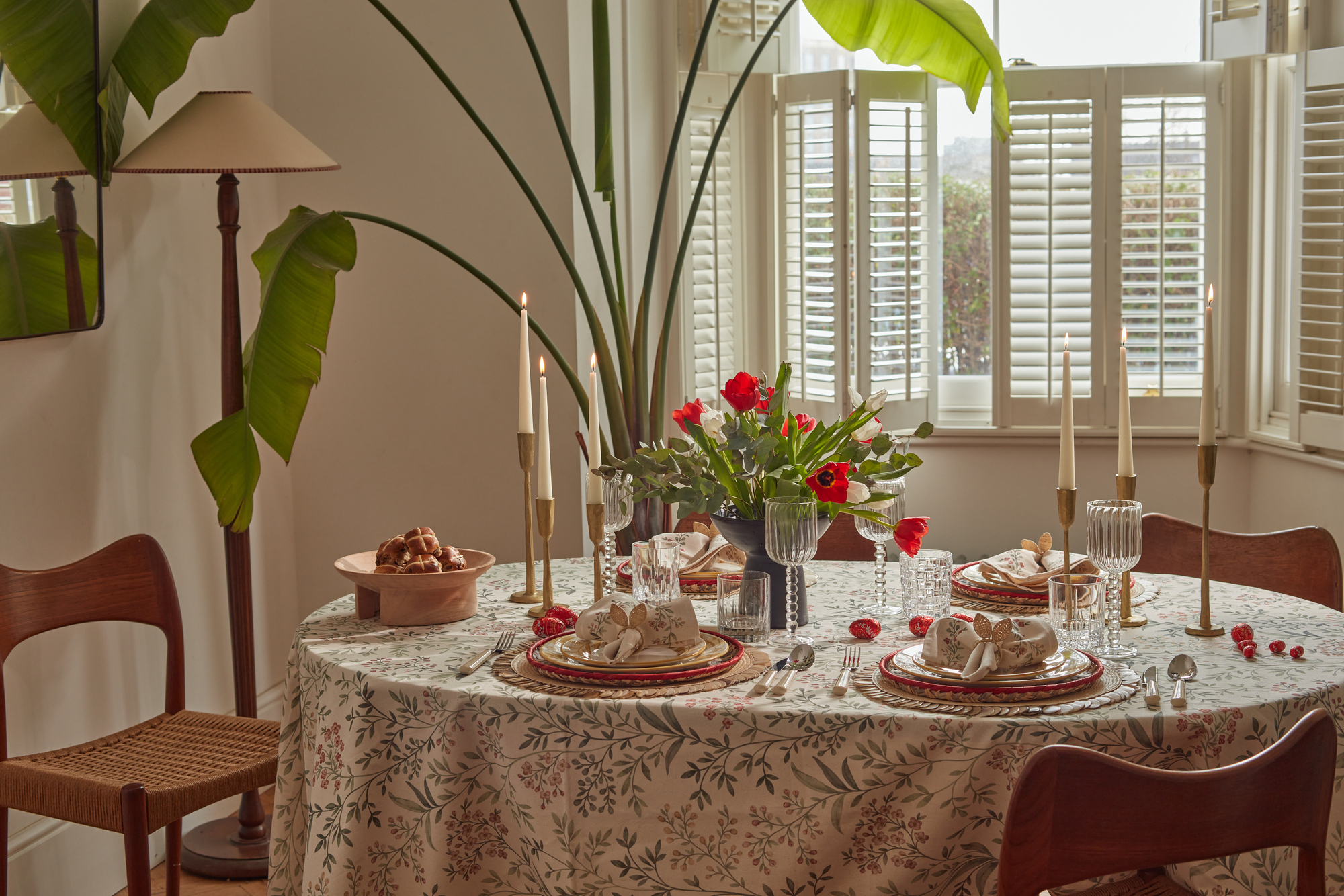 9 Easter Table Decor Ideas to Plan Now for Perfect Tablescapes This Season
From centerpieces and color schemes to tablecloths and seasonal themes, let these designer-approved ideas inspire your table styling this Easter
By Lilith Hudson Published