6 Before and After Kitchen Makeovers That Went From Seriously Dated to So Modern
These kitchen makeovers offer up some serious inspiration for what's possible with this all-important room

The Livingetc newsletters are your inside source for what’s shaping interiors now - and what’s next. Discover trend forecasts, smart style ideas, and curated shopping inspiration that brings design to life. Subscribe today and stay ahead of the curve.
You are now subscribed
Your newsletter sign-up was successful
If you're planning a kitchen makeover, or are simply looking for fresh ideas to spark inspiration, then these 6 winning examples are worth exploring. These kitchens, which were once dark, outdated, and dreary were transformed into spaces filled with style and function. Post the reno, cooking, dining, and entertaining here has become a pleasure.
If you're ready to commit to the time and budget of a full renovation, then these real-life modern kitchen makeovers are filled with tons of ideas to get you started. Take a look.
1. A Connecticut Home's Kitchen Reno That Spells "Warm Minimalism"

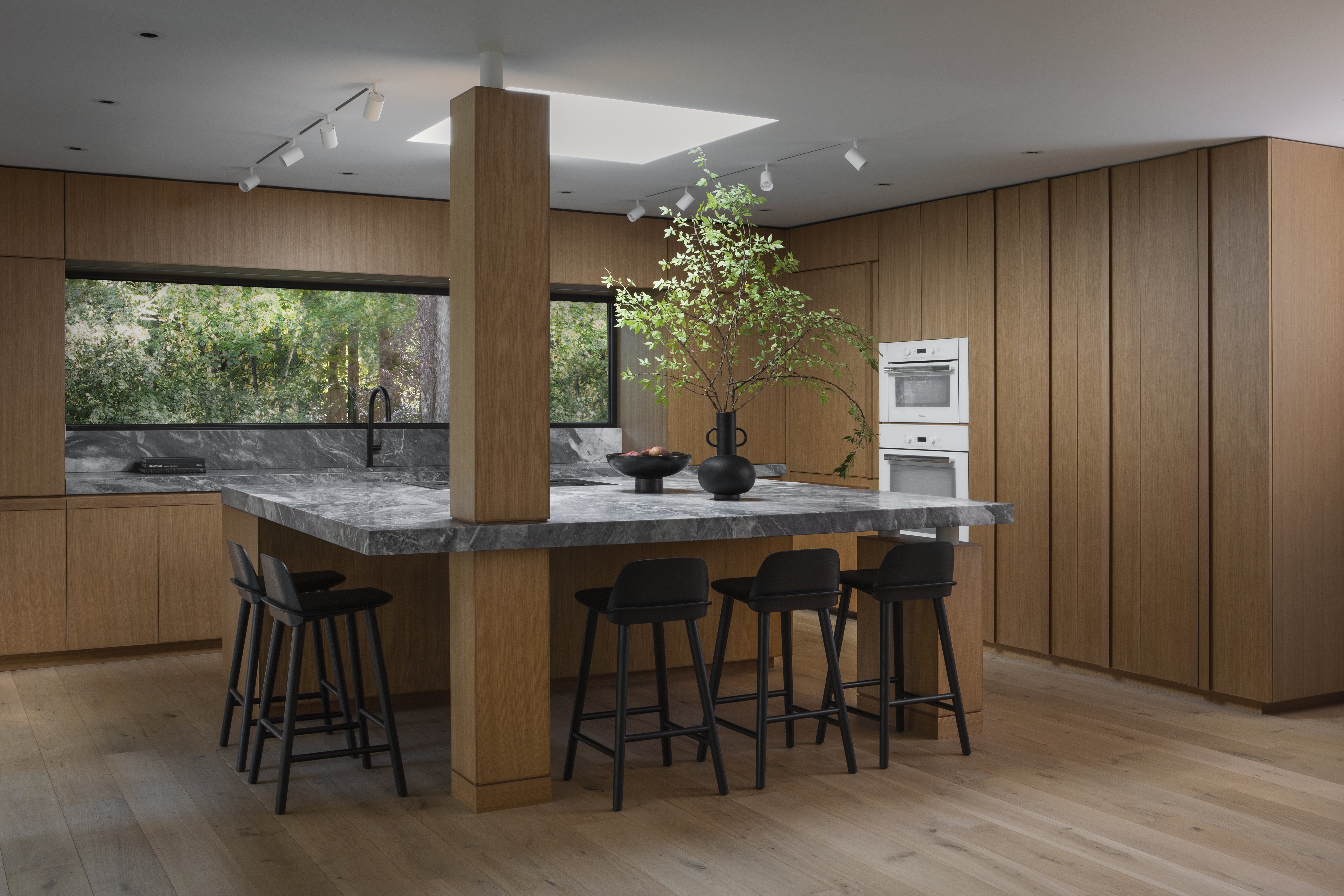
James Veal and Christine Stucker, founders of Stewart-Schafer studio were inspired by the beauty of the surroundings outside the four walls of this Connecticut home and while remodeling the kitchen, converted it into a minimalist, and warm haven.
They gutted the original space and opened it up for more light and air. 'We moved all the appliances and expanded the overall size,' says Christine. 'We created a center body that houses the stove — it appears to be holding up the ceiling and follows through into the formal living room. On the back side of this body (in the living room) we added beautiful custom bookcases and additional storage.'
Wood, marble, and custom millwork add an organic vibe to the room, and despite the minimalist kitchen design, the space feels characterful. 'We resurrected some original details and married them with new elements,' says Christine. 'We wanted the home to have an old world European, yet modern feeling.'
2. A Storybook Reno With a Californian Cabin Vibe
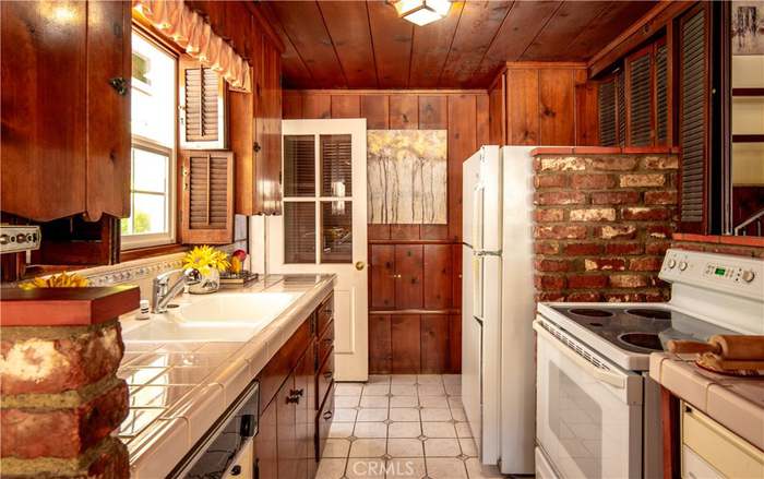
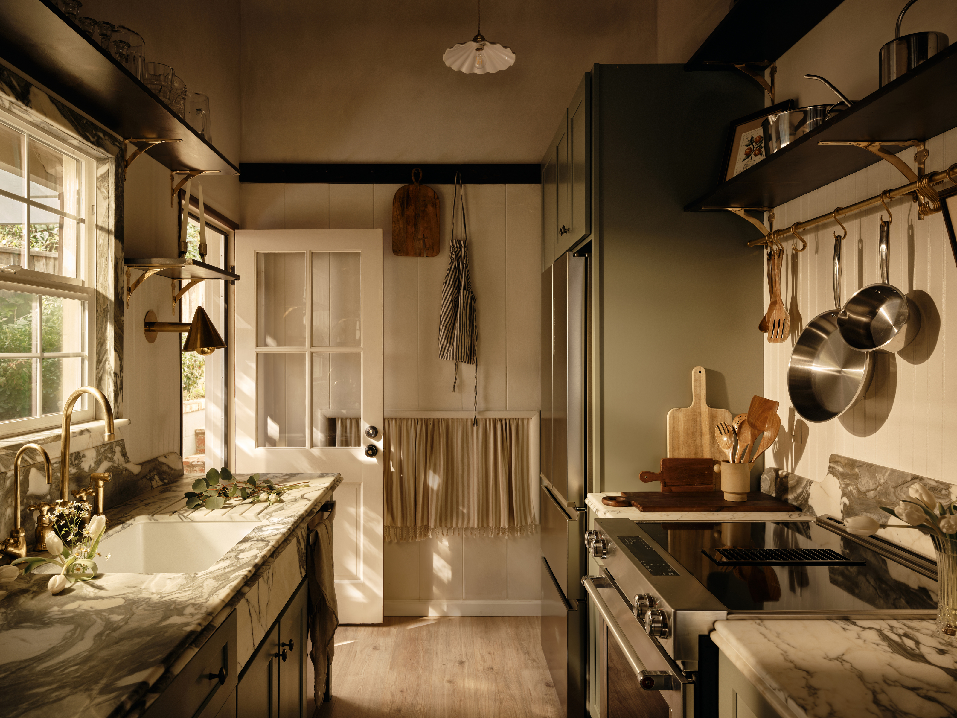
This kitchen was in dire need of a contemporary redesign — its aging floor tiles and retro appliances made it a drab space to work or socialize in. The clients reached out to LA-based designer Naomi Gibson of Gibson House who decided to preserve some of the room's original character, while also adding in modern elements. The designer chose a sage green kitchen color, and contrasted it with dark veined marble kitchen countertops, and brass hardware.
The rustic kitchen now feels classic and timeless.
'I added a beadboard backsplash in small amounts, a peg rail at the transition from the wood paneling, and an oversized pot rail from Devol,' avers Naomi. 'To keep it modern, I used sleek brass sconces, tiny almond cabinet knobs, and stainless steel appliances. The calming effect of natural materials and the movement of stone and wood just feel so good together.'
3. A Breezy Cali-Coastal Kitchen Makeover
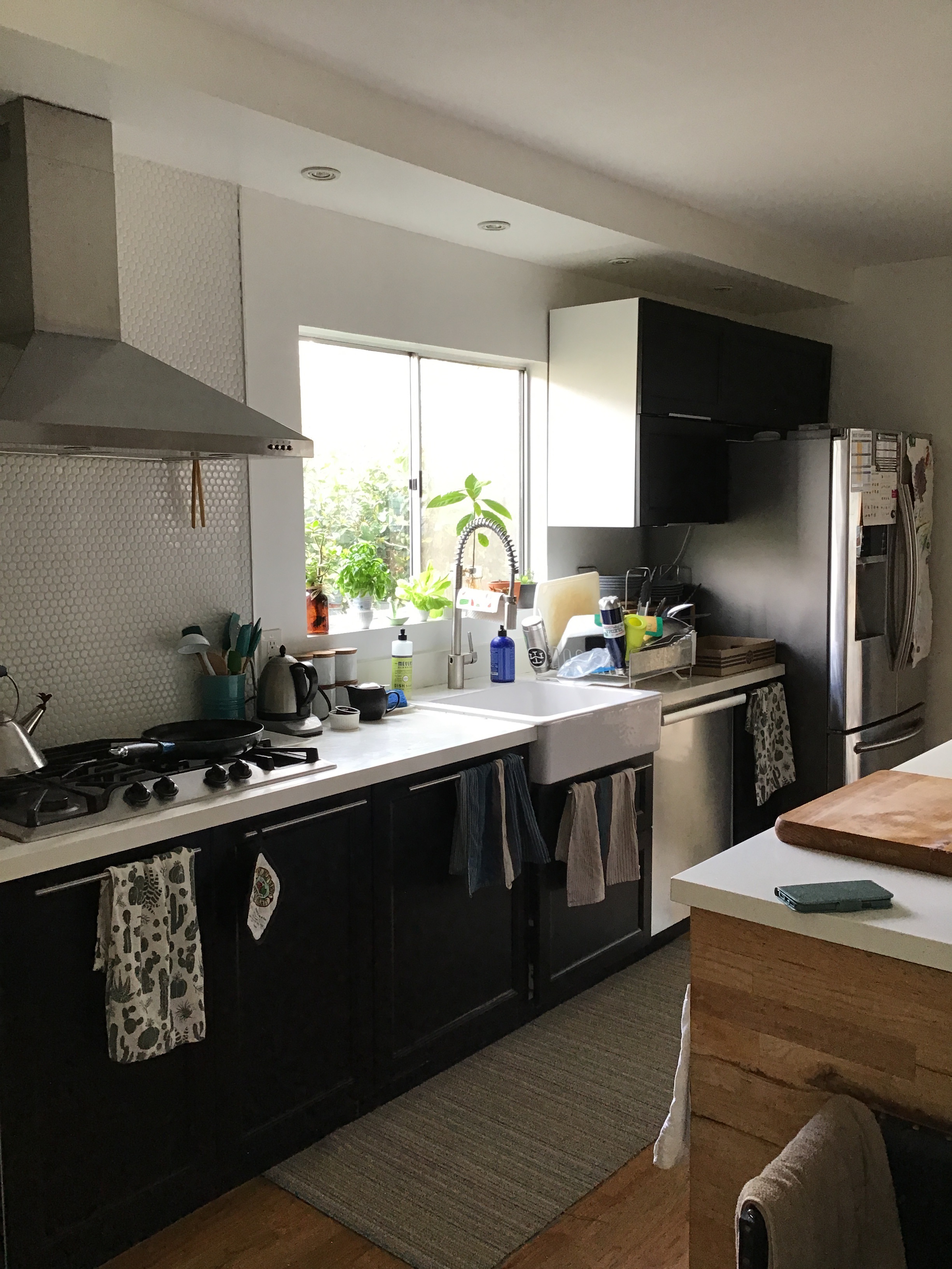

'The goal for this project was to modernize the space while optimizing functionality,' explains Jennifer Verruto, founder and CEO of Blythe Interiors. For this kitchen, the homeowners desired a better workspace for cooking and a place to store their large coffee and tea collections. The designer reworked the kitchen footprint and devised a smarter use of the space, in addition to adding kitchen storage.
The Livingetc newsletters are your inside source for what’s shaping interiors now - and what’s next. Discover trend forecasts, smart style ideas, and curated shopping inspiration that brings design to life. Subscribe today and stay ahead of the curve.
The space now sports kitchen cabinets in a deep blue hue, a black ILVE oven with a dynamic vintage appeal, and a white Ferguson farmhouse sink. The white quartz kitchen countertops and a textured ivory tile kitchen backsplash brighten the space with light, clean finishes.'The deep blue color also brought a sense of warmth, as opposed to the cool starkness of the previous black cabinets,' says Jennifer. 'This gorgeous shade also served as a bold focal point in the kitchen and provided a gorgeous contrast paired with the lighter countertop and backsplash.'
4. A LA Kitchen Remodel That Celebrates Dark Wood Cabinets
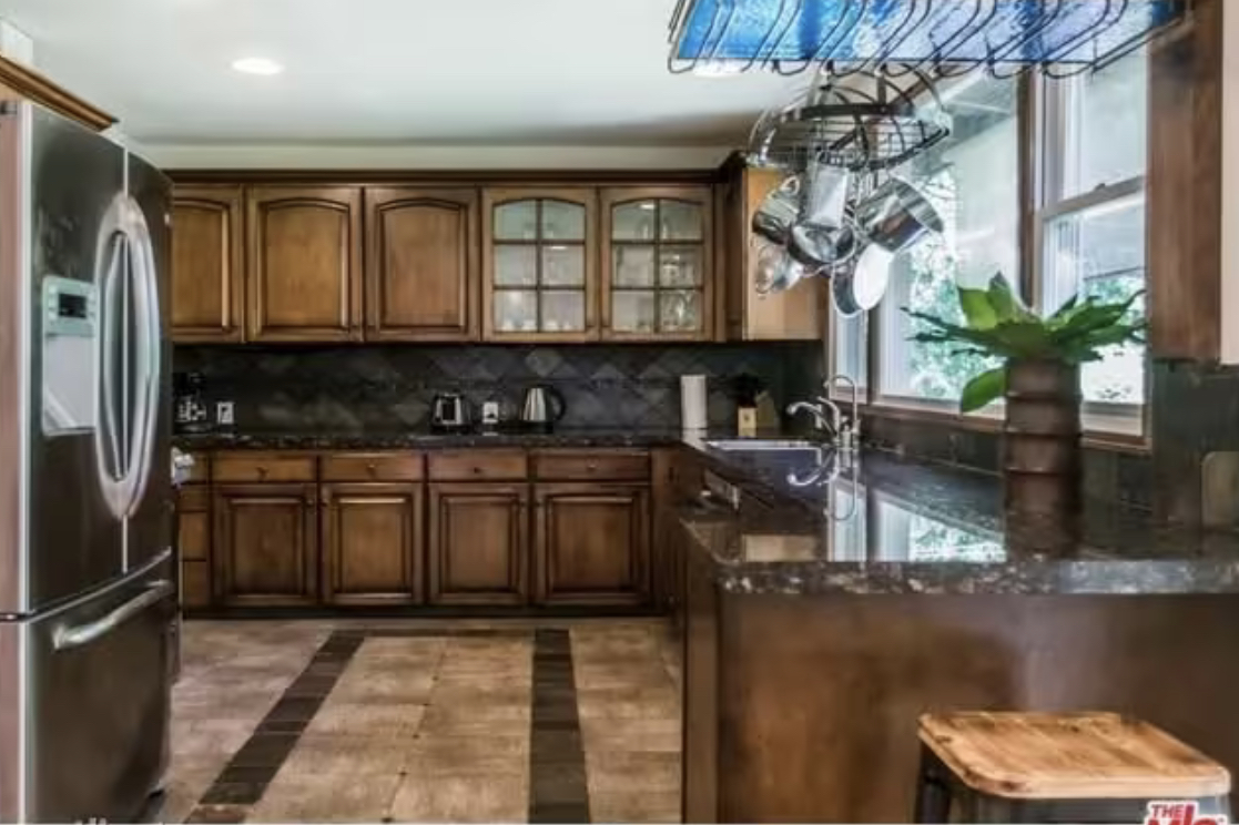

For this outdated kitchen, the brief was to create a space that felt cocooning and cozy. 'If you ever have the intention of bringing warmth and having a sense of space that's livable and cozy — incorporate dark wooden kitchen cabinet,' advise Amanda Leigh and Taylor Hahn of House of Rolison.
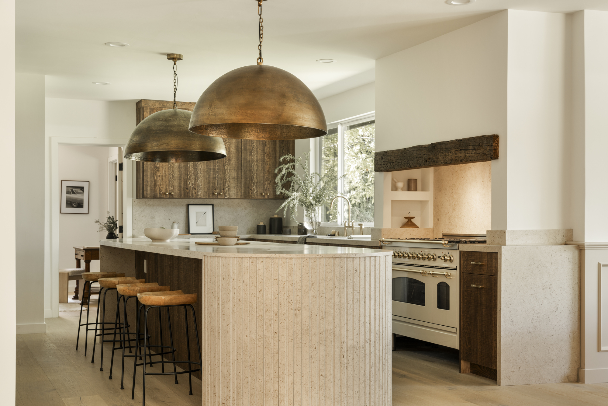
To redesign this space, the designers chose Querkus white oak with a custom stain, as the latter highlights different parts of the grain. To make the wood pop and balance it all out, the designers chose kitchen emulsion paint that feels neutral yet warm. A big kitchen hardware trend is of using brass fixtures. 'We prefer black and brass metals with a warm wood,' say the designers. To add more layering to the room, they chose a fluted island. Finally, an oversized kitchen pendant lighting was hung above the island. 'We love when light fixtures are almost obnoxious and on the overstated side,' say Amanda and Taylor.
5. A bold transformation of a 60s kitchen in Calgary

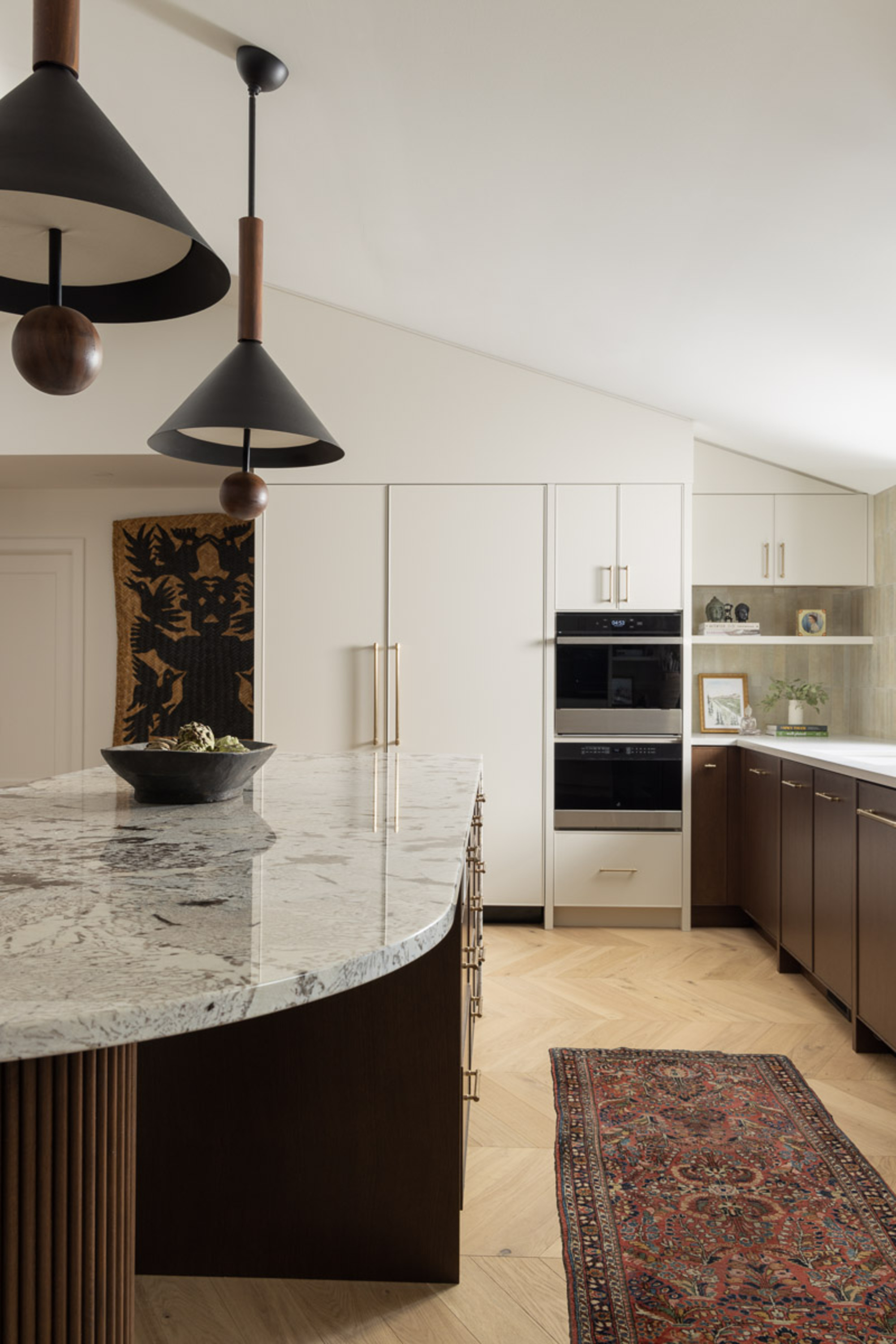
Before designer Alykhan Velji of Alykhan Velji Designs was brought in, the home had a closed floor plan and the low ceilings made the rooms, especially the kitchen feel dark and dingy. Wanting to take advantage of the two existing windows, the designer decided to bring in more light and make this room the focal point of the home. He also decided to get rid of the old cabinetry.
As part of the reno, Aly made the kitchen island as a gathering spot with seating. The granite waterfall countertop adds to the aesthetic. 'I love the look of this material because it is so variated but also very warm,' says Aly. He added natural oak cabinets in white and dark brown and chose full-length designs on either side of the kitchen for symmetry. 'The two overscaled pendants above the island help create a dramatic moment in the space and are a little unexpected,' says Aly.
6. A Venice Beach Kitchen With a Moody Makeover

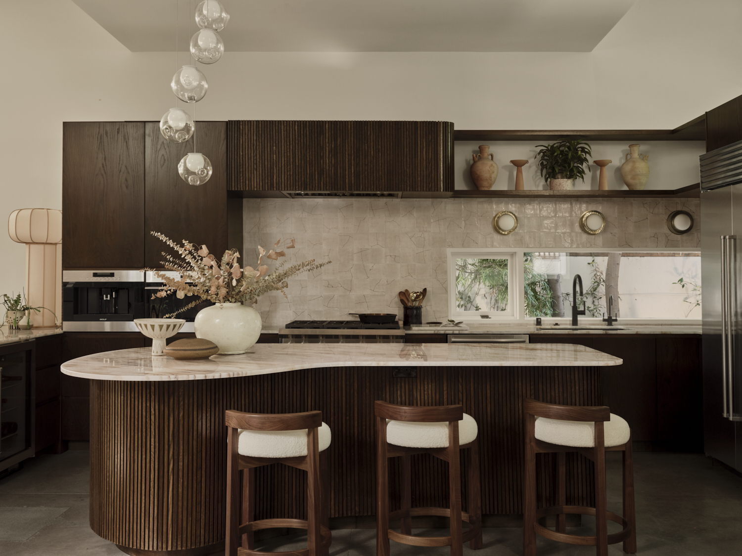
Known for her globally inspired world traveler aesthetic, Tamarra Younis of Union of Art Interiors outfitted this kitchen with bold color, whimsical details and unexpected fixtures. What was once a white kitchen was transformed into a beautiful, dark bespoke one, with custom cabinetry, and a statement, fluted curved island that exudes pure luxury.
Since the reno budget was tight, 'we had to come up with ways to get the look without totally gutting the whole space,' explains Tamarra. 'We felt that a strong color change to complement the dark textured brown of the L-shaped sectional was the way to go.'
The designer brought in asymmetrical soft curves in contrast to the very linear angular lines of the architecture. The kitchen island layout is unique with a custom-designed kidney shape, while the chairs are placed along the curves. It doubles as a living/dining area too. 'I believe that kitchens are moving to color and darker tones, and it's one of the elements that make this home not feel like your standard beach house,' adds Tamarra.
3 products to transform your kitchen

Aditi Sharma Maheshwari started her career at The Address (The Times of India), a tabloid on interiors and art. She wrote profiles of Indian artists, designers, and architects, and covered inspiring houses and commercial properties. After four years, she moved to ELLE DECOR as a senior features writer, where she contributed to the magazine and website, and also worked alongside the events team on India Design ID — the brand’s 10-day, annual design show. She wrote across topics: from designer interviews, and house tours, to new product launches, shopping pages, and reviews. After three years, she was hired as the senior editor at Houzz. The website content focused on practical advice on decorating the home and making design feel more approachable. She created fresh series on budget buys, design hacks, and DIYs, all backed with expert advice. Equipped with sizable knowledge of the industry and with a good network, she moved to Architectural Digest (Conde Nast) as the digital editor. The publication's focus was on high-end design, and her content highlighted A-listers, starchitects, and high-concept products, all customized for an audience that loves and invests in luxury. After a two-year stint, she moved to the UK and was hired at Livingetc as a design editor. She now freelances for a variety of interiors publications.
