7 Kitchen Storage Trends That Designers say are Best Avoided
Storage trends come and go in the kitchen, but which do we need to steer clear of to achieve the most efficient and beautiful space?
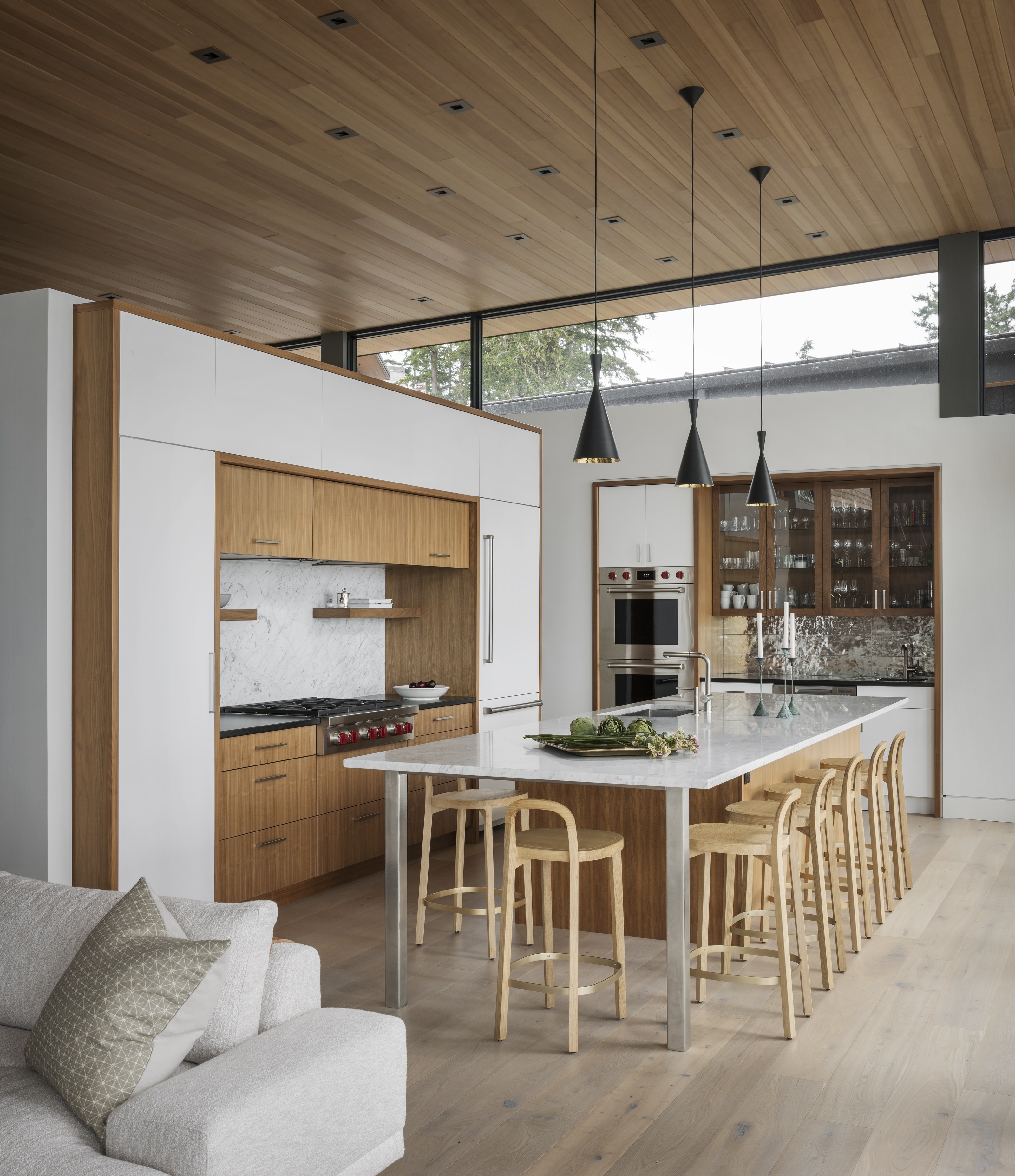

Kitchens are a big investment, both in time and money, so it’s essential you achieve the right design to suit your household for years to come. This means being aware of the rapid change in trends and opting for a more timeless approach that works best for you in a style you really love.
The goal is to create a fully functioning kitchen where all your spacial needs are met and if you manage to involve some extra features, that’s a bonus! But there are some kitchen trends we should avoid when it comes to the practicality of these all-important spaces — whether they're style over substance or just not all their cracked up to be, here's what designers think.
1. Excessive open shelving
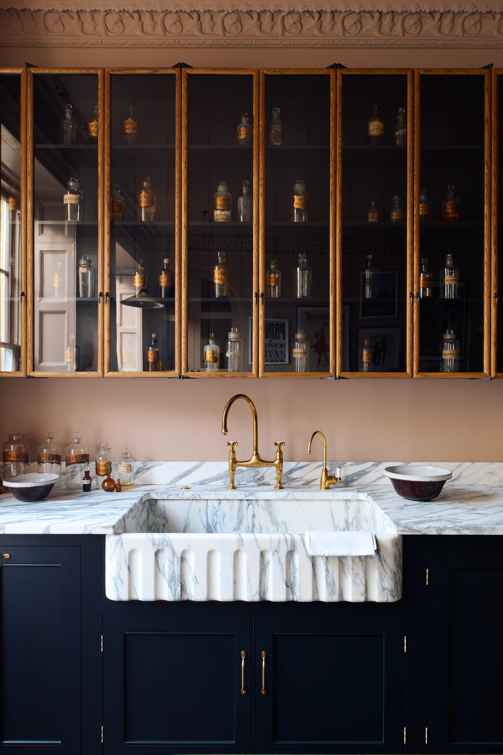
Open shelving in a kitchen can be a stylish feature to give the kitchen some personality, but without proper organization it can quickly become the place to put things.
‘Excessive open shelving can look cluttered and messy.’ says Merlin Wright, Design Director of Plain English, a kitchen design studio with showrooms in New York and Los Angeles. ‘The trick is to incorporate an open dresser or a single long open shelf with well-considered content. Too many things can give the feel of an overstuffed dresser, as is often the case. "Less is more" and a collection of same-colored china, or a line of simple bowls, doesn’t dominate or confuse the eye, so it adds a sense of calm. The only exception to this is in a pantry where the more well positioned shelving on neat brackets the better!'
Long term it’ll be best to avoid a space where it could result in accumulating clutter and dust, requiring frequent deep cleaning.
2. Overcomplicated storage systems
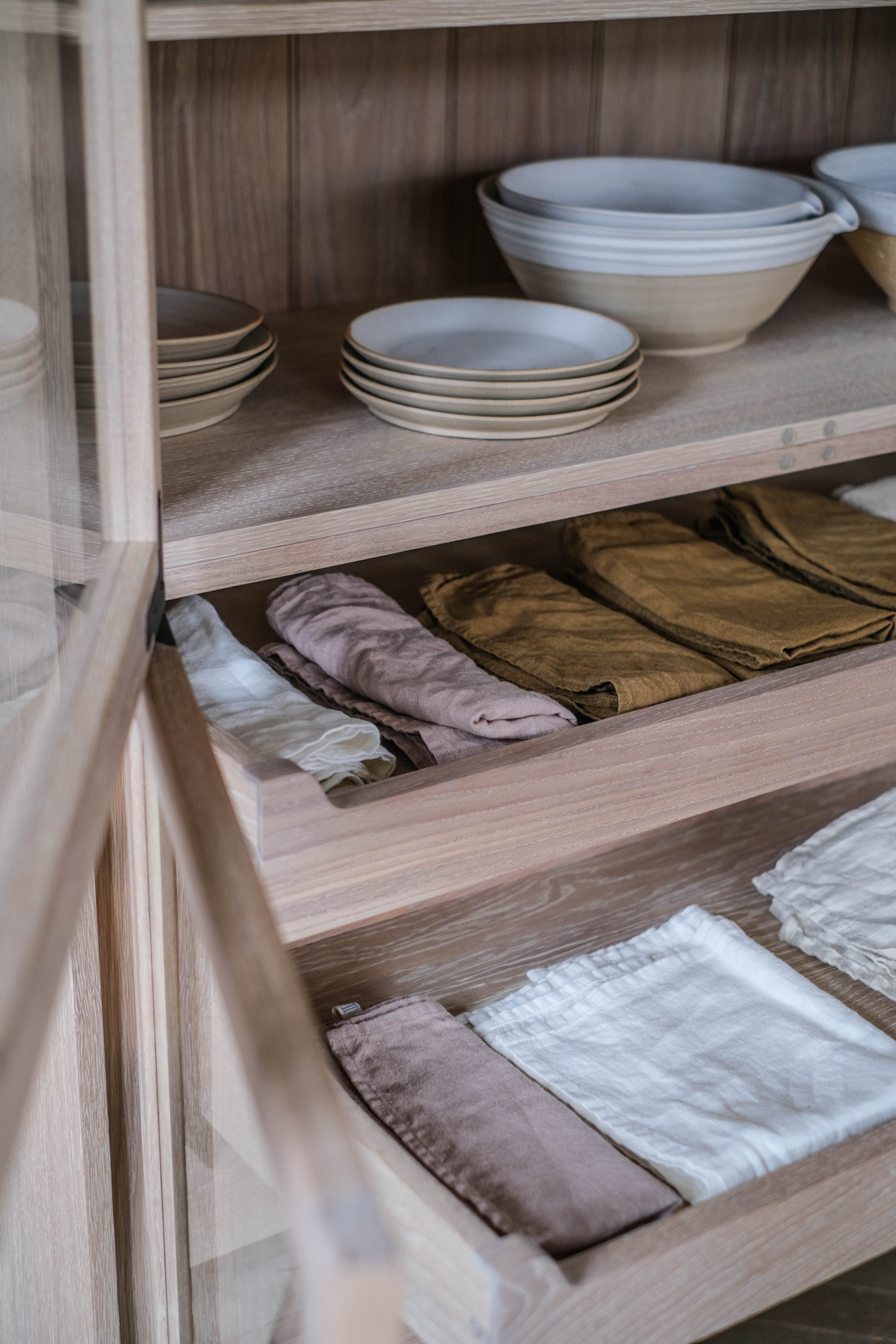
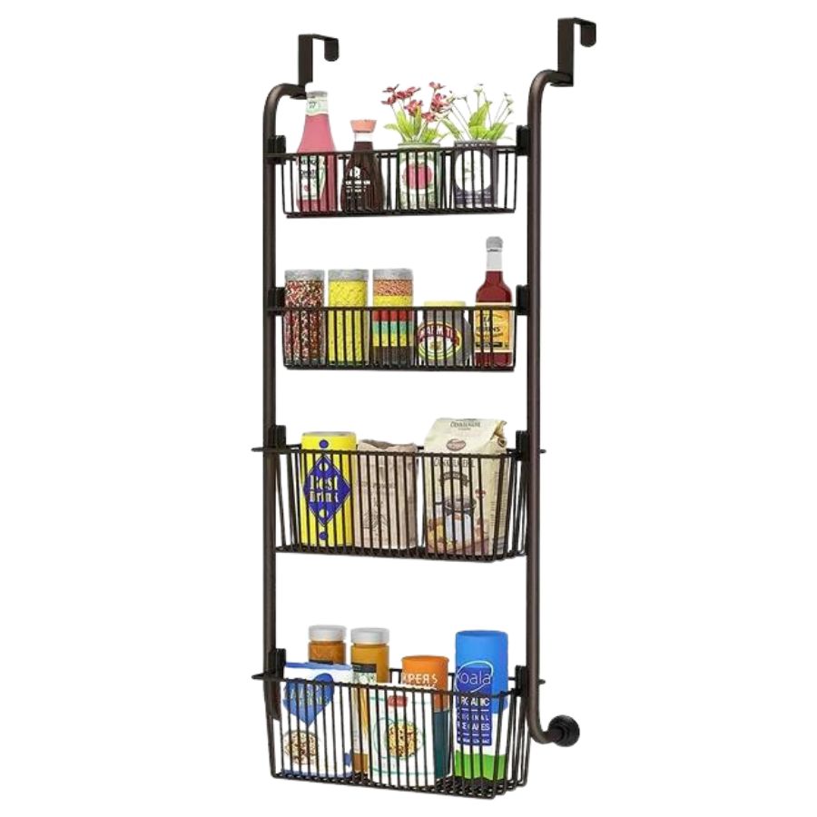
From labeled jars to hidden compartments, and baskets with lots of tubs layered inside, these ways of storage are often begun with good intentions but as time goes on, they become messy and disorganized, and, therefore, wasted time in the kitchen.
You need equipment and ingredients easily accessible when cooking, so it may well be that stacking all these layers up feels good at the time but ends up not being quite as functional as the system you had in mind. It may be a case of reorganizing a single layer or row of jars with visible labels and leaving it as simple as that. ‘If you have a smaller kitchen and use a cabinet as your pantry, avoid piling things onto the shelf without containerizing them first,' says suggests Amanda Wiss, Founder of NYC-based home organizing firm Urban Clarity. 'I have a bin on my shelf that is specifically devoted to breakfast items like my coffee, tea bags, oatmeal, cinnamon and honey. By grouping items that are typically used together, I don’t find myself rifling through several shelves to put together one meal.'
If you know which systems work efficiently for you, hold on to them.
3. Countertop storage
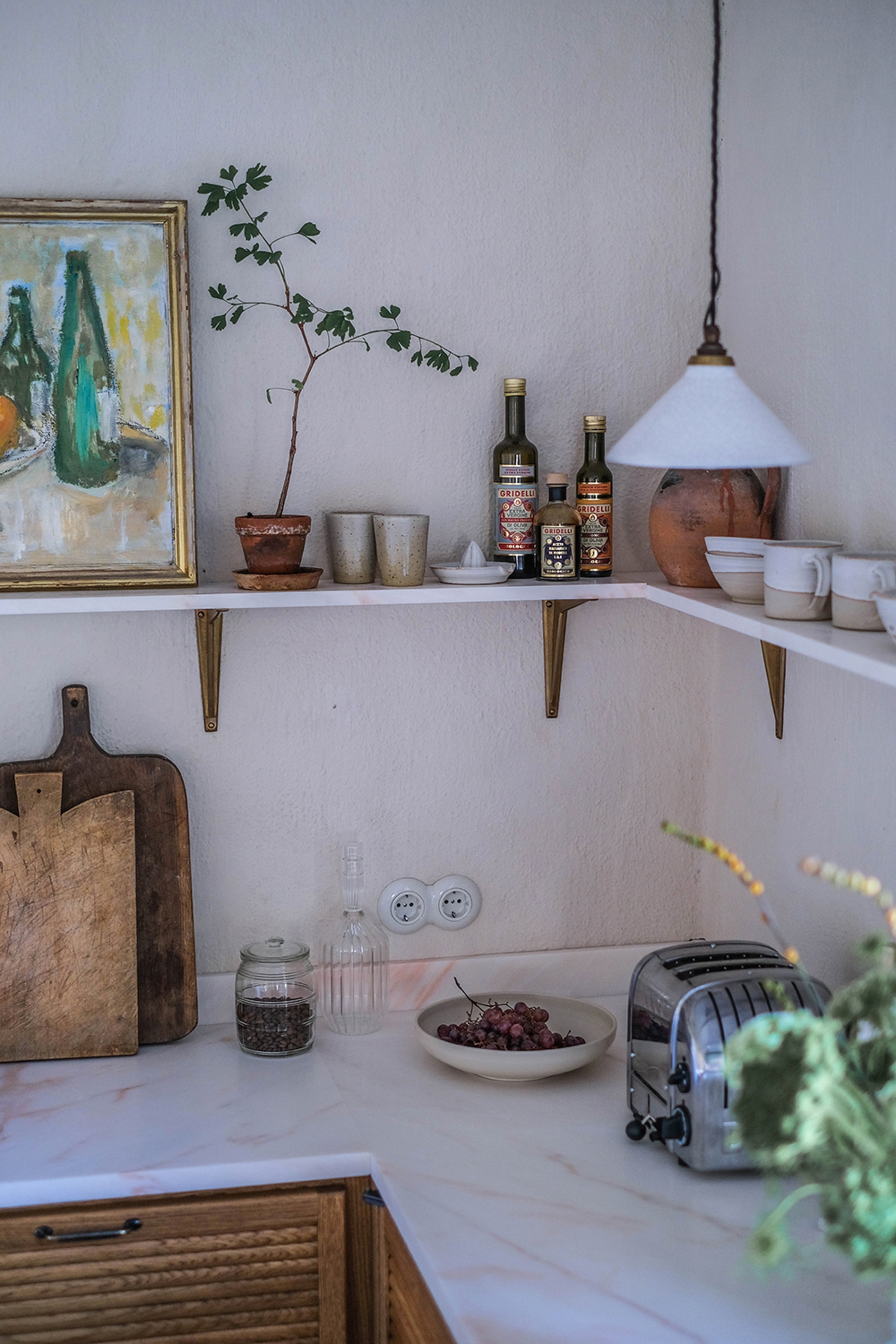
Stylish countertop storage may be a trend we're seeing more of, but overcrowding kitchen countertops with too many appliances or containers can make the kitchen feel cramped and cluttered, and nobody wants wires permanently trailing around their chopping board while preparing dinner.
‘The most exciting kitchen would be one in which the surfaces were clear and everything was where it belonged, not where it fit,’ says Ben Soreff, Professional Organizer at House To Home Organizing. Aim to ensure all essentials have their place in the kitchen and if you do have any items out on the worktop, let it be aesthetically pleasing as well as practical, such as a few good looking chopping boards, a couple of pinch pots, and a bottle of olive oil for cooking with.
4. High overhead storage
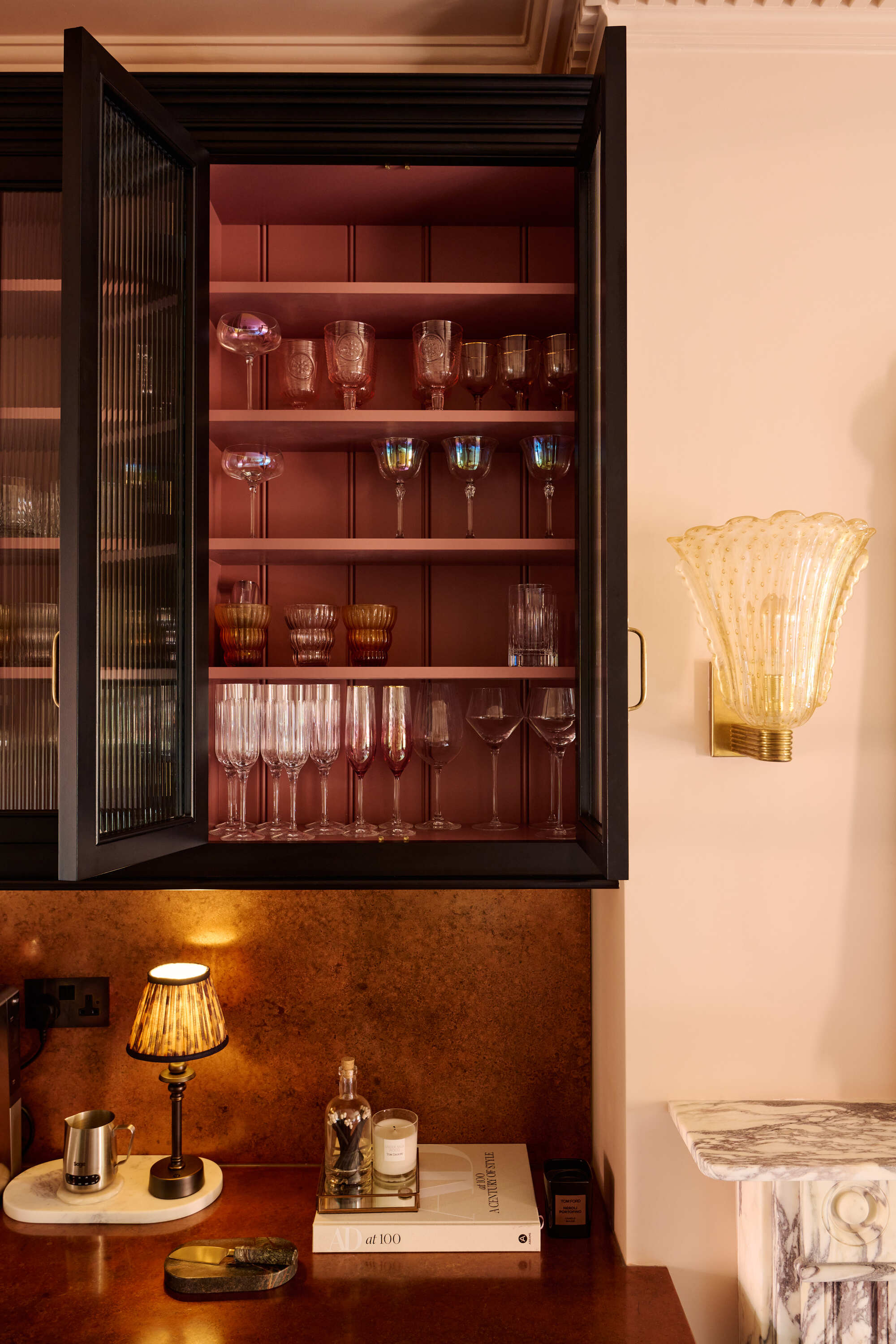
At the time of designing your kitchen, wall cabinets to the ceiling seem like a great idea (and can look stunning!), but realistically they often get filled once with items which are seldom used, and then they’re barely touched again.
‘When you can’t reach items with even a normal step stool, that is an issue.’ says Ben Soreff. ‘In a perfect world the very top level would be glass or open to showcase only decor.’
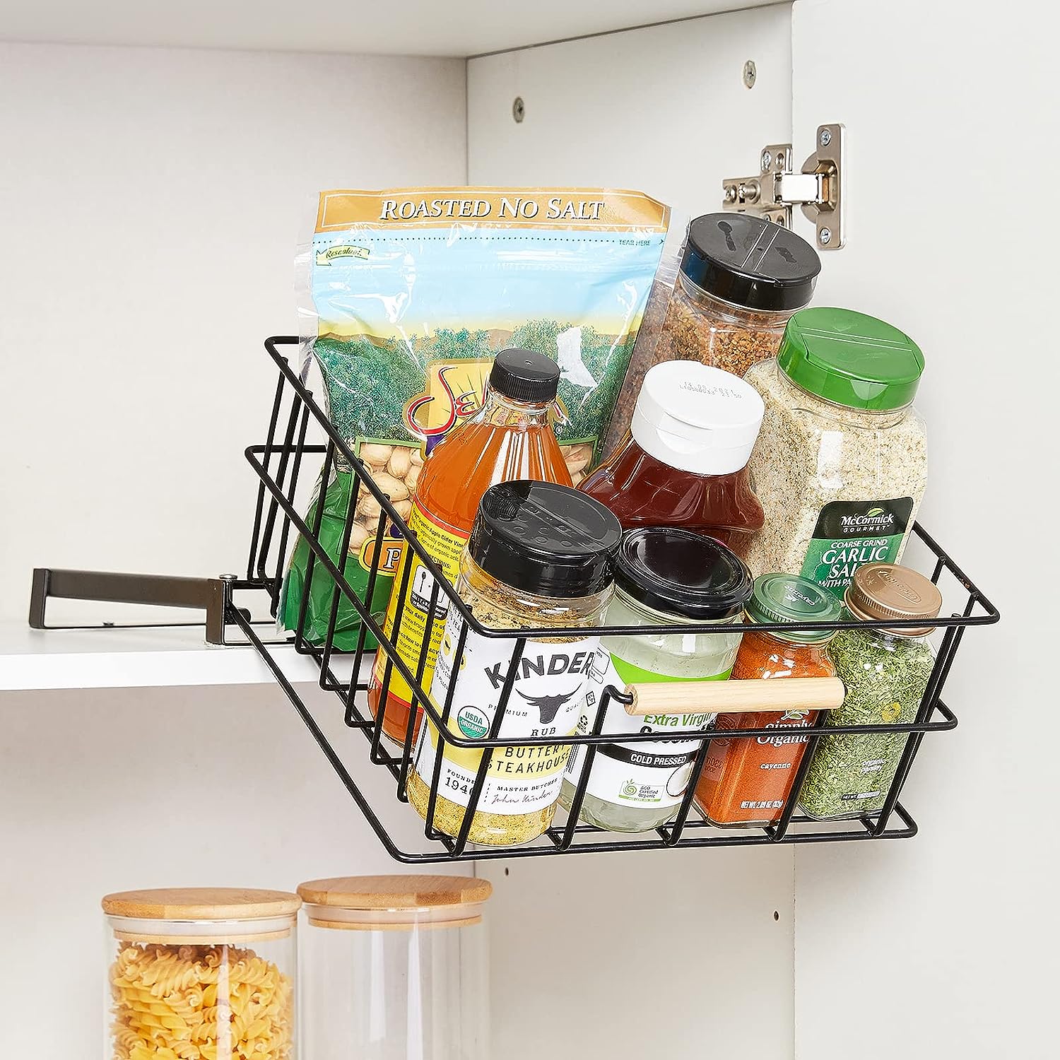
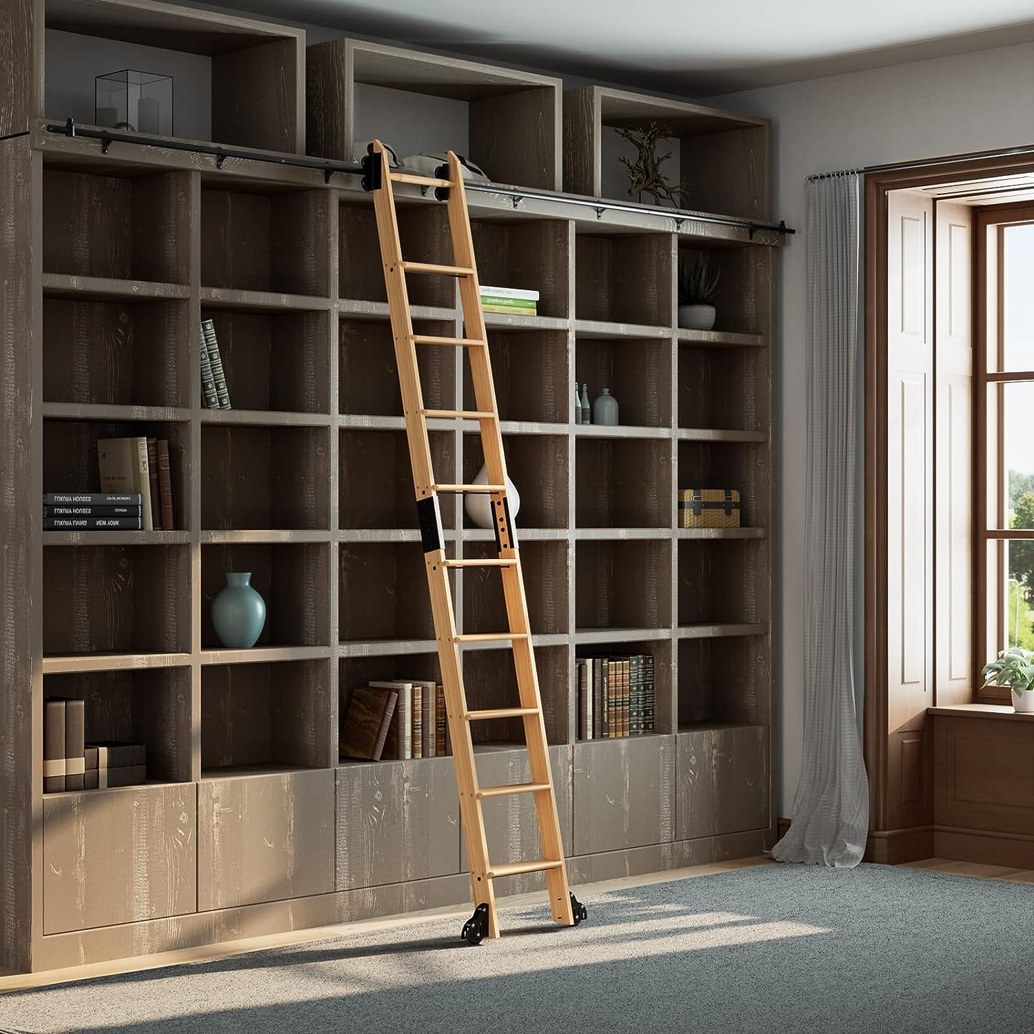
When high-level storage is unreachable without assistance, you may like to opt for featuring a ladder on a rail to ensure constant use of the space, which will add a whole load of character and style to your kitchen. There are some other clever ways to reach high cabinets like baskets that slide out and down that can help, too.
5. Complicated corner cabinets
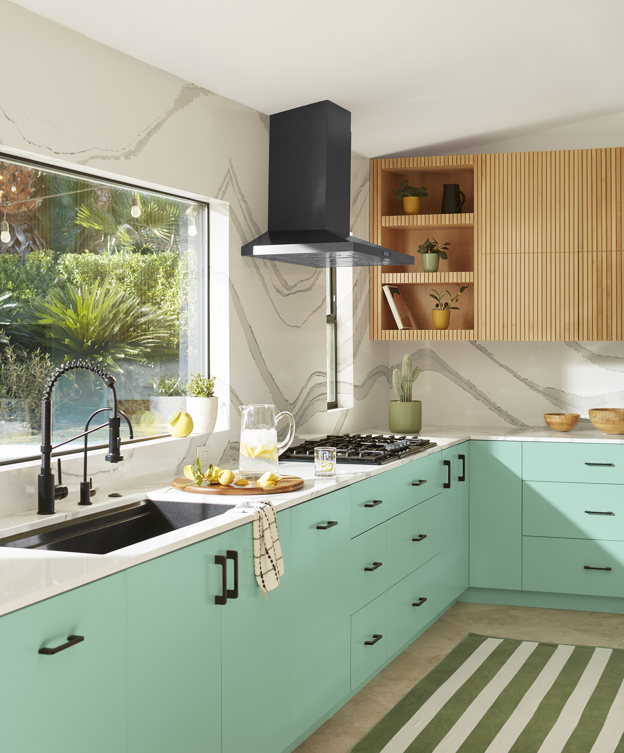
Corners can seem like the perfect place to install a special storage unit, in an attempt to make the most of the extra space. However, the corner cabinet presents a challenge.
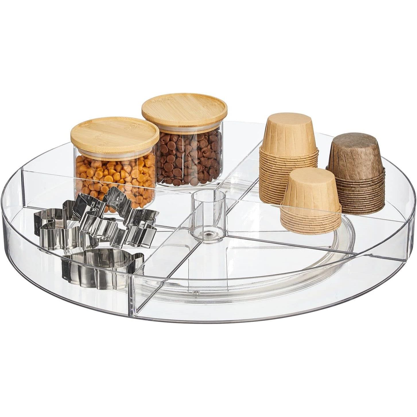
‘In a perfect world every corner cabinet would only exist with a pull-out turntable/drawer,’ says Ben Soreff. ‘However, most people either have a regular large turntable or a deep shelf. With the deep shelf, the area becomes a black hole. With the turntable, items fall over and get trapped. So we recommend storing larger seldom used appliances in the corner instead.’
This gives these appliances a spacious place to live and avoids the catastrophe a corner cabinet usually results in.
6. Too much glazed cabinetry
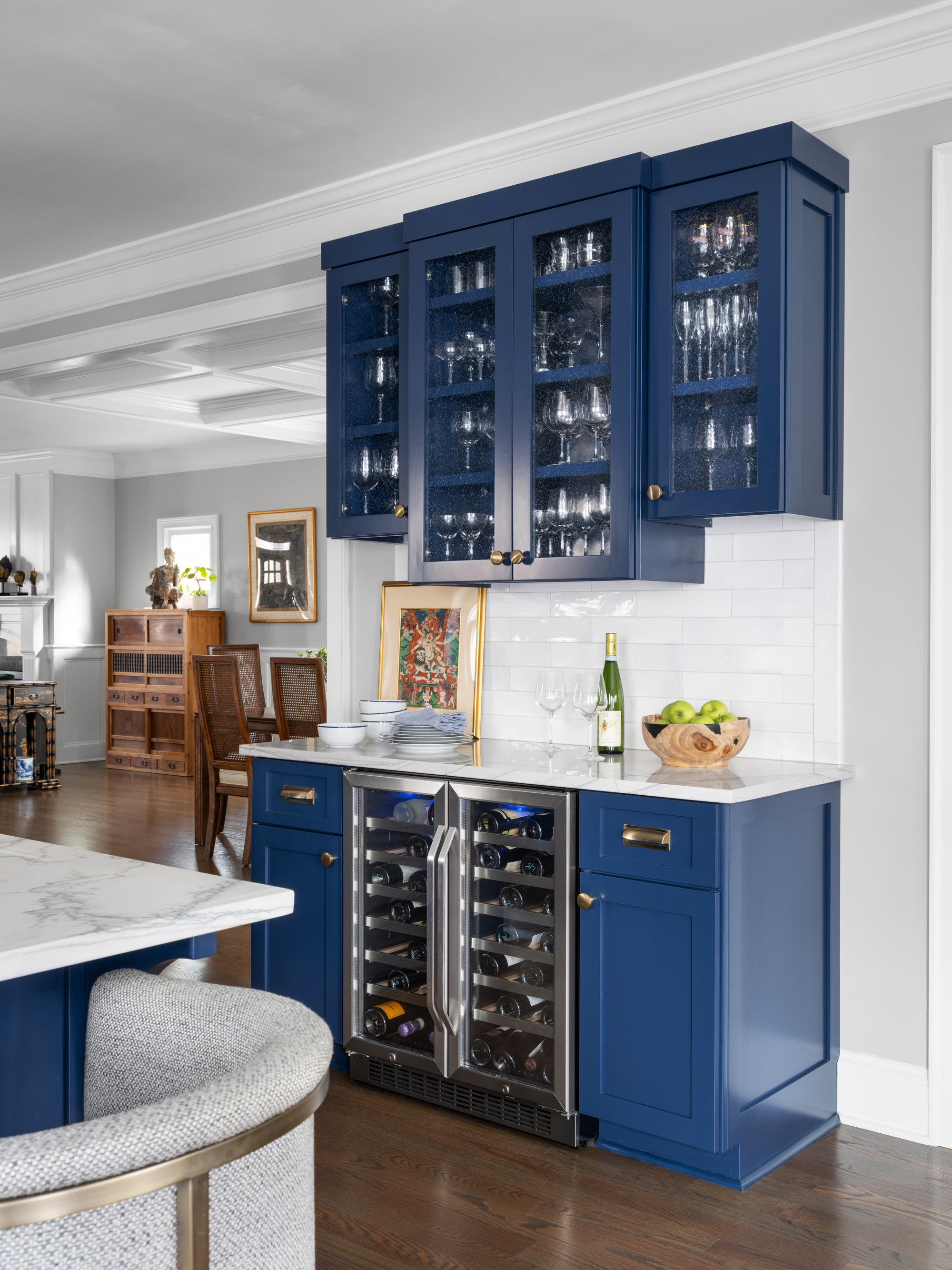
Glass can be a striking feature in a kitchen, but when there’s a lot of glass fronted cabinets, especially where you’re storing essential things, it’s not very aesthetically pleasing.
‘While this can look totally splendid in a dining room with a display of antique glassware, silver and color-coordinated dainties, a half-eaten packet of crackers on display next to a jar of peanut butter isn’t the look,’ says Merlin from Plain English. It’s the blurred shapes and colors of not so attractive equipment and packaging behind glass that you want to avoid. ‘Better to have some sensible solid cupboards for the unsightly items of everyday, or a big larder cupboard to take the weight of storage, allowing a well-positioned glazed cupboard or shelf to take centerstage,’ he advises.
If you’re going to have some glass fronted kitchen cabinets, ensure they are housing stylish items which you don’t mind becoming an obvious feature of the kitchen. ‘It’s a case of balance with some added variety. Solid door, wall to wall cupboards of any kind can feel claustrophobic at eye level.
Sectioning a larger room into designated areas can allow light to flow through and give additional wall space for floor cupboards. A walk-in pantry takes care of the dry foods and a tall china cupboard can then leave the luxury of a painting, lantern or an open dresser top. An open area somewhere in a kitchen gives the opportunity to play with display options throughout the year, which can be great fun.’
7. Too much storage space
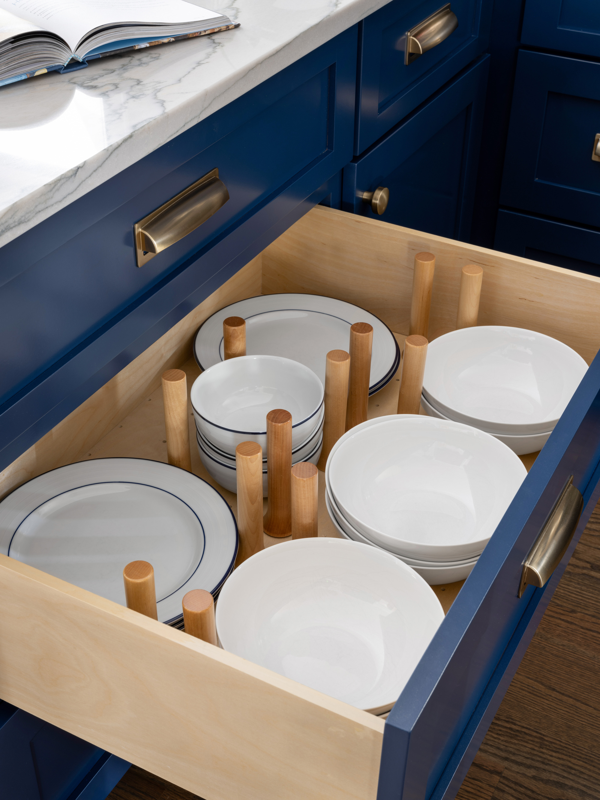
Of course, when thinking about a new kitchen we all want to fit in as much storage as possible to house everything we have and keep our countertops clear and clutter-free. However, overdoing storage may mean making the space feel closed in, and will allow you to house equipment you don’t necessarily need or use – it's a vicious circle of feeling like there’s not enough space and allowing for more, but then finding you’re filling it up anyway because you have extra space to store more items. Looking at the state of your current kitchen will help to determine how much storage you really need, and a good declutter right to the backs of the units will certainly refresh your approach before any hasty decisions.
It seems that quality over quantity is the way forward when it comes to modern kitchens. ‘The key to transcending fashion is to go for simple, beautifully made classic cupboards, fittings and worktops and then add small, well chosen pieces gradually, ensuring they are things you will grow to love more rather than go off because they are a little bit ‘of the moment,’' proposes Helen Parker, Creative Director at kitchen design studio deVOL, which has a showroom in New York City. It’s important that you find a design to suit your lifestyle, and a declutter is priority before making any major decisions. Think long term rather than quick fix.
Shop our top kitchen storage picks here
Be The First To Know
The Livingetc newsletters are your inside source for what’s shaping interiors now - and what’s next. Discover trend forecasts, smart style ideas, and curated shopping inspiration that brings design to life. Subscribe today and stay ahead of the curve.

Portia Carroll is an interior stylist, writer, and design consultant. With a background in interior architecture and design, she has a plethora of creative experience in the industry working with high end interior brands to capture beautiful spaces and products and enhance their qualities.
-
 These Are the Flower Crowns I’m Wearing This Spring (Spoiler: They’re Actually for My Door)
Coachella confirmed the comeback of flower crowns. At home, they just go by another name: the spring wreath
By Julia Demer
-
 Bunny Ears, Be Gone — 7 Easter Table Styling Mistakes That Will Take Your Setting from Tawdry to Tasteful
From fussy floral displays that disrupt conversation to over-relying on tacky tropes, don't fall victim to these errors when decorating your Easter table
By Lilith Hudson
-
 I'm Calling It — Chrome Decor Is the Most Influential Design Trend of 2025 for Rooms That Feel Effortlessly Cool
Have you been eyeing a chrome candle holder or side table to complete your room's look? This is your sign to embrace the shiny, chic material
By Olivia Wolfe
-
 Straight from Salone: 5 Emerging Trends I Found in Milan That'll Shape Interiors for the Year Ahead
From reflective silver to fluidity, here's my perspective on the key themes and new moods coming through from Milan Design Week
By Sarah Spiteri
-
 The 'Red Table Trick' Is the Easiest and Most Expensive-Looking Trend to Hit 2025 So Far
A red dining table makes a seriously stylish statement; the beloved pop of red trend just got an bold and expensive-looking upgrade
By Olivia Wolfe
-
 Cork Is the Cool, Sustainable, and Surprisingly Chic Material We Can't Stop Furnishing With Right Now
In honor of Earth Month, we’re toasting to cork... furniture, that is
By Julia Demer
-
 The Coquette Aesthetic Is Still Going Strong in Homes in 2025 — But Now It's Charming, Whimsical, and Has Modern Flair
A designer weighs in on how you can make the classic coquette trend feel modern while still retaining its whimsical elegance
By Devin Toolen
-
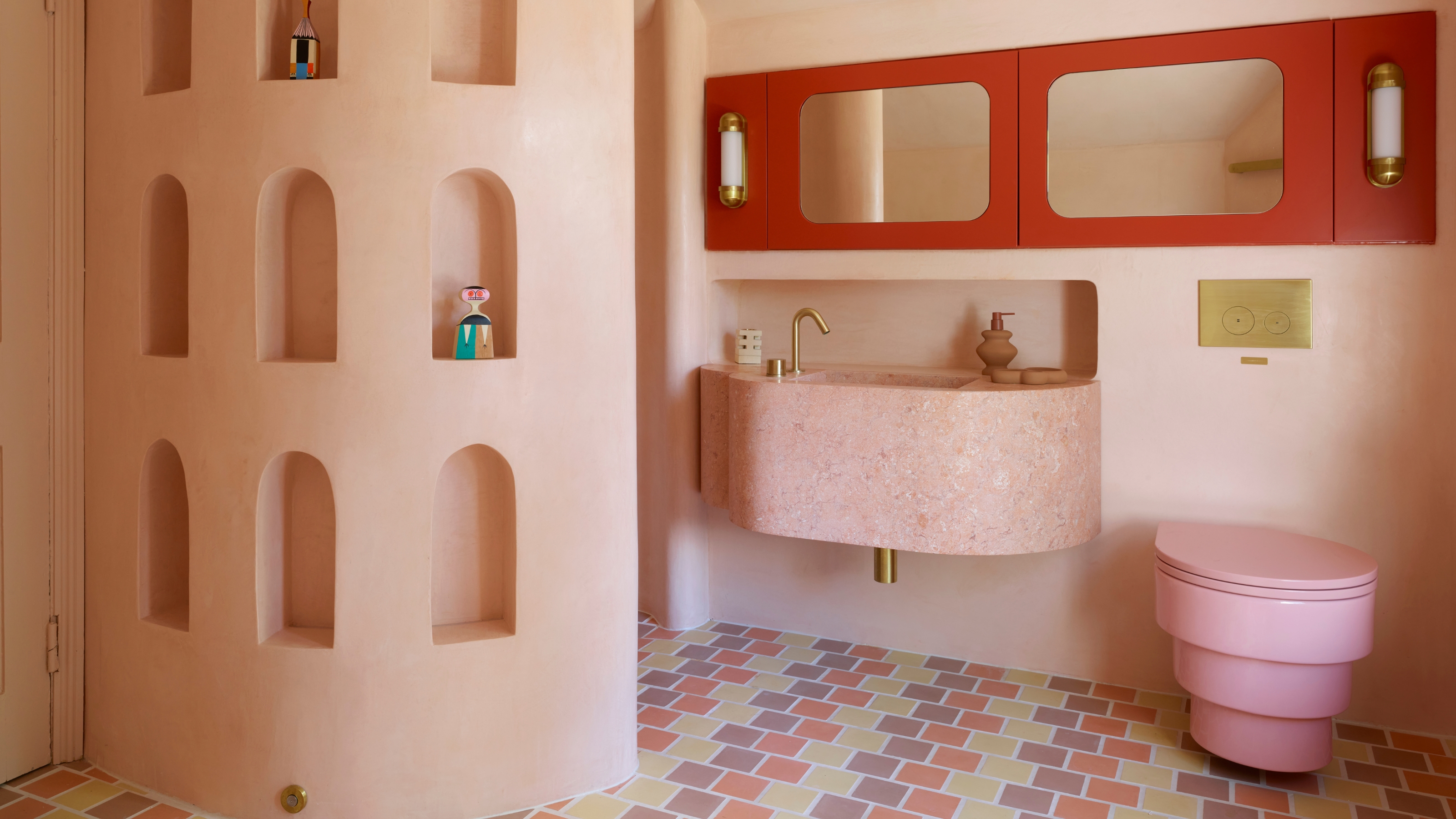 Spotted in the Coolest Bathrooms of the Moment — This Colorful-but-Divisive Trend Is the Idea You'll Either Love or Hate
See you later, sterile white. This playful plumbing trend is bringing color back to our bathrooms in an utterly unexpected way
By Olivia Wolfe
-
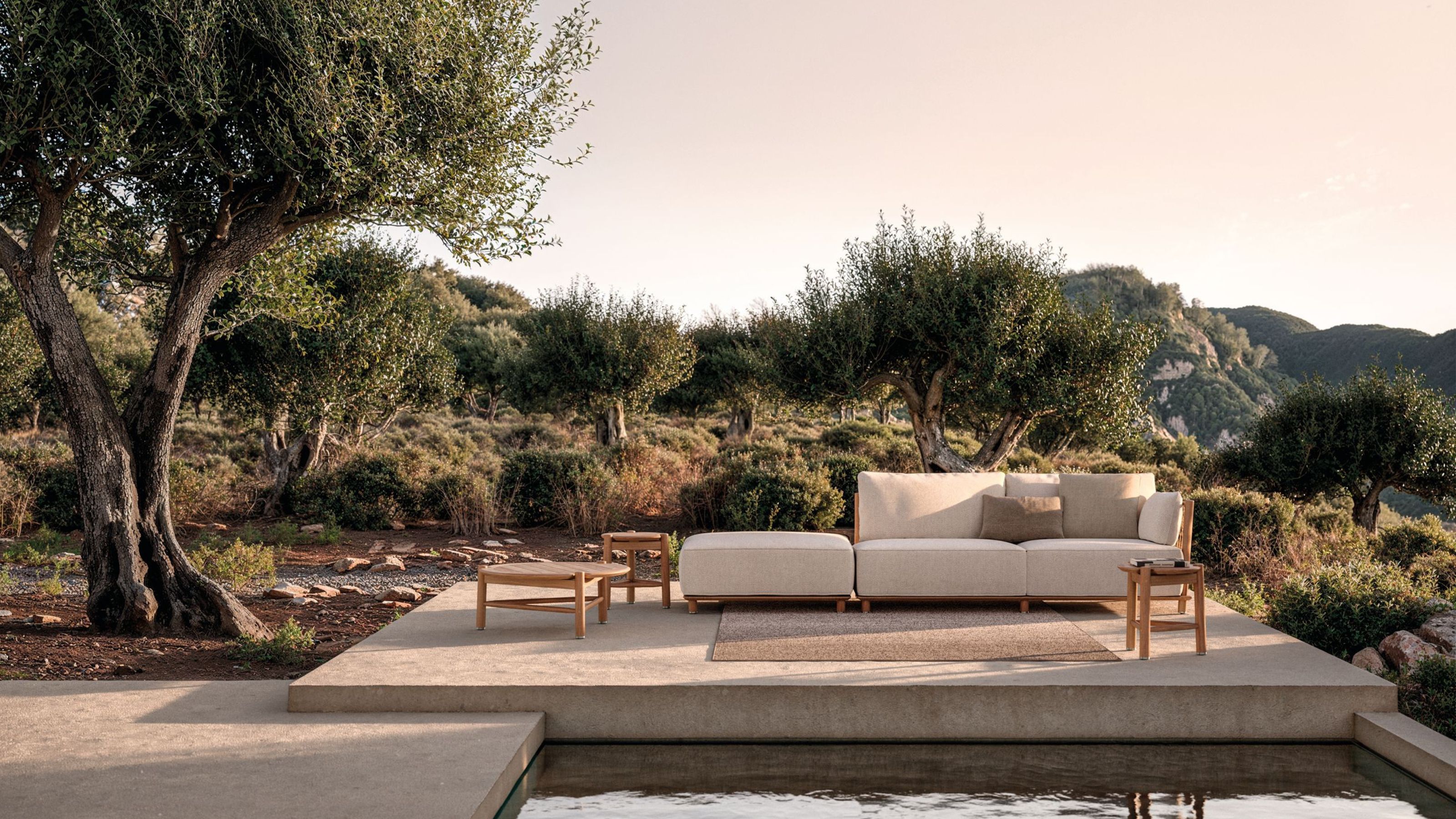 The Biggest Outdoor Furniture Trends for 2025 Embrace the Natural World, White Lotus, and a Touch of Whimsy
Sofas as plush as your living room’s, tables fit for a five-star resort, and materials straight from nature — here’s how outdoor living is evolving this year
By Julia Demer
-
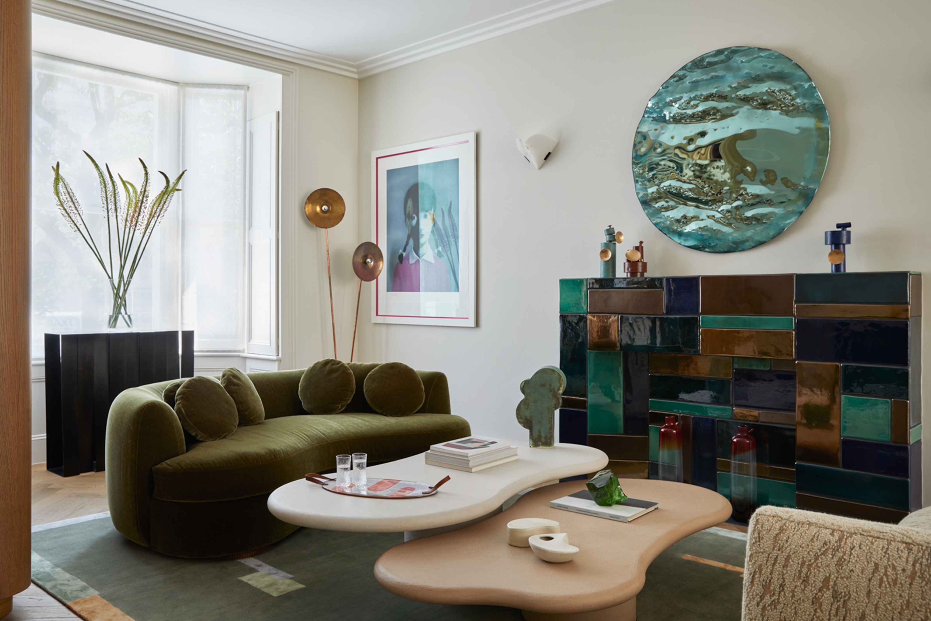 The "One Amazing Thing" Theory Could Just Be the Secret to Making Your Decorating Budget Go Further (While Making More Impact)
What if we told you designers had found a way to control a project's spend even while elevating the final result? This new trend does just that
By Pip Rich
