10 ingenious kitchens without an island or peninsula that still maximize surface and storage space
Working with a small space? Let these spaces inspire you to create a socialable, functional kitchen without an island
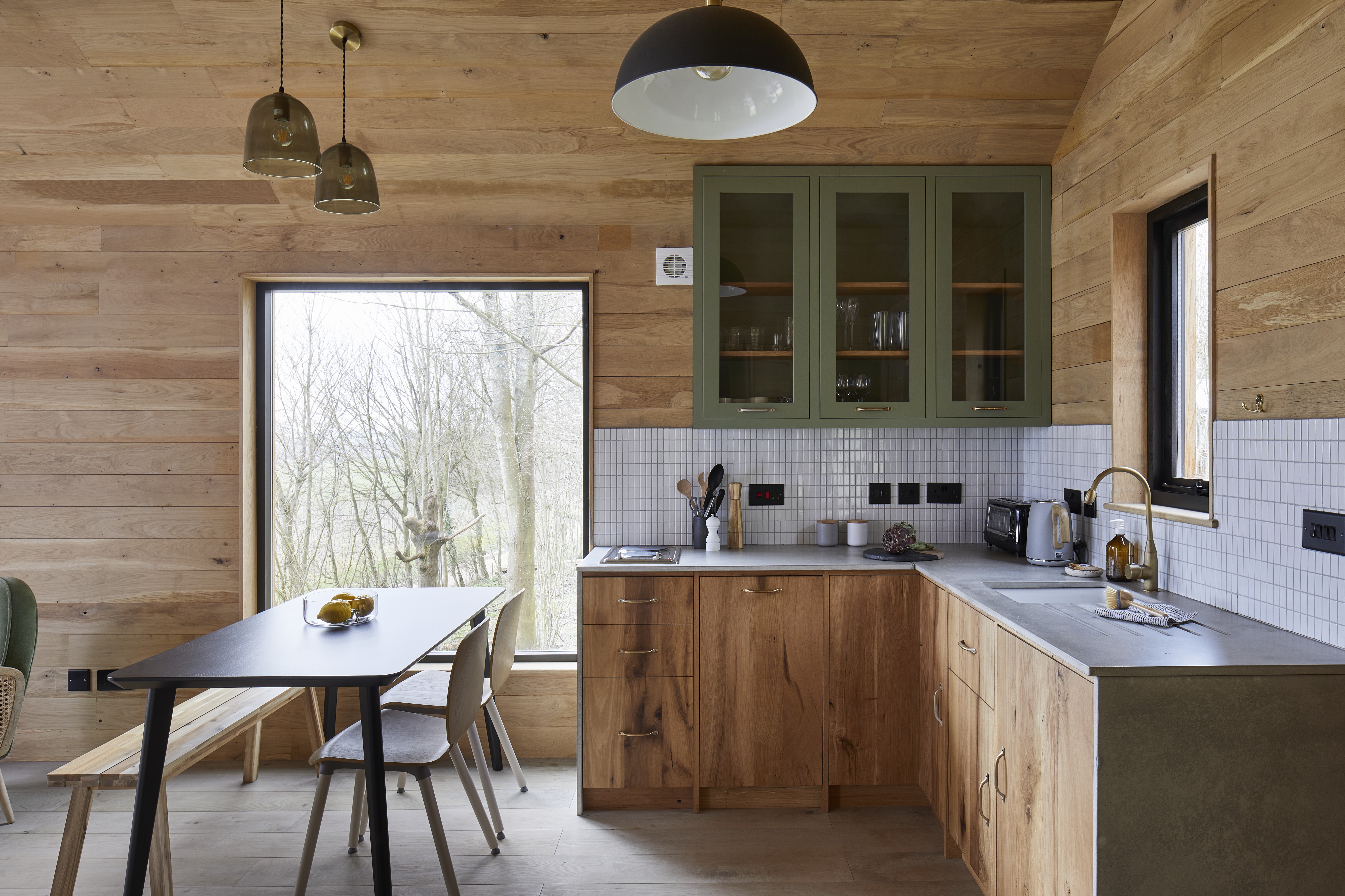

It's rare you see a kitchen without an island. They have become a must-have and it's like we have all forgotten how a kitchen could possibly function without this huge slab of cabinetry floating in the middle of the room. But what if you don't have the space for an island, or if you actually don't need one in your home? What other options are there and how can you design a kitchen without an island or a peninsula?
As these next ten modern kitchens are about to remind you, kitchens of all sizes can work without an island. Not everything needs to be focused around this go-to layout, and you can still design a beautiful, sociable and practical space. We asked the experts how they would recommend designing a kitchen without an island, and how going sans island could actually end up being a far better option.
Can you have a kitchen without an island?
Of course! Islands used to be a novelty, not the norm, and trying to squeeze an island or a peninsula into a space where it doesn't actually fit can be one of the biggest kitchen design mistakes you can make.
The big draw of a kitchen island is not so much about the storage they add, or that extra surface space, but how they instantly make the space more sociable. An island turns a kitchen into the real hub of the home – a place to cook yes, but also a place to work, relax, and entertain.
How to design a kitchen without an island
1. Consider why you wanted an island in the first place
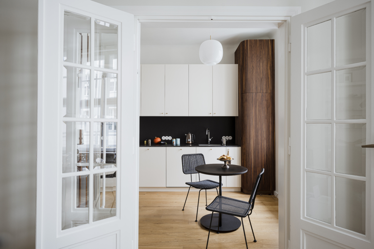
We understand that an island is very tempting when designing a new kitchen. But don't let it become a non-negotiable and don't become so stuck on the idea you start to compromise on the rest of the space. For a moment, ignore all the kitchens you have saved on Pinterest and consider if you can fit an island in your kitchen? If you are going to have less than 47 inches between the island and any other surface, the answer is no.
And also consider if you actually need an island – they are an expensive addition, so need to work hard to be worth it. Would a butcher's block or even a dining table be a better option?
This apartment kitchen, designed by Colombe, was used as a pied-à-terre by the owners so really there was no need for any extra cooking or surface space. The decision was made to keep the design simple and ensure the space felt light and open. 'The style of the kitchen was to be classic and very simple,' explains Marta Chrapka, founder of Colombe. 'The owners wanted a breakfast table and the kitchen itself was to be used occasionally without much cooking, so the island did not meet the needs of the space or those using it.'
2. Consider the flow of the room
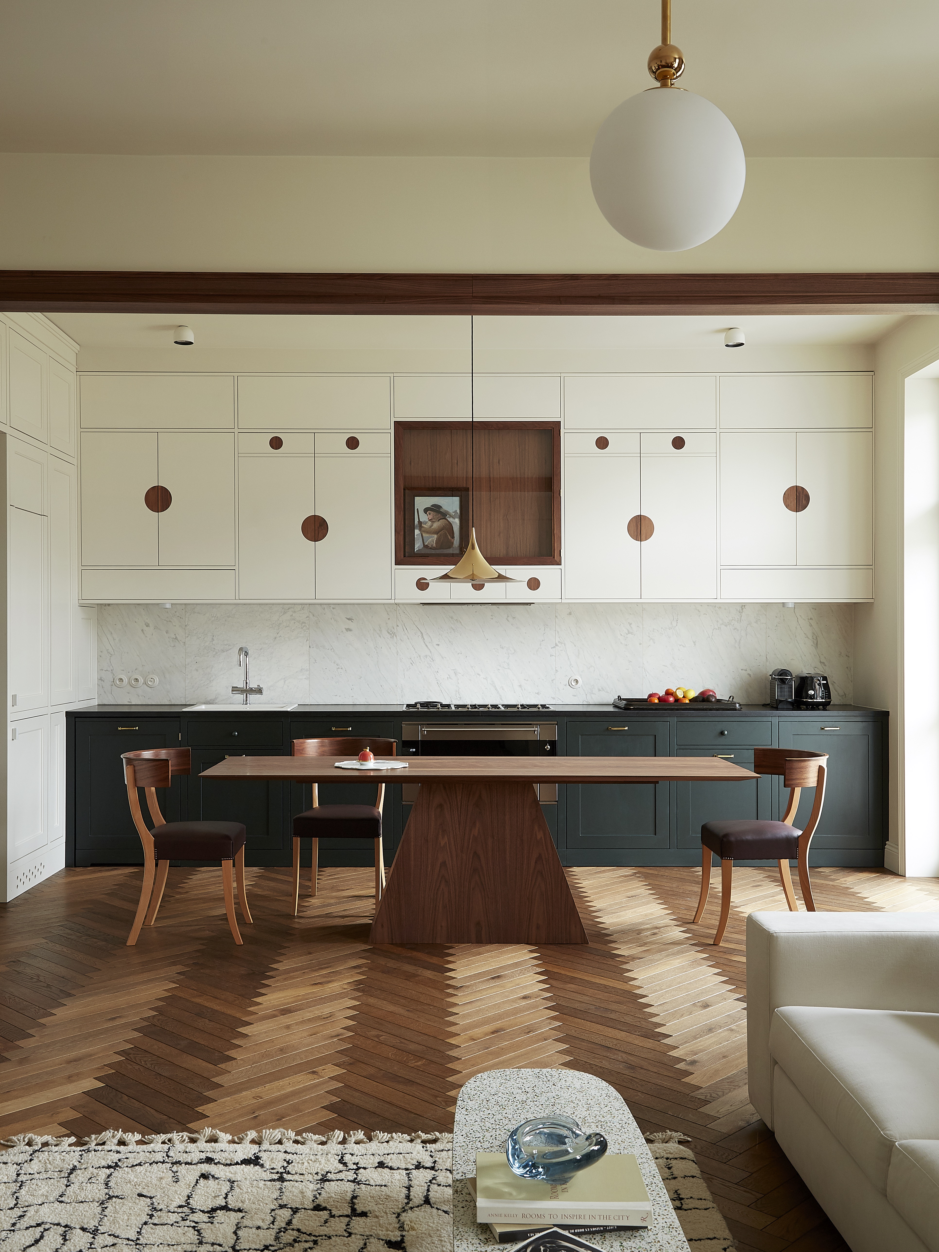
Islands and peninsulas are almost synonymous with open-plan kitchens. They help fill that awkward sea of floor in the middle of the kitchen and help connect the kitchen area with the rest of the room. However, an island isn't the only option here. In fact, forgoing an island can help the kitchen flow better with the other living spaces – an island is very much part of the kitchen but pick a less obvious piece of bulky 'kitchen' furniture and you find a more seamless, less defined flow throughout the space.
This open-plan apartment demonstrates the idea perfectly. There is obviously room for an island here, but the table connects the spaces far better and allows more light into the room. 'The kitchen is integrated with the living room, so we wanted to avoid typical kitchen furniture and instead create a comfortable space, absolutely usable, but at the same time one where you can host guests for dinner. We considered an island here, but since the room is narrow and the passage to the living room is limited, the best option was a long, narrow table,' explains Marta.
3. Create a layout that works for you
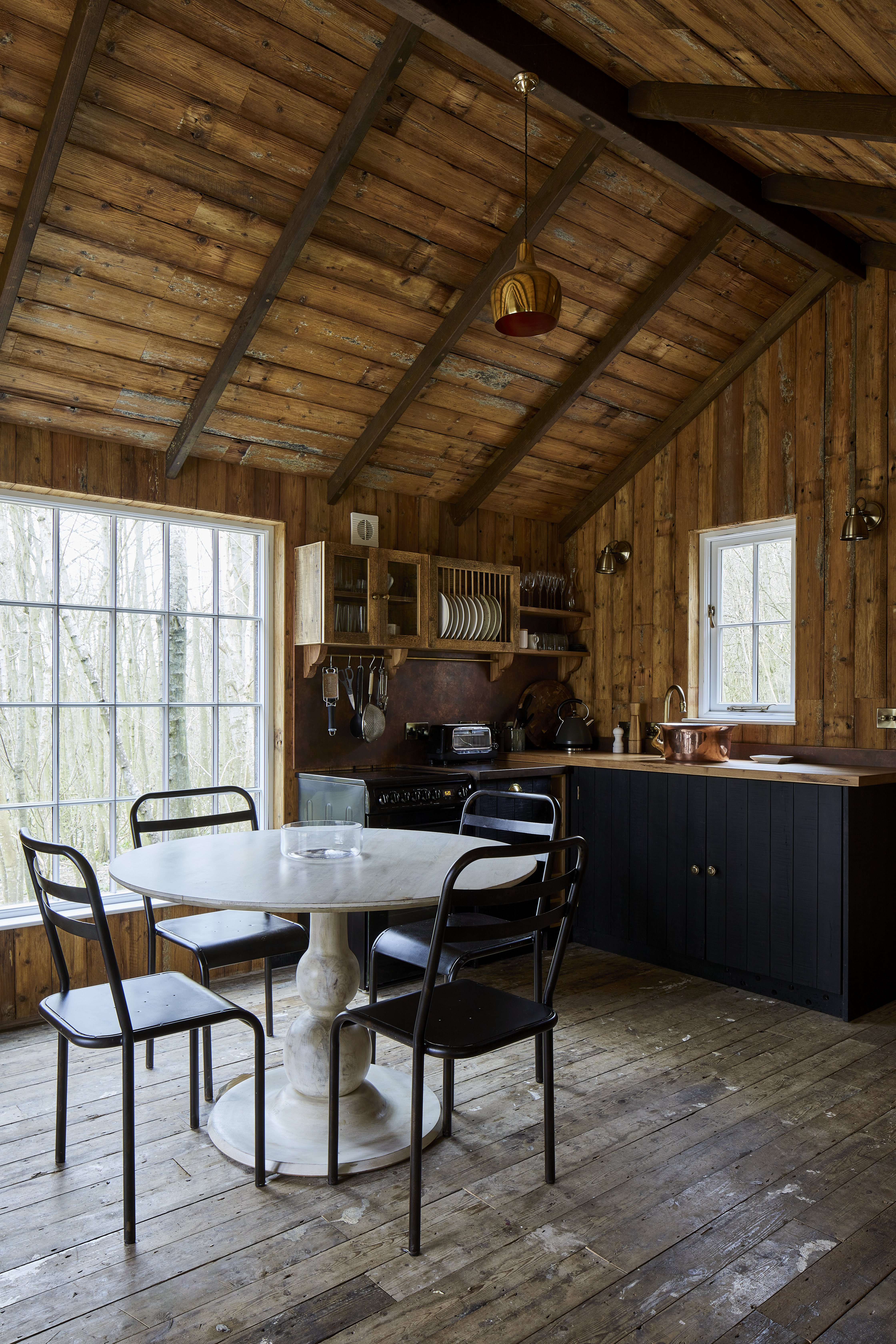
We've all heard of the 'golden triangle' or the 'working triangle' when talking about kitchen design. Its origins may be rooted in the 1940s, created by hardworking housewives but the concept still very much works in a modern-day kitchen. The idea that your main working zones within a kitchen (sink, fridge, stove) are all positioned in the most convenient places and never too far apart makes sense. So when designing a kitchen without an island or peninsular, consider how you will move around the space and where best to position your triangle. You might even find ditching the island makes this far easier.
'The best layout will depend on the shape of the space that your kitchen is intending to fill. But no matter what shape, for a kitchen without an island, we recommend placing the hob and sink closer to each other – 23.5 inches to 40 inches would be ideal –and the fridge closer to the sink,' explains Oana Sandu, Lead Designer at Blakes London.
'For an L-shape kitchen, we would place the sink and dishwasher on the shorter side and the hob on the longer side. For a galley kitchen, depending on the size of the room, sink, fridge, and freezer on one side and hob, ovens, and larder on the other side.'
4. Ensure your layout is sociable
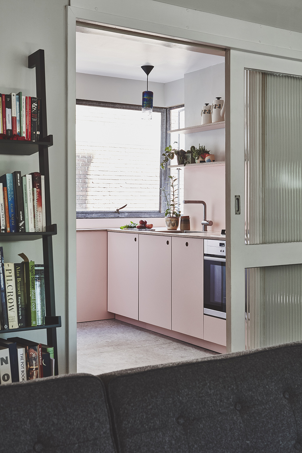
The big plus of an island or a peninsula is they take a kitchen from a place you cook in, to a place you socialize and entertain in. However, there are plenty of ways to make a kitchen feel like the social hub of a home without this layout.
'Consider positioning the hob close to the entrance of the kitchen, or if open plan, towards the end of a run that is close to the dining or living area. This will enable you to stay within earshot of what's going on elsewhere and will mean that you do not have your back to guests,' suggests Elizabeth Sherwin, Creative Director of Naked Kitchens.
'Try not to position tall units in areas that isolate or block off key prep and cooking zones as it is these areas you will spend the most time. A tall unit can form a screen that can make others feel like they can't enter the kitchen when in use. And consider whether there is space to include a breakfast bar within the room – this could be in front of a window for example and will offer a comfortable perch for others.'
5. Keep a small kitchen open with a single wall layout
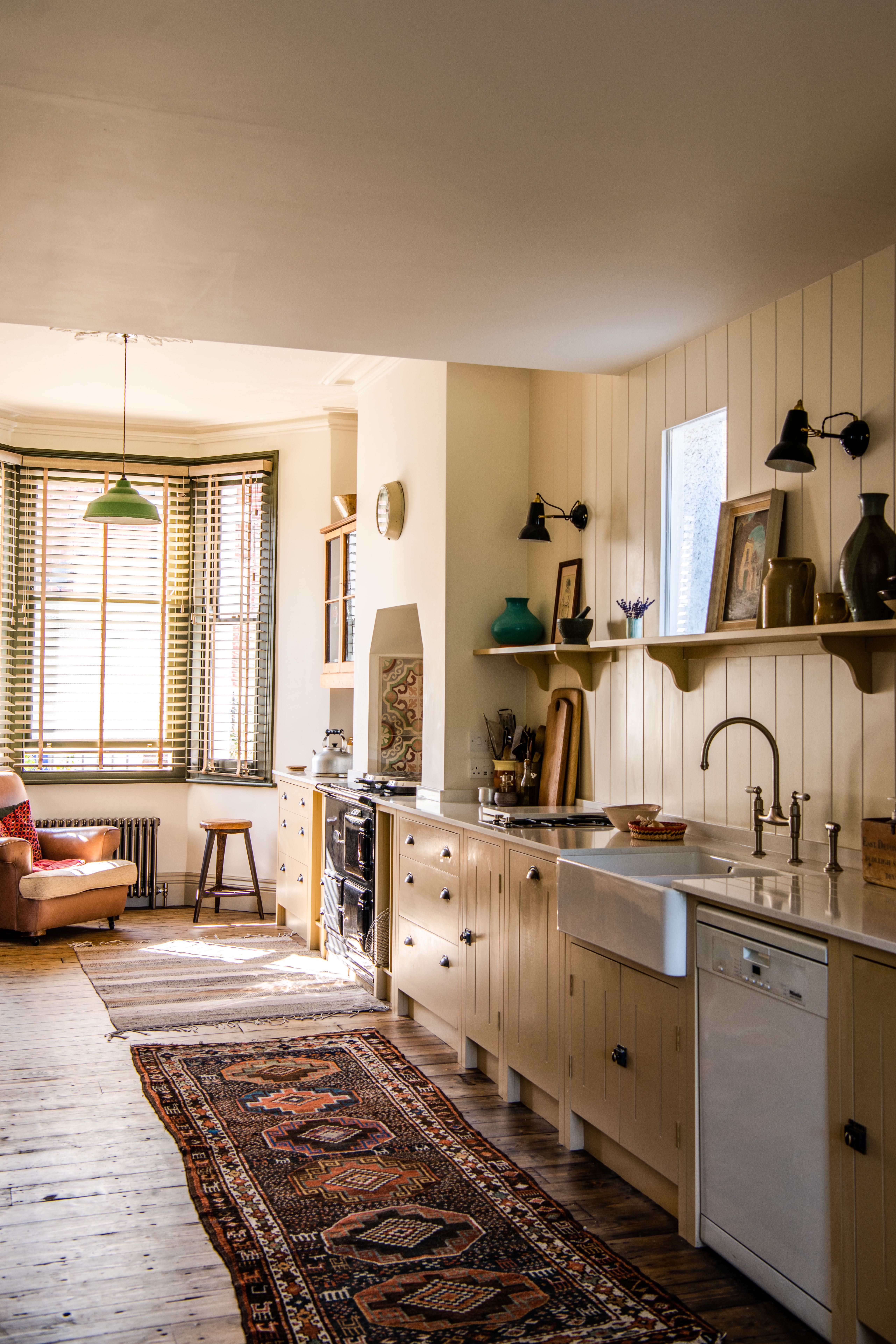
If you are squeezed for space in a small kitchen but want to create that open-plan feel that an island adds, consider keeping it really simple and just add a single wall of cabinetry. This layout means nothing gets cut into or blocked and you have the rest of the room to play with as you please. You could create that sociable aspect we just talked of by adding in a sofa or a loveseat, and throwing down a kitchen rug to create an open-plan kitchen/living room in miniature.
'In compact kitchens or smaller open-plan kitchen-living spaces, a single-wall layout will sometimes be the best option, says Charlie Smallbone of Ledbury Studio. 'You can still create an efficient working area, it’s just important to ensure there is enough useable worktop space. I like to locate tall storage and fridge-freezer at either end of the worktop to facilitate this. Placing a dining table adjacent to the run of kitchen cupboards will ensure you have an additional surface to play with, should you need it.'
6. Reinvigorate the galley kitchen
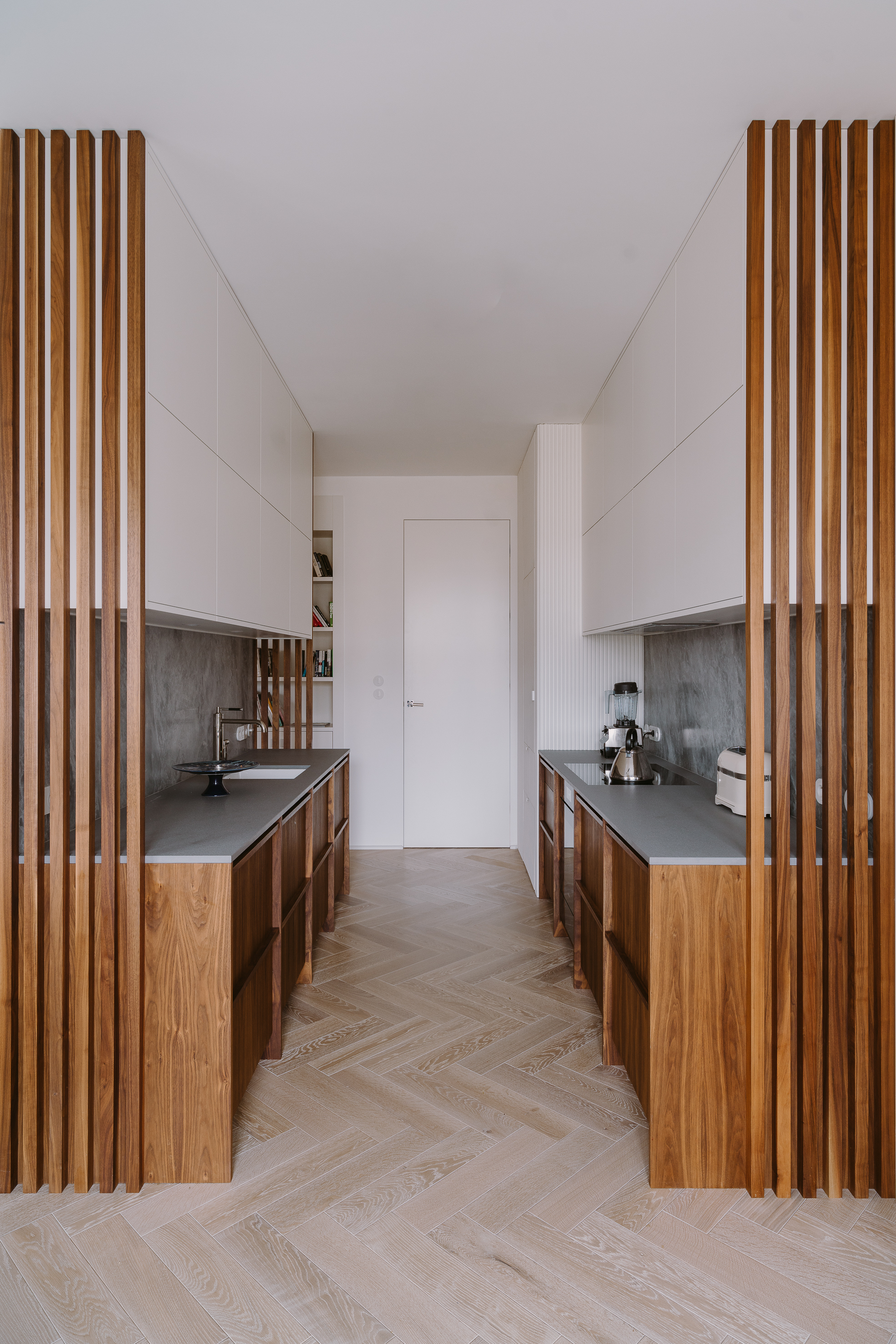
If your space is far too narrow to consider a mini living room addition, go for the classic galley layout – it's a classic for a reason and is one of the best small kitchen layouts out there. It makes efficient use of both sides, but you don't feel boxed in as you might with a U-shaped layout. And if you want a place to perch as you would have with an island – ditch a couple of floor cabinets and tuck under some stools.
'In narrow kitchens, a galley layout can make the most efficient use of space. Running the cooking zone and worktops down one wall and placing tall larder cupboards and fridge-freezer opposite will ensure you have plenty of prep space, while keeping all necessary functions close to hand.' advises Charlie Smallbone.
7. Switch an island for a kitchen table
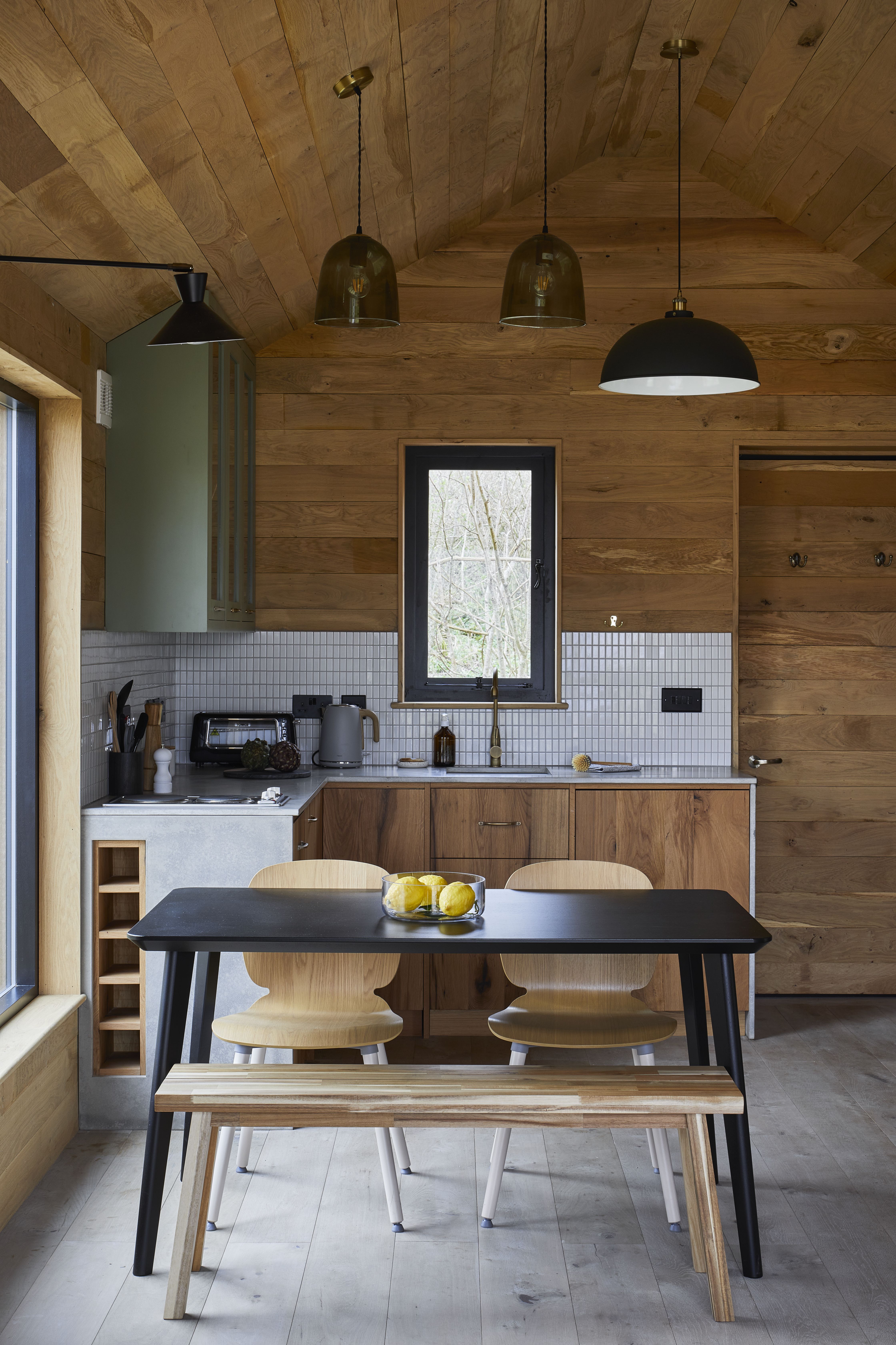
Apart from the additional storage, there are very few differences between and island and a kitchen table. You still get that extra surface space and the sociable aspect but you have more flexibility with positioning and a table won't add as much visual bulk.
'A kitchen table can work well as an alternative to a kitchen island, allowing for a social space within the kitchen that can be used not only for dining and entertaining but also as a food preparation space, or even as a workstation,' says Sophie Chapman of design studio The Vawdrey House.
Alex Main, Director at The Main Company agrees that 'If you don’t have space for an island, an open plan kitchen with a dining table is a great way to create a space with more function and flow – making interacting and socializing much easier. The open plan creates lighter, larger, and airier spaces, offering greater versatility in your kitchen.'
8. Or build in a banquette
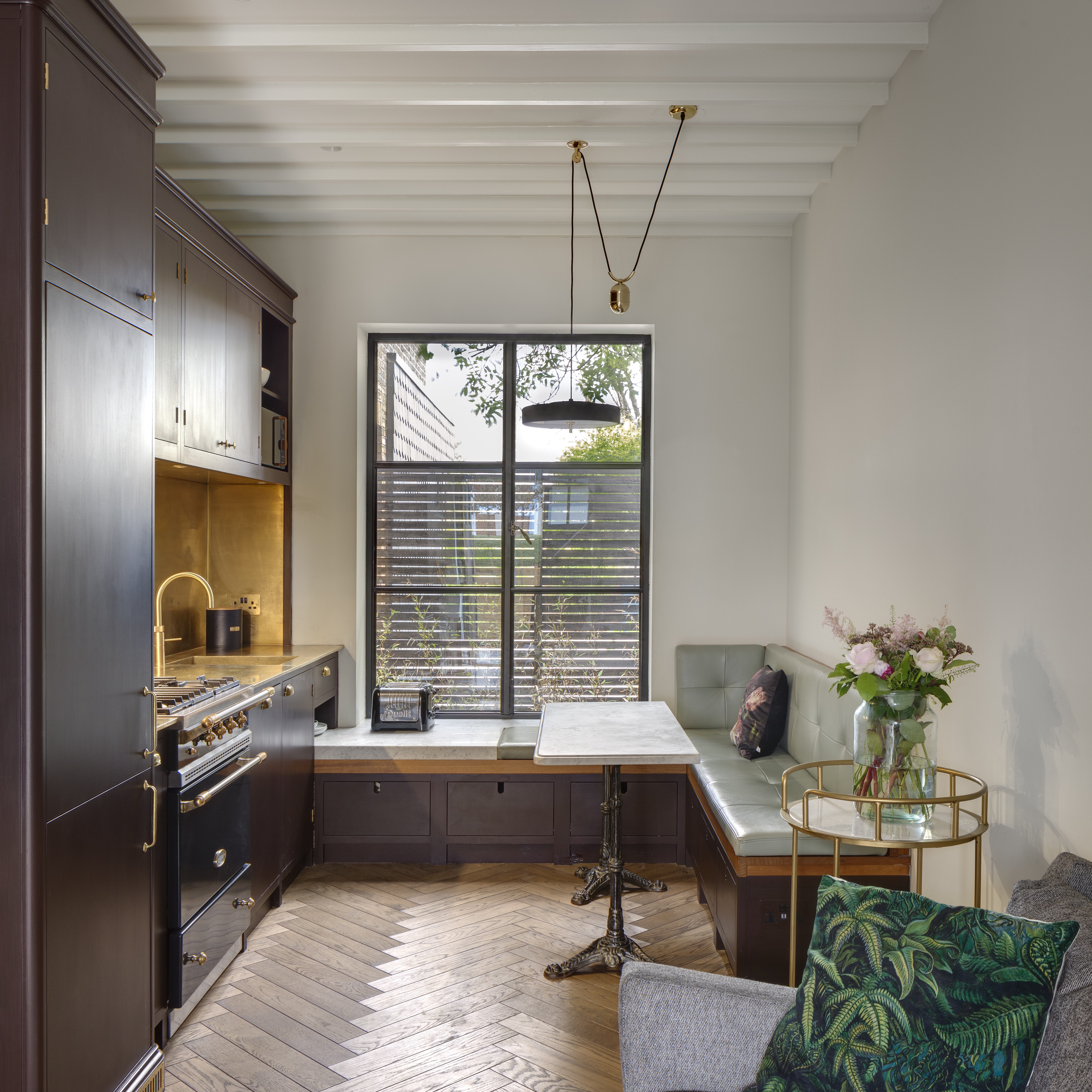
'If the kitchen is particularly small, a narrow table with banquette seat or even an L-shaped window seat like the one at our Coach House project will work well to offer increased functionality to the kitchen,' suggests Sophie. 'The added bonus of incorporating a banquette seat is that it can also serve as a storage area. In this kitchen we designed storage drawers underneath the seat for items that weren't needed as frequently. Lift-up seats work equally well depending on what you plan to store and how often you need to access the items.'
'Kitchen islands are often considered to be the hub of the kitchen, a gathering point that anchors the space, but by adding this L-shaped seating design we were able to offer a strong visual point of interest while adding character and texture in the form of the pleather seat and backrest.' she adds.
9. Add a compact breakfast bar
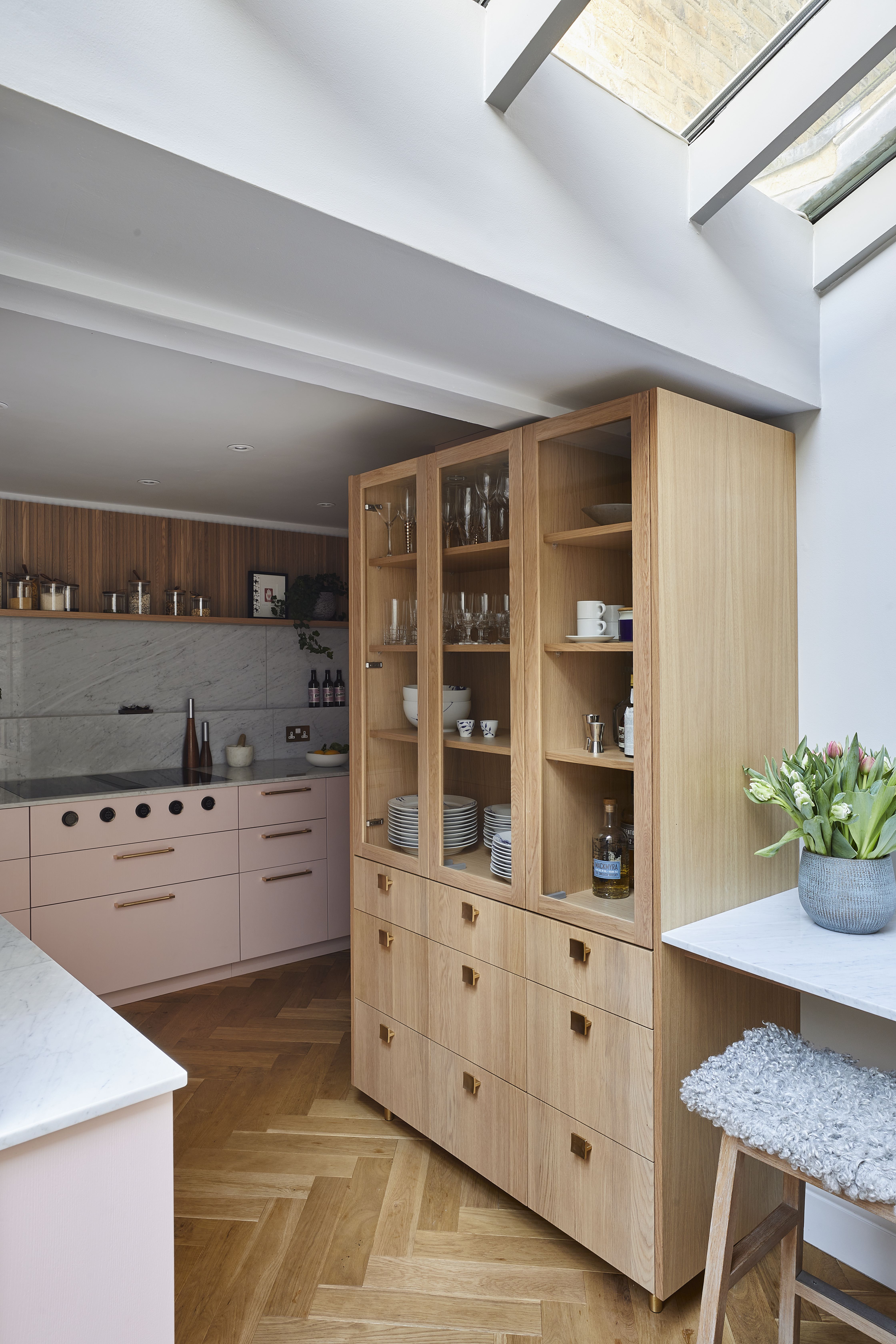
A breakfast bar may feel like a bit of sacrifice when you are working with a small space and really need to maximize kitchen storage, but having that break in cabinetry can do a tiny kitchen so much good. Not only does it give you a spot to entertain, it stops the room from feeling crowded with cabinets.
Note how in this, let's face it, pretty awkward-shaped kitchen, the lack of wall cabinetry, and leaving a spot for a compact breakfast nook stops the room from looking closed in. 'In this layout, it was a juggling act of trying to place everything in the compact corridor-like room. Base cabinetry runs along one side of the L-shaped area, with both open shelving and wall units above for extra storage,' explains Rhiannon Phenis, Head of Design Sola Kitchens.
'To keep a feeling of space, a glass-fronted dresser was included for crockery and glassware. While tall units have been placed on the hob run and on the wall opposite. A breakfast bar was suggested as the kitchen has no space for a kitchen island.'
10. Simplify the layout but go bold with the color
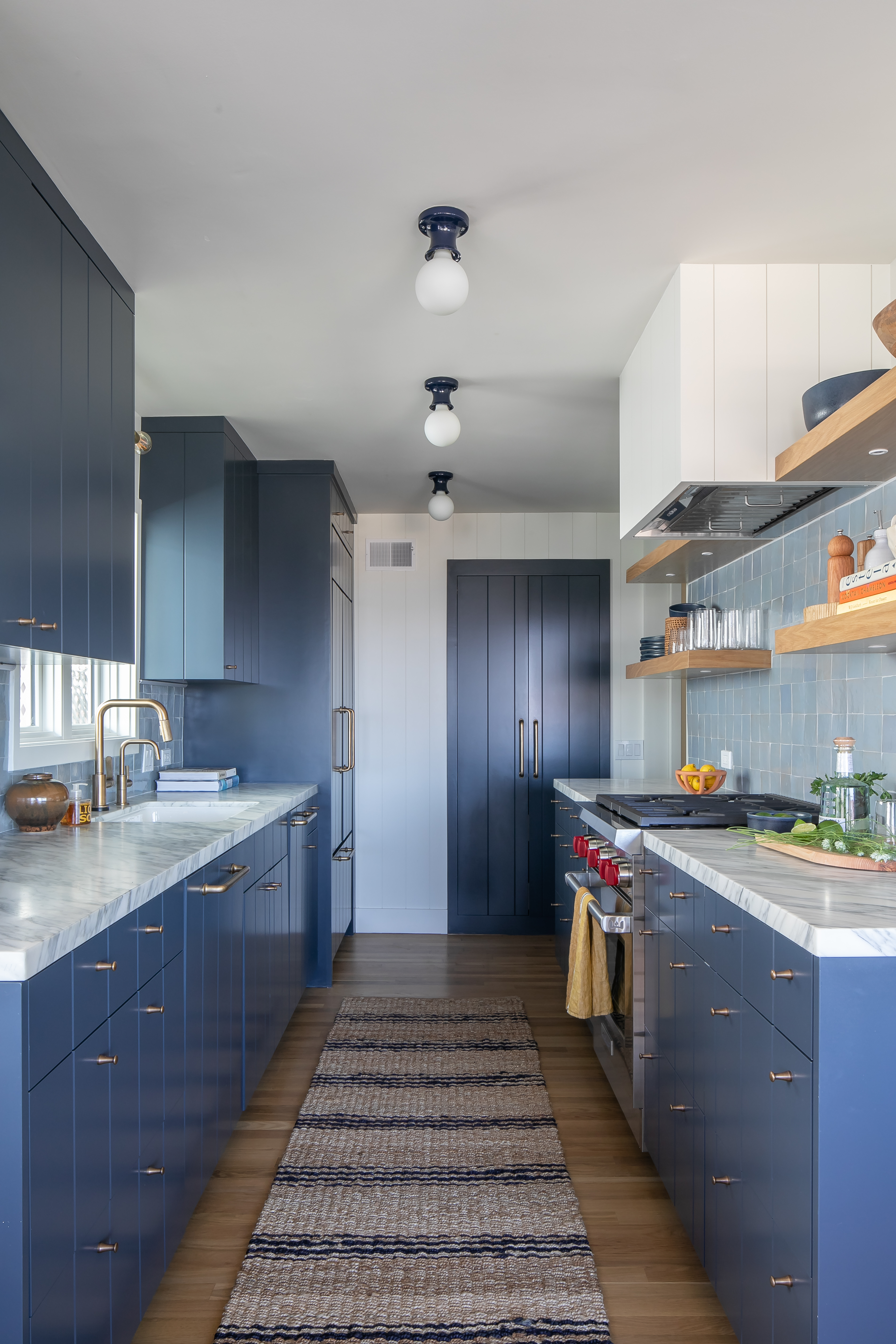
In smaller kitchens, the go-to colors tend to be pretty neutral – keep everything light and bright to make the room look larger etc. etc. However, forgoing an island frees up a lot of physical and visual space – this lack of extra cabinetry can allow you to be far bolder with design and color. Keep the layout simple and let your kitchen color choices be the focus.
'As this cottage didn't allow room for an island, we made sure to include countertops that span this kitchen space. What this cottage lacked in square footage was made up for in design – the tonal blues in the cabinetry and backsplash pack a punch,' explains designer and founder of Raili Ca, Raili Clasen.
When should you not include a kitchen island?
When you don't have the room! No matter how many pros an island might have, it's going to stop your kitchen from functioning if you are having to squeeze between cabinets and can't open your appliances properly. We'd suggest only adding an island if you can have at least 47 inches of clearance around it. And don't just downsize the island to fit one in – if it gets too small it becomes pointless and could easily be replaced with a dining table or a butcher's block.
What can you use instead of a kitchen island?
There are plenty of alternative options for a kitchen island, the most obvious being a kitchen table – all the functions of an island but you can more flexible with size, shape, and spacing.
Rhiannon Phenis suggest 'instead of an island, include a casual seating area such as a comfy sofa in your kitchen as it creates a welcoming feel. Also breakfast nooks… large or small. Breakfast nooks are also perfect for making the most of extra space in your kitchen. These small dining areas offer a cozy spot to enjoy your morning coffee and meals.'
'The benefit of a kitchen with a dining table rather than an island is that it makes life easier when setting the table. For instance, you can quickly grab an extra knife from the cutlery drawer or that pot of jam you’ve forgotten to put out for breakfast. And when it comes to clearing the table, you’re within easy reach of the dishwasher as well as all the drawers and cupboards,' adds designer Irene Gunter.
'If you’ve got children, it’s nice to have them sitting around the kitchen table doing their homework or arts and crafts. By making the table a place where everything happens, you create a hub that people are naturally drawn to.'
So if you want that same sociable feel an island brings to a kitchen, just add in some extra seating or surface in any form and size that's going to work with your space.
Be The First To Know
The Livingetc newsletters are your inside source for what’s shaping interiors now - and what’s next. Discover trend forecasts, smart style ideas, and curated shopping inspiration that brings design to life. Subscribe today and stay ahead of the curve.

Formerly the Digital Editor of Livingetc, Hebe is currently the Head of Interiors at sister site Homes & Gardens; she has a background in lifestyle and interior journalism and a passion for renovating small spaces. You'll usually find her attempting DIY, whether it's spray painting her whole kitchen, don't try that at home, or ever-changing the wallpaper in her entryway. She loves being able to help others make decisions when decorating their own homes. A couple of years ago she moved from renting to owning her first teeny tiny Edwardian flat in London with her whippet Willow (who yes she chose to match her interiors...) and is already on the lookout for her next project.
-
 The 10 Different Types of Kitchen Taps — And the Pros and Cons of Each One to Know Before You Pick
From sleek pull-outs to vintage bridge taps, explore 10 kitchen tap styles that mix function, flair, and a splash of cool
By Linda Clayton Published
-
 5 Things You Should Never Buy From a Thrift Store, According to People Who Know About Antiques
It may look like treasure, but it may also just be trash. Here is how to know what to avoid while thrifting, and what to look for instead
By Olivia Wolfe Published