Kitchens Without Backsplashes — 15 Attractive Alternatives That Throw Out the Rule Book
Take the unconventional route and give your kitchen a stylish backdrop that blends into the room
- Can you have a kitchen without a backsplash?
- 1. Consider a stainless steel kitchen
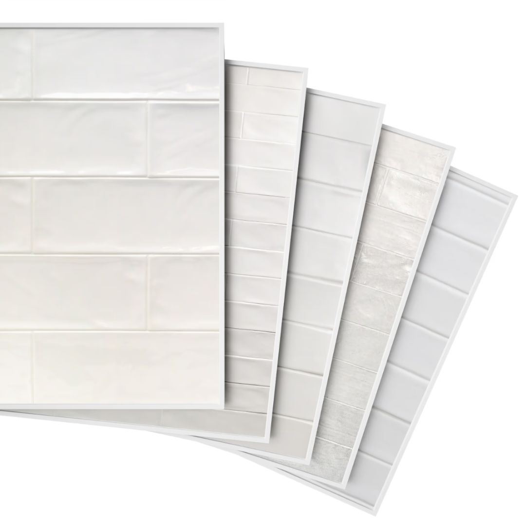
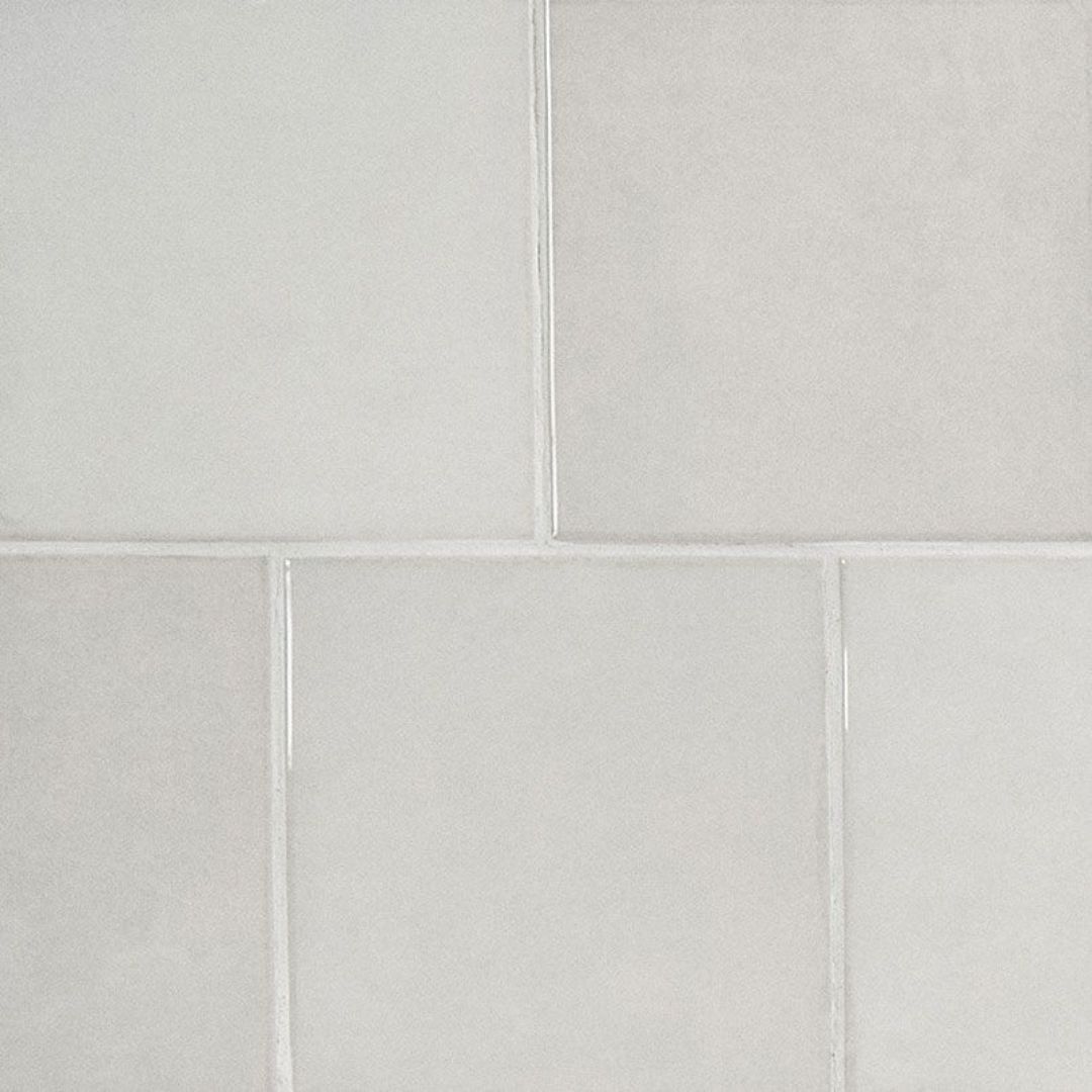
- 2. Let the ceramic tiles take over the walls
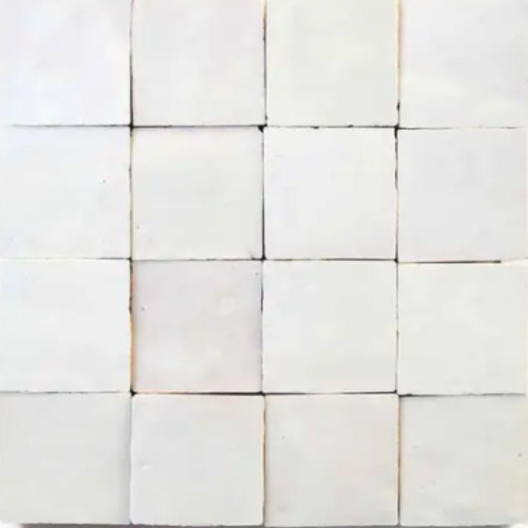
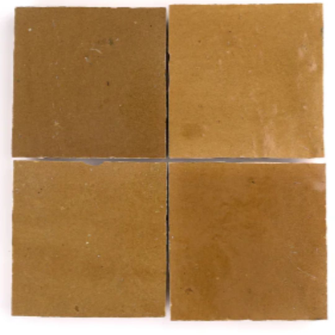
- 3. Or go for Zellige tiles
- 4. Design the kitchen with cement walls
- 5. Choose panelling
- 6. Warm up with paint
- 7. Use a water-resistant paint
- 8. Add texture with plaster walls
- 9. Protect your walls with an upstand
- 10. Bring in color and pattern with wallpaper
- 11. Consider a single slab
- 12. Choose a subtle sheet of quartz
- 13. Blend in a backsplash
- 14. Make use of a window for a backsplash free kitchen
- 15. Add a rustic feel with exposed brick

Hebe Hatton
Experts are asking us to rethink and question conventional design; and one of the elements they suggest you can ditch is the backsplash — surprised? Yes, a kitchen doesn't always need a backsplash but that doesn't mean you need to get rid of it completely. The idea is to choose elements, designs, and materials that protect the walls from stains and splashes, without having to look like run-of-the-mill additions.
So, think tiles or bricks that run all the way from the counter to the ceiling. Or waterproof paints, or perhaps glazed plaster walls. The choices are unlimited if you truly want a modern kitchen that feels different.
If you're interested in a space without a standard kitchen backsplash, then these expert-recommended ideas are ones to take a look at. Get creative and design.
Can you have a kitchen without a backsplash?
Yes, a kitchen backsplash is not a compulsory element, and you can do without one. However, experts do recommend considering the needs of the kitchen first.
"I think whether or not you need a backsplash depends on the space and the level of use," explains designer Marie Flanigan. "Backsplashes are great for containing the mess and allowing for easy clean up."
Reuben Ward, lead designer at Blakes London, adds: "In a kitchen that is infrequently used, where perhaps the homeowner is more of a tea/coffee, microwave meal style user can afford to be less concerned with installing a backsplash. We tend to see this style more in apartment kitchens or in flats that are used as pied-à-terres."
There are several wonderful ways to elevate kitchens without backsplashes. Here are some great ideas:
1. Consider a stainless steel kitchen
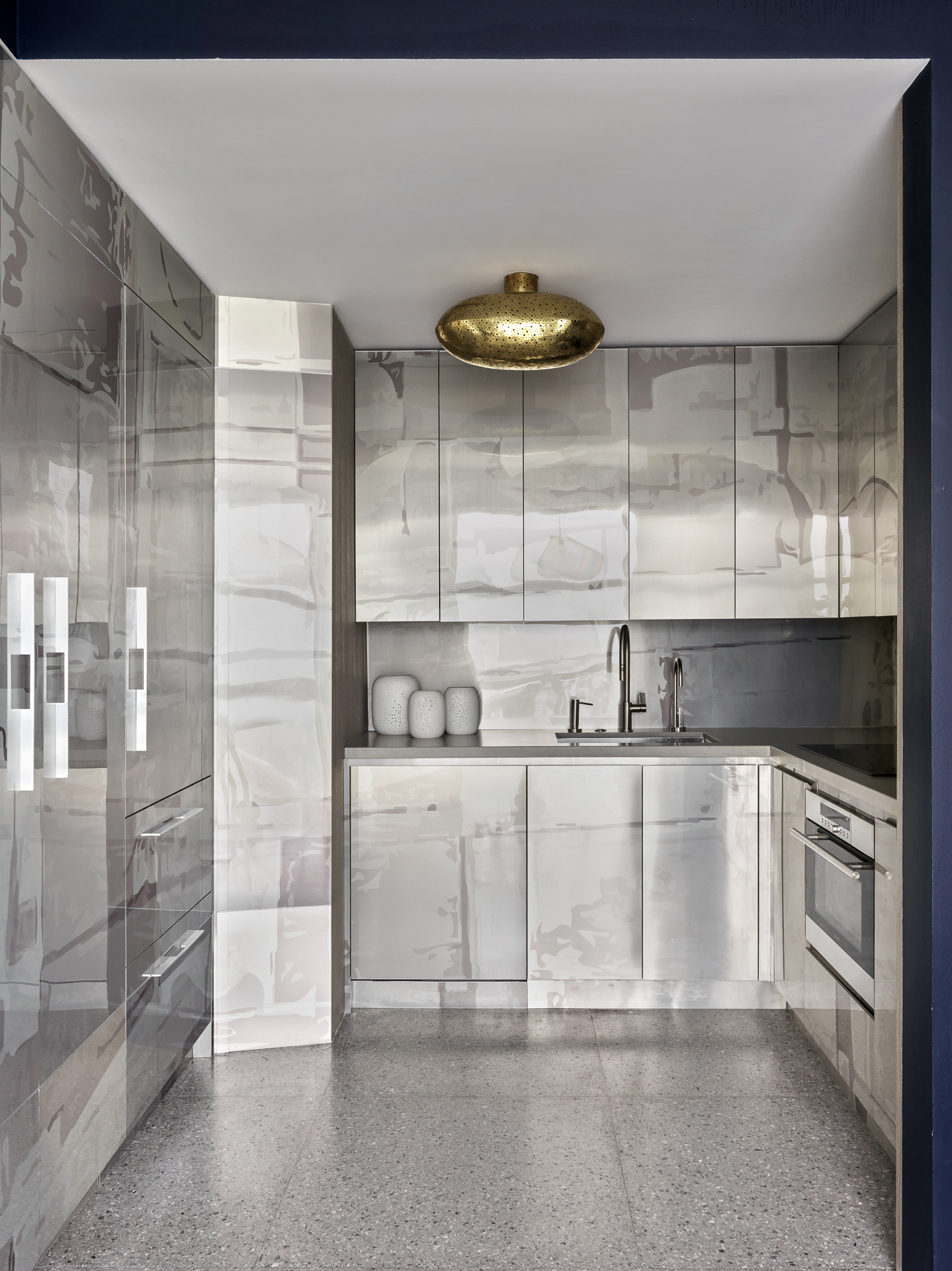
Stainless steel kitchens have been quite a trend lately, and for good reason. The material, usually seen in restaurants, has a clean, sleek, and polished aesthetic. Steel is hard, tough, and doesn't break or warp under pressure. If yours is a busy kitchen, used by multiple people, this could be the one to go for.
“This kitchen is designed in laser-printed stainless steel," says Jean-Louis Deniot, founder of Deniot. "We created a kind of stencil on Photoshop based on water reflections, laser printed it on stainless steel, and then clad the entire custom cabinetry and backsplash to make it look liquid, and feel liquid."
The abstract pattern laser-printed on the stainless cabinet front was done by Dornbracht.
2. Let the ceramic tiles take over the walls
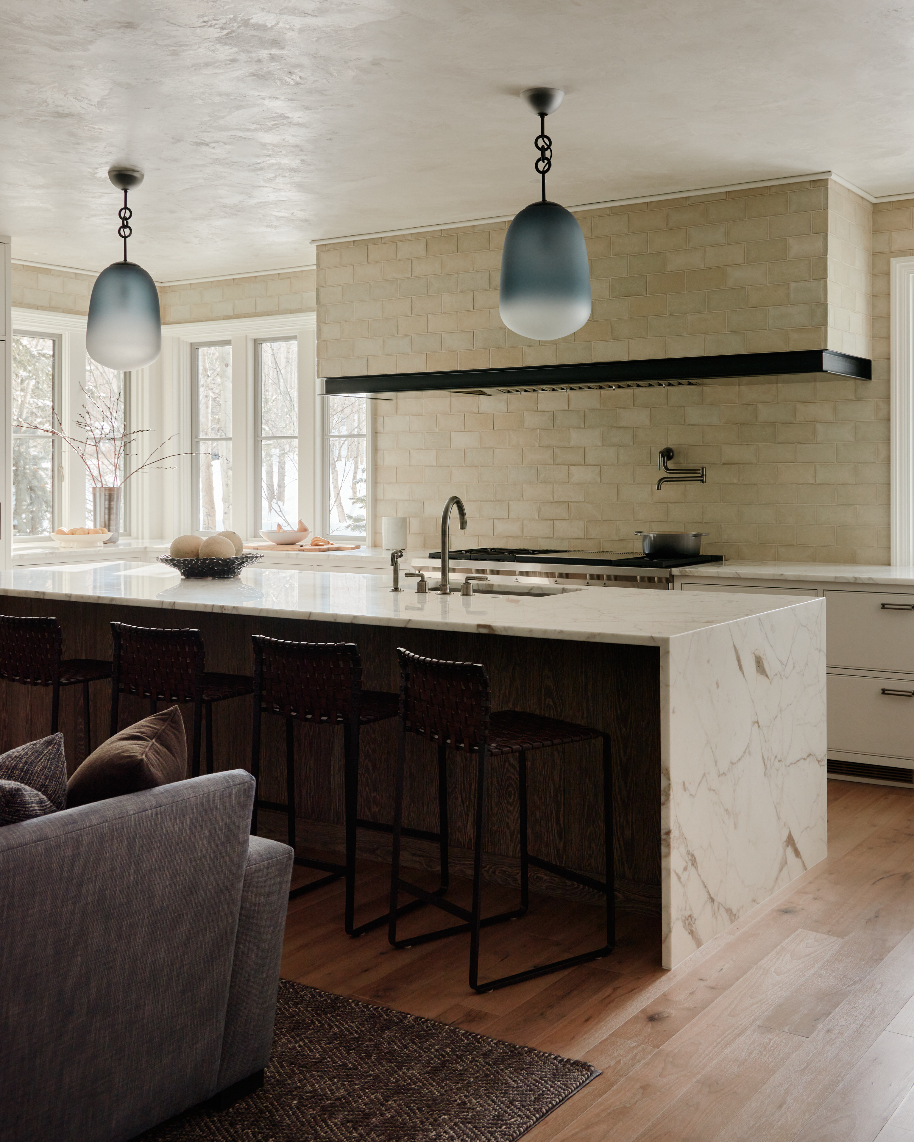
Kitchen tiles don't need to be restricted to just one section of the room. Include these across walls, hood, and even ceiling for a seamless look that also looks neat. Consider adding a washable matt varnish on the tiles so that they're easily wipeable and the stains are almost undetectable on them.
"We opted for handmade ceramic tiles, which beautifully complement the kitchen environment," says interior designer Clive Lonstein. "They’re durable and can withstand the heat from back burners, accommodating large pots without any worry. The glazed terracotta finish adds an aesthetic warmth while being practical for daily use."
3. Or go for Zellige tiles
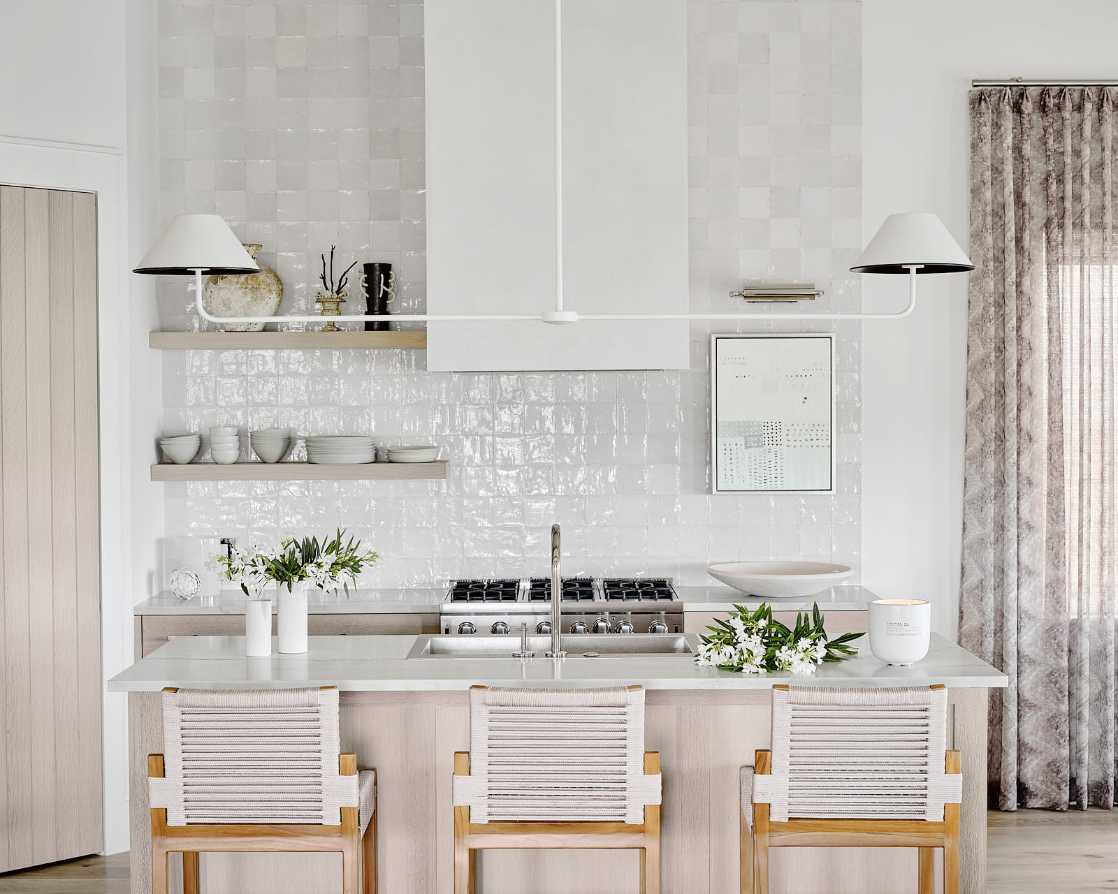
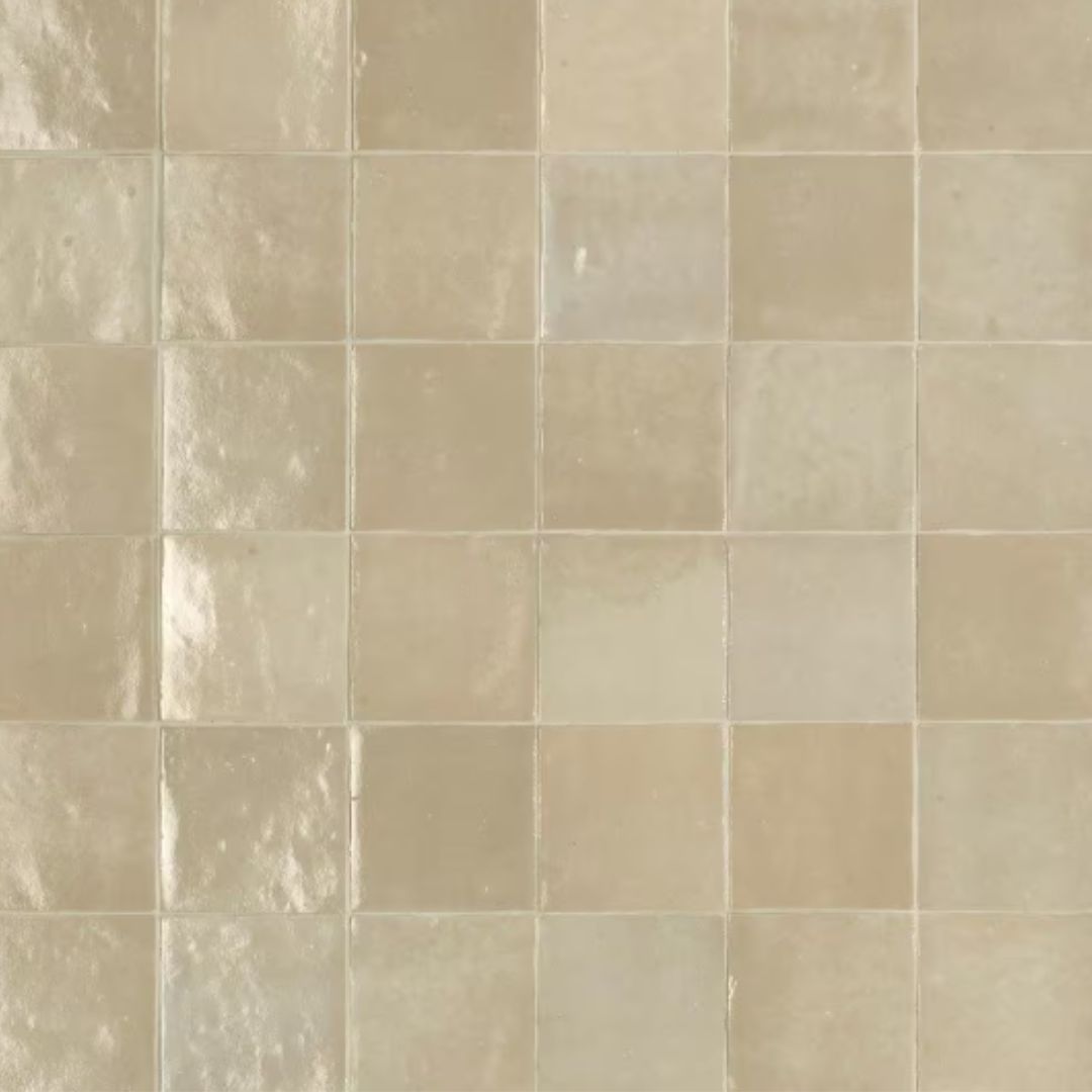
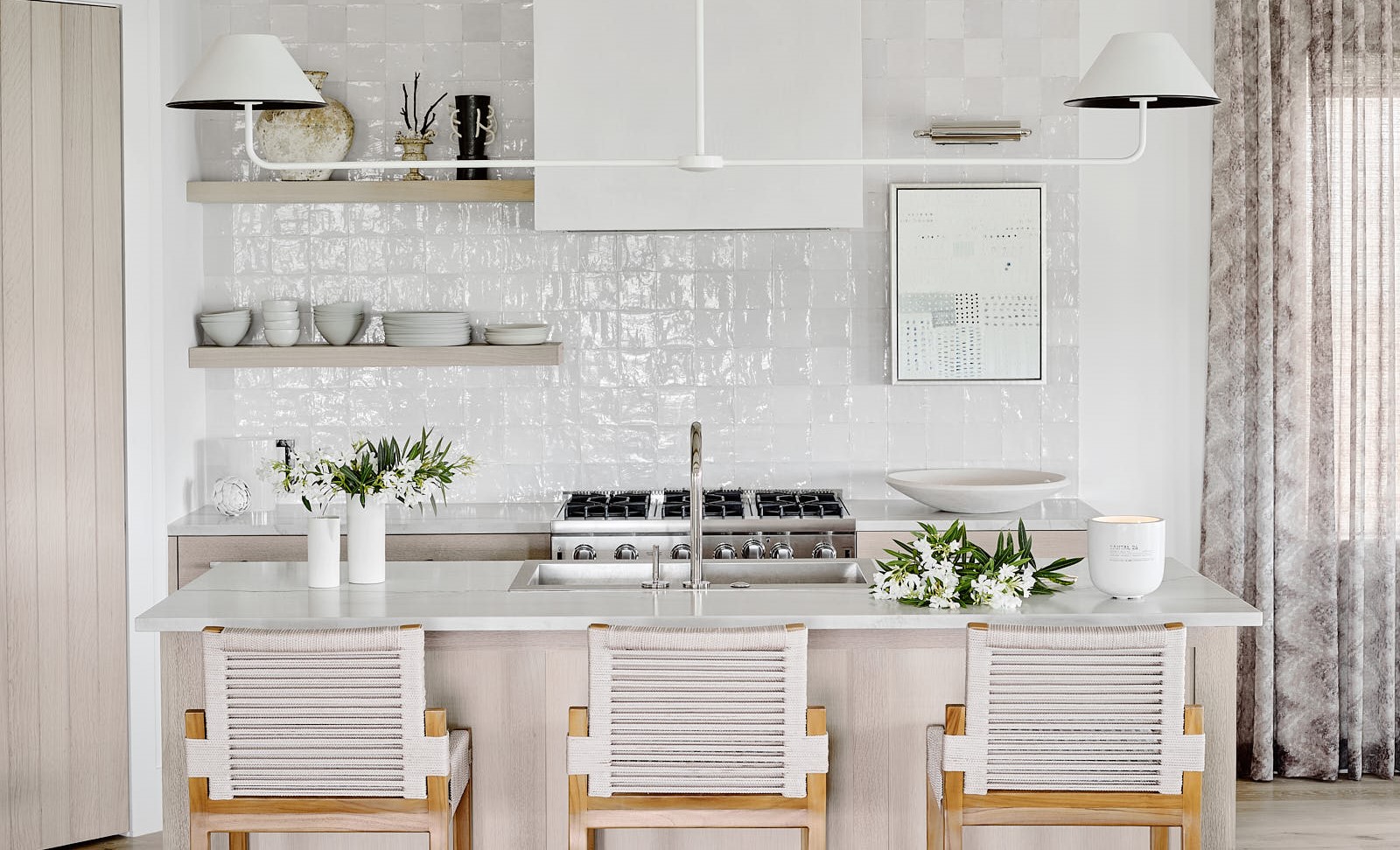
Elevate your kitchen with the beautifully glossy, striking Moroccan tiles that feel both fresh and charming. Kitchens with Zellige tiles have a naturally alluring look, where the organic texture adds layering to the room. Plus, these are available in several colors, are easy to clean, can be configured in many ways, and have super versatile applications.
"Inside this beach bungalow, the shimmery kitchen backsplash goes the entire way up the wall," says Anne Grandinetti, founder of Ashby Collective. “The sheen of the tile really picks up on the water elements surrounding the home."
4. Design the kitchen with cement walls
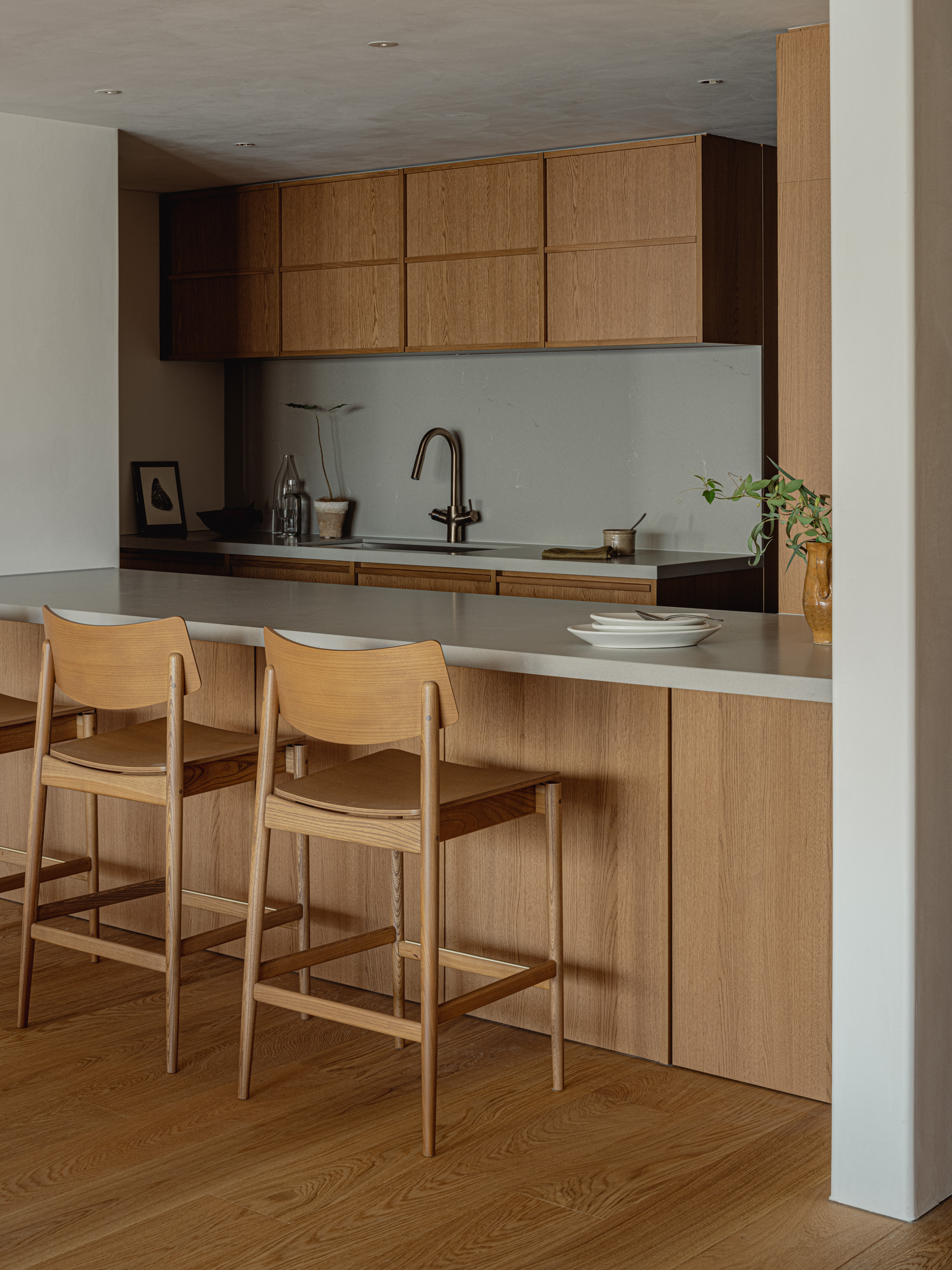
For an earthy vibe, match the kitchen cabinets with tactile walls that add dimension and depth to the scheme, yet blend into the room's aesthetic.
You could go in for concrete or even plaster walls, for a more industrial kitchen. Often these types of walls or coatings develop patina over time but can be painted over or polished to give them a new look.
"The kitchen is open and can be seen from the living room," shares Keiji Ashizawa, founder of Ashizawa Keiji Architects. "We designed the kitchen to feel harmonized with the living room by using oak panels painted in the same color as the living room, simple concrete walls, and a bronze faucet to blend in with the wood color."
5. Choose panelling
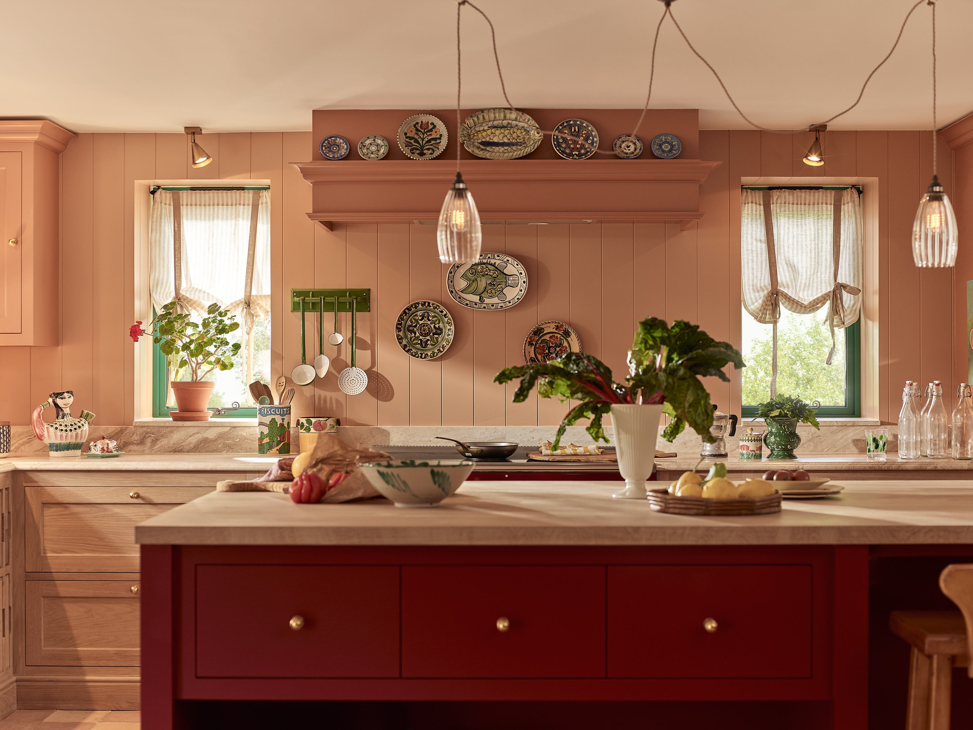
“Kitchens without backsplashes offer a clean and minimalist design scheme that creates a sense of openness and simplicity," says Fred Horlock of Neptune. "The use of paneling offers an alternative to tiles that adds visual interest while maintaining functionality. If painting the panels, eggshell works best to allow the finish to withstand the wear and tear of a busy kitchen. Wall paneling easily adapts to both cozy, rustic kitchens, as well as more modern spaces. It's also practical, as the paneling provides a surface that allows for hanging decor, adding character and warmth to the space, making it feel inviting and stylish.”
What's also interesting about paneling is that it's easy to install kitchen storage units like shelves and cabinets on these. Panels can also hold wall plates, and pots and pans, making all the important things easy to reach.
6. Warm up with paint
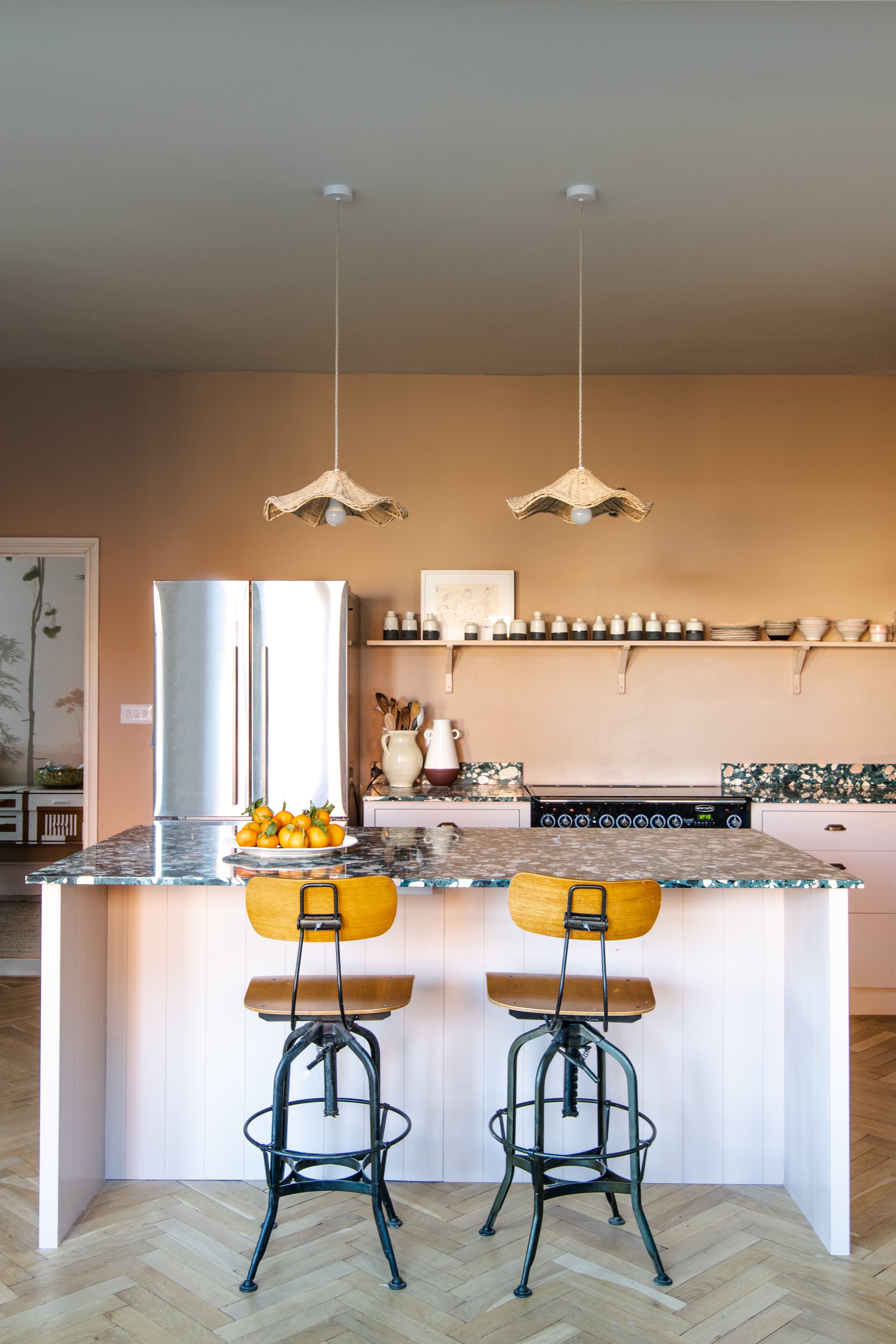
This gorgeous pink kitchen is eye-catching, and the lack of wall cabinets and backsplash make this a soft, warm space.
Freeing up all that wall space, and not just covering it in tile, gives you the chance to play a bit more with kitchen colors too. Stripping a kitchen back to just the essentials means there's not too much going on visually so you can be bolder with your paint choices. Be inspired by this space and embrace the color-drenching trend — something we have seen a lot recently in hallways, bedrooms, and living rooms but not so much in kitchens.
"Having Farrow & Ball's Setting Plaster modern eggshell for the color of cupboards, the soft, muted pinky hue adds warmth to the kitchen," explains Adrian Bergman of British Standard by Plain English. "The lack of backsplash meant that the owner had greater space to complement the color of the cupboards with a new color from Farrow & Ball's collection on the walls: Templeton Pink Modern Emulsion. The result is an inviting and welcoming space."
7. Use a water-resistant paint
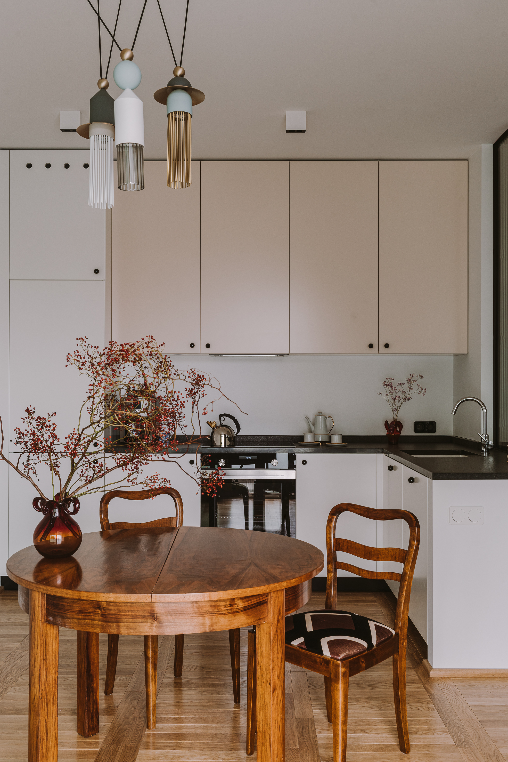
While we love the simplicity of forgoing a backsplash there is the argument that it's a pretty high-maintenance approach. If a wall of tiles gets wet or splattered you simply wipe it down; not so easily done with a painted wall.
However, there are precautions you can take to make paint a slightly more practical choice for a backsplash. Always choose a kitchen-specific paint — look out for a formula that's greaseproof washable and water resistant. Paint is never going to be as hardy as kitchen wall tiles, but if you are quick with the clean-up, you can avoid water damage and stains.
"This kitchen is intended for occasional cooking, so we could afford not to make the backsplash," explains Marta Chrapka founder of Colombe. "We wanted the space to be light and bright and the stone or tiles would weigh it down too much."
"To ensure not including a backsplash is still practical, we usually use glass to protect wallpaper or if using paint, as in this kitchen, choose a water-resistant pool paint," adds Marta. "Mineral plaster is also a good solution but only in kitchens that aren't too heavily used."
8. Add texture with plaster walls

"Think outside the traditional stone or tile backsplash box," suggests designer Lisa Sherry. "I often like to cover the backsplash — or sometimes the entire wall — in plaster. It’s functional, tactile, and modern."
Plaster walls are a huge trend right now, and while they look gorgeous, pick the right approach and it can be a really practical choice for your space. If you're remodeling a kitchen, consider Tadelakt walls. These, unlike clay, are waterproof and mold-resistant, often used in wet rooms so would work perfectly as a backsplash. Just consider that they may be prone to staining, so perfectly fine above a sink but experts wouldn't recommend using above a hob.
9. Protect your walls with an upstand
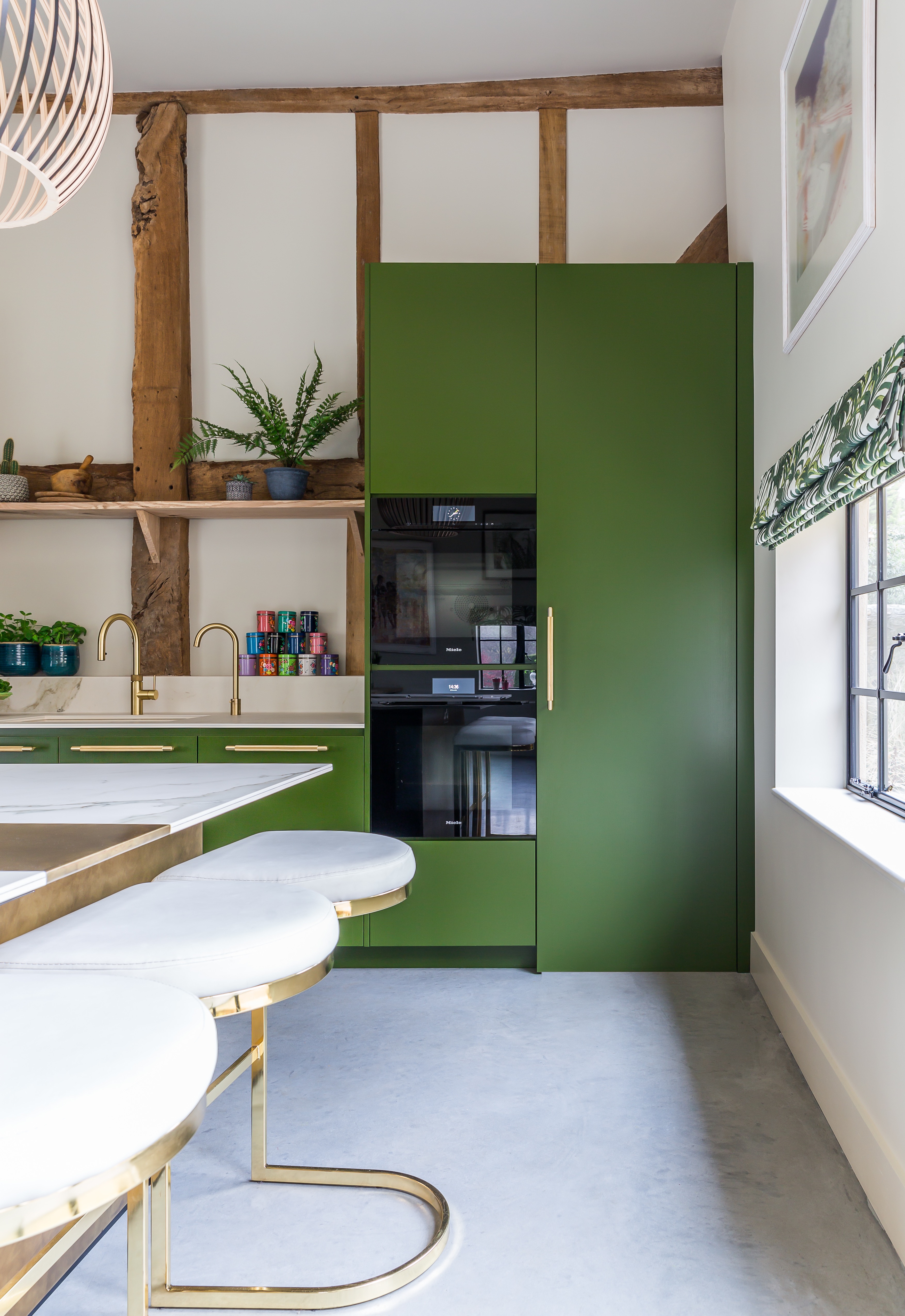
Not quite a backsplash, an upstand is a more subtle way to protect the parts of your walls that need it most, without having to take it more than a couple of inches up the wall. This approach is ideal if you want a no-backsplash kitchen but need that little bit of something — say if you are designing a family kitchen in which the sink is going to see a lot of action and splashes are definite. Or if you are set on wallpaper, an upstand will ensure it lasts longer as it is more water resistant — or like in this green kitchen, you want to protect original features like beams or brick.
"In this specific kitchen, our clients opted for an upstand rather than a backsplash, mostly for aesthetic purposes, to blend the countertop in with the adjacent wall," explains Rhiannon Phenis of Sola Kitchens. "As this was a former barn, and the clients wanted to keep some of the elements such as the restored beams."
10. Bring in color and pattern with wallpaper
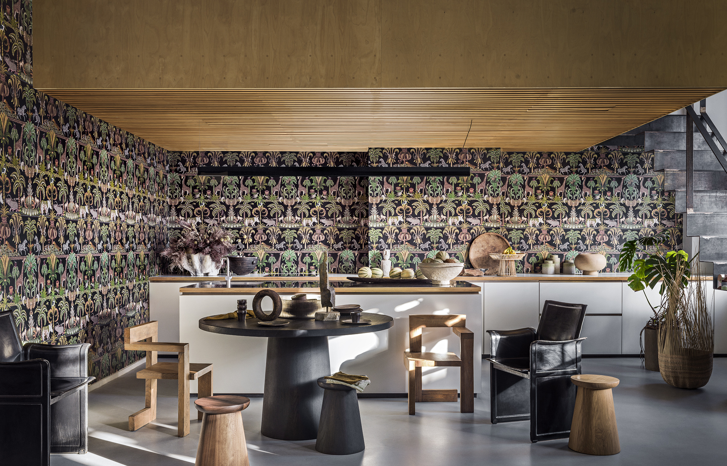
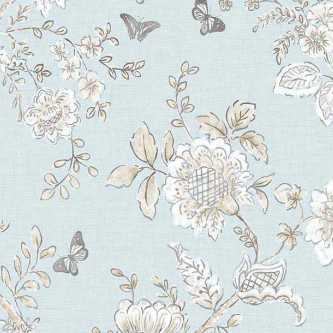
In our opinion, wallpaper doesn't get used enough in kitchens. It's such an easy way to bring in some pattern, color, and depth to a space that's so often in need of it. And if you are going to bring in a kitchen wallpaper, really commit and take it right from the countertop to the ceilings.
This look works best for kitchens without backsplashes, and if you keep visual clutter to a minimum — so ditch the backsplash and even the wall cabinetry, if you can afford to, and just let the wallpaper be the focus.
There are some practicalities to consider, though. Kitchens are often steamy places, which doesn't pair well with wallpaper. To prevent the effects of condensation, protect your paper with a matte varnish and avoid the area directly above the sink — or be sure to add an upstand.
11. Consider a single slab
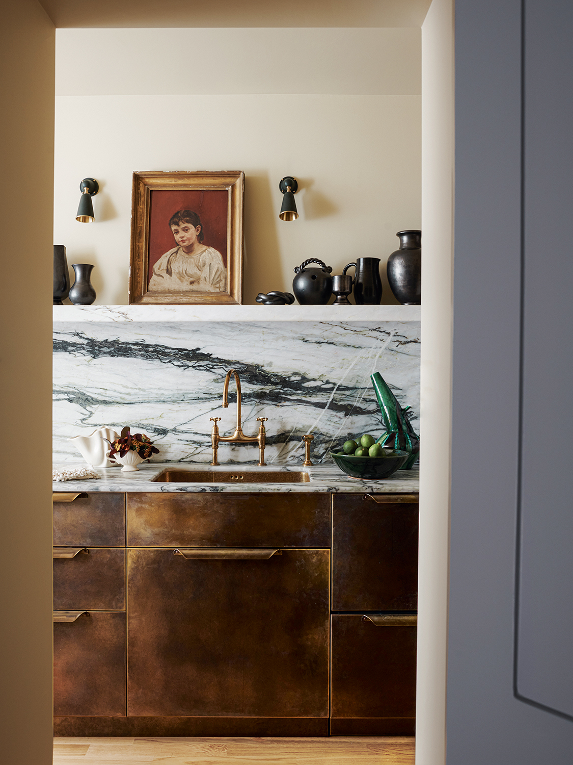
"We would always recommend a backsplash from a practical level," says Tom Rutt, founder of TR Studio. "Without one, walls behind sinks and cookers would become quite grimy and show water marks — even with a good high-quality kitchen paint."
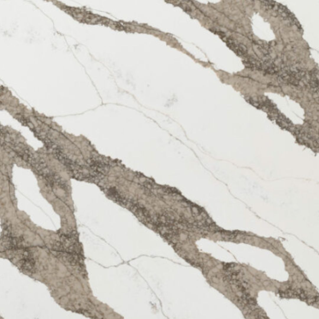
"However, I think a lot of people think backsplash and think tiles, which feels a little dated," adds Tom. "We would recommend one large format slab of marble which is used as a feature, not just as a backsplash. A stunning marble kitchen with Calcutta Violla or Carrara used as countertop and backsplash taken most of the way up the wall or even to the ceiling looks contemporary and stylish."
12. Choose a subtle sheet of quartz
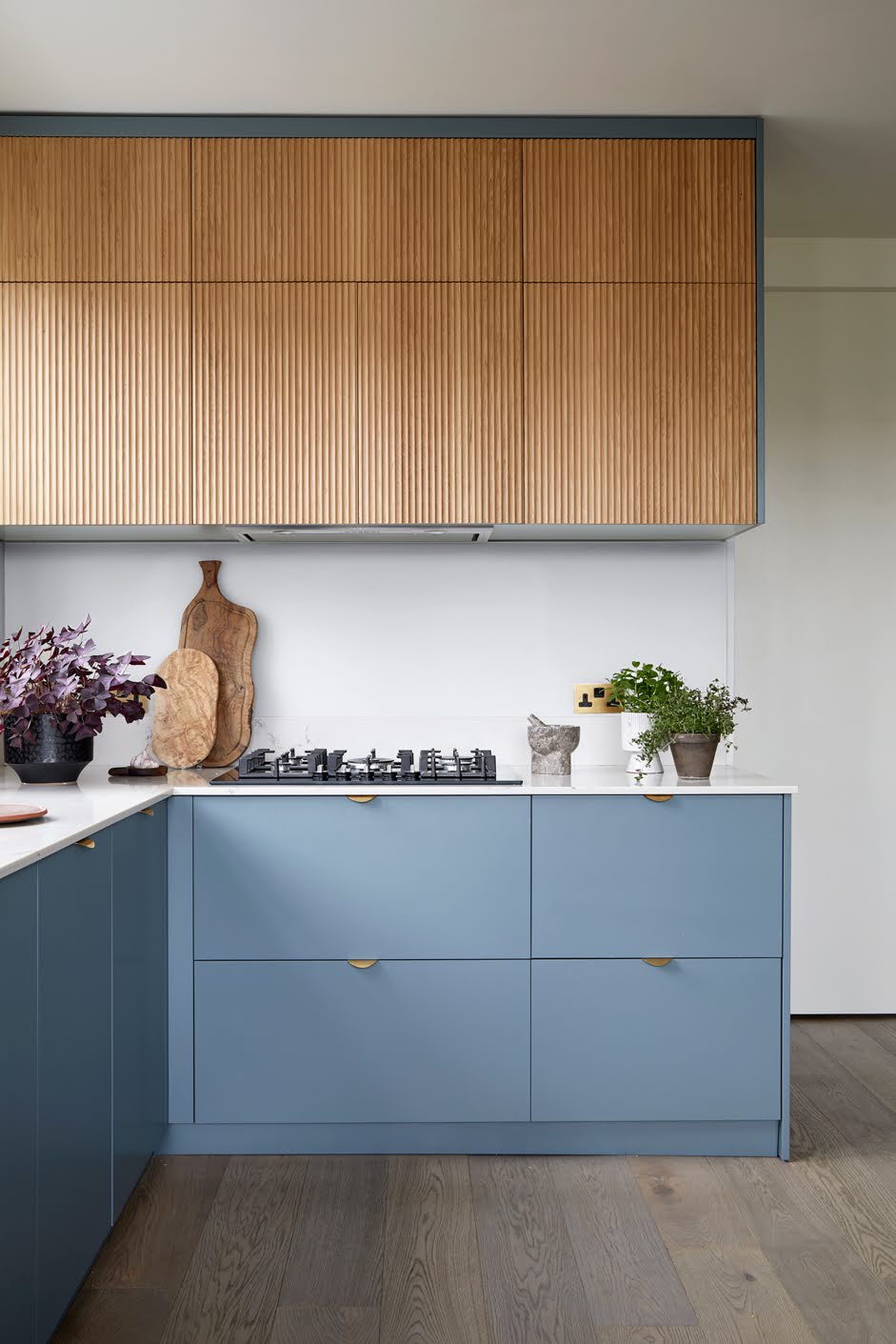
Want a no-backsplash kitchen but the practicalities of one without visual clutter? Take note of this blue kitchen designed by A New Day. "There is generally a practical need for an easy-to-clean and hardwearing surface behind a hob and near the sink, but this doesn’t have to be a traditional backsplash," says designer Andrew Griffith.
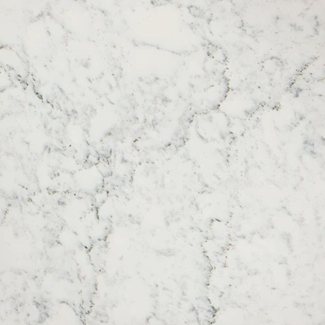
"This kitchen has a very subtle backsplash — a sheet of quartz which matches the worktop," adds Andrew. "It’s a seamless and clean look, designed to provide a practical wipe-clean surface behind the hob without detracting from the beautiful reeded oak finish of the upper cabinets."
13. Blend in a backsplash
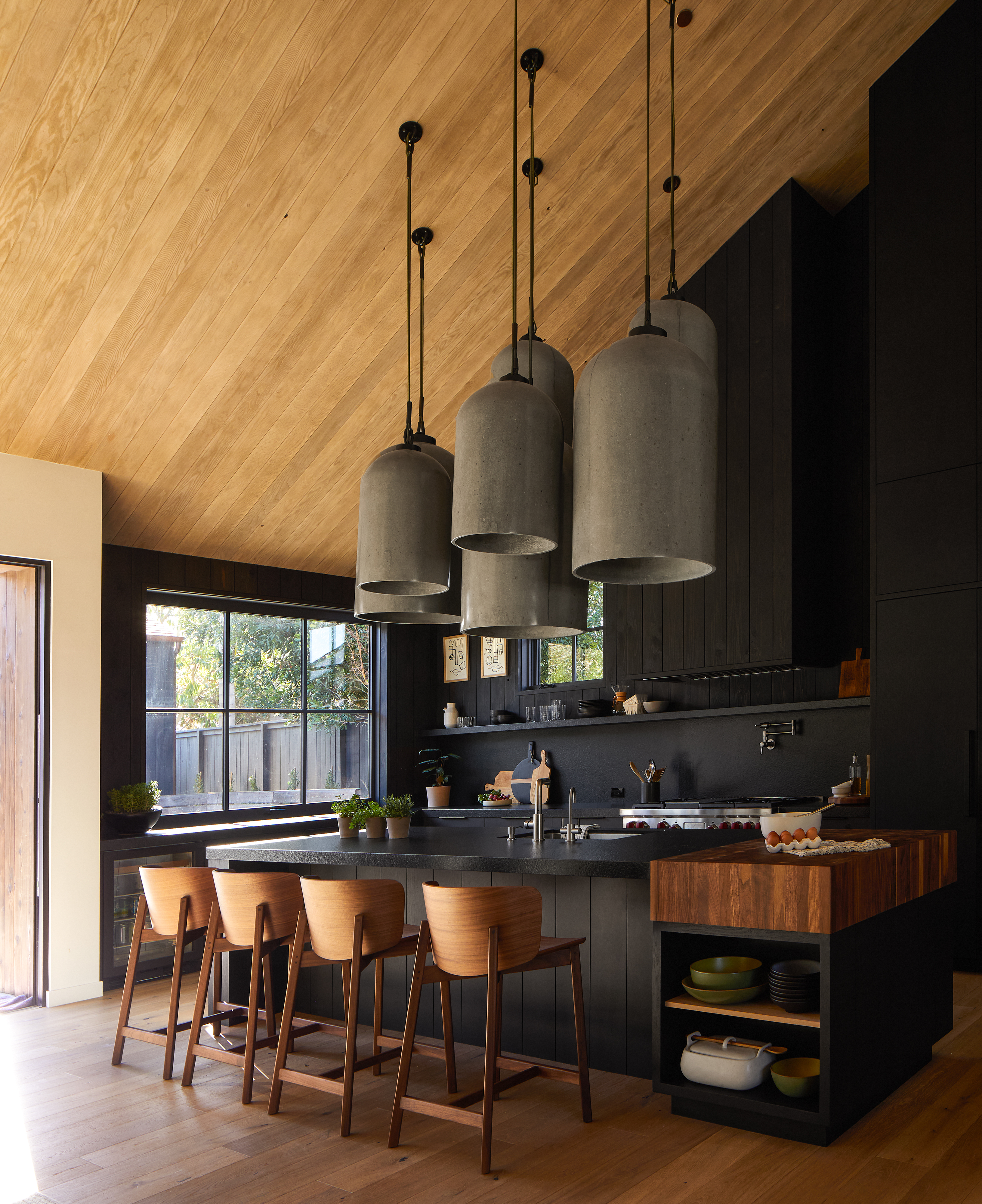
This black kitchen designed by Raili Ca is in line with the no-backsplash trend. While the backsplash might blend in perfectly with the cabinets and the paneling and look like it's painted in that same matte black, it's actually a beautifully textured leather granite — a practical choice that creates the same effect as having no backsplash at all.
"We used a leather granite rather than a tiled backsplash in this kitchen," shares Raili Clasen. "The oversized concrete pendants are the star of the show so we wanted to keep the rest of the design minimal to not distract from the lighting installation."
14. Make use of a window for a backsplash free kitchen
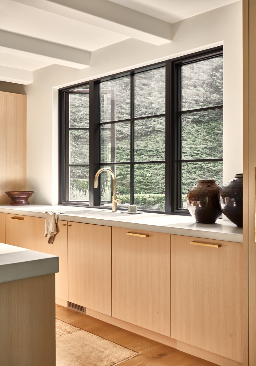
The main areas that usually need a backsplash are above the sink, however an easy way to get around that is by placing your sink underneath the window — the window almost becomes the backsplash, perfectly demonstrated in this space designed by Lisa Staton.
"In this design, a generous window comes down tight to the countertop, allowing for a backsplash-free sink area that is easy to maintain when splashes hit," explains Lisa. Plus, the best place for a kitchen sink is under a window — a nice view and plenty of natural light.
15. Add a rustic feel with exposed brick
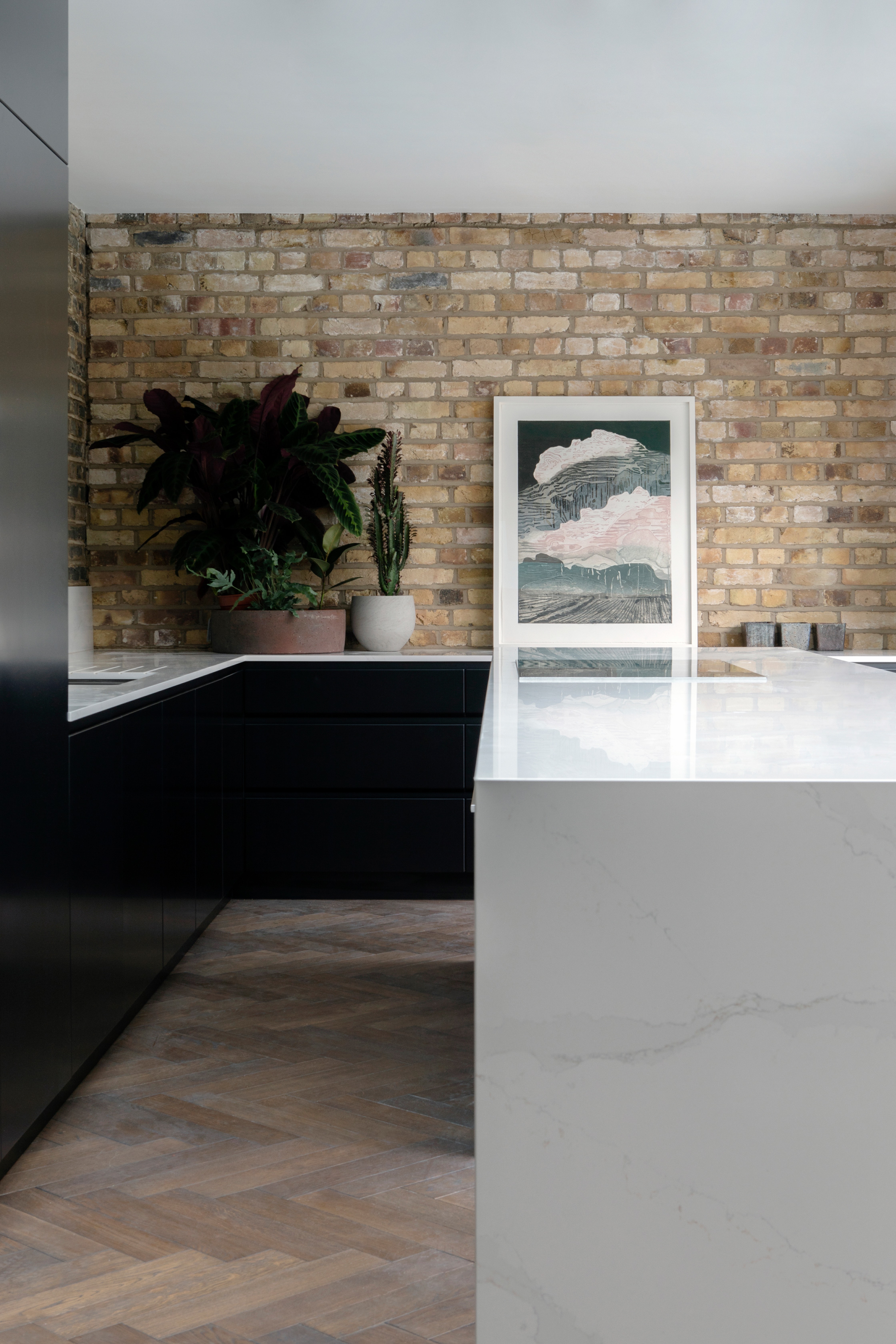
For kitchens without backsplashes, exposed brick walls add instant texture and warmth. Durable, splashproof, and heat and stain resistant, it's a strong rival to tile. And it can be painted any shade to fit your space. If you haven't been blessed with original exposed brick in your kitchen, there are plenty of brick-slip options — and then you have the freedom to play around with layout too.
In this kitchen designed by Kingston Lafferty Design, "the brick was original existing brick so we wanted to focus on retaining and making a feature of it, as it had beautiful color tones," explains CEO Becky Russel. "We always think when a building presents you with lovely original details like that you should retain and expose them so they can be seen, as these are unusual and really bring out the character of older buildings — and is a detail that is unique to them."
Does my kitchen need a backsplash?
Generally, experts say that a backsplash isn't a necessity in a kitchen. But before making any decisions, it's important for you to determine your kitchen's main functions and how it is used. If yours is an extremely busy kitchen and you tend to cook every day, or a lot — plus if it's a space that's used by multiple people — a backsplash might actually be useful. This element isn't a mandatory component of a kitchen, but it is a useful one, as it prevents water, grease, and other liquids from damaging the wall behind it. Without one, your wall will be exposed and will require a higher level of maintenance. However, it does come with an extra cost (of tiles, installation, and labor). In case you decide to do without one, you could simply take measures to ensure your kitchen walls don't get permanently stained or damaged.
A high-quality paint will allow you to wipe repeatedly without causing discoloration. You could also seal the countertop where it meets the walls. This will help to protect the walls.
How can you protect kitchen walls without a backsplash?
"We have seen lots of changes in backsplash trends over the past few years," suggests Elizabeth Sherwin of Naked Kitchens. "A common choice amongst our clients is to opt for a small upstand where the majority of their worktops meet with the walls, reserving a taller backsplash for particularly messy zones like behind the hob or the sink — a good option if you prefer a 'no frills' approach."
"An upstand provides a water-resistant vertical surface to protect the section of wall that most frequently comes into contact with a cloth when wiping down surfaces," adds Elizabeth. "There are also lots of paints available specifically developed for use in bathrooms, kitchens, and high traffic areas — using one of these will make life a little easier if choosing not to install a backsplash."
What is a good alternative to a backsplash?
"When designing your kitchen, a backsplash can be a small but monumental part of the design," says Rhiannon Phenis. "For some, it’s used as a way to add a pop of color or feature, and for others looking for a different style, it can be used to tie the room design together. However, for many, tiles or glass backsplash are not what they’re looking for, so there are a few alternatives."
"Cork — for a more natural kitchen and sustainable approach, and naturally fire resistant," adds Rhiannon. "Mirrors, such as antique panels, will make a kitchen feel lighter, especially if you have windows in the kitchen — it will reflect the light around the room. Copper has long been a popular material, especially hammered copper. Marble is one of the most popular design choices and the natural patterns in the stone make for a statement backsplash."
Be The First To Know
The Livingetc newsletters are your inside source for what’s shaping interiors now - and what’s next. Discover trend forecasts, smart style ideas, and curated shopping inspiration that brings design to life. Subscribe today and stay ahead of the curve.

Aditi Sharma Maheshwari started her career at The Address (The Times of India), a tabloid on interiors and art. She wrote profiles of Indian artists, designers, and architects, and covered inspiring houses and commercial properties. After four years, she moved to ELLE DECOR as a senior features writer, where she contributed to the magazine and website, and also worked alongside the events team on India Design ID — the brand’s 10-day, annual design show. She wrote across topics: from designer interviews, and house tours, to new product launches, shopping pages, and reviews. After three years, she was hired as the senior editor at Houzz. The website content focused on practical advice on decorating the home and making design feel more approachable. She created fresh series on budget buys, design hacks, and DIYs, all backed with expert advice. Equipped with sizable knowledge of the industry and with a good network, she moved to Architectural Digest (Conde Nast) as the digital editor. The publication's focus was on high-end design, and her content highlighted A-listers, starchitects, and high-concept products, all customized for an audience that loves and invests in luxury. After a two-year stint, she moved to the UK and was hired at Livingetc as a design editor. She now freelances for a variety of interiors publications.
- Hebe HattonFormer Digital Editor
-
 My 10 Favorite Designs at Milan Design Week 2025 — Out of the Hundreds of Pieces I Saw
There is a new elegance, color, and shape being shown in Milan this week, and these are the pieces that caught my eye
By Pip Rich
-
 Iridescence Is Chrome’s More Playful, Hard-to-Define Cousin — And You're About to See It Everywhere
This kinetic finish signals a broader shift toward surfaces that move, shimmer, and surprise. Here's where to find it now
By Julia Demer
-
 Smeg Says Teal, and We’re Listening — The Kitchen Shade of the Year Is Here
Designers are already using the soft, sea-glass green everywhere from cabinetry to countertops
By Julia Demer
-
 5 Problems With Boiling Water Taps That No One Ever Talks About — And How to Troubleshoot Them
We got our experts to spill the beans on the truth behind these kitchen staples
By Maya Glantz
-
 Does a Kitchen Need to Have a Door? The Pros and Cons (and Regulations) Explained
As popular as open-plan kitchens may be, they aren't for everyone. Our experts break down all the pros and cons of this design style.
By Maya Glantz
-
 11 Kitchen Flooring Ideas to Build a Brilliant Renovation Scheme From the Ground Up
Starting with your kitchen's flooring isn't a bad idea when it comes to creating a successful scheme — here are 11 modern ways to do it, and expert advice from interior designers
By Tessa Pearson
-
 "I Just Bought a Stand Mixer — Where Can I Store It in My Small Kitchen?" 6 Clever Storage Ideas to Consider
Love your stand mixer, but hate not knowing how to store it? We've got the same problem, but these six expert tips have solved our limited storage problems for good.
By Amiya Baratan
-
 Bar Stools vs Counter Stools — The Difference You Need to Know to Avoid Buying the Wrong One for Your Kitchen
You might think they're the same thing, but bar stools and counter stools are subtly different, and knowing how will help you avoid buying the wrong ones
By Maya Glantz
-
 10 Kitchen Tap Ideas That Will Upgrade Your Sink — Who'd Have Thought Doing the Dishes Could Look This Good?
From pot fillers to pull-out hoses, these are the kitchen taps that the experts are lusting over right now…
By Lara Sargent
-
 16 Kitchen Island Ideas That Feel Pitch Perfect for 2025 Projects
Who would have thought there would be so much inspiration to choose from? Experts share their stylish and most inspiring ideas for kitchen islands
By Faiza Saqib
