L-shaped kitchen ideas – inspiring ways to reimagine this classic layout
L-shaped kitchen ideas are a classic for a reason, they work hard and often are the best option for getting the most out of a space

The Livingetc newsletters are your inside source for what’s shaping interiors now - and what’s next. Discover trend forecasts, smart style ideas, and curated shopping inspiration that brings design to life. Subscribe today and stay ahead of the curve.
You are now subscribed
Your newsletter sign-up was successful
L-shaped kitchen ideas are the most popular for a reason. They work. Consisting of one straight run of cabinets often with a short peninsular on the end, they are the perfect layout for nailing that all-important old-school design of 'the kitchen triangle'. Plus, the L-shaped can be a good layout choice for open plan spaces, when you want to zone off the kitchen, and yet still have that easy flow between spaces.
Having cabinetry meet at a perpendicular angle can also open the room up and provide more floor space making an L-shaped a savvy consideration when planning a small kitchen layout too. From incorporating vintage cabinets to color-drenching your kitchen, take a look at our favorite L-shaped kitchens, and be inspired by this easy, practical kitchen layout idea.
8 stylish L-shaped kitchen ideas
1. Incorporate a window divider
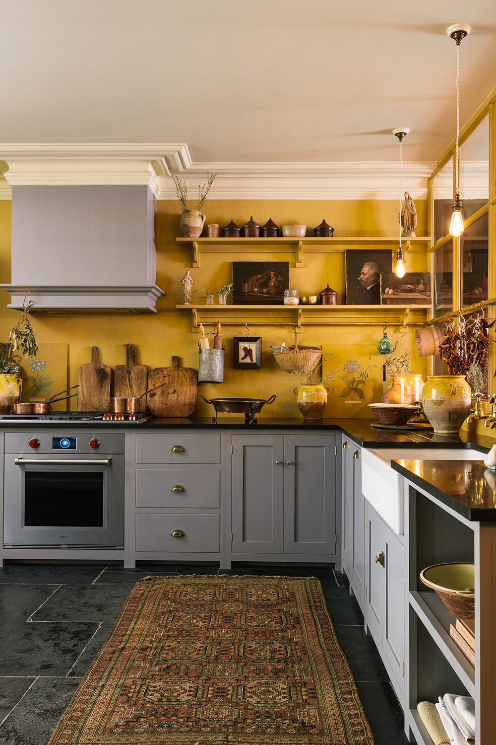
Pairing up with the kitchen cabinets that creates the short run in the L, this beautiful yellow kitchen by deVOLfeatures a wall of internal glass panels, painted and then aged to allow light and reflections to stream into dark corners. The warm mellow yellow of the walls has given this room a beautiful ambiance and cleverly turns a dark space into a peaceful and magical kitchen.
'Group your tall cupboards together on the end of a run for an uncomplicated look, says Helen Parker, Creative Director at deVOL 'This includes integrated or freestanding appliances and add shelving, wall cupboards, or hanging rails if you need extra kitchen storage.'
'If your kitchen is big, you can add an island or prep table. This will create a galley-style workspace when parallel to the main run, as well as a place for people to sit up and be part of the action. A table works just as beautifully or even a little butcher's block.'
2. Create areas for display
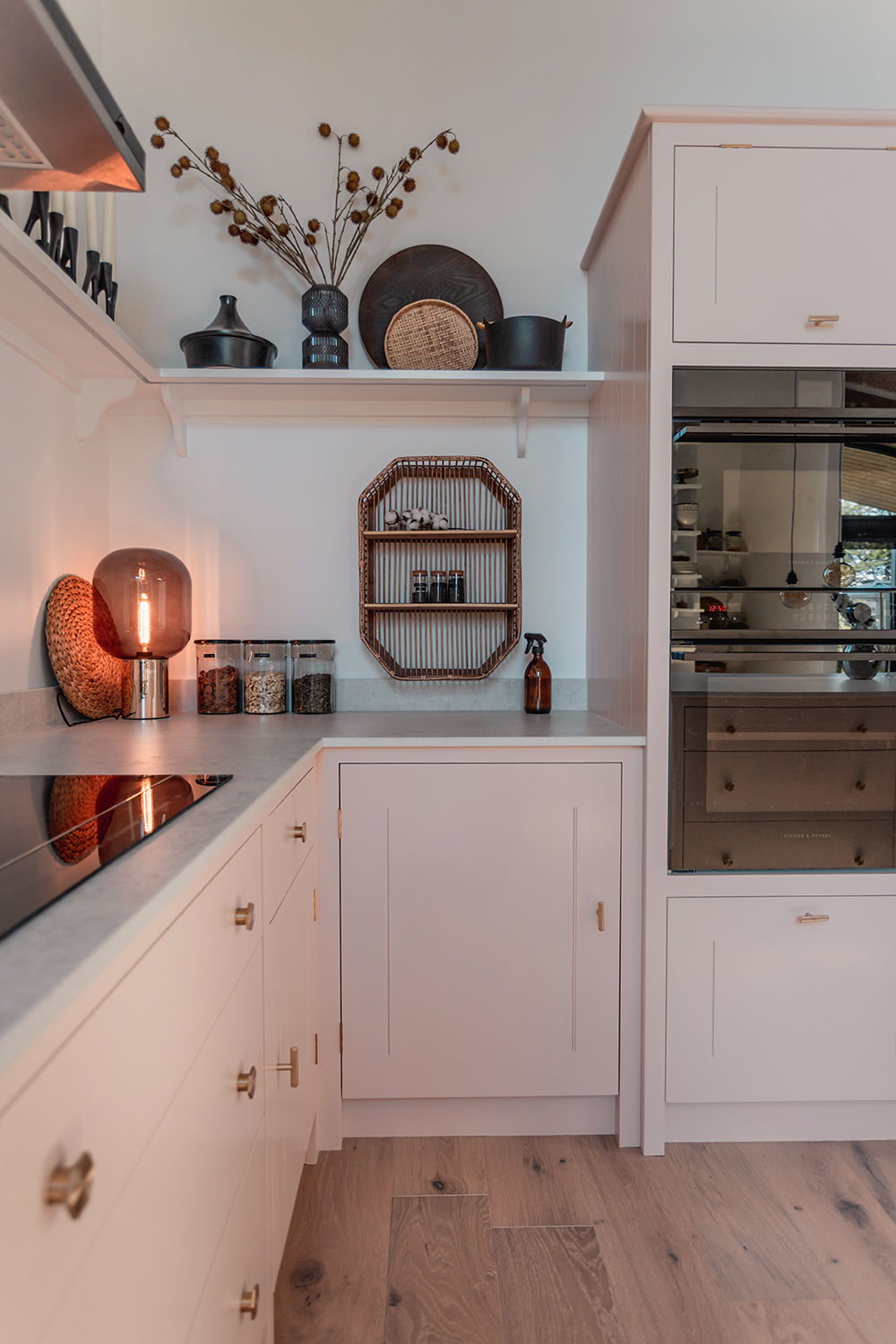
The L-shape offers up nice nooks for creating a run of shelves to display kitchen items like this pale pink kitchen from Plain English which shows off a styled collection of contrasting black accessories on its elegant shelves.
'This can be a good layout for smaller kitchens or kitchen diners,' explains Adrian Bergman, Design Manager at British Standard by Plain English. 'It allows space for a dining table and doesn't intrude on the main space too much. It permits straightforward access between the main elements although the distance traveled can be greater than with other layouts. It's usually best to group the fridge, sink, and dishwasher together and then move round to the hob and oven on the second run.'
3. Incorporate a nostalgic farmhouse table
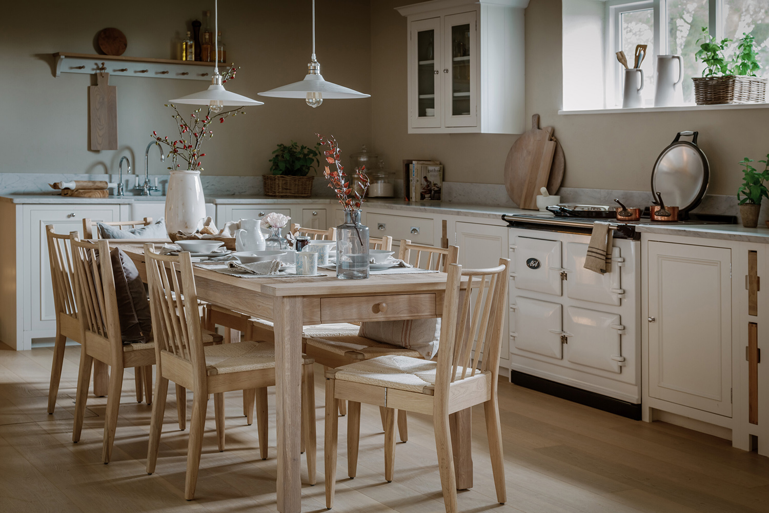
Having cabinetry meet at a perpendicular angle can open the room up and provide more floor space allowing room for a kitchen diner. This traditionally inspired cream kitchen from Neptune incorporates a nostalgic farmhouse table paired with elegant cream cabinets.
‘An L-shaped kitchen provides plenty of additional floor space without having to compromise on work-surface space, says Stephanie Nix, Kitchen designer at Neptune Fulham. 'Opting for an L-shaped design will allow for a kitchen table to be incorporated into your room or a breakfast bar or island. With plenty of lower cabinetry for incorporating appliances, opt for wall cabinets or open shelving for crockery, store cupboard essentials, pots, and pans.’
4. Create a division in an open plan space
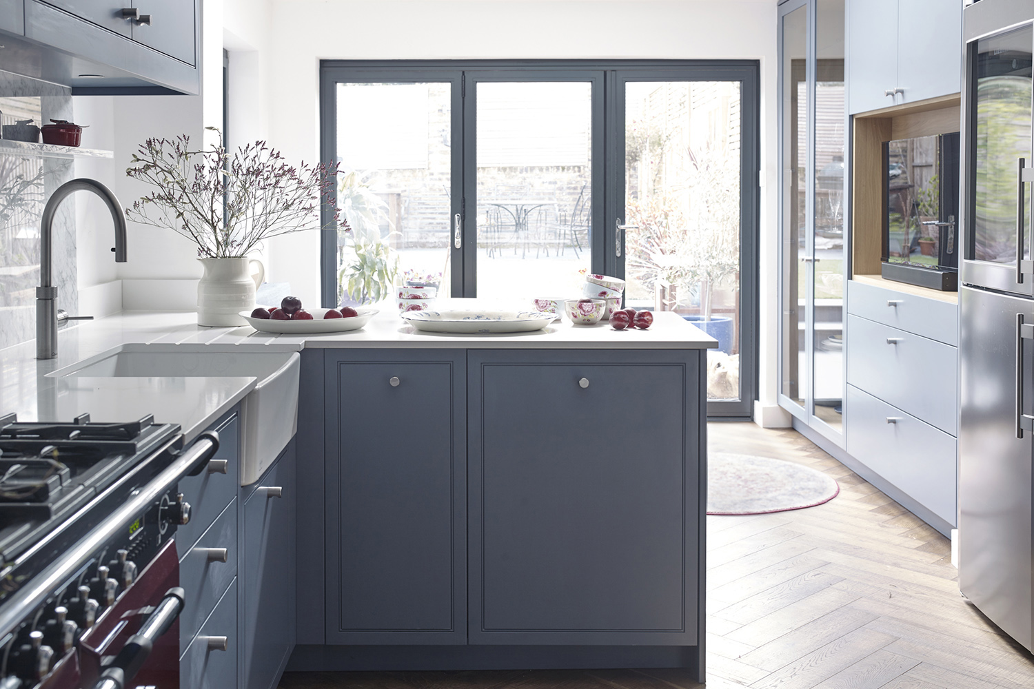
An L-shape area creates a division in an open plan kitchen creating a barrier of sorts between the person cooking. Configured in this way with the peninsula facing outwards instead of fixed to a wall it's also a great option for incorporating a breakfast bar offering more seating on either side and gives the kitchen its own zone within an open plan space, by semi-sectioning it off.
'The pros are that it’s a good layout for those who like to keep their cooking space to themselves.' says Allison Lynch, of kitchen design company Roundhouse. 'A peninsular means that anyone can’t just walk around the space.'
The Livingetc newsletters are your inside source for what’s shaping interiors now - and what’s next. Discover trend forecasts, smart style ideas, and curated shopping inspiration that brings design to life. Subscribe today and stay ahead of the curve.
4. Incorporate vintage cabinets
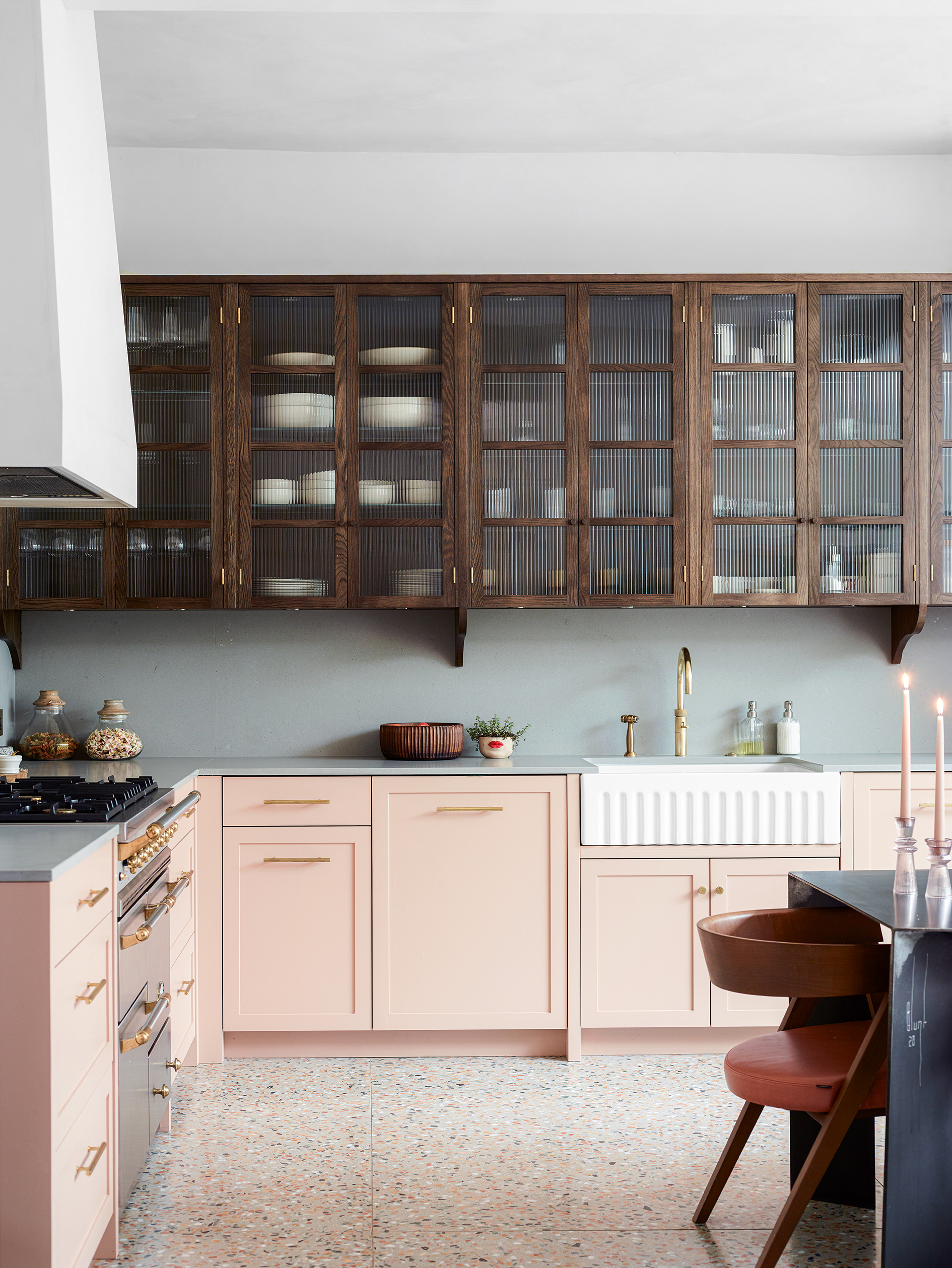
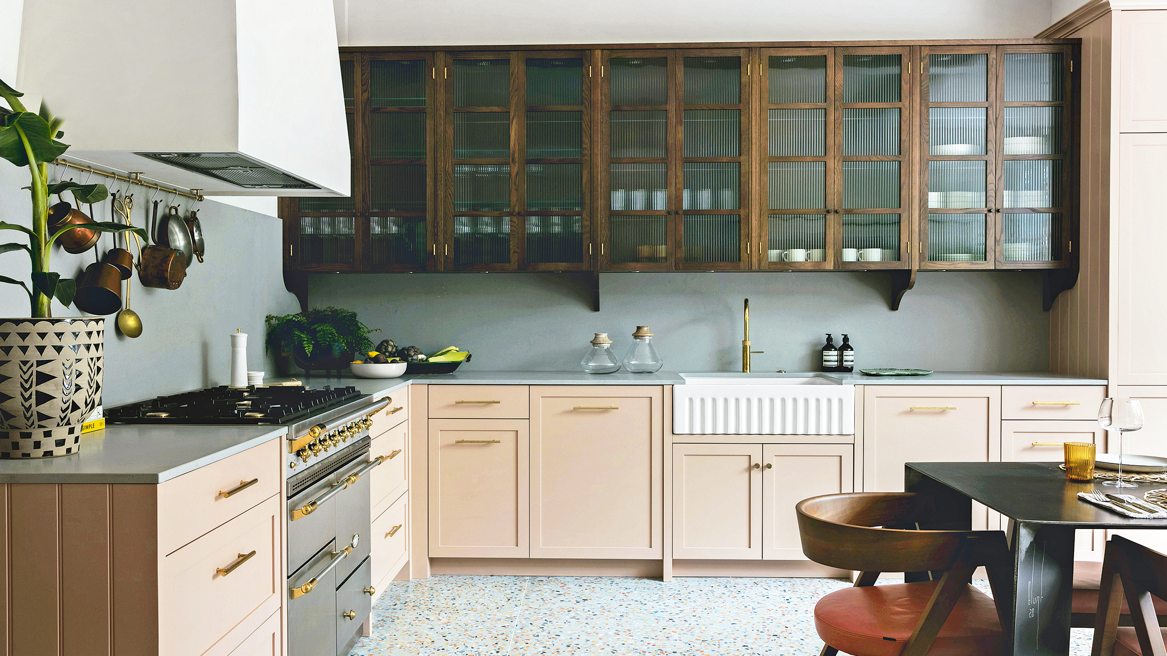
Vintage cabinets are a great way to soften a kitchen and turn a functional space into something more homely. This L-shaped kitchen by Studio Duggan incorporates a mix of reeded glass cabinets with warm pink cupboards below. The wooden cabinets match with the Mid-century dining furniture and the layout allows for that much desired open space in the center of the room.
5. Go bold and rustic
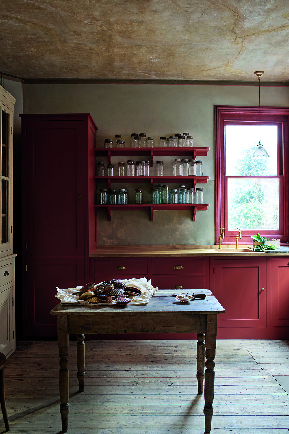
This transportive kitchen and scullery benefits from the openness of this layout featuring brightly painted shelving and tall cupboards with space for a rustic worktable.
The kitchen color is resplendent in red – hand-painted in Plain English’s ‘Rusty Nail’, creating a unique and characterful corner. Modern appliances are concealed behind cupboard doors and the worktops are oiled Oak. Raw linen, textured walls, and a glint of burnished copper add depth to this cheerful design.
6. Color drench your L-shaped kitchen
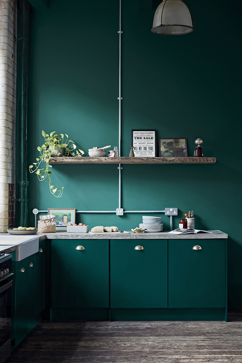
From small studio apartments to Airbnb's the most affordable and popular shaped kitchen is the L. We love how this chic and small kitchen has been elevated using the on-trend 'color drenching' technique which transforms this functional spot into a talking point.
Go for a darker tone, like charcoal or green for your cupboard doors, and take it across to the walls and any pipes and architectural details. As the cabinets run on adjacent walls, the layout will still feel spacious and look striking at the same time. These deep-hued units are on-trend and will also draw the room in to create a cozy and intimate atmosphere that guests can sink into after dinner.
7. Create a cafe style kitchen
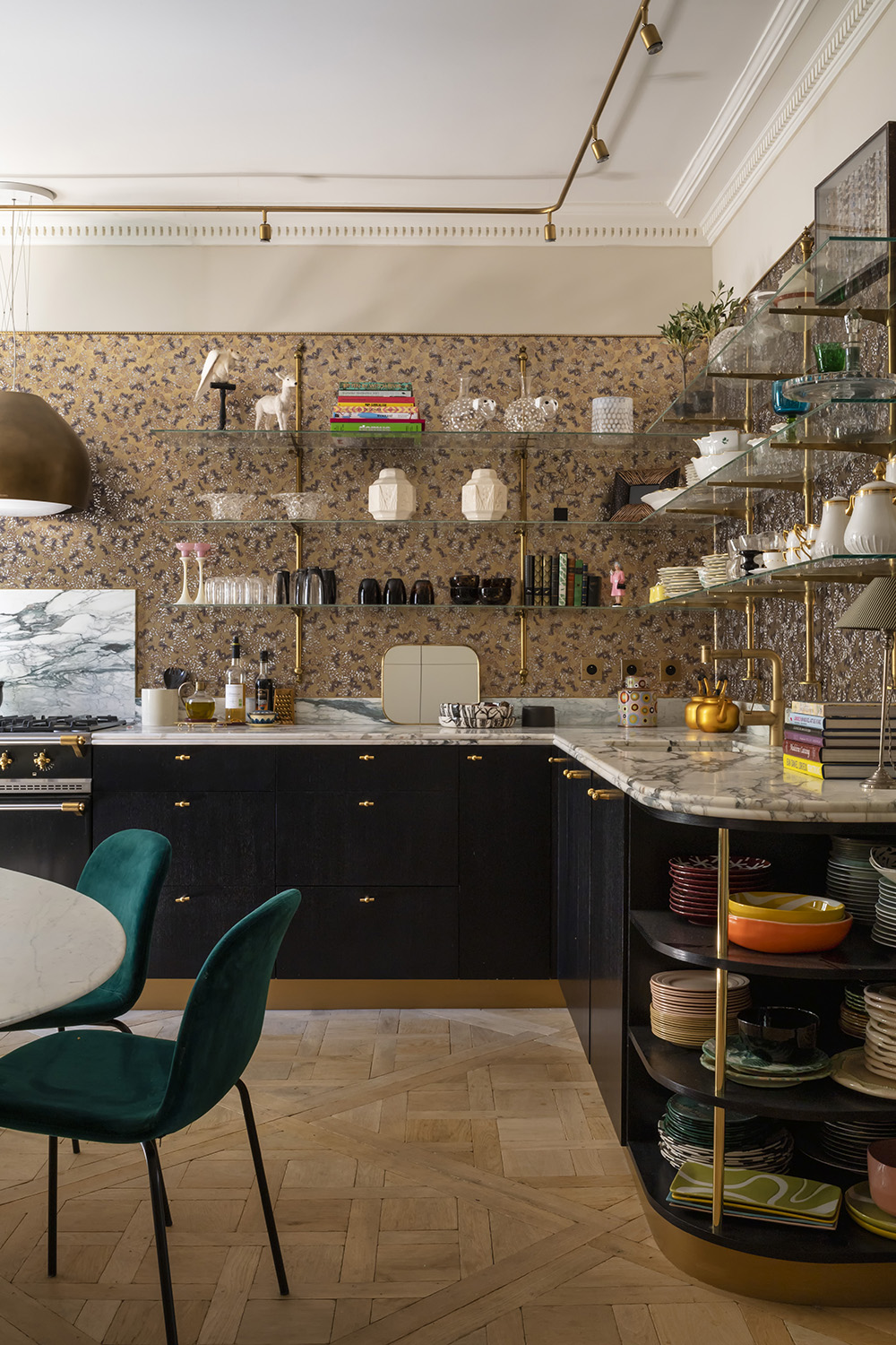
This beautiful kitchen inspired by Art Deco style, feels as though it is in a French bistro or eclectic bar. With rounded edges, marble tops, and brass and glass shelves it brings added allure to an everyday environment.
'When lacking space an L-shaped kitchen allows for optimal storage whilst maintaining an efficient workflow.' says Tom Howley. 'To keep an open feel choose light paint colors and reflective materials such as bright quartz or a mirrored splash-back. Utilize every inch of space from the full height, awkward nooks, and the use of islands if you have room.'
8. Go for Light and Bright and Enhance Space
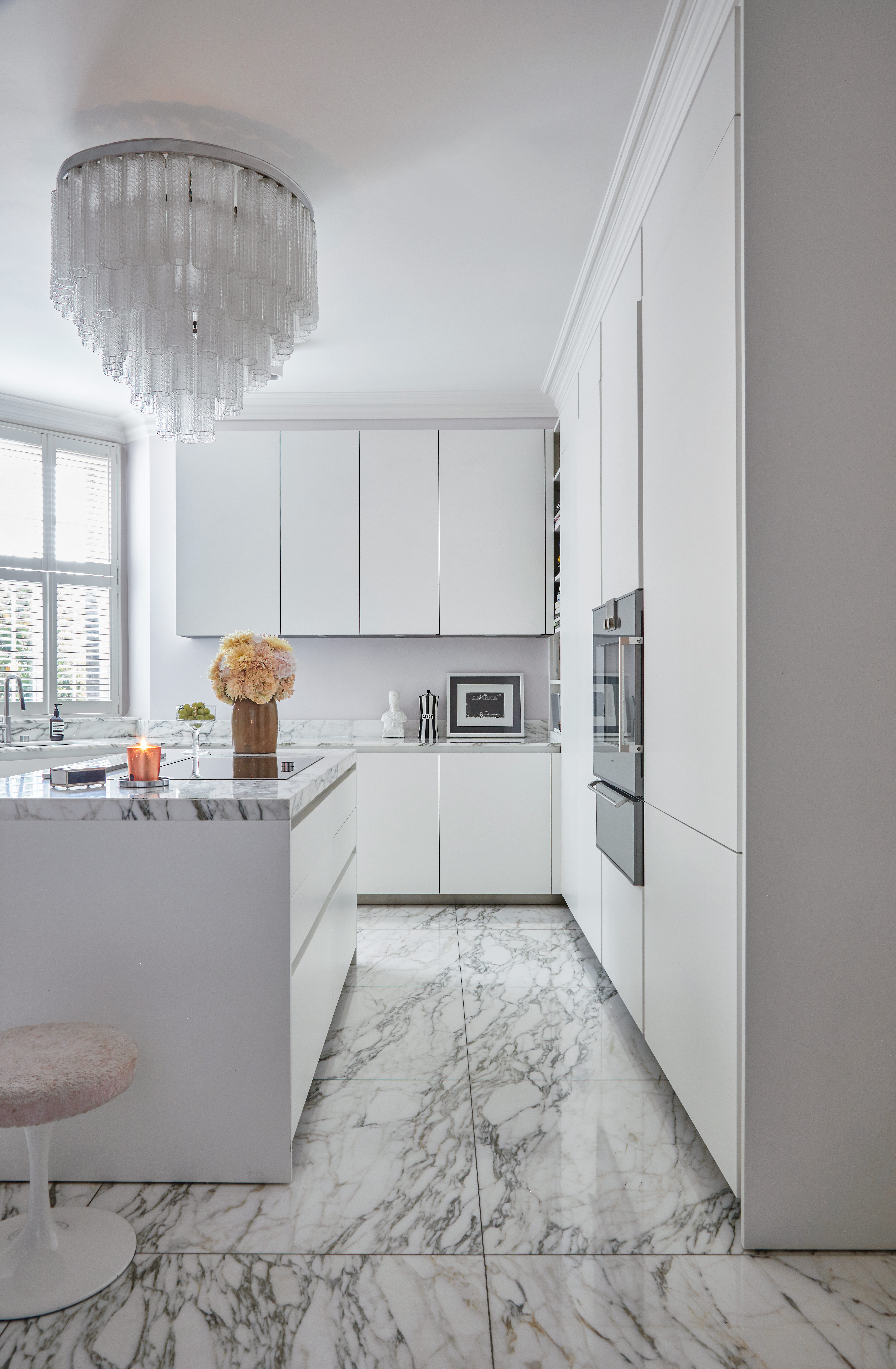
One of the biggest benefits of an L-shaped kitchen is that they create such open and airy spaces, it's why they are so popular with smaller spaces. So why not enhance that open feel by opting for white, or lighter shades for your cabinetry? This will make the most of light for an airier atmosphere. This tip is also suitable for rooms with little natural light, as it creates a bright ambiance with minimum effort.
How do you arrange an L-shaped kitchen?
To design a classic L-shaped kitchen, locate the longest wall of your kitchen and the wall perpendicular to it. This is where your cabinets and appliances will go. In an open-plan space where you want a section of the L to be a peninsular, again choose the longest wall for your cabinets and then consider where the peninsular will best make sense in your space – do you want it to zone off the kitchen? Or create a separation between the cooking space and dining space? Consider how long you want this section to be too.
Where do you put appliances in an L-shaped kitchen?
When considering kitchen appliance layout ideas, keep sinks and appliances to one end to ensure they are at the furthest distance from the living area also. The rule of thumb with appliances is to follow the 'kitchen triangle rule' or the 'golden triangle' as it's also known. This layout of appliances means your three main appliances/work areas (sink, fridge, oven) should form a triangle, so you aren't having to waste time moving up and down your kitchen. For this to work in an L-shaped kitchen, it would mean having your appliances towards the bottom of the L, around the corner where the banks of cabinetry meet.

Rohini Wahi is Content Editor for Livingetc Online. With a decade-long career in the interiors and design industry working as a journalist for premium lifestyle publications then delving deeper into the business as a trend forecaster, Rohini has amassed a wealth of global design knowledge that informs her work. She loves a period drama and keeps a tidy home.