Designers Have a New Clever Shortcut To Make Rooms Look More Rich — 5 Spaces That Nail the Look
Take your cue from these designers: a mixed wood palette is the height of luxury interior schemes right now
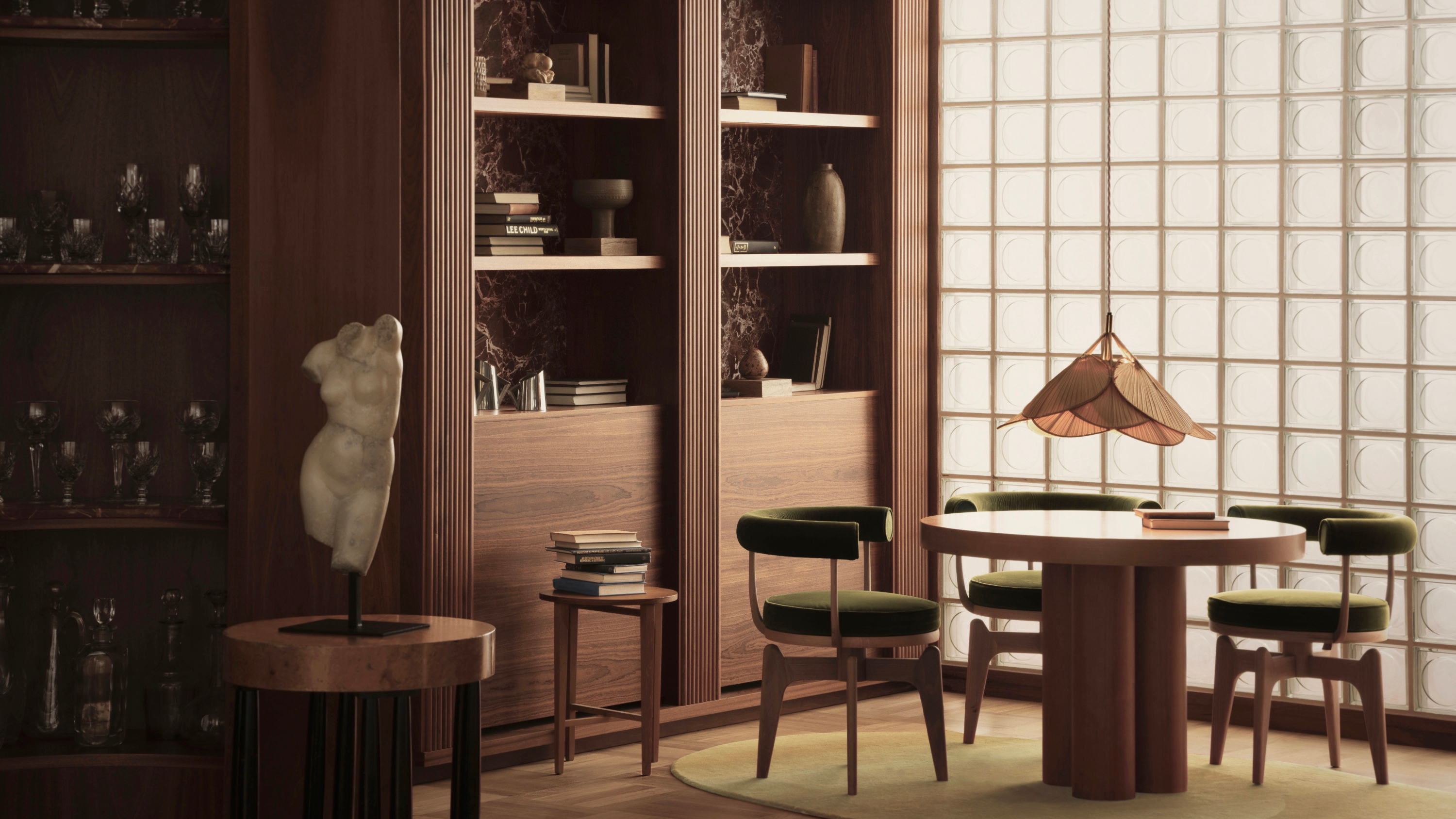
Gone are the days of matchy-matchy wooden furniture and one-note finishes. The most understated way to decorate in 2024 is with layered timber – the technique of pairing different tones of wood, through surfaces, furniture or accessories, for a look that feels rich, warm and sophisticated.
Before we dive further into this interior design trend, a note on the timbers to use together – and those to avoid. 'Timbers such as pine, oak, cherry and maple work wonderfully together,' say Alexy Kos and Che Huang, founders of London-based design practice Child Studio. 'Look into species indigenous to your area, because it’s sustainable and that’s what local craftspeople are used to working with. Absolutely avoid exotic woods and endangered species.'
So, let's get into it: here are five spaces that show how to use this trend to your advantage to create schemes that feel welcoming, cozy and elegant – everything we want from a room.
1. A dining room with rich wood joinery
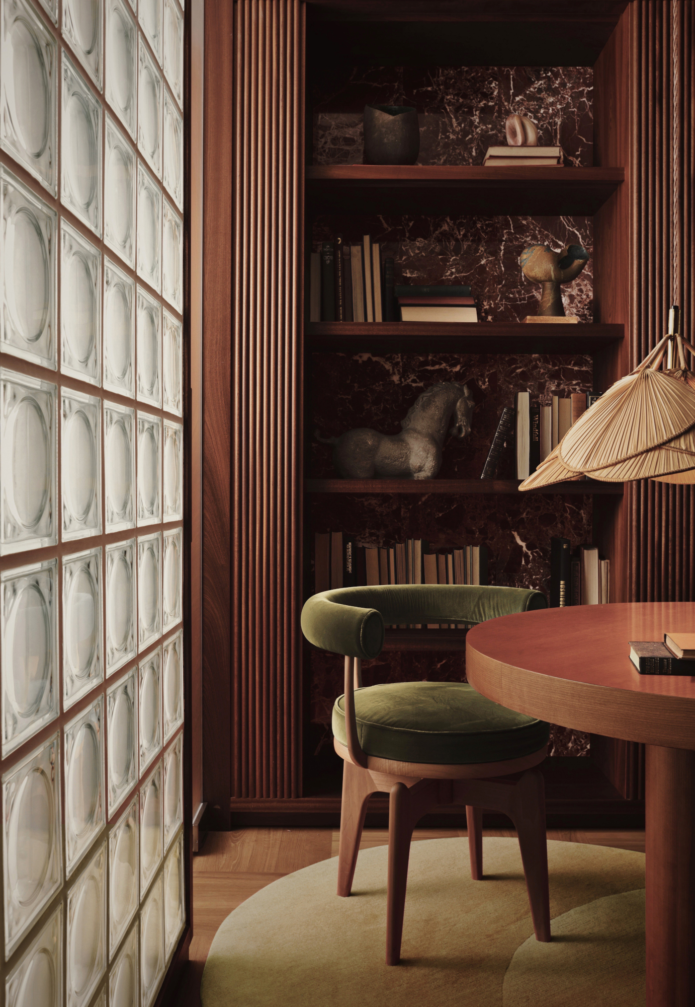
For this dining room idea, Child Studio opted for mahogany library walls, lined with red Rosso Levanto marble, and a round maple table – both slightly red in tone for a deep, rich feel.
'Layering various beautiful tones and textures of wood creates a timeless atmosphere, and wood immediately makes the home feel warm, cosy, and lived-in,' Alexy Kos and Che Huang explain. 'The beauty of layering two tones of timber in the home is that if it’s used in an understated way, it’s timeless. Overly elaborate designs don’t age well, so let the timber sit more in the background, and update the space with accessories or art.'
2. A lighter and brighter approach to layering woods
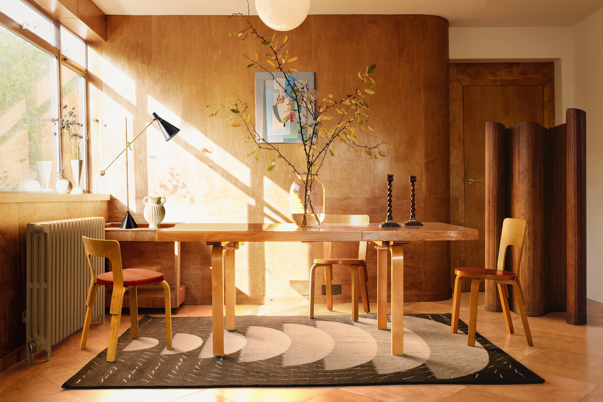
The curved walls in this project by Child Studio furthers the organic feel of the space – and note how, despite having different tones, the walls, furniture, screen and wooden decor work together in a space dominated by the material.
That's all thanks to careful choice of grain. 'It’s important to pick specific pieces of timber to combine so you get that attractive natural pattern,' the designers explain. 'Wood has a very beautiful texture and wood grain – it’s all about letting it come through. Some timbers have very linear grains, which can look artificial, so we choose soft and natural grain patterns. There’s also the sheen – high gloss levels on wood can also feel plastic and artificial, so use oils and varnishes to preserve an organic appearance.'
3. A kitchen-diner with a wraparound tonal panelled look
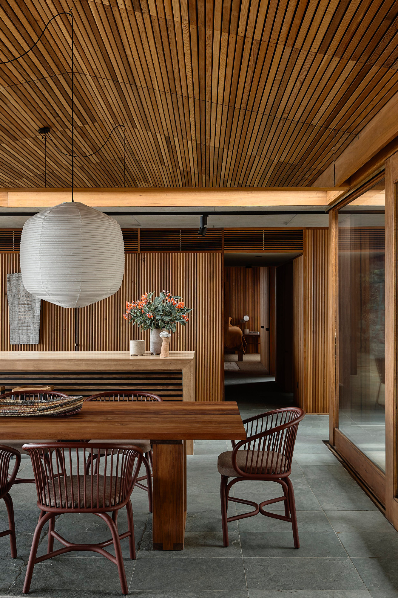
For this project by Melbourne architects Kennedy Nolan, every material used was chosen for warmth, texture, durability and a capacity to improve with age – including the wooden slats for the walls and ceiling of this kitchen-diner. 'One of the aspirations of [the project] was to give the sense of a warm embrace,' says founding partner Patrick Kennedy. 'By eliminating white and lining all surfaces in timber, the warmth and softness of the material is amplified and the views are emphasized.
Layering woods in this way is something the studio is cautious about, so a lot of care was taken to create this scheme. 'We have always been reticent to mix timber species, [but] we are aware that there is a great tradition of it in vernacular architecture,' Patrick explains. 'We were careful to balance tones, we avoided high contrast and we used timbers specifically for their inherent qualities.'
4. A vignette of carefully paired tones
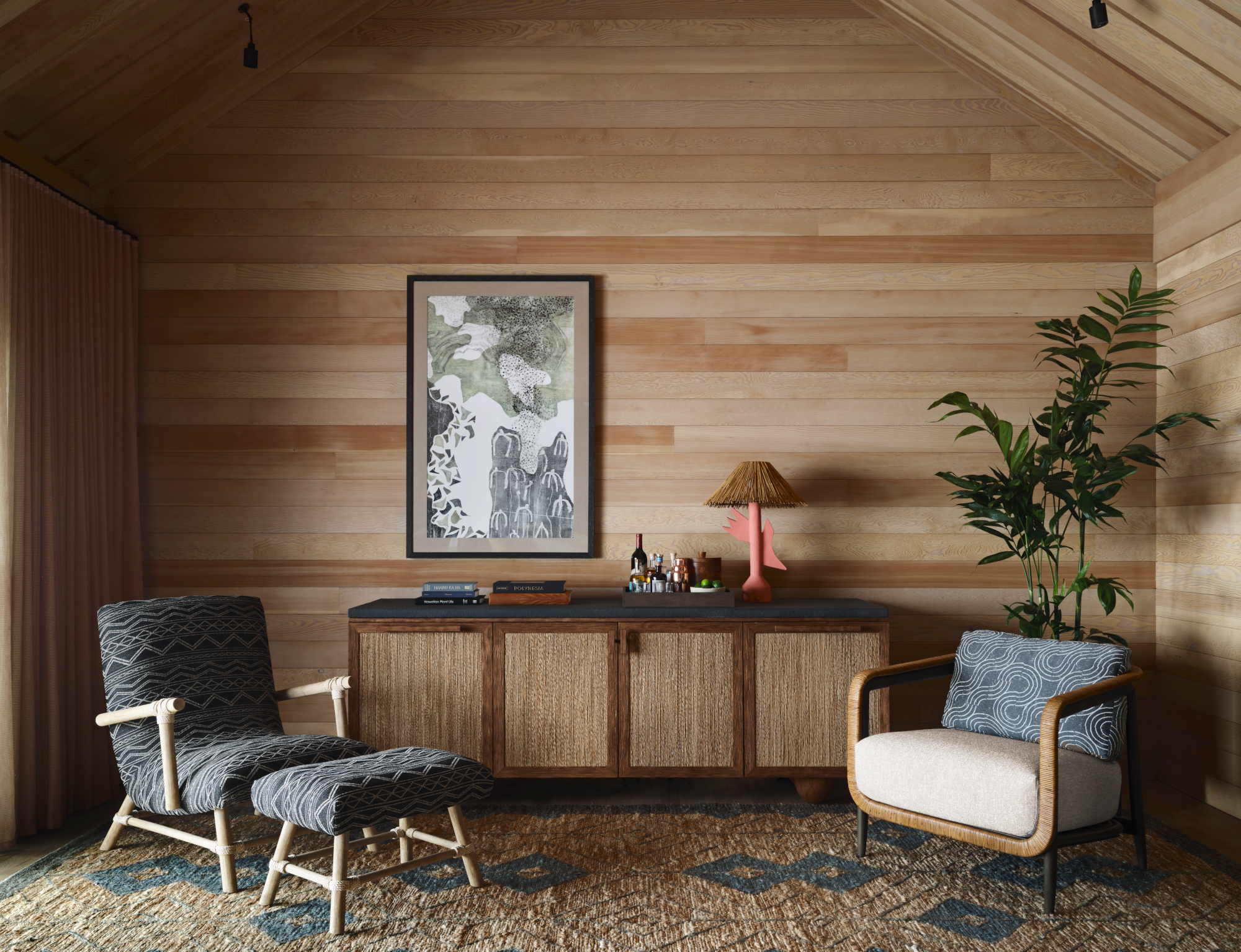
Designed by San Francisco firm NICOLEHOLLIS, the luxury Kona Village, A Rosewood Resort in Hawaii draws on the landscape for its interiors, including a liberal use of wood. In this scheme, cabin-like walls and ceilings clad in Douglas Fir are paired with a mix of wood furniture, from the deep red-brown of the sideboard to the pale frame of the armchair. These elements are drawn together by other natural materials, such as cane.
Alexy Kos and Che Huang advises pairing light and dark timbers to create contrast and interest, as in this space. 'We use different shades of oak for lighter tones and cherry and walnut for the darker,' they explain. 'Use one as a backdrop, then add in highlights with the opposing shade. When dark and light timbers are contrasted it creates a smart and sharp look, while a mixture of softer, more subtle tones, grains and sheens feels casual and relaxed.'
5. An architectural hallway with subtle highlights
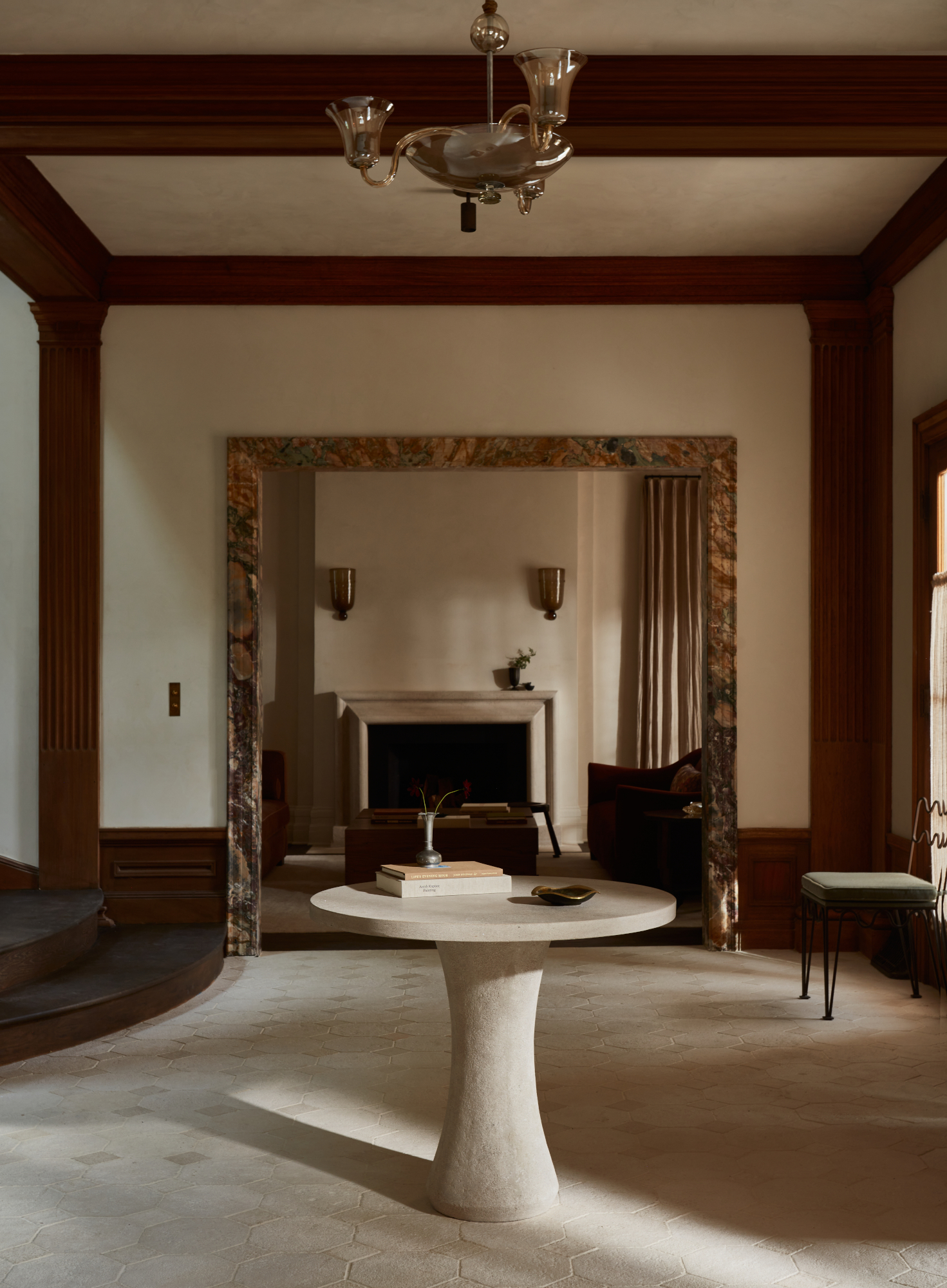
At first glance, this architecturally beautiful entryway idea by Los Angeles interior designer Jake Arnold appears to use one type of timber throughout – but look closely and there's a subtle difference in tone between the staircase and the columns that serves to highlight the architectural beauty of each of these elements.
Adding to the scheme is the stone table that stands out in contrast against the deep woods. 'Materials that look great with mixed woods are other natural elements,' say Alexy Kos and Che Huang. 'We always come back to a small selection that we know work beautifully – stones such as marble or limestone, metals such as brass, and textiles like wool.'
Be The First To Know
The Livingetc newsletters are your inside source for what’s shaping interiors now - and what’s next. Discover trend forecasts, smart style ideas, and curated shopping inspiration that brings design to life. Subscribe today and stay ahead of the curve.

Ellen is deputy editor of Livingetc magazine. She works with our fabulous art and production teams to publish the monthly print title, which features the most inspiring homes around the globe, interviews with leading designers, reporting on the hottest trends, and shopping edits of the best new pieces to refresh your space. Before Livingetc she was deputy editor at Real Homes, and has also written for titles including Homes & Gardens and Gardeningetc. Being surrounded by so much inspiration makes it tricky to decide what to do first in her own flat – a pretty nice problem to have, really. In her spare time, Ellen can be found pottering around in her balcony garden, reading her way through her overstacked bookshelf or planning her next holiday.
-
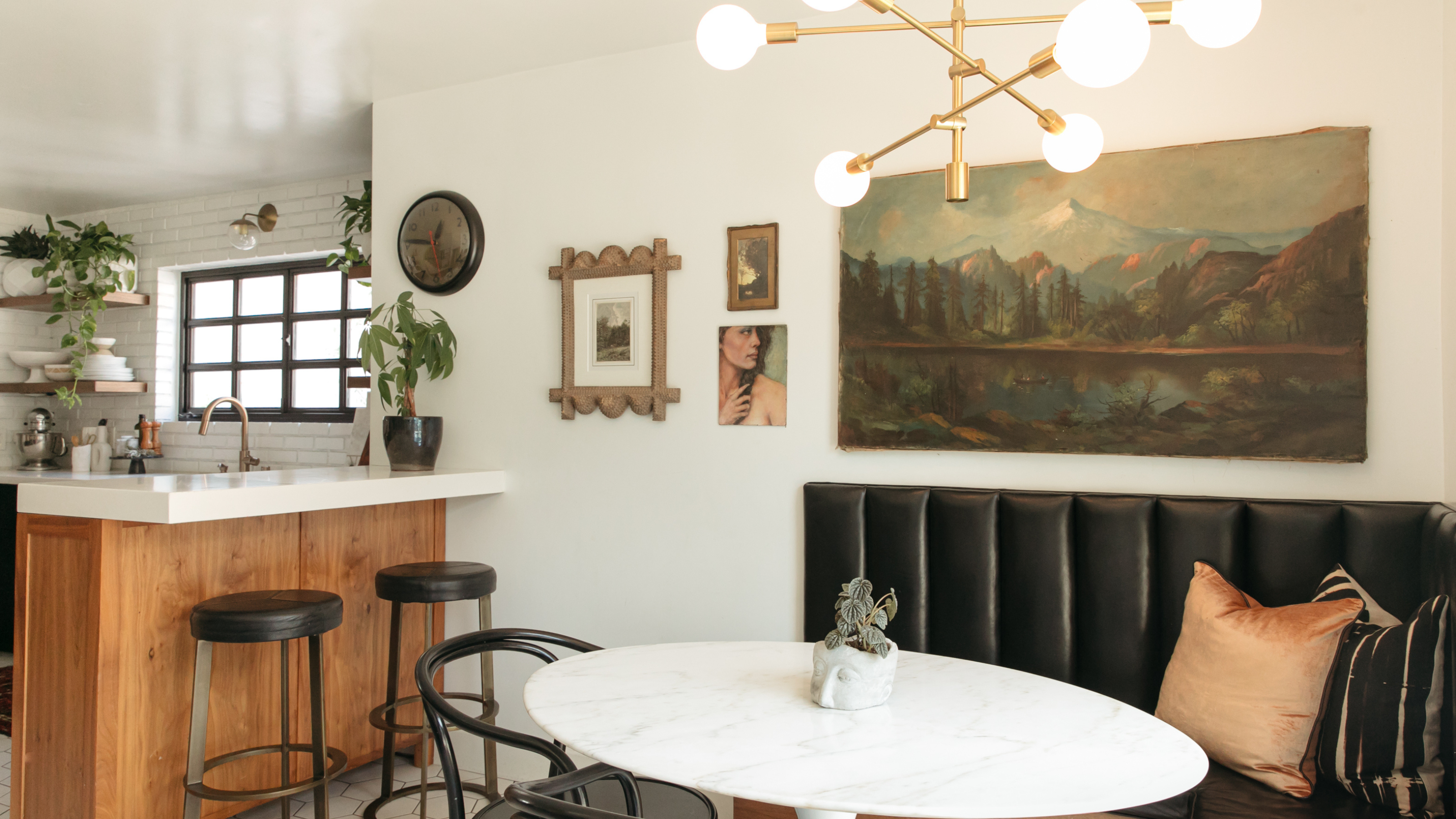 Does Anyone Decorate With Wall Clocks Anymore? We Asked Designers For Their Thoughts — Timeless or Time to Go?
Although they've been around for centuries, their presence in interiors divides designers. So, are wall clocks our of style? Let's discuss
-
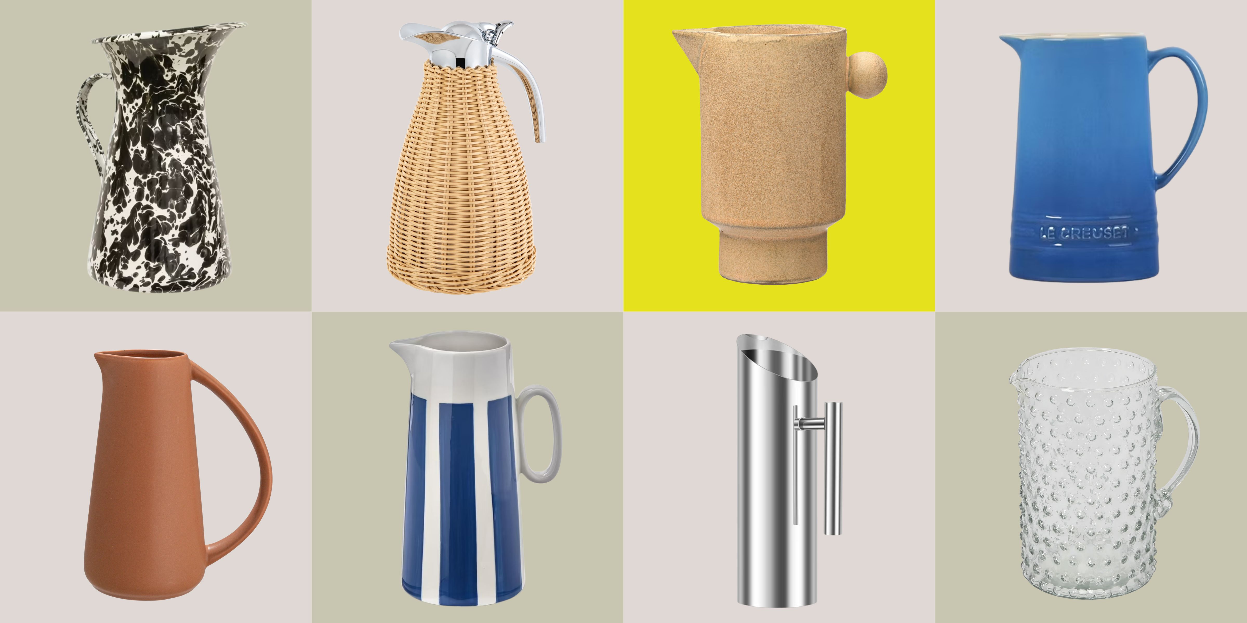 Take a Pitcher, Make It Last Longer — This Is the Crucial Thing Your Spring Table is Missing
For spring tables with style, meet the warm-weather staple that keeps drinks flowing (and the host seated)
