7 layout ideas that are the perfect antidote to awkwardly-shaped bathrooms
If you've got a difficult bathroom space, these are the interior designer-approved layouts to try for it

A carefully designed bathroom layout is integral to a successful, fully functioning and long-lasting space that you'll be happy with for years to come. So understanding your layout and working out how best to maximize the space is the first step when it comes to design. But how to deal with those awkward-shaped bathrooms?
From narrow bathrooms that lack space to sloping ceilings that mean you're crouching down, there are ways around these problems to turn your bathroom dilemma into an interesting feature or focal point. We've spoken to modern bathroom designers to find out the most common awkward bathroom layouts and how best to approach them.
1. Tuck your bath under a sloping ceiling

A common problem designers and homeowners often encounter is a bathroom with a sloping ceiling, meaning you're spending your time crouching down. An easy way to remedy the problem is by simply slotting your bath underneath. It creates a cozy, snug space where you can relax while taking a soak and makes sense of the shape of the room.
'It's one of the most effective ways to use the space under a sloping ceiling,' says Irene Gunter of international interior design firm, Gunter & Co. 'If the slope is quite steep, consider installing a free-standing bathtub or a walk-in bathroom shower wall with a glass panel rather than a door, as this can help to prevent the space from feeling cramped or claustrophobic.'
In bathrooms with sloping ceilings, natural light can sometimes be compromised too. 'An excellent solution to this problem is the installation of skylights,' says Irene. 'This solution allows natural light into the room, making it appear bigger and brighter.'
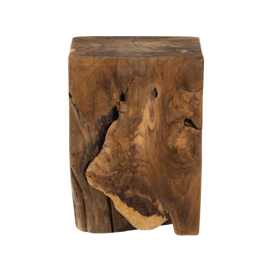
Material: Teak
Price: $199
Get the look with this natural teak stool. Teak is a great addition to your bathroom as it is a rot-proof wood that fares well in such a damp space. This bath stool has a variation of knots and holes which give it character - a great accessory for your bath.
2. Wall hanging storage
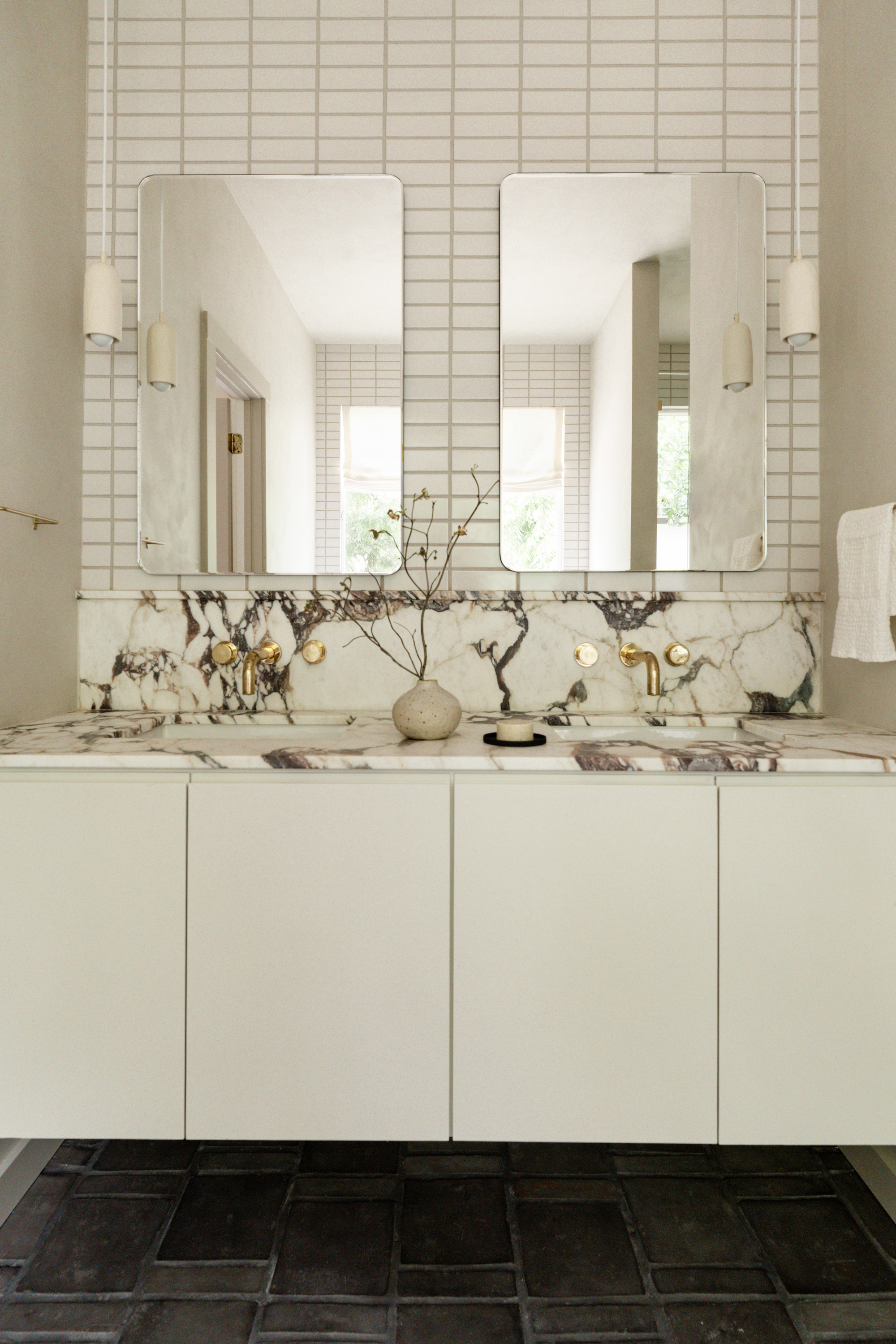
Go for wall-hung, floating designs that give you space and create an illusion of more room. A typical wall-hung bathroom sink might feel too large for an awkward-shaped bathroom, but there are smaller models you can opt for that feel stylish and sleek.
Floating the vanity means the flooring extends to the wall, which helps your bathroom feel and look more spacious. A little foot room under the vanity also changes the way you engage with the space, allowing you to be closer to the mirror and sink as you can tuck your feet under.
One problem with the floating vanity look is that they tend to have less bathroom storage space than freestanding designs because the cabinets don't go all the way to the floor. However, this can be mitigated with clever use of the space - a wall-hung vanity creates more usable space for items like trashcans and scales. Try bathroom shelving or other floating storage solutions that match your floating vanity look. A wall-hung vanity also creates more space for storing pieces like a wastebasket or a scale.
The wall-hung look is also a great option for WCs which are typically more compact models. These work as they are anchored and plumbed into the wall rather than the floor.
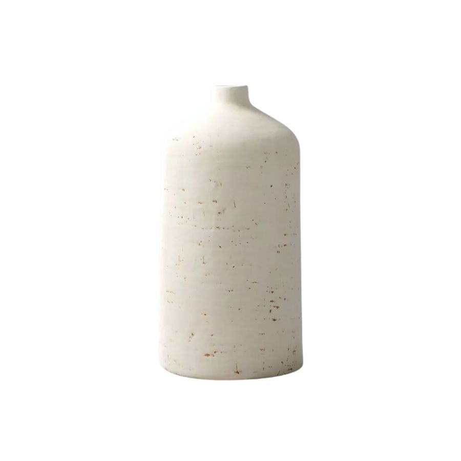
Material: Ceramic
Price: $29.99
Accessorize your bathroom vanity with the simple addition of this distressed ceramic vase. Add someo dried foliage or single stem flower to bring some freshness to your bathroom.
3. Go for a compact tub

If you have a small bathroom, you might be fooled into thinking that a freestanding tub isn't going to work for you, but it doesn't mean you've got to banish your hopes and dreams of that luxurious freestanding tub. Look out for the smaller models that measure up to 55 inches. Compact slipper baths are a great option with their asymmetrical frame raised at one and lower at the other.
Also, you might want to think about the placement of your tub. 'Position the shower or bath, often the most sizable item, at the end of the room to enhance its width,' says Irene.
4. Purpose-built storage

Good bathroom storage can boost the sense of space by keeping surfaces clear and clutter out of sight. Just like how a floating vanity can help those awkward-shaped bathrooms, think about going for a shallow depth, a custom-made corner build, or look to build up. A taller vanity or bathroom storage cupboard might grant you more space for a less claustrophobic feel in a narrow space.
In this example, the designers at My Habitat Design have gone high up the wall space, building up instead of a wide storage unit with a three-tiered vanity. The result of building up is that the footprint is maximized. 'Hand-picked marble slabs were used to create a unique custom vanity and cladding for the shower and are contrasted by hardware and accents that lend a timeless resonance to the interior,' says Alexandra Coxon, interior designer at Amsterdam-based My Habitat Design.
5. Try a wet room solution

If you have a small or irregularly shaped bathroom, creating a layout with a dedicated wet room can be a great option to carve up the space in an elegant way. One of the key advantages of a wet room is that it can be an excellent space-saving solution. 'By eliminating the need for a traditional shower enclosure, you can make even the smallest of bathrooms appear much larger than they really are,' says Irene.
Bear in mind that the installation process for a wet room is more complex compared to a traditional bathroom. 'The room needs to be properly sealed and waterproofed to prevent leaks, which can be a costly and time-consuming process,' says Irene.
6. Try a privacy wall

If you don't have the space or have an awkward room, make sense of the layout by optimizing privacy with a bathroom partition or privacy wall.
These can be easy features to add, as shown here in a design by Emily Lauren Interiors with a simple brick wall extended into the bathroom to hide the WC.
'The original bathroom was cramped, inefficient, and impractical. In order to meet the needs of the homeowners' teenage children, the space required adequate storage,' says Emily Lauren..
'To further optimize the bathroom's layout, we installed a wall-hung toilet that could be hidden behind a privacy wall, allowing for minimal footprint and maximum efficiency.'
7. Create an illusion of space through color
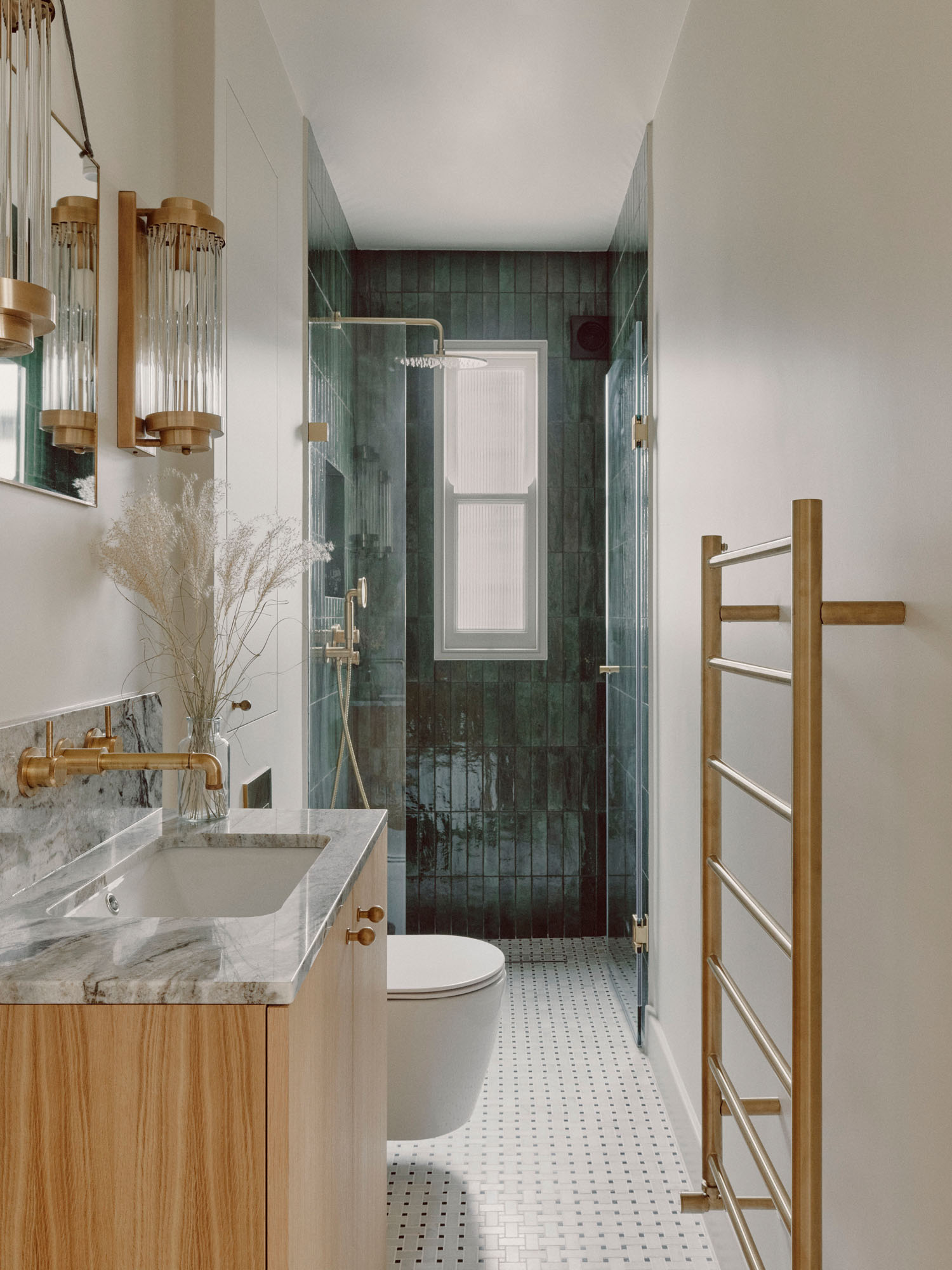
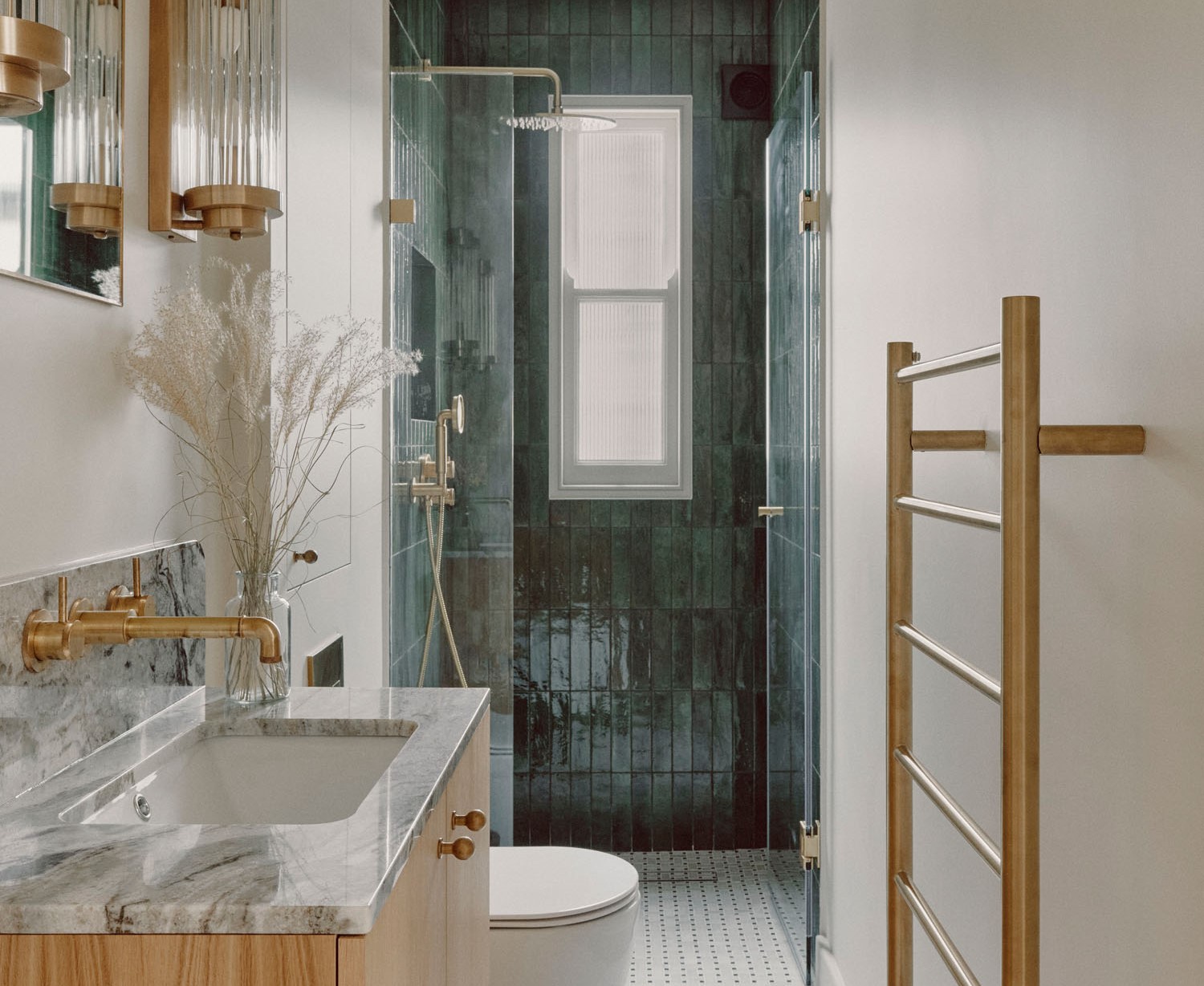
Finally, as with all rooms in the home, the way you apply color to the walls might just be the trick to helping create zones and an illusion of more space. In this narrow bathroom designed by Atelier Ochre, the designers have created an illusion of space in the room by tiling the end of the room with a dark blue tile and taking it upwards to the ceiling - creating a feeling of length and depth with a sharp contrast against the white walls.
Drawing the eye with clever tiling patterns or even painting the ceiling in a brighter bathroom color is a great way to distort the shape of the space. Consider tiles that have a gloss finish like zellige tiles too - these will help bounce light around the space which further creates an illusion of brightness and airiness.
Be The First To Know
The Livingetc newsletters are your inside source for what’s shaping interiors now - and what’s next. Discover trend forecasts, smart style ideas, and curated shopping inspiration that brings design to life. Subscribe today and stay ahead of the curve.

Former content editor at Livingetc.com, Oonagh is an expert at spotting the interior trends that are making waves in the design world. She has written a mix of everything from home tours to news, long-form features to design idea pieces, as well as having frequently been featured in the monthly print magazine. She is the go-to for design advice in the home. Previously, she worked on a London property title, producing long-read interiors features, style pages and conducting interviews with a range of famous faces from the UK interiors scene, from Kit Kemp to Robert Kime. In doing so, she has developed a keen interest in London's historical architecture and the city's distinct tastemakers paving the way in the world of interiors.
-
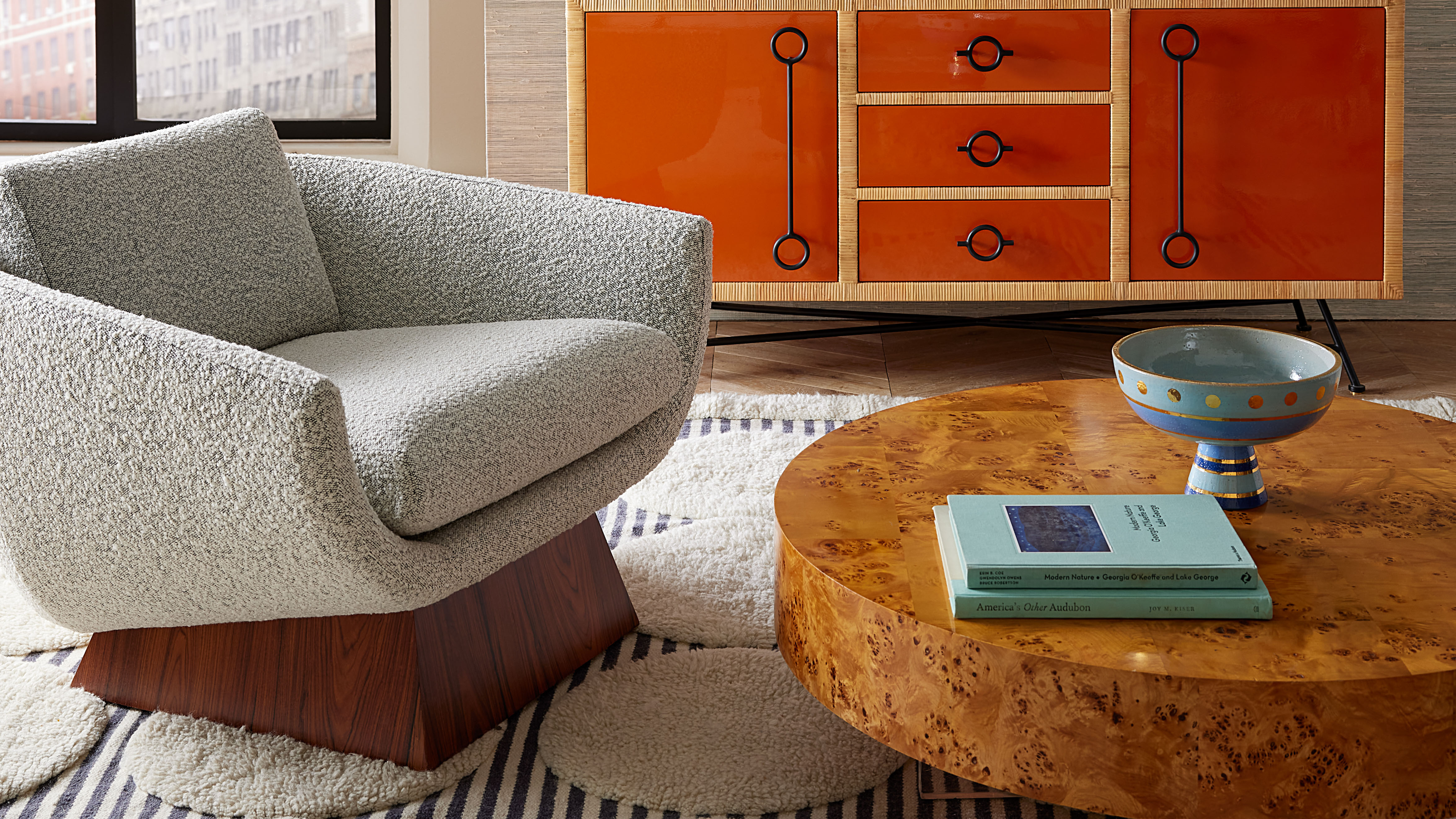 Burl Wood Decor Is 2025’s Most Coveted Comeback — Here’s How to Get the Storied Swirls for Less
Irregularity is the ultimate luxury, but you don’t need an antiques dealer to find it
By Julia Demer Published
-
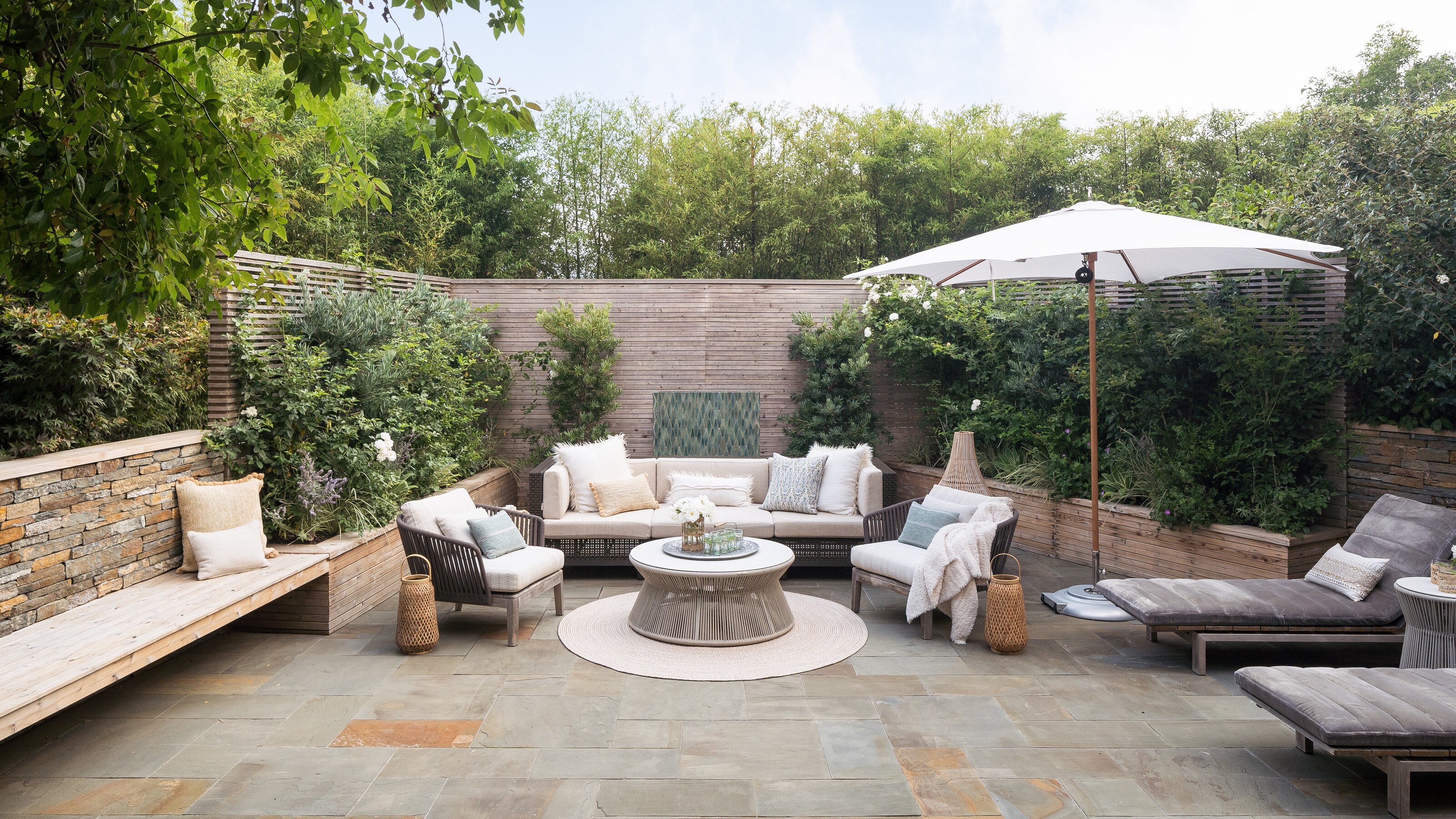 5 Garden Features That Instantly Add Value to Your Home — While Making Your Outdoor Space More Practical, too
Get to know all the expert tips and tricks for making your backyard a standout selling point for your home.
By Maya Glantz Published
