Living room ceiling ideas – 10 artistic ways to make your 'fifth wall' stand out
With these creative living room ceiling ideas, just look overhead for an inspiring accent feature
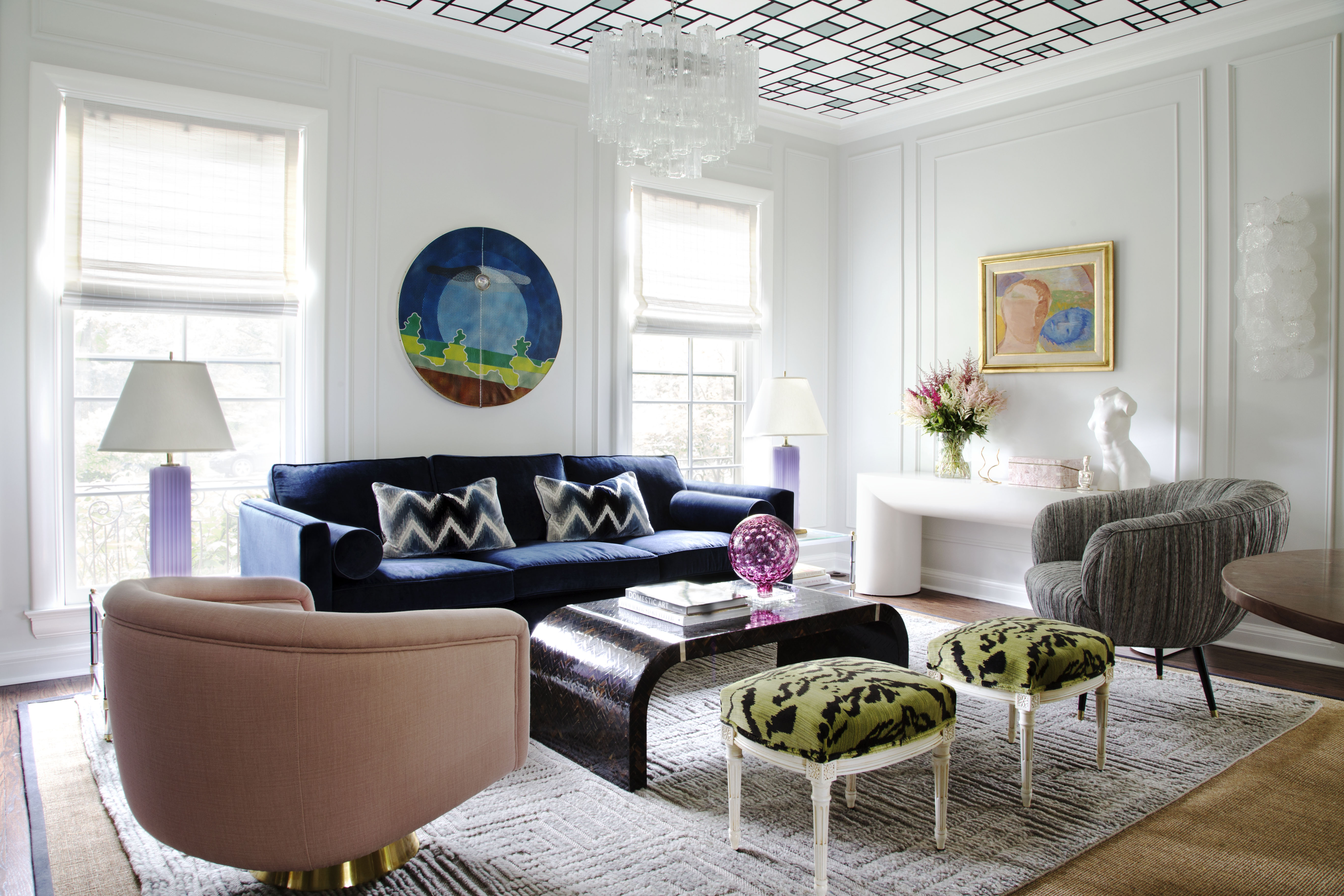

The right living room ceiling ideas can completely transform your space, taking it from bland to bold. When it comes to living rooms, ceilings are often overlooked, but they offer the potential to revolutionize your design.
Often referred to as a fifth wall, experimenting with the ceiling as part of your living room ideas can trick the eye to make a space look bigger, or more cozy, and create drama. From wooden ceilings, beams, and fabric, to wallpaper, there are several ways to play up its style and design.
If you're ready to go bold overhead, then these ideas suggested by top designers can get you started.
10 living room ceiling ideas to that will create soothing to stunning visuals
There's always the option of living room color ideas, ceiling details, and other decor elements to uplift the space. But if your living room already has certain interesting architectural or material details, use these to lead the way, whether that's beams, original crown moldings or even something like an industrial concrete ceiling.
If you're working with a blank canvas, then there are ways to install interest to a ceiling for a more characterful living room.
1. Consider a fabric canopy ceiling for a dramatic look
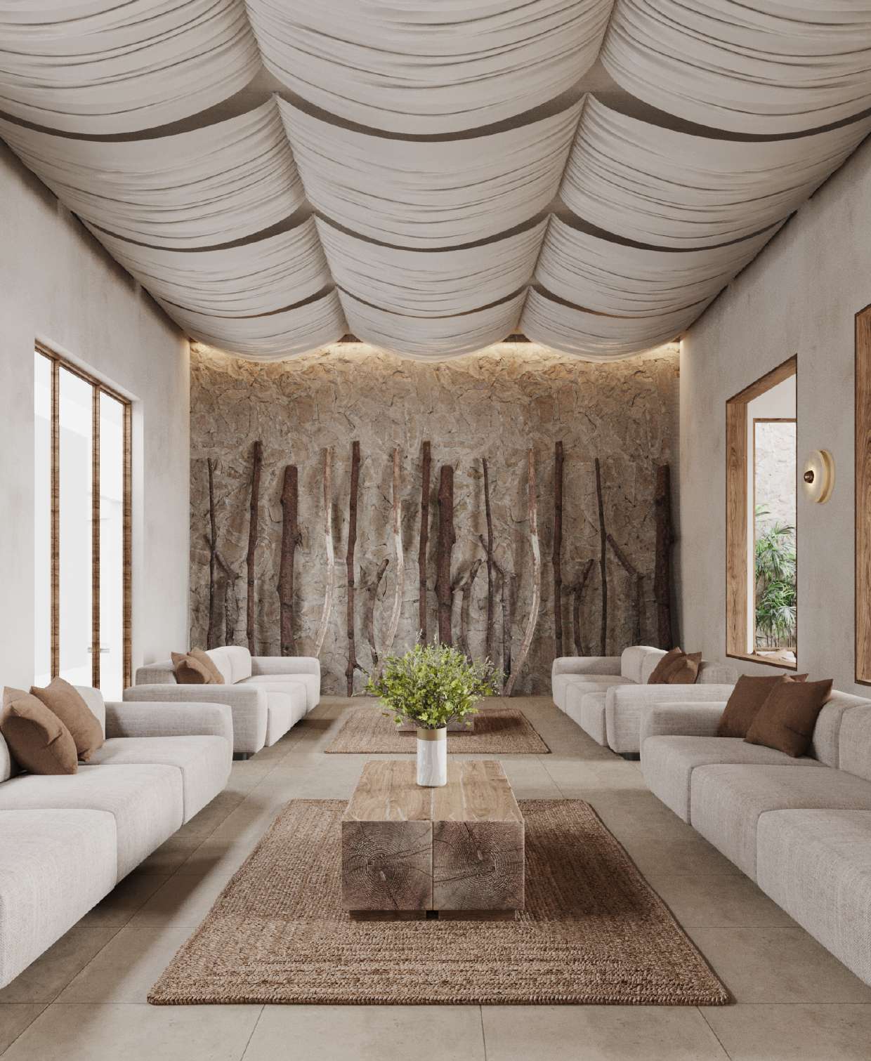
Doesn't this room give you the Arabian Nights feel? Hanging fabric from the ceiling can be quite a dramatic idea. Plus, in extremely hot terrains, the fabric can be helpful, as it absorbs the heat radiated from the ceiling and allows the temperatures below to be cool.
Another reason why a fabric ceiling could work is if you want to hide unsightly details on your ceiling and don't want to invest large sums on completely renovating it. This is a good idea for renters, although, with an overhanging fabric, the need for constant cleaning will arise. Plus you need to speak to a local contractor to affix ceiling lights on the walls and suspend the fabric in the right way so it holds steady and has the perfect draping effect.
All things considered though, if a farmhouse living room style is for you, then a fabric ceiling along with wooden furniture piece will keep the interiors earthy and rooted. Even the color palette is muted, in beiges and browns.
'This project is a return to the traditional architecture of farmhouses,' says Lotfy Husayn, founder of LOAK. 'Here, our aim was integrating nature into contemporary living; something that is seen constantly in the project. We've chosen weather-resistant materials, created vantage points that oversee the property, and used windows to center nature as the focal point. For this living room, we decided to create a canopy effect for a Mediterranean feel with linen, which is attached to wooden ceiling beams installed at equal distance.'
2. Give glossyceiling tiles a go
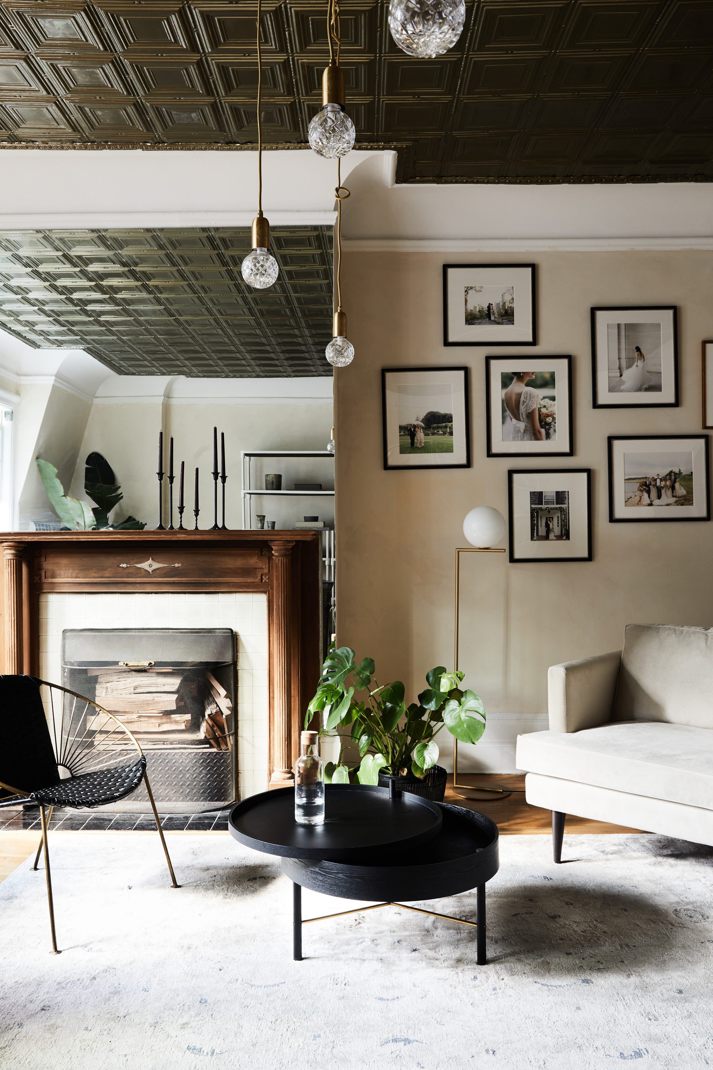
In the modern world, tin tiles are more likely to be seen in in restaurants, pubs, or commercial spaces, and so, spotting one in a residence can create quite a dramatic effect. This design style was associated with Victorian architecture, where the tiles were pressed down and embossed upon to form intricate patterns.
Of course, there are hundreds of patterns you can choose from for these ceilings. For an elegant living room, you could think about patterns that have a strong association with a historical period. Usually, geometrical shapes are associated with Art Deco style, in which case the tin ceiling can help you create the same mood.
There's no doubt that this type of ceiling looks beautiful, but it does require more care than a modern plaster ceiling. You will have to spend some time checking if the tiles are corroding or not. Use a soft, dry cloth to wipe it weekly, and once in six months, get a professional to clean it.
'We kept the original tin ceiling in this pre-war Upper East Side building,' says Melissa Lee, principal designer at Bespoke Only. 'The cut crystal pendants from Lee Broom highlight the texture and reflective nature from the tin tiles while the simple bulb form offset the intricate glimmer with a modern flair.'
3. Highlight the ceiling beams in the living room
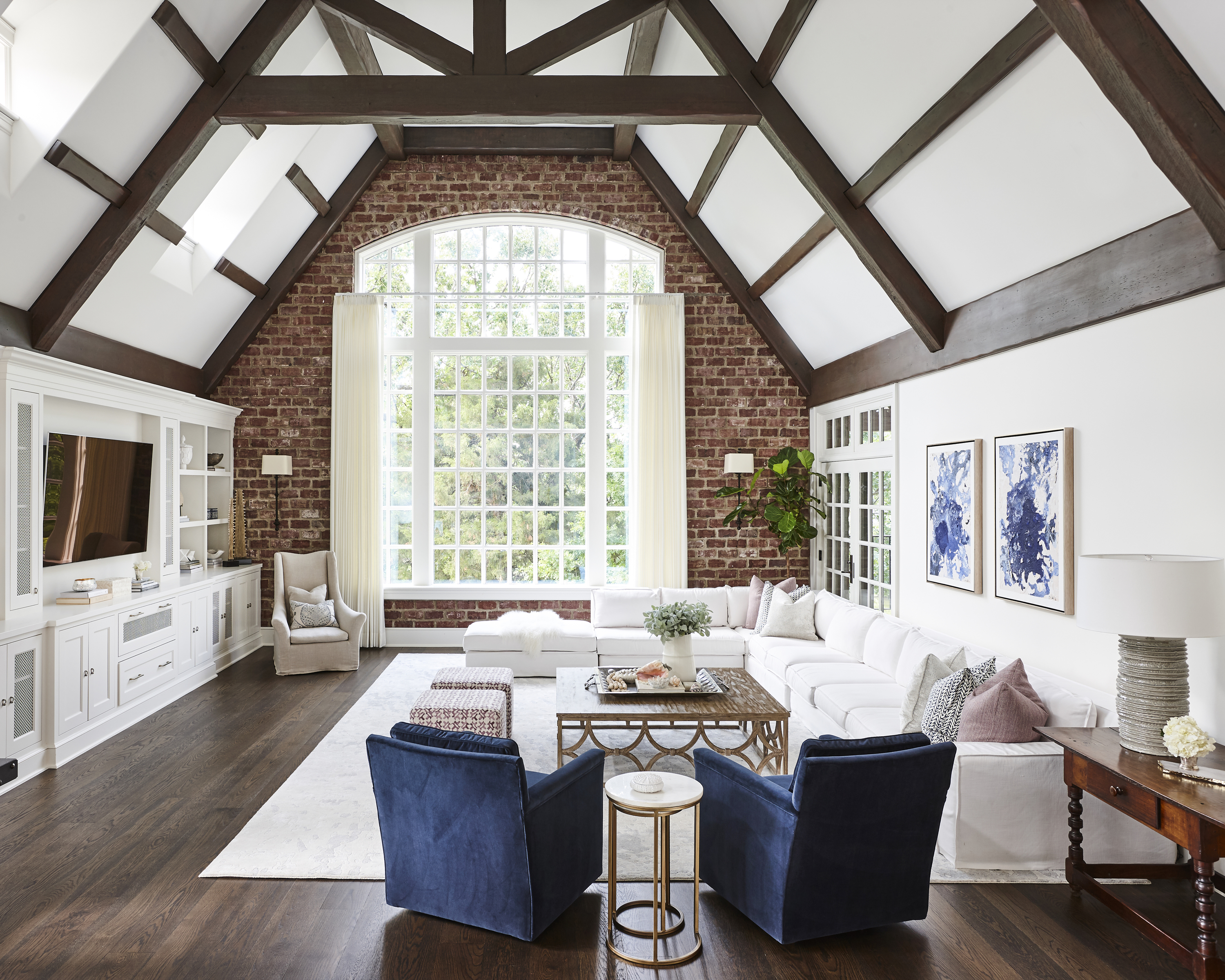
For a mid-century modern vibe, choose reclaimed or decking boards for the ceiling. Exposed beams were especially popular in Spanish colonial architecture, but today can create a wonderful rustic living room vibe.
If you'd like to recreate this look, you could go in for high-density polyurethane, faux beams that look as good as real wood. They are lightweight, which makes them easier to install than real wood beams. If you have an open plan home, you can even use a solid wood beam and column as a divider between the two spaces.
'The remodel of this space was an intensive project, but we were able to re-work a few existing details,' says Mel Bean, founder of Mel Bean Interiors. 'One example is the wood planking and beam combination. We were able to preserve these elements with careful consideration despite reworking lighting locations. We updated the stain colors to play up the materials in this space and tie them into the beams in the adjacent living spaces. The result feels authentic yet updated.'
4. Create a grand room with murals
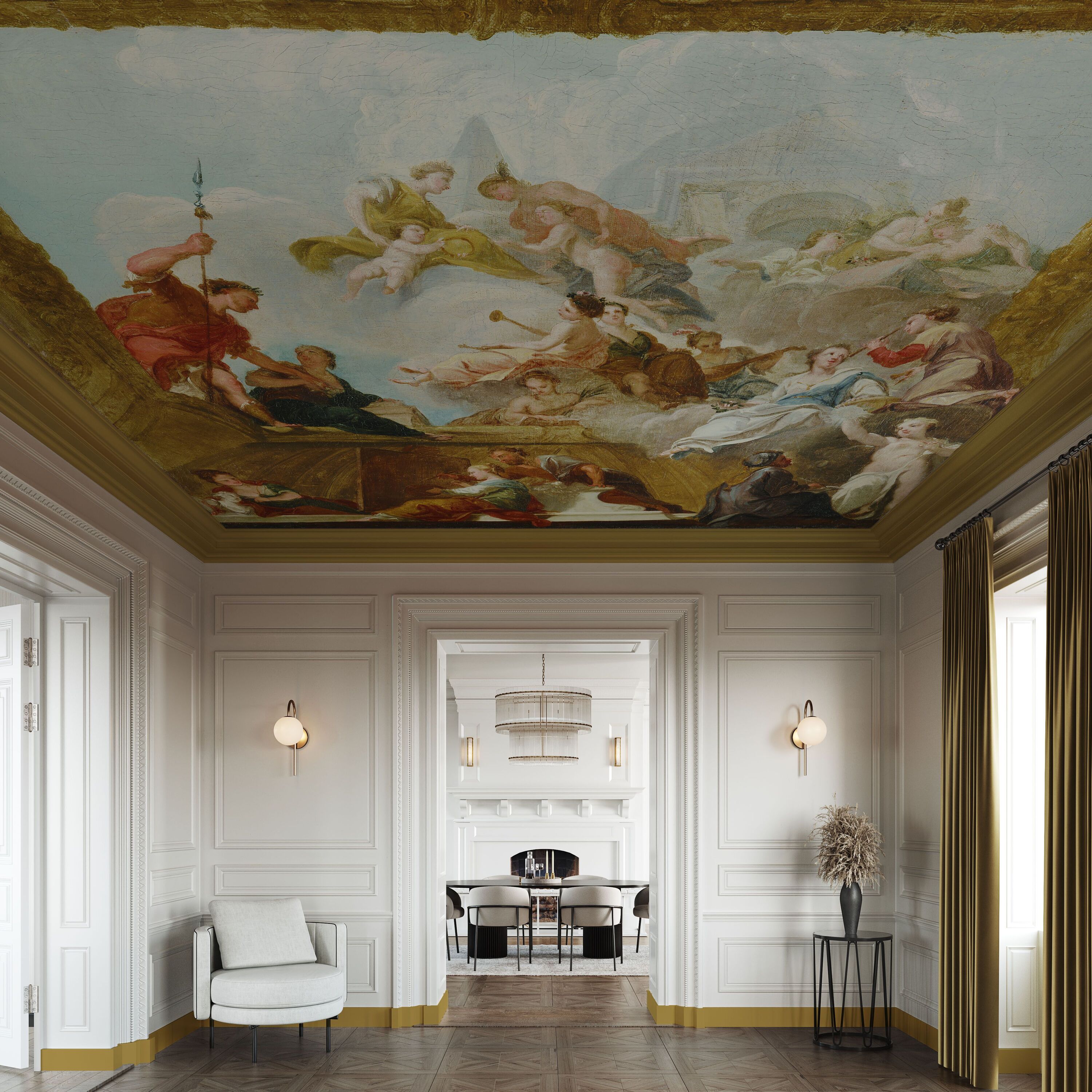
If you are an art enthusiast and love Renaissance-inspired art, then painting a ceiling or wall mural could be the best choice for you. Draw inspiration from notable works by Michelangelo, and Van Gogh, or from the Sistine Chapel, and give your interiors a grand touch. Plus, murals are a wonderful way to add color and texture to a room, so you can build your interior palette, from top to down.
In case murals seem too over the top for you, or if you're limited as a renter, you could also choose decals that look great and can be easily removed or pasted again.
This ceiling design is inspired by Francesco Slater; a representation of the Liberal Arts. It is an early 18th-century oil painting that created the illusion of a golden coved ceiling that spills into the godly world. It features Minerva, goddess of wisdom and the arts, and Mercury, identified with reason and learning.
'Why frame your favorite painting when you can have a wall full of it, or your very own ceiling mural? Your favorite piece of art your way is only limited by your imagination,' says Alan Kemp, head of brand at Graham & Brown.
5. Add a charming touch to your interiors with crown moulding
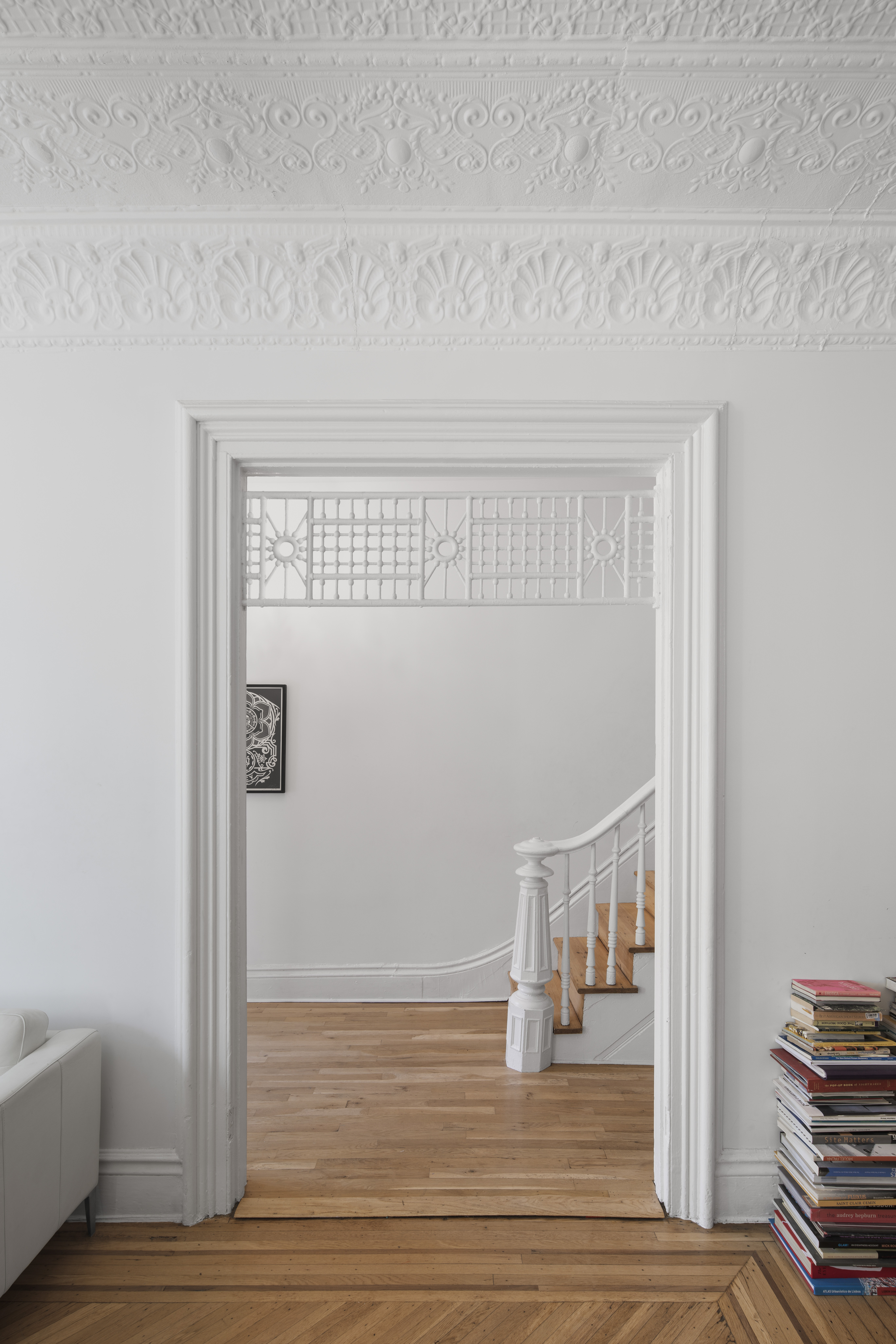
Crown moldings are like jewelry; they add that extra layer of design to a charming and cozy living room. Unless you are lucky enough to live in a vintage home duly appointed with lovely crown moldings, you may find yourself feeling like your interiors are lacking in architectural details that give it distinction.
And so, for an elegant, charming touch, consider well-crafted and detailed molding for your walls or ceiling. To draw focus on the molding, consider keeping your furnishings simple with clean lines and very little pattern. Paint the walls a serene white so that the wall patterns subtly stand out and look delicate and aboriginal.
'Two art professionals approached us to renovate their existing 100-year-old home on a tight budget,' says Luki Anderson, founder of Studio Officina Architecture PLLC. 'They wanted to find a way to update and modernize the existing 3-floor townhouse while retaining the historic details that had originally drawn them to the building. To update the home, many decades-worth of paint and plaster finishes were stripped from the interior surfaces to reveal and enhance the historic details of the home. This ceiling is a pressed metal ceiling that we retained.'
6. Opt for a wooden ceiling
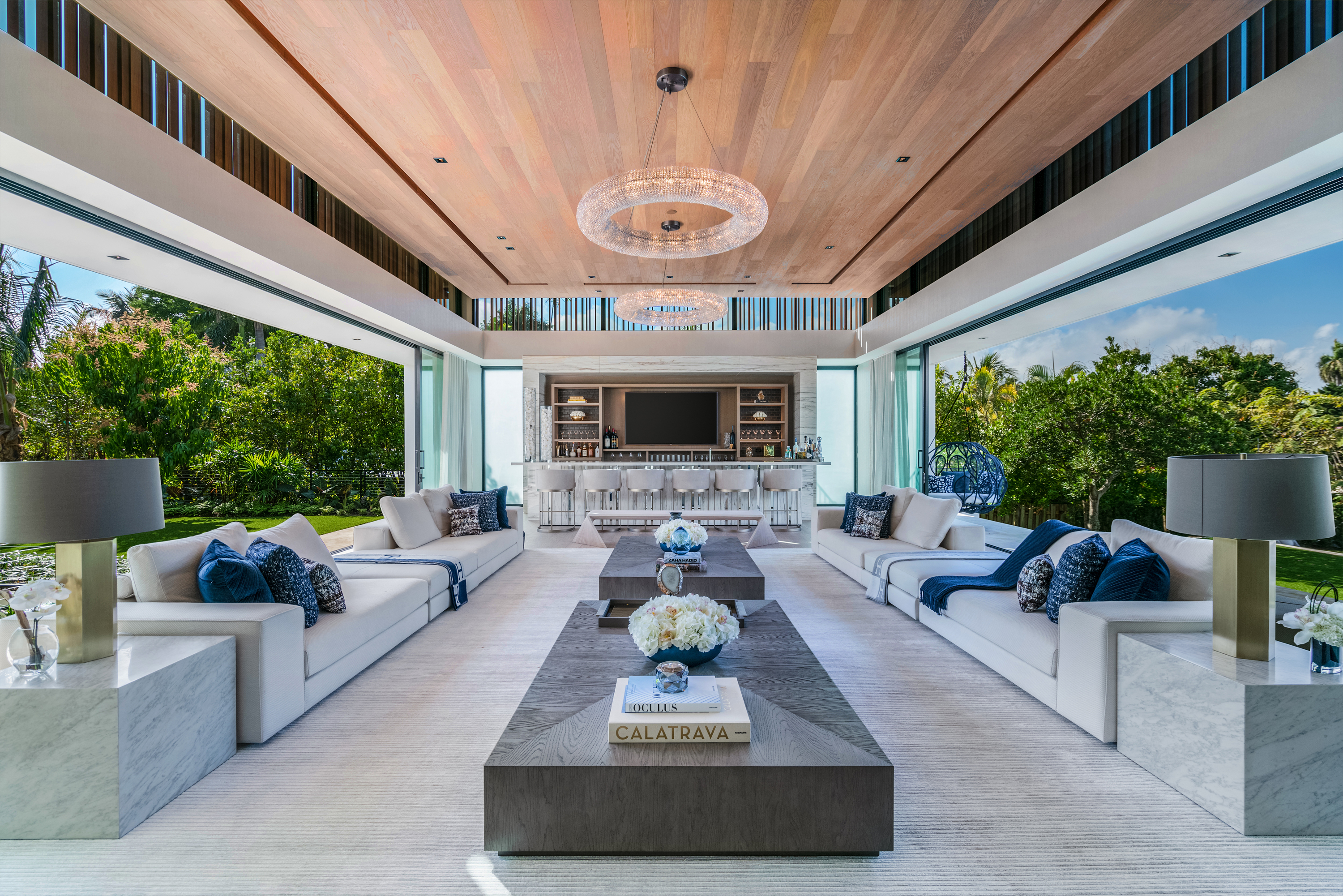
A great ceiling design idea is wooden ceilings that can give a room a unique, inimitable, and individual character. The design has a cozy, inviting look; plus the warmth of the wood is unmatched. Give your modern living room texture and dimension with this material.
One thing to keep in mind is that wood can create a cave-like feel, so ditch dark wood for lighter planks, and match the pale ceiling with warm colors below to make a room feel more intimate. A good ceiling and floor pairing is wood and slate, or wood and ceramic tiles. Add potted plants to complete the organic scene.
'This great room is all about symmetry and parallels, from the sliding glass doors to the 20-foot long sofas, chandeliers, and side tables that create an indoor-outdoor experience,' says Brittany Farinas, creative director at House of One. 'The wood planks on the ceiling bring an oasis-like experience into Miami Beach and make one feel like they’re in Bali.'
7. Draw focus to the ceiling with a cascading light
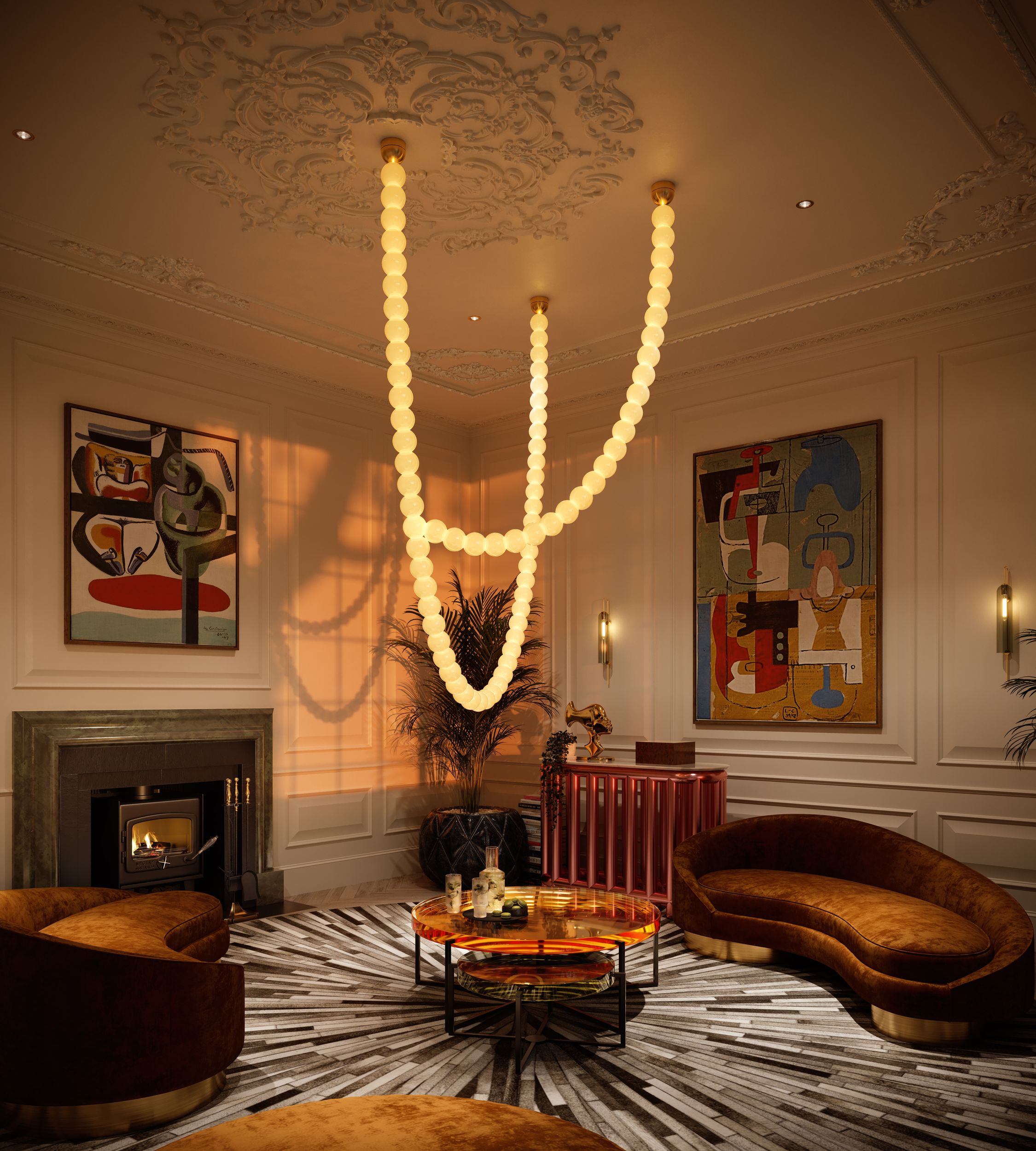
Who doesn't love a chandelier flowing from the ceiling, lighting up a room and increasing the appeal of a home? Not only do long, hanging lights look good, but they also serve several benefits. For one, they make us look up, and so if you have a beautiful, aboriginal ceiling that's worth a second look, use this trick to draw focus upwards. You can even hang these in a living room corner.
The other advantage of chandeliers and long pendants is that they accentuate the height of a room. When a long light is hung from the top, it encourages dwellers to take in the entire length of the room while observing the light.
These lights also throw a soft glow around the room, illuminating it softly. In this particular image, the Halti chandelier made of hand-blown glass pearls by Cameron Design House acts as the perfect addition to an intricately designed ceiling.
8. Take the paint from the walls to the ceiling
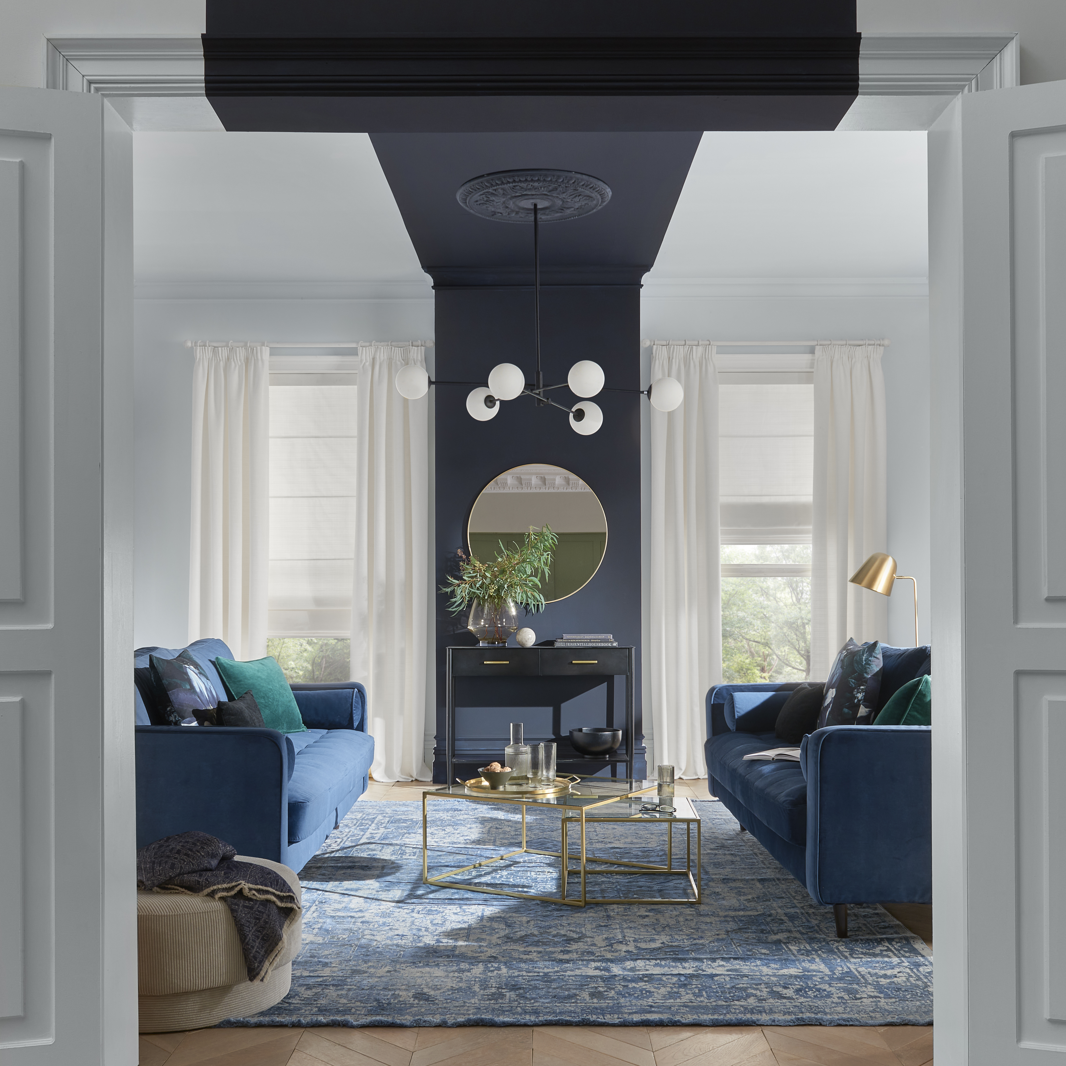
Give your interior a bold streak. The black stripe that flows from the wall to the ceiling gives this luxurious living room pizzazz. The effect is immediately eye-catching and clever. The paint creates soft segregation along with symmetry in the room, where both sides have mirroring design features.
The two paint colors are Graham & Brown's Terrazzo paint with the walls in Cool Britannia.
9. Or contrast the ceiling color with the walls
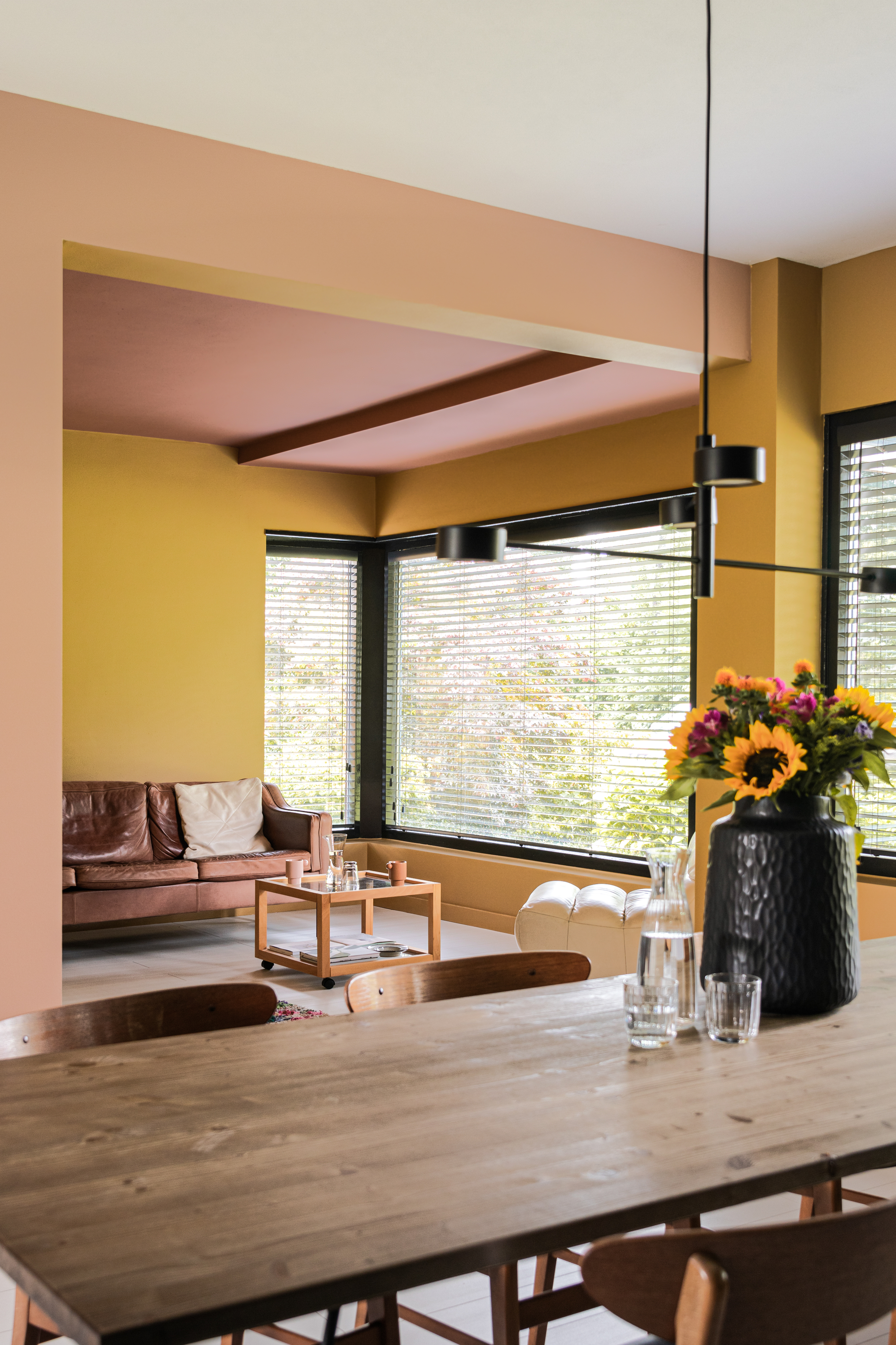
There's no better way of adding depth, interest, and of course, color to your homes than with paint. It is an easy tool to use, and with the use of different deep hues, you can create a striking effect that looks personal and bespoke, especially when it comes to ceiling decorating ideas.
When working with pink and yellow, the trick is to choose the right shades of each color. Yellow can go from light ecru to bold sunshine, while pink can be in rose to neon shades. For best results, choose pastel tones or ones with a brown or grey undertone so that the contrast looks eye-catching but isn't too overwhelming.
If you have a living room and dining room combo, create a unified look with paints that flow between both spaces. This is a clever trick to make a space look larger than it is as the sightlines remain uninterrupted. Add wooden elements to warm up the scheme.
10. Cover the ceiling in wallpaper
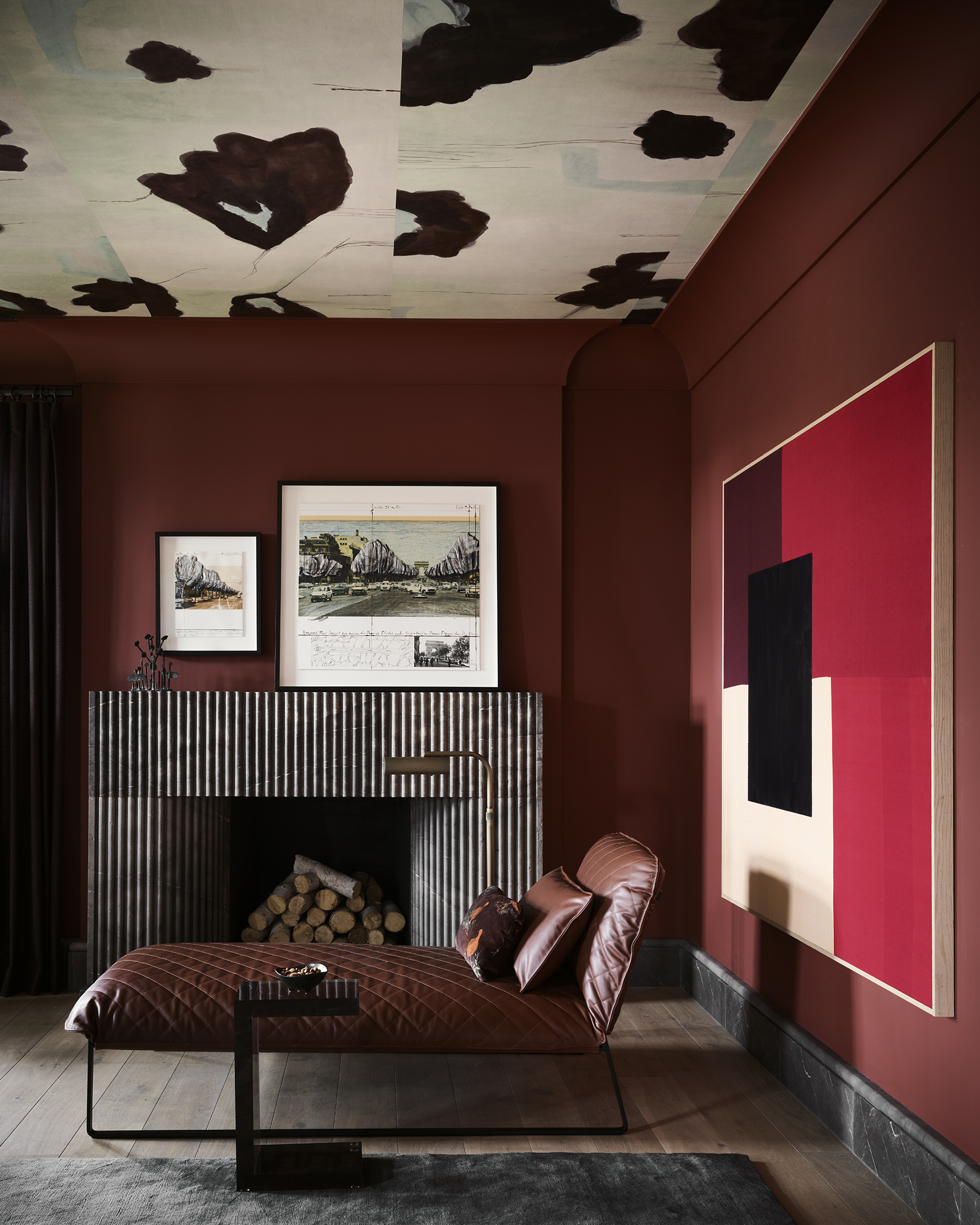
A brilliant pattern on the ceiling can do more than just flat paint. It can add a punch of personality and color without disrupting an all-neutral theme. Darker prints can weigh down a room, so this could work if you have high ceilings and want to create a more cocooning look. On the flip side, lighter colors can make smaller rooms feel larger.
While living room wallpaper is like jewellery for an interior design, if you're worried about its permanency, you could choose the removable designs.
In this room designed by Chad Dorsey Design, the ceiling is designed in collaboration with Porter Tello wallcoverings.
How can I make my ceiling more attractive?
Ceilings don't always have to be flat, horizontal planes of white-painted drywall. Give them personality with a vaulted, trayed, or coffered design. If you don't want to make big renovations, then go in for fun living room paint ideas.
Consider a color block by painting the ceiling and walls in contrasting hues. You could also suspend a long pendant light to make people look up and admire the ceiling. Other options are adding wallpaper above or even experimenting with crown molding.
Be The First To Know
The Livingetc newsletters are your inside source for what’s shaping interiors now - and what’s next. Discover trend forecasts, smart style ideas, and curated shopping inspiration that brings design to life. Subscribe today and stay ahead of the curve.

Aditi Sharma Maheshwari started her career at The Address (The Times of India), a tabloid on interiors and art. She wrote profiles of Indian artists, designers, and architects, and covered inspiring houses and commercial properties. After four years, she moved to ELLE DECOR as a senior features writer, where she contributed to the magazine and website, and also worked alongside the events team on India Design ID — the brand’s 10-day, annual design show. She wrote across topics: from designer interviews, and house tours, to new product launches, shopping pages, and reviews. After three years, she was hired as the senior editor at Houzz. The website content focused on practical advice on decorating the home and making design feel more approachable. She created fresh series on budget buys, design hacks, and DIYs, all backed with expert advice. Equipped with sizable knowledge of the industry and with a good network, she moved to Architectural Digest (Conde Nast) as the digital editor. The publication's focus was on high-end design, and her content highlighted A-listers, starchitects, and high-concept products, all customized for an audience that loves and invests in luxury. After a two-year stint, she moved to the UK and was hired at Livingetc as a design editor. She now freelances for a variety of interiors publications.
-
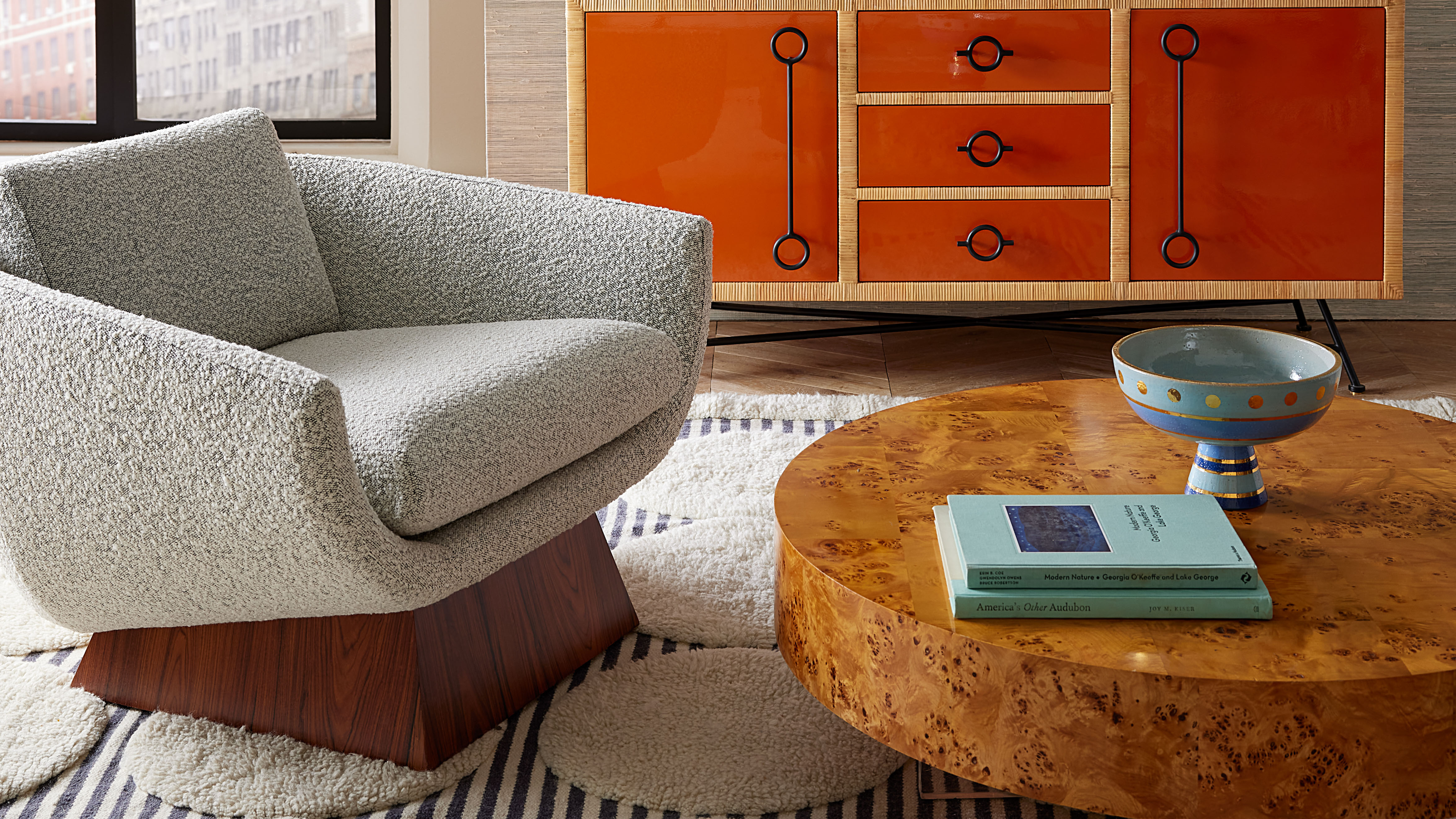 Burl Wood Decor Is 2025’s Most Coveted Comeback — Here’s How to Get the Storied Swirls for Less
Irregularity is the ultimate luxury, but you don’t need an antiques dealer to find it
By Julia Demer Published
-
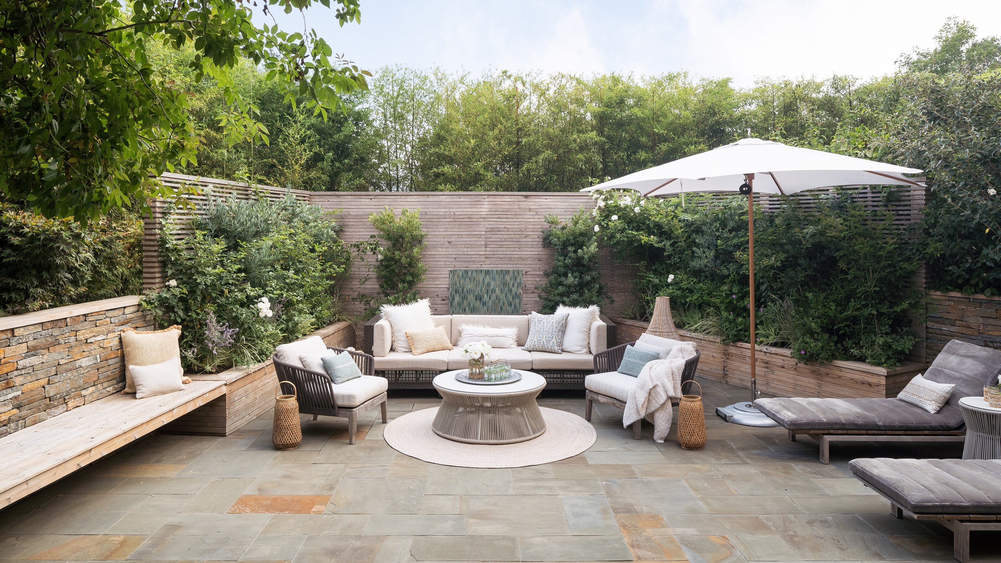 5 Garden Features That Instantly Add Value to Your Home — While Making Your Outdoor Space More Practical, too
Get to know all the expert tips and tricks for making your backyard a standout selling point for your home.
By Maya Glantz Published
-
 10 rules to achieve balance in interior design - the secret style sauce which brings schemes together
For calm interiors with visual stability, balance is the go-to design principle for perfect harmony in good measure
By Keith Flanagan Published
-
 I'm trying a 30-day minimalism challenge this January, a step-by-step guide to life of soothing simplicity
Try our 30-day minimalism challenge to declutter your mind and home this January
By Oonagh Turner Published
-
 These 10 foolproof rules will help you host Christmas in a small space
If you're faced with hosting a Christmas in a small home, fear-not, we've got the expert advice to see you through the season
By Oonagh Turner Published
-
 The 10 best minimalist interior designer accounts to follow to inspire a less cluttered home
These are some of our favorite interior designers accounts to follow for seriously beautiful, minimalist spaces
By Oonagh Turner Last updated
-
 8 of the best table centerpiece ideas that will take minutes to achieve, yet make any occasion feel extra special
These table centerpiece ideas will help to elevate your hosting game and wow your guests
By Oonagh Turner Last updated
-
 This often-forgotten element of design is what will make your Christmas feel most magical, say these experts
Festive scentscaping is the next frontier for the home at Christmas. We speak to fragrance experts to find out how to do it
By Oonagh Turner Last updated
-
 9 genius tricks for decorating with books that can change the vibe of your home in less than an hour
If done in the right way, decorating with books can bring unique, fresh and interesting perspective to your space
By Aditi Sharma Maheshwari Published
-
 25 modern bedroom ideas for a sleep space that's contemporary yet cozy
A modern bedroom doesn't mean a cold, soulless space. These ideas take contemporary style and make it comfortable
By Aditi Sharma Maheshwari Last updated