25 living room trends for 2024 – next year's big colors, materials and moods designers are loving
Dark walls, colored marble and a metal we've not seen in design for a while, living room trends for 2024 are an exciting glimpse into the future of design
Roddy Clarke
The best thing about modern living room trends is that they can be brought into youe home in an instant. Unlike kitchen and bathroom trends, which often involve a remodel, living room trends vary from a new statement piece of furniture, a new selection of pillows or just some new lighting. An easy way to update for the new year.
And there are so many impressive ideas coming through from designers for 2024 – new palettes, new textures, new ideas for what makes a house a home. So to decode the latest interior design trends we've asked the experts for their insight, offering plenty of inspiration for your own decor.
'A lot has been changing in design this year generally, and the way this is filtering into living room for next year is really exciting,' says Livingetc's editor Pip Rich. 'With the rise of minimaluxe to new fabrics beginining to compete with boucle for popularity, what we want from living rooms is evolving. Smartness coupled with informality is a really enticing vibe, leading to rooms you feel you can curl up in, but feel nice while doing so.'
So could next year be the year you embrace a cork? Or maybe it's time to dip your toe into the world of maximalism with some brightly colored cabinets? Whichever of these trends resonates with you, they all lead to living rooms you'll want to spend time in.
What are the living room trends for 2024?
Designers explain the key looks and moods we're going to be seeing a lot of in 2024.
1. Wallpapered ceilings
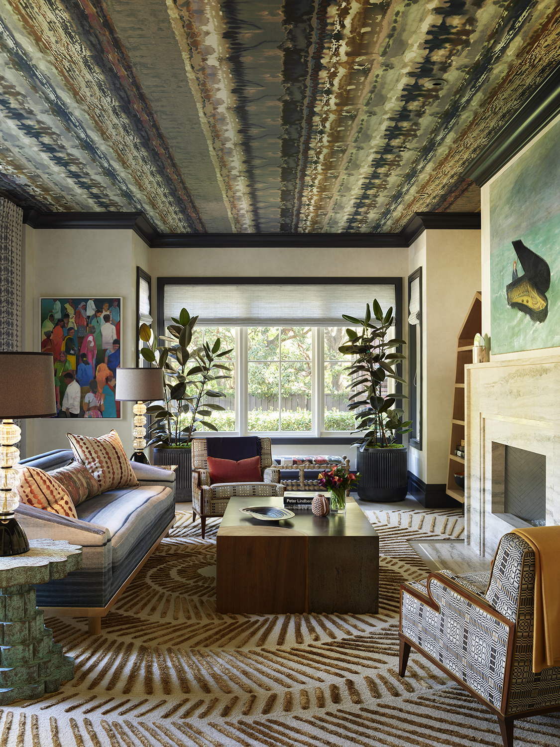
When designing any living room, you might assume the focal points are the television, a hefty sectional, or perhaps a fireplace. But the latest conversation starter might be above your head: wallpapered ceilings are becoming a bold alternative to plain white paint. “Adding wallpaper on a living room ceiling is a simple way of incorporating the maximalist trend, without completely redesigning the entire space,” says San Francisco’s Jay Jeffers.
In his recent living room design above in Atherton, California, Jay covered the ceilings in a richly patterned Tempest Wallpaper by the UK’s Boeme, adding layers of visual interest all in one. “I recommend going bold with a patterned wallpaper, then weaving in those colors throughout the rest of the room,” recommends Jay. “Don’t be afraid to mix and match patterns; as long as they remain in the same color family, different patterns help add layers and personality to a room.”
Adding to the look is Jay's use of the best rug for this space - an equally patterned wonder that complements the ceiling perfectly.
2. Entertainment layouts
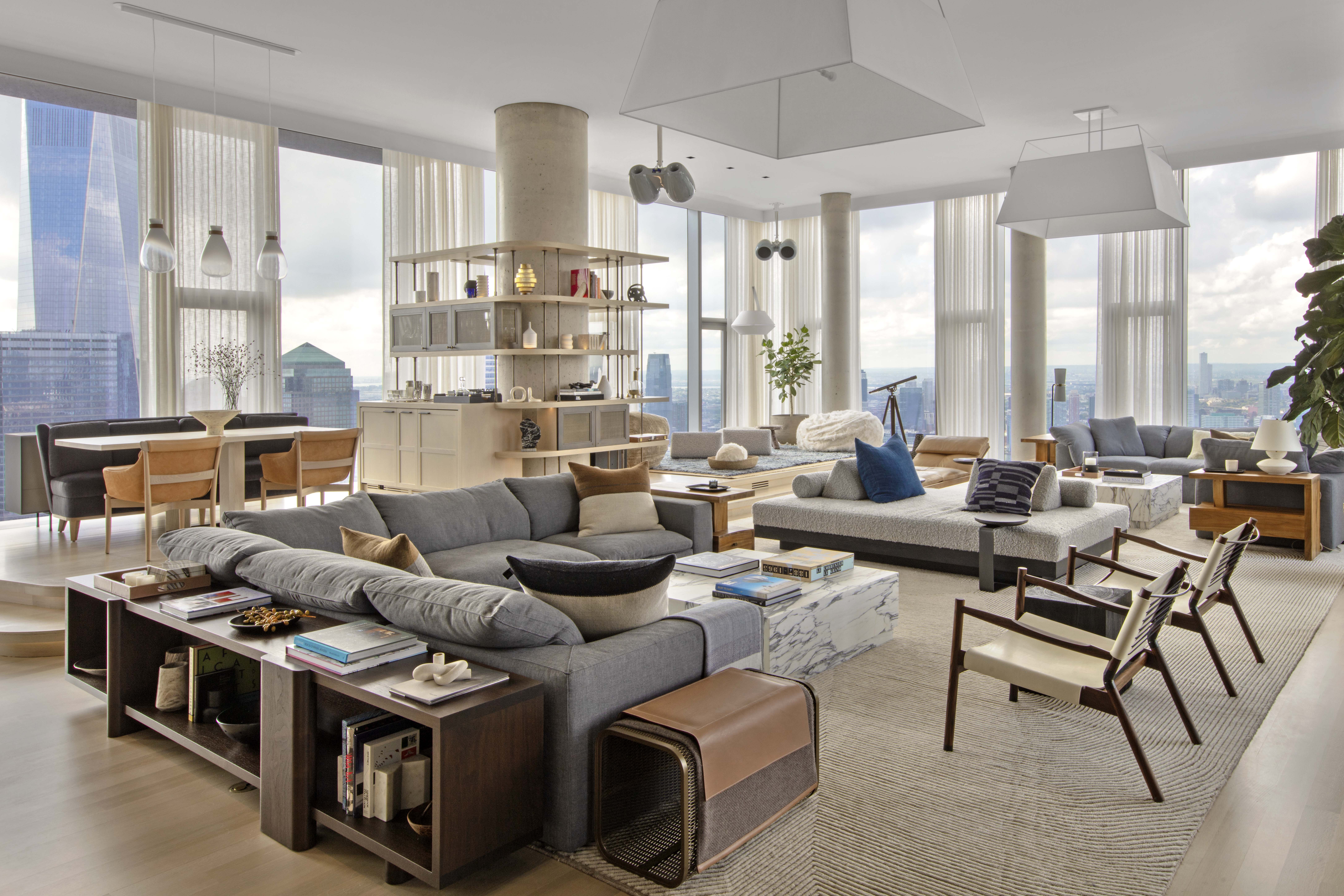
Don’t be surprised to find a new bar cart in your friend’s living room – according to Will Meyer, co-founder at NYC’s Meyer Davis, there’s a growing interest in living room layouts with major entertainment value. “In the post-pandemic world, we’ve seen more homeowners seeking living rooms that are centered around entertaining and hosting,” says Will, noting that clients are requesting living rooms built for multiple occasions, parties, and gatherings.
You can see this in action at 56 Leonard, a new penthouse by Meyer Davis, where an open floor plan features multiple zones that revolve around a central wet bar; a raised oak platform also creates a flexible, multi-use space with enough room for a full DJ setup. “When designing an entertainment space, it’s important to make bold design choices such as incorporating a custom-designed bar, professional-level sound system and a projector screen in the living room,” adds Will. “Activating the space from morning to night, the bar is the perfect spot for entertaining, intimate gatherings and quiet self-reflection while listening to music or watching the sunset.”
3. Neutrals plus jewel tones
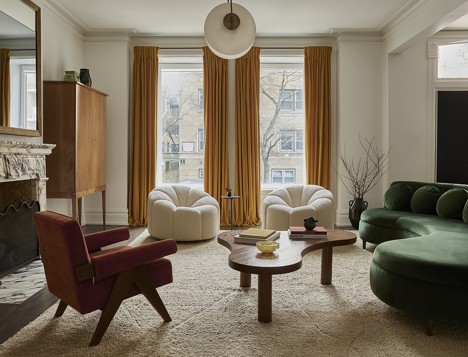
Whether by way of a gradient sheer curtain or a vibrant geometric sectional, interior design is often enamored by precious stones – which makes the living room a perfect place for contemporary jewel tones. Living room color trends are using them set against neutrals, which can add a sense of luxury and complexity. “People can often be afraid of color, but done in the right combination, jewel tones and richer colors can still feel elegant and refined,” says Lydia Toppston or Chicago’s Wendy Labrum Interiors, which designed the living room above with colors like emerald green - which is used on the just the best couch for this space - and citrine yellow on the opulent drapes.
The formula for decorating with jewel tones should come naturally, according to Lydia. “When using bright colors, you want to make sure to have a balance of warm and cool colors and incorporate natural colors and textures for balance,” she says. “Pick colors you love and make sure that they compliment each other.”
4. Flexible seating

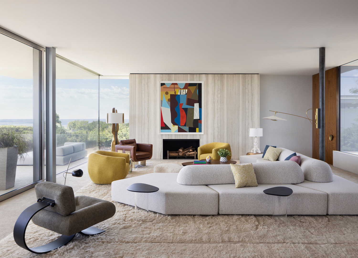
When space allows, traditional layouts are out the window in favor of flexible seating arrangements. Enabled by new sofa trends for modular and multi-directional couches (which allow you to face in many directions), living room interiors can embrace a variety of seating moments all in one. “Rooms need to accommodate a varying number of people, from larger groups to entertain, to smaller, immediate family-only evenings,” says Deborah Hancock, Partner at Rees Roberts + Partners LLC. “Multi-oriented furniture allows for a larger room to maintain an intimacy while in use by these smaller groups or even individuals who are reading or enjoying a fire in the fireplace.”
In the above living room, a central multi-directional sofa made the most of its surroundings, activating different views and zones depending on the occasion. “In this case the architecture and views also invited a number of seating orientations,” adds Deborah. “A sea view at the front of the house, a fireplace in front of the sofa and a beautiful courtyard view behind.”
5. Mirrors, mirrors
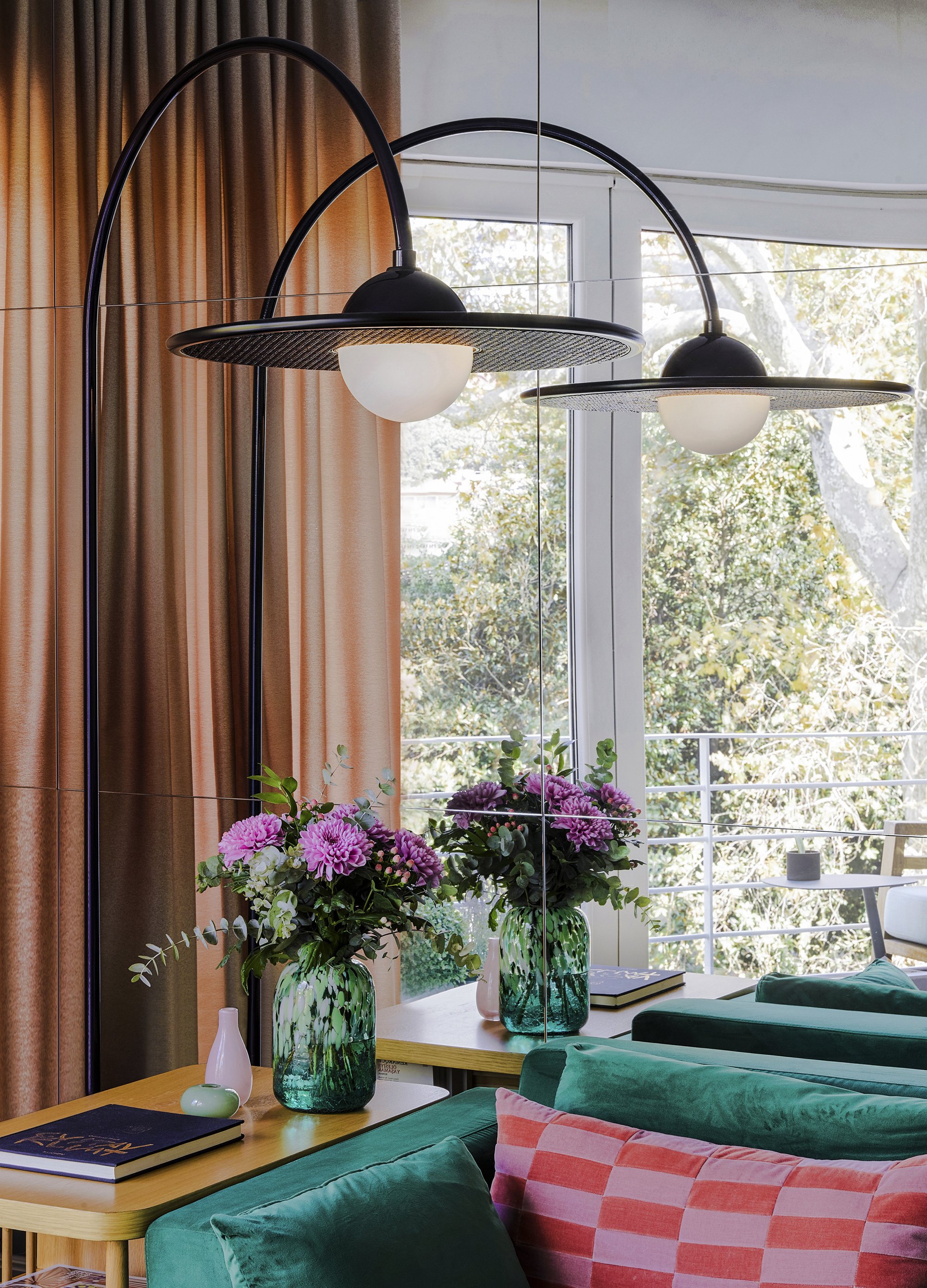
History loves to repeat itself, or in the case of this 80s mirror trend, reflect itself: interior designers are taking a shine again to mirrored or metallic surfaces, furniture and decor. The most tried-and-true example is a mirrored wall, like the one pictured above by designer Merve Kahraman, with shiny mirrored squares paneled across a living room wall. “I think mirrors are a timeless material and if used well it’s very luxurious, simple, futuristic and elegant,” says Merve. “It works especially well in living rooms because it enlarges the space.”
And while these high-polish surfaces work anywhere from walls to cabinetry, you can also incorporate the material as an accent, opting for shiny objects that reflect light and add surprising visual interest. A few examples include this Mirrored Cube side table by Howard Elliot, which duplicates the space in all directions, or for a splurge, the iconic and shiny Chippensteal Chair by Oskar Zięta is a guaranteed showstopper.
6. Over-sized furniture
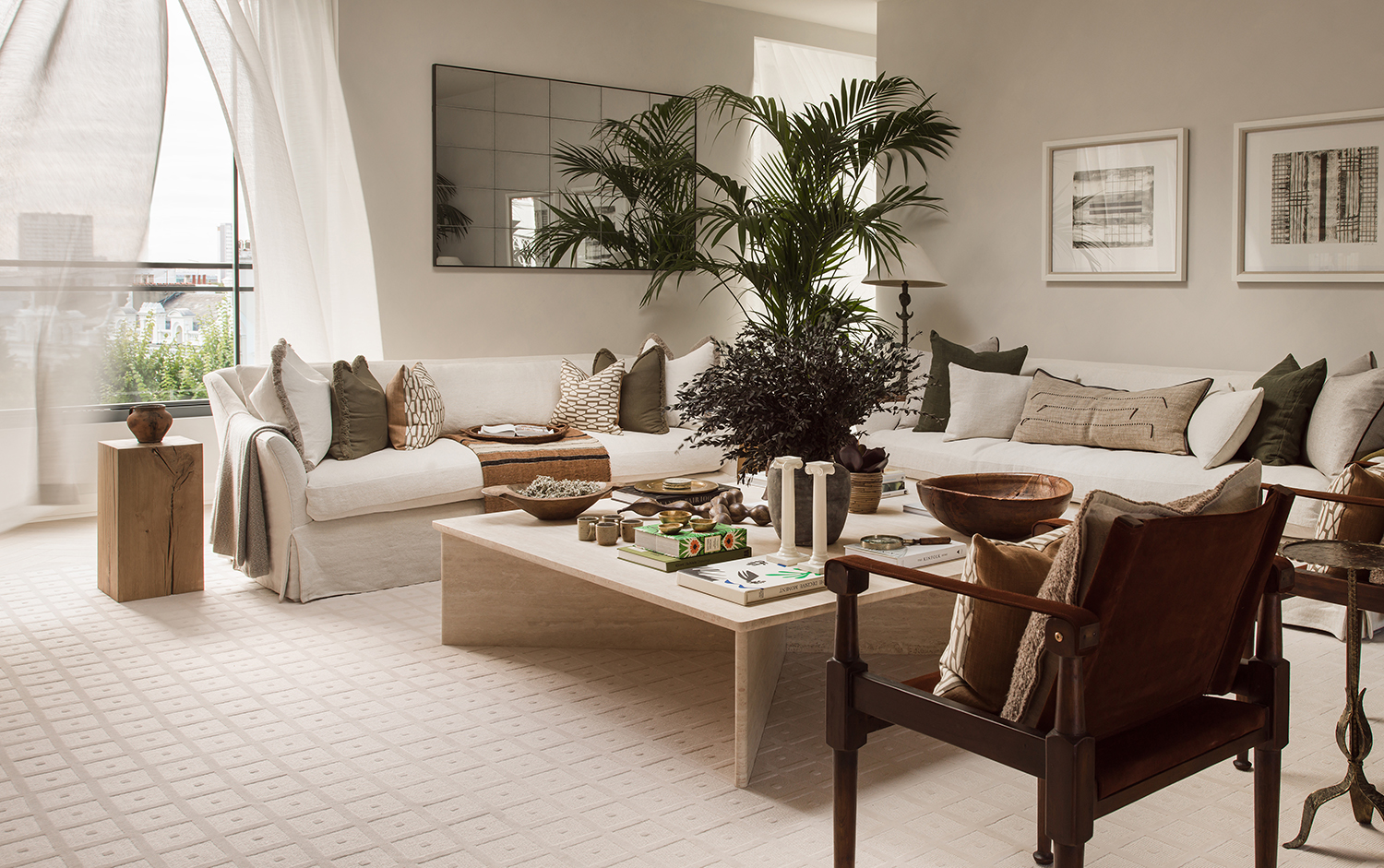
“It’s about scaling up your furniture, even in small living rooms,” states Creative Director of interior design studio Albion Nord, Camilla Clarke. “Fill a small sitting room with a large sofa, a living room sectional or a large potted plant. It becomes so much more inviting and aesthetically compelling.”
In this project Camilla completed, the sofa takes up the bulk of this white living room - and doesn't it look comfy and like you want to be on it? So, if you’re wondering, now is the time to think big. Oversized silhouettes or large sculptural forms, it’s all about the drama and making a statement. This also plays into the New Pretty trend.
7. Blue Marble Furniture
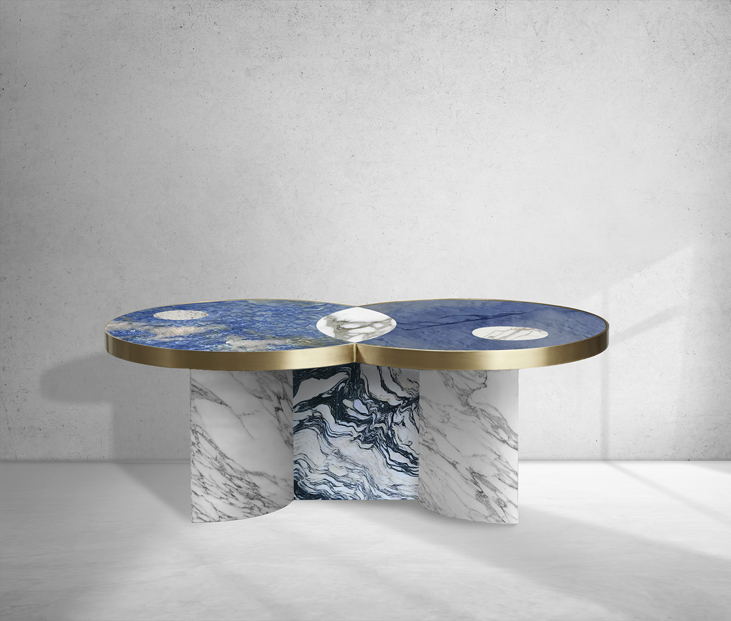
While marble has been a staple in our homes for decades, opting for unconventional varieties of the stone is becoming more popular. The deeply veined Azul Macaúbas, as used here in the Sun and Moon Coffee Table by Bohinc Studio, brings theatre and intensity to the home.
'I love blue stone', says the interior designer Noa Santos, whose work is reguarly featured in Livingetc. 'It's so dramatic.'
While marble is often applied into muted or Scandi-style home decor themes, colored varieties paired with metallic finishes are perfect for maximalist environments.
8. Cork Strip Flooring
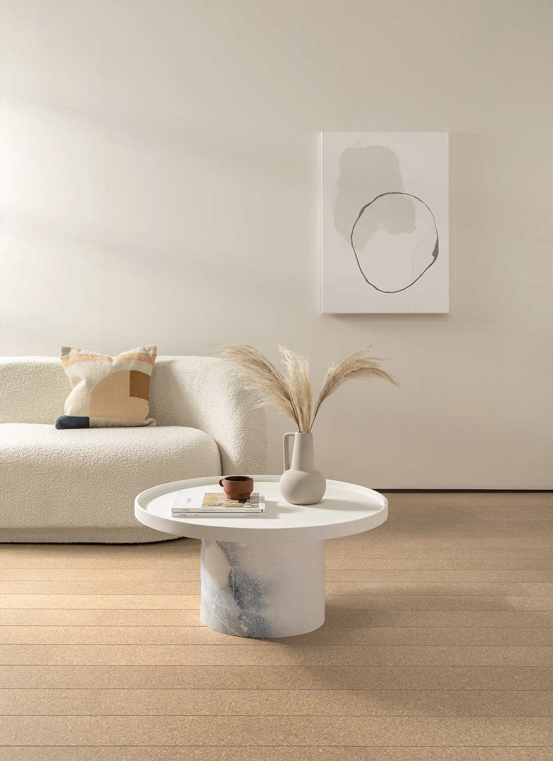
Cork flooring was a 70s must-have; however, we fell out of love with the trend as other fashions caught our eye. Thanks to Recork, cork flooring has had a facelift and is a superb solution for homes today, meeting the sustainable and visual needs of conscious consumers.
With natural resources under threat, this material is harvested using only the bark of a cork oak tree meaning the trees continue to thrive and biodiversity isn’t put under threat. Using plant-based oils, Recork offers six finishes bringing a refined aesthetic to cork strip flooring.
9. Brightly Painted Woodwork
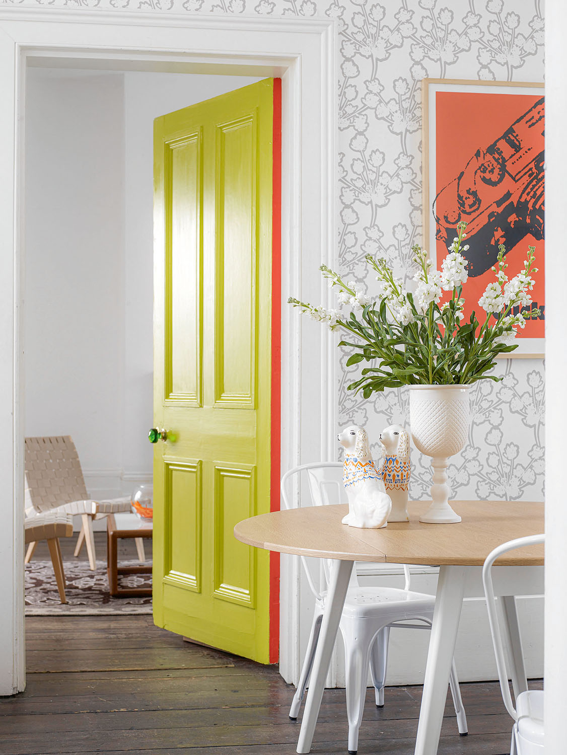
Make a feature of the woodwork with an accent tone which complements the scheme of the room. “I always go with a general plan of using three main colors in a room,” states Matthew Williamson. “One for the walls and ceiling, one of larger items such as a sofa and one main accent colour for the details.”
This is similar to the 60-30-10 rule we've seen take hold of decorating this year.
Think softer tones on the walls and ceiling and opt for brighter, more intense hues to spotlight the beauty in the detail of architrave, skirting and window frames. Or, if you want to keep to a neutral living room, painting the door brightly - with an even brighter slither of color on the side - is a wonderful way to introduce this living room trend.
10. Bespoke Decorative TV Cabinets
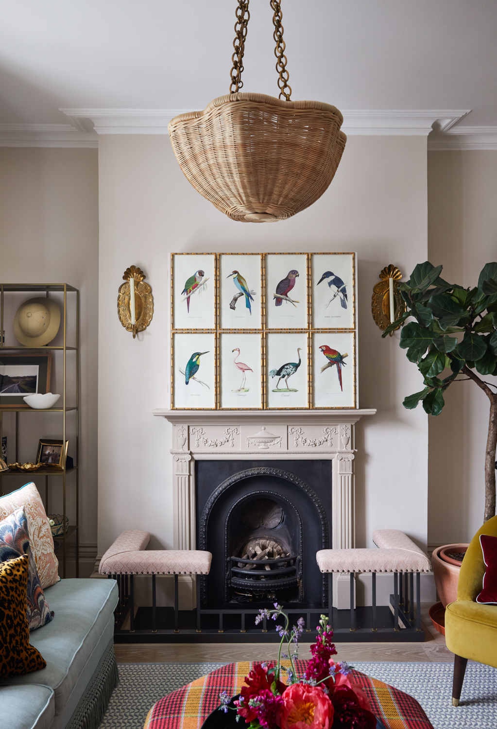
Hiding a living room TV is often a challenge, but designers are coming up with innovative solutions to create decorative and functional alternatives. Interior designer Melissa Hutley, one half of Hutley & Humm, states that more and more requests are coming in as we see each room as a multifunctional space.
“We recently created a cabinet with gilt bamboo framed prints (as pictured), and it was easy to forget it had another function!” she explains.
11. Curtained Storage
Our all defining need for our homes to be workspaces too may be over, but that mood is here to stay.
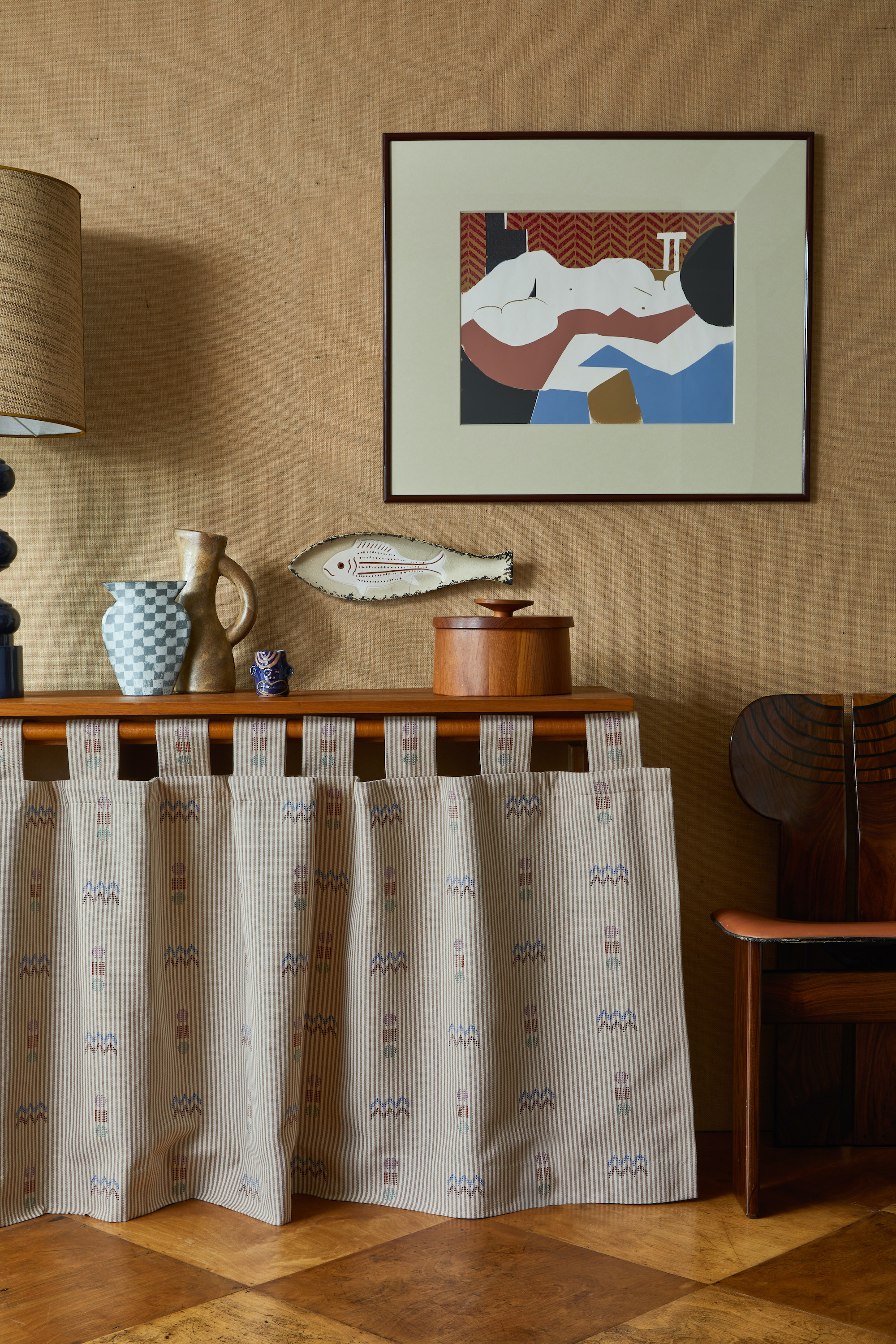
With more tech to store, and the importance of returning the space back to a home after work, practical living room storage has become a necessity. In smaller spaces larger storage units can be cumbersome and curtained storage provides a clever alternative.
With the simple addition of a shallow shelf, under which to store items you need quick access to, you can create a softer aesthetic with the chance to bring in vibrancy through different fabric options as seen here with The Rum Fellow’s new Pepenado textile collection.
12. Organic color schemes
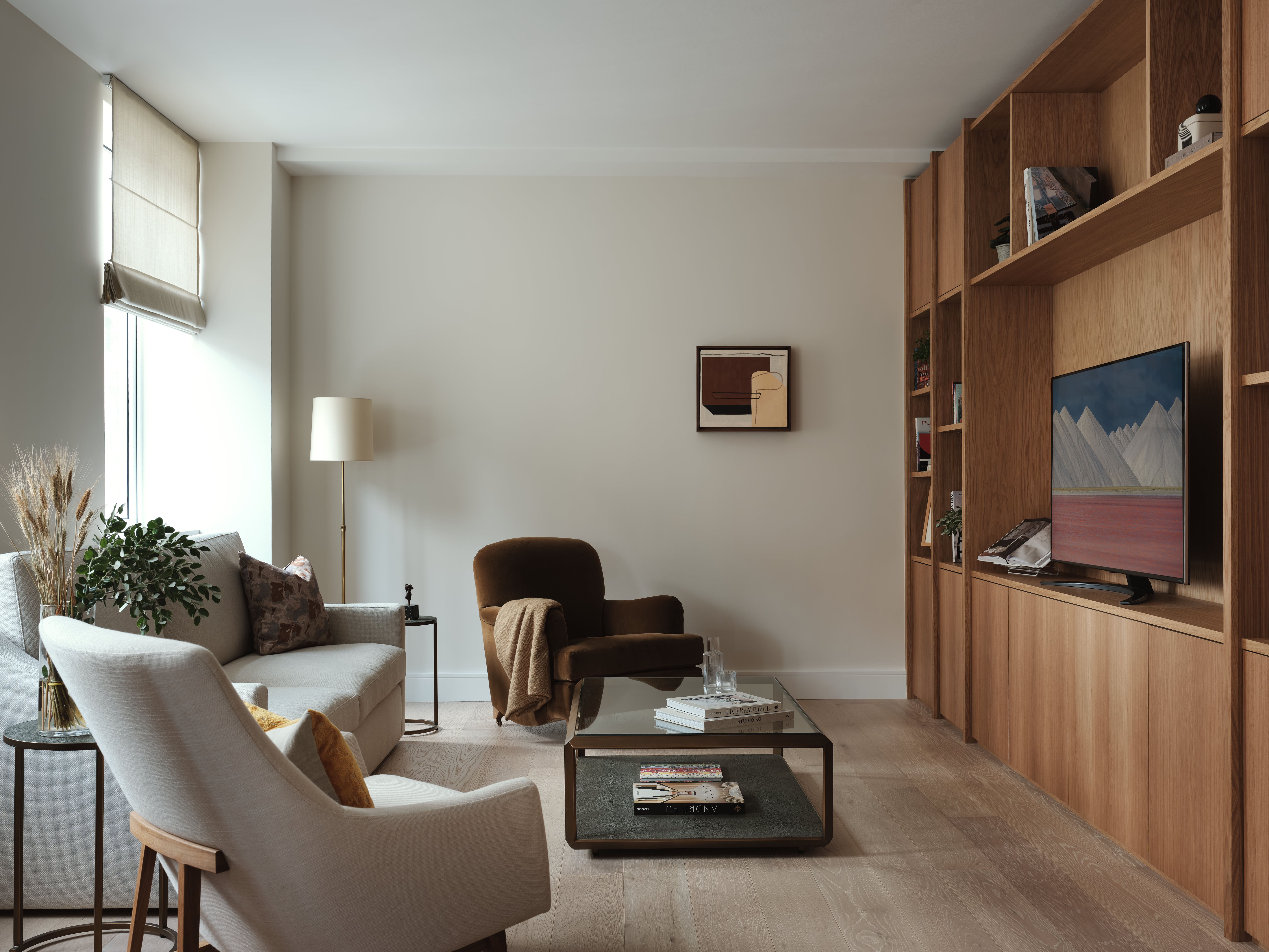
“I think for 2024, many people will still be longing to have living spaces that can act as a sanctuary,” states interior designer Margot Tsim. “Despite maximalism dominating the interiors world recently, I think people will long for homes that are calm, serene and uncluttered without too much visual stimulation to promote wellness for the mind & soul, in search of peace, especially given the current climate we are living in.”
Through embracing these neutral living room color trends and natural materials such as timber and hessian, we can find comfort, tactility, and tranquillity to come back to each day, the embodiment of the new organic modern style.
Remember if you are adding above the sofa decor ideas, ensure you choose tones that coordinate well with the overall scheme of the room.
13. Open Storage Dividers
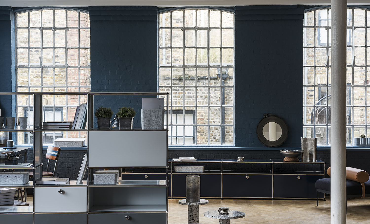
Adding functionality into the home is a priority for many as we spend even more of our working days at the dining table or home office area. Open storage room dividers, such as the modular Haller system by USM, is a great way to zone the living room without removing light or creating something which makes the room feel more enclosed.
This system also offers ample storage for extra technology and plant holder fixtures to bring greenery into the room, again a great way to liven up the space. With an array of bold color choices available, this is a superb concoction of practicality and elegance.
14. Polished metals
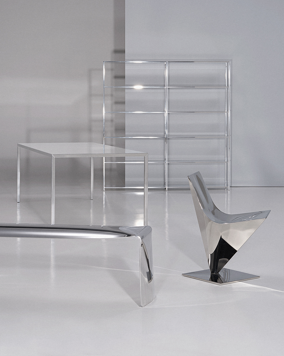
Highly polished metals are having a resurgence in living room trends, with designers working with such materials in new forms and applications. Alluding back to the popularity of materials such as aluminium and steel in the 1950s, we are falling in love again with the glamour and finesse they bring to the home.
MDF Italia have reimagined four of its iconic designs in polished steel and aluminium When bringing this into the home, don’t be afraid to mix different metals and finishes to create added depth and interest.
15. Limewash paint
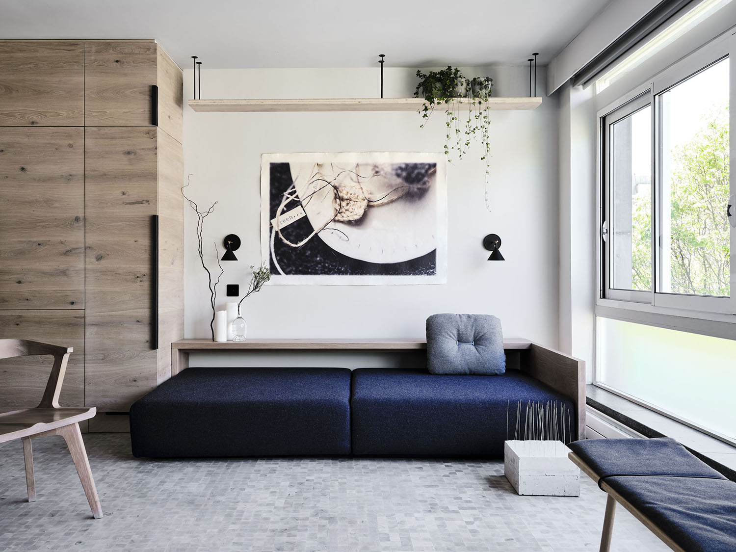
With its breathability, non-toxic and plastic-free qualities making it a popular choice for historical and period architecture across the world, limewash has been used over centuries with its textured, velvety aesthetic being loved by many. It helps to create pleasing, transitional-style living rooms.
This appearance has again become increasingly popular, and, thanks to Francesca’s Paint, it is available to buy in a ready-made format making application a lot simpler. With a variety of shades available, bringing this finish into a contemporary interior has never been easier.
16. Gallery-style elegance
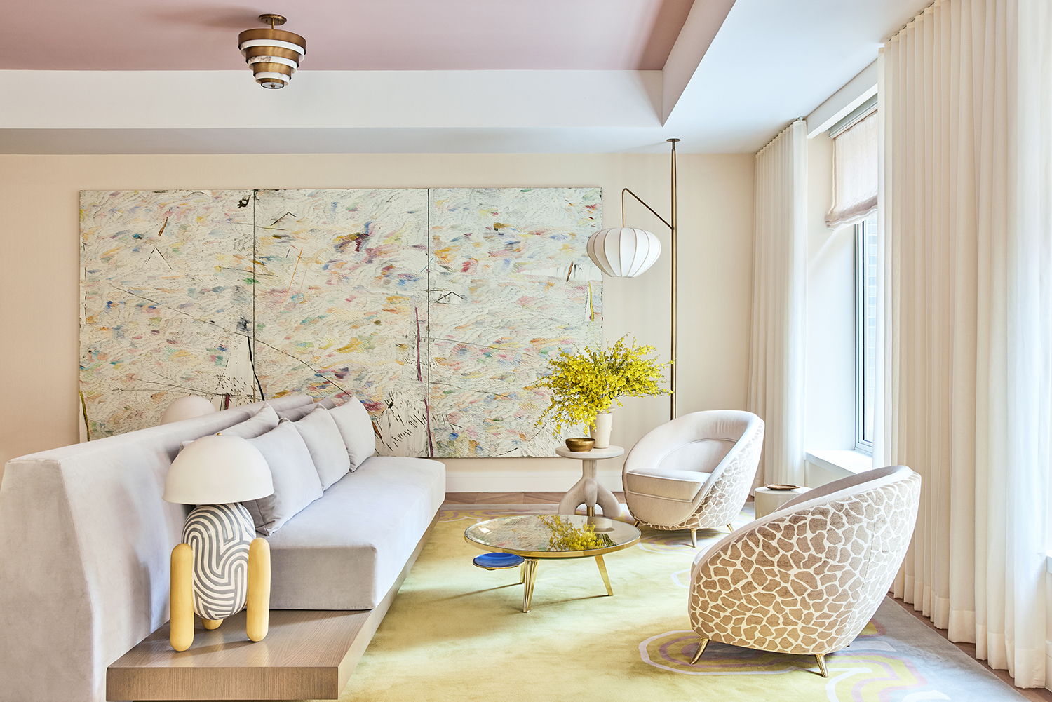
Opting for a curated collection of lovely things is a sure-fire way of getting an original interior. 1228 Madison Avenue is a modern, boutique residential building with architecture by Robert A.M. Stern Architects and interiors by Kelly Behun Studio, and is full of modern living room trends.
The apartment building in question is located in the Upper East Side’s Carnegie Hill, one of New York City’s most storied and classically elegant neighborhoods. Founder and lead interior designer Behun comments, ‘I designed one of the full-floor apartments as a living gallery; a space filled with my own custom designs along with some of my favorite furniture, lighting, rugs, art, and accessories. It is a homage to my favorite gallery spaces and the style reflects the refined and elegant feel that galleries tend to embody.’
Behun’s sensitive approach to the living room design means that whilst it works as a whole scheme, each of the modern furniture ideas and piece of art truly sings in its own right. The design for the main room, referenced as ‘The Great Room’, all started with the wow-factor rug. ‘The notion of a traditional bordered rug that you might see in a townhouse on the Upper East Side was what inspired the design’, says Behun. ‘Instead of using straight lines, we designed a series of undulating shapes and forms that flow around the rug margins.
17. Cocooning and calming color palettes
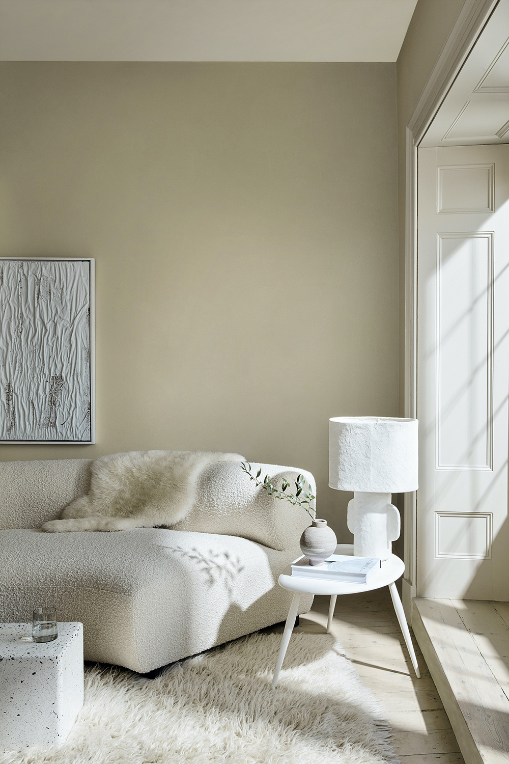
Ruth Mottershead, who is the marketing director at paint and wallpaper brand powerhouse Little Greene, highlights tranquility and a calming color palette as one of the most major modern living room trends, as a result of the pandemic and people looking to seek ultimate comfort and calm within their home surroundings, with more soothing living room color ideas.
Ruth says, ‘over the last year we have seen a big shift from cooler tones towards softer and warmer shades, helping us to create cozy spaces within our homes. Neutrals and warm tones help us to create calming and restful schemes, working particularly well for bedrooms and living rooms, spaces where we seek peace and comfort. ‘These tones really make a space feel modern. They transition well from season to season and have been very popular over the last year as we have sought out neutral tones and natural texture.'
‘Neutral tones, such as our Little Greene Normandy Grey and Stone Mid Cool are very versatile and are easy to combine with warmer olive greens, paler creams and other earthy tones for a more dynamic and contemporary look. For a more harmonious scheme that is calming, yet still looks fresh and uplifting, look no further than a selected mix of white tones. Our new Silent White family exists for exactly this reason. Neutral White, available in paler and darker variations of the same shade, can be used in combination on walls, ceiling, and paneling for a sophisticated tonal scheme whilst simultaneously providing soft warmth. Effectively, you can bring interest by shifting shades in the most subtle of ways’, says Ruth.
‘Whichever colors you opt for on the walls, layering in a few textural elements will help to tie the scheme together and ensure it looks fresh; wooden finishes, wool, and linens will really help bring the room together and make it feel new. The most successful way to make a cocooning and calm living room work is by bringing in a textured boucle sofa or armchair, a deep pile rug, and cushions and accessories which give the living space a relaxed vibe.’
18. Rustic wall panelling
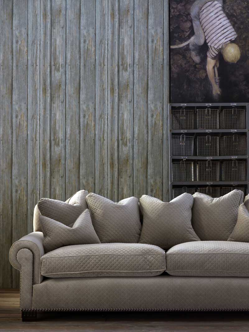
There are no flies on this decorating trick. Wall paneling, which is by no means a new invention we admit, has seen a resurgence in popularity recently as people look for alternative ways to bring interest into their living rooms, other than the traditional wallpaper and paint methods. However, this modern living room trend is all about thinking wall paneling with a modern twist!
Whether you opt for a sleek 1960s style slim-line paneling, or indeed a more traditional period formation with beading and detailed molding, it’s all about the color you paint or indeed the finish that you coat it with. It can also be about being clever and creating a paneling effect but with wallpaper. We caught up with Martin Waller, founder of Andrew Martin, one of the UK’s most prolific wall treatment design houses, to ask how you can make sure that your wall paneling is oh-so modern!
‘Wall panels add subtle textures and still achieve their original function of maintaining warmth, fulfilling our longing for the tactility and natural materials that modern life is often lacking.' Martin says. 'Wall paneling is often seen as a traditional application to our homes but fast forward to today and many people are adding their own spin to paneling, making it a more accessible design trend.'
'Take a traditional wall paneling for example - as soon as you paint it a contemporary tone of paint then it instantly takes on a rather joyous and modern aesthetic. If taking part in this DIY task seems overwhelming, you can also achieve a wall paneling look through the use of wallpaper - design trick 101! It's one of those living room wallpaper ideas that offers the same effect but requires minimal effort.’
19. Bringing the outside in
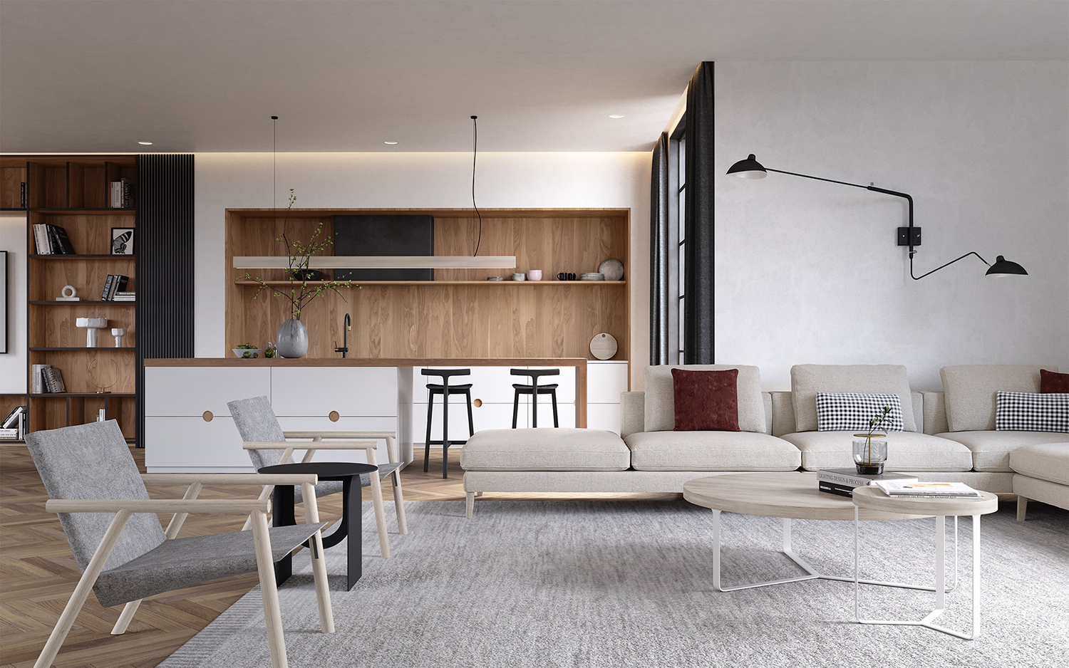
Design by Sova Studio
Bringing outdoor elements into a living room needn’t involve oversized palm prints and glaring green tones, that’s the word on the street when it comes to modern living room trends in 2024. It can be achieved with the most subtle of touches that are perfect if you prefer neutral living room ideas; wooden surfaces, natural woven fibers, and a general, subtle, infusion of nature in the interior design scheme.
For New York-based interior designer Ewa Podgórska, this is exactly how she approached the living room in her Luna House project. Podgórska says, ‘In designing spaces of the Luna House, we looked to nature to create configurations for depth, openness, and refuge. Nature is particularly evident in the material finishes and subtle texture choices in the main living room space’ says Podgórska.
‘In this design, we create connections with the use of natural materials, like wood, stone, natural fabrics (think natural woven wool textures, linens, and natural fibers like jute). We focus on subtle textural differences, so each piece has a unique tactile effect. Smooth, rough, polished, brushed – even the same material will feel unique to the touch depending on how it’s finished!'
'Another thing we borrow from nature is the use of the - often subtle - variety because nature loves diversity. So when using wood, we like to mix a few different species and colors of the material in the same space. Colors are soft and neutral, yet we add touches of unexpected patterns, to have that small element of surprise and interest. It’s all about layering. Simplicity can also be dynamic,’ explains Podgórska.
Want to recreate the subtlety of this trend? Seek out your natural materials and cues and keep it all understated and calm.
20. Very dark walls
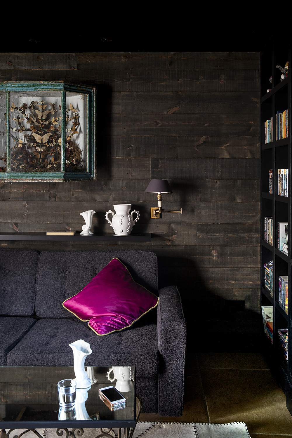
‘Dark tones feel incredibly inviting whether you're in for the day or reading deep into the night,' says Patrick O’Donnell, Farrow and Ball’s brand ambassador. 'A living-room-meets-workspace with a velvety Down Pipe tone feels smart and business-like during work hours, yet glamorous enough to set the scene for intimate dinners or relaxing when the day is done.'
We're seeing that dark walls are feeling like the hug we all feel we need. But to stop them looking too gothic, add in some brighter accessories - a hot pink cushion will really pop.
21. Downtown urban city chic
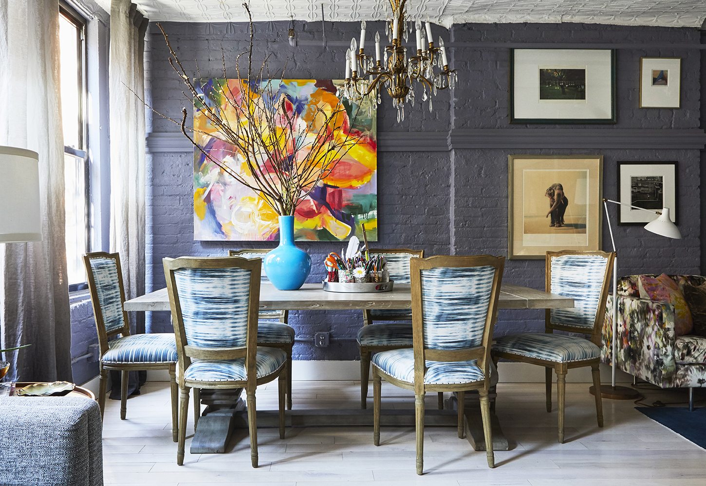
Bringing the urban city apartment look right up to date, with a certain downtown chicness, is New York-based designer Rayman Boozer. We’ve had the Industrial trend. You probably know what that looked like. Stripped back steel, burnished metal fittings, and lots of copper and exposed filament bulbs. Well, it’s moved on. Take your industrial apartment or warehouse-style and get confident with color, says Rayman, a proponent of this modern living room trend.
Brick walls or wall paneling looks brilliant painted out - softening the backdrop - with a muted color hue. Boozer has the ultimate touch when it comes to transforming a downtown living room.
‘Color palette can really set a tone for a room, and particularly in your home, it sheds light on your personality!' Rayman says. 'You can walk into a space and instantly learn something about the inhabitants without speaking a word. The real challenge is discovering what personality to emote.'
Recreate that urban city buzz and energy with a smorgasbord of colorful furnishings, accessories, and art, against a smooth and sophisticated backdrop hue. It’s confident and it’s new. If the infamous - original - Carrie Bradshaw apartment needed a 2024 interior overhaul, our bets would be it would be looking like this.
24. 20th century magpie
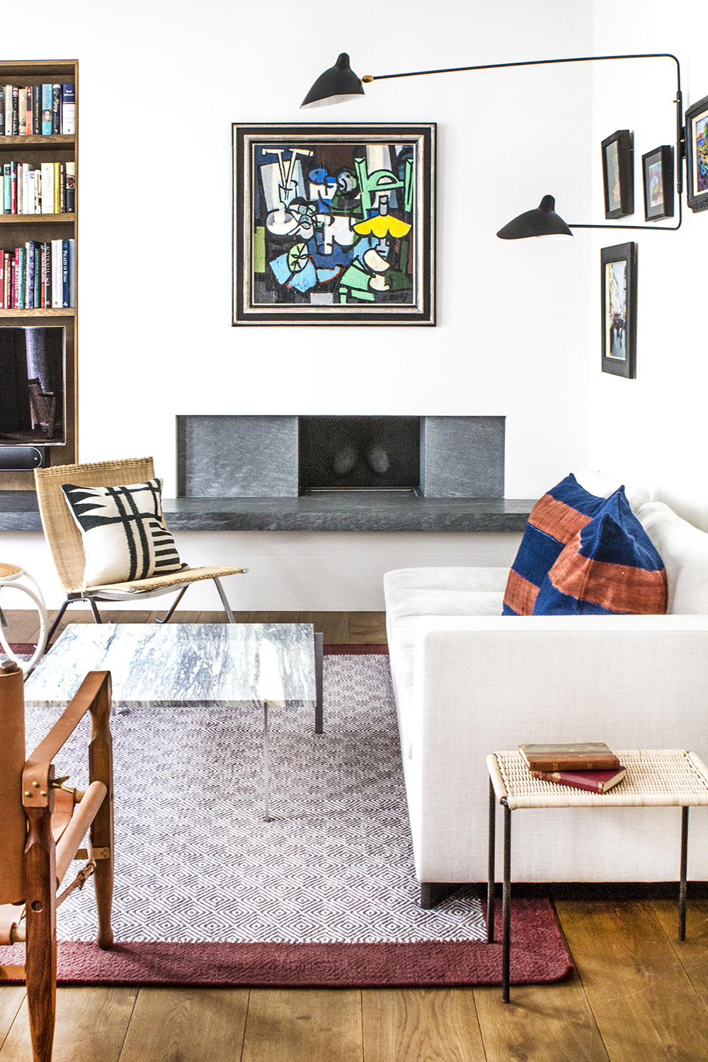
Reclaimed, vintage, and modern antiques are a buoyant trend in the interiors industry. Mid-century modern furniture design pieces, in particular, prove greatly appealing for interior designers and their clientele.
Kurt Kovacs Braidley, gallery manager at Sigmar, a King’s Road-based interior design business that specializes in the sourcing and supply of unique and highest quality 20th century design furniture and lighting, says ‘Including original vintage furniture and objects within an interior is a necessity for us. It’s our raison d’etra. Most people are aware that putting something old within a new space is a good way to inject warmth and character into a room. However, sourcing the right vintage piece for an interior can do much more. The perfect armchair, chair, or coffee table can help make a space more operational, breathable, and calm. It is all about feeling.'
'Generally speaking, we find that objects from the past were awarded a greater level of consideration in regards to their design and materials. You have to go far to match the same levels of craftsmanship and inherent uniqueness in today’s world. Specifically, Modernist design from the Mid-20th Century, an era characterized by Utopian post-war reconstruction, was resolved in being better than what came before and pieces were designed to last. In a nutshell, the high level of consideration put into designs of the Mid-20th century design items means that they retain a sense of traditional craftspersonship even though, more often than not, they utilized modern industrial materials and were mainly produced by machine. Include a 20th century item of quality, say a table or chair from the mid-1950s or 160s, and you instantly add a higher level of design to your living room.’
25. Dusky yellows
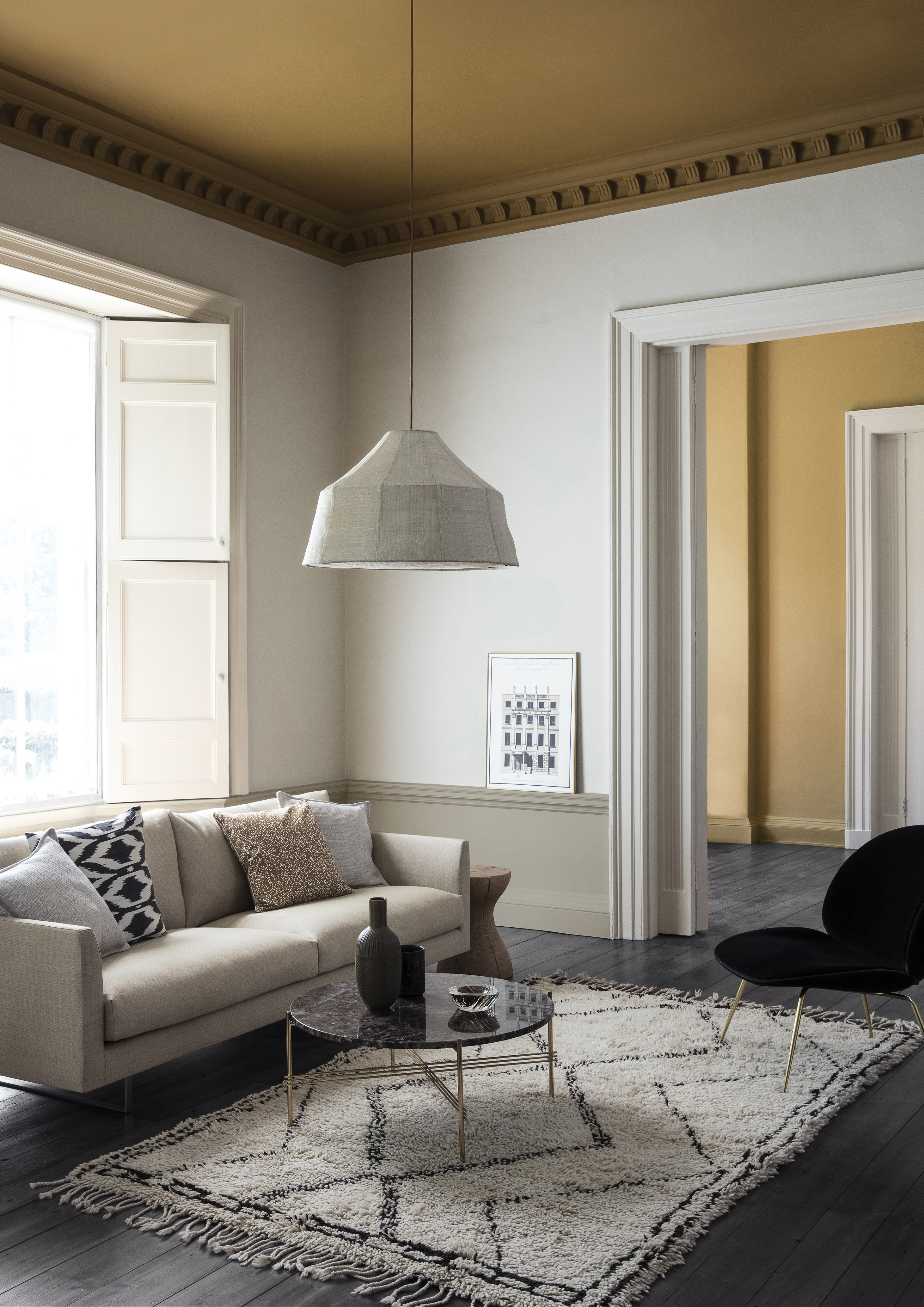
'For a living room, the use of yellow can create a mellow and uplifting interior all at the same time,' says Martin Waller of Andrew Martin. 'It transports us back to long lazy sun-drenched days in the Mediterranean and it can brighten us up on gloomy days. It works brilliantly with blues, teals, greens and reds, and for real crisp freshness use with white. But if you want to opt for tones such as grey, this will help create the illusion of space.'
Now yellow can be a tricky shade to work with, but pick the right one and choose the best colors to pair with yellow and it can transform a room into a sunny cave of warmth and comfort. And if painting all four walls seems like too much of a jump, be inspired by this living room trend and just take it up onto the ceiling for a subtler look.
What colors are on trend for living rooms in 2024?
As a lot of these living room trends show, when it comes to colors there has been a huge shift over the past year from light, airy, bright rooms to colors that instill more of a cozy comforting vibe. So rather than crisp white walls and grey sofas we have seen in past years, it's now all about warm hues – creams, beiges, ochres, terracotta, and when done right, even browns.
And the colors are getting bolder too. Maximalism is back in a big way but with more of a curated, less cluttered vibe and this look is all about experimenting with colors as well as prints. More muted versions of the primary hues are seeping into interiors, red for example, a once rarely used shade, is popping up more and more frequently in living rooms adding vibrancy but also that warmth too.
The key colors for living rooms in 2024 will be brown, black, yellow and green.
What furniture in on trend for living rooms?
The love for Mid-century modern furniture isn't going anywhere let's just say that from the off. Those clean, slim lines are still a huge living room trend. But, again linked to the whole comfort trend, furniture that's cozy and comfy and curvy is creeping in amongst the simple silhouettes of Mid-century modern pieces.
Tactile upholstery is here too, boucle, velvet, suede, fabric that feel good to touch are on trend living room furniture ideas.
We're also seeing a big return to symmetrical living rooms and placement of furniture in an orderly way to help promote calm.
Be The First To Know
The Livingetc newsletters are your inside source for what’s shaping interiors now - and what’s next. Discover trend forecasts, smart style ideas, and curated shopping inspiration that brings design to life. Subscribe today and stay ahead of the curve.
Keith Flanagan is a New York based journalist specialising in design, food and travel. He has been an editor at Time Out New York, and has written for such publications as Architectural Digest, Conde Nast Traveller, Food 52 and USA Today. He regularly contributes to Livingetc, reporting on design trends and offering insight from the biggest names in the US. His intelligent approach to interiors also sees him as an expert in explaining the different disciplines in design.
- Roddy ClarkeDesign Expert
-
 Burl Wood Decor Is 2025’s Most Coveted Comeback — Here’s How to Get the Storied Swirls for Less
Irregularity is the ultimate luxury, but you don’t need an antiques dealer to find it
By Julia Demer Published
-
 5 Garden Features That Instantly Add Value to Your Home — While Making Your Outdoor Space More Practical, too
Get to know all the expert tips and tricks for making your backyard a standout selling point for your home.
By Maya Glantz Published