Living room dining room combos - interior designers explain how to create the most beautiful dual-purpose space
Top designers explain how to decorate ideal living room dining combos, perfect rooms made for relaxing, eating and entertaining

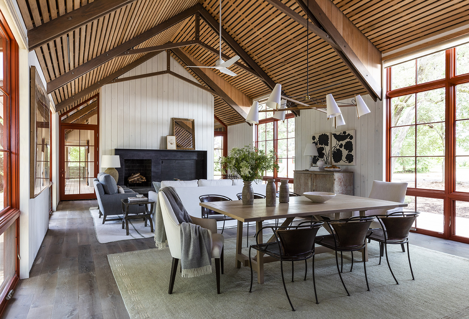
Open floor plans are the most aspirational style of home design right now. Informal, relaxed and spacious, it's a format that lends itself to both family life and grown up entertaining spaces.
Open plan rooms are not without their drawbacks, though. Potential decor pitfalls are many. Often, great rooms will accommodate both the living and dining areas, but how should one go about unifying these spaces while ensuring that each one sings on its own?
As with any living room ideas, the most important thing, according to designer Marie Flanigan, is to really think about your family’s needs so the space “will best serve your household.”
Designer Scott Sanders says he loves large rooms with multiple functions because “it’s a great way to break up the space and create a captivating visual narrative.”
Meanwhile, according to designer Bo Massey, “It’s important for all furnishings and finishes to coordinate in order to have a cohesive space. And if you happen to be working with a rather small footprint, make sure to scale down the furniture as much as possible while still maintaining comfort.”
In living room dining room combos, both areas should be in keeping with one another, says designer Philip Gorrivan, “but there should be some sort of transition between them to keep the room feeling energized and accommodating.”
Read on for more advice from the pros about creating the perfect combination living-dining room.
The Livingetc newsletters are your inside source for what’s shaping interiors now - and what’s next. Discover trend forecasts, smart style ideas, and curated shopping inspiration that brings design to life. Subscribe today and stay ahead of the curve.
Decor tips for living room dining room combos
1. Keep furniture low
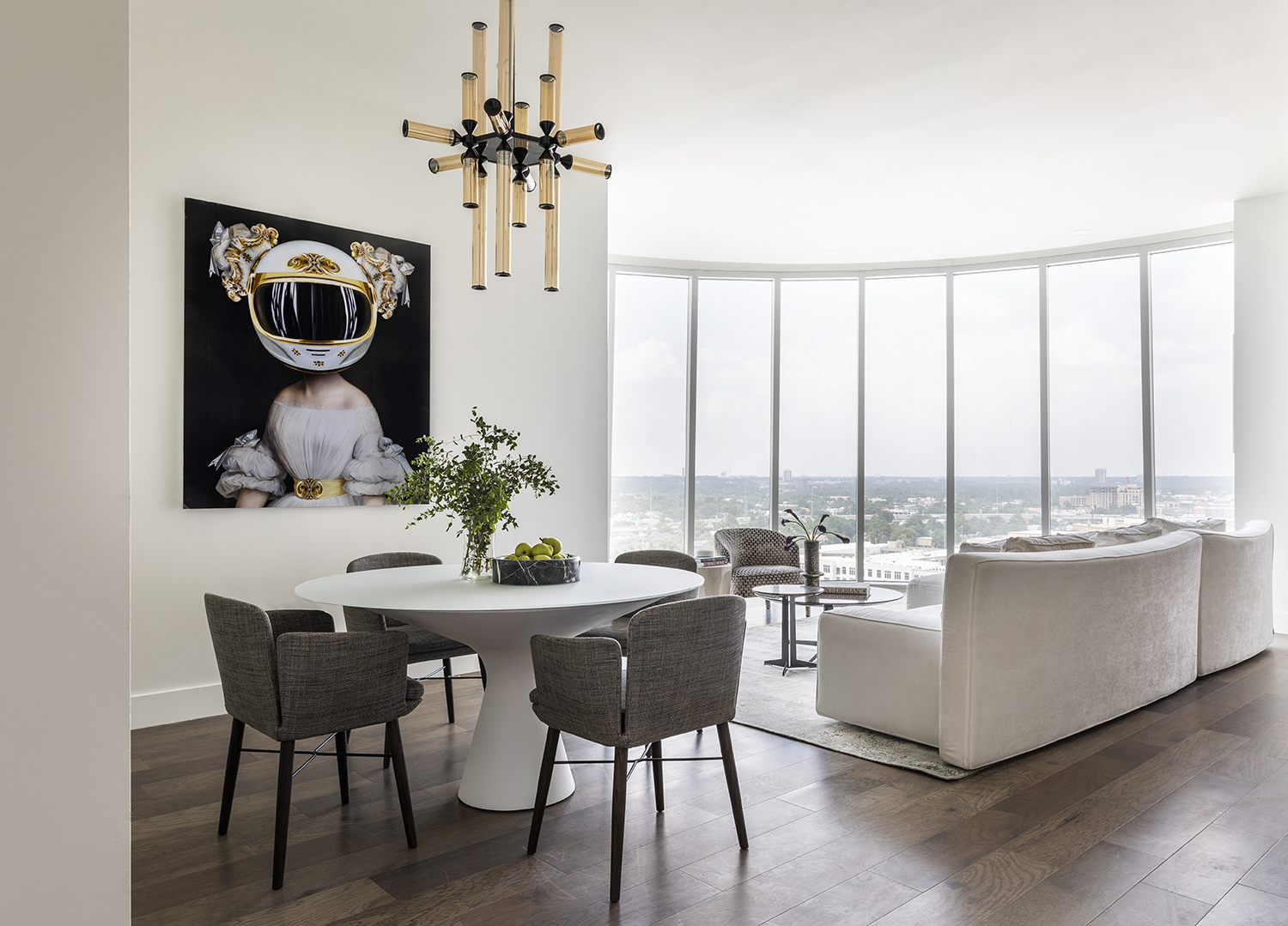
While empty, living room dining room combos tend to look pretty vast. But as soon as you've added in your living room furniture, your dining table and some chairs then you realise how important it is to get the scale of everything right.
Although this penthouse condo is a bit limited in terms of the overall square footage, it was important to designer Nina Magon to give her clients living and dining areas that felt unique yet cohesive.
“We used low, modern furniture in each space to allow for a harmonious flow from one to the next,” explains Nina. High backed furniture would have felt obstructive, interrupting the sight lines. “Both areas feel tailored and separate, but not cut off from one another. The open layout works well for both lounging with the family or entertaining guests.”
2. Place tall storage at the sides as subtle dividers
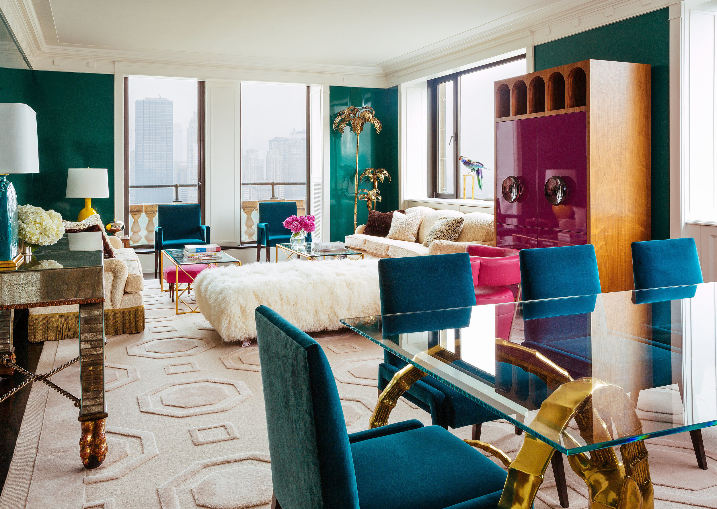
In this city apartment designed by Philip Gorrivan, the living and dining areas occupy one large room. Because the spaces are so close together, they share both a living room color palette and a rug.
However, a console table and a tall cabinet placed between these two zones helps separate them visually. “When it comes to urban living, it’s critical that space be properly utilized,” says Gorrivan. “This room is divided with different purposes in mind, while maintaining a clear flow—both for ease of movement and ease of living.”
By positioning these storage pieces at the side of the room, they don't get in the way of the sight lines, but they do help to subtly cause a distinction between the two zones.
3. Think individual yet related
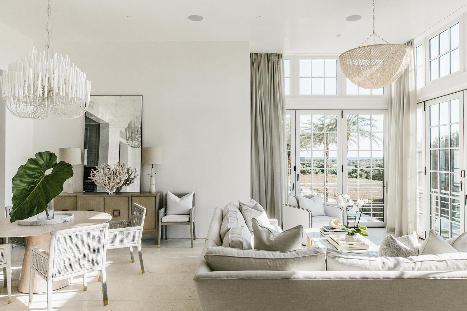
Design: Bo Massey of the firm Bohlert Massey
In order for the living and dining areas to maintain their own boundaries, it’s crucial that the furnishings clearly differentiate the zones. In this neutral living room, for example, there are several visual cues that help divide the two functions.
The living area is designated with the help of the sectional, windows, and light fixture; and the dining area, by the sideboard and a different light fixture.
Meanwhile, a serene palette throughout unites the spaces. “We utilized natural wood tones, unlacquered brass, and various shades of gray and white,” says designer Bo Massey. “Several different finishes—like rattan, coral, cerused oak, and stone—lend texture and visual interest to the space.”
4. Commit to one palette
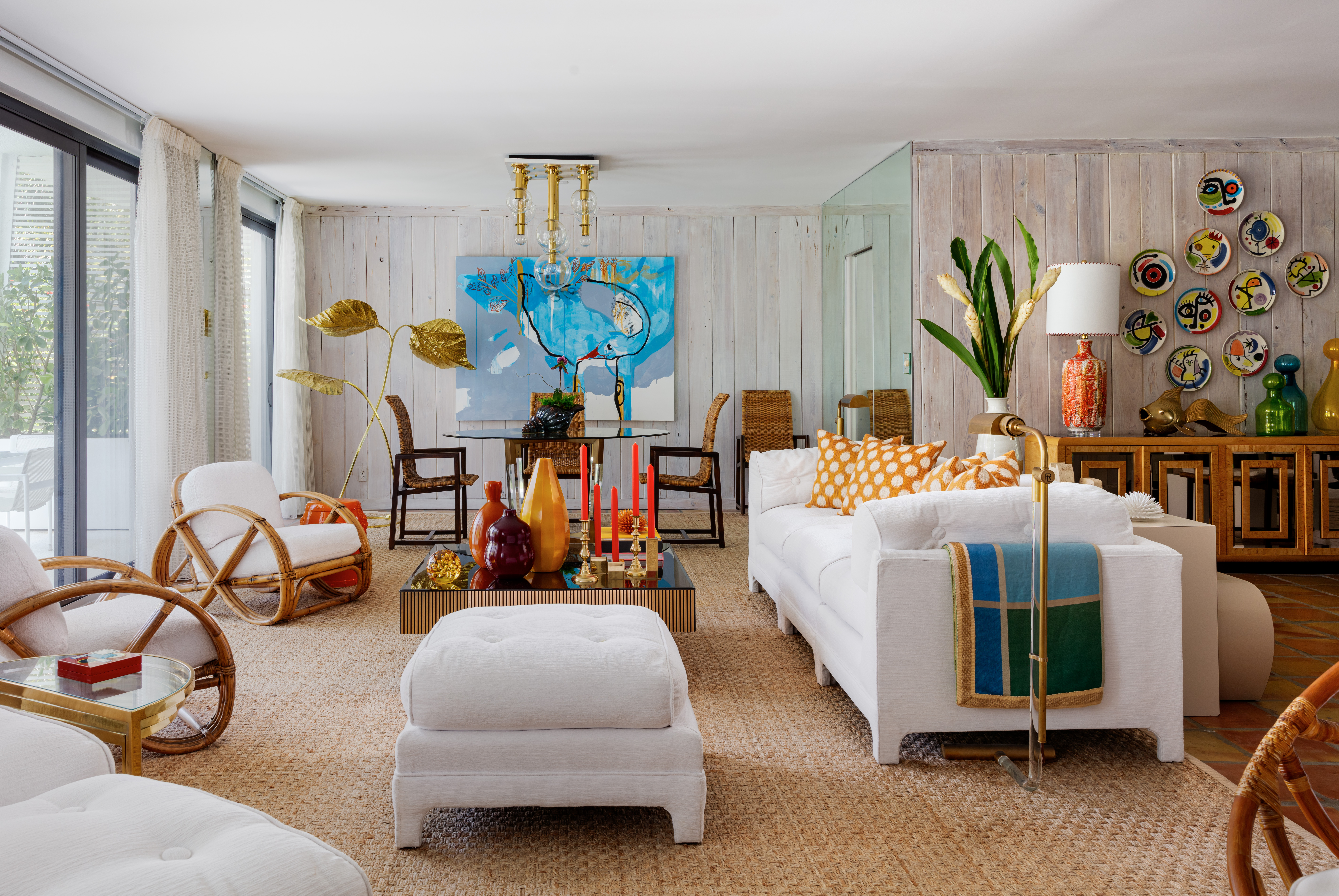
According to designer Scott Sanders, maintaining a consistent color palette throughout the white living room and dining areas is the key to “a cohesive, sophisticated design. For my own apartment, the white upholstery matches the architecture, while hints of orange connect to the vintage Mexican tile floors, and natural woven carpeting adds warmth. Working within this color scheme paved the way for vibrant art and accents throughout.”
In fact, the entire room is chockfull of colorful treasures that Sanders and his partner have collected throughout the years. But, by keeping the main palette white, the space doesn't feel overcrowded. “These items speak to us and make our home feel special and personal.”
5. Separate the areas with area rugs

In this home, a soaring great room contains both the dining and living areas. Designer Marie Flanigan focused on establishing a multifunctional space that feels open yet cozy at the same time. The best living room rug ideas are so much more than just about what you're walking on, but can direct how well the space works.
“We needed to compartmentalize the room, and the best way to delineate different areas is to add rugs, which anchor and define a space,” says Flanigan. “You’ll notice that these rugs are very similar in size, which allows for symmetry between the living and dining areas while creating a natural pathway through the room.”
6. Create a calming space for both day and night
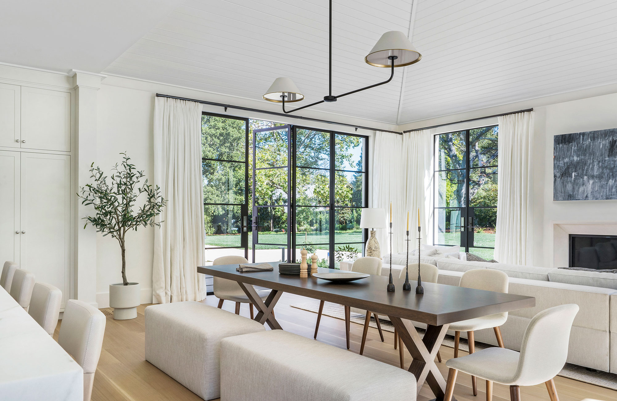
Informal areas help to make this expansive great room feel more approachable. “This is where the family spends most of their time together, and the room functions just as well for large cocktail parties as it does for small family gatherings,” notes designer Heather Hilliard.
The only color comes from the leaves of the indoor tree, a nod to the expanse of greenery seen through the Crittal-style doors.
“In order to unify the spaces, we kept the color palette consistent. When you need to have lots of large furniture in one room, calming, neutral colors work well and don’t overwhelm the space.”
7. Separate the areas with a semi-wall
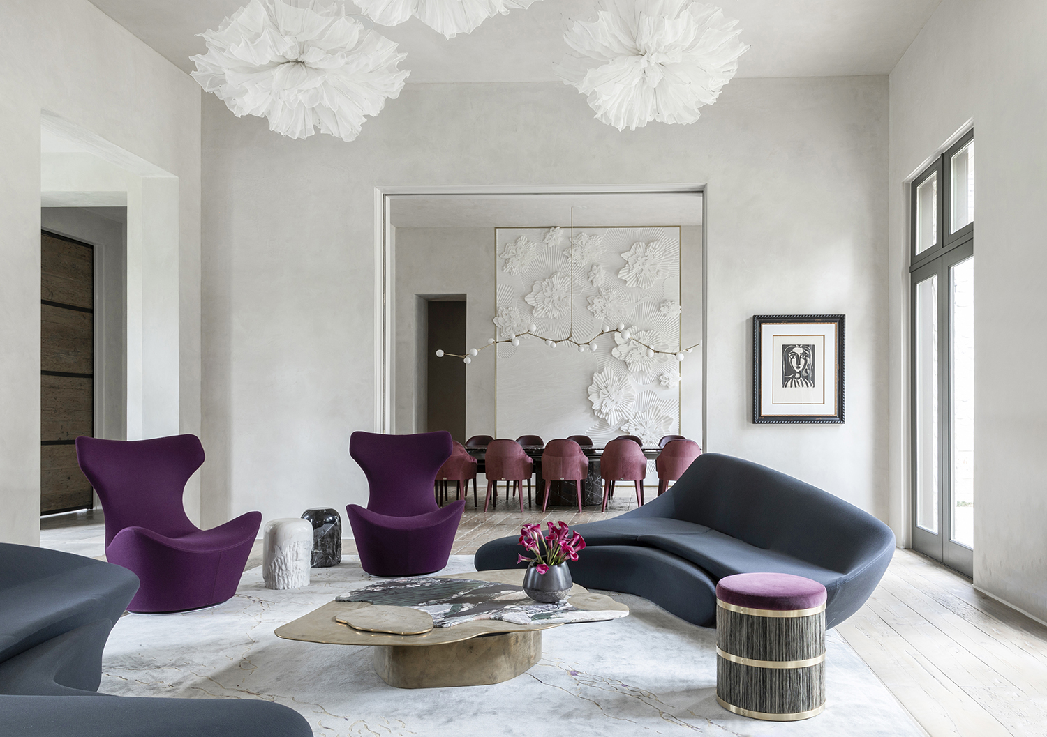
In this contemporary residence in which the living and dining rooms are open to one another, designer Nina Magon doubled down on the drama. By putting a semi wall in between the two areas but leaving what could have been a doorway unfilled, there is a distinction between the two, yet still a sense of airiness and space.
Choosing colorful, sculptural pieces for both rooms allows the home to feel luxurious and cohesive. “We wanted them to have the same bold aesthetic in order to complement one another,” says Magon. “We selected unique, eye-catching pieces for both areas that flow together nicely.”
8. Recess the dining area in a nook
Design by Marie Flanigan
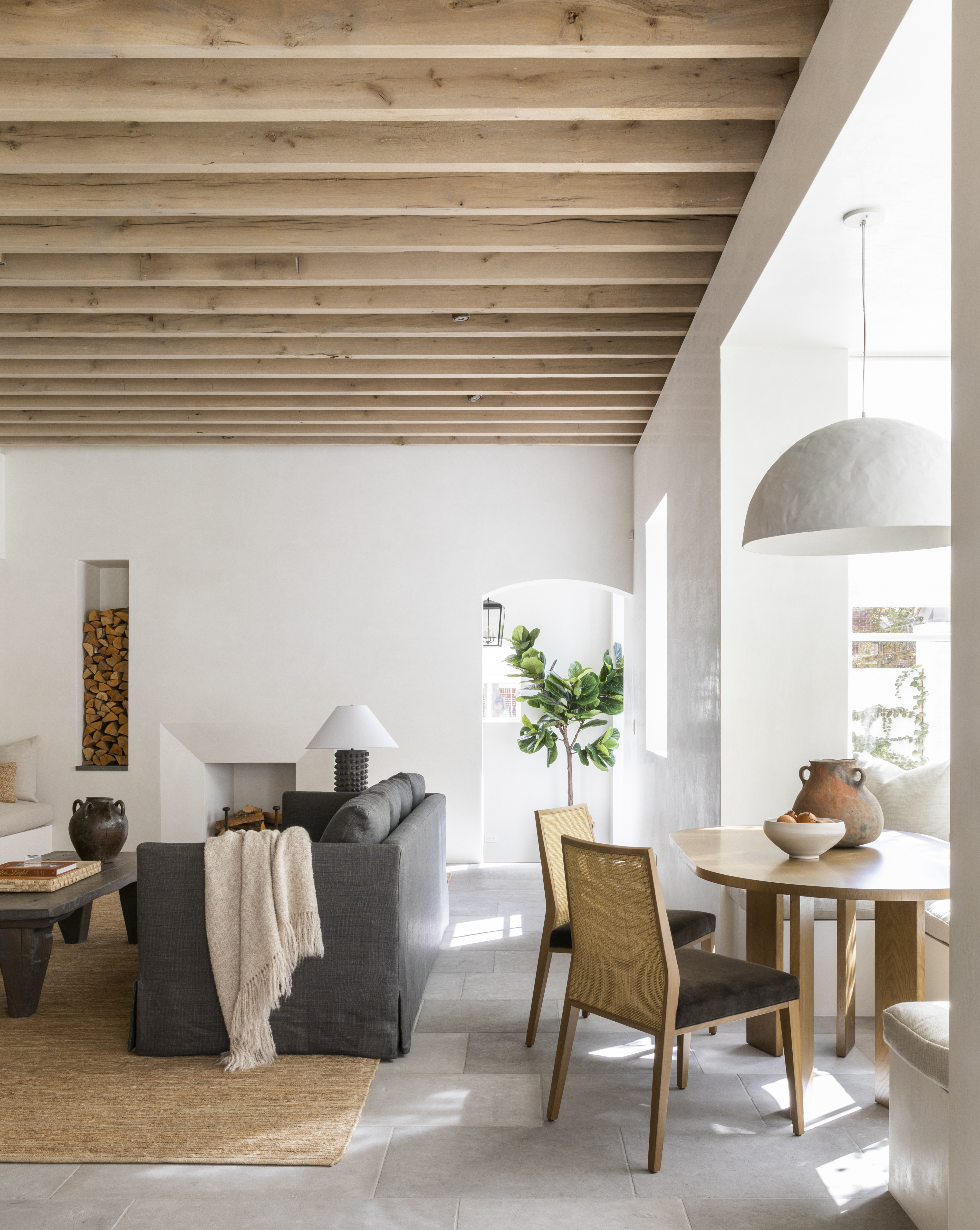
Designer Marie Flanigan wanted to provide her clients with a multifunctional great room that could operate as an entertaining space or a cozy family room for visiting with their children and grandchildren.
“By incorporating a breakfast nook between the kitchen and living room, the homeowners have lots of versatility in how they function within the space,” explains Flanigan. “The table and banquette can serve as a dining area, extra seating during a party, or a serving station. But most importantly, it isn’t cut off from the comfortable sitting area, which is the most beloved space in the house.”
9. Make the most of architectural details
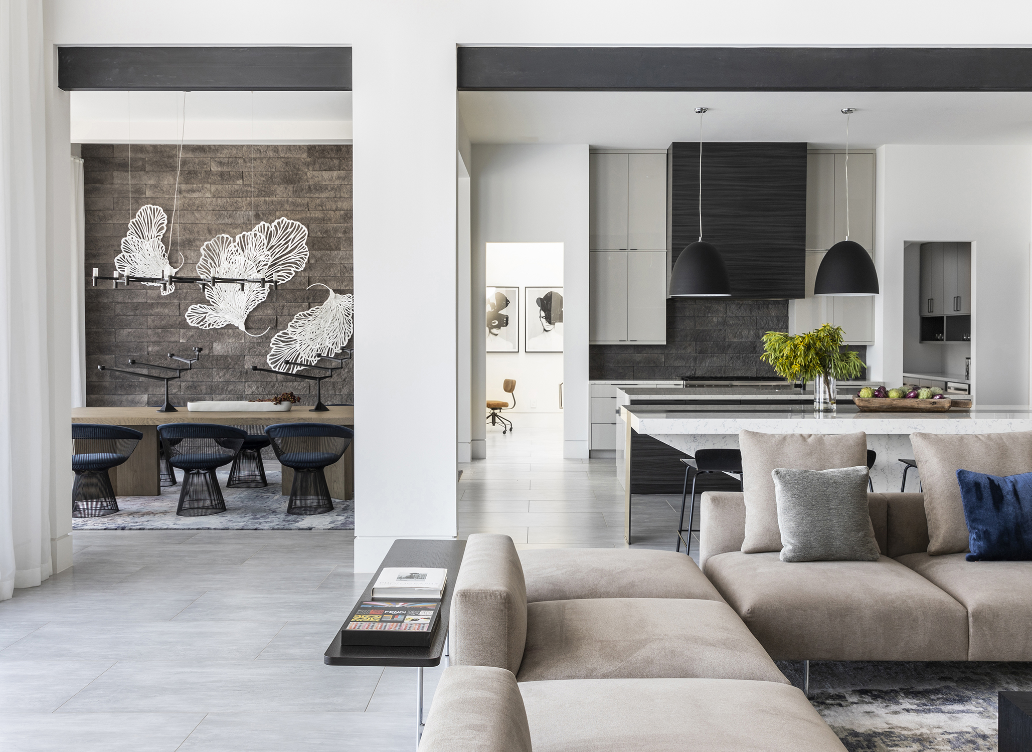
Thanks to the columns, the living and dining rooms in this residence can operate both as self-contained areas as well as a larger entertaining space. “We wanted each space to be separate from one another, but you can also enjoy family and guests no matter which area you’re in,” says designer Nina Magon.
Even if you're not lucky enough to have columns, you can take the room's features and turn them to your advantage. Perhaps there is panelling on the wall that separates the two, or a join in the floor type. Be creative with what you have.
How far apart should the living room and dining room be in an open plan space?
When a room contains different zones, it’s critical that there’s enough breathing room for each area. “Be mindful of the space between groupings,” says designer Bo Massey. “We try to keep a minimum of 36 inches between areas in order to allow for physical passage and avoid visual crowding.”
It's possible to keep the pieces relating to each other, despite this physical distance. “The repetition of colors and materials allow the furnishings and lighting to flow together and create a sense of unity as opposed to discordance,” Bo says.

Alyssa Bird is a New York−based freelance writer and editor with experience covering architecture, interior design, travel, hospitality, and real estate. She has held editorial positions at Architectural Digest, Elle Decor, Hamptons Cottages & Gardens, and New York Cottages &Gardens. When she’s not writing about dreamy spaces, you can find her tweaking the decor in her own Brooklyn home, honing her green thumb, testing out a new recipe, or scouring for antiques.
