10 Before and After Living Room Makeovers That Will Make You Want to Remodel
These living room transformations are so drastic, you won't believe the before and afters
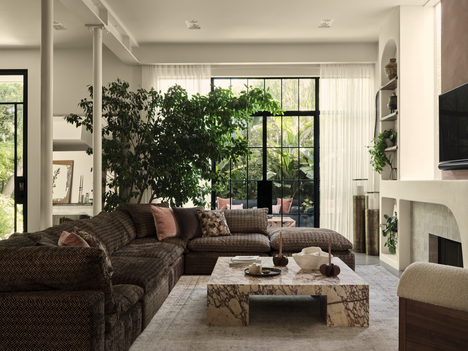

There is nothing more satisfying than a good makeover, a transformation so dramatic it exceeds all expectations, pushing the boundaries of what you believed a space could be.
In this collection of living rooms, we have a slice of inspiration for everyone. Vintage homes made modern, and modern homes made vintage. Living rooms made for hosting fabulous soirées, and spaces designed for family time. Complete restructures, and clever upgrades. No matter your style, we're sure you'll find something that will catch your eye in this list.
These living room ideas prove that with enough creativity, any room can become your dream room.
1. This Virginian living room that brought gothic to the modern-day
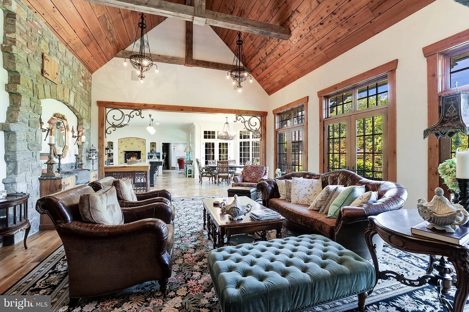
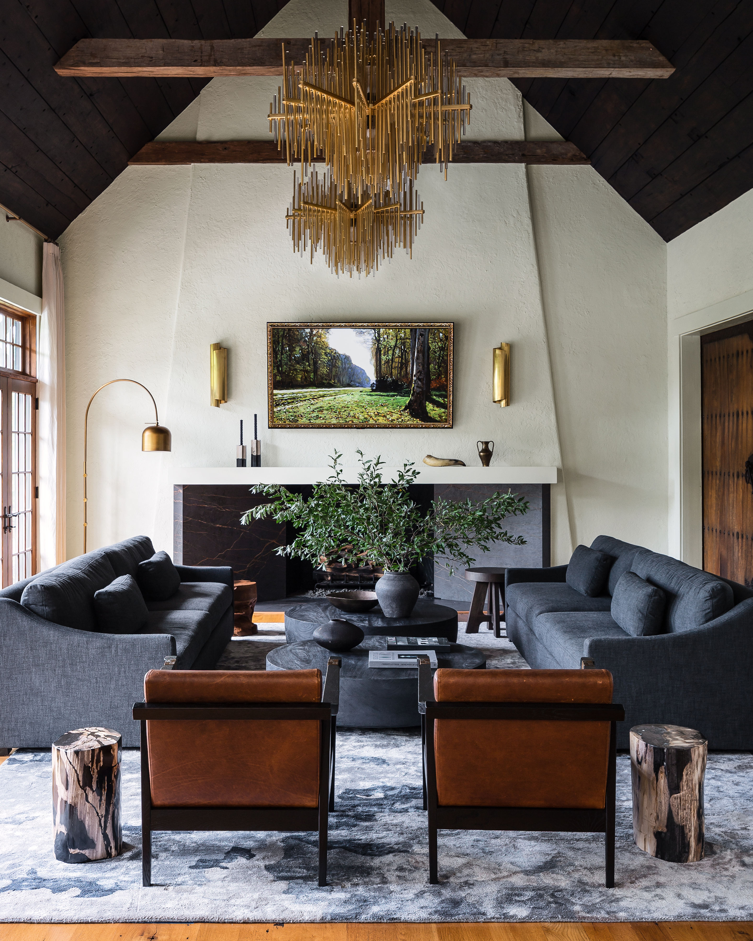
Ann Gottlieb of Ann Gottlieb Design described her vision for this home as 'Spanish Revival meets Gothic,' as demonstrated in the living room's stunning renovation.
Ann utilized the building's striking architectural features within her design, adding chandeliers to the center of the room to accentuate the vaulted living room ceiling. Her use of symmetry elevates the dark, gothic tones, making it appear more modern and sophisticated.
The wood was stained a darker tone to create more contrast within the room, adding a dramatic flair that complements the modern gothic style.
See the rest of this moody home here.
2. This Venice Beach boho room that got a lesson in chic
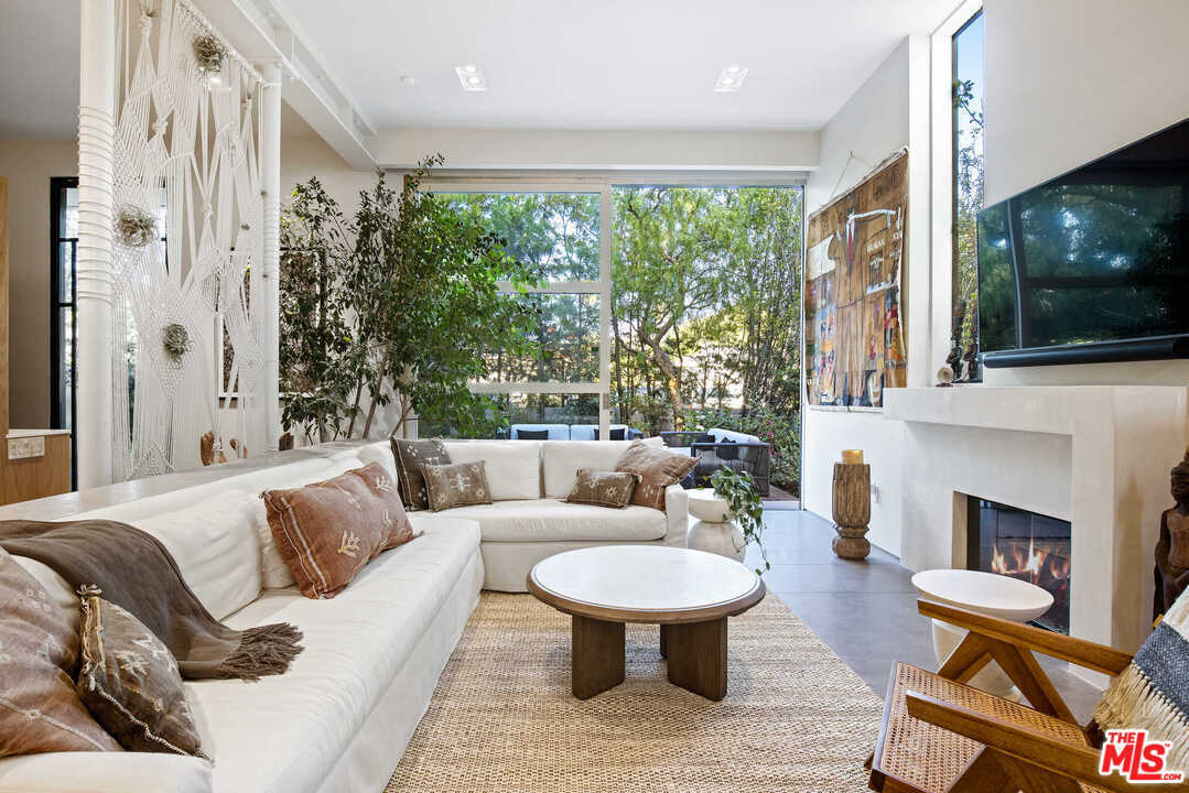

With its large stone fireplace and gorgeous garden views, this living room had the bones of a truly special space. However, its lackluster, boho-beige interiors left much to be desired.
With just a few simple upgrades, Tamarra Younis of Union of Art Interiors created a modern oasis so cozy you would never want to leave.
Bringing in deeper tones through the large, slouchy sofa and the delicate veining on the marble coffee table helped to create a moodier, comforting vibe to the room, a contrast to the beachy look from before.
The sweeping leaves of the large, indoor tree help bring the outdoors in, creating a sense of unison and flow with the garden seen through the floor-to-ceiling windows.
See the full beach-house escape here.
3. The beige loft that turned into liveable jewelbox
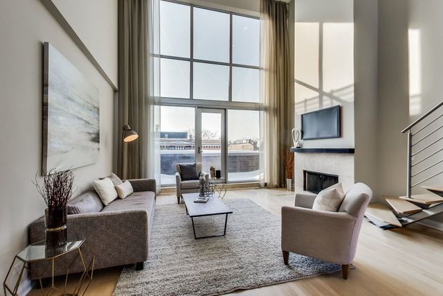

This moody, jewel-toned living area is a stark contrast to the beige blandness that once occupied this space. The room's high ceilings and varied array of seating make it an ideal setting for hosting, and was designed with this in mind.
The warm, dark tones carried through the wallpaper to the carpet create a sophisticated and sultry mood. While unique features such as the antique tapestry hung on the back wall imbue the room with a strong sense of character.
'The grand scale of the wall called for a large piece of art to accompany it,' explains interior designer Lauren Svenstrup.
'We were immediately drawn to the concept of an antique tapestry, and intended for the tapestry to be sourced by our client, so he could have more of a personal connection to the space.'
See the rest of this loft transformation here.
4. The family room that went from formal to flexible
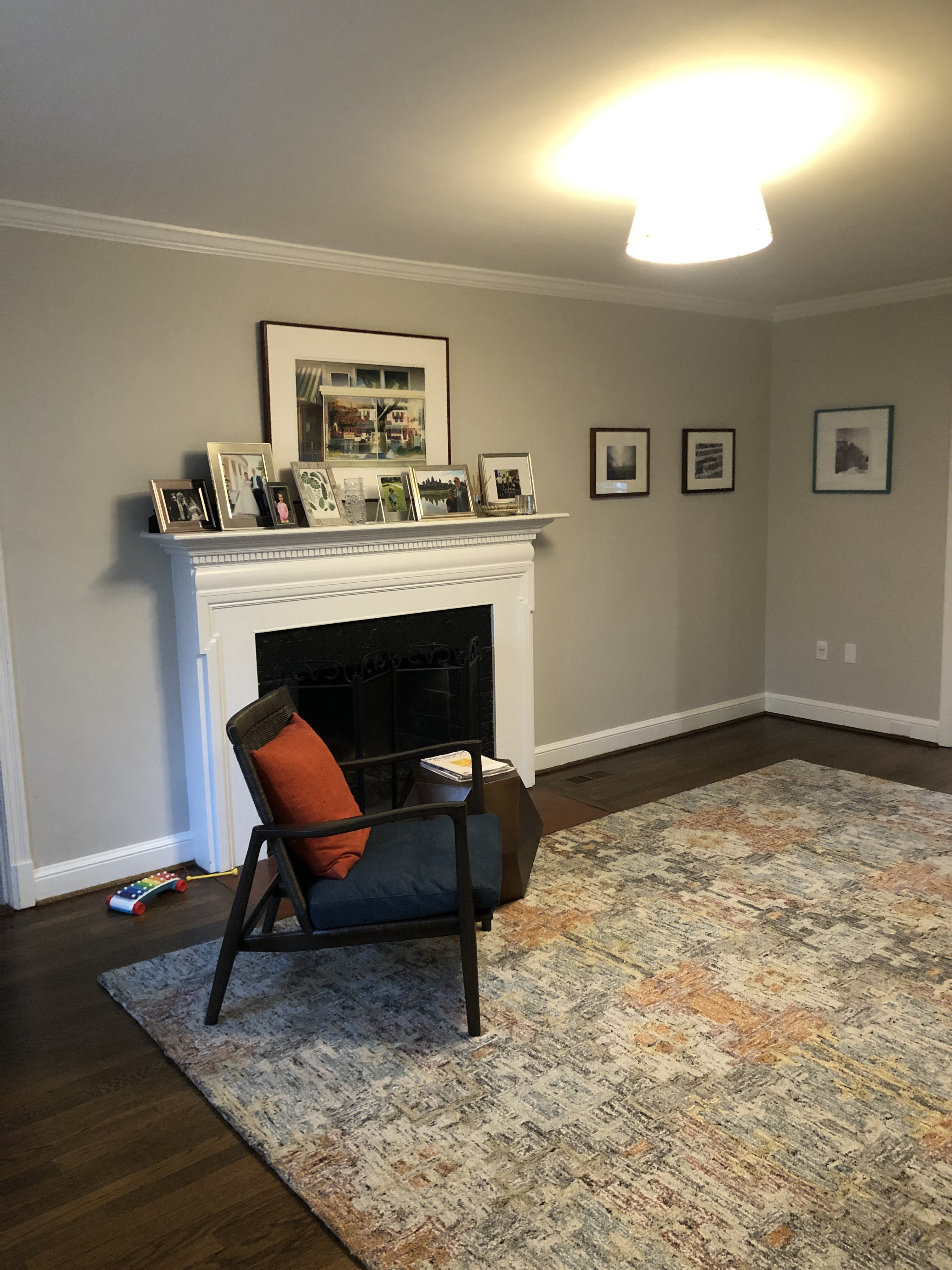
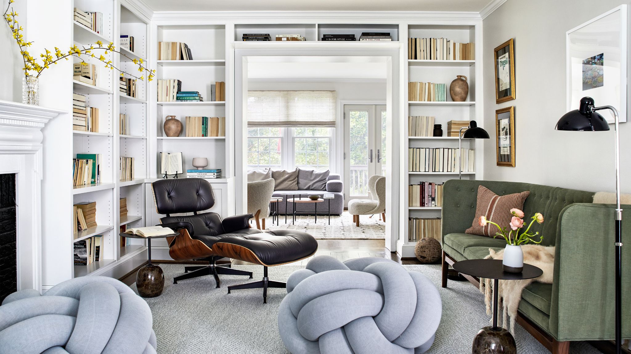
Described by the designer, Kate Ballou, as not so much of a living room but more of a 'pass-through space', it was important to the clients that this room was not overcrowded to allow for a natural flow, yet still functional as a cozy living room.
Ballou took this challenge on with ease, replacing the obstructive coffee table with knotted floor poufs that add a playful touch to the space, and are a hit with the children.
See the rest of this family home here.
5. This LA living room decked out with views and vinyls
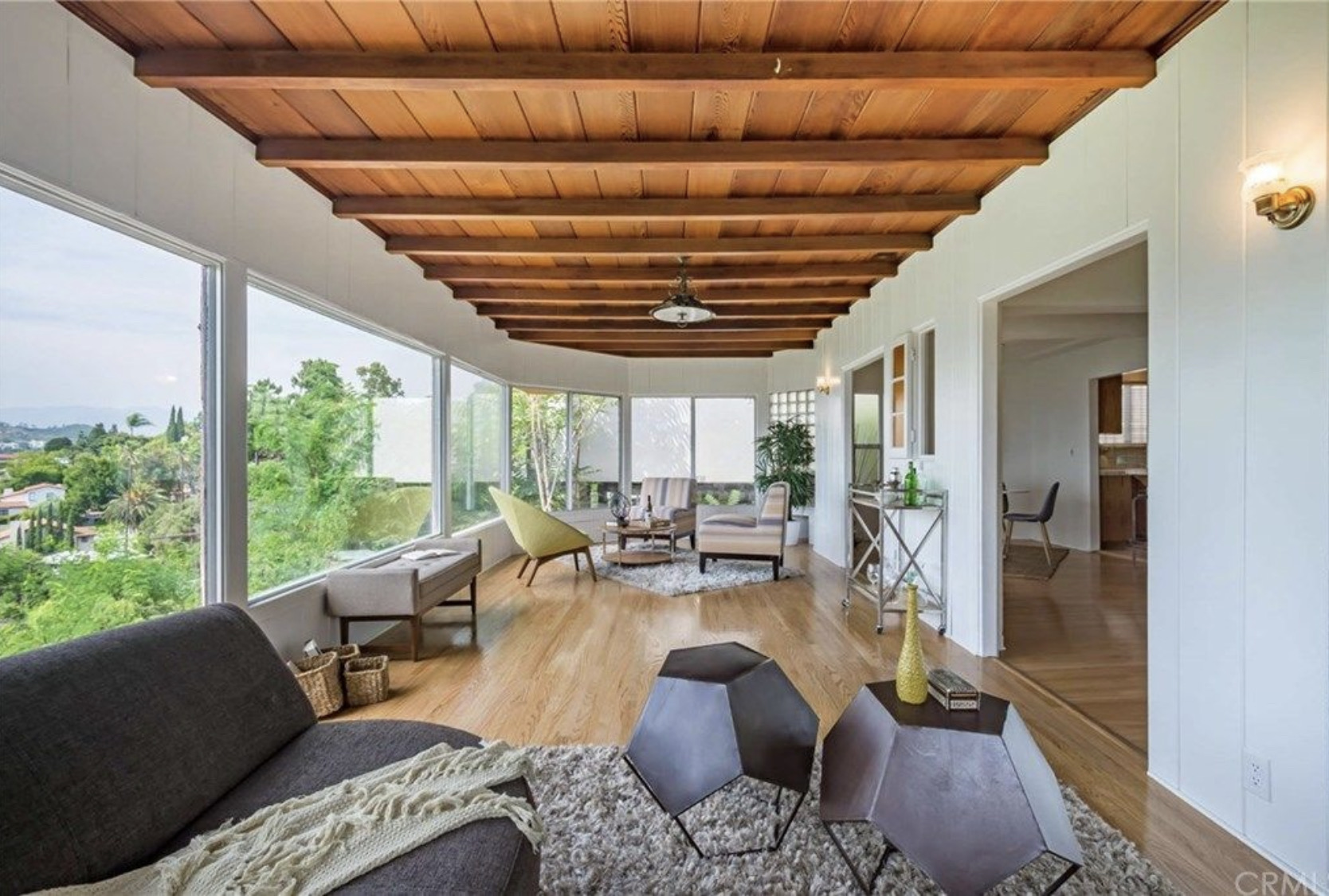
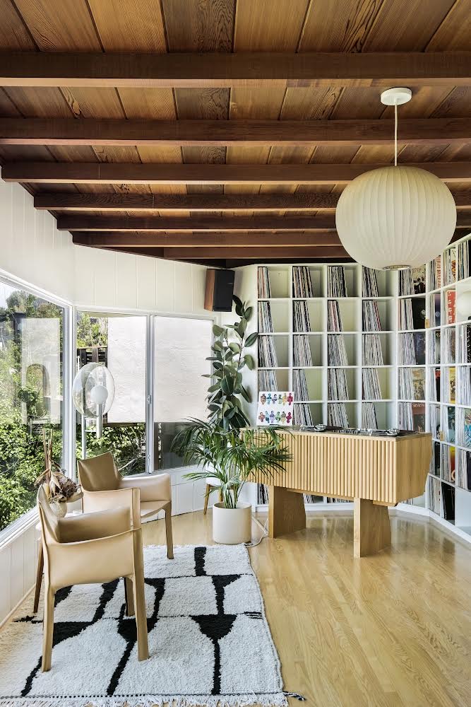
With panoramic views stretching across LA, it's not hard to see the potential of this living area. But its drab furnishings and outdated wooden panelling left it in need of a refresh.
Singer, Mayer Hawthorne, went above and beyond in his renovation, transforming the space into the ideal setting for his weekly 'wine and vinyl' livestreams.
By staining the wall panelling a darker shade, and replacing the flooring with a lighter wood, Mayer brought this room into the modern age. His custom shelving and ribbed wood DJ booth create an effortless California-cool style, complemented by the views of the LA skyline.
See the rest of the musicians home here.
6. This wooden cabin that went from dated to on-trend
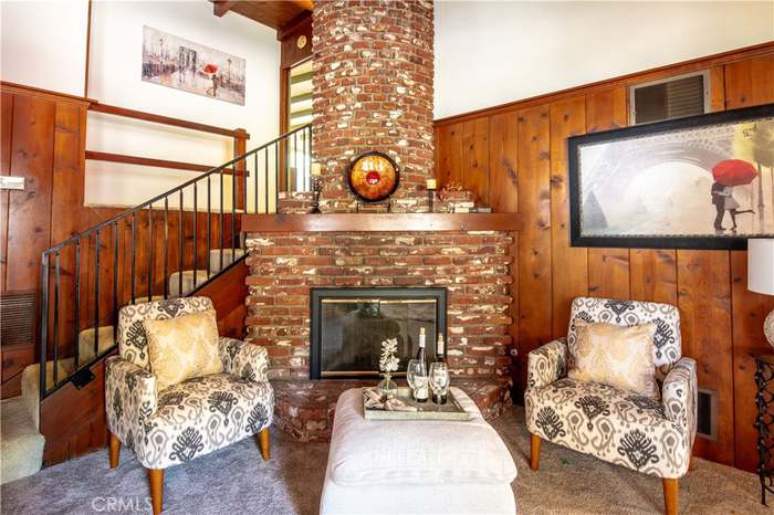

This cabin has brought the cottagecore trend to the Californian hills. But it took some intensive renovations to get there, and is now completely unrecognisable from the dark and dated cabin it was before.
The living room's heavy carpet, wood-clad walls, and dark brick fireplace shrunk the already tight space. Designer Naomi Gibson, of Gibson House managed to completely transform this room while maintaining much of the original architecture.
Instead of ripping off the wooden paneling, Naomi added a white limewash that allowed for a lighter, brighter space, with all the details and texture offered by the wood. A marble frame was attached to the fireplace, keeping the coziness but with a more elegant appearance.
See the rest of this fairytale cabin here.
7. This beach house that was stuck in the 70s
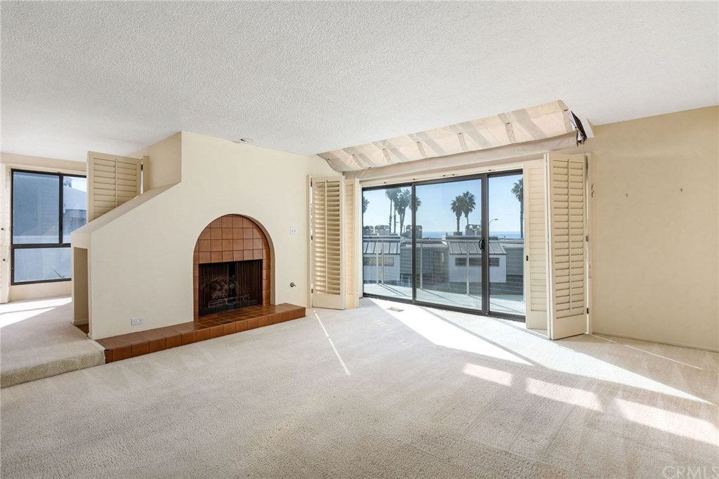
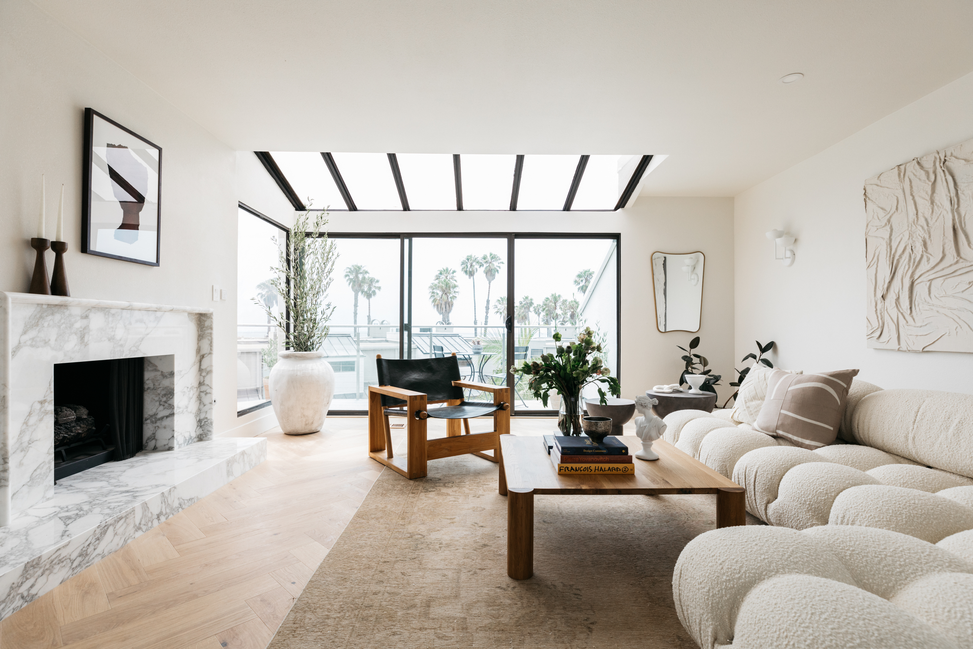
Designed in the late 1970s and barely altered since, this home was begging for a renovation.
Joelle Kutner and Jesse Rudolph, of design studio Ome Dezin, transformed the home into the epitome of minimaluxe, replacing the shag carpets with light wash wooden floors, and adding elegant marble features throughout.
The living room utilizes a neutral color scheme that doesn't appear boring through the rich variation of textures and tones. The dimpled, white, boucle sofa is reminiscent of the sandy shores, connecting this room to its coastal surroundings.
'The rich marble extending from the fireplace to below the office door, the soft boucle Mario Bellini couch in white, plaster lighting sconces, and leather accent chairs provide the perfect combination of materials that radiates quiet luxury', says Joelle.
See the rest of this minimaluxe dream here.
8. This dark and dingy living room that was brought to life by a skylight
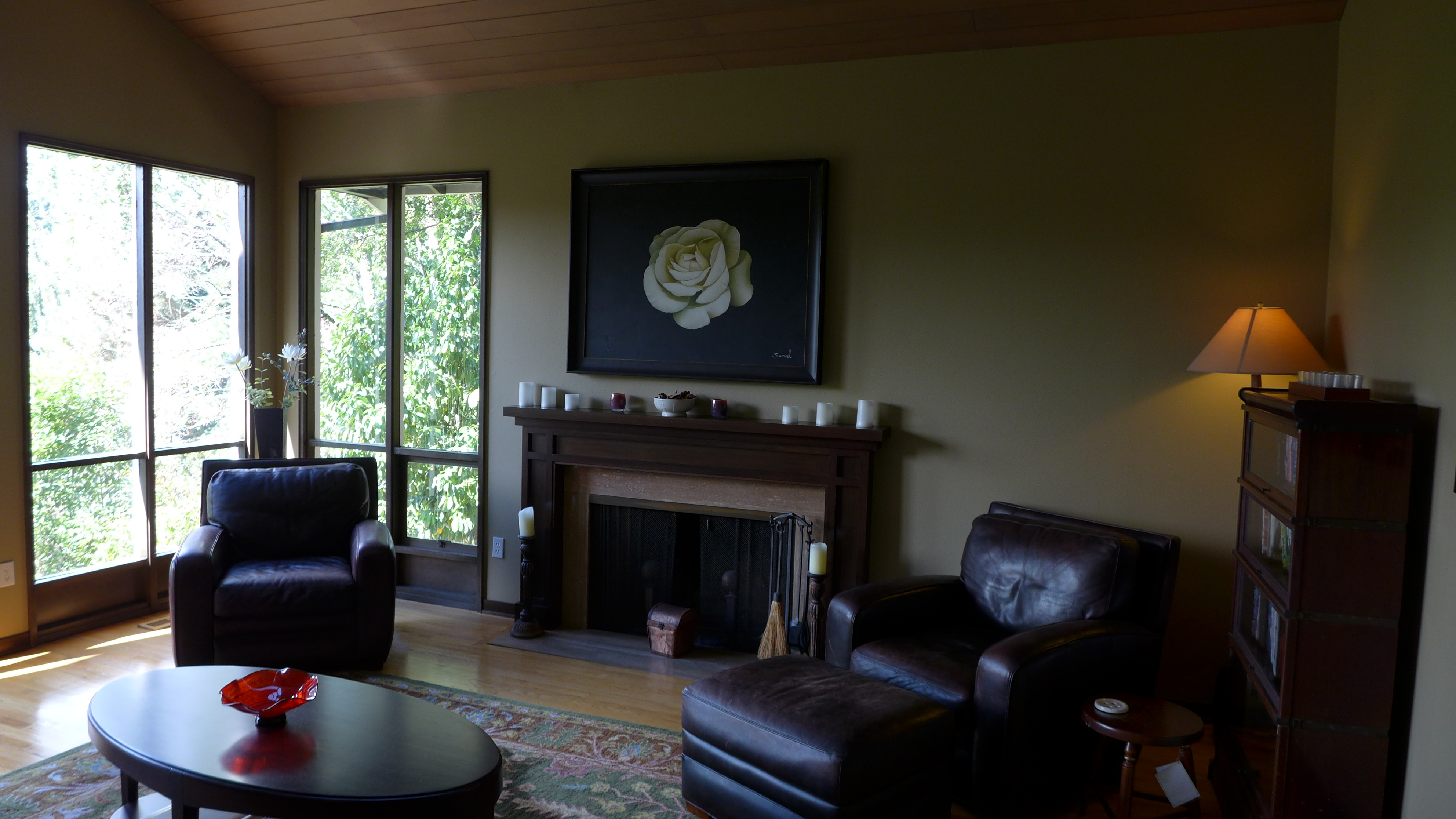
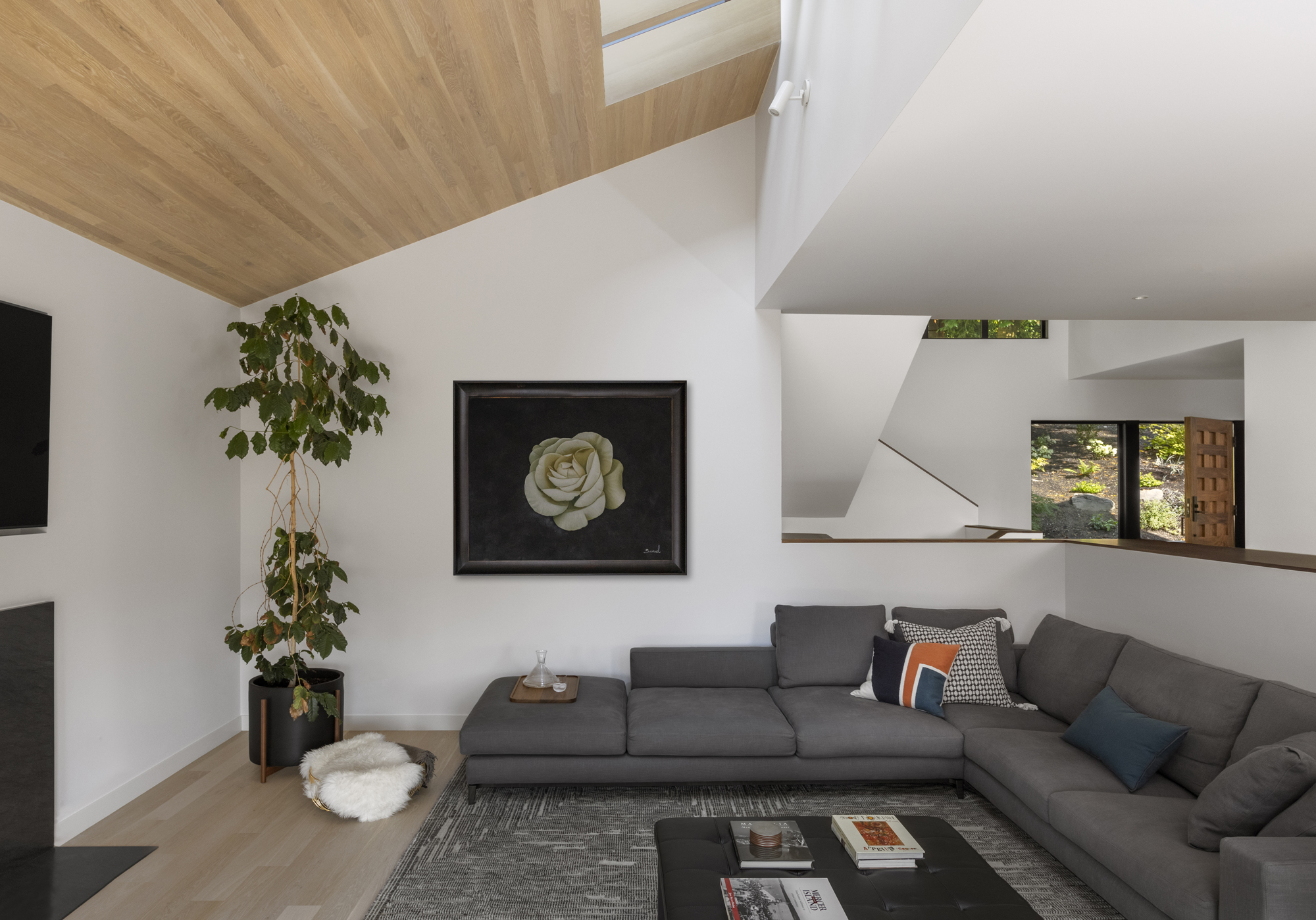
Prior to renovation, this living room was so dark and dingy that the family rarely ventured in, opting instead to congregate in the kitchen.
By adding in skylights, windows, and painting the room white, Allison Hogue, co-founder of Floisand Studio, completely transformed this space.
Now flooded with natural light, the room is bright, airy, and inviting, a drastic change from what it once was.
See the rest of this complete transformation here.
9. This duplex that combines Manhattan views with Parisian style


When beginning this project, the design team at PJCArchitecture was tasked with bringing their clients 'Parisian contemporary' dream to this Manhattan duplex. A request at odds with the space described as a '1960s apartment with little architectural character to it'.
The firm brought this dream to life, creating a living room that feels more Victorian-era than it does swinging sixties. Adding in structural details such as crown molding, sunken cabinetry, and a faux fireplace have helped develop the room's sense of character.
Combining these more traditional architectural features with contemporary furniture, and a rich color palette makes these additions appear more authentic, as if the room has always looked this way. A sharp contrast to its box-like origins, the space is now a much better fit for its Park Avenue surroundings.
See the rest of this Park Avenue duplex.
10. This living room proves that all-white does not have to mean boring
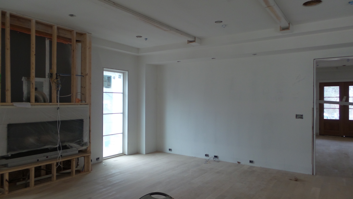
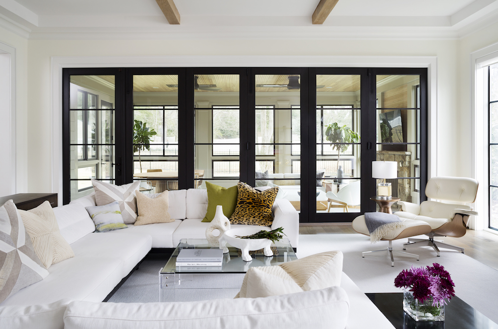
An all-white living room may sound like the farthest thing from cozy, evoking anxious visions of messy children and clumsy red wine drinkers. But interior designer Zoe Feldman managed to create an inviting warmth in a room that could easily have slipped into the clinical.
Cheetah print cushions add a playful touch to the room, while the green upholstered chairs bring in earthier tones. These chairs tie in beautifully with the framed reindeer moss hung on the back wall. Coupling these warm, earthy colors with the crisp, clean white creates a sense of relaxed comfort in the room.
Using a white material on slouchier, comfortable-looking furniture, like the Eames chair and U-shaped sofa, elevates the pieces, adding a level of sophistication to what could otherwise appear a purely functional item.
Be The First To Know
The Livingetc newsletters are your inside source for what’s shaping interiors now - and what’s next. Discover trend forecasts, smart style ideas, and curated shopping inspiration that brings design to life. Subscribe today and stay ahead of the curve.

Maya Glantz is a Design Writer at Livingetc, covering all things bathrooms and kitchens. Her background in Art History informed her love of the aesthetic world, and she believes in the importance of finding beauty in the everyday. She recently graduated from City University with a Masters Degree in Magazine Journalism, during which she gained experience writing for various publications, including the Evening Standard. A lover of mid-century style, she can be found endlessly adding to her dream home Pinterest board.
-
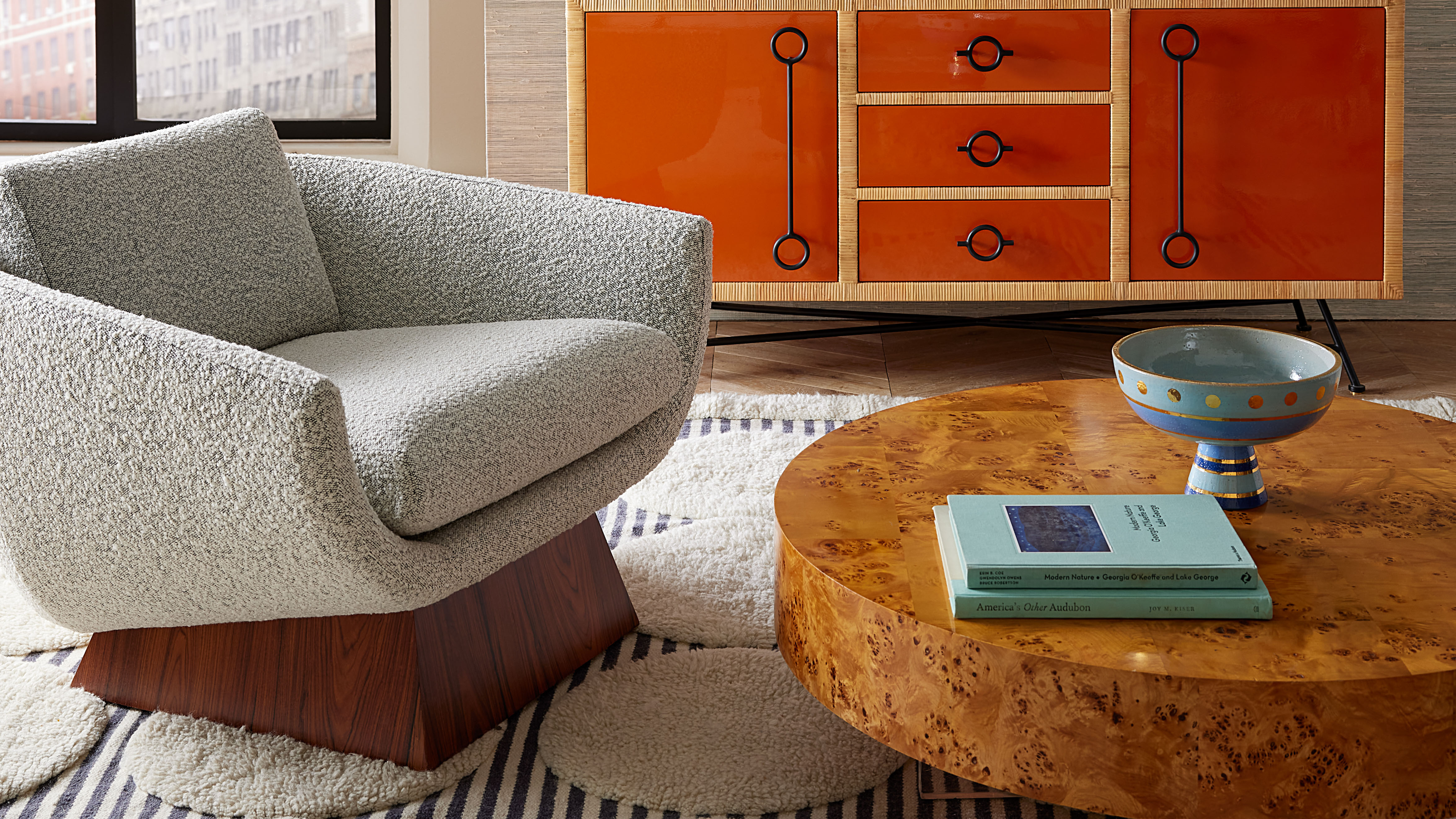 Burl Wood Decor Is 2025’s Most Coveted Comeback — Here’s How to Get the Storied Swirls for Less
Irregularity is the ultimate luxury, but you don’t need an antiques dealer to find it
By Julia Demer Published
-
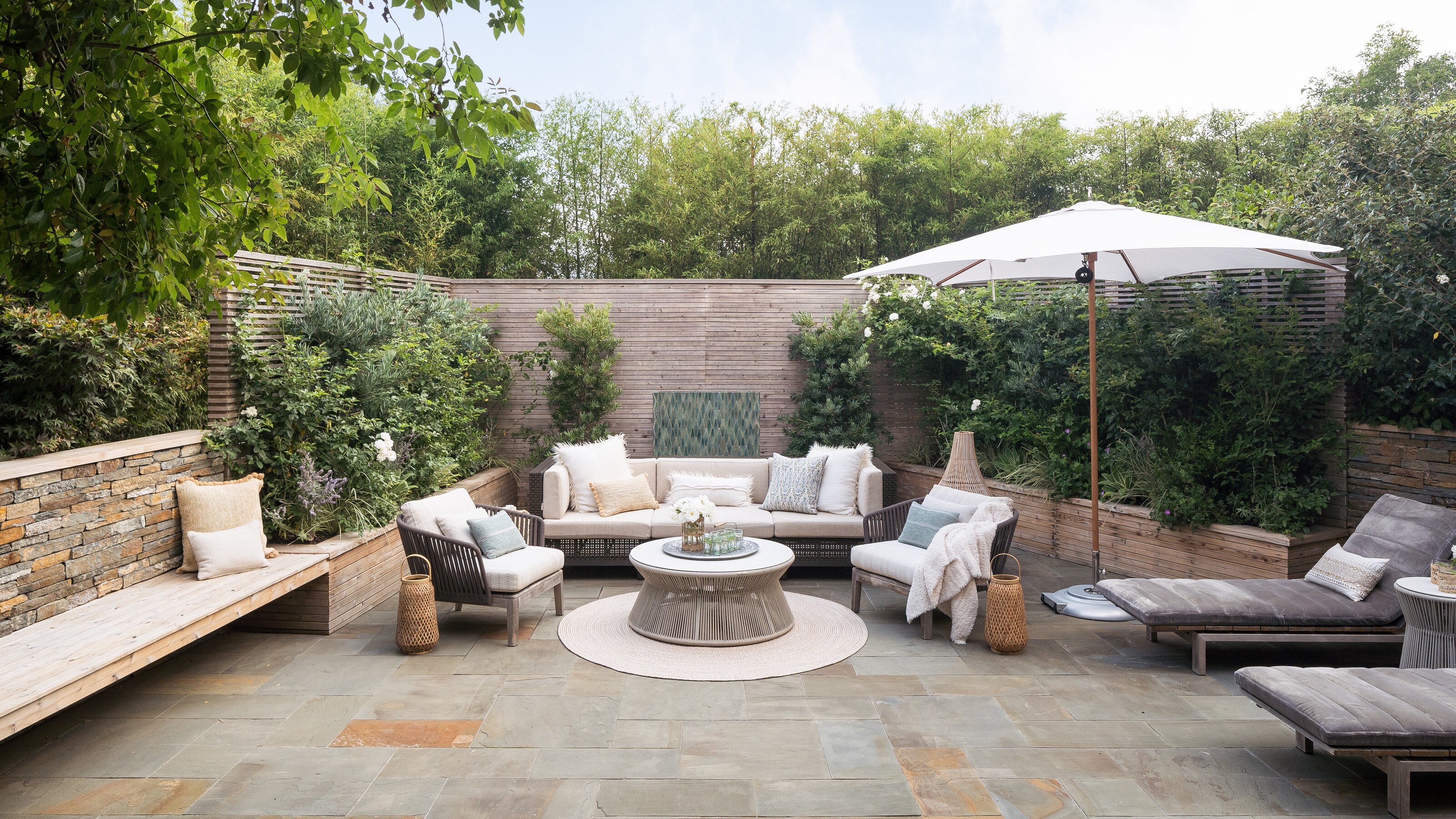 5 Garden Features That Instantly Add Value to Your Home — While Making Your Outdoor Space More Practical, too
Get to know all the expert tips and tricks for making your backyard a standout selling point for your home.
By Maya Glantz Published