10 living rooms where the focal point is NOT a TV - design experts have a better approach
A techless living room where the focal point isn't a TV is the best kind of living room, and these 10 are perfect examples of what to look at instead
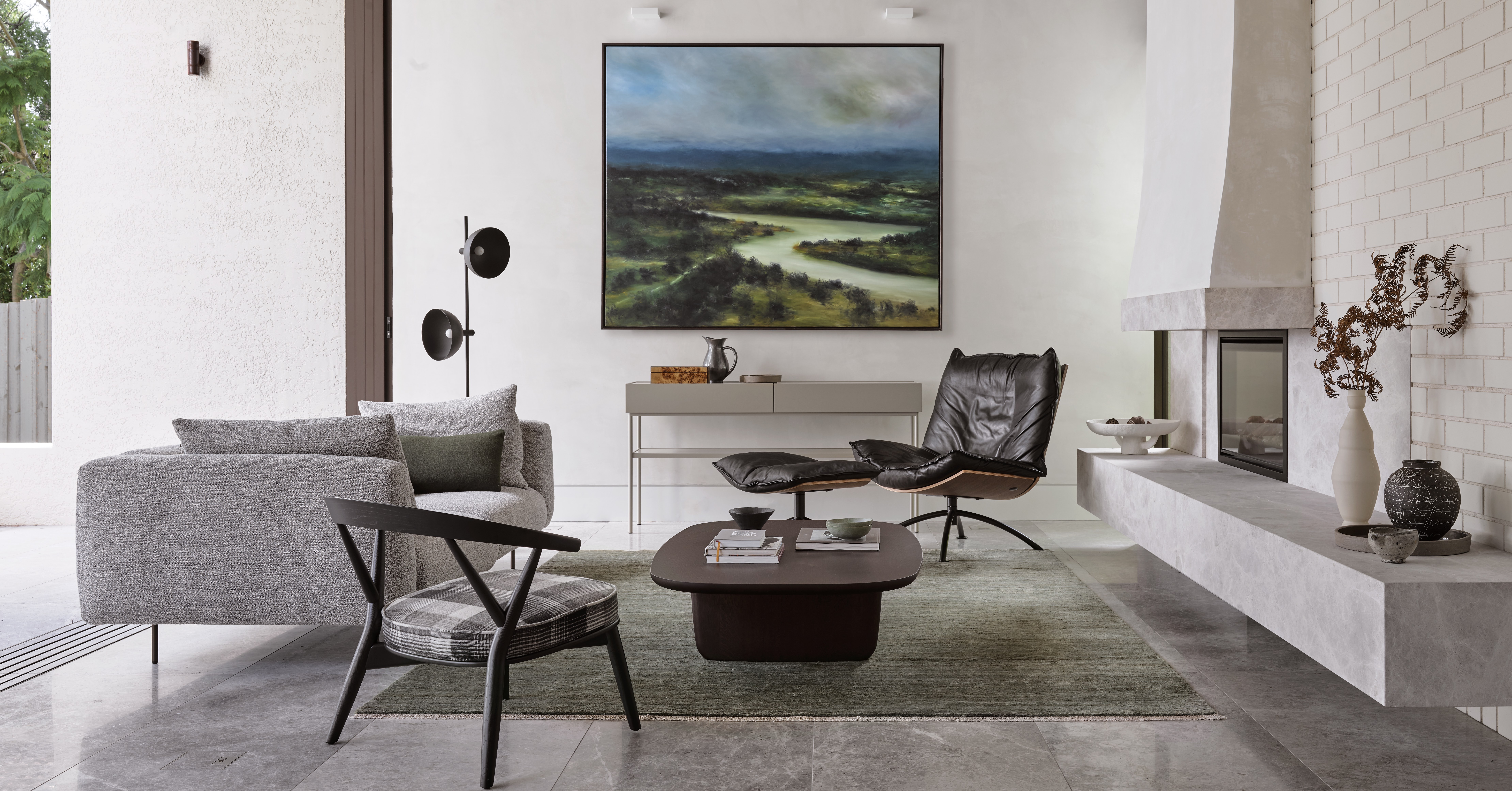

When designing a living room, there's one particular element that tends to... let the vibe of the room down. You can pick the most stylish sofa, the trendiest of rugs, the perfect color palette, and then it comes to adding the TV. Where do you put this black hole and not immediately turn it into the focus of the space?
Well, the first option is to ditch the TV altogether. The most sophisticated, grown-up spaces are tech-free, and instead, center around artwork, architectural features, stand out pieces of furniture. However, if loosing the screen in your living room isn't an option, there are plenty of ways to draw attention from the TV and send it elsewhere in the room.
10 living room focal point ideas (that aren't a TV)
Whether you are looking for ideas on what else your room can be structured around, or you want your tech to be less of a visible feature in the space, we asked designers what are their top tips for designing a living room that doesn't totally focus around the TV.
1. Use beautiful custom joinery to disguise a TV
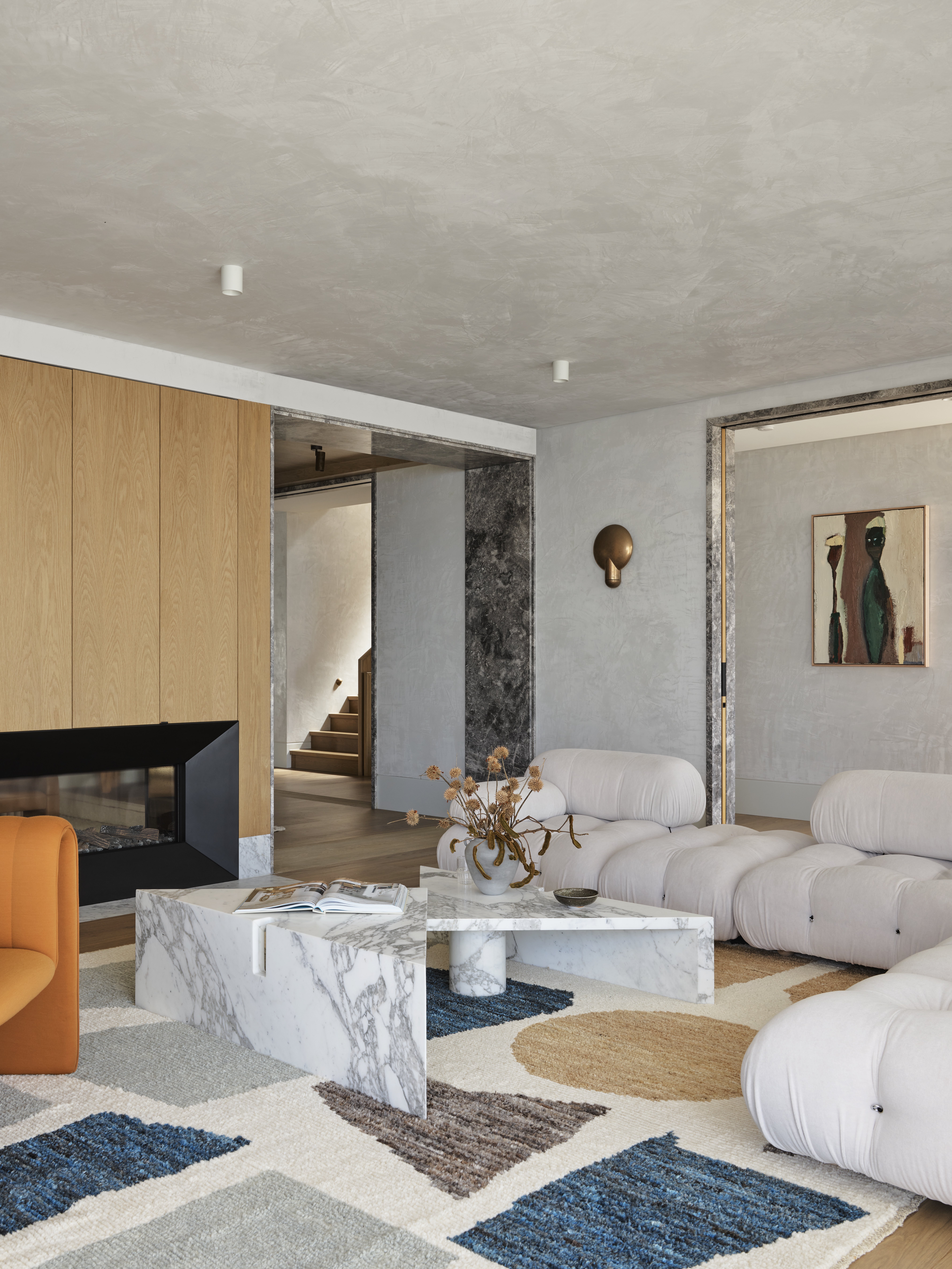
'Firstly, can you avoid the living room TV all together!? Use a laptop or an IPAD to start and lose the television for good,' says Tess Glasson of Alexander and Co. 'If not, what corners or visually secondary niches could hold the TV, placing it lower can sometimes achieve the same outcome. If you have the space, a TV can be placed within an operable custom piece of joinery or can be pneumatically stored within a benchtop or coffee table too.'
Hiding your TV behind some sleek and simple joinery, as seen in this living room, lets the rest of the furniture become more of the focus. Instead, of instantly being drawn to the black square in the room, you notice the fabulously contrasting shapes used in this space, the curves of the sofa with the hard lines of the marble coffee table, the different textures, and subtle patterns.
2. Choose a single piece of artwork as your room's focus

This living room is really making a case for ditching the tech. A single, oversized, really statement piece of artwork adds so much more to this room. It brings the simple color palette to life, and makes that mix of old and new that's going on here even more apparent.
'The goal of this living room was to make take old-world elegance and give it a more modern twist. There are soft details, like the curve of the couch, mixed with more brutalist touches like the stone side table. I love the play on light and dark in this space as well. The room’s neutral palette ensures the eye is drawn to the aubergine-colored couch and artwork.' explains designer Marie Flanigan.
And of course, you could have both a TV and a large-scale print within your living room, but they'd always be competing for attention, and let's be honest the TV will often win when it comes to furniture layout, etc.
3. Go 3D for extra impact

A TV has no chance in this gorgeous monochrome living room designed by Nina Magon. 'This particular plaster artwork was custom-made by a dear friend of mine, Amanda Kinnan, and was created specifically for this space. My intention was to add visual interest to this towering, vacant wall above the fireplace by incorporating a 3D-style art installation that ascended the fireplace and drew attention to the lofty ceilings. This addition served to create a captivating focal point within the space and provided a delightful conversation starter for when I entertained guests.' describes Nina.
And to help distract even further from the tech in the room Nina also suggests 'arranging the furniture in a way that doesn't place the TV as the main focal point. This can be achieved by placing the TV on a side wall or in a corner, which is still usable, but this allows something else to be a focal point. Incorporating other decorative elements such as bold artwork, lighting, or a statement piece of furniture to draw the eye away from the TV. There are also exquisite picture frame televisions available in the market that, when not in use, can be switched to digital art mode. This feature enables the television screen to be transformed into a beautiful art piece, rather than a dull, black screen.'
4. Create sociable layouts

'Think about how people would hang out in a party situation (and I'm talking about a cocktail party where people are talking to one another with music in the background and not a Superbowl party focused on the tv!). Seating should face one another. If you have a feature wall where a TV might otherwise go, think about a salon-style art wall or maybe a credenza with a record player,' suggests Jessica Davis of Atelier Davis.
'I like to create zones and use non-traditional seating like a daybed where people can perch on either side for conversation. Don't just push all the furniture up against the walls. Furniture can float and oftentimes is much more sophisticated and conversation-friendly if done this way.'
5. Highlight architectural features
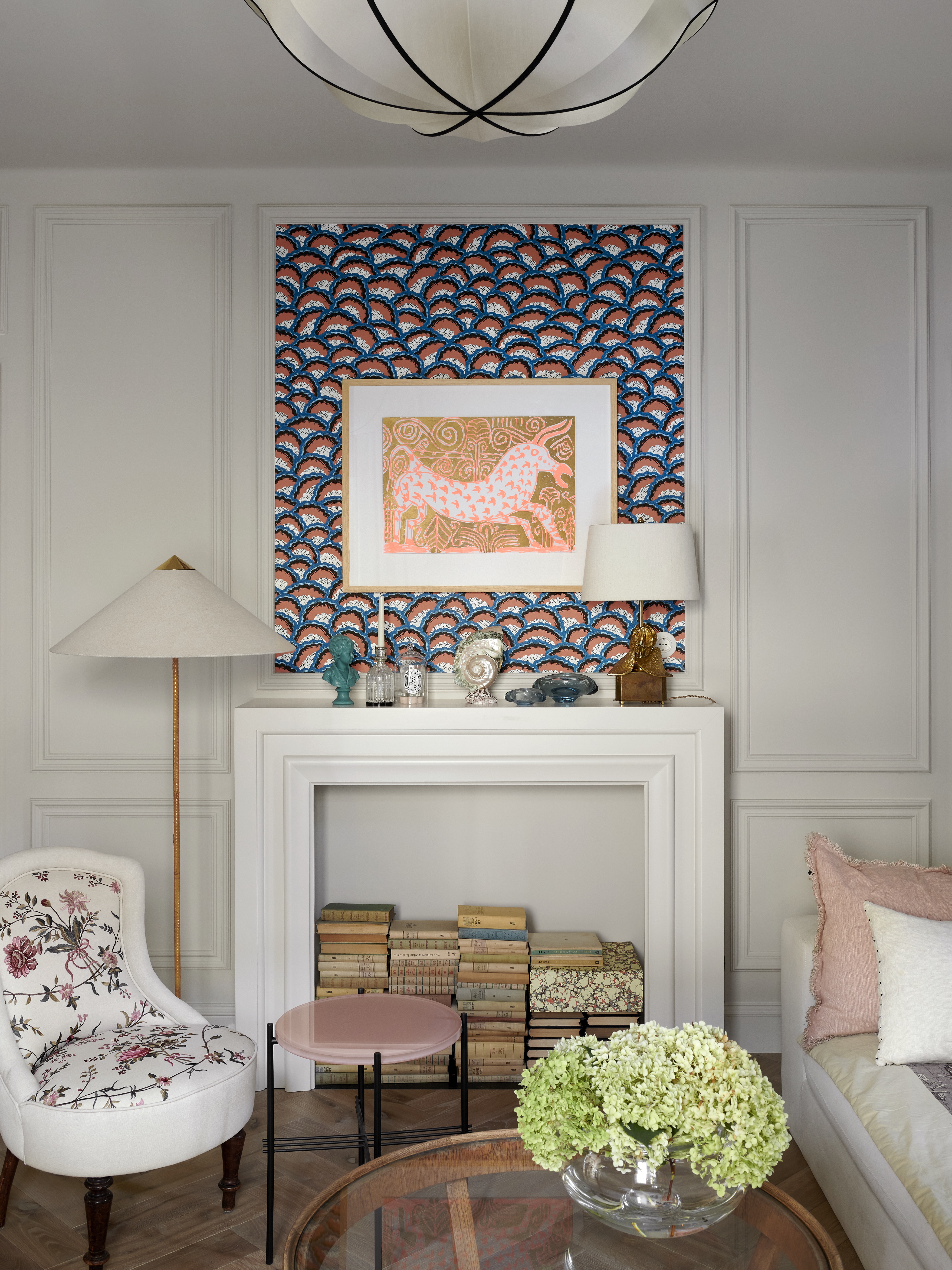
In this living room designed by Colombe the natural focus of the room was the fireplace, but rather than mount the TV above the mantle, a bold living room wallpaper highlights the wall paneling and provides the perfect background to make a print even more of a focal point.
'Decorative molding and a fireplace are brilliant focal points for defining symmetry. And I also really like to highlight the proportions with moldings by putting wallpapers or fabrics within them,' explains Marta Chrapka, founder of the studio.
'And when it comes to making the TV less of a focus, my favorite ways are to nonchalantly place it on a stand, without tv cabinets or a dedicated place. If the TV must be set seriously, then cabinets with a lift that hides the TV or glazed display cabinets with doors, the glass reflects the light perfectly and then often you can't see the TV hidden in the display case.'
6. Seamlessly integrate the TV into a fireplace
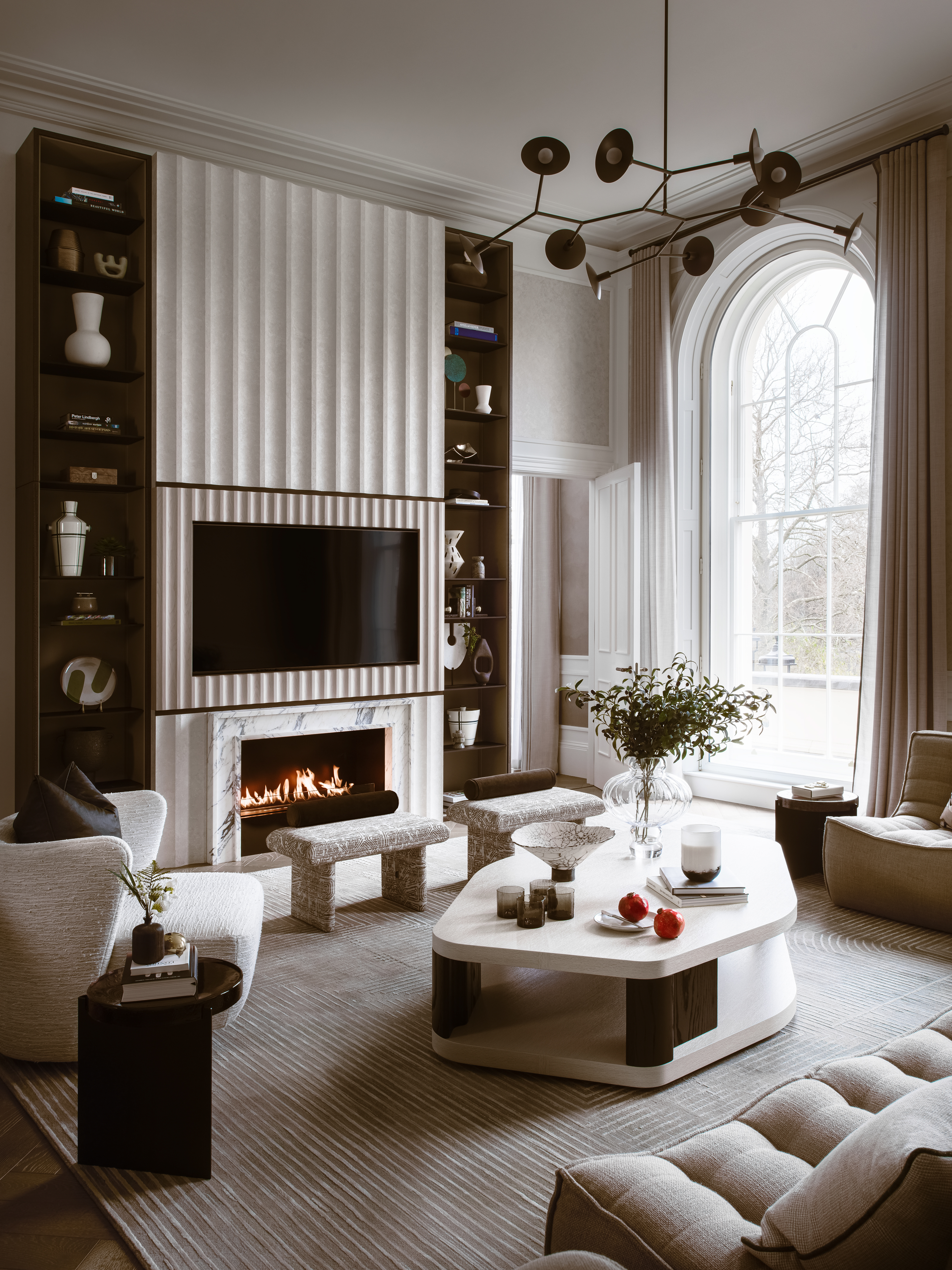
'Increasingly, clients are asking us to seamlessly incorporate media entertainment and screens into spaces, ensuring that the living space can be multi-functional. To achieve this within this project, we integrated the TV and fireplace into a single built-in unit with vertical shelving to display the client's beautiful collection of ceramics.' explains Charu Gandhi, founder, and director of design studio, Elicyon.
'By adding floor-to-ceiling shelving on either side of the TV, we were able to utilize otherwise empty space for storage as well as drawing focus away from the central television, instead extending the profile of the room. This results in an uncluttered and contemporary feature that helps to balance the living space by offering other areas of visual interest.'
'Another easy way to move focus from a large screen is to center the seating arrangement in the living space around a coffee table. This can help to encourage conversation as it directs everyone’s attention away from the television and onto the other people in the room,' adds Charu.
7. Have fun with the furniture
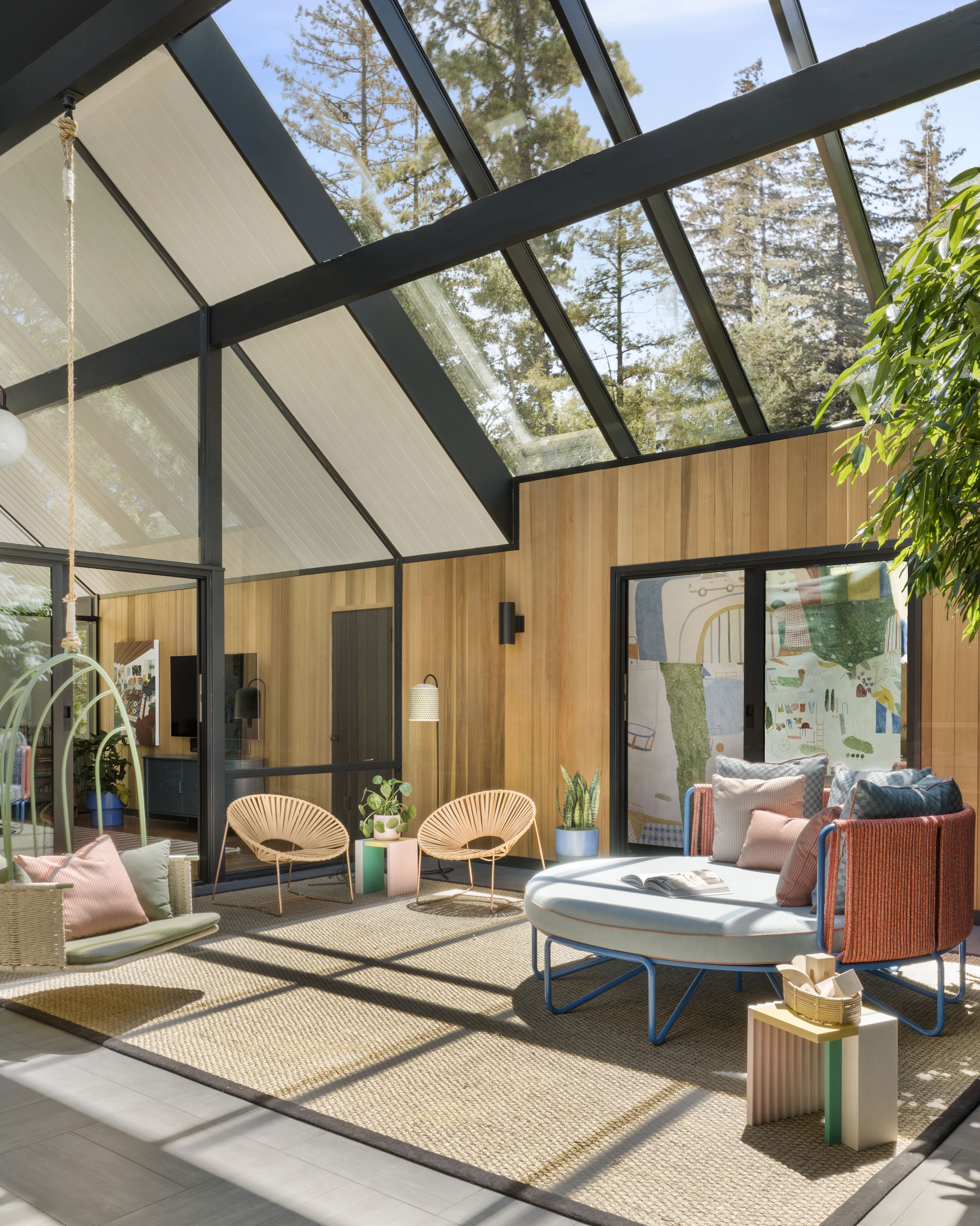
''This is an atrium lounge space for a family with four young girls, designed in collaboration with architect Gustave Carlson.It's the heart of the home and gets used every day. Just because kids are involved doesn't mean that it needs to be super casual or ugly. Use color in an elevated way. Think about nonprimary colors and mixing unexpected hues to have a space be playful but still sophisticated. And consider other functions. This space has a fun swing for the kids and a big custom lounger that they love to read books on.' explains Jessica Davis.
And notice anything else about this space? Despite being a family room there is no TV. The focus instead is on the playful colors and quirky string furniture. The layout can be far more open and flexible because of the lack of a screen, with pockets of seating, and curved pieces that create that sense of sociability.
8. Center the room around a fireplace
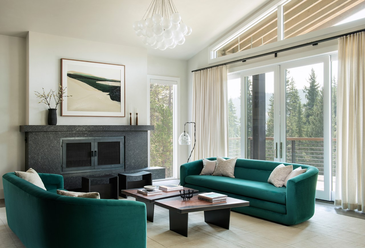
It can sometimes be tricky to know how to decorate a living room with a fireplace in the middle, but what usually works best is to make it the focal point of your layout. And the fireplace is a far more sociable, and sophisticated element to base a living room around than a TV.
'Typically, if a living room has a fireplace we will orient the seating arrangement towards this focal point. Another option is to use the view to draw the eye outside or use bold upholstery to grab attention,' explains Jennifer Jones founder of Niche Interiors. 'For this vacation home in the mountains we layered in sophisticated contemporary furnishings in saturated jewel tones with playful patterns and statement lighting for a stylish (but not too serious) retreat.'
And if you have a TV in your living room too, focusing on the fireplace can draw attention away from the screen. As designer Irene Gunter suggests, 'Another way to draw attention away from the TV is to create a focal point elsewhere. For example, if you have a fabulous fireplace (or can add one), it can become the center of attention by positioning your furniture around it and adding a beautiful picture or painting above it to draw the eye. Another great distraction is a fabulous view. Make sure to maximize it with a large glass facade, and then arrange your furniture so that every seat can soak up the surrounding scenery.'
9. Let the windows be the focus

If your living room features a larger window make this the focal point of your room by turning the seating (or a proportion of the seating) towards it. If you can, ditch the window treatments to really accentuate the windows and allow in as much light as possible.
'I try to not have the tv be the room’s focus and instead use art, windows, and fireplaces to define sight lines. A custom wall mural of scenic wallpaper can create an immersive and dramatic experience as well. We like to hide TVs in cupboards, on hydraulics that can retract behind furniture or use Frame TVs. In other rooms, we’ll paint the walls a dark color so the tv blends in with the surrounding rich colors.' explains Keren Richter, Co-Founder and Principal Designer at White Arrow.
'We renovated and furnished this Williamsburg bachelor pad that needed to feel sophisticated and hotel-like. We accentuated the home’s double-height ceilings by bringing in a large-scale chandelier and thinking vertically. We carved out storage by creating custom display shelves that mask the irregular existing conditions, and sourced a mix of stylish multipurpose furniture, like the French secretary desk and velvet sleeper sofa,' adds Keren.
10. Bring in some greenery
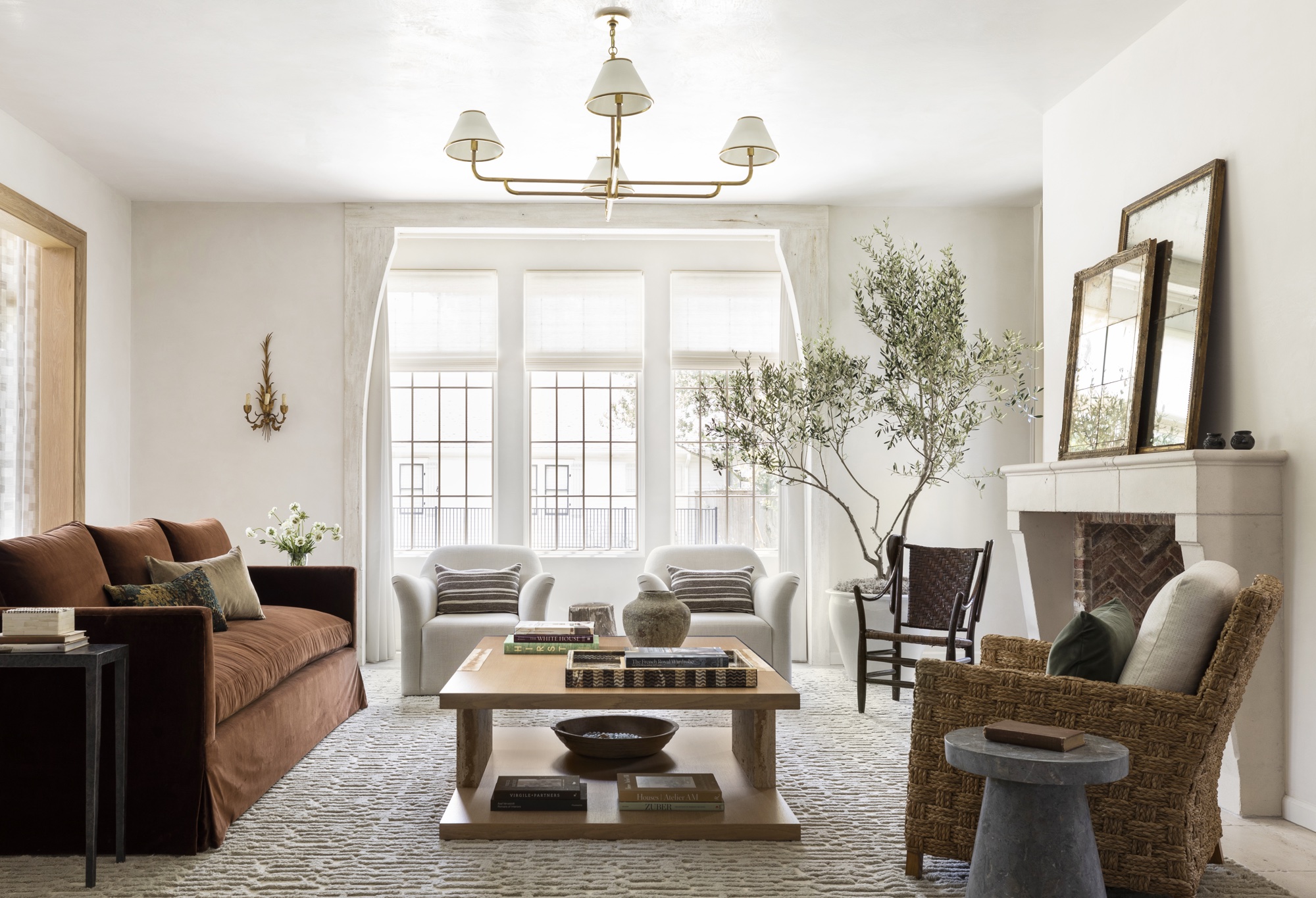
Indoor trees are having a bit of a moment right now. They are just such an unexpected addition to a living room, seeing a full-grown tree among all those soft furnishings adds an instant focal point no matter where you place it. A large tree really makes a statement and can elevate a living room, adding texture, shape, and height. An easy hack to make a tree (or a houseplant) more of a focus is it position it on a plant stand or go for a larger pot so you get that extra height.
If you aren't the most green-fingered, we would definitely recommend going for a fake option. You can get some really realistic ones now that are far cheaper than the real thing, and you won't be stuck with an expensive eye sore if your tree starts to fade.
Be The First To Know
The Livingetc newsletters are your inside source for what’s shaping interiors now - and what’s next. Discover trend forecasts, smart style ideas, and curated shopping inspiration that brings design to life. Subscribe today and stay ahead of the curve.

Formerly the Digital Editor of Livingetc, Hebe is currently the Head of Interiors at sister site Homes & Gardens; she has a background in lifestyle and interior journalism and a passion for renovating small spaces. You'll usually find her attempting DIY, whether it's spray painting her whole kitchen, don't try that at home, or ever-changing the wallpaper in her entryway. She loves being able to help others make decisions when decorating their own homes. A couple of years ago she moved from renting to owning her first teeny tiny Edwardian flat in London with her whippet Willow (who yes she chose to match her interiors...) and is already on the lookout for her next project.
-
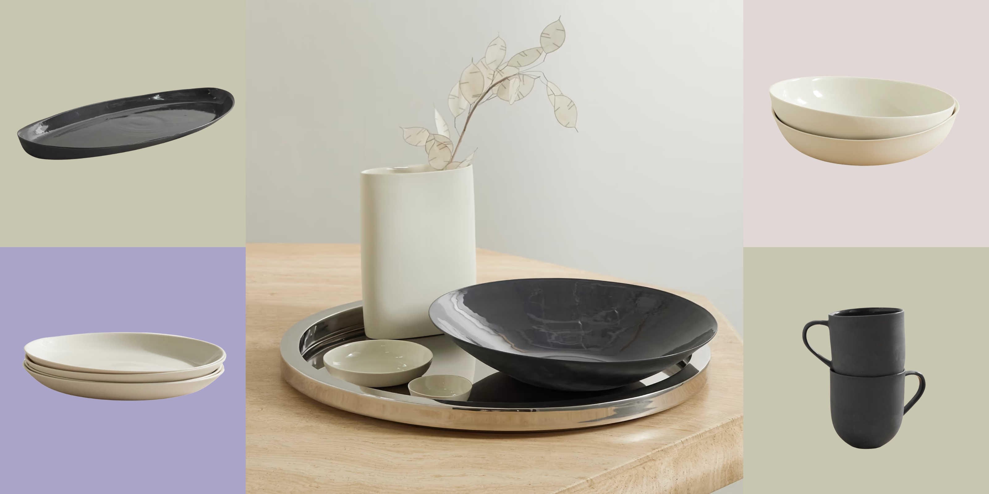 Turns Out, Sustainable Design Can Be Chic, and Net-a-Porter's 'Net Sustain' Curation Is Proof — Here's What I'm Shopping
From the Net Sustain collection, Mud Australia's homeware is not only design-oriented, but eco-focused, too
By Devin Toolen
-
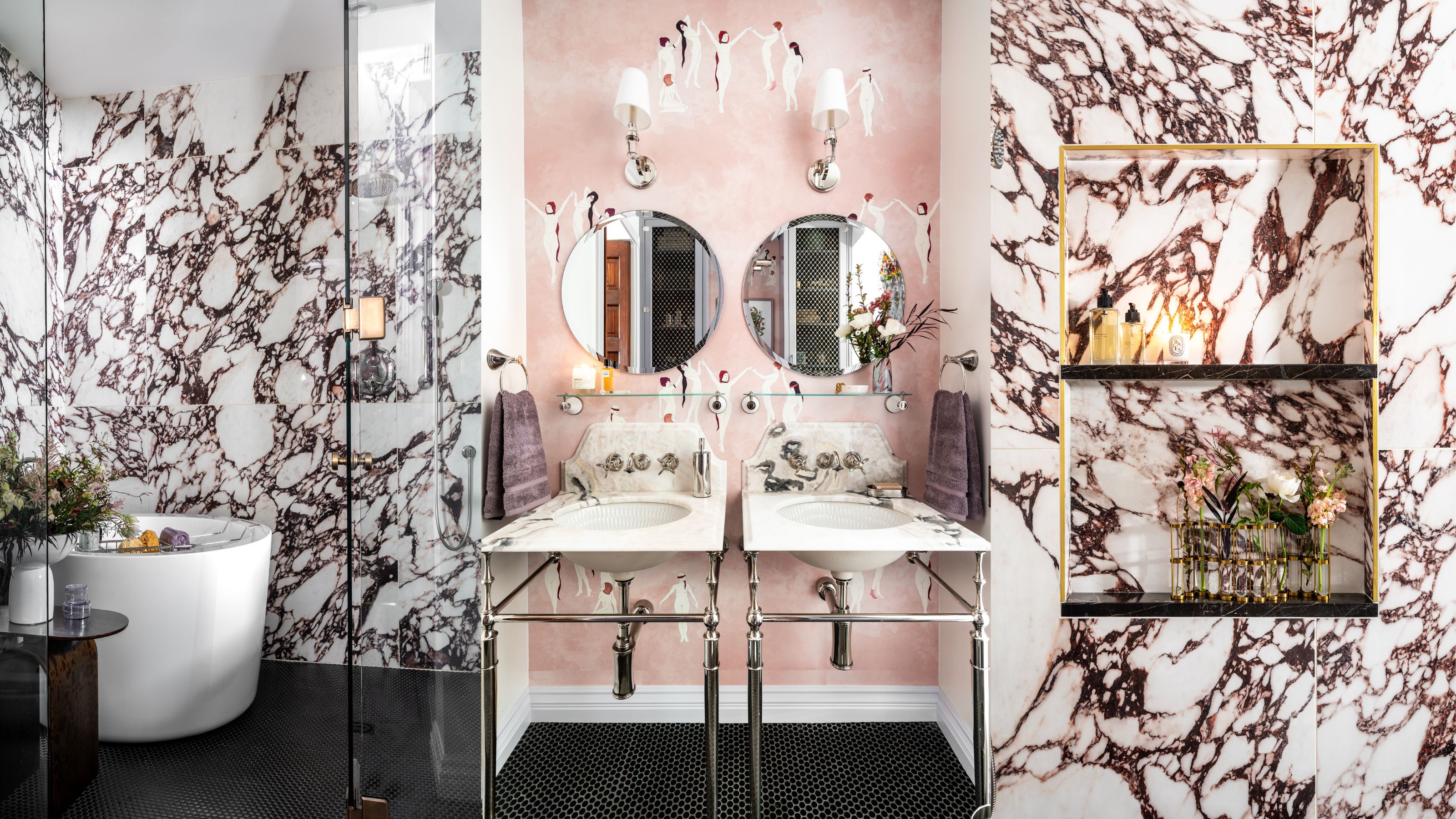 Before and After — How This Jewel-Box Bathroom Made the Most of Its Proportions With Maximalist Design and a 'Soaking Tub'
This design offers a masterclass on creating a luxurious bathroom that is equally playful and elegant.
By Maya Glantz