8 mid-century modern kitchen ideas that feel so contemporary and design-forward – 'they're timeless'
Mid-century modern kitchens are the design trend that isn't going anywhere, here's how to get the look

Is there an interior design style with as much staying power as the mid-century modern look? Emerging in the 1940s and stretching all the way until around the '70s, the era is considered the greatest period for international design. To this day, furniture designers recreate and pay homage to the heyday of interiors with modern creations that mimic this enduringly cool style.
The key to using this style in the home is to carefully strike a balance and not go too overboard with the mid-century touches. Mixing the style with contemporary touches can feel elevated and cool. ‘Mid-century modern design is a delicate balance between modern sophistication and retro nostalgia,’ says Kelly Holland, Melbourne-based interior architect at K.Holland Architectural Interiors.
The look works well across the home, but there is nowhere I love the mid-century style more than in the kitchen - the ultimate canvas for creating a dramatic contrast where old meets new. These 8 modern kitchen ideas embrace the style with a contemporary feel that feels very 'now'.
1. Bring wood panelling to add warmth
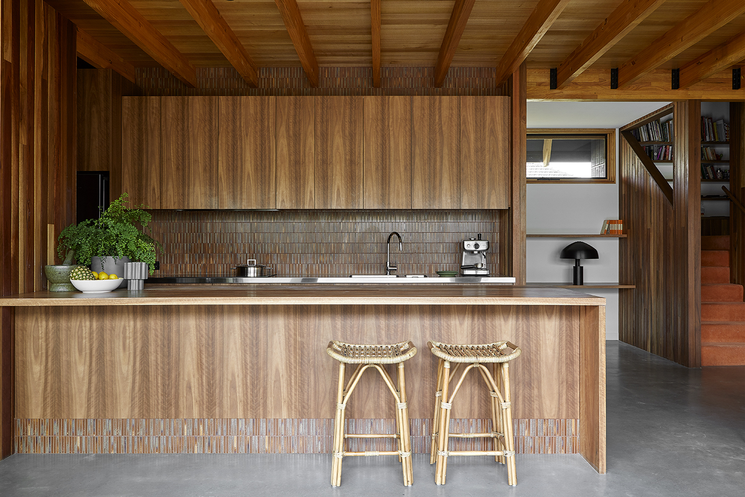
Wood paneling is synonymous with the mid-century modern look, and it works beautifully in the kitchen. Wood is known to be a hygienic material, with antibacterial properties. It also has a low thermal conductivity compared with other materials that we typically find in the kitchen - metal, marble, glass, and concrete to name a few.
Aside from its numerous practical benefits, aesthetically, it brings a real mid-century flair. Go all out with your paneling and embrace the cabin look with wood across the ceiling or wooden beams. Alternatively - and more suitable if you've already designed your kitchen, bring in wooden accessories for a subtle nod to the style.
‘Wood paneling and wood ceilings are a way to get a mid-century feel,’ says Carola Pimentel, the founder of Assure Interiors, an award-winning Miami-based practice. ‘We suggest light and natural woods to keep things from feeling too heavy.' Having said that, if you really want to go all out with the mid-century look, you might want to go for a darker and warmer, orange-toned stain to avoid a kitchen that feels muted and Scandi.
2. Create a mid-century color scheme
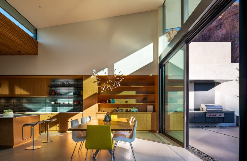
Color is a simple way to bring a mid-century feel to your kitchen. Create a kitchen color moodboard with a mid-century modern palette - think oranges, dark greens, and a spectrum of brown shades, and keep things dark and sultry with warm pops.
This kitchen by 180 Degrees Design + Build is the perfect mid-century palette - a mix of blues, browns, greens, yellows, and brown from the wood used throughout the space. 'Simplicity and contrast are a few of the tools used to infuse a mid-century feel into our projects,' says 180 Degrees firm partner, Troy Vincent.
'To add visual interest, like mid-century designers Charles and Ray Eames or Eero Saarinen, contrasting use of bold colors as well as both organic and geometric shapes are typically incorporated. In addition to the bold use of colors, the introduction of complementary colors adds a striking contrast and vibrancy to each design.'
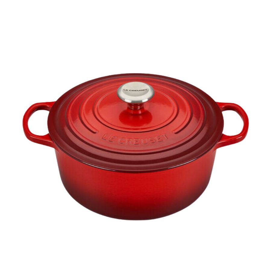
Remember those primary pops too to bring things into the mix and keep things interesting. Go for the odd cabinet door or drawer front in a primary red, blue, or yellow for a jolt of energy - even a display of brightly colored Le Creuset saucepan on open shelving can be a good way to introduce some color. ‘Bold blocks of color, particularly avocado green, mustard yellow, or citrus orange are a key feature and element of mid-century kitchen design,’ says Kelly Holland of K.Holland Architectural Interiors.
3. Bring in seating to create a social space

The mid-century is when designers and homeowners started seeing the kitchen as a social space to entertain. Reflect this evolution by enlisting the help of beautifully curated mid-century furniture to shift the focus towards socializing in your kitchen.
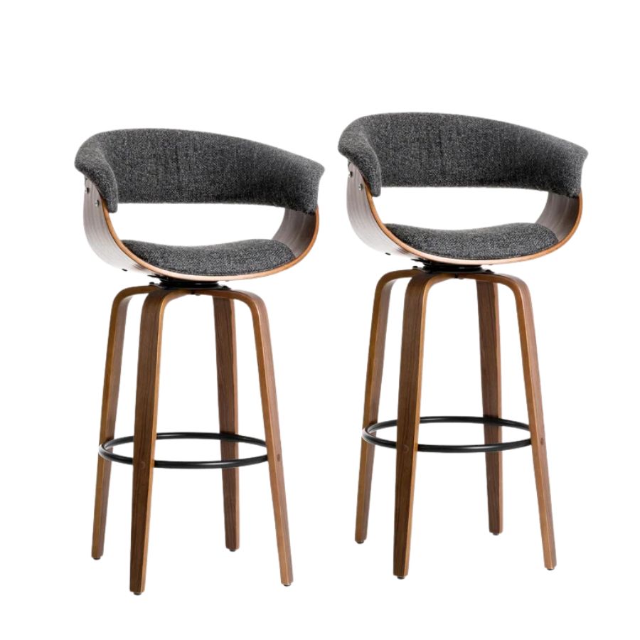
‘Arising from post-war events, mid-century kitchens focused on functionality and family gathering spaces,' says Kim Irons of Stonehouse + Irons Architecture. 'Island benches with locally resourced timbers cupboards and laminates of primary colors or warm hues reflecting nature became a kind of the informal dining table.' Modern kitchen islands or peninsulas accessorized with bar stools is a brilliant way to refocus your kitchen as a space to entertain and can even help bring the feel of your favorite bar to the kitchen.
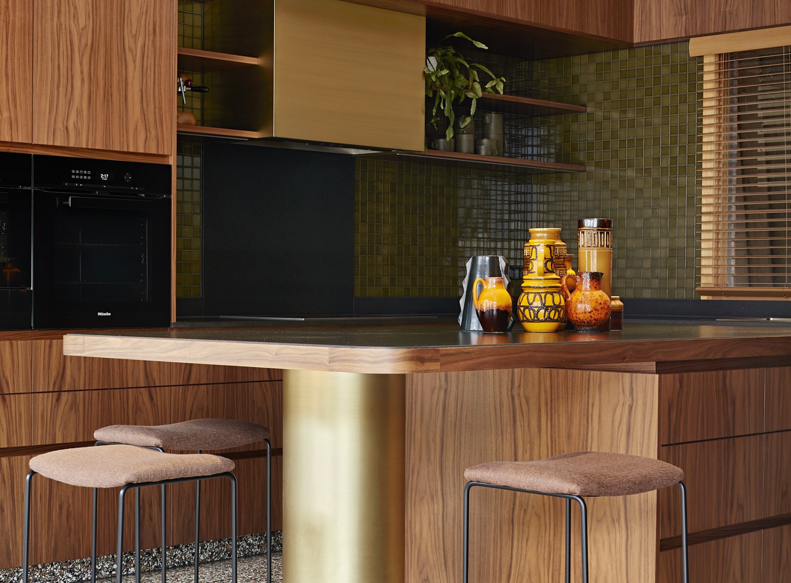
This kitchen by Design Theory is the perfect example of wood used to get that coveted mid-century modern feel, and the furniture in the form of the stools is the cherry on top. 'The classic Dot Stool, an authentic design by modernist icon Arne Jacobsen for Fritz Hansen in 1967, finishes off the space beautifully,' says director at Design Theory, Lisa Reeves.
4. Go for floating shelving
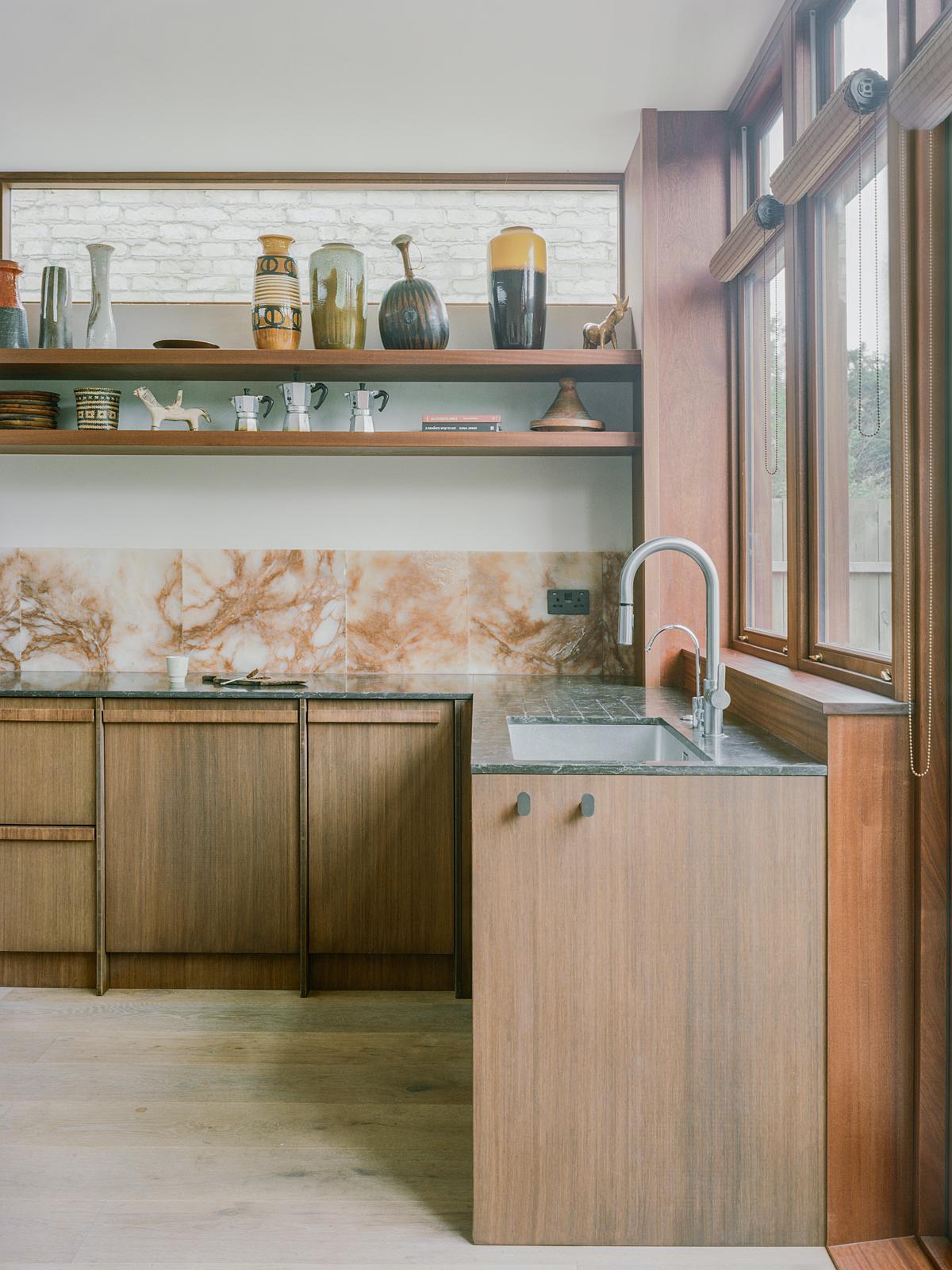
Often, mid-century modern kitchens would omit upper cabinets in favor of open kitchen shelving. ‘Avoid upper cabinets if possible,’ advises Carola. ‘Open shelves let you display your collections and can be styled to suit your changing mood.’ I love the open shelving look, with kitchen shelves stacked on top of each other. Try the look against a tiled backsplash, or take the shelving to the ceiling with a kitchen shelving unit that is open on either side - almost acting as a room divider.
Each shelf offers up an opportunity to create a vignette showcasing your favorite decorative pieces - just don't go too contrived with the styling. ‘Light, open islands and shelving units create a sense of space and openness,’ agrees Kelly.
5. Try stainless steel
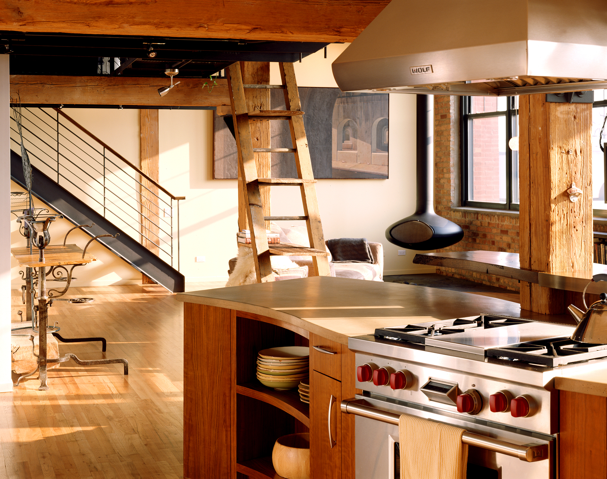
Stainless steel is commonly associated with appliances in the kitchen, but I love the trend for stainless steel kitchens which sees designers using the material on kitchen cabinetry, backsplashes, and countertops. ‘Stainless steel panels bring a rich materiality to complement the sleek modern lines,’ says Matt Wittman, principal at Wittman Estes.
The result is something that feels modern, slick, and super cool, but the material has roots in the mid-century too, invented in the early 20th century but emerging in the everyday home by the 1920s. Back then, the look of stainless steel was to give a home or kitchen a futuristic and modern sheen, but today it carries bags of vintage charm. In this design by Scrafano Architects, the stainless steel oven and matching hood blend beautifully against the wood.
6. Consider adding terrazzo
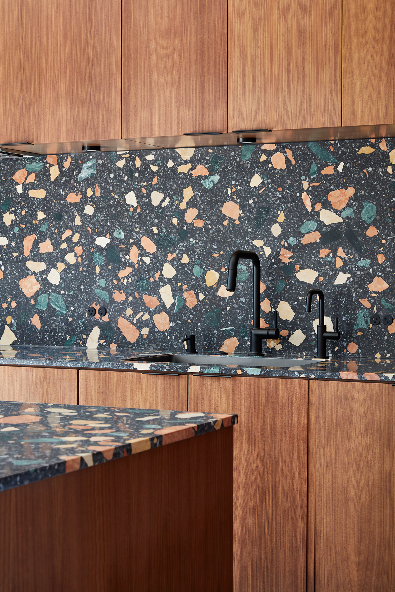
Terrazzo emerged in the 1920s but really gained traction and became popular in the everyday home in the mid-century. It's a pillar of mid-century modern style that is still popular today. Used in bathrooms and as kitchen backsplash for a color pop, it's a playful addition to your kitchen design.
Designers of this period loved using terrazzo in the kitchen for its monolithic look - formed of a single block of stone, and it works so well against the warmth of wood. 'Terrazzo floors add a dash of Italian flair too,’ says Carola.
7. Bring in metallics
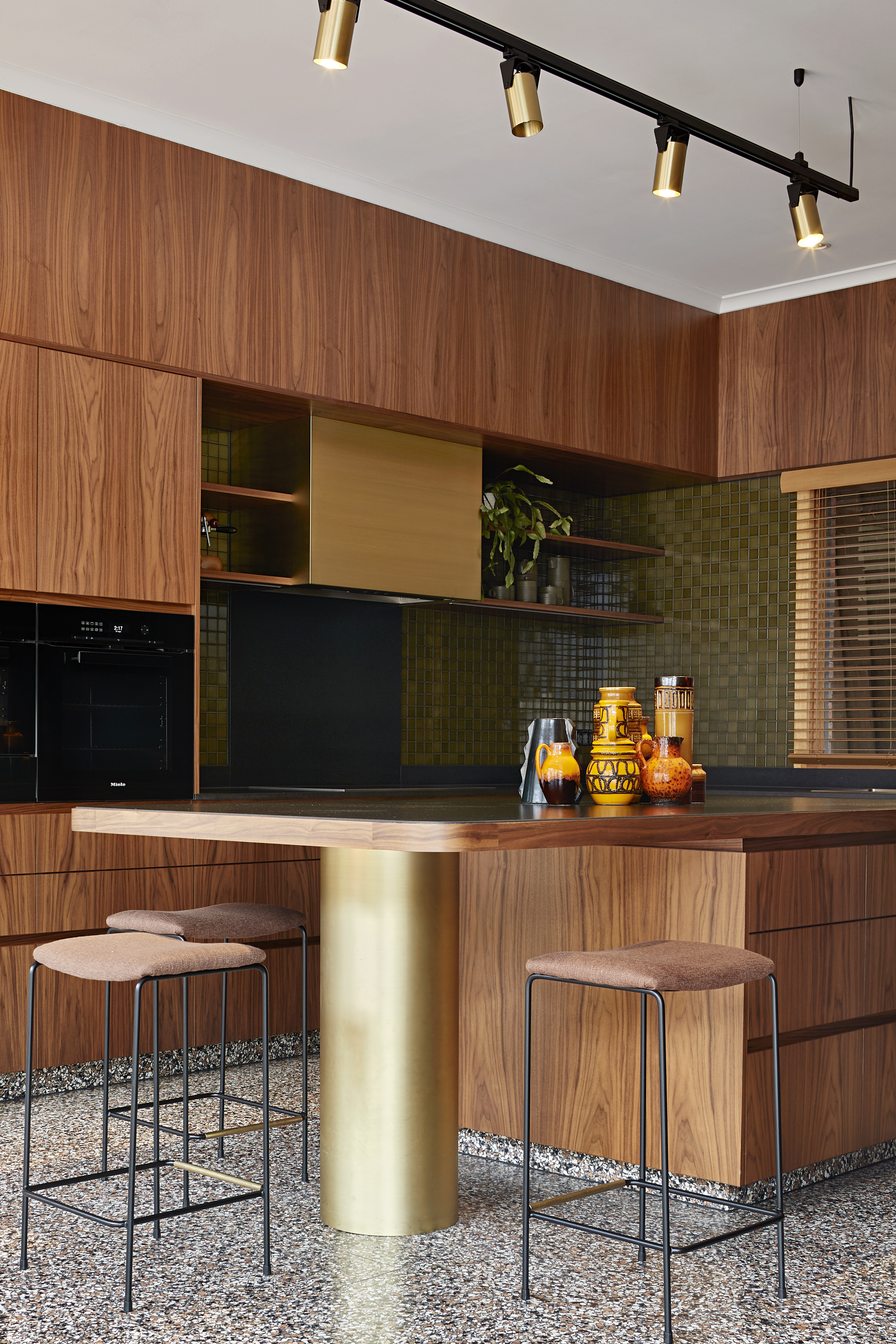
Bring in subtle metallic accents in warm tones to embrace the mid-century look and bring a dose of glamor to your kitchen. Don't go overboard, but the odd glimmer of gold, brass, or brushed nickel can really bring a bit of interest to the room. The best kitchen handles are metallic and are a great way to bring in metallics in a subtle way, and I love this gleaming gold leg supporting the peninsula in this kitchen by Melbourne-based CoLAb Design Studio.
8. Add track lighting
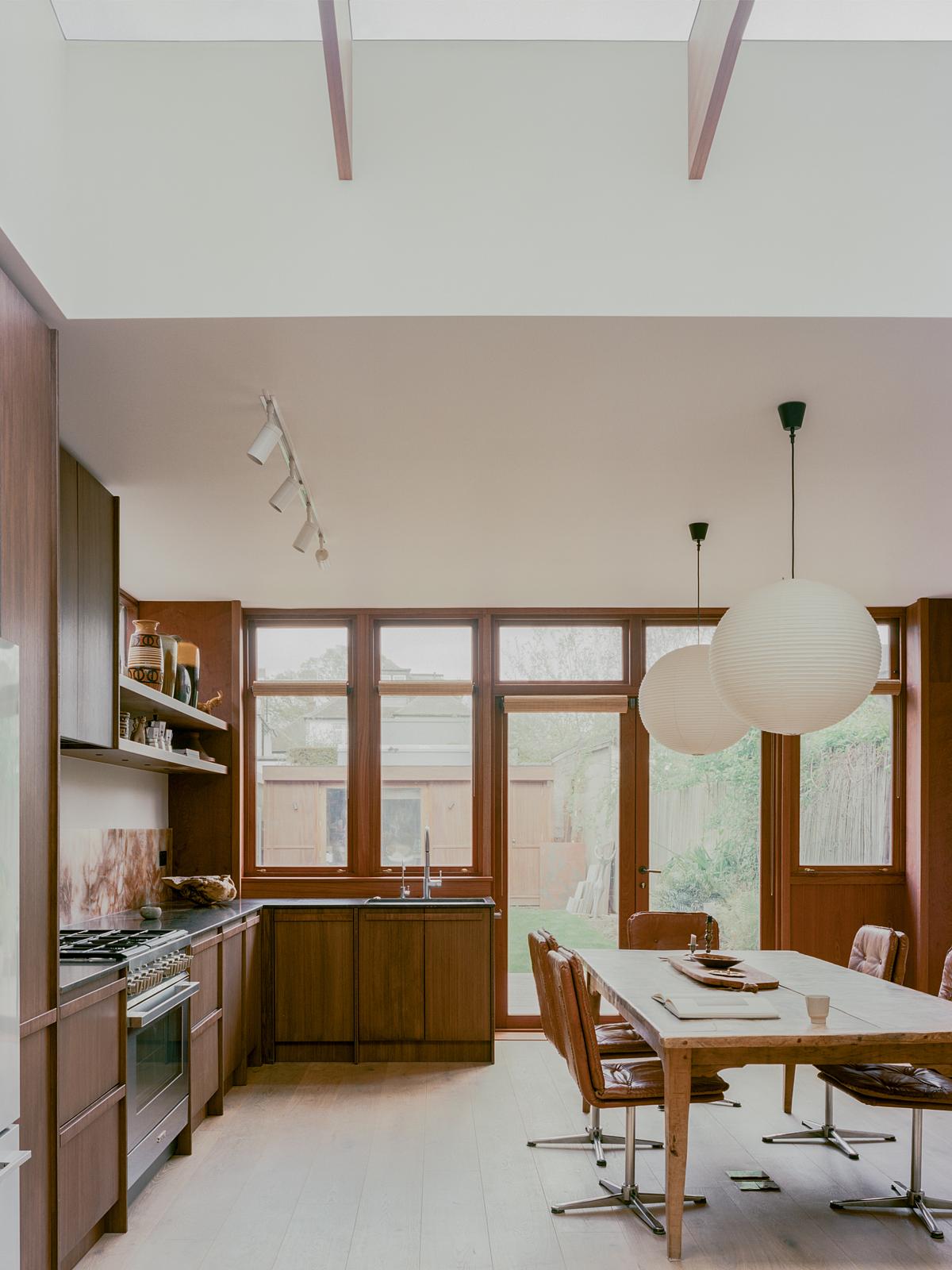
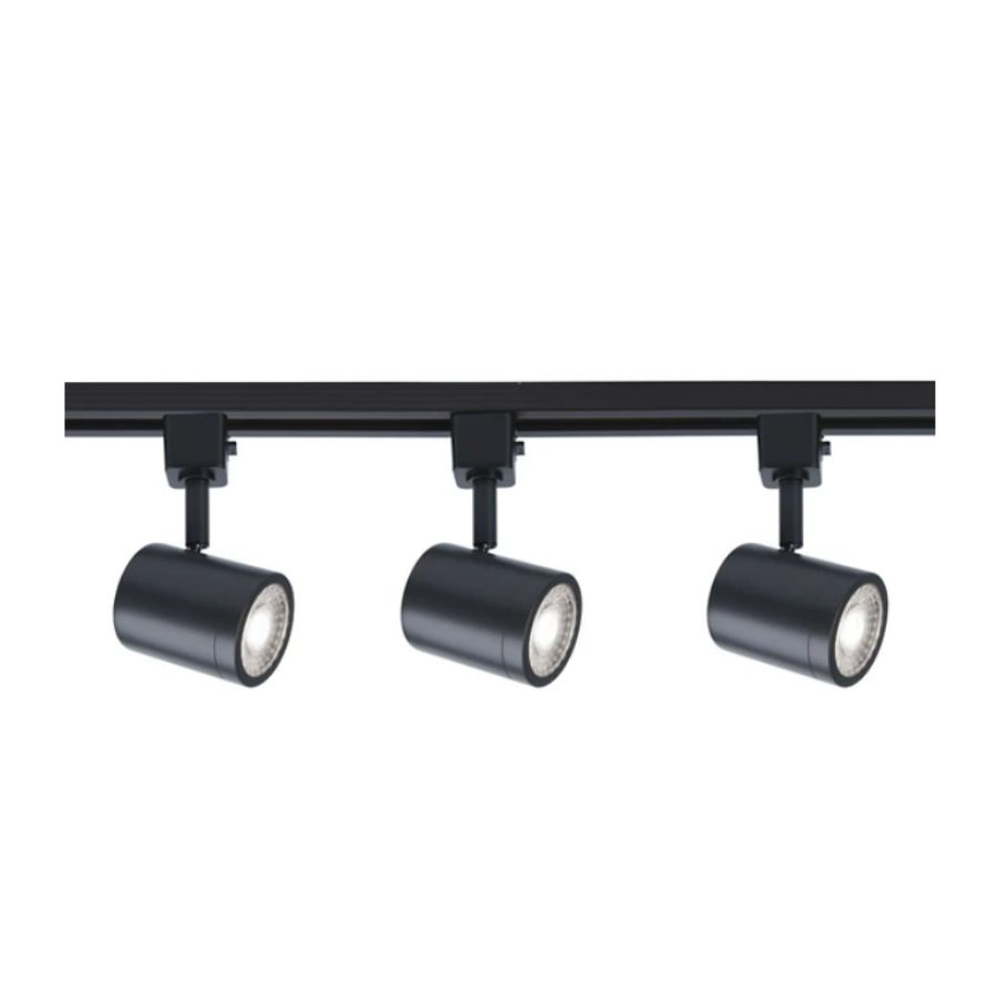
Finally, track lighting has a distinctly mid-century look. It's a style of kitchen lighting that really took off in the '60s and '70s and makes for the perfect mid-century addition. Track lighting isn't too decorative, feels purposeful and functional, but has that retro edge to it.
Track lighting emphasizes the lines of the room, can help draw the eye across the ceiling, and in long and narrow kitchens can help the space feel bigger. The added benefit is that they give the homeowner flexibility, allowing you to angle the lights to where you most need them.
3 mid-century modern buys to elevate your kitchen
Be The First To Know
The Livingetc newsletters are your inside source for what’s shaping interiors now - and what’s next. Discover trend forecasts, smart style ideas, and curated shopping inspiration that brings design to life. Subscribe today and stay ahead of the curve.

Former content editor at Livingetc.com, Oonagh is an expert at spotting the interior trends that are making waves in the design world. She has written a mix of everything from home tours to news, long-form features to design idea pieces, as well as having frequently been featured in the monthly print magazine. She is the go-to for design advice in the home. Previously, she worked on a London property title, producing long-read interiors features, style pages and conducting interviews with a range of famous faces from the UK interiors scene, from Kit Kemp to Robert Kime. In doing so, she has developed a keen interest in London's historical architecture and the city's distinct tastemakers paving the way in the world of interiors.
-
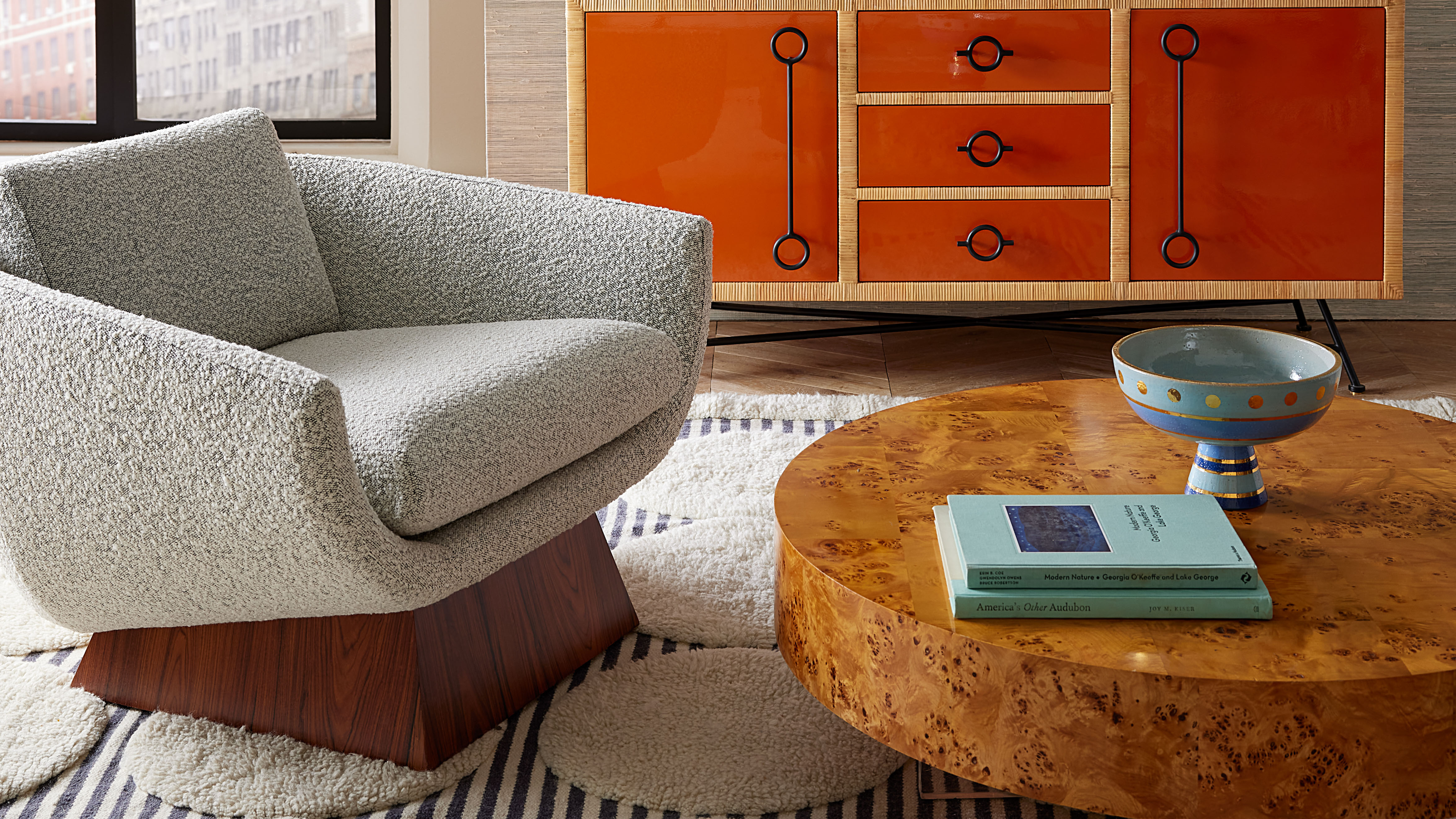 Burl Wood Decor Is 2025’s Most Coveted Comeback — Here’s How to Get the Storied Swirls for Less
Irregularity is the ultimate luxury, but you don’t need an antiques dealer to find it
By Julia Demer Published
-
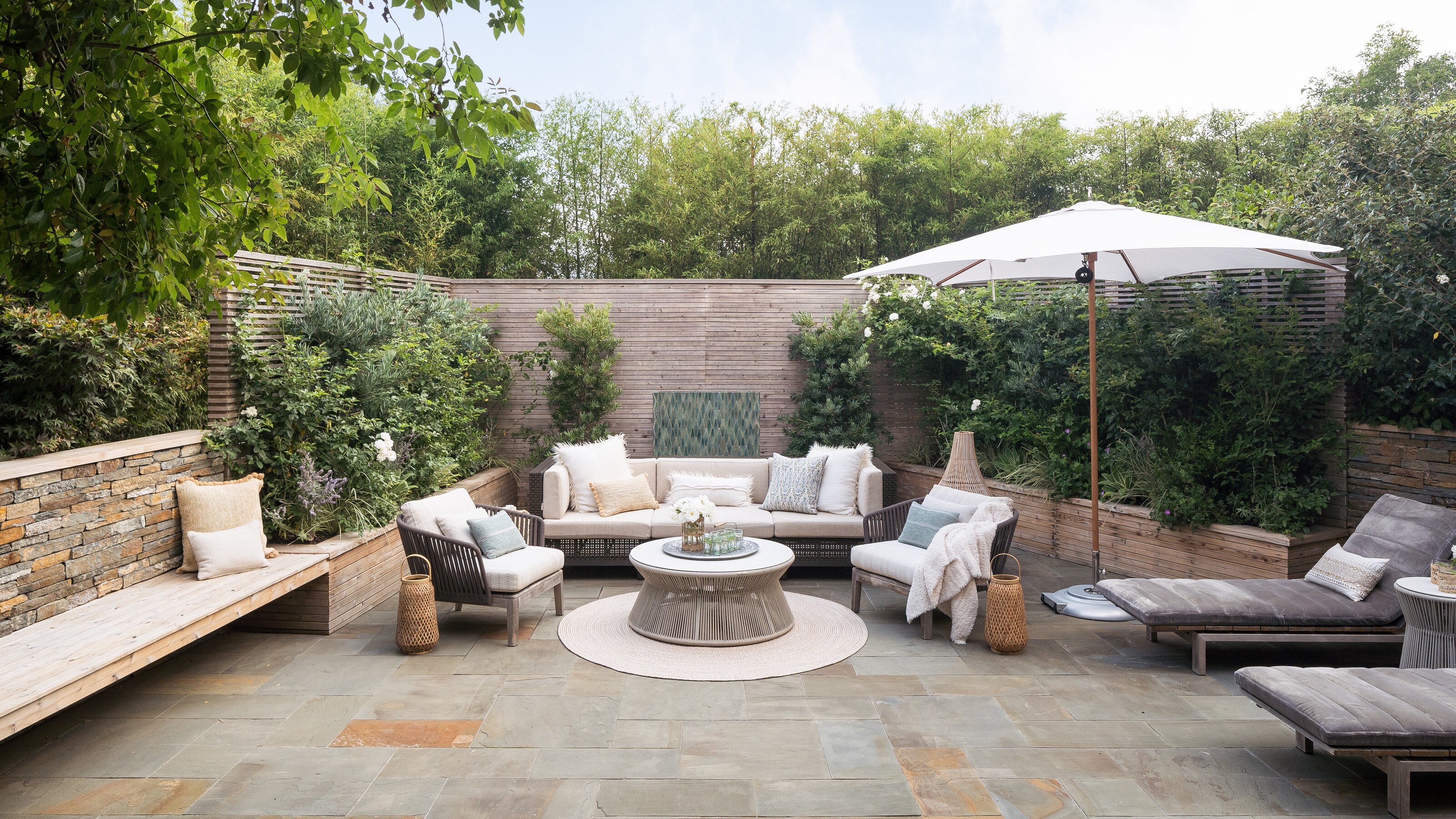 5 Garden Features That Instantly Add Value to Your Home — While Making Your Outdoor Space More Practical, too
Get to know all the expert tips and tricks for making your backyard a standout selling point for your home.
By Maya Glantz Published
