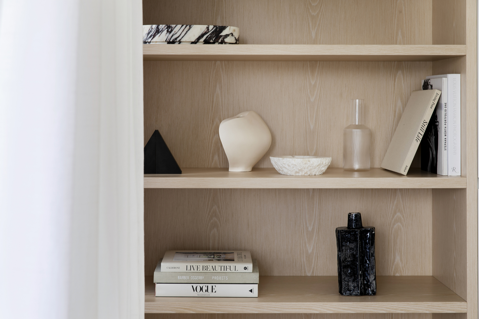
Minimalist Bookshelf Styling — 5 Simple Rules for Shelves That Are Pared-Back, Not Under-dressed
Ready to unlock the answer to a more minimal take on styling a bookcase? Experts share how to get the balance right
The Livingetc newsletters are your inside source for what’s shaping interiors now - and what’s next. Discover trend forecasts, smart style ideas, and curated shopping inspiration that brings design to life. Subscribe today and stay ahead of the curve.
You are now subscribed
Your newsletter sign-up was successful
Curating shelf styling that's minimalist can be a tricky balance to strike. Too much fuss and you run the risk of creating a shelf that’s cluttered, overcrowded and busy; while not enough color or proportion can leave your space looking absent and empty.
Of course, minimalism is all about being clever with texture, color, scale and shape, while staying true to the pared-back principles this movement is known and loved for.
So, to help you understand how to style a bookcase with minimalism in mind, we spoke to interior designers to discover the rules they live by.
Article continues below1. Make use of wood for warmth
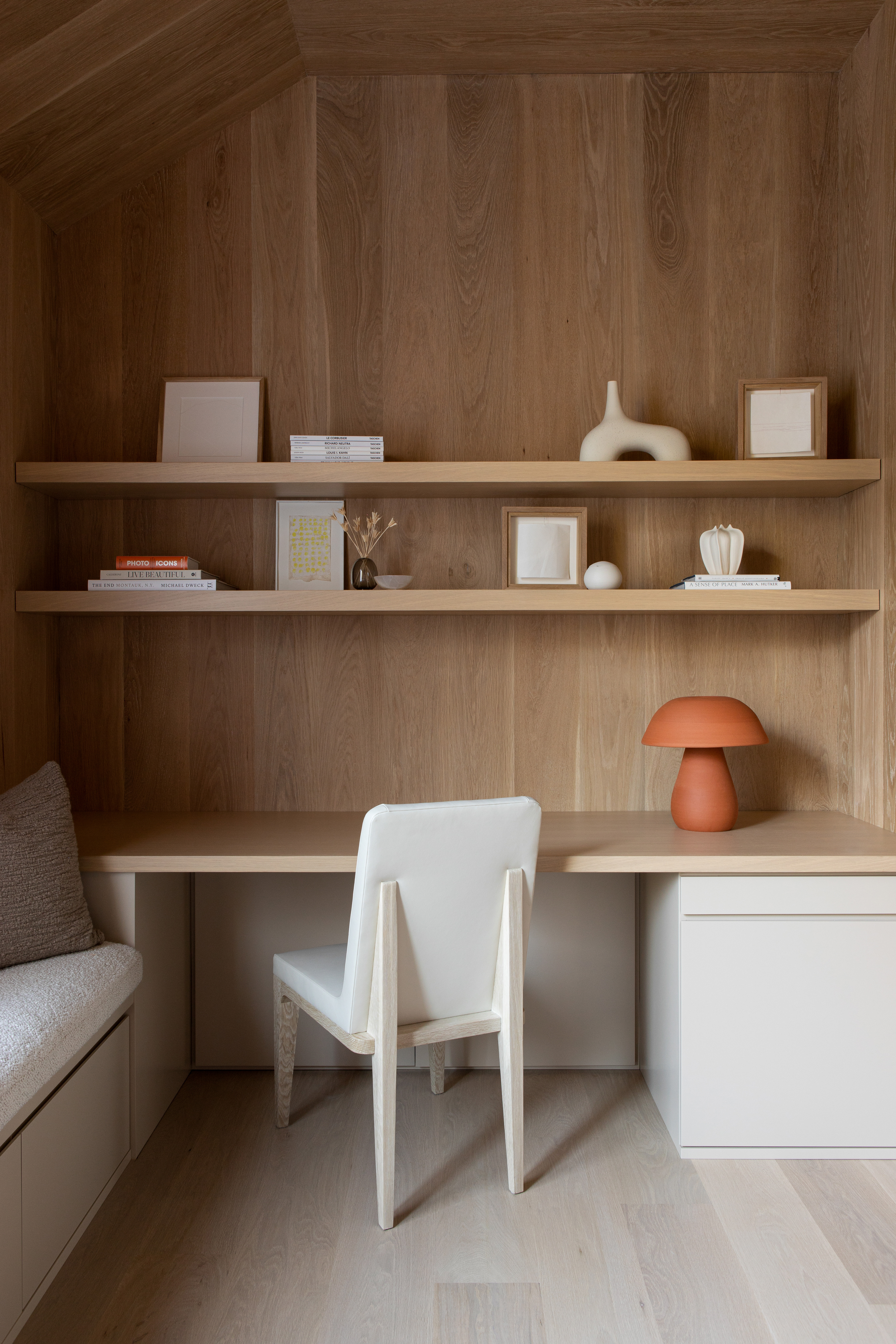
If not done quite right, some takes on minimalism in interior design can look stark and slightly soulless — especially if they’re void of color or monochrome.
But that's not the case with this study, located in a minimalist and modern Hamptons home, which was designed by New York-based interior design firm, Chango.
To achieve a minimalist style without lacking interest, the team injected a lot of warmth with the wood paneling and coordinating shelving, which provided a place to display the client's objects, art, and favorite books — a cool contrast to the washed floors.
So if you’re yet to invest in the right bookshelf or have shelves made, consider opting for a wooden option, to help bring some warmth to your space.
The Livingetc newsletters are your inside source for what’s shaping interiors now - and what’s next. Discover trend forecasts, smart style ideas, and curated shopping inspiration that brings design to life. Subscribe today and stay ahead of the curve.
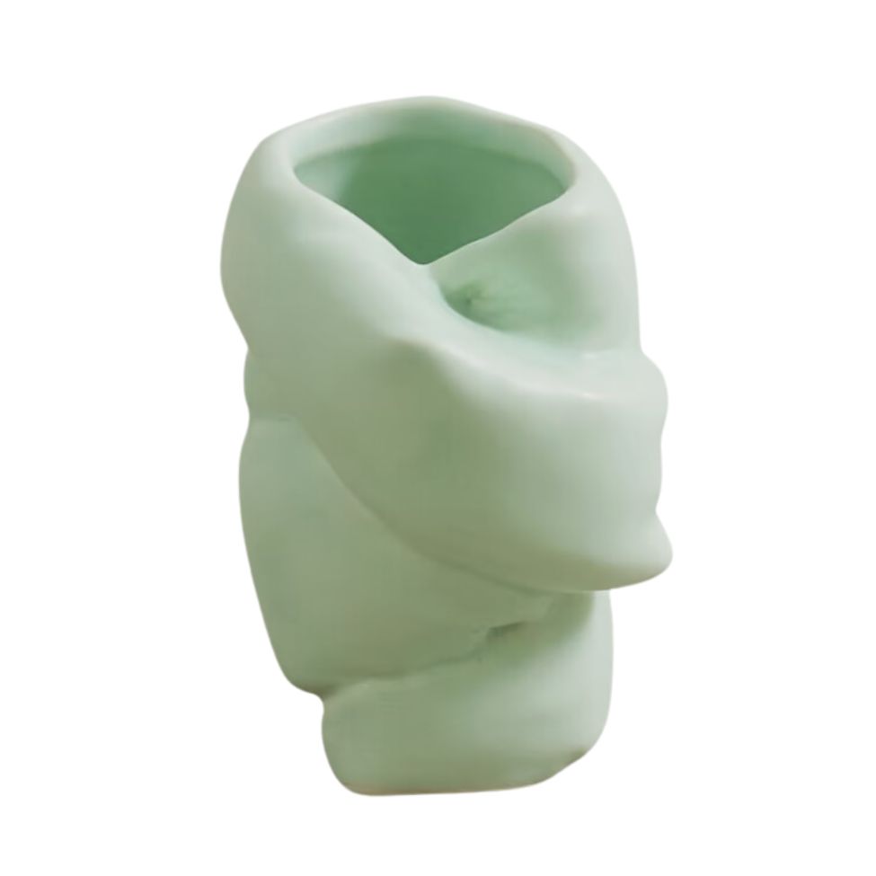
Price: $64, Was: $160
This soft shade of green still feels minimalist while offering an intriguing colorful addition to your shelves.
2. Embrace negative space

"Negative space when designing bookcases refers to space around and between objects," Connie Vernich of Tennessee-based resident interior design firm, Vernich Interiors, explains. "This space allows the object you put in your bookcase to stand out and become centerstage. Too many people make the mistake of putting every piece they own and love on their bookcase shelves thinking that they will want to see it and appreciate them but unfortunately, what happens is you end up with a cluttered mess."
Connie’s take on whittling down your ornaments? Take the items that mean the most to you and give them the space they deserve.
"I tend to put like objects or collections together, for example, a grouping of antique boxes or possibly some found old antique cameras can look so amazing when displayed together. They tell a much better story," she says.
3. Include objects that vary in form
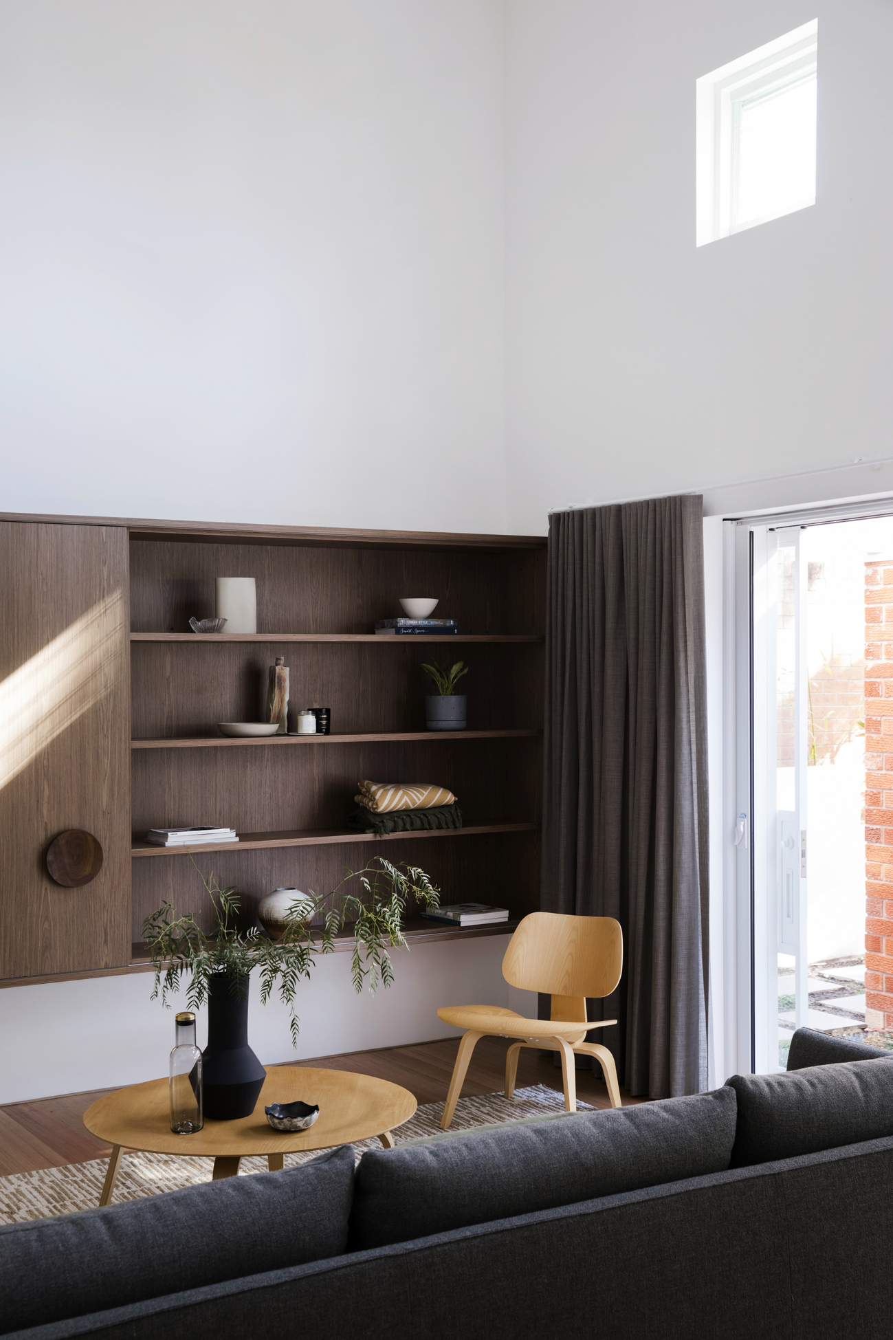
They might be called bookshelves but that doesn't mean you can only place books on them. "For a minimal color palette, consider including objects that have variation in form, directionality, texture and opacity to bring depth to the arrangement," Eva-Marie Prineas, principal of Studio Prineas suggests. Whether it's plants, vases, bowls or candles, mix up your additions to max out on interest.
After picking out your most prized possessions, the next step is to start decorating your bookshelf. But, as Prineas reminds us all, remember to 'review the "solid to void" ratios of the arrangement of elements. "This will ensure there is more void than solid within the composition, while also positioning objects along the shelves to maintain a visual balance," the expert adds.
4. Limit your color palette
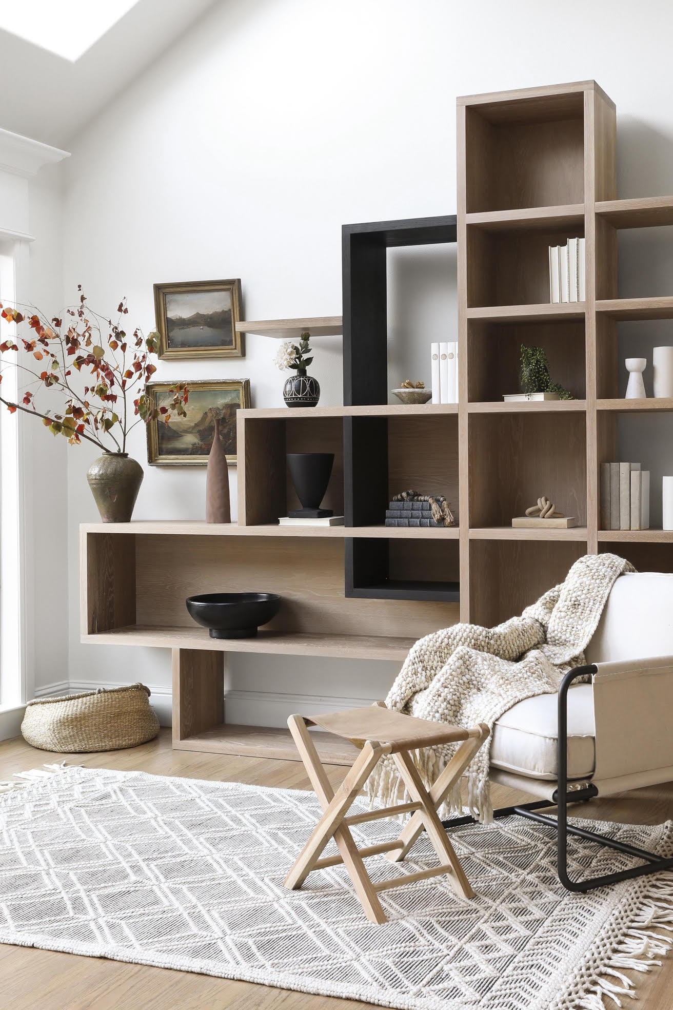
While we’re not saying you need to avoid color entirely (for example, soft shades, like baby pink, can still be used in a minimalist color palette), it's worth giving some serious thought to the number of shades you use.
"Stick to a limited color palette to maintain a cohesive look," Ginger Curtis, president of Texas-based interior design company, Urbanology Designs, says. "Neutral colors with occasional pops of muted tones work well."
These pops of color could come from books, plants or pictures you've placed next to the shelf.
5. Choose quality over quantity
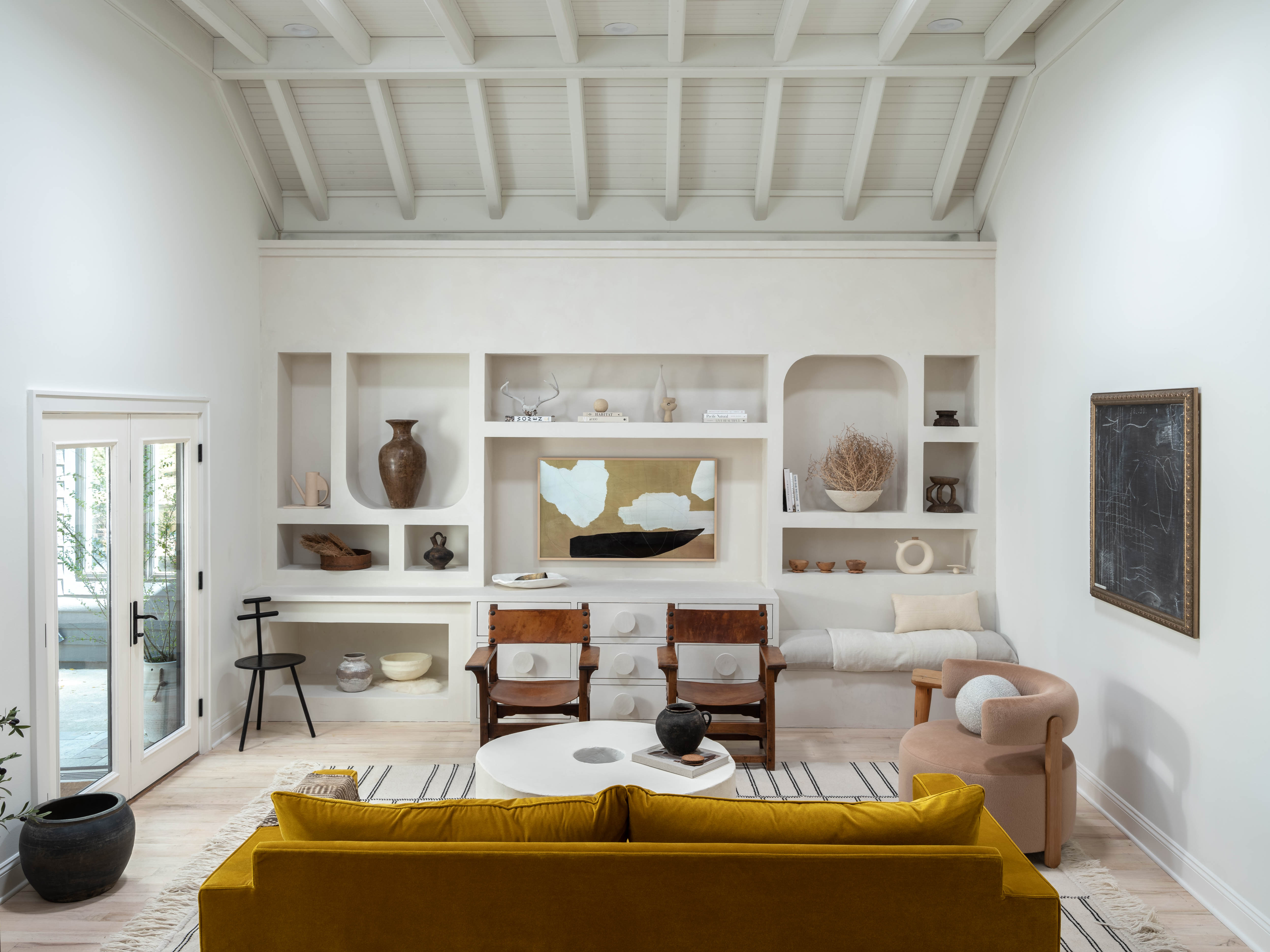
Simplicity and intentionality are at the heart of the minimalism movement.
Therefore, keep in mind the quality over quantity approach, while taking on a less is more mindset which will help to create visual harmony on your shelves.
"Choose high-quality items that make a statement rather than filling the shelf with numerous small objects," Curtis explains. "Layer items by placing smaller objects in front of larger ones to create depth and interest without overwhelming the space."
How do you make a bookshelf not look cluttered?
To make a bookshelf not look cluttered, there are a few rules to follow. According to Ginger Curtis, president of Urbanology Designs, editing regularly, grouping similar items together, making good use of storage solutions and not being afraid of negative space is a good place to start.
Curtis says: "Periodically reassess your bookshelf and remove items that no longer serve a purpose or fit the aesthetic. Group books and objects by type, color, or theme to create a sense of order. Incorporate stylish storage boxes or baskets to keep smaller items out of sight and leave some shelves partially empty or sparsely decorated to create breathing space and prevent a cluttered look."
Becks is a freelance lifestyle writer who works across a number of Future's titles. This includes Real Homes, Top Ten Reviews, Tom's Guide, TechRadar and more. She started her career in print journalism at a local newspaper more than 8 years ago and has since then worked across digital and social media for food, fashion and fitness titles, along with home interior magazines. Her own interior style? She's big on creating mindful spaces in every corner of her home. If it doesn't spark joy or happiness, it has no place here. When she’s not writing, she’s reading and when she’s not reading, she’s writing.
