8 minimalist design trends for 2024 to take pared-back schemes to a new level
New ways with texture and a cool new furniture style – these minimalist design trends are calling to us…

The Livingetc newsletters are your inside source for what’s shaping interiors now - and what’s next. Discover trend forecasts, smart style ideas, and curated shopping inspiration that brings design to life. Subscribe today and stay ahead of the curve.
You are now subscribed
Your newsletter sign-up was successful
As far as enduring design trends go, minimalism has to be up there as one of the most popular movements that designers return to year after year. In part, that's because our homes are one of the few sanctuaries from the fast-paced nature of daily life – and designers play a key role in creating stillness through our environment.
But another reason why minimalism remains so appealing is that designers are constantly finding fresh ways to approach it. By experimenting with texture, color, scale and shape, the top creatives have introduced us to exciting new interpretations of the trend – all while staying true to the movement's principles. 'We strive to create minimalist designs that whisper rather than shout,' as Danish studio Norm Architects so succinctly puts it.
From new furniture silhouettes to innovative ways with texture, the ideas below are some of the best new trends to come from this enduring interior design trend.
Article continues below1. Low-slung furniture
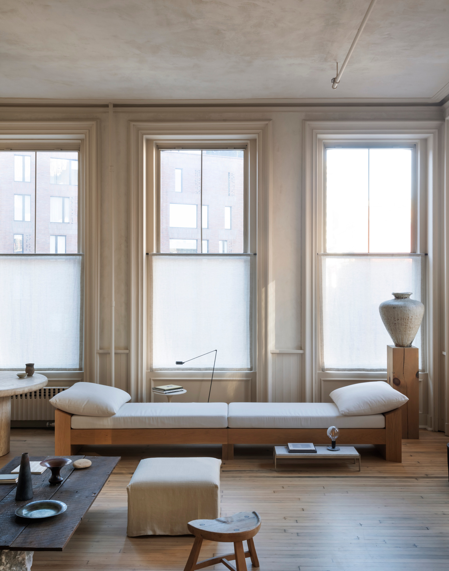
There's a casualness to furniture that sits low to the ground that lends itself perfectly to minimalist spaces – it helps these schemes feel a little less formal, a little more lived-in. Sofas, beds and shelving are prime candidates for taking this low-profile approach. They can also have a heightening effect on a room – a kind of optical illusion that's particularly beneficial for a minimalist scheme.
For stylist Colin King, low-slung furniture like this daybed was part of a larger effort to strip his New York apartment back as much as possible to let the building take center stage. ‘The more I pared back the apartment, the more the beautiful original features like the windows, mouldings and flooring came back to life,' he told us when we took a tour of his home.
2. Stone baths
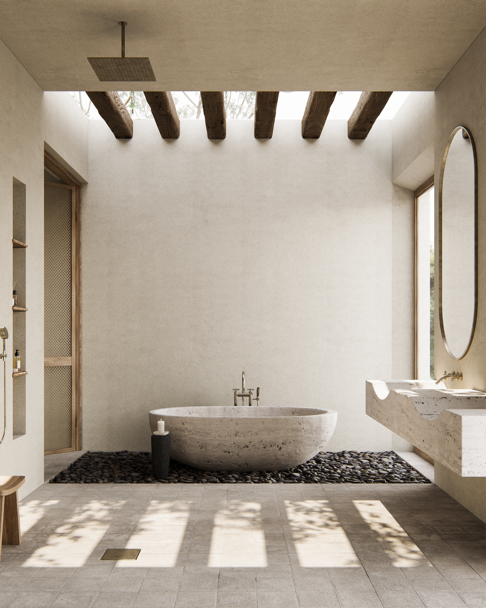
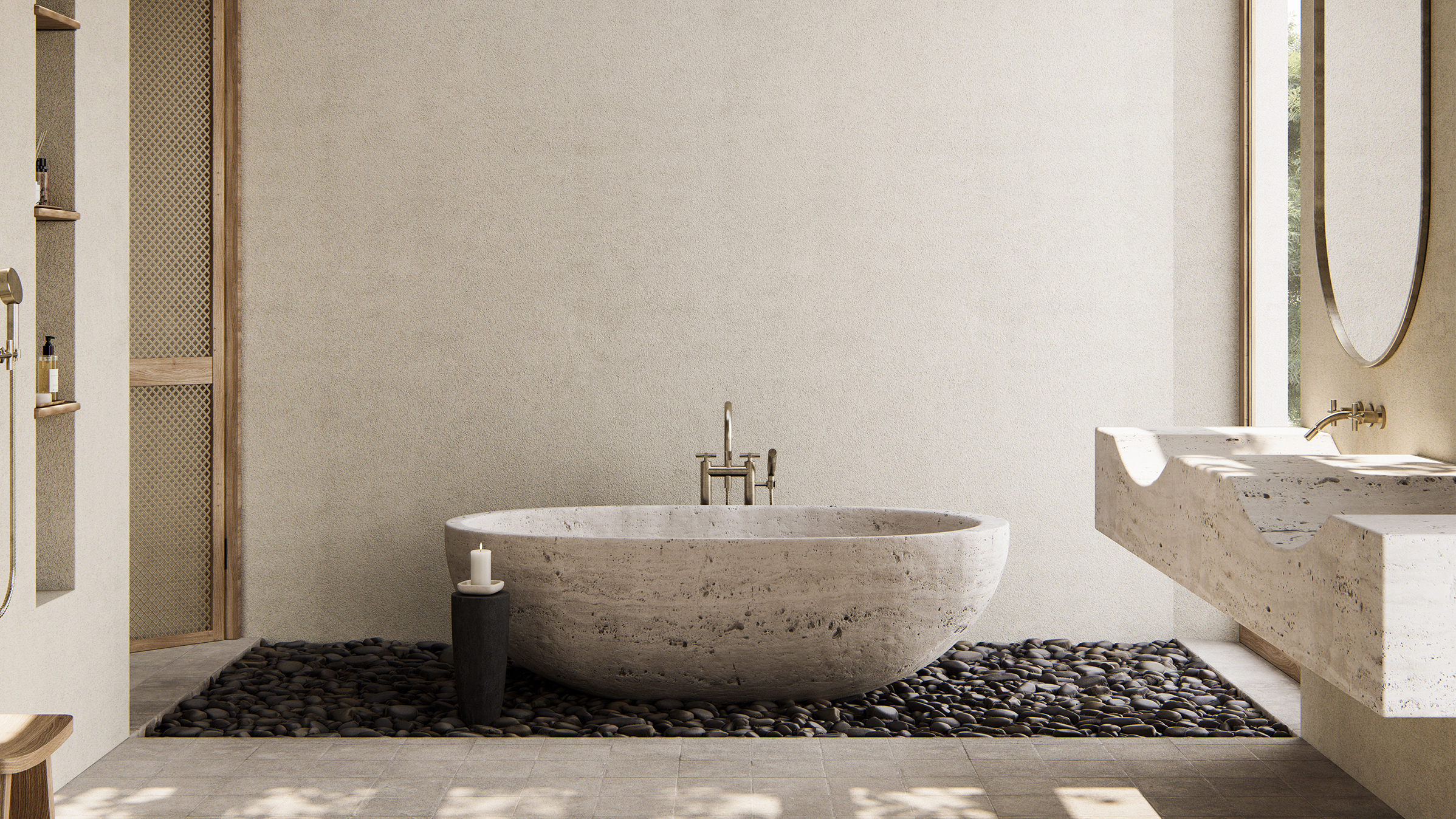
Bathroom design has taken an exciting new turn recently with the growing popularity of more unusual bathroom materials, but it's stone that's gained the most favor among minimalist designers, thanks to its ability to bring instant texture and earthiness to the space. The key is to use the material in conjunction with softer forms for an easy harmony. 'It is about creating balance and bringing out the qualities of each material, either visual or functional – and by playing with contrasts (cold and warm, smooth and textured), the materials and the space become elevated,' Danish architect Danielle Siggerud told us.
We've seen stone used in basins and vanity units, but we're particularly taken by the concept of stone baths. It taps into Siggerud's comments on contrast: the interplay between the smooth shape of a bath and the rough look of stone (though don't worry – they're smooth to touch!) is key to this minimaluxe look. At the helm of the trend, naturally, is Noa Santos, who's used stone across several of his bathrooms – including this one, which features a travertine design over a bed of smooth pebbles.
The Livingetc newsletters are your inside source for what’s shaping interiors now - and what’s next. Discover trend forecasts, smart style ideas, and curated shopping inspiration that brings design to life. Subscribe today and stay ahead of the curve.
3. Paper lamps
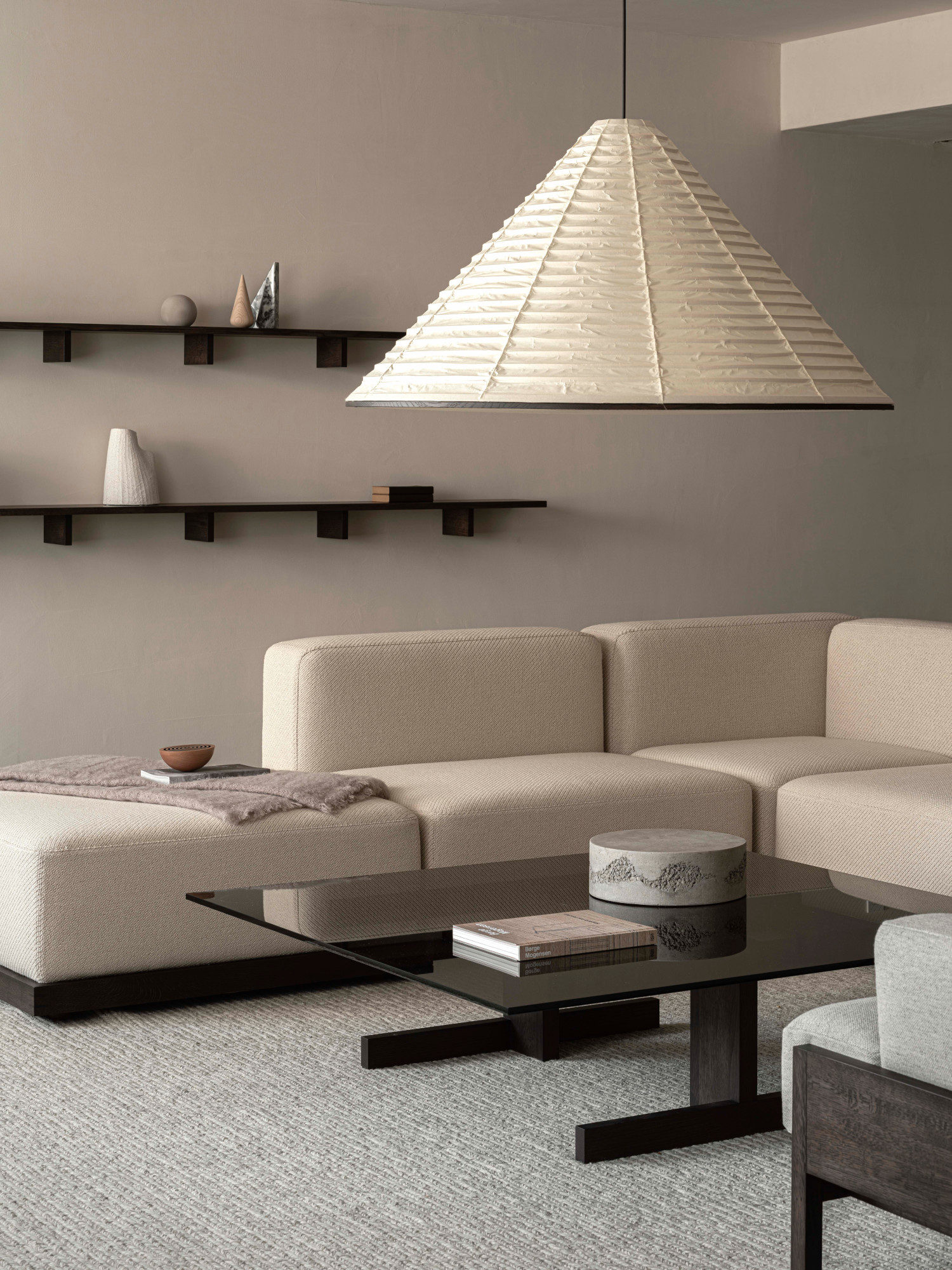
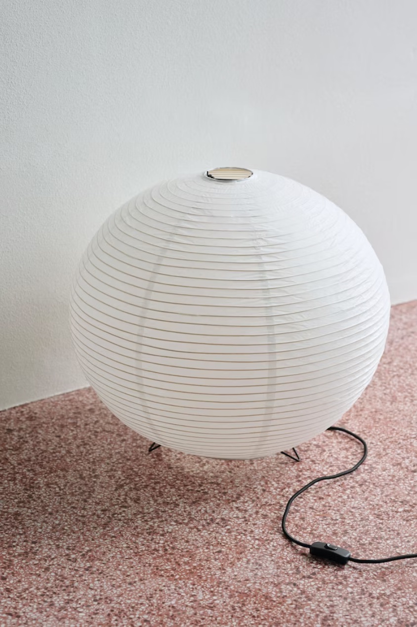
Paper lamps have strong ties with Japanese design, and we've seen them appear more frequently in projects over the last couple of years – a Noguchi piece has become a staple of many a design-savvy household. But this lighting trend lends itself particularly well to minimalist schemes.
'Built from natural materials and meant to illuminate the surroundings in all directions, the traditional Japanese lanterns are a great example of the integration of traditional Japanese design in minimalist Scandinavian homes,' explains Emma Jo Ejskjær of Copenhagen's Norm Architects, who created the bespoke lamp above to tell the story of the collaboration between Karimoku, a leading Japanese wooden furniture manufacturer, and Kojima Shouten, a 220-year-old Kyoto-based lanternmaker. 'Using the inherent qualities of the paper to diffuse light, it becomes warm and inviting, while also showing the tactility of the paper itself.'
4. Straight lines
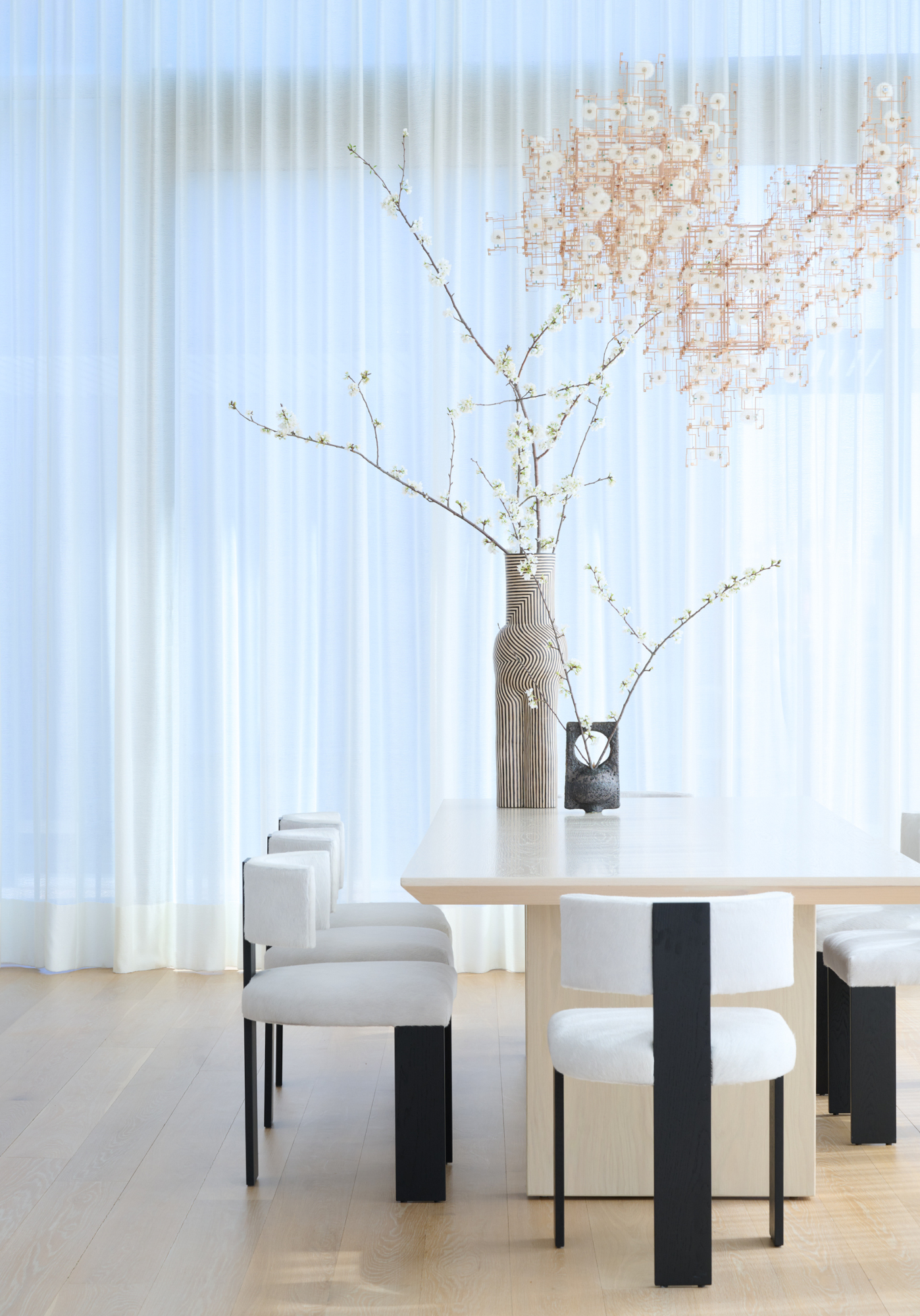
Curvaceous forms have enjoyed such popularity in minimalist interiors for the past few years that it's refreshing to see graphic lines and angular pieces return as centerpieces in a space. While curves can feel soothing and organic, straight lines have a sense of order and structure that can benefit a minimalist scheme.
The bolder decorator can evoke these lines through larger furniture pieces: think a sleek, low-profile but boxy sofa, a rectangular dining table or a statement dining chair, like the ones used in this minimalist dining room scheme by New York interior design practice Butter and Eggs. Alternatively, choose a rug with a linear pattern, or invest in a piece of artwork that plays with angular forms.
5. Zellige floors
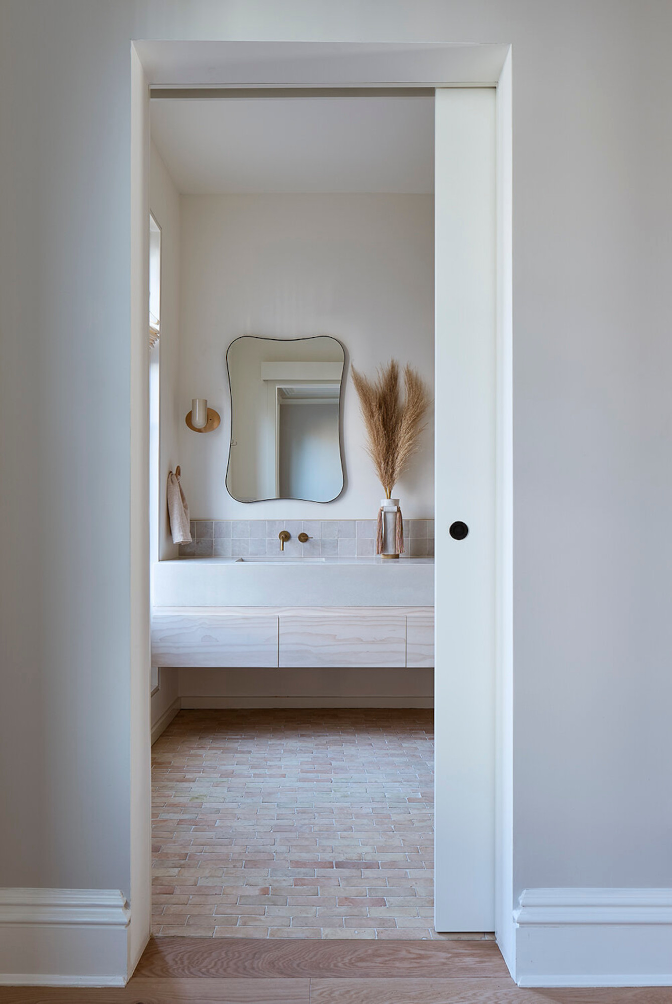
You might have noticed that many of the trends on this list are materials – and that's because texture is a crucial element of a successful minimalist scheme. And so it goes that zellige tiles have been popping up in the flooring of some architectural and interior design projects – they're a warmer way to introduce texture underfoot than some stones, and feel fresher too.
For Brooklyn, New York design practice Studio Fauve, zellige was the natural pairing with the pale woods and stones of this bathroom. Keeping to lighter shades stops the small-scale pattern of the flooring from overwhelming the space.
6. Pocket doors
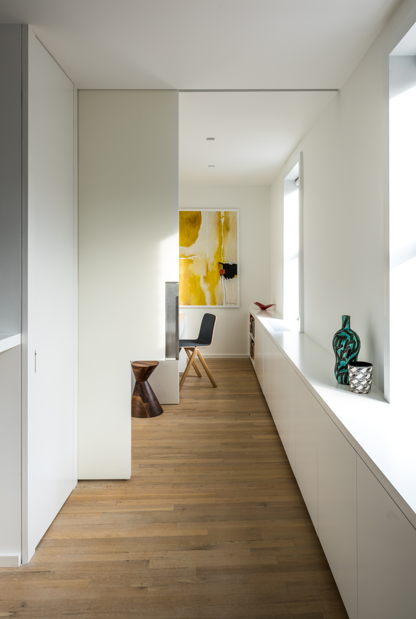
As well as being a space-saving solution, clever pocket doors are a great way to zone a minimalist space, offering the option to keep rooms open or close them off as needed. They tap into the contemporary need for flexibility while being visually unobtrusive.
They're particularly useful in apartments, as this project by New York's Michael K Chen Architecture shows. In it, the studio explains, 'a home office at one end can be partitioned from the rest of the apartment with an oversized pocket door.' It's part of a larger-scale bespoke design that adds extra functionality to the home while remaining low-key. 'Lightened and subtly textured materials, and exactingly detailed custom elements, create an elegant and informal living environment for a professional couple,' the studio adds.
7. Earthy green
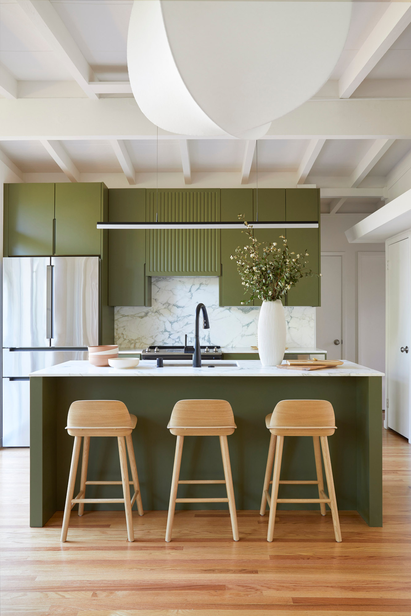
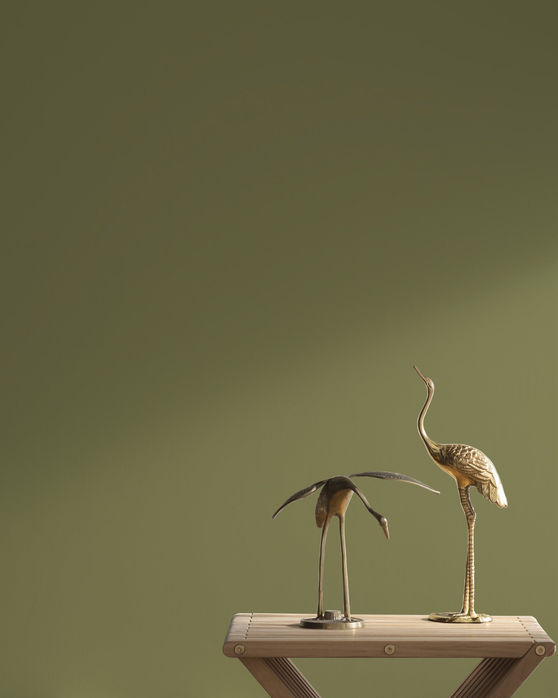
Warm neutrals might be a popular choice in minimalist schemes, but that doesn't mean color is excluded: in fact, earthy green has grown in popularity among designers who use minimalist principles in their work. 'Earthy greens are a favorite color for us to incorporate into our designs because they occur naturally in our outdoor surroundings, making them blend in with our minimalist designs fairly seamlessly,' explains South Bay Area interior designer Cathie Hong. 'They add punch, but in a calming, natural way.'
As an example of a minimalist way to use green, Cathie chose Benjamin Moore's Shady Lane for these kitchen units. '[It] felt like a perfect complement to all of the greenery seen through the large floor-to-ceiling glass panels just adjacent to the kitchen,' she says. 'The architectural style of the house was midcentury modern with sloped wood ceilings and exposed rafters, so we paired the natural color with a clean and linear design with playful grooved accents.'
8. Textured walls
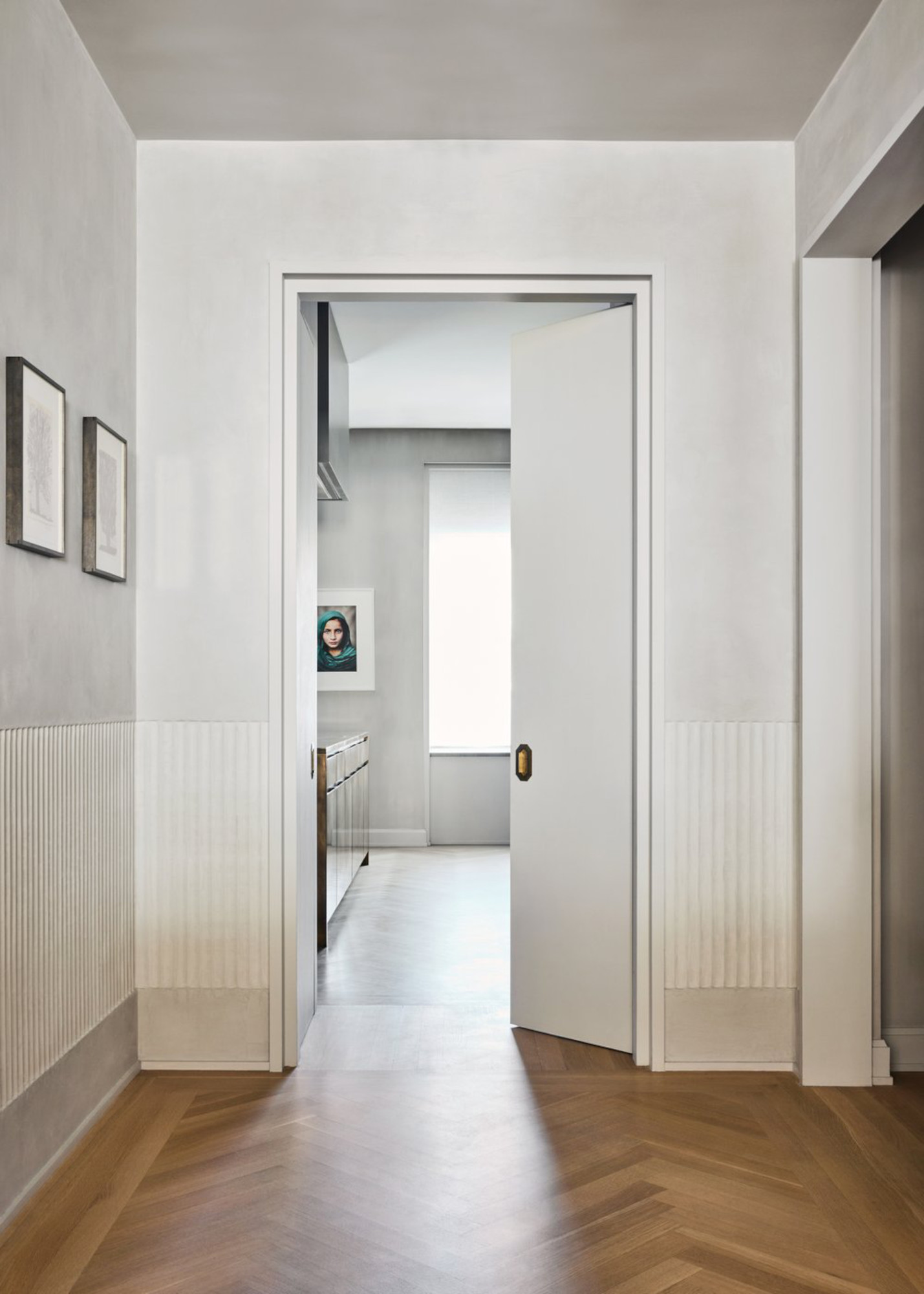
Plaster-effect walls have been popular for some time now, but they remain one of interior designers' favorite ways to introduce a softness to a minimalist scheme. Now, the next iteration of this trend sees carvings and mouldings used to add even more interest to this otherwise blank canvas.
In this Soho apartment, New York studio GACHOT created a ribbed texture in a ribbon wrapping around the lower third of the hallway walls – an addition that feels like a fresh new take on panelling, but is unobtrusive enough to appeal to minimalist schemes. Keeping the rest of the space clean – including smooth joins between the walls and ceiling – helps draw attention to this small but effective detail.

Ellen is deputy editor of Livingetc magazine. She works with our fabulous art and production teams to publish the monthly print title, which features the most inspiring homes around the globe, interviews with leading designers, reporting on the hottest trends, and shopping edits of the best new pieces to refresh your space. Before Livingetc she was deputy editor at Real Homes, and has also written for titles including Homes & Gardens and Gardeningetc. Being surrounded by so much inspiration makes it tricky to decide what to do first in her own flat – a pretty nice problem to have, really. In her spare time, Ellen can be found pottering around in her balcony garden, reading her way through her overstacked bookshelf or planning her next holiday.
