10 minimalist dining rooms where even breakfast would feel elegant, and how to recreate them
Calm, chic and flexible, these clever minimalist dining rooms can do it all. We asked ten designers to reveal their tricks
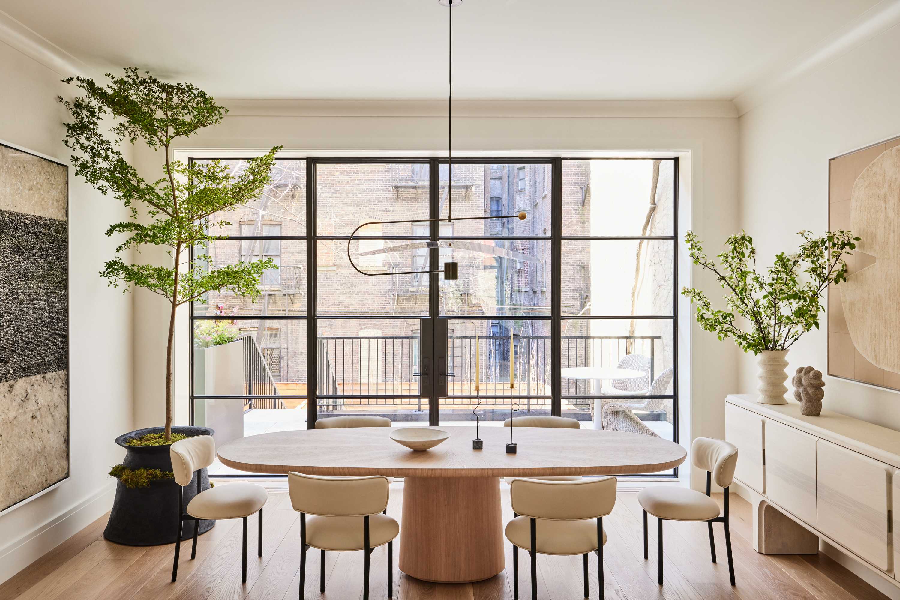
Scented candles on the dinner table? Surely not. It's an often-repeated 'rule' that sandalwood, orange blossom et al are best left out of the dining room, so as not to muddle our poor senses entirely. But could the same be said of another sense – sight? And could minimalist dining rooms actually make perfect sense when it comes to setting the scene for a perfect feast?
If there's any room in the home that makes a strong case for minimalist interior design, it's this one. Naturally, there is need for a sizeable piece of furniture – and a decent dining table is just as important as the much agonised over sofa – as well as enough chairs to comfortably seat the whole clan. Add in the happy anarchy of family mealtimes or a more-the-merrier dinner party and it's clear that a little curation is just the thing when chaos comes all too easily (and that's without a disorienting waft of pomegranate noir).
Creating an effective dining space is all about asking yourself the right questions, suggests Keren Richter, co-founder of New York-based interior design studio White Arrow. "Do you need to accommodate six or twelve? Will you be hosting mostly adults, or children as well? We also think about how a dining space will feel – is your chair upholstered and made for long conversations? Do you like the warmth of wood or the tactility of stone?" Layering all of these choices feeds into what she calls "a full design conversation".
We've selected ten beautifully minimalist dining rooms that answer those questions brilliantly – and asked the designers how they did it.
Ten minimalist dining rooms and how to achieve them yourself
1. Resist the pursuit of perfection
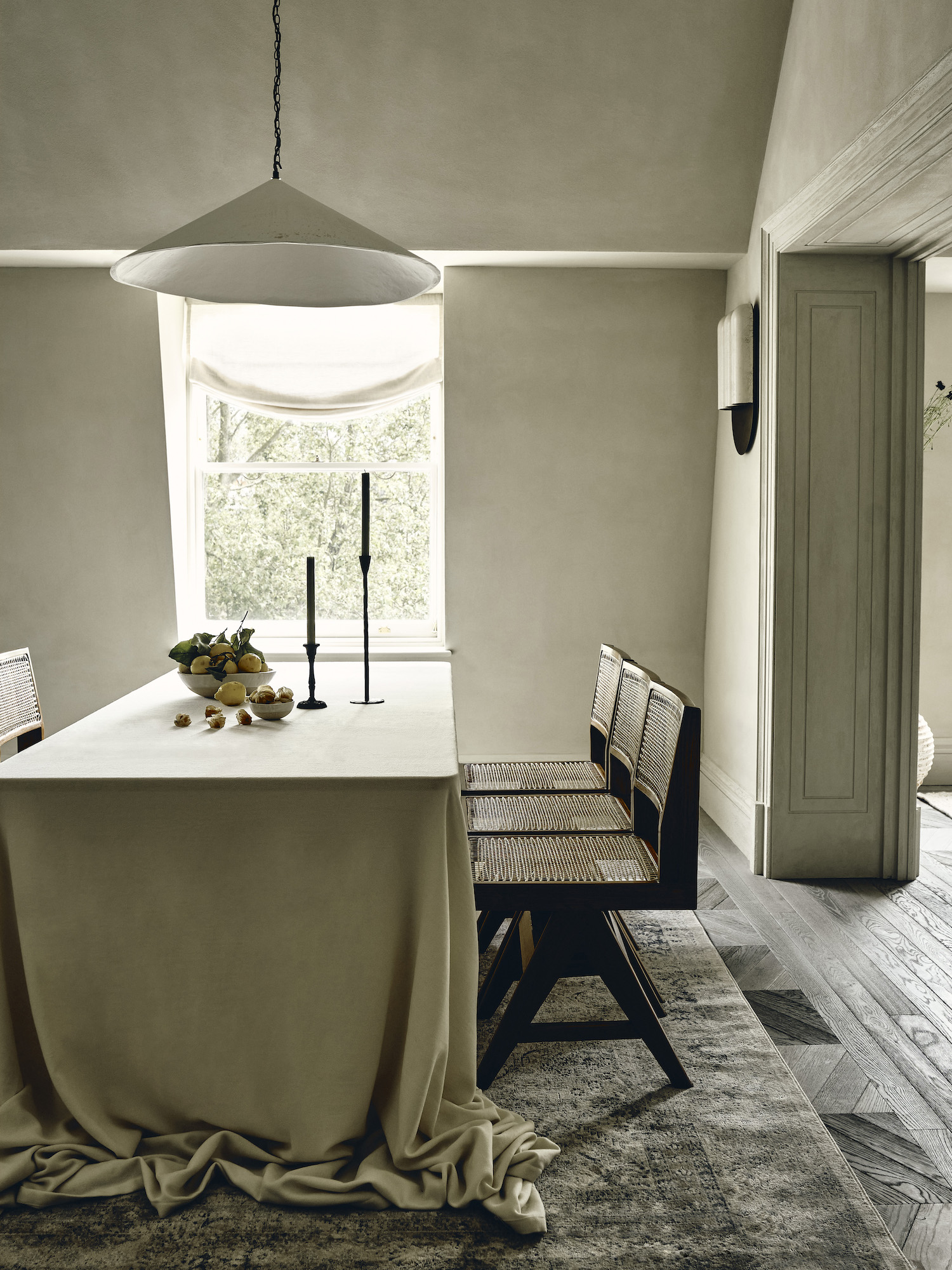
Wabi-sabi dining room by Banda
With its clay plaster walls and Vermeer-like palette, there might be something a little monastic about this dining room by Banda. Perhaps that's precisely why CEO and creative director Edo Mapelli Mozzi is keen to point out why it's anything but austere.
"The Japanese principal of wabi-sabi – the art of finding beauty in imperfections – was a big influence in the design of this home," he says. "The loosely draped and oversized table cover adds a very relaxed, informal feel which is reinforced by the beautiful, but imperfect, 'Wobble' light by Alexandra Robinson above."
Made by applying plaster with a palette knife, the textured pendant naturally draws the eye to a softer edge, while the gathered cloth eases the transition from table to floor.
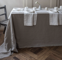
Smooth linen table cloth, Rough Linen
There is a real slubbiness to the cloths at Rough Linen, a tactile texture that catches the light. It also sells bedding, and its duvet sets make for wonderfully sensual minimalist bedrooms, too.
2. Mirror your materials
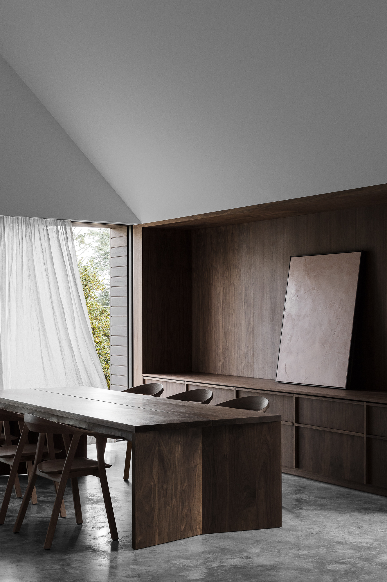
Design by Adam Kane Architects
As well as a walking advertisement for the virtues of walnut, this minimalist kitchen and dining space by Adam Kane Architects is a clever lesson in continuity.
"The island transforms seamlessly from kitchen bench into the dining table, through a discrete floor level change within the kitchen area," Kane explains. "This creates an informal area to entertain and gather, and was believed a refined solution to ‘stepping’ the benchtop heights. The back-bench joinery extends into the living area, connecting the two spaces together."
The dining area, then, is part of a larger and airier space, and yet it maintains a real sense of intimacy. With a wealth of historic timber homes in the area and a walnut tree already on site, the dark wood proved an easy choice for the cabinetry, custom dining table and chairs.
3. Consider color – but choose carefully
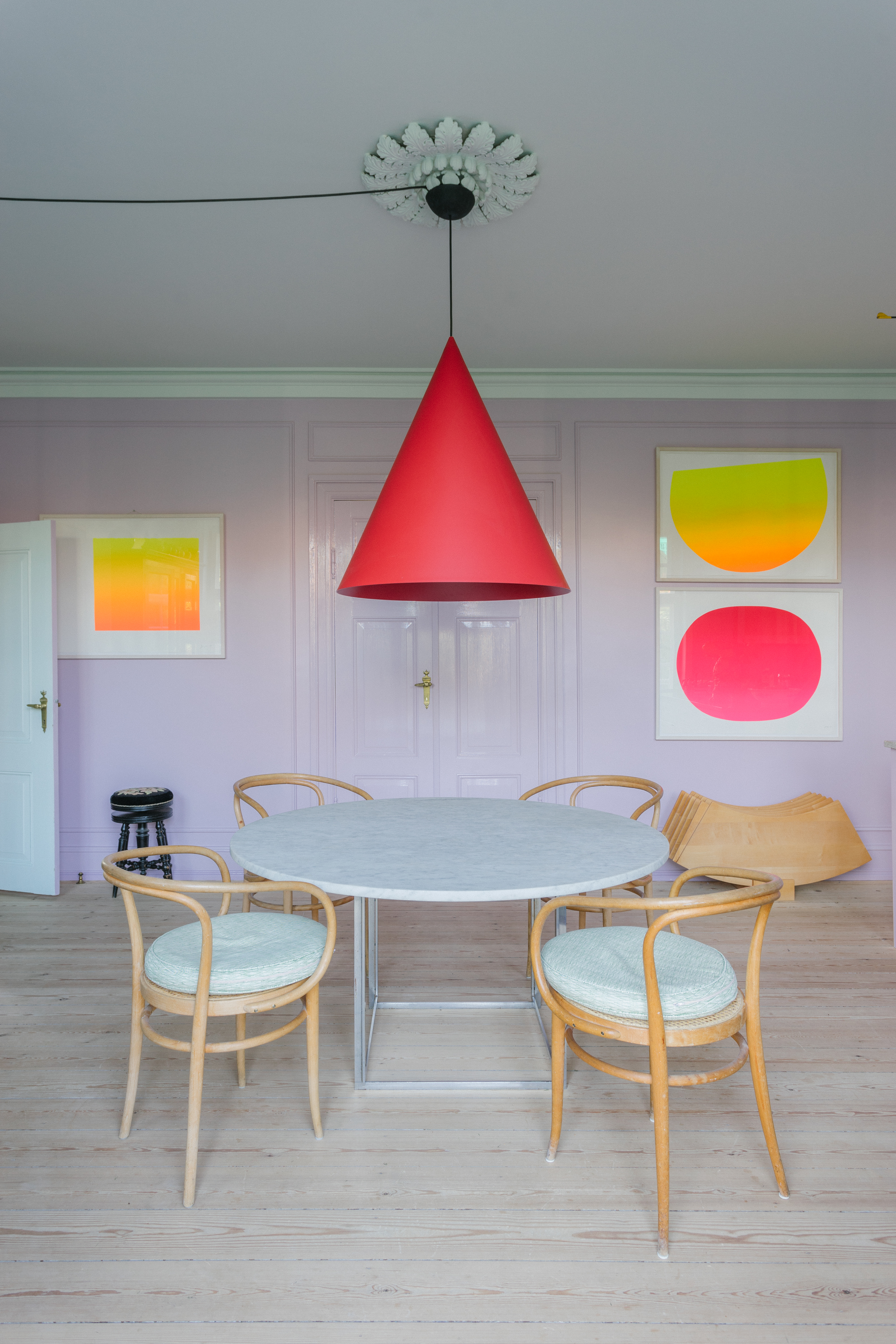
Dining room by Nadia Olive Schnack
Purists might feel challenged by the modish lilac shade that interior designer Nadia Olive Schnack has chosen for her own dining room – in fact, there's hardly a white wall in the house. But like so many things in life, she says, maintaining a sense of calm in a colorful space "is a question of balance".
"When choosing color for a room I always consider a contrasting atmosphere, and which colors are cold or warm. Usually when I get those right you get the sensation of an inspiring and calm space," she says
You want the whole house to feel harmonious, and these shades can carry through to your minimalist living room too. "My trick is to repeat a color or two throughout the house so unconsciously you will feel the coherence," Nadia advises.
4. Soften the space with a controlled dose of decoration
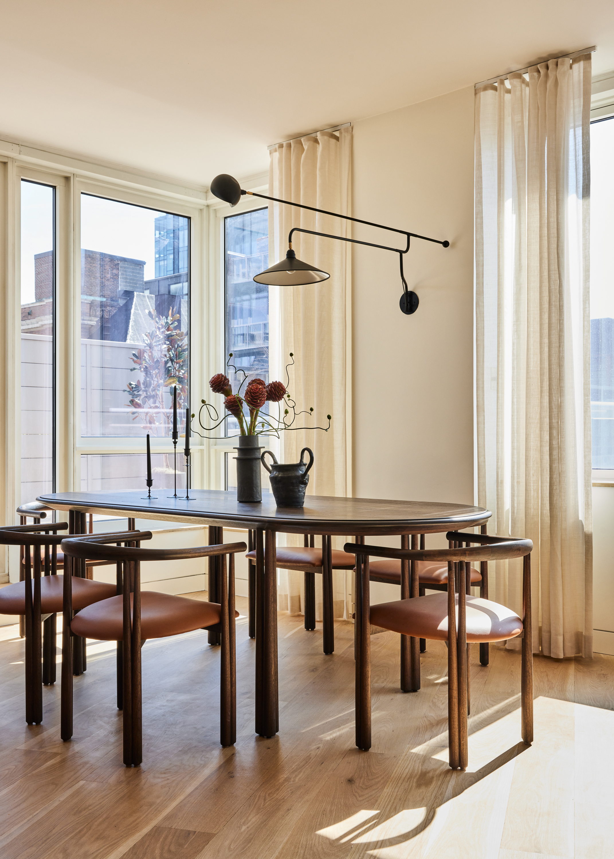
Dining room by Le Whit
A whole raft of designers have been saying why minimalism is a better way of life, pointing to how uncluttered spaces lead to uncluttered minds. The most ardent minimalists might do away with decoration altogether, but we say there's always room for a flourish or two – if done right.
A case in point? This elegant dining area by New York designers Le Whit, which co-principals Corey Kingston and Liza Curtiss approached with a light touch. "This Chelsea home has an expansive exterior patio that overlooks the Hudson River. That and lots of other more dramatic elements throughout the home led us to create a dining room that expresses softness, with its power in the spare minimalism of its furnishings."
The sleek furniture helps to anchor the space, which is bathed in light from dawn to dusk. "We chose a dark wood to foil the bright windows and views, and an elegant lighting fixture that's decorative without being too ornamental. As a family home, we wanted this space to be cozy but understated, beautiful but not overly precious."
5. Seek out symmetry
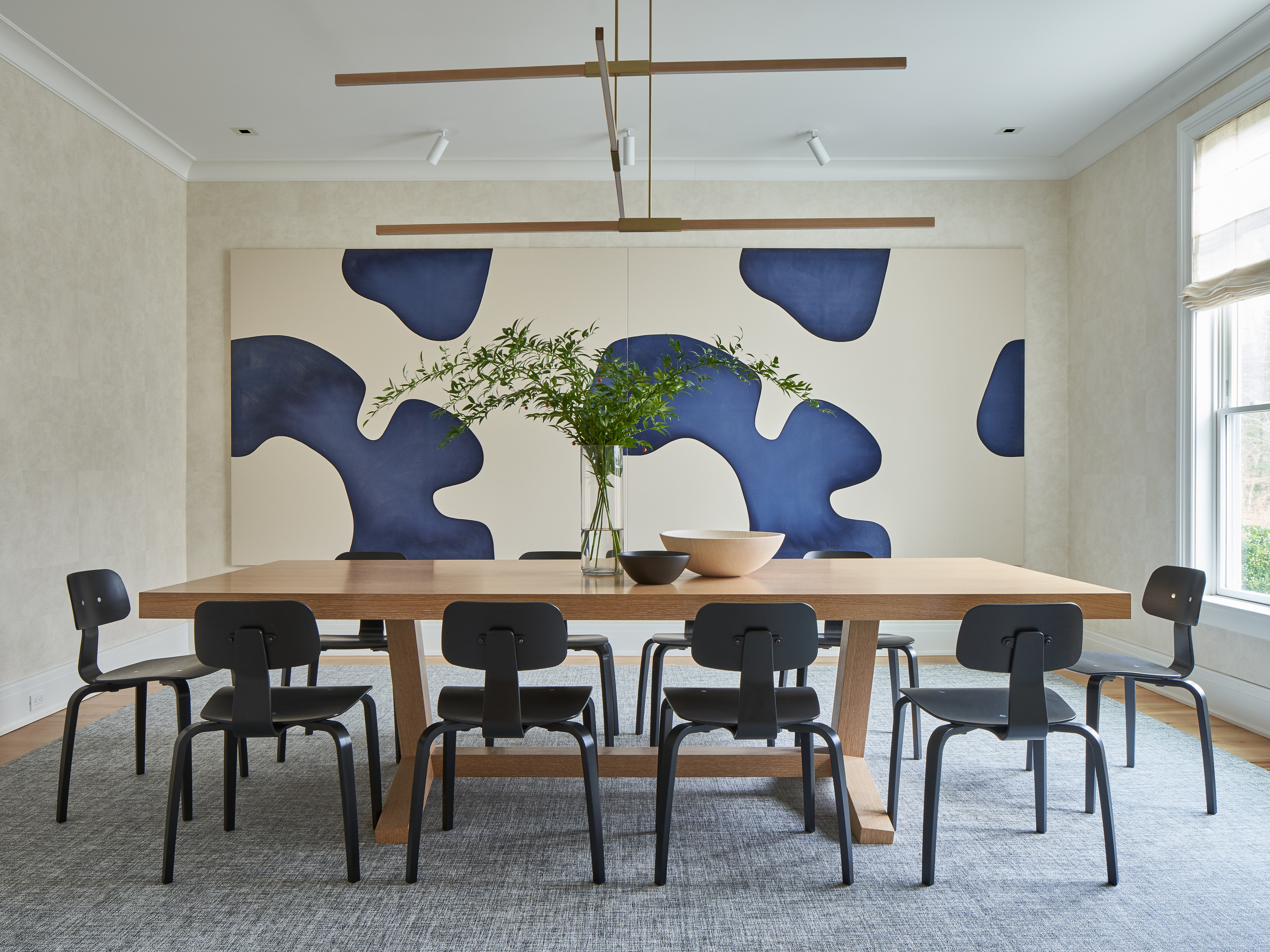
Dining room by Amie Weitzman
There's no denying that this abstract artwork by Landon Metz is high-impact, but its repeat motif offers an unlikely kind of visual balm. It's a smart choice for a minimalist space, where a figurative piece or a sweeping landscape would dominate.
"Symmetry is naturally calming," explains Amie Weitzman, who approached the design of this dining room with a "Shaker style sense of simplicity" in mind, resulting in one of the best minimalist houses we know. "I love the way the lines of the chairs are reflected in the spaces of the modernist painting. It has a quiet, minimal and modern feel."
As well as a mirrored form, there's a clever color trick happening here. The painting's restful blue is grounded by a neutral shade in such a similar color to the wall that the edges almost disappear entirely.
6. Layer neutral tones for instant warmth
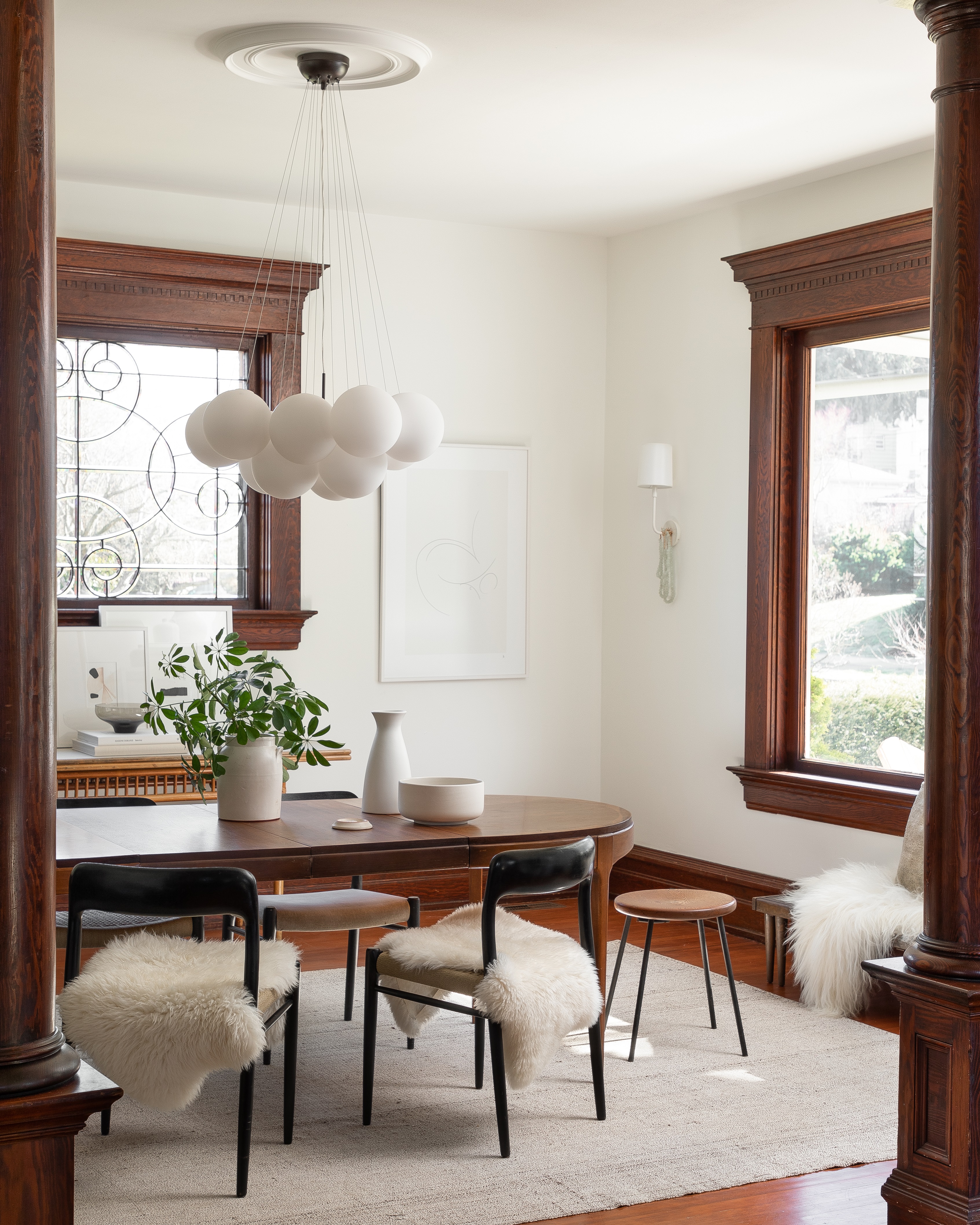
Dining room by Lisa Staton
Keen to preserve the old bones of a turn-of-the-century home while coaxing it gently into the twenty-first, Washington-based designer Lisa Staton had to find a counterbalance to the wealth of dark wood paneling and window trims.
The essence of the brief, as she puts it, was "to take an old and stuffy interior and infuse it with warmth and airy-ness". And the formula? "A layering of creams and neutrals with natural textures and organic shapes."
In the dining room an oatmeal-hued rug breaks up the expanse of dark wood flooring, while the sheepskins do the same for the chairs. The cloud pendant, well-placed wall lights and delicate, barely-there drawing are working hard too – they're just the thing to offset the richness of the wood. And that is the goal of minimalism, to make every space feel as soft as a dream.
As the brand name suggests, this is the one-stop shop for affordable rugs, and it does a great line in sheep skin throws. Ideal for layering around the dining room table.
7. Play with woods for a welcoming feel
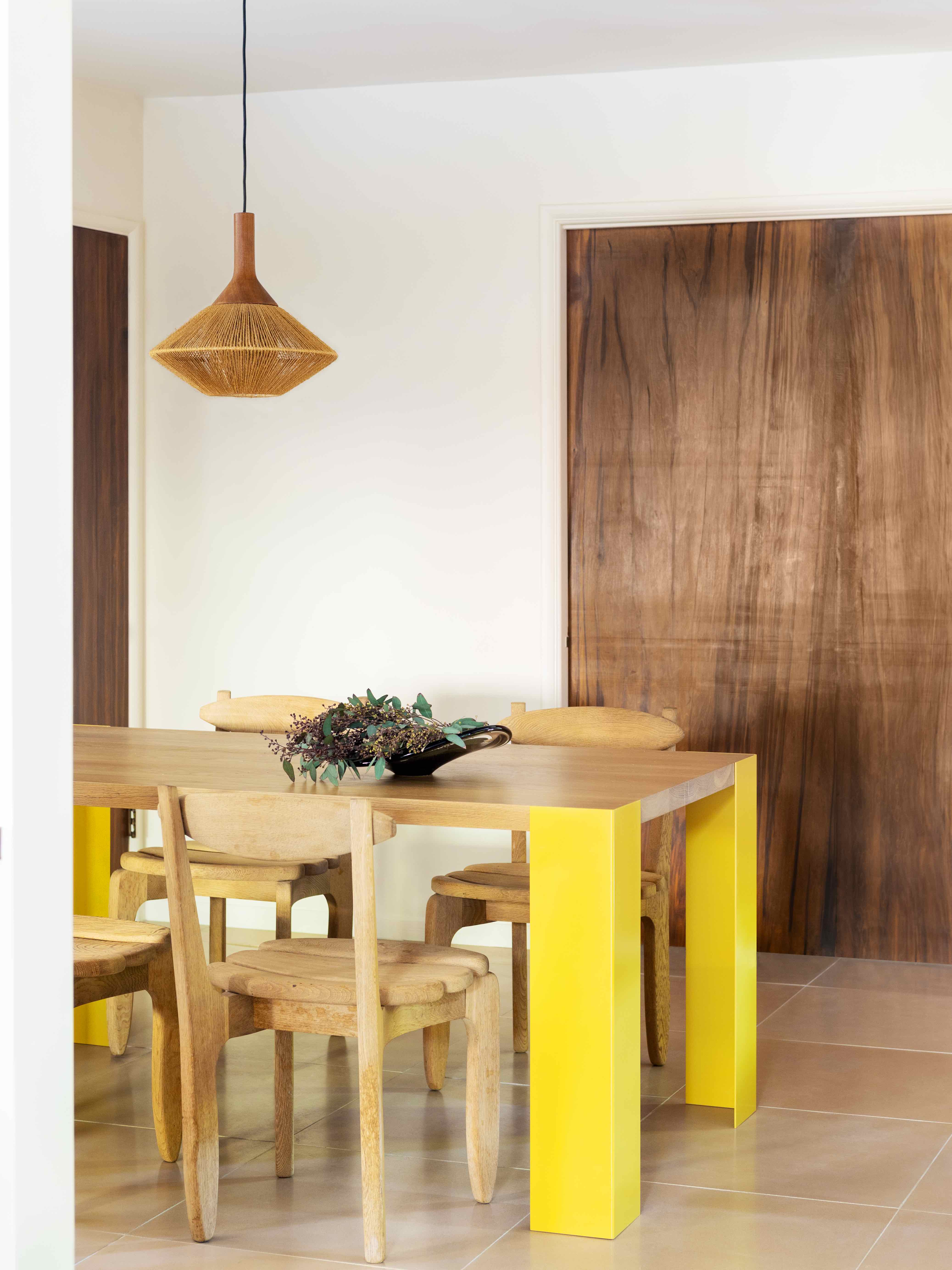
“We like to bring in materials that are 'of the earth' to create a calm and cohesive feel," says designer Corinne Mathern, who was asked by Arctic Monkeys' drummer Matt Helders to transform his newly purchased midcentury home in Los Angeles.
Rather than wall-to-wall walnut or oak, she opted for a happy blend of the two. "We mixed woods to create layers within the dining room that made it feel inviting.”
Where a single wood could feel a little one note, a subtle shift in shade, grain and finish will create a sense of depth, with many designers suggesting that each should be represented at least twice. Here, it's all lifted by that hit of sunshine yellow on the table legs – a bespoke piece, says Mathern, who is keen to experiment with different combinations.
8. Be expressive with a pendant light
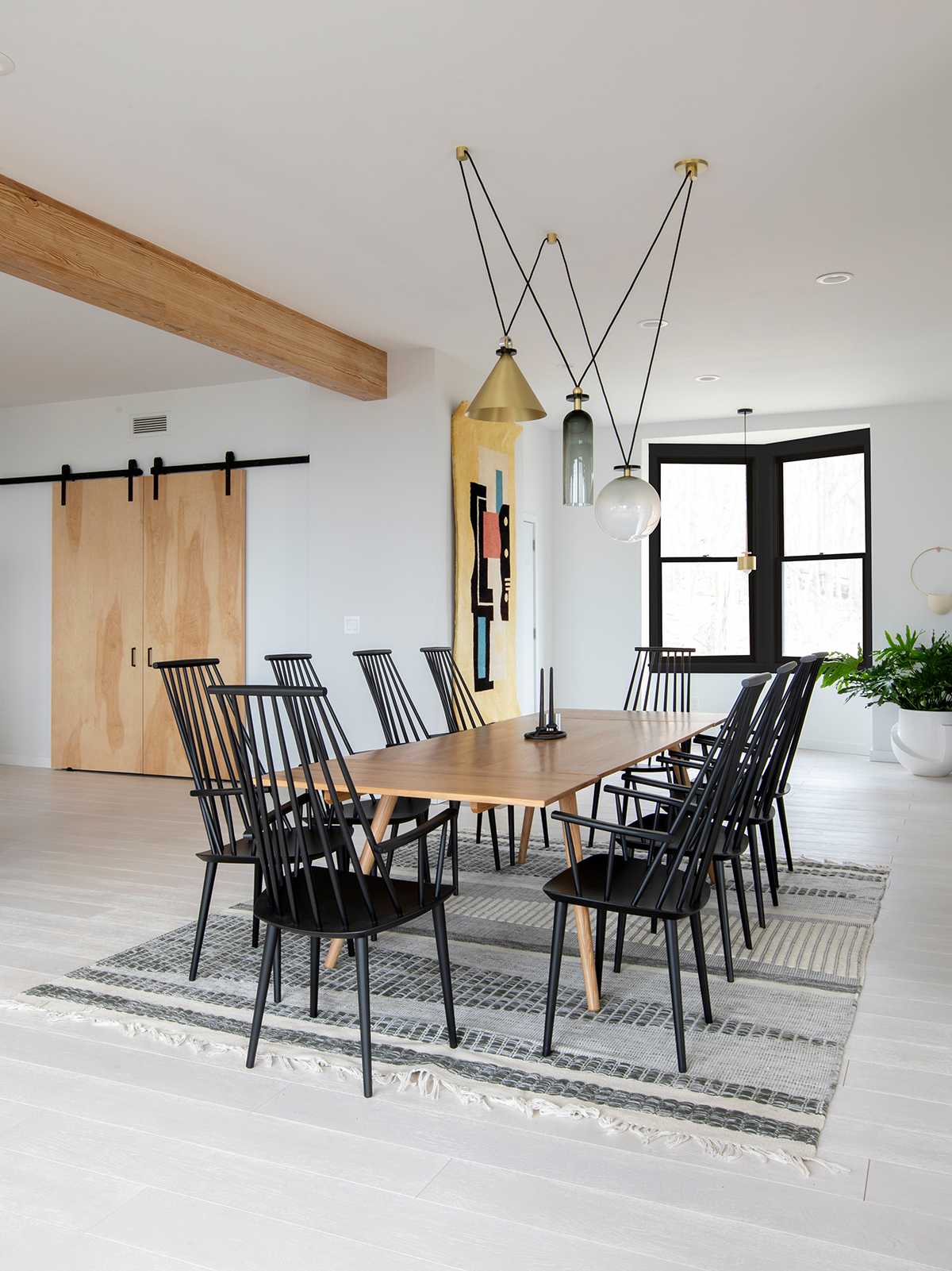
Dining room by Tangible Space
Practical as well as aesthetically pleasing, a pendant light above a dining table is something of an if-it-ain't-broke situation. Scroll back up and you'll spot some lovely dining room lighting hanging in the center of almost every space, though perhaps none catch the eye quite like this bold, geometric fixture by Ladies & Gentleman Studio. It's a clever foil to the more traditional trappings of this 19th century home, which has been overhauled by interdisciplinary studio Tangible Space.
"The lighting is playful, and simultaneously brings together and elevates our use of organic materials," says co-founder Michael Yarinsky. "Our client wanted a home that was design-forward, light, bright, and full of art and design."
Positioned in the center of a wider area, the dining zone becomes a key hub. "The space is kept open with many moments of congregation with the intention of welcoming family and friends, over communal meals, shared stories, and intimate conversations."
9. Make the dining table your star
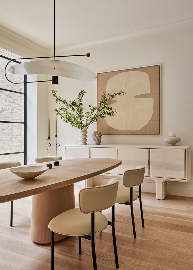
Dining room by Chango & Co
Quiz any giddy renovator on their most carefully deliberated buy and they're likely to mention the sofa.
And yet unlike a sofa, which is usually pushed against a wall and often plays second fiddle to a central fireplace (or, if you're so inclined, a giant TV) the table will always be the default focal point of a dining room. A good investment will last decades – no fraying upholstery here – so it's worth getting it right the first time.
In this dining area by Chango & Co, a palette of beautifully muted tones take their cue from the pale oak veneer of the 'Good Day Sunshine' table by French designer Damien Langlois-Meurinne. It might just be a masterclass in decorating with neutral color schemes.
It seems only fitting that the direction of the grain should radiate out towards the rest of the room, such is its influence on the space.
10. Consider how you can shape mood
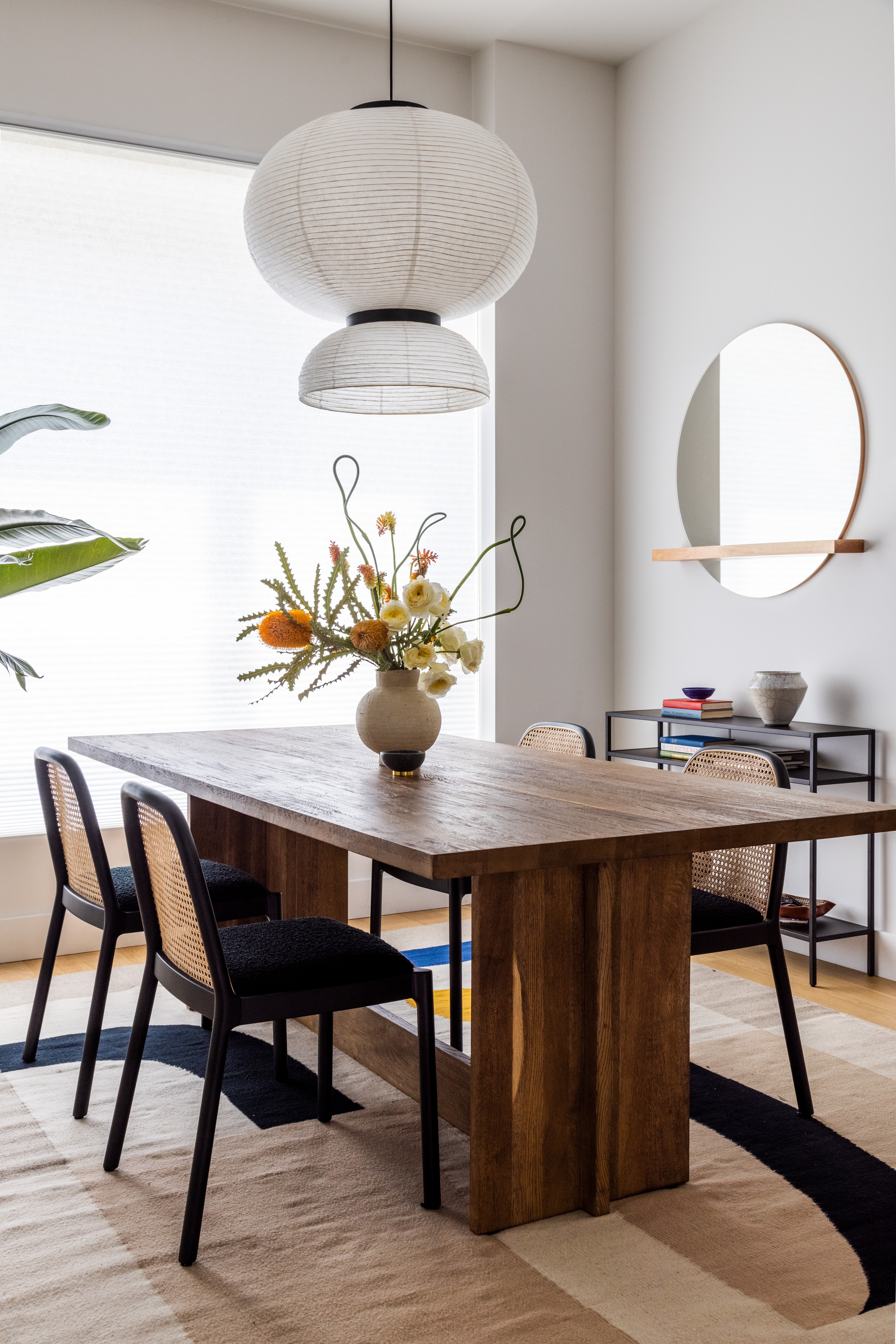
Dining room by White Arrow
"We always think about layered lighting and reflectivity in a dining room," says Karen Richter of White Arrow. "We’ll add candles, table lamps, sconces and pendant lighting or chandeliers. You want your guests to be bathed in flattering light, with dimmers."
Don't be shy about a little shine, she says, even if the overall feel is sophisticated. "Dining rooms are most often used in the evenings, so incorporating a bit of drama and sparkle feels right."
The best dining space is one that can effortlessly flex for different events without a great reshuffle – the last thing you'll want to do while waiting for guests to arrive is hauling out furniture. "Think through the floor plan so you can use space most effectively without bringing too many items in, or the need to rearrange any time you go to host," she adds. "Art and accessories are important, as is a place to serve cocktails or a server to stage food and refreshments".
Minimalista by Shira Gill, Amazon
A step by step guide to a better minimalist life, Shira Gill shows how to start habits that lead to a calming decor.
Be The First To Know
The Livingetc newsletters are your inside source for what’s shaping interiors now - and what’s next. Discover trend forecasts, smart style ideas, and curated shopping inspiration that brings design to life. Subscribe today and stay ahead of the curve.
Cat Olley is a British design and lifestyle journalist, editor and copywriter. Formerly on the features team at ELLE Decoration, she has written for The Guardian, The Modern House, Evening Standard Homes & Property, Inigo and John Lewis at Home. She specializes in the latest trends and ideas happening in the design world, and is our go-to for aesthetically-led pieces.
-
 Burl Wood Decor Is 2025’s Most Coveted Comeback — Here’s How to Get the Storied Swirls for Less
Irregularity is the ultimate luxury, but you don’t need an antiques dealer to find it
By Julia Demer Published
-
 5 Garden Features That Instantly Add Value to Your Home — While Making Your Outdoor Space More Practical, too
Get to know all the expert tips and tricks for making your backyard a standout selling point for your home.
By Maya Glantz Published
