5 Minimalist Kitchen Mistakes to Avoid — These Choices are Making Your Space Lack Heart and Soul
If you have minimalist leanings when it comes to your kitchen's design, here's how to make sure it doesn't feel stark or sterile
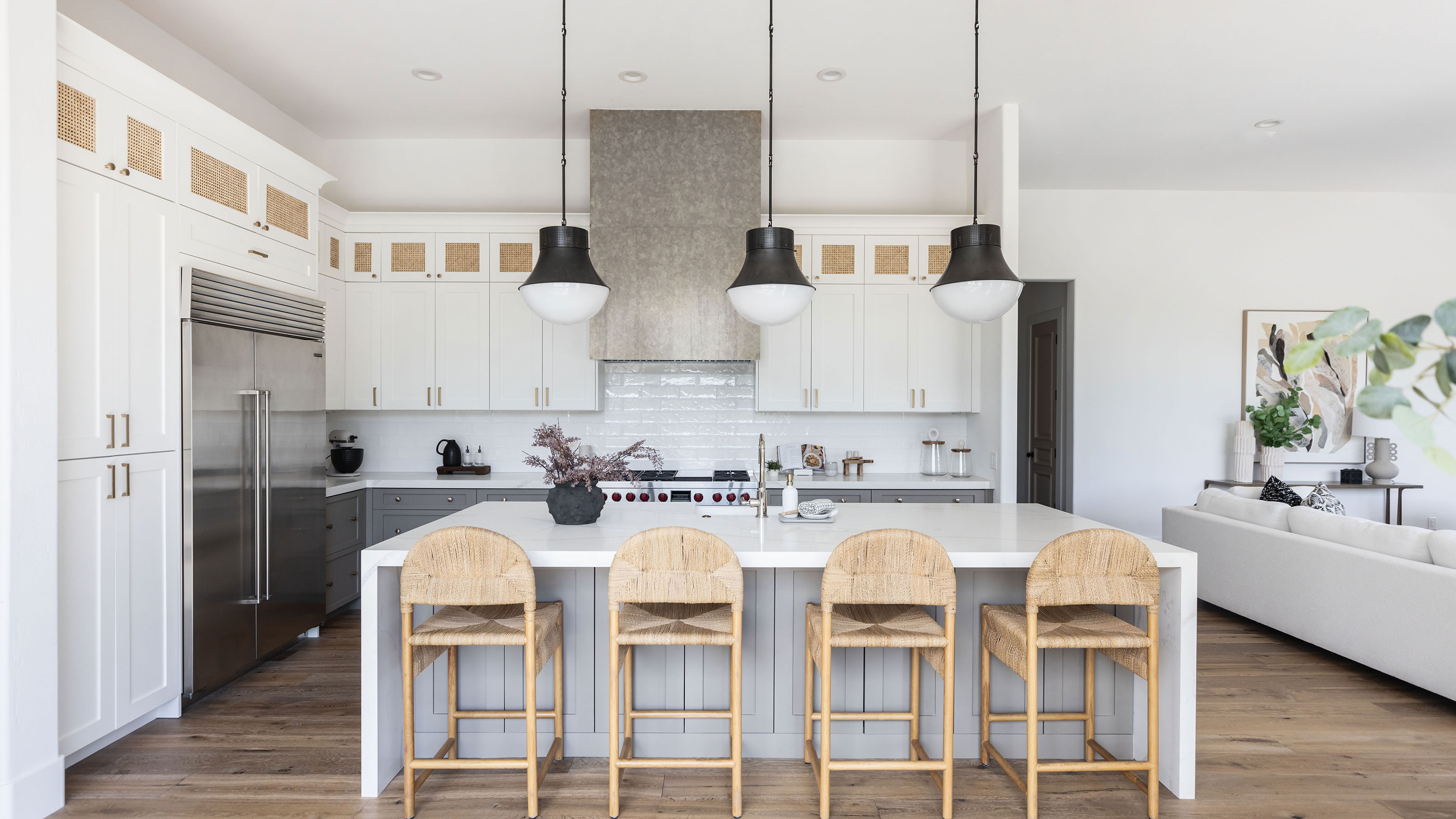

When a dinner party is on the horizon, a minimalist kitchen aesthetic might feel like the perfect way to go. Clutter-free, clean and peaceful — a minimalist kitchen can be just as much something for yourself as it is for impressing guests.
But if the ambiance is off, you might have overdone it. And minimalism gone wrong can feel unwelcoming at its worst. It is no surprise really, since muted colors, and no objects in sight, on paper, doesn't sound like the life and soul of your home. However, minimalism in interior design isn't quite what it used to be. Although this utilitarian rooted design aesthetic has no time for clutter, it does leave room for an inviting finish. With warm minimalism making its mark in homes everywhere, we think it deserves a dinner invite too. But if you think your kitchen is more icy than hearty, keep scrolling for some common minimalist kitchen mistakes according to designers, and how to remedy them.
1. Only tapping into neutral colors
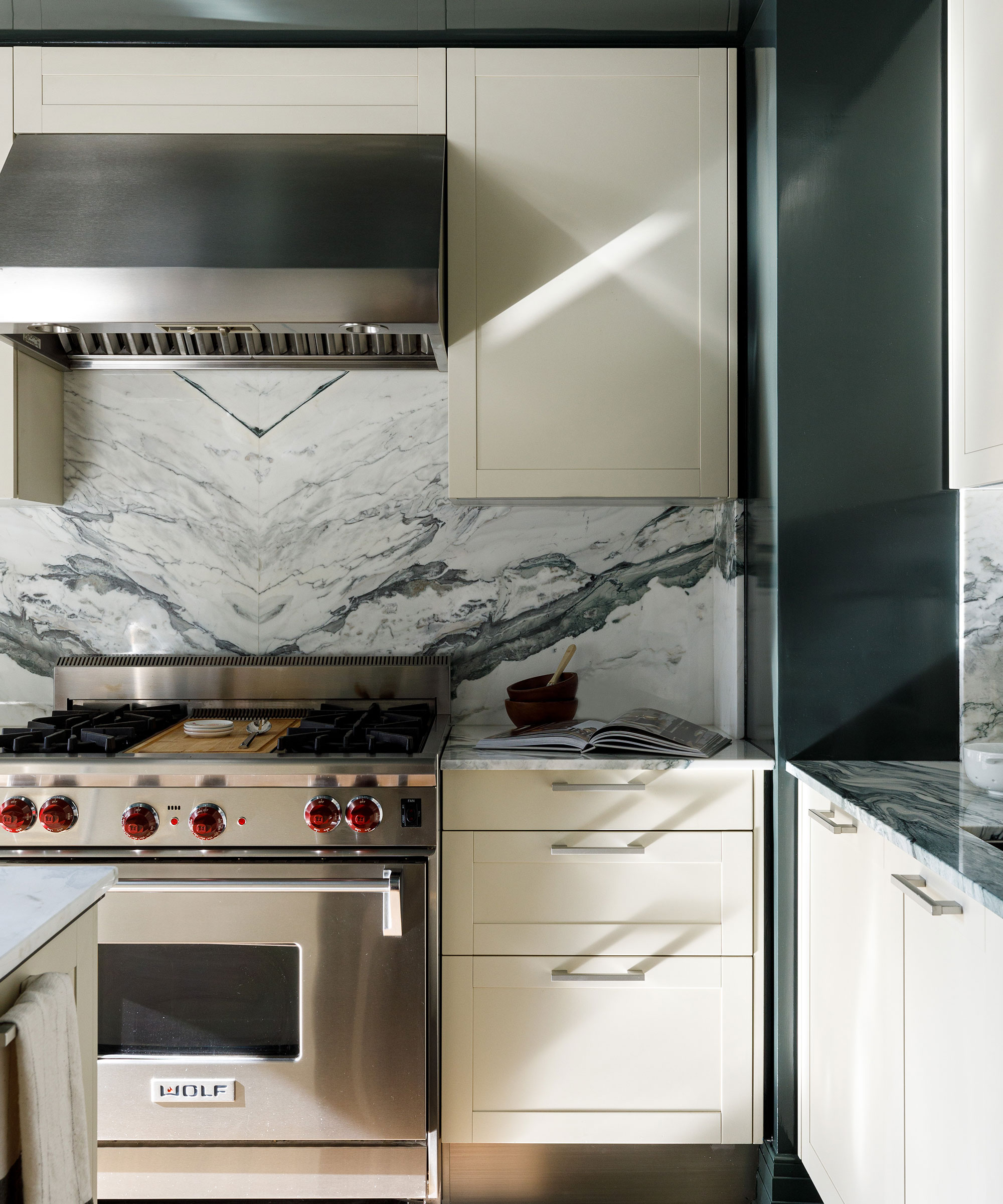
Design by: Kate Taylor Interiors Photo credit: Aimee Mazzenga Photo styling: @Trish Hayes Design & Cate Ragan
Modern kitchens range from neutral shades, to more colorful kitchen ideas. But the latter is often considered a no-go in the world of minimalism. For a cooking space that is as primed for conversation as it is for canapés, stop swerving away from color in a bid to make the room look less fussy. The key is to keep it balanced and monochrome in tone, as interior designer Kate Taylor displays in this space.
'I consider this kitchen minimal even though the walls are lacquered in a deep green color! It still feels clean and modern yet has soul,' says Kate.
Sure a beige kitchen is cool, and lends itself well to a minimal design, but it should be paired with the right tones and a dash of color to keep it visually appealing and a cozy kitchen space through and through. It's not necessarily about including every kitchen trend either, you want to dig deeper. 'We suggest sourcing high-quality, timeless materials — marble, handmade tiles, plumbing with a living finish, and custom cabinetry.'
2. Not putting character in the right places
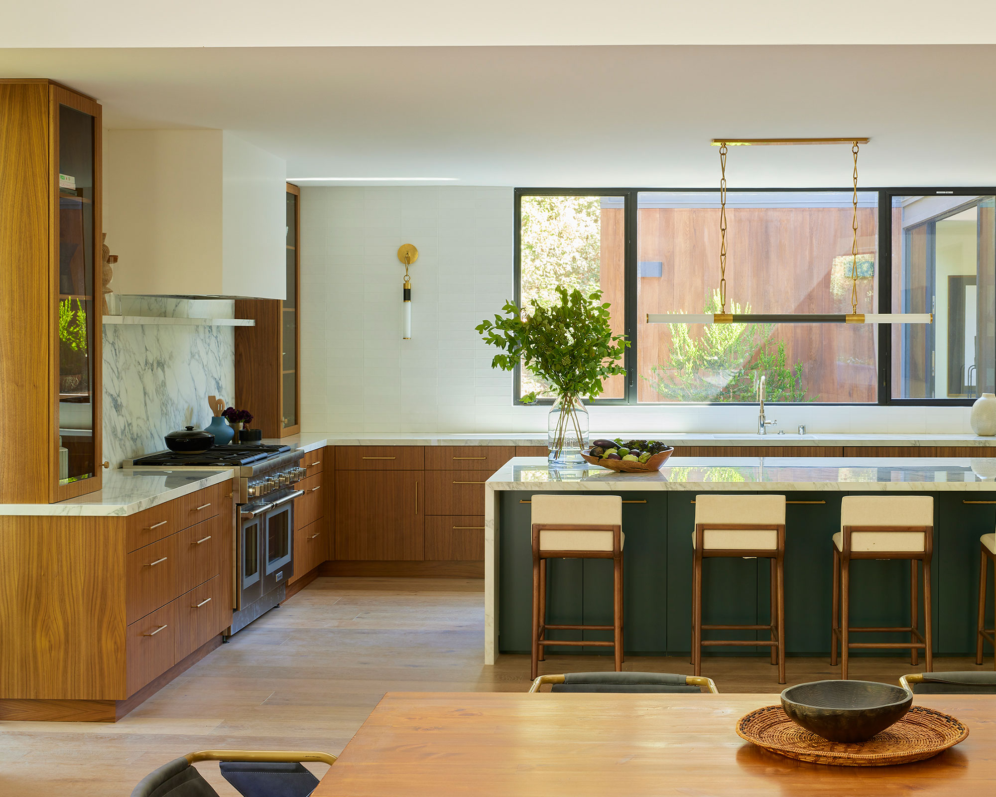
A space that exudes personality doesn't always come across as synonymous with minimalism, but they can, in fact, go hand in hand. It is about adding charm via the main bones of your minimalist kitchen space, rather than by using lots of objects to decorate with.
'A minimalist kitchen doesn’t have to feel cold and impersonal,' David Thompson, Principal and Founder of Assembledge+ reassures us. 'Rich, natural materials create a depth of character and warmth that surpasses mere superficial flair. Unique wood textures, dynamic natural stone, and elegantly crafted fixtures can elevate a kitchen from tired to timeless.' Think Zellige tile for their unique finish, rich cabinet materials, and more that will make the space feel earthy and dynamic.
3. Leaving out art and accessories altogether
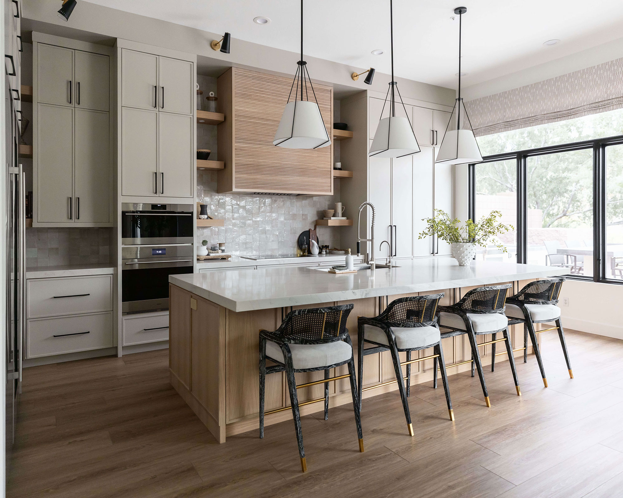
With that said, kitchen countertops and walls still deserve attention. Art should, after all, never be an afterthought in the home, and this is even more crucial than we might have realized when going after a minimal kitchen aesthetic that doesn't feel stark or without soul.
Lauren Lerner, interior designer and founder of Living with Lolo also agrees that natural materials like stone and wood can 'infuse warmth,' however, some decorative *extras* are important to avoid a stark finish. 'Add personality using vibrant accessories or art pieces,' recommends Lauren. Even including one of two indoor plants can soften any harsh lines of slab material, for example. As can a cleverly positioned kitchen rug, and architectural pendants for brilliant lighting.
4. Forgetting that storage needs to be beautiful too
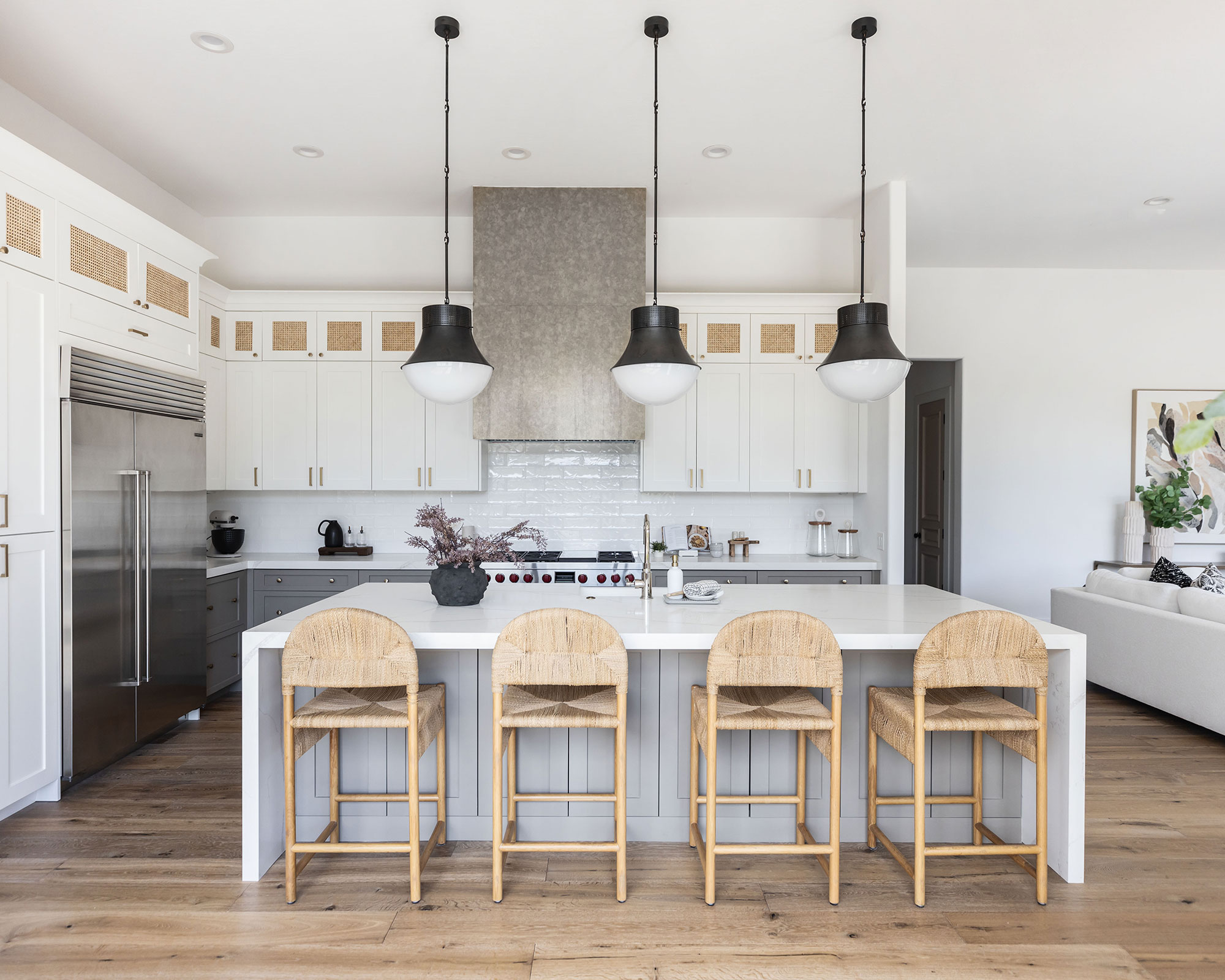
Storage is storage, right? Wrong. Kitchen storage has come a long way and is no longer dull. An invisible kitchen is one thing, but if it isn't a fine canvas for personality and warmth, it is not working out.
'Strike a harmonious blend of simplicity and charm by choosing striking lighting, adding personal flourishes, and keeping spaces clutter-free with smart storage solutions,' continues Lauren. Choose wisely when kitting out your minimal kitchen to make sure you choose a design that camouflages into your surroundings to conceal essential items, and add elegant appeal. Although uppers have been argued as outdated kitchen storage, we like the rattan finish in this kitchen, which adds texture whilst cleverly creating more space for small appliances, and martini glasses.
5. Having 'less pieces' without recouping design depth and form
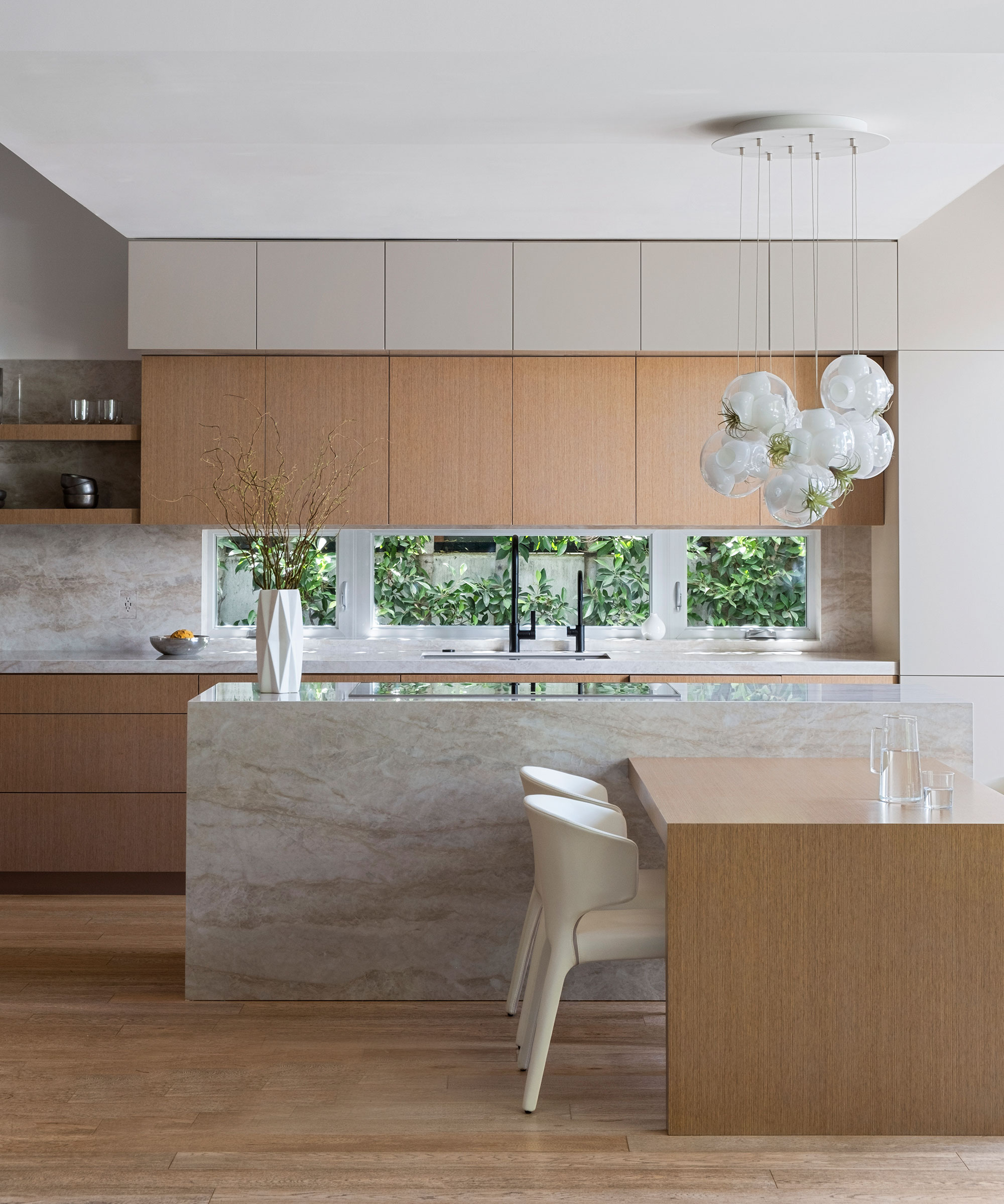
Finessing the design detail makes the difference between a space that has no impact, and one that sparks memorable conversations and excitement – minimal or not. 'With minimalism, even though the goal is to approach each space with a "less is more" mentality, the pieces that you do incorporate should add texture and depth to the space,' Victoria Holly, principal and founder of Victoria Holly Interiors tells us.
Unlike maximalist spaces that owe their flamboyance to a unique display of multiple items, colorways, patterns, and potentially more, minimalism takes away physical elements. And the energy these usually bring will want compensating, somehow. 'There is a difference between bare and minimalism,' continues Holly. 'A bare room has less pieces, but without richness and depth. A minimalist room has less pieces, but with this richness and depth, through use of texture, rich palettes, and different types of material.' Introducing marble kitchen accessories can make a striking addition, as can hand-made pendants, and gloss backsplash tile Holly says. 'All of these details add warmth without cluttering the kitchen.'
How to accessorize a minimalist kitchen
A natural, unfussy, and organic finish will ultimately deliver all the heart and wholesomeness that a minimalist kitchen deserves. Here are some of our favorite pieces for a seasoning of design interest:
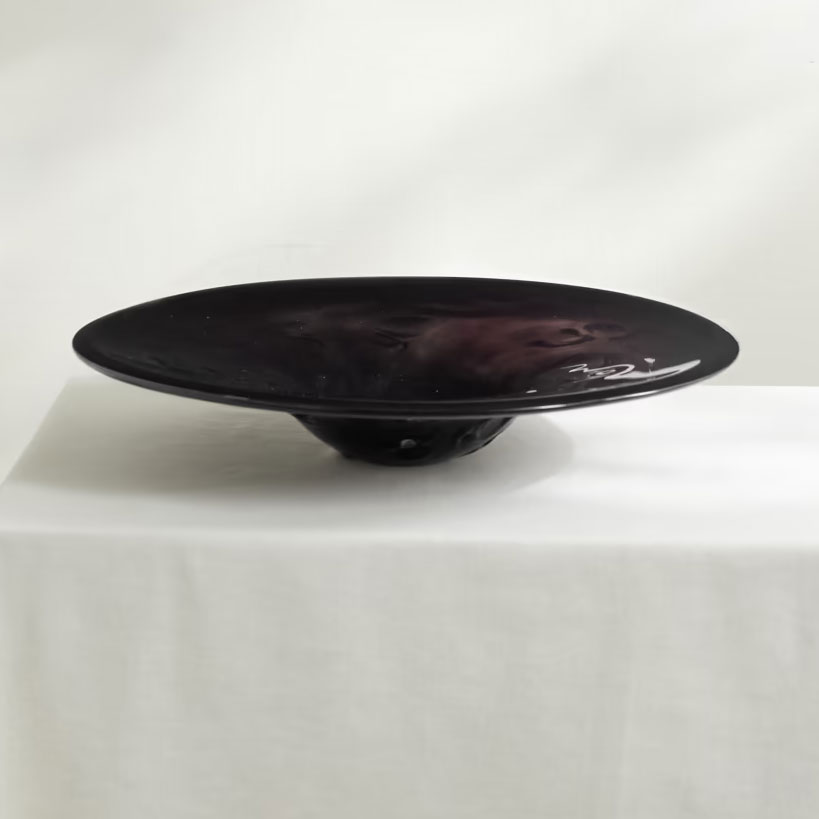
Price: $805
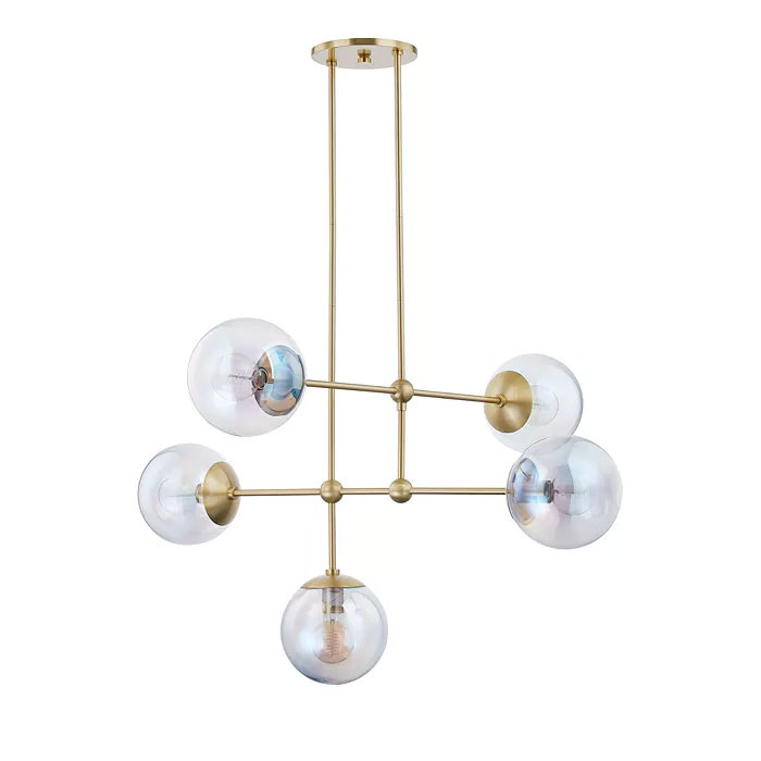
Was: $1,190.00, Now: $952.00
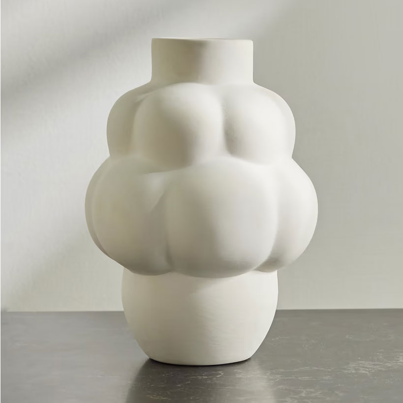
Price: $140
Be The First To Know
The Livingetc newsletters are your inside source for what’s shaping interiors now - and what’s next. Discover trend forecasts, smart style ideas, and curated shopping inspiration that brings design to life. Subscribe today and stay ahead of the curve.

Camille is a freelance interiors writer and the former deputy editor of Real Homes where she covered a broad range of topics, including DIY, small space design, and gardens. She studied English language and Italian at the University of Manchester and it was during her year abroad studying in Bologna that she started documenting her adventures and observations in a blog. Camille has a passion for art and beautiful spaces. When not writing or refreshing her home, you will find her gallery hopping, taking photos, painting, and traveling to seek out interiors inspiration.
-
 Sateen vs Percale Sheets — What's the Difference, and Which Are Better?
Who would have thought a simple weave pattern could make all the difference to your sleep
By Devin Toolen
-
 I Asked Interior Designers to Share the Worst Design Trends They've Seen on Social Media — And What They Want to See Instead
Just because something is trending, doesn't mean it's tasteful — from dupe-culture to OTT lighting, here's what designers hate seeing in homes
By Devin Toolen