12 Minimalist Kitchens That Balance Pared-Back Design With Picture-Perfect Style
For kitchens that are streamlined, stylish, and clutter-free, be inspired by these 12 lessons from minimalist spaces and the designers behind them
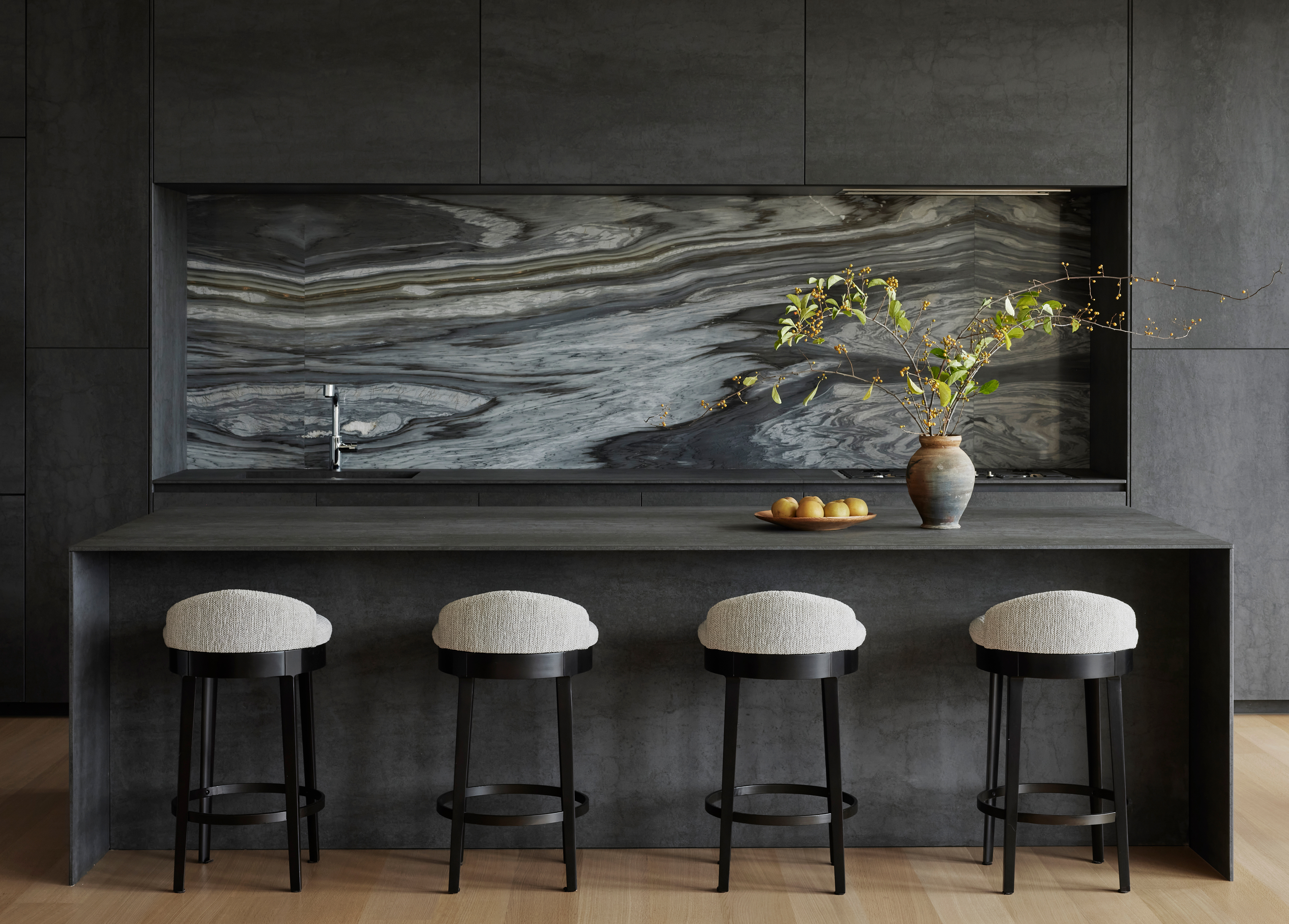
Luke Arthur Wells
We could argue that minimalism has a different meaning in the kitchen than elsewhere in the home — less 'less is more' and more 'everything in its place'. Having said that, if you're searching for minimalist kitchens, there's a good chance you're looking for a specific aesthetic that channels a pared-back calm that's associated with this interior design style.
Besides making sure your storage allows for you to keep clutter you don't want out of sight, there are a few tenets to these more minimalist spaces when it comes to the design part.
There are certain modern kitchen ideas that feel effortlessly minimalist, and some that are a little cliched, that you can probably put to rest in your search for a simpler design of kitchen. Minimalist kitchens don't have to be all white, devoid of character, or completely unadorned, but there's a secret to the balancing act for the contemporary interpretation of this style. Here, experts explain exactly how they've achieved it.
1. Don't be afraid of pattern
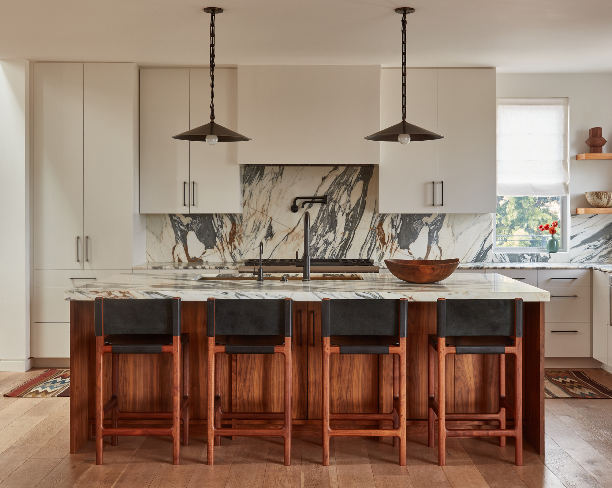
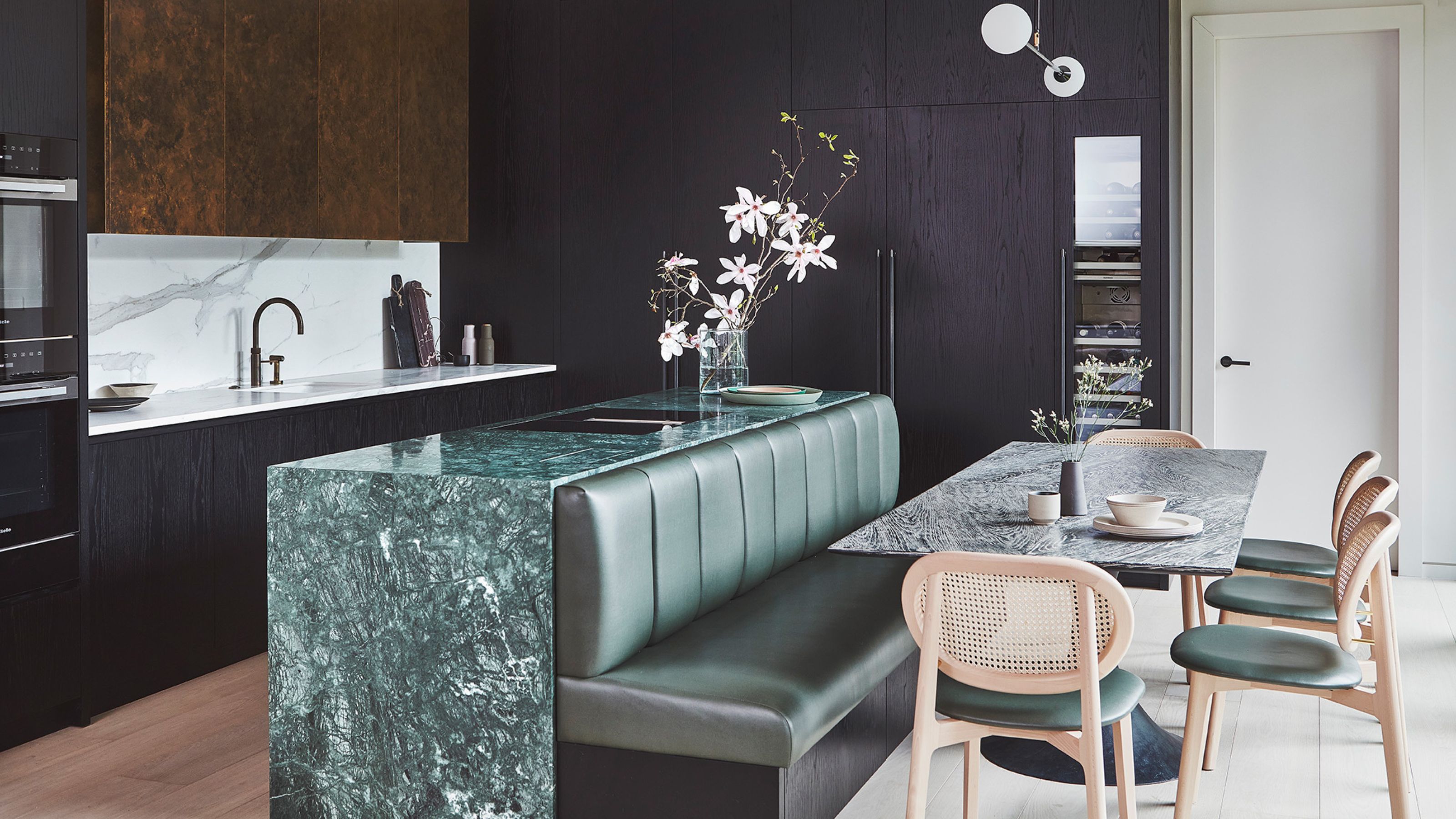
Just like the kitchen above, this space designed by interior design Sarah Solis challenges the idea that minimalist kitchens need to be void of pattern and print.
"Veined Arabescato marble countertops and backsplash introduce a sophisticated minimalism to the kitchen, complemented by a curated mix of stools," says Sarah.
In using it with a simple slab door, mirrored in the range hood, and a restrained color palette of black, white, and wood tones, there's an easy minimalist interior design to this space that doesn't feel too forced.
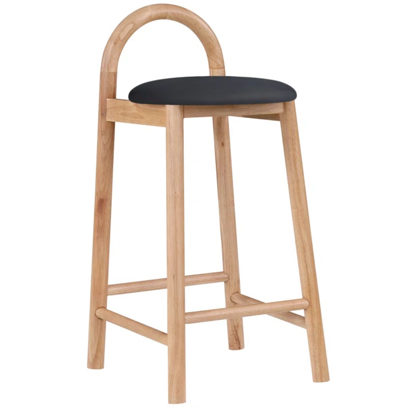
Price: $204.99
This simple curved bar stool is a cool silhouette for a modern kitchen space.
2. Limit the materials used
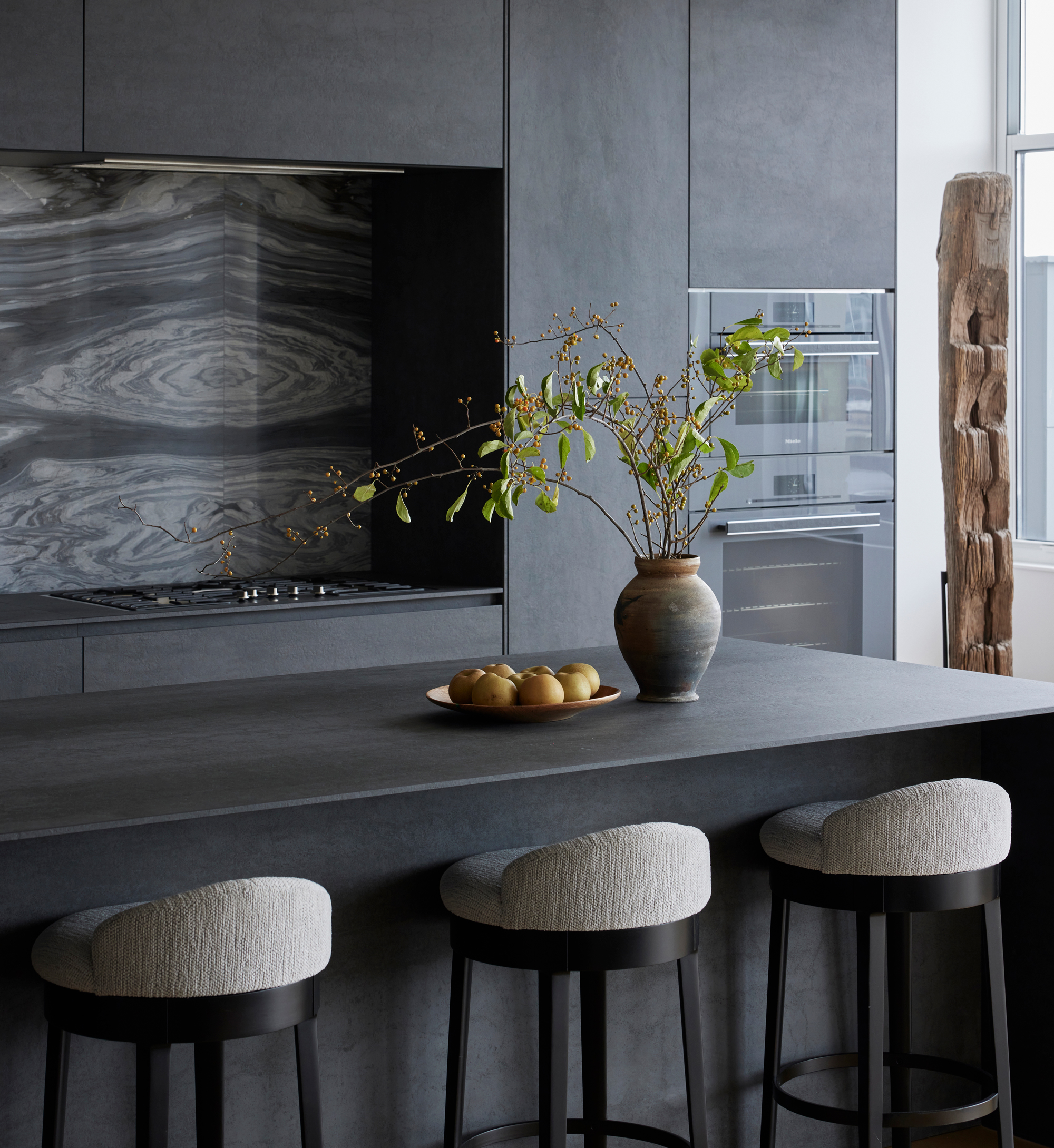
'Reduced materiality' is classic architect speak for a trick that effortlessly makes any space, kitchens included, feel more minimalist. It's the idea that paring back the number of materials you use in a room will mean less visual clutter.
It doesn't always mean only using one material throughout, but being mindful of when and where they're used. In the kitchen of this loft apartment in Chicago, this is manifested through a kitchen that uses a ceramic material for the doors and countertop, allowing the statement kitchen backsplash idea to shine as the feature of the room.
"The reduced materiality gives the kitchen an abstract and sculptural quality that makes it the centerpiece of the apartment’s open, loft-like living space," says architect Eric Rothfeder, who designed the space. "The kitchen is very assertive and dramatic, but through its rigorous simplicity it doesn’t look like a typical kitchen."
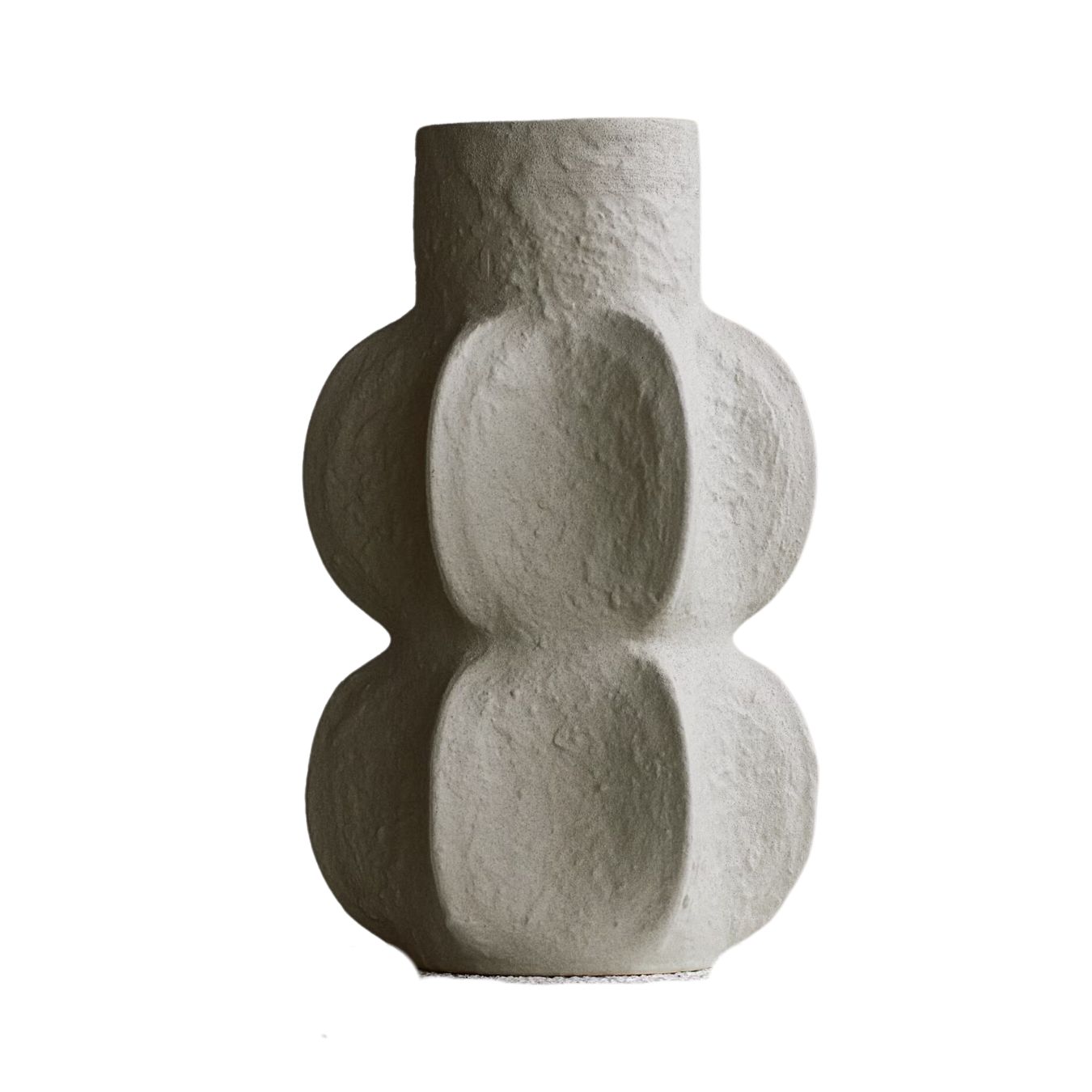
Price: $34.99
A textured vase brings some contrast to the sleek modern materials of this kitchen.
3. Try a tonal palette
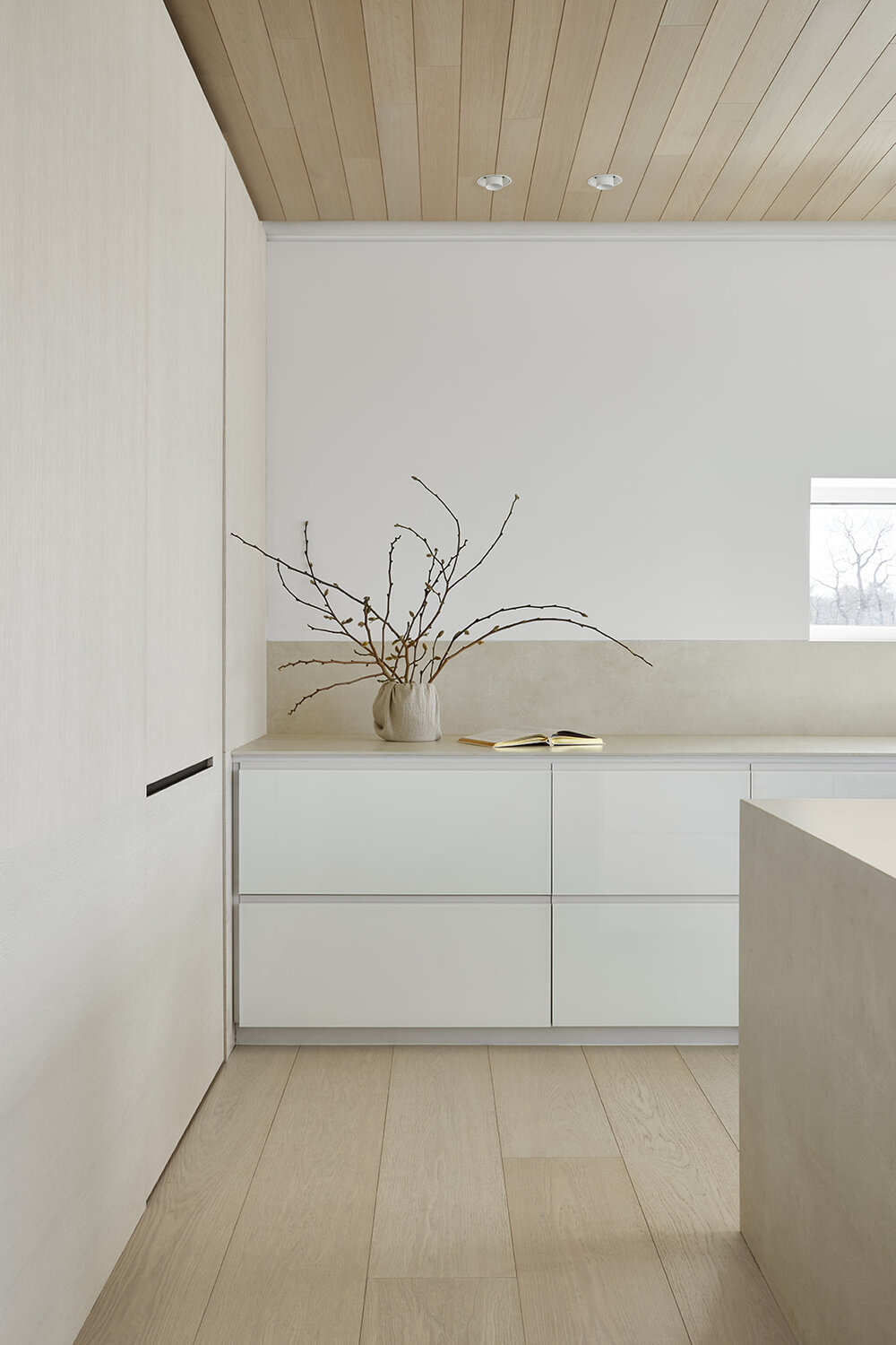
If you skip the coldest whites and glossy finishes, a well-judged palette of neutrals will feel anything but clinical. Just ask the Scandinavians, who design their minimalist houses to combat long, dark winters.
Let us steer you towards this kitchen designed by Studio Author, which sees snow outside for several months of the year. "It's a study in subtle finishes," says Jayme Million, one of the firm's founding partners. "We accented the custom glass base cabinets with warm oak and tactile kitchen countertops."
Bulky upper cabinets were never in the conversation. "The adjacent concealed pantry holds the fridges and food storage, allowing us to eliminate the need for any cabinet towers or uppers. It creates a clean and quiet look."
4. Defer to a striking view
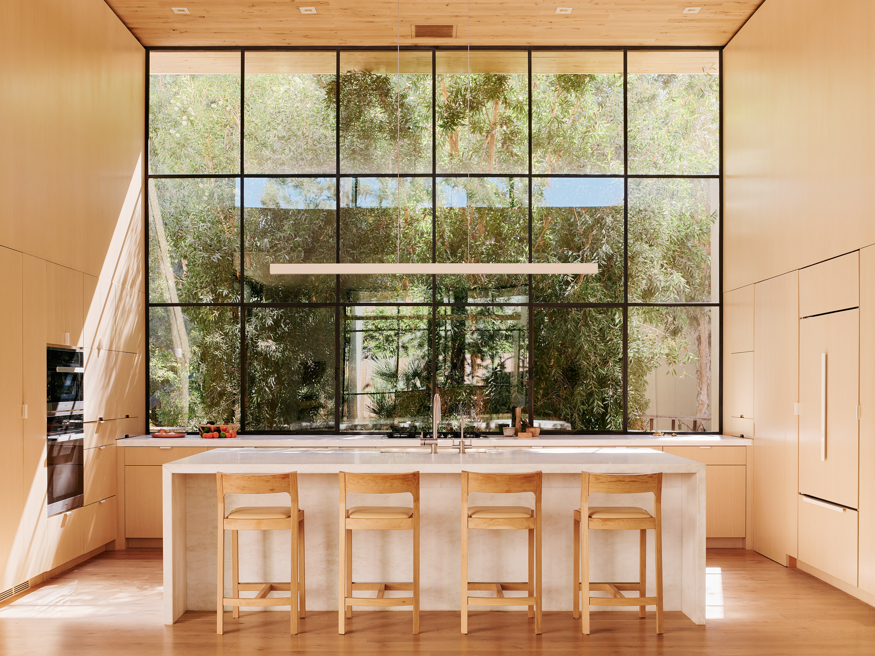
"When we design spaces we often look to capture what we call 'single transformative moments' and this kitchen window is certainly one of those moments," says Noah Walker of his design for this Los Angeles home, which faces a grove of melaleuca trees.
That glorious green outlook is the natural star of this space, so it made sense to install a sleek wood kitchen that wouldn't compete for attention. With the same wood extended up to the ceiling, the cabinetry all but disappears into the wall - something we're seeing a lot of in architecture trends. "We worked to keep the 'kitchen' parts of the kitchen to a visual minimum, hiding the fridges, the extractor and the pantry door. It allows the space to feel more universal and simple."
5. Call on natural materials
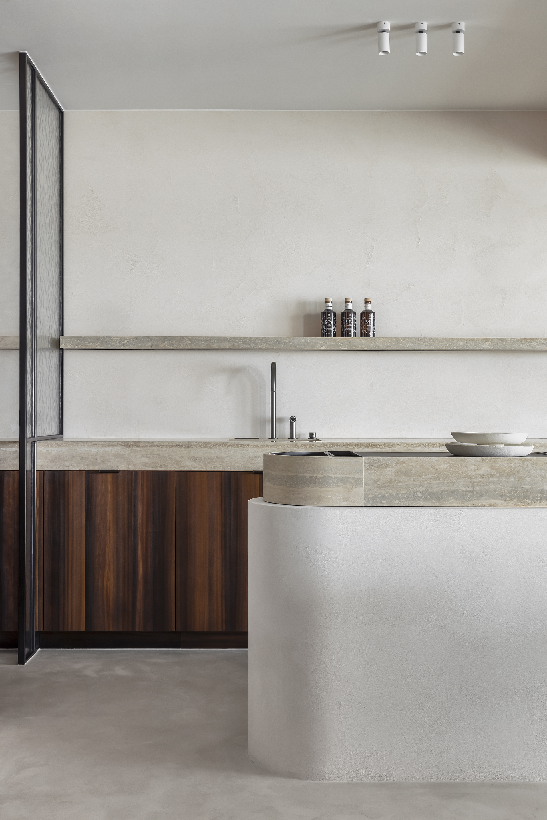
We've lived with these materials for millennia, so it's little wonder that the human brain registers wood, stone and natural plasters as particularly liveable – never mind the longevity factor. Just like in a minimalist living room, a visible grain or textured clay can do wonders to warm up the place.
Tasked with decorating apartments for a pair of siblings, Dries De Malsche created two same-but-different kitchens with just this in mind. "Both spaces use a soft natural stone as a base in the kitchen," says the designer. "There's a neutral uniform natural plaster on all floors and walls, complemented with a warmer smoked, brushed larch wood for the brother's apartment."
6. Use pastels as a neutral
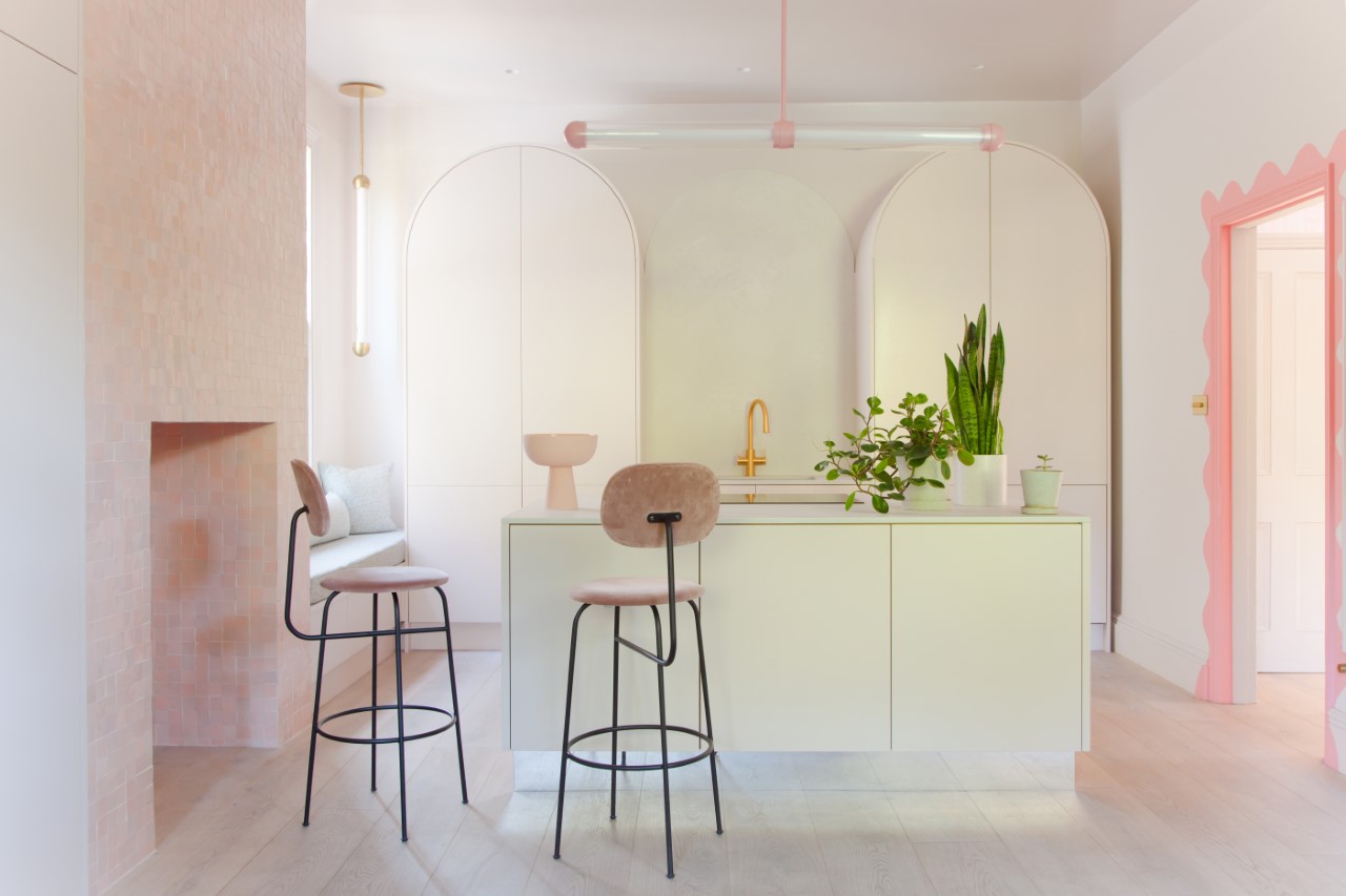
If you're wondering how to make a kitchen more minimalist and are wary of too much white, then all is not lost If you're not a dyed-in-the-wool purist, you'd do well to take a cue from Jordan Cluroe and Russell Whitehead of 2LG Studio, who live with their 'Rise' kitchen design for John Lewis of Hungerford.
The barely-there pastel shades feel fresh and contemporary, thanks to those modish curved, clean lines – but look carefully and you'll realize the duo have performed a brilliant disappearing act in this subtly pink kitchen. "To achieve a fully minimalist look everything must have its place. Every inch of the arched cabinetry is used, and everything hidden away – there are no handles even on the fridge. This allows you to play with texture within the space."
7. Lower the contrast
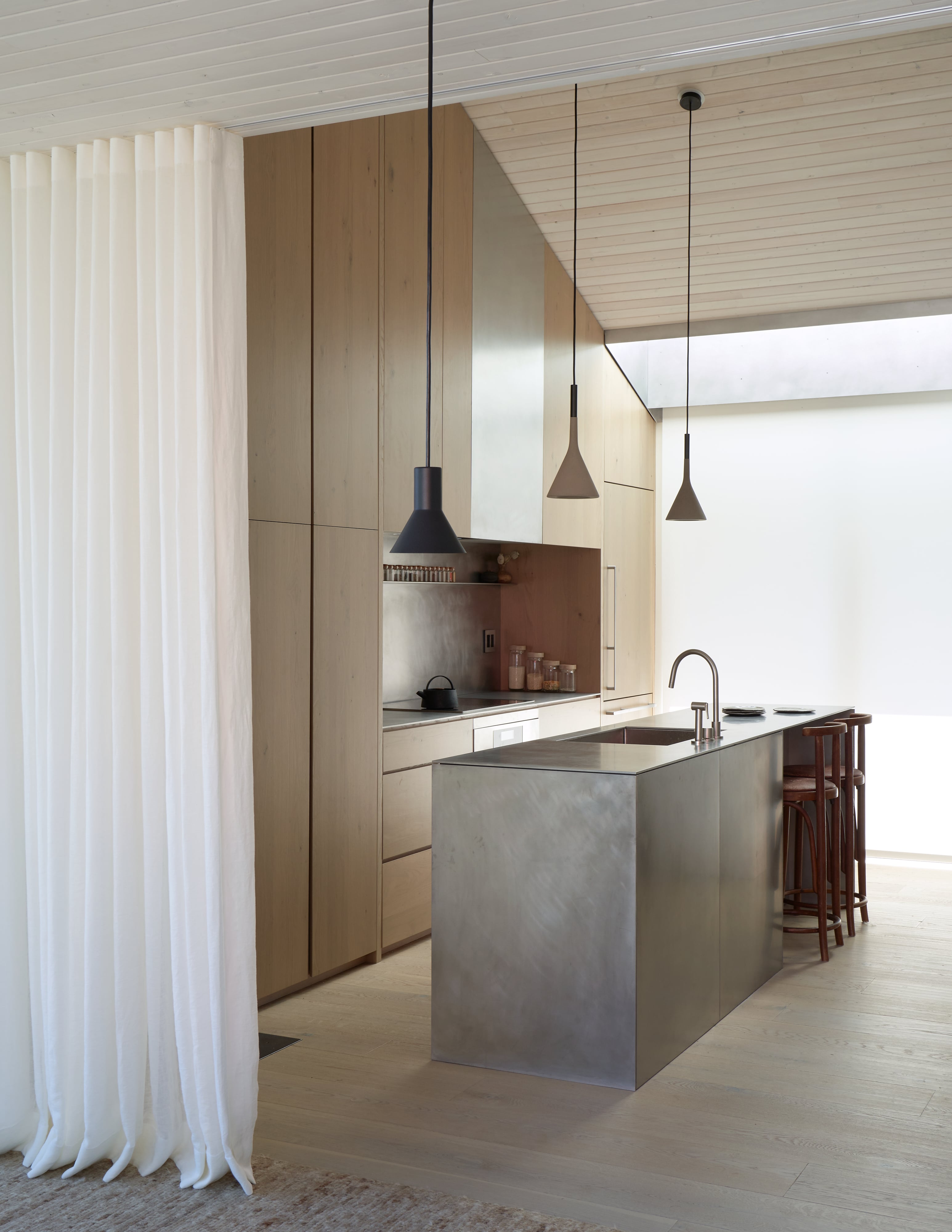
There's a lot of confusion around contrasting colors and materials – we blame muddled teachings on color theory in art class – but the general consensus among designers is to dial it down for a restful result. That means considering how a stone and a plaster might sit side-by-side: are they natural bedfellows, or do you find your eye drawn to the boundary?
Studio DIAA principal Suzanne Stefan talks in terms of the "quiet" of a space - a principle that can easily be applied to minimalist bathrooms, too. Combining wood and stainless steel in the kitchen of her own floating home in Seattle's Portage Bay, she looked toward "finishes that had a tonal relationship or ones that could be placed in adjacency and would allow for the eye to move more freely."
8. Don't discount metallics
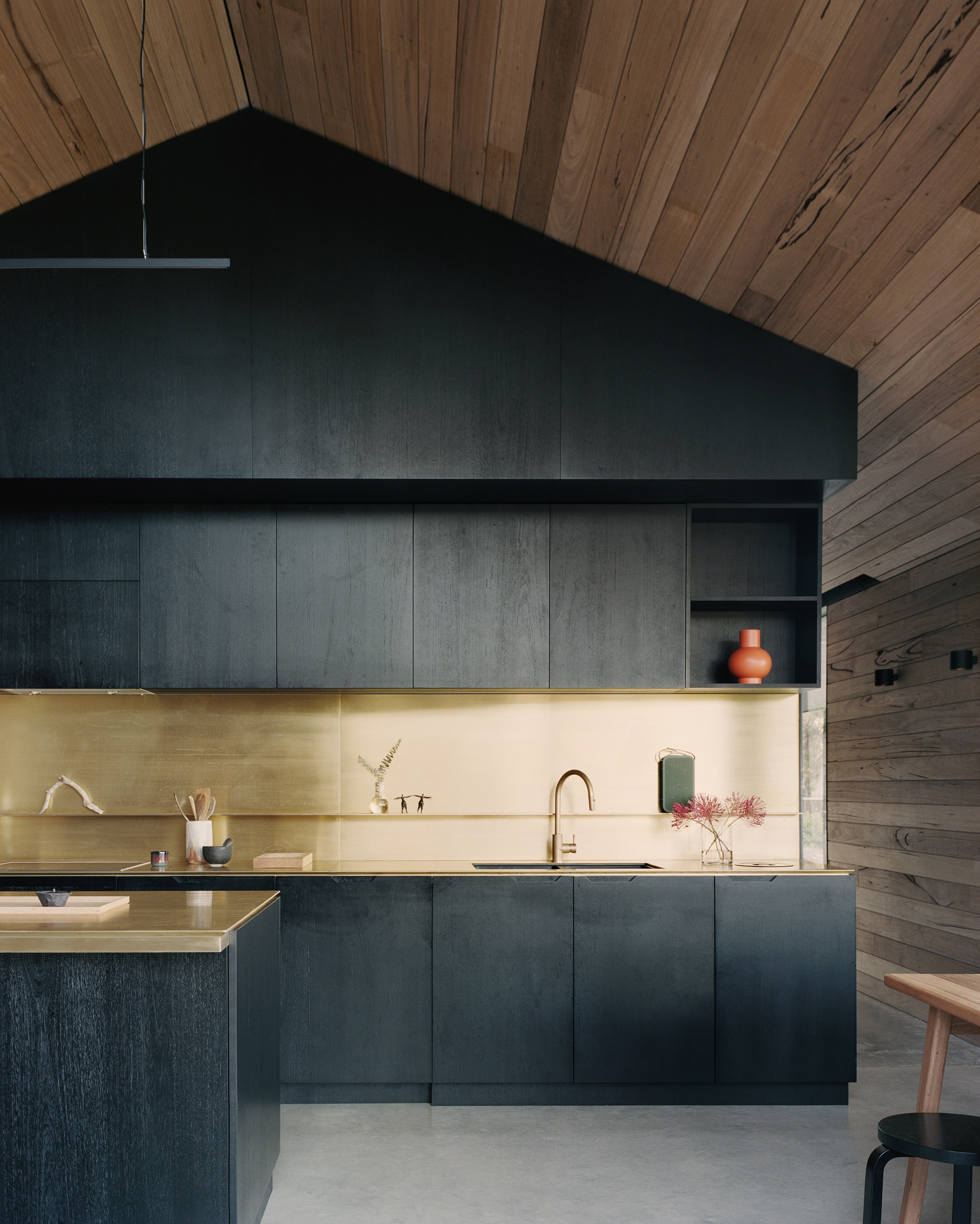
Benjamin Shields of Dreamer Lab might recommend fewer materials, but that doesn't mean they should be middle-of-the-road. For this impactful kitchen project, the client was keen to use brass in reference to 'an older era of rustic accommodation,' he explains. 'It gives a subtle feeling of craft to the space.'
The stained black timber joinery not only contains the metal but grounds too, acting as a brilliant foil to the light-catching brass kitchen countertop and backsplash. "Soft lighting can also be important for calmness," adds Benjamin. "With the large roof eaves, most of the light is reflected rather than direct, which gives a lovely quality to the space."
9. Look to the landscape
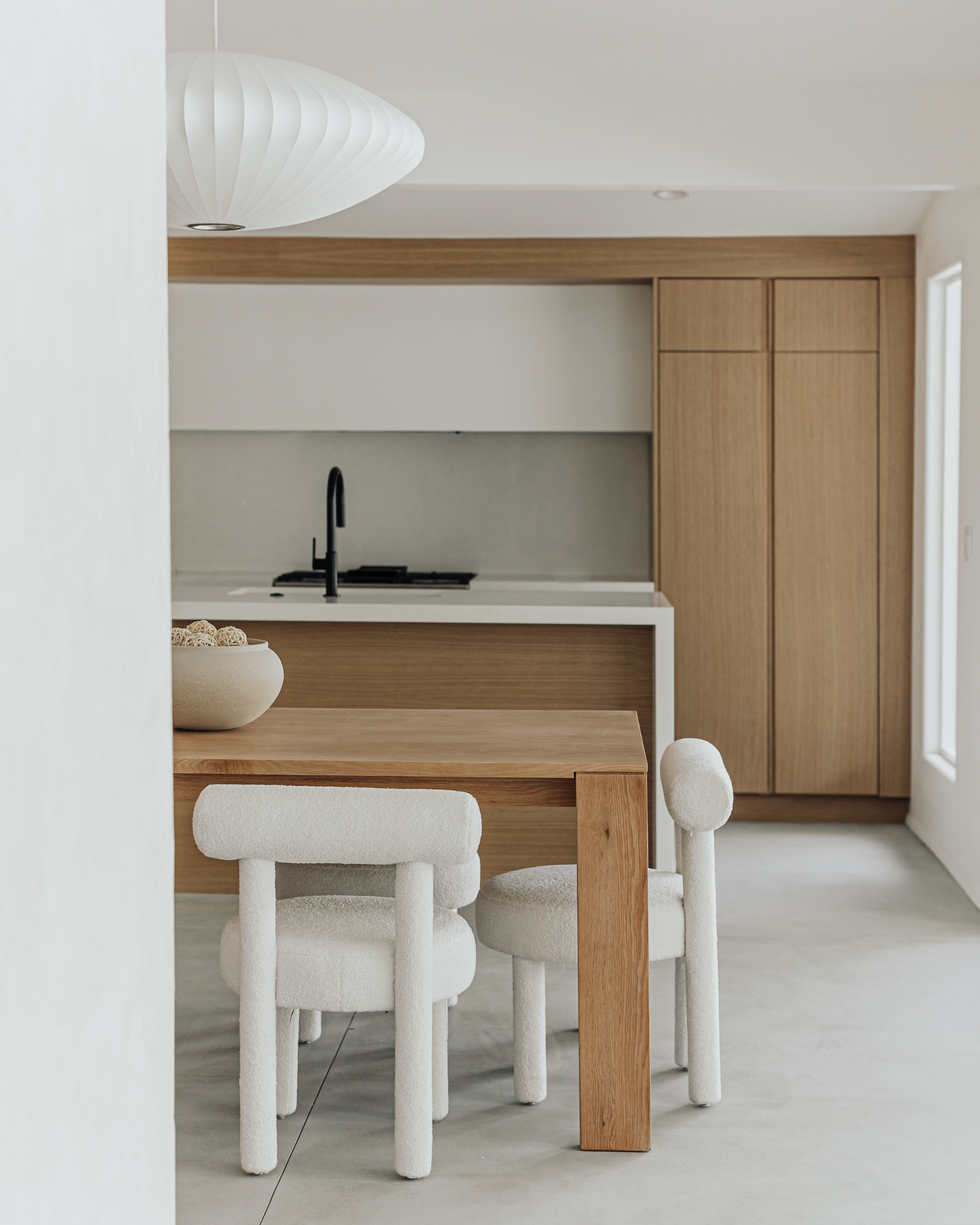
A minimalist approach means something a little different to every designer, but for for Lilianna Kim, it's all about "an experience without any unnecessary distractions" — which also means honing in on the best bits.
In this Palm Springs project, she says, that's "the beauty of the surrounding desert. The use of natural stones and materials throughout bring a balance between the interior and the surroundings, which creates a calm and cohesive feel."
Few of us live among such dramatic scenery, but there's something to be said for looking to the landscape for materials and subtleties in shades, whether that's a stretch of sand or patch of moss.
10. Pick a practical material
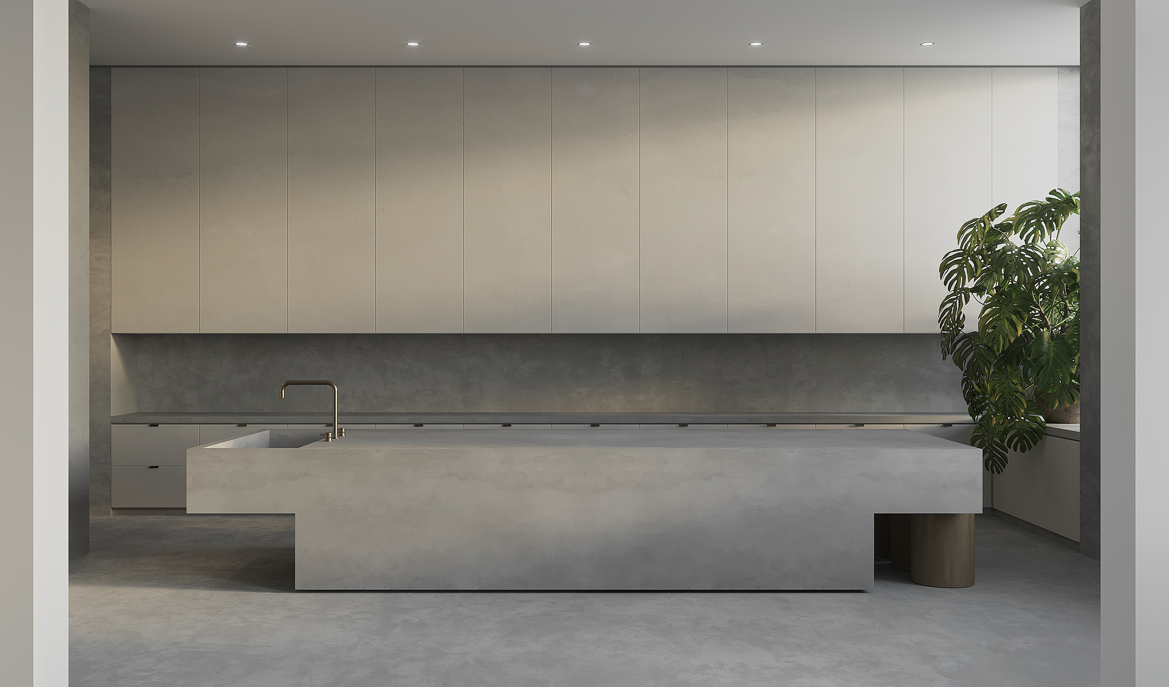
Here's a kitchen that's earned a double take. So well hidden are the usual kitchen components that you'd be forgiven for mistaking that monolithic island for part of a high-end spa — before you spot the kitchen sink.
"The client wanted a space that was incredibly durable and retained its sculptural quality even with extreme everyday use," says Noa Santos, founder of NAINOA.
The solution? "We covered nearly all surfaces in a highly durable plaster, reducing seams to a minimum, and hid all kitchen clutter behind closed storage. When in use, the clients are free to make a happy mess. And when they’re done, clean-up is quick and easy."
11. Consider restful color
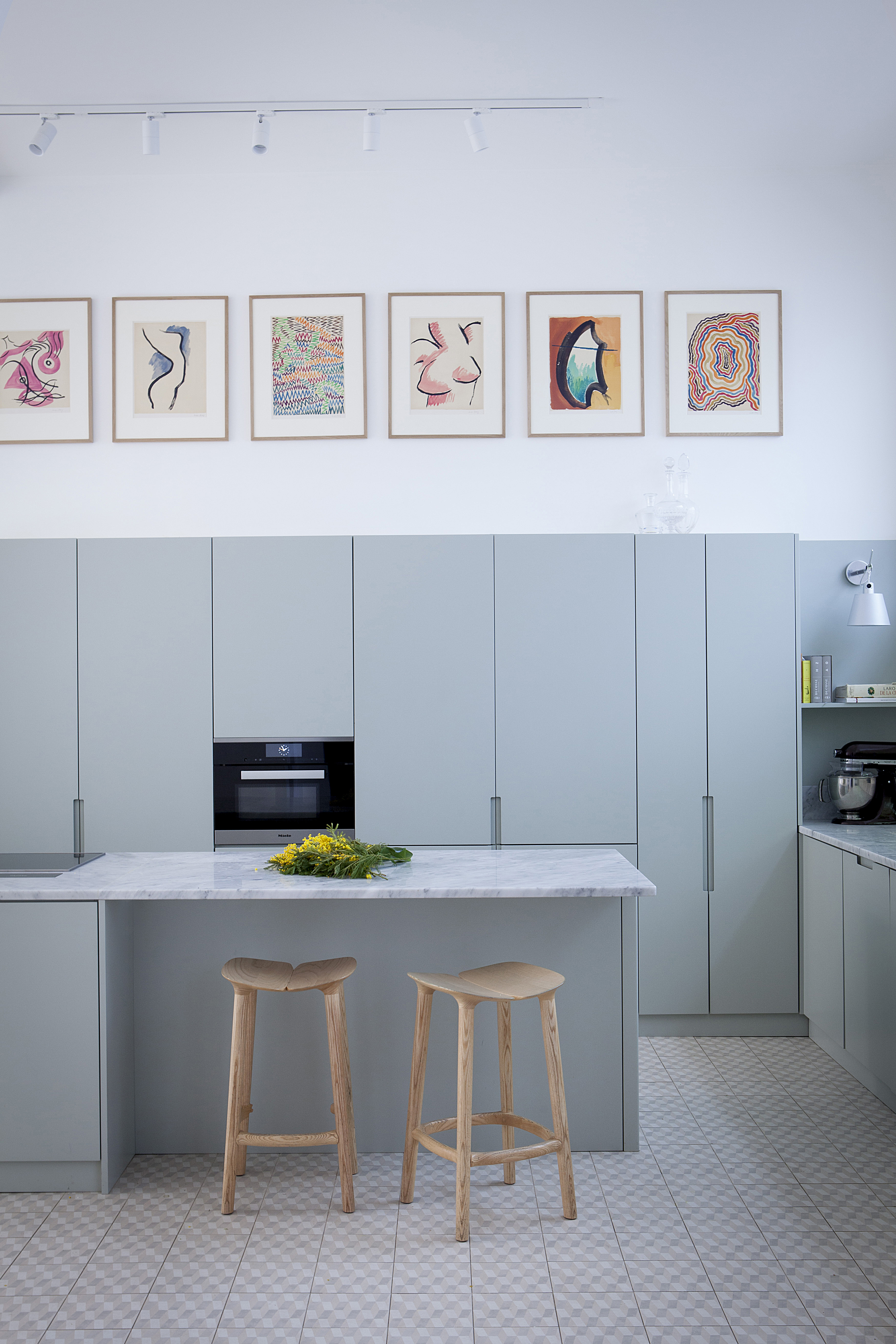
Call it duck egg or a muted cornflower – either way, we suspect this glorious gray-blue kitchen color scheme could catch the eye of even the most ardent colorphobe.
It's the work of designer Marie Deroudilhe, who took inspiration from the mood of a French country house for its "graphic tiles, pale pastel tones and large countertops." The finished space offers a calm canvas for a row of vibrant prints hung above storage with recessed handles.
"Our client, a well-known photography expert and curator, organized the hanging of her collection once the project was settled," explains Deroudilhe. "This amazing colorful series of original Man Ray prints found its perfect setting above the line of tall cabinets."
12. Keep wellness in mind
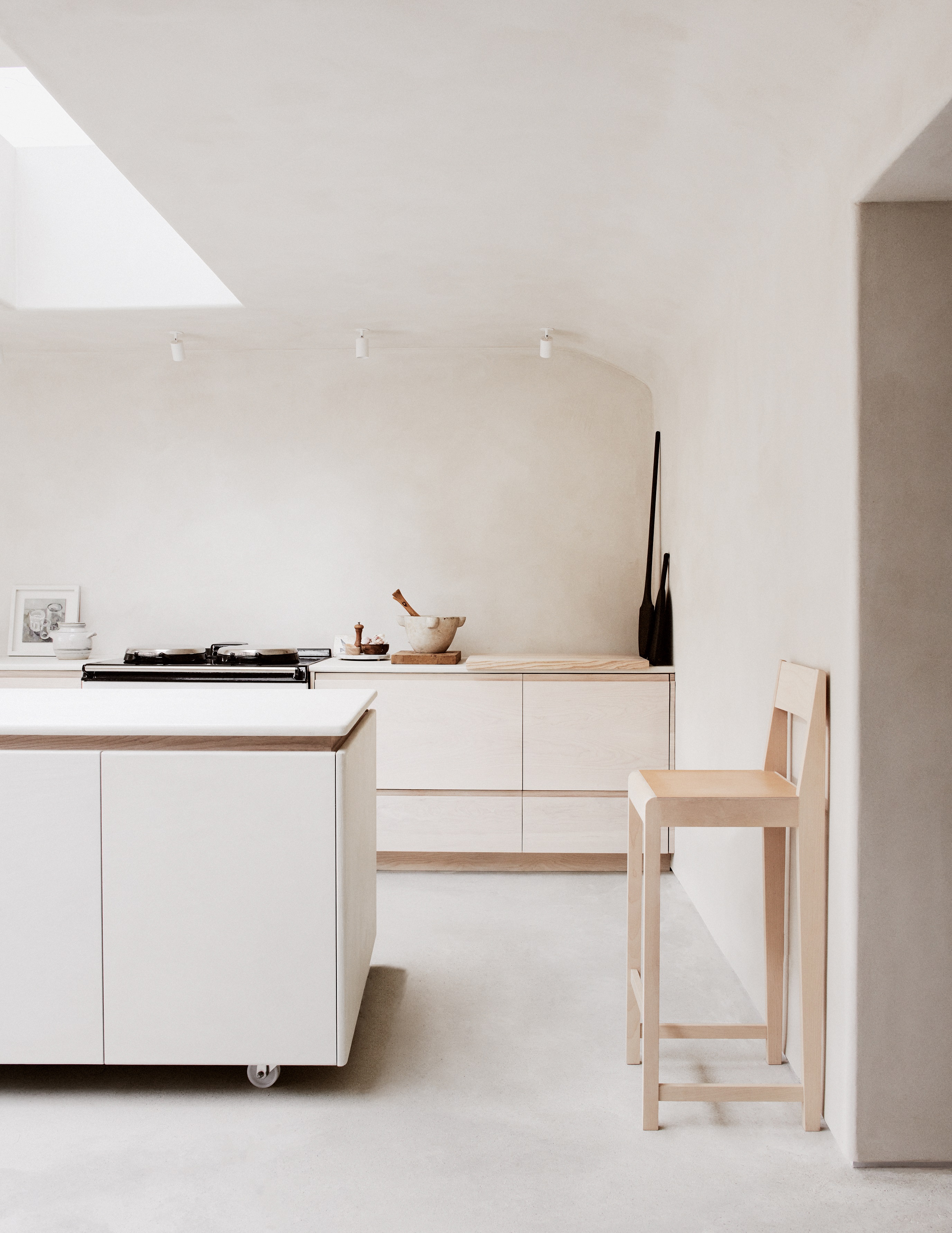
"Sometimes the most crucial aspects of a well-functioning space are not on display," says designer Louisa Grey, whose north London townhouse has all sorts of tricks up its sleeve – not least the cocooning kitchen downstairs, designed with a nod to happy Puglian holidays.
She'd imagined "creating the healthiest kitchen imaginable" but wasn't willing to compromise on aesthetics. "We’ve used clay on the walls of the kitchen and throughout the lower ground floor as it regulates humidity, which is essential to eliminating black mold."
The modern AGA is powered by renewable energy, while birch plywood and ash for the cabinetry are locally sourced. "Natural resources harvested directly from the earth ground us in nature for a calmer environment, improving concentration and providing stress reduction."
FAQs
What is a Minimalist Kitchen?
When people refer to a minimalist kitchen, they're likely talking about one or two things:
1. Minimalist in functionality
This means a kitchen design that's based on keeping countertops free from clutter. Think practical storage, hidden pantries, appliance garages, and more.
2. Minimalist in design
Minimalist kitchens from a design perspective rely on a few decorating ideas. "We feel the key to subdued spaces are fewer material choices, muted colors, a softness to textures, and the use of natural materials," says Benjamin Shields of design firm Dreamer Lab — but that's just the beginning.
Be The First To Know
The Livingetc newsletters are your inside source for what’s shaping interiors now - and what’s next. Discover trend forecasts, smart style ideas, and curated shopping inspiration that brings design to life. Subscribe today and stay ahead of the curve.
Cat Olley is a British design and lifestyle journalist, editor and copywriter. Formerly on the features team at ELLE Decoration, she has written for The Guardian, The Modern House, Evening Standard Homes & Property, Inigo and John Lewis at Home. She specializes in the latest trends and ideas happening in the design world, and is our go-to for aesthetically-led pieces.
- Luke Arthur WellsDesign writer
-
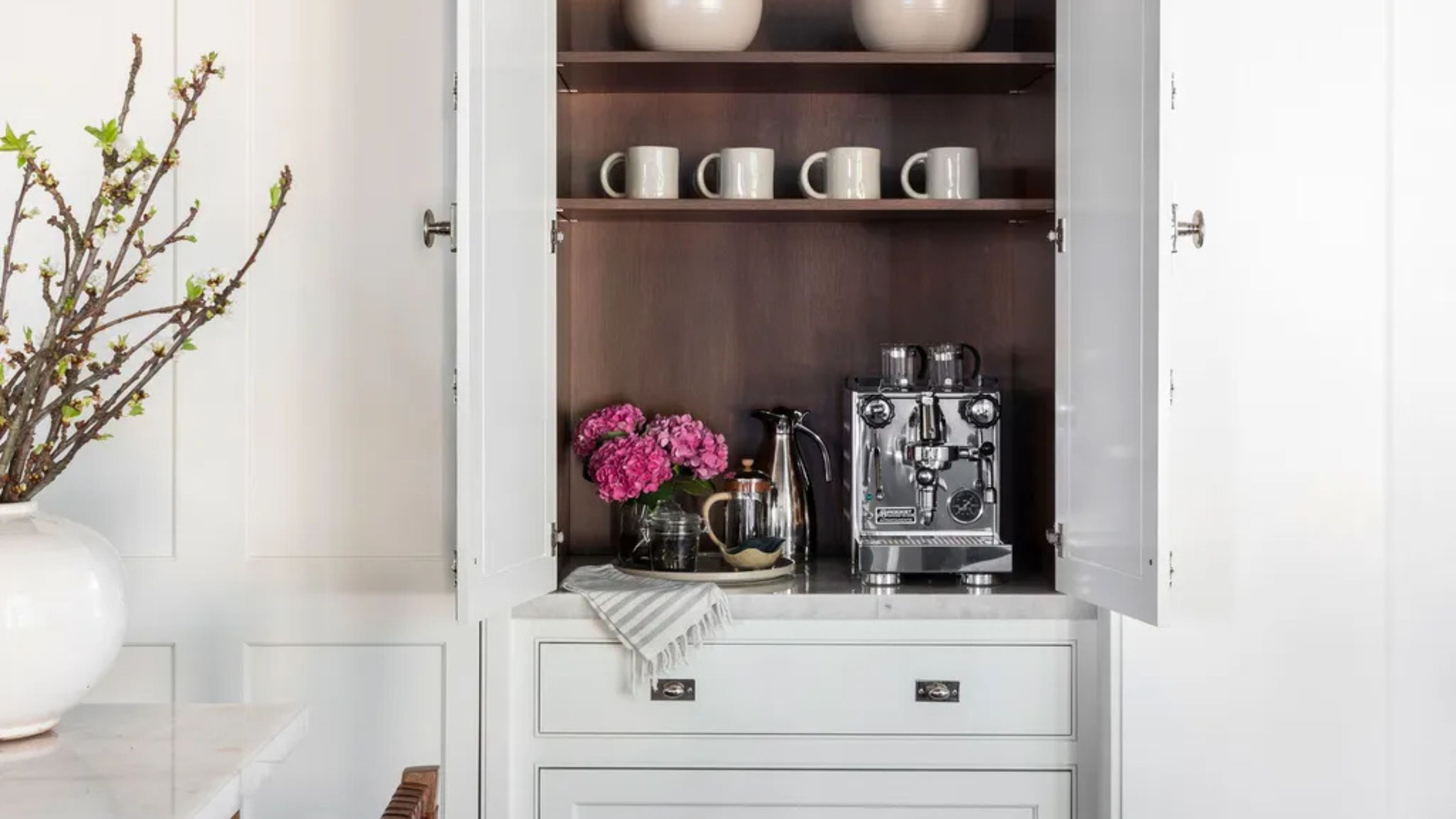 Turns Out the Coolest New Café is Actually In Your Kitchen — Here's How to Steal the Style of TikTok's Latest Trend
Goodbye, over-priced lattes. Hello, home-brewed coffee with friends. TikTok's 'Home Cafe' trend brings stylish cafe culture into the comfort of your own home
By Devin Toolen Published
-
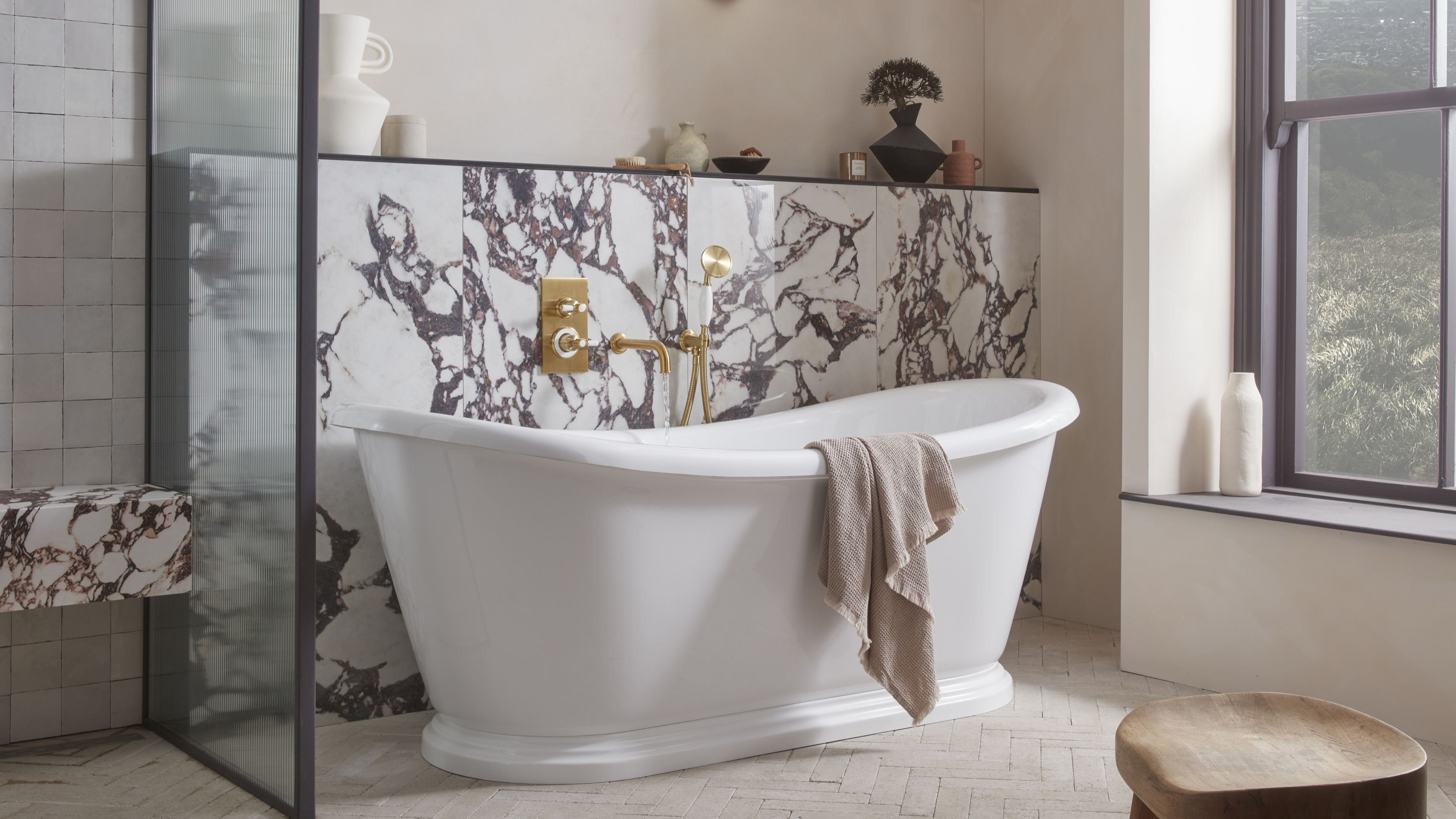 5 Bathroom Layouts That Look Dated in 2025 — Plus the Alternatives Designers Use Instead for a More Contemporary Space
For a bathroom that feels in line with the times, avoid these layouts and be more intentional with the placement and positioning of your features and fixtures
By Lilith Hudson Published
-
 Smeg Says Teal, and We’re Listening — The Kitchen Shade of the Year Is Here
Designers are already using the soft, sea-glass green everywhere from cabinetry to countertops
By Julia Demer Published
-
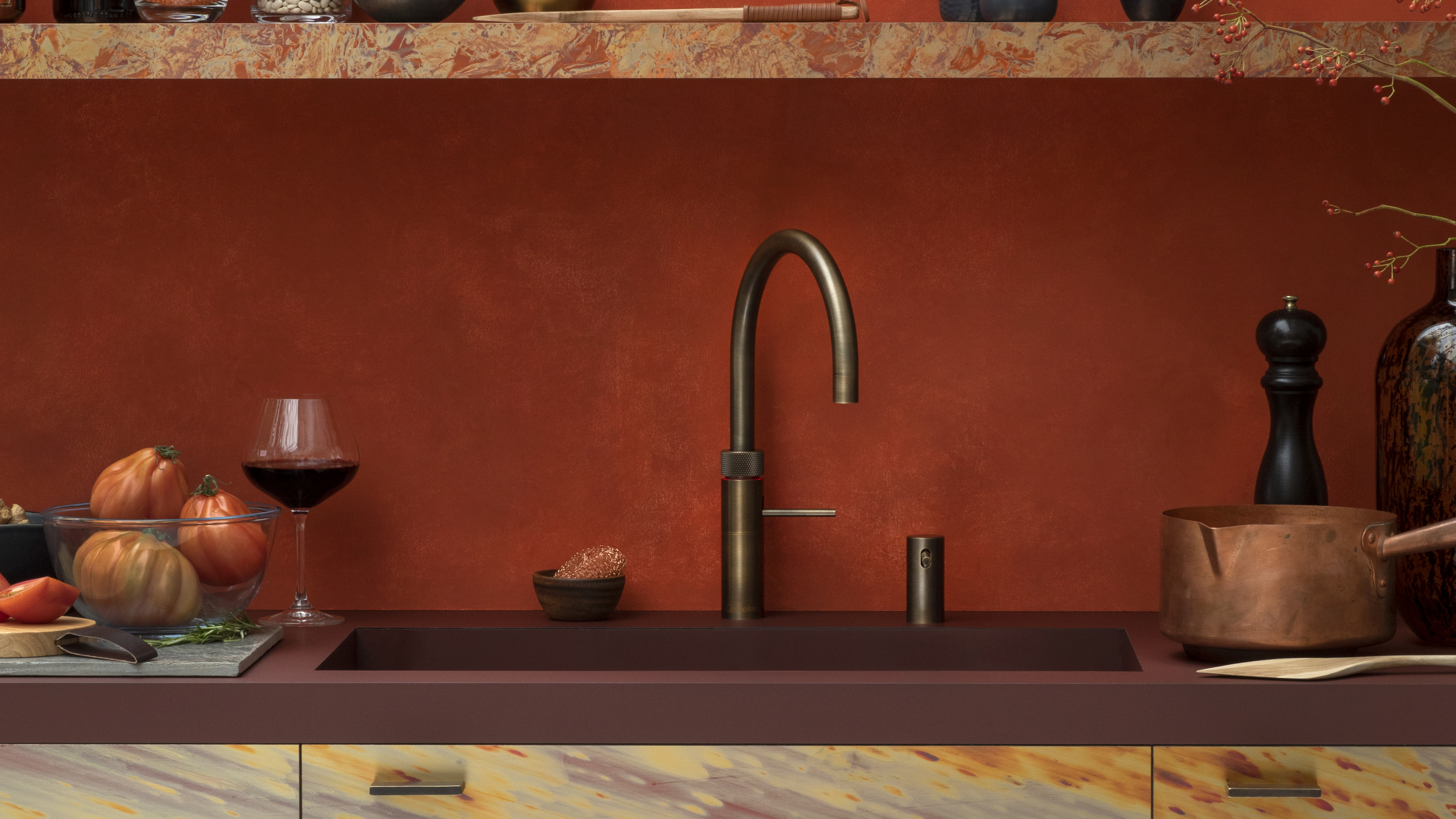 5 Problems With Boiling Water Taps That No One Ever Talks About — And How to Troubleshoot Them
We got our experts to spill the beans on the truth behind these kitchen staples
By Maya Glantz Published
-
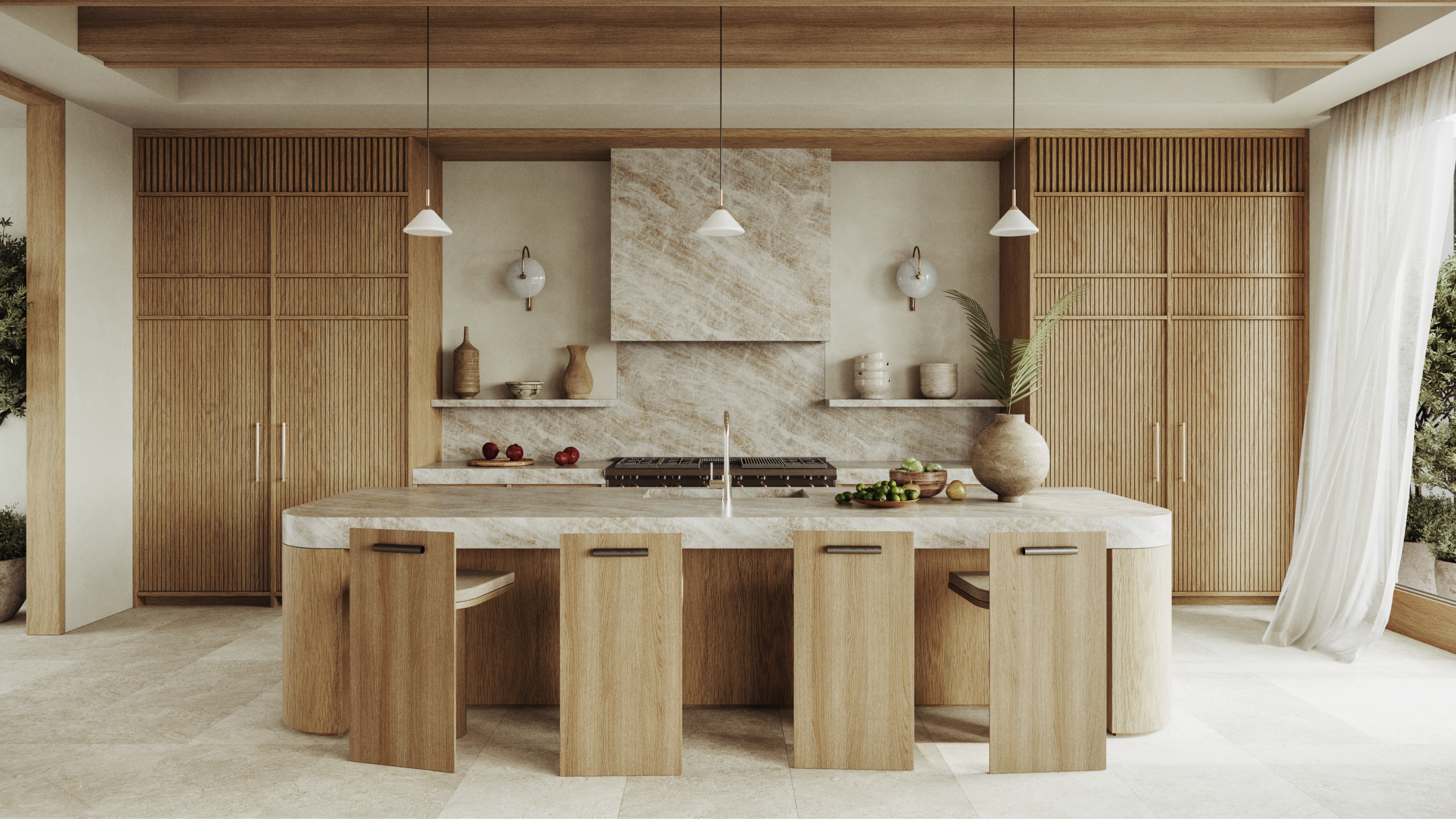 Does a Kitchen Need to Have a Door? The Pros and Cons (and Regulations) Explained
As popular as open-plan kitchens may be, they aren't for everyone. Our experts break down all the pros and cons of this design style.
By Maya Glantz Published
-
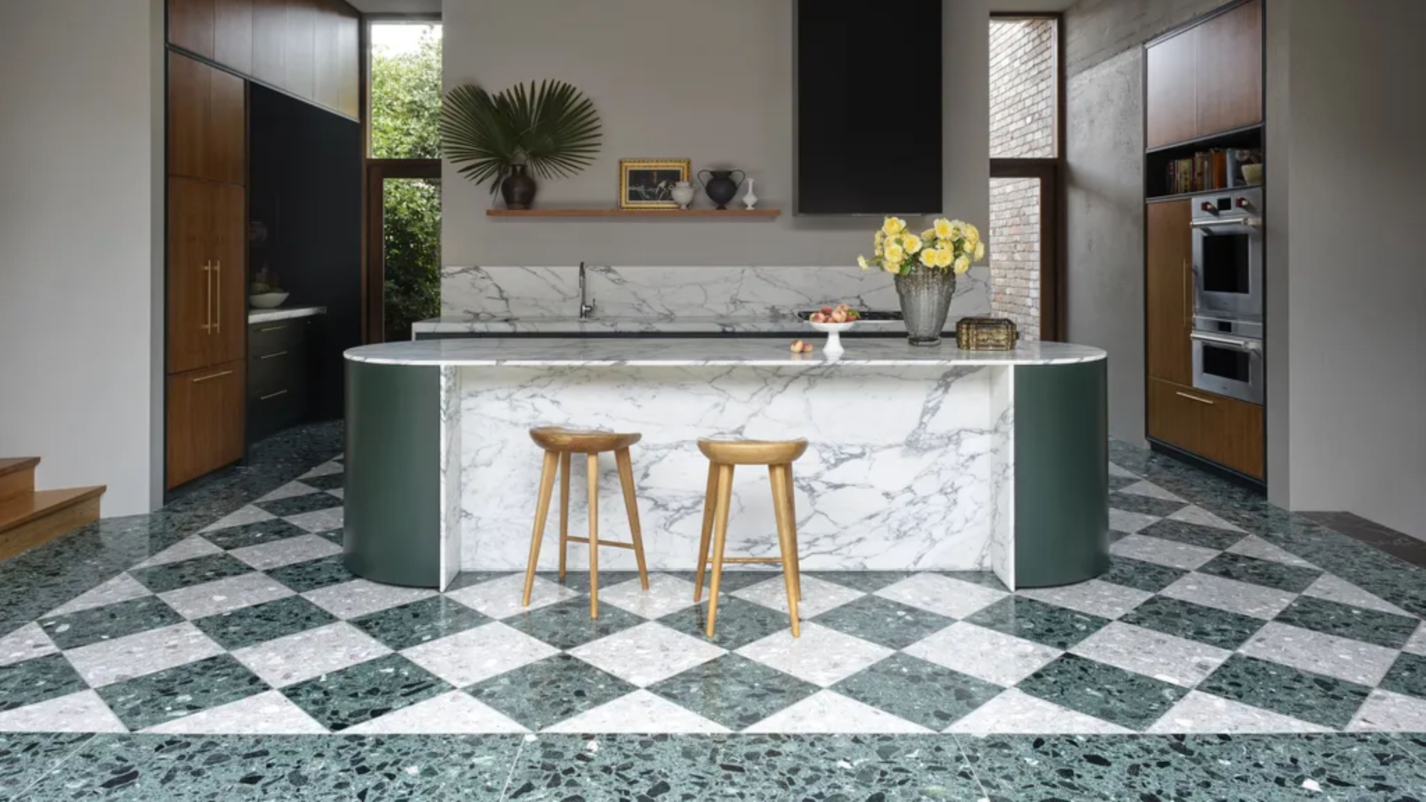
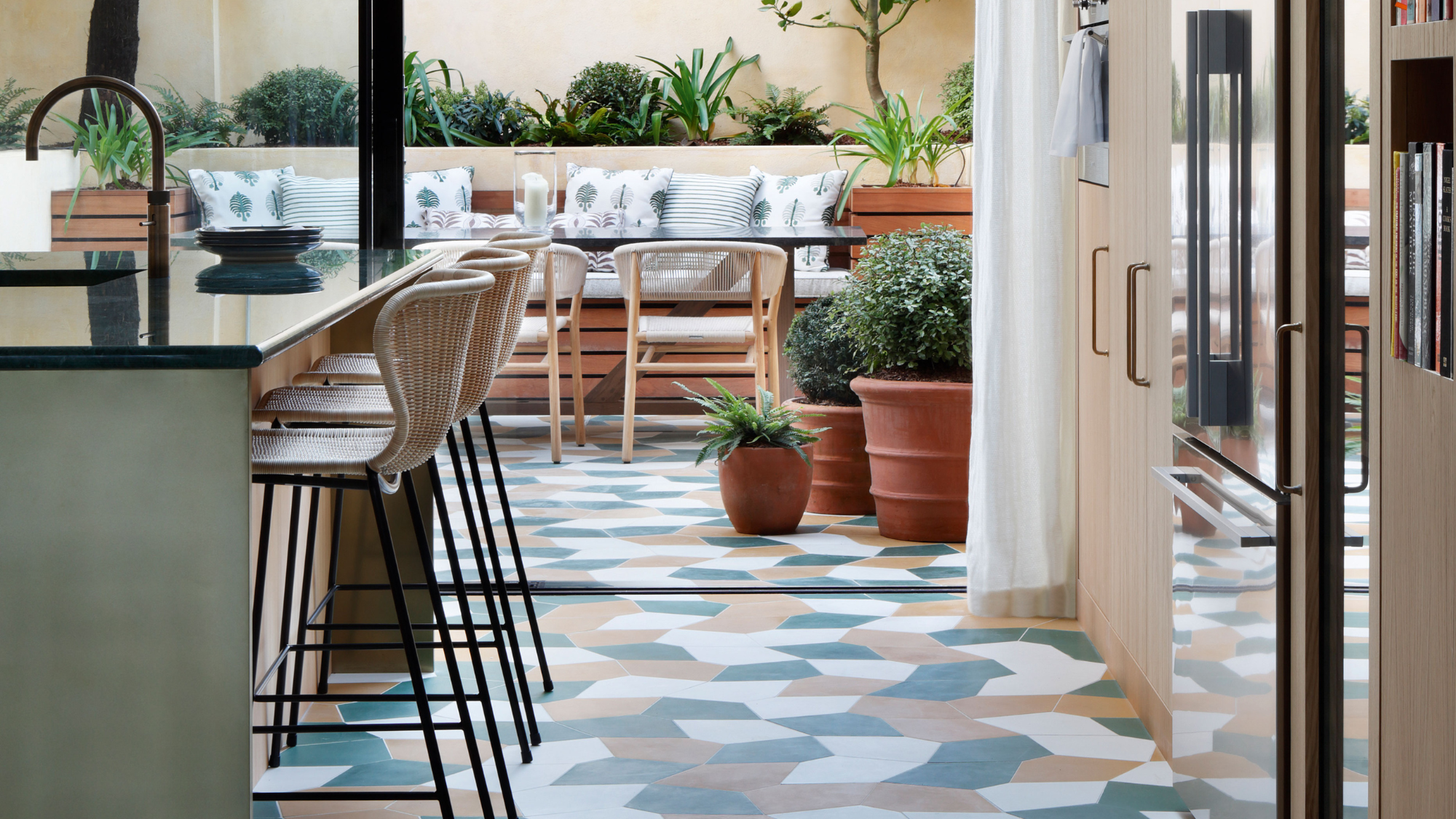 11 Kitchen Flooring Ideas to Build a Brilliant Renovation Scheme From the Ground Up
Starting with your kitchen's flooring isn't a bad idea when it comes to creating a successful scheme — here are 11 modern ways to do it, and expert advice from interior designers
By Tessa Pearson Published
-
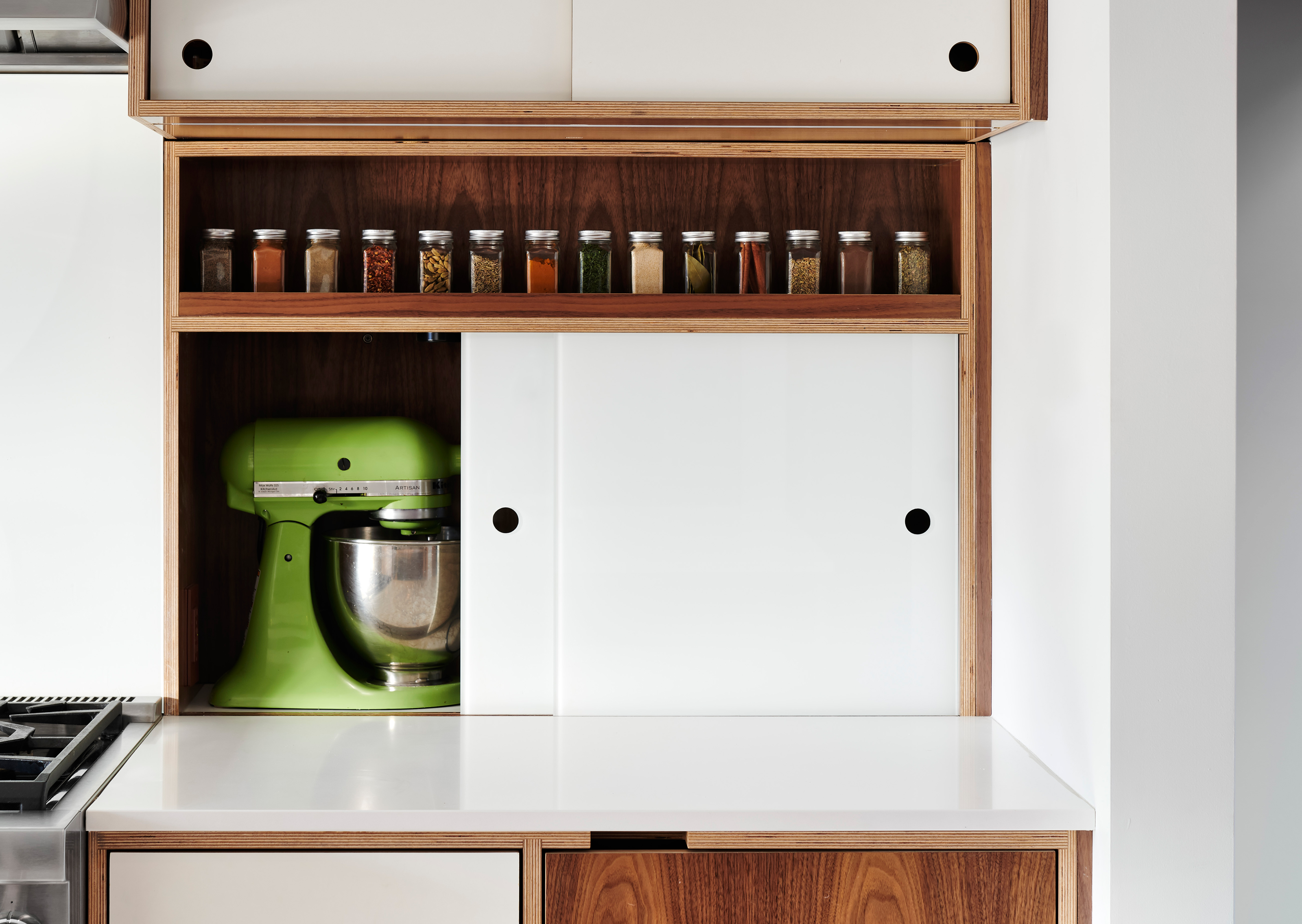 "I Just Bought a Stand Mixer — Where Can I Store It in My Small Kitchen?" 6 Clever Storage Ideas to Consider
Love your stand mixer, but hate not knowing how to store it? We've got the same problem, but these six expert tips have solved our limited storage problems for good.
By Amiya Baratan Published
-
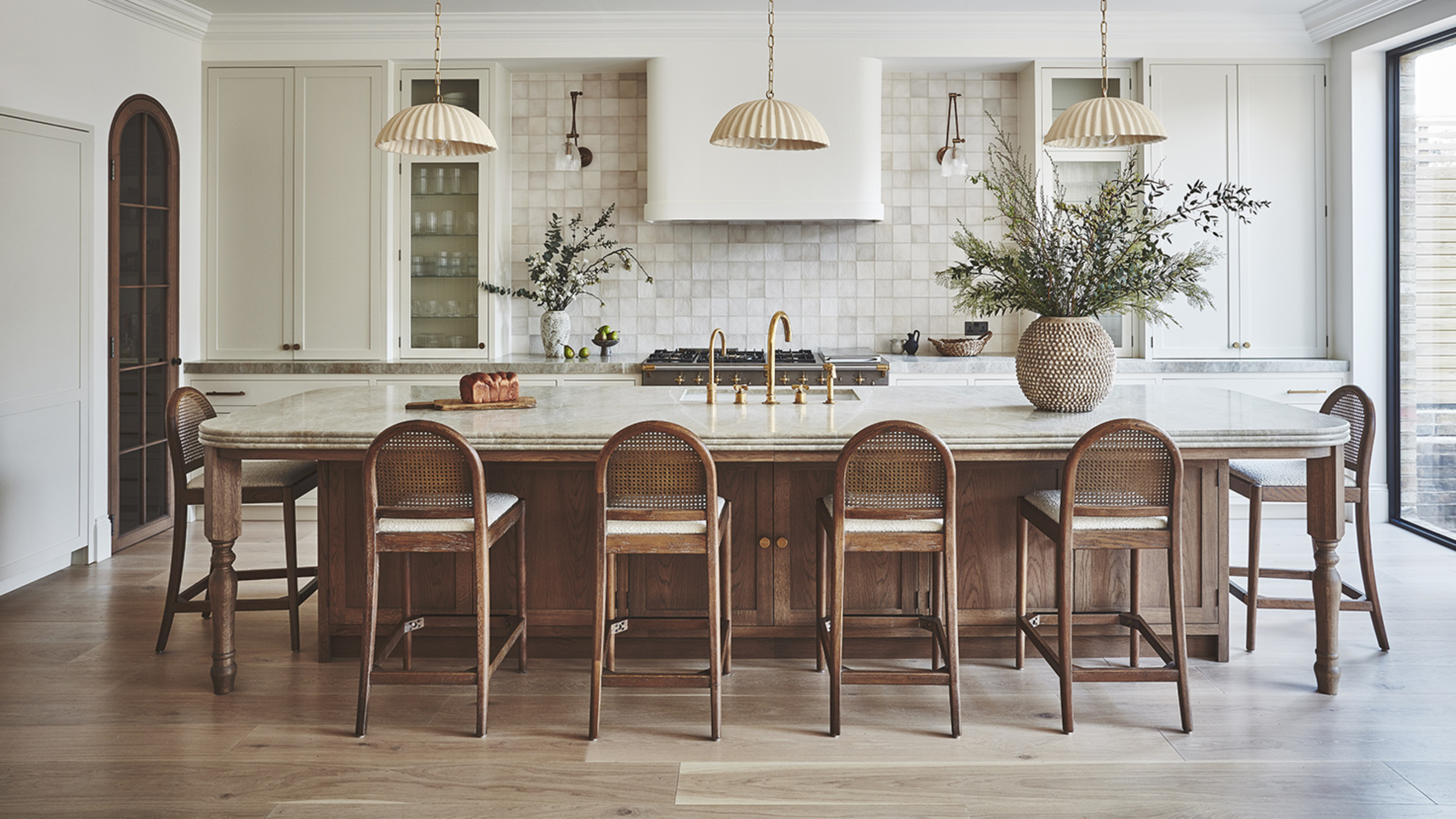 Bar Stools vs Counter Stools — The Difference You Need to Know to Avoid Buying the Wrong One for Your Kitchen
You might think they're the same thing, but bar stools and counter stools are subtly different, and knowing how will help you avoid buying the wrong ones
By Maya Glantz Published
-
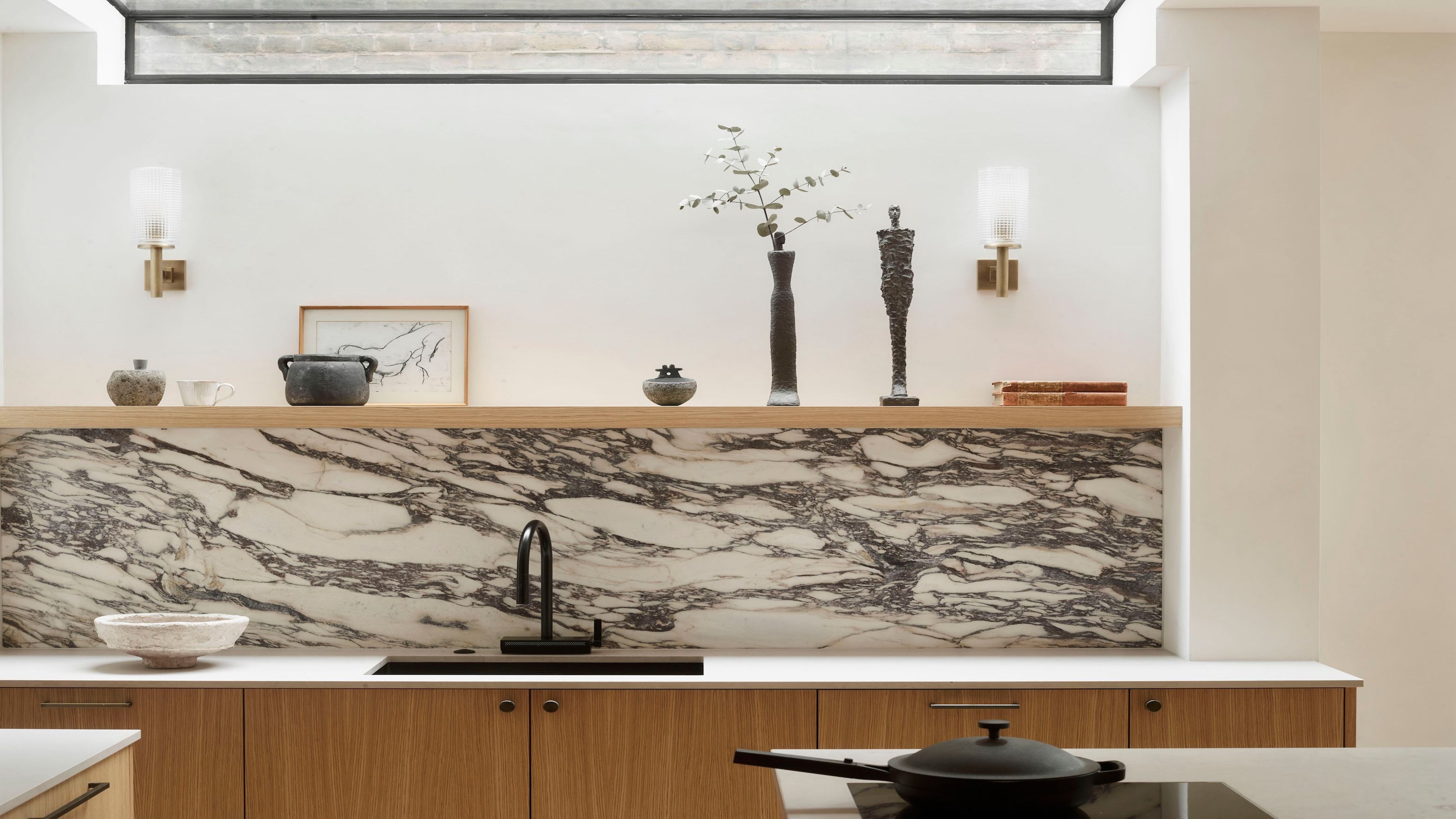 10 Kitchen Tap Ideas That Will Upgrade Your Sink — Who'd Have Thought Doing the Dishes Could Look This Good?
From pot fillers to pull-out hoses, these are the kitchen taps that the experts are lusting over right now…
By Lara Sargent Published
-
 16 Kitchen Island Ideas That Feel Pitch Perfect for 2025 Projects
Who would have thought there would be so much inspiration to choose from? Experts share their stylish and most inspiring ideas for kitchen islands
By Faiza Saqib Published