6 lighting ideas for minimalist homes that look incredible and make spaces feel so much less cluttered
Lighting may be the 'jewelry' of the home, but sometimes, for a more minimalist look, you need to take one piece off
Lighting has invariably changed throughout history. From candles and gas lamps to electricity’s promise of instant light through the light bulb, it's easy to think there isn’t much we haven’t thought about doing when it comes to lighting a room, but you would be proven wrong.
Lighting is becoming softer and more serene as designers and DIY home experts persist in the evolution of lighting. We are seeing light sources concealed and many are eschewing the traditional pendant structure for something more subtle. In short, lighting is undergoing a renaissance in minimalist interior design, and we are here for it.
The benefits of this new school of lighting are simple but effective, by concealing the light source, the light feels less harsh and more ambient. Your interior as a whole feels calmer and more welcoming, not to mention more open as the need for traditional wall fixtures is reduced. We look at some of how interior designers are experimenting with the minimalistic approach to lighting and how you can bring these luminary ideas into your home.
1. Create an illusion with your wall
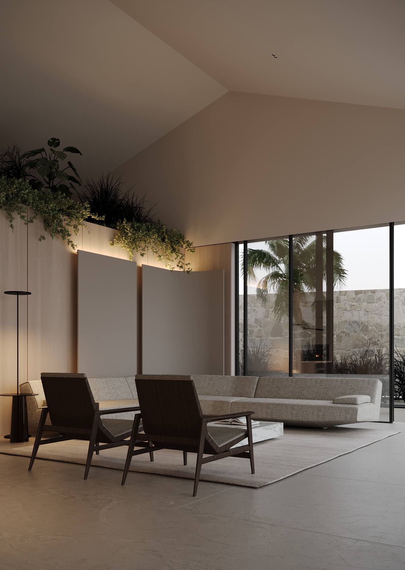
This softly lit space champions concealed living room lighting and shows it can be subtle yet striking. Hiding the light source behind a curved screen creates an illusion with the existing architectural element but also offers a candle-like focal feature for this scene.
'Creating dispersed minimalist lighting at present is a must-try! It provides a highly comfortable ambiance in the space,' say Vlad and Karyna Diachok from design studio Diachok Architects. 'In this concept, we have arranged the lighting to be diffused throughout the room while also illuminating the plants from below, offering multiple lighting scenarios at once. Moreover, the back panel serves as both a torchiere and a decorative element on the wall, enhancing the overall aesthetic appeal.'
Layering as mentioned by the designers is a key ingredient to consider when using a softer approach to lighting, consider how your lighting fixtures work in tandem not just individually.
2. Find your perfect plastered piece
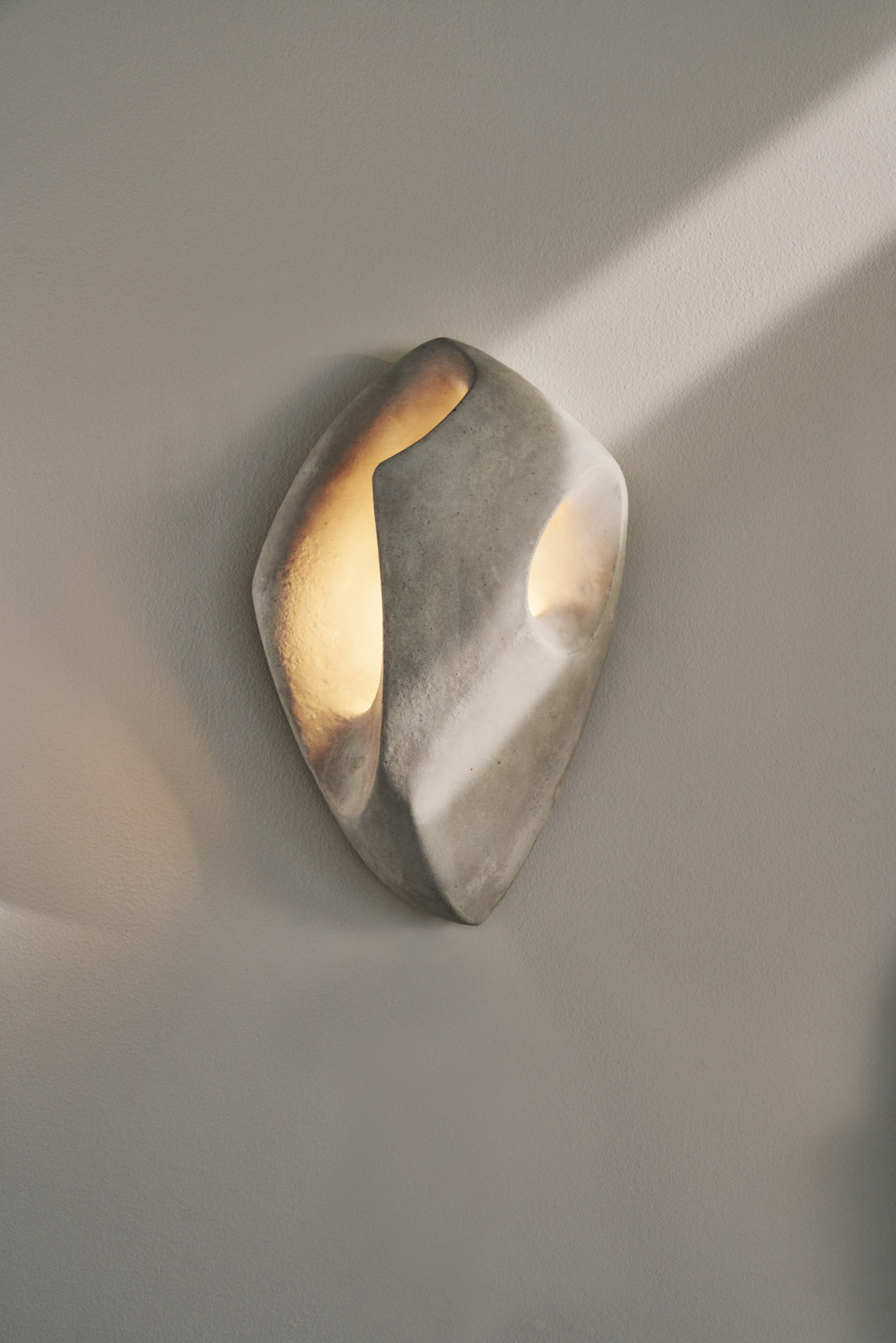
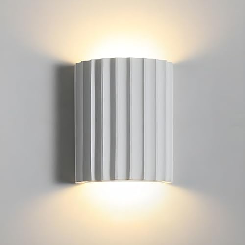
Plastered walls, furniture, and lighting continue to grow in popularity as designers and their clients seek to create calming and peaceful interiors. Sculptural sconces that conceal the light source and blend with the wall are a great solution for those seeking to add minimalistic lighting to their spaces but don’t want to incur the cost and time that is associated with making major architectural changes.
Be The First To Know
The Livingetc newsletters are your inside source for what’s shaping interiors now - and what’s next. Discover trend forecasts, smart style ideas, and curated shopping inspiration that brings design to life. Subscribe today and stay ahead of the curve.
'Turning my art practice into designs for the home, specifically lighting, came from an interest in art blending into people's surrounding environments,' says LA-based artist, Kassandra Thatcher. 'It’s wonderful when art stands as a focal point, but more interesting to me is when art seamlessly becomes part of the story of the home, which is for many the most beloved space.' This synergy between the lighting as wall decor and the interior is a core tenant in this new approach to lighting and is something to factor in when constructing your interior.
3. Go for a bespoke solution

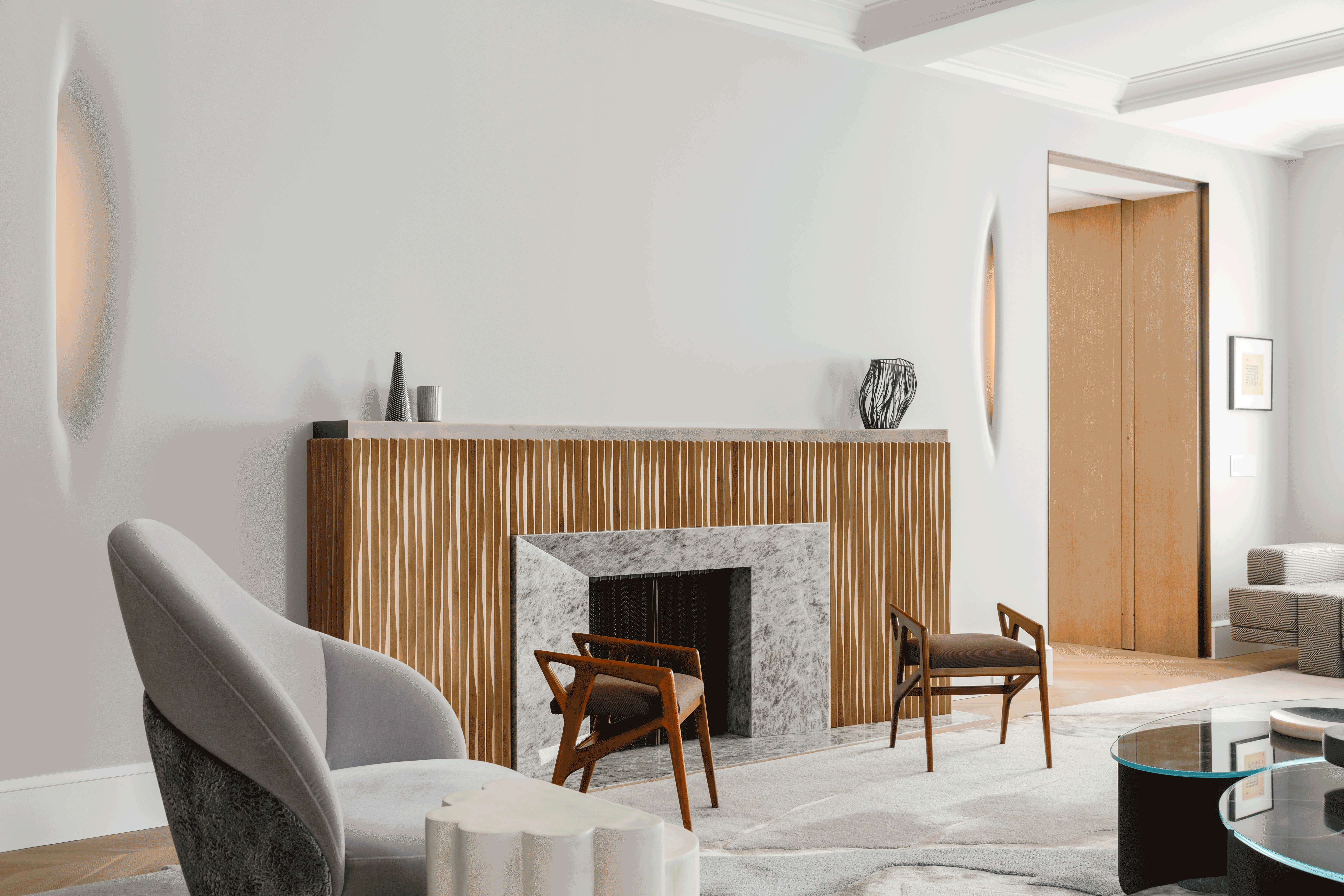
This pared-back living room designed by MKCA for their Carnegie Hill project shows an architectural approach to minimal lighting. The bespoke fixtures at either end of the fireplace offer an ambient glow but also add an interesting sculptural touch to the wall.
'The sconces are a collaboration with our friend, the sculptor Christopher Kurtz,' explains Michael Chen, founder of MKCA. 'We were interested in developing a light fixture with an ambiguous relationship to the architecture, where it would be hard to discern where the wall ended, and the sculpture began. This was in part to allow for the possibility of an artwork over the mantel, but also to create something subtle that would still have presence to hold the empty space on its own. We love to create moments of deliberate emptiness in an interior. I think it’s important, especially in a city like New York, where one is always so stimulated.'
This fascination for the absence of objects in favor of a curated simplicity gives this project a sense of minimal opulence - it's all about the power of negative space. 'The fixtures are carved from wood and plastered into the wall,' Michael adds. 'They are illuminated with a flexible LED sheet that glows against an inner surface. That’s what gives the opening a soft glow. There are access panels for the light fixture hidden in millwork on the opposite side of the wall.'
To recreate this look, be sure to consider lighting early on in the design process and discuss with your architect contractor, and interior designer to get a sense of what is possible within your space.
4. Light up the ceiling

While tradition has always dictated that we light downwards, lighting up your ceiling can create a beautiful and delicate display of light for your home. Spanish architects, Balzar Arquitectos demonstrate how minimal and concealed lighting can help direct the eyes and create a sense of drama with their Avenida del Oeste apartment project. The coved ceilings feel romantic and relaxing with this lighting scheme and there is no harsh lighting fixture to break these beautiful lines.
'The illumination is achieved with indirect light integrated into a pit,' reveals Laura Moreno Albuixech from Balzar Arquitectos. 'This is our usual way of working to keep the ceilings clean.' Taking the designer’s advice onboard, it’s worth consulting the experts to ensure your lighting is concealed in the best way so the result feels elevated rather than unfinished.
5. Blend light with art

Minimalist lighting solutions are also seeing a greater focus on multi-functional lighting fixtures. These sculptures do much more than illuminate their surroundings but rather create a space for connection, contributing to what is revealed to be an emotive interior.
'Certainly, the concept behind this sculptural light was to provide clients and designers with the opportunity to seamlessly integrate it into existing walls,' says artist and interior designer, Mattia Biagi. 'The aim was to create a captivating on-site installation effect rather than just a conventional lighting fixture.'
By choosing to create your cluster of luminary sculptures, you can blur the lines between lighting and living room wall art. Another benefit with this approach is it can be tailored to your interior architecture, blending with the wall to highlight surrounding elements.
Writer and design expert Faaizah Shah is the founder of The Interiors Consultancy. She has worked with designers such as Staffan Tollgard and design houses such as Sanderson to help them understand and communicate their narratives. She is known for crafting engaging stories and imaginative content, and understanding great decor from her years alongside some of the best creatives in the industry. She is also a contributor to Livingetc.
-
 Burl Wood Decor Is 2025’s Most Coveted Comeback — Here’s How to Get the Storied Swirls for Less
Irregularity is the ultimate luxury, but you don’t need an antiques dealer to find it
By Julia Demer Published
-
 5 Garden Features That Instantly Add Value to Your Home — While Making Your Outdoor Space More Practical, too
Get to know all the expert tips and tricks for making your backyard a standout selling point for your home.
By Maya Glantz Published
-
 Straight from Salone: 5 Emerging Trends I Found in Milan That'll Shape Interiors for the Year Ahead
From reflective silver to fluidity, here's my perspective on the key themes and new moods coming through from Milan Design Week
By Sarah Spiteri Published
-
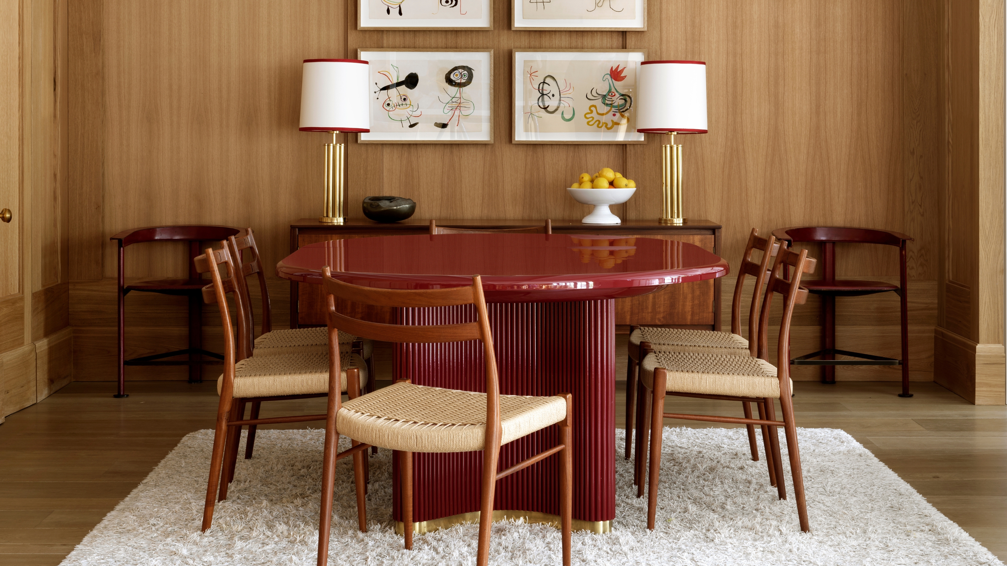 The 'Red Table Trick' Is the Easiest and Most Expensive-Looking Trend to Hit 2025 So Far
A red dining table makes a seriously stylish statement; the beloved pop of red trend just got an bold and expensive-looking upgrade
By Olivia Wolfe Published
-
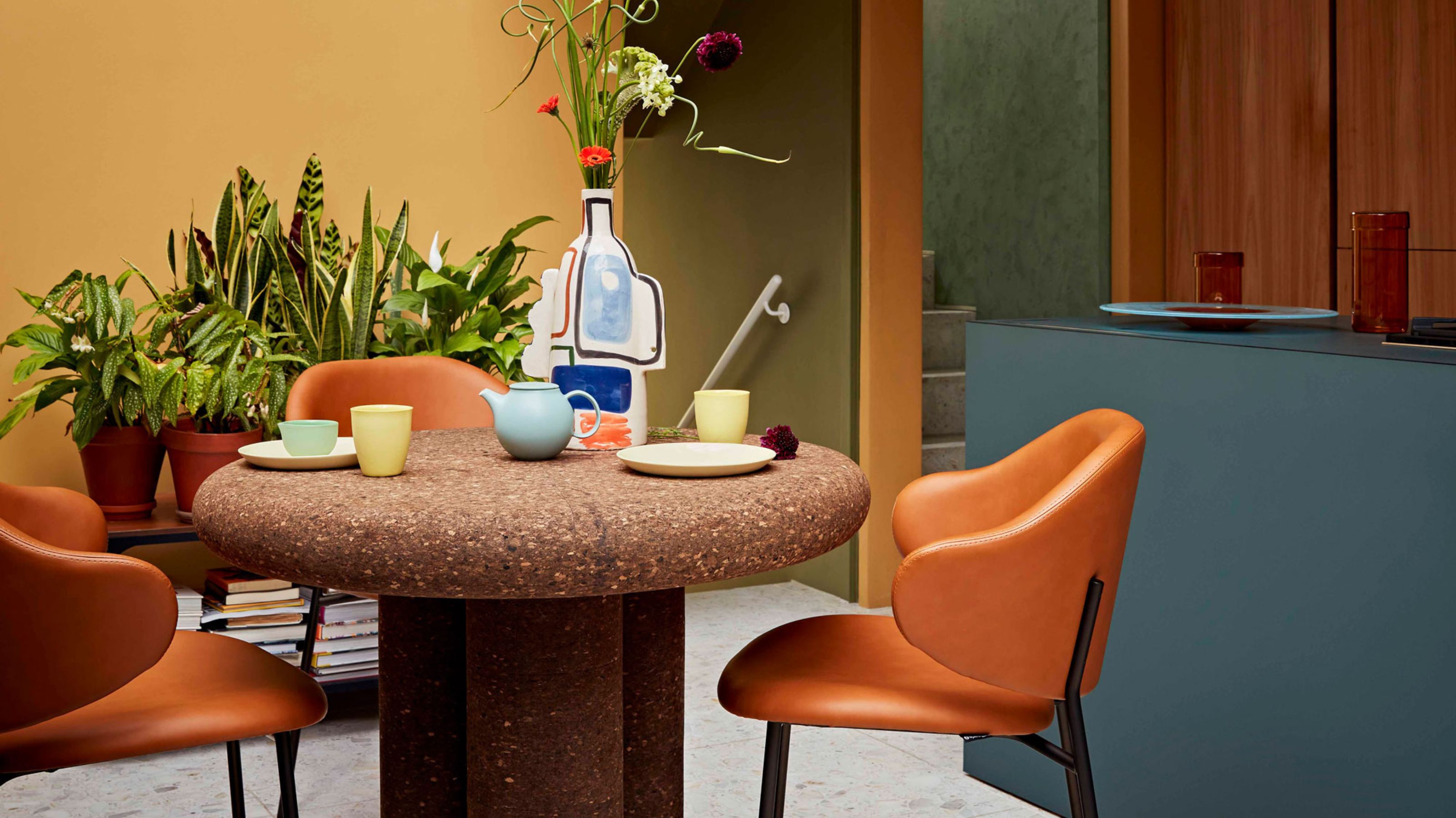 Cork Is the Cool, Sustainable, and Surprisingly Chic Material We Can't Stop Furnishing With Right Now
In honor of Earth Month, we’re toasting to cork... furniture, that is
By Julia Demer Published
-
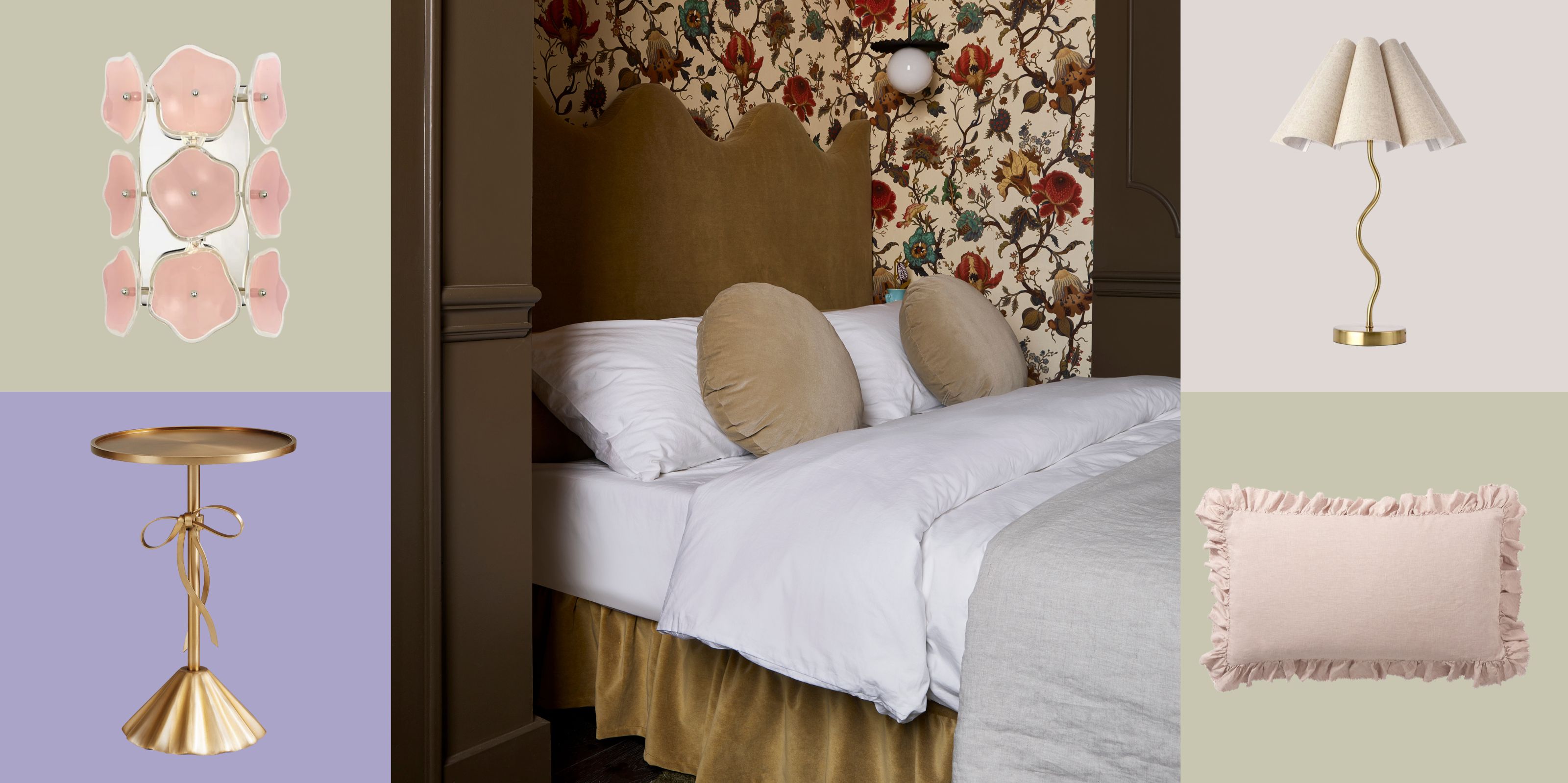 The Coquette Aesthetic Is Still Going Strong in Homes in 2025 — But Now It's Charming, Whimsical, and Has Modern Flair
A designer weighs in on how you can make the classic coquette trend feel modern while still retaining its whimsical elegance
By Devin Toolen Published
-
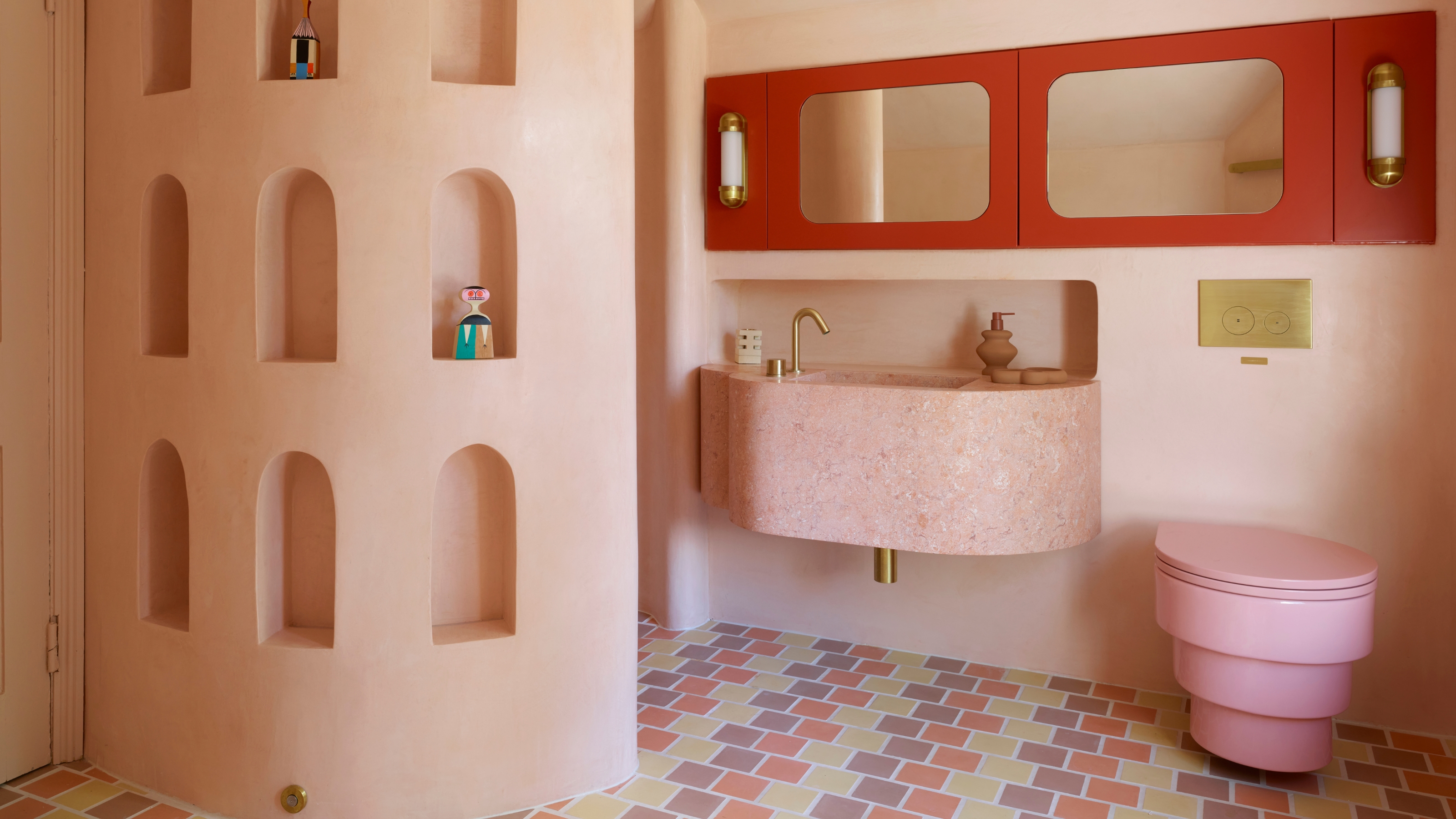 Spotted in the Coolest Bathrooms of the Moment — This Colorful-but-Divisive Trend Is the Idea You'll Either Love or Hate
See you later, sterile white. This playful plumbing trend is bringing color back to our bathrooms in an utterly unexpected way
By Olivia Wolfe Published
-
 The Biggest Outdoor Furniture Trends for 2025 Embrace the Natural World, White Lotus, and a Touch of Whimsy
Sofas as plush as your living room’s, tables fit for a five-star resort, and materials straight from nature — here’s how outdoor living is evolving this year
By Julia Demer Published
-
 The "One Amazing Thing" Theory Could Just Be the Secret to Making Your Decorating Budget Go Further (While Making More Impact)
What if we told you designers had found a way to control a project's spend even while elevating the final result? This new trend does just that
By Pip Rich Published
-
 Carpets Used to Give Me the Ick, but This Bold New Style Makes Me Think They're the Next 70s Design Detail Due for a Revival
I've always had visions of ripping up wall-to-wall carpets, but now I'm thinking about actually installing them — what gives?
By Emma Breislin Published
