How minimalists are decorating with pink - when you love the color, but have had enough of "Barbiecore" decor
Pink can be that subtle, visually-pleasing element that layers and softens a space. Here's how to embrace pink in a quiet, minimalistic manner
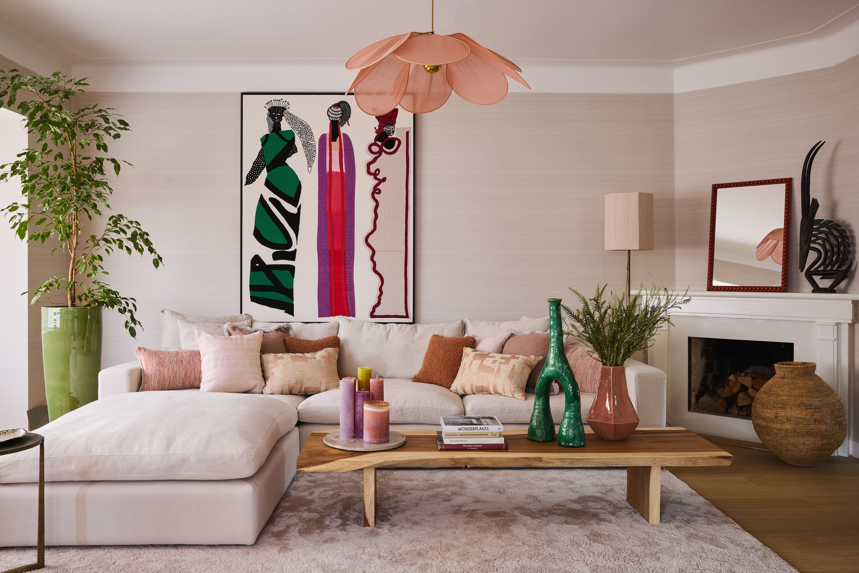

Minimalism is the current mood in interiors and love for restrained and soft design has homeowners hooked. It's all about less is more, with an undertone of quiet luxury. While colors are the most essential element in the design, minimalist design points at ways of using shades more subtly. This means, swapping out bright, maximalist schemes for more soothing ones. At the moment, minimalism in pink is on the rise.
'Consider pairing light pink with muted tones like white or grey for subtlety,' says Lauren Lerner, principal and founder of Living with Lolo. 'When choosing pink as an accent tone, test out a few paint tones to ensure it looks good in your space and lighting, and doesn't dominate the space.'
Scroll down to find 8 ways to embrace this interior design trend of 'minimalist pink'.
8 minimalist ways to use pink
Pink is a timeless and contemporary color; one that has been around for decades and still has staying power. Yet, it is a hue that needs a good amount of thought before using it. Get a little too carried away, and pink can make your interior feel overly decorated and cutesy. Not the best look for a modern home!
A good, subtle way to a pink living room or bedroom is the way you use the color, in combination with other hues. When styled with warm, earthy colors or light neutrals such as brown, beige, grey, or ochre, it can create a calming effect. Pepper the hue around the room instead of concentrating on one large element to reduce its sugary look.
For more ideas, take a look at these ways to style and design with pink.
1. Use it on a carpet

Color doesn't have to be on walls – for a subtle dose of hue, add it to soft furnishings. Not only will this help weave in the hue in the overall scheme without standing out, but it will also allow you the flexibility to change it or take it out when you want to redesign your space.
One way to add pink in a minimalist way is by adding it to the carpet. Plus, many colors go with pink, so it'll allow for a more mature and layered space that doesn't feel too saccharine-sweet.
'This project began with a focus on the pattern and colors meticulously developed for this exquisite carpet,' say Olivier and Clio, founders of Garcé & Dimofski. 'Expertly crafted by the renowned carpet upholstery brand, Manufacture de Tapis de Bourgogne, it exudes a sense of luxury and artistry. The carefully chosen gradient of pink used for the carpet offered us a unique chance to infuse the room with a welcoming and cozy ambiance. Ingeniously, the furniture pieces artfully play around the lines and vibrant colors of the carpet's design, creating a harmonious and visually captivating space.'
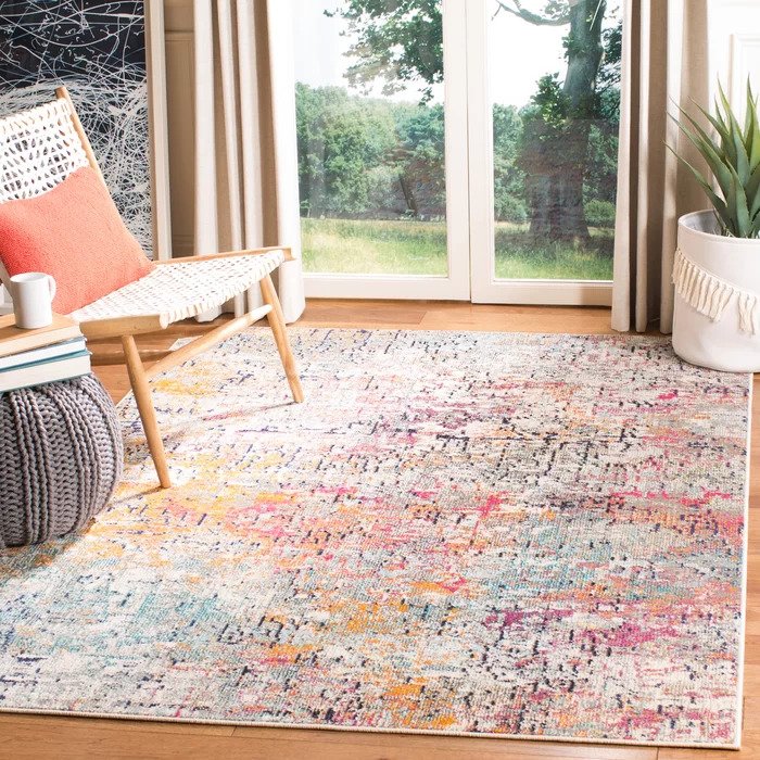
Material: Polypropylene
Price: $158
Choose this carpet with subtle pink and red shades and add a nice, soft touch of color to your interiors.
2. Add a touch of pink in bathroom fixtures
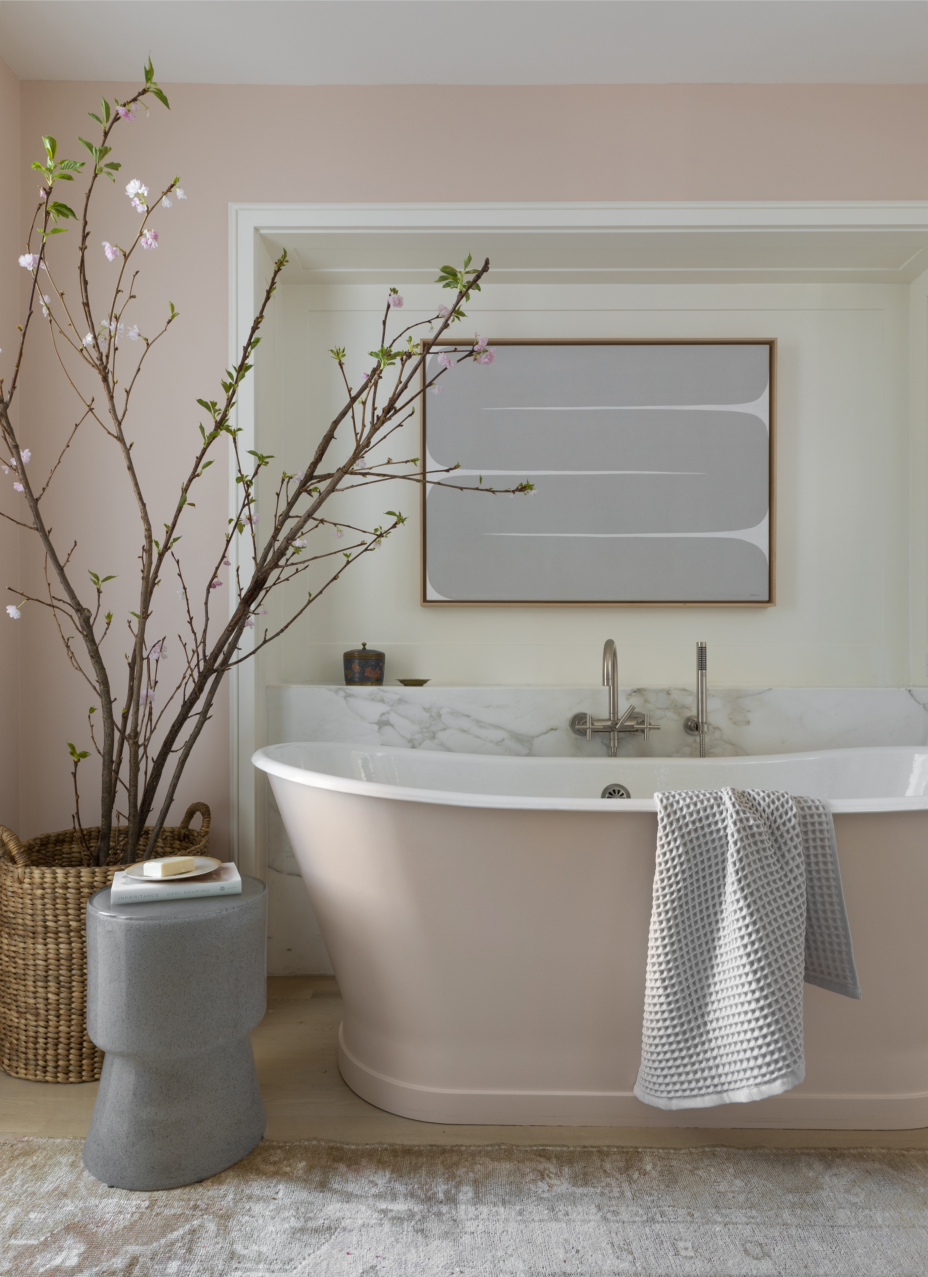
Conjure a calming, soothing vibe and add to the bathroom color ideas with the inclusion of soft pink. This tone doesn't need to be splashed across the wall but can be displayed on fixtures such as the bathtub. A matt finish pink on a sculptural piece will add a touch of timeless elegance to the room,
'If done in the right space, a soft, light pink can act as a neutral,' says Marie Flanigan, founder of Marie Flanigan Interiors. 'For this bathroom, we knew that this exquisite pink tub paired with complementary walls would bring the space together. However, we were careful to paint the alcove in white to break up the pink color and create contrast. When working with pink, try to avoid overly saturated hues and undertones. The pink color should be your color palette’s starting point for layering in additional hues, which will balance out the saturated color.'
3. Pepper pink on throw pillows
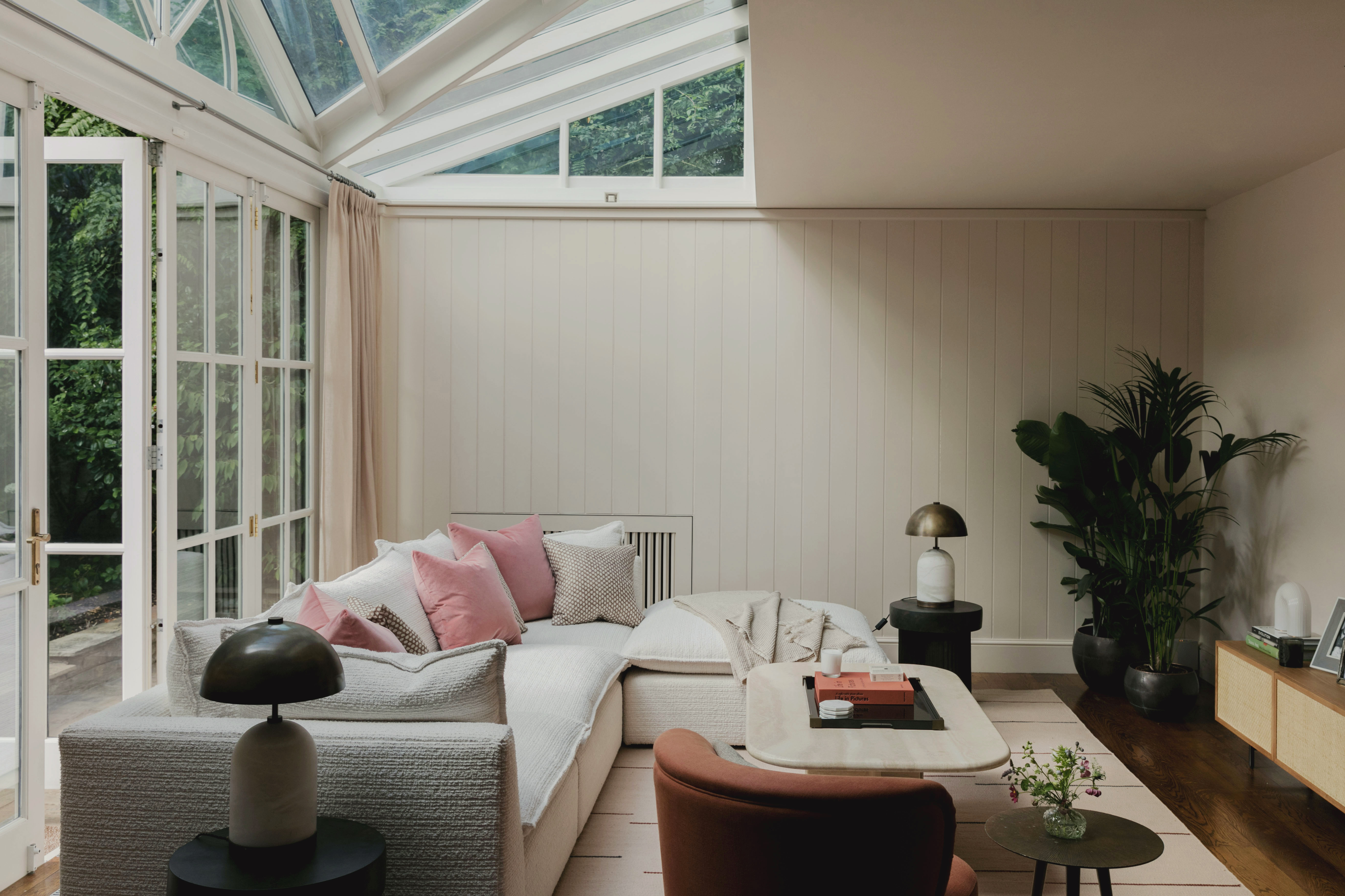
Fold in pink in the most seamless manner in your living room color scheme with pillows. These small yet significant additions can add a little touch of color to the space without overwhelming it. If you want to tone down the look of pink even more, choose a light shade or embroidered pillows. The texture will give the color a more formal feel and disallow it from looking too non-serious.
'Soft pale pink is such a great warm neutral and it is an excellent choice for walls or furnishings to subtly warm up a more minimalist space,' says Tiffany Duggan, director, of Studio Duggan. 'I think people can be a bit concerned that it will look too feminine – but the right pink (ideally with a touch of yellow or black to it) is a adaptable choice, that works well with most other shades. In this space mixing a little pink velvet with more earthy shades of brown and terracotta keeps the look natural and grounded.'
4. Make it a neutral by color drenching
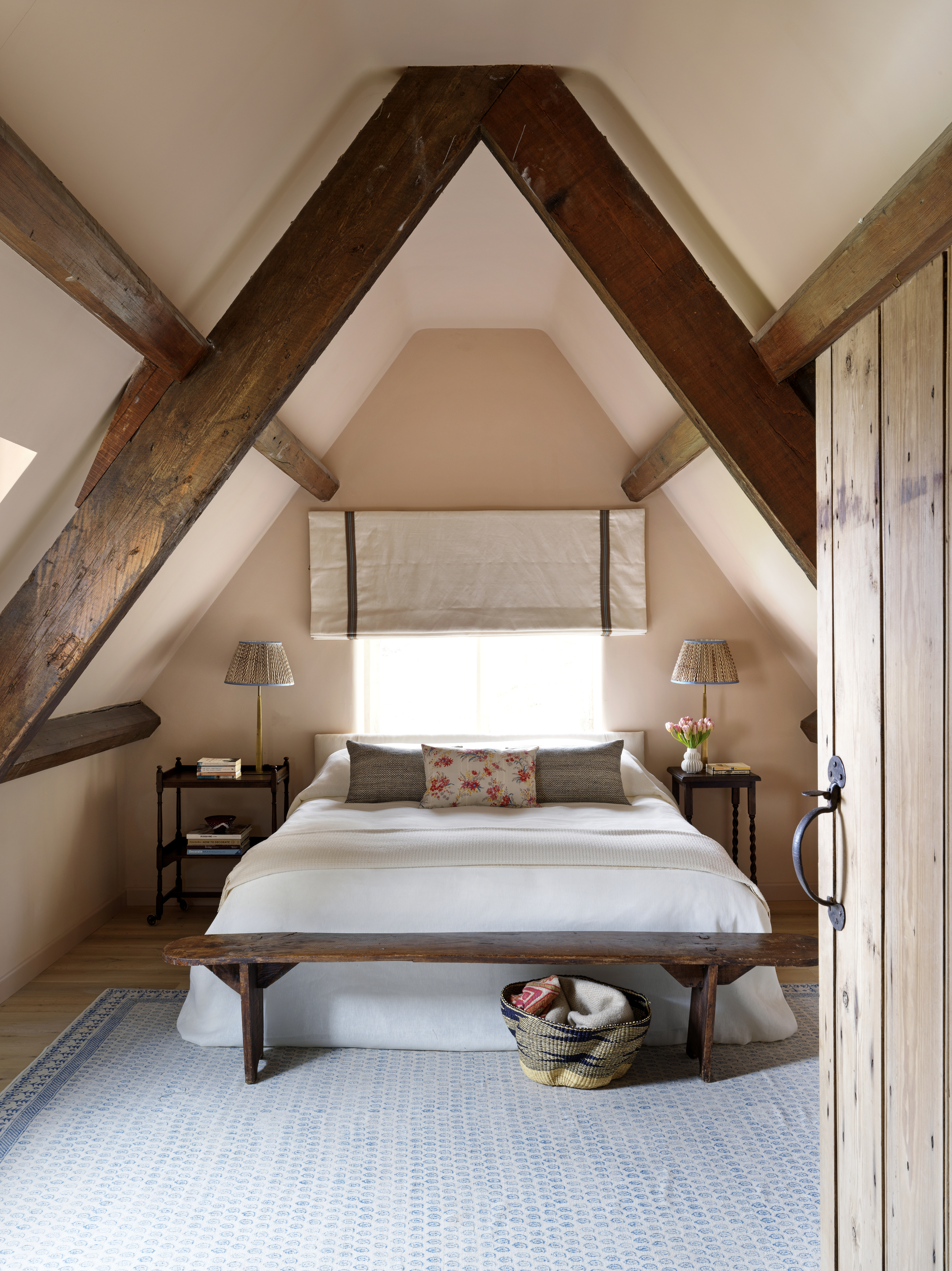
Painting ceiling and walls the same color can add richness and timelessness to a space. By using one color across surfaces, you dial down its intensity and it eventually feels like a neutral. This style of painting works both in contemporary and traditional-style spaces. But it’s especially useful for adding impact to a plain or featureless space that may otherwise feel bland in pale, neutral tones.
Choose a warm pink, with a grey or brown undertone as it will give the space a cocooning feel.
'Try using a pink with a more red tone rather than purple or orange and then complementing colors to ensure it is not too sickly sweet,' says Victoria Gray, co-founder of Olivine Design. 'We treat the beautiful shade of pale pink, Farrow & Ball's Setting Plaster, as a neutral, lovely alternative to cream walls. The classic shade ensures a calming effect and feels fresh. We can add splashes of bright color or muted shades to this pale pink for a different, more subtle scheme depending on the room. Of course, with accessories, we can add modern, personal, and eclectic elements which adapt over time.'

Consider this dusty pink hue with a slight yellow pigment to create a wonderful, warm, and cocooning color-drenching effect in the bedroom, bathroom, or living room. This color is also a nice backdrop to antique furniture.
5. Use it on a lighting fixture

Another way to introduce pink in a minimalistic manner is by adding it to a small fixture, such as a table lamp or a pendant light. The color will be designated to a small area of the room and have a small yet soothing role to play in the space's overall scheme.
'For me, pink is a natural color which you can use a lot,' says Nicole Dohmen, founder of Atelier ND. 'I use it as a base coat and base color in all my designs. It makes the room soft and special. It goes very well with dark, somber colors, such as greens, petrol blue, dark yellows, and browns but also in lighter interiors.'
6. Dot a space with small pink stools

Adding a slice of hue to a flexible, lightweight, and easily swappable element such as stools makes playing with shades easy. Move it around the home to create different vignettes, experiences, and looks. In a small home office that is usually drenched in more sober tones, a pink stool can add a touch of fun. In a more layered living room scheme, it'll add to the space's aesthetics.
'Adding pink via fabrics on stools or chairs can make a statement but still look soft, mixed with patterns and less traditional colors like warm oranges and reds,' says Taline.
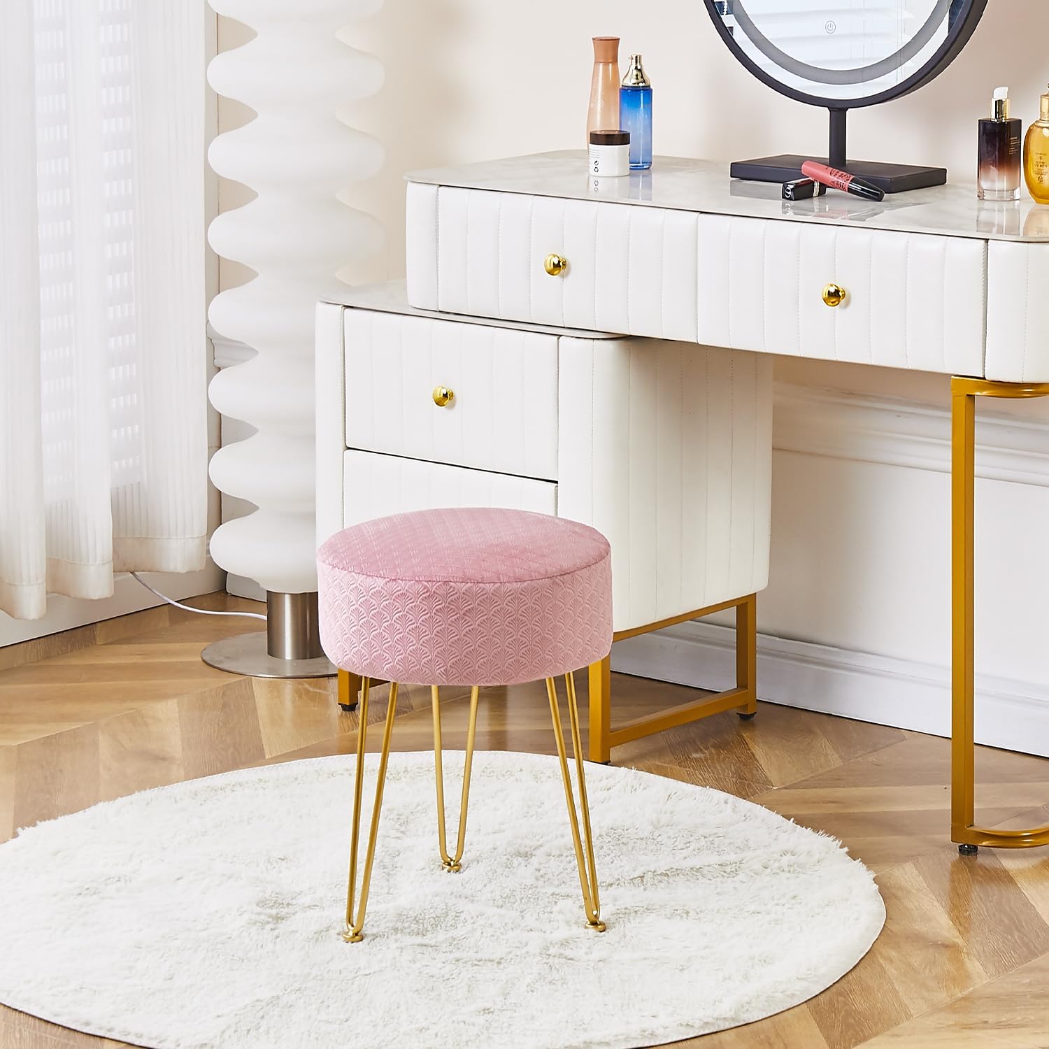
Material: Wood and velvet
Price: $26
Use this easy, lightweight, and visually appealing stool to place in your work area, in the bedroom, or even a dressing room, to add a subtle touch of pink.
7. Use it on tiles
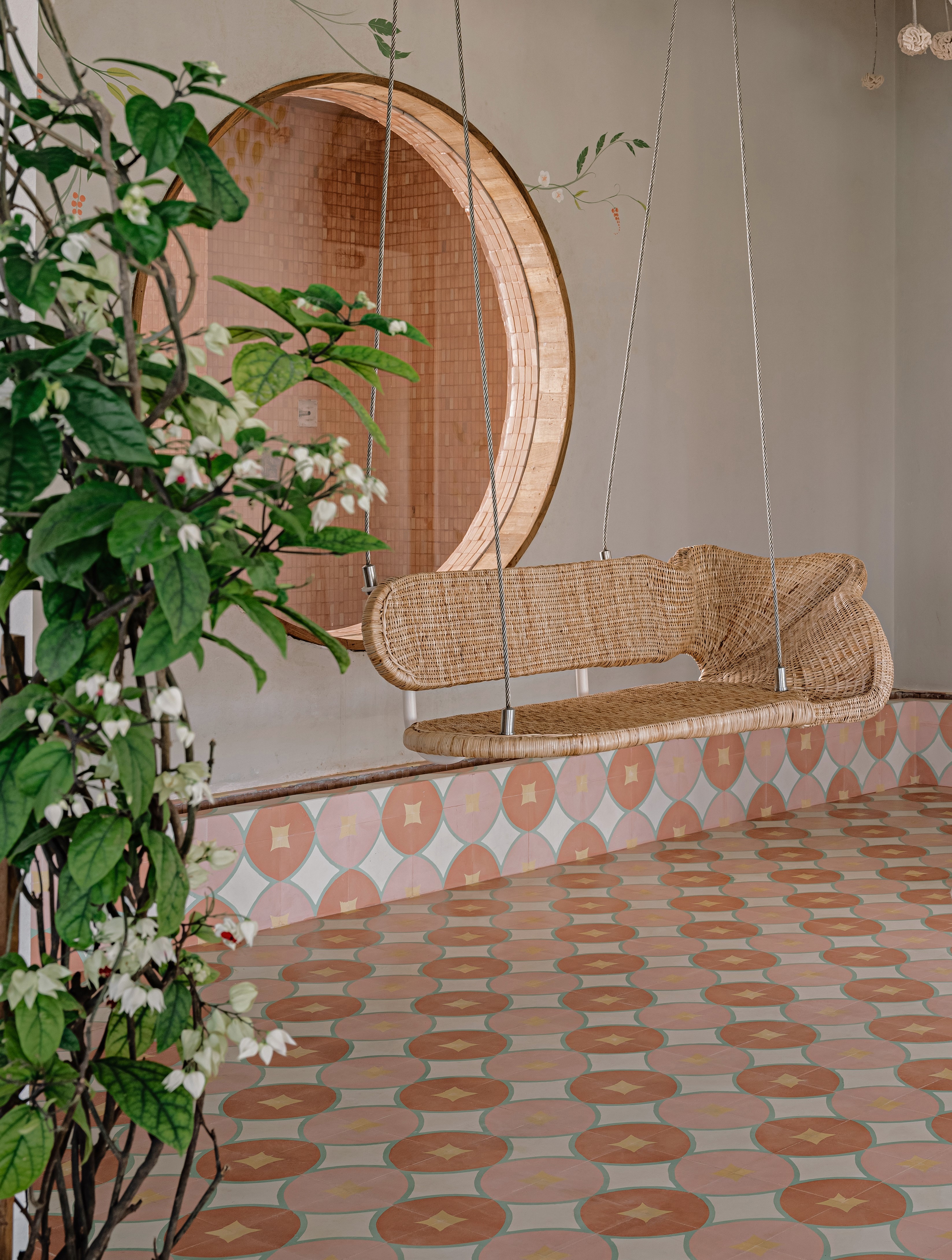
If you love pink but want it in a more permanent way, consider colorful floors that will completely transform the vibe of a space. Build the decor scheme from the ground up, and use the subtle tones on the tiles to decorate the rest of the space. Today there are several options when it comes to painted tile patterns, designs, and looks. From herringbone, chequerboard, and Art Deco-inspired styles to more 3D, straight-lay motifs, Moroccan designs, and more, there are several styles to choose from.
'We decided to do these cement patterned tiles on this home's second floor to provide a change of materiality from stones and marbles in the house, while still keeping it elegant,' says Kumpal Vaid, founder of Purple Backyard. 'The colors were a fresh take on using nudes and blush tones as neutral colors with a space rather than the usual whites, browns, and blacks.'
8. Use it on artworks

Artworks are the best and most handy tools to add to the bedroom or introduce an elegant living room wall decor. These can help create contrast in a room with their bold visuals or create the perfect layering, adding another subtle touch to the room's existing scheme. Consider adding a light pink tone via an artwork.
'I wanted to take the classic 'palace' blue shade as the foundation in this room,' says Tim Veresnovsky, founder of Veresnovsky Design Studio. To refrain from the interior seeming too heavy and serious, Tim decided to add a portrait on a pink background. 'The combination of pink and blue is always a winning one. I also added a banquette in a nice pink velvet fabric to layer the scheme.'
How do you tone down pink?
While many people may be charmed by pink it isn't the easiest color to use, or even mix and match in interiors. It can feel a little overwhelming when used on walls or across all furniture. But a good way to use pink in a more minimalist and liveable manner is to use it on smaller elements such as a pillow, a lighting piece, or a living room carpet. These elements induce pink but in a non-permanent manner.
If you wish to go a step further and are brave enough to use pink on walls, then a more mid-to-dark tone of pink should be your way to go. Consider paints that have a brown, grey, or black undertone, that reduce the sweet effect of pink. Color drenching a room will take away the OTT effect and make it feel more natural.
Be The First To Know
The Livingetc newsletters are your inside source for what’s shaping interiors now - and what’s next. Discover trend forecasts, smart style ideas, and curated shopping inspiration that brings design to life. Subscribe today and stay ahead of the curve.

Aditi Sharma Maheshwari started her career at The Address (The Times of India), a tabloid on interiors and art. She wrote profiles of Indian artists, designers, and architects, and covered inspiring houses and commercial properties. After four years, she moved to ELLE DECOR as a senior features writer, where she contributed to the magazine and website, and also worked alongside the events team on India Design ID — the brand’s 10-day, annual design show. She wrote across topics: from designer interviews, and house tours, to new product launches, shopping pages, and reviews. After three years, she was hired as the senior editor at Houzz. The website content focused on practical advice on decorating the home and making design feel more approachable. She created fresh series on budget buys, design hacks, and DIYs, all backed with expert advice. Equipped with sizable knowledge of the industry and with a good network, she moved to Architectural Digest (Conde Nast) as the digital editor. The publication's focus was on high-end design, and her content highlighted A-listers, starchitects, and high-concept products, all customized for an audience that loves and invests in luxury. After a two-year stint, she moved to the UK and was hired at Livingetc as a design editor. She now freelances for a variety of interiors publications.
-
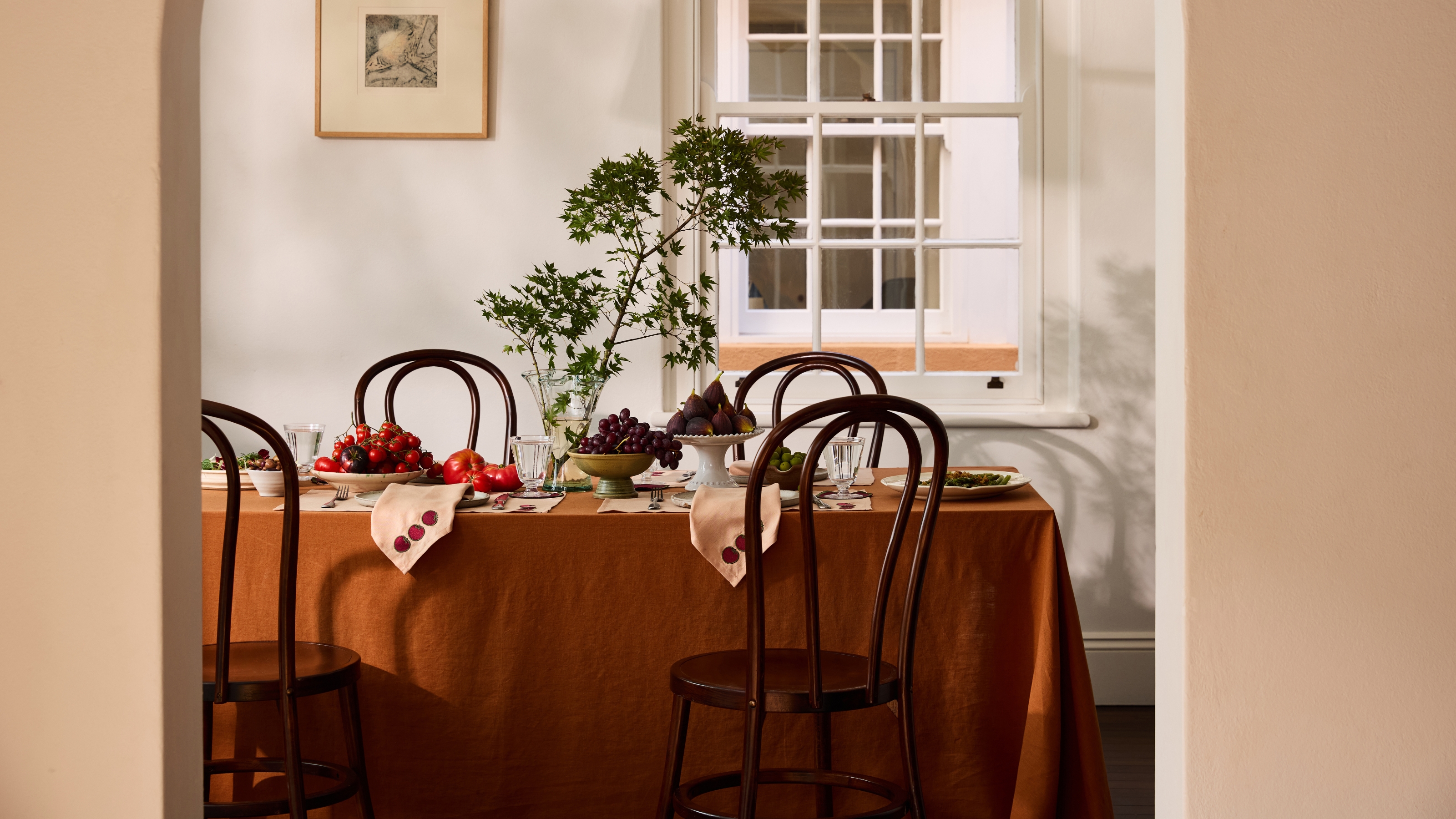 This Bistro-Style Detail Is the Most Charming Way to Elevate Your Dining Table, and Hosting Game, This Season
Get your dinner party plans ready, embroidered tablecloths are bringing personality back to your tablescape, and here's where to shop the look
By Olivia Wolfe
-
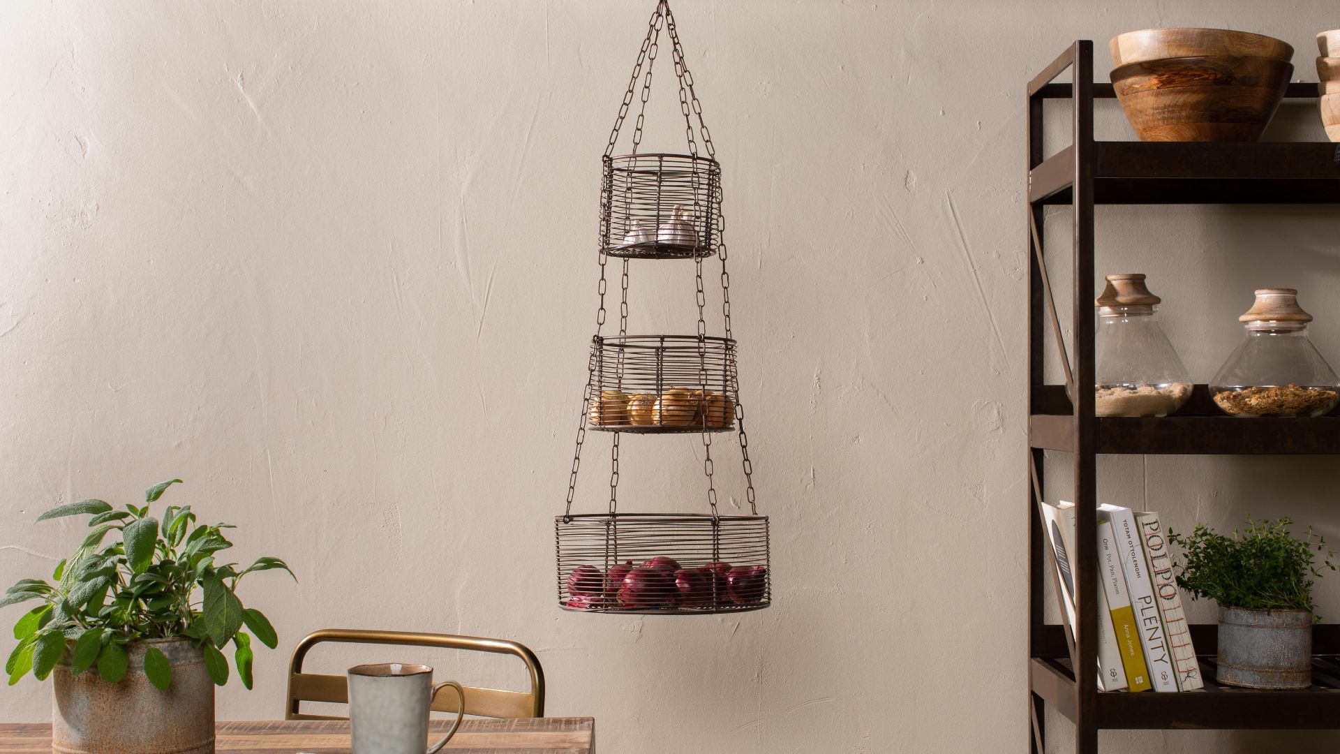 These Hanging Kitchen Baskets Have a Cool, Casual Energy That Give Your Produce Storage Serious Style
There are a couple of popular produce items that just aren't meant to be refrigerated. In that case, this hanging basket display is the perfect alternative.
By Amiya Baratan