'They're so comforting!' Designers explain why minimaluxe living rooms are the only decor style you need to know about
Minimaluxe living rooms are calming, contemporary and comforting - a space to feel relaxed yet smart and elegant. Designers explain how to create this elevated look
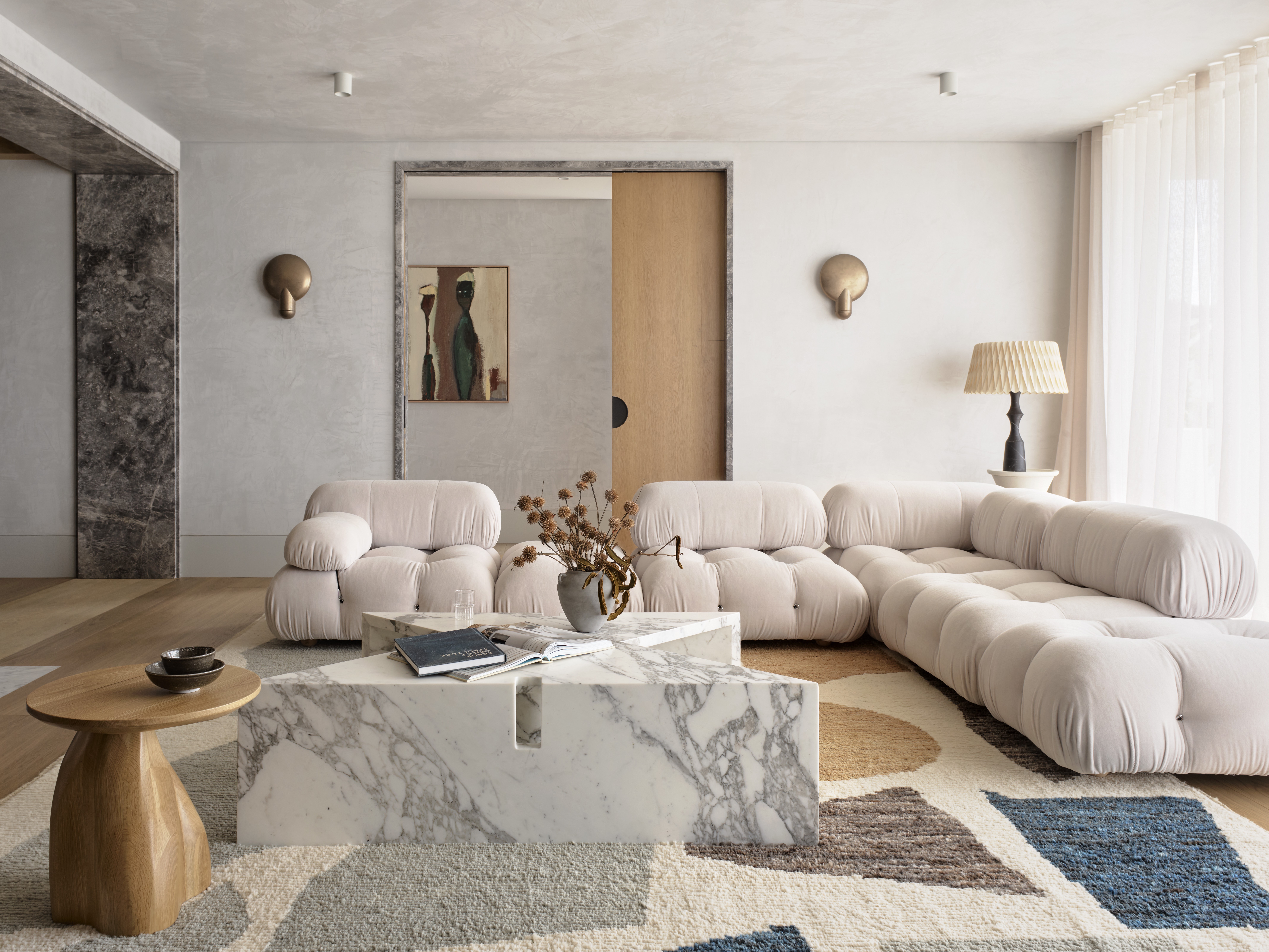

Minimalism has reigned for decades in the world of interior design trends. This simple, bared-back aesthetic has been favored by designers the world over, and it will always have a place in our hearts. However, every now and then we see a new version of this long-lived trend start to seep through, a twist on the classic that takes the characteristics of minimalist design and gives it a new look. And right now, that new take is minimaluxe.
So what is minimaluxe? Well, it's minimalism – clean, uncluttered, simplistic - but it's softer, warmer, more inviting. The stark whites and greys are replaced with creams and terracottas and the straight, architectural shapes and replaced with curves and slubby finishes. We see it as a more livable, more... cozy version of minimalism.
And there's no better room to start experimenting with this new trend than in the living room. It's a space that straight-up minimalism can only work if you don't mind a slightly stark and cold feel, but really for a living room what most of us want are those softer shapes and warmer colors. So here we have asked designers how to create a minimaluxe living room that brings together everything we love about minimalistic styles with a slightly more homely approach.
1. Soften minimalist style with curves

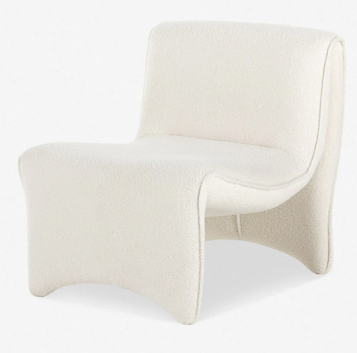
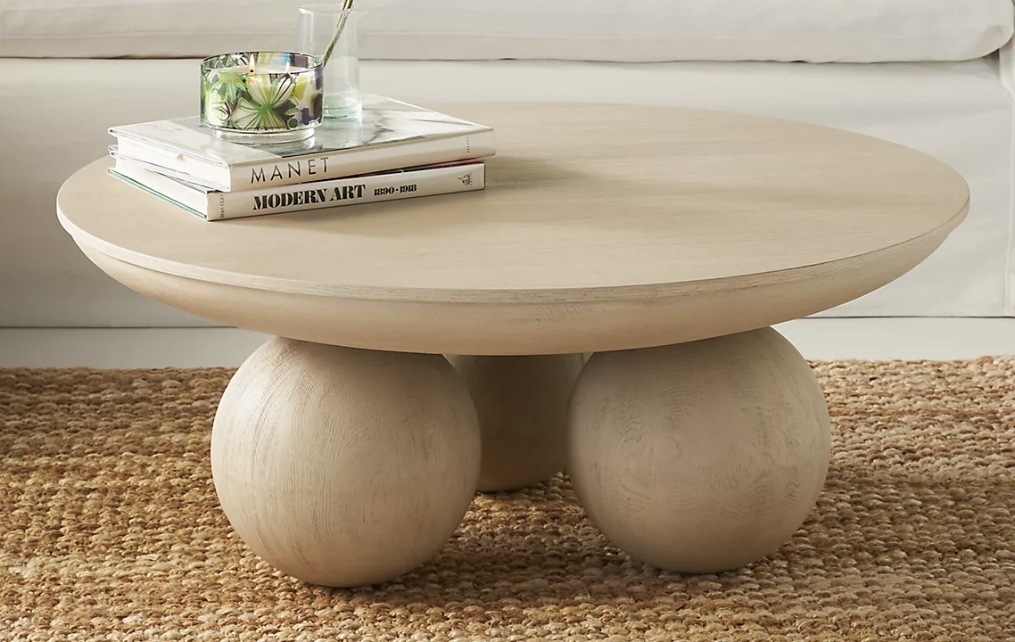
The key difference you'll notice between minimalism and minimaluxe is that while minimalism is very much about clean straight lines and very light, slim furniture, minimaluxe is much softer, curvier, and bulkier (in a chic way). And in a living room is where you really want those comfy shapes, so when making furniture choices go low with the design and soft with silhouettes.
This space designed by Tala Fustok Studio is the perfect example of minimaluxe. It's simple, sleek, and clutter-free, as you would expect with minimalism, but the shapes and colors are gentler and more inviting. There are a couple of nods to classic minimalism with the lines of the armchair and use of negative space, but there's a lived-in, relaxed feel.
'This space radiates a timeless elegance and a tranquility which was very important to balance the lifestyle of my client,' explains Tala Fustok, Designer and Founder of Tala Fustok Studio. 'We integrated a travertine fireplace to echo that of the dining space with smoky mirroring. Individual moments within the space include a circular shaggy rug by Tim Page whose assorted pile height results in great texture depth, cloudy patina draping the walls, and M.A.H Gallery sculptures dusting the room.'
'Minimalism in itself is a craft and can quite often look stark and clinical if not curated well. Minimalism can be chic and timeless, but must also reflect your unique personality which will immediately bring that desired warmth as it's personal to you and the space will exude that. Introducing soft furnishings as well as warmer powder hues can bring a certain comfort to a minimalist space, softening a harder aesthetic. Indoor plants - bringing the outside in - are also a strong mechanism for introducing serenity,' adds Tala.
2. Pare back but not to the point of starkness
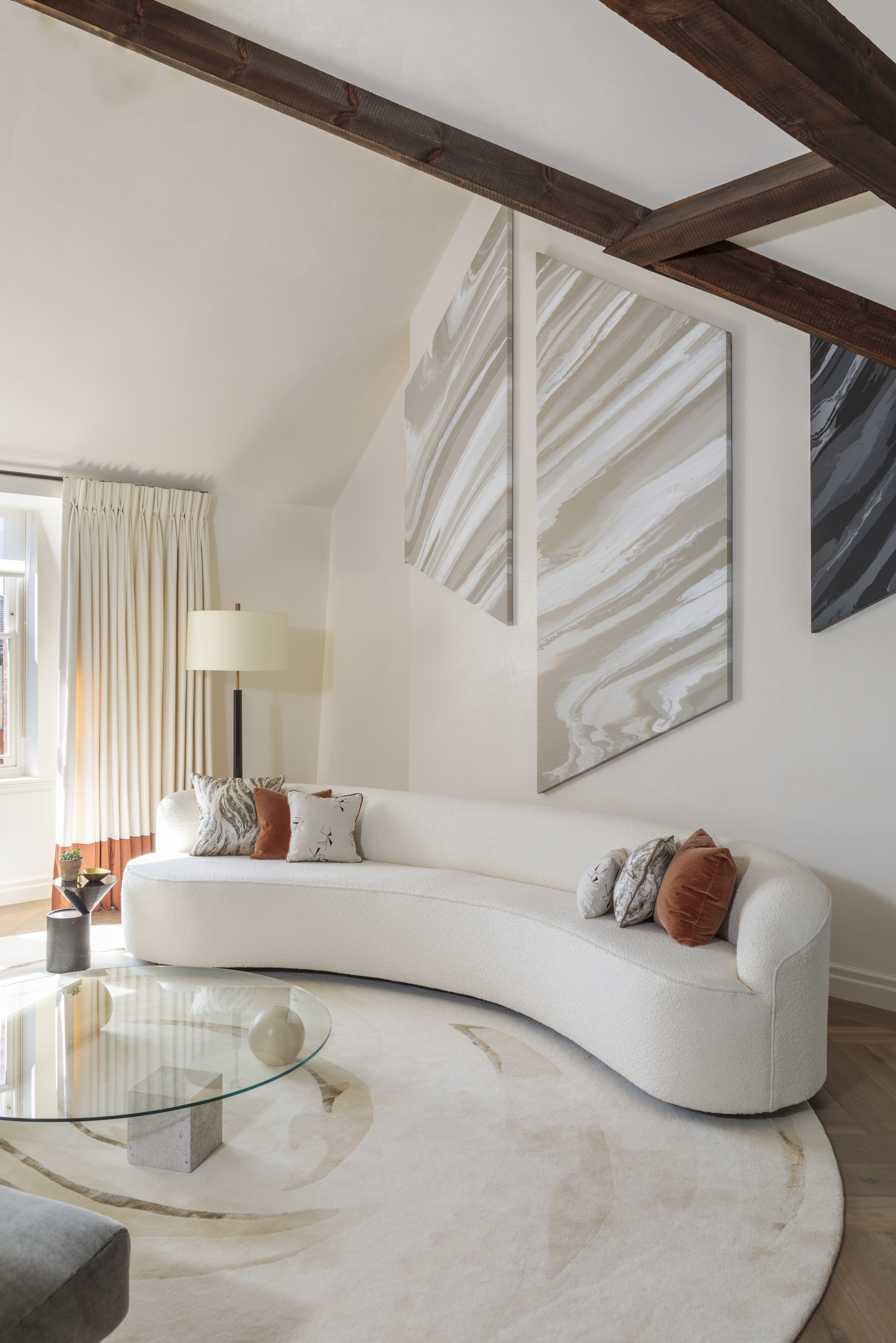
In a minimaluxe living room, you still want to take that less is more approach that's so synonymous with minimalism. But that's not to say the room should feel bare and stark. Keep the amount of living room furniture to a minimum but go large with the pieces you choose, so the pieces aren't just floating in a sea of floor. A living room rug will help with this too as it can give a room new dimensions to work from. See how in this space the circular rug almost becomes the parameter of the room and something to ground the furniture.
'Making a living room feel comfortable is always important and focusing on fewer high-quality pieces, such as coffee tables, sofas and armchairs, allows you to create a minimalist space that still feels soft and inviting. By introducing a small, curated selection of decorative accessories and artwork add personality without overwhelming the space,' advises Clara Ewart, Head of Design Kitesgrove.
'And when designing a soft minimalist space, balance soft neutrals with natural materials such as timber, leather or marble to create a textural, versatile backdrop with more depth than plain white. This will also allow you to introduce stronger accent colors through artwork, furniture, or decorative accessories that not only provide contrast, but help to define the character of the space whilst maintaining a quieter more pared-back aesthetic.'
3. Keep the color scheme soft and warm
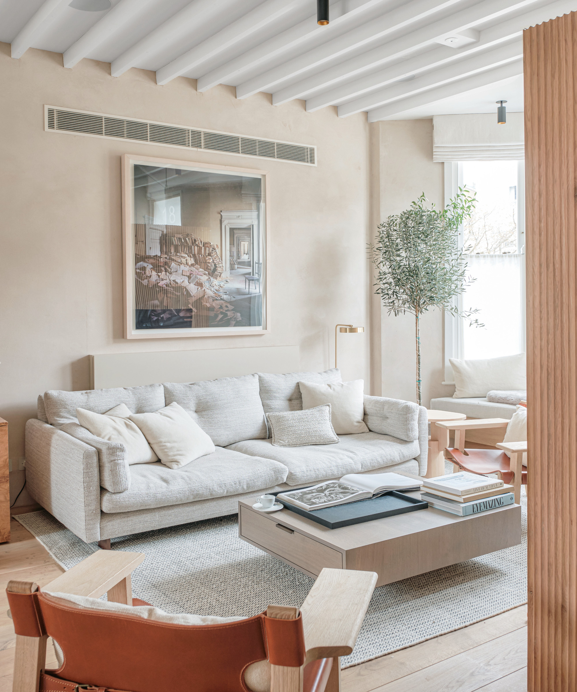
Again, this is somewhere else that minimaluxe deviates from minimalism. Whereas with minimalism a lot of the most used colors come from the cool side of the color wheel – cool whites, grey, and silvers – minimaluxe kitchens, living rooms and spaces has a far warmer, softer color palette. Think beiges, creams, terracotta, and plaster pinks.
'Colors are key in a soft minimalist space, choose earthy, warm, and light tones,' suggests Tom Rutt, founder of TR Studios. 'We used clay on the walls which adds texture and depth paired with oak floors and doors. Mid-century furniture pieces, natural textiles, and rustic accessories also help to create a soft and welcoming environment without feeling over-styled or cluttered. Planting also helps to soften an interior and add a relaxing ambiance.'
'Pairing subtle shades with deep indulgent hues can have a strong effect within a minimalist setting, bringing an understated layer of intrigue to disrupt a potential clinical aesthetic.' adds Tala Fustok. 'Swerving away from common whitewashes or hues of grey also allows you to inject your personality into a space, and can be executed whilst adhering to a minimalist look. I treasure creams, warm beiges, and terracotta hues over crisp whites and grey walls, and am deeply drawn to emeralds and sages, which can pair effortlessly with an array of spring tones.'
4. Get a balance between designed and relaxed
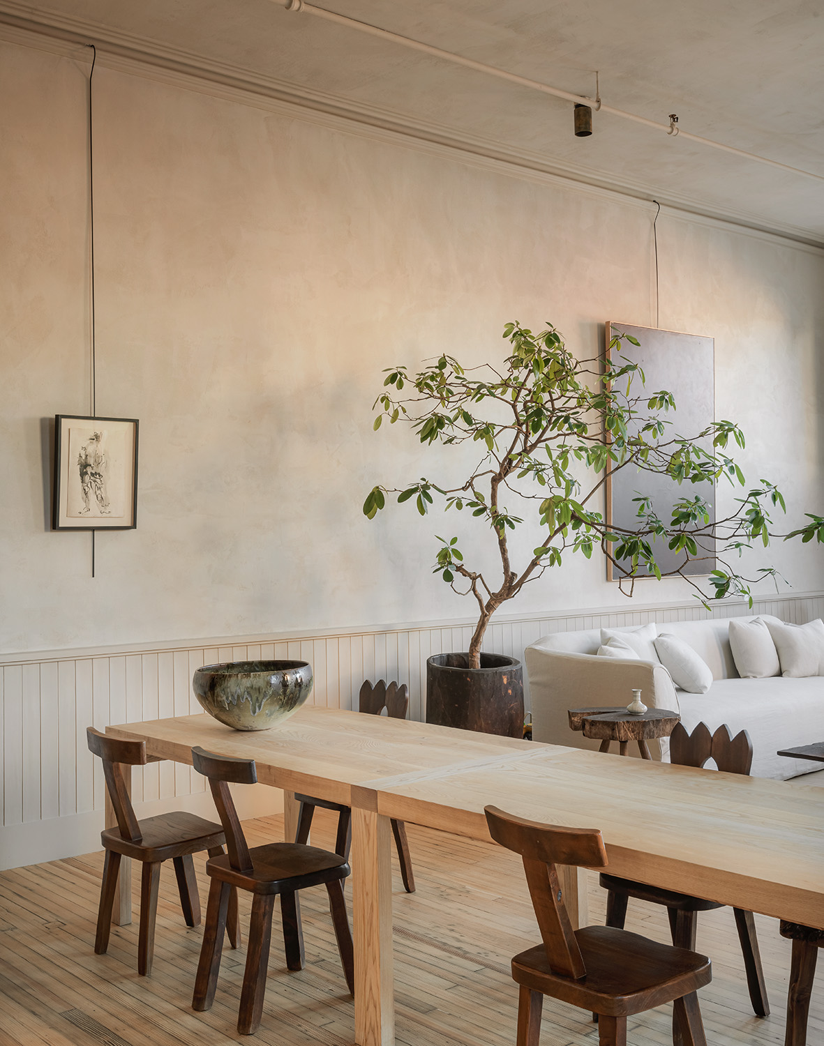
'This soft minimalist style is definitely all the rage right now. I would say that in order for a luxury minimalist space to be timeless, you really want it to be inviting and feel lived in. Really avoid that brand new look by selecting repurposed items, relaxed linens, and limewash walls.' says Samantha Struck of StruckSured Interiors.
That's exactly the feel of stylist Colin King's apartment and it embodies that minimaluxe trend perfectly. The living space is minimalist in that it's got those traits – not too full of furniture, no fussy decor – but it also feels very lived in, and not overly curated or styled. And it's this balance that minimaluxe is all about, creating spaces that are both sleek and sophisticated, but also cozy and welcoming.
5. Add texture to the walls with a plaster finish
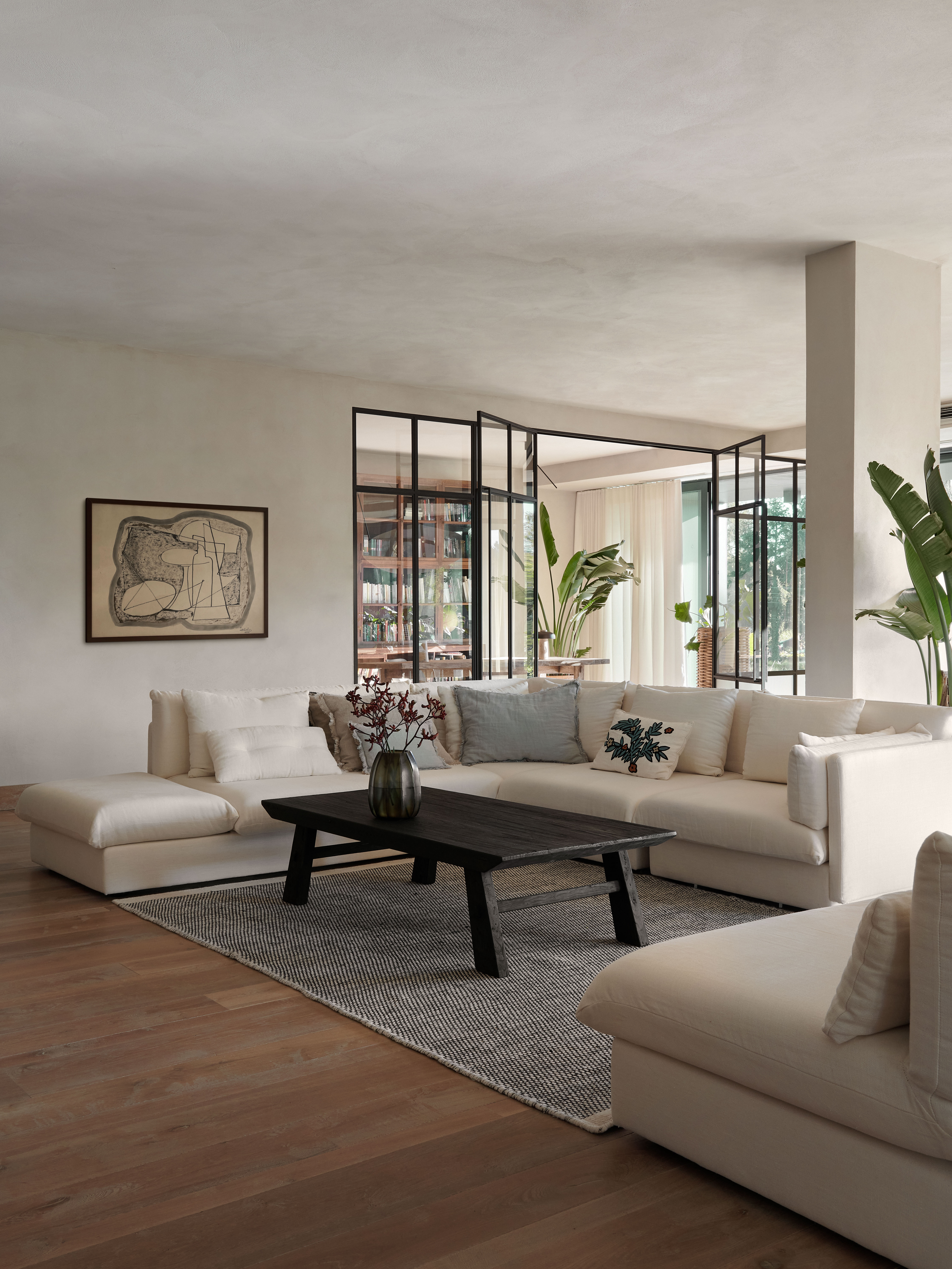
Plaster walls and plaster finishes are synonymous with this trend. Almost every example of minimuluxe living rooms has subtly textured walls, and the fact that they are such a huge interior design trend has meant there a now plenty of really easy and accessible ways to create the look – including using paint.
Adding texture to the wall adds softness and warmth and takes away the polished feel of a minimalist space. It's going to add that relaxed almost unfinished vibe we were talking of above and balance out any more stark and modern aspects of the room.
'If you are able to change the finish of the wall, the best solution is mineral plaster, which beautifully absorbs the paint pigment and gently reflects the softened light. Thanks to this, the interior still remains minimalist, but not raw and uncozy.' suggests designer Marta Chrapka.
'In my opinion, the definition of a minimalist interior is simple forms and natural, non-aggressive colors, i.e. all off-whites, meringues, grays broken with black detail or natural wood. If a strong color appears, it is only as an accent that is supposed to emphasize the calmness and coherence of a bright, minimalist space.' she adds.
6. Layer up contrasting shapes and finishes
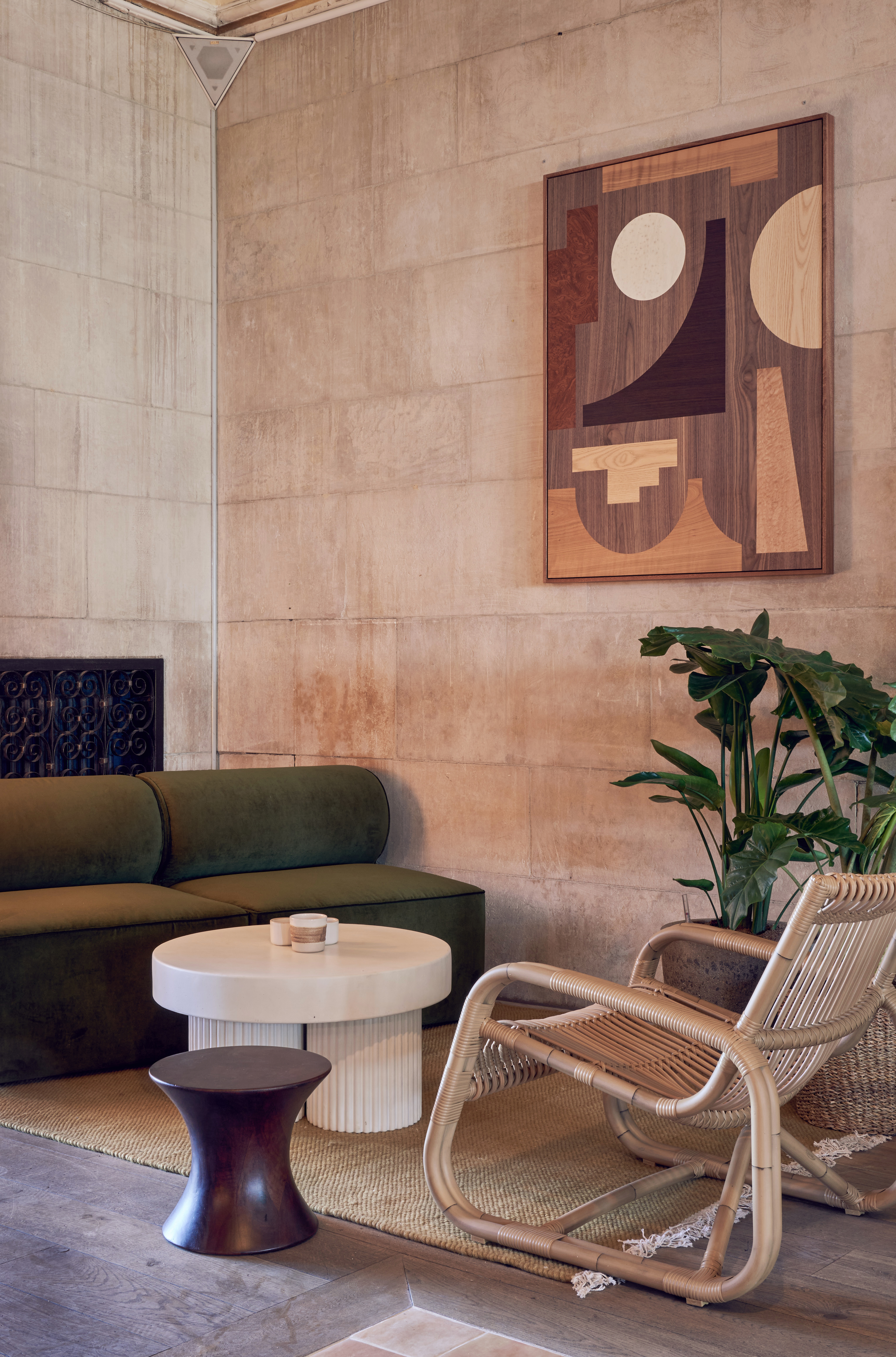
Texture and a heavy mix of different finishes is key to the minimaluxe style. The living room colors may be muted but the layering of texture is what adds all the interest.
'Making sure a living room is cozy and comfortable is important,' says Kashi Shikunova, Director of YAM Studios. 'Textures and warm colors are very important, be this finishes or fabric. Layering textures will add depth to the space and when combined with warm colors the space will feel welcoming. I would avoid using cold and shiny materials like chrome or glass, and always go for tactile and matt options.'
Nina Magin adds, 'as a more modern-minded interior designer, creating a warm and welcoming minimalist living room is all about striking a balance between simplicity and comfort. To create a cozy and inviting atmosphere, consider using warm and textural elements such as a soft area rug, throw pillows, or blankets. This can help to soften the clean lines and sparse aesthetic of a minimalist space.'
'And bringing in natural elements such as plants, wood accents, or a woven basket can add warmth and organic texture to a minimalist living room. These elements can also help to bring a sense of calmness and tranquility to the space.'
7. Leave room for negative space
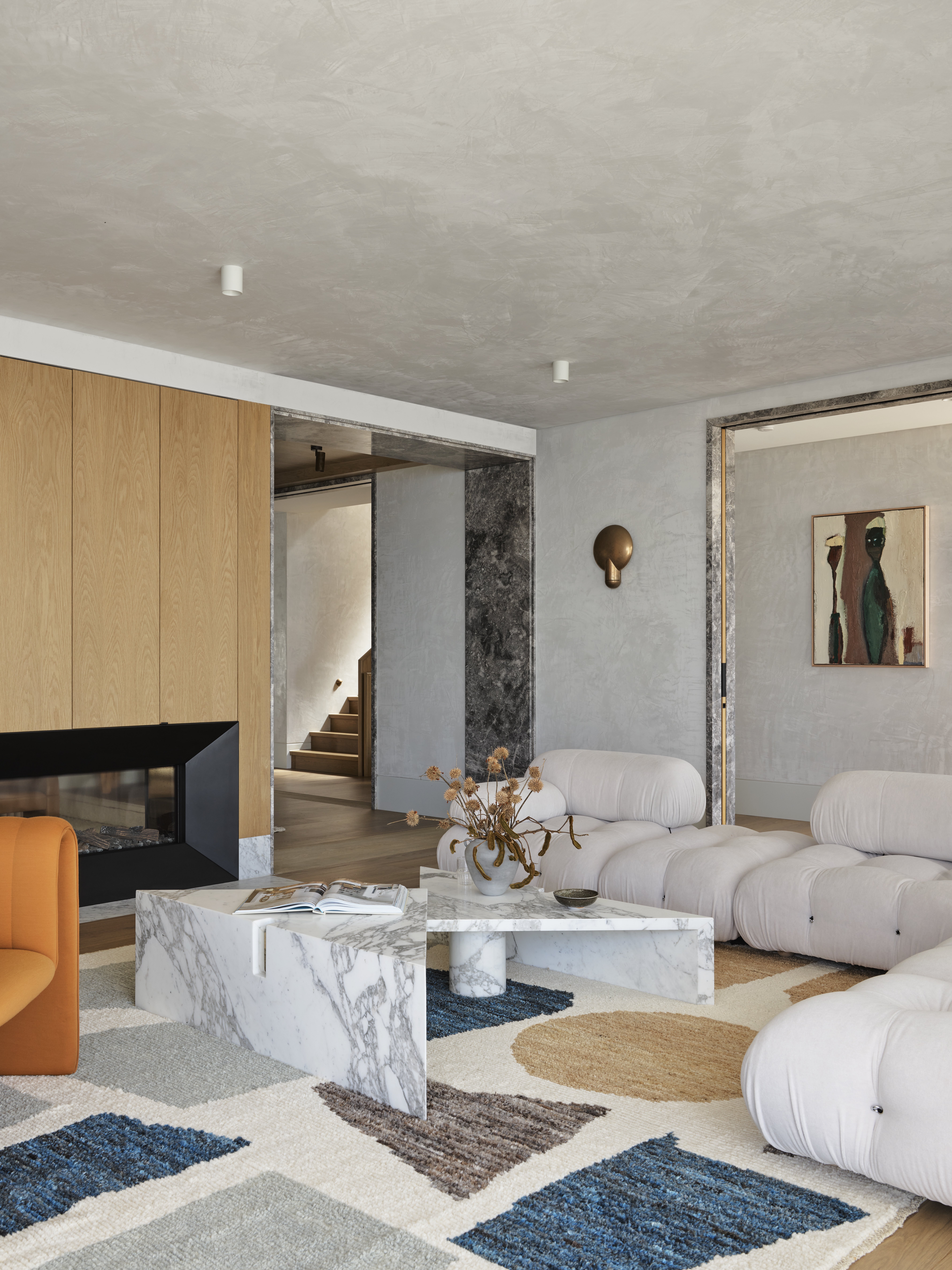
'To make a minimalist living room feel warm and welcoming, it's important to balance the negative space with warmth and texture. This can be achieved by using warm color tones, mixing metals, and layering different textures. Additionally, it's important to avoid overfilling the space with too many decor items,' suggests Ginger Curtis, President of Urbanology Designs.
This minimaluxe living room designed by Alexander & Co. gets this balance just right. The large, L-shaped sofa and statement coffee table comfortably fills the room but there's still plenty of clear space above and around the furniture so despite all the textures and finishes going on in this space it still feels minimal.
8. Go oversized (but sleek and lowslung) with the couch
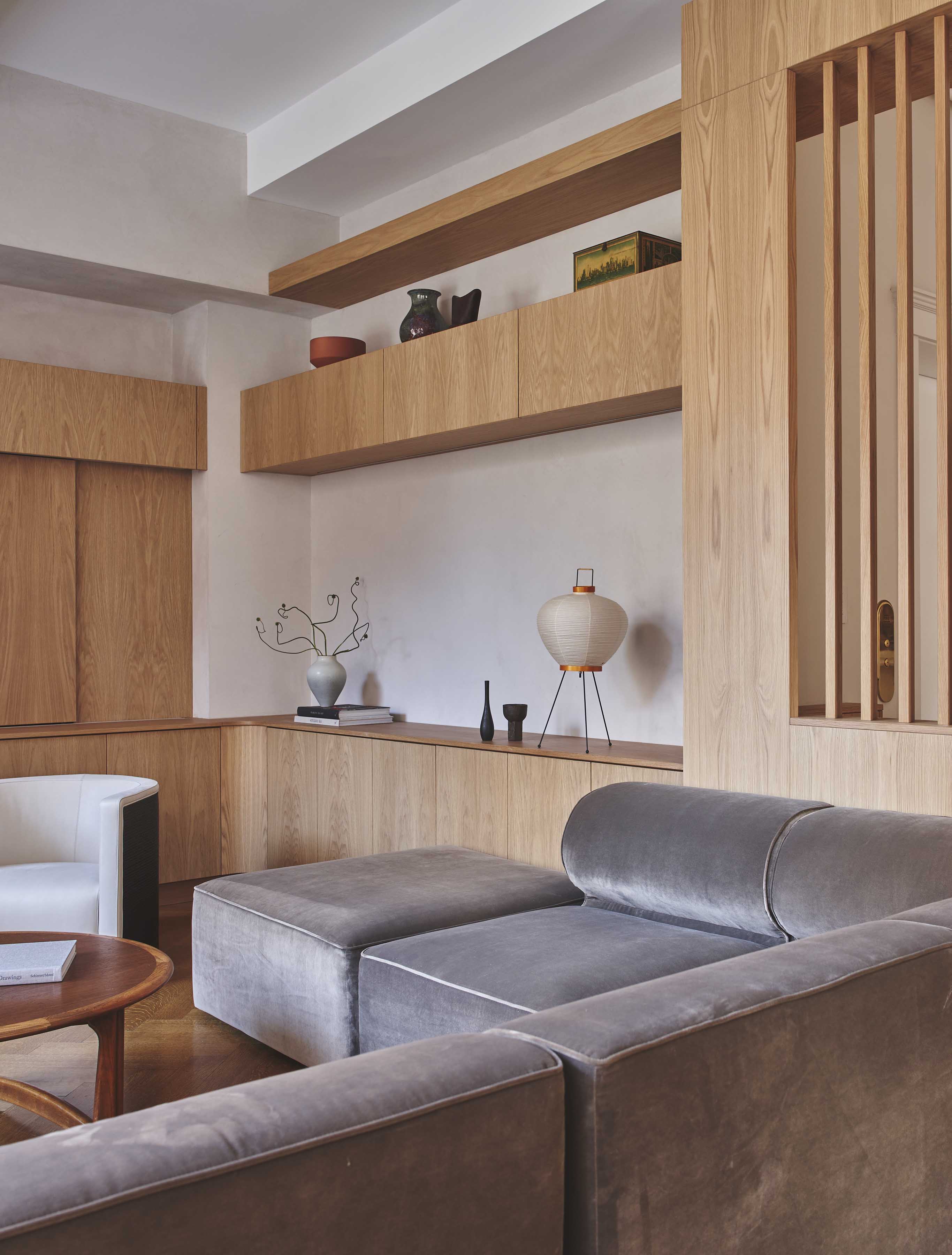
To create those luxurious but cozy living room vibes you want to go chunky and comfy with the couch. The best designs are ones like the above, that are really deep and relaxed but simple in design and low-slung so they sit below eye level so you don't notice the visual bulk they add to the room. And again as we mentioned above, this kind of L-shaped, low design fills to room nicely but still allows for light to flow easily.
'We wanted to create a restful place to sit that doubled as a threshold into the home from the outside, thus enhancing the transition. The slatted wood allows for light to percolate in gradually making the entryway subtle, refined, and welcoming while also providing filtered sightlines,' says Tommy Zung, Principal of Studio Zung. 'The cool grays and rich browns brought by the custom wooden millwork and inviting upholstery of European linen allow for a sense of calmness and serenity to wash over the inhabitants.'
9. Soften a minimalist space with characterful pieces
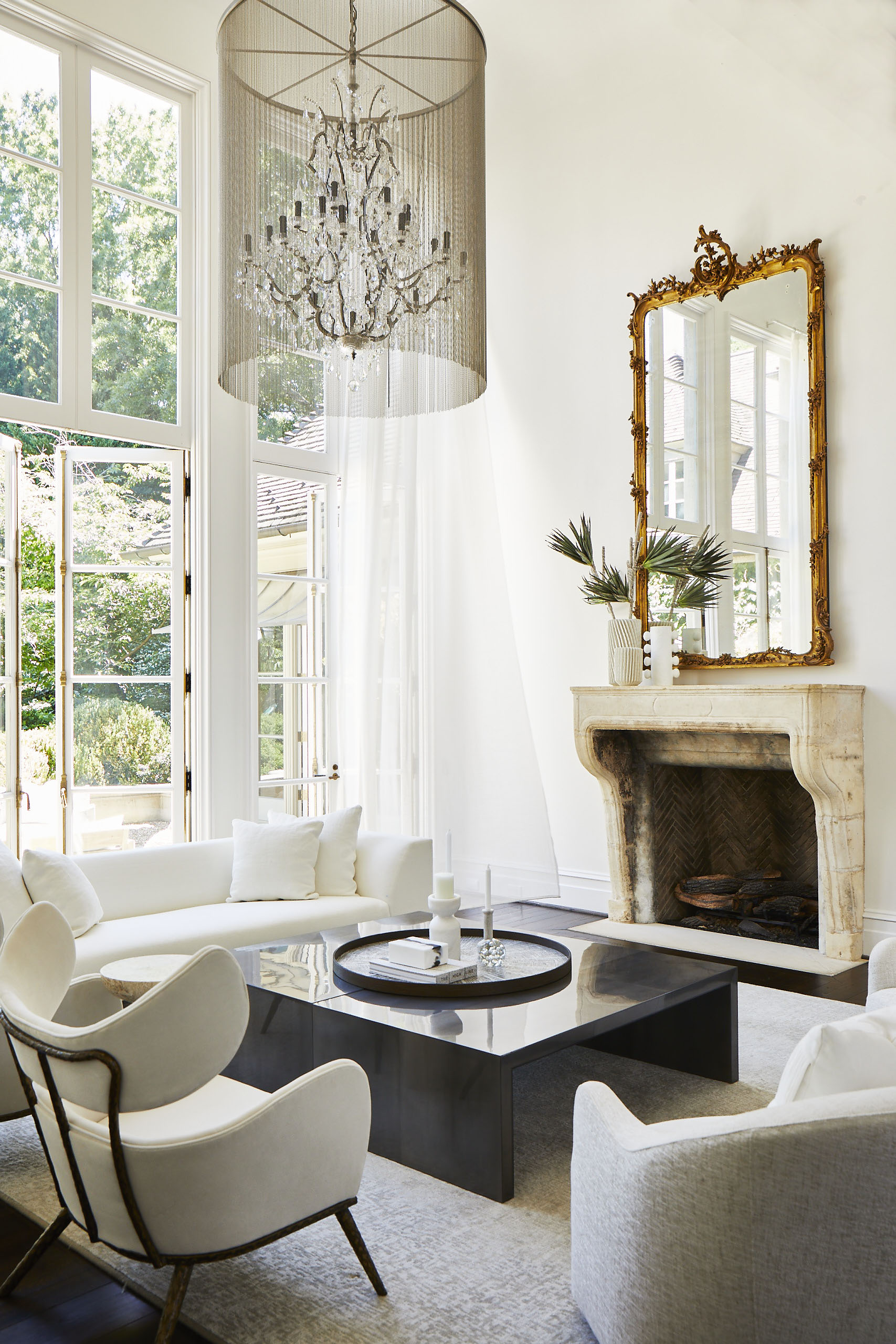
We've seen a lot of very contemporary spaces so far, but an easy way to bring character into a minimalist space and give it a more minimaluxe feel is to mix in some more characterful pieces. Just a single statement piece like an ornate chandelier or a vintage mirror will add a touch of luxury and a different finish than more modern furniture.
'I love juxtapositions. I opted for a neutral light bright palette in this space – walls, drapery, rugs and upholstery coverings are all neutral and very tactile. The large square coffee table in black stone and lacquer is a counterpoint. It works beautifully,' says Lisa Sherry.
'Combining original features or pieces with warm wood tones in flooring or furniture, mixing stones and metals and ensuring the right balance of vintage and modern furniture is key. Unifying the scheme with a clear color palette makes things easier to mix and match to create a minimal space with lots of character and interest,' adds designer Sheena Murphy.
Minimaluxe living room buys to elevate your space
Be The First To Know
The Livingetc newsletters are your inside source for what’s shaping interiors now - and what’s next. Discover trend forecasts, smart style ideas, and curated shopping inspiration that brings design to life. Subscribe today and stay ahead of the curve.

Formerly the Digital Editor of Livingetc, Hebe is currently the Head of Interiors at sister site Homes & Gardens; she has a background in lifestyle and interior journalism and a passion for renovating small spaces. You'll usually find her attempting DIY, whether it's spray painting her whole kitchen, don't try that at home, or ever-changing the wallpaper in her entryway. She loves being able to help others make decisions when decorating their own homes. A couple of years ago she moved from renting to owning her first teeny tiny Edwardian flat in London with her whippet Willow (who yes she chose to match her interiors...) and is already on the lookout for her next project.
-
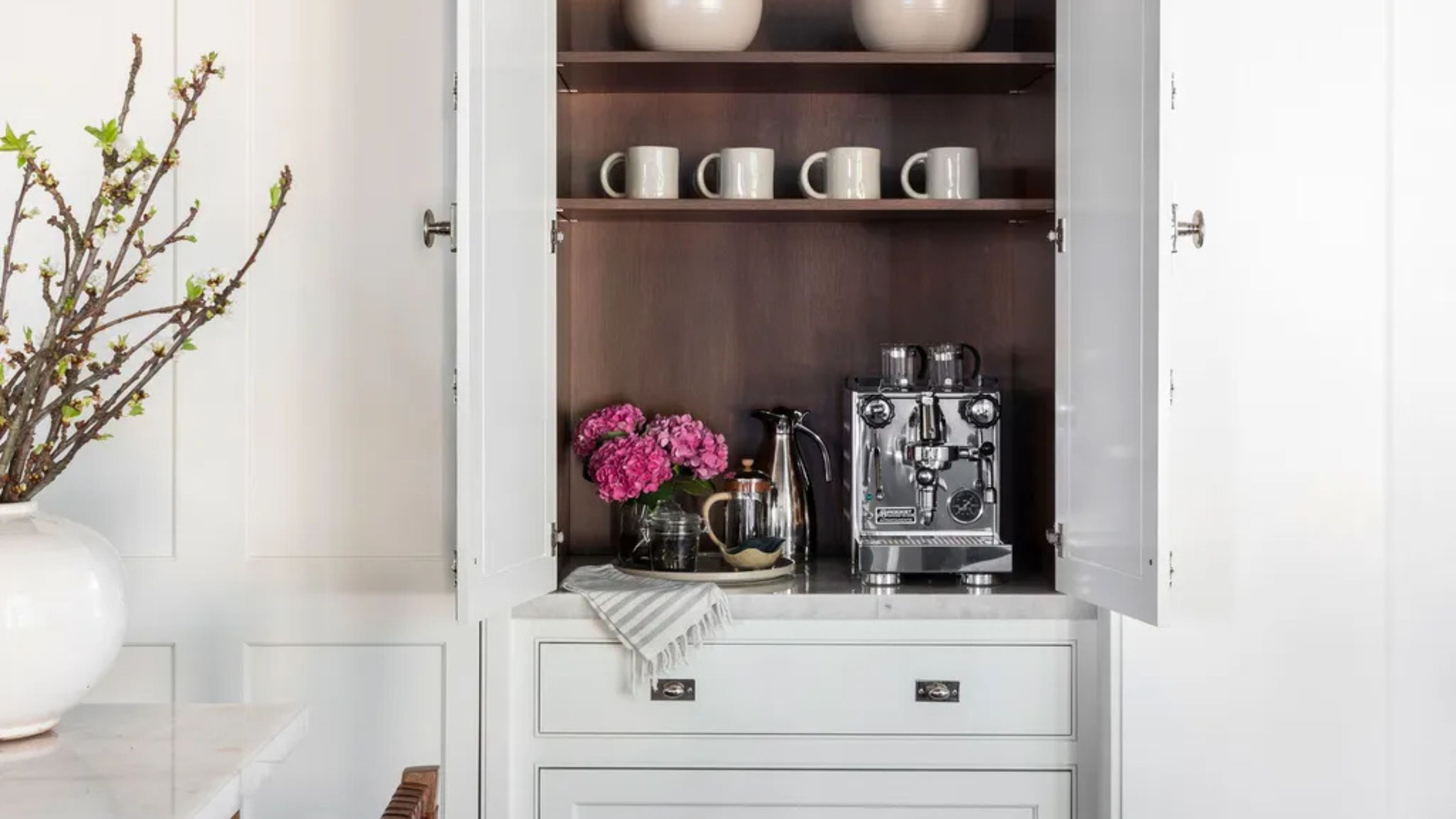 Turns Out the Coolest New Café is Actually In Your Kitchen — Here's How to Steal the Style of TikTok's Latest Trend
Goodbye, over-priced lattes. Hello, home-brewed coffee with friends. TikTok's 'Home Cafe' trend brings stylish cafe culture into the comfort of your own home
By Devin Toolen Published
-
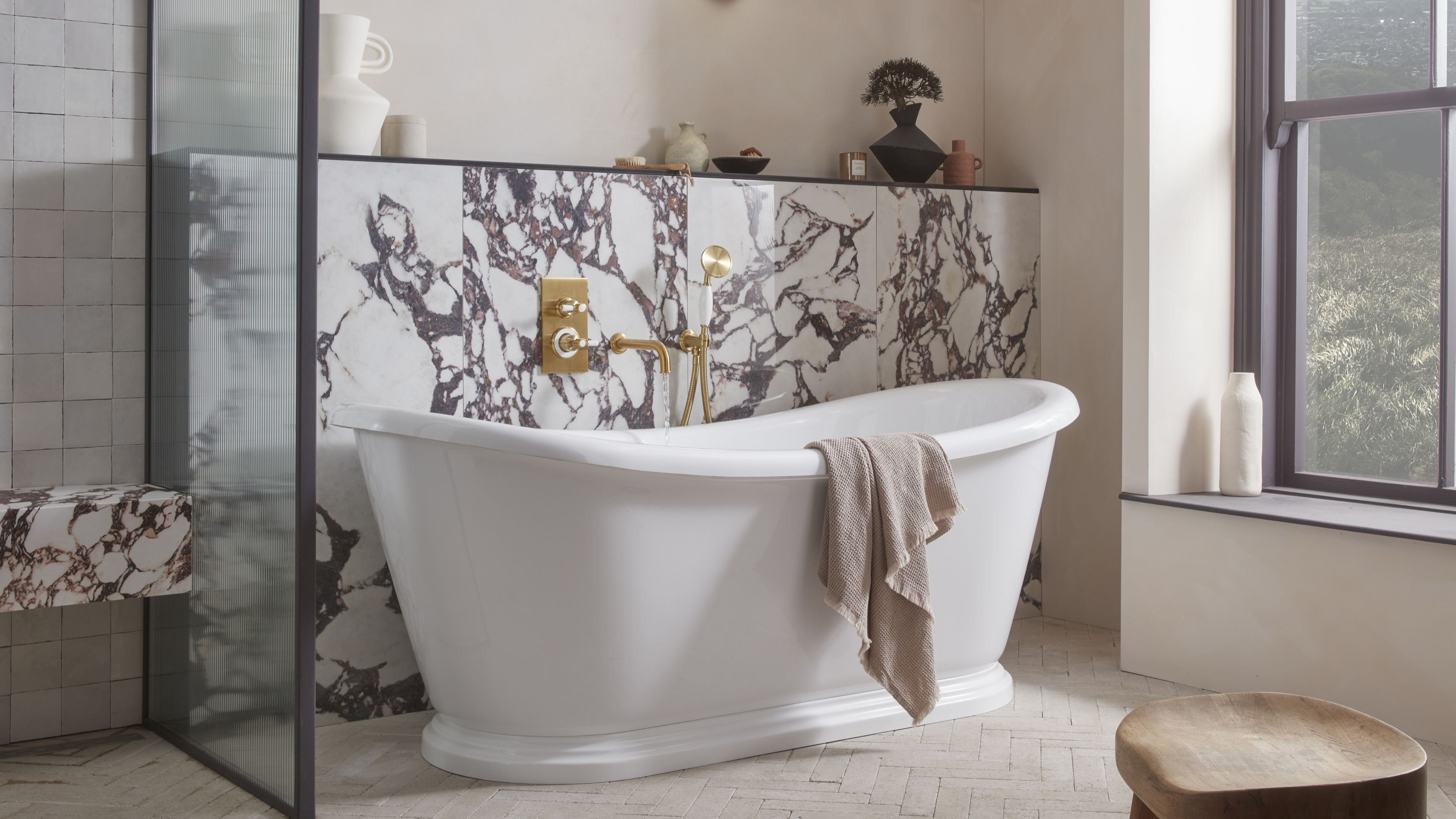 5 Bathroom Layouts That Look Dated in 2025 — Plus the Alternatives Designers Use Instead for a More Contemporary Space
For a bathroom that feels in line with the times, avoid these layouts and be more intentional with the placement and positioning of your features and fixtures
By Lilith Hudson Published
