5 Mistakes Designers Say are Making Your Entryway Look Smaller — And How To Solve Them
Poorly designed entryways can feel small and cramped, we speak to the experts to find out what mistakes to avoid
We can’t always choose the size of our entryway. Some are vast and expansive whilst the majority tend to be small and confined spaces. The challenge of the entryway can seem impossible to solve. You’re trying to create space where there seemingly isn’t any. But interior designers have cleverly maneuvered around this obstacle for years.
As you enter your home, the entryway shouldn’t be a constrictive realm but instead should encourage feelings of warmth and welcome, all the while encouraging movement into the rooms that follow. Experts advise that you keep this area clutter-free and well-lit. They also suggest that you lean into a design style that speaks to you, considering not just light bright tones but also dark deep moody ones too. These tips and tricks help you navigate the sins that have so commonly been committed when it comes to entryways.
1. YOU’VE OVERCROWDED THE ENTRYWAY
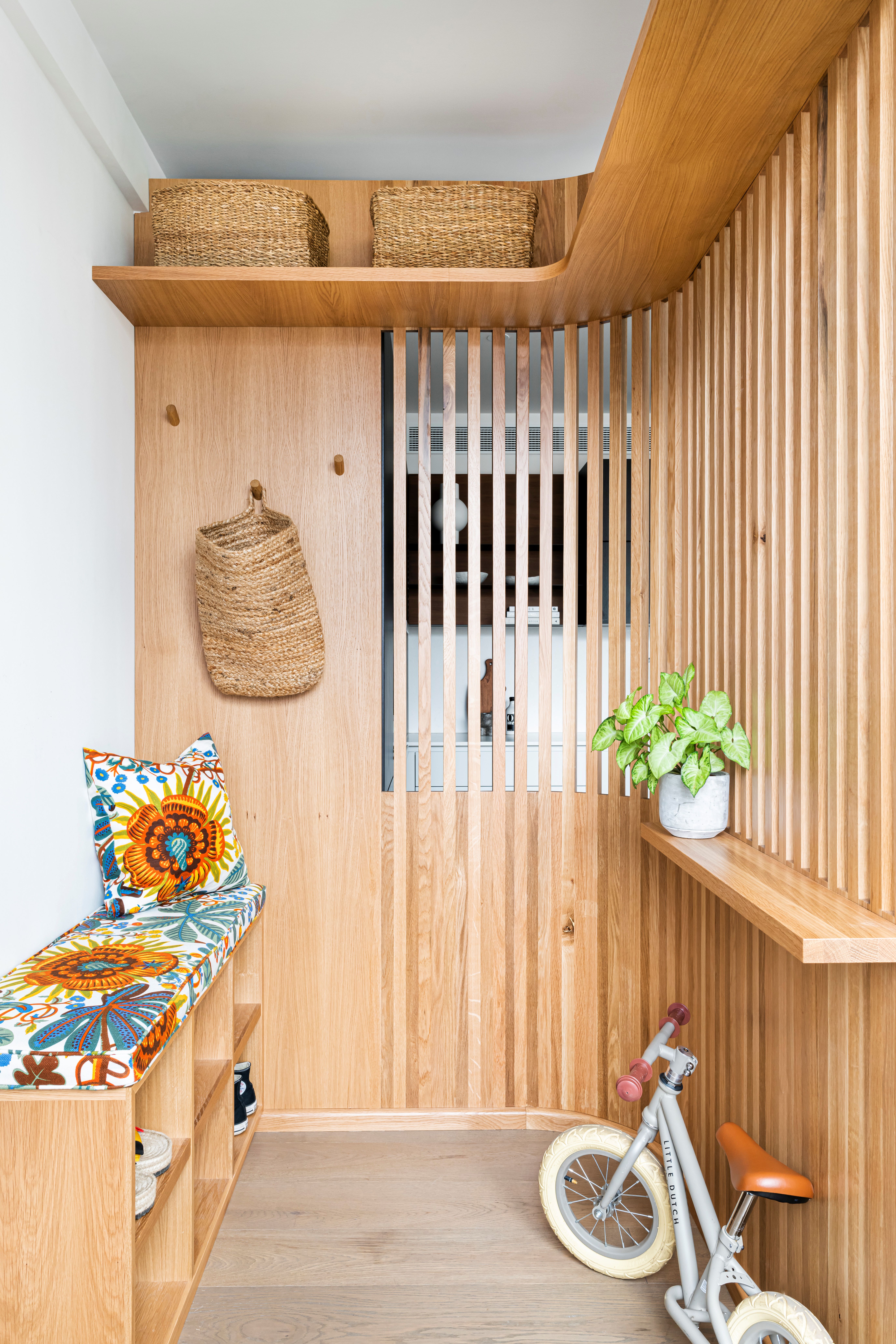
It’s very easy to let clutter build up in your small entryway, but planning your storage solutions effectively is a great way to avoid this. Consider your daily routines and rituals and the role that your entryway plays in them. 'First impressions are everything, and for the home, that means your entryway, so you need to set the right tone.
'Many homes don’t have the luxury of having large entryways so it’s important to work with what you have to create the feeling of space,' say Owl Design founders, Sophie van Winden and Simone Gordon.
The designers are big fans of furniture that is proportional to your space. 'Avoid storing items in a narrow entryway, if this can’t be avoided try and make sure everything has a place to go and possibly concealed with cupboards. Choose furniture that fits the scale of the hallway, anything too large can feel overwhelming,' add Sophie and Simone.
2. YOU’RE NOT KEEPING THINGS SUBTLE
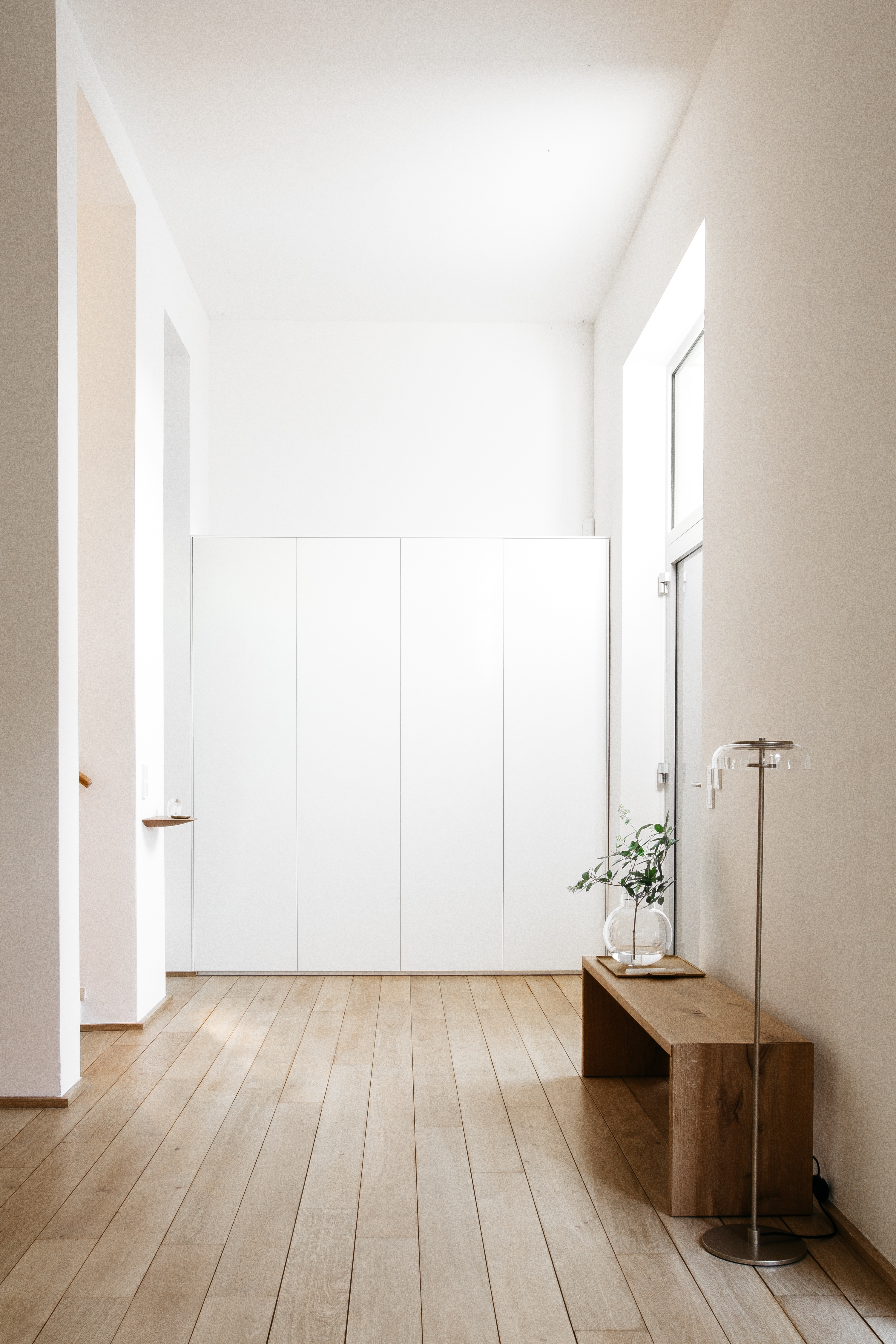
A minimalist approach to your entryway can be incredibly useful. Choosing curated pieces that make an impression but also work with the proportions of the room is a balancing act but essential for visual harmony. 'I always plan the entryway very cleaned up and clear. I prefer built-in furniture that melts in with the walls, and only little loose furniture.
'To set accents, I use large prints or paintings – this makes the entryway feel big and spacy,' says contemporary interior designer, Constanze Ladner. The sleek entryway storage solution is also a great way to create a functional and beautiful space. Painting the entire space a uniform color also creates the illusion of a larger space.
3. YOU’RE NOT LETTING ENOUGH LIGHT IN
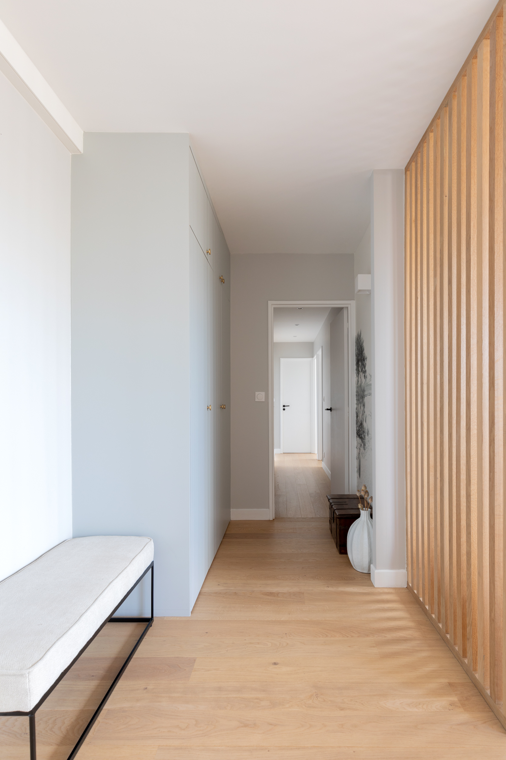
Entryway lighting is about so much more than large statement pendants and sculptural floor lamps. Implemented strategically, lighting can open up your entryway and establish an ambiance. 'Insufficient lighting can make the entrance feel smaller. Good lighting, ideally with natural light sources and well-positioned lighting fittings,' reveal Mathilde Abeel and France Lepoutre, founders of the Parisian agency, Studio Castille.
Opting for warmer lighting cultivates a candle-light glow that makes the home feel much more welcoming. Where possible, make as much use of natural light sources. Choosing materials that reflect light well will also emphasize the sense of space.
4. YOU’RE AFRAID OF THE DARK

Dark colors have a bad reputation when it comes to smaller spaces, but dark colors for entryways can prove to be incredibly inviting. These sumptuous shades can envelop you and evoke a sense of escape.
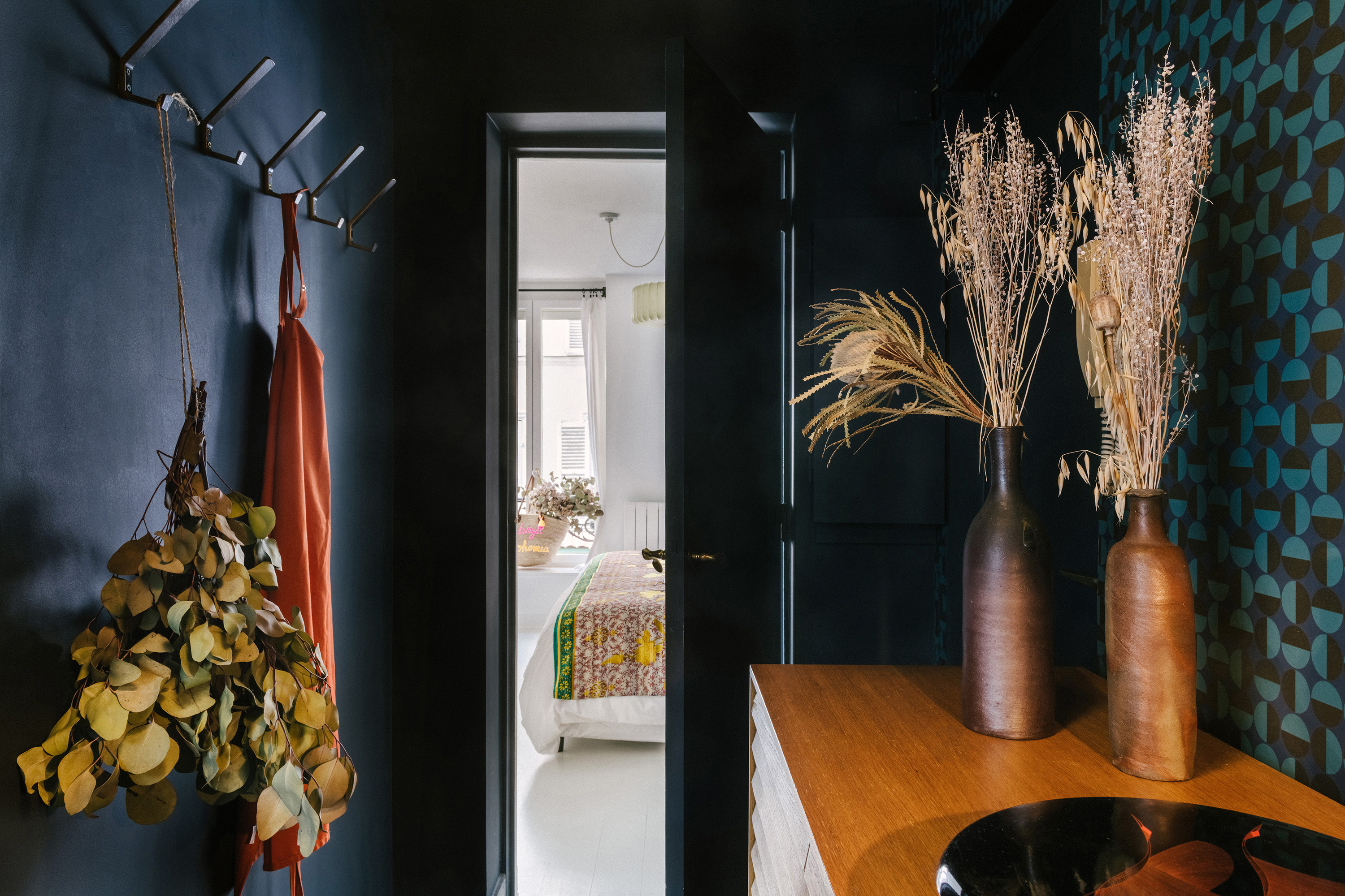
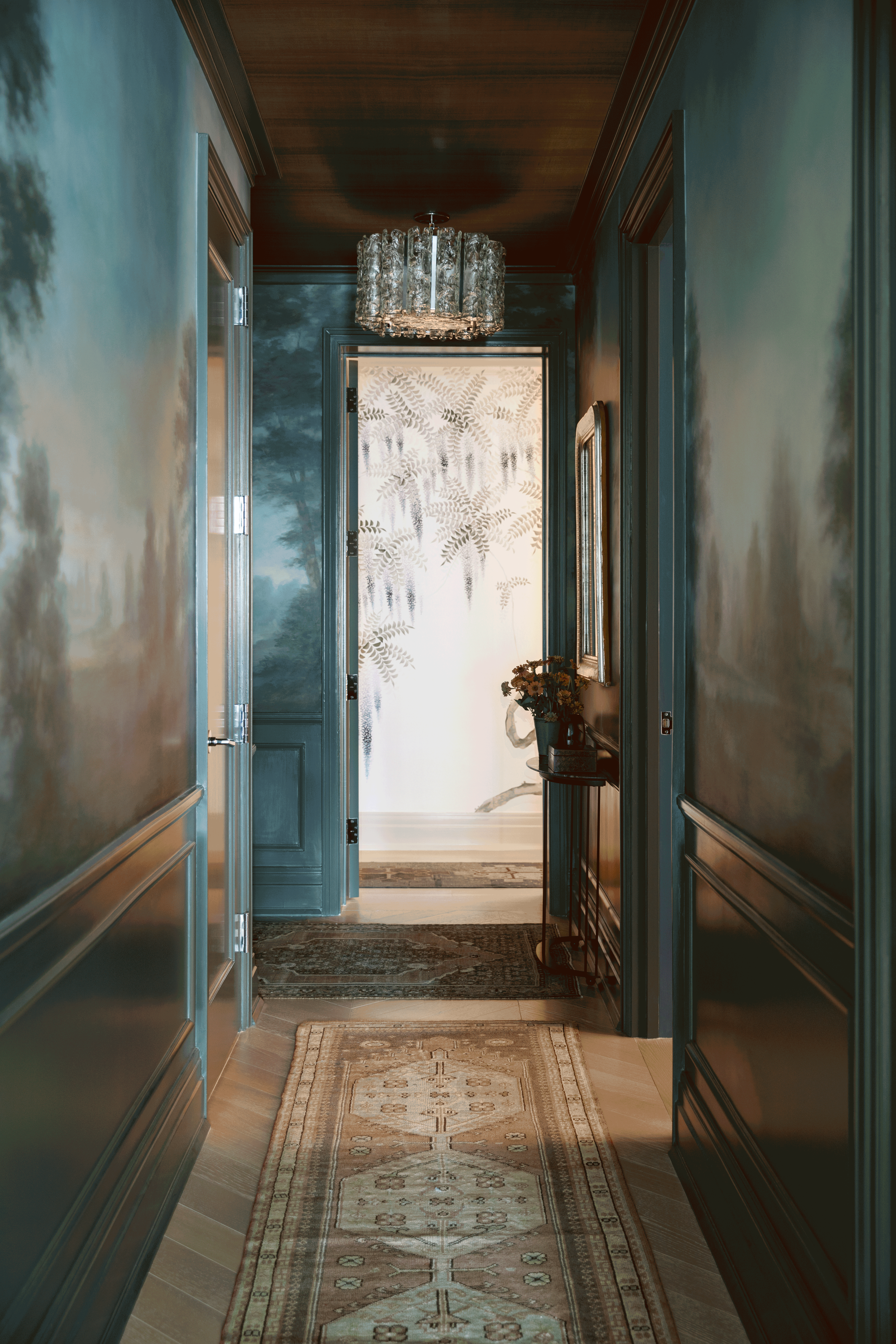
This inky entryway designed by French studio, Virajo is a testament to the versatility of richer pigments. 'When it comes to decorating small, dark entryways, many people make the mistake of using light colors to lighten the space. It might be fighting a losing battle and create the opposite effect by highlighting the lack of natural light.
'In that situation, I like using color drenching. It creates outstanding results by painting walls, the ceiling, doors, and radiators in the same color, delivering a cohesive scheme that contrasts with the rest of the interior,' says Sonia Lazowski, interior designer at Virajo.
The studio cleverly utilizes warmer wooden accents to temper the cool navy walls. 'This small, windowless entryway of this Parisian apartment was on the dark side. We took this to our advantage by embracing the darkness using a dark navy blue paint color from the walls to the ceiling that creates a “black box” effect.
'The dark blue color broadens space and emphasizes the details of beautiful vintage lights and decorative objects. Finally, gold textures from the wallpaper bring warmth and depth to the intense tones,' adds Sonia.
5. YOU’VE FORGOTTEN TO ADD A MIRROR
Mirrors are not just perfect for those final checks before you leave home but also create illusions. They are the perfect solution for how to make a small entryway brighter and bigger. For her Tribeca Pied a Terre project, the mirror and lighting reflect light around the room. 'Mirrors aren't just for checking your appearance - they can also make a space feel larger.
'Placing a mirror in your entryway can help to visually expand it,' says New York-based interior designer, Kati Curtis of Kati Curtis Design.
It’s advisable to choose a mirror that feels large enough to make an impact in the space but also doesn’t overwhelm the walls. Adding a small console similar to the one featured in Curtis’s design is a great way to create a station for everyday essentials.
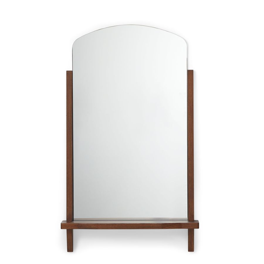
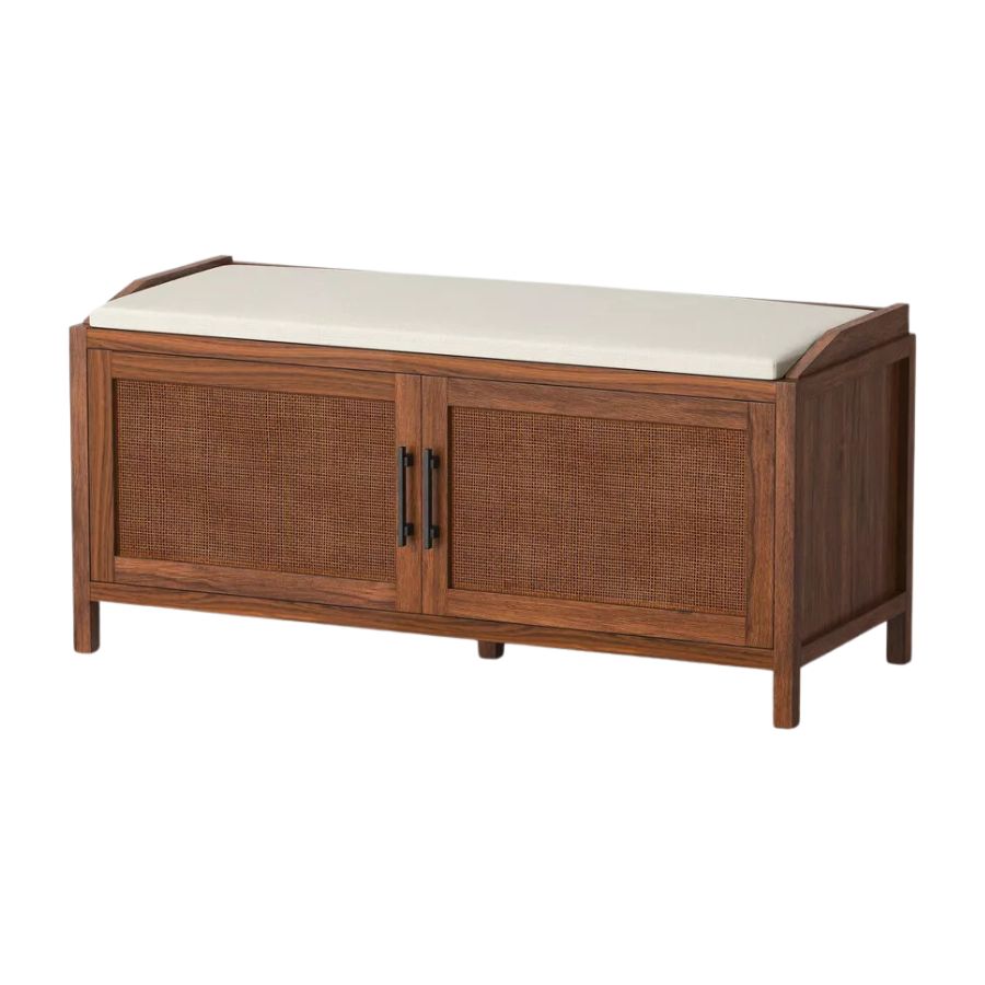
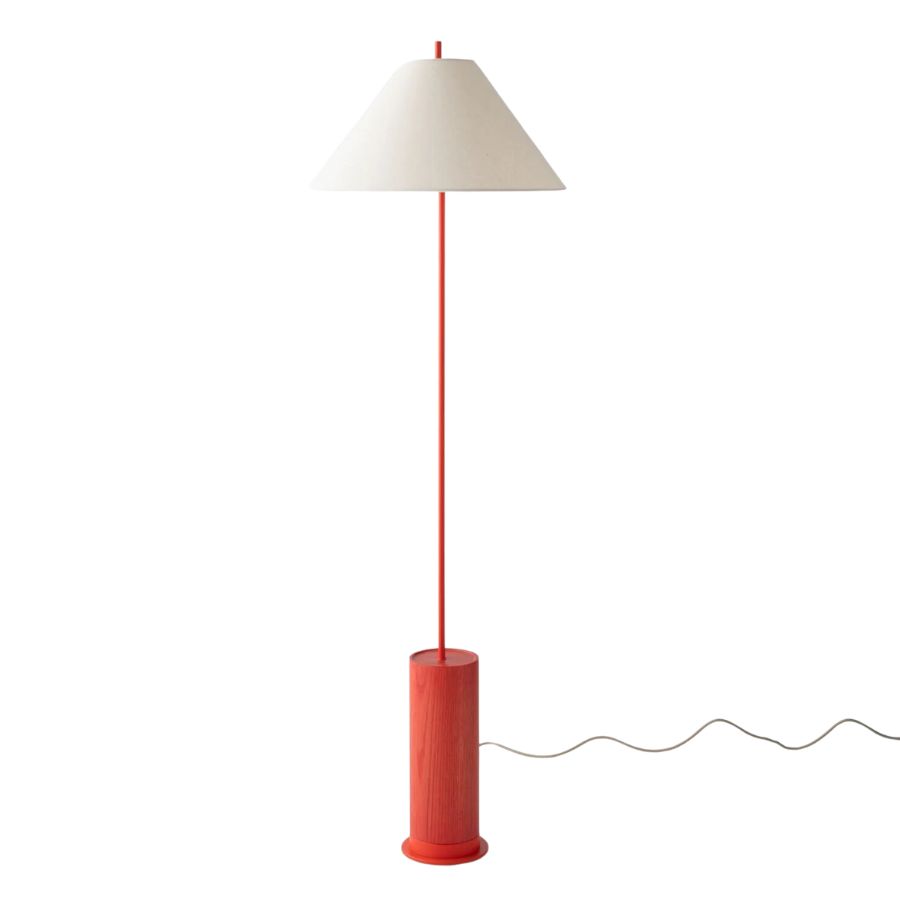
3 buys to elevate your entryway to the next level
Be The First To Know
The Livingetc newsletters are your inside source for what’s shaping interiors now - and what’s next. Discover trend forecasts, smart style ideas, and curated shopping inspiration that brings design to life. Subscribe today and stay ahead of the curve.
Writer and design expert Faaizah Shah is the founder of The Interiors Consultancy. She has worked with designers such as Staffan Tollgard and design houses such as Sanderson to help them understand and communicate their narratives. She is known for crafting engaging stories and imaginative content, and understanding great decor from her years alongside some of the best creatives in the industry. She is also a contributor to Livingetc.
-
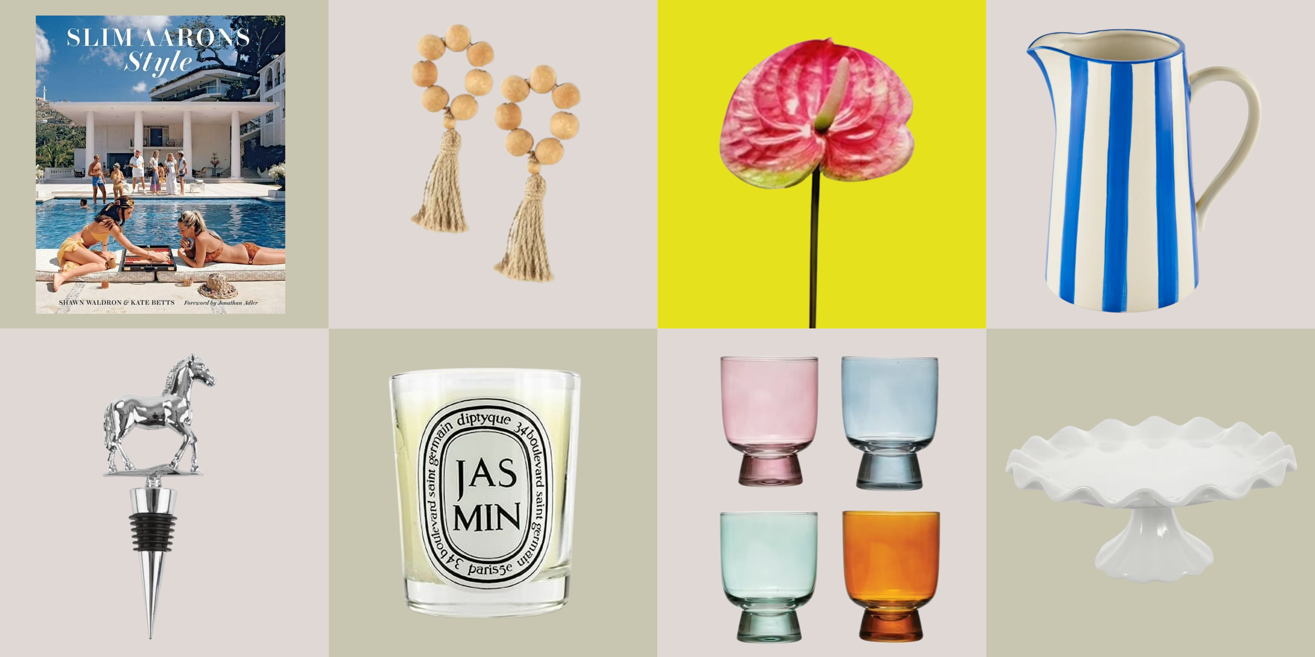 12 Essentials Every Cool, Collected Spring Host Needs — And You’ll Never Guess Where They’re From
Guests will think you thought of everything, you just knew where to shop
By Julia Demer Published
-
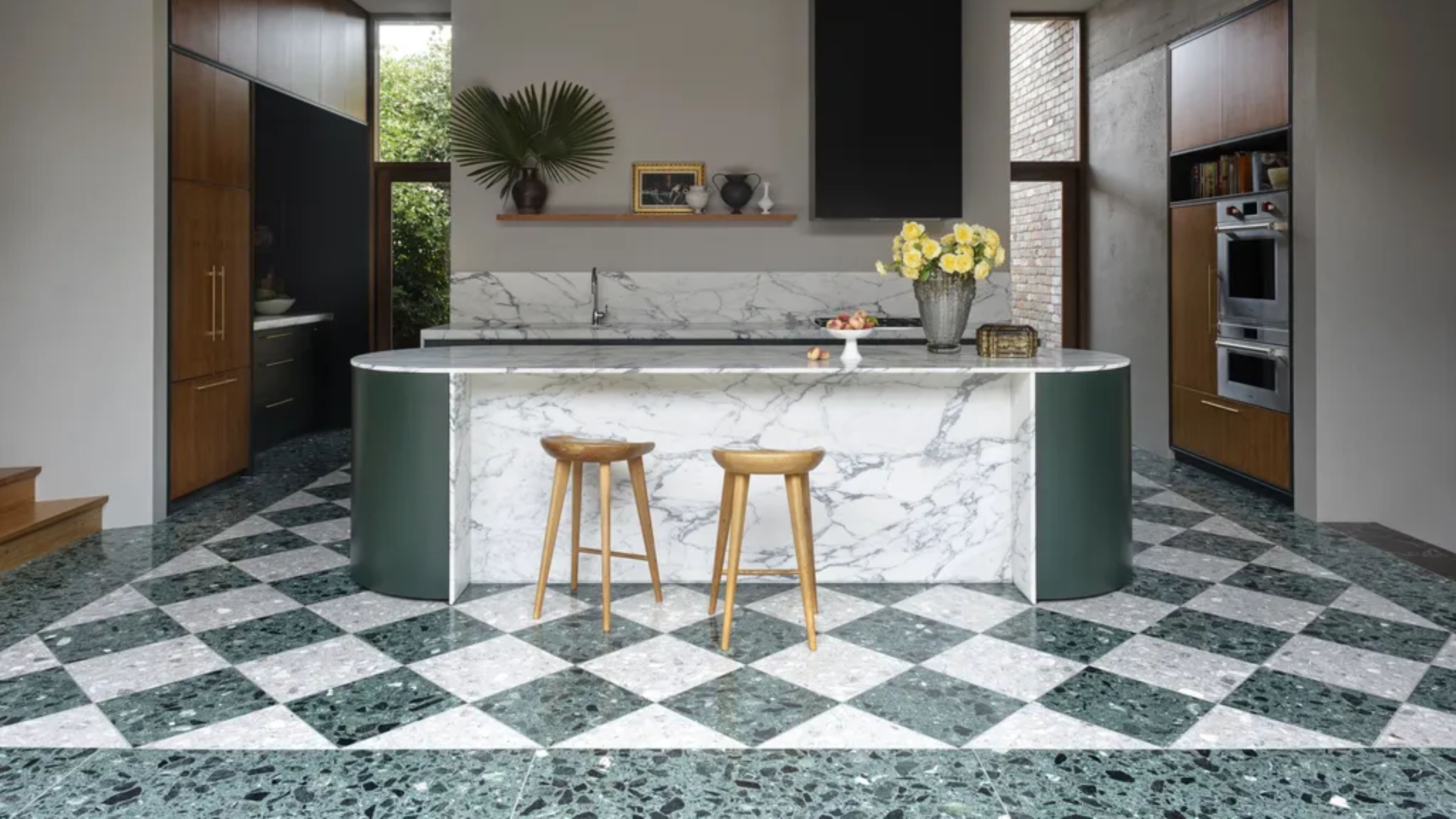 Smeg Says Teal, and We’re Listening — The Kitchen Shade of the Year Is Here
Designers are already using the soft, sea-glass green everywhere from cabinetry to countertops
By Julia Demer Published
