‘It Instantly Shrinks the Size of Your Room!’ 5 Design Mistakes That Are Making Your Home Look Smaller
It can be easy to make these mistakes that will make your home look smaller than it is. Interior designers tell us to what they are and how to avoid them
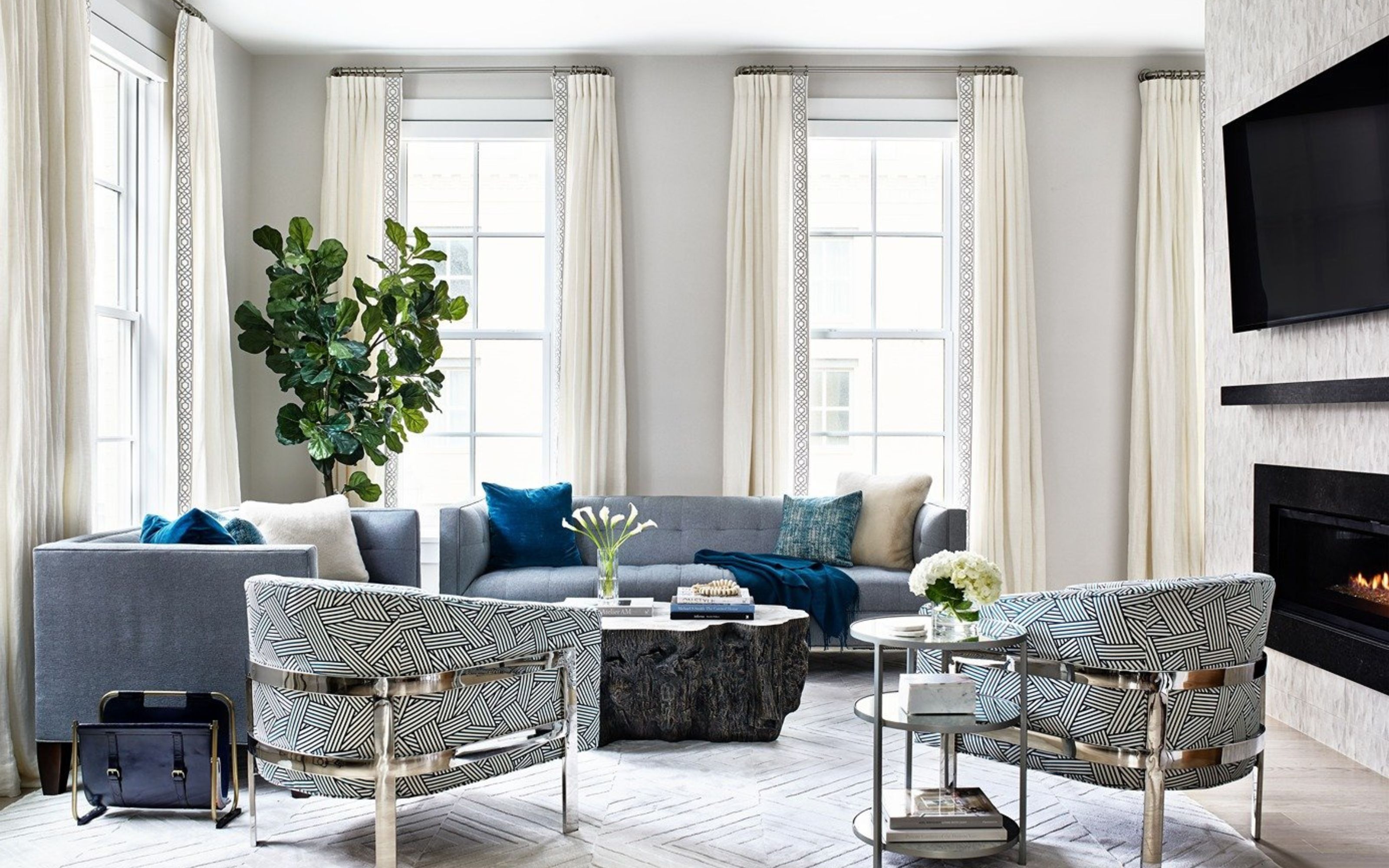
Driven by intuition, a strong sense of what you like, and guided by trends, it might seem easy to try your hand at designing your home all by yourself. In a lot of cases, where you have a good grasp of what you need to make a space work for you, you might not need the help of an interior designer to create a home that delivers. But here is where a trained eye makes a difference: there are small details that can make or break how we perceive a room, and pitfalls that we won't even realise are there. One of the most common mistakes designers see in clients' homes are spaces that feel smaller than they actually are.
While you might try to achieve the opposite, there are some decisions that most of us make without even realising the impact they have on the overall look and feel of our homes. Here’s where the experience of an interior designer kicks in. I spoke to experts in curating modern homes that feel spacious and airy, and they shared the five most common mistakes and important flags to watch out for, if you don’t want to make your rooms look smaller than they are.
1. Choosing rugs that are too small
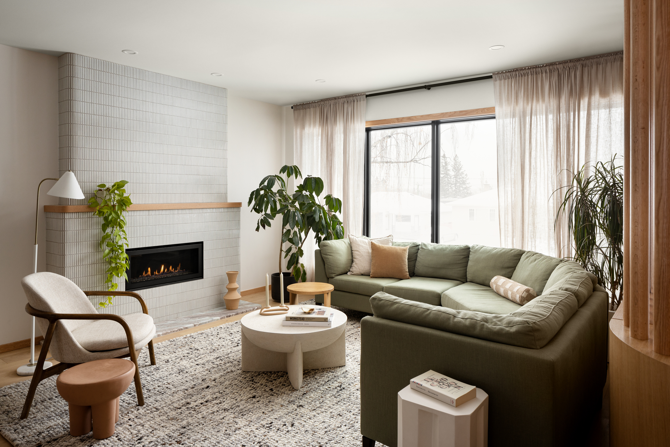
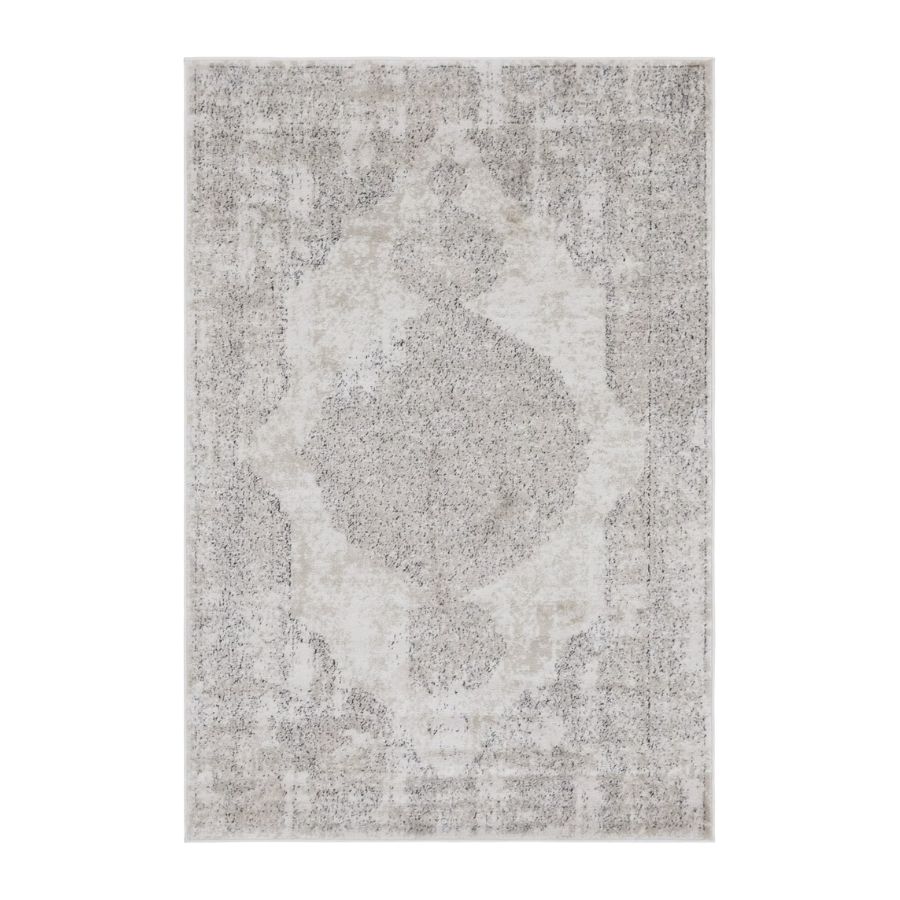
Designers unanimously agree with this, and they see this mistake being made more often than you’d think. Choosing the right size living room rug is important as it not only grounds the design scheme but also can zone the space, affecting our perception of it. ‘One design mistake I see often is rugs that are too small for a room, what I jokingly refer to as "postage stamp" rugs,’ says interior designer Diana Lombard. ‘A larger rug tricks the eye and instantly makes a room feel more expansive. I always advise clients to maximize the size of a rug when possible, as it is an easy way to make a space feel grander,’ advises the expert.
Interior designer Liad Schwartz agrees. ‘If your rug is too small, it will instantly shrink the size of your room and make it look choppy. Don’t be afraid to let your rug extend its reach. Aim for a 10’’ border around the wall. Never be afraid to go big!’ he says. Diana tells me that a good rule of thumb is to aim for being no more than 12" away from the walls of a room and advises that at least the front legs of all furniture pieces in the room are firmly on the rug, especially in an open plan space.
2. Overcompensating with bulky furniture

This is an easy mistake to make. Just by placing oversized furniture in a room it won’t make the space appear bigger. ‘Size matters, especially in the world of furniture. Chunky pieces will make your space feel smaller,’ Liad tells me. ‘The number one mistake I see people making is buying furniture that is scaled incorrectly to the room, like giant living room sofas and chairs,’ shares interior designer Bethany Adams. ‘Think of your home as a full-size dollhouse. Just as you wouldn't put disproportionately large furnishings in a doll’s house, you shouldn't do it in real life either,’ she adds.
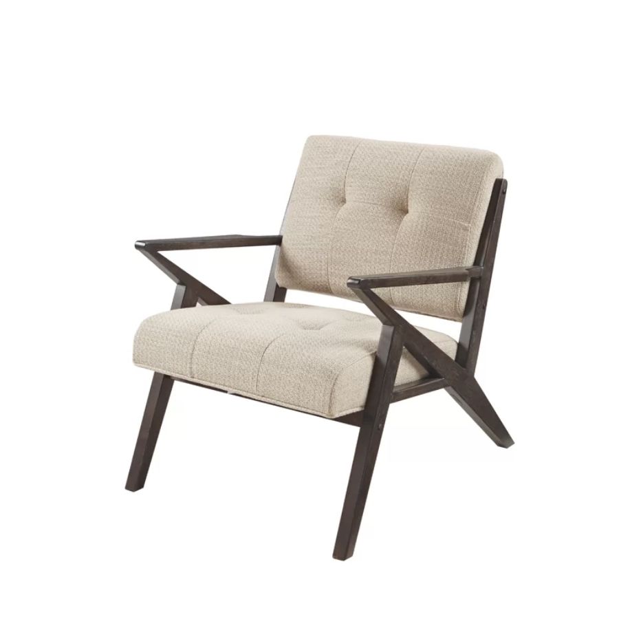
Here's what you should do instead. ‘When working in a smaller space, it is always important to consider the proportions of your furniture,’ explains Diana. ‘Too often I see clients with pieces that are way too large for their space, and the result is a room that feels heavy and cramped. Instead of bulky recliners, sectionals, and lounge chairs, look for pieces that have slimmer arms, compact depths, and legs instead of chunky bases. Legs on sofas and side chairs let more light through, which makes a room feel larger,’ advises the expert. Translucent furniture is a great option to consider to make your space look more light and modern. ‘Translucent furniture can help a room appear larger, allowing for more of a flow for the eye, rather than the blocking nature of chunky furniture,’ shares Liad.
Interior designers Meghan Bannon and Tara Marshall mention that when working within the constraints of a small living room or bedroom you should pay attention to the visual heaviness of your pieces. ‘When we say heavy we don't mean the weight,’ explain the designers. ‘In our opinion small spaces are about balance. If you have a heavier looking sofa, consider mixing it with a lighter framed table or chair. Lighter framed furniture or items on legs will visually appeal lighter and smaller in the space,’ they add.
3. Cluttering with too many details and objects

When you want to make a space look open and airy, the last thing you need is too much stuff cluttering it. Too many colors, patterns, pieces of furniture, accessories and personal items left lying around will all make a room feel smaller than it is. ‘The expression, "less is more" works well when maximizing space in a home,’ explains Diana. ‘Too much clutter and unnecessary objects can easily overwhelm a room, making it feel cramped and enclosed,’ she adds, and interior designer Sara Malek Barney agrees: ‘A home overrun with clutter can make it feel like the walls are closing in on you,’ she says.
Meghan and Tara admit that as much as they love furniture, a little negative space in interior design goes a long way. ‘When a room is small you need to fight the urge to fill every nook and cranny. Too much stuff will lead to a room feeling smaller,’ they tell me. The same applies to using too many colors and patterns. ‘To avoid drowning in a sea of color and patterns, think of your space as a canvas, but keep it specific,’ advises Liad, but that doesn’t mean you shouldn’t use bold colors, or a maximalist scheme if that’s what you like. The secret lies within consistency, balance, and purposeful decisions. ‘Stick to a consistent and bold palette to make even the tiniest room feel grand. It's all about creating visual harmony and not visual chaos,’ adds the expert.
When it comes to deciding what you bring into a room, it’s important to make mindful, intentional choices, as Diana advises. ‘Be intentional about the objects that you display, the furniture pieces that you select, and again, look for ways to increase positive and negative space in the room. If you have a lot of prized possessions that you want to display, try rotating them through so they are not all out at once. If you give various areas in your home some breathing room, you will be surprised how suddenly open they feel,’ she points out.
4. Painting your walls in dark colors
Dark colors are not wrong in small spaces if you’re looking to create a cozy atmosphere, and they’re often a great choice for a home office or library. But they will make a space look smaller and are best avoided if what you’re looking after is the opposite effect. ‘Medium to dark paints make walls feel more enclosed, while lighter paints give the illusion of space,’ explains Diana. ‘When working in smaller spaces, I always recommend choosing a bright, light paint as opposed to going too dark, unless of course the goal is to create a cozy or moody vibe,’ she adds.
‘Although we love a dramatic room, if you want to make your room feel larger, we suggest a lighter, brighter paint color,’ advise Meghan and Tara. Diana agrees and adds that you can’t go wrong with white paint. Keeping all the walls the same light color will create the illusion of more space too. ‘My favorite choice to radically make a home feel larger is to paint the walls white, and to keep all the walls the same color. This will allow your eye to travel throughout the space continuously, as opposed to the view being broken up by multiple shades,’ shares Diana.
5. Not utilizing the space on the vertical axis

A very common mistake to make is not thinking about your space on the vertical axis. Don’t just think about the low level furniture but ask yourself how can you get the eye to travel up, and create the illusion of height. ‘Look up!’ advises Liad. ‘Add mirrors, art, drapery, or even shelves with décor to make those walls soar to new heights. Going vertical will make your ceilings look taller, making a smaller room feel more spacious and stylish all at once,’ says the designer.
A simple trick and a good starting point is your window treatment. Diana tells me she often sees window treatments that are too short for the room, taking away from the perception of height. ‘Another trick to make a room feel more expansive is to install drapery as close to the ceiling as possible, which creates the illusion of more ceiling height. When hanging drapes, make sure the panels hang either all the way to the floor or a maximum of 1/2" off the floor. Drapes that are too short or that are installed directly above a window (leaving a lot of wall exposed) can trick the eye into thinking the ceiling is lower than it actually is, which is the opposite of what you want. Drapes that are installed super close to the ceiling, however, accentuate the height of the room and make it appear taller,’ she explains.
Be The First To Know
The Livingetc newsletters are your inside source for what’s shaping interiors now - and what’s next. Discover trend forecasts, smart style ideas, and curated shopping inspiration that brings design to life. Subscribe today and stay ahead of the curve.
Raluca formerly worked at Livingetc.com and is now a contributor with a passion for all things interior and living beautifully. Coming from a background writing and styling shoots for fashion magazines such as Marie Claire Raluca’s love for design started at a very young age when her family’s favourite weekend activity was moving the furniture around the house ‘for fun’. Always happiest in creative environments in her spare time she loves designing mindful spaces and doing colour consultations. She finds the best inspiration in art, nature, and the way we live, and thinks that a home should serve our mental and emotional wellbeing as well as our lifestyle.
-
 The 'New British' Style? This Victorian London Home Embraces Its Owners' Global Background
Warm timber details, confident color pops, and an uninterrupted connection to the garden are the hallmarks of this relaxed yet design-forward family home
By Emma J Page
-
 Muji Living Room Ideas — 5 Ways to Harness The Calming Qualities of This Japanese Design Style
Inspired by Japanese "zen" principles, Muji living rooms are all about cultivating a calming, tranquil space that nourishes the soul
By Lilith Hudson
