The architectural trend that squeezes seating into even the smallest of kitchens, creating perfect nooks
Modern banquettes are having a moment, with designers creating seating in even the most awkward of kitchen layouts
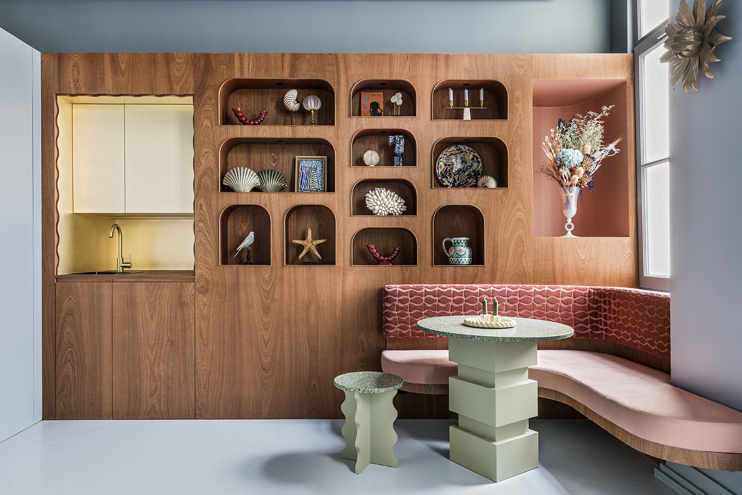
Tucked into kitchen corners, banked along dining areas, or nestled along pretty much any interior wall in need of a lift, modern banquettes are one of the hardest working architectural features throughout interior design right now.
‘Banquettes are a great way to best maximise small spaces, both in terms of making enough room for a dining area in the first place, and making it as comfortable as possible,’ says Sam McNally, co-founder and director at London-based design studio Echlin.
As casual alternatives to formal dining rooms and tables, they are a cozy spot for conversation or a cup of tea in the morning, afternoon, and night. But it’s a special balance between function and comfort that’s winning hearts.
A built-in modern banquette can change up your whole interior. It can anchor an open space with a new focal point. It can squeeze a dining nook into awkward rooms that wouldn’t accommodate a table with chairs on all sides. It can offer space for secret storage with hinged seats and hidden drawers.
And if the concept reminds you of your favorite hotel or restaurant, why shouldn’t it? ‘We believe that customers are increasingly looking for a way to get closer to the hotel industry's atmosphere,’ says Florence Jallet, a co-founder of Paris-based Batiik Studio. After all, hospitality has a knack for luxe functionality. ‘It’s also about the feeling of the melding and meshing of commercial and residential – they are really morphing into one,’ adds Pittsburgh’s Leanne Ford.
While a built-in banquette is a shoo-in for modern kitchens with casual dining areas, you’ll find them all throughout modern homes — here are a few tips and tricks for getting them right.
Modern banquettes and how best to style them
1. Use durable upholstery
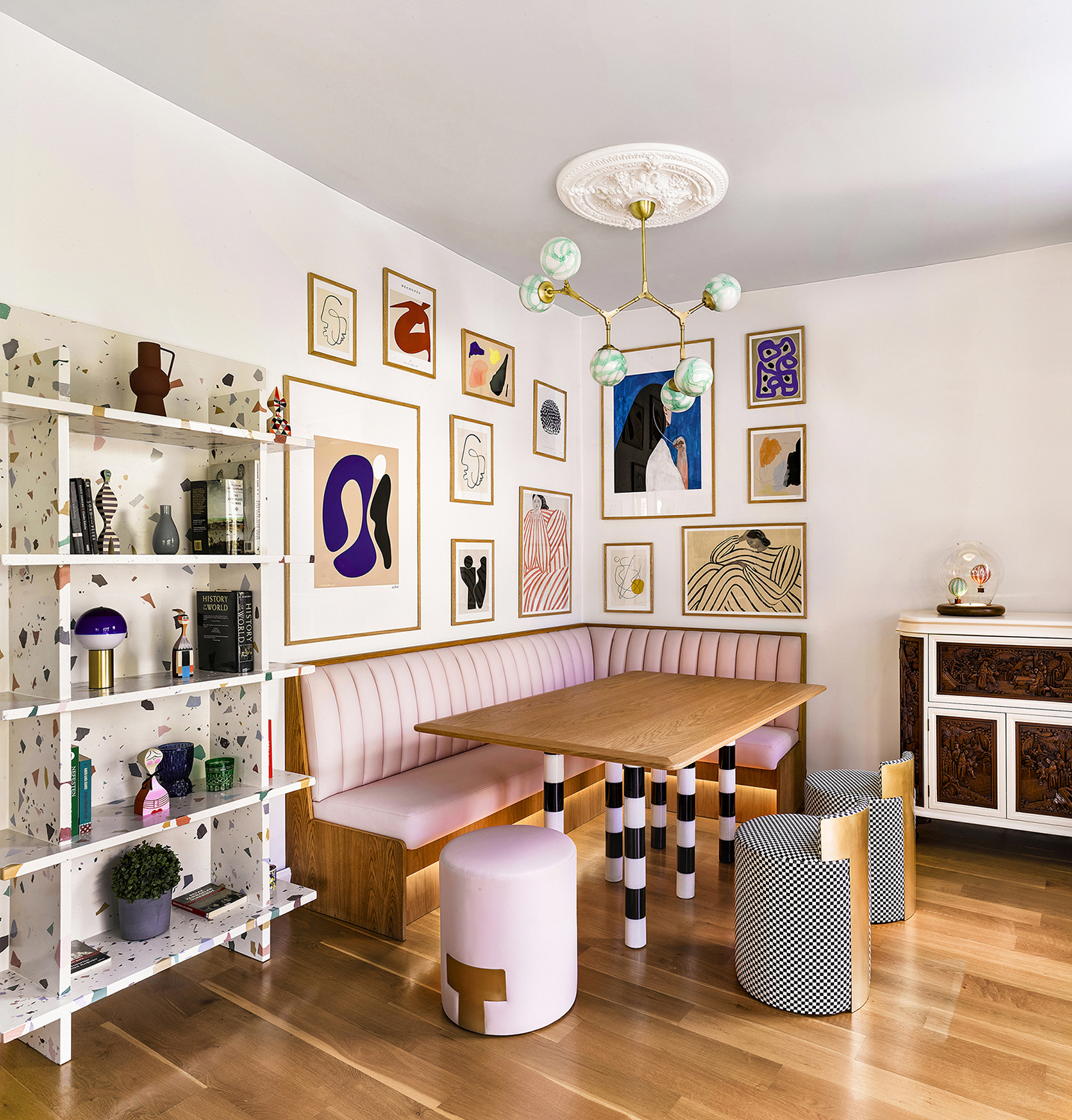
While upholstering a banquette creates a new canvas for bold fabrics, the chief concern is durability. It’s the reason why restaurants often stick with easy-to-clean materials like leather that hold up to messy situations. ‘Now there are durable versions of almost every material without sacrificing the look and feel,’ says New York-based designer Merve Kahraman, who chose a faux pink leather for her playful banquette. For upholstery that lasts, consider commercial grade materials, or dark and patterned fabrics that hide the inevitable splash of red wine.
“It is very easy to clean and very durable and still gives you the feeling of sitting on a leather banquette,” says Kahraman. Topping it off, the pink material injected happy vibes into the space, allowing her to get creative with the dining area’s surrounding design elements, too. “It is combined with a white oak dining table with handcrafted marble legs, a custom made colorful terrazzo bookshelf, and a mint green colored Ziron Chandelier along with checkered and brass poufs,” adds Kahraman. “The art wall surrounding it also gives you the feeling of sitting in a bistro or cafe.”
2. Consider the height and depth
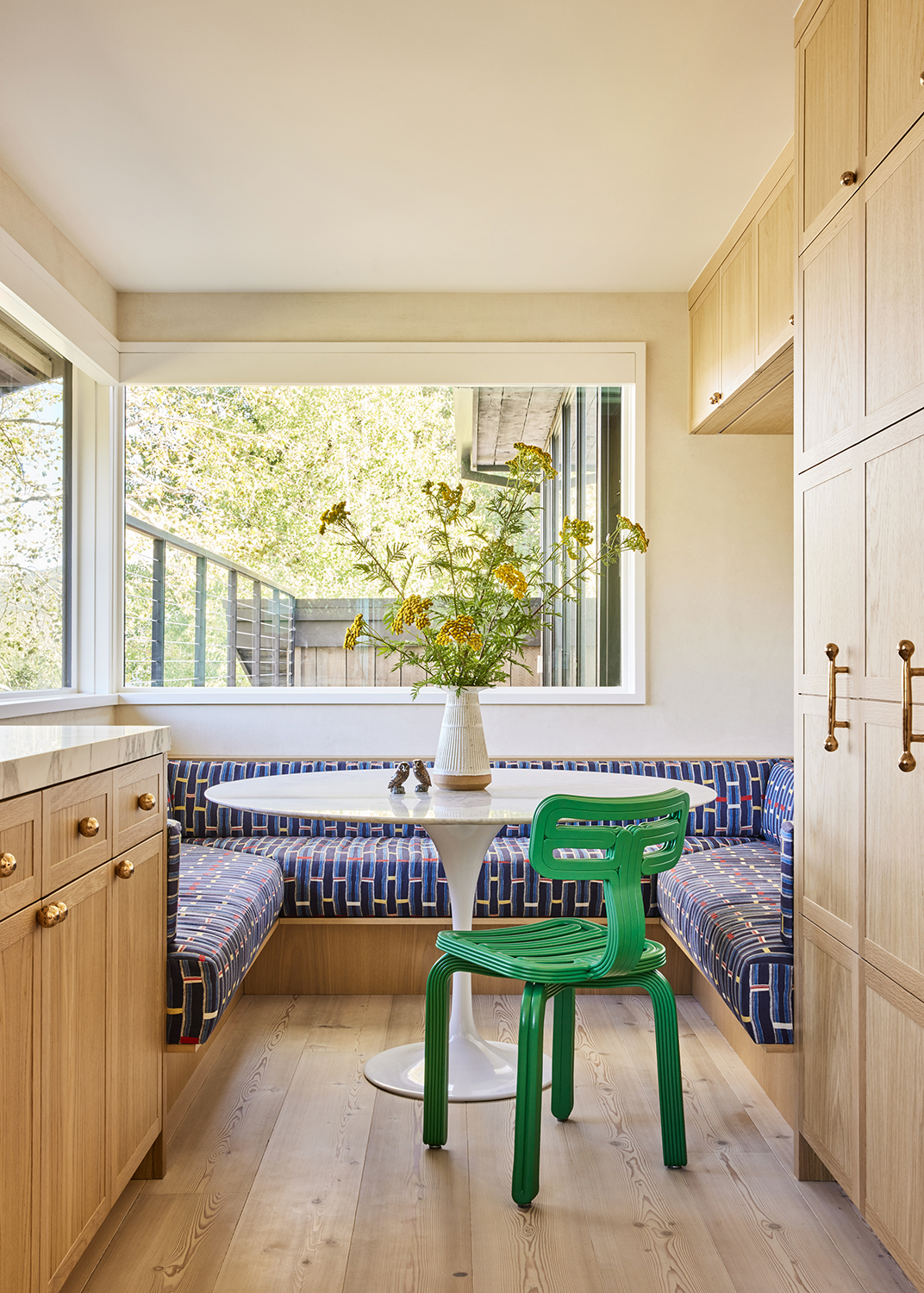
As space-saving solutions, banquettes can accommodate a range of layouts, as simple as straight benches along walls or slightly more complicated construction (think U-shapes and L-shapes) that transform a room’s layout. ‘In general it’s best to take the footprint into consideration and then determine how many seats you’re trying to accommodate,’ notes Jennifer Bunsa, who chose a U-shaped design for a family with kids who needed seating all around the table. ‘It’s also important to have an idea of the table dimensions so you can be sure you have enough overlap.’
Along with measuring your table, there are plenty more considerations to keep in mind. “Seat depth and height is very important – if it’s a dining table banquette you want to be sure the seat height is around 18” and the foam that is used for the seat is more rigid so it’s easier to scoot around,” adds Bunsa. “I wouldn’t want anyone cursing my name as a designer if they were sitting too low for the table, or couldn’t scoot around because they were sinking into the cushions!”
3. Float the banquette for a feeling of space

Tailor-made banquettes can achieve heights that normal furniture cannot – as in their ability to eliminate chair legs altogether. In certain configurations, banquettes can float along the wall with hidden structural reinforcement. ‘In this case, the fact that the banquette is a corner banquette, and despite the fact that it is large, allowed us not to put any legs,’ explains Florence Jallet, co-founder of Paris' Batiik Studio. ‘Floating banquettes are a trick to create a feeling of space by freeing up the floor space.’
And when it comes to legs, don’t just think about those on (or off) your banquette. ‘Choose the table at the same time as the banquette so as not to make mistakes about the proportions and the position of the table legs, which can sometimes get in the way,’ adds Jallet. ‘It is important to remember that this is fixed furniture and that you cannot go back once it has been installed.’ This is a good trick for minimalist kitchens, as it creates less visual noise.
4. Keep their usage in mind
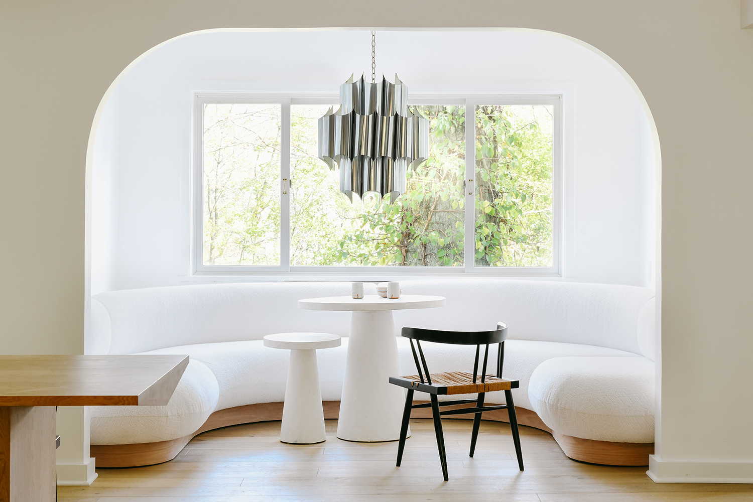
Today’s designs often find inspiration from the hospitality industry, allowing banquettes to embrace bigger and bolder designs that transport owners to their favorite dining destinations. ‘The built-in was a great way to take advantage of what would have otherwise been an awkward space in this home,’ explains designer Leanne Ford of this window seat. ‘This was a fun project because we were designing for young parents, but the parents also loved to have fun, entertain, and go out – so they loved the idea of bringing the feeling of being out to their home.’
Keep in mind, however, that banquettes – depending on their layout – might not be a total replacement for a proper dining table. ‘Just know with bigger banquettes you do have to slide in and out – so it’s not the best for every day eating,’ adds Ford. ‘I love them for special occasions.’
5. Build the banquette into the island
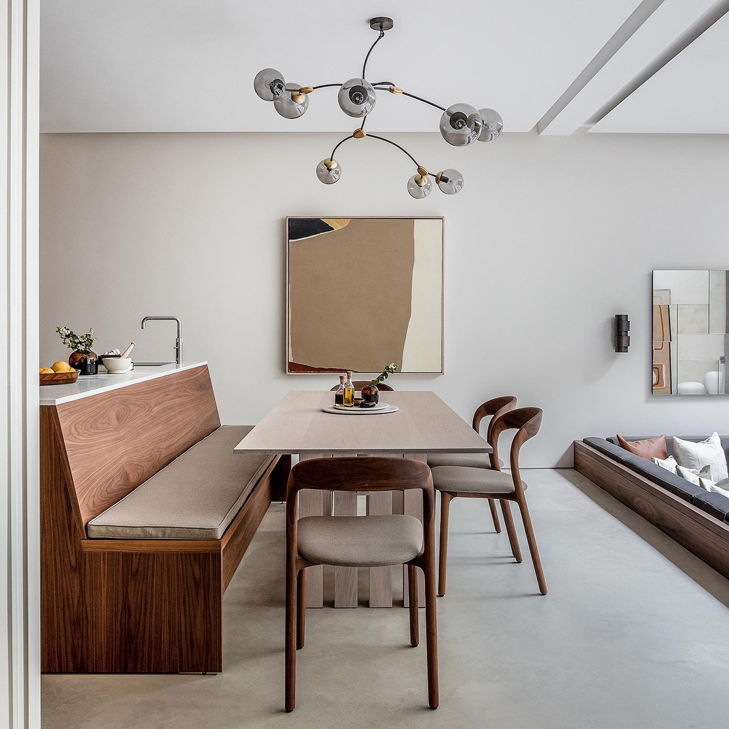
While built-in banquettes often occupy space along a wall, this dual-purpose kitchen island with seating is an interesting way to pivot. ‘In the kitchen, having the banquette built-in to the island saves space and avoids the island having a sheer face that would usually house bar stools, which are the default but not always needed in an open plan space where there are plenty of places to sit,’ explains Sam McNally, co-founder and director at London’s Echlin. ‘In this configuration a pedestal table is a must as it avoids the corner legs that make it difficult to get in and out of the bench area.’
McNally stresses the need to get your dimensions right by getting a firm understanding of your existing seat heights and depths from the start; once you understand what you’re working with, you can modify your designs. “Do look to where you may be able to cheat the standards, like making your table narrower than the normal 35 inches, but this depends on how you eat and serve your meals,” he says. “For example, if you’re the type of cook that likes to put everything in bowls and serve on the table, then don’t scrimp on the central space. Make sure not to forget to rake or angle the seat back as otherwise it won’t be comfortable.”
6. Use curvy lines
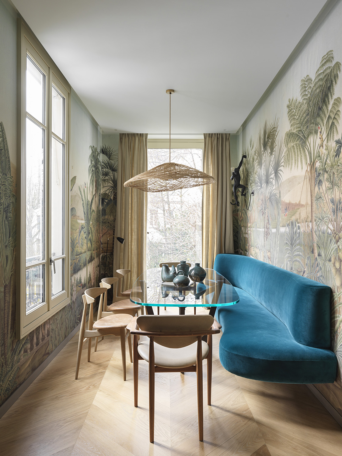
While straight lines are typical of bench seating, contemporary banquettes aren’t afraid to show off their curves. Along with the layout, the seat itself can be rounded out with cushioned upholstery, or designed with a sinuous shape to soften any harsh angles of your architecture, like in this pied-à-terre. “Paired effectively with a bespoke solid walnut and glass topped table by SIGebene, the curved edges of the bench are echoed by the rounded wooden chairs by Carl Hansen & Son and Finn Juhl, creating a sense of fluidity,” explains Thomas Vevaud of Paris’ design studio Le Berre Vevaud.
The long banquette uses its curvy shape to create rhythm in interior design, but also works overtime by introducing an exciting palette. “A banquette can elegantly introduce bold colours and can be used to harmonise the shapes and materials in the design,” says Vevaud. “For example, in the dining room of this apartment, the custom-made bench in a Pierre Frey fabric acts as a statement piece in the space and brings modern flair.”
7. Play with pattern
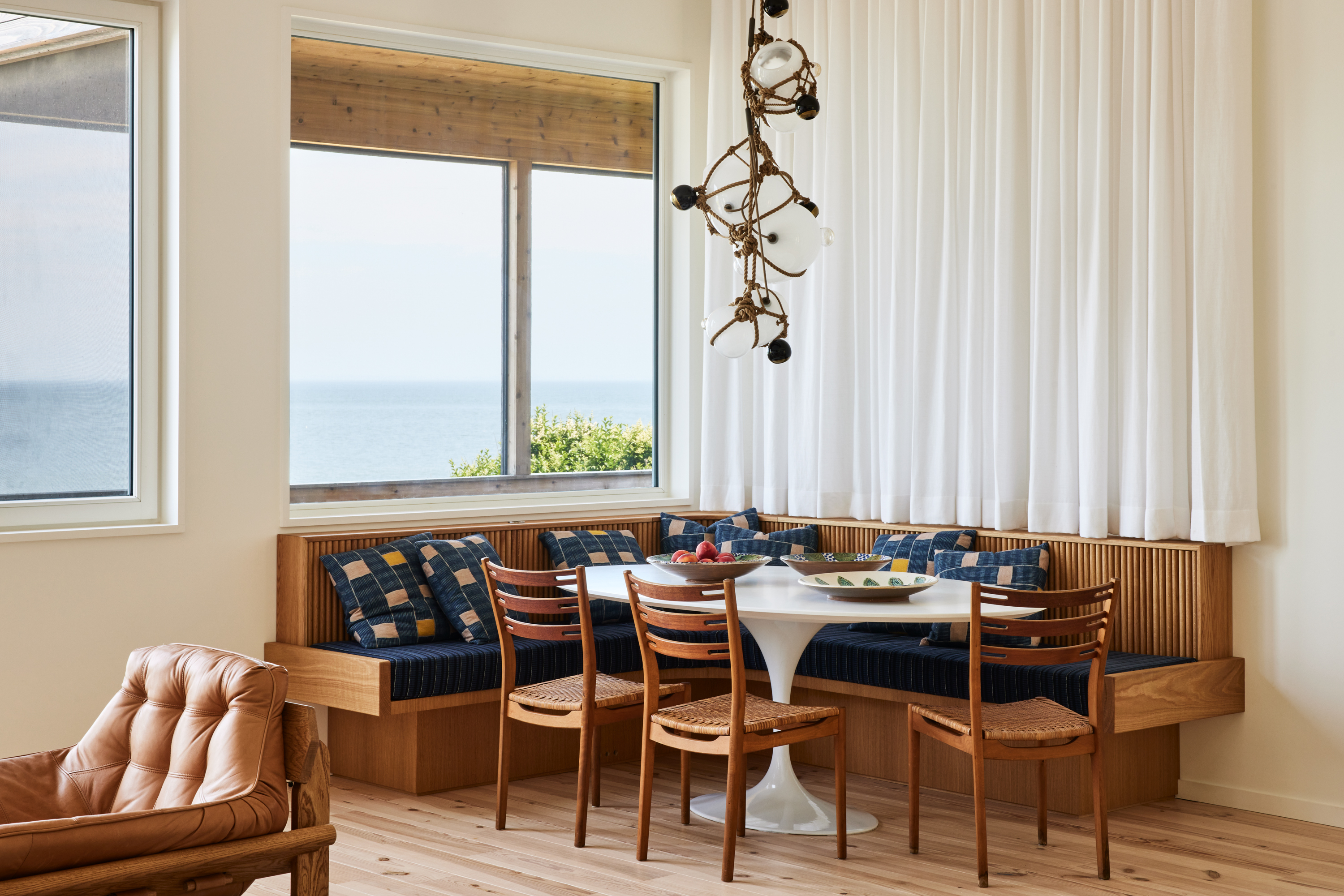
One main perk of the built-in banquette is rather hard to miss: it creates a new focal point. Especially when used in wide open layouts, banquettes can pull the eye with an array of different finishes – anything from contrasting colors and patterns to exciting textures and materials will create an eye-catching visual moment.
In the waterside home above, an L-shaped banquette steals the show. First, the custom design allowed designers to position tables closer to the wall than usual (as loose chairs would need more room to move in and out), meaning they could also center a hanging chandelier with a fixed pane window above the banquette. Secondly, the anchored feature doubles as a brand-new focus within the space thanks to fluted oak details and dark blue colors. “It allowed us to create a focal point in the larger space of the room, and create spatial definition within one larger room,” explains Jennifer Bunsa.
8. Fill an awkward space
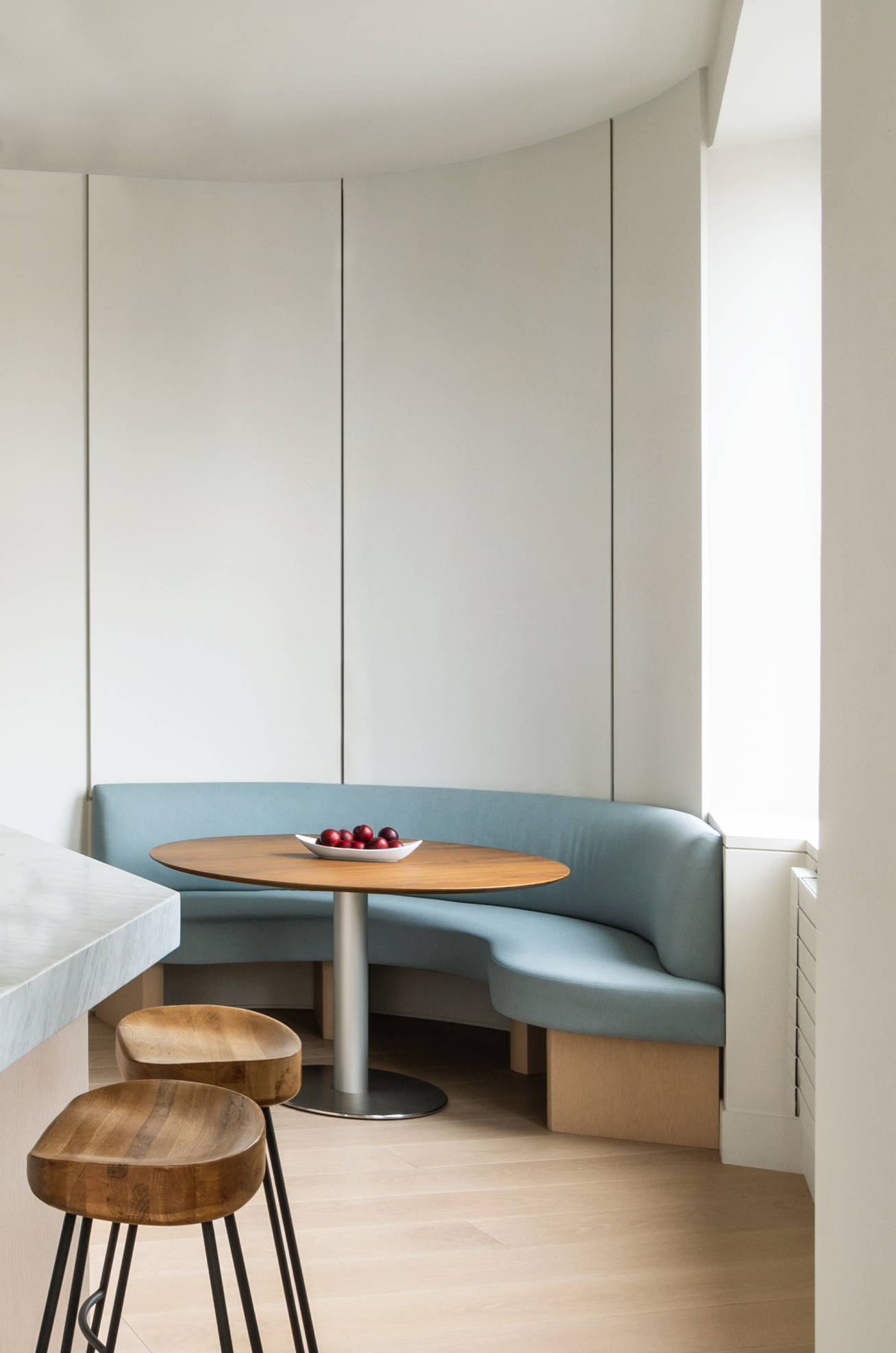
Built-in banquettes can reclaim spaces that aren’t obvious fits for furniture — like the curved spot beneath a bow window, or a small nook without room for loose chairs. It’s why the blue banquette above is the perfect solution. “This semicircular banquette was designed in the most geometrically challenging corner of a triangular-shaped apartment,” explains Juliana Sorzano of New York’s PJCArchitecture. “Due to the proximity to the kitchen and the lack of a formal dining space, it made sense to design a custom banquette that provided both a functional space for eating and softened the footprint’s sharpest corner.”
The lesson here is just how functional built-in banquettes can be compared with conventional furniture. But even though your design might be custom, be careful with your size and shape. “A big mistake would be to give the wrong proportions to a banquette and either create something too big that feels cramped in a space or something too small that feels out of scale,” adds Sorzano. “Paying close attention to functionality and thinking about accessibility for each user are also key considerations when designing built-in banquettes.”
Be The First To Know
The Livingetc newsletters are your inside source for what’s shaping interiors now - and what’s next. Discover trend forecasts, smart style ideas, and curated shopping inspiration that brings design to life. Subscribe today and stay ahead of the curve.
Keith Flanagan is a New York based journalist specialising in design, food and travel. He has been an editor at Time Out New York, and has written for such publications as Architectural Digest, Conde Nast Traveller, Food 52 and USA Today. He regularly contributes to Livingetc, reporting on design trends and offering insight from the biggest names in the US. His intelligent approach to interiors also sees him as an expert in explaining the different disciplines in design.
-
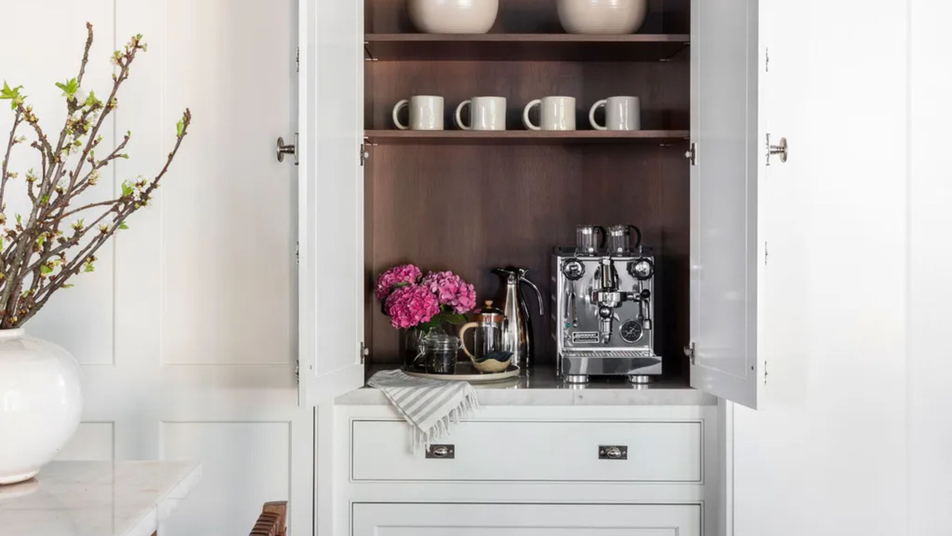 Turns Out the Coolest New Café is Actually In Your Kitchen — Here's How to Steal the Style of TikTok's Latest Trend
Goodbye, over-priced lattes. Hello, home-brewed coffee with friends. TikTok's 'Home Cafe' trend brings stylish cafe culture into the comfort of your own home
By Devin Toolen Published
-
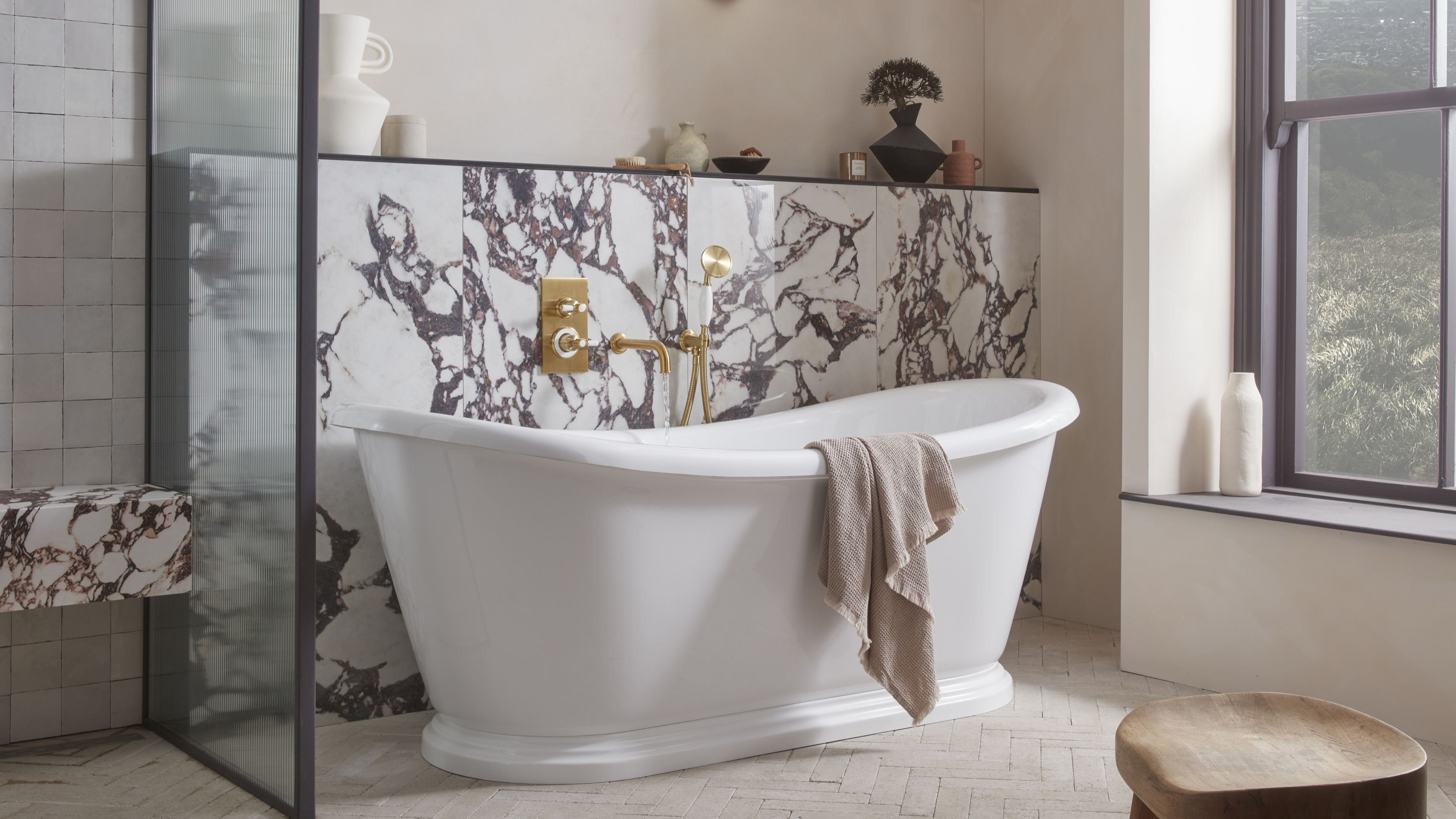 5 Bathroom Layouts That Look Dated in 2025 — Plus the Alternatives Designers Use Instead for a More Contemporary Space
For a bathroom that feels in line with the times, avoid these layouts and be more intentional with the placement and positioning of your features and fixtures
By Lilith Hudson Published