10 interior designers share their tips for creating the most beautiful modern bedrooms
Modern bedroom design is made easy with these 10 expert tips, covering lighting, furniture, colors and more
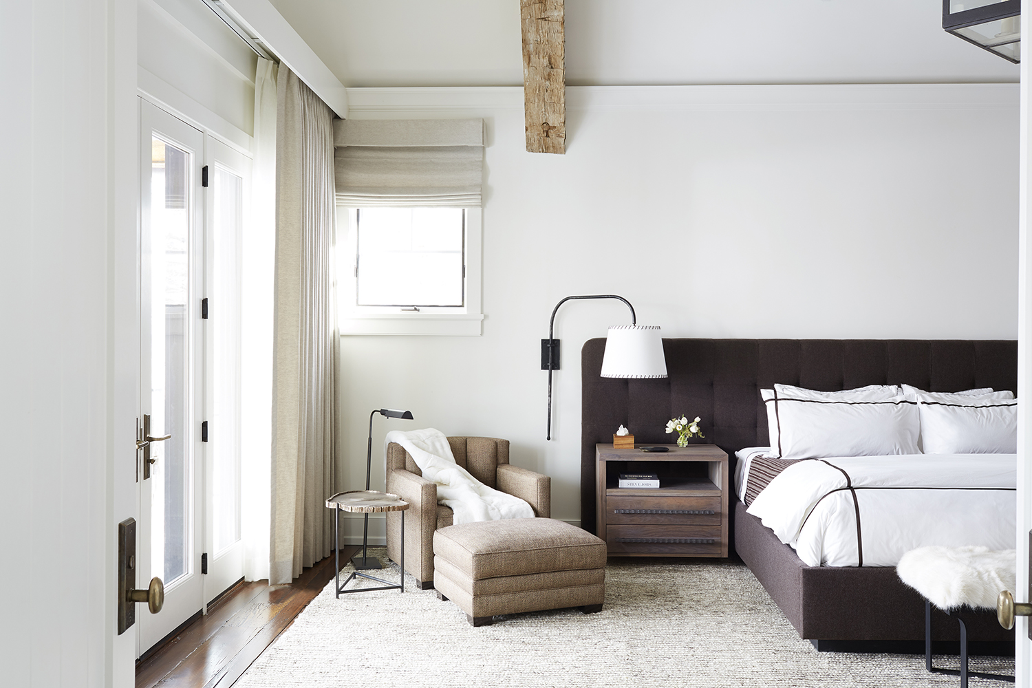

Mastering a the art of modern bedroom ideas is easier said than done. People often think that it’s as simple as throwing together a few minimalist furnishings, but there’s a great deal of thought and planning that goes into creating a clean, beautiful, and functional space. So much more than the way it looks, a bedroom is about how it feels, and how it makes you feel. There are tricks to getting this right, tricks that these experts just happen to have up their sleeves. Below, designers share their best advice tips for curating the ultimate modern bedroom.
1. RAISE THINGS UP
Design by Studio Carol Egan
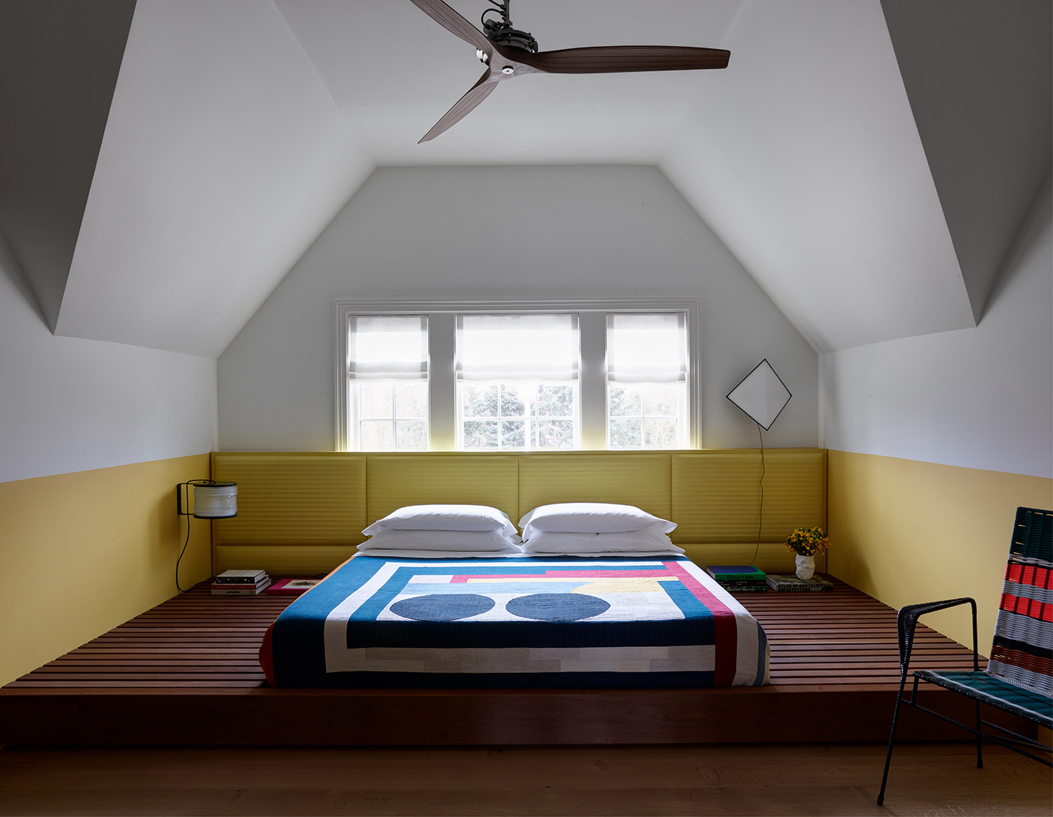
Designer Carol Egan of Studio Carol Egan pumped up the volume in what was originally a mundane beach house bedroom by painting the lower half of the walls in a fun yellow and then designing a dramatic matching headboard that spans the width of the room.
Carol suggests not just stopping at deco updates, but also thinking structurally, too. “We also built an architectural step, which does double duty as a platform for the bed and bedside tables,” she explains. The platform is not difficult to create - the sort of weekend DIY project any handy person ought to be able to manage. And the result is a room that’s unexpected, cool, and not too serious - and as far as bedroom storage ideas go, you could also use this to hide drawers.
2. SCALE DOWN

Design by Melanie Millner of the Design Atelier
Scale is key when designing a minimalist, functional room. In this bedroom, designer Melanie Millner of the Design Atelier created a sleek custom bed, nightstands, and sconces to ensure that the room feels cohesive and well proportioned.
“Modern interiors tend to have lower profiles and simple lines,” says Millner. “No one single item should jump out at you.” When buying a contemporary bed, or one o f the best mattresses, Millner suggests being mindful of the dimensions when pairing it with other furnishings, since they tend to be much lower than people think. “The top of the nightstand should be level with the top of the mattress,” she says. To determine the correct sconce height, Millner often uses painter’s tape to map out where the headboard will be on the wall, making it easier to envision the most comfortable lighting placement while one is sitting in bed.
3. CREATE AMBIENCE
Design by West Chin Architects
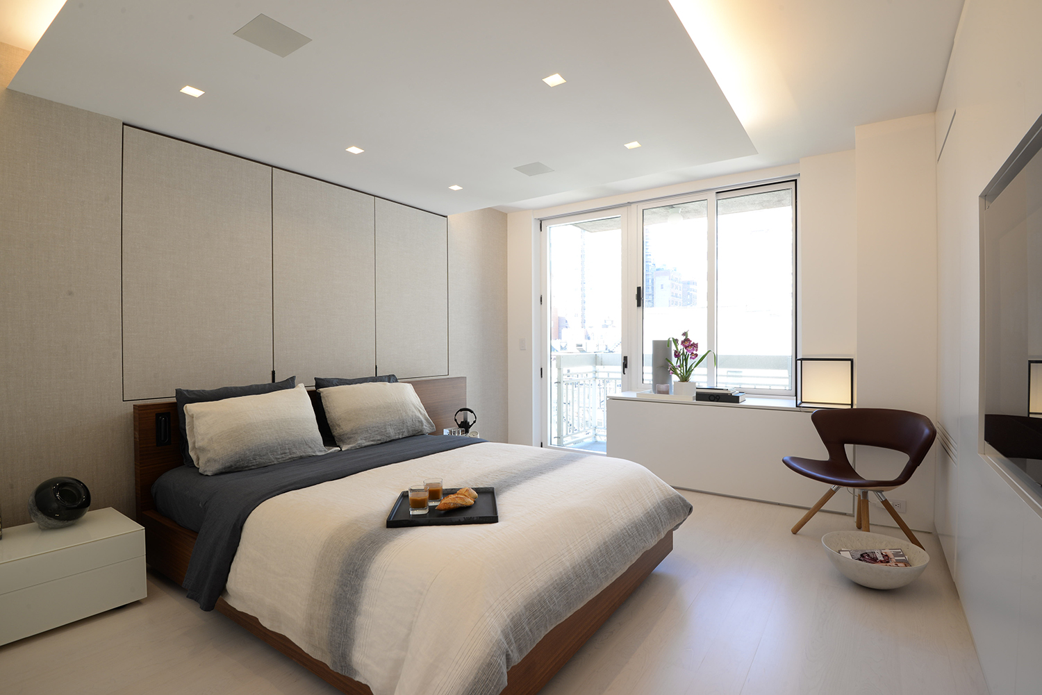
In a bedroom, having multiple light sources is vital. A favorite bedroom lighting trick of architect and interior decorator West Chin of West Chin Architects & Interiors Designers is cove lighting, or indirect lighting that’s tucked into a niche in the ceiling.
“Cove lighting infuses a space and elevates it to create a hotel-like mood,” he explains. “Make sure it’s dimmable to one percent, though, because the last thing you want in your bedroom is harsh lighting.” Chin also adds that cove lighting isn’t a substitute for other light sources in a room, such as table or floor lamps, but rather “a layer of ambient light that creates architectural interest.”
4. HAVE FUN WITH FURNISHINGS
Design by Studio Carol Egan
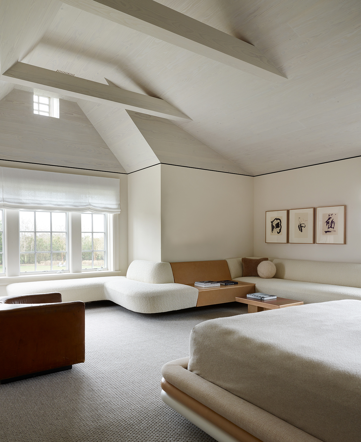
Modern design should be surprising, and what could be more unexpected than sinuous, cantilevered furnishings? “We designed a custom wraparound sofa to give the appearance of floating furniture, which lends itself to a clean, crisp, minimal aesthetic,” says Egan. The designer even went so far as to round out the corners of the bed to match. Modern doesn’t have to feel stark and severe, and the curves of the furnishings in this room help soften the entire space.
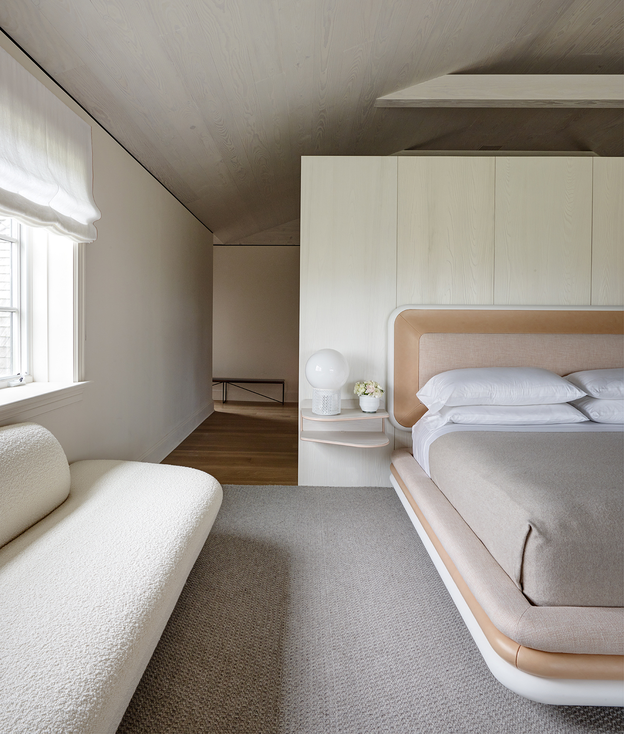
Design by Studio Carol Egan
5. MIX ’N MATCH
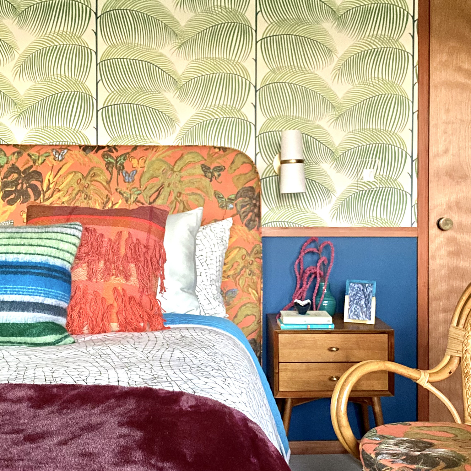
Design by Coco Kanakis of Spaciality, Inc
Expertly combined patterns inject life into a space, keeping things from feeling boring or predictable, and are well suited to guest bedroom ideas, as they're rooms which tend to get less use.
“For a guest bedroom in a mid-20th-century modern house, we set rich, vibrant colors and textures against a large-scale palm print for an upbeat, whimsical touch,” says designer Coco Kanakis of Spaciality, Inc., who encourages clients to go outside their comfort zones and take risks when it comes to combining prints and textures. “The mix feels refreshing and modern.”
6. CONSIDER HOW OPPOSITES ATTRACT
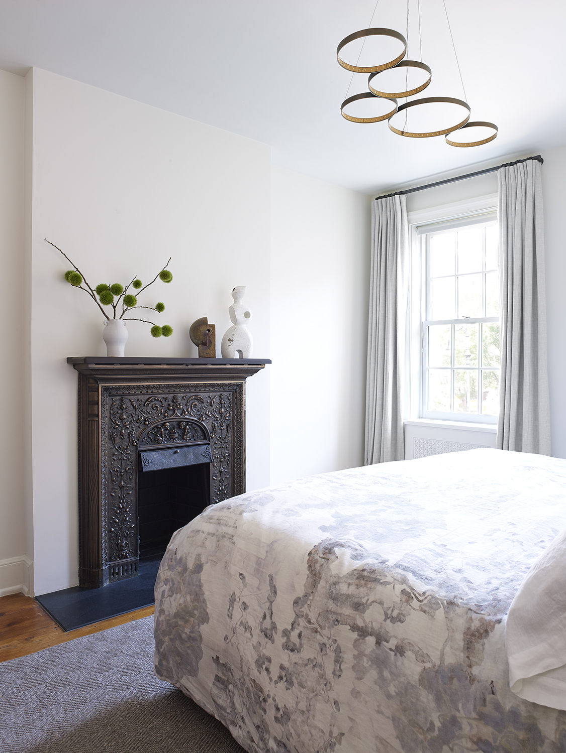
Design by RC Studio
Pairing dissimilar items is a great tool for making a space feel more modern—even if all the individual furnishings don’t feel especially modern. Take this bedroom by designer Rena Cherny of RC Studio, in which she hung a contemporary light fixture above an ornate bronze mantle from 1841. “Juxtaposing contrasting pieces creates beautiful tension and unexpected harmony,” says Cherny. The designer also suggests editing out distractions in order to “make your gems shine.” Here, she chose to highlight only a couple of striking sculptures and a simple vase.
7. OPT FOR SLEEK STORAGE
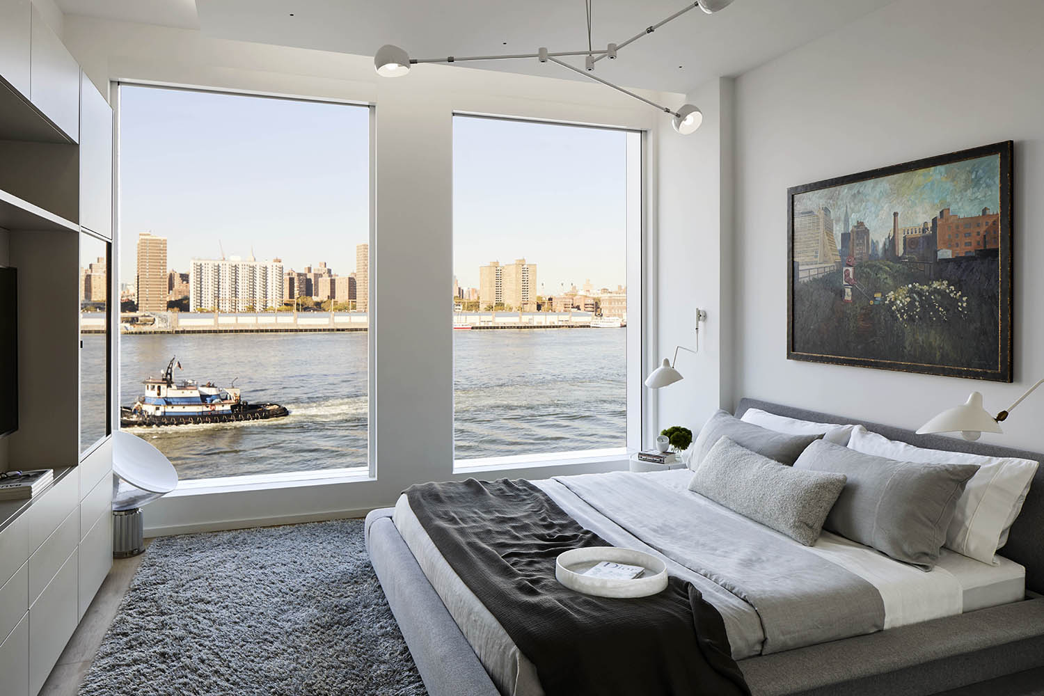
Design by West Chin Architects
When one thinks of a modern space, clutter isn’t normally part of the equation. Therefore, storage is key. In a bedroom, West Chin of West Chin Architects usually opts for a simple storage system that can serve multiple purposes, including housing a television.
“The bedroom is a personal and intimate space, so it shouldn’t be dominated by the television,” says Chin. “Either hide it or display it intentionally by incorporating it into the millwork. Here, Chin selected a contemporary storage system by Porro, which he carries at his West | Out East stores.
8. THINK CRISP AND CLEAN
Design by Melanie Millner of the Design Atelier
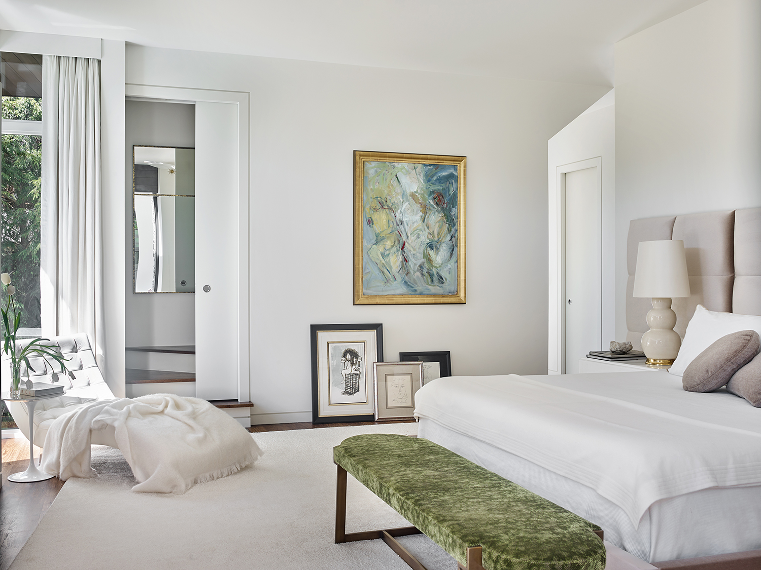
You can’t go wrong with a mostly pale color scheme with just a fews pops of color, which is why we're so drawn to neutral bedroom ideas. “A clean, bright palette always seems to modernize a space,” notes designer Melanie Millner of the Design Atelier. “In a bedroom, you want to create a Zen-like experience to unwind from the hectic activities of the day. Whites and greens are like a breath of fresh air.”
Meanwhile, Kanakis suggests looking to nature when selecting colors for a bedroom, and pairing those with a classic pattern: “Soft tones that recall the beach and the sunset mixed with more formal striped bedding creates an unfussy yet crisp modern scheme,” she says.
9. DITCH THE BOX SPRING
Design by West Chin Architects
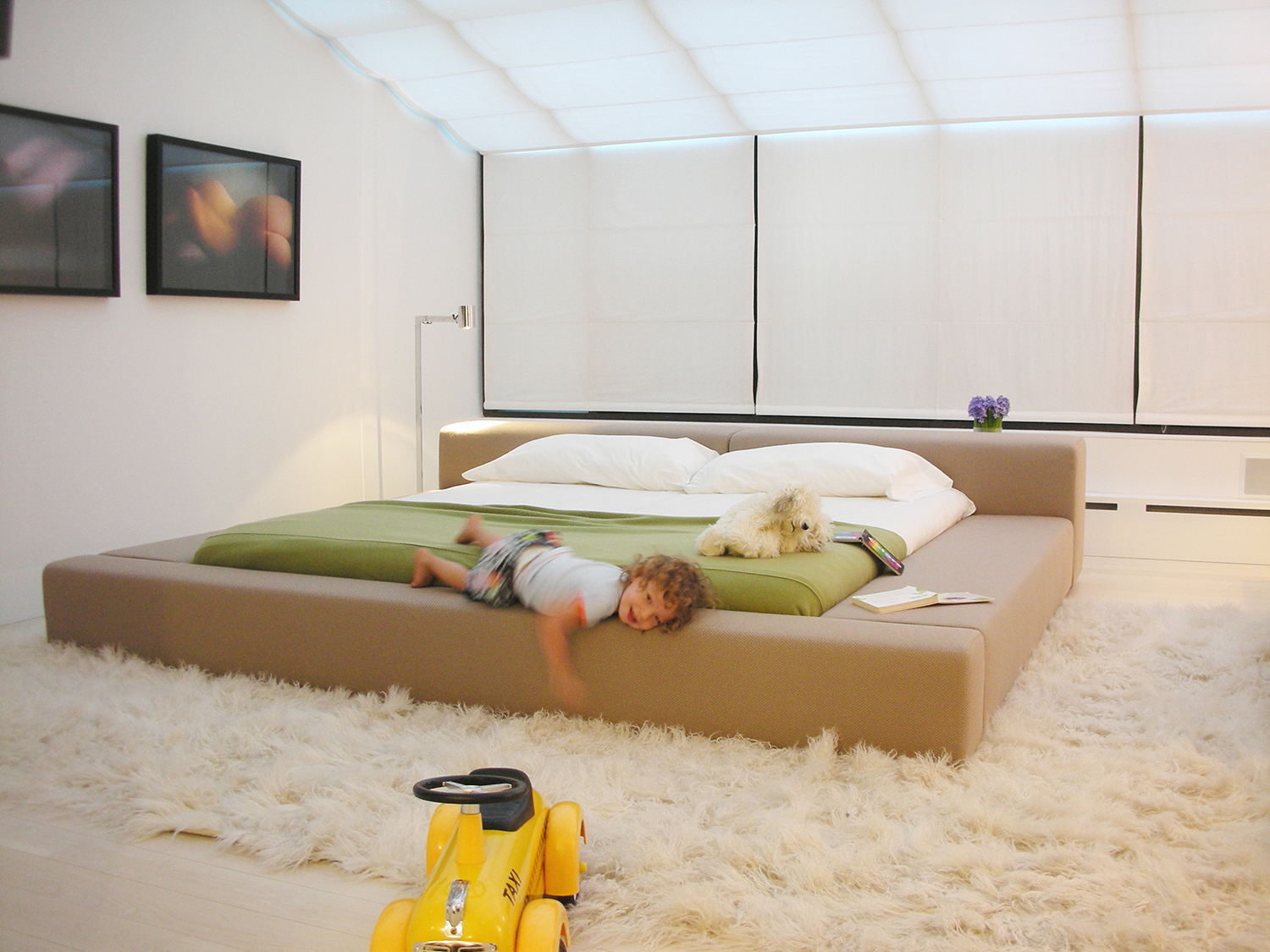
The bed sets the tone for the entire space, so when redecorating or modernizing a bedroom, it’s a good place to start. “The bed is the focal point, so instead of a double-stacked mattress, opt for something sleek,” says architect West Chin. A modern, low-lying platform bed will instantly transform the room. In this townhouse bedroom, a bed by Living Divani takes center stage, while a cozy, high-pile rug keeps the space from feeling too cold.
10. KEEP IT SIMPLE
Design by RC Studio
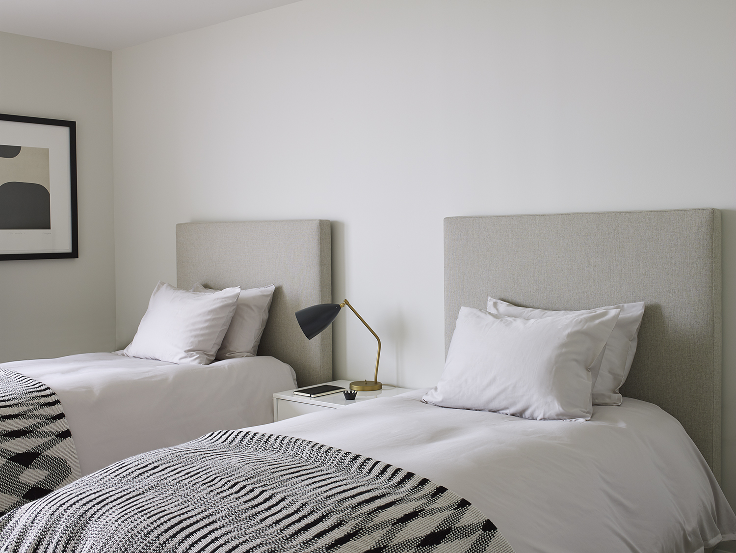
According to Rena Cherny of RC Studio, a mountain of throw pillows is unnecessary. “Getting into bed, as well as making it in the morning, should be easy rituals, so I like to have a single decorative pillow and luxurious linens,” she says. Instead, she brings in interest through minimal accent pieces and textiles. Here, a neutral scheme is jazzed up with black accents, including a Danish table lamp, artwork, and a geometric Missoni blankets. “These moments of contrast result in modern sophistication,” says Cherny.
Be The First To Know
The Livingetc newsletters are your inside source for what’s shaping interiors now - and what’s next. Discover trend forecasts, smart style ideas, and curated shopping inspiration that brings design to life. Subscribe today and stay ahead of the curve.

Alyssa Bird is a New York−based freelance writer and editor with experience covering architecture, interior design, travel, hospitality, and real estate. She has held editorial positions at Architectural Digest, Elle Decor, Hamptons Cottages & Gardens, and New York Cottages &Gardens. When she’s not writing about dreamy spaces, you can find her tweaking the decor in her own Brooklyn home, honing her green thumb, testing out a new recipe, or scouring for antiques.
-
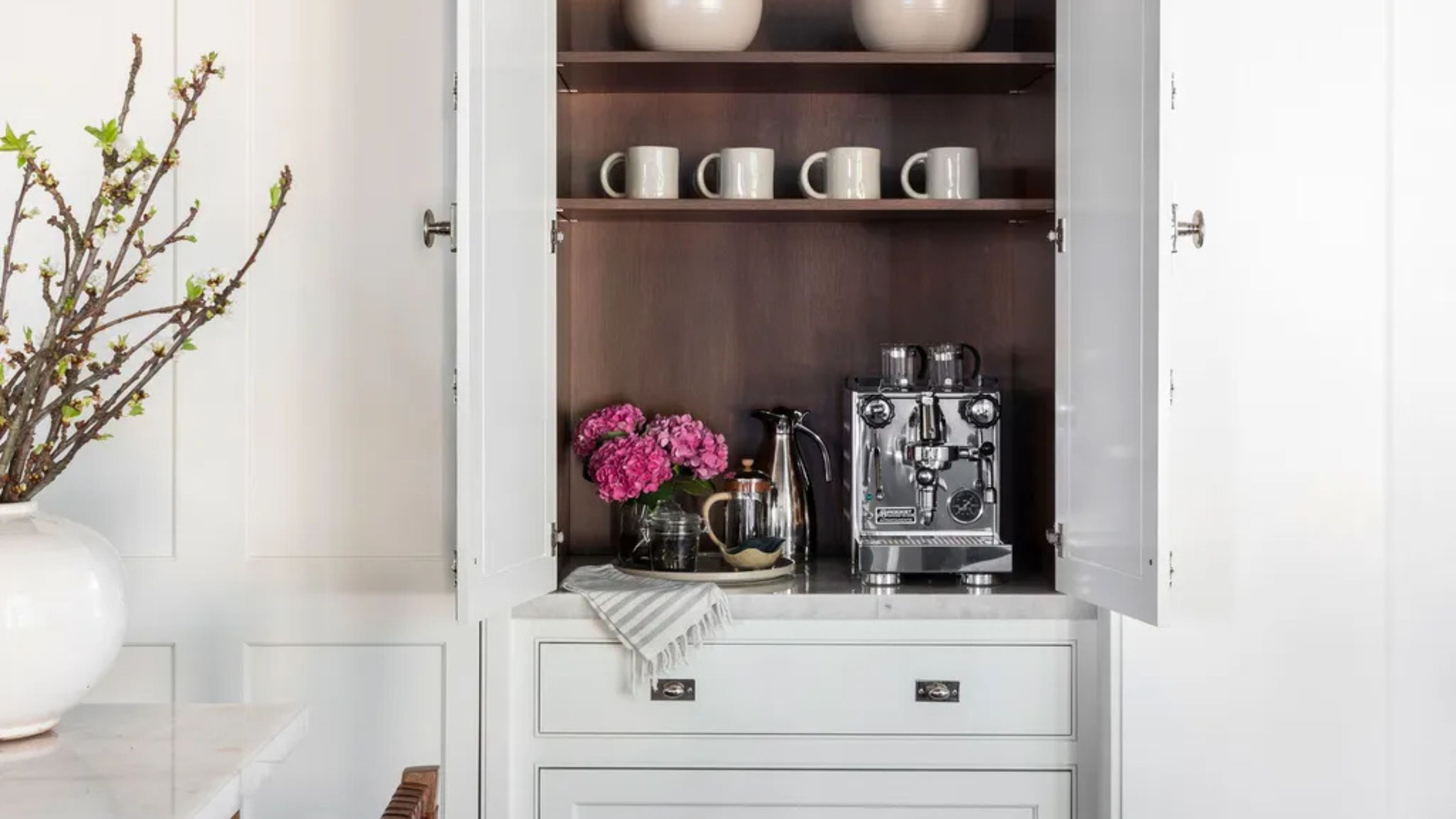 Turns Out the Coolest New Café is Actually In Your Kitchen — Here's How to Steal the Style of TikTok's Latest Trend
Goodbye, over-priced lattes. Hello, home-brewed coffee with friends. TikTok's 'Home Cafe' trend brings stylish cafe culture into the comfort of your own home
By Devin Toolen Published
-
 5 Bathroom Layouts That Look Dated in 2025 — Plus the Alternatives Designers Use Instead for a More Contemporary Space
For a bathroom that feels in line with the times, avoid these layouts and be more intentional with the placement and positioning of your features and fixtures
By Lilith Hudson Published