Modern farmhouse clichés to avoid – expert tips for an original take on this time-tested trend
We asked design experts for their insider knowledge to help you create a modern farmhouse interior that feels both fresh and personal
If you're wondering what clichés to avoid when designing a modern farmhouse, then it's worth stating from the start that one should never confuse clichéd with classic. There might be certain styles, motifs or pieces that you feel you've seen a million times before, but that could be for good reason. The beauty of modern farmhouse interiors is that, when done well, they transcend passing fads and trends. If an aesthetic draws on references that have been around for half a century or more, you can probably count on it to look good for years to come.
Whether you're hoping to channel the laid-back comfort of a modernist upstate bolthole, or the restraint of a Shaker-style interior, you can still ensure your take on modern farmhouse design feels unique. Perhaps the best way to create a space that doesn't date is to tap into what resonates with you and fits with your lifestyle, as an authentic home will endure the passing of time much better than one informed only by current trends.
'If you don't have a clear understanding of who you are, and how to express that in your home, it's easy to become distracted and create what you think is appropriate rather than what is meaningful.' says Australian stylist and author Natalie Walton, whose own interior style is informed by her early childhood in the English countryside, as well as summer holidays spent in French farmhouses. 'Everyone's style is different because we've all taken different journeys in life,' she continues. 'To this day, I am drawn to the humble simplicity of time-worn stone and raw timber for no other reason than that it feels good.'
The key takeaway is to tailor the aesthetic you're trying to achieve so that the spaces you inhabit encompass some, if not all, of the elements that bring you joy. Whether that means overhauling a rural abode with a minimalist scheme, or integrating your love of color into a rustic farmhouse interior. If you're keen to steer clear of clichés, then the following expert ideas set a good example of how to embrace originality, whatever your personal style.
8 WAYS TO AVOID MODERN FARMHOUSE CLICHÉS
1. DON'T FEEL CONSTRAINED BY A NEUTRAL PALETTE
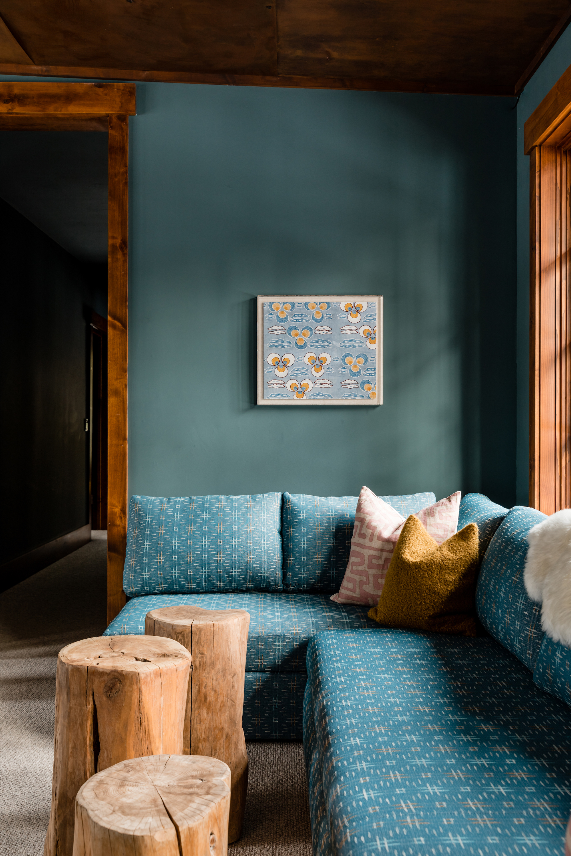
When Colossus Mfg. studio remodeled this Lake Tahoe home, they didn't shy away from using strong colors, whether in the dark-painted living spaces, the rich-hued bedrooms or this cozy L-shaped seating area. 'Our goal for this home was to create a collected, lived-in feeling by using a mix of mountain-inspired and modern elements throughout,' says studio co-founder Christina Valencia. 'We wanted to make the space fresh and youthful for a young family, yet still distinctly grounded within its surroundings.' The deep teal paint color that's been applied to the walls here works particularly in combination with the warm wooden window frames and tree stump tables that offer a rustic touch that nods to the home's location.
2. ELEVATE FARMHOUSE STYLE WITH LUXURIOUS TOUCHES
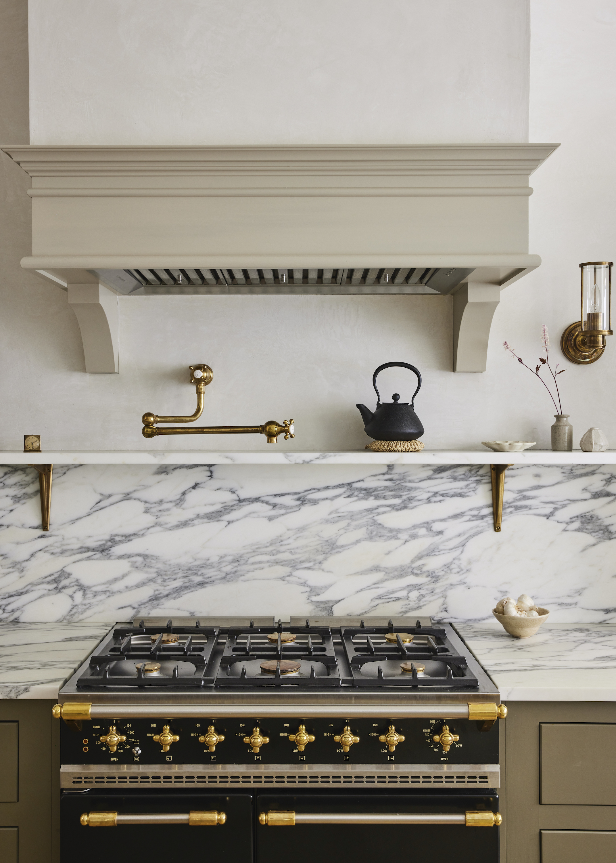
This Queen Anne Victorian brownstone in Jersey City was painstakingly restored by its owners, with help from And Studio and deVOL Kitchens. 'Our Classic English and Shaker furniture was the perfect choice for the room, and a home so full of charm and history,' says deVOL's creative director Helen Parker of the space, which pairs timeless modern farmhouse kitchen cabinetry with luxurious touches, such as the Arabascato Corchia marble worktop and backsplash. Lustrous aged-brass accents further elevate the aesthetic, including the patinated shelf brackets and handy pot filler tap, also by deVOL.
3. HONOR A CONTEMPORARY EXTENSION WITH A MODERN INTERIOR
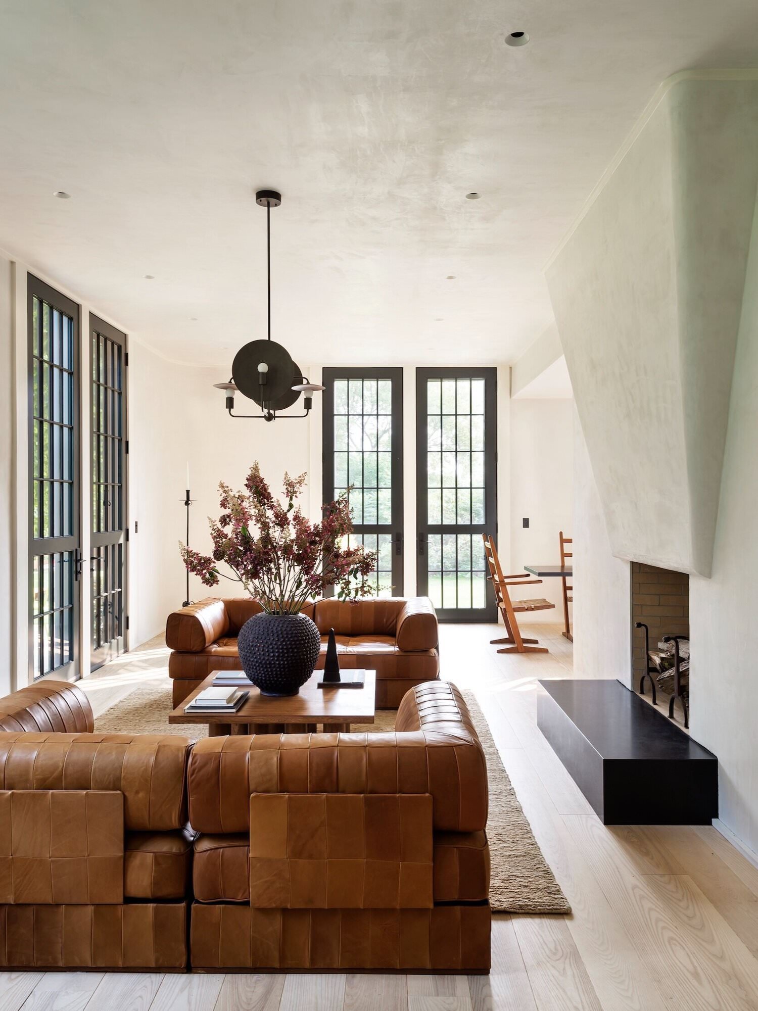
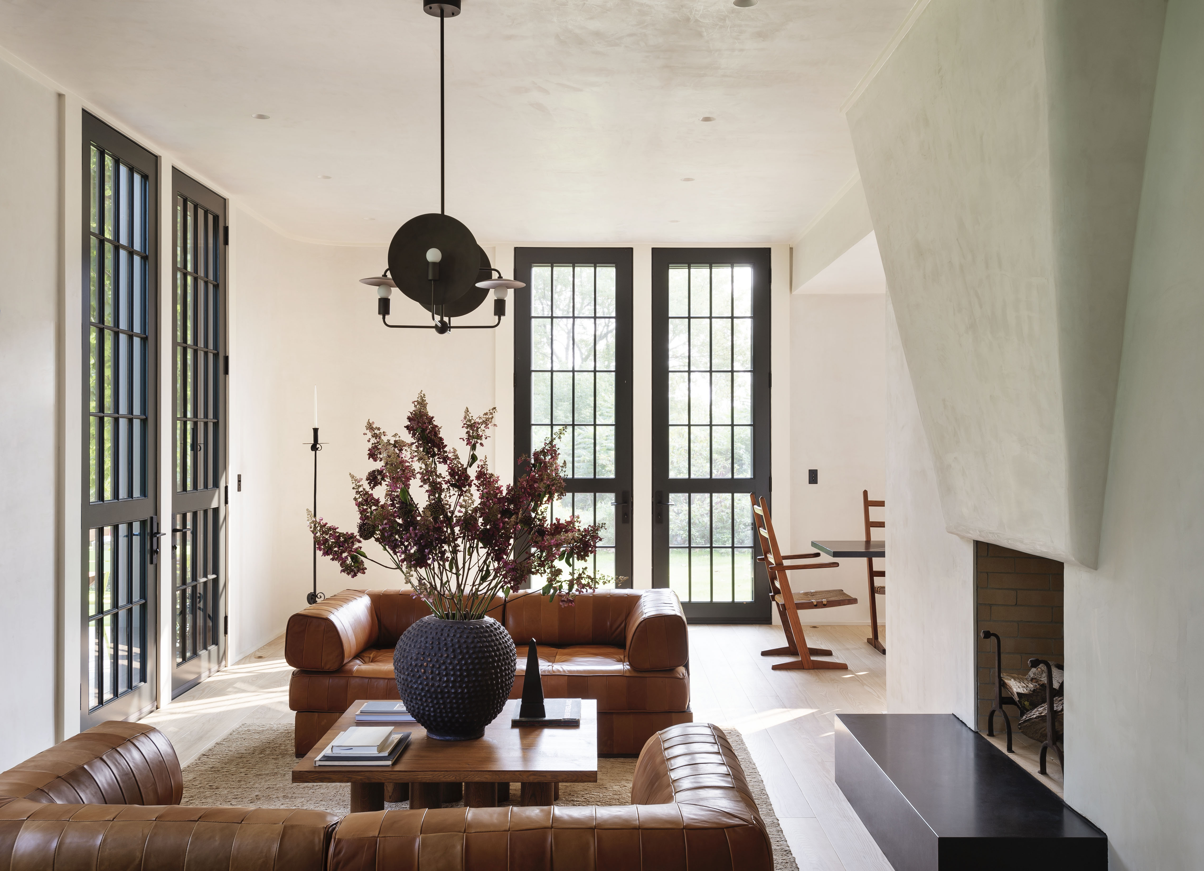
When Workstead overhauled this 19th-century Victorian home in Hudson Valley, they expanded the original structure with a contemporary clapboard pavilion. In keeping with this interplay of old and new, the homeowner requested a decisively modern interior for the new extension. 'The interior design of the original home plays into the 19th-century architecture, while the pavilion reflects a minimalistic approach with clean lines and natural hues,' say the designers. In the modern farmhouse living room, a Workstead Orbit chandelier hangs above a pair of leather de Sede DS88 sofas, while floor-to-ceiling glass doors open out onto five acres of farmland
4. TRY A STRIPPED-BACK APPROACH TO THE COUNTRY KITCHEN
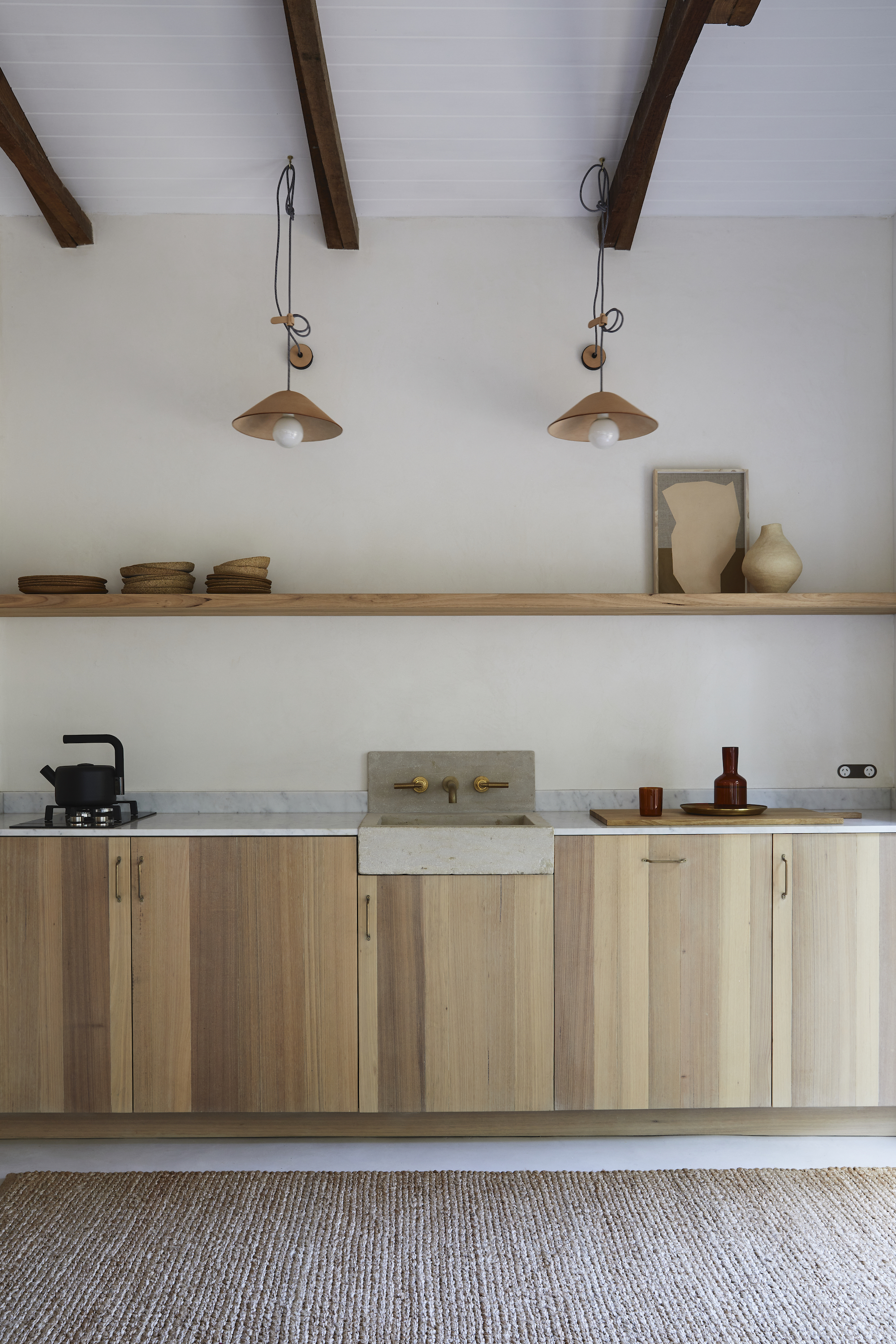
While a classic fitted farmhouse kitchen will never go out of fashion, it might feel a little too traditional for a contemporary home. If you're on the hunt for an alternative, why not follow Australian stylist Natalie Walton's lead, and opt for a row of unfussy natural timber units for a modern kitchen? If you can manage without the additional storage, then swapping wall-hung cabinets for a single shelf will add to the streamlined feel, while textural elements – such as the leather pendant lights, concrete sink and jute floor rug – are practical ways to enliven a space. 'As we spend so much time in the kitchen, let’s make it a place that delights the senses and feels inviting,' advises Natalie.
5. EMBRACE AGRARIAN STYLE AND UTILITARIAN MATERIALS
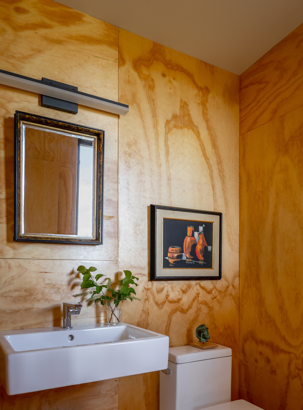
This home and creative retreat in Tieton, Washington, belongs to artist and collector Michael Northrup, who enlisted Best Practice architects to build a house to sit alongside the decommissioned apple warehouse that first drew Michael to the site.
'I love living near structures with tangible human history. There are recipes, drawings, and even romantic scribbles on the plywood walls,' says Michael. To link the new structure to the old warehouse, Best Practice chose low-maintenance materials that reference the vernacular buildings peppered throughout this agricultural area for a modern rustic style. Think concrete blocks, corrugated metal sidings and interior plywood walls and flooring.
6. BE SELECTIVE WHEN PRESERVING ORIGINAL FEATURES
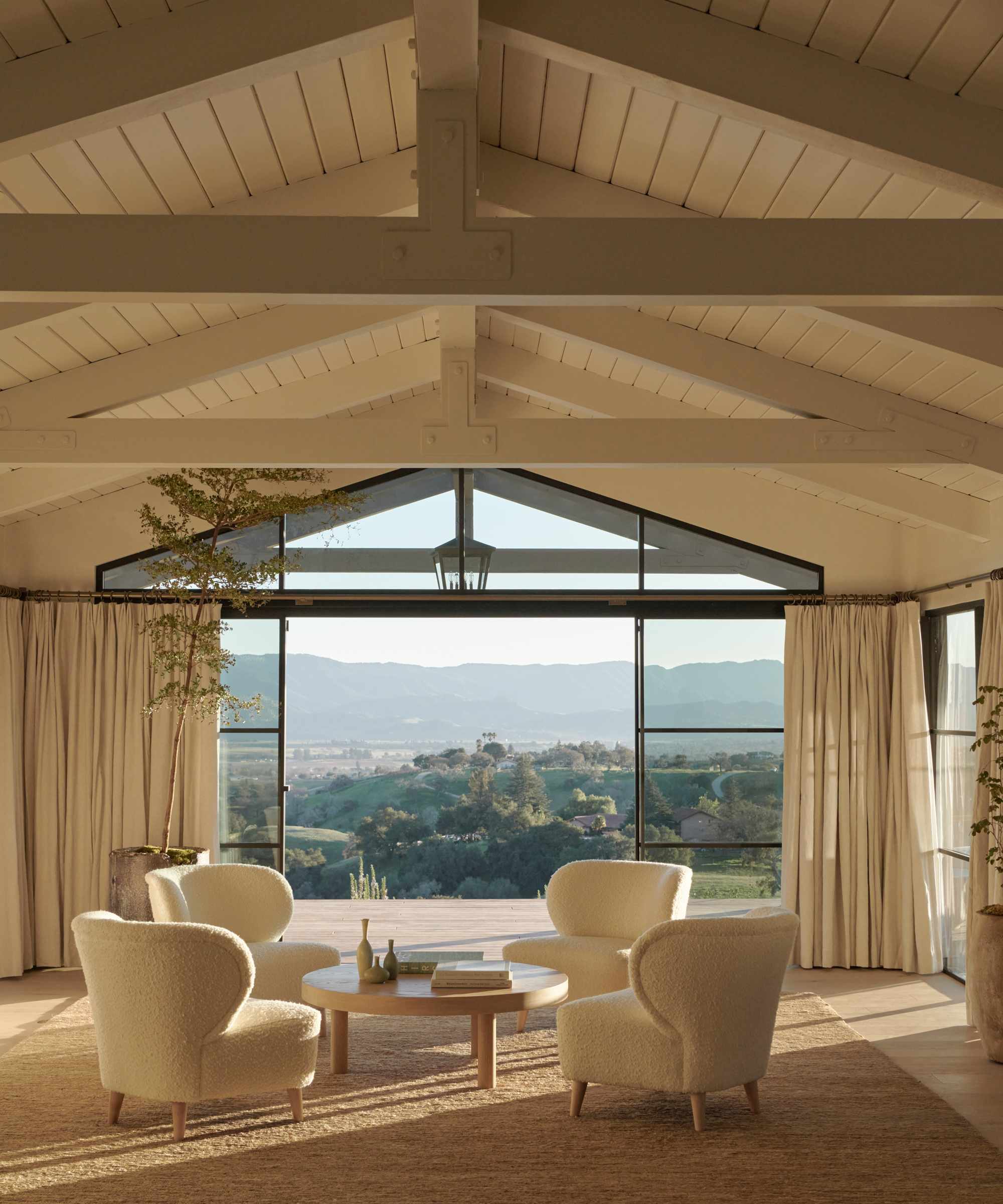
The great room at Jenni Kayne's remodeled ranch had a sunken sitting area with a look and feel that dated back to the 1970s. Jenni and her team swiftly identified what was meant to stay, such as the pitched wood ceilings, and what could go.
Rather than feeling wedded to the original features that didn't suit Jenni's vision, they chose to adjust some elements of the room’s layout, leveling out the flooring and making way for some vast windows and doors. 'Nature is always a source of inspiration, so when designing the ranch, we looked to optimize the space for indoor-outdoor living, making sure each room had its own unique view of the Santa Ynez mountains,' explains the designer.
7. INTRODUCE UNEXPECTED DECORATIVE TOUCHES
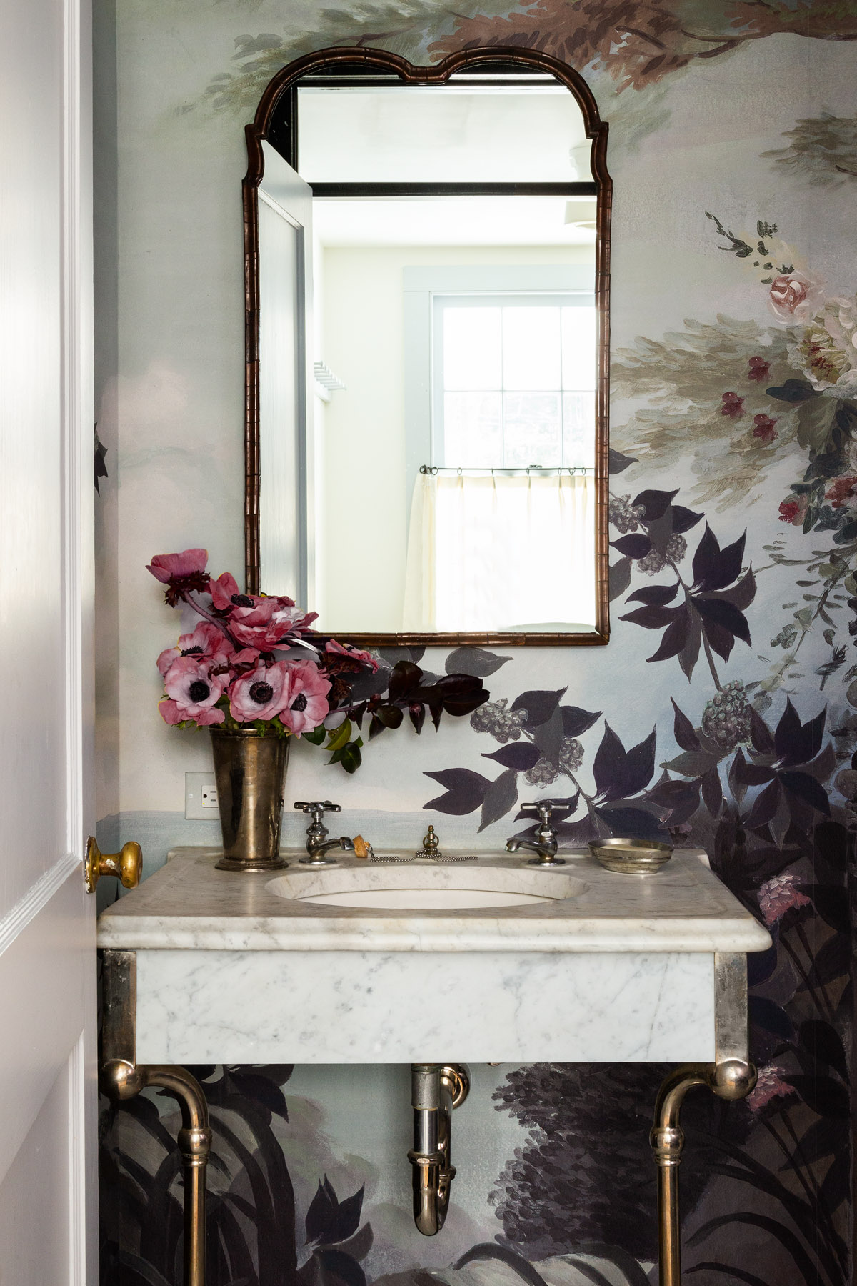
Located in New York’s Pound Ridge, Westchester County, this 1850s farmhouse was renovated by White Arrow studio. Husband-and-wife team Keren and Thomas Richter wanted to create a country retreat inspired by homes in the Cotwolds, and added in layers of pattern, rich colors, and textural fabrics. Rather than feeling bound to a pared-back modern farmhouse aesthetic, the duo opted for decorative flourishes throughout, such as the Ananbo wallpaper that lines the compact modern farmhouse bathroom. ‘We live for the small unexpected details as much as the grand gestures,’ say Keren and Thomas. ‘Our work celebrates time spent collecting, crafting and collaborating.’
8. SOURCE VINTAGE PIECES AND INDUSTRIAL ANTIQUES
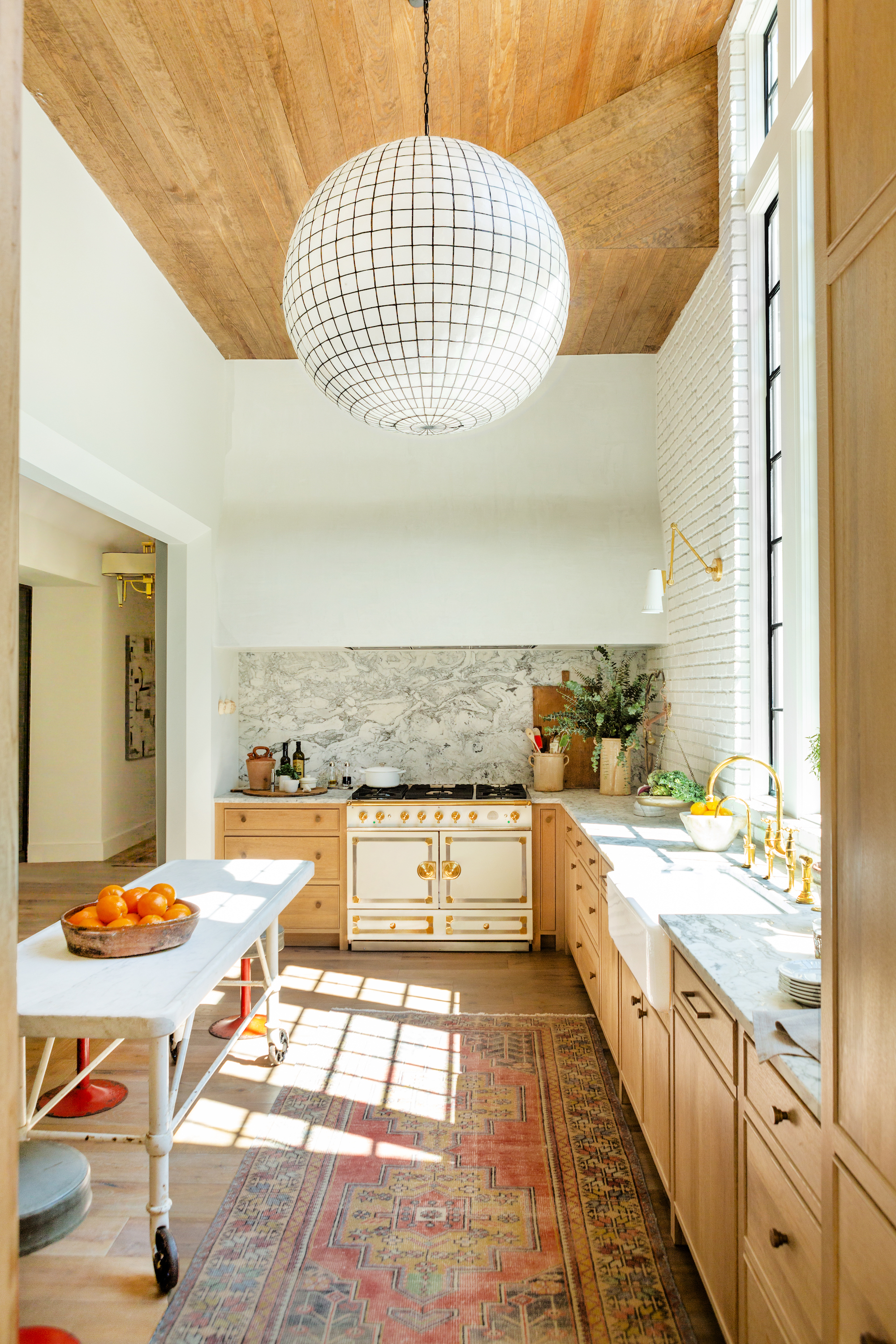
'Our design approach uses humble, tactile and familiar materials such as reclaimed wood and brick,' says designer Robin Rains, who created a truly unique kitchen in her Nashville home by mixing up the provenance and period of the pieces she sourced. A faded vintage oushak rug covers the floor, while the leather bistro counter stools where found in France.
'Instead of choosing a standard kitchen island, I bought an amazing French pastry table with a beautiful marble top that shows years of use and wear,' says Robin. 'This creates a contrast against with the more refined elements of the kitchen, such as the show-stopping La Cornue range and oversized round pendant light.'
Be The First To Know
The Livingetc newsletters are your inside source for what’s shaping interiors now - and what’s next. Discover trend forecasts, smart style ideas, and curated shopping inspiration that brings design to life. Subscribe today and stay ahead of the curve.
Tessa Pearson is an interiors and architecture journalist, formerly Homes Director at ELLE Decoration and Editor of ELLE Decoration Country. When she's not covering design and decorative trends for Livingetc, Tessa contributes to publications such as The Observer and Table Magazine, and has recently written a book on forest architecture. Based in Sussex, Tessa has a keen interest in rural and coastal life, and spends as much time as possible by the sea.
-
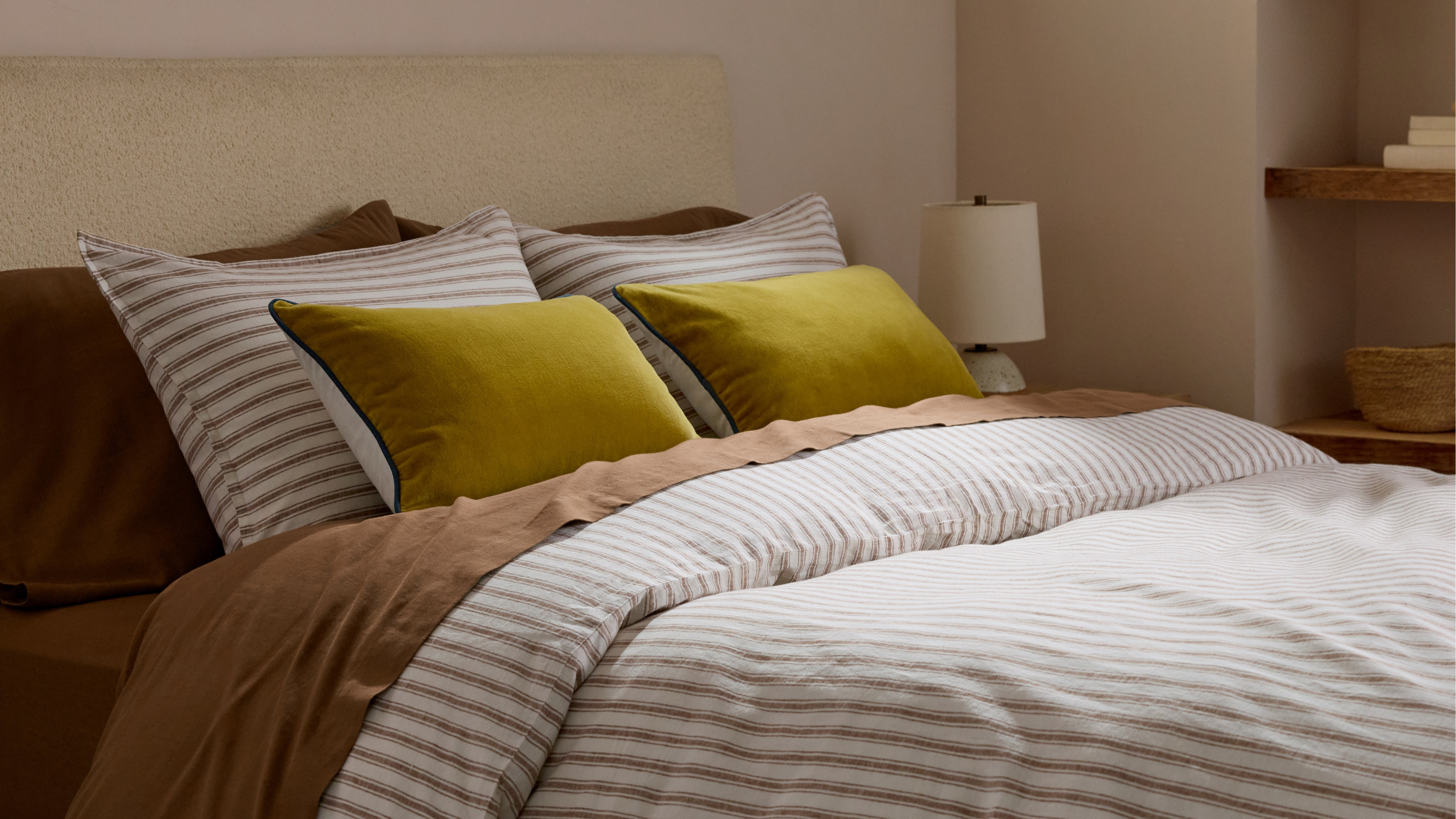 Parachute Just Dropped a Collection at Target and It's A Guaranteed Sell Out
High quality bedding and bath linens just got a lot more accessible. Parachute's signature effortlessly chic style is now available in over 200+ pieces at Target
By Devin Toolen
-
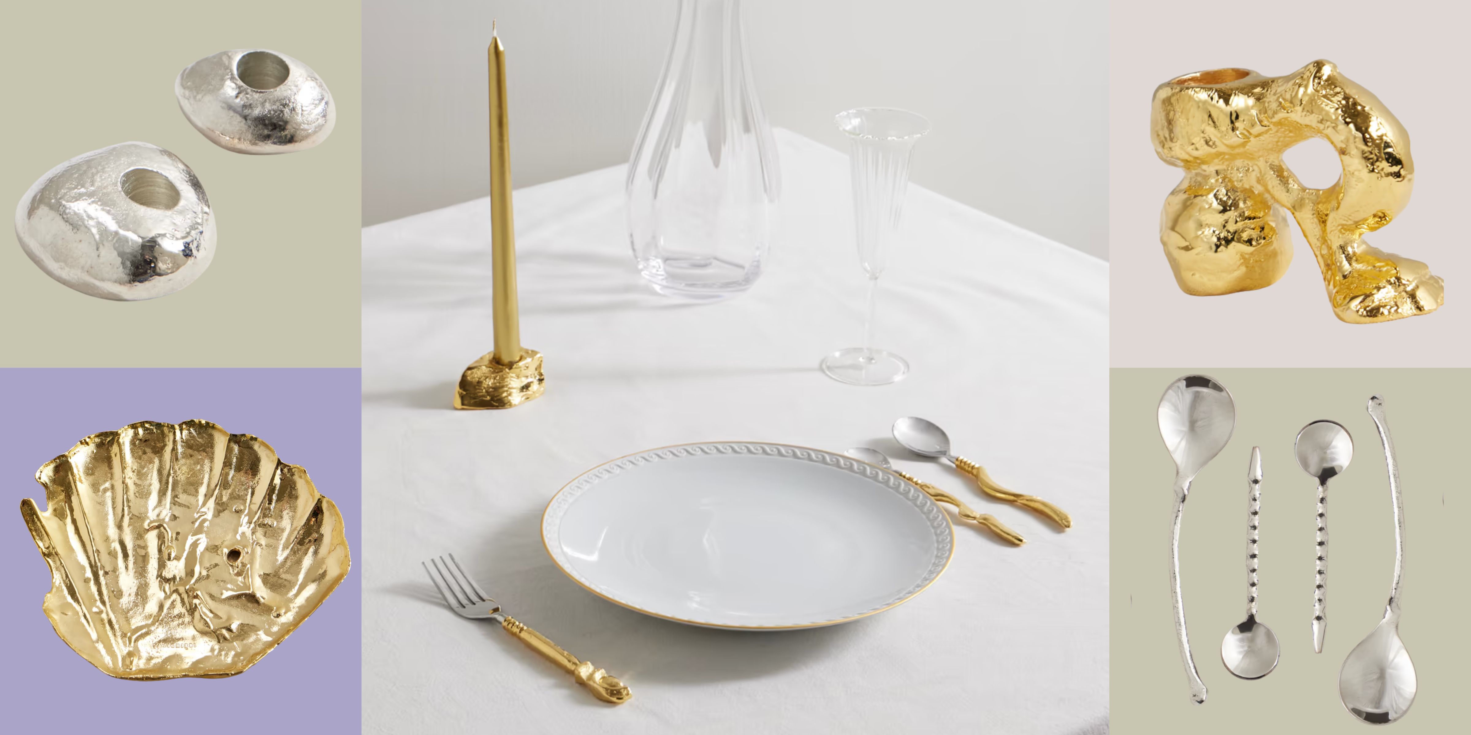 Now Serving: Jewelry for Dinner — Alighieri Brings Its Signature Raw Beauty to the Table
Alighieri CASA is what happens when a jewelry house designs your cutlery — and yes, it’s just as fabulous as it sounds
By Julia Demer