Before and after – 3 inspiring modern farmhouse makeovers, each with a unique point of view
From a reinvigorated modernist build to the restoration of a 19th-century country home, discover three very different modern farmhouse-style transformations
Whether you're embarking on a renovation or pondering a pipe dream, be warned: poring over modern farmhouse makeovers can result in the sudden urge to have a complete interiors overhaul. Perhaps it's due to the enduring style of modern-rustic spaces, or the fact that there's a farmhouse-inspired look to suit almost every taste – as these three unique projects prove.
Whatever the style or period of your home, these respectful and resourceful remodels show that sometimes, it's the smallest or simplest of adjustments that can have the biggest impact – from lightening up a dark-wood interior to reinstating a flowing floor plan. While the architecture and the interiors of each of these modern farmhouses differ dramatically, they all share a relaxed, contemporary take on farmhouse living that works as well in the city as it does in a rural retreat.
1. WHITE ARROW'S HISTORIC FARMHOUSE RESTORATION
Surrounded by five acres of lush green countryside in the hamlet of Pound Ridge in Westchester County, this dilapidated 1850s farmhouse was renovated and redesigned by White Arrow. Founders Keren and Thomas Richter initially purchased this historic home as out-of-town retreat. After a multi-year renovation, the home eventually became a full-time residence for the former Brooklynites and their growing family. 'We are committed to learning, curiosity, and great design that takes time,' say the husband-and-wife team. 'We live for the small unexpected details as much as the grand gestures.'
THE FARMHOUSE BEFORE:
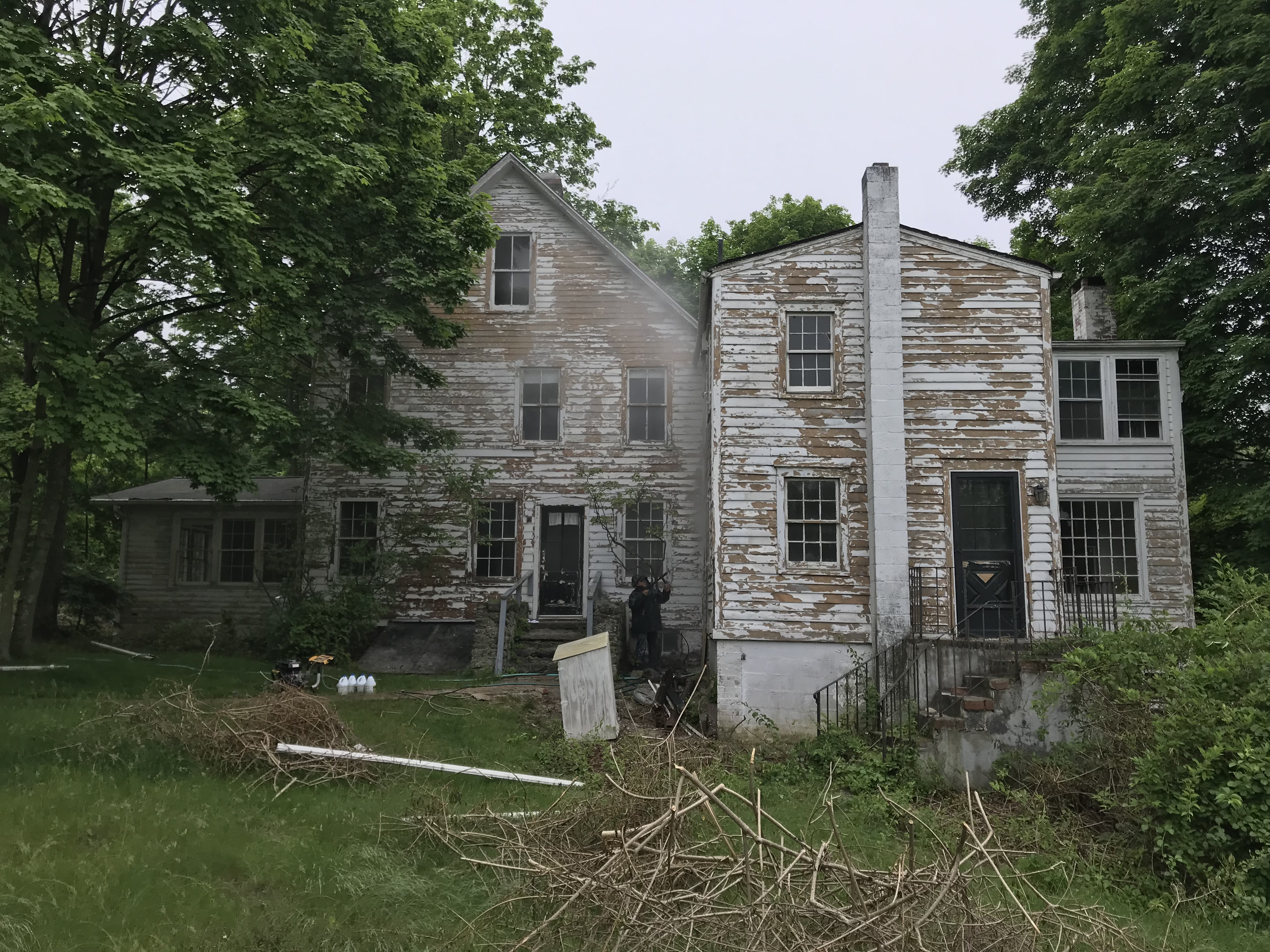
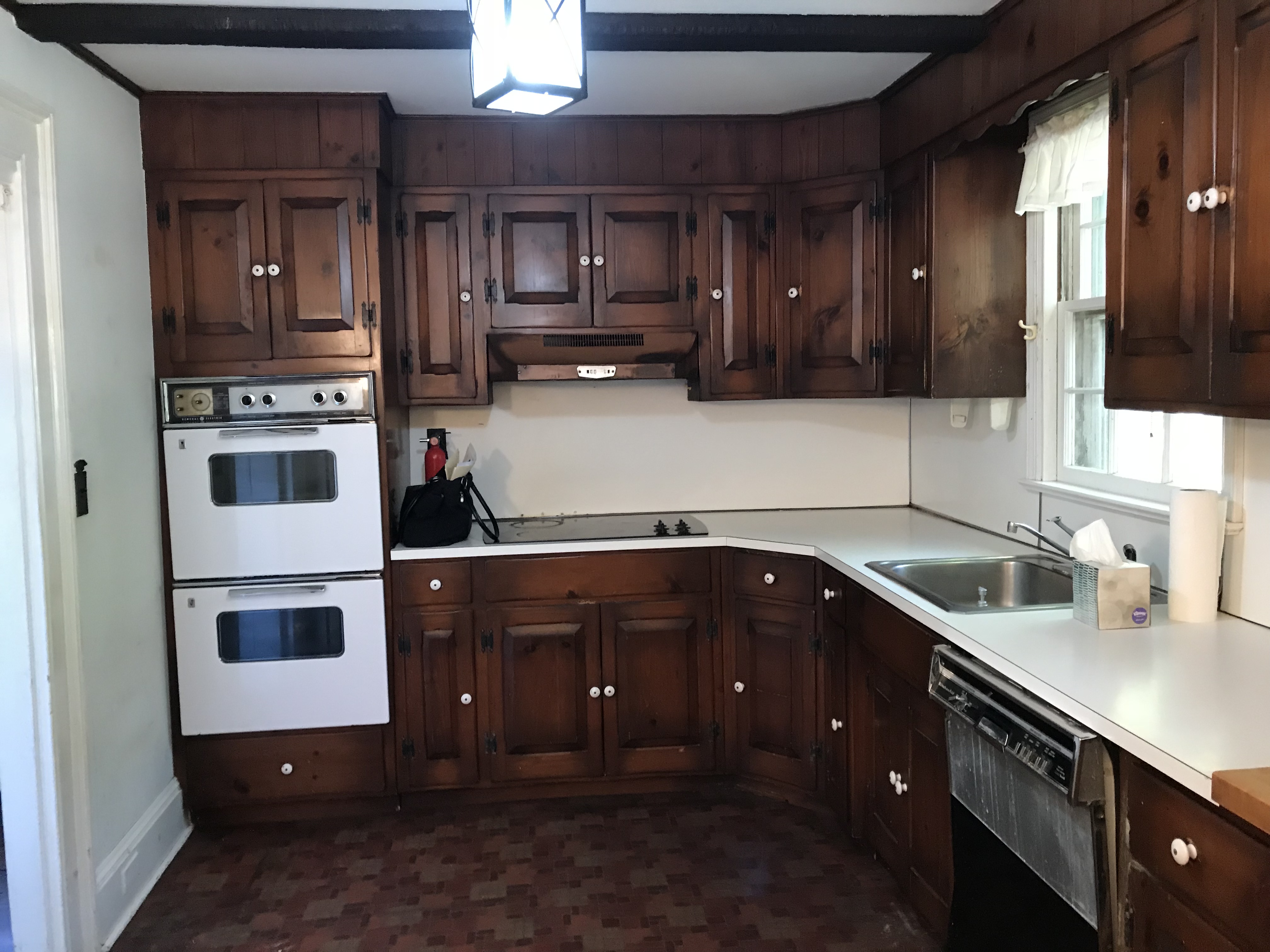
When Keren and Thomas acquired the old farmhouse it was in estate condition. The structure itself was falling apart and the interior had been stripped down to its cloth wiring and linoleum floor tiles. This provided the duo with a clean slate to realize their vision: a country retreat inspired by rural English homes in the Cotswolds.
THE FARMHOUSE AFTER:
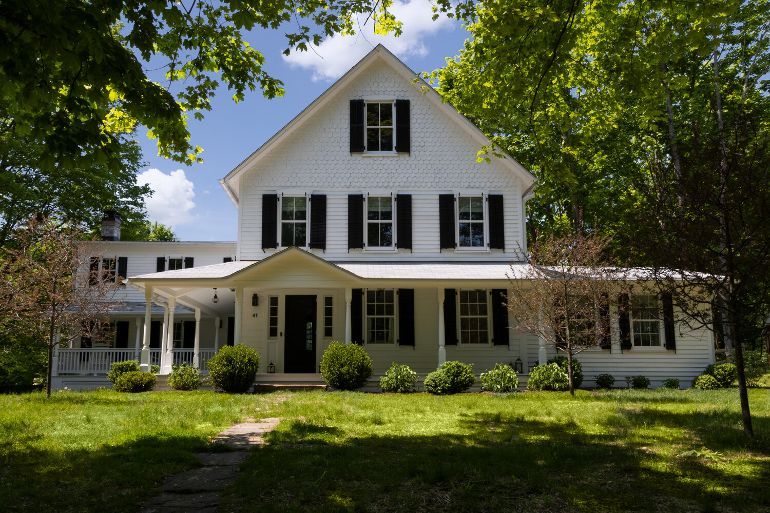
As both designers and owners, the pair wanted to act as stewards for the house, integrating some modern conveniences but ultimately maintaining the home's character. They removed any modern additions, shifted walls and window locations to create more symmetry, and restored the home’s original footprint, as well as its wraparound porch.
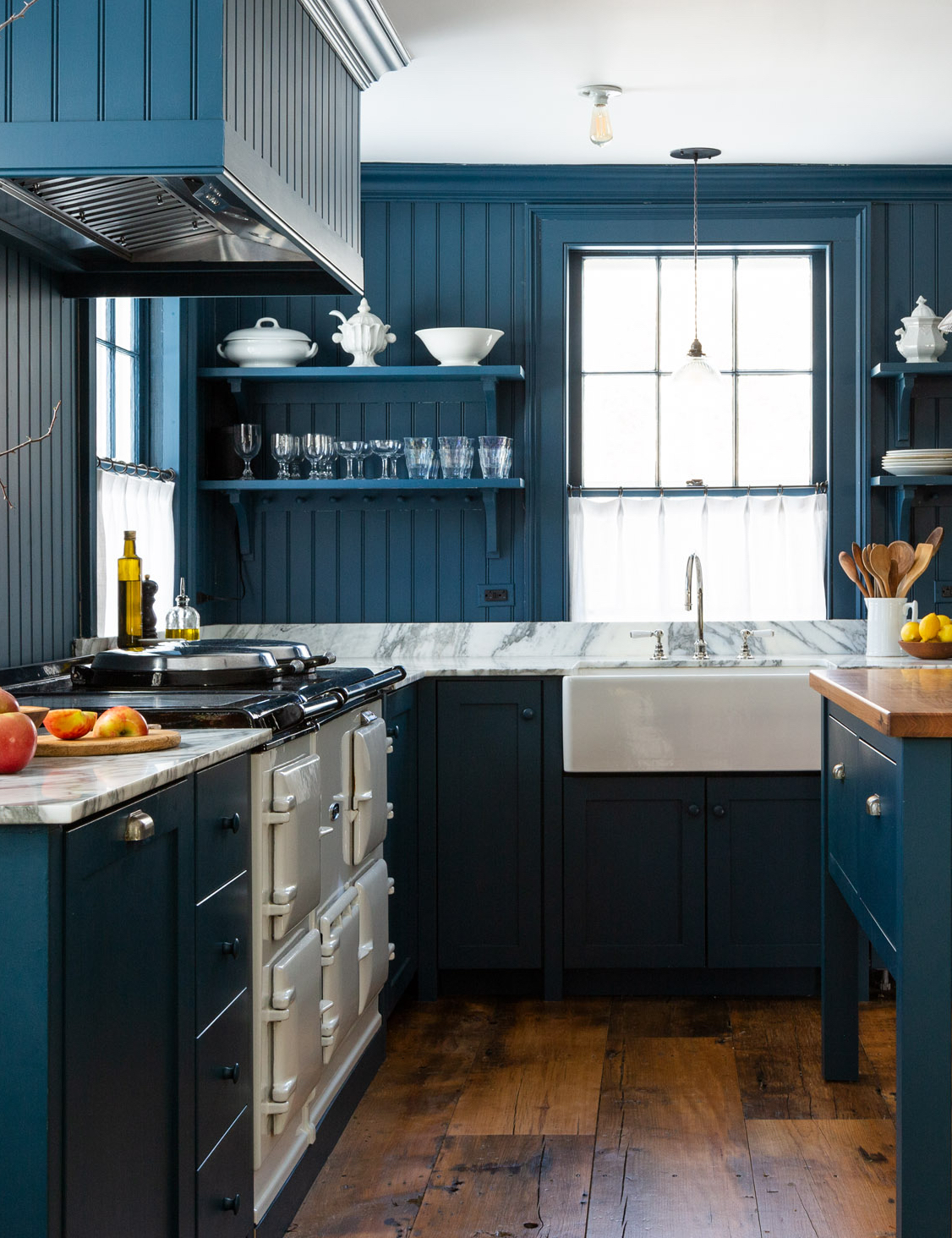
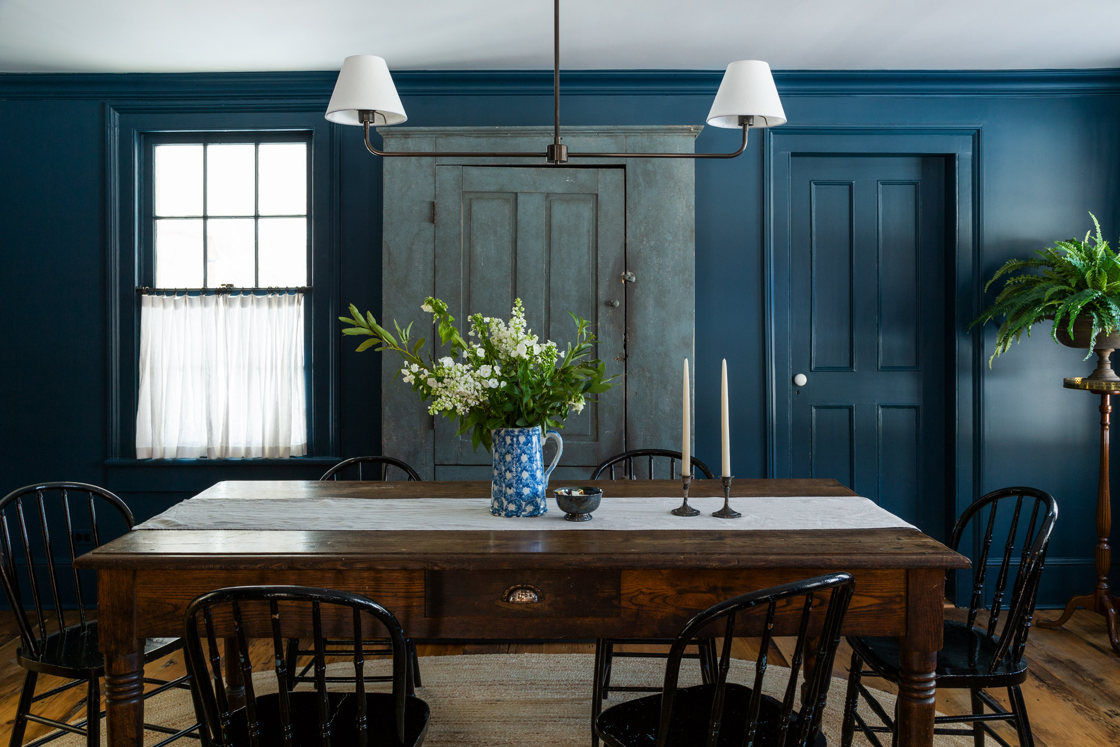
For the interiors, Keren and Thomas wanted to create a comfortable atmosphere that felt in keeping with the building's history. A vintage Aga is the now the center of the modern farmhouse kitchen, which features rich colors drawn from a quintessentially British palette. The inky blue used to paint the walls and units in the Shaker-style kitchen is by Fine Paints of Europe, and was chosen to contrast with the home’s white exterior.
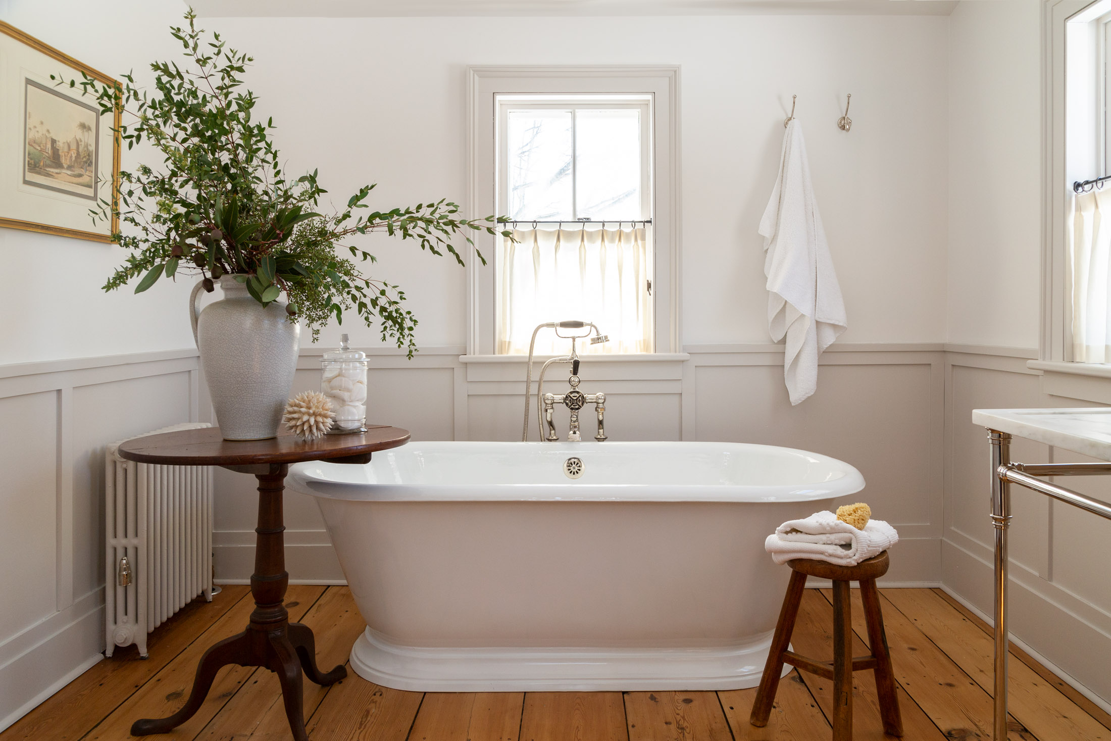
Edwardian and Victorian antiques and works are peppered throughout the home, where White Arrow have maintained a careful balance of traditional and modern elements. A mix of repurposed and reclaimed flooring retains the farmhouse's characterful feel, while elegant touches – such as this Cheviot bathtub – elevate the modern farmhouse bathroom.
2. SHED ARCHITECTURE'S MODERNIST RANCH MAKEOVER
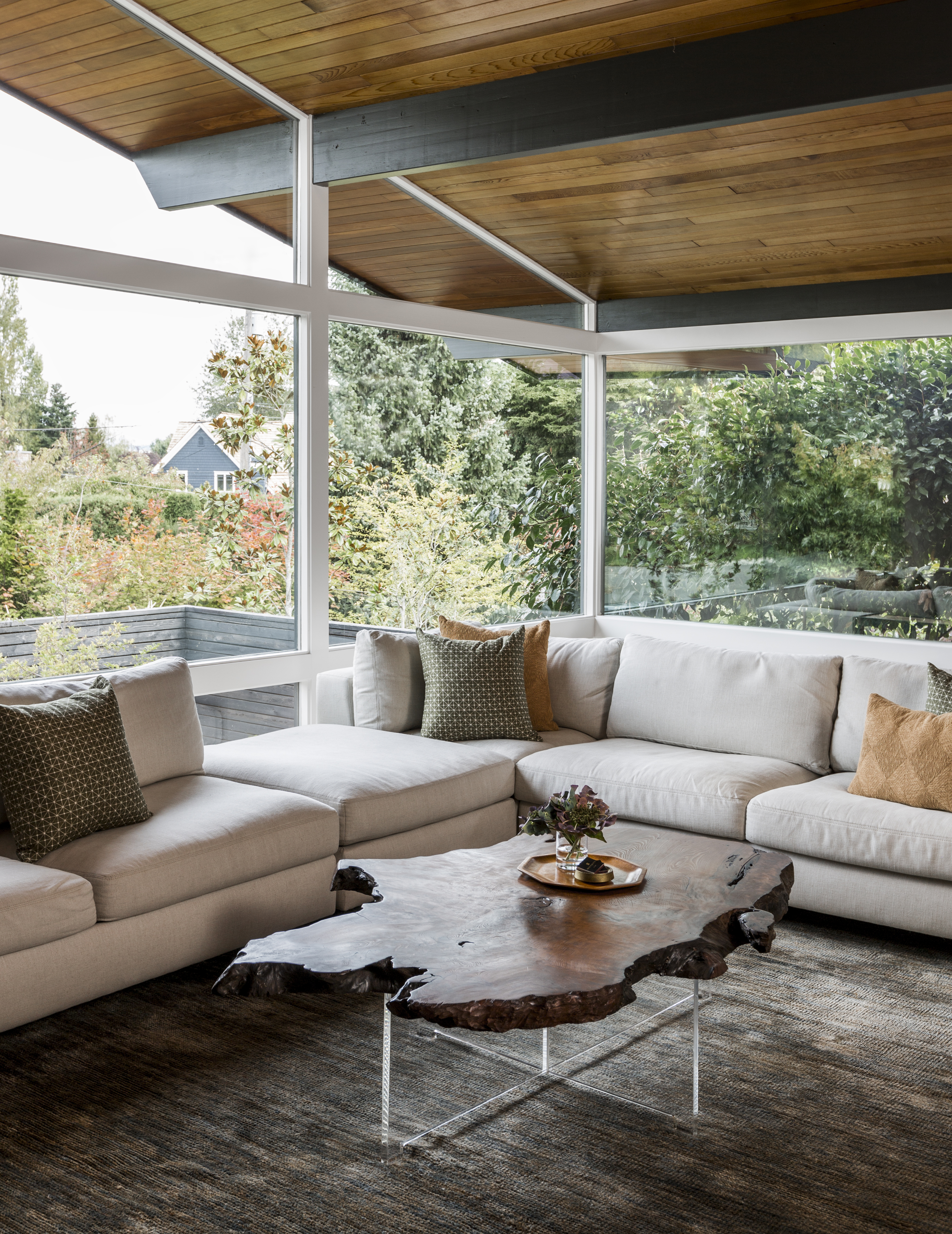
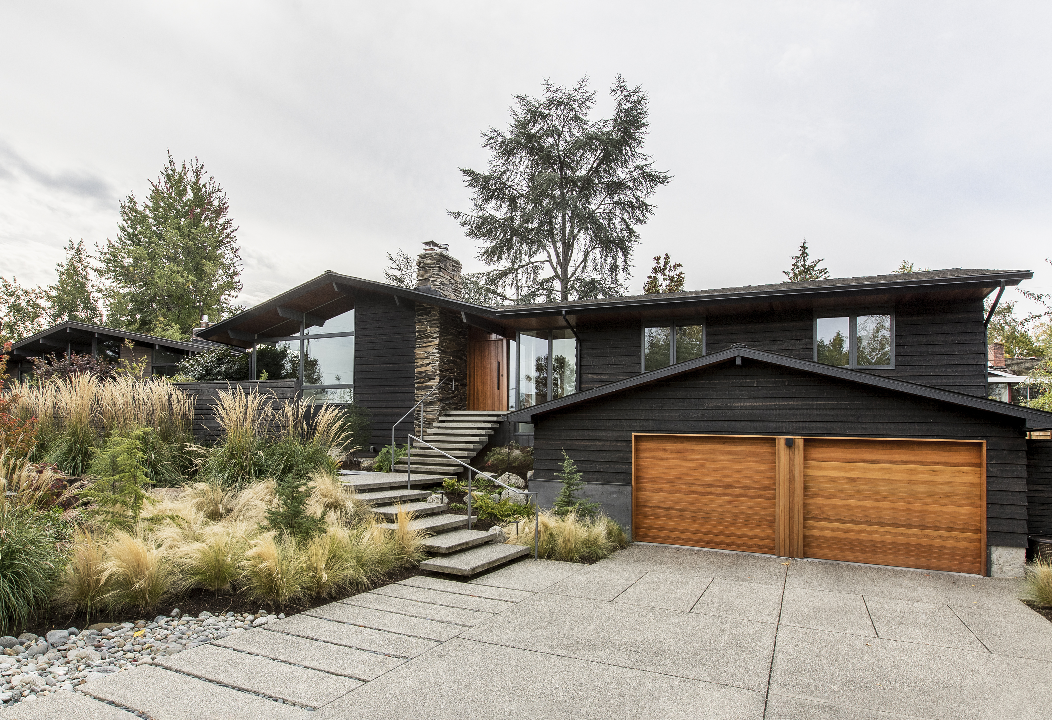
Built on a large lot in Seattle’s Madison Park neighborhood, this 1950s ranch-style home had been altered by a series of different updates over the years, diluting the essence of its mid-century design. Shed Architecture's task was to undo the various layers of remodeling, reviving the home with a cohesive aesthetic inside and for this modern farmhouse's exterior.
The practice set out to design new and naturally landscaped areas for the garden, improve circulation throughout the interior of the house and create improved spaces for outdoor living.
THE RANCH BEFORE:
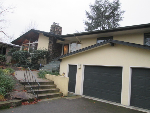
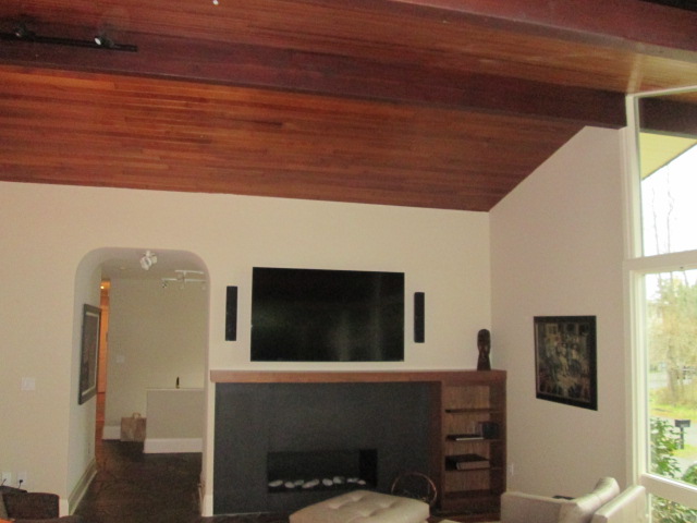
Originally built in the Northwest Contemporary style, this Seattle ranch had lost its architectural identity due to a lifetime of remodeling. 'It deserved a holistic revitalization to honor its original spirit and make it suitable for contemporary living,' say the architects, who opened up the compartmentalized floor plan to enhance a sense of connection between each of the spaces.
THE RANCH AFTER:
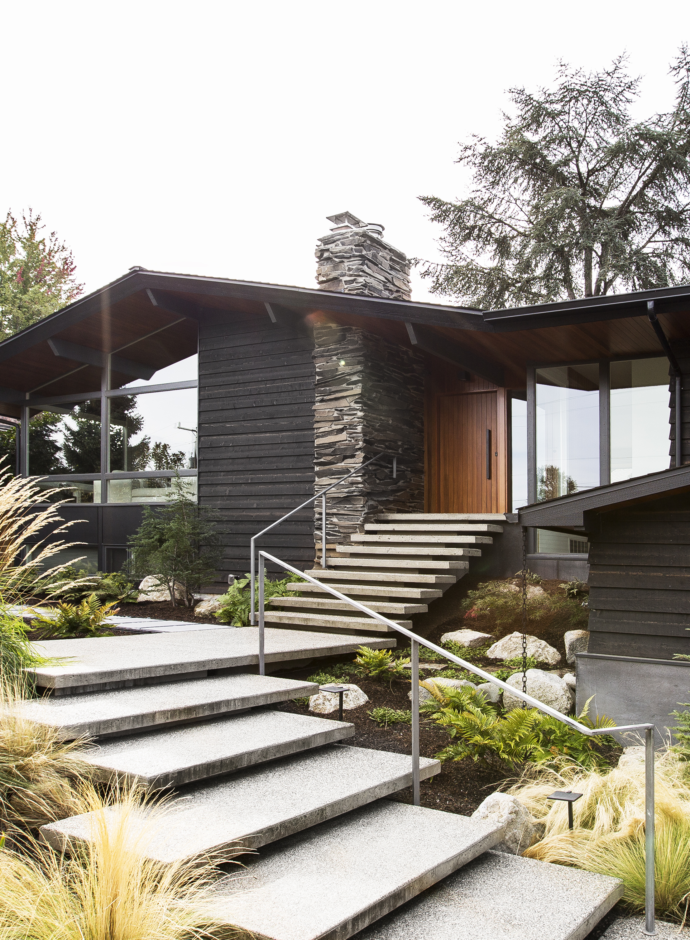
Shed selected materials that respect and complement the home’s original palette, providing a timeless and durable aesthetic for the future. Exposed aggregate concrete pavers form walkways throughout the yard, 'These paths and steps gently engage with the natural landscaping, gradually connecting the home to a series of private outdoor spaces around the property,' say the architects.
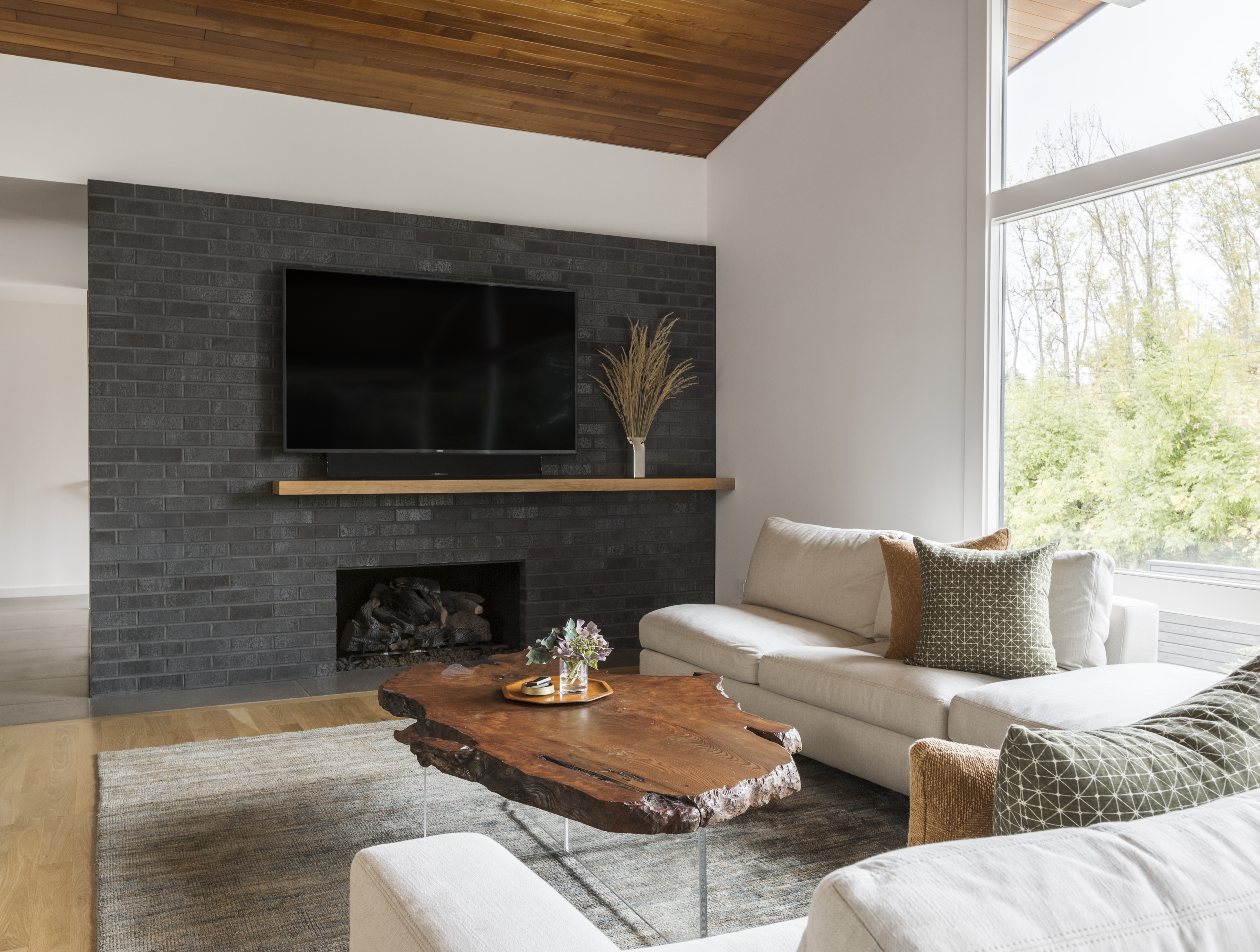
In the modern farmhouse's living room, a modernist-inspired hearth in dark brick now sits in place of the formerly underwhelming fireplace. Large windows look out on to the new, naturalistic garden, which is framed by mature trees. The old wall, with its narrow arched doorway, has been torn down to create a more open feel and an easier flow into the hallway and kitchen.
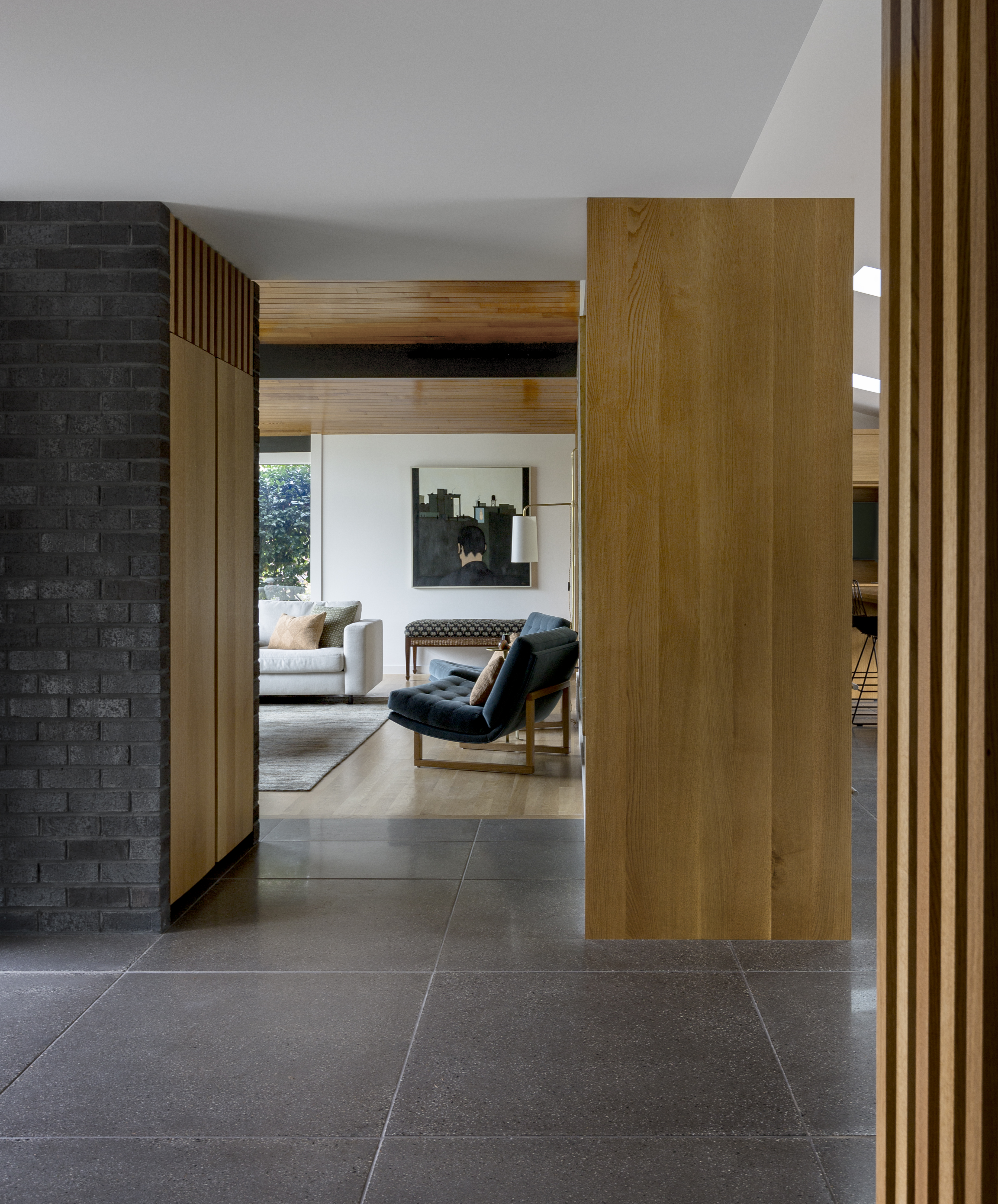
In the same way that the new floor plan better reflects the design of a Northwest Contemporary home, so do the materials that Shed selected for the remodel. Expressed aggregate concrete tiles serve as the main interior flooring, echoing the appearance of the new exposed aggregate concrete pavers outside. Timber elements add warmth and contribute to a natural palette that feels in keeping with the home's leafy location, which is close to the shores of Lake Washington.
3. LEANNE FORD'S RUSTIC CANYON CABIN REVIVAL
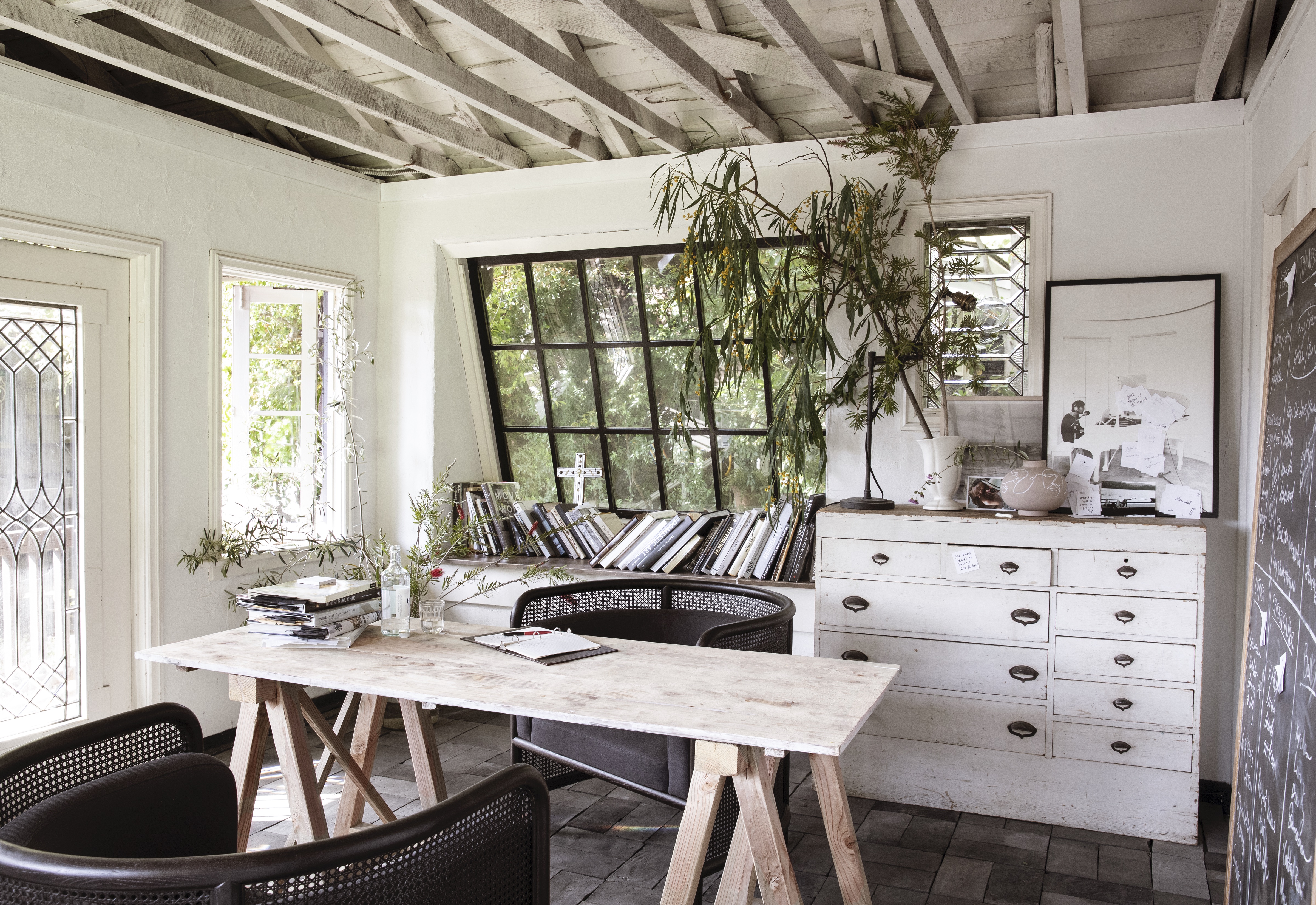
Located in Rustic Canyon, a neighborhood in LA's Pacific Palisades, this atmospheric cabin-style residence is the former home of interior designer Leanne Ford. While undeniably charming, the wood-clad interior of this quirky house was incredibly dark and somewhat oppressive before Leanne worked her magic on it. That said, the designer knew she wanted to retain as much of its original character as possible. 'I thought, 'I don’t want to fight this house; I want to go with it',' she says. 'It has storybook whimsy that I couldn’t take away.'
THE CABIN BEFORE:
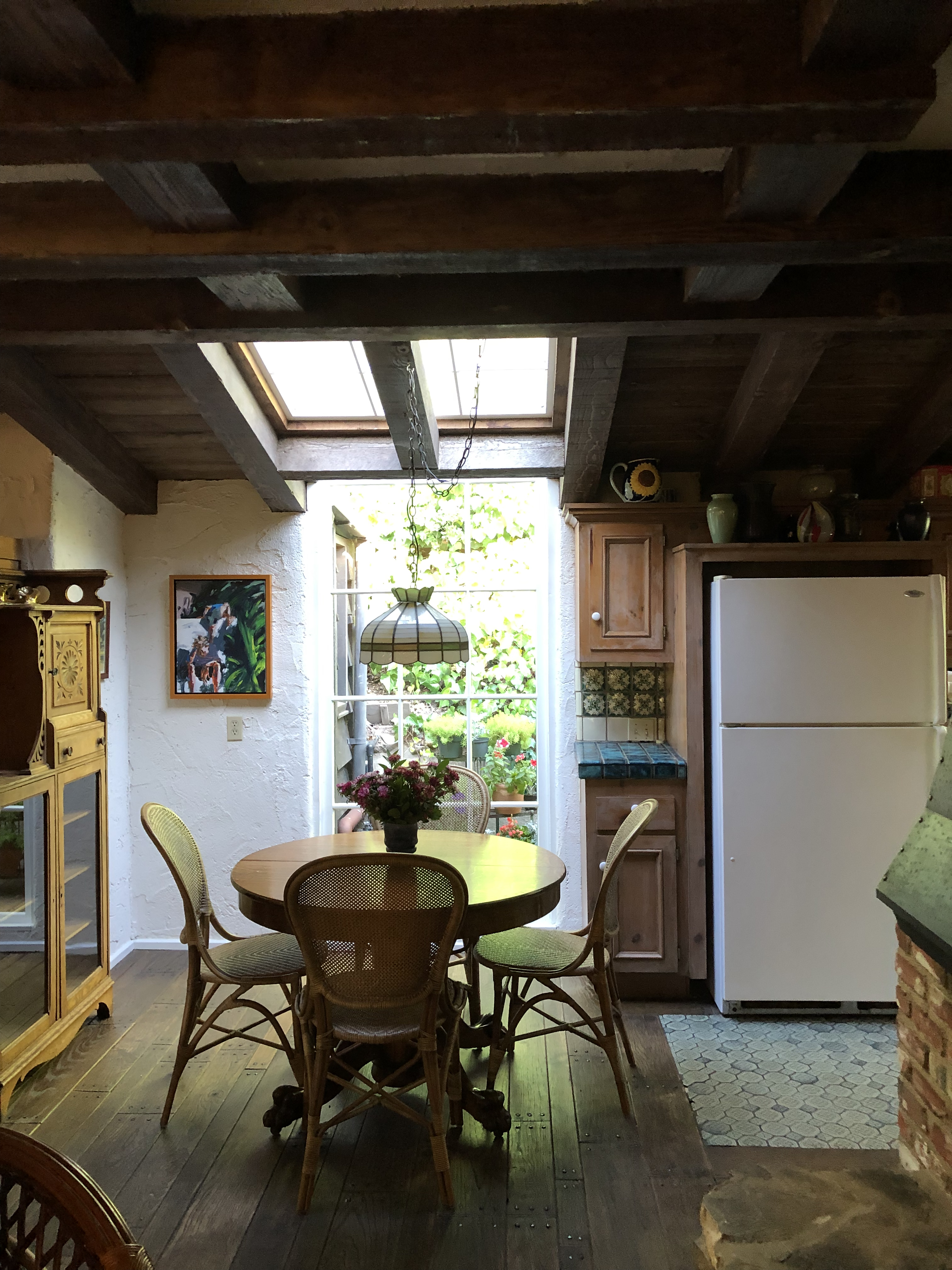
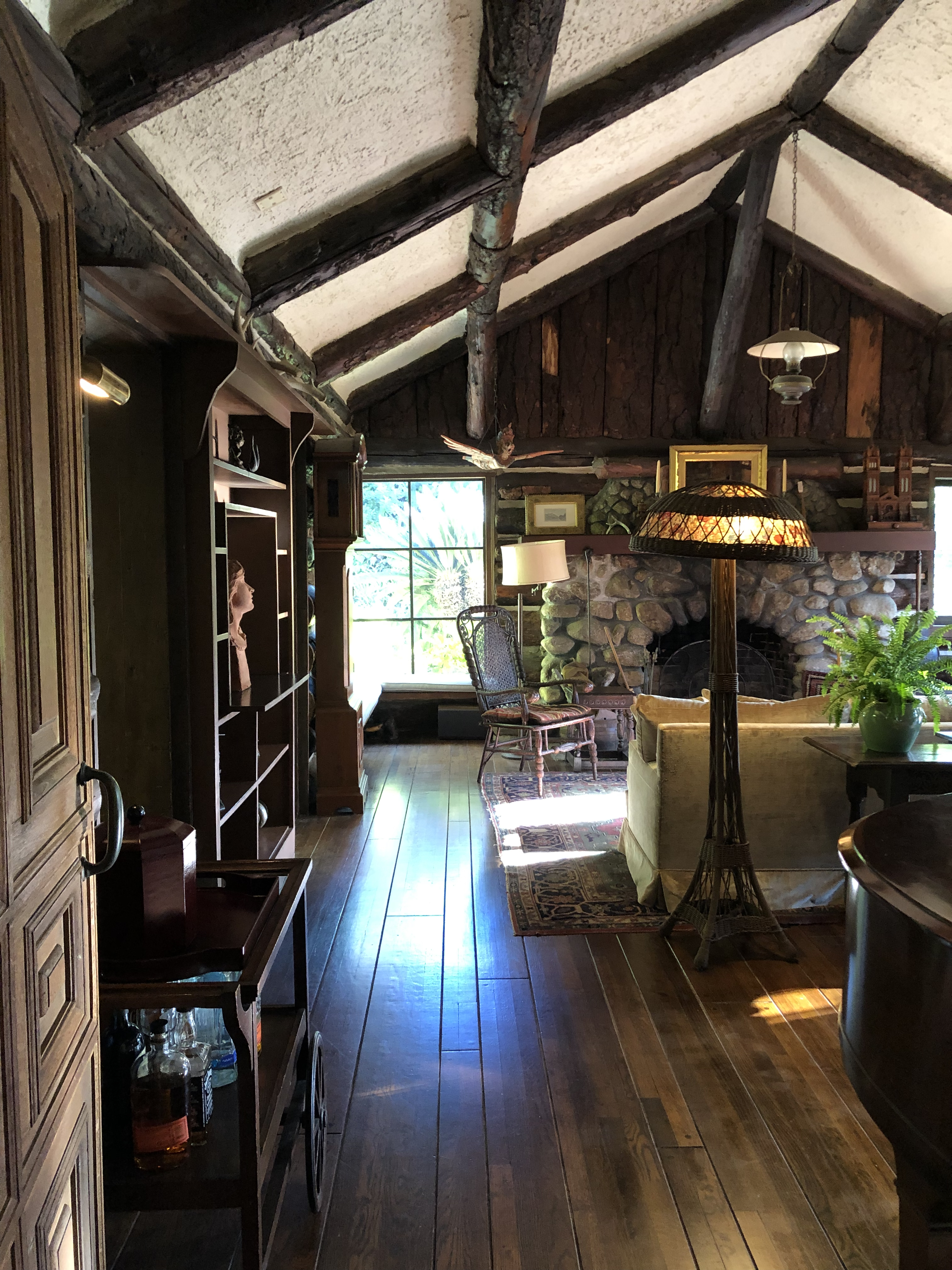
Before the makeover, this unusual home featured a lot of built-in cabinetry, as well as floors, rustic paneling and ceiling beams in dark wood. Leanne wanted to retain the important original features, such as the quirky stone fireplace, but modernize the home in a respectful way.
THE CABIN AFTER:
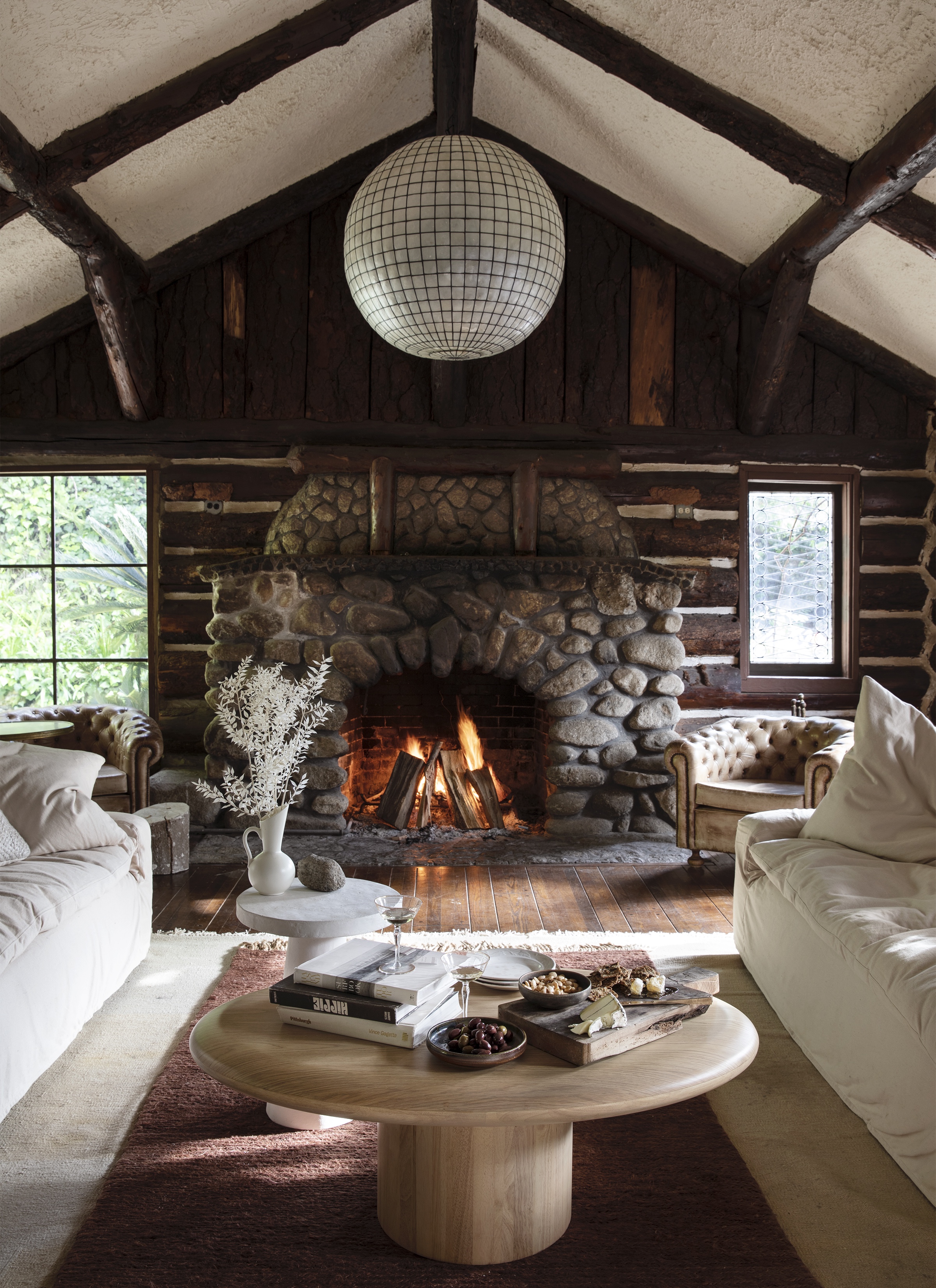
The living room was once a standalone cottage belonging to an invitation-only social club founded in 1913. The structure was brought from Lake Arrowhead and served as a movie set during Prohibition. To respect its history, Leanne didn’t do much to the space which anchors around this classic stone fireplace, and instead used pale-colored furnishings and accessories to offset all the dark timber. The statement shell pendant is by Restoration Hardware, and has an iridescent quality.
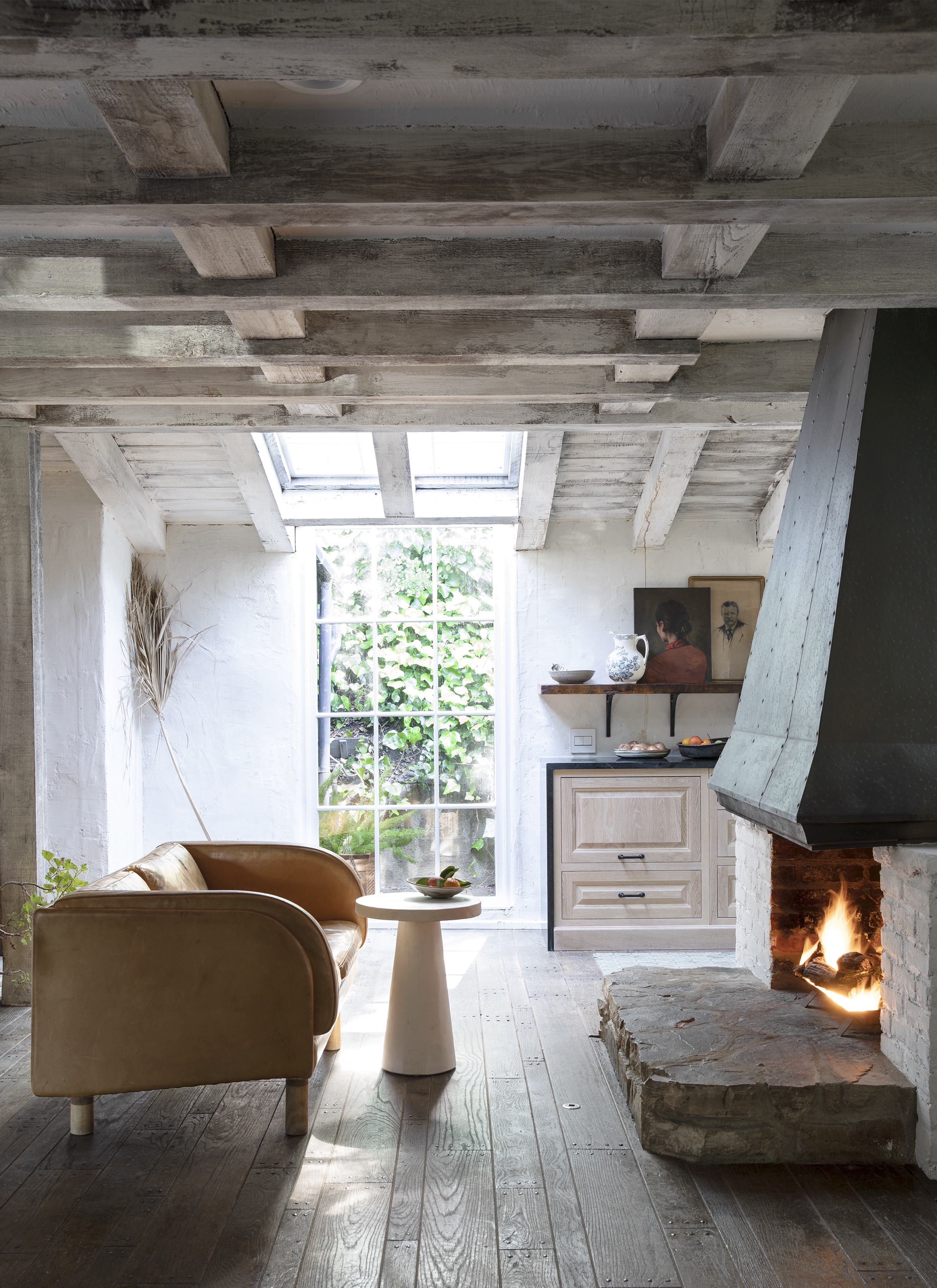
We can't get over the light and inviting feel in the cabin's new kitchen, where the ceiling beams have been transformed by a coat of concrete stucco. Custom cabinetry topped with soapstone worksurfaces wraps around two sides of the kitchen, while in this corner, a cozy seating area flanks the original brick hearth, which has been updated with white paint.
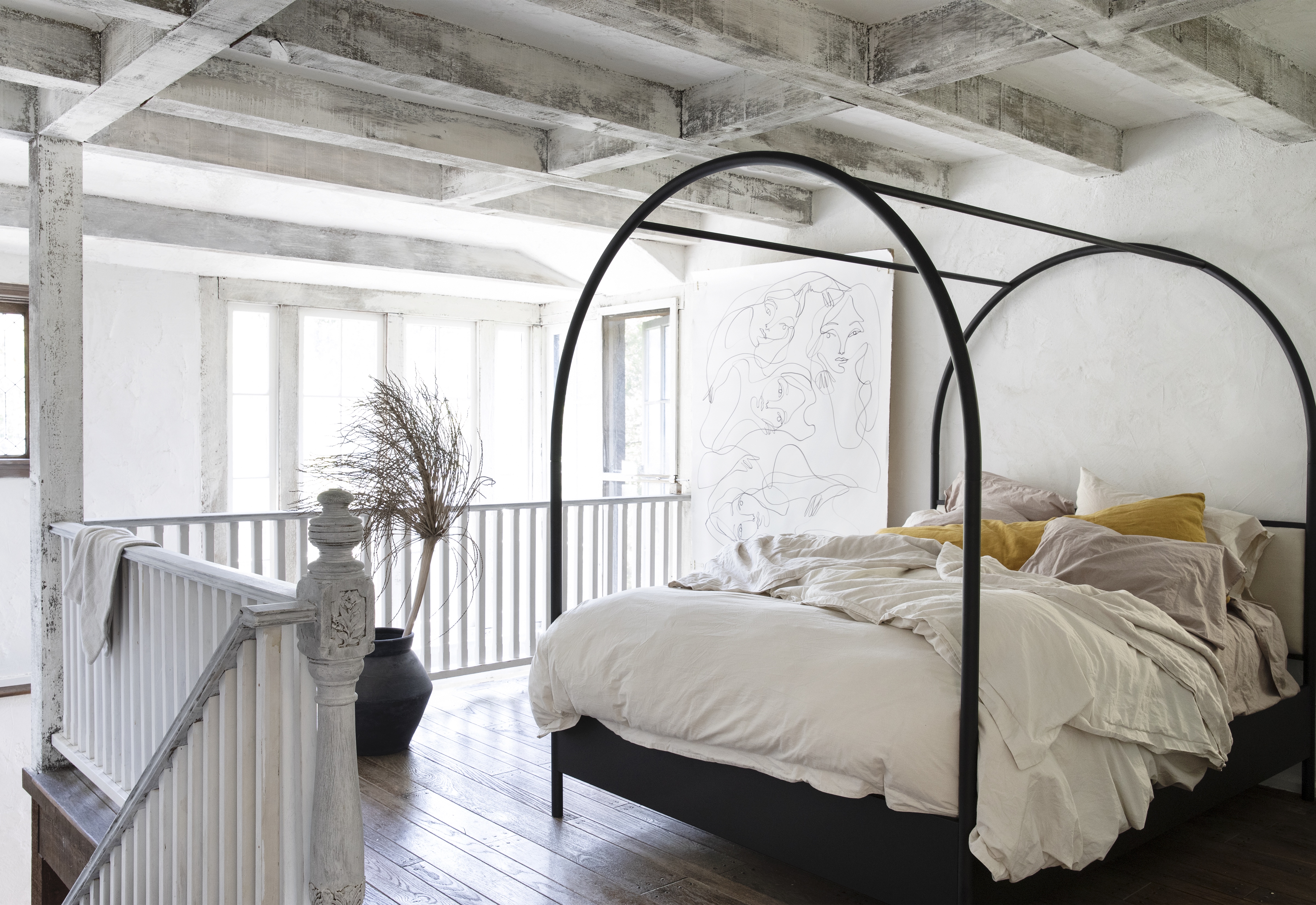
The stucco-covered wooden beams continue in the modern farmhouse bedroom on the mezzanine, which features a statement curved four-posted bed, designed by Leanne Ford for Crate & Barrel. The dark wooden balustrade surrounding the space has also been lightened, leading to an airy loft-style aesthetic that feels both rustic and contemporary.
Be The First To Know
The Livingetc newsletters are your inside source for what’s shaping interiors now - and what’s next. Discover trend forecasts, smart style ideas, and curated shopping inspiration that brings design to life. Subscribe today and stay ahead of the curve.
Tessa Pearson is an interiors and architecture journalist, formerly Homes Director at ELLE Decoration and Editor of ELLE Decoration Country. When she's not covering design and decorative trends for Livingetc, Tessa contributes to publications such as The Observer and Table Magazine, and has recently written a book on forest architecture. Based in Sussex, Tessa has a keen interest in rural and coastal life, and spends as much time as possible by the sea.
-
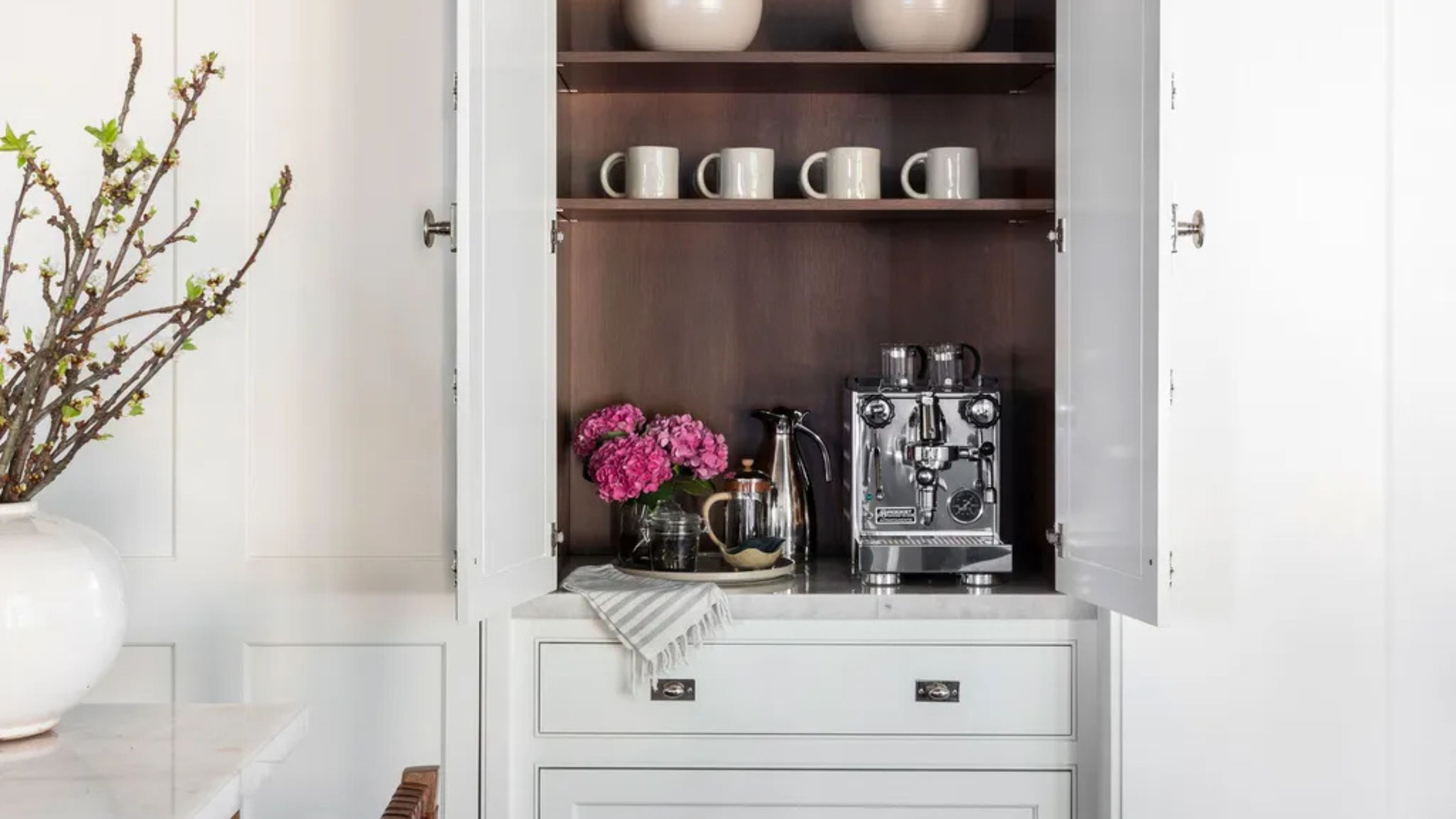 Turns Out the Coolest New Café is Actually In Your Kitchen — Here's How to Steal the Style of TikTok's Latest Trend
Goodbye, over-priced lattes. Hello, home-brewed coffee with friends. TikTok's 'Home Cafe' trend brings stylish cafe culture into the comfort of your own home
By Devin Toolen Published
-
 5 Bathroom Layouts That Look Dated in 2025 — Plus the Alternatives Designers Use Instead for a More Contemporary Space
For a bathroom that feels in line with the times, avoid these layouts and be more intentional with the placement and positioning of your features and fixtures
By Lilith Hudson Published