Modern hallway ideas – how designers are getting creative with these often overlooked spaces
Modern hallway ideas, from decor to color and lighting, can transform your transitional spaces into something really special

Is it fair to say that hallways are likely to be the rooms in your house you're least excited about decorating? They're not spaces you're likely to dwell in for too long, nor do they have the proportions to mean you can get particularly creative with their design. Or so you'd think.
In actual fact, interior designers are now looking to modern hallways as standout spaces within the home - an area to experiment, be bold and even set the tone for the wider scheme. These spaces connect rooms, after all, meaning that while you might not linger in them, they affect how you experience every other room they adjoin.
To prove that they shouldn't be overlooked, we've curated some of our favorite forward-thinking hallway ideas, from creative lighting and decor, to projects where the hallway is a defining feature of the home, to showcase the true potential of these spaces.
Creative ideas for modern hallways
'There is no reason why a transitional space shouldn’t be beautiful and expressive. We may only experience these spaces in passing but they can really brighten up a home.'
Irene Astrain, architect
1. Use a hallway as a gallery
When you have a narrow hallway, the only practical use it can really have is to act as a walkway from A to B, but with function out of the equation, you can start to think about how to make this space an enjoyable one to traverse.
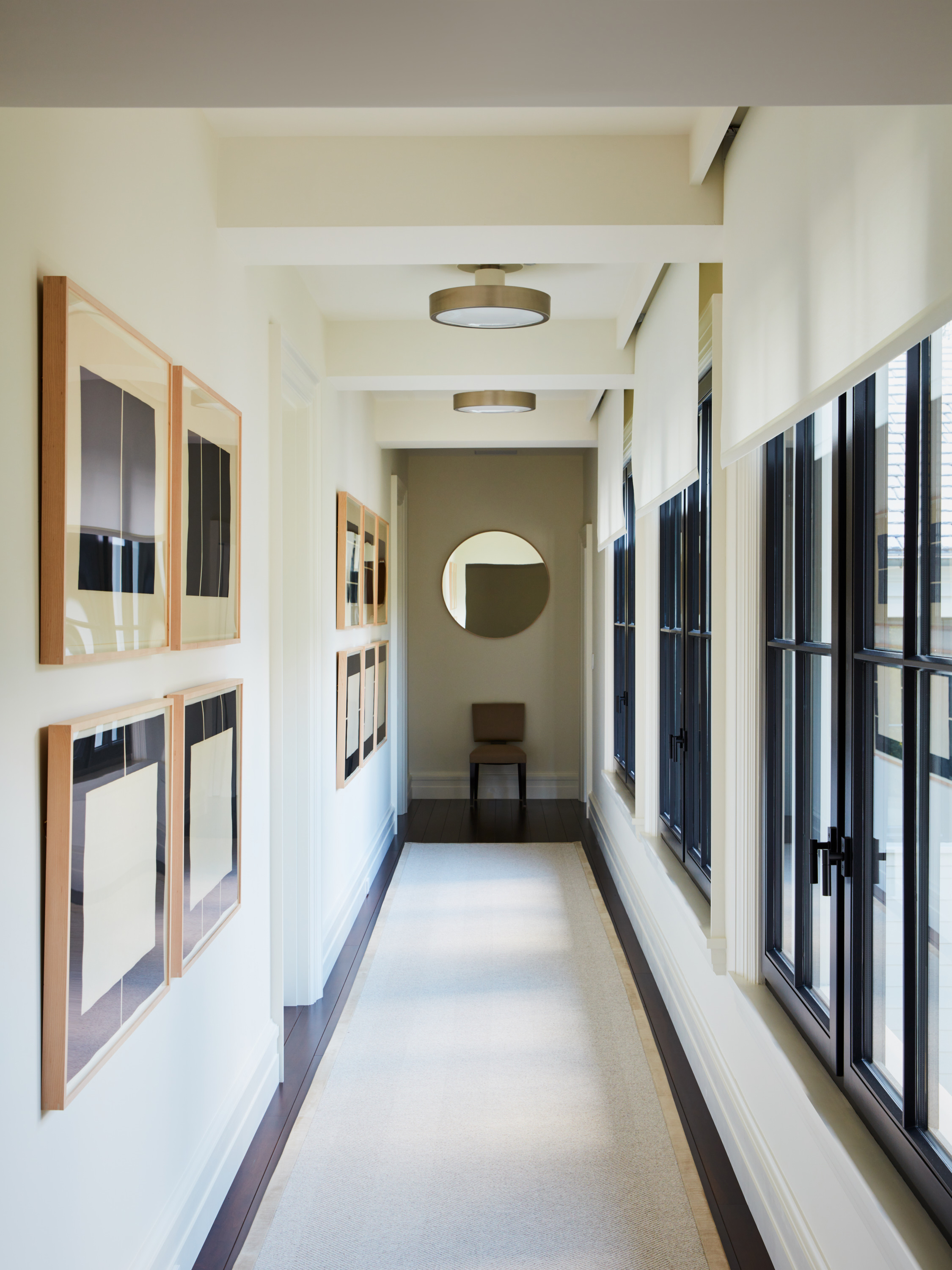
We love this idea for turning a hallway into gallery, allowing for wall decor to be appreciated daily as you move around your home, and by guests too. In this design by foley&cox, a cohesive collection of wall art makes for a cohesive scheme.
'Presented with the graciously wide and window-lit hallway shown here, we recognized the chance to create a kind of art gallery moment,' Michael Cox, principal design of foley&cox tells us. 'Semi-flush mount fixtures of bold scale yet clean lines were selected to be a subtle counterpoint to the graphic and elegant series from Donald Judd.'
The neutral color palette and luxe finishes make for an elevated feel, with interest introduced by picking contrasting forms. 'Linear art reflected opposite rectangular windows and circular fixtures and a round mirror at the end are how we play with the classic design elements of “circle meet the square",' Michael adds.
2. Or add in art via the floor
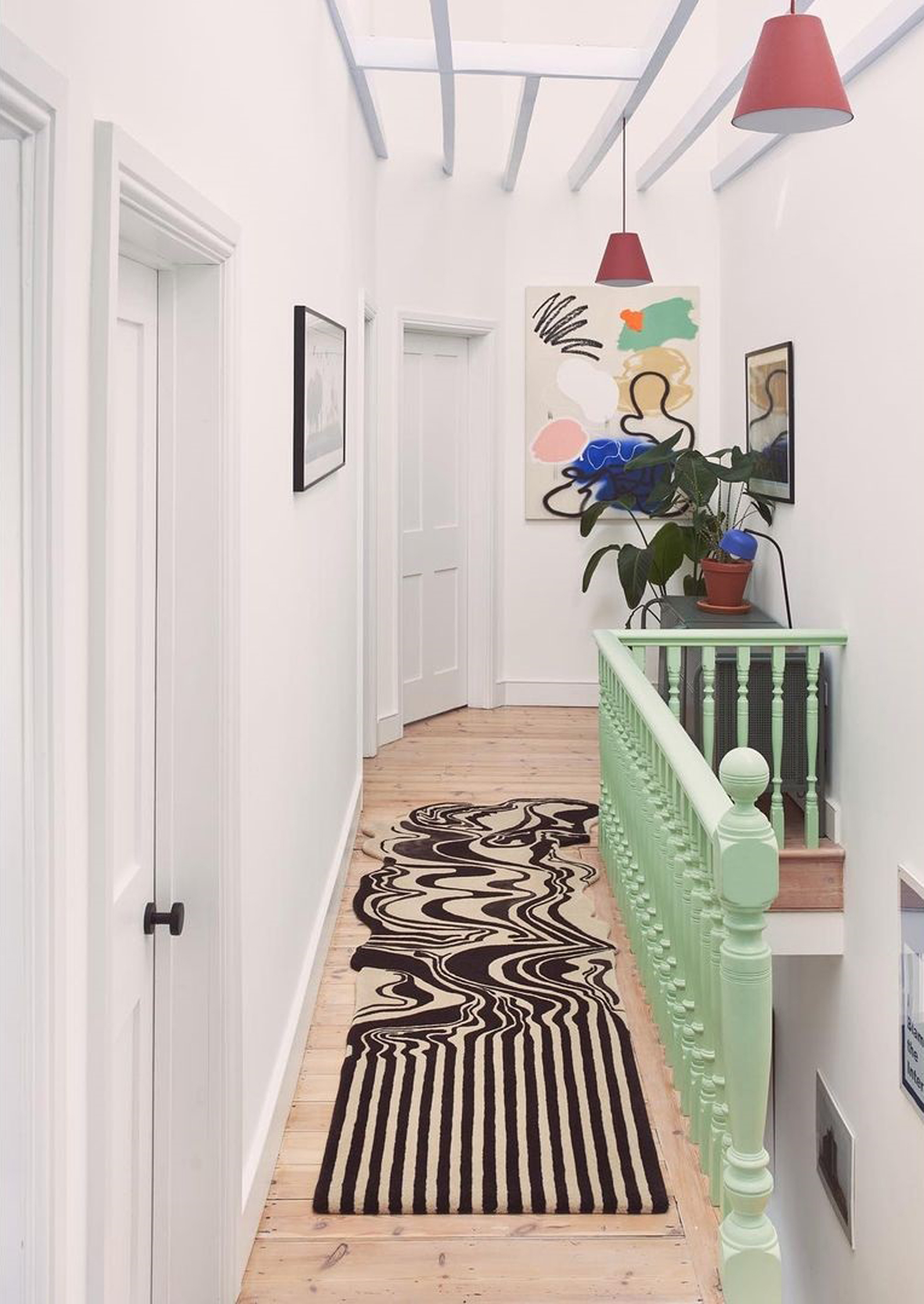
If a hallway is particularly narrow or small, creating a gallery wall can make the space feel like the walls are closing in, but if you want to ensure there's enough interest in your space, think overhead and underfoot. A statement-painted ceiling, for example, is a great way to add something a little different to a hallway, while when it comes to creative hallway floors, why not embrace a bold runner that adds the artistic elements you're lacking on the walls?
This design by rug brand Floor Story introduces pattern and abstract form that makes the white hallway in the project designed by architecture studio CAN feel anything but plain.
3. Consider a bold alternative to a standard lighting scheme
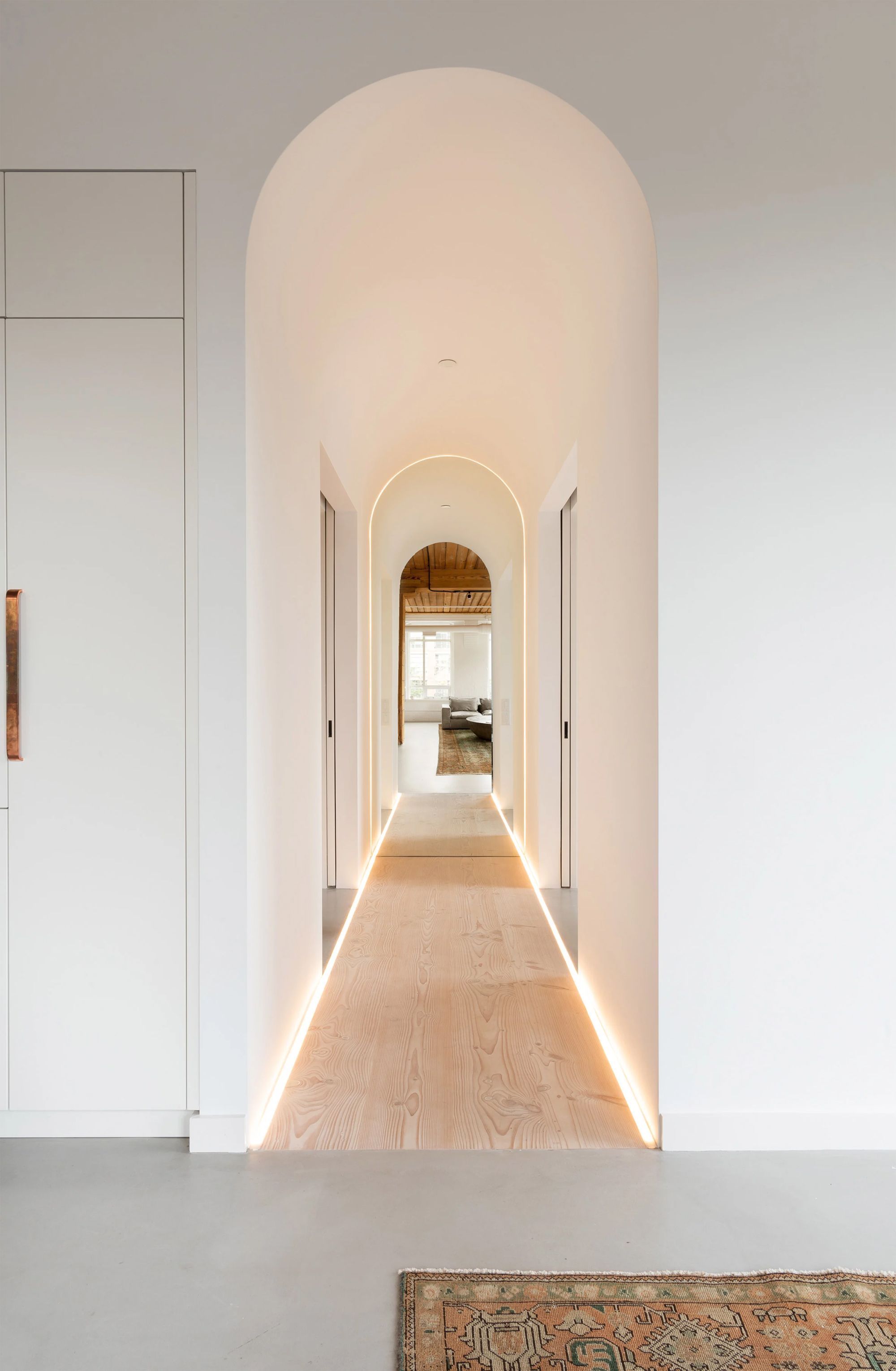
Lighting in a hallway can be tricky, as if you don't have the ceiling clearance, you'll find yourself limited to recessed lights, semi-flush pendants and low-profile wall sconces, which may leave your hallway lighting scheme feeling restrained.
How about this project by Studio AC as a bold alternative? LED lighting strips have been used in this loft apartment not only to outline the walkway - creating the perfect illumination if you find yourself making a late night trip to the bathroom - while also highlight the beautiful arched architecture.
4. Create a different feel in a hallway

There's an inherent idea that hallways should be simple spaces, scaled-down reflections of the interior style of the whole house. However, there's no interior design rule that says this has to be the case. A hallway can feel markedly different from the rest of the house, adding a contrasting feel to other spaces in the home.
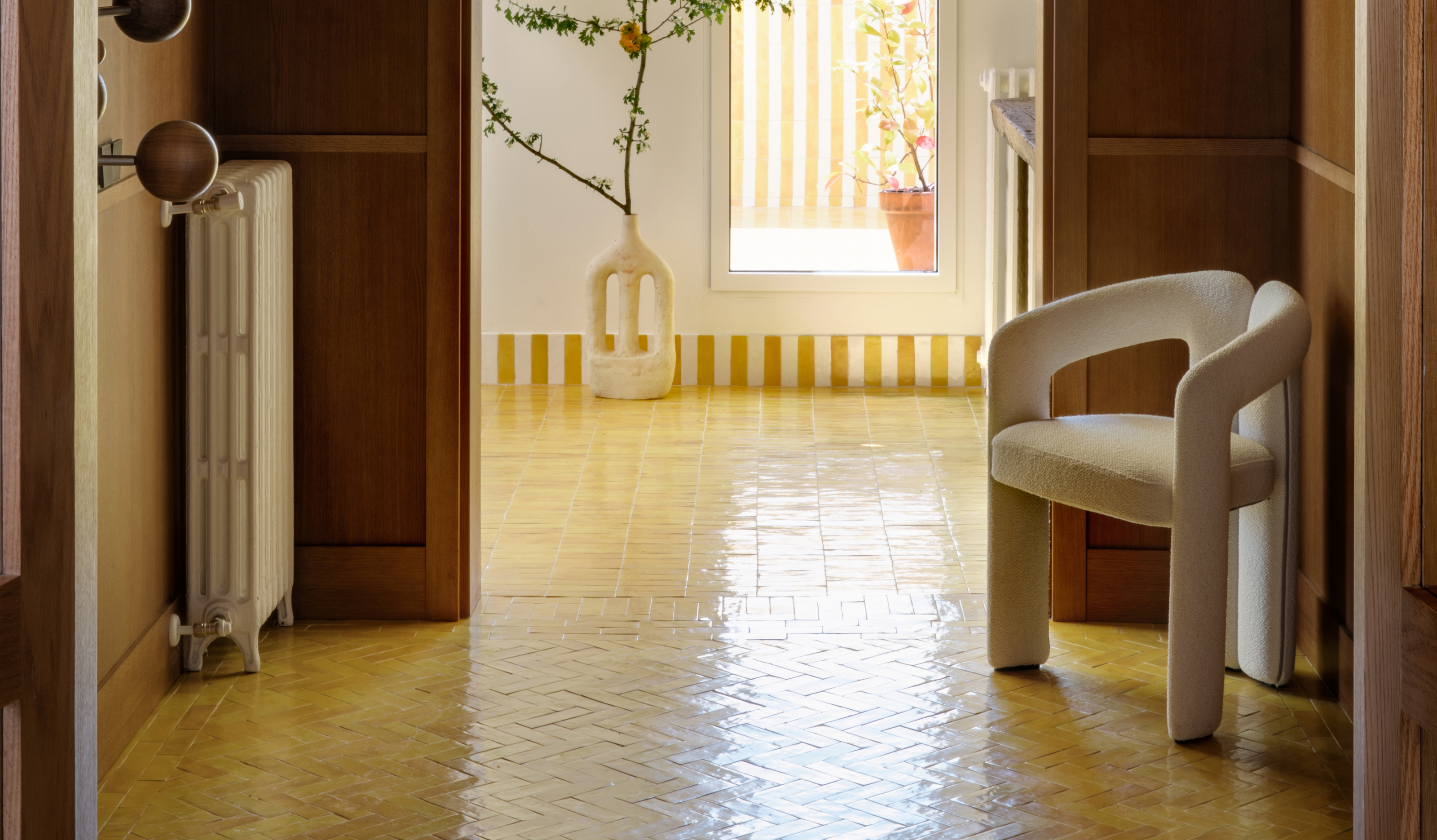
In this Madrid apartment by interior design and architecture studio Sierra + de la Higuera, a timber-clad hallway has a distinctly different feel to the sunny, colorful rooms beyond. 'The idea was to make an entrance hall that would serve as a connection between two rooms, which are accessed by two arched passages,' architect Inés Sierra tells us, 'but it's important to note that wood is only represented in this space of the house.'
The envelope is a matte orange oak wood wall paneling, which manages to give a noble character to this space, and manages to transmit the necessary warmth to then move to the adjoining spaces, much cooler,' Inés explains.
5. Make a hallway the stand out space of your home
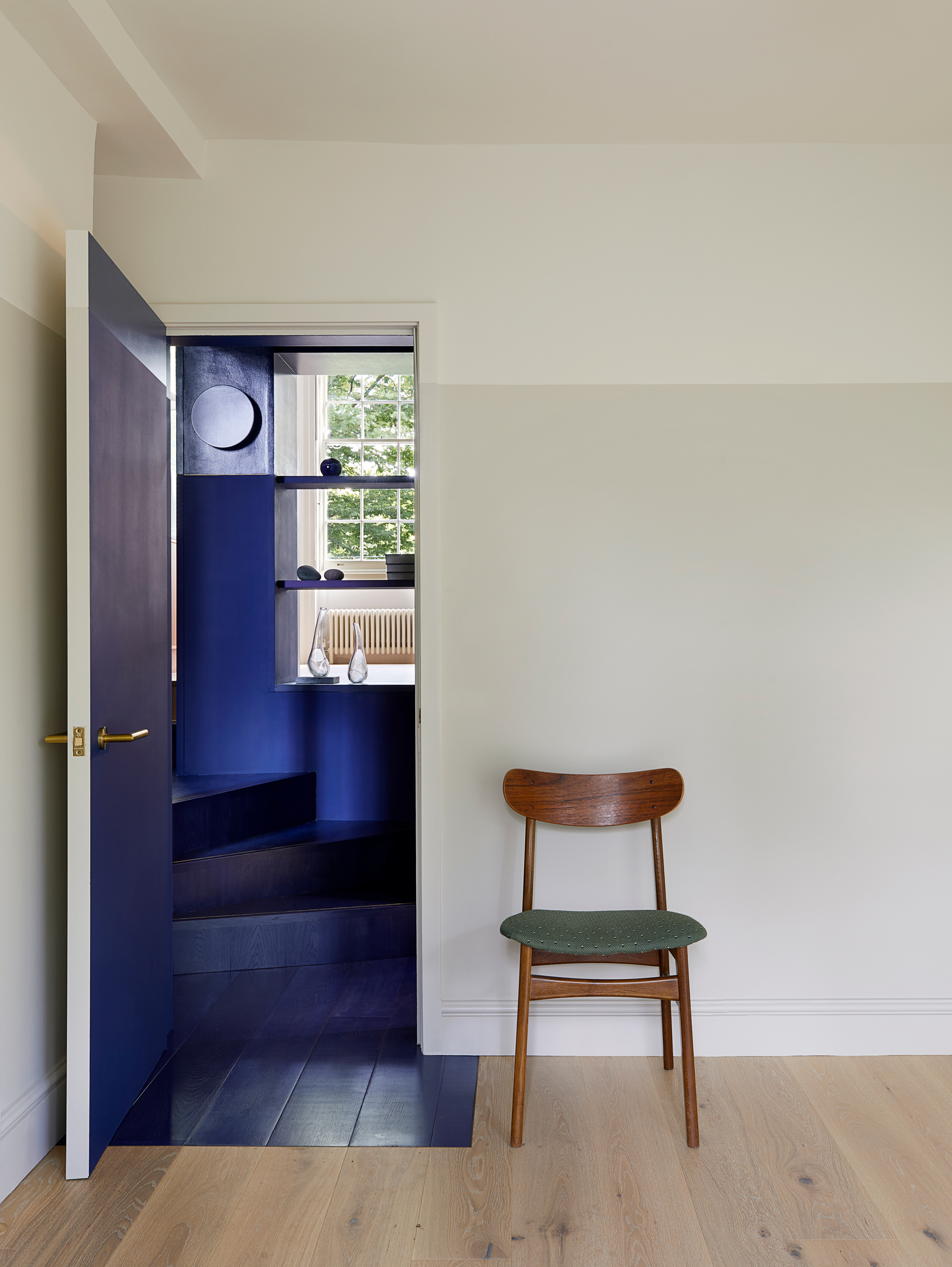
Not only can a hallway stand apart from the rest of your design, it can also stand out. In this London apartment, the bedrooms, living room and kitchen are all simple, neutral spaces, yet the hallway has been color-drenched in rich, electric blue.
'This was a space to move through quickly with a room on the other side of the house in mind, the transition was unenjoyable,' explains architect Uwe Schmidt-Hess of Patalab Architecture. 'Using light neutral colors in the habitable rooms, the paint treatment dramatically changes to dark blue in the central staircase. The depth of color in this space allows light from either direction to be reflected, and although it’s very striking when you stand in this space, the darkness of the tone increases its visual neutrality and you look through it to the view of green space beyond.'
Blue hasn't just been adopted as a hallway paint color here, either. 'Everything is dark blue in this area,' Uwe says. 'Not only are the walls painted blue (with matte paint on the lower part and gloss above) but the flooring, which is the same timber as everywhere else in the apartment, is stained the same color. Creeping beyond the thresholds of the doors, the blue flooring continues into the mainly neutral-colored rooms so that when doors are open, the liminal space extends to bring views of greenery closer.'
6. Use mirror in clever ways
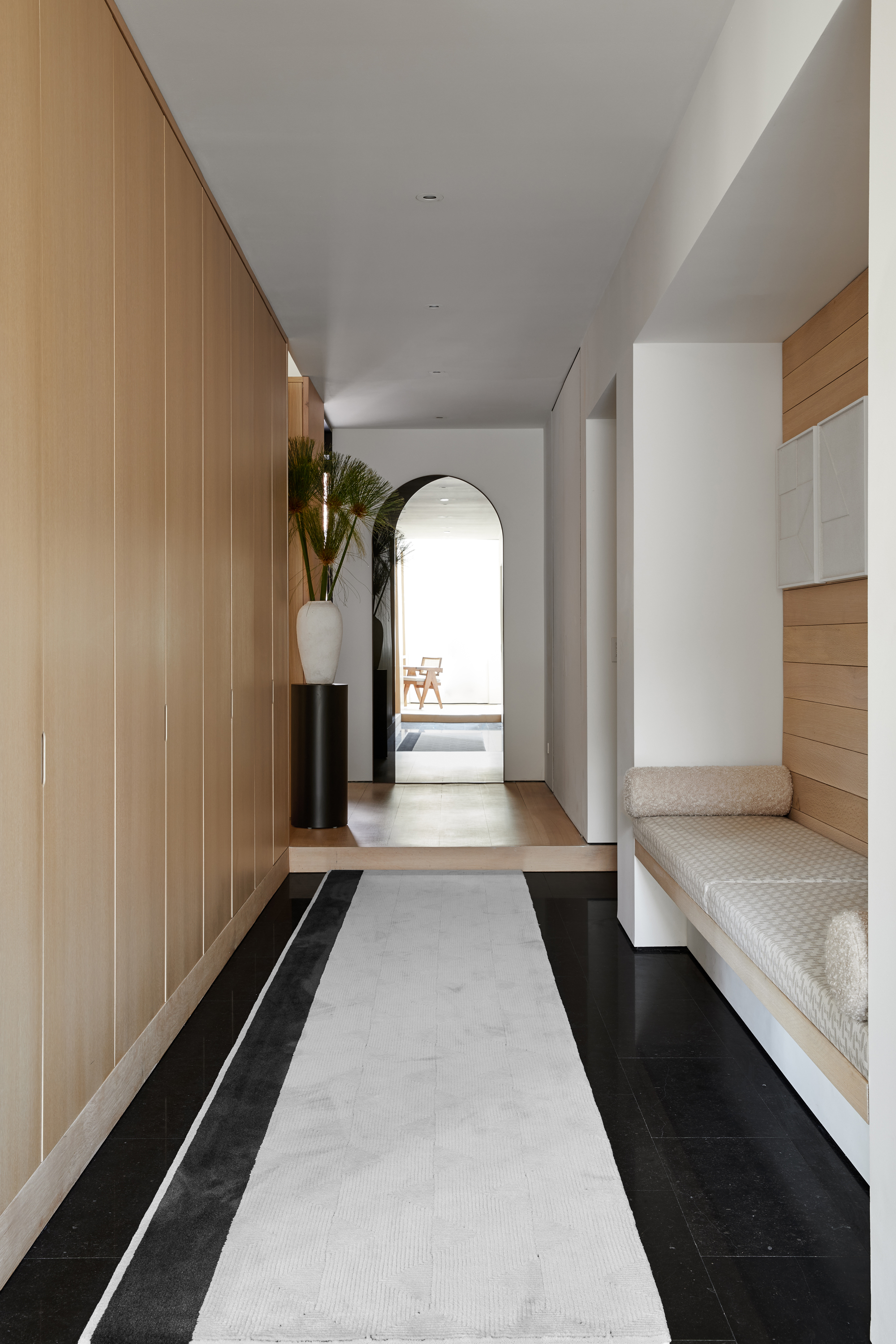
Mirror is any room's best friend, but in particular for making small hallways feel larger and brighter than they actually are. While a simple wall-mounted mirror may be all your space needs, many interior designers look to use mirror in inventive ways that trick the eye into thinking your hallway extends far beyond its walls.
In this modern hallway, interior designer Justin Charette has created one such optical illusion. 'I wanted to create a great sense of never-ending space by using a mirror that appeared like an arched doorway at the end of the hallway,' Justin explains. 'I accentuated the black portion of the mirror by creating a black stripe on the runner to lead your eye to the arch, and play of the mirror.'
7. Echo the architecture
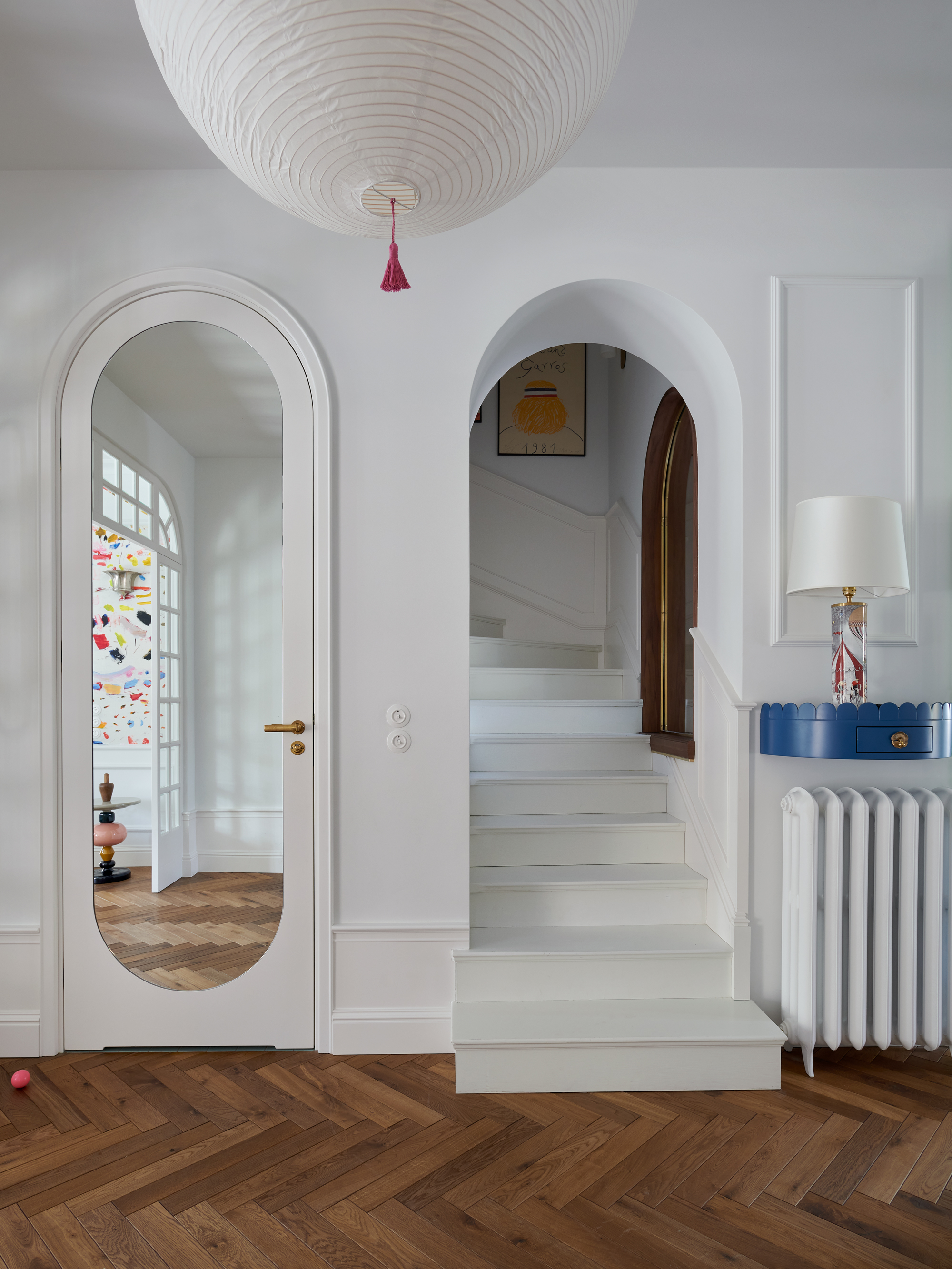
Whether you're building a new house, or have inherited a home with beautiful original features, if your hallway has something of interest to it, architecturally speaking, your choices of decor can help to play up and emphasize these elements.
That may be a contrast color for crown moldings, creating a feature out of a balustrade, or using forms and decor that complement these features. In this design by Colombe Studio, designer Justyna Colombe has highlighted the arches her client inherited with the property. 'The house is from the 1950s and this shape was used quite often in this type of building during this period,' Justyna says. 'Therefore, referring to the style and architecture, we also used it in other details such as the mirrors or doors.'
8. Turn it into a useful space
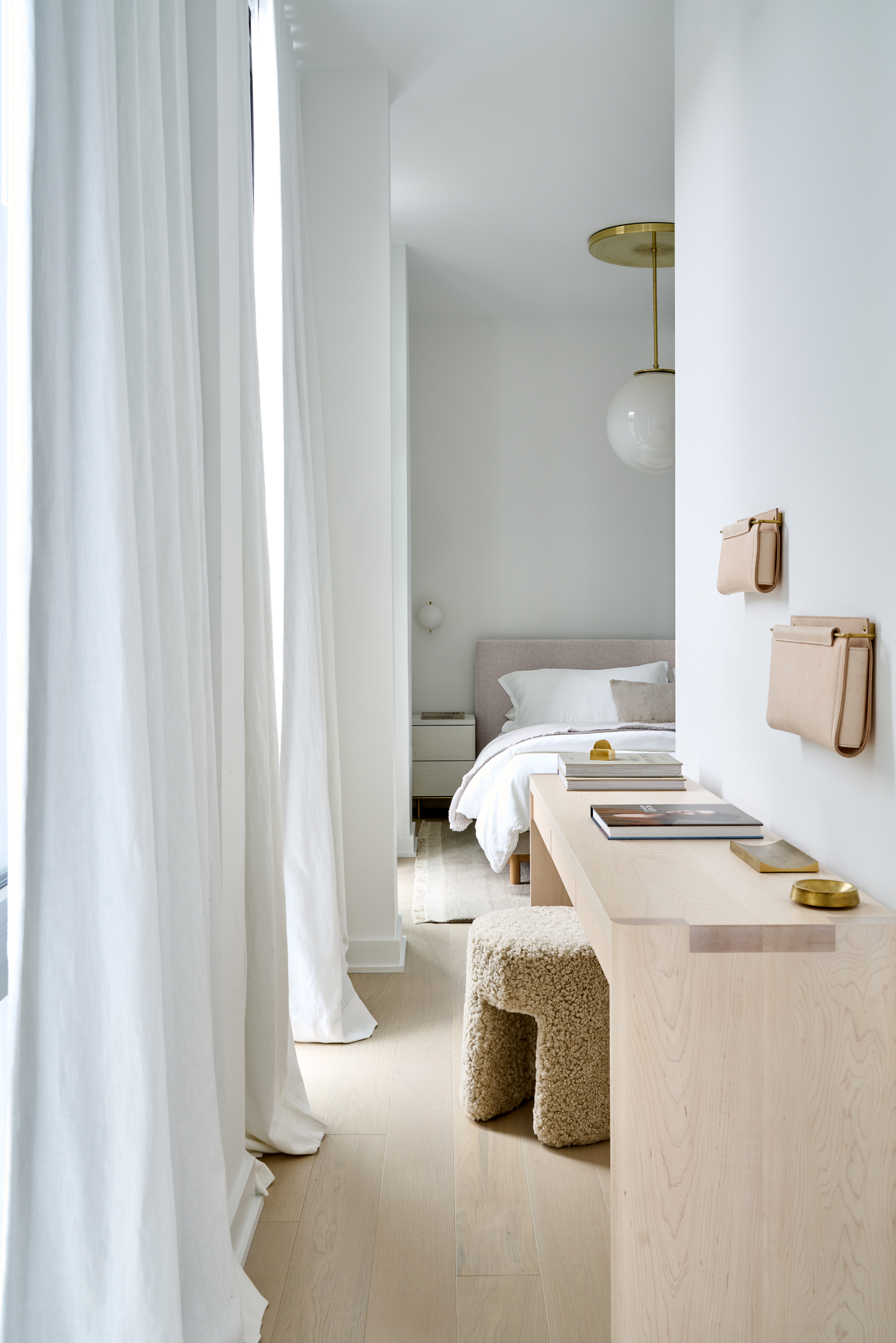
Sometimes, even narrow hallways need to pull their weight in a home's design, and a modern hallway can be transformed into a practical space like a small home office. Incorporating a small niche in your hallway storage, or tucking a desk under the stairs may all be ways to incorporate a work-from-home area into a hallway.
In this design, a narrow table has been used to create a casual hallway workspace as a bedroom office. 'Our client had been working home through the pandemic, so it was necessary to carve out a small space where she could work from home,' explains Chelsea Reale, cofounder of SISSY + MARLEY Interiors. This table acts as a multi-functional object in this narrow hallway, which leads to the apartment's bedroom, doubling as a vanity, too.
9. Have fun decorating a hallway
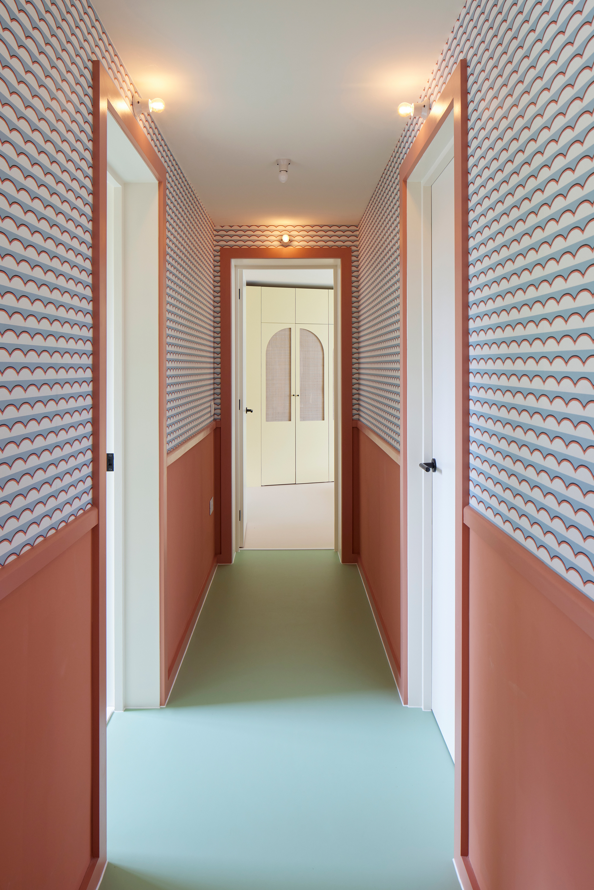
If you've got a creative decorative style, consider the hallway as the ultimate canvas to do something adventurous. 'I think a hallway is a perfect place to have some fun,' says architect Irene Astrain of Astrain Scheldt Architects. 'There is no reason why a transitional space shouldn’t be beautiful and expressive. We may only experience these spaces in passing but they can really brighten up a home.'
'There is also the added advantage that because we don’t spend lingering time in them, you can be bolder,' she adds. 'I do think that they are more successful if designed with a cohesive design idea that carries through in the rooms beyond, but you can definitely accentuate the ideas and be adventurous.'
Not only have boldly colored wainscoting and door trims been used in combination in this colorful hallway, but a fun lighting detail has been incorporated above the doors. 'This was the client’s idea and we love it,' Irene says. 'They were really inspired by the Hotel Voltaire in the South of France, a perfectly fitting design reference for this 60s house.'
How do you decorate a contemporary hallway?
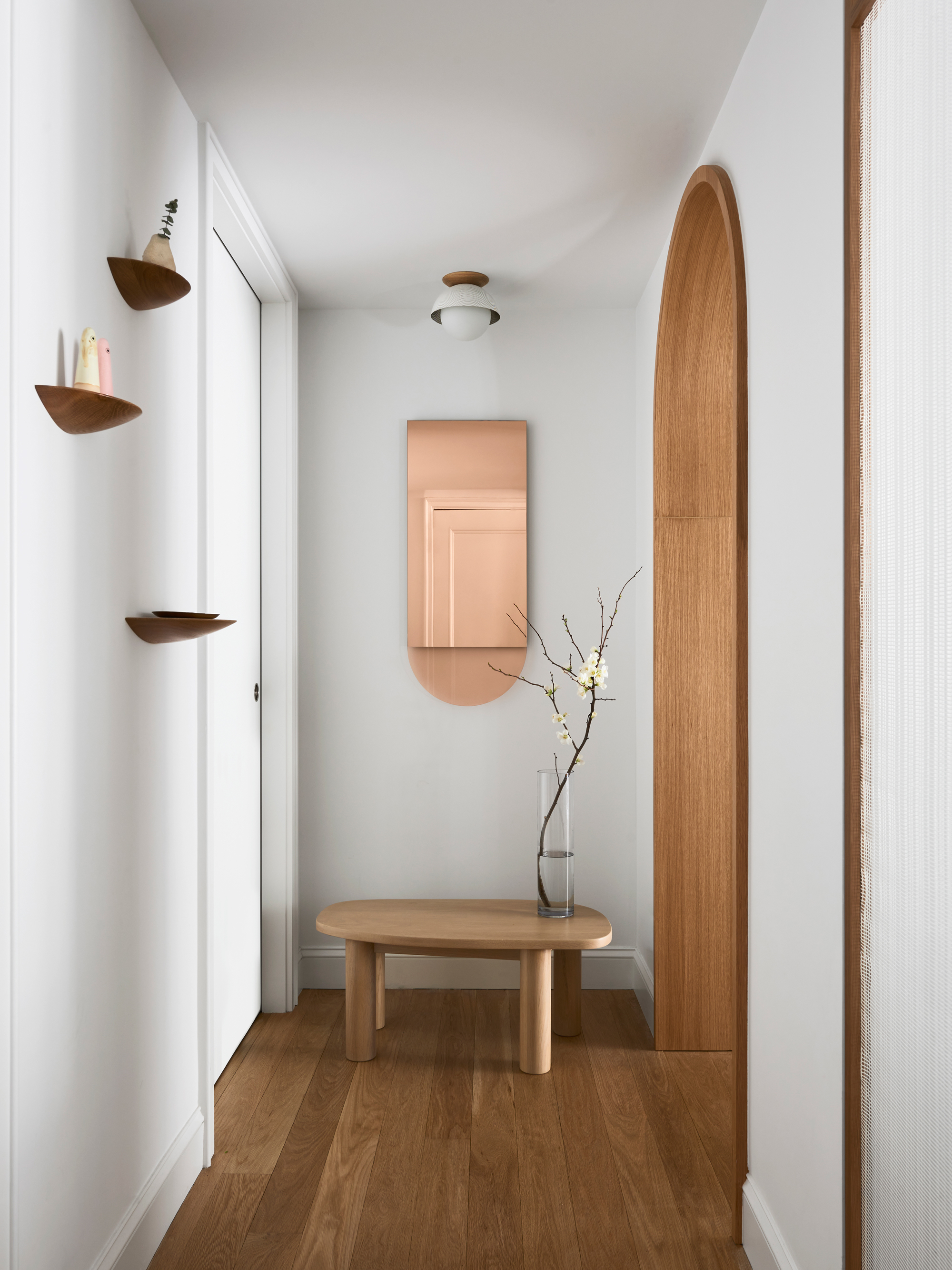
For a contemporary look, try for a well-balanced minimalist look in a hallway. This will keep your hallway looking clean and sleek, and not overly cluttered.
When it comes to lighting, look to semi-flush mounted styles in statement designs, rather than choosing pendant lights or going for recessed lights. 'Whatever you select, keep the base 7’ from the floor,' explains interior designer Ben Marshall, creative director of Hudson Valley Lighting Group. 'Add the length and width of the space in feet, then change that sum from feet to inches to find the ideal diameter for an entryway ambient light.'
Mirror is a clever way to make a small hallway look bigger. You'll get the biggest effect from it by making your hallway look longer, positioning it on the shorter wall at one end of the corridor.
When choosing wall decor, ensure it doesn't encroach on anyone using the space. Artwork or shelves that can be knocked when walking past will put anyone who uses the hallway on edge.
If room allows, including a small seating area or table is an interesting detail. It may not be used often, but it provides a visual resting point for the eye.
Be The First To Know
The Livingetc newsletters are your inside source for what’s shaping interiors now - and what’s next. Discover trend forecasts, smart style ideas, and curated shopping inspiration that brings design to life. Subscribe today and stay ahead of the curve.

Hugh is Livingetc.com’s editor. With 8 years in the interiors industry under his belt, he has the nose for what people want to know about re-decorating their homes. He prides himself as an expert trend forecaster, visiting design fairs, showrooms and keeping an eye out for emerging designers to hone his eye. He joined Livingetc back in 2022 as a content editor, as a long-time reader of the print magazine, before becoming its online editor. Hugh has previously spent time as an editor for a kitchen and bathroom magazine, and has written for “hands-on” home brands such as Homebuilding & Renovating and Grand Designs magazine, so his knowledge of what it takes to create a home goes beyond the surface, too. Though not a trained interior designer, Hugh has cut his design teeth by managing several major interior design projects to date, each for private clients. He's also a keen DIYer — he's done everything from laying his own patio and building an integrated cooker hood from scratch, to undertaking plenty of creative IKEA hacks to help achieve the luxurious look he loves in design, when his budget doesn't always stretch that far.
-
 Biophilic Decluttering — What to Take Out of Your Home (and What to Put in) for a More Natural Home
Try your hand at biophilic decluttering to ground your interiors, connect to the environment, and cure chronic clutter in one go. Here's how.
By Amiya Baratan
-
 10 Arrestingly Beautiful Milan Restaurants Locals *Actually* Dine at — Selected for Their Interiors
Brought to you by our community of culture insiders, this edit of the best restaurants in Milan sees authentic Italian food and immersive design unite
By Gilda Bruno