Modern White Bathroom Ideas — 5 Things Designers Are Doing to Make Them Feel More Modern
There's still a place for modern white bathroom ideas, and these can be as smart, modern and welcoming as colorful bathrooms
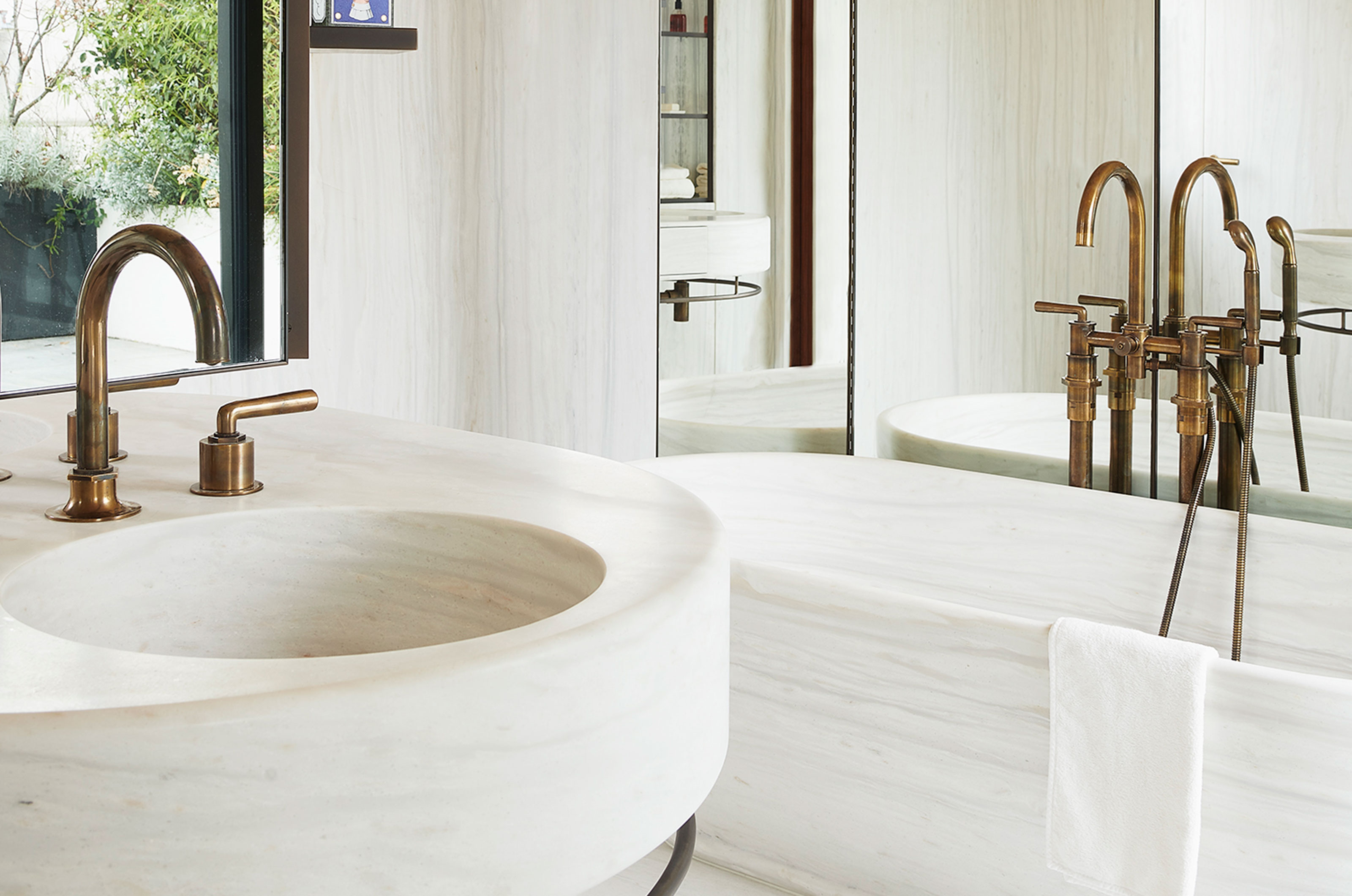

These modern white bathroom ideas will help you create a room full of serenity, cleanliness, and peace. Plus, white bathrooms allow other elements like the textures, the color of the hardware, and more to look more defined. If you're struggling for the perfect bathroom palette, try white bathrooms.
'White has a beautiful range and ways you can style it,' says interior designer, Nina Magon. 'And it can adapt to any kind of interior design style you might want to go for, from Scandi-inspired to maximalist.'
To give you more inspiration, we spoke to designers who offered great examples of this bathroom color and its use. Browse this list and find out how best to use this tone.
1. Add layering to a white bathroom with textured walls and furniture
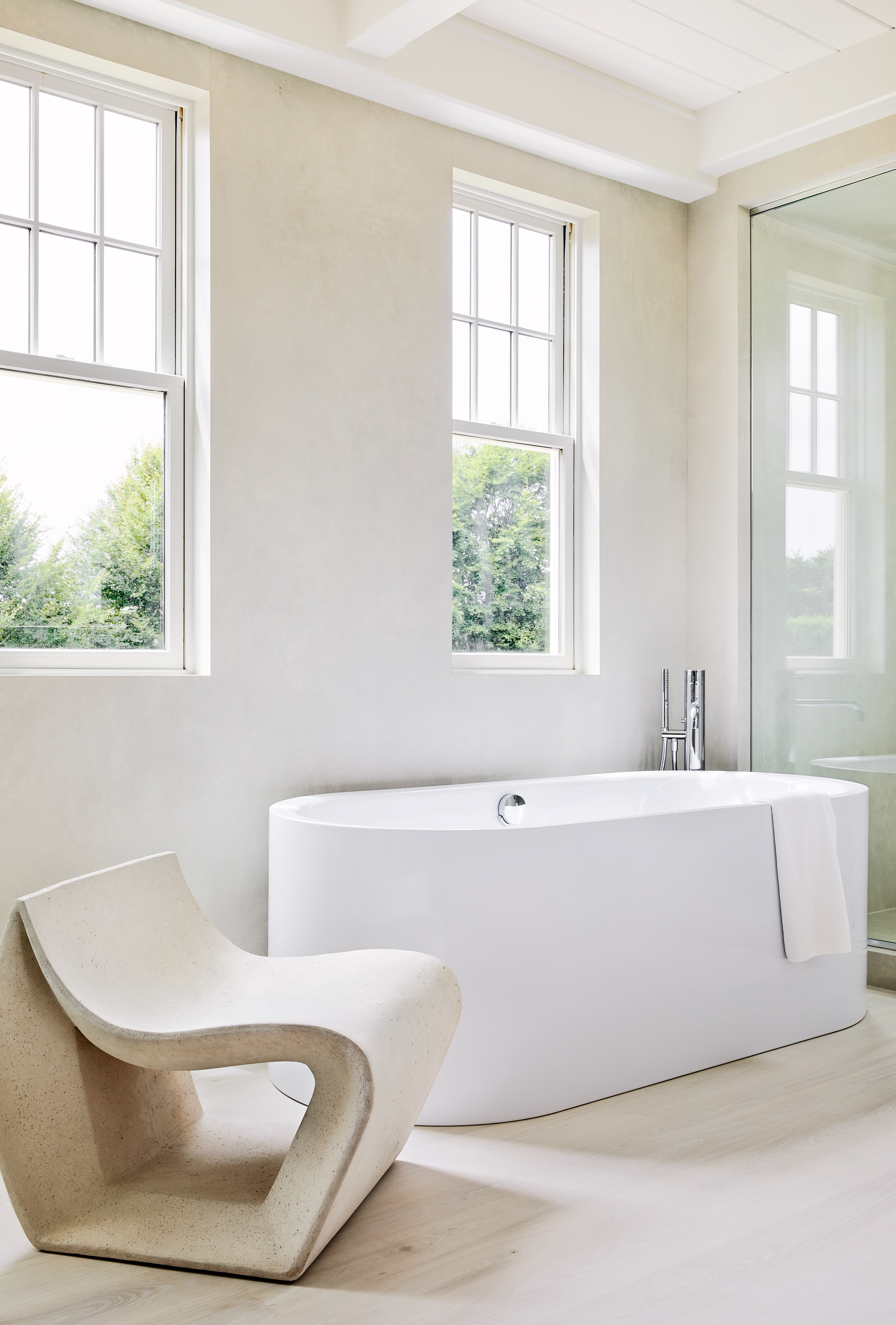
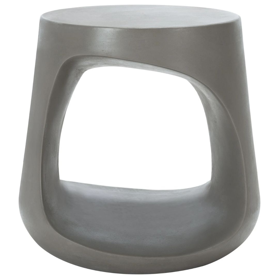
Sometimes an all-white space can feel a bit one-dimensional. To refrain it from feeling so, and for a more modern bathroom look, consider adding texture to the walls....think limewash paints or paneling. You can even bring in a wooden stool, a terracotta vase, or more to add layering to the room.
'This bathroom is from a home in the Hamptons,' says Andrew Kotchen, founding principal at Workshop/APD. 'Our team used various shades of white to create a serene soaking space centered around a Kaldewei Meisterstuck Centro Duo freestanding tub. The porcelain walls elevate the room with their cool textured surfaces.'
2. Go for a minimalist design
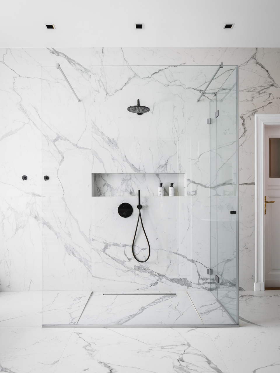
For a truly luxury bathroom look, go for a white bathroom that showcases clean lines, sleek designs, and a minimalist aesthetic. The type of style works especially well in small bathrooms where the color white and unobstructed elements can ensure clear sightlines.
'The bathroom stands as a testament to the owner's unique taste and the seamless blend of art and fashion,' says Agnieszka Kuczyńska, founder of Takk Studio. 'The shower partition, a pivotal element in the bathroom's design, was envisioned to complement the open, airy feel of the dressing room, seamlessly integrating the realms of personal style and contemporary luxury. Opting for a minimalist yet elegant design, the partition allows for an unobstructed view from the dressing area, ensuring that the space remains connected and expansive.'
'The choice of materials speaks to a commitment to quality and aesthetic finesse,' shares Agnieszka. 'Italian Cielo ceramics clad the bathroom, offering a canvas of understated elegance. These ceramics were chosen for their ability to mirror the sophistication of the space. The flooring, adorned with Marazzi tiles, introduces an additional layer of luxury and durability, completing the vision of a space that is both a sanctuary and a reflection of the owner's passion for art and fashion.'
3. Go for a white bathroom to highlight the outdoors
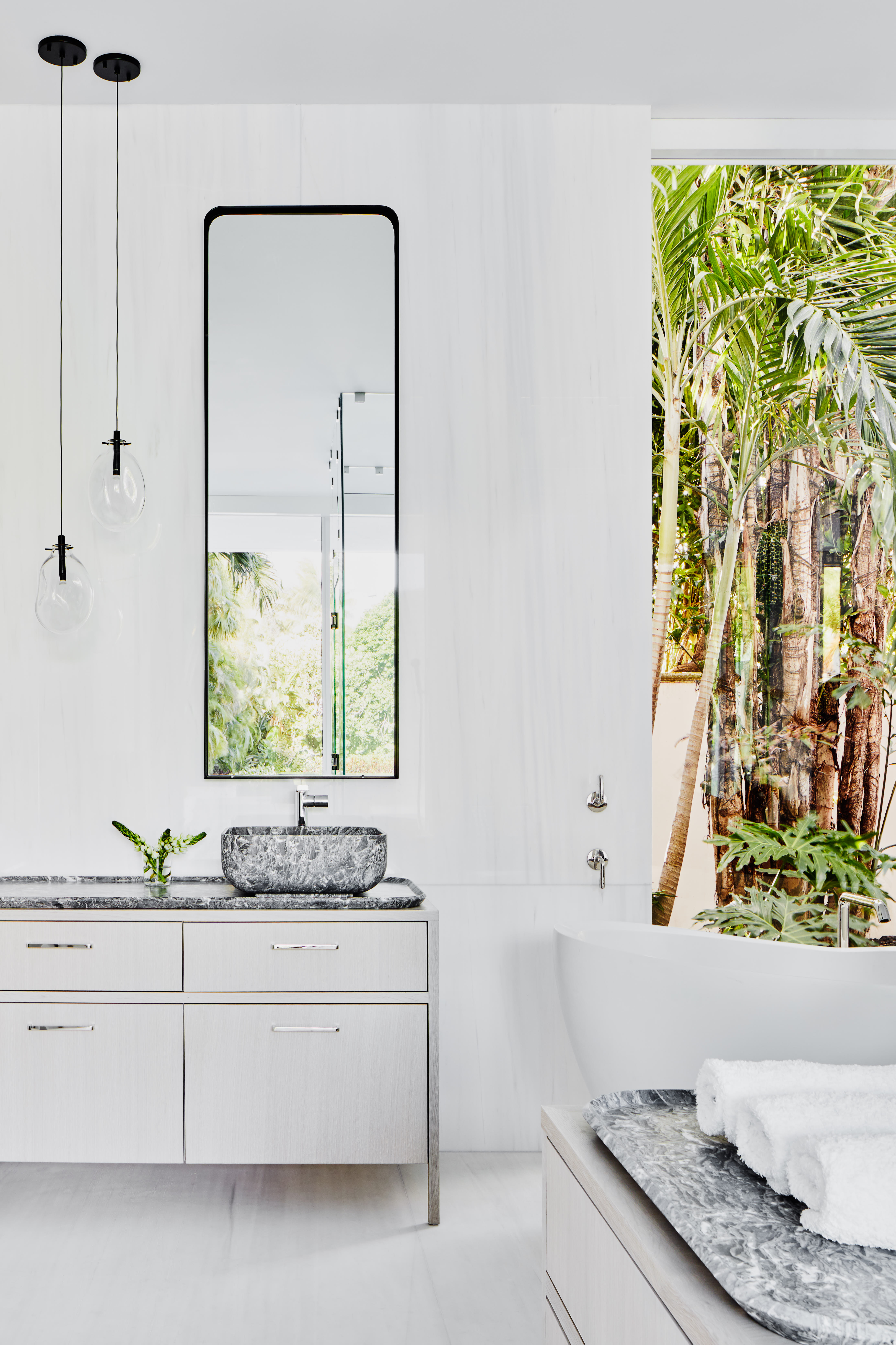
Sounds counterproductive? It actually works very well. If you live in a wonderfully landscaped, leafy neighborhood and want to create a nice indoor-outdoor look for your bathroom, then consider a white space. This will not only not only create a spa bathroom feel but also highlight the greens peeping from the windows.
'This bathroom in Palm Beach has a bright, subtly striated stone for the floors and walls with a shiny finish that brings in the bright green of the palm trees outside,' says Andrew. 'Contrasting it with the bolder sinks and countertops helped to ground the space.'
4. Add subtle color with grout lines

Want to add just a hint of color to the space? Consider bathroom tiles with gray grout lines.
'White and gray are neutral colours that have stood the test of time in interior design,' says Richard Misso, creative director at The Stylesmiths. 'They are unlikely to look dated or out of fashion, making this combination a safe and stylish choice for the long term. White tiles and gray grout are practical choices for a bathroom, as they both hide stains well.'
5. Highlight stylish fixtures in a white bathroom
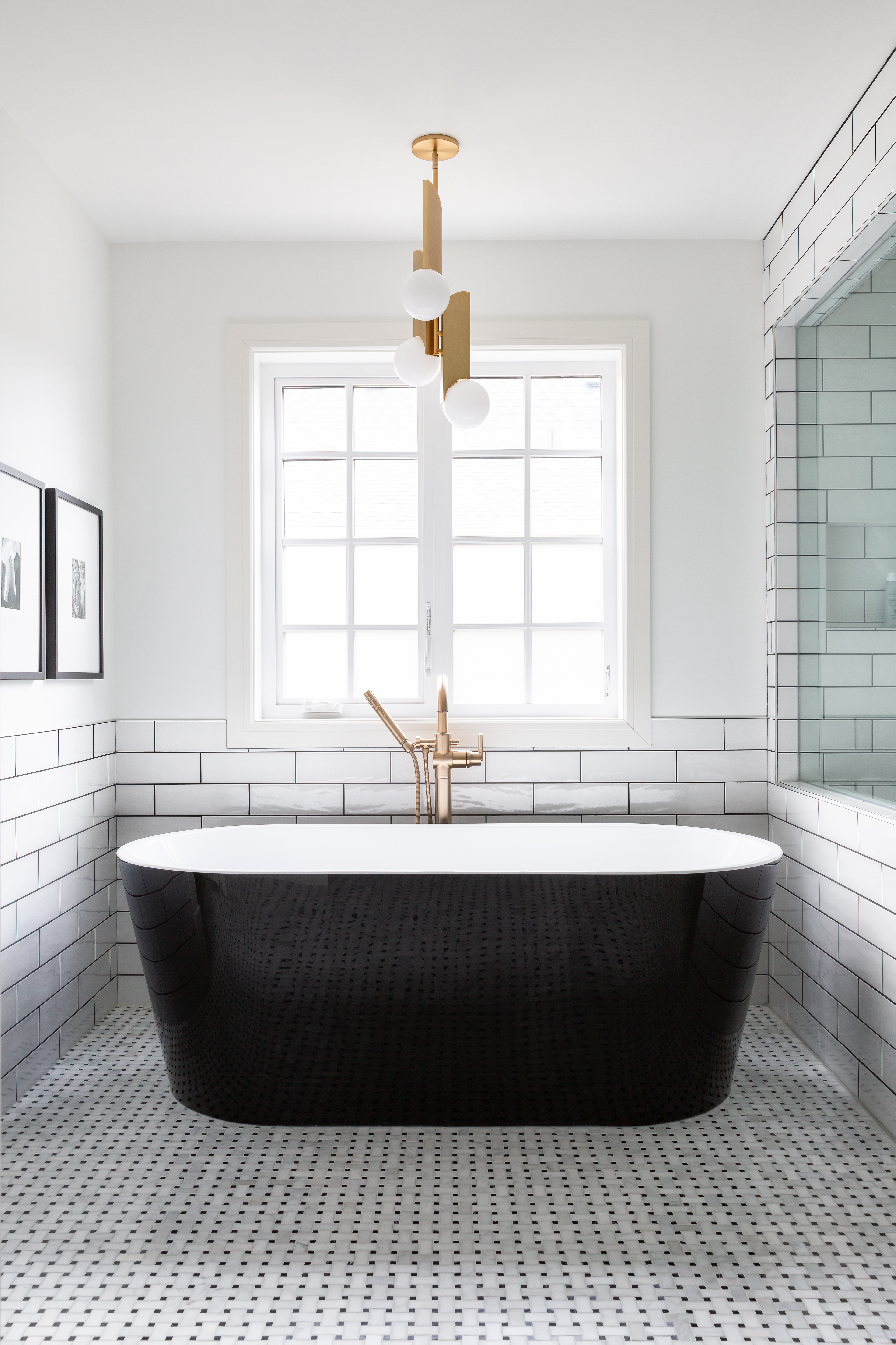
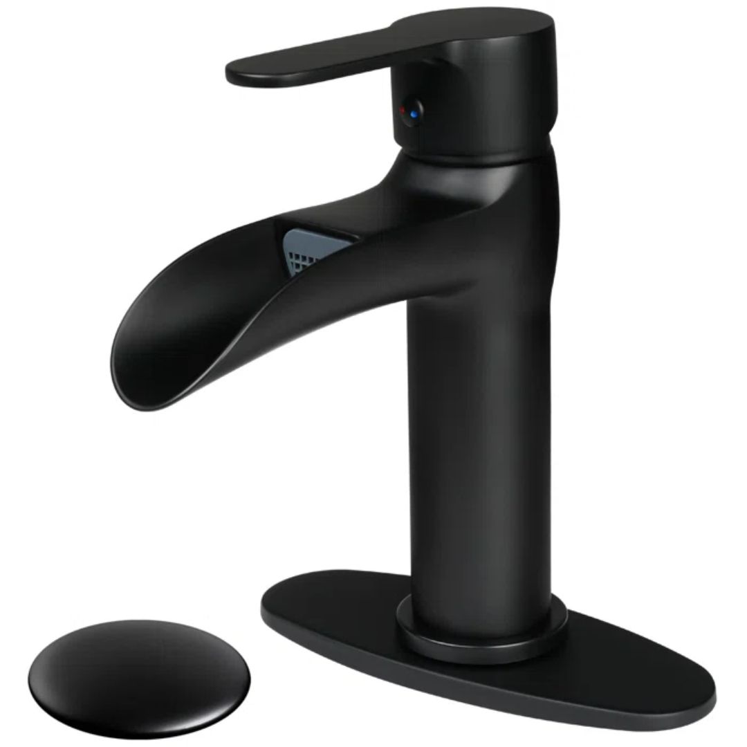
White, muted interiors allow other elements to shine. One among them is the taps, the lights, and more. A big bathroom trend at the moment is honey tones and fixtures in beautiful copper finishes.
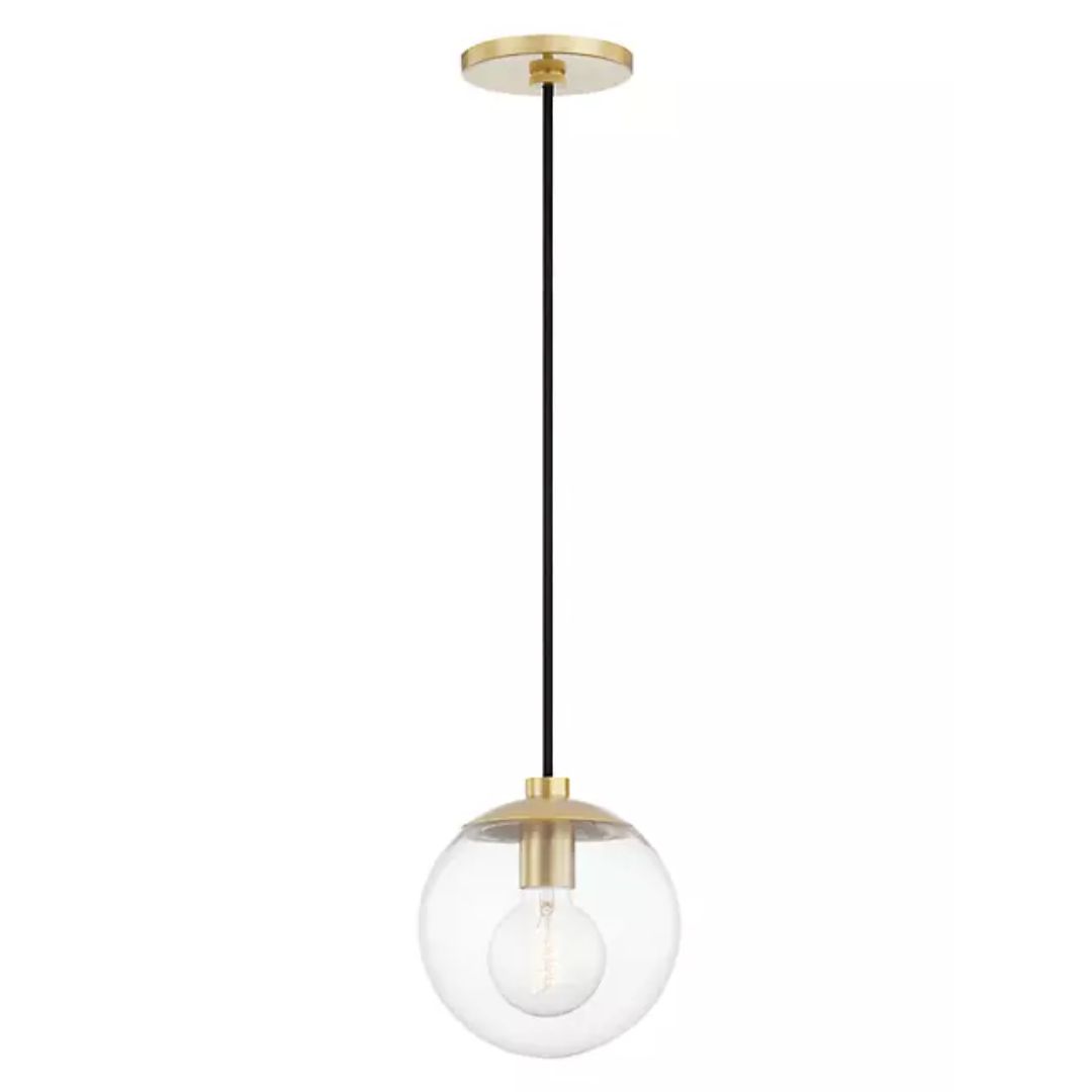
'Enhance the ambiance and functionality of your bathroom with upgraded lighting fixtures in wonderful finishes,' says Richard. 'Think decorative pendant lights or chandeliers for a touch of elegance. Quality light fixtures in gold not only improve visibility but also contribute to the overall mood and atmosphere of the space.'
3 products to elevate the white bathroom
Be The First To Know
The Livingetc newsletters are your inside source for what’s shaping interiors now - and what’s next. Discover trend forecasts, smart style ideas, and curated shopping inspiration that brings design to life. Subscribe today and stay ahead of the curve.

Aditi Sharma Maheshwari started her career at The Address (The Times of India), a tabloid on interiors and art. She wrote profiles of Indian artists, designers, and architects, and covered inspiring houses and commercial properties. After four years, she moved to ELLE DECOR as a senior features writer, where she contributed to the magazine and website, and also worked alongside the events team on India Design ID — the brand’s 10-day, annual design show. She wrote across topics: from designer interviews, and house tours, to new product launches, shopping pages, and reviews. After three years, she was hired as the senior editor at Houzz. The website content focused on practical advice on decorating the home and making design feel more approachable. She created fresh series on budget buys, design hacks, and DIYs, all backed with expert advice. Equipped with sizable knowledge of the industry and with a good network, she moved to Architectural Digest (Conde Nast) as the digital editor. The publication's focus was on high-end design, and her content highlighted A-listers, starchitects, and high-concept products, all customized for an audience that loves and invests in luxury. After a two-year stint, she moved to the UK and was hired at Livingetc as a design editor. She now freelances for a variety of interiors publications.
-
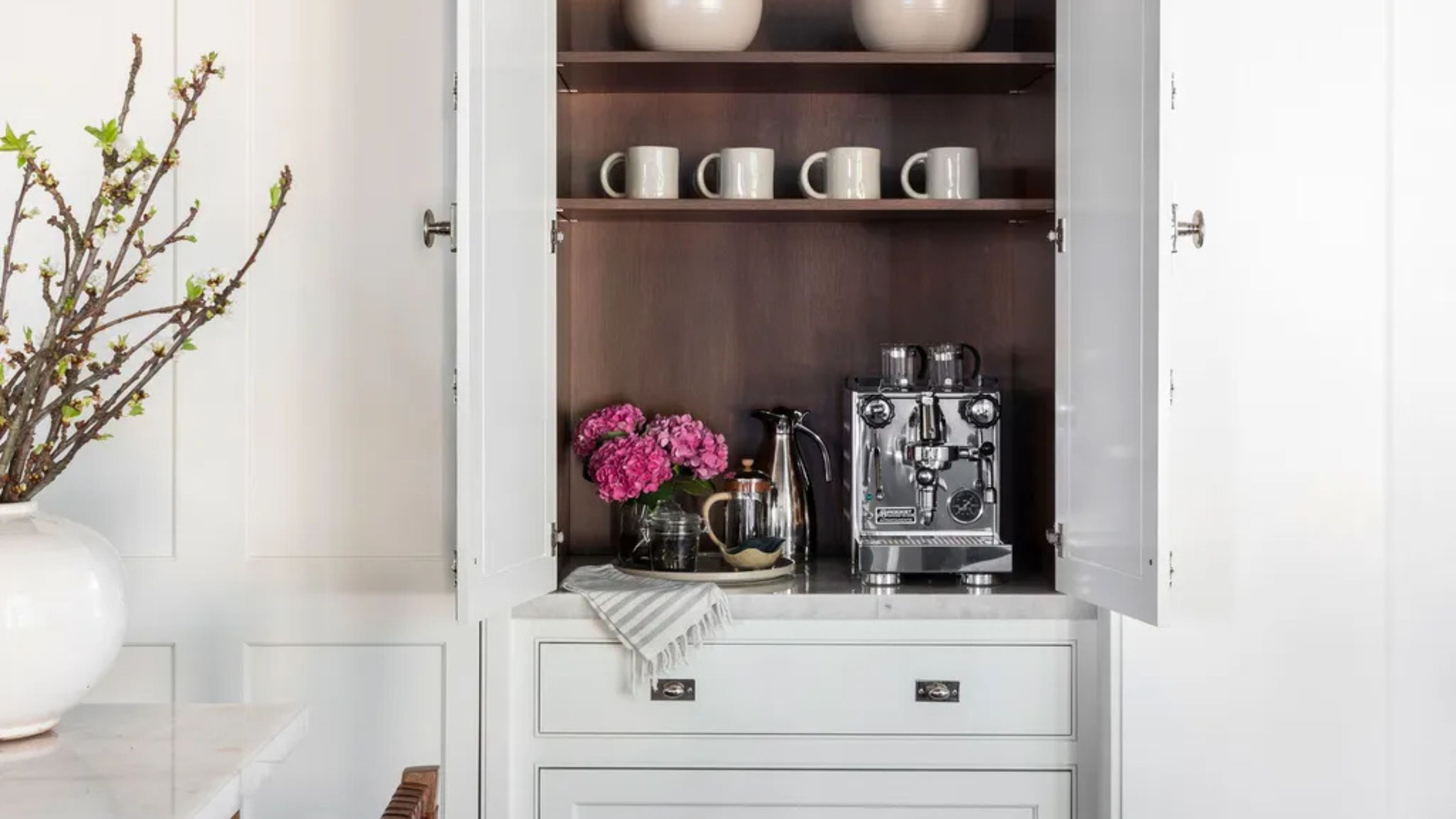 Turns Out the Coolest New Café is Actually In Your Kitchen — Here's How to Steal the Style of TikTok's Latest Trend
Goodbye, over-priced lattes. Hello, home-brewed coffee with friends. TikTok's 'Home Cafe' trend brings stylish cafe culture into the comfort of your own home
By Devin Toolen Published
-
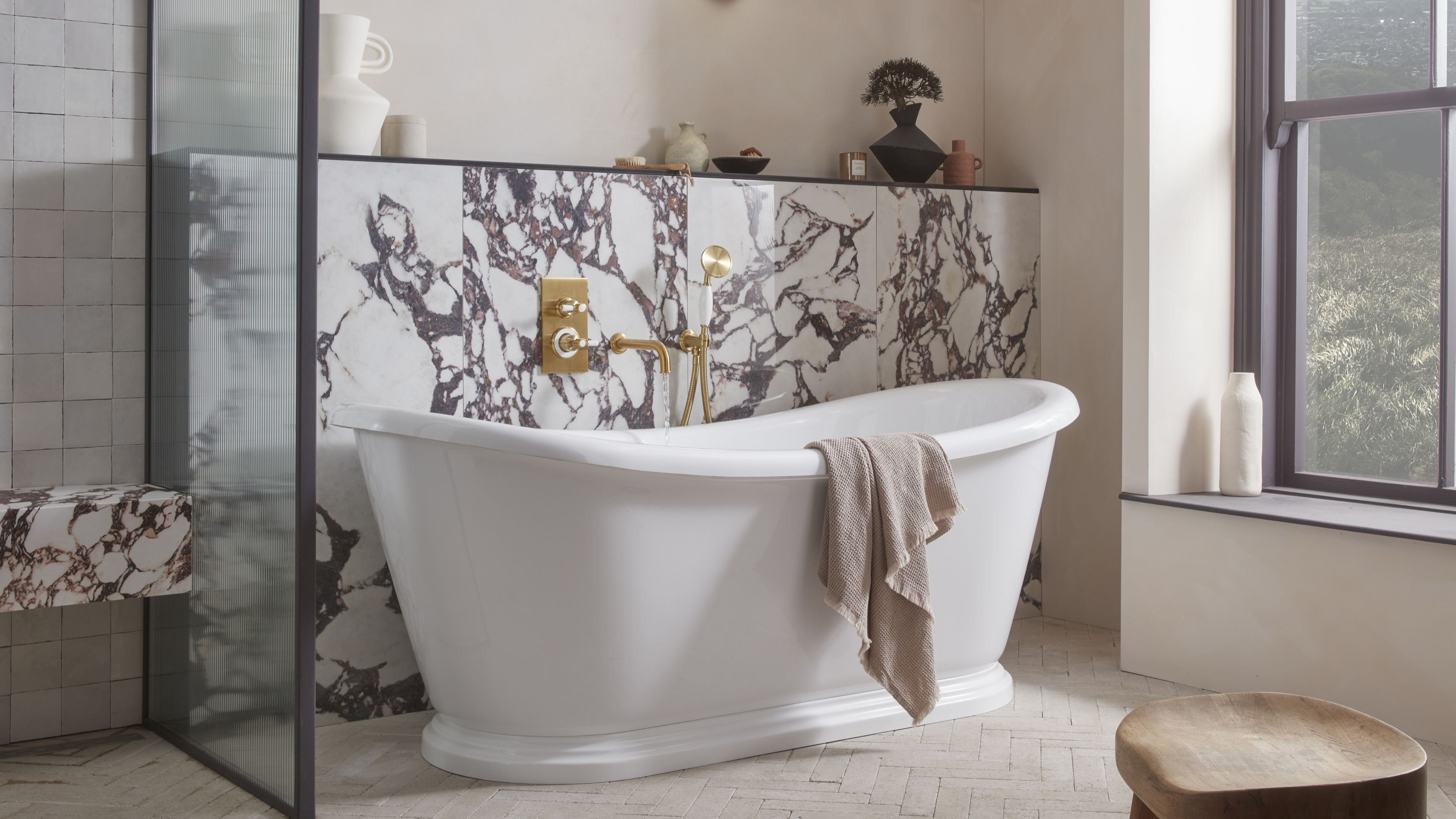 5 Bathroom Layouts That Look Dated in 2025 — Plus the Alternatives Designers Use Instead for a More Contemporary Space
For a bathroom that feels in line with the times, avoid these layouts and be more intentional with the placement and positioning of your features and fixtures
By Lilith Hudson Published
