

Farrow & Ball is one of the better known and most popular paint brands out there — and they have plenty of iconic shades behind them that you might have heard of. But, I've often wondered, when it comes to picking neutrals, which are the most popular?
I've had enough discussions with the designers on paint and color by now to know that if there is any color to avoid, it's a bright and pure white. In the wrong setting, pure white can feel gallery-like, creating a living space that feels cold, stark, and sterile. That's why we recommend warming up any space with a neutral lick of paint. With undertones of reds, browns, or yellows, these off-whites hold the power to bring a subtle warmth to your space, helping it to transition to a room that, once filled with your furniture and decor, feels cozy and cocooning.
Neutrals range from pale off-whites that in bright light might look pure, all the way through to light browns or greige tones. But there are so many shades to pick from in the wide world of neutral paint, so where do you start? Of all the best Farrow & Ball paint colors, which neutral will work best for your space? We've spoken to the team at Farrow & Ball and some of our favorite interior designers to get an idea of what the most popular Farrow & Ball neutral paint colors are and why to help you narrow down your choices.
1. Elephant's Breath

Chances are, you've heard of Elephant's Breath, perhaps, in part, for its affectionate name, but most likely because this is one of the most popular Farrow & Ball neutral paint colors around.
It's a warm mid-gray that was created by John Fowler, the notable English interior designer, and has an impressive way of changing with the light. It's a great color for a south-facing living room, with a consistent stream of warm light pouring in throughout the day, Elephant's Breath feels warm, but it can become almost lilac in west-facing rooms. 'It has a touch of magenta undertone, which is what makes it appear almost lilac in cooler lighting,' explains Patrick O'Donnell, brand ambassador and color consultant for Farrow & Ball. 'Elephant's Breath is a renowned favorite,' he adds.
For Gillian Gillies of Gillian Giles Interiors, a neutral is the best trim color around. 'We believe that your trim is an opportunity to do much more than simply paint it pure white,' says Gillian. 'In this third floor bedroom, we took inspiration for the trim color from the Cole & Son Nuvolette wallpaper. Painting the trim in a harmonious color – we used Farrow & Ball Elephant’s Breath. It blends the wall with the trim and the overall effect is soothing and luxurious.

Price: From $140 per US gallon
2. Dimity

Dimity is another great neutral and a Farrow & Ball bestseller. It is a slightly darker neutral shade but the perfect color for those who are looking for a little more shadow and depth. 'Moving towards the warmer whites, we find this gem,' says Patrick. 'It has just a little red through and therefore an ideal choice for those nervous about poorly lit rooms.
'You can use it as a wall color and team it with Pointing on your woodwork or use it as a ceiling color when decorating your room in our softest red, Red Earth — this will feel much less harsh than a pure white.'
In this example, Dimity has been selected as a wonderful backdrop to colorful appliances and kitchen fittings. ‘We wanted the kitchen furniture to be the main act in this room, so we decided to paint the wall in a warm white with some red and black pigments,’ Sina Gwosdzik of Jall & Tofta.
'The gentle backdrop creates a blank canvas which highlights and pushes forward the brighter tones which sit upon it, so the colors become more three-dimensional, seeming almost to float. Let’s not forget the beautiful warm white and speckled grey marble splashback, which adds texture as well as a hit of luxury, giving the whole room a sophisticated edge.'

Price: From $140 per US gallon
3. School House White

This paint comes up time and time again, and for good reason. It's a dreamy off-white that feels soft and calming, and in some bright lights may even look like a pure white. It's perfect for a white kitchen, giving it a warmer aesthetic as seen here in this example when paired with Farrow & Ball's Bambauche.
'School House White is an ever popular, timeless soft white, reminiscent of the color used in old school houses,' says Patrick. 'With none of the cool undertones of more contemporary neutrals, it is particularly versatile, while still appearing white even when used in more shaded areas.'

Price: From $140 per US gallon
4. Shaded White

Another one of the most popular neutrals of all time is Farrow & Ball's Shaded White. 'It's one of our best sellers — this is such a good off-white which works brilliantly with our more restrained blues and greens but can hold its own as a wall color,' says Patrick.
'There is just enough color through it to deliver some character and teamed with its tonal companion School House White offers an easy and effortless scheme for any room in your home.'
Designer Christiane Lemieux is also a fan of the shade and has used it on the walls to create a layered and warm neutral color scheme. 'We love this neutral because it also has a lot of warmth to it, making it a perfect neutral for fall or winter!'

Price: From $140 per US gallon
5. Jitney

Finally, for something a little darker, veering away from that off-white look, Jitney is brilliant, and I'm not alone in thinking it.
Jitney is seriously popular with lovers of Farrow & Ball. 'It's a soft, gentle brown-based neutral which, when teamed with a warm white such as Wimborne White delivers a clean aesthetic but delivers more warmth than a grey shade,' says Patrick. 'The ideal choice for an entryway without too much light or a clean living room that can be easily layered with pretty prints and linens on your upholstery and curtains.'

Price: From $140 per US gallon

-
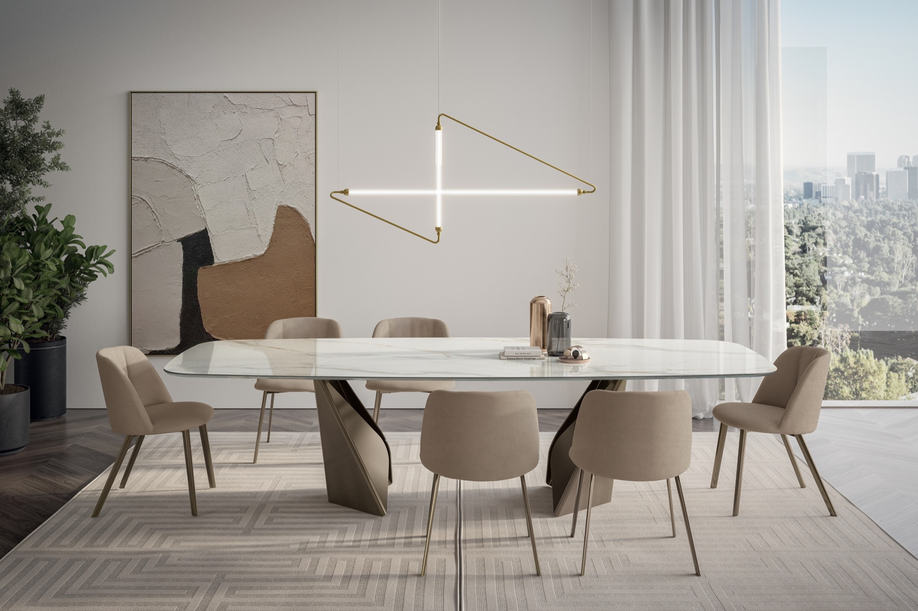 My 10 Favorite Designs at Milan Design Week 2025 — Out of the Hundreds of Pieces I Saw
There is a new elegance, color, and shape being shown in Milan this week, and these are the pieces that caught my eye
-
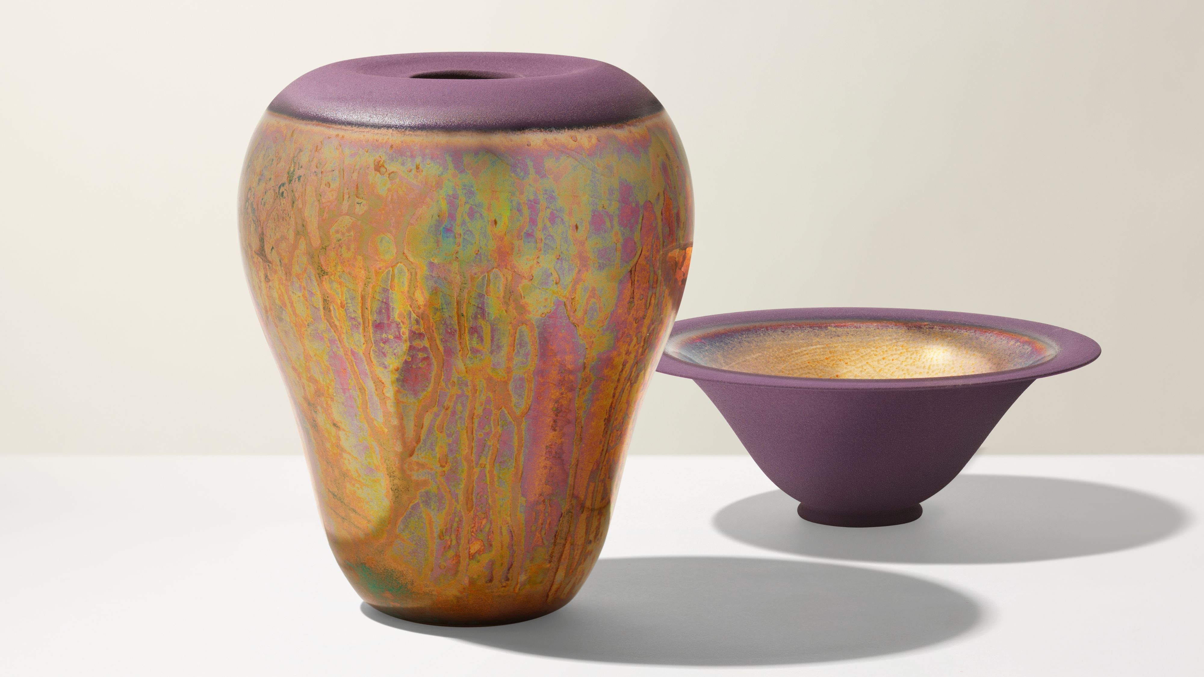 Iridescence Is Chrome’s More Playful, Hard-to-Define Cousin — And You're About to See It Everywhere
This kinetic finish signals a broader shift toward surfaces that move, shimmer, and surprise. Here's where to find it now


-
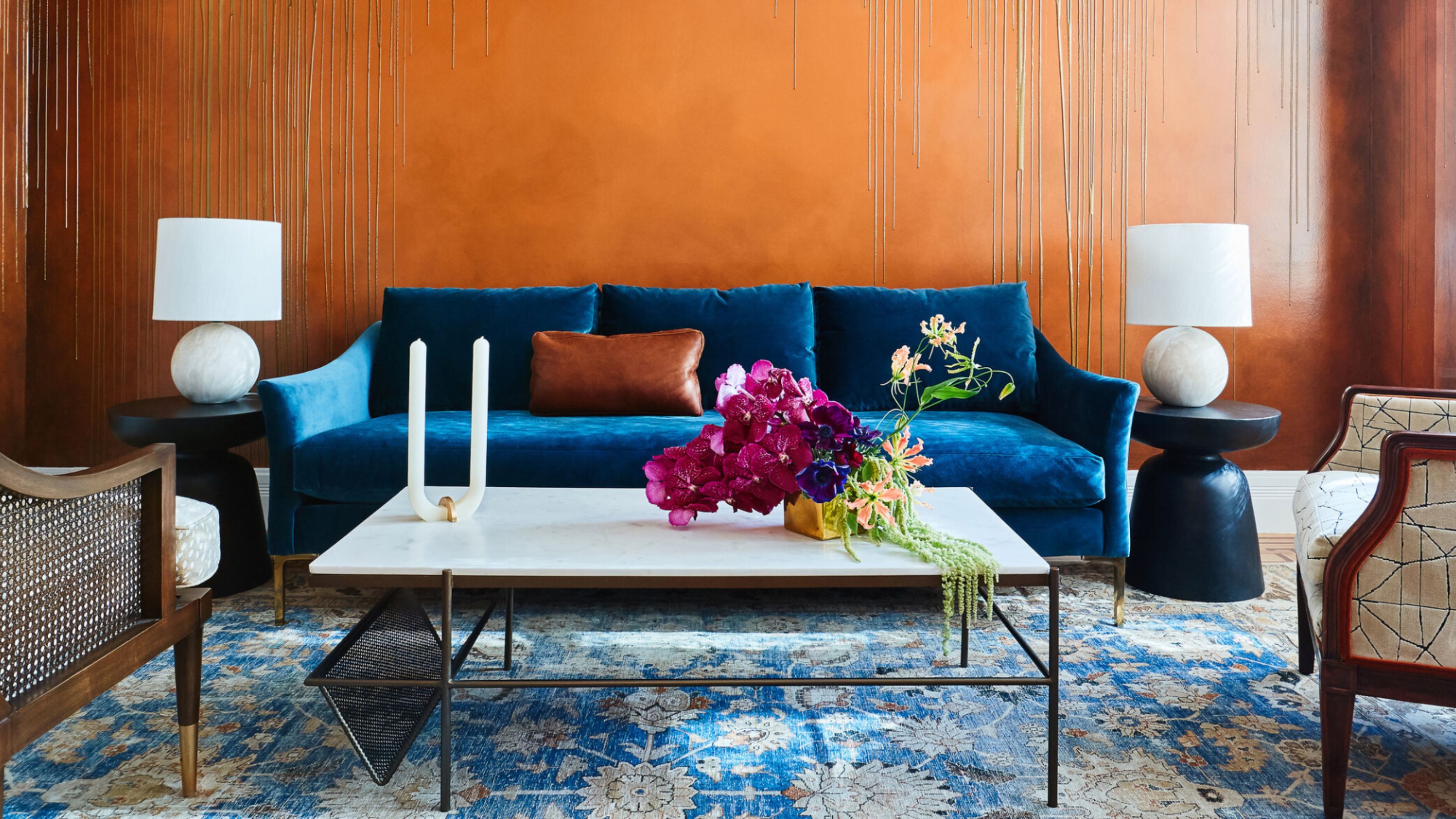 The Combination You Weren't Expecting to Love — 8 Blue And Orange Living Room Ideas That Feel Surprisingly Elevated
A blue and orange scheme for living rooms may sound jarring, but these spaces prove they're striking, vibrant, and certainly unforgettable
-
 Smeg Says Teal, and We’re Listening — The Kitchen Shade of the Year Is Here
Designers are already using the soft, sea-glass green everywhere from cabinetry to countertops
-
 Do Yellow and Purple Go Together? Designers Reveal How to Make This Unexpected Pairing Feel "Totally Intentional"
In an era where unexpected combinations have become cool, we've done a deep-dive to discover how to pair yellow and purple in a space
-
 5 Unexpected but Seriously Stylish Spring Color Palettes to Shake Up the Season — "It's Pastel, but Punchy"
Spring color palettes are notorious for their use of pretty pastels, but that doesn't mean they have to lack variation
-
 The 'Red Table Trick' Is the Easiest and Most Expensive-Looking Trend to Hit 2025 So Far
A red dining table makes a seriously stylish statement; the beloved pop of red trend just got an bold and expensive-looking upgrade
-
 Everyone's Going Crazy for This One New Shade From Farrow & Ball Online — So What's the Big Deal With 'Scallop'?
It's a classic beige, but with a hint of blush — and it's the shade we're expecting to see in every minimalist's home this year
-
 4 Bathroom Colors That Are Going Out of Style in 2025 — Don't Say We Didn't Warn You
If you're redecorating your bathroom this year, our design experts suggest you avoid these outdated colors
-
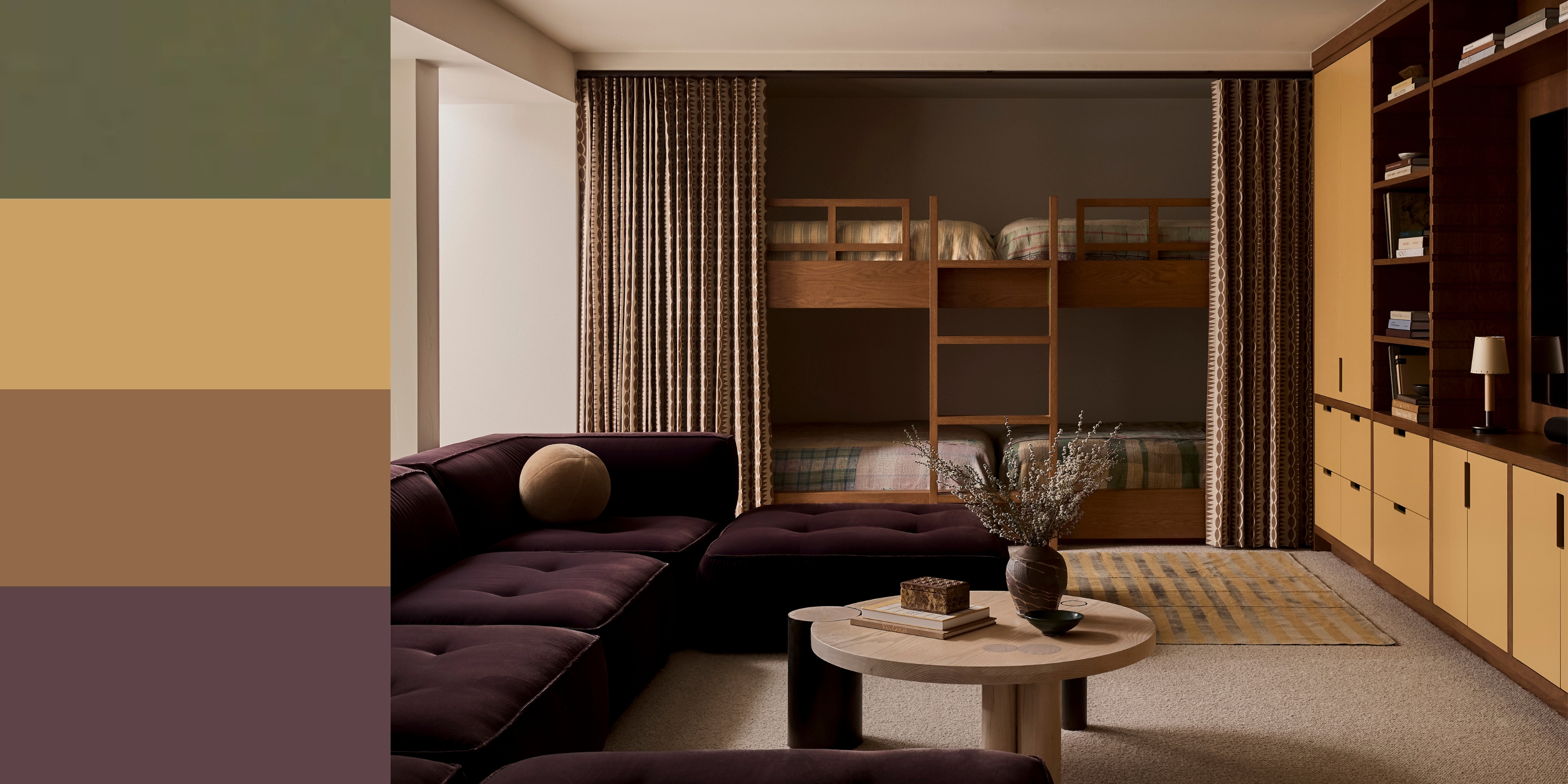 70s Color Palettes That Work for 2025 — 4 Designer-Approved Color 'Recipes' That Feel Modern Enough for Homes Today
It's time to bring out your paisley print and disco shoes — the golden yellows, olive greens, and deep purples of 70s color palettes are making a comeback


