Neutral nursery ideas – 10 ways to create a stylish space that's perfect for all genders
Because neutral nursery ideas will never go out of style, and any color will work for any child, here's how to create an almost ageless room

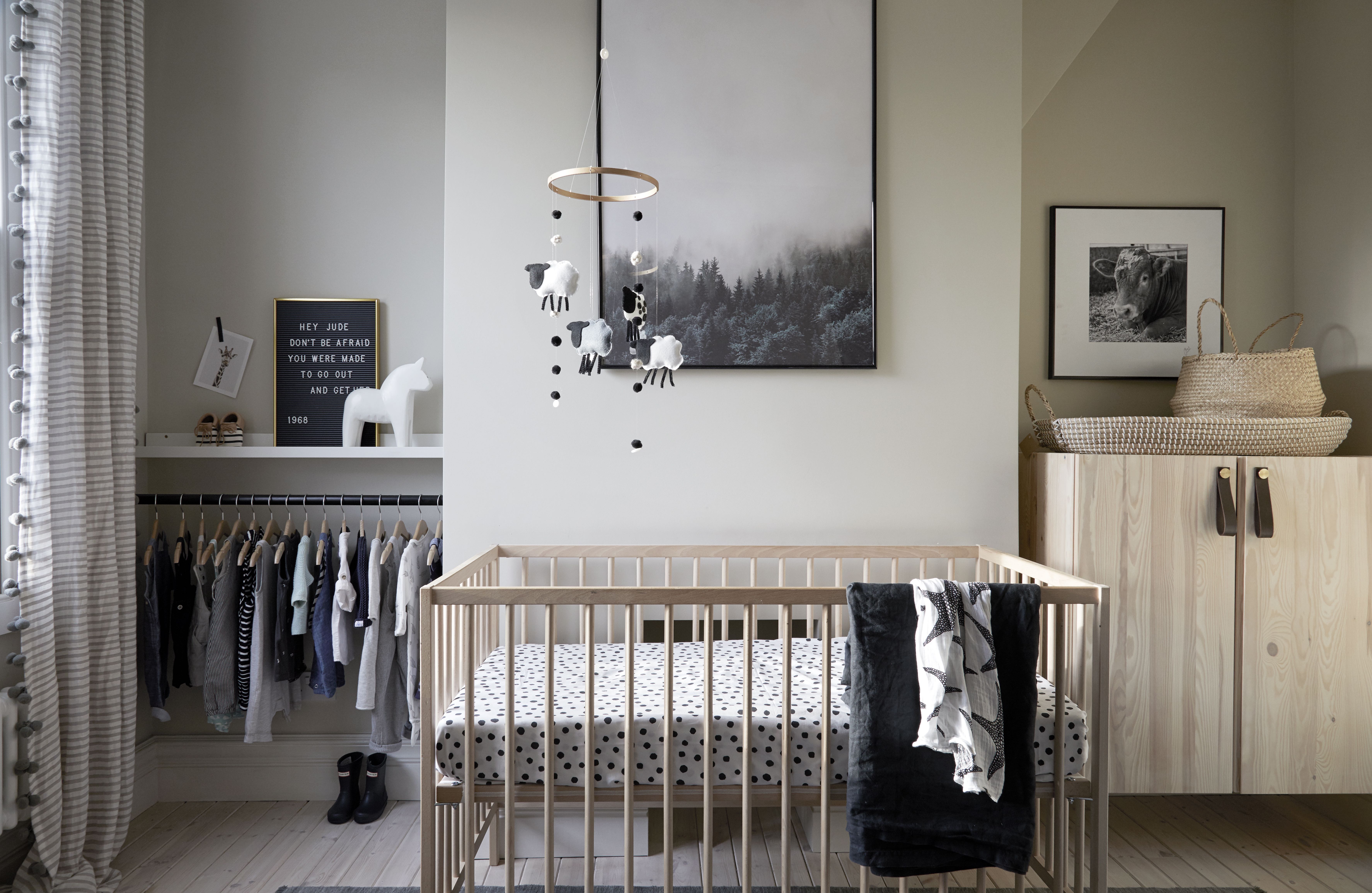
When it comes to neutral nursery decor, things are changing fast. Not so long ago it was either pink or blue and very little else. But we are quickly breaking with that tradition and neutral nursery ideas are definitely on the rise.
Now neutral may sound a bit...blah. But as all these spaces prove you don't need bold colors to create a playful space. You can still fill the room with personality that both you and your little one will love. Plus, a neutral scheme has longevity, you won't be painting their room every year as they grow and their tastes change from Minions to Minecraft. A neutral backdrop can be switched up with simple accessories when needed.
'It's a lot easier to accessorize with a few feminine or masculine touches once the baby is born rather than planning an entire scheme without knowing,' says Joanna Landais, founder of Eklektik Studio says. 'Also, parents who are planning a few more children like to have the flexibility of being able to repurpose the nursery for another baby who might be a different gender.'
From boho spaces that are all about texture, to minimalist monochrome schemes, here are the best neutral nursery ideas to inspire.
Neutral nursery ideas
1. Use a neutral scheme to keep a nursery gender neutral
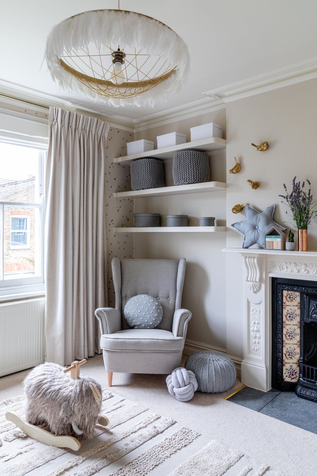
Whether you don't know the sex of your baby or don't want to adhere to gender stereotypes, sticking to a neutral color scheme scheme ensures flexibility and means you don't have to worry about whether is a a girl or baby boy nursery. And does that even matter anyway?
'We chose a neutral color palette for this nursery as planning and installation were finalized before the baby's arrival,' says Joanna Landais, founder of Eklektik Studio says. ;When choosing color, both parents wanted a design that's flexible when it comes to gender stereotypes and so a warm, neutral color scheme was the answer going forward.'
'Many of the home's Victorian features were still beautifully intact therefore we worked with existing features such as the original fireplaces, covings and chose the color that would give a fresh look yet slight vintage feel. To highlight the original sash window we chose a statement window treatment and added touches of brass to give the nursery a bit of an antique feel.'
The Livingetc newsletters are your inside source for what’s shaping interiors now - and what’s next. Discover trend forecasts, smart style ideas, and curated shopping inspiration that brings design to life. Subscribe today and stay ahead of the curve.
2. Bring plenty of texture into a neutral nursery
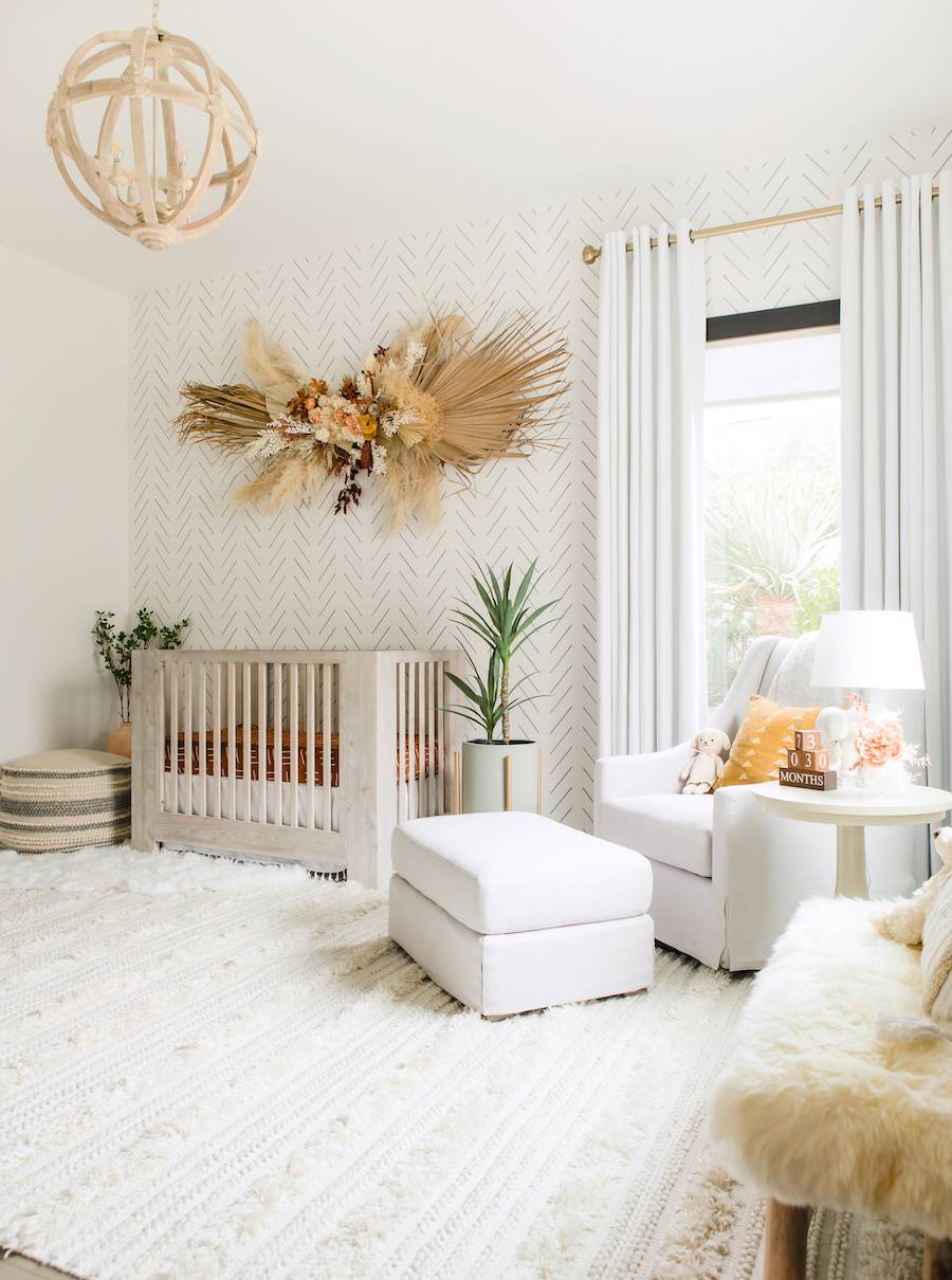
The best way to approach a neutral nursery is to treat it like any other neutral room in your home. Just as you would with a neutral living room or kitchen, you want to look for ways to add interest to the space without using color. And for us, that means texture and plenty of it.
In this very boho nursery designed by Little Crown Interiors, the color scheme is lovely and muted and soft but the space doesn't feel bland thanks to all the tactile features going on. 'This nursery was for a fairly modern home, but the client wanted a more bohemian space. So the challenge was to create a space that fit within her home, but that also gave her that “cozy” bohemian feel.' explains Naomi Alon Coe, founder of Little Crown Interiors.
'We did that by using a wallpaper with a bit more of a modern pattern, furniture with clean lines, and some really stand-out drapery to anchor the space. Then we added in lots of bohemian decor, like the amazing dried floral piece above the crib and the textured rug, and a faux-fur bench. There’s also some touches of rich color in there like mustard yellow and rust to give it depth, and plenty of greenery for that natural touch!'
3. Opt for a subtle theme
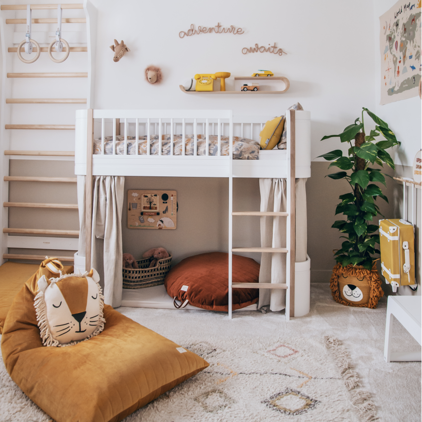
Nursery themes can be tricky as you always want to ensure the space feels fun and playful, but equally whatever theme you roll with has to last for years to come. You and your baby are going to be spending a lot of time in there so you want to choose a scheme that feels serene as well as characterful.
This space gets that balance spot on. A neutral backdrop with just a few nods to a jungle theme. 'The brief was for a neutral nursery as the gender of the baby was unknown as with many requests for a neutral nursery. The client wanted to base the design around a Safari theme which is a very popular trend for a nursery as it is so versatile and can be interpreted in so many different ways to make it unique for each customer!' says Laura Williams founder of The Modern Nursery.
'We love to use sustainable items in our designs and create nurseries that will grow with the child so our clients don't have to re-decorate again in a short space of time. For example, the Oliver cot used in this space can be purchased from newborn and used up until 9 years old! '
And as this nursery shows, 'neutral' doesn't have to just mean whites and greys and creams. A neutral palette can be so much more exciting, including pastels and muted hues. As Laura says, 'Earthy tones create a warm and inviting color palettte, neutrals can be complemented with hints of caramels, mustards, and rusts.' Warm and welcoming but still timeless.
4. Create a Scandi vibe with cool colors and pale wood

Scandinavian style is a classic and goes hand in hand with a neutral color scheme. Fresh, bright, and as practical as it is pretty the Scandi aesthetic lends itself perfectly to a nursery, and because by its nature it's minimal, it's the perfect starting point for designing a room that can be adapted as your baby grows.
'This was my son's nursery in our old house.' says designer and founder of Studio Fortum, Rebecca Wakefield. 'It was the middle room in a typical 3-bed terrace house. It was west facing so got lovely afternoon light and always felt bright and calm, even with the rainbow array of plastic toys (out of shot!).'
The walls were painted in Farrow & Ball's Shaded White, the same shade used throughout the rest of the house. But Rebecca used accessories to give the room a more child-like feel. 'Always layer textures and materials and don’t forget to use a more grounding darker tone somewhere (like the rug/cot blanket/art used here). I like the addition of spots (in the bedding) and stripes (on the curtains) to add subtle interest too.' she suggests.
5. Redefine neutral with a sage green scheme
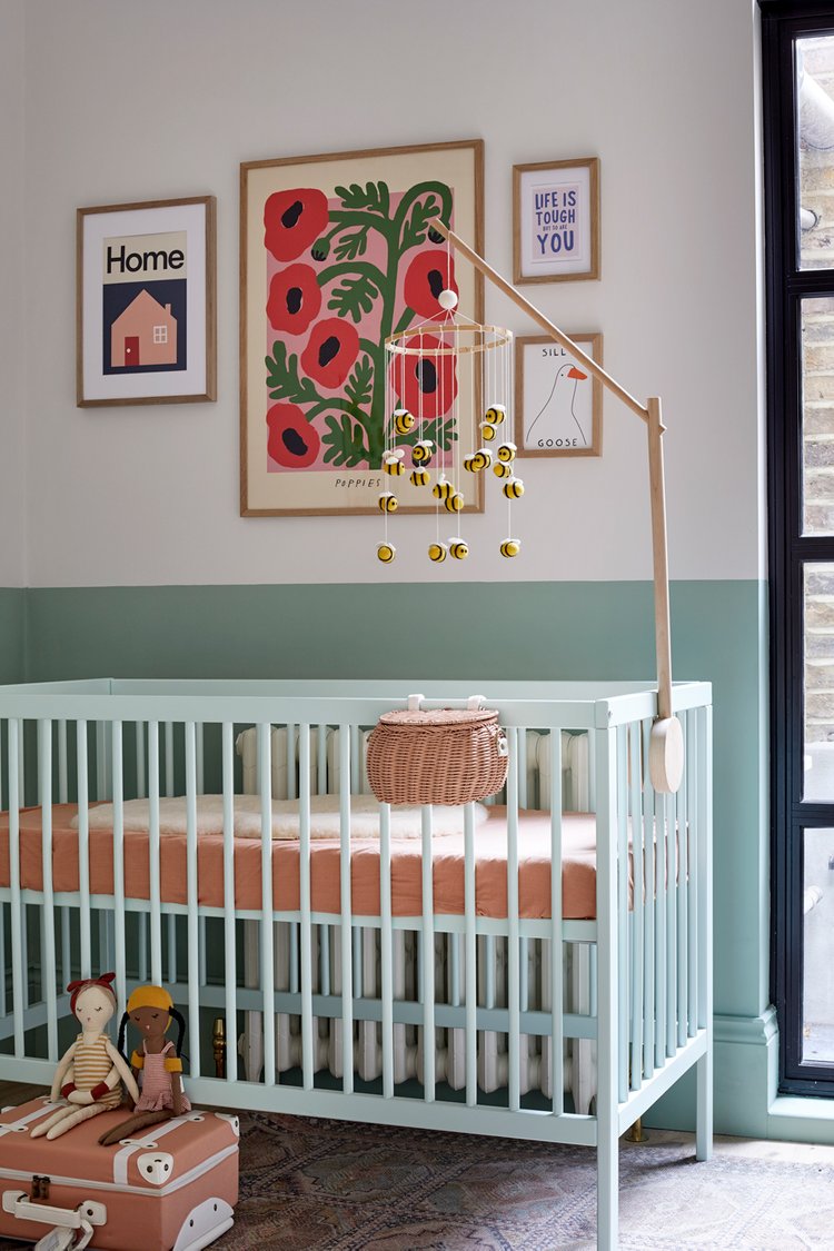
Neutral doesn't have to mean colorless, it's more about using muted colors but they can still have underlying bolder hues. This works especially well with blues and greens, the palest shade of sky blue or sage green can easily behave as a neutral, blending into the background just as a grey or cream would. And colors that go with sage green are a particular popular gender-neutral palette for nurseries because of its very soft calming qualities as this nursery designed by Born & Bred demonstrates.
'This young couple actually had their little baby girl two weeks before the builders left after renovating their whole home. I suppose it's not unusual to do all the things at once (why do we so often do that!?).' says Lisa Mettis Founder of Born & Bred Studio.
'Having a nice space early on for nursing in the early hour was important to the couple (even if the baby wasn't ready to sleep in the room). The room is sage green which is a color used throughout the remainder of the house. It's the perfect gender-neutral color (the couple didn't know the sex of their child during pregnancy and painting!!). The paint effect of color blocking the walls is great for adding strong color in small spaces, whilst allowing light to still bounce around.'
6. Inject excitement into a neutral scheme with accessories
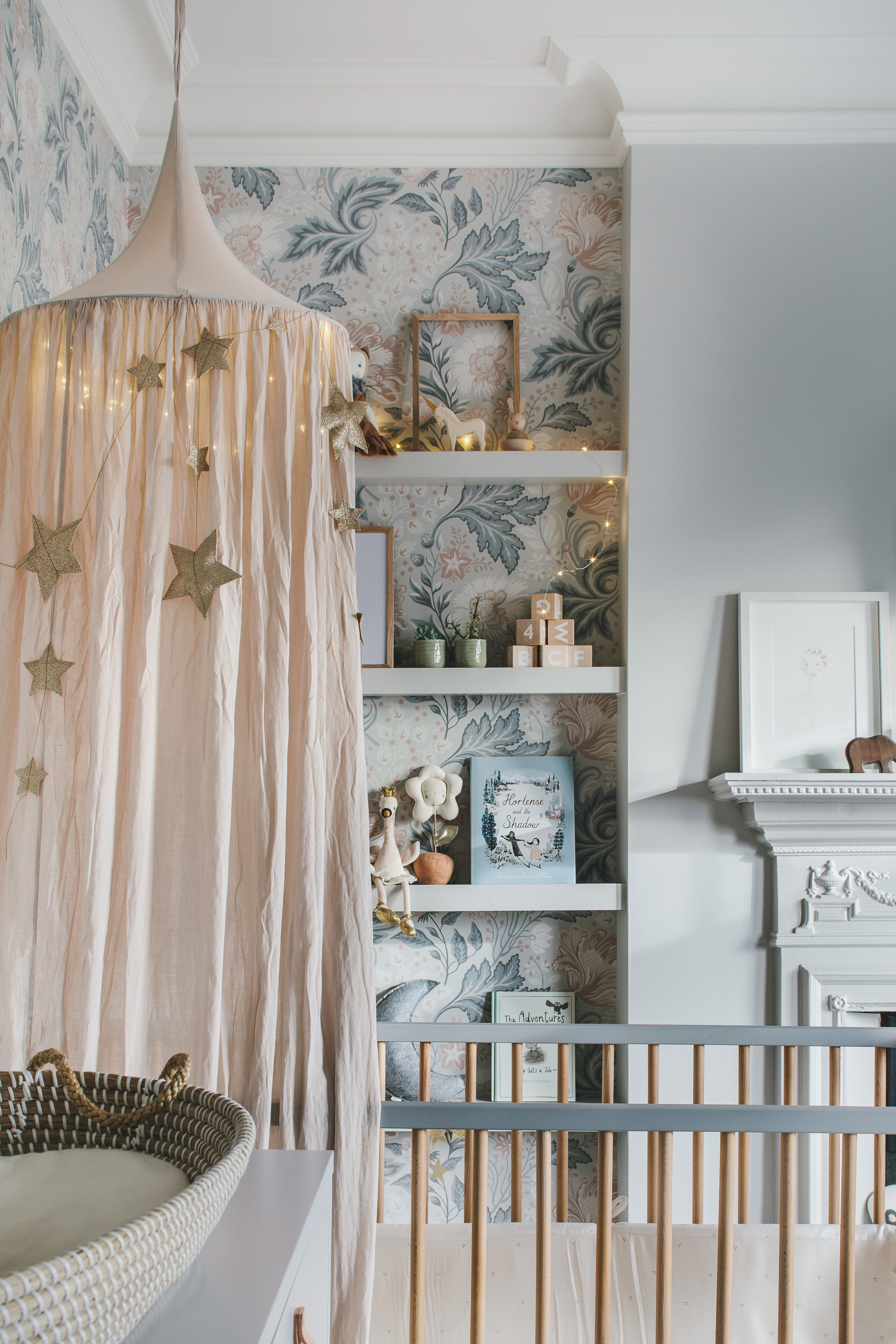
Something you are sure to have noticed by now is when it comes to neutral nurseries, it's all about the accessories. A neutral space can be just as exciting as a boldly decorated nursery, you just have to ensure there's plenty of decor to add personality. And bring in pattern too. A wallpaper or mural in a soft, muted colorway will add a ton of character to a nursery.
'The brief for this nursery was for a soft, delicate, and feminine room. We created a tonal grey scheme to work with the existing carpet and added feature wallpaper to offset the new furniture. In one of the room’s alcoves, we installed display shelves. Dusty pink and rust accents tie the room together, whilst natural fiber and timber add warmth.' explains Ursula Wesselingh, founder of Room to Bloom.
'By using whimsical/fun accessories, such as cushions on a bed, beautiful bedding, interesting child-friendly prints, fun lighting, displaying the best looking toys (and keeping the rest in pretty boxes or cupboards). Playing with color can also help create a child-friendly atmosphere – with paint effects on walls, or painting furniture in colors that are a little different.'
Again, a lovely example of how neutral can incorporate color. The blue-toned grey and pale pinks used in this space feel very kid-friendly and yet won't date as a bolder blue or pink might. If you are after the best paint colors for a girl's bedroom but want to avoid anything too girly, this combo would be perfect.
7. Choose a neutral mural for the perfect backdrop
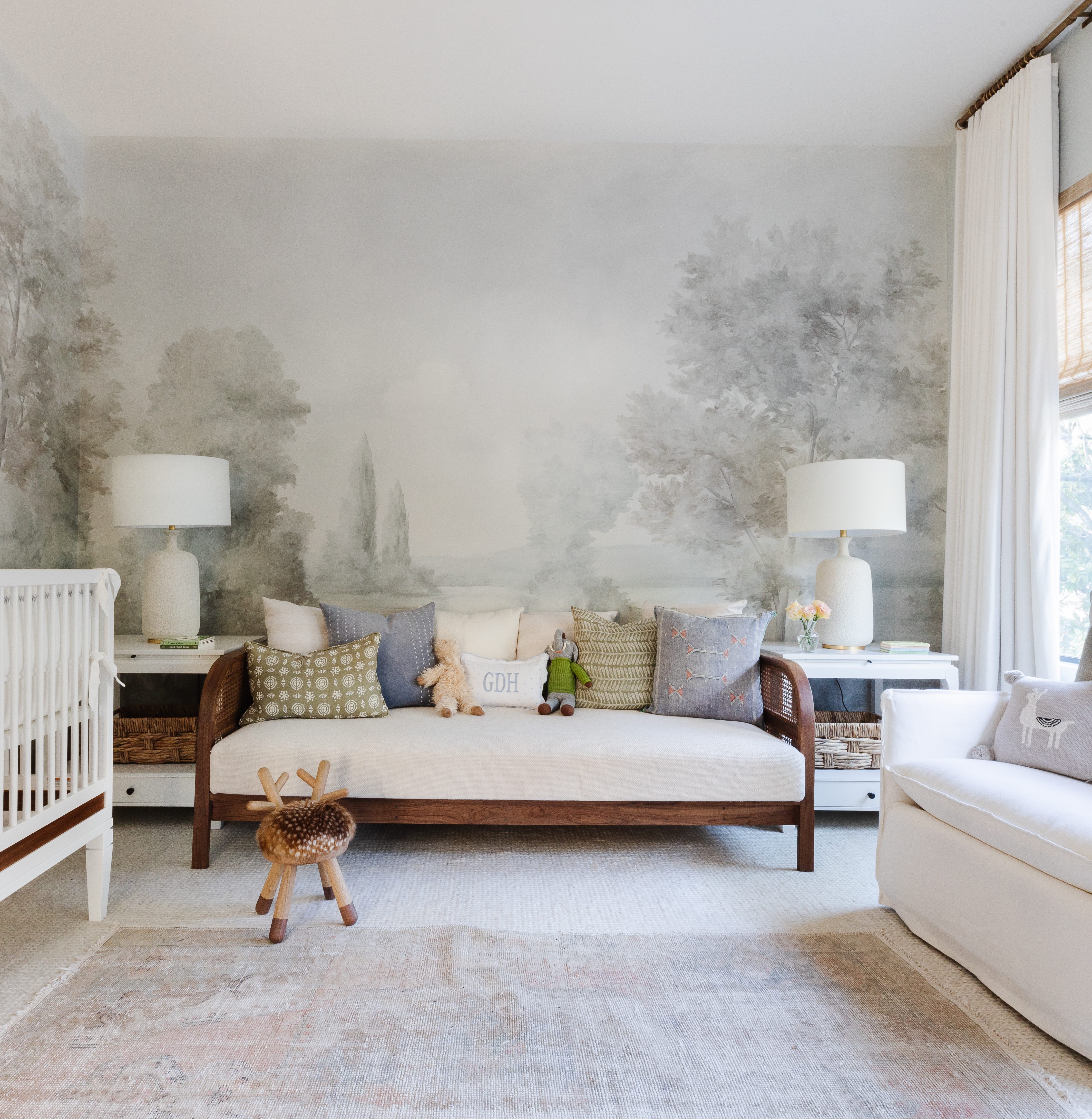
How dreamy is this nursery designed by Marie Flanigan? The mural feels whimsical without being too quaint and the hints of pale blue and green fit the subtle nature theme and yet still feel nice and neutral.
'This nursery is an incredibly sweet and serene space. Our goal was to pick a soft palette that we could layer with similar colors and natural elements, while giving the family space to grow into. I love how the bespoke Susan Harter mural paper sets the tone for the room without visually dominating the space.' says Marie.
'To recreate this space, wall coverings are always a beautiful statement. If a mural like this one is out of budget there are wall coverings like natural, textured papers or even peel-and-stick options that can serve to elevate the space. Having a daybed in the room adds comfort for the exhausted new parents while providing longevity.'
'I also love incorporating touches of nature and texture by using wicker baskets, woven wood shades, and beautifully stained furniture. Lastly, ensure the room is soft underfoot. Layering rugs is a great option so that no matter where tummy time takes place, the little one is comfortable.'
7. Use a rug to add color and pattern
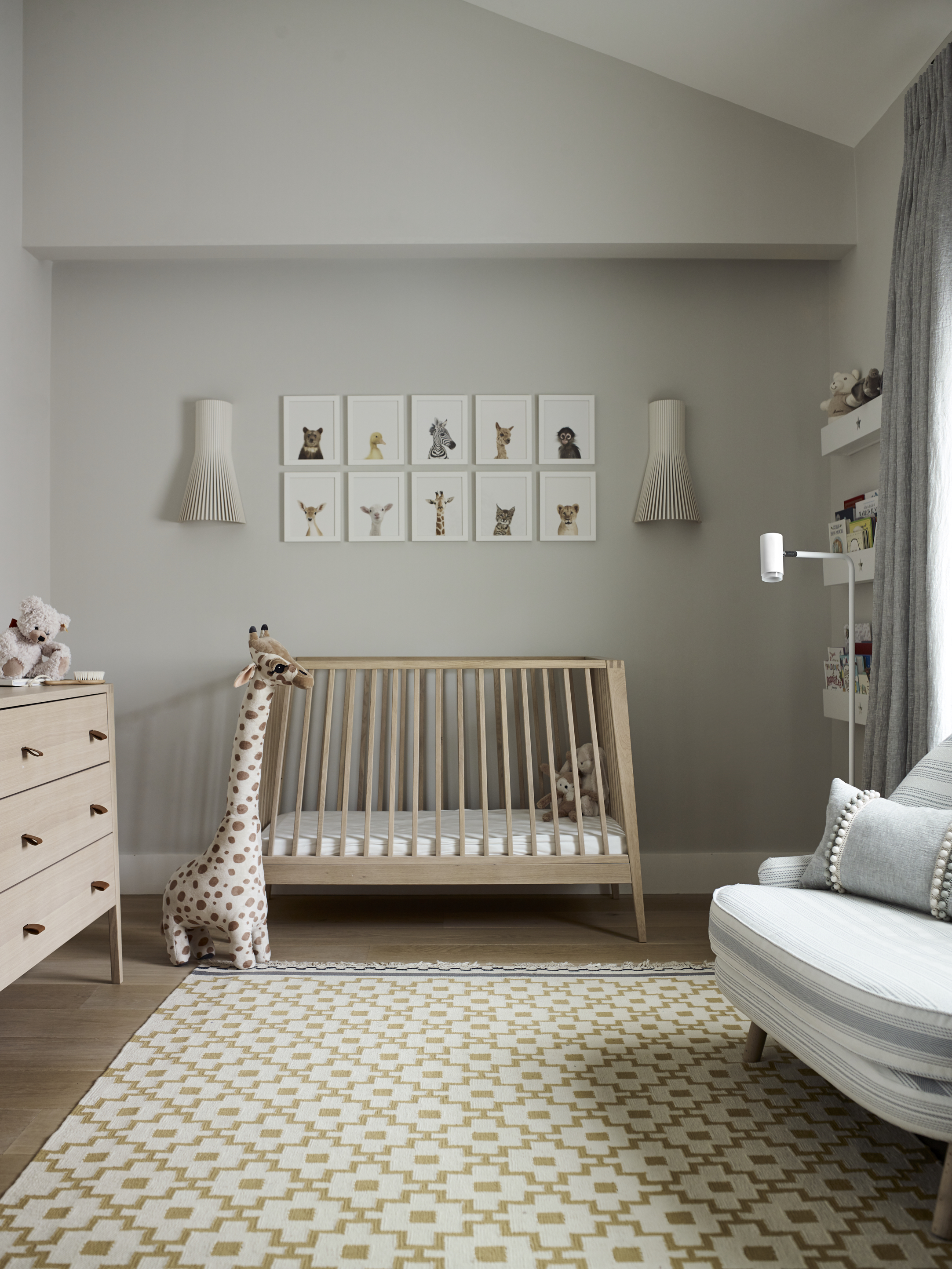
An area rug can add so much to a room – color, pattern, and texture and is a practical addition to a nursery too as it adds softness underfoot (and bellies). It's also an easy way to create a focal point in a neutral room but is interchangeable too, so you aren't committing to say a bright wall color or bold wallpaper.
'If your nursery is painted in neutral tones, add a splash of color with a statement rug.' advises designer and founder of Gunter & Co, Irene Gunter. 'A quick reminder: the number one mistake people make is picking a rug that’s too small. Remember, a rug should pull the various elements of a room together as well as anchor the furniture. If it is too small, it will look as though it is floating in the middle of the room, making the space feel disjointed.'
'You’ll also need to consider what material your rug is made of. It will need to feel super soft underfoot, but given its location, it will also need to be hardwearing and easy to maintain. For this reason, I recommend a washable rug or an antibacterial memory foam play mat, which just needs a wipe down with a gentle cleaning solution and cloth.'
8. Use prints to add personality
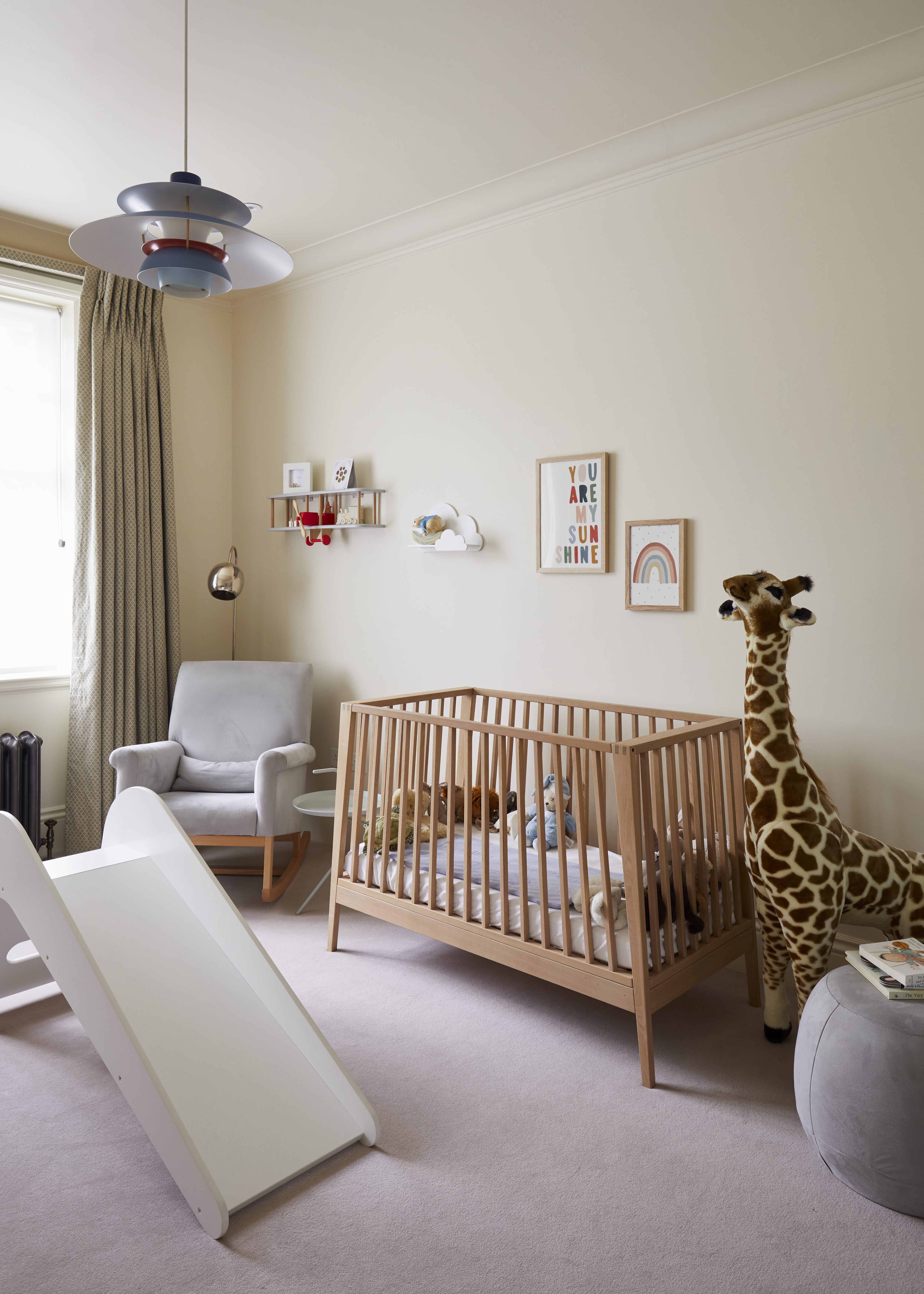
Similar to a rug, prints, whether you opt for a few statement pieces or a gallery wall, are an easy way to inject some personality into a neutral scheme. Plus, you can really affordably switch them out as your baby grows to change the theme and feel of the space.
'This was a neutral nursery created when our client was pregnant and didn’t know her child’s sex so she wanted it to work for either a boy or a girl. We used a neutral, yellow, and grey palette with a Scandi feel for neutrality.' explains Nicky Mudie Founder and Director of Violet & George.
Irene Gunter adds 'Accessories are the perfect way to lift a neutral nursery. Pull a color from a patterned rug or piece of art and repeat it on a smattering of accessories. Remember, it’s not necessary to color match everything. Source accessories in a slightly darker or lighter shade of your key color to keep things interesting. You could even work with a mixture of both.'
9. Add opulence to a neutral nursery
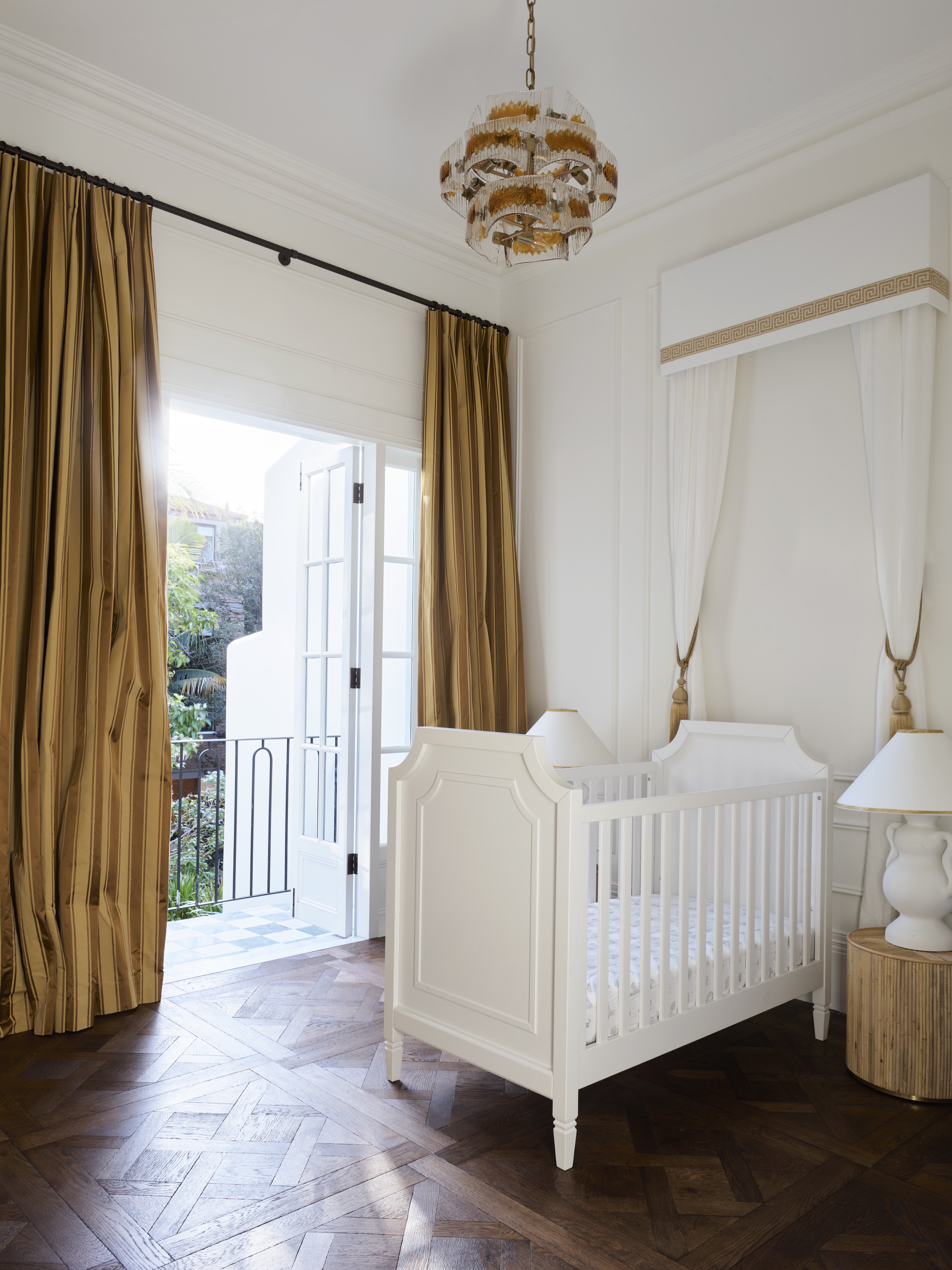
This nursery is chicer than most adult bedrooms! The rich gold curtains, the gorgeous parquet floor, the canopy, and the statement lighting are all things we'd covet in our own rooms. And as a parent, you loving the space and feeling calm whilst in there is really important too. Chances are you are going to be spending a lot of late nights in the nursery so designing a space that's zen-like and relaxing is key.
'This project was a European-inspired renovation nestled in the heart of leafy Potts Point.' explains designer Tamsin Johnson. 'The nursery was designed with a mix of charm and opulence, with a 1960’s Amber Murano glass pendant and luxurious honey striped silk curtains. Whilst having strong features the neutral palette allows for the room to transition throughout the child’s early years.'
10. Ground a neutral color palette with darker hues
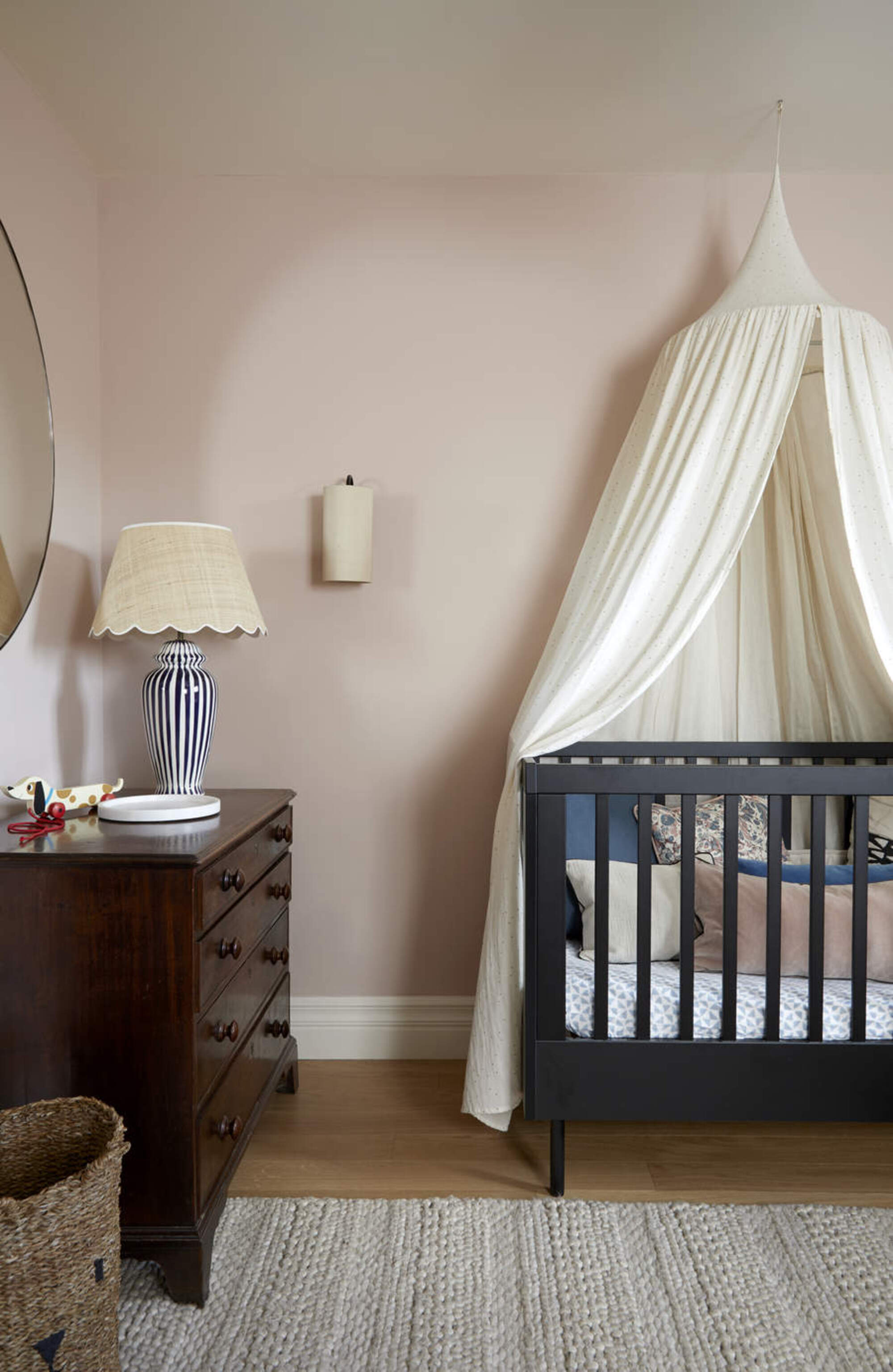
While all those soft lovely hues of a neutral scheme work to create the perfect calming scheme for your baby, from a design perspective (and hey that's important too!) you want some darker hues in there to ground the space.
You could easily do this with smaller accessories but if you really want to create a focal point within the space, choose one of the main pieces of furniture. The deep soft black used in this pale pink nursery prevents the room from becoming too saccharine, it doesn't feel overly girly and creates a more neutral feel.
Plus, if you have a wooden cot you can always paint it to change the look of the nursery. You could go for something very pale and calming when you have a newborn and then as they get older try our darker or bolder shades. Just be sure to choose a water-based, low-odor paint.
How do you bring a natural vibe to a nursery?
Think texture. Rattan storage baskets, seagrass lampshade, really lovely slubby throws, and a cozy, high-pile rug. And consider colors too, along with all the traditional neutrals like white and grey, bring in some softer, more nature-inspired hues like sage greens and pale custard yellows. For a real natural vibe, you could run with it as a theme and bring in subtle nature motifs in your prints, wallcoverings, or soft furnishings.
'Textures are the key.' says Joanna. 'Layering faux sheepskin, knitted fabrics, or accessories with feathers can significantly elevate the space. Remember about working within the same color palette but in different shades. For instance, mixing off-white with beige and brown shades will bring in a lot of visual interest. Also don't be afraid to use texture, rattan, cane, or wood of all shades and finish will ensure a cohesive color scheme.'
What neutral colors work in a nursery?
Traditionally, neutral covers colors like white, grey, beige, and cream, but we think when decorating a nursery, you are best off playing fast and loose with the term 'neutral.' We think dusky hues and earthy tones like pinks, blues, greens, and oranges can work perfectly well in creating a neutral color scheme.
'Classic neutrals such as white, beige, grey, and monochrome work well for Scandinavian style nurseries, but soft color works equally well, as long as the color scheme is kept simple.' suggests Ursula.
'For example, choose one main color with one or two accent colors, or by using a tonal scheme. And for a really successful neutral scheme, you will need lots of storage to keep dissonant colors/items out of view and simplify the room.'

Formerly the Digital Editor of Livingetc, Hebe is currently the Head of Interiors at sister site Homes & Gardens; she has a background in lifestyle and interior journalism and a passion for renovating small spaces. You'll usually find her attempting DIY, whether it's spray painting her whole kitchen, don't try that at home, or ever-changing the wallpaper in her entryway. She loves being able to help others make decisions when decorating their own homes. A couple of years ago she moved from renting to owning her first teeny tiny Edwardian flat in London with her whippet Willow (who yes she chose to match her interiors...) and is already on the lookout for her next project.