

Emma Breislin
Neutral paints. There are thousands of shades to pick from — whites, beiges, greiges, and creams — it can be hard to know where to even begin. So, I've made a start for you, by asking interior designers to share their favorite neutral paint shades (some even swatched straight off the walls of their very own homes.)
And it turns out, when it comes to curating neutral color schemes, most designer's have a failsafe paint shade they turn to time and time again. Whether it's one that works best in low light, bright light, or has color-changing qualities throughout the day, most of the designers I spoke to were quick to share their top neutral paint color.
Below, I've narrowed down your search from a whole lot (Home Depot has over 200 neutral paint colors alone), to these top nine, recommended by designers.
1. Benjamin Moore's 'Chantilly Lace'

Looking for a warm, bright backdrop for this neutral living room, designer Lee Broom opted for Benjamin Moore's Chantilly Lace. "The furniture and textures in the room are all shades of ivory to shades of beige, so I wanted a very clean palette for the walls that would highlight and frame those objects," he explains.
With key lighting from Lee's own collection providing a warm hue, in the evening the wall color becomes imbued with its own sense of warmth. "Often people who visit the penthouse don't even realize the walls are actually white," he says. "It's all about the lighting, the objects, and the natural daylight in the space."
California-based designer Nureed Saeed, of Nu Interiors, agrees that Chantilly Lace should be a go-to neutral paint shade. "I use it for walls, trim, and ceilings to give the space a cohesive feel," she shares. "I've used this color in both my home in New Jersey and California for the main spaces, kitchen, bathrooms, and bedrooms, and love how it reads bright, yet warm."

Price: $5.99/sample
2. Backdrop's 'Morning Ritual'

Just like every good neutral paint color should, interior designer Alana Marie of Alana Marie Interiors says Backdrop's Morning Ritual can easily be dressed up or down. "It's ideal for bedrooms," she says, "where its warm, light gray-beige tones can shift towards taupe or lavender, depending on the amount of light in the room."
It's the sort of shade you can apply to the walls and ceiling without overwhelming the space, although Alana also recommends pairing it with, "Cooler tones of taupe and blue, then balance the look by incorporating antiques or vintage pieces to add warmth and character."

Price: $5/sample
3. Sherwin Williams' 'Alabaster'

Another subtle off-white paint that exudes coziness and comes with designers' tick of approval is Sherwin Williams' Alabaster. It's a subtle off-white that exudes coziness. In bright light, it shines brighter, but during darker days in the cooler months, it starts to feel warmer and more cocooning with its subtle creamy undertones."
"We chose this white [for the room above] as it is crisp and warm at the same time in certain lights," says Shannon Mann, founder and principal of Texas-based Mann Designs Studios. "It works perfectly with the light caramel tones in the French oak floors. This palette of indigo, caramel, cream, charcoal, and stone is based on the homeowner's desire for a sophisticated neutral palette that offers longevity and a great backdrop for the wall art."

Price: free color chip
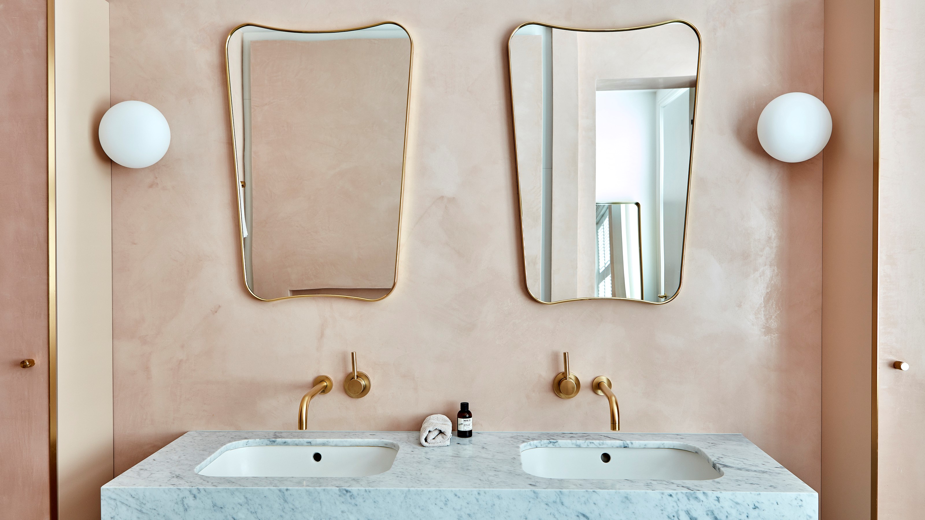
4. Benjamin Moore's 'Pale Oak'

Whether it's used in the bathroom or main living area, one of the best Benjamin Moore neutrals, according to interior designer Ashley Macuga of Collected Interiors, is their Pale Oak shade.
"With just the right balance of warm and cool undertones, this perfect neutral paint creates an incredible backdrop for a room's furniture, décor, and architectural details to take center stage," she says.
Pictured above in a neutral bathroom color scheme from one of Ashley's projects, the neutral paint sets off the bright white of the marble countertop and mirror and balances these features with the warmer tones of the wood cabinet.

Price: $5.99/sample
5. Farrow & Ball's 'Shaded White'

For a neutral paint that's a little bit warmer, and one that works well during fall and winter, opt for a sandy off-white that has a warming yellow undertone.
"The color used in this room is Farrow & Ball's Shaded White," says designer Christine Lemieux of Lemieux Et Cie. It's one of her favorite, and it's easy to see why.

Price: $8.50/sample
6. Benjamin Moore's 'White Dove'

Kentucky-based interior designer Bethany Adams says it's neutral paint colors from Benjamin Moore that she regularly reaches for. She uses White Dove OC-17 in "almost every project that requires white trim or a neutral white wall," she says. "It looks great next to every other color. It's never too yellow, never too gray, never too stark — always perfect. My own neutral kitchen cabinets are painted this color, and I love it."
Interior designer Sarah Brady, principal and founder of Salt Design Company also recommends Benjamin Moore's White Dove. "Its soft, warm undertones strike the perfect balance between crisp and cozy," she says. "It's light enough to brighten a room without feeling stark, yet it still has depth, which lends a sophisticated, timeless feel."
"It's my tried-and-true backdrop for layered, curated interiors that feel both classic and livable," Sarah adds. "Its clean aesthetic pairs effortlessly with natural stone, wood accents, and modern finishes."

Price: $5.99/sample
7. Benjamin Moore's 'Titanium'

But Bethany also likes to use Benjamin Moore's Titanium OC-49, seen pictured in this sunroom. "I love this color because it looks wildly different in every project, but always fabulous," she says. "It's a chameleon-like color that could be gray or green or blue depending on what you put next to it or where it is in the home. I've used it in basements with no light and brightly-lit sunrooms — it's fantastic everywhere."

Price: $5.99/sample
8. Sherwin Williams 'Drift of Mist'

If you're looking for a gray-toned neutral paint, interior designer Lauren Sullivan of Tennessee-based studio Well x Design recommends Sherwin Williams' Drift of Mist.
"We primarily have this color in a custom-tinted limewash plaster in the main living area throughout our home," she says. "I chose it because it's a warm and inviting off-white with a hint of gray that helps to balance the incredible amount of warm evening sun we receive."

Price: free color chip
9. Benjamin Moore's 'Horizon'

A neutral is characterized by a color without much saturation, and Benjamin Moore's Horizon has a fresh, cool undertone that reads a subtle tinge of green in certain lights. It's barely noticeable, which is why this is a near-perfect neutral paint.
"We love using Benjamin Moore's Horizon," says Matthew Rauch of New York-based Rauch Architecture. "It's a warm, milky blue-green gray. It's perfect for living rooms because it's the perfect calm gray that reflects enough light to make a statement while not clashing with any other design decisions in the space.
"It changes throughout the day, allowing a golden glow in the mornings and a soft backdrop in the evenings — perfect for softening any room and making it feel more cozy," he adds. "Another trick that we have been using is to paint the ceiling the same color as the walls [called color drenching]. The lack of contrast can create a more subtle, muted color scheme, and make the ceiling feel a bit lower and less intimidating."

Price: $5.99/sample
So now that the design experts have narrowed down your choice of neutral paint colors, you might want to consider reading up on the nuance behind how to choose neutral paint depending on your space — its size, the amount of sunlight it gets, as well as its intended purpose, because they're important factors to consider.

-
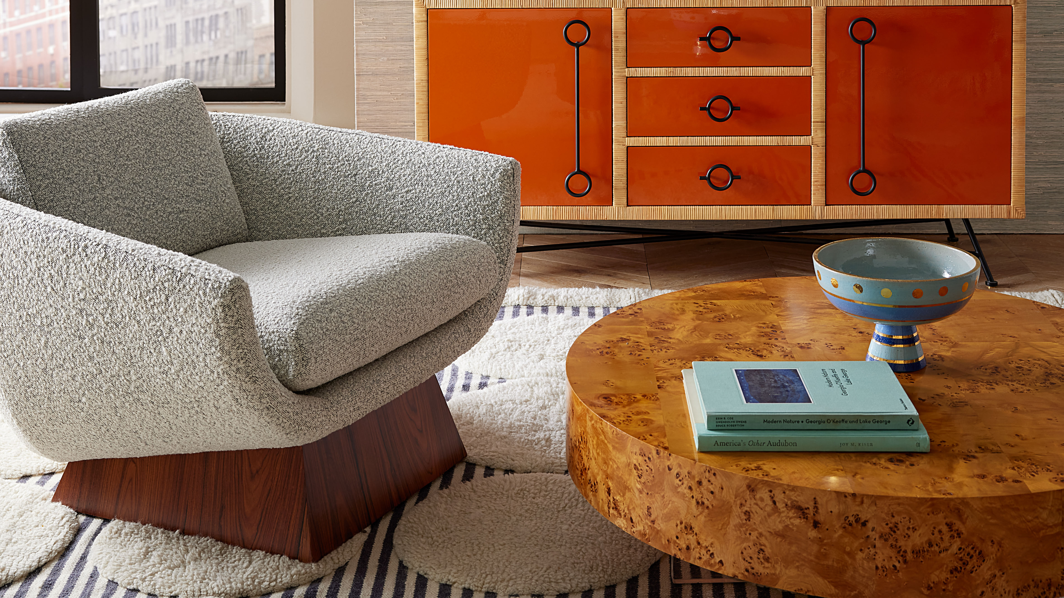 Burl Wood Decor Is 2025’s Most Coveted Comeback — Here’s How to Get the Storied Swirls for Less
Irregularity is the ultimate luxury, but you don’t need an antiques dealer to find it
-
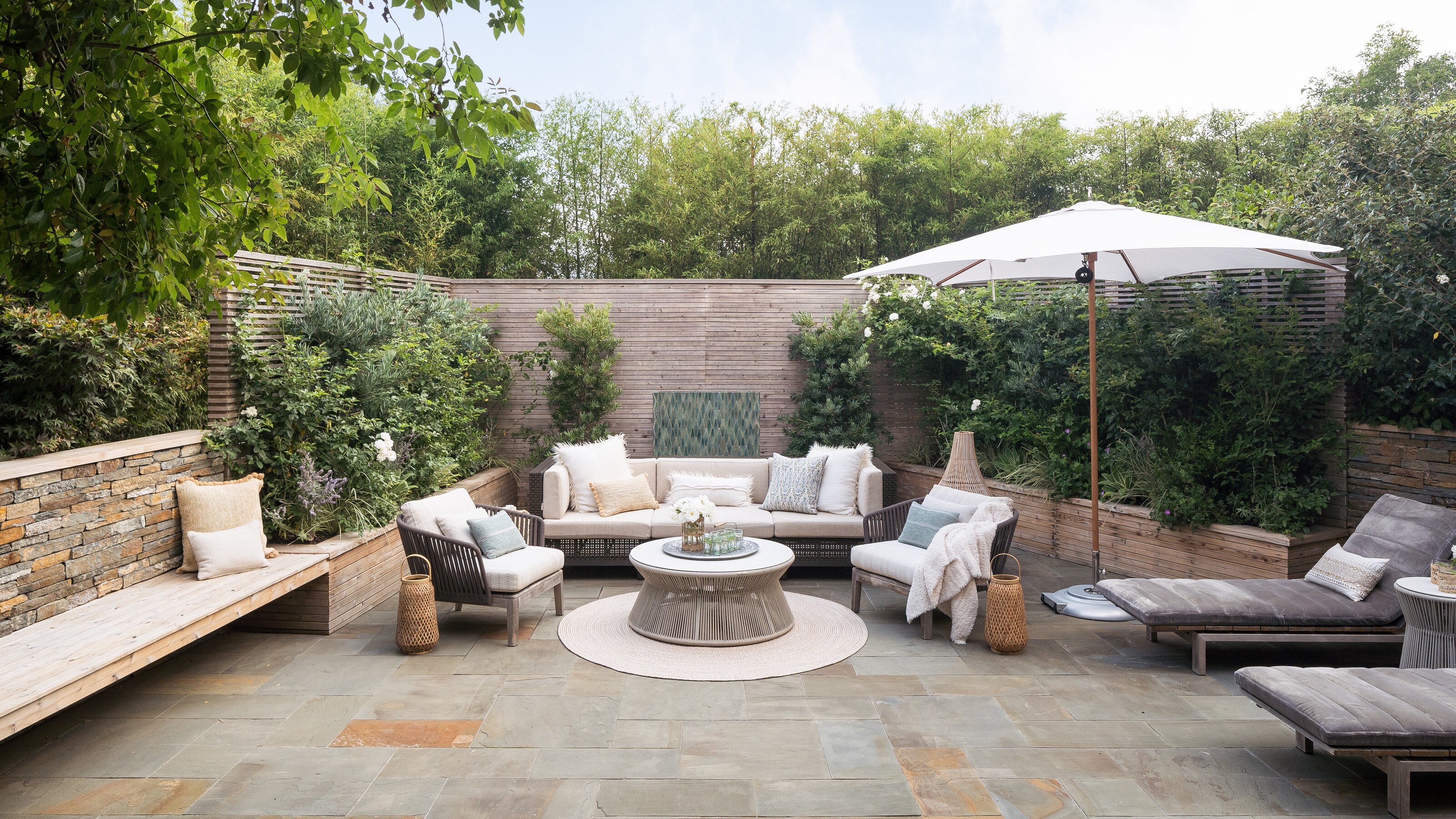 5 Garden Features That Instantly Add Value to Your Home — While Making Your Outdoor Space More Practical, too
Get to know all the expert tips and tricks for making your backyard a standout selling point for your home.


-
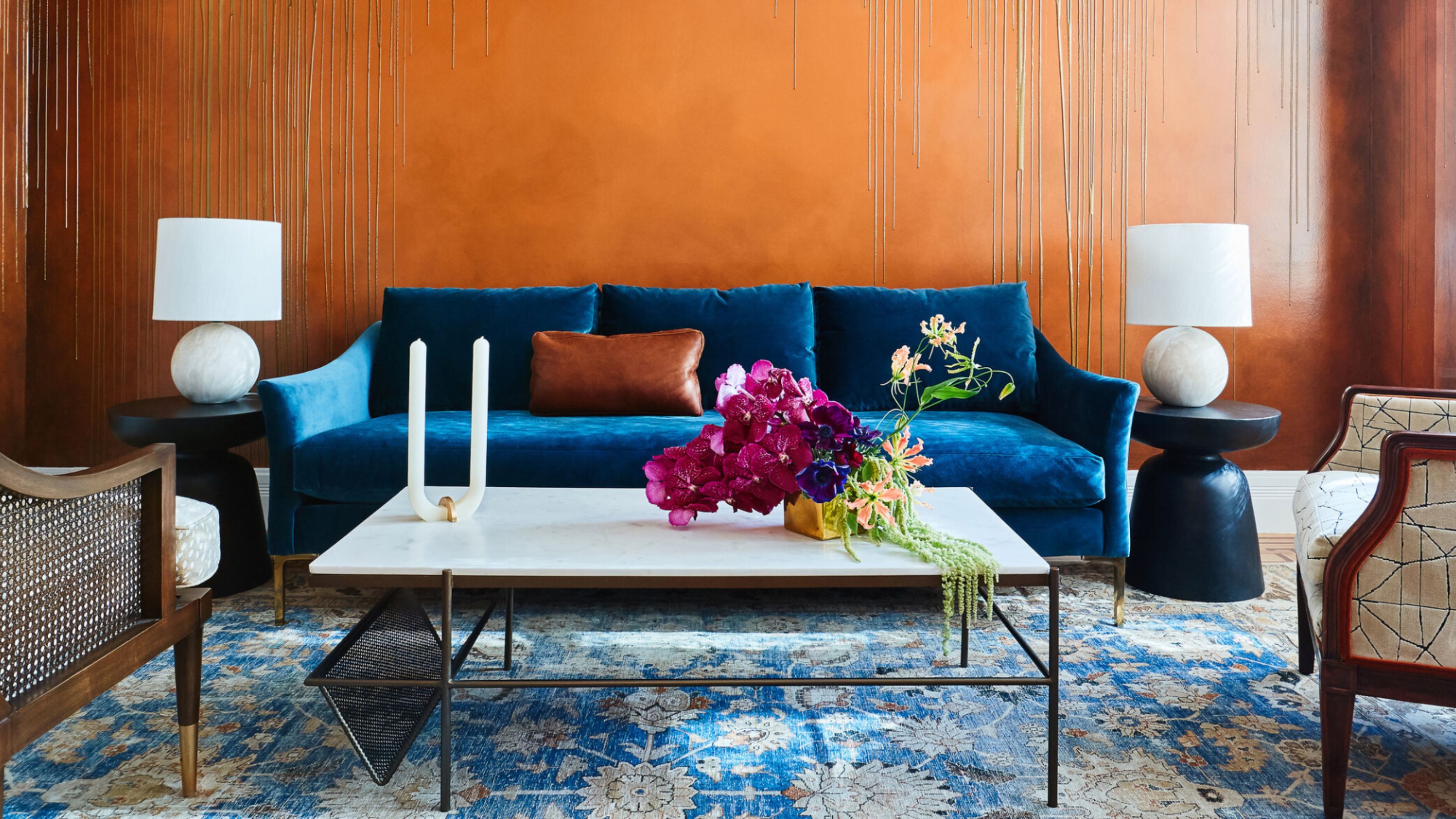 The Combination You Weren't Expecting to Love — 8 Blue And Orange Living Room Ideas That Feel Surprisingly Elevated
A blue and orange scheme for living rooms may sound jarring, but these spaces prove they're striking, vibrant, and certainly unforgettable
-
 Smeg Says Teal, and We’re Listening — The Kitchen Shade of the Year Is Here
Designers are already using the soft, sea-glass green everywhere from cabinetry to countertops
-
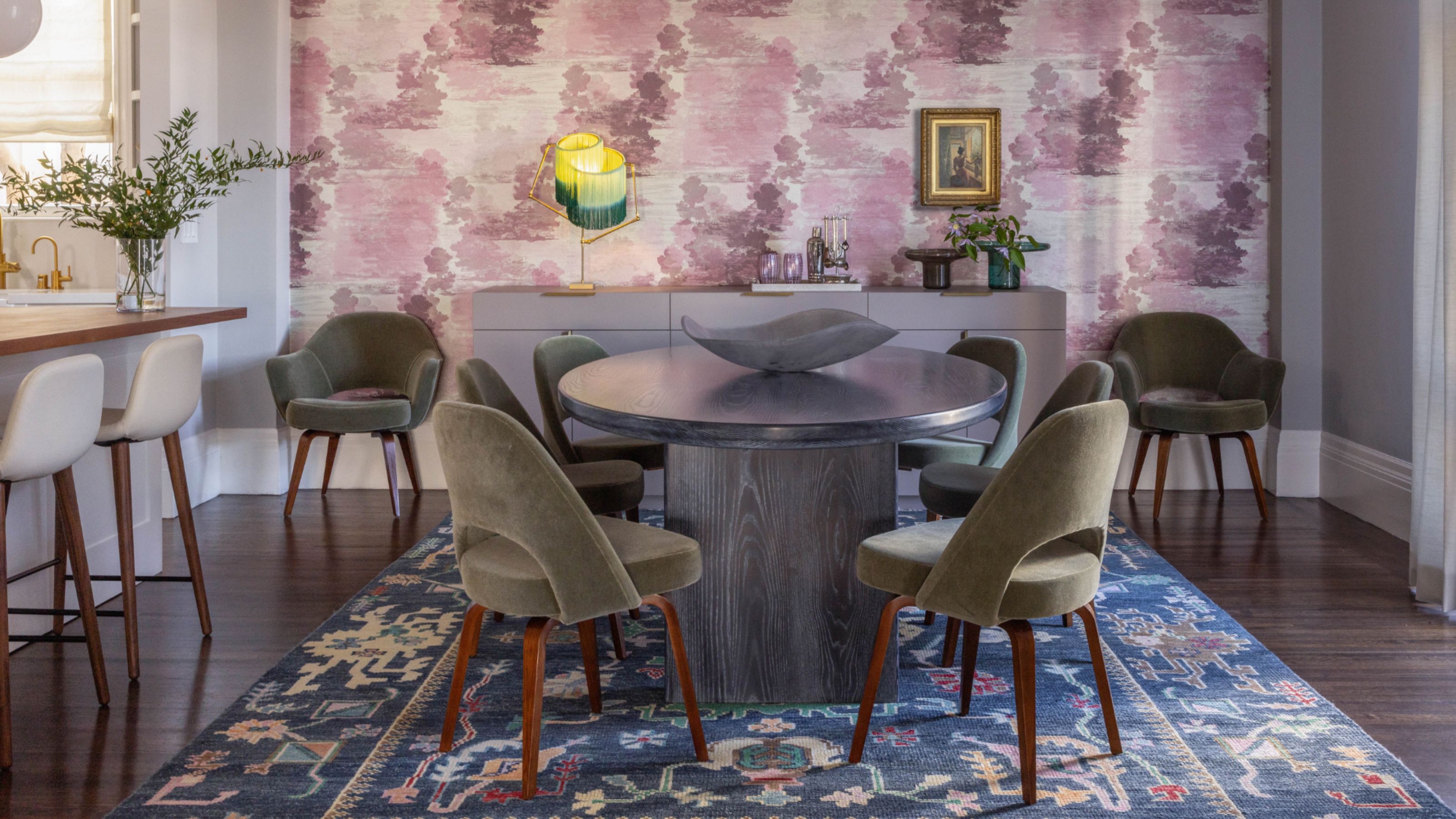 Do Yellow and Purple Go Together? Designers Reveal How to Make This Unexpected Pairing Feel "Totally Intentional"
In an era where unexpected combinations have become cool, we've done a deep-dive to discover how to pair yellow and purple in a space
-
 5 Unexpected but Seriously Stylish Spring Color Palettes to Shake Up the Season — "It's Pastel, but Punchy"
Spring color palettes are notorious for their use of pretty pastels, but that doesn't mean they have to lack variation
-
 The 'Red Table Trick' Is the Easiest and Most Expensive-Looking Trend to Hit 2025 So Far
A red dining table makes a seriously stylish statement; the beloved pop of red trend just got an bold and expensive-looking upgrade
-
 Everyone's Going Crazy for This One New Shade From Farrow & Ball Online — So What's the Big Deal With 'Scallop'?
It's a classic beige, but with a hint of blush — and it's the shade we're expecting to see in every minimalist's home this year
-
 4 Bathroom Colors That Are Going Out of Style in 2025 — Don't Say We Didn't Warn You
If you're redecorating your bathroom this year, our design experts suggest you avoid these outdated colors
-
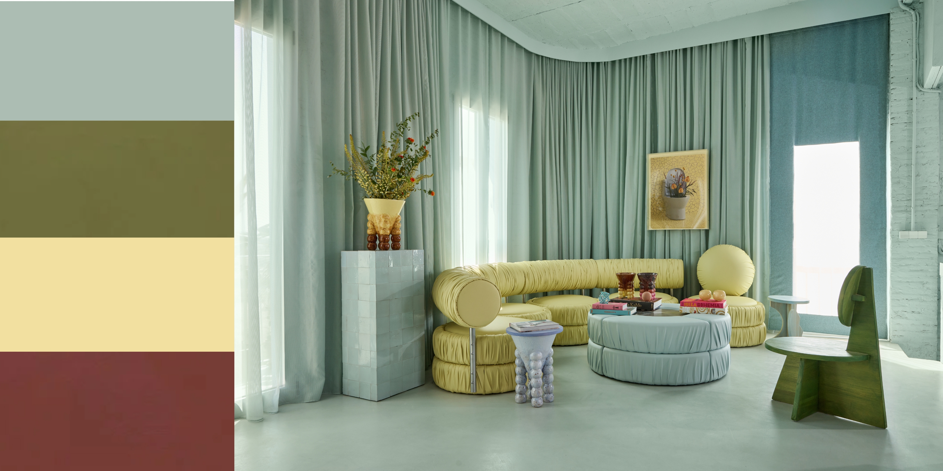
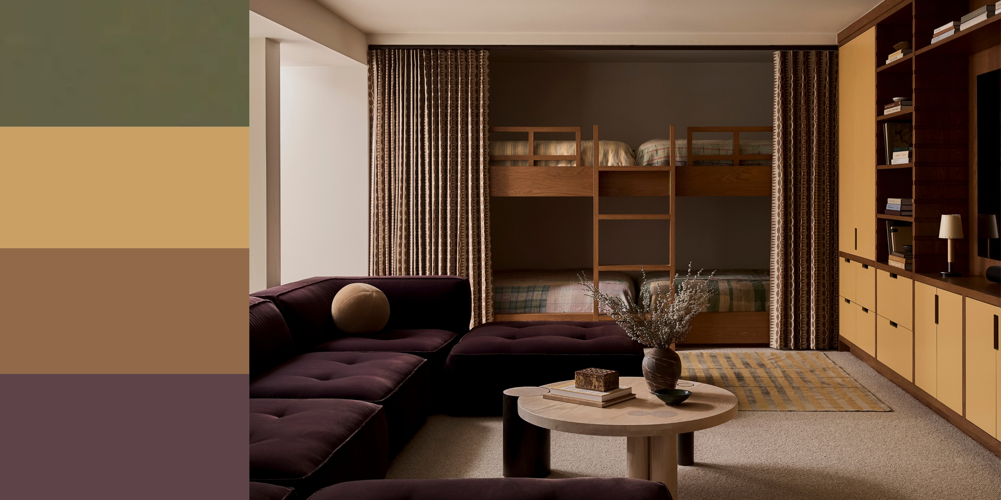 70s Color Palettes That Work for 2025 — 4 Designer-Approved Color 'Recipes' That Feel Modern Enough for Homes Today
It's time to bring out your paisley print and disco shoes — the golden yellows, olive greens, and deep purples of 70s color palettes are making a comeback


