We're sold – a one wall kitchen might just be the best solution when you're working with a small space
A one wall kitchen packs plenty into a small area, giving you space to play with for the rest of your floorplan

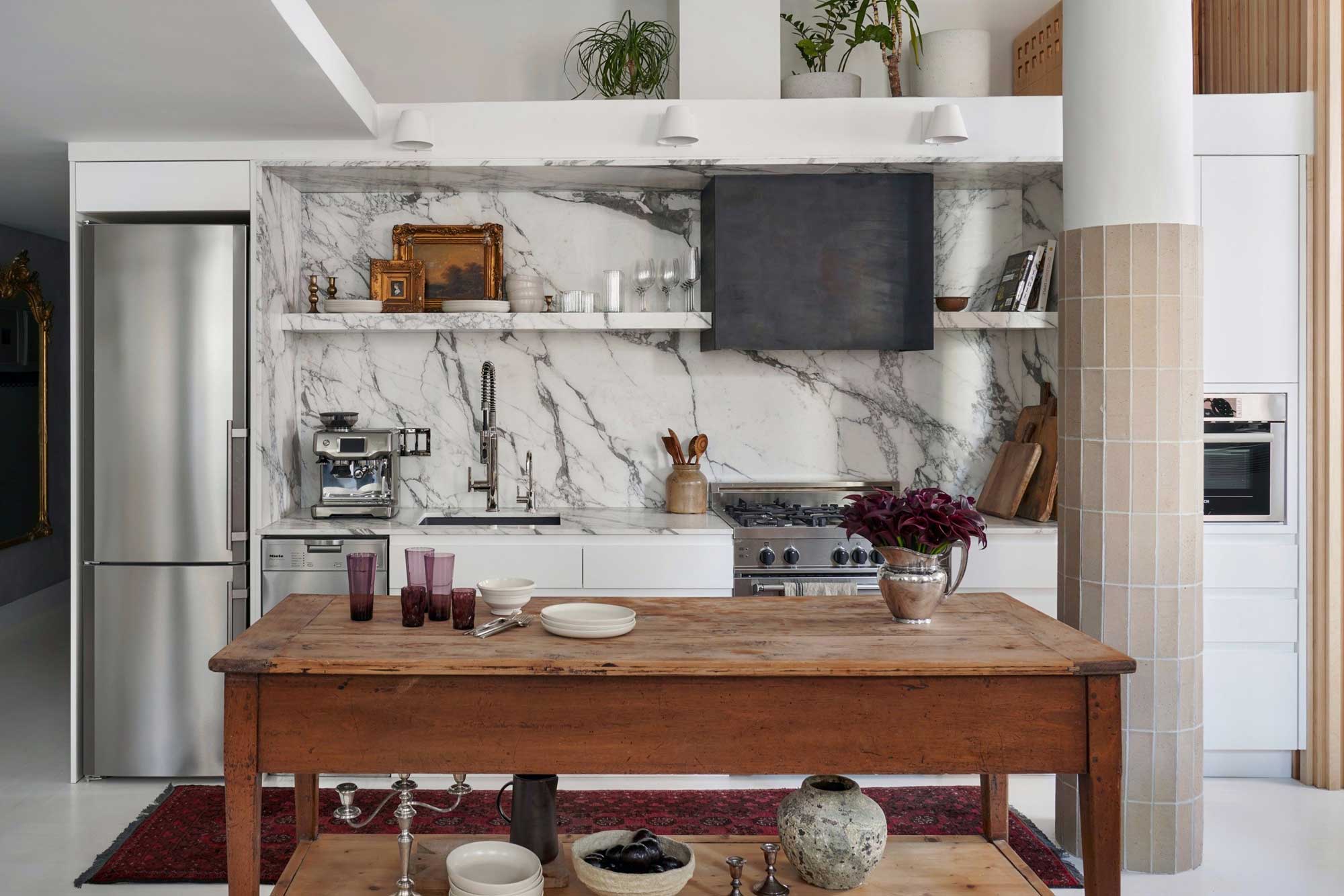
One wall kitchens, also known as a single galley kitchens, can be the perfect layout choice for spaces of any size, whether you live in an open loft, a pocket-size condo, or a tiny apartment. The entire kitchen runs along a single wall, leaving ample space in front or to the side of the room for other functional spaces to take over; perhaps a dining, a breakfast bar, an island, or even a seating area.
Small homes apart, one wall kitchens can contribute to a spacious open-concept floor plan. These offer plenty of countertop space and are equipped with clever storage ideas, which can be the key to making any home comfortable, functional, and stylish.
If you're looking for effective kitchen layout ideas, then consider this one, packed with brilliant benefits.

Aditi is a homes writer and editor with several years of experience. Her articles, backed by expert insights, offer suggestions aimed at helping readers make the best home design choices
The best one wall kitchen ideas
One wall galley kitchens usually have about an 8 foot worktop, enough to fit in a sink, stove, and even a microwave, although most appliances tend to be close together in this layout. Although they're not as efficient as kitchens that have a classic work triangle, these do put gear and groceries within quick reach.
Typically, these do not have corner cabinets or other awkward pinch points, making it easier to access everything, and keep things moving in the kitchen. One wall kitchens are a solution that helps with efficiency of space within the whole house, rather than just for the efficiency of the kitchen. With their reduced footprint, these allow much more movement and function in the home at large.
1. Pick a hero material
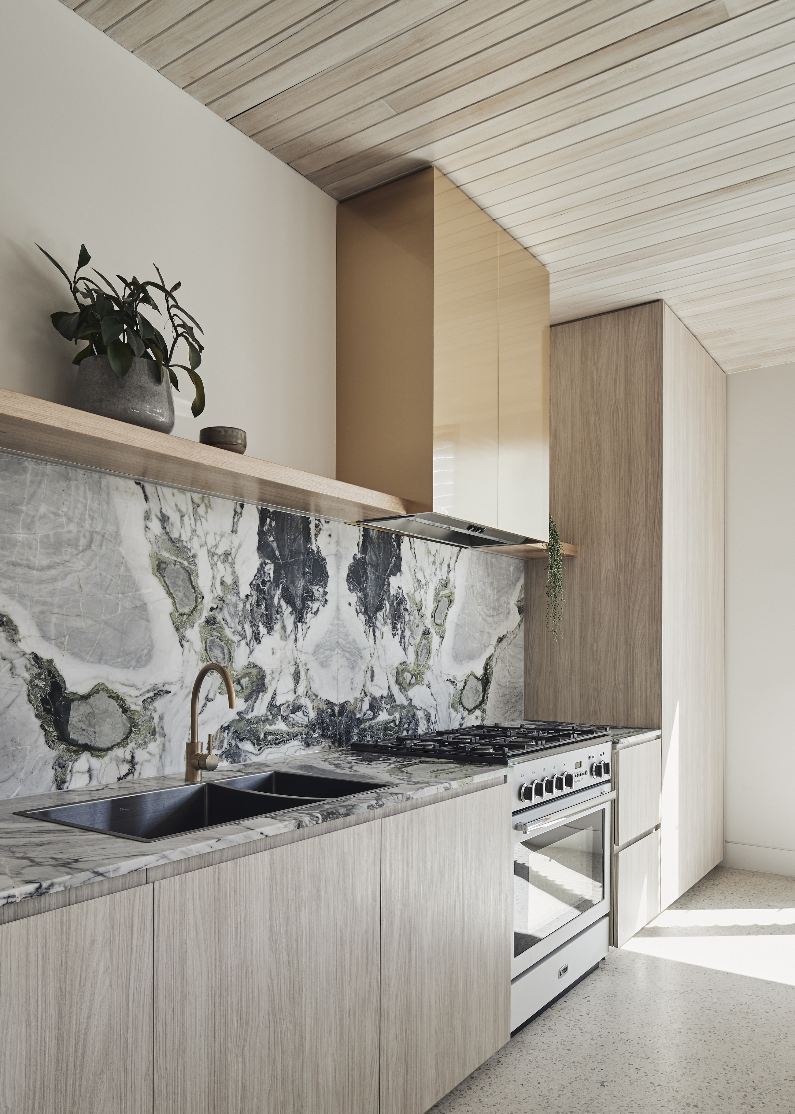
In small kitchen layouts, it's easier to draw focus to one material or color, allowing it to conquer the space. Make this compact kitchen stand out with high-end materials or finishes. This will not only lift the look of the cooking space but in open-plan rooms, lift the aesthetic of the entire space.
'This kitchen was planned along the southern wall of the house to maximize windows on the north and west for northern sun access and views out to the pool and landscape,' says Sally Timmins, co-founder of Timmins + Whyte. 'The southern wall also has a pantry with a stone bench and led lighting inside with doors that open back into pockets to allow it to be open when cooking/ using appliances. The marble backsplash is the artful hero in space. We added a timber curved support frame for the bench cantilever to soften an otherwise hard-edged element.'
The Livingetc newsletters are your inside source for what’s shaping interiors now - and what’s next. Discover trend forecasts, smart style ideas, and curated shopping inspiration that brings design to life. Subscribe today and stay ahead of the curve.
2. Keep it monochromatic for a seamless look
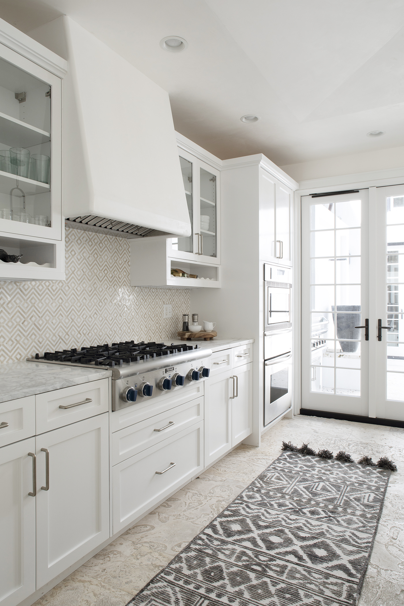
In smaller, open-plan spaces, keep the interiors clean, streamlined, and clutter-free. One way to do this is by choosing a streamlined palette that helps maintain a sleek look.
When it comes to kitchen cabinet colors, consider a muted, monochromatic look, along with editing down your kitchen paraphernalia. Choose specialized cabinet and drawer inserts like hooks, racks, and open shelving on adjacent walls, and freestanding shelves.
3. Create an invisible kitchen
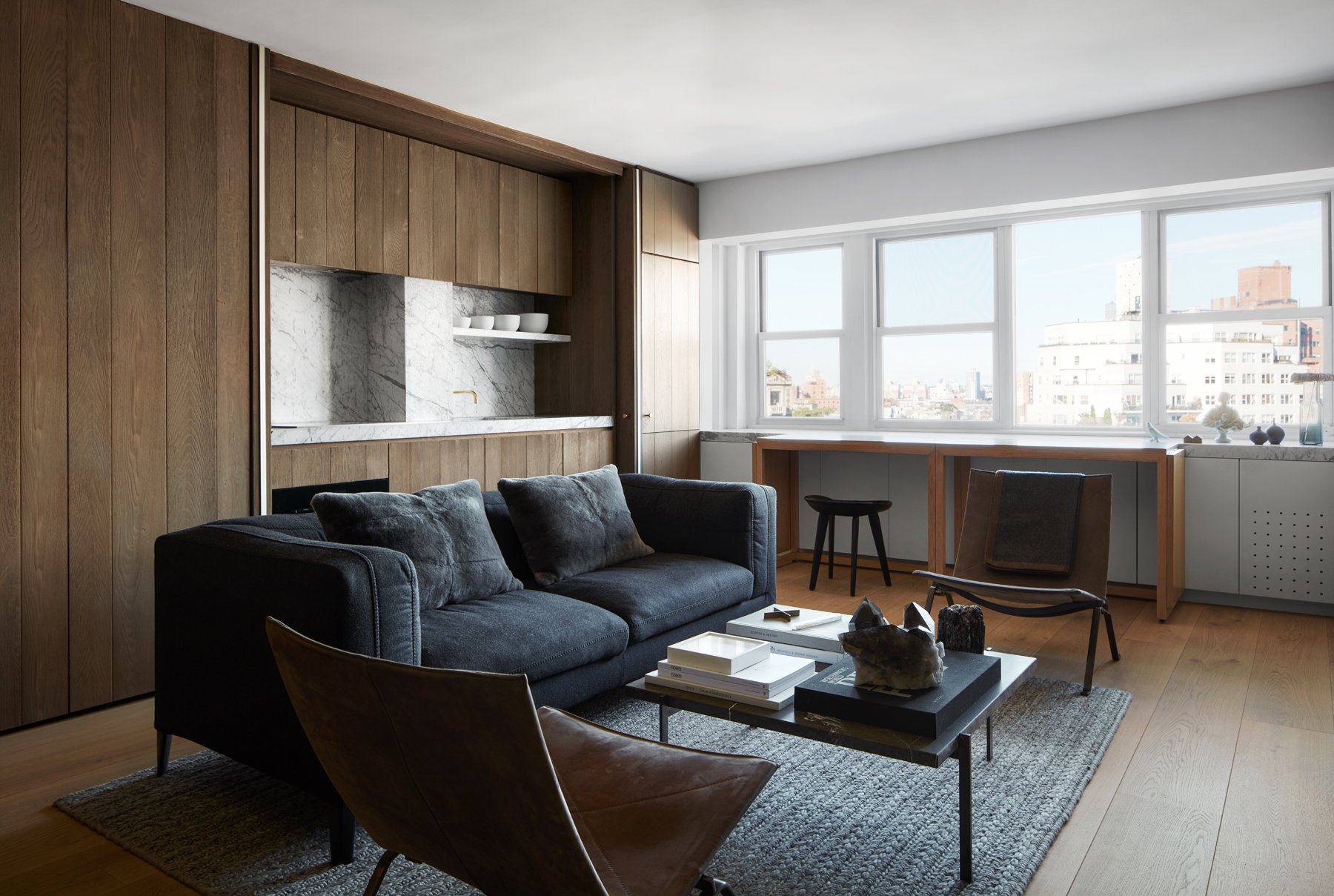
A one wall kitchen is the perfect candidate for the 'invisible' kitchen treatment. This is usually achieved by hiding away the entire kitchen, countertop and appliances included, behind doors so that you can hide your kitchen away when not in use.
In this studio apartment designed by Messana O'Rorke, the kitchen closes away behind doors that look like wood paneling, helping this tiny space feel like it can serve different functions at different times.
4. Combine with an island
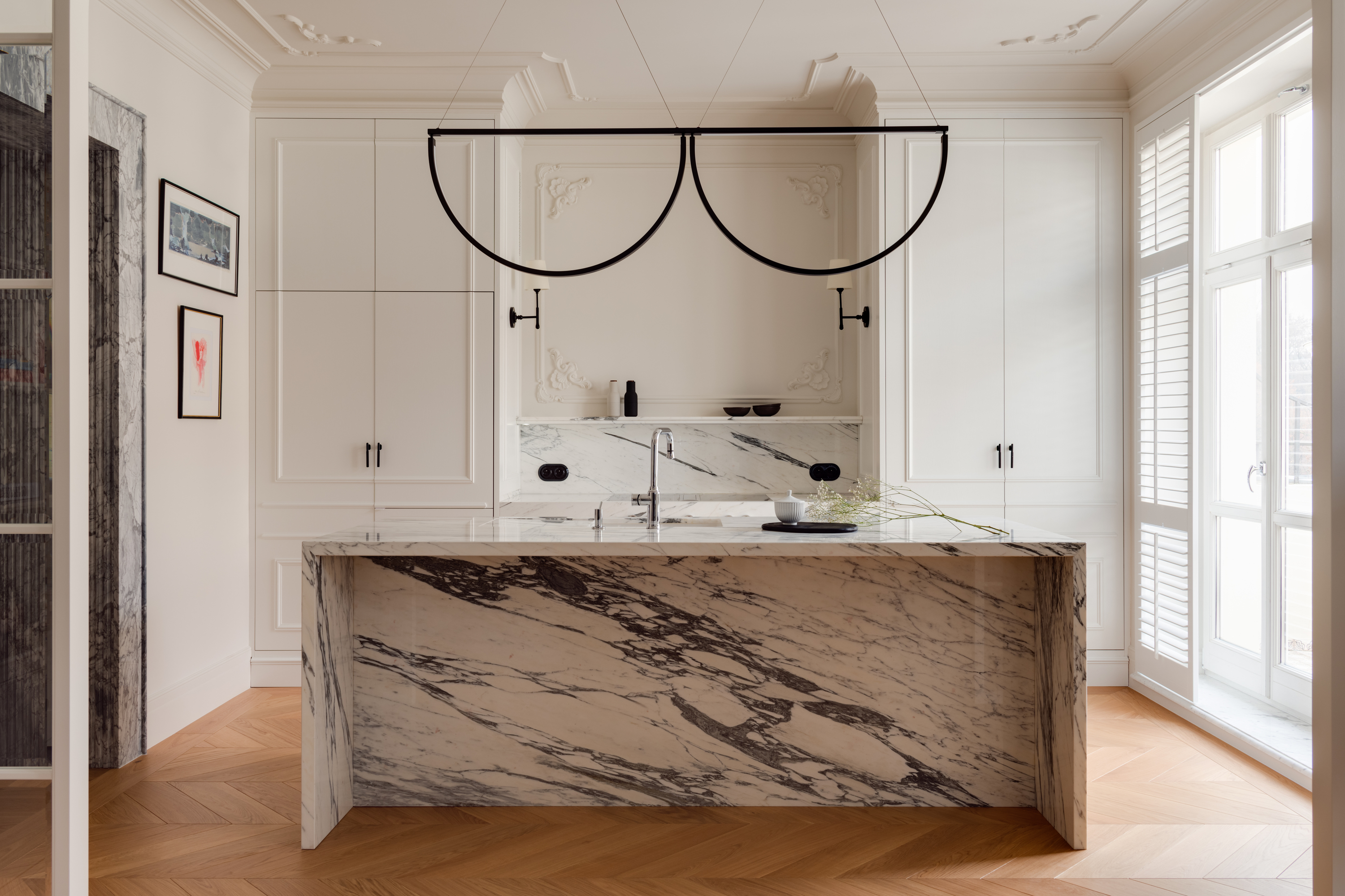
Since all cabinetry must share a common wall space with countertops and appliances, storage is usually compromised in this layout. This is why adding a small kitchen island is a great way to make use of the open space in front.
If you do add an island, consider removing the sink from your kitchen, and including it in the island instead, leaving more counter space for the former.
5. Include open storage
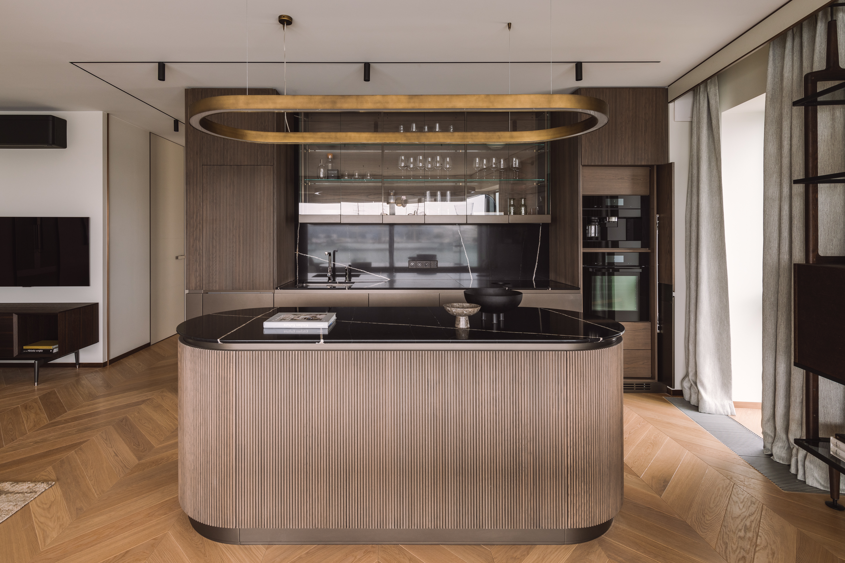
Open or glass-fronted storage can prevent a one wall kitchen from feeling too block-y and solid, so consider open shelving above the kitchen countertop.
'Due to the function of this apartment, the one wall kitchen is minimalistic and serves as a buffet,' say Jagoda Ziolkowska and Tomasz Ziolkowski of JT Grupa. 'The walls are designed in beautiful black marble, juxtaposed with the brown veneer of the building. The dark kitchenette contrasts with the light floor, grey curtains, and the beige seating area.'
6. Install a one wall kitchen in a transitional space
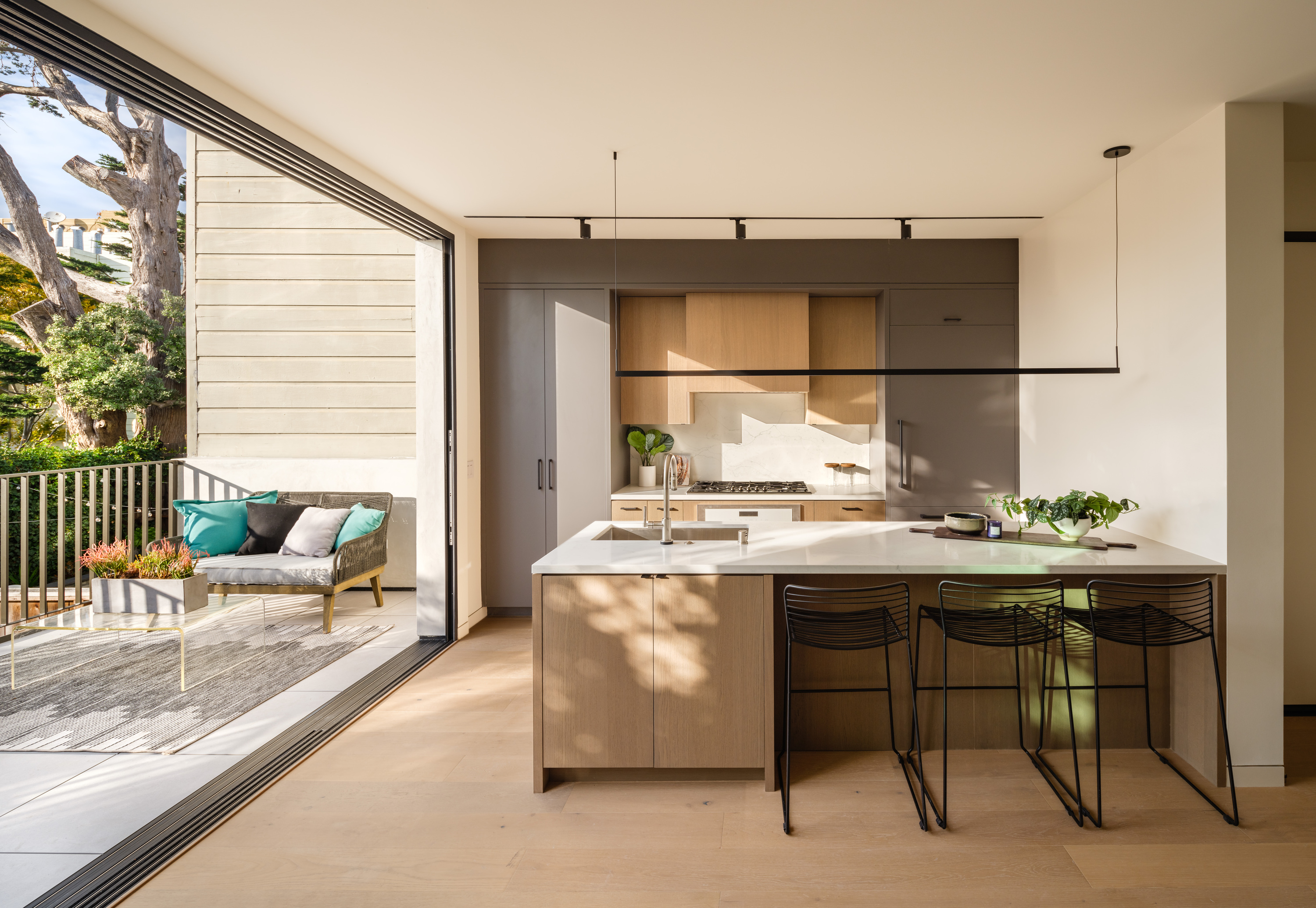
Tired of constantly running in and out when entertaining your friends outdoors? A great transitional design that can fit between the interior and exterior of your home is a one wall kitchen that also works as a pantry.
Consider customizing a design that fits snugly between two large walls, and add a large counter space where you can place glasses, plates, and trays with ease. Since this specific kitchen will be visible at all times to guests, consider increasing its visual value by installing premium countertops such as quartz or concrete. A kitchen without a backsplash will feel more seamless, with less going on visually.
Keep in mind to install this kitchen design along a wall that doesn't have a window. Windows tend to reduce the number of wall cabinets you can install.
Casserole Dish from Le Creuset
Entertain often? Consider this bright-toned, cast-iron dish that can be used directly on the stove to warm food, and used to serve as well. Its properties help keep your dishes warm for a long time.
7. Include a dining table
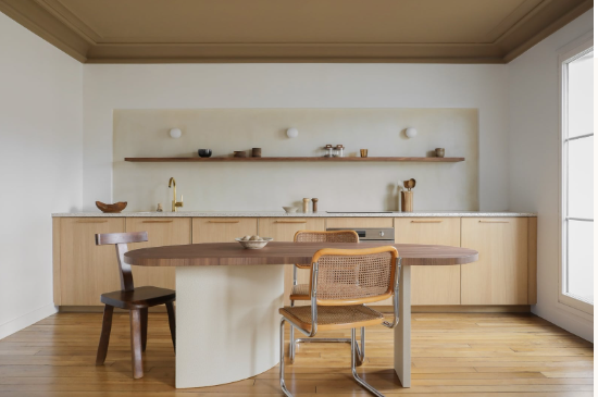
Small kitchens mean more space for living areas. Include a wonderful kitchen diner idea, and make your home a smart yet functional space,
'Due to the small square footage of the apartment, we wanted to create an intimate interior design, a comforting and warm cocoon,' says Helene Pinaud, founder of Helene Pinaud, Heju. 'We wanted to use a sensitive and abstract approach to space. For the one wall wooden kitchen, we deliberately chose a minimalist and uncluttered look, the singularity being brought by the green ceiling which delimits the dining area. The recessed waxed concrete splashback and the walnut shelf that crosses it brings depth to the whole area.'
8. Use a glass partition

Sometimes an open plan isn't the most ideal, especially when you may have a modern small kitchen overrun with daily cooking, fumes, and smells. You definitely would want to close off the space.
Consider adding a glass partition (perhaps a fluted glass for more privacy?), so that while you can section off the one-wall kitchen, it doesn't visually block it completely from the open plan. Sightlines aren't hindered and the room still feels airy and open.
What are the disadvantages of one wall kitchen?
A one wall kitchen is a smart, practical modern kitchen idea full of benefits, great for small spaces. But it does come with a few disadvantages. Since the design is fully decked against one wall, it can be difficult for more than one person to work in this space. It can also limit the functionality and flow of the kitchen because you need to make everything work in one specific area.
Storage too is usually limited as you have only one wall to fit everything in, be it the stove, sink, appliances, or cabinets.
Also, since it's a single-length kitchen, it offers very limited counter space in comparison to other kitchen layouts.

Aditi Sharma Maheshwari started her career at The Address (The Times of India), a tabloid on interiors and art. She wrote profiles of Indian artists, designers, and architects, and covered inspiring houses and commercial properties. After four years, she moved to ELLE DECOR as a senior features writer, where she contributed to the magazine and website, and also worked alongside the events team on India Design ID — the brand’s 10-day, annual design show. She wrote across topics: from designer interviews, and house tours, to new product launches, shopping pages, and reviews. After three years, she was hired as the senior editor at Houzz. The website content focused on practical advice on decorating the home and making design feel more approachable. She created fresh series on budget buys, design hacks, and DIYs, all backed with expert advice. Equipped with sizable knowledge of the industry and with a good network, she moved to Architectural Digest (Conde Nast) as the digital editor. The publication's focus was on high-end design, and her content highlighted A-listers, starchitects, and high-concept products, all customized for an audience that loves and invests in luxury. After a two-year stint, she moved to the UK and was hired at Livingetc as a design editor. She now freelances for a variety of interiors publications.
