Open plan kitchen ideas - designers explain how to create the perfect modern space
The 10 best open plan kitchen ideas from the experts, for when you're creating the ideal space for modern life
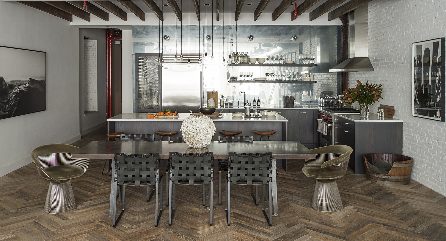
Open plan kitchen ideas are the bulk of most modern home renovation conversations. Everyone wants an open plan kitchen, a space to cook in, eat in, relax in and live in.
But as the way we use our homes has changed, so has the way that we want to form our open plan kitchen ideas. It's not just enough to put an island in a space and call it a day, now we need zones for working, for eating and for switching off.
In fact, the trend today is to make the open plan kitchen less of a design statement, and more a seamless part of the rest of the house. 'You want to ensure the kitchen feels part of the wider space,' says the interior designer Alexandria Dauley. 'Consider making it feel like a piece of furniture as you will look at it all of the time. Make sure there is a link to the wider scheme so that the whole room is cohesive in materiality, color and style.'
There are plenty of ways to do this, to fold into your kitchen ideas tricks that help it blend into your decor. From the materials you use to the colors you choose, you can create an inviting space that fits with your style.
And while the layout is key, what you put into your open plan kitchen is the most important bit. 'You need soft furnishings to help acoustics, otherwise, it can sound and feel like a village hall!' says the interior designer and Livingetc columnist Rebecca Wakefield. 'I generally use lightweight linen curtains to help absorb sound, they also help to create a more cozy feel to a large open-plan space, and often some much needed night time privacy and day time sun shade.'
Open plan kitchen ideas
'My rule of thumb is to include five - or more - different light sources to create an ambient vibe with depth and layers.'
Rebecca Wakefield, interior designer
1. Go sleek in a small space
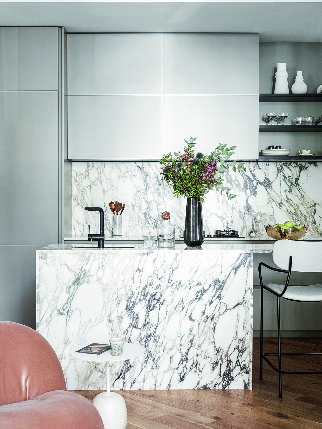
It's possible to flex your open plan kitchen ideas into a small space, and apartments can have kitchens/diners/living areas too. Because you're trying to get so much into so little square footage, pare back the amount of extra detail you have, by choosing for chic, sleek kitchen cabinet ideas.
Designer Kayla Pongrac designed this marble and grey kitchen for own apartment. She chose not to have handles, as they would have protruded into the space too much, and to simplify as much as possible. She also didn't want the cabinets to impose too much.
'We have lots of cupboards but we broke them up with open shelving so they didn't become oppressive,' Kayla says.
2. Enhance natural light
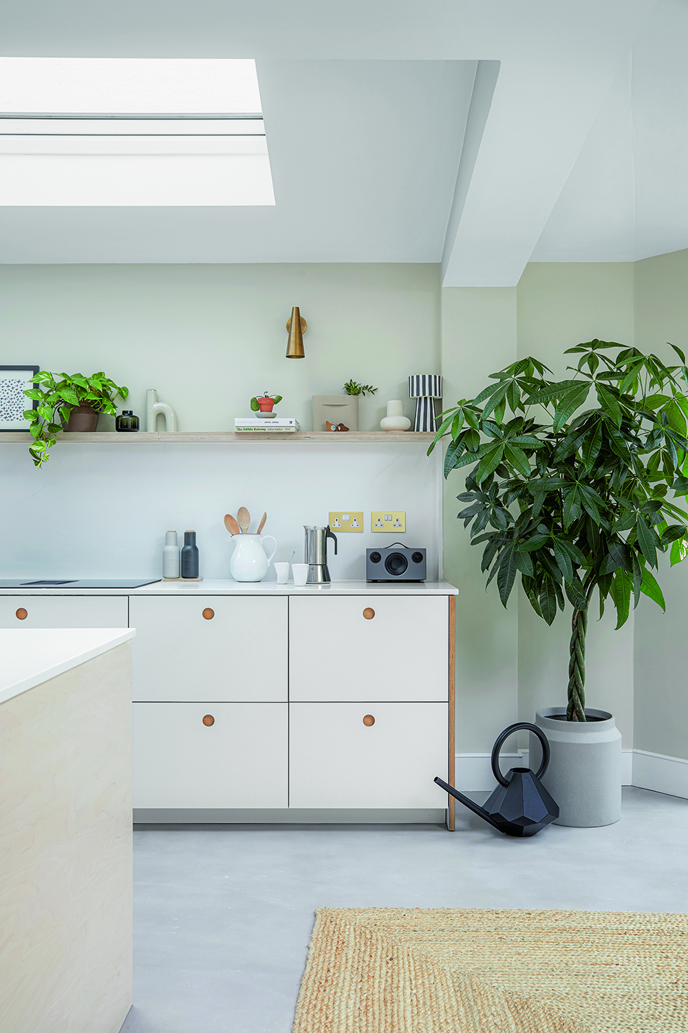
One of the many benefits to open plan living is how light, bright and airy you can make a space feel. With no walls obstructing the room, you can create a sense of freshness and breeze.
There are some tricks to enhance this, though. Homeowner Emily Mayne created this space to let the sunshine pour in from the skylights as easily as possible. 'We designed an open working area, avoiding wall units, to sit under the skylight,' she said.
By pairing this with uncluttered kitchen shelving ideas, the open plan space feels, well, a lot more open, and like it has a lot more space.
3. Choose furniture carefully
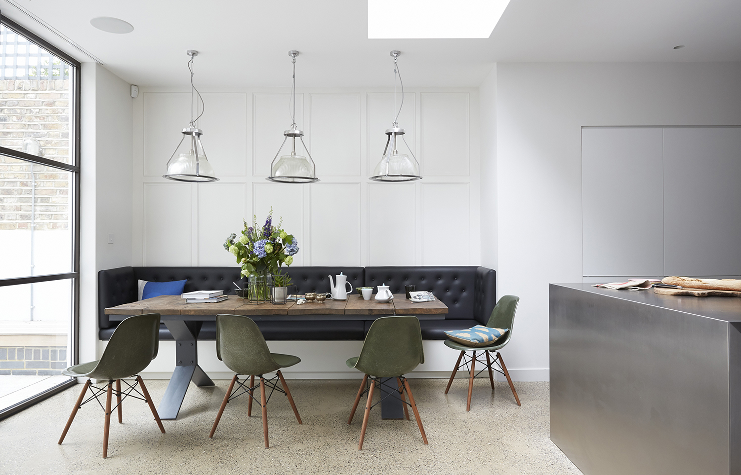
Just because you have space for different zones in your open plan kitchen, doesn't mean you can just fill it with furniture. In fact, because there are no walls to break the eye, it's even more important to consider each piece that makes it into your kitchen diner ideas.
'Be careful of plonking a sofa in a kitchen - it can look like it just fell from the sky!' says interior designer Rebecca Wakefiled. 'I use timber media cabinets, vintage benches or low sideboards behind sofas to create a well considered look. If you can add lamps on top of the sideboard for height and ambient lighting, even better.'
4. Change the floor heights
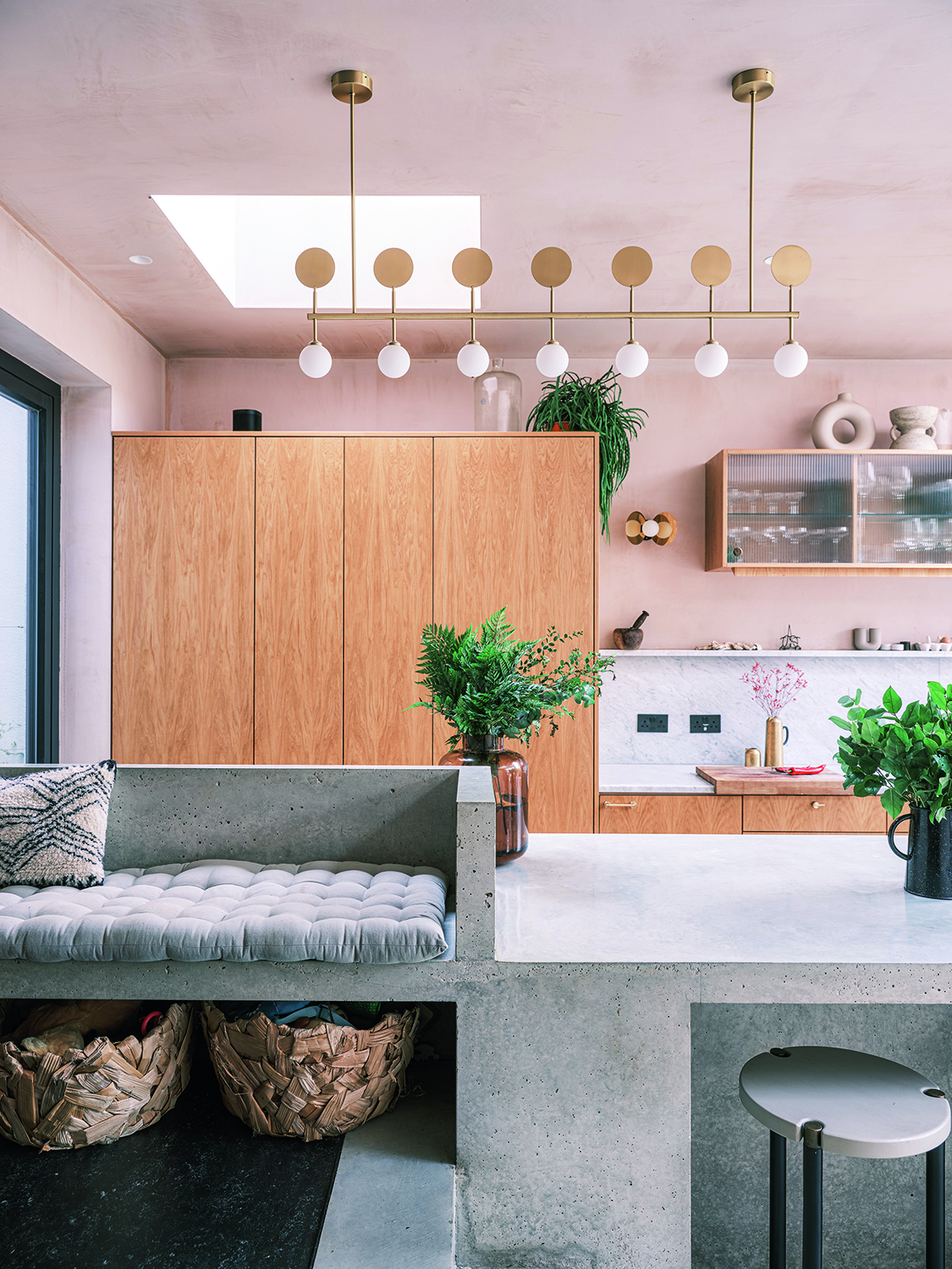
Why should an open plan space be all one level? For this kitchen/diner/living space, architects Fraher and Findlay zoned the areas by putting the dining table, at one end by the windows, on a lower level.
This not only gained ceiling height, but helped to separate the areas slightly - you can see above how the island, on the same level as the dining table, then steps up into a low bench. This doesn't compromise at all on square footage, but has a big effect on the feel of the room.
5. Contrast dark and light colors
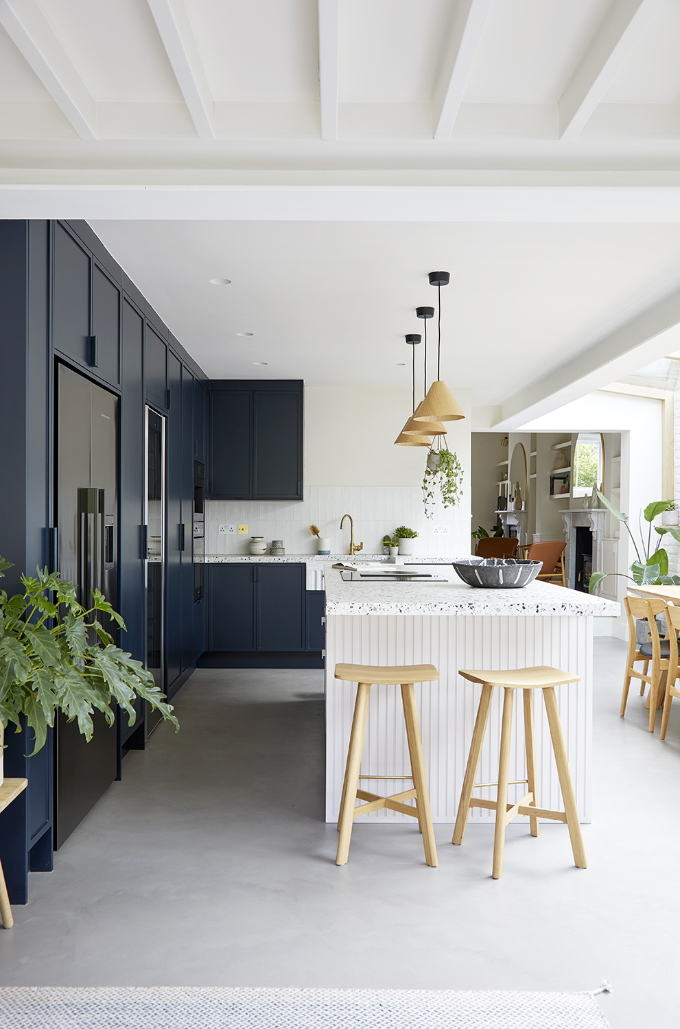
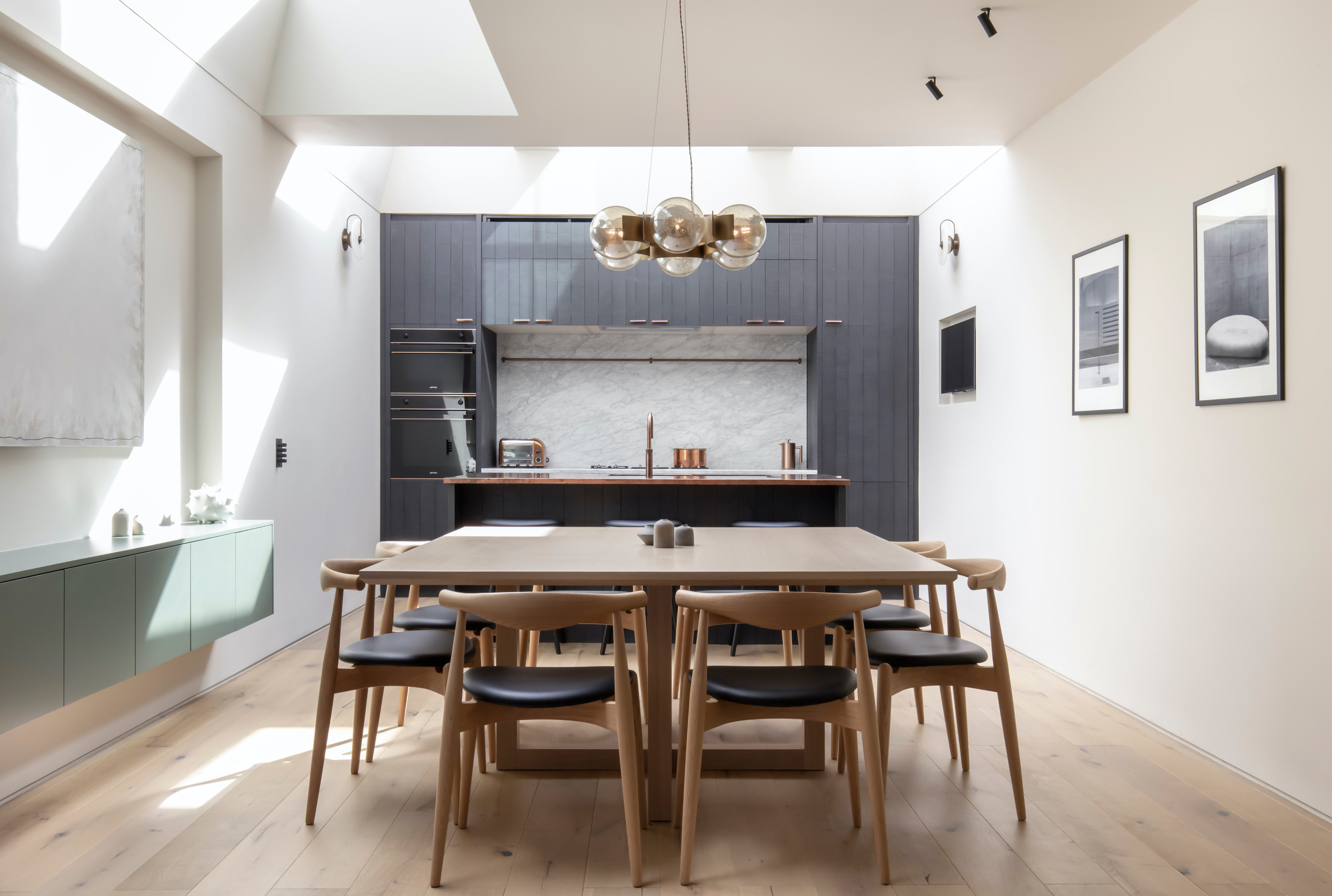
One way to help the open plan kitchen look like a considered space is to choose corresponding shades for different areas. Here, the cabinetry is dark, painted in Basalt by Little Greene, to ground the otherwise light space.
'My color scheme is usually light, but the designer we worked with, Steve Nash, encouraged me to be a little bolder,' says homeowner Kirsten Miller. The result is some execution of white kitchen ideas which feels elevated, rich, and like the room has distinct zones.
6. Have five light sources
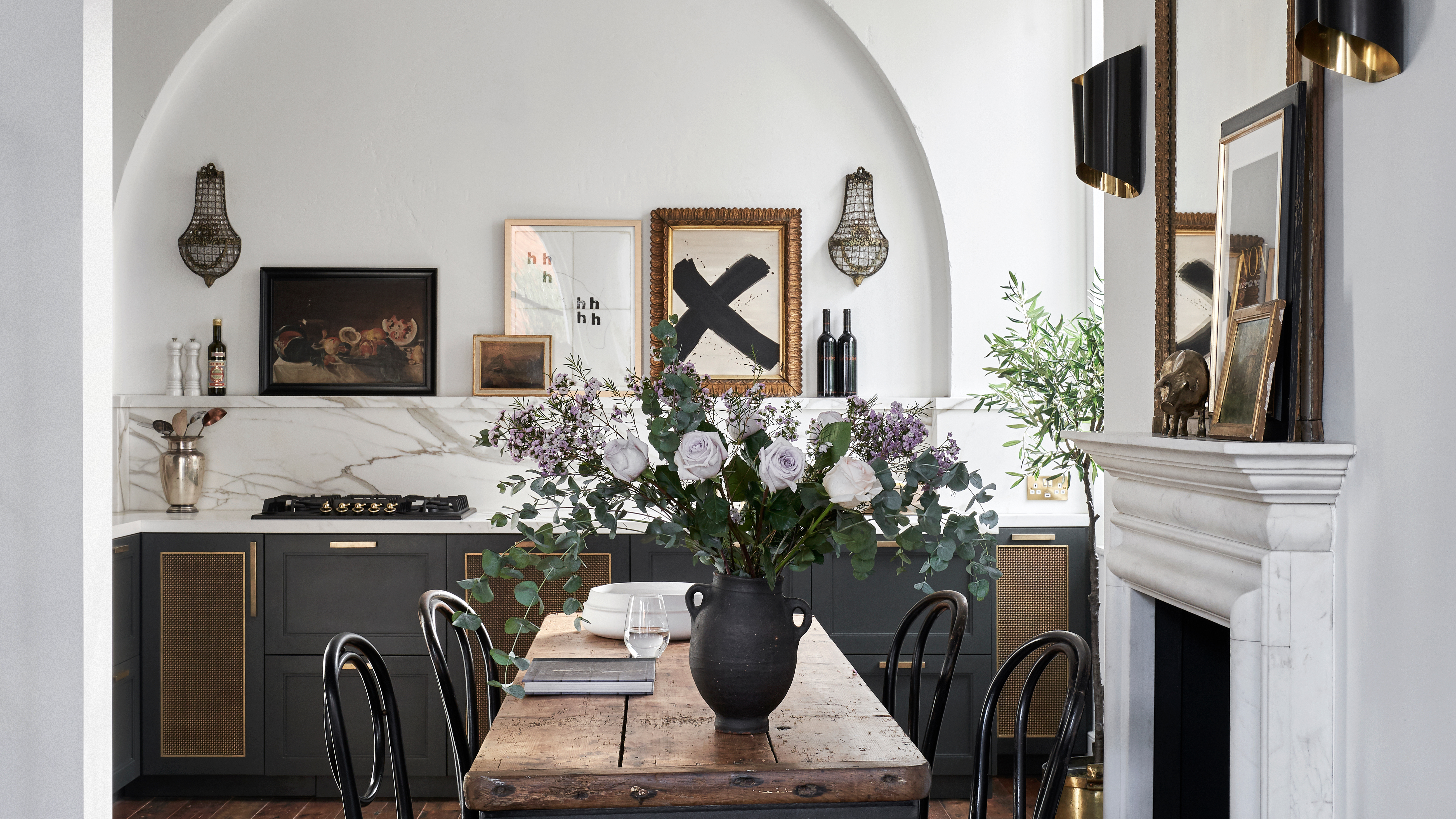
It's tempting, in an open plan kitchen, to put pendants above the island and spotlights everywhere else. But there are plenty more kitchen lighting ideas you can use if you want to create a properly enriched space.
'Lighting is key!' says designer Rebecca Wakefield. 'Avoid too many ceiling downlights as they feel one-noted and corporate. Instead try a combination of flush mount ceiling lights, wall lights, pendants and occasional lighting like table lamps and floor lamps. My rule of thumb is to include five - or more - different light sources to create an ambient vibe with depth and layers.'
7. Add a dramatic floor
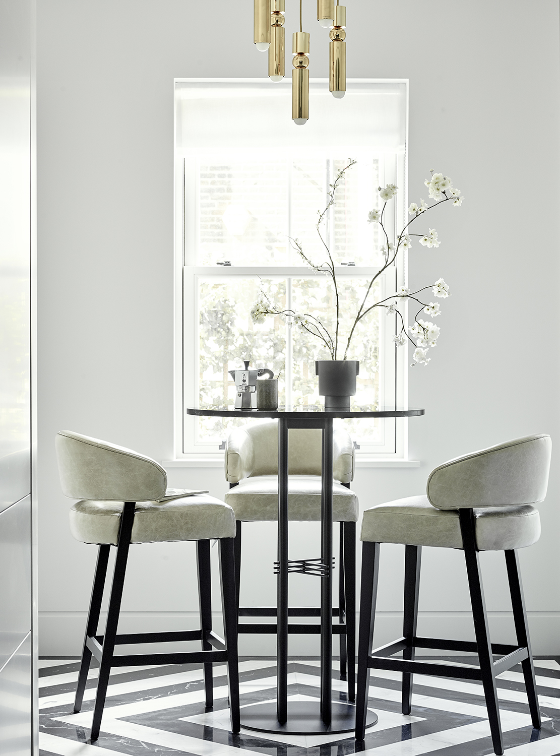
Design by Elicyon
This open plan kitchen is part a relatively small apartment, lived in by a family. The kitchen includes this breakfast area, which then becomes the lounge.
'Instead of this being a small, leftover space, we turned it into a monochrome highlight,' says Charu Ghandi, interior designer and founder of Elicyon, who created this space.
The dramatic use of black and white kitchen ideas on the flooring helps to take attention away from the functional cooking areas, and into the parts of the home meant to be relaxed in.
8. Let textiles soften the space
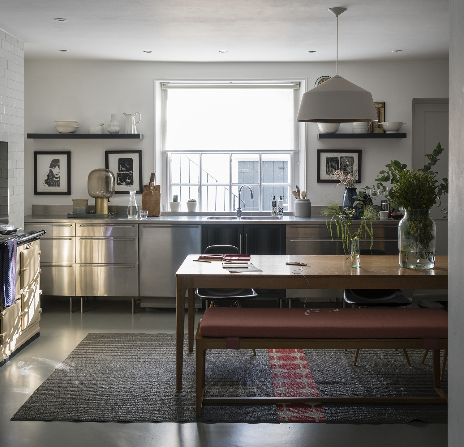
By their very nature, open plan kitchens tend to be big boxes. Lots of hard corners, lots of edges, not much to make you feel sensual. This is why, when wondering how to remodel a kitchen, you need to think about adding in those softer layers.
'A rug can help to zone a soft seating area,' says the designer Rebecca Wakefield. 'And using a natural fabric like jute is a great material for open plan spaces that are close to food and drink.'
Placing the rug under seating and extending it out into the cooking space also helps to create a pleasing visual link between the two.
9. Add texture to cabinets and islands
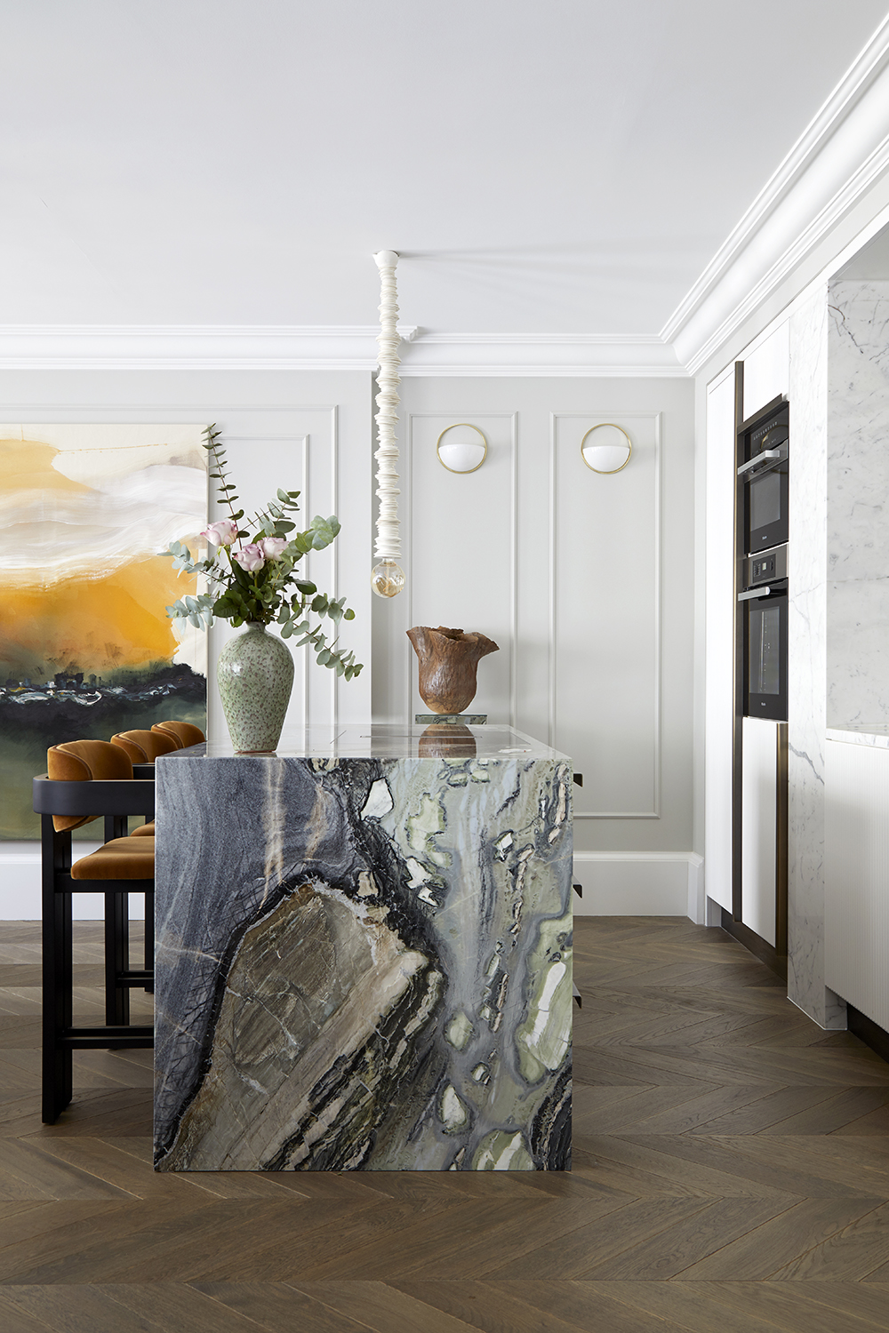
Why not extend your marble kitchen ideas into the world of open plan living? This creates a luxe space that is just as ready for entertaining as it is for cooking.
But that deep veining isn't the only interest here - look closely and the cabinets are fluted, too. ‘The fluting is reminiscent of hotel design from the 1920s and 30s,’ says the designer Marie Soliman of Bermgan Interiors, who created this space. ‘We took the Art Deco identity of this building and reinterpreted it in a very contemporary way. White goods and storage are concealed behind bespoke cabinetry, all trimmed in brass.
What this does is mean that when your guests are enjoying a dinner party at the adjoining dining table, they're not looking at anything too functional.
10. Get the doors right
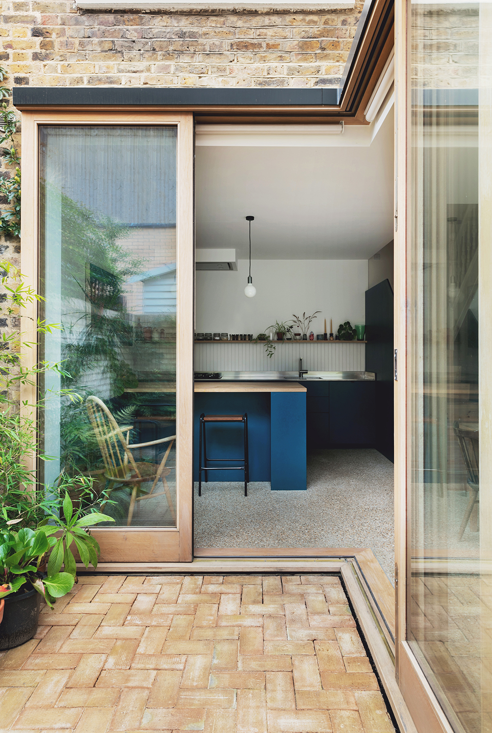
Design by Emil Eve Architects
This open plan small kitchen extension idea was conceived to fit into an L-shaped garden. It features L-shaped sliding doors, that owner and architect Emma Perkins wanted to have without having a beam down the middle to get in the way of the light or view.
'It was hard to find so we ended up designing them ourselves, working closely with the joiner,' she says. This is a timely reminder about getting the doors right into and out of your space. Too many beams or rafters and you risk carving up the light you're trying to achieve, so remember to factor this into any decisions you make.
Where should a television go in an open plan kitchen?
As a family space, open plan kitchens often end up needing a television in. The place for a TV to go in an open plan space, then, is on the wall, so it doesn't become a focal point.
'Be modest with your TV,' says the interior designer Rebecca Wakefield. 'The Samsung Frame is the least offensive, in my opinion. Always anchor it above a piece of furniture, allow for hiding it in joinery or hang it asymmetrically so it’s never the focus of a room.'
How do you make the acoustics better in an open plan space?
Open plan kitchens and living spaces tend are great for meaning you can keep an eye on the family, but not so great for the din that often reverberates around them.
'To make the acoustics better in an open plan space, sofas, rugs, curtains and other soft furnishings will help to absorb sound,' says interior designer Rebecca Wakefield. 'They'll also create a layered and soft look. Generally kitchens tend to have a more hard, architectural look as they need to be practical, so things like cafe style curtains, wall lights with fabric shades or upholstered bar stools can help to feel less sterile and work more harmoniously with an adjacent living area.'
Be The First To Know
The Livingetc newsletters are your inside source for what’s shaping interiors now - and what’s next. Discover trend forecasts, smart style ideas, and curated shopping inspiration that brings design to life. Subscribe today and stay ahead of the curve.
The editor of Livingetc, Pip Rich (formerly Pip McCormac) is a lifestyle journalist of almost 20 years experience working for some of the UK's biggest titles. As well as holding staff positions at Sunday Times Style, Red and Grazia he has written for the Guardian, The Telegraph, The Times and ES Magazine. The host of Livingetc's podcast Home Truths, Pip has also published three books - his most recent, A New Leaf, was released in December 2021 and is about the homes of architects who have filled their spaces with houseplants. He has recently moved out of London - and a home that ELLE Decoration called one of the ten best small spaces in the world - to start a new renovation project in Somerset.
-
 The Easiest Way to Turn Your Designer Scarf Into Wall Art — No Frame, No Fuss, No Regrets
Because silk this pretty should never stay in a drawer
By Julia Demer Published
-
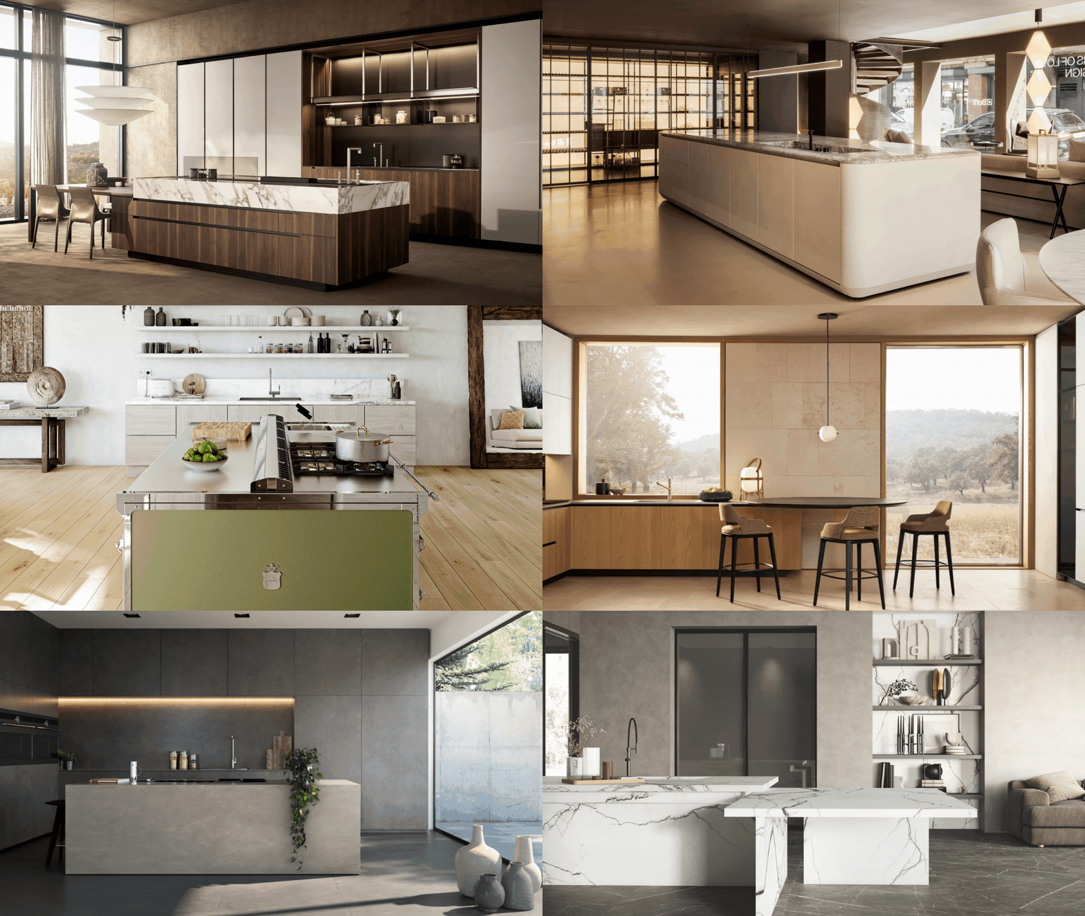 Italian Kitchen Trends — 5 Emerging Ideas From the Chicest Italian Designers That I Predict Will Go Global in 2025
Fresh from Milan Design Week, these are the exciting finishes, styles, and innovative materials I can't wait to see in more kitchens this year
By Faiza Saqib Published