5 Paint Colors Going Out of Style — And What You Should Replace Them With
Are dated colors dragging down the look of your home? With a new year nearing, now could be a good time for a new color. Here's what designers are doing
The Livingetc newsletters are your inside source for what’s shaping interiors now - and what’s next. Discover trend forecasts, smart style ideas, and curated shopping inspiration that brings design to life. Subscribe today and stay ahead of the curve.
You are now subscribed
Your newsletter sign-up was successful
When it comes to what's 'in style', there's never really enough time to get too comfortable. Designers are constantly working on new ways to push boundaries, coming up with new ideas that capture our attention and inspire us to freshen up our homes. But the last thing you want to do is paint your home in a color that's going out of style.
Looking back at the best paint colors for the past few years, you may have noticed that things haven't actually moved quite as fast as we're used to. There have been some shades that have seemingly stuck around for a while; firm favorites we couldn't quite let go of.
Instead, we've played with different tones of the same color (from cool to warm), textures (from dead flat all the way to gloss), and where in the home we could use them (from hallways to kitchens and beyond). Ultimately, it's a question of taste and personal style. When it comes to our homes, interior design trends no longer dictate but simply inspire.
Article continues belowSo if you're looking for some new inspiration for your home, we asked interior designers for the paint colors they think it's time to move on from. These are the five shades they picked, and, most importantly, the colors they'd swap them for.
1. Swap Gray for Soft Yellow
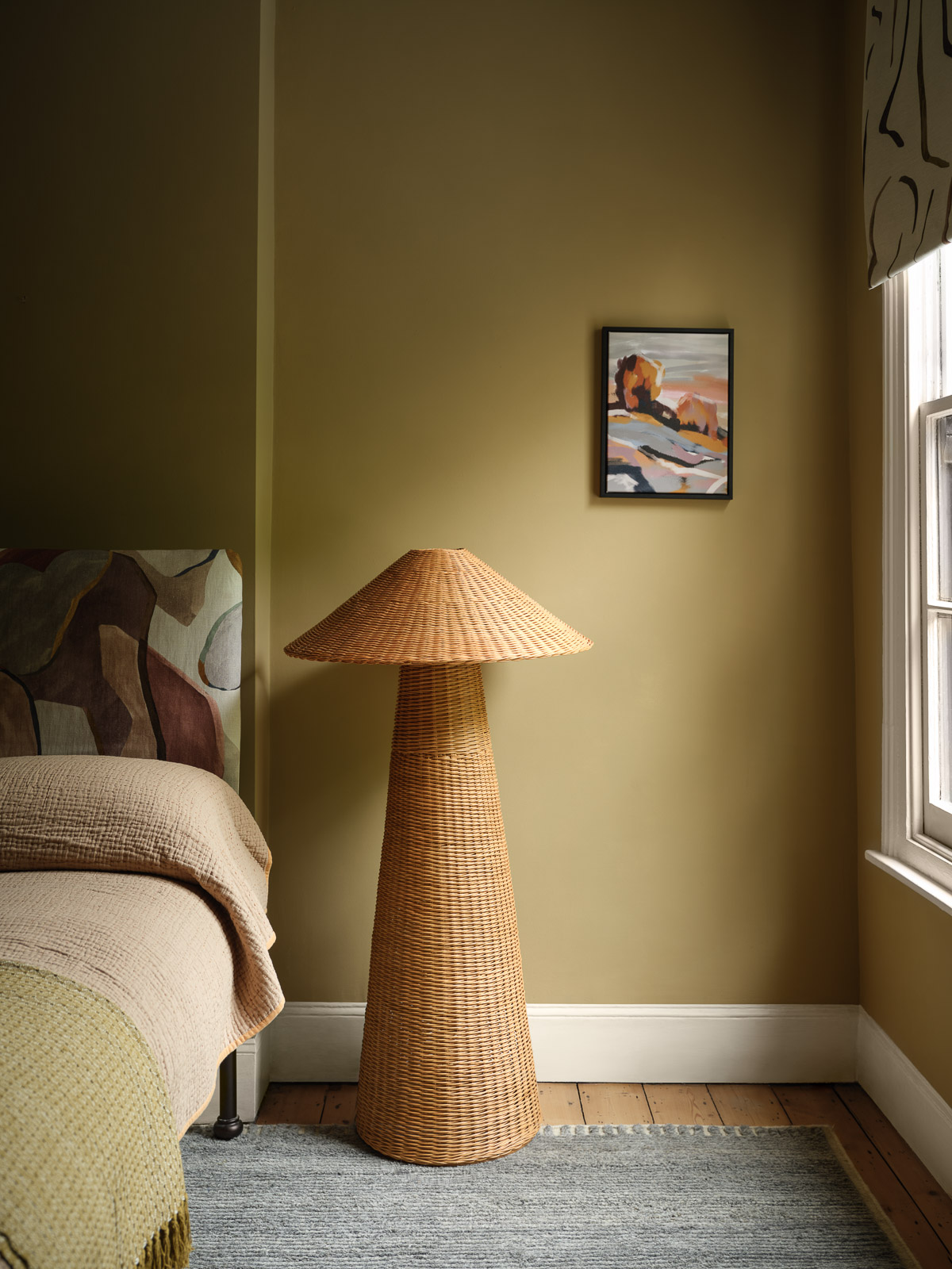
Choose instead: a natural, pollen yellow.
There are few colors that have seen as many iterations as gray has. From cool, steely grays, to more natural, stone shades it’s been the color of choice for contemporary homes for too many years, and we’ve pretty much explored all the options there are. Now, we’re leaning towards rich sandy hues instead, that feel more welcoming and softer on the eye. "Grays can feel cold and impersonal, not conveying warmth and welcoming spaces," says interior designer Martha Franco.
"In more recent years, the popularity of grays has started to wane, with warm, earthy, neutral paints replacing them," Helen Shaw, color expert at Benjamin Moore tells me. "A hue such as our Summerdale Gold HC-17 is an effortless way to integrate a 'new neutral', to create schemes that are earthy yet energetic. This is a color that pairs beautifully with tactile materials, from wicker to appliqué, while acting as a relaxed foil to abstract pattern, painterly finishes and rich hues."
2. Swap Pure White for Off-White
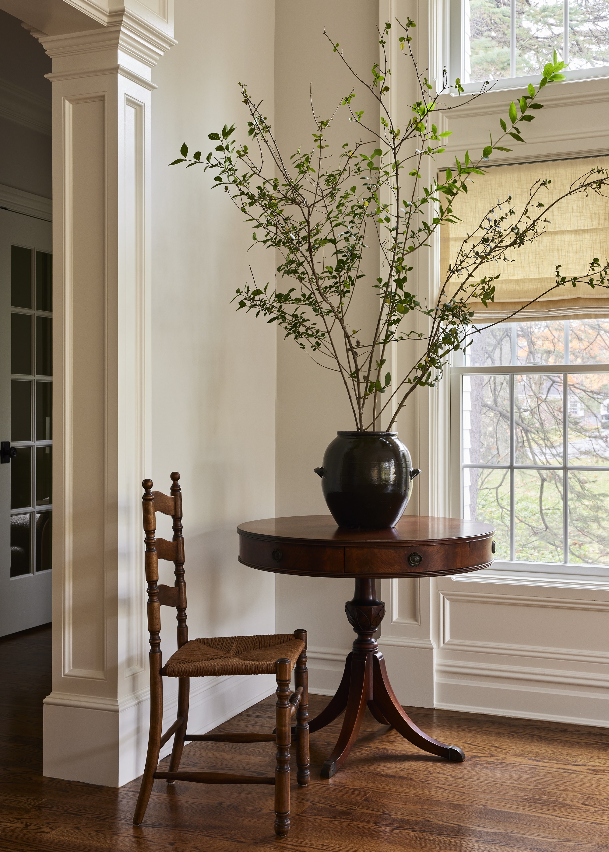
Choose instead: warm off-whites.
Although considered by many a classic and the go-to choice for those who feel overwhelmed by the myriad options in a color chart, pure white has become (let’s face it) the lazy option. A tad uninspiring, even if one might claim they actually love a fresh white. There are too many gorgeous colors out there to settle for a plain, pure white, especially when it's overused.
The Livingetc newsletters are your inside source for what’s shaping interiors now - and what’s next. Discover trend forecasts, smart style ideas, and curated shopping inspiration that brings design to life. Subscribe today and stay ahead of the curve.
"Pure white can feel stark and clinical, and spaces where all is monochromatic white feel sterile and less inviting," says Martha. Moving on from white doesn’t mean you can’t still achieve a bright, light look though. "People are gravitating toward softer whites that feel cozier. Instead, creamy whites or off-whites are becoming the go-to choice," she adds. "A cozy white palette adds warmth and character to any home. Rooms with neutral warm palettes and accents of other colors or natural textures are more suitable for home living. Use with colorful accents like soft warm terracottas".
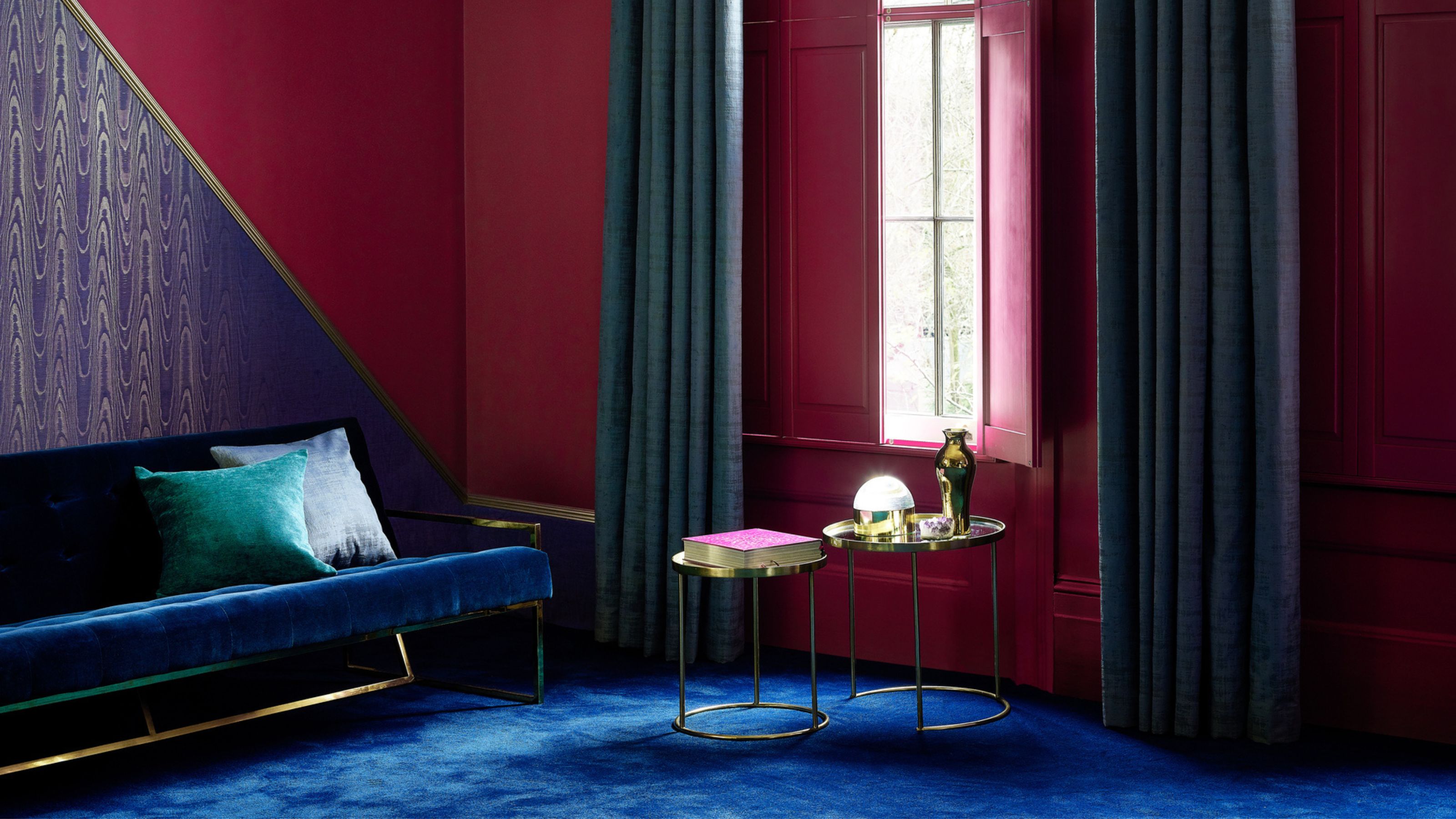
For interior designer Josephine du Rietz, we're taking things a step further. She predicts we'll be replacing white with a statement-making color. "White will take a pause and be replaced with more musty colors such as burgundy," she says. "I think we will be bolder with selecting a beautiful color on the walls instead of white."
3. Swap Green for Aubergine
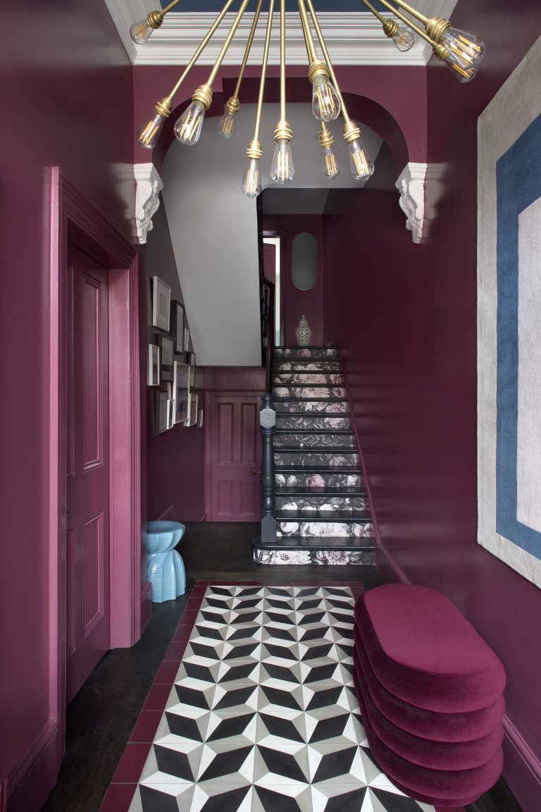
Choose instead: dramatic aubergine.
To put it simply, green has been done to death. It has been one of the biggest colors we've seen for the past few years, and we've tried every possible tone, shade and texture. We've painted every bit of wall, panelling, and even experimented with color drenching rooms in it. We’ve gone from mint, to sage, to dark mossy green. We’ve tried it all, and now, it seems, the time has finally come to see green go out of style for 2025.
Peter Spalding, CCO and co-founder of designer marketplace Daniel House Club thinks even though we are over green, we will continue to see warm palettes prevail. "But green kitchens will be absolutely dead," he says, suggesting we try for more dramatic yet earthy colors like aubergine instead. And he's not alone — designers called out the burgundy color trend as the one to watch this year and next.
4. Swap Blue for Violet
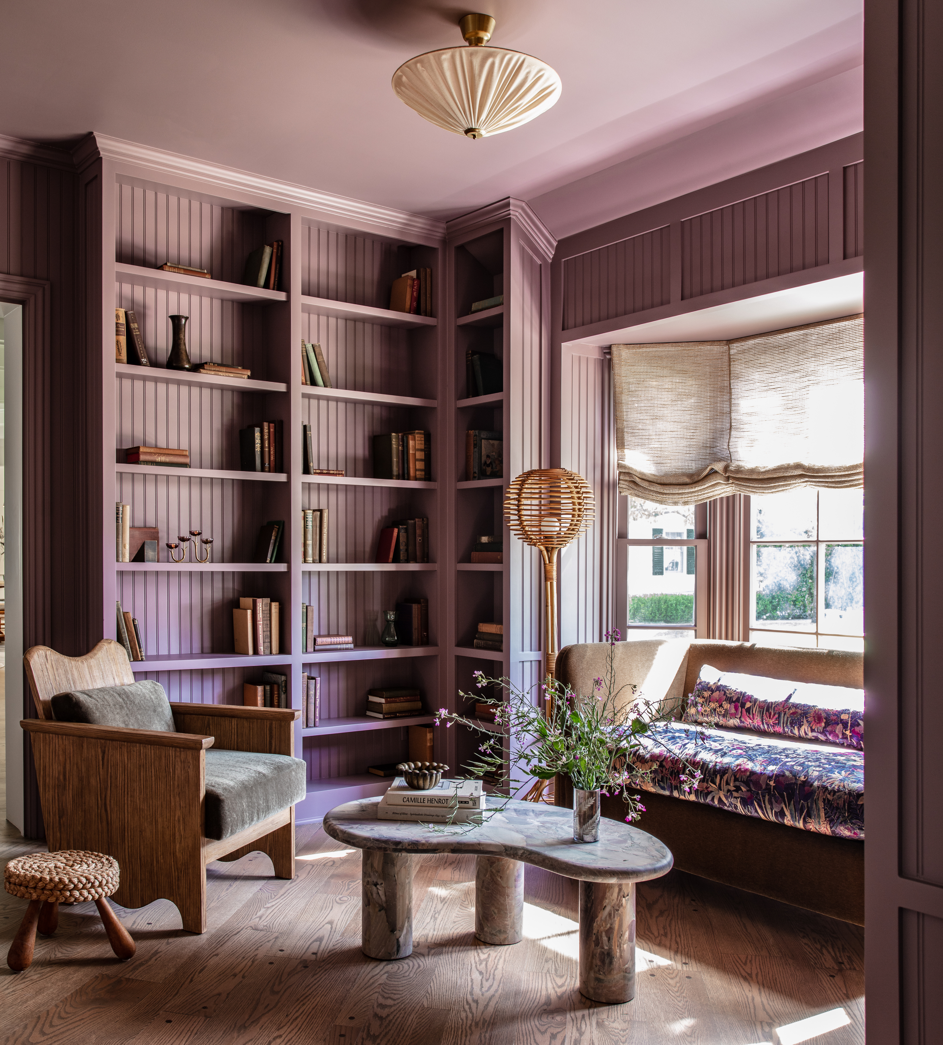
Choose instead: calming violet.
In a similar way to green, we fell in love with blues over recent years as designers started to look more at the natural world for colors that were calming, sophisticated, and easy to live with. Blue ticks all those boxes and can also look very chic in darker tones. If blue is your go-to choice, then by all means stick to it, but it's not always the most suitable shade, and there are others out there worth trying.
"Cool blues can feel too sterile or monotonous, and spaces should provide and stimulate energy," says Martha. If you’re loyal to blue, the designer advises you to try "rich jewel tones to add depth and sophistication".
But perhaps a more palatable step away from blue is a more lilac/violet, or light purple tone, that is made by combining blue and red. Surprisingly there are a lot of colors that go with lavender, and it feels more modern, yet still has the sophistication and drama of blue.
5. Swap Beige for Terracotta
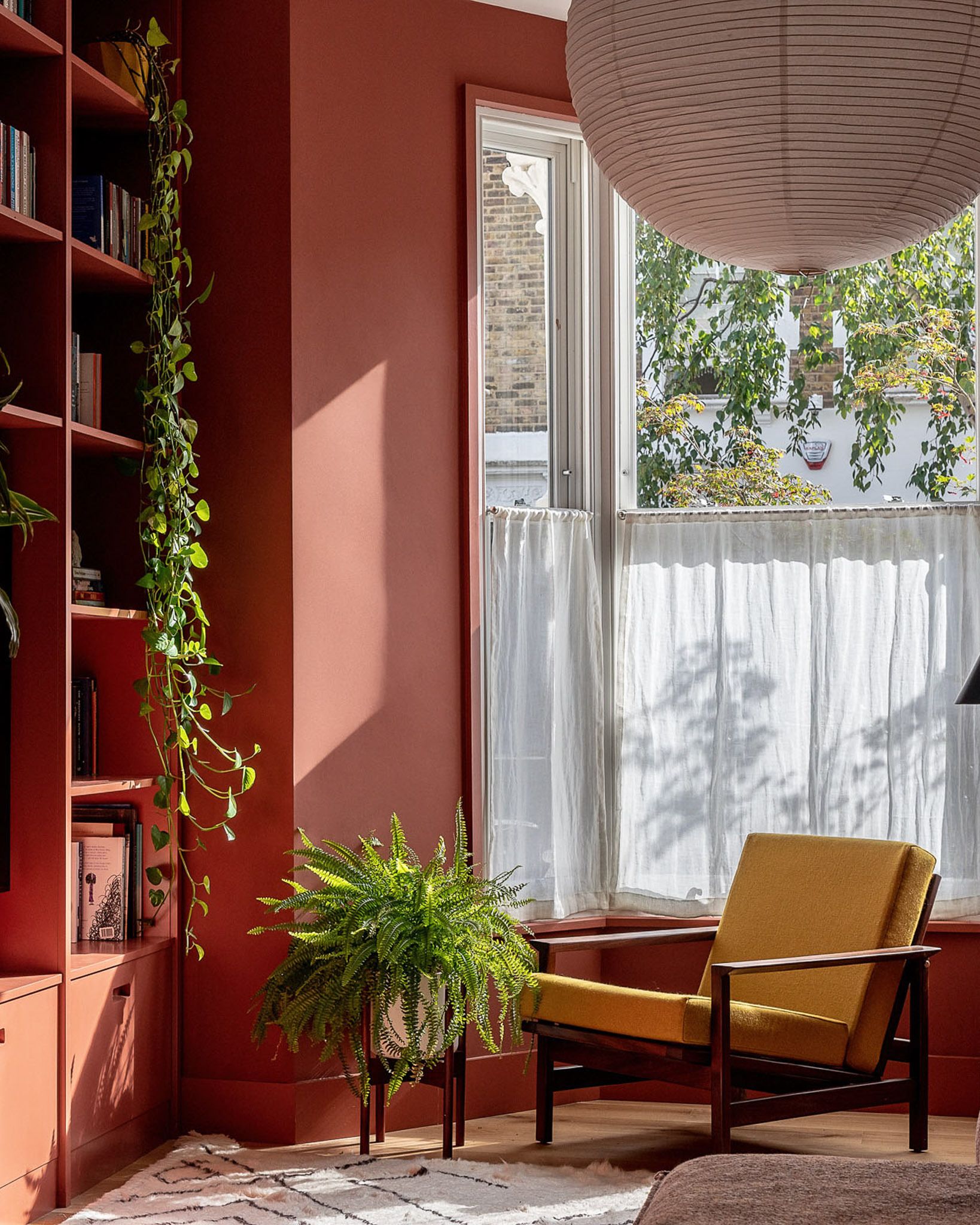
Choose instead: rich terracotta.
There’s a very fine line between a warm off-white and a beige, but it's quite obvious when you cross it. An off-white is effectively a white with a color base, which can be cooler or warmer, have a subtle tint to it, and can be paired beautifully with similar tone colors to balance them out.
Beige, on the other hand, is a color all in itself, and belongs in the light brown family. While there was a huge trend for beige, it’s been completely taken over by the sophistication and clarity provided by the myriad off-white options available.
"Once a staple, beige is now viewed as bland and unexciting," says Martha. "Many people prefer colors that add character and warmth. Instead, earthy tones, such as terracotta are favoured for their organic feel and ability to connect with nature."
Trends exist to help inspire us, to help us (and our homes) evolve, and to lift us out of a state of monotony. When it comes to selecting colors for our homes, it's important to remember that at the end of the day, you're the one having to live in the space.
"The thing about color trends is that as long as you don't pick the color of the year, you're likely to have rooms you will love for a decade," says Peter Spalding.
So take from trends what you will — start with small accents and slowly build up from there. Be open-minded and prepared to adapt. After all, a lick of new paint on a wall will always be an exciting refresh in any home. Will you be making a switch for 2025?
Raluca formerly worked at Livingetc.com and is now a contributor with a passion for all things interior and living beautifully. Coming from a background writing and styling shoots for fashion magazines such as Marie Claire Raluca’s love for design started at a very young age when her family’s favourite weekend activity was moving the furniture around the house ‘for fun’. Always happiest in creative environments in her spare time she loves designing mindful spaces and doing colour consultations. She finds the best inspiration in art, nature, and the way we live, and thinks that a home should serve our mental and emotional wellbeing as well as our lifestyle.


